Agreeable Gray SW 7029 by Sherwin-Williams
Detailed Guide From The Experts
Neutral greiges like SW Agreeable Gray 7029 have always been customers’ favorites, but this specific hue beats them all! It remains on top of the list of the best-selling brand’s paints for several years already, and their selection is not spontaneous or random.
Since it belongs to quite a wide family of greiges, this tint hits many requirements of an average customer, especially if one does not know what hue will fit his or her home better.
This warm and soft hue won its popularity over the other Sherwin-Williams paint colors simply because it is so universal.
SW Agreeable Gray can suit any chamber, moreover (and that is said to be its primer benefit), it pairs wonderfully with almost any other tint.
Already looking forward to learning more? Then stay tuned!
What Kind Of Color Is Agreeable Gray SW 7029?
What a silly question, some of you might think.
The hue’s name states it is gray, so apparently, this is the answer! Nevertheless, we would not hurry up that much.
For an amateur in coloristic, this tint will probably seem to be gray indeed with pretty warm notes but since it is a member of the neutrals family, it has certain specifics.
In particular, according to the credible source Encycolorpedia , this hue belongs to the greige hues family.Generally, it is all about its undertones that make the hue show up in slightly diverse ways hanging upon particular conditions.
In some spaces it may be revealed closer to gray whilst in others, the hue will turn into a more beige-like coating.
But in general, if we take a look at the hue sample applied to the surface, it will show up as warm and relatively deep grey with a noticeable beige tint.
But don’t be alarmed, this paint is far from browns so it will not create that “muddy” appearance.
Also, it is not the one that will reveal yellowish hints – another issue that customers are afraid of so much.
housekeepingbay
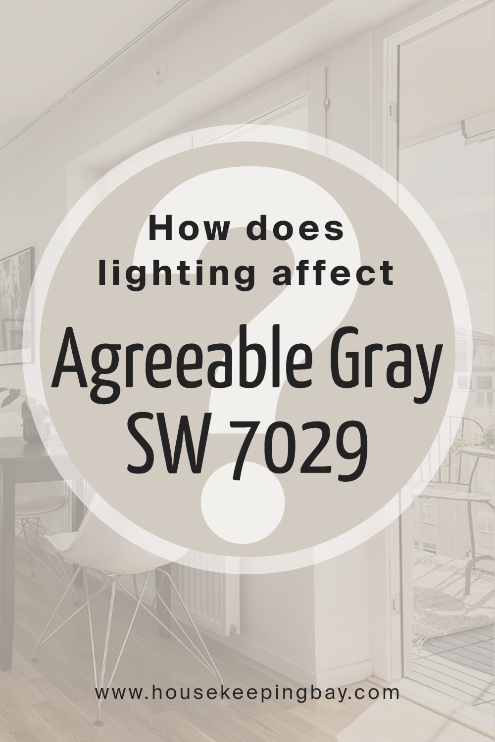
How Does Lighting Affect Agreeable Gray ?
Lighting plays a significant role in how Agreeable Gray (SW 7029) appears in different spaces. Here’s a breakdown of how various lighting conditions can affect this popular Sherwin Williams color:
Natural Light
- North-Facing Rooms: In north-facing rooms, which receive cooler and more diffused light, Agreeable Gray may lean more towards its gray undertones, appearing cooler and slightly more muted.
- South-Facing Rooms: In south-facing rooms, which receive warmer and more direct sunlight, Agreeable Gray tends to show more of its warm beige undertones, creating a cozy and inviting ambiance.
- East-Facing Rooms: In east-facing rooms, the morning light can make Agreeable Gray appear brighter and more luminous, while the afternoon light may cast a softer glow.
- West-Facing Rooms: In west-facing rooms, the color may look warmer and richer in the afternoon and evening as the sunlight becomes more golden.
Artificial Light
- Warm White (2700K – 3000K): Under warm white lighting, Agreeable Gray will emphasize its warm beige undertones, making the room feel cozy and inviting.
- Cool White (4000K – 5000K): Cool white lighting can bring out the cooler gray tones in Agreeable Gray, giving the space a more modern and slightly crisper feel.
- Daylight (5000K – 6500K): Daylight bulbs will make Agreeable Gray appear closer to its true color, balancing both its warm and cool undertones.
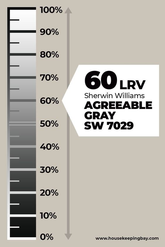
What is the LRV of Agreeable Gray ?
How LRV Affects Your Space
- Brightness and Openness: With its LRV of 60, Agreeable Gray can make a room feel bright and open. It’s not too dark, so it won’t absorb too much light, and it’s not too light, so it won’t feel stark or washed out.
- Versatility: This LRV makes Agreeable Gray versatile. It can work well in rooms with various light levels, from natural to artificial lighting.
- Balance: Agreeable Gray strikes a good balance between light and dark, making it suitable for a wide range of interior styles and color schemes.
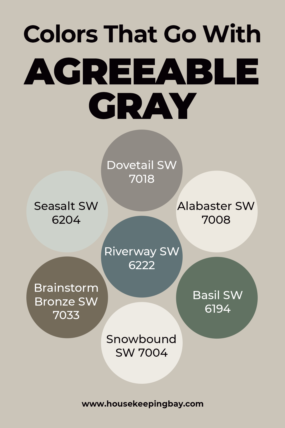
Colors That Go With Agreeable Gray
Finding proper coordinating hues is not an easy task, especially if one is not a professional painter or designer.
However, it is possible to solve this puzzle. Simply take into consideration the list of hues that pair with the AG best of all.
- Dovetail SW 7018
- Seasalt SW 6204
- Alabaster SW 7008
- Riverway SW 6222
- Brainstorm Bronze SW 7033
- Basil SW 6194
- Snowbound SW 7004
Even albeit this hue is neutral and can basically be combined with tons of other tints, these ones will reveal their potency way better.
housekeepingbay
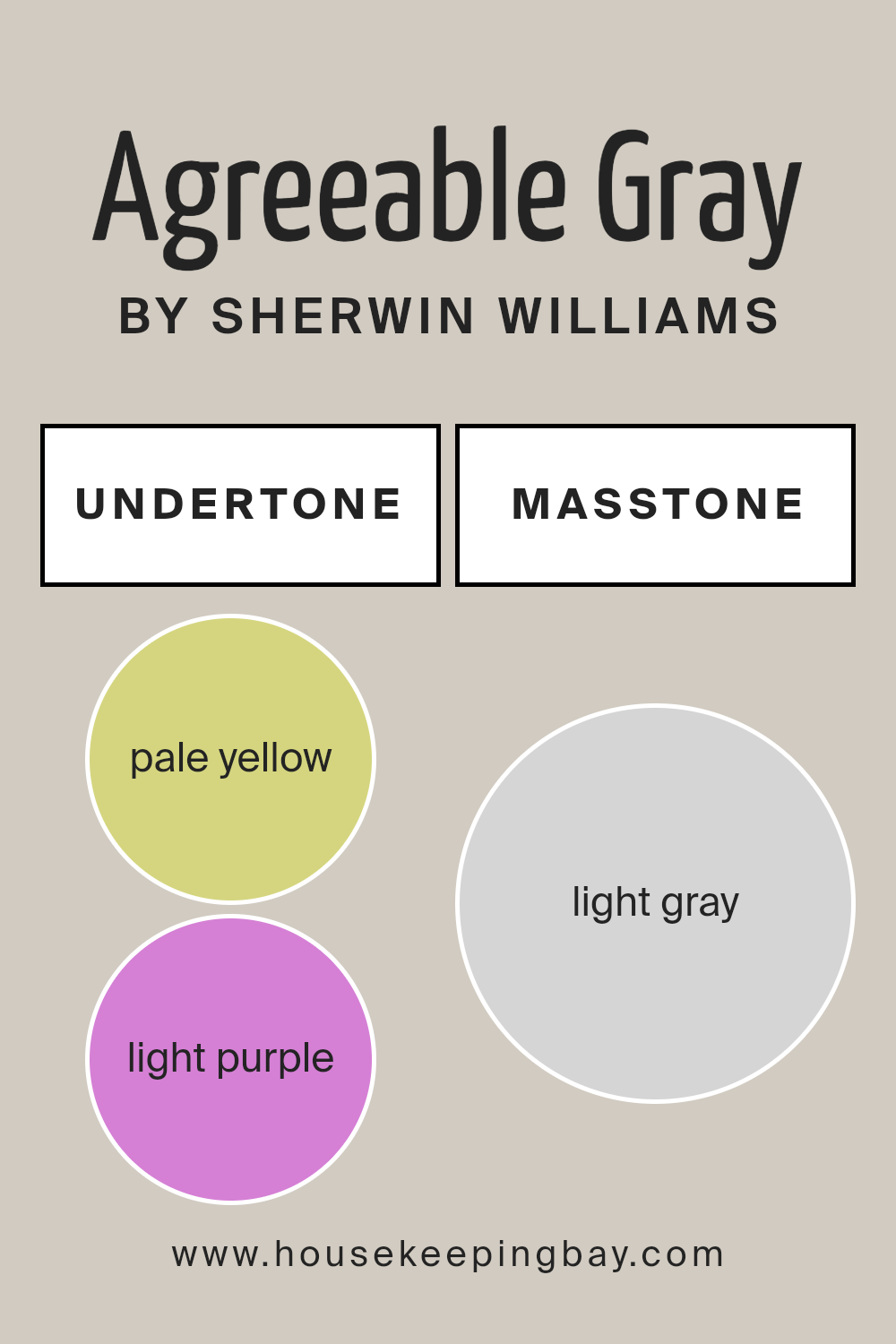
Agreeable Gray Undertones
It is a versatile and popular choice for interiors, thanks to its subtle undertones and balanced appearance. With a masstone of light grey, this color provides a neutral and sophisticated backdrop suitable for various design styles.
Its pale yellow undertone adds a touch of warmth, making spaces feel inviting and cozy, while the light purple undertone introduces a hint of coolness, adding depth and complexity.
This perfect blend of warm and cool undertones allows Agreeable Gray to adapt seamlessly to different lighting conditions, ensuring that it looks consistently appealing throughout the day. Whether used in living rooms, bedrooms, or kitchens, Agreeable Gray’s harmonious blend of undertones makes it a reliable and stylish choice for any home.
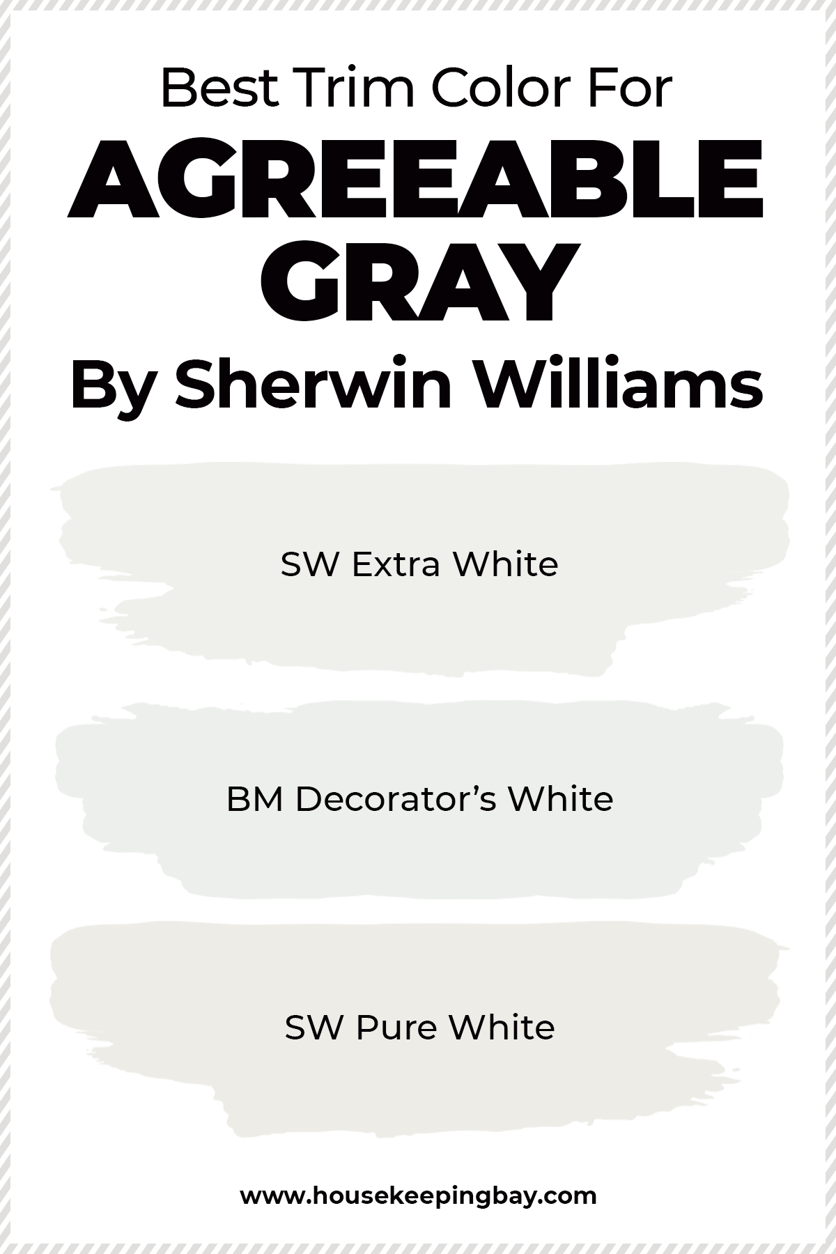
What Is the Best Trim Color For Agreeable Gray?
Trims are used for both decorative and practical purposes. On the one hand, they cover the gaps between two areas like a wall and a ceiling, but on the other hand, trims enhance the total look of the room, setting the style and tone to it.
This is why it is so important to choose the trim color correctly!
Since Agreeable Gray belongs to the family of greige colors, it means that white will be the optimal choice when looking for the best trim colors to combine it with your Agreeable walls.
However, knowing that it is white is not enough!
Such a seemingly simple color as white is highly reflective which means you must be very careful when picking the shades of white that will create a harmonious ensemble with your greige walls.
Speaking of SW Agreeable Gray, you can easily pair with such whites as:
- SW Extra White (you will get a really bright white trim)
- BM Decorator’s White (not too bright since this white has a hint of gray in it)
- SW Pure White (similar to Decorator’s White only being a smudge brighter)
And in addition, you’d better avoid any warmer white shades, such as BM Simply White
Housekeepingbay.com
What is the best trim for agreeable gray?
When choosing a trim color for Agreeable Gray, it’s best to select a shade that complements its warm undertones while providing a crisp and clean contrast. White trims are a classic choice, creating a timeless and elegant look that enhances the softness of Agreeable Gray. Colors like Sherwin Williams Pure White SW 7005 or Benjamin Moore White Dove OC-17 work exceptionally well, as they bring out the subtle warmth of the gray without overpowering the room.
Additionally, darker trim colors such as Sherwin Williams Tricorn Black SW 6258 or Urbane Bronze SW 7048 can add a bold, modern edge to your space, offering a sophisticated and striking contrast.
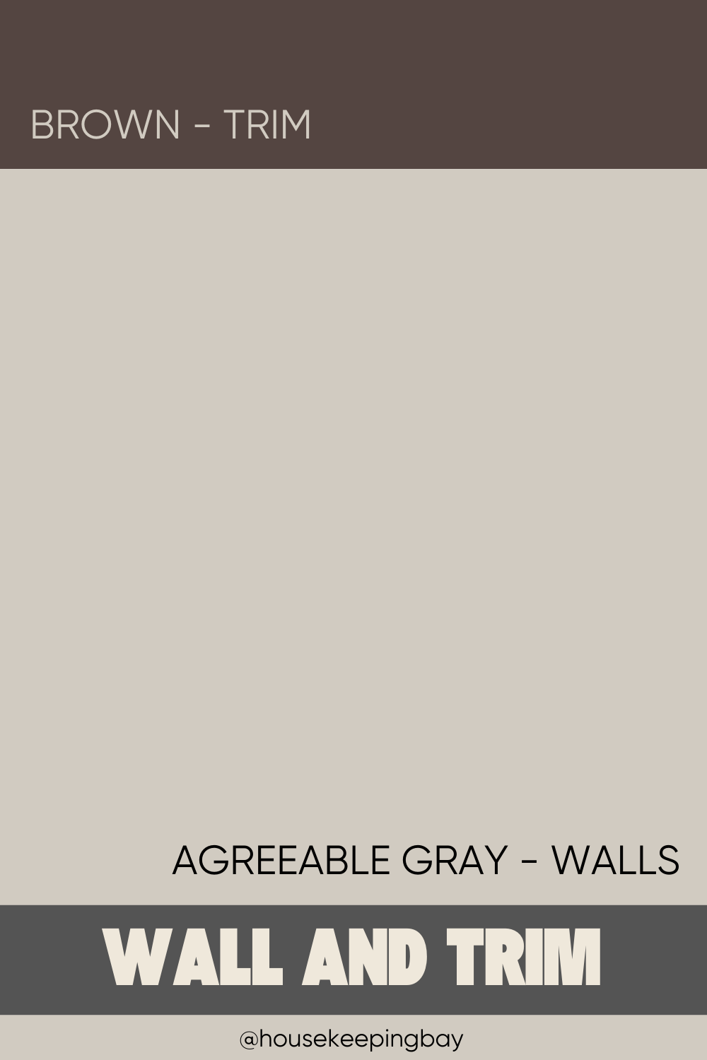
Agreeable Gray with Brown Trim
Pairing Agreeable Gray with brown trim creates a cozy and inviting atmosphere. The warm undertones of Agreeable Gray harmonize beautifully with rich brown trims, such as Benjamin Moore Kendall Charcoal HC-166 or Sherwin Williams Urbane Bronze SW 7048.
This combination is perfect for traditional and rustic interiors, adding depth and character to your space. The brown trim provides a strong yet complementary contrast, enhancing the gray’s subtle warmth and creating a balanced and cohesive look.
Using brown trim with Agreeable Gray can also work well in transitional spaces, blending contemporary and classic elements. The earthy tones of the brown trim anchor the room, making it feel grounded and comfortable.
This combination is particularly effective in living rooms and bedrooms, where a warm and welcoming ambiance is desired. To complete the look, incorporate natural materials such as wood furniture and textiles in neutral tones, further enhancing the harmony between the gray and brown.
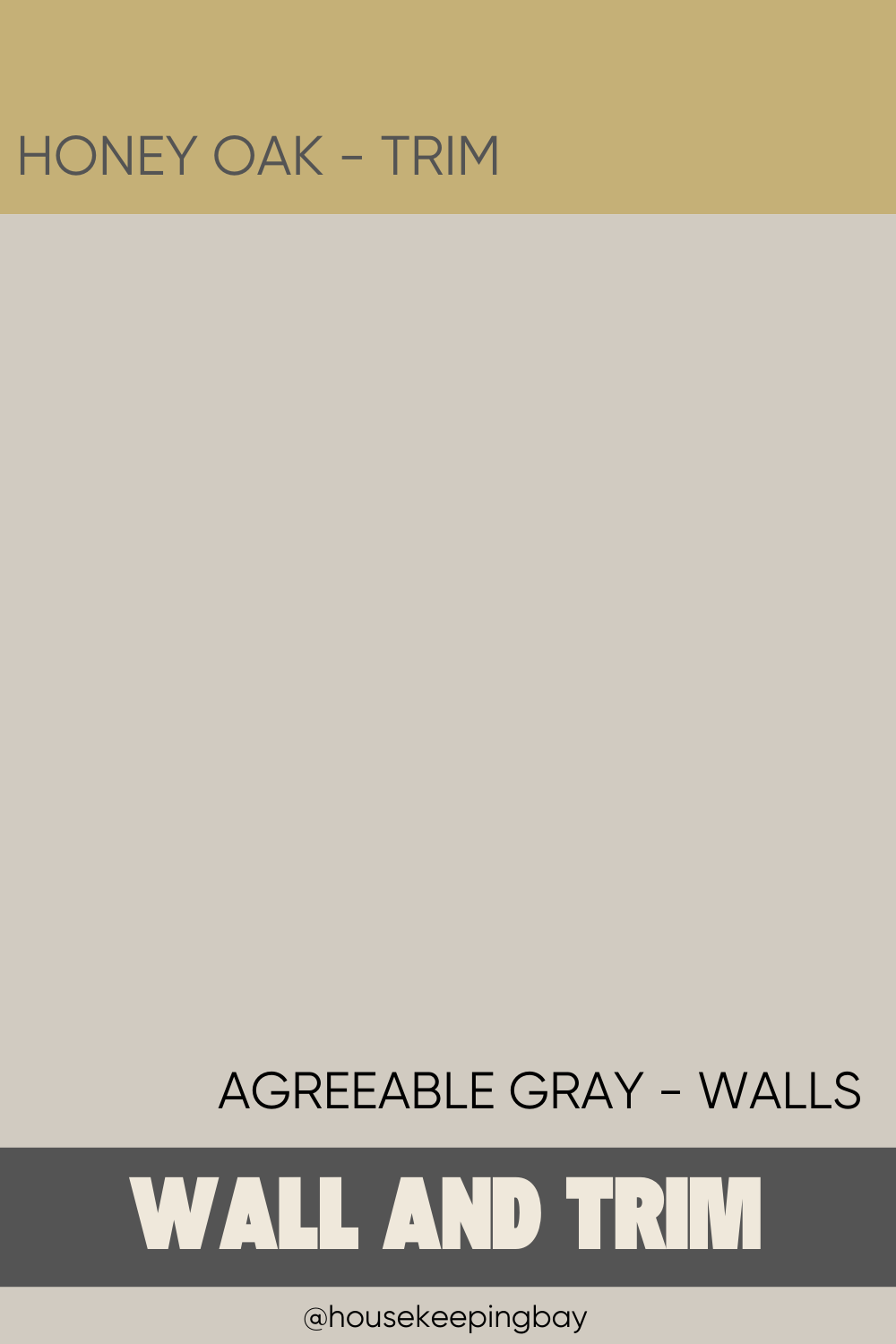
Agreeable Gray and Honey Oak Trim
Agreeable Gray paired with honey oak trim brings a fresh and updated look to spaces with existing oak features. The soft, neutral tones of Agreeable Gray balance the warm, golden hues of honey oak, preventing the room from feeling too yellow or dated.
This combination works well in kitchens, living rooms, and bathrooms where you want to retain the warmth of the wood while introducing a modern, sophisticated gray. The gray helps to neutralize the honey tones, creating a more contemporary and cohesive design.
In addition, this pairing can brighten up spaces with honey oak cabinets or trim, making them feel more spacious and inviting. The contrast between the cool gray and warm oak adds visual interest without clashing, allowing the natural beauty of the wood to shine through.
To enhance this look, consider adding accents in soft white or light blue to create a serene and balanced color palette that complements both the gray and the honey oak.
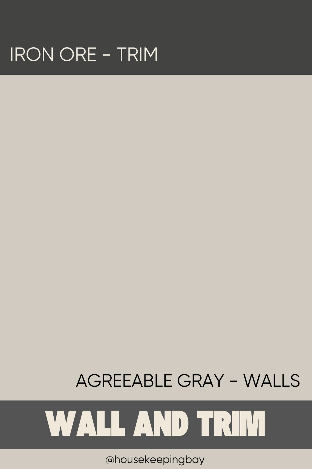
Agreeable Gray with Iron Ore Trim
Agreeable Gray combined with Iron Ore trim creates a dramatic and modern look. Sherwin Williams Iron Ore SW 7069 is a deep, almost black charcoal that provides a striking contrast to the soft, warm gray of Agreeable Gray. This combination is perfect for contemporary and industrial interiors, adding a touch of sophistication and elegance. The dark trim frames the Agreeable Gray walls beautifully, highlighting architectural details and creating a bold statement.
This pairing is also highly versatile, working well in various settings from living rooms to bedrooms and even kitchens. The dark trim can help define spaces and add a sense of structure and depth.
To balance the intensity of the dark trim, incorporate lighter furnishings and accessories, such as white or light wood pieces, to create a harmonious and cohesive design. This combination of Agreeable Gray and Iron Ore trim is sure to impress with its modern and stylish appeal.
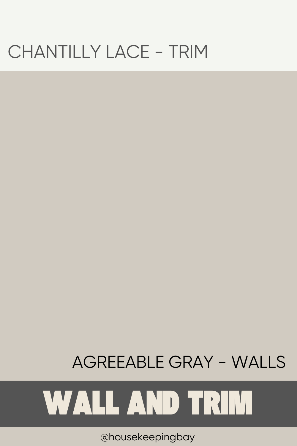
Agreeable Gray and Chantilly Lace Trim
Agreeable Gray paired with Benjamin Moore Chantilly Lace OC-65 trim offers a clean and crisp look that is both timeless and elegant. Chantilly Lace is a bright, pure white that provides a sharp contrast to the soft, warm undertones of Agreeable Gray. This combination is ideal for creating a fresh, airy feel in any room, making it perfect for living rooms, bedrooms, and kitchens. The bright white trim accentuates the subtle warmth of the gray, enhancing the overall lightness and brightness of the space.
Using Chantilly Lace trim with Agreeable Gray also allows for flexibility in decorating, as it pairs well with a wide range of accent colors and styles. Whether you prefer a minimalist, modern aesthetic or a more traditional, cozy look, this combination provides a neutral backdrop that can be easily customized with different accessories and furnishings. The clean lines of the white trim also highlight architectural details, adding depth and interest to the room.
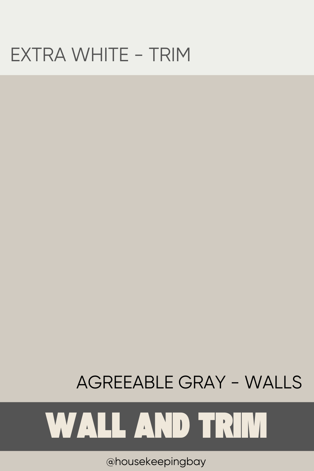
Agreeable Gray and Extra White Trim
Agreeable Gray with Sherwin Williams Extra White SW 7006 trim creates a sleek and contemporary look that is both fresh and versatile. Extra White is a bright, cool white that complements the warm undertones of Agreeable Gray without overpowering them.
This combination is perfect for modern interiors, providing a clean and crisp contrast that enhances the overall brightness and spaciousness of the room. The cool white trim brings out the subtle gray tones, making the space feel more cohesive and balanced.
This pairing works particularly well in open-plan living areas, kitchens, and bathrooms, where a bright and airy feel is desired. The Extra White trim provides a neutral frame for the Agreeable Gray walls, allowing other design elements, such as furniture and accessories, to stand out.
To complete the look, consider adding accents in cool blues, greens, or metallics to create a harmonious and stylish color palette that complements both the gray and the white.
Best Accent Colors for Agreeable Gray
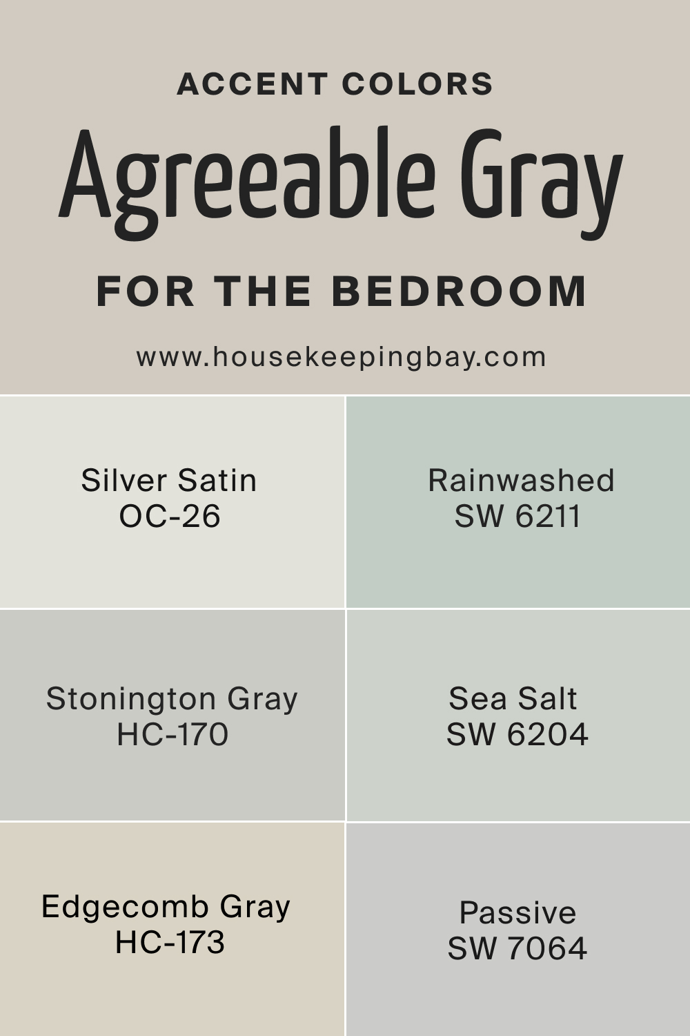
Agreeable Gray for the Bedroom
- Silver Satin OC-26: This soft, airy color from Benjamin Moore adds a touch of elegance to any bedroom. Silver Satin pairs beautifully with Agreeable Gray, enhancing its warm undertones while providing a light and refreshing contrast that brightens the room.
- Rainwashed SW 6211: Sherwin Williams’ Rainwashed is a calming blue-green that creates a serene and tranquil atmosphere in the bedroom. Its cool tones complement Agreeable Gray, adding a soothing and harmonious vibe perfect for relaxation and rest.
- Stonington Gray HC-170: This classic gray from Benjamin Moore is a perfect partner for Agreeable Gray. Stonington Gray offers a slightly cooler contrast, adding depth and sophistication to the bedroom while maintaining a cohesive and elegant look.
- Sea Salt SW 6204: A popular choice from Sherwin Williams, Sea Salt brings a soft, muted green-blue to the mix. It pairs beautifully with Agreeable Gray, offering a gentle, beach-inspired vibe that is both relaxing and refreshing for bedroom spaces.
- Edgecomb Gray HC-173: Benjamin Moore’s Edgecomb Gray is a warm, light gray that works wonderfully with Agreeable Gray. This combination creates a cozy and inviting bedroom environment, perfect for unwinding after a long day.
- Passive SW 7064: Sherwin Williams’ Passive is a light, cool gray that adds a crisp and modern touch to the bedroom. When paired with Agreeable Gray, it provides a subtle contrast that keeps the room feeling fresh and contemporary.
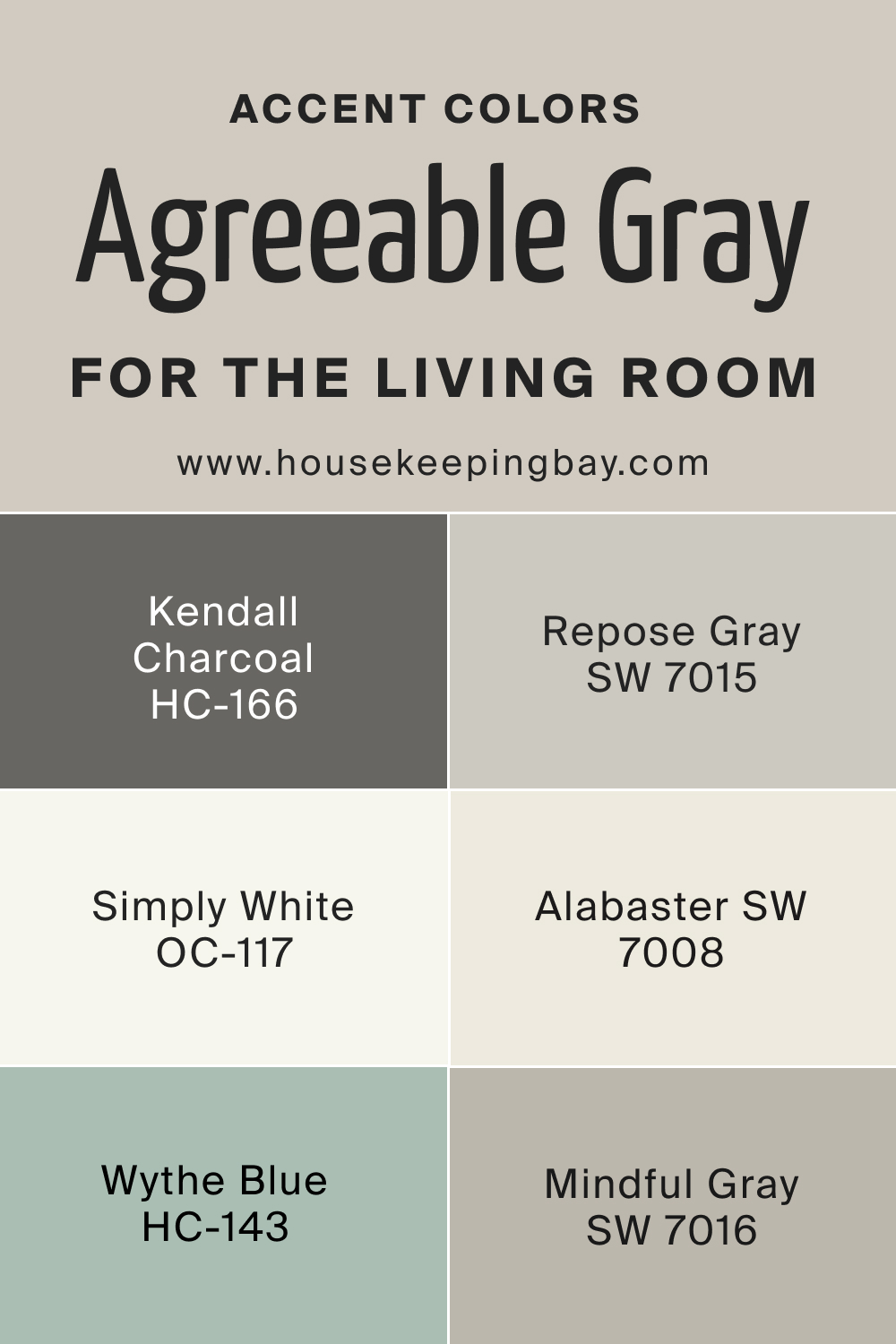
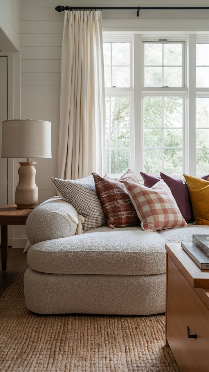
Agreeable Gray for the Living Room
- Kendall Charcoal HC-166: This rich, dark gray from Benjamin Moore adds depth and drama to living spaces. Kendall Charcoal pairs well with Agreeable Gray, offering a bold contrast that creates a sophisticated and stylish look, perfect for accent walls or trim.
- Repose Gray SW 7015: Sherwin Williams’ Repose Gray is a versatile, neutral gray that complements Agreeable Gray seamlessly. This pairing brings a balanced and cohesive feel to the living room, ideal for creating a warm and inviting atmosphere.
- Simply White OC-117: A clean, bright white from Benjamin Moore, Simply White adds a crisp and fresh contrast to Agreeable Gray. This combination is perfect for a modern and airy living room, highlighting architectural features and adding a touch of elegance.
- Alabaster SW 7008: Sherwin Williams’ Alabaster is a soft, warm white that pairs beautifully with Agreeable Gray. This combination creates a serene and welcoming living room environment, perfect for creating a cozy and inviting space for family gatherings.
- Wythe Blue HC-143: Benjamin Moore’s Wythe Blue is a lovely muted blue-green that adds a refreshing pop of color to the living room. Paired with Agreeable Gray, it creates a balanced and calming palette, ideal for a relaxed and stylish living space.
- Mindful Gray SW 7016: Sherwin Williams’ Mindful Gray is a perfect neutral that complements Agreeable Gray’s warm tones. This pairing brings a modern and cohesive look to the living room, offering a versatile and elegant color scheme.
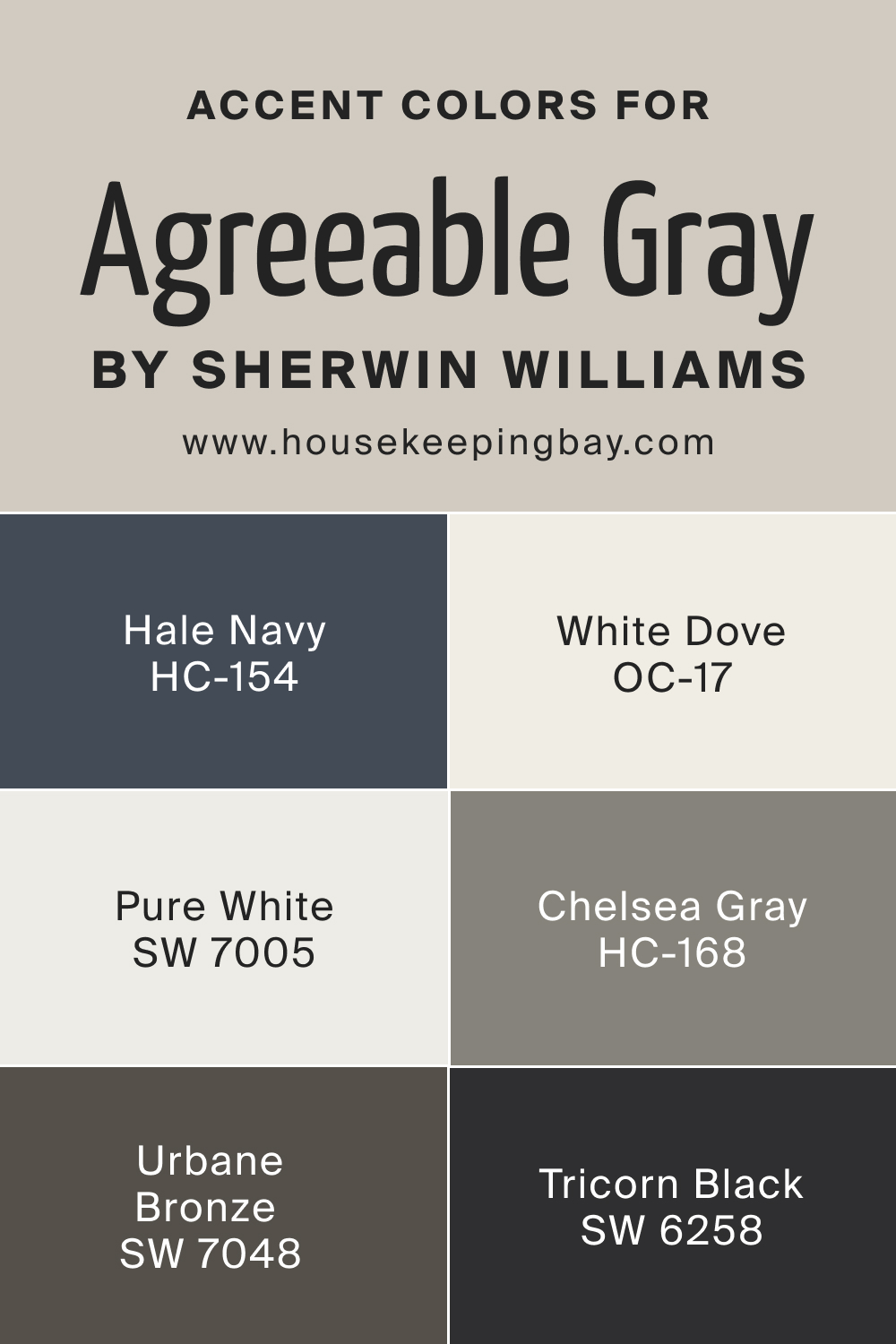
Universal Accent Colors for Agreeable Gray
- Hale Navy HC-154: Benjamin Moore’s Hale Navy is a deep, rich blue that adds a touch of sophistication and drama to any room. When paired with Agreeable Gray, it creates a striking contrast that is both elegant and timeless.
- Tricorn Black SW 6258: Sherwin Williams’ Tricorn Black is a bold and modern choice that provides a dramatic contrast to Agreeable Gray. This pairing is perfect for creating a sleek and contemporary look, adding depth and definition to the space.
- White Dove OC-17: A classic, soft white from Benjamin Moore, White Dove offers a clean and elegant contrast to Agreeable Gray. This combination is perfect for creating a timeless and sophisticated look in any room, enhancing the gray’s warm undertones.
- Pure White SW 7005: Sherwin Williams’ Pure White is a versatile and crisp white that pairs beautifully with Agreeable Gray. This combination creates a fresh and modern look, ideal for highlighting architectural details and adding a touch of elegance to any space.
- Chelsea Gray HC-168: Benjamin Moore’s Chelsea Gray is a rich, warm gray that adds depth and sophistication to any room. Paired with Agreeable Gray, it creates a harmonious and elegant color scheme, perfect for a balanced and stylish interior.
- Urbane Bronze SW 7048: Sherwin Williams’ Urbane Bronze is a deep, earthy bronze that offers a bold and sophisticated contrast to Agreeable Gray. This combination is ideal for creating a modern and luxurious look, adding a touch of drama and elegance to any space.
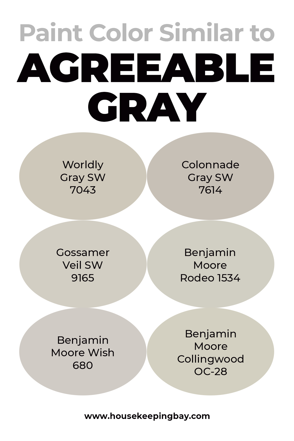
Paint Color Similar to Agreeable Gray
When it comes to greiges, it can be rather challenging to tell the difference between the two hues simply because they are so alike!
But sometimes we might need more diversity and alternatives to make a selection, so check out what other grays are comparable to the Agreeable Gray:
- Worldly Gray SW 7043
- Colonnade Gray SW 7614
- Gossamer Veil SW 9165
- Benjamin Moore Rodeo 1534
- Benjamin Moore Wish 680
- Benjamin Moore Collingwood OC-28
Among all of them, Collingwood, Rodeo, and Wish stay closest to the AG than others.
housekeepingbay
Where to Use Agreeable Gray Paint Color?
Agreeable Gray (SW 7029) by Sherwin Williams is a versatile and timeless color that works beautifully in various spaces throughout your home. Here are some great places to use this popular paint color:
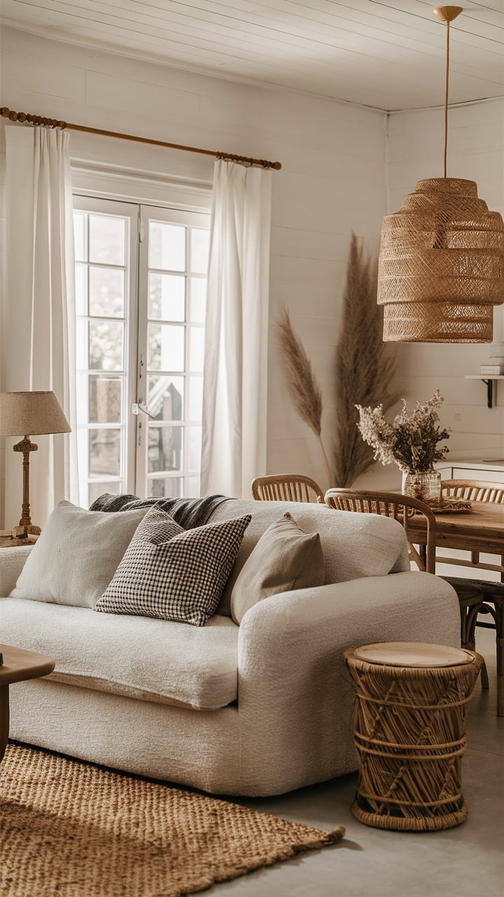
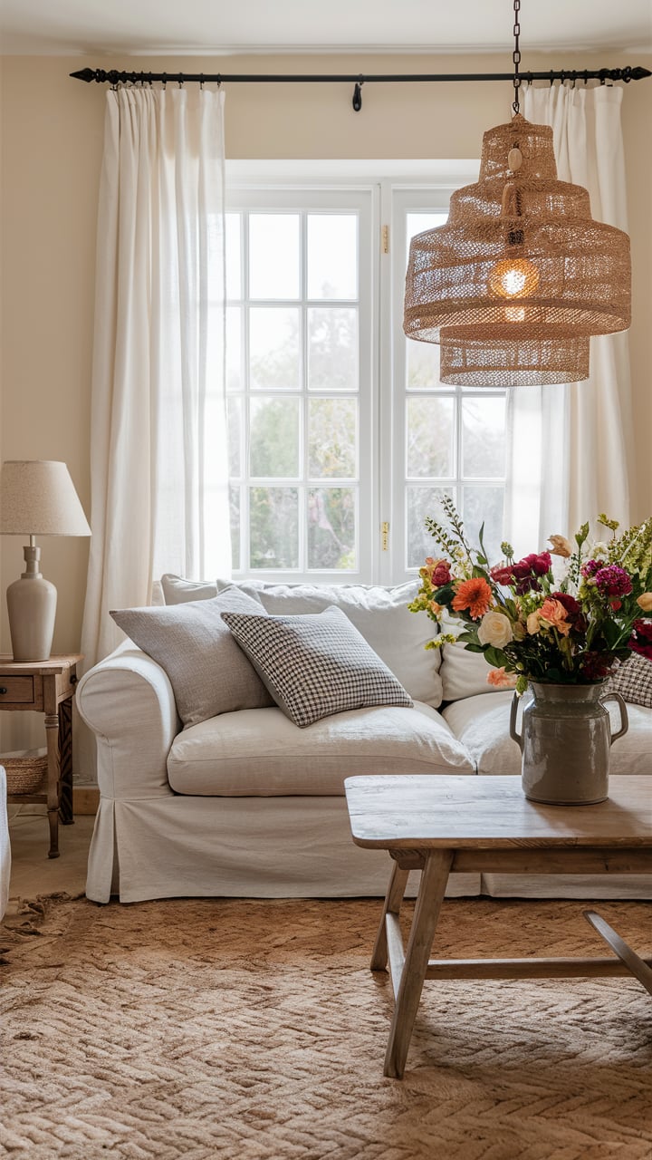
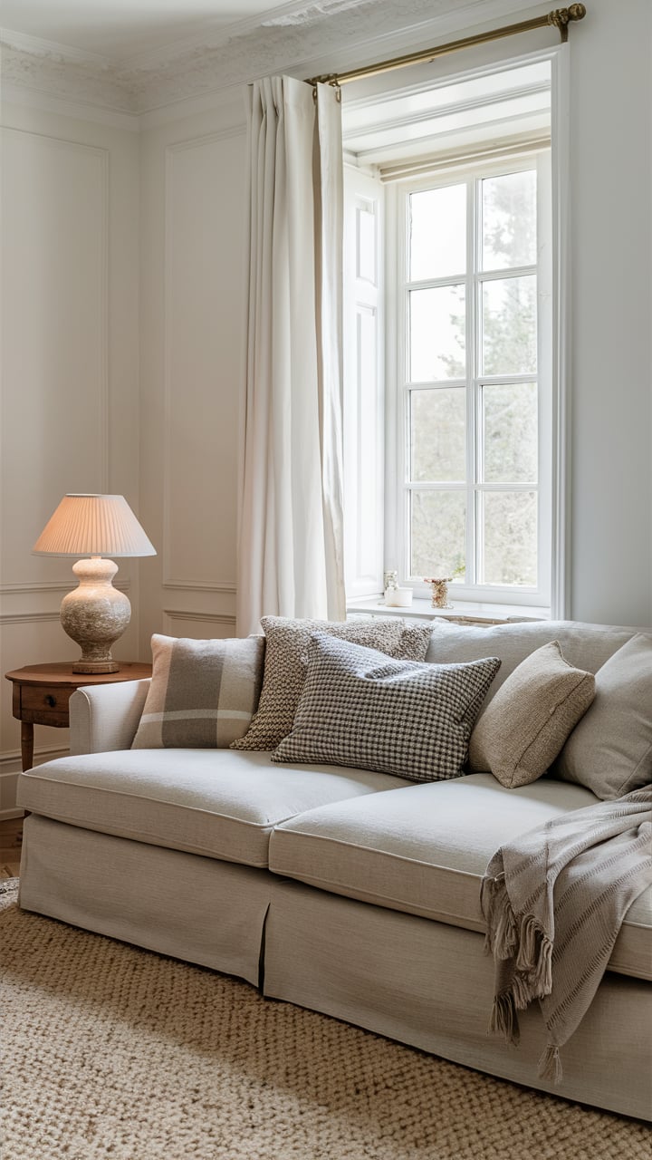
Agreeable Gray In a Living Room
Agreeable Gray creates a warm and inviting atmosphere in the living room. Its neutral tones make it easy to pair with a variety of furniture styles and accent colors, from contemporary to traditional.
The light gray masstone combined with its subtle undertones helps anchor the space without overpowering it. You can complement it with bold or soft furnishings, artwork, and decor pieces. Whether your living room features large windows with abundant natural light or relies on artificial lighting, Agreeable Gray will adapt beautifully, creating a cozy and sophisticated ambiance.
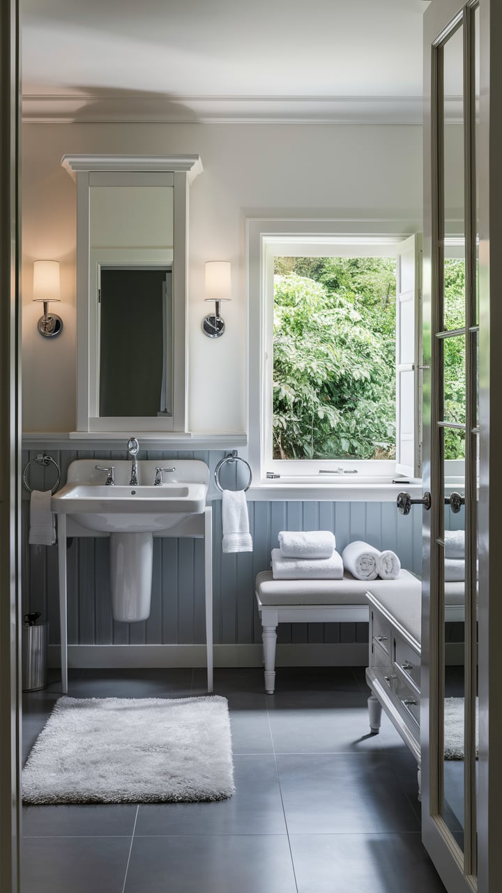
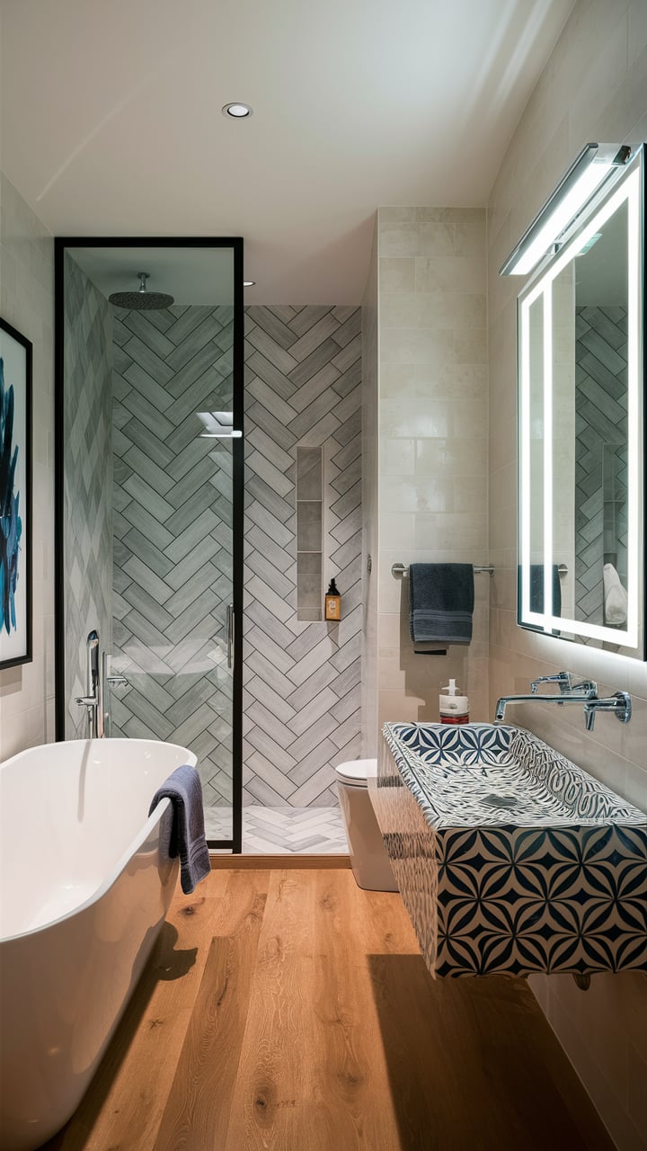
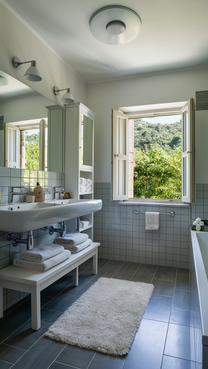
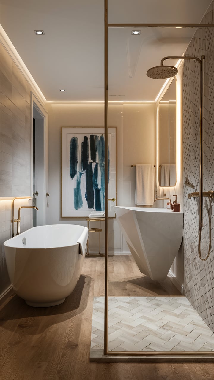
Agreeable Gray in a Bathroom
The bathroom is an ideal selection for applying this hue since this greige is rather neutral which makes it possible to combine with other tints.
It will show up especially stylish and refreshing with a black-and-white scheme that has brighter accents (for instance, red towels or decorations, etc).
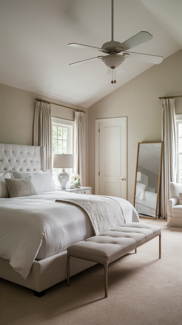
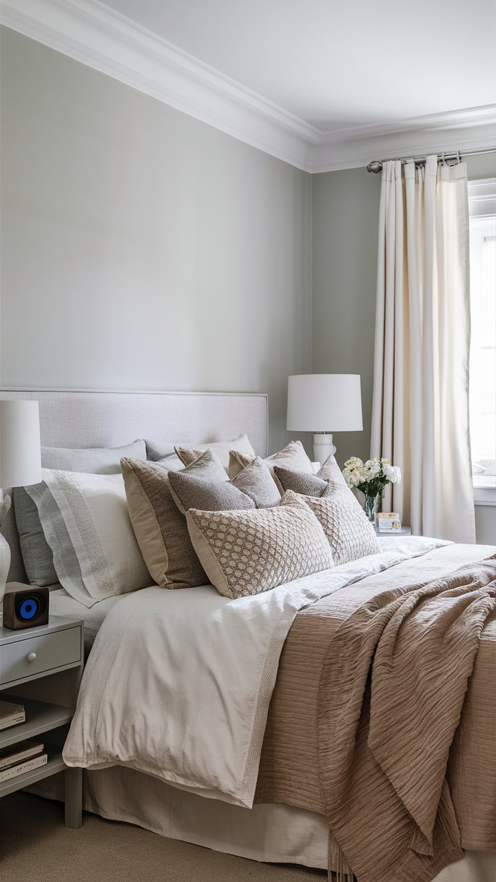
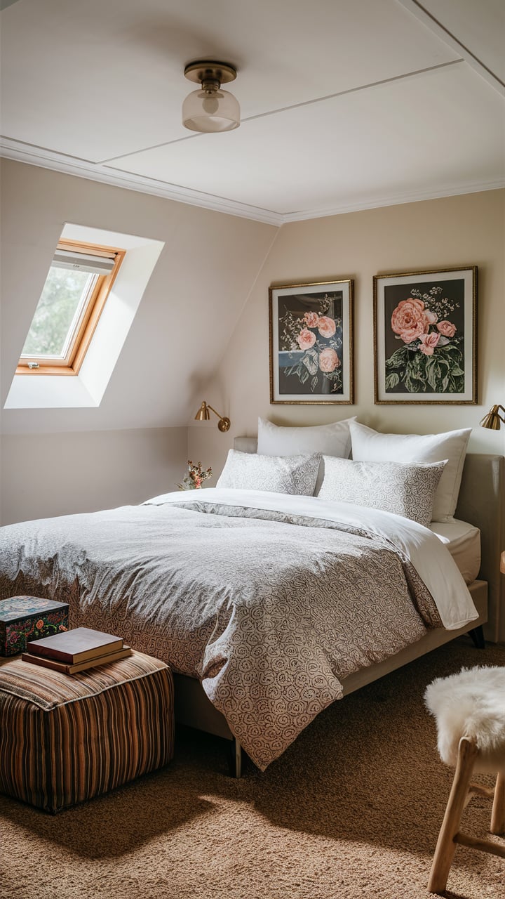
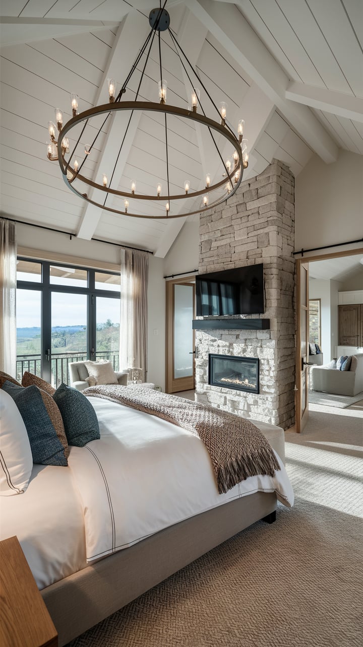
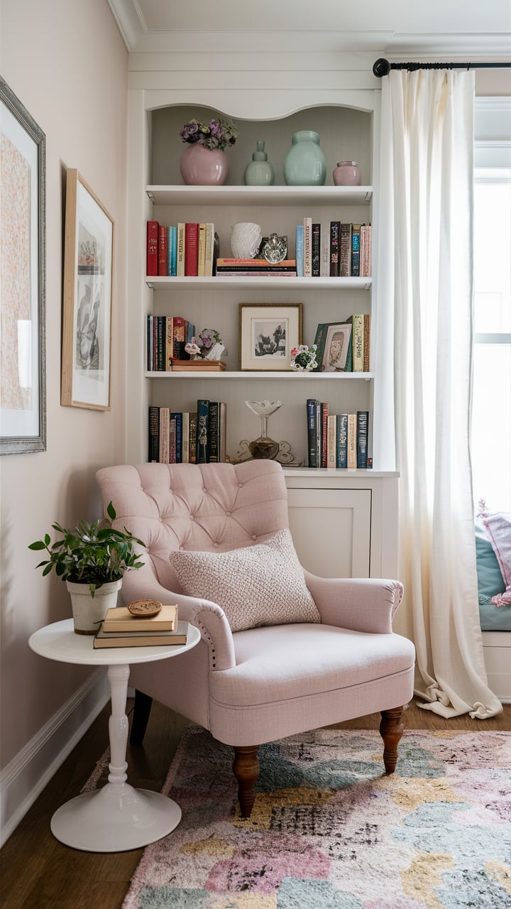
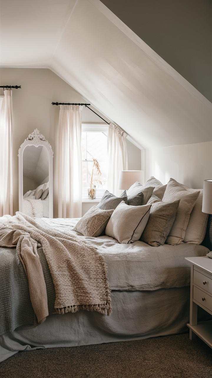
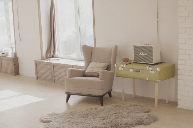
Agreeable Gray In a Bedroom
This soothing color is perfect for bedrooms, providing a calm and restful environment. The light gray masstone, paired with the pale yellow and light purple undertones, helps create a cozy and serene space, ideal for relaxation. Agreeable Gray pairs well with both light and dark bedroom furniture, allowing for flexibility in your decor choices.
You can enhance the tranquil vibe by adding soft textiles, such as plush bedding and curtains, in complementary colors. This color also works well with natural wood tones, adding a touch of warmth and comfort to your personal sanctuary.
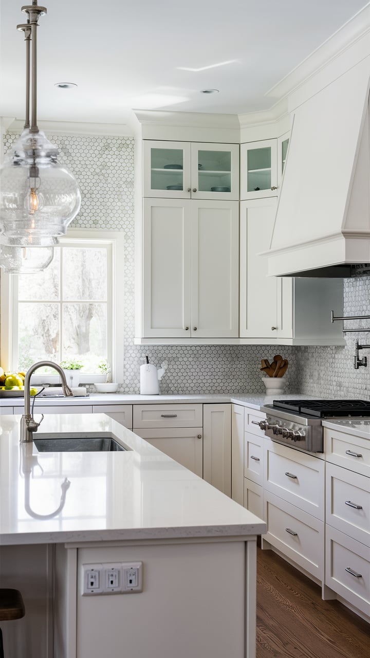
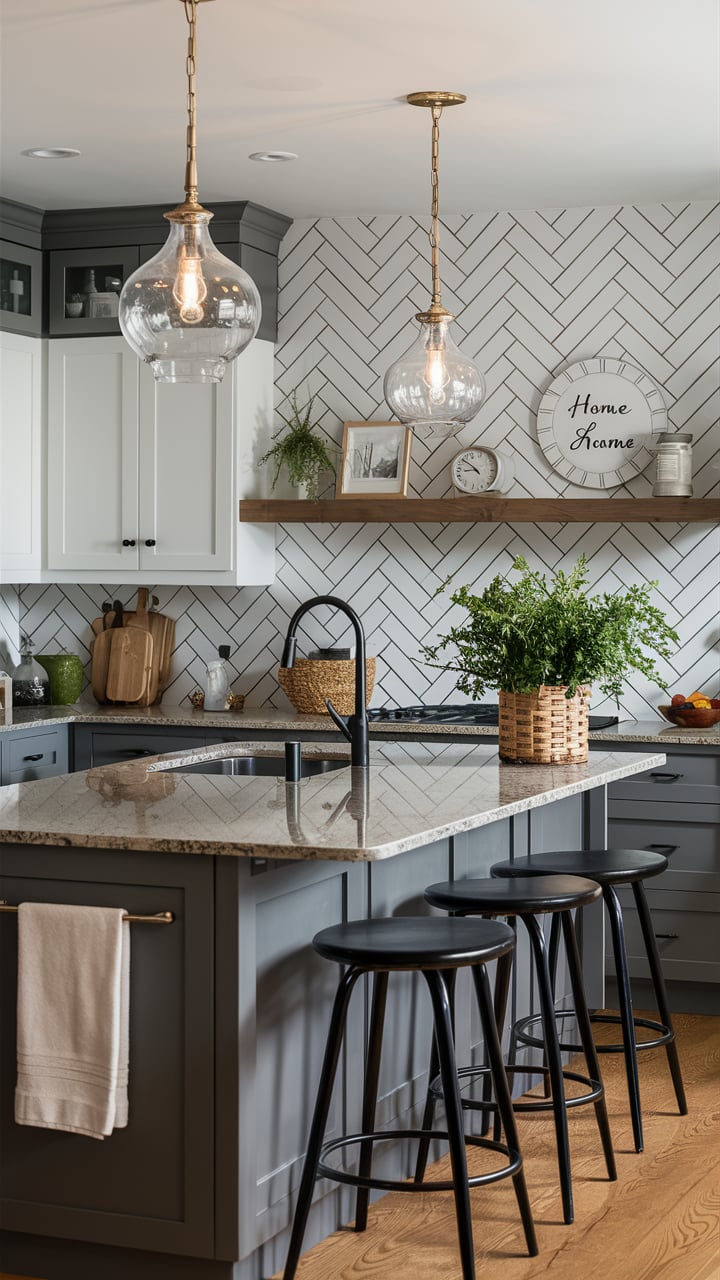
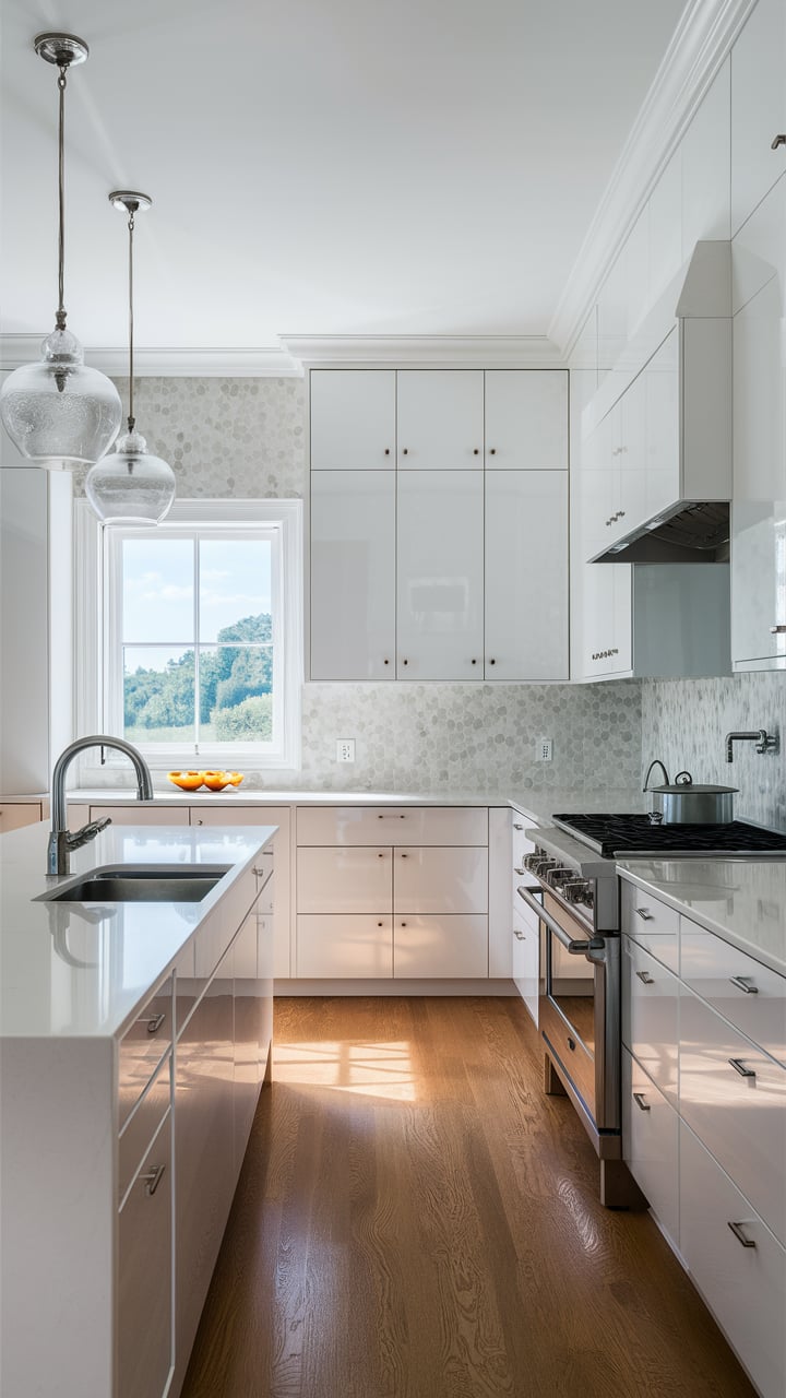
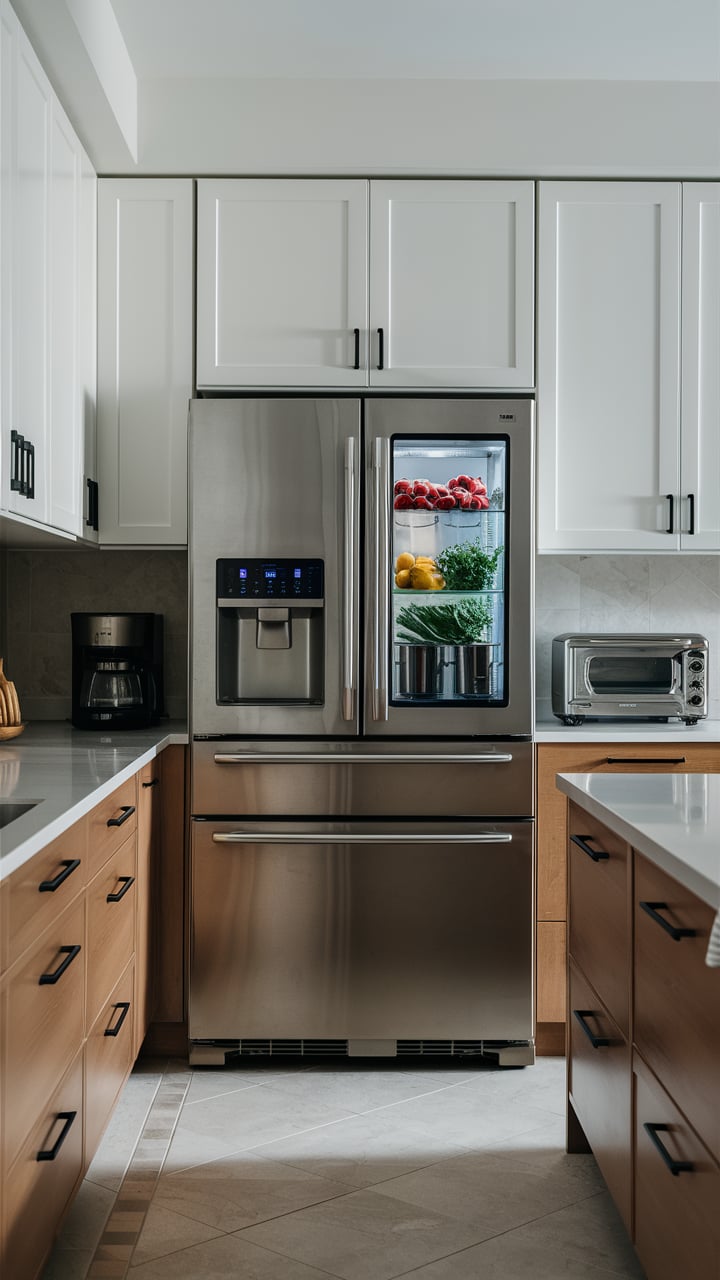
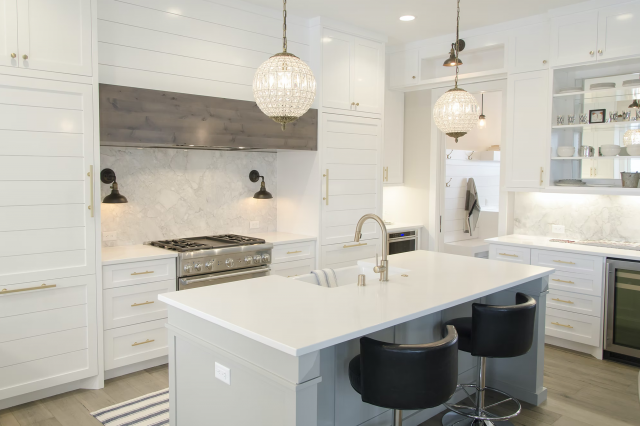
Agreeable Gray in Kitchens
Agreeable Gray works well in kitchens, complementing both light and dark cabinetry. Its balanced undertones allow it to coordinate with various countertop materials and backsplash options, providing a cohesive and elegant look. Whether your kitchen design leans towards modern, farmhouse, or transitional, Agreeable Gray adapts effortlessly.
It enhances stainless steel appliances and pairs beautifully with natural stone or quartz countertops. For a cohesive look, consider using Agreeable Gray on walls and pairing it with white or off-white trim for a crisp and clean finish.
It will also pair successfully with wooden and stone elements like countertops or shelves/cabinets.
It is one of the top greiges that we recommend to use in the kitchen.
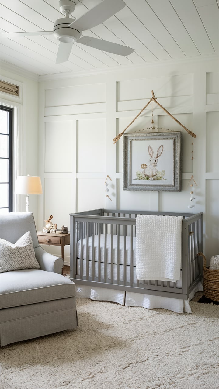
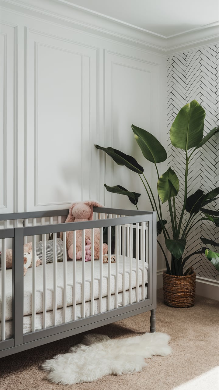
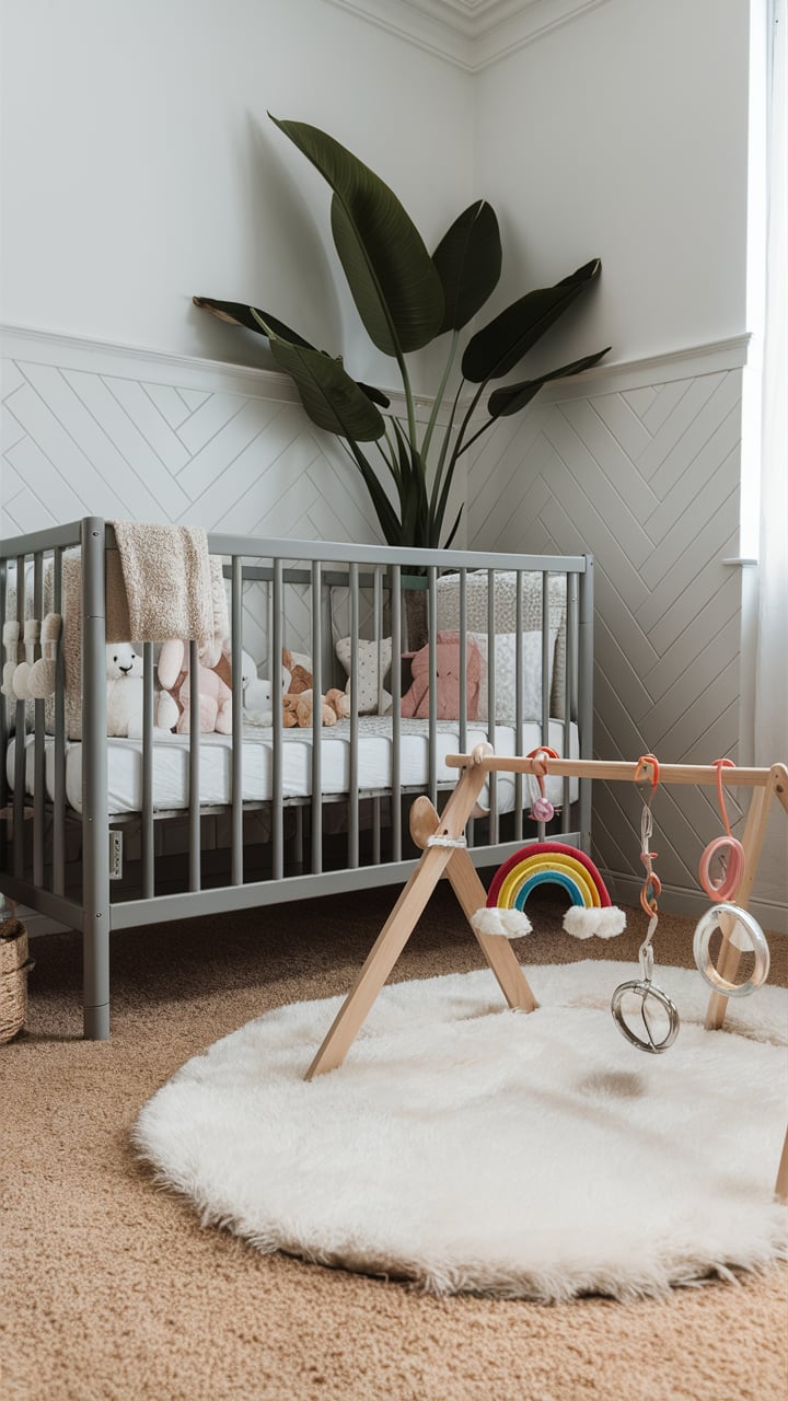
Agreeable Gray For the Nursery Room
When looking for a proper paint color to apply on the walls of a nursery room, most of us would think of something neutral and calm. At the same time, we would not want to have the nursery walls too pale or cool-toned.
This is why most people stick to various shades of gray paint color when going to paint their baby room.And if you are hesitating whether Agreeable Gray paint color by Sherwin Williams is the suitable choice for this type of painting project, we can assure you that it definitely is!
It is a warm-toned greige which means that this color combines both features of gray and beige paint colors in one.It makes the color stand in between the coolness of pure gray and warmth of pure beige. As a result, you have a perfectly balanced warm-toned color that may, however, look slightly warmer or cooler depending on lighting in a room.
In addition, Agreeable Gray pairs well with other warm-toned colors, especially with those that have earth tones.
This feature allows you to choose among the variety of alternative variants and pick the accent color for your nursery room in case you don’t want to have it all painted with the same color.
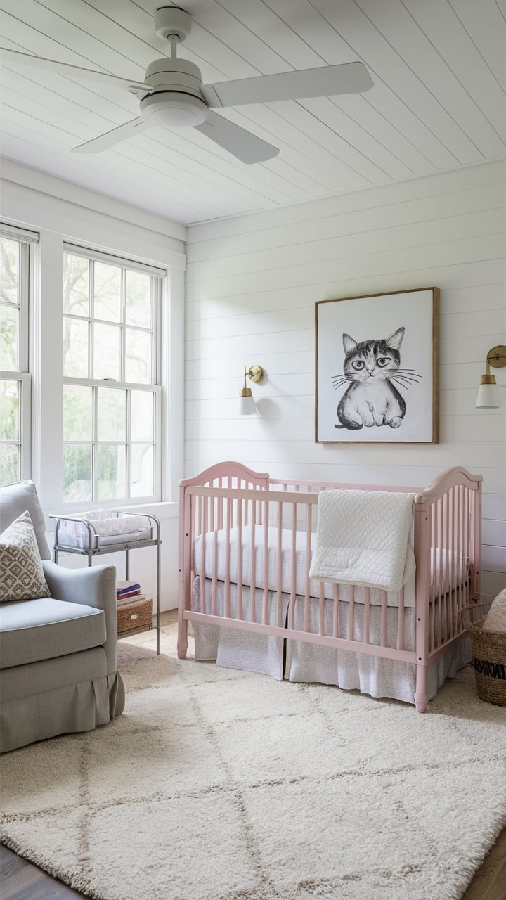
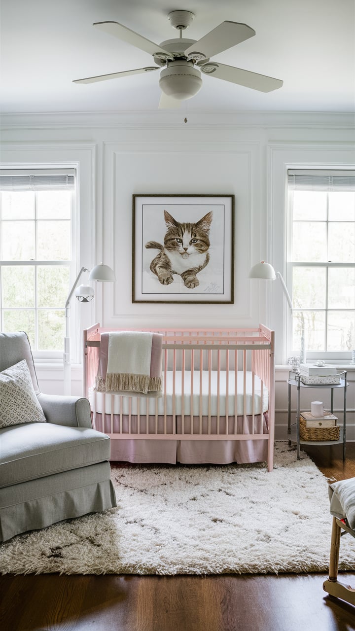
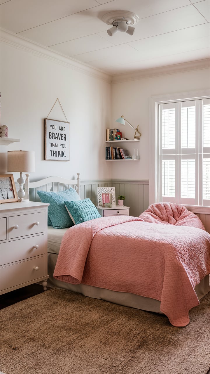
Can I Use Agreeable Gray For the Girl’s Bedroom?
When it comes to choosing a paint color to be applied on the walls of a girl’s room, many parents hesitate what color to opt for.
Well, we can say that, unless you are going to choose something like pink, painting the walls of your daughter’s room with Agreeable Gray is the best solution.
This color is very subtle and delicate on the walls, and also, it is neither cool nor too warm.
It means that the room will not look too dark or too “cold”, remaining in a perfect balance. And even if the lighting changes, the most that can happen is that the color of the walls will look slightly cooler or slightly warmer, but definitely not totally different color!
In addition, since Agreeable Gray is a neutral color, it can be combined with decor elements and furniture, as well as upholstery and curtains, of different colors.
This will allow you to play with decoration and the overall design of the space.
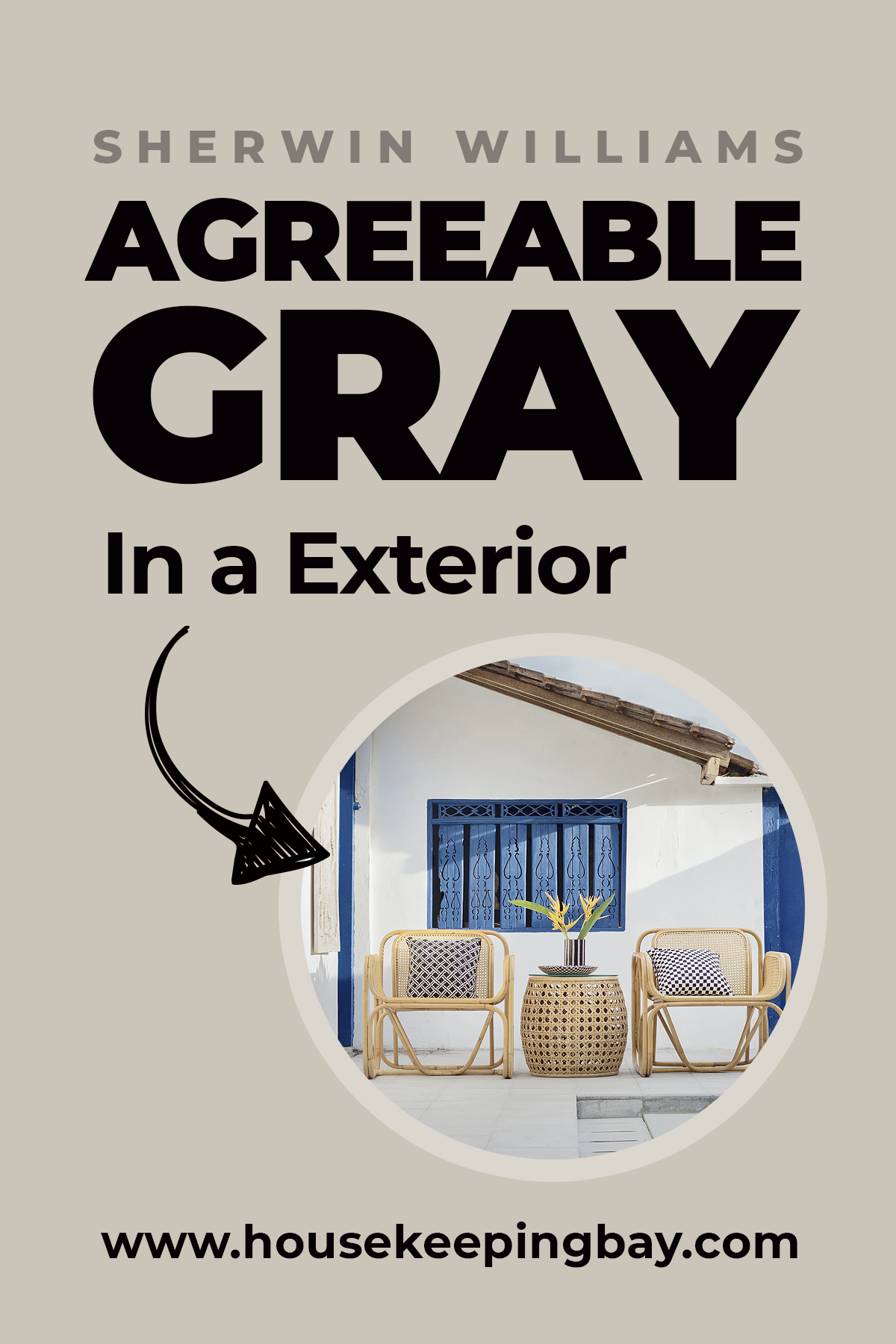
Exterior Use Of a Agreeable Gray
Agreeable Gray (SW 7029) is a versatile and elegant color that can enhance various aspects of your home’s exterior. From exterior walls and trim to front doors and shutters, this balanced light gray hue adapts beautifully to different architectural styles and environments.
Its neutral undertones ensure a timeless and sophisticated appearance, making your home look appealing and cohesive. Whether you’re aiming for a classic, modern, or contemporary look, Agreeable Gray provides a stylish and flexible solution for your exterior paint needs.
housekeepingbay
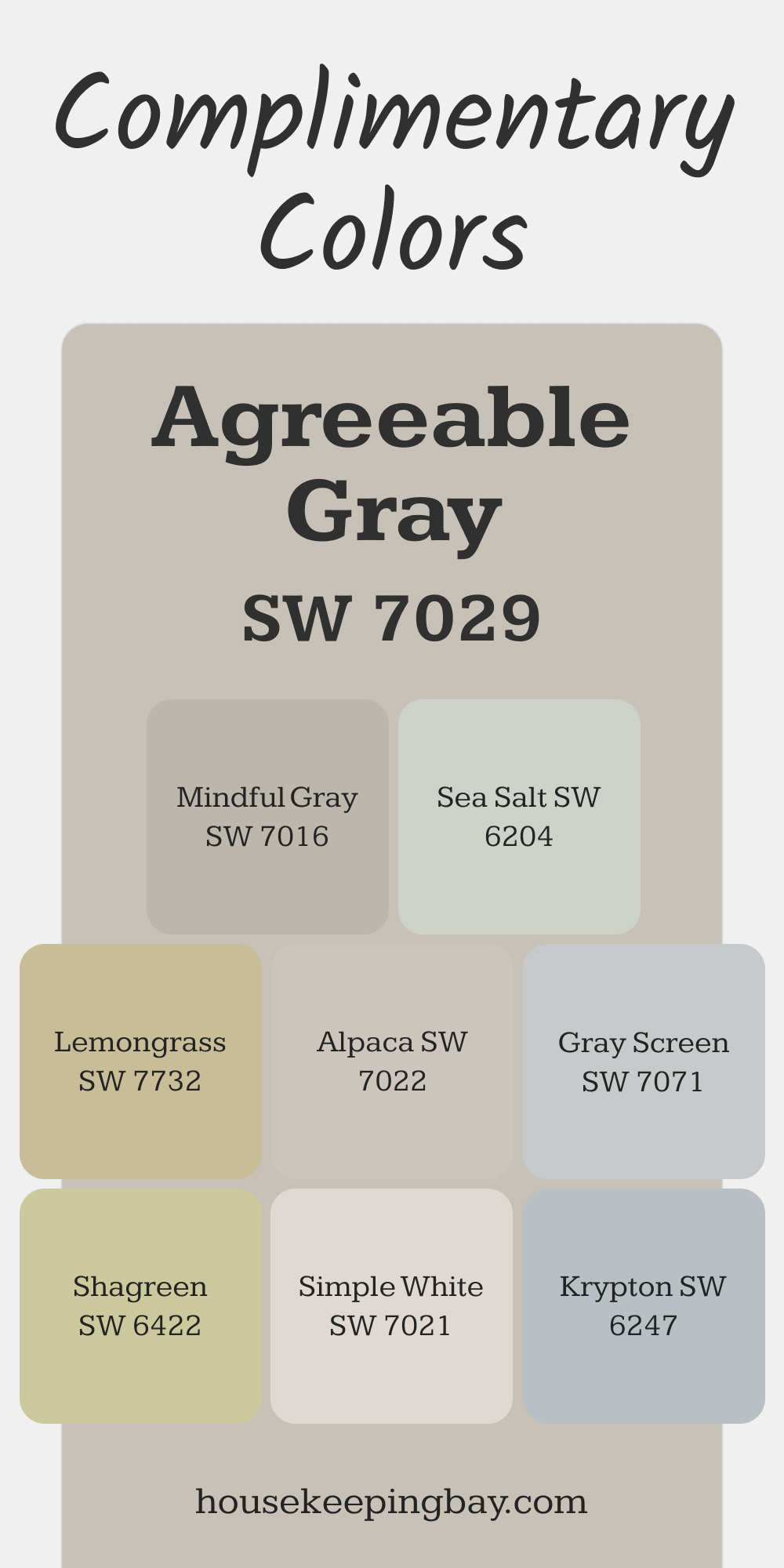
Complimentary Colors for Agreeable Gray SW 7029 Paint Color by Sherwin Williams
Agreeable Gray works beautifully with a variety of colors. Pair it with Mindful Gray or Alpaca for soft, cohesive tones. Sea Salt or Krypton brings a refreshing hint of color, adding subtle contrast. These combinations create a harmonious, well-balanced look.
For a touch of vibrancy, try Shagreen or Lemongrass. Gray Screen and Simple White add crisp accents, keeping the palette versatile and polished. These colors complement each other effortlessly.
via housekeepingbay.com
Agreeable Gray VS Other Colors
Finding a well-working hue that complements existing colors can be challenging. Even with a universal option like Agreeable Gray, it’s crucial to compare it with alternatives to make an informed decision.
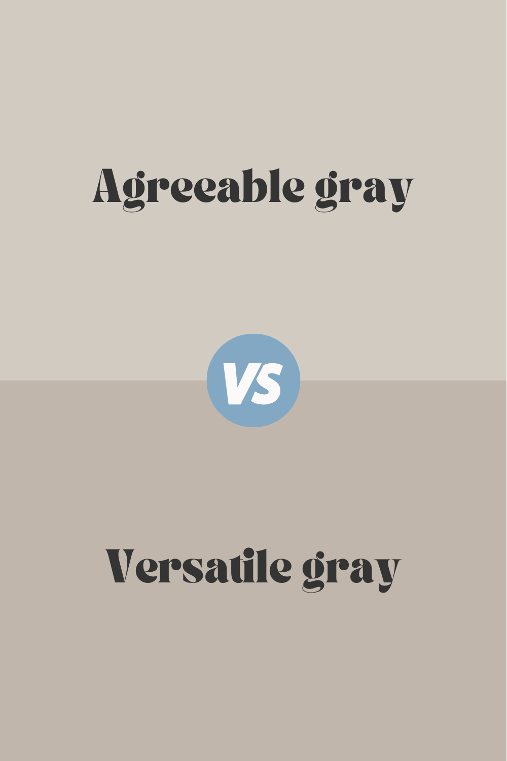
Agreeable Gray vs Versatile Gray
Agreeable Gray (SW 7029) and Versatile Gray (SW 6072) both come from Sherwin Williams’ extensive palette of neutrals, yet they bring different nuances to a room. Agreeable Gray is known for its perfect balance of warm and cool undertones, making it a highly adaptable color for various lighting conditions and styles. Versatile Gray, on the other hand, leans more towards a warm, taupe-gray, giving it a slightly richer and cozier feel. While Agreeable Gray offers more flexibility with different color schemes, Versatile Gray excels in creating a warm and inviting atmosphere, making it ideal for spaces where a snug, comfortable ambiance is desired.
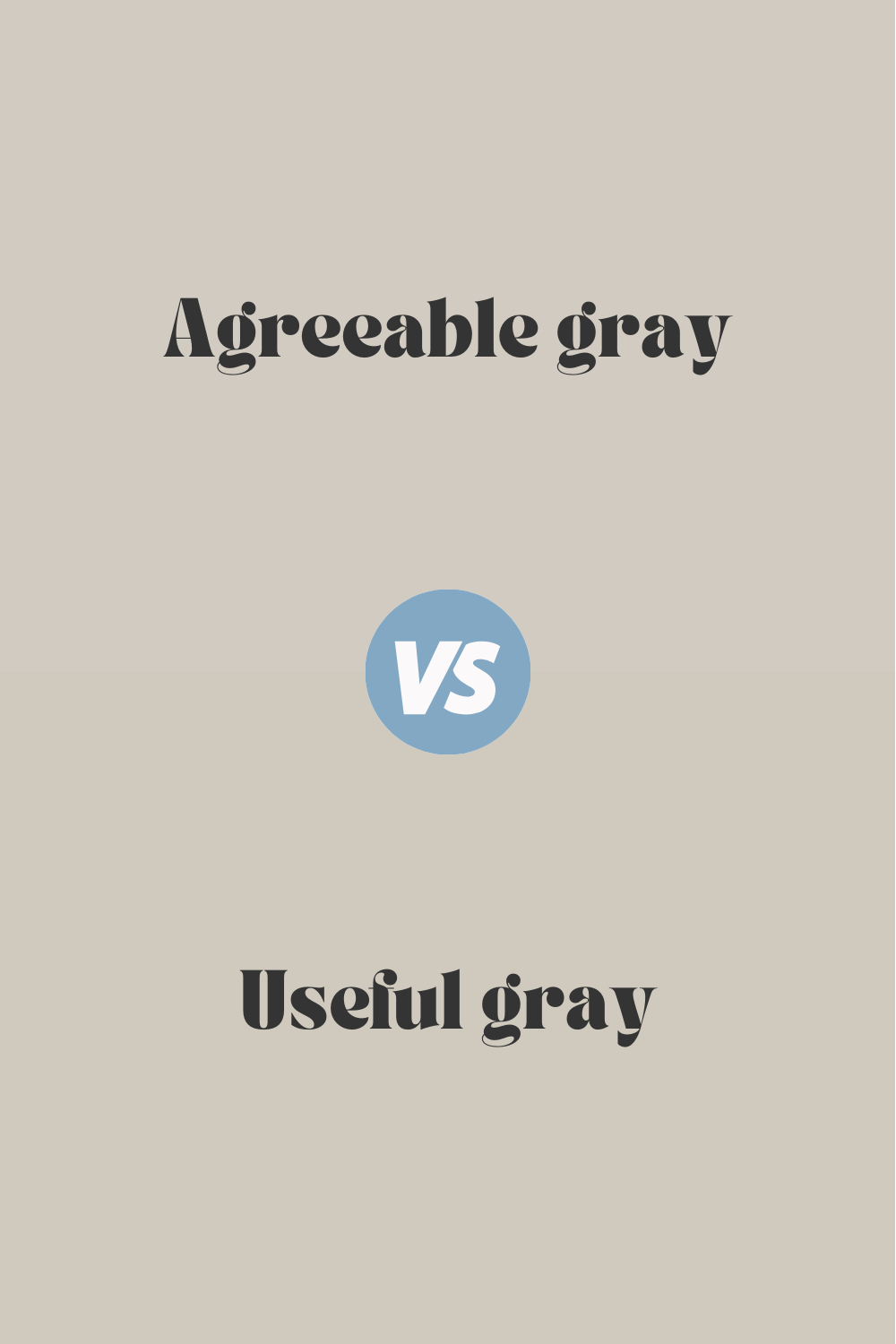
Agreeable Gray vs Useful Gray
Sherwin Williams’ Agreeable Gray (SW 7029) and Useful Gray (SW 7050) are both excellent neutral choices, but they serve different design purposes. Agreeable Gray is celebrated for its balanced mix of warm and cool tones, making it a versatile and widely loved color. Useful Gray, however, leans more towards a greige with a subtle green undertone, offering a unique twist to traditional neutrals. This slight green tint in Useful Gray can add a touch of freshness and earthiness to a room, while Agreeable Gray remains a steadfast, neutral backdrop that works well with a variety of color accents and design styles.
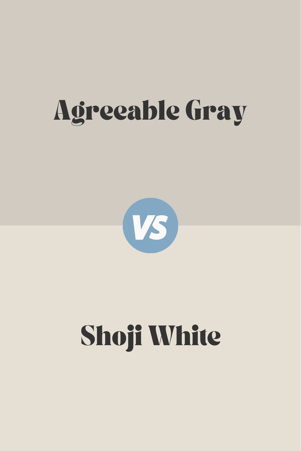
Agreeable Gray vs Shoji White
Agreeable Gray (SW 7029) and Shoji White (SW 7042), both from Sherwin Williams, offer distinct looks despite their neutral base. Agreeable Gray is a warm gray that adapts beautifully to different lighting conditions, providing a versatile foundation for any room. Shoji White, however, is a soft, warm white with a hint of beige, offering a light and airy feel that is perfect for spaces needing brightness and warmth. While Agreeable Gray is great for creating a cozy and grounded atmosphere, Shoji White excels in making rooms feel open and spacious, making it an excellent choice for smaller or darker spaces.
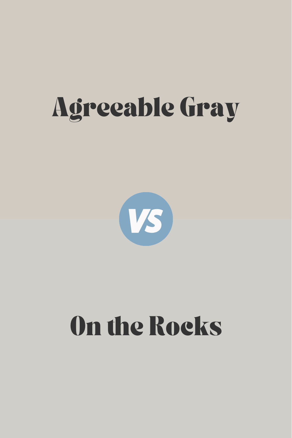
Agreeable Gray vs On the Rocks
When comparing Agreeable Gray (SW 7029) to On the Rocks (SW 7671), the difference lies in their undertones and the mood they set. Agreeable Gray is a warm, balanced gray that complements a wide range of colors and styles, making it incredibly versatile. On the Rocks, however, is a cooler, lighter gray with subtle blue undertones, offering a crisper, more modern look. This cooler hue of On the Rocks can provide a serene and calming effect, whereas Agreeable Gray’s warmth makes it perfect for creating a welcoming and comfortable environment. The choice between them depends on whether a room needs warmth or a cool, contemporary touch.
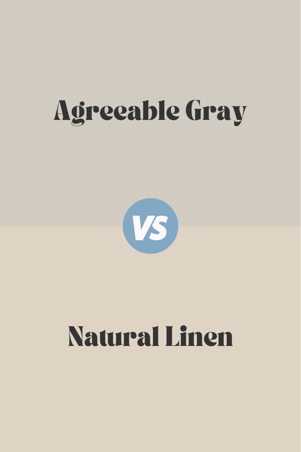
Agreeable Gray vs Natural Linen
Sherwin Williams’ Agreeable Gray (SW 7029) and Natural Linen (SW 9109) cater to different aesthetic preferences with their unique tones. Agreeable Gray is a warm gray known for its versatility and ability to pair well with both warm and cool accents. Natural Linen, however, is a warm, beige-toned neutral that exudes a soft and inviting feel, ideal for creating a cozy, lived-in look. While Agreeable Gray serves as a flexible backdrop suitable for modern and traditional spaces alike, Natural Linen offers a more classic, homely vibe, perfect for rooms aiming for a comfortable and timeless appeal.
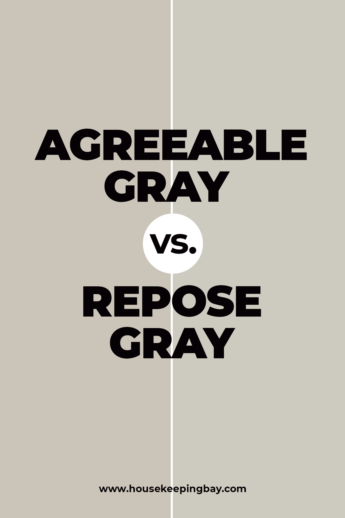
Repose Gray vs. Agreeable Gray
Both Repose Gray (SW 7015) and Agreeable Gray (SW 7029) by Sherwin Williams are popular for their versatility and neutral tones, but they have distinct differences. Repose Gray has a mix of warm and cool undertones, showing hints of blue and green in certain lighting, giving it a cooler feel. It has an LRV of 58, making it slightly darker. Agreeable Gray, with warm undertones of pale yellow and light purple, appears cozier and has an LRV of 60, reflecting more light.
Repose Gray works well in modern and contemporary settings, while Agreeable Gray is perfect for traditional and farmhouse styles. Repose Gray suits living rooms, kitchens, and bathrooms with its sophisticated look, and Agreeable Gray is ideal for bedrooms and open spaces, providing warmth and comfort. For exteriors, Repose Gray offers a modern, elegant appearance, while Agreeable Gray creates a warm, welcoming feel.
In summary, choose Repose Gray for a cooler, modern vibe and Agreeable Gray for a warmer, cozier atmosphere, depending on the mood and style you want to achieve.
housekeepingbay
Revere Pewter vs. Agreeable Gray
housekeepingbay
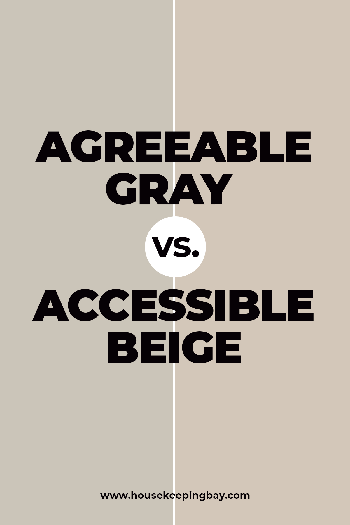
Agreeable Gray vs Accessible Beige
Agreeable Gray (SW 7029) and Accessible Beige (SW 7036) by Sherwin Williams are popular neutrals with distinct characteristics. Agreeable Gray has warm undertones with hints of pale yellow and light purple, giving it a cozy yet neutral gray appearance. With an LRV of 60, it’s lighter and more reflective, brightening up spaces and making them feel open. It works well in living rooms, bedrooms, kitchens, and open spaces, pairing beautifully with both warm and cool colors.
Accessible Beige, with its warm undertones and subtle hint of gray, leans more towards a warm beige with a slightly greige feel. It has an LRV of 58, making it slightly darker but still reflective enough to keep spaces light and airy. Ideal for living rooms, dining rooms, and bedrooms, Accessible Beige creates a soft, inviting atmosphere, complementing warm color palettes and natural materials. It offers a classic and timeless appeal for both interiors and exteriors, providing a cozy and welcoming look.
housekeepingbay
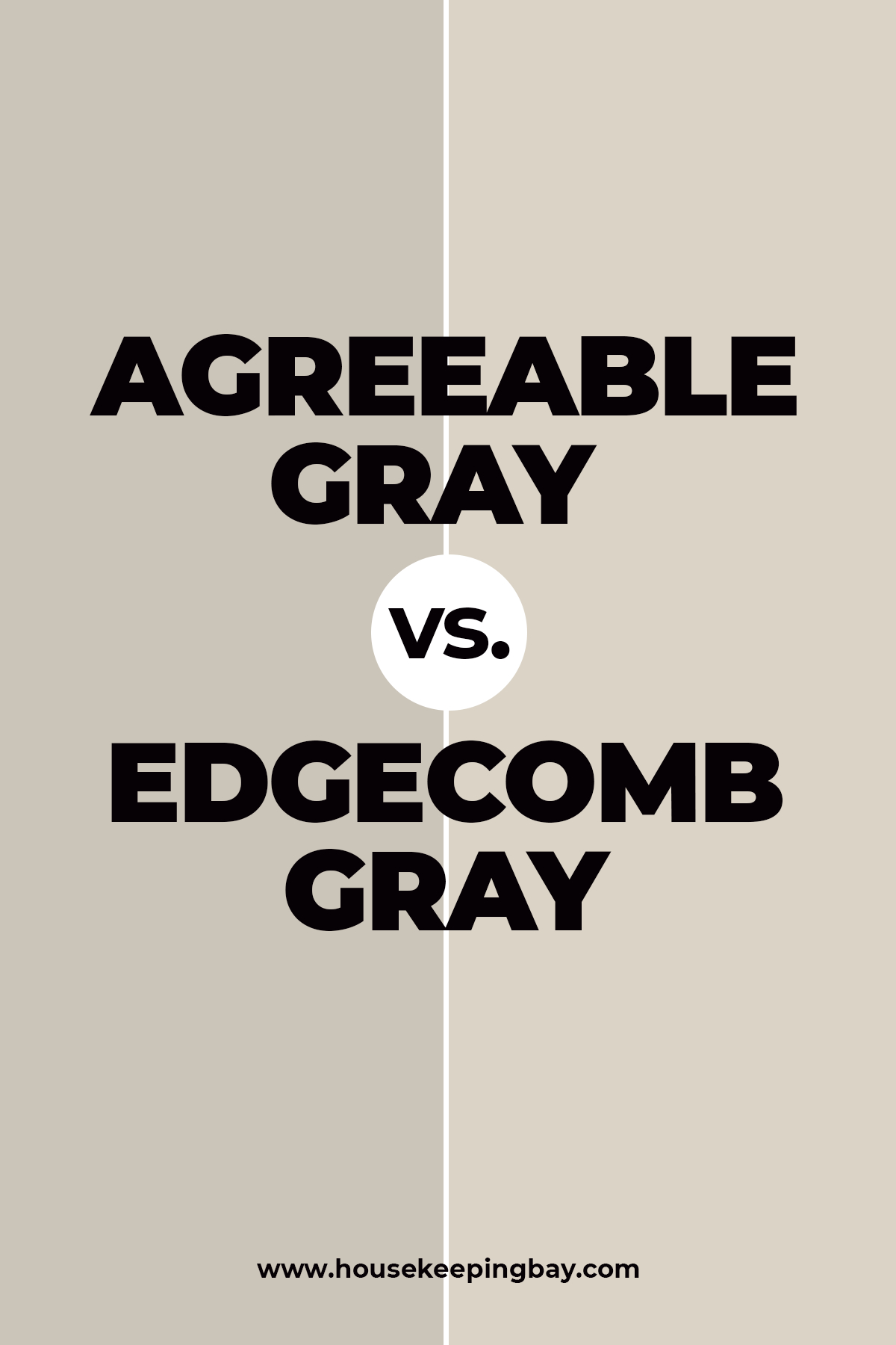
Agreeable Gray vs Edgecomb Gray
Agreeable Gray (SW 7029) by Sherwin Williams and Edgecomb Gray (HC-173) by Benjamin Moore are both popular neutral paint colors, but they have distinct differences.
Edgecomb Gray, has a soft, warm beige tone with subtle green undertones, giving it a slightly earthy feel. It has an LRV of 63, making it slightly lighter and more reflective than Agreeable Gray. Edgecomb Gray is ideal for creating a calm and soothing environment, working well in traditional, transitional, and farmhouse styles. It’s perfect for living rooms, dining rooms, and bedrooms, offering a light, airy feel while maintaining warmth and versatility.
housekeepingbay
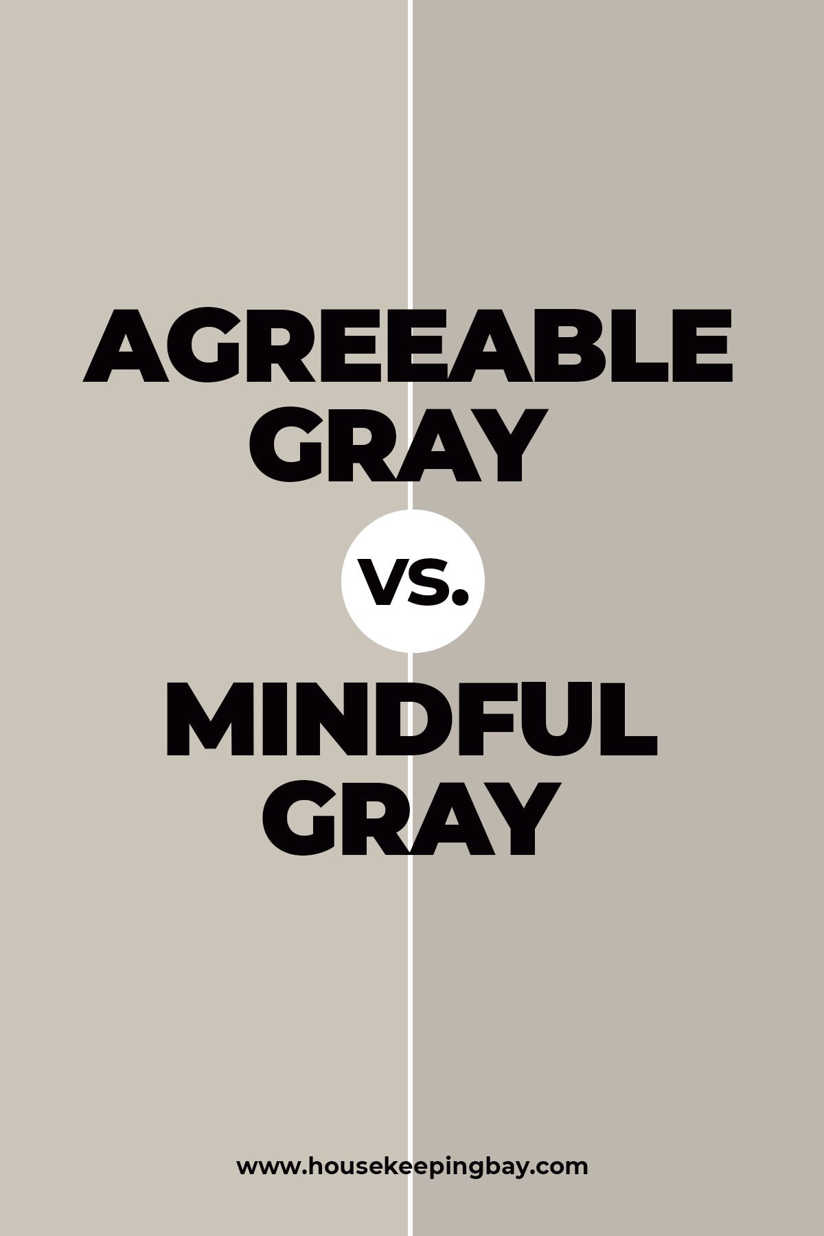
Agreeable Gray vs Mindful Gray
Mindful Gray is darker than its counterpart being a more intense version of grey.
However, it does have a rather prominent hint of beige that makes it warmer.
It will pair successfully with whites creating a fine contrast whilst the AG may seem somewhat pale next to the white item or surface.
housekeepingbay
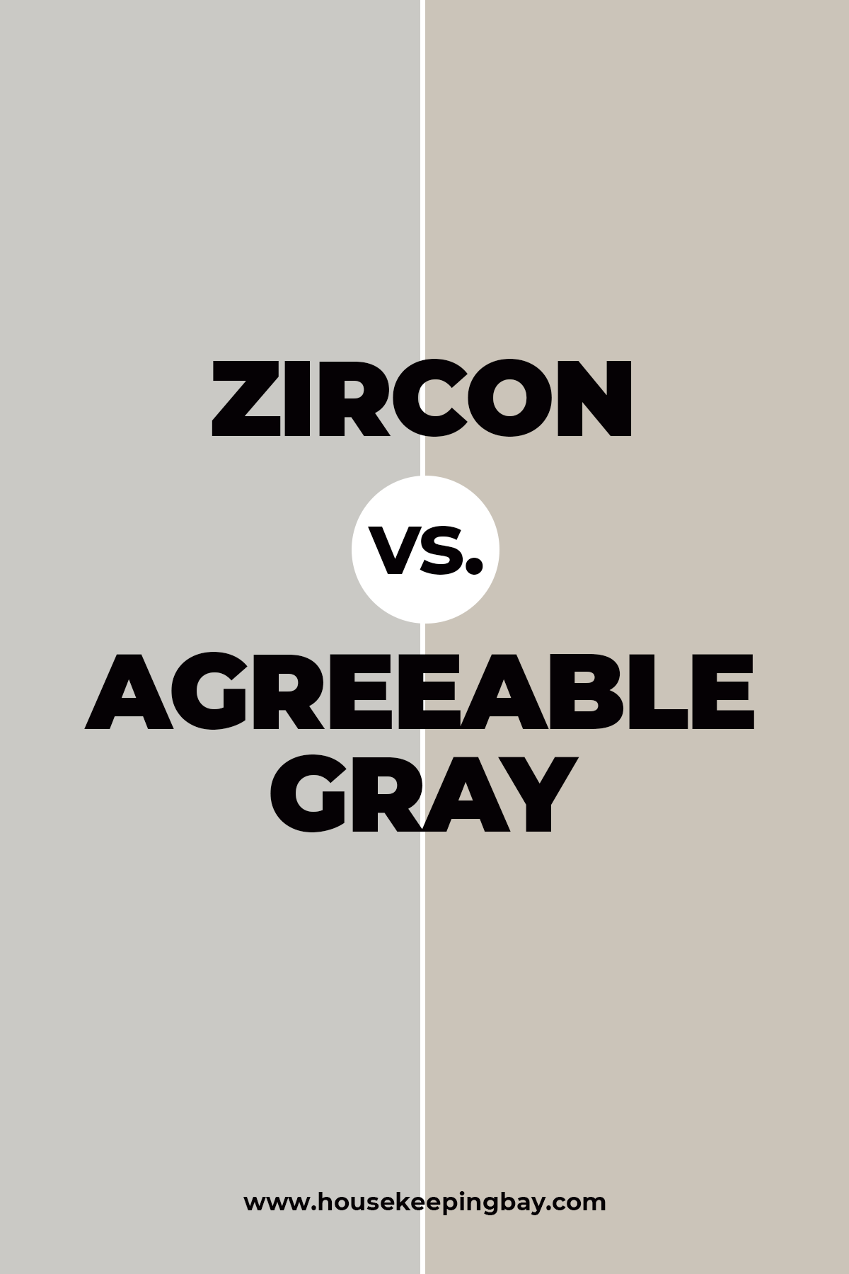
Zircon vs Agreeable Gray
Even though these two colors are distributed by the same brand, they are not the same. You might think that Zircon and Agreeable Gray are similar, but to see that it is not true you just need to put these two colors side by side.
Agreeable Gray is a warm-toned greige that has quite prominent warm beige undertones that come through especially well in warm lighting.
And if you take a closer look at Zircon, you will see that this paint color shows way more of cool gray undertones.
So basically, Zircon can be considered cool gray whilst Agreeable Gray leans more towards warm greiges.
Housekeepingbay.com
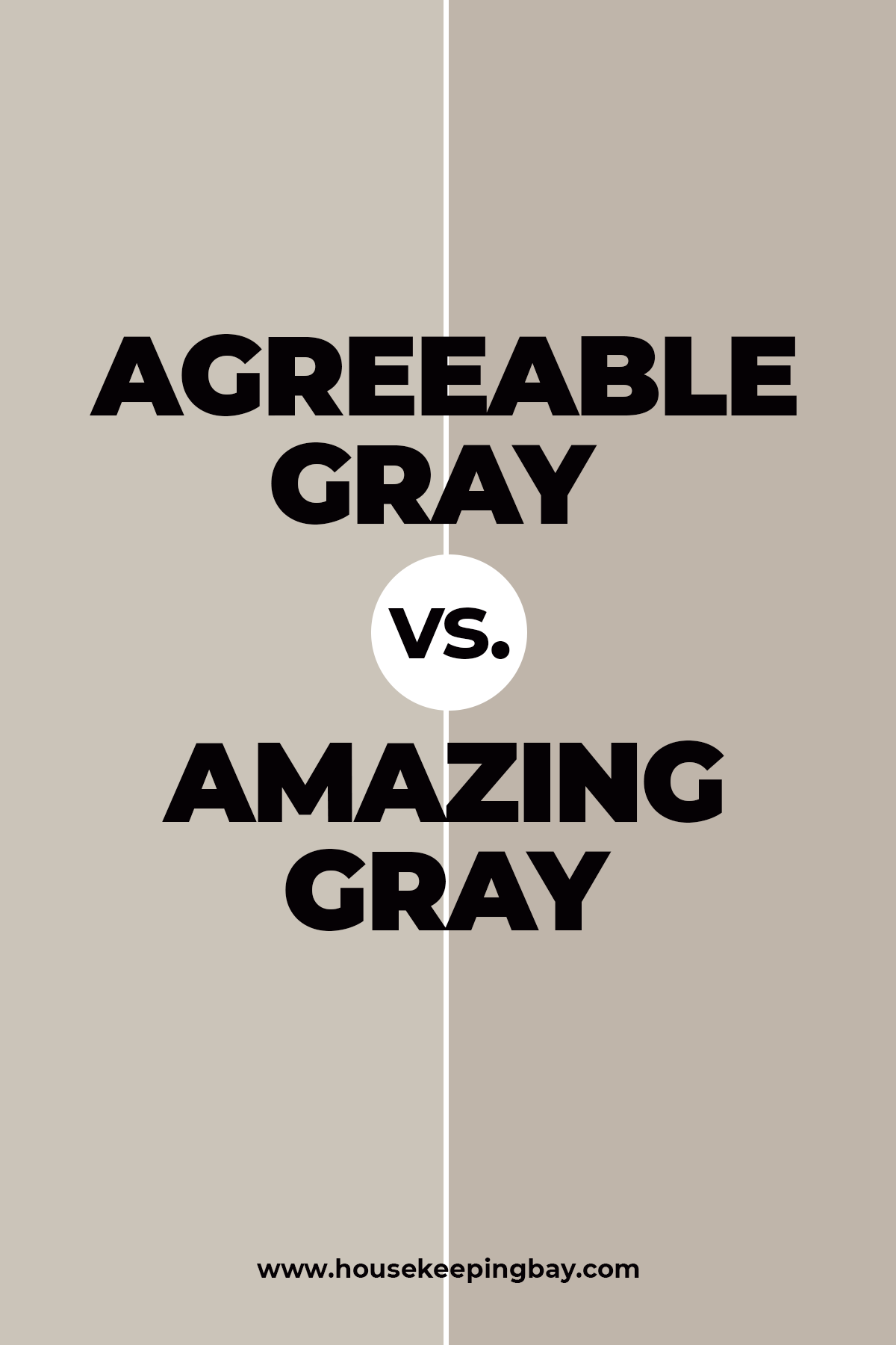
Agreeable Gray vs Amazing Gray
Even though Amazing Gray and Agreeable Gray are both greige paint colors, they look completely different.
If you put them side by side, you will see that Amazing Gray commits more to a green undertone that is subtle, but noticeable.
On the contrary, Agreeable Gray has more beige undertones that are warm.
Apparently, these two will not look harmonious if combined together in the same space.
And surely, you should not take Amazing Gray into consideration if you are not into the greenish tint on your walls!
Housekeepingbay.com
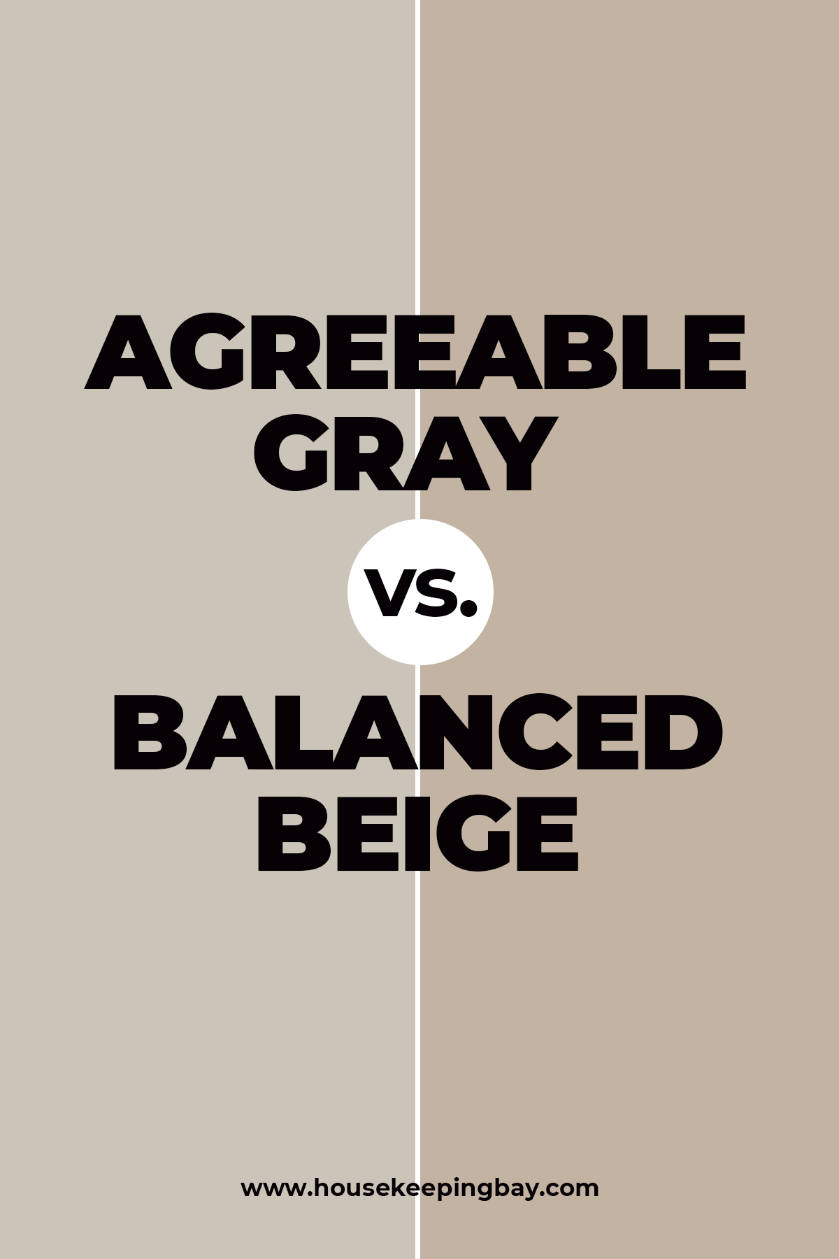
Agreeable Gray vs Balanced Beige
If we compare Agreeable Gray and Balanced Beige , both paint colors by Sherwin Williams, we will see the prominent difference.
Balanced Beige is much warmer with more prominent beige undertones in comparison to Agreeable Gray that has also gray undertones in its palette.
However, thanks to that beige that these colors share, they can be successfully combined in the same space!
So if you want your room to be all beige and cozy, but you’re not into having it all painted with one color, consider using Agreeable Gray and Balanced Beige since they will complement each other greatly.
Housekeepingbay.com
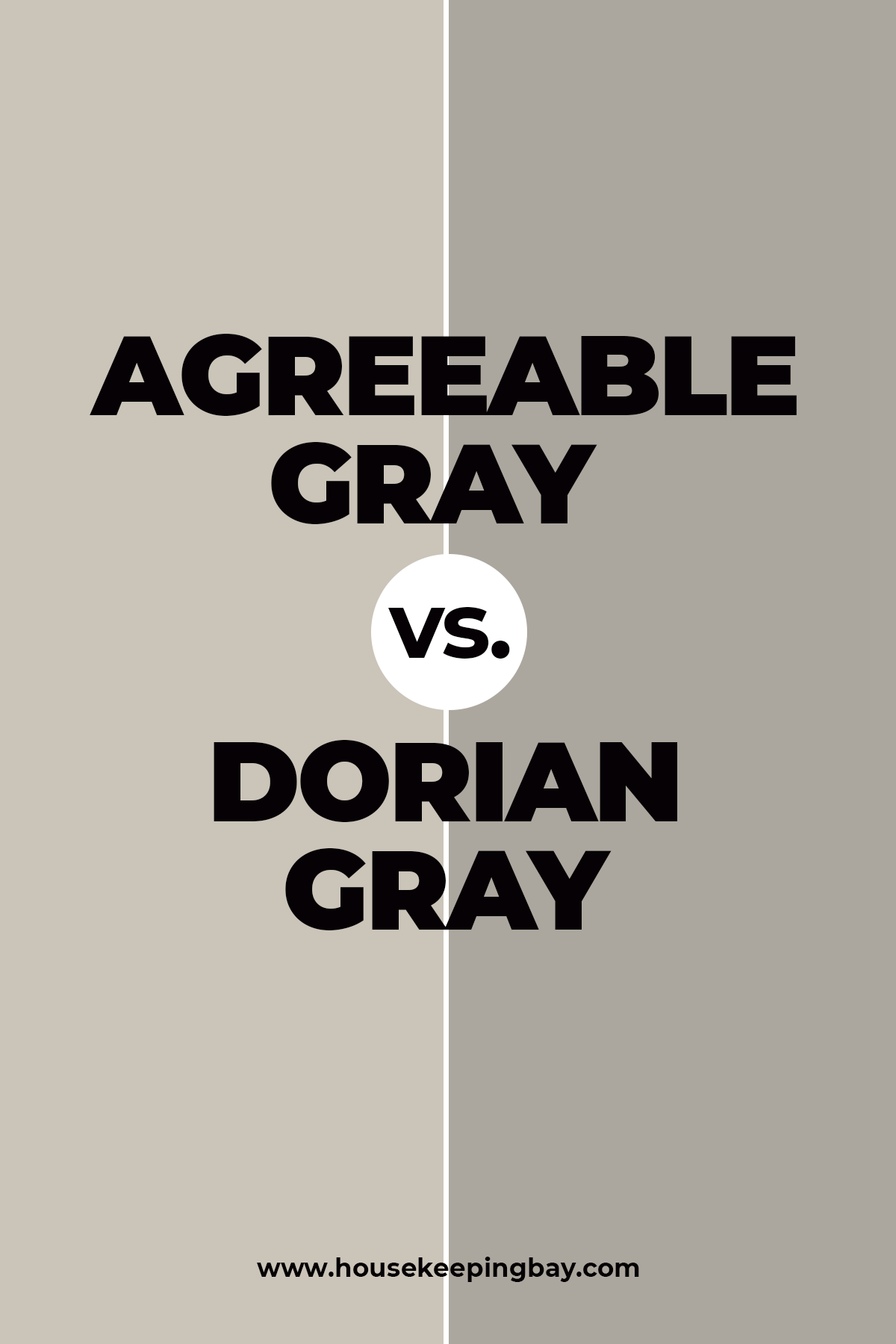
Agreeable Gray vs Dorian Gray
Dorian Gray by Sherwin Williams is a typical and rich gray color.(get a sample)
To be precise, it is a warm, medium to dark neutral gray that has subtly purple undertones. However, in certain types of lighting, it may even reveal a very slight hint of greenish undertones.
In comparison to it, Agreeable Gray is a warm greige that combines both features of gray and beige in it.
And since both of them contain gray color, these paints can be very successfully combined with each other creating a harmonious and stylish pair!
Deep grayness of Dorian Gray will be perfectly highlighted by the lighter shade of Agreeable Gray. And since both colors are warm, there will be no disbalance.
Housekeepingbay.com
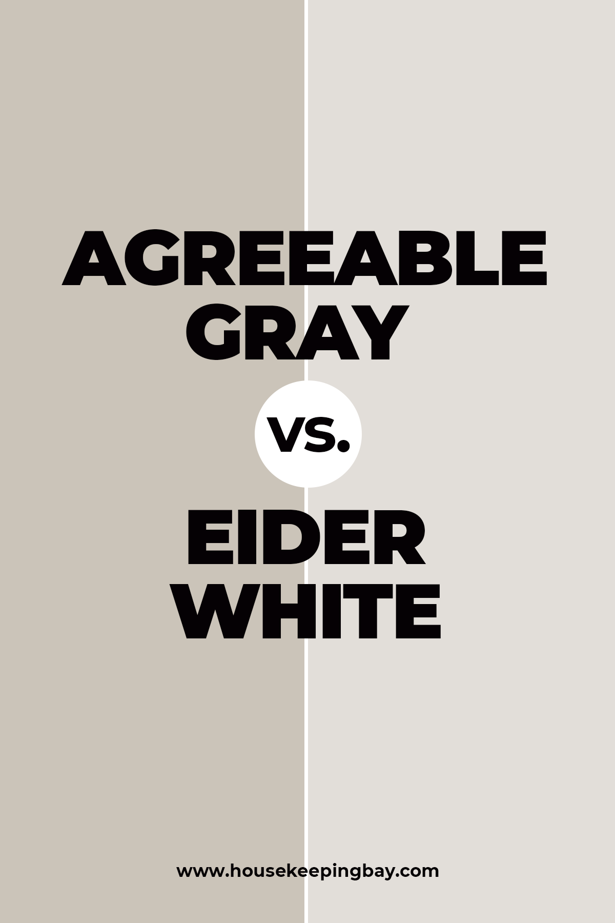
Agreeable Gray vs Eider White
Agreeable Gray and Eider White (also the pair of colors by Sherwin Williams brand) create a very good-looking and harmonious combo. (get a sample)
Eider White being an off white color with a nod of gray in it that pairs just perfectly with Agreeable Gray, a greige color that possesses both features of light and warm beige, and warm gray.
And even though Eider White may sometimes show a cast of purple or pink, if paired with Agreeable Gray which looks way warmer, it creates a nice and harmoniously contrasting color combination where both colors complement each other.
Housekeepingbay.com
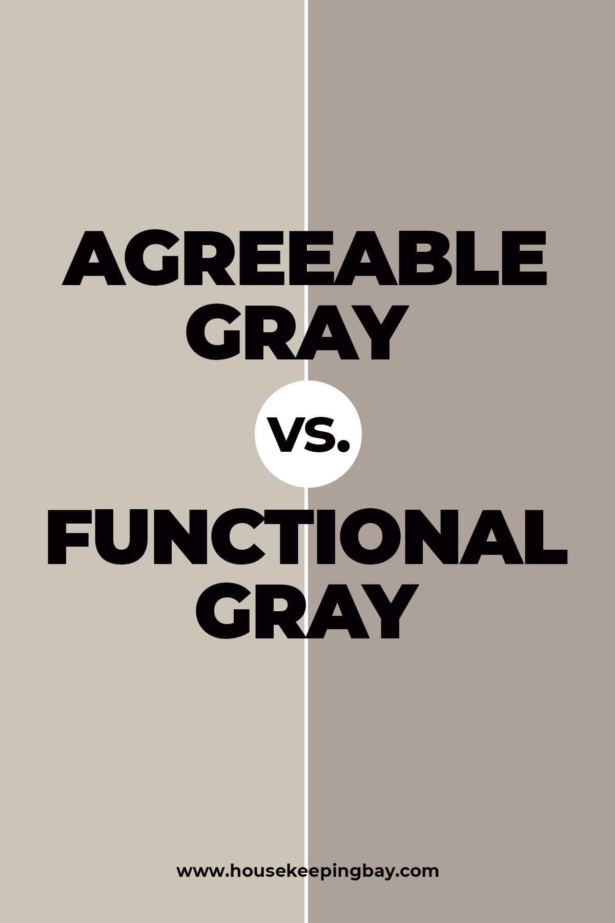
Agreeable Gray vs Functional Gray
Functional Gray is much warmer than Agreeable Gray even though they both belong to the same paint brand called Sherwin Williams.
Functional Gray is a soft taupe, perfectly neutral, that leans on the cool side whilst Agreeable Gray is a warm greige.
However, these two can be combined pretty well! Deep warmth of Functional Gray with its rich beige notes will be elegantly highlighted with the lighter Agreeable Gray that also has beige undertones which makes these two colors a great pair.
Housekeepingbay.com
To sum up all this information, we can say that Agreeable Gray is a perfect match for those who are seeking a universal and multipurpose hue for their homes.
Feel free to apply it anywhere both indoors and outdoors, only take into consideration the lighting and the surrounding tints that still influence this hue greatly.
housekeepingbay
Ever wished paint sampling was as easy as sticking a sticker? Guess what? Now it is! Discover Samplize's unique Peel & Stick samples. Get started now and say goodbye to the old messy way!
Get paint samples


Frequently Asked Questions
⭐ Is Agreeable Gray popular now?
Yes, and its popularity is actually rising.
⭐ What are the undertones of Agreeable Gray?
This color has warm beige undertones.
⭐ Does Agreeable Gray look purple?
It may look a bit purplish in certain qualities of light indeed, but in general, this color belongs to the yellow hue family.
⭐ Does Agreeable gray work well with Alabaster?
These two create a perfect match!


Do SW-7018 Dovetail and SW Agreeable Gray work well together?
No, I’d not say they can make a good combo. The Dovetail color is rather deep with its gray and brown undertones, whilst Agreeable Gray is a soft and warm gray. They might seem a nice pair of colors, but I personally think they’ll look too “heavy”.
What is the best gray color you could recommend for a Scandinavian style living room?
Well, I assume it should be a fairly light shade of gray since Scandinavian interior design doesn’t use dark colors a lot. Also, you might want to consider cooler shades of gray since warm-toned colors should be used moderately. My personal opinion: try BM White Wisp, BM Gray Owl, BM Paper white, or BM Stonington Gray.
Hey everyone! Need your advice, folks. Do you think Agreeable Gray SW-7029 is too dark for a bedroom?
Hi! In my opinion, it dependss on the light in your bedroom and its size. In a small and poorly lit room, thai color may indeed read darker. But if the room is spacious and light, then it’s ok. I had my bedroom painted SW Agreeable Gray for a couple of years, and I liked it a lot! By the way, you can use a lot of white in the room to make this gray read lighter.
Will BM White Dove or SW Alabaster be good trim, ceiling and kitchen cabinet options to pair with Agreeable Gray walls?
I’m pretty sure this is a good option!
I will have this paint in a room with a red brick accent wall that has a sheetrock schmear over it with a polyurethane topcoat. Will this combo work?
Hey Loreen! Well, yes, a combination of red brick accent wall with SW Agreeable Gray is more than fine, this paint color is even recommended for brick houses as an exterior paint!
I’m in doubt. What color trim will look best of all with agreeable gray? I’d like something more interesting than just white, but what exactly? Does anyone have some fresh ideas?
Well, white is indeed the best color, but as far as I know, neutral colors, as well as greens and blues can also be very good-looking if paired with this paint color.
Hi folks! I need a piece of advice from those who already used Agreeable Gray in their homes. What ceiling color will pair well with agreeable gray? Thanks!
Hey there. Choose white and you won’t miss, for sure! Well, unless you’re brave enough to paint your ceiling turquoise, green or blue since these are also complementing colors for the paint.
What undertones does agreeable gray have? Our living room is facing East so there’s pretty much sunlight in it during the day. So I’m wondering how my walls will look if painted with this color.
I’m pretty sure your walls will look nice since the major undertone for this paint is warm beige. And in a room with a lot of daylight it tends to lean more to beige rather than grey.
Can anyone tell me whether this brand is available in the UK, and if so where
Thank you
hi Jan, There are number of online shops where you can purchase Sherwin Williams, just google and order online. Wish you good luck!
Who makes agreeable gray paint? What’s the name of the brand?
It’s name is Sherwin Williams.
What colors go with agreeable gray? I decided to paint my kitchen with this neutral but I’m not quite sure what paints to use additionally like for trimming, etc. I’ll be so grateful for any suggestions!
Well I can tell you that among the other Sherwin Williams colors, Agreeable Gray complements such paints as Retreat, Functional Grey, Incredible White, and Oyster Bay. But I would say it will pair well with Status Bronze, Nomadic Desert, Warm Stone, and Cloak Grey. All depends on whether you want your kitchen to be painted in cooler or warmer tones more.