Repose Gray SW 7015 by Sherwin-Williams
Ultimate Guide To Repose Gray Paint Color by Sherwin-Williams
When one needs a neutral tint for painting a chamber, it is often gray that becomes people’s top choice. In particular, Repose Gray by Sherwin-Williams company is extremely popular these days. It is actually one of the brand’s bestsellers!
Why so? Well, this hue is very versatile since we can make use of it in almost any area in our house, besides, this hue is suitable for nearly any color scheme which is especially important if you are one of those who enjoys colorful patterns and bright accents in where you live.
But of course, if grey tones seem to be too cold for you (even though there are warmer variations of them), it is easy to select Sherwin-Williams paint colors that will match your demands and requirements.
The brand offers a wide variety of diverse tints of all kinds from warm to cool, from pastels to dramatic hues, so finding a suitable solution for the particular interior will not be an issue.
What Kind Of Color Is Repose Gray SW 7015?
Some might be surprised at such a question since the answer seems to be present in the hue’s name already. If it’s a Repose Gray, so apparently, the hue is gray. But everything is not that simple here!
From first sight, it is indeed a fine neutral gray tint with a very slight coolness added to the otherwise warm hue. Nevertheless, we can’t say it is close to a traditional gray hue.
It is rather a perfectly balanced combination of taupe base, gray, brown, greige, and a slight hint of purple.
It works surprisingly effectively with any decor styles and other colors, not necessarily from the gray or neutral range, which means this hue can be chosen for any home renovation tasks, in any chamber, with any hues being parallelly used.
As we already mentioned, it looks rather grayish, but if we take a closer look, we will see very delicate and gentle warm notes hidden in its depth.
Those warm dabs make the overall hue less cool in comparison to other gray alternatives.
Is Repose Gray a Warm Or a Cool Color?
This question bothers many of us, especially those who are not good at defining colors and their coolness or warmth.
So if that is you, just remember that Repose Gray is a warm gray hue, that is what trustworthy sources Encycolorpedia can tell you, but compared to other similar tints, it may indeed seem somewhat cooler owing to that note of purpleness it possesses.
housekeepingbay
Understanding Repose Gray SW 7015: Undertones and Masstone
Since Repose Gray is often classified as a greige hue, it has the same feature common for all of these hues.
Yes, we are talking about undertones.
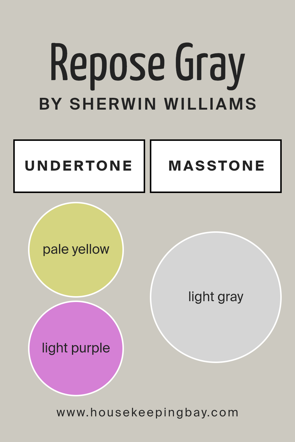
Masstone: Light Gray
At first glance, Repose Gray appears as a light gray with a soft and neutral appeal. This is its masstone, the predominant color you perceive when looking at the paint. The light gray tone makes it an excellent choice for creating a serene and balanced atmosphere, making it a go-to option for both modern and traditional interiors.
Undertones: Pale Yellow and Light Purple
While the masstone of Repose Gray is a lovely light gray, the undertones are what give this color its unique character. Repose Gray has subtle pale yellow and light purple undertones.
- Pale Yellow Undertone: The pale yellow undertone adds a touch of warmth to Repose Gray, preventing it from feeling too cold or stark. This warmth makes it adaptable to various lighting conditions, allowing it to complement both cool and warm color schemes.
- Light Purple Undertone: The light purple undertone can sometimes peek through, especially in spaces with less natural light. This undertone gives Repose Gray a slight coolness, adding depth and interest to the color. It’s this blend of warm and cool undertones that makes Repose Gray so versatile and dynamic.
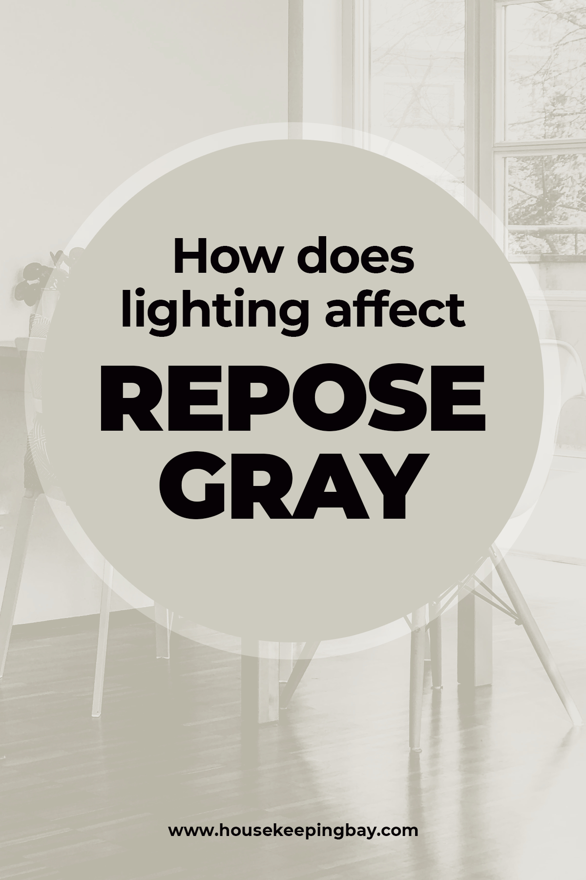
How Does Lighting Affect Repose Gray?
Picking hues like The RG might be tricky stuff all because of those magical undertones it possesses.
See, like all greiges and, in general, neutrals, Repose Gray is rather selective when it comes to lighting around. As everyone probably knows, the way we perceive a certain color strongly hangs upon how this color is being lit by the surrounding lighting.
That said, some tints tend to look darker and “muddier” in poorly-lit areas whilst others will turn way too pale when applied in a chamber lit by artificial lighting. And moreover, the hue itself can also change!
Due to its complex undertones, the color can shift subtly depending on the type and amount of light it receives.
- Natural Light: In rooms with ample natural light, especially northern light, Repose Gray may appear cooler, with the light purple undertone becoming more noticeable. This gives the color a crisper, more modern look. In spaces with southern exposure, the pale yellow undertone may be more prominent, adding warmth to the gray and making it feel softer and more inviting.
- Artificial Light: Under warm artificial lighting, such as incandescent or warm LED bulbs, Repose Gray’s yellow undertone can be enhanced, making the color appear slightly warmer and cozier. Conversely, cooler artificial lights, like daylight LEDs or fluorescent bulbs, may emphasize the gray’s cooler side, bringing out the purple undertone and giving the space a more contemporary feel.
- Low Light Conditions: In low light or shaded areas, Repose Gray may lean more towards its gray base, appearing as a true neutral gray. The undertones become less pronounced, and the color takes on a more subdued, sophisticated appearance.
Overall, the lighting in your space will influence whether Repose Gray leans warmer or cooler, so it’s essential to test the color in your home’s specific lighting conditions before making a final decision.
housekeepingbay
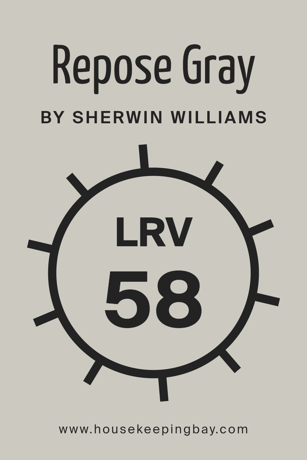
What is LRV of Repose Gray?
The Light Reflectance Value (LRV) of Repose Gray SW 7015 is 58, which means it reflects a moderate amount of light. With an LRV of 58, Repose Gray is a versatile neutral that works well in various lighting conditions, making it suitable for both bright and dim spaces. It’s light enough to keep a room feeling airy and open but dark enough to add some contrast and depth, making it a perfect choice for those looking to create a balanced and inviting environment.
What is LRV? Read It Before You Choose Your Ideal Paint Color
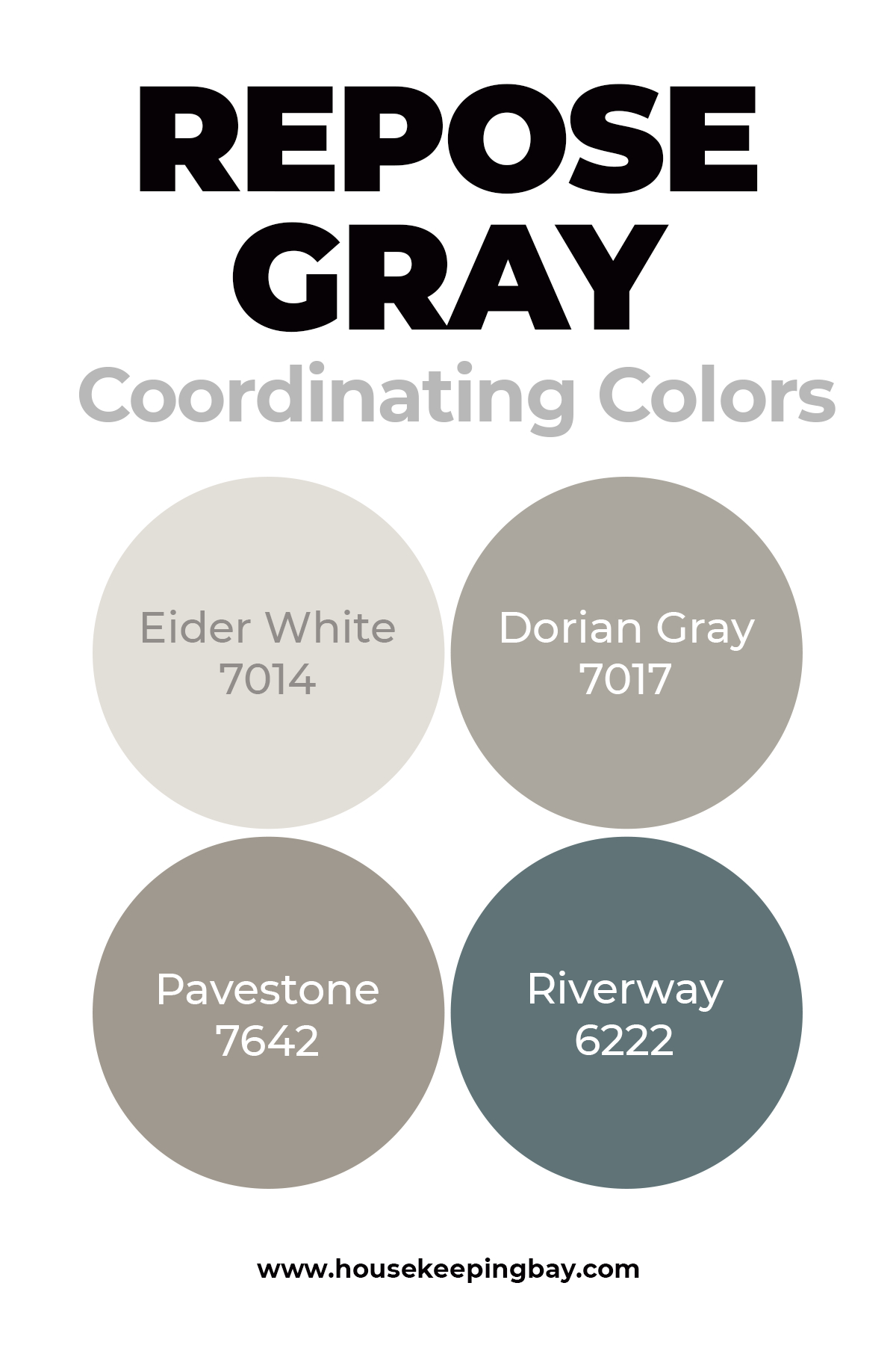
Coordinating Colors
In terms of finding proper coordinating hues to match the RG, this hue is a true miracle since it can be literally paired with almost anything! Blue-gray hues will work with it especially fine, to the point.
Nevertheless, if you need more ideas, take into consideration that the following hues will make an ideal match too:
If you take a look at the samples of the paints listed above, you will see that they belong to the greens, grays, and beiges both fair and dark.
housekeepingbay
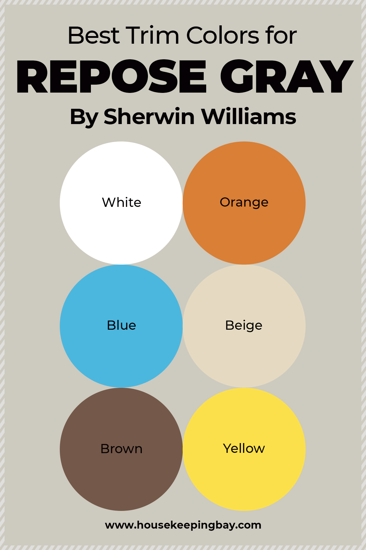
What’s the Best Trim Color For Repose Gray?
When selecting paint for any indoors renovations, the most crucial part of the process is to pick up the hue that will go well along with the color trim.
And even if you chose to make use of such a universal neutral as Repose, we would advise you to take into consideration that white trim, and also bright light and fair colored furnishings will allow favoring the cooler side of this hue.
The same is true for blue tints, especially the cool ones.
But in case your goal is to reveal its warmth more intensively, opt for warmer colors like intense beiges, browns (both light and dark), and maybe even certain tints of yellow or orange!
Housekepingbay.com
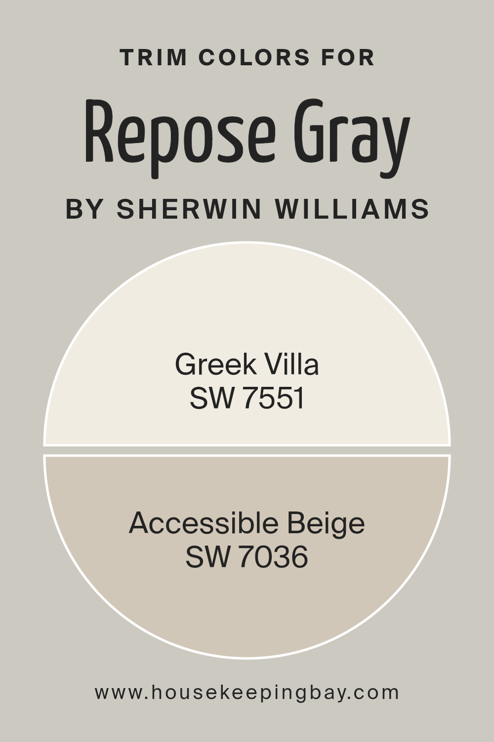
Universal Trim Colors for Repose Gray SW 7015
Choosing the right trim color is crucial for creating a cohesive and polished look in any room, and Repose Gray SW 7015 by Sherwin Williams pairs beautifully with a range of trim colors. Here are two ideal trim options that complement the subtle undertones and neutral base of Repose Gray:
Greek Villa SW 7551
Greek Villa is a warm, soft white that adds a touch of elegance and brightness to any space. When paired with Repose Gray, Greek Villa provides a crisp, clean contrast, highlighting the soft gray walls while maintaining a warm, inviting atmosphere. This combination works especially well in rooms where you want a classic, timeless feel.
Accessible Beige SW 7036
Accessible Beige is a warm beige that blends beautifully with Repose Gray, creating a harmonious and cozy look. This trim color is an excellent choice if you prefer a more subdued, monochromatic palette that exudes comfort and warmth. Accessible Beige adds a subtle depth to Repose Gray without overpowering it, making it a versatile option for both traditional and modern spaces.
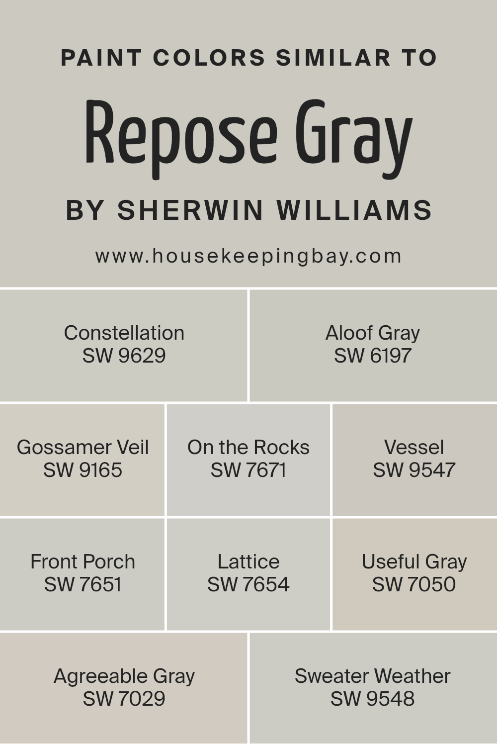
Paint Colors Similar to Repose Gray SW 7015
Repose Gray is a popular choice for its versatile and neutral appeal, but there are several other colors within the Sherwin Williams palette that offer similar vibes, each with its own unique twist. Here are some alternatives that you might consider if you love Repose Gray:
- Constellation SW 9629: A soft, airy gray that leans slightly cooler, offering a more ethereal quality. It’s perfect for spaces where you want a light, almost dreamy atmosphere.
- Aloof Gray SW 6197: Another cool-toned gray, with just a hint of green, making it a bit more refreshing and crisp compared to Repose Gray. It works well in spaces with plenty of natural light.
- Gossamer Veil SW 9165: A light gray with subtle warm undertones, making it an excellent choice if you’re looking for something that feels both cozy and modern.
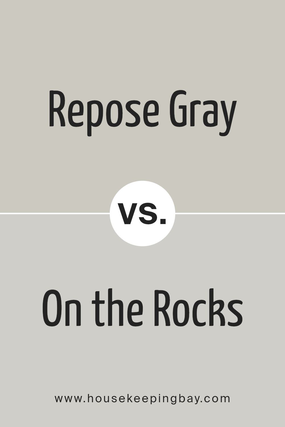
- On the Rocks SW 7671: A balanced, neutral gray that is slightly darker than Repose Gray, providing a bit more depth and drama to your interiors.
- Vessel SW 9547: A warm, medium gray that offers a more grounded and earthy tone, ideal for creating a welcoming, homely feel in living spaces.
- Front Porch SW 7651: A soft, warm gray with a slightly weathered feel, making it perfect for traditional or farmhouse-style homes.
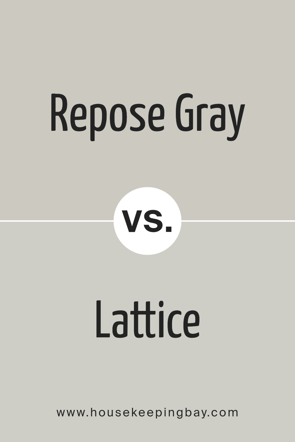
- Lattice SW 7654: A cool, light gray with a slight blue undertone, offering a refreshing and calming effect in any room.
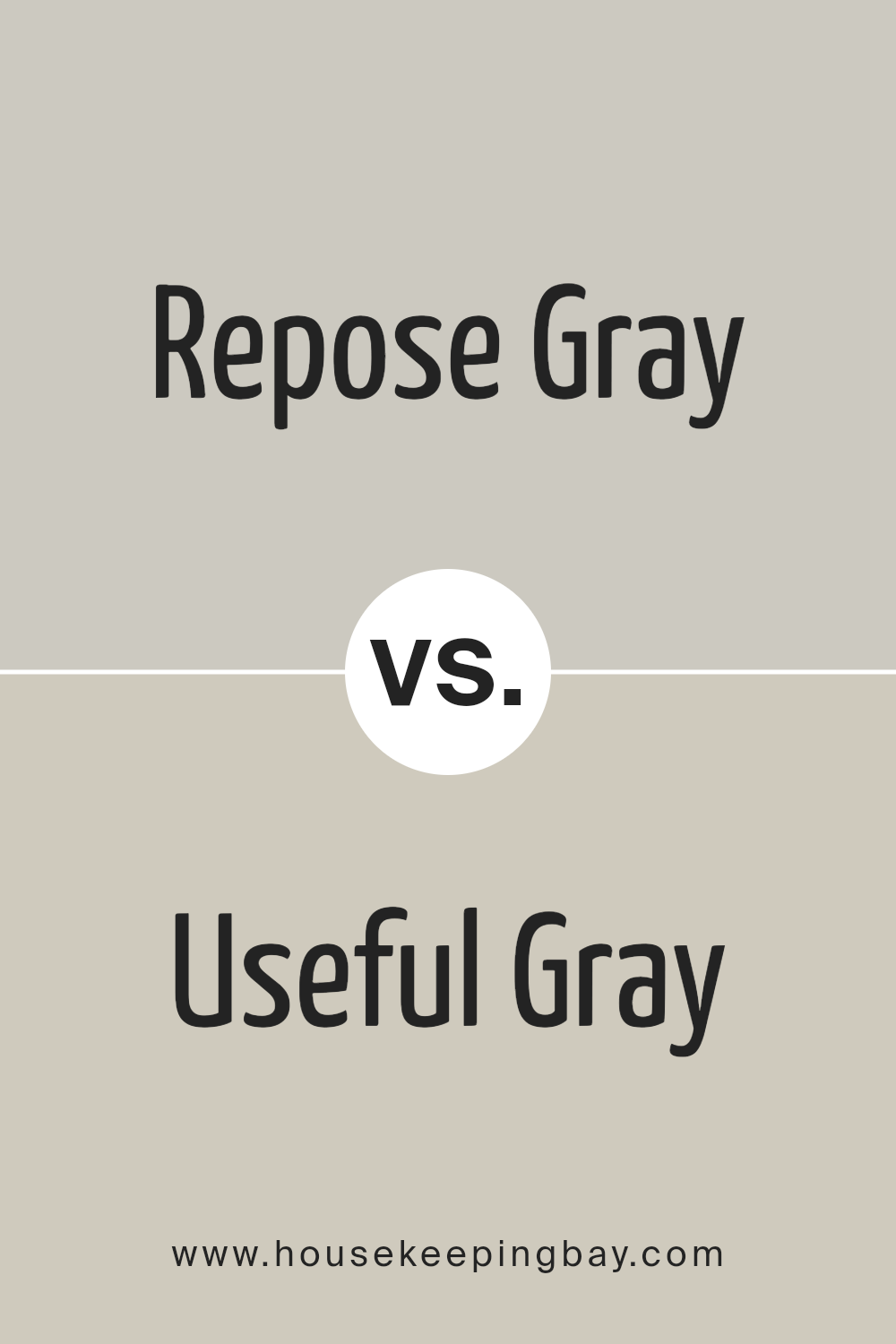
- Useful Gray SW 7050: A gray that leans towards the beige side, making it a fantastic choice for those who want a more neutral, warm palette.
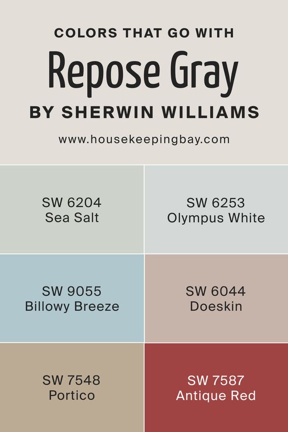
Colors that go with Repose Gray
Repose Gray SW 7015 pairs beautifully with a variety of colors that enhance its versatile neutral tone. SW 6204 Sea Salt and SW 6253 Olympus White bring in soft, cool tones that create a serene and calming atmosphere, perfect for bedrooms or bathrooms. SW 9055 Billowy Breeze adds a gentle touch of blue, ideal for coastal-inspired spaces. SW 6044 Doeskin and SW 7548 Portico introduce warm, earthy tones that ground the gray, making it feel cozy and inviting in living rooms or dens.
For a bolder contrast, SW 7587 Antique Red injects a rich, warm hue that creates a striking focal point, perfect for accent walls or front doors. This palette offers a harmonious blend of colors that can adapt to various styles and moods.
Colors That Pair Well with Repose Gray SW 7015
Repose Gray is a versatile and neutral shade that complements a wide range of colors, allowing you to create cohesive and stylish color schemes. Here are some excellent coordinating colors that pair beautifully with Repose Gray:
- Mindful Gray SW 7016: A medium, warm gray that offers a subtle contrast, enhancing the depth of Repose Gray while maintaining a balanced, monochromatic look.
- Black Fox SW 7020: A deep, rich brown with gray undertones that adds a dramatic contrast, perfect for accent walls or trim in a sophisticated space.
- Gauntlet Gray SW 7019: A dark, warm gray that provides a striking contrast when paired with Repose Gray, creating a dynamic yet cohesive color scheme.
- Dovetail SW 7018: A medium, warm gray with a slight taupe undertone that complements Repose Gray’s subtle warmth, making it ideal for a harmonious, layered look.
- Acier SW 9170: A cool, mid-tone gray with blue undertones that brings a touch of modernity and coolness to the Repose Gray palette.
- Dorian Gray SW 7017: A warm, medium gray that sits between Repose Gray and Gauntlet Gray in depth, creating a seamless transition in color schemes.
These colors offer a variety of options depending on the mood and style you want to create, whether you’re aiming for a soft, serene space or a bold, contemporary look.

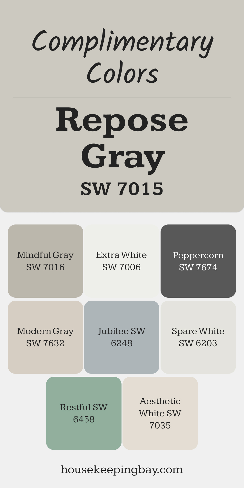
Complimentary Colors for Repose Gray SW 7015 Paint Color by Sherwin Williams
Repose Gray SW 7015 by Sherwin Williams is a versatile gray that pairs beautifully with a range of colors. Mindful Gray SW 7016 adds depth for a layered look, while Extra White SW 7006 and Spare White SW 6203 provide crisp, clean contrast. These combinations work well for a balanced and inviting feel.
For more variety, try Jubilee SW 6248 for a soft blue-gray touch or Restful SW 6458 for a gentle green accent. Peppercorn SW 7674 offers a bold contrast, while Aesthetic White SW 7035 and Modern Gray SW 7632 keep things light and cohesive.
via housekeepingbay.com
Where Repose Gray Color Can Be Used?
As we just said, the RG can go to any chamber and space in a house including stairways, corridors, and other areas of that kind. However, in diverse spaces, it will reveal itself in a different way, and that must be taken into account.
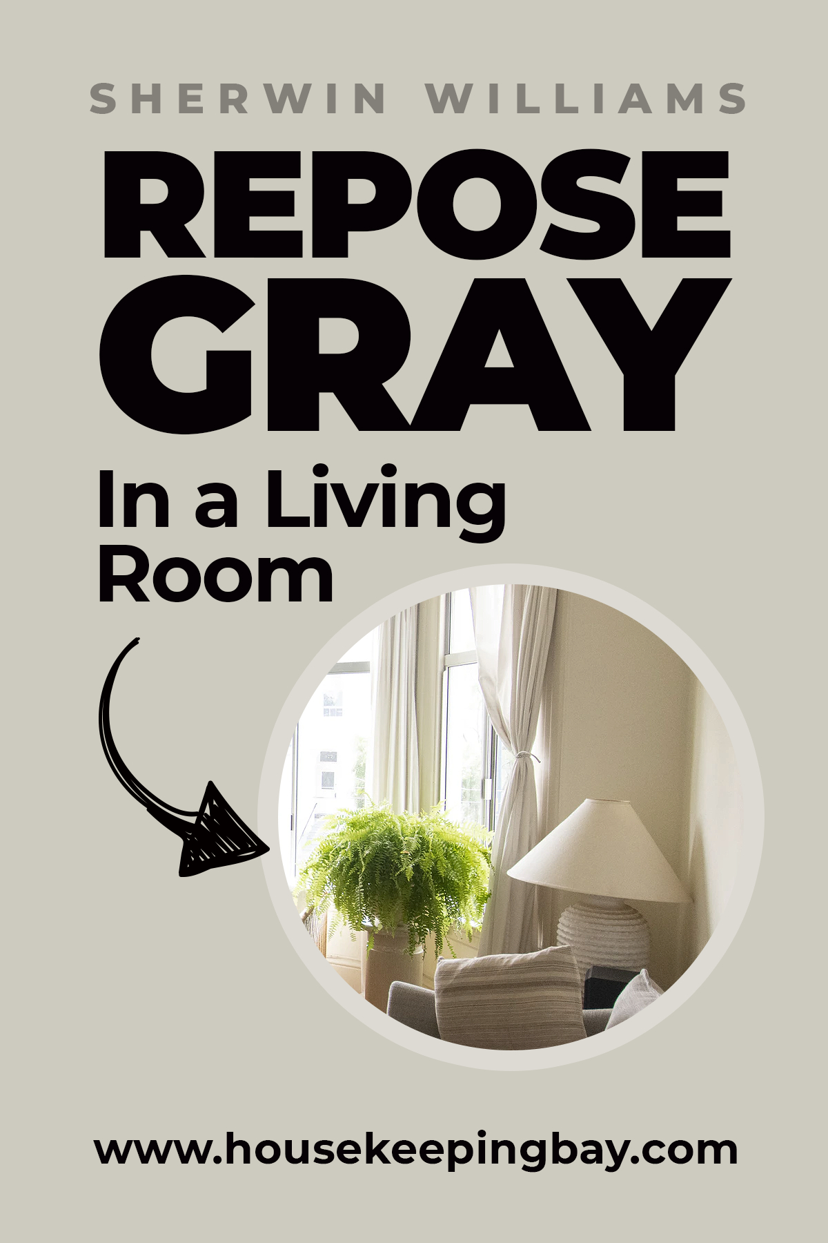
Repose Gray in the Living Rooms
This hue is an ideal option for this chamber since in a well-lit area it will create that airy and refreshing feeling that makes any room look more spacious.
Nevertheless, consider the lighting: if a chamber has tons of daylight, that’s fine, and the hue will show up as a perfectly balanced neutral. But in a poorly or artificially lit space, it can reveal its beige notes and look warmer and even slightly darker.
housekeepingbay
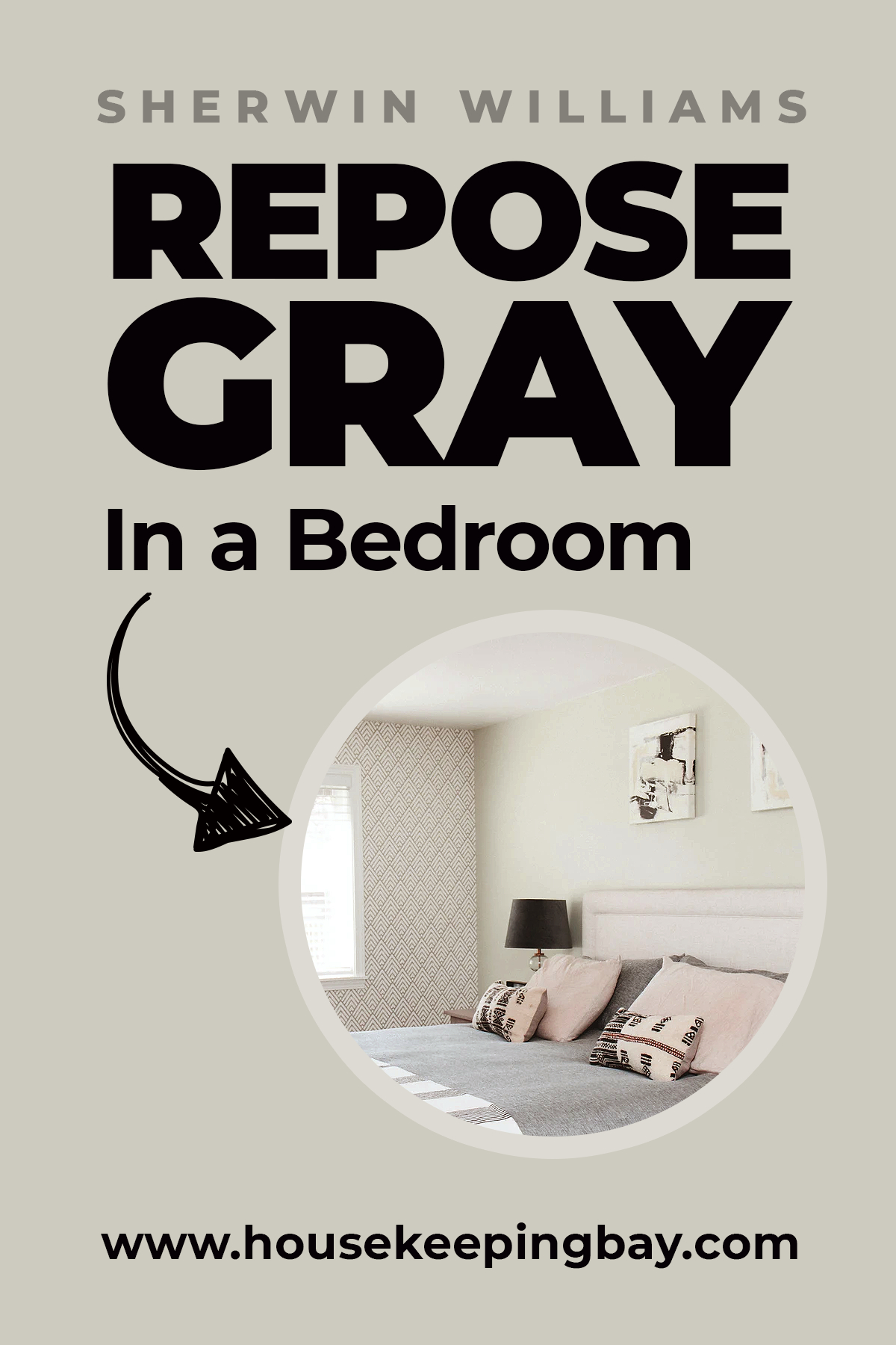
Repose Gray in a Bedroom
For your bedroom, Repose Gray is one of the best colors. Since this hue belongs to the group of warm tints, it means that the walls of your sleeping space will not look too cold (which is, let’s agree, not the best solution for the room that is supposed to be as cozy as possible).
In addition, it can be successfully combined with other grays and whites which allows us many more experiments with the appearance of our bedroom.
housekeepingbay
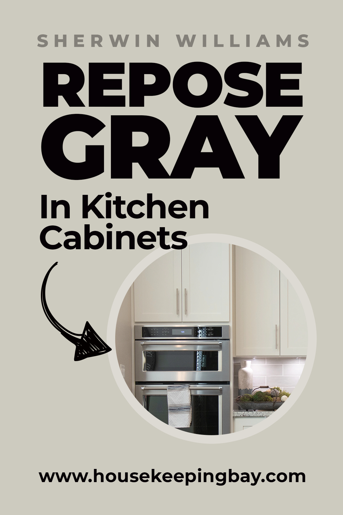
Repose Gray in the Kitchen Cabinets
A Repose hue is a super choice for painting cabinets since it pairs with any hardware no matter whether it is brass, metal, black, or silver! Besides, it will definitely not look pale after being applied which means you will get nice greige accents in your cooking area.
housekeepingbay
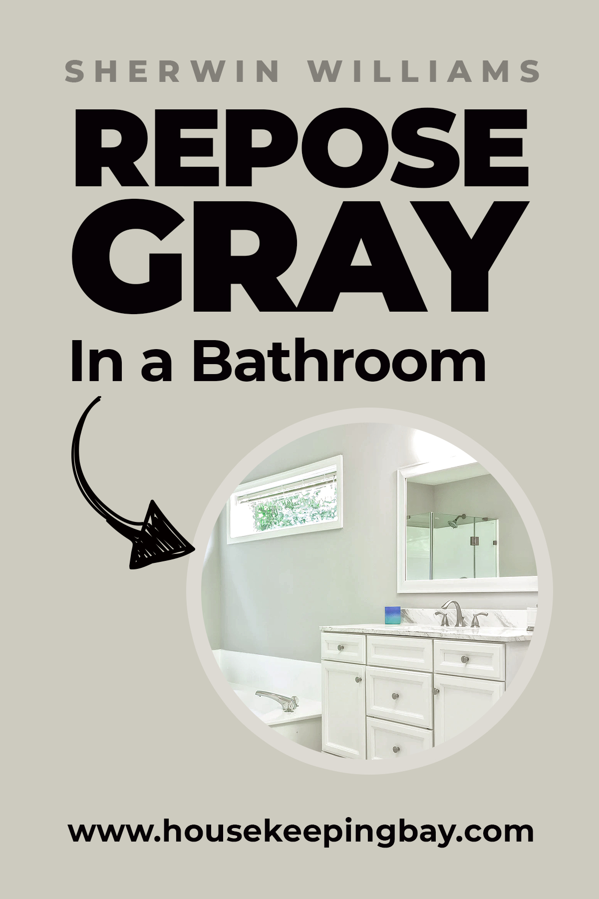
Repose Gray in the Bathrooms
If you prefer calming hues in a bathroom, the RG is a fine option. It will never look cold, moreover, this hue pairs wonderfully with so many finishes and tints!
Even with artificial lighting, it will make the area look more spacious and airy.
housekeepingbay
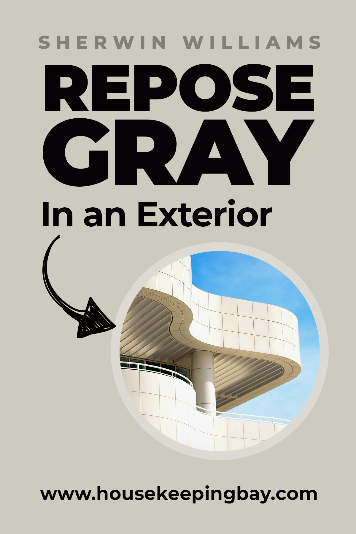
Repose Gray in the Exterior Application
When being painted on the facade, this hue will most likely seem lighter and closer to its gray side unlike the interior tint it reveals when applied indoors.
However, both under the direct sunlight and in a more gloomy area, it will anyway show up nicely.
housekeepingbay
How Does Repose Gray Work With Other Color?
Repose Gray vs. Aloof Gray
Repose Gray SW 7015 and Aloof Gray SW 6197 are both popular choices in the neutral palette, but they have distinct differences. Repose Gray offers a warmer undertone, making it versatile for both warm and cool spaces. Aloof Gray, on the other hand, has a cooler, slightly greenish undertone, giving it a more modern and crisp appearance, especially in rooms with plenty of natural light.
Repose Gray vs. Constellation
Repose Gray SW 7015 is known for its balanced, neutral tone with subtle warmth, making it an ideal choice for a wide range of spaces. Constellation SW 9629, however, is a cooler and lighter gray, leaning towards an ethereal and airy vibe. If you’re aiming for a more serene and light-filled atmosphere, Constellation might be the better choice, whereas Repose Gray offers more versatility and warmth.
Repose Gray vs. Front Porch
Repose Gray SW 7015 and Front Porch SW 7651 are both soft, neutral grays, but they serve different design needs. Repose Gray carries a hint of warmth with its beige undertones, making it a cozy and inviting choice. Front Porch, with its slightly cooler and more weathered feel, is perfect for a traditional or farmhouse-style aesthetic, providing a subtle contrast that still feels cohesive.
Repose Gray vs. Gossamer Veil
Repose Gray SW 7015 and Gossamer Veil SW 9165 are both light grays, but Gossamer Veil has warmer undertones, making it a softer and more approachable option. While Repose Gray offers a perfect balance of warm and cool undertones, Gossamer Veil leans more towards a beige-gray, ideal for creating a warm, cozy environment with a touch of modernity.
Repose Gray vs. Lattice
Repose Gray SW 7015 offers a balanced mix of warm and cool undertones, making it a highly versatile gray. Lattice SW 7654, however, leans cooler with a hint of blue, giving it a crisp and refreshing feel. If you’re looking for a gray that adds a touch of cool sophistication, Lattice might be the choice, while Repose Gray is great for spaces needing warmth.
Repose Gray vs. On the Rocks
Repose Gray SW 7015 and On the Rocks SW 7671 are both excellent choices for a neutral gray. On the Rocks is slightly darker and cooler compared to Repose Gray, which makes it more dramatic and suitable for creating depth. Repose Gray, with its subtle warmth, is ideal for spaces where a light and airy feel is desired without sacrificing coziness.
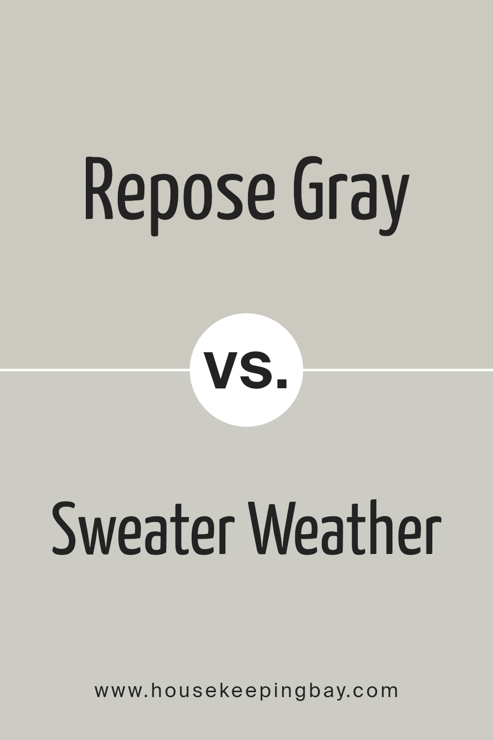
Repose Gray vs. Sweater Weather
Repose Gray SW 7015 is known for its soft, neutral warmth, whereas Sweater Weather SW 9548 brings in a slightly more muted, darker tone. Sweater Weather has a cozy, almost rustic feel that makes it great for spaces where a bit more depth and mood is needed. Repose Gray, in contrast, offers versatility and lightness, suitable for various styles and spaces.
Repose Gray vs. Useful Gray
Repose Gray SW 7015 offers a balanced neutral gray with warm undertones, making it adaptable to various design styles. Useful Gray SW 7050, on the other hand, leans more into the beige side of gray, providing a warmer, earthier feel. If you’re looking for a gray with more warmth and neutrality, Useful Gray might be the better option, while Repose Gray offers more versatility.
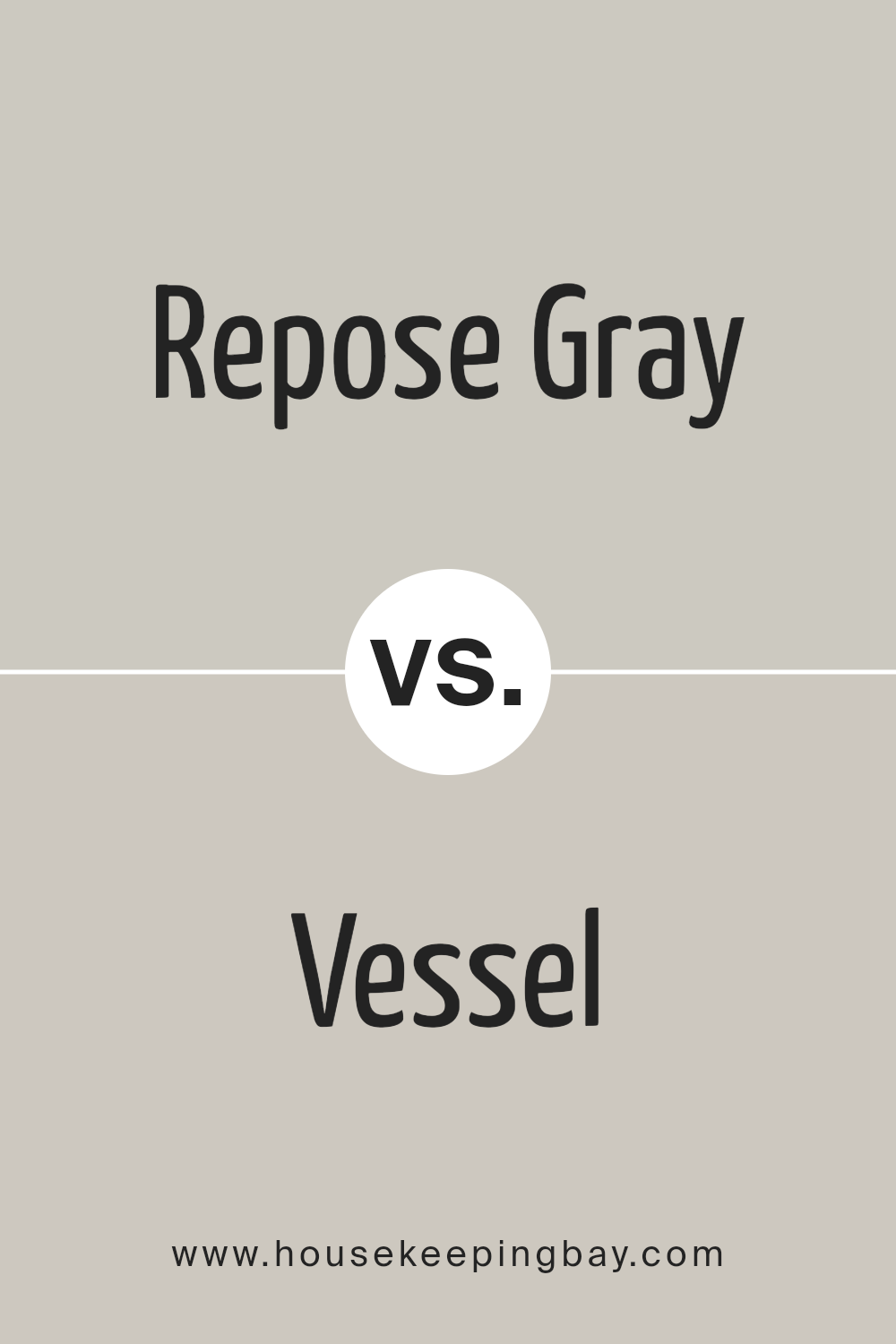
Repose Gray vs. Vessel
Repose Gray SW 7015 and Vessel SW 9547 both belong to the gray family, but Vessel is darker and warmer, with a brownish undertone. This makes Vessel a great choice for adding depth and richness to a space, especially in more traditional or cozy settings. Repose Gray, with its lighter and more neutral tone, is ideal for creating a soft, welcoming atmosphere with greater flexibility in design.
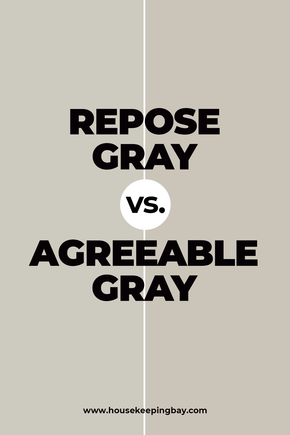
Repose Gray vs Agreeable Gray
When a question arises which one of these colors is the best, finding an answer might be tricky since both shades are pretty much alike. However, certain distinctions do exist.
If we compare Repose Gray with Agreeable Gray , we will see that the first one is somewhat darker than its “cousin”. Nevertheless, the difference is very insignificant.
Also, Repose Gray can sometimes take on a greenish tint if painted in certain areas.
In addition, the color contains more gray notes in it in comparison to its counterpart which, on the contrary, has a slight hint of beige. (get a sample of Agreeable Gray)
housekeepingbay
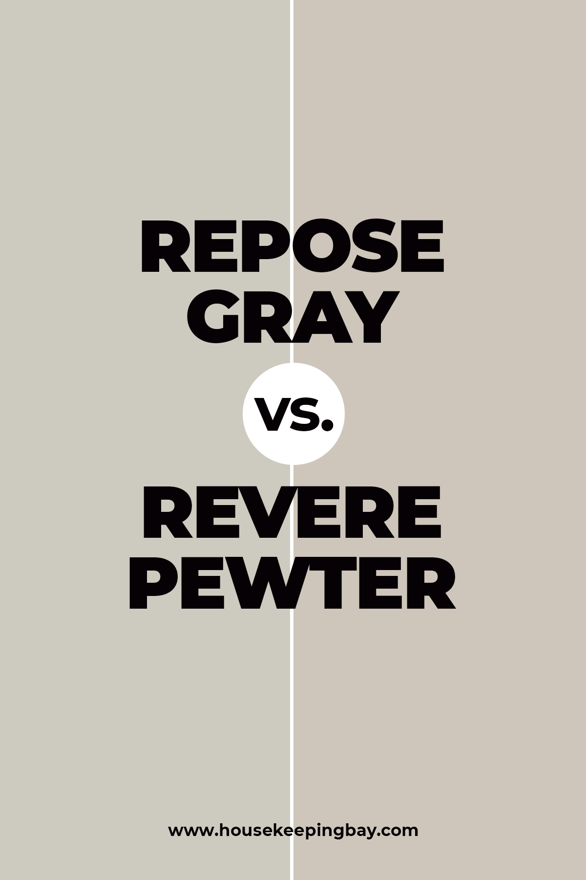
Repose Gray vs Revere Pewter
It may seem that these two colors are almost the same, but if we put them side by side, we will clearly see that Repose Gray has much cooler bluish and purple undertones.
Moreover, since it has its LRV being of 60, it can be considered as a light shade that reflects more light.
In comparison to it, Revere Pewter with LRV of 55 is somewhat darker, but not very dark, of course, and it has way more prominent beige notes. (get a sample of Revere Pewter)
housekeepingbay
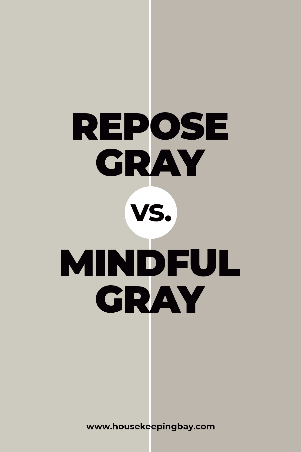
Repose Gray vs Mindful Gray
When being compared, these two shades can be easily distinguished.
Mindful Gray is closer to medium-tone grays whilst Repose Gray belongs to the family of medium to light gray tints having way warmer undertones. (get a sample of Mindful Gray)
Also, Mindful Gray is one tone darker than its counterpart.
housekeepingbay
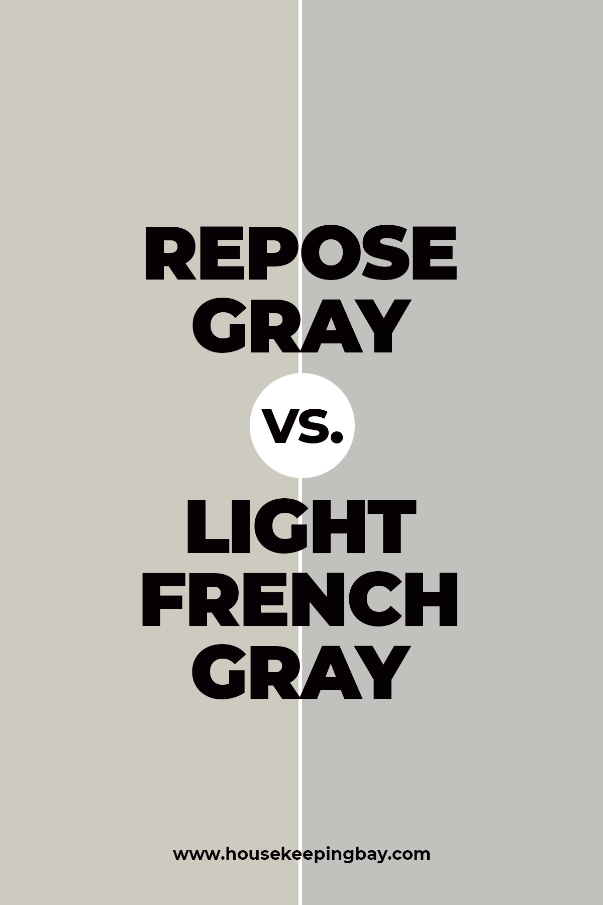
Repose Gray vs Light French Gray
If you are up to painting your walls with either French Gray or Repose Gray, and you still can’t make a decision which one to pick, take the following fact into consideration. Light French Gray looks quite cool (meaning cold) being a light gray tint with no outstanding undertones. (get a sample of Light French Gray)
It has almost perfectly balanced warm and cold tones in it which makes it very close to the pure gray.
These features make it super versatile for being painted in almost any room.
Repose Gray, on the contrary, is significantly warmer having brown, gray, and greige undertones.
housekeepingbay
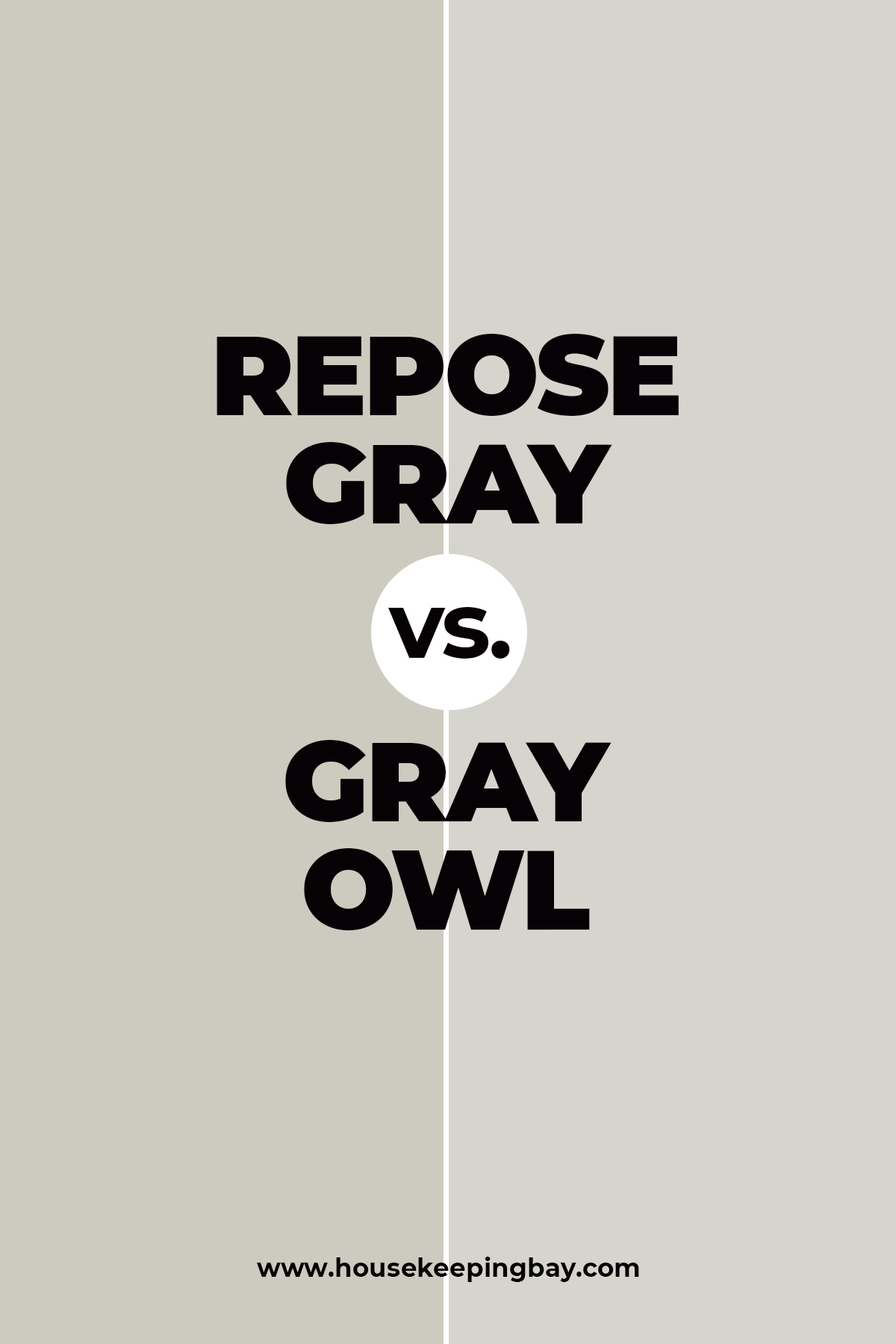
Repose Gray vs Gray Owl
The Gray Owl shade, even despite being called gray, has rather prominent greenish undertones which makes it rather tricky for application.
If we compare it with the Repose Gray, we will clearly see that the Gray Owl looks cooler and greener in comparison to its counterpart that is more greige. (get a sample of Gray Owl)
In addition, the greenish undertones of the Gray Owl color can even look a bit blue in certain light.
Because of this nuance, this paint has to be used very carefully considering the lighting of the room you are going to use it in.
housekeepingbay
So, as you can see from all we have described, the RG is a truly universal hue that suits any design, any color scheme, and quite many trims. Use it indoors or outdoors, in any chamber you feel like, and feel free to add more colorful accents to combine with it.
The hue will complement such a decision easily!
housekeepingbay
Ever wished paint sampling was as easy as sticking a sticker? Guess what? Now it is! Discover Samplize's unique Peel & Stick samples. Get started now and say goodbye to the old messy way!
Get paint samples


Frequently Asked Questions
⭐ Is Repose Gray good for exterior application?
Yes, it is.
⭐ What colors will look nice if paired with Repose Gray?
Try Pure White, Urbane Bronze, and Tidewater.
⭐ What is the most popular exterior gray of the Sherwin Williams?
They are Agreeable Gray, Mindful Gray, Amazing Gray, Mega Greige, Dorian Gray, Anew Gray, and Worldly Gray.
⭐ Does Repose Gray look blue?
In very rare cases, it may indeed reveal a very little bit of bluish hue since this color does have a slight blue undertone among others.
⭐ What dark grays go well with Repose Gray?
They are SW Dovetail, SW Peppercorn, and SW Black Fox.
⭐ Will Repose Gray look well together with Sea Salt?
Definitely, it will.

Hi! We plan to paint our kitchen cabinets Repose Gray and our walls Dorian Gray. The cabinets take up most of the space than our walls do in our small kitchen. Will those colors work well together? Counter top color is a combination of black, gray and white.
Thanks, Cindy
Hello. I’ve ocme for your help. See, I want to erpaint my living room, but I can’t choose between Repose Gray vs Agreeable Gray. Which one do you think is more suitable?
Do you think Repose Gray by Sherwin-Williams will look good on bedroom walls if the room is small?
Hi. I guess it might work, but only if the room is well-lit and there are many white items loiek curtains, bedding, carpets, etc. White will add space and airiness, making the room look bigger than it is, thus reducing the way Repose Gray affects the space.
Hello. I have a question about this color if you don’t mind. Is Repose Gray by Sherwin-Williams only considered an interior color? Thank you.
Hello. No, you can use this paint color both on exterior and interior walls. Indoors, it can also be used on cabinets.
I’m going to repaint my exterior walls and I’m considering SW Repose Gray. Do you know whether Repose Gray by Sherwin-Williams is good for exterior paint work?
Yes, I like how this color reeds on exterior walls. Some say it may erad too warm sometimes, but I gues it’s because they use this color in sunny areas. When being lit with sun, it may indeed read warmer.
We are thinking of using Repose Gray on the siding of our lake house. We sit in full sun. and sit on the water. We are thinking of using a medium fray on facia boards and a dark gray on Bumpouts. We also have black windows, roof, and all fixtures are black. We have dark cedar wood on garage doors and deck. What colors do you suggest we use with Repose grey to get a rustic modern look? Thank you!
Hello. We would suggest either SW Black Fox, which reads a deep chocolate brown, or SW Peppercorn, which is a charcoal gray shade. Both are darker than Repose Gray, and both give that natural rustic look.
We are looking at painting our lakehouse siding with Repose Gray but would like to pair it with a medium and/or darker color scheme on trim/facia boards and bumpouts. We also have black windows and dark wood cedar garage doors, deck, and entry doors. All of our fixtures are black as well as a black roof. What other colors would you suggest we use with Repose Gray? Thank you for your help!
Does Sherwin-Williams Repose Gray look too warm on the walls?
I’d not say it looks too warm, although, it is warm-toned enough indeed. But I see it as a moderately warm and balanced color.
Does Sherwin-Williams Repose Gray look too warm on the walls?
I’m working on a TV stand and need advice on paint colors for the top and front/inside shelving, I want the top a dark color and the rest a lighter color. Walls are Repose Gray and Floors are oak in a honey oak color. I’m thinking something similar to Urbane Bronze, Peppercorn or Grizzle Gray for top but unsure what would look good on the rest…help!!! Also, have a large sectional that’s a medium cream color.
Hi Jennie! Thanks for you question! Your issue does seem difficult enough, so here’s what we can say. We see that for your TV stand outside, Urbane Bronze would be a good choice since it has brownish undertones that pair well with the color on your walls which is Repose Gray.
As for the inside shelves of the stand, try SW Agreeable Gray. It’s very fair in comparison to Urbane Bronze, but it will work fine for the inside shelves. See, if you use dark colors like Peppercorn, the whole stand will look way too gloomy and dark in your room which is pretty fair as we could understand from your description!
In addition, a dark stand will pair better with a TV which is usually black.
But if you find Agreeable Gray way too light and you’d prefer something darker and browner, we would recommend SW Warm Stone.
Good luck!
I have a huge issue with buying Repose Gray paint! I can find it only on the Internet, but the delivery time is way too long for me. Does anyone know where to buy repose gray except for doing this online?
I’m afraid you can only do it online since the brand doesn’t sell its paint in hardware stores. At least, I never saw them there.
We bought repose gray at sherwin Williams. But it’s definitely got a solid blue undertone. In the evening/night it looks like baby blue. Still pretty but not what we expected.
What color matches repose gray better than others? I want to add a lighter accent into my living room but using only white seems a bit too boring to me.
Well, if you need something except for the whites… For me personally, this color works well with quite many blue shades, as well as soft greens (e.g. Sea Salt or Rainwashed) and navy. I would even say that aquatic colors and pinks will make a great match with this paint color! It’s really versatile so you should try.
I wanted to paint my kitchen with repose grey but later I realized it’s too dark for this room. What is lighter than repose gray? A tone or too lighter will be fine.
You can try Agreeable Gray, it’s a bit lighter and has warmer undertones. Paper White is also a good option, by the way.
I need help from you, people! My husband and I are repainting our entire house now and we can’t decide on which color is better for the living room, simply white or repose gray? What do you think?
I think it depends on its lighting. Simply White will fit the room that has not that much natural light, I suppose, whilst Repose will work better on the walls that have enough daylight. But that’s my opinion.
Hello! I’m planning to do some renovations in my kitchen and so I also decided to repaint the cabinets and walls. Could you give me any ideas on what trim color pairs well with repose gray? The whole kitchen will be in light neutral colors.
Hi. In my opinion, you can use white color but be sure to opt for clean white since it works with the Repose best. Also, it would be great if you have any wooden elements in your kitchen since they will make the whole space look warmer.
What sherwin williams trim color you could suggest that compliments repose gray best of all?
I guess it will win from being paired with white or off-white trims, such as SW Alabaster, Oyster, or Greek Villa.