Simple White SW 7021 by Sherwin Williams
Embracing Minimalist Charm with a Timeless Hue
Welcome to our overview of SW 7021, also known as Simple White by Sherwin Williams. If you’re on the hunt for the perfect white paint for your space, you’re in the right place. Simple White isn’t just any standard white paint; it’s a favorite among homeowners and interior designers for a reason.
This paint color offers a clean and versatile backdrop that can brighten up any room, making it feel more spacious and inviting. Whether you are looking to refresh your living room, bedroom, or even your kitchen cabinets, Simple White brings a fresh and airy feel to any project.
One of the key benefits of Simple White is its ability to blend seamlessly with a wide range of decor styles and color palettes. Whether your home is modern, traditional, or somewhere in between, Simple White can complement your existing furnishings and enhance natural light, adding a subtle warmth to the space without overwhelming it. In addition, it’s incredibly user-friendly for both DIY enthusiasts and professional painters, offering excellent coverage and a smooth finish.
In this article, we’ll explore why Simple White by Sherwin Williams could be the perfect choice for your next painting project, highlighting its unique qualities, tips for application, and how it stands out from other white paints on the market.
via sherwin-williams.com
What Color Is Simple White SW 7021 by Sherwin Williams?
Table of Contents
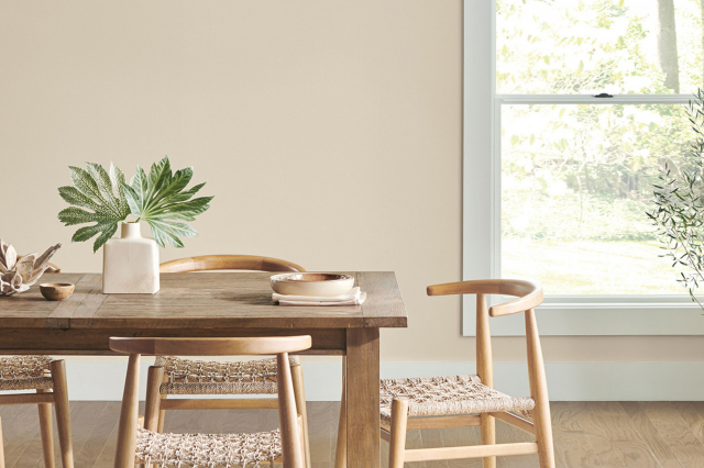
Simple White SW 7021 by Sherwin Williams is a warm and inviting shade of white that brings a sense of simplicity and cleanliness to any space. This color has a hint of creaminess, making it less stark compared to pure white, which adds a touch of coziness to rooms. Simple White works as an excellent background, allowing furniture and decor to stand out.
It’s versatile enough to suit various interior styles, from modern minimalism to rustic farmhouse, and even shabby chic. Its adaptability means it can also play a crucial role in transitional and traditional interiors, where a balance between contemporary and classic elements is desired.
Simple White pairs wonderfully with a wide array of materials and textures. In a room with natural wood elements, such as exposed beams, hardwood floors, or wooden furniture, it can create a warm and earthy feel. With metals like brass, silver, or copper, Simple White can tilt towards a more refined and elegant look.
It’s also perfect for spaces that incorporate textiles of different kinds – think soft cotton drapes, textured linen sofas, or plush wool rugs. These combinations allow for a harmonious balance, making spaces feel well thought out and inviting. The winning feature of Simple White is its ability to adapt, making it a go-to color for anyone looking to freshen up their space without overwhelming it.
housekeepingbay.com
Is Simple White SW 7021 by Sherwin Williams Warm or Cool color?
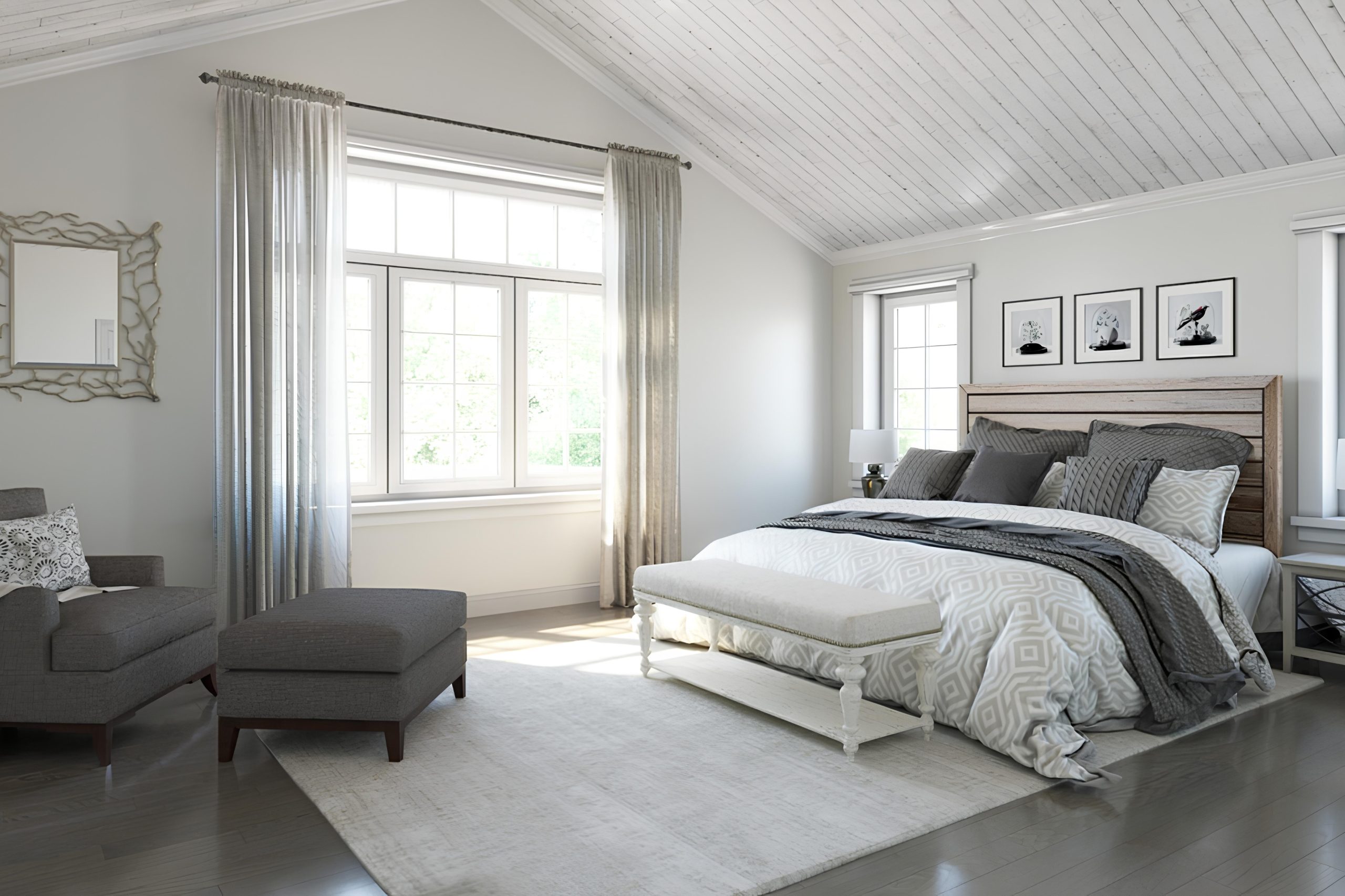
Simple White SW 7021 by Sherwin Williams is a popular paint color for those wanting to bring a fresh and clean look into their homes. This color has a way of making spaces feel brighter and more open. Because it’s a very pure shade of white, it can help to reflect natural light around a room, making it feel airy and more spacious. This is especially helpful in smaller rooms or areas with limited light, as it can make them appear larger and more welcoming.
Simple White is very versatile. It can match well with almost any decor style, from modern to rustic, and complements a wide range of other colors and materials. Whether you’re pairing it with bold colors to create a striking contrast or soft, neutral tones for a calming space, Simple White acts as a perfect backdrop. It allows other elements in a room to stand out, whether it’s furniture, art, or personal collections.
Its simplicity also means it’s timeless, making it a great choice for people who want a color that won’t quickly go out of style. This can be particularly beneficial for areas of the home you don’t plan to repaint often, like living rooms or exteriors. Overall, Simple White is a great choice for creating bright, timeless spaces in your home.
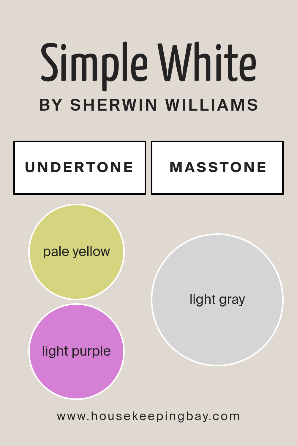
What is the Masstone of the Simple White SW 7021 by Sherwin Williams?
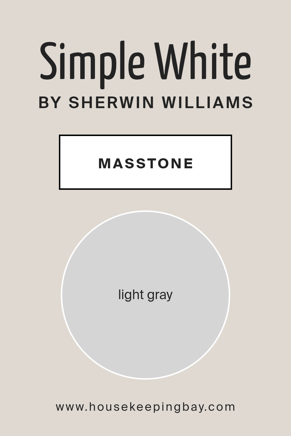
Simple White SW 7021 by Sherwin Williams has a masstone that looks like a light gray color, which you can think of as a soft shade of silver or a very pale gray. This color is really interesting because even though it’s called Simple White, it’s not your typical bright white. Instead, it has this gentle gray touch that makes it unique. When you use this color in your home, it brings a feeling of calm and understated elegance. It’s like having a quiet friend who makes everything around them feel more peaceful and put together.
This light gray hint means that Simple White is super versatile. It can work wonders in making small spaces look bigger and brighter, as it bounces light around the room. At the same time, it’s not too stark or cold, thanks to its gray undertone, making it cozy and welcoming.
Whether you’re painting your living room, bedroom, or even the kitchen, this color can create a clean, fresh look without feeling too clinical. It’s like giving your home a gentle hug, making it feel soothing and inviting.
housekeepingbay.com
Undertones of Simple White SW 7021 by Sherwin Williams
Simple White SW 7021 by Sherwin Williams is more than just a straightforward white paint; it carries subtle undercurrents of color that add depth and character to its overall appearance. Imagine mixing a bit of pale yellow (#D5D580) and light purple (#D580D5) with white.
These are the kinds of undertones we’re talking about. They might not jump out at you at first glance, but they’re there, quietly influencing how the color feels and behaves in different settings.
Undertones play a big role in the way we perceive color. They can make a color feel warmer or cooler and affect how it looks next to other colors or in various types of lighting. For Simple White, the pale yellow undertone adds a touch of warmth, making spaces feel more inviting and cozy. On the other hand, the light purple undertone introduces a slight coolness, giving the color a fresh, clean look.
When applied to interior walls, these undertones in Simple White can subtly change the mood of a room. In natural daylight, the pale yellow might make the space feel bright and sunny, whereas the light purple could lend a calm and serene feeling under artificial lighting. This interplay of undertones means Simple White can adapt beautifully to different styles and settings, making it a versatile choice for your home.
housekeepingbay.com
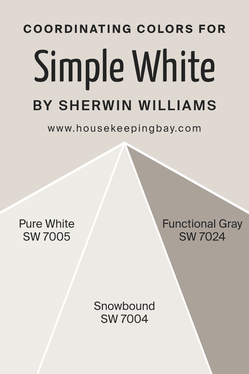
Coordinating Colors of Simple White SW 7021 by Sherwin Williams
Coordinating colors are hues that complement each other and work well together when used in the same space, creating a cohesive and pleasant visual experience. These colors can bring out the best in each other, balancing tones and adding depth to your decor. In the case of Simple White SW 7021 by Sherwin Williams, there are specific coordinating colors that enhance its clean and adaptable nature, ensuring that your room maintains a harmonious and inviting atmosphere.
One of the coordinating colors is Pure White SW 7005, a bright and fresh shade that adds a crisp clarity, making it an excellent choice for trim or ceilings to lift the overall airy feel of a space.
Then, there’s Snowbound SW 7004, a softer white with a slightly gray undertone, providing a subtle contrast to Simple White without overwhelming the senses, perfect for a nuanced layering of whites. Lastly, Functional Gray SW 7024 introduces a stronger contrast with its solid and grounding presence, offering a contemporary twist and depth to the space, making it an ideal choice for accent walls or furniture, thereby anchoring the room’s design.
Together, these colors harmonize with Simple White, allowing for a design that feels coherent and tailored to personal tastes.
You can see recommended paint colors below:
- SW 7005 Pure White
- SW 7004 Snowbound
- SW 7024 Functional Gray
housekeepingbay.com
How Does Lighting Affect Simple White SW 7021 by Sherwin Williams?
Lighting plays a key role in how we see and experience colors in any environment. Different types of light can make the same color look different, sometimes so much so that it feels like entirely another color. Simple White SW 7021 by Sherwin Williams is a versatile color that can look different depending on the light it’s under, whether it’s natural or artificial.
Under artificial light, Simple White can take on different tones based on the type of bulb used. LED lights, which have a cooler tone, can make Simple White look brighter and more crisp, perfect for a modern look. Meanwhile, incandescent bulbs, which give off a warmer light, may make this color appear softer and warmer, adding a cozy feel to the room. This makes Simple White a great choice for spaces where the ambiance can change based on time of day or desired atmosphere.
In natural light, Simple White changes its appearance through the day and depending on the direction the room faces. In north-faced rooms, which get less direct sunlight, this color might look a bit cooler and more subdued, giving a calm and serene feel. It won’t feel stark but rather will softly reflect the limited light, maximizing the brightness of the space without being overpowering.
South-faced rooms bask in plenty of sunlight, making Simple White radiate warmth and brightness. Here, it appears livelier and more welcoming, perfect for creating a cheerful and airy space. This direction lets Simple White show its versatility by adapting beautifully to the abundant light.
East-faced rooms receive most of their sunlight in the morning. Here, Simple White will feel warm and bright in the morning but become cooler as the day progresses. This makes it suitable for spaces used mainly in the morning, like kitchens and breakfast nooks, providing a refreshing start to the day.
Lastly, west-faced rooms get the evening light, making Simple White warm and inviting in the afternoon and evening. It’s perfect for living rooms or dining rooms, where it can help create a relaxing atmosphere as the day winds down.
In conclusion, lighting significantly affects how Simple White SW 7021 by Sherwin Williams is perceived. Its ability to adapt to different lighting conditions makes it an incredibly versatile color for any room, regardless of its orientation or the type of light it receives.
housekeepingbay.com
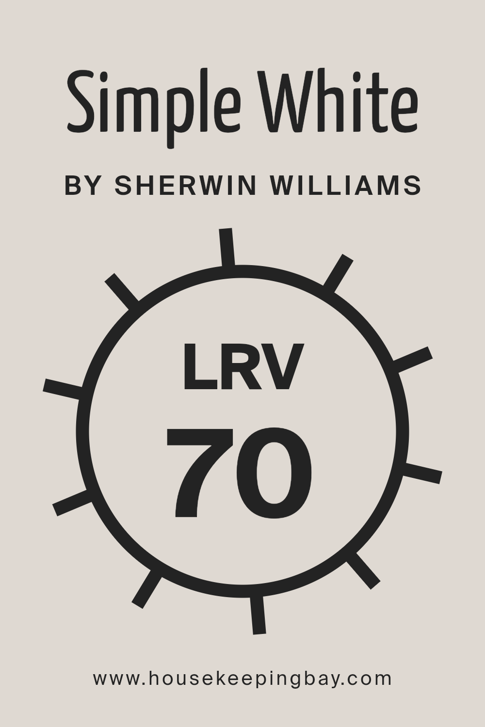
What is the LRV of Simple White SW 7021 by Sherwin Williams?
LRV stands for Light Reflectance Value, which is basically a way to measure how much light a color reflects or absorbs. Think of it as a scale from 0 to 100, where 0 is completely black, absorbing all light, and 100 is pure white, reflecting all the light back.
This value is super helpful when choosing paint colors because it can give you an idea of how bright or dark a color might look once it’s up on your walls. Colors with higher LRVs, closer to 100, will reflect more light, making spaces feel airier and larger, while lower LRV shades, closer to 0, will absorb more light, creating a cozier, more intimate vibe.
Regarding the color Simple White SW 7021 by Sherwin Williams, with an LRV of 69.82, it’s on the lighter end of the spectrum. This means it’s great at reflecting light, contributing to a bright and open feeling in a room.
It’s not pure white, but with its high LRV, Simple White will help to bounce a lot of light around, which can make the color appear more vibrant and the space more inviting during the day. This LRV value suggests that Simple White is a versatile choice, capable of enhancing natural light in a room while still bringing in a warm and welcoming atmosphere.
housekeepingbay.com
What is LRV? Read It Before You Choose Your Ideal Paint Color
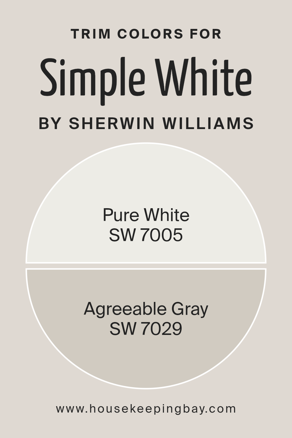
What are the Trim colors of Simple White SW 7021 by Sherwin Williams?
Trim colors play a pivotal role in framing and accentuating the appearance of your walls, and when we talk about a base color like Simple White SW 7021 by Sherwin Williams, the choice of trim color becomes even more crucial.
The trim, which includes skirting boards, door frames, window frames, and crown molding, acts as a visual outline that can either subtly complement or strikingly contrast with the base color.
Opting for the right trim color can enhance the base color’s natural characteristics, add depth to the overall aesthetic, and create a cohesive look throughout the space. In the case of Simple White SW 7021, a crisp and bright base tone, selecting an appropriate trim color can highlight its pure and clean qualities, ensuring that the space feels inviting and well-defined.
For a choice like SW 7005 – Pure White, which itself is a fresh and clean shade, using it as a trim provides a seamless transition between the trim and the Simple White walls, promoting a sense of unity and expansiveness in the room. Its unblemished and neutral undertone ensures that the space doesn’t feel overwhelming but rather open and airy, making it ideal for spaces aiming for a minimalist or modern ambiance.
On the other hand, SW 7029 – Agreeable Gray, offers a warmer, more inviting contrast to Simple White, adding subtle depth and dimension to the room without overpowering the base color. This gentle gray hue exudes a soft elegance and versatility, making it perfect for creating a cozy and cohesive space that still feels connected and balanced.
Together, both trim colors offer distinct benefits, allowing for customization according to the desired mood and style of the room.
You can see recommended paint colors below:
housekeepingbay.com
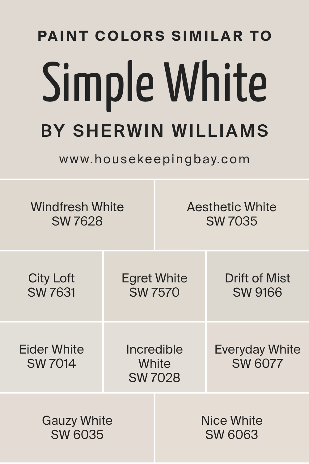
Colors Similar to Simple White SW 7021 by Sherwin Williams
Choosing similar colors for a space, especially those akin to Simple White SW 7021 by Sherwin-Williams, plays a pivotal role in achieving a cohesive and soothing aesthetic. These shades offer flexibility and a subtle variety that can enhance the dimensions of a room without overwhelming it with contrast.
By leaning on similar colors, you can craft an environment that feels unified and thoughtfully curated, as each color complements and elevates the others. The use of such colors, characterized by their close relation on the color spectrum, ensures that the transition from one shade to another is seamless, making the space feel larger and more open.
Among these similar colors, Windfresh White SW 7628 brings a breath of fresh air with its clean and invigorating feel, perfect for creating a bright and airy atmosphere. Aesthetic White SW 7035 offers a slightly warmer tone, lending an inviting softness to rooms that crave a touch of coziness.
City Loft SW 7631 has a refined urban appeal, its light gray undertone presents a chic backdrop for contemporary spaces. Egret White SW 7570 carries a hint of warmth, making it ideal for spaces that seek a neutral with a serene and welcoming ambience. Drift of Mist SW 9166 bridges the gap between gray and white, providing a misty, ethereal quality that enhances natural light.
Eider White SW 7014 displays a soft, almost blush-gray tone, offering subtlety and elegance. Incredible White SW 7028 is remarkably versatile, its slightly gray cast harmonizes with both cool and warm palettes. Everyday White SW 6077 is just as its name suggests—versatile and timeless, perfect for any and every day.
Gauzy White SW 6035, with its gentle and light presence, evokes a sense of tranquility. Lastly, Nice White SW 6063 stands out with its crisp clarity, making it an excellent choice for creating a sharp, clean look. By considering these shades that closely resemble Simple White, anyone can achieve a harmonious and beautifully layered interior
You can see recommended paint colors below:
- SW 7628 Windfresh White
- SW 7035 Aesthetic White
- SW 7631 City Loft
- SW 7570 Egret White
- SW 9166 Drift of Mist
- SW 7014 Eider White
- SW 7028 Incredible White
- SW 6077 Everyday White
- SW 6035 Gauzy White
- SW 6063 Nice White
housekeepingbay.com
How to Use Simple White SW 7021 by Sherwin Williams In Your Home?
Simple White SW 7021 by Sherwin Williams is a paint that can truly make a home feel fresh and welcoming. Its clean and straightforward shade provides a perfect backdrop for any room, allowing your furniture and decor to stand out. Whether you’re updating your living room, bedroom, or kitchen, Simple White offers a versatile option that can suit a variety of styles and tastes.
Using this paint can help brighten up a space, making it appear larger and more open. It’s especially handy for rooms that don’t get a lot of natural light, as it reflects whatever light is available, enhancing the overall brightness of the area. Simple White also pairs well with almost any other color, so whether you prefer bold and vibrant accessories or subtle and soft tones, it can support your vision.
Incorporating Simple White SW 7021 into your home is a straightforward way to refresh your space. It’s ideal for creating a clean canvas that allows your personal style to shine through. Whether you’re going for a minimalist look or a cozy, layered aesthetic, Simple White can help achieve the vibe you’re after with ease.
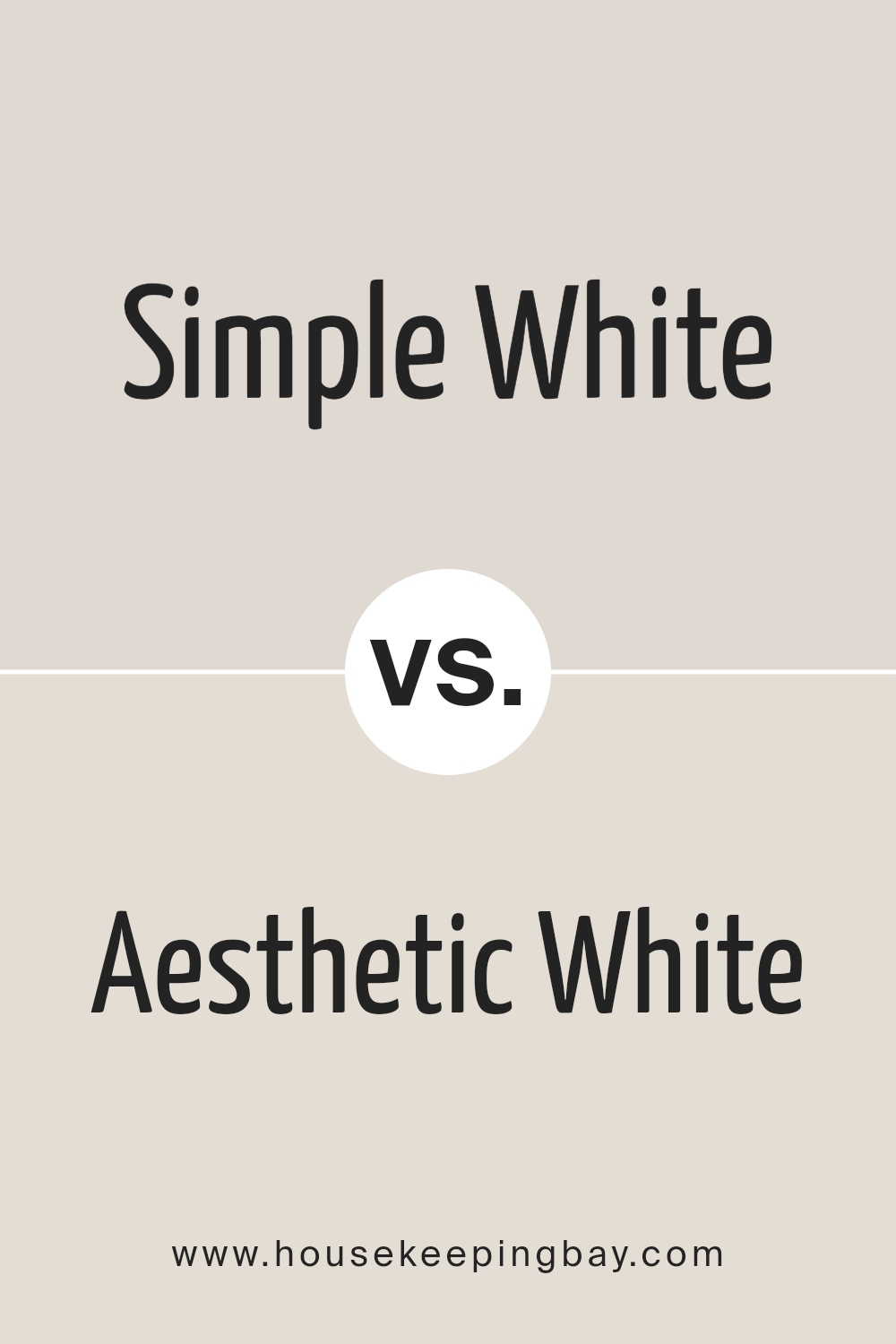
Simple White SW 7021 by Sherwin Williams vs Aesthetic White SW 7035 by Sherwin Williams
Simple White SW 7021 by Sherwin-Williams and Aesthetic White SW 7035 by Sherwin-Williams are both popular choices, but they do have differences. Simple White is a clean, straightforward shade of white. It’s like a blank canvas, really opening up a space and bringing in a lot of light. It’s perfect for someone who wants a pure, uncomplicated white without undertones that might complicate the color’s impact.
On the other hand, Aesthetic White is a bit warmer and has a subtle hint of gray and beige. It’s not your stark, bright white. Instead, it offers a cozy, soft feeling to the room. This color is great for adding warmth to a space while keeping it light and airy.
Both colors are versatile and can work in various settings, but your choice might depend on the mood you’re looking to create. Simple White is great for a modern, crisp look, while Aesthetic White is ideal if you’re aiming for a warm, inviting atmosphere.
You can see recommended paint color below:
housekeepingbay.com
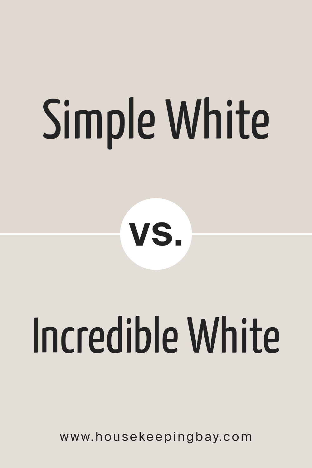
Simple White SW 7021 by Sherwin Williams vs Incredible White SW 7028 by Sherwin Williams
Simple White SW 7021 and Incredible White SW 7028 by Sherwin Williams are two popular shades, often chosen for their subtle yet distinct tones. Simple White has a clean, pure essence, giving off a fresh vibe that’s perfect for making spaces seem larger and more open. It works well in rooms that aim for a crisp, minimalistic look, reflecting light beautifully and creating an airy feel.
Incredible White, on the other hand, leans towards a warmer, cozier white with grayish undertones. This warmth makes it ideal for creating inviting spaces, adding a touch of comfort without darkening the room. It pairs nicely with wood finishes and soft furnishings, offering a more nuanced backdrop compared to the sharper presence of Simple White.
While both colors share the versatility of white, their undertones set them apart, offering different atmospheres. Simple White brightens with a stark simplicity, whereas Incredible White envelops you in a gentle warmth. Choosing between them comes down to the mood you’re looking to create—crisp and fresh, or warm and cozy.
You can see recommended paint color below:
housekeepingbay.com
Simple White SW 7021 by Sherwin Williams vs City Loft SW 7631 by Sherwin Williams
Simple White SW 7021 by Sherwin Williams is a clean and straightforward white color. It’s the kind of white that feels fresh and can easily brighten up any space, making it look more open and airy. On the other hand, City Loft SW 7631 also by Sherwin Williams, takes a step towards a warmer, more neutral palette. It’s not just a plain white; it has hints of gray and beige mixed in, giving it a cozy and inviting feel without losing the light and airy vibe.
When comparing the two, Simple White is your go-to for a pure, unadulterated white that’s great for creating a sharp, clean look. It’s perfect for spaces you want to feel crisp and clear. City Loft, however, is warmer and more complex, offering a subtle and sophisticated blend of colors that can make a room feel more welcoming and lived-in. It works well in spaces where you want a bit of warmth without deviating too much from a neutral color scheme.
You can see recommended paint color below:
housekeepingbay.com
Simple White SW 7021 by Sherwin Williams vs Windfresh White SW 7628 by Sherwin Williams
Simple White SW 7021 by Sherwin Williams is a clean and straightforward shade of white. It has a pure and minimalist aesthetic, making it perfect for spaces where you want a fresh and unfussy look. This color reflects light well, illuminating rooms and making them appear more spacious. It’s great for a modern or traditional setting, providing a neutral backdrop that can easily pair with any decor style.
Windfresh White SW 7628, on the other hand, is a bit more complex than Simple White. It carries a slight undertone that adds a hint of warmth to spaces without overwhelming them with color.
This makes Windfresh White a cozy option for rooms where you want a touch of softness, ensuring the space feels welcoming and comfortable. It’s ideal for living areas or bedrooms where the aim is to create a gentle and inviting atmosphere.
In summary, while both colors are white, Simple White leans towards a pure, clean look, and Windfresh White offers a slightly warmer, cozier feel. Each has its unique appeal, making them suitable for different spaces and preferences.
You can see recommended paint color below:
housekeepingbay.com
Simple White SW 7021 by Sherwin Williams vs Everyday White SW 6077 by Sherwin Williams
Simple White SW 7021 by Sherwin Williams and Everyday White SW 6077 are two shades of white paint that hold subtle differences. Simple White leans towards a clean and straightforward look. It’s the kind of white that can brighten up a space without feeling too stark or cold. It’s versatile, working well in various settings, from modern to traditional.
On the other hand, Everyday White takes a slightly different path. It has a warmer tone, offering a cozy and inviting feel. This warmth makes it perfect for creating a homely atmosphere in living spaces. It’s like wrapping your room in a soft, warm blanket.
While both are white, Simple White is more about freshness and clarity, bringing a sense of openness. Everyday White, however, focuses on comfort and warmth, making spaces feel more intimate. Choosing between them depends on the mood you’re aiming to achieve in your space.
You can see recommended paint color below:
housekeepingbay.com
Simple White SW 7021 by Sherwin Williams vs Egret White SW 7570 by Sherwin Williams
Simple White SW 7021 and Egret White SW 7570 by Sherwin Williams are two popular paint colors. Both colors are great for giving a room a fresh and clean look, but they have their differences. Simple White is exactly what its name suggests: a straightforward, clean white.
It’s a great base for any room, providing a crisp background that makes other colors pop. On the other hand, Egret White is a bit softer and warmer, with a hint of gray.
This gives it a cozy feel, making it perfect for creating a relaxing space. Egret White works really well in rooms that get a lot of natural light, as the light brings out its warm undertones. In contrast, Simple White can brighten up darker spaces effectively. Depending on the vibe you’re going for – either crisp and vibrant with Simple White or soft and cozy with Egret White – you can’t go wrong with either of these Sherwin Williams colors.
You can see recommended paint color below:
housekeepingbay.com
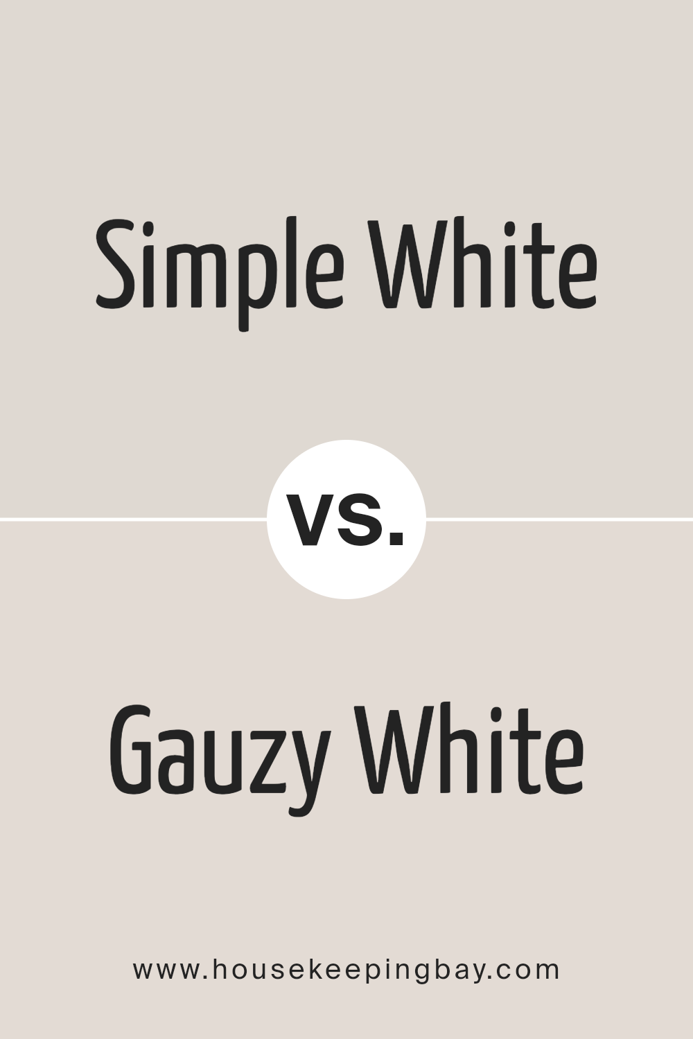
Simple White SW 7021 by Sherwin Williams vs Gauzy White SW 6035 by Sherwin Williams
Simple White SW 7021 by Sherwin Williams is a classic and versatile white. It has a clean, pure appearance that makes it an ideal choice for creating a fresh and inviting space. This color is perfect for those who want a straightforward white without any complicated undertones, making it easy to match with other colors and decor styles.
On the other hand, Gauzy White SW 6035 is a softer, slightly more nuanced white. While still maintaining a sense of clarity, it offers a hint of warmth, making it feel cozy and comfortable. This color is great for adding a gentle, welcoming atmosphere to a room without the starkness that some pure whites can have.
When comparing Simple White and Gauzy White, think of Simple White as the go-to for a crisp, clean backdrop, while Gauzy White brings in a touch of softness and warmth, making spaces feel more intimate and lived-in. Both colors serve different purposes, depending on the mood and feel you want to achieve in your space.
You can see recommended paint color below:
housekeepingbay.com
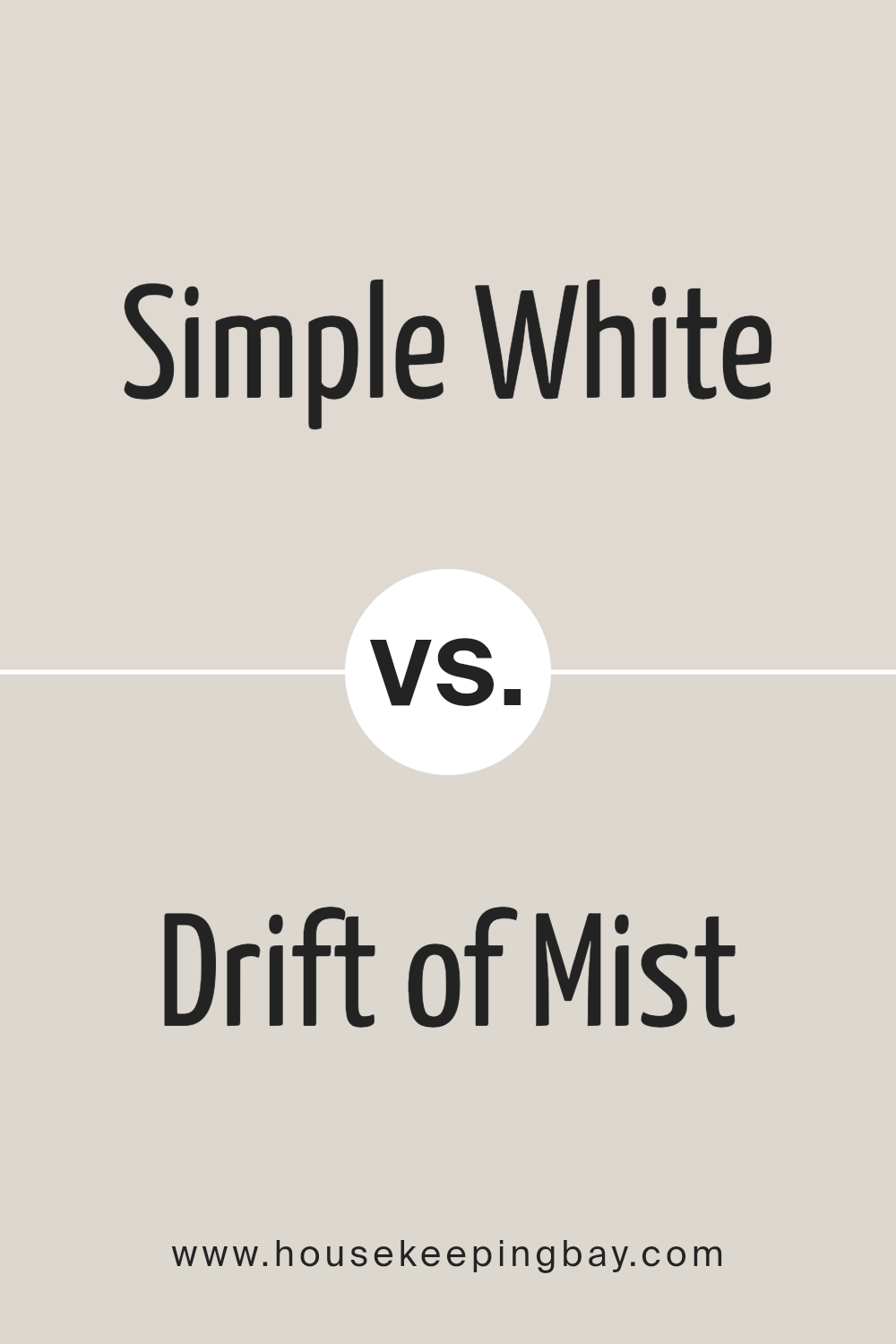
Simple White SW 7021 by Sherwin Williams vs Drift of Mist SW 9166 by Sherwin Williams
The main color, Simple White SW 7021 by Sherwin Williams, is a clean and straightforward shade. It’s the kind of white that can brighten up a space without feeling cold or too stark. It has a very subtle warmth to it, making it versatile for different rooms and styles. Whether it’s for walls, trim, or cabinets, Simple White offers a fresh, crisp backdrop.
On the other hand, Drift of Mist SW 9166, also by Sherwin Williams, is a light gray with a hint of warmth. This color adds a bit more depth to spaces than Simple White. It’s not just plain gray; it has an inviting quality that works well in rooms where you want a bit more character without overwhelming the space. Drift of Mist is excellent for creating a soft, serene atmosphere.
So, when you compare Simple White and Drift of Mist, you’re looking at the difference between a pure and bright white and a light, warm gray. Both colors are subtle and understated, but they serve slightly different purposes in home decor. Simple White is all about freshness and clarity, while Drift of Mist offers a hint of color, adding a layer of coziness to the environment.
You can see recommended paint color below:
housekeepingbay.com
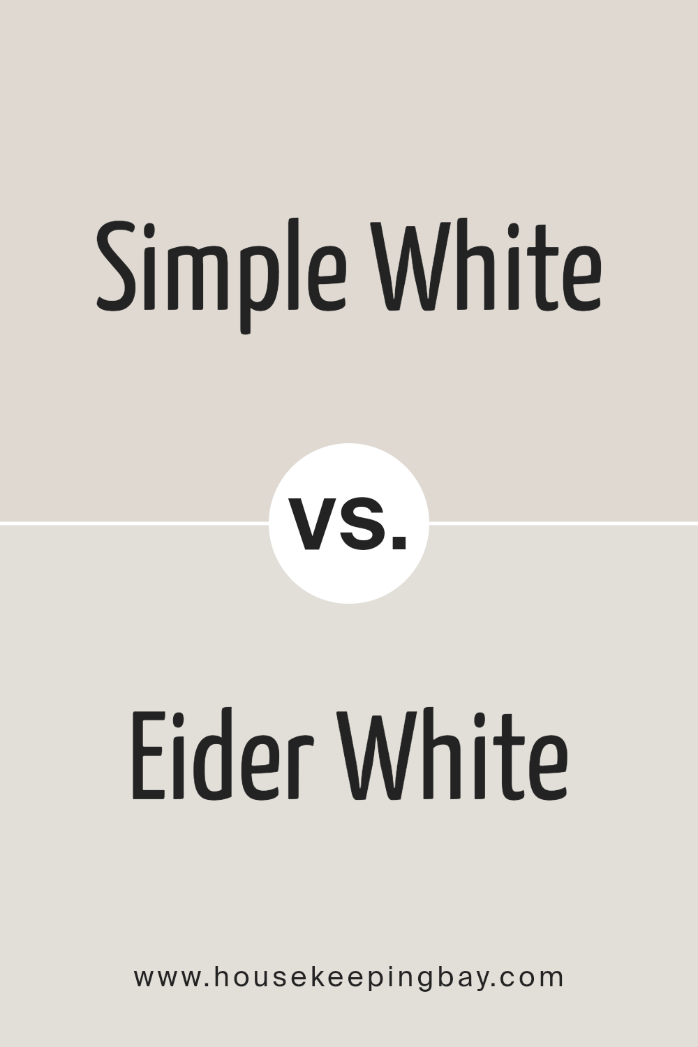
Simple White SW 7021 by Sherwin Williams vs Eider White SW 7014 by Sherwin Williams
Simple White SW 7021 by Sherwin Williams and Eider White SW 7014, also by Sherwin Williams, are two popular shades of white that add distinct vibes to any space. Simple White is a pure, bright shade that brings a fresh and clean look to rooms. It’s like a blank canvas, making it a great backdrop for any decor style, allowing other colors in the room to pop.
On the other hand, Eider White has a hint of gray, giving it a softer, warmer appearance. This shade is perfect for creating a cozy and inviting atmosphere without going too dark.
While both are white, Simple White leans towards a crisp brightness, and Eider White offers a gentle warmth, making them suited for different moods and settings. Whether you prefer the stark simplicity of Simple White or the subtle warmth of Eider White can depend on the ambiance you’re aiming for in your space.
You can see recommended paint color below:
housekeepingbay.com
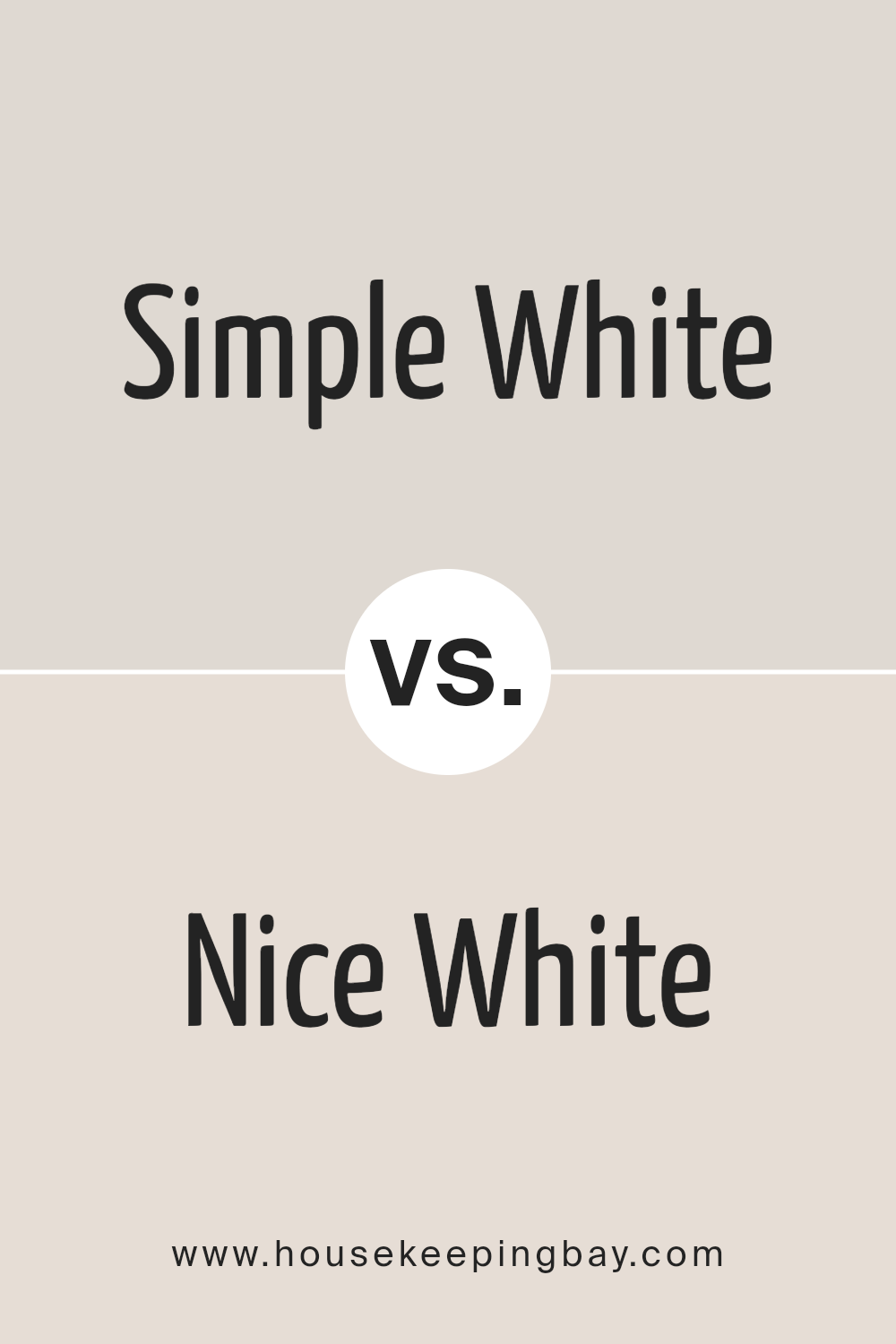
Simple White SW 7021 by Sherwin Williams vs Nice White SW 6063 by Sherwin Williams
When comparing Simple White SW 7021 and Nice White SW 6063 by Sherwin-Williams, we’re looking at two shades of white that bring their unique touches to spaces. Simple White has a clean, straightforward vibe. It’s a pure kind of white that can brighten up rooms without feeling too stark or cold. It’s versatile and can be used in various settings, from living rooms to kitchens, adding a fresh and open feel.
On the other hand, Nice White is a bit softer and warmer. It’s not just plain white; it has subtle nuances that can make a space feel more inviting and cozy. Perfect for those who want a white with a bit more character, it pairs well with other colors, adding a gentle warmth to the surroundings.
Though both are white, Simple White leans towards a crisp, clear ambiance, while Nice White offers warmth and coziness, making each ideal for different moods and styles. They serve various purposes but remain united in their ability to make spaces feel bigger and brighter.
You can see recommended paint color below:
housekeepingbay.com
Conclusion
In summary, Simple White SW 7021 by Sherwin Williams stands out as a versatile and timeless color choice suitable for any space. With its clean and unassuming elegance, it offers a perfect backdrop for both modern and traditional interiors. Its ability to pair seamlessly with a wide range of decor elements and colors makes it an ideal choice for anyone looking to refresh their home. Simple White brings a bright and airy feel to spaces, enhancing the sense of openness and purity.
Furthermore, this shade of white is notable for its adaptability in various lighting conditions, reflecting light beautifully to make rooms appear more spacious and welcoming. Whether used on walls, trim, or cabinetry, Simple White SW 7021 adds a subtle touch of sophistication and simplicity, making it a go-to color for designers and homeowners alike.
Its understated charm helps in creating serene and inviting environments, proving that sometimes, simplicity is the ultimate sophistication.

housekeepingbay.com
Ever wished paint sampling was as easy as sticking a sticker? Guess what? Now it is! Discover Samplize's unique Peel & Stick samples. Get started now and say goodbye to the old messy way!
Get paint samples