Dorian Gray SW 7017 by Sherwin Williams
Upgrade your house design with a classy paint shade by an iconic manufacturer
Looking through current catalogs of furniture and finishing materials brands, you probably noticed that the overall color palette is shifting from cool to warm tones.
If you want your interior to look noble and stylish, it’s time to move away from “simple” colors. Powdery shades of gray and beige are the new black today. Such tones allow you to design a calm interior, where it is easy to be in harmony with yourself.
And this is exactly the option where you can use Dorian Gray by Sherwin Williams.
What is it about Dorian Gray that makes it so perfect? As Encycolorpedia says, Dorian Gray is a true warm gray, unlike many other gray paint tones that include blue undertones. I’d put it in the “greige” (gray + beige) category.
If you want a real gray that won’t seem blue, this is the gray for you. It has nearly green undertones to it.
Table of Contents
What Color is Dorian Gray SW 7017 by Sherwin Williams?
Dorian Gray is a very versatile color. You can use it both for painting walls and furniture like cabinets. The combination of practical gray and warm beige is at the peak of popularity.
Their mixture gave the world a new fashionable color, which Sherwin Williams named after the well-known literary work. Dorian Gray looks best in the bedroom or living room, creating a cozy and calm atmosphere.
The use of Dorian Gray paint in the interior is an unusual but definitely a winning solution. Its many-sided shades are picturesque and sensitive. It looks amazing both as a neutral background and a bright accent.
The apartment decorated with 7017 Dorian Gray Sherwin Williams paint has a unique elegance and attractiveness.
Unlike other color options, it sets a special mood for the atmosphere, acts as its main feature, and at the same time emphasizes the beauty of furniture, curtains, and decor.
Dorian Gray by Sherwin Williams has come to the forefront with its subtle touch of semi-minimalism and power to make a neutral and slightly unidentified style expanding in demand.

housekeepingbay
Is Dorian Gray a Cool or a Warm Color?
With the LRV of 39, Sherwin Williams Dorian Gray paint is definitely a warm tone of the beautiful greige color palette. This shade is perfect for compact living rooms that need to add a sense of space and lightness.
However, we should warn you right away that too much natural light can cause Dorian Gray to become colder and no longer look like a warm gray.
If you are looking for a paint color that will match an atmosphere of ease and effortless comfort, it is definitely your choice. The Dorian Gray shade is a great companion for rooms with both natural and artificial light sources.
Give your apartment a touch of translucent mist by using Dorian Gray by Sherwin Williams.
How does lightning affect the paint shade of Dorian Gray SW 7017?
The lighting in the room is continually shifting as the sun moves across the sky. The light changes dramatically at sunrise, day, and dusk. At the same time, our apartments’ windows frequently face only one direction.
Warm colors, such as Dorian Gray, will help make the environment cozier.
The LRV (Light Reflectance Value) of Dorian Gray is 39. The LRV ranges from zero to 100, with zero being entirely black and 100 completely white.
As you can see, Dorian Gray is at the bottom of the list. However, it is still considered a medium paint color, and it will reflect some light.

housekeepingbay
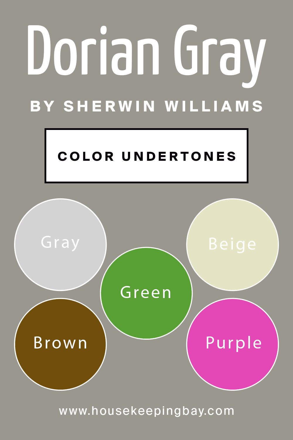
Undertones of Dorian Gray
Dorian Gray SW 7017 by Sherwin Williams is a perfect base for both modern and classic interior styles. This color has gray and beige undertones, each belonging to a neutral palette. Neutrals are the all-time favorites of designers and are the most requested color shades by people worldwide.
You’ll notice a gray base with hints of purple, brown, and sometimes even green undertones.
Dorian Gray is primarily gray and does not lean substantially towards any of these undertones. However, depending on the lighting, fixed features, and furnishings in the area, it can pick up these undertones.
The Dorian Gray color paint is versatile. It can be an accent or coordinating color for shades and tones of the same palette of bright colors.
If you want to get a background that becomes translucent and blends into the overall design perfectly, take a swatch of Dorian Gray shade.
It looks amazing on walls, as a floor coating, or you can use it to customize furniture. It is gorgeous with brown and chocolate tones in big and spacious rooms.
To properly understand what this color is and its shades, imagine mixing gray and beige warm tones in one.
You will get a greige color that perfectly blends subtle, nude undertones, which can complement your apartment and give it a unique vibe of modernized elegance.
housekeepingbay
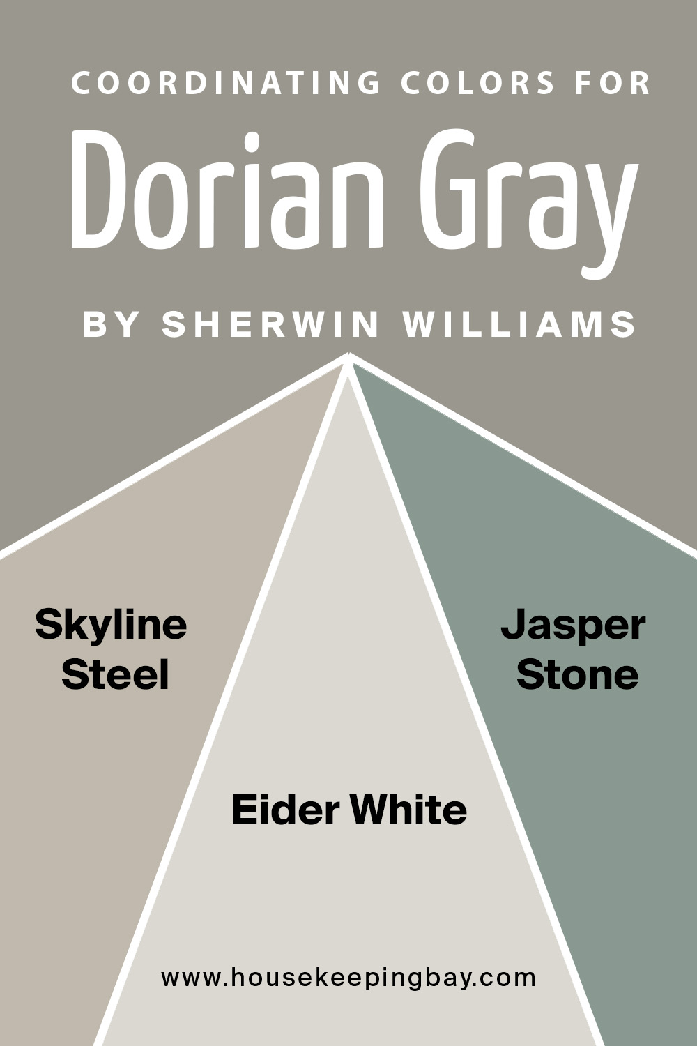
Dorian Gray by Sherwin Williams Coordinating Colors
Warm gray is becoming more and more popular thanks to the active development of modern trends of interior design. Today, shades like Dorian Gray are widely used in spaces in the loft, high-tech, urban and postmodern design.
Revealing the dynamics of the shades of this color scheme, it is easy to create an unusual, eye-catching, and practical environment that allows you to fully relax and, if necessary, easily concentrate on every day and work tasks.
If you are a fan of cool and unusual colors for the interior, make sure to take a look at these shades from the Dorian Gray Sherwin Williams paint palette:
- SW 1015 Skyline Steel
- SW 9133 Jasper Stone
- SW 7014 Eider White
All of these tones can become a beautiful addition to your Dorian Gray by Sherwin Williams based room.
Take a note: It is better to create a color scheme using 2-3 matching shades for one room than to use a lot of similar tones.
You can use SW 9133 Jasper Stone for kitchen and cabinets to create a bright and vivid design that will look stylish and sophisticated.
We also recommend you explore some homes painted with Dorian Gray by Sherwin Williams on the net.
You can take advantage and ask people in the comments section below. Get the real experience to make sure you will be satisfied with the result.
housekeepingbay
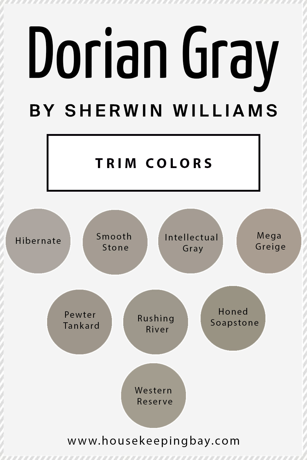
Dorian Gray by Sherwin Williams and Trim Options
The shade is best combined with:
- SW 9573 Hibernate
- SW 9568 Smooth Stone
- SW 7045 Intellectual Gray
- SW 7031 Mega Greige
- SW 0023 Pewter Tankard
- SW 7746 Rushing River
- SW 9126 Honed Soapstone
- SW 9597 Western Reserve
These are overall amazing options for balancing the interior of your apartment with complementing similar shades.
If you want a darker version of Dorian Gray by Sherwin Williams, then you have no choice but to see the beautiful SW 7018 Dovetail paint color.
It’s an incredible cool neutral shade that looks classy and fits any room as a background or its main element.
housekeepingbay
Where can You Use Dorian Gray by Sherwin Williams?
Strict elegance, sublime sophistication, and subtle understatement are the major features of the Dorian Gray SW 7017 paint. It is adored and admired not only by prominent designers but also by amateurs and owners of houses and apartments.
The subtle gray hue in the interior is an excellent basis for adding vibrantly-colored highlights, accentuating the beauty and originality of shapes and textures of all interior components.
Overall, Dorian Gray is a stunning paint color that can be used in a variety of home styles. It’s elegant and timeless, soft and warm, yet at the same time polished and comfy.
Dorian Gray is a great choice if you want a gray color that isn’t cold. Dorian Gray is a great choice for walls, home exteriors, and cabinetry.
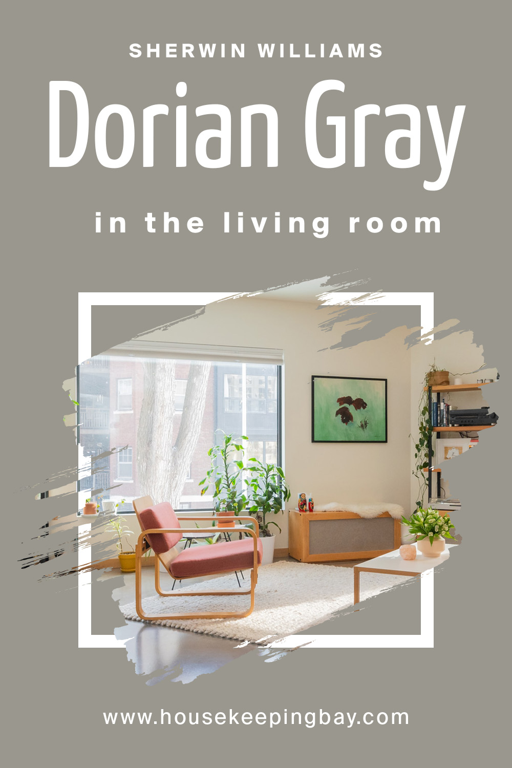
Dorian Gray by Sherwin Williams in Living Room
Beige looks advantageous in the interior of rooms of different purposes. Small corridors and hallways with light beige walls in combination with brown moldings look wider and more spacious.
Bathrooms, small in size, visually increase, and the loggias acquire coziness.
Many who want to be at home in a comfortable environment and relax after a busy day, choose a calm tone for the interior. The living room design in beige color gives peace, a sense of security, and reliability.
This shade relaxes, allowing you to create an unobtrusive environment in harmony and complete balance.
housekeepingbay
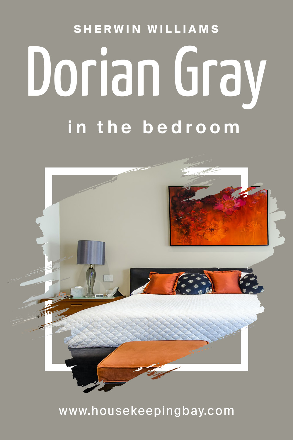
Dorian Gray by Sherwin Williams in Bedroom
Modern research has shown that the presence of bright color spots in the bedroom can lead to excessive arousal that interferes with sleep and proper rest. The gray color comes in very handy here.
Creating an aura of calm and tranquility helps to calm down and fall asleep and makes an invaluable contribution to the creation of a sophisticated modern interior.
Of course, the bedroom is not the best place to experiment with all shades of gray. You should prefer only one, maximum two fundamental tones in this room that will coordinate Dorian Gray.
To create a light and airy interior, a combination of light gray and snow-white is an ideal choice.
housekeepingbay
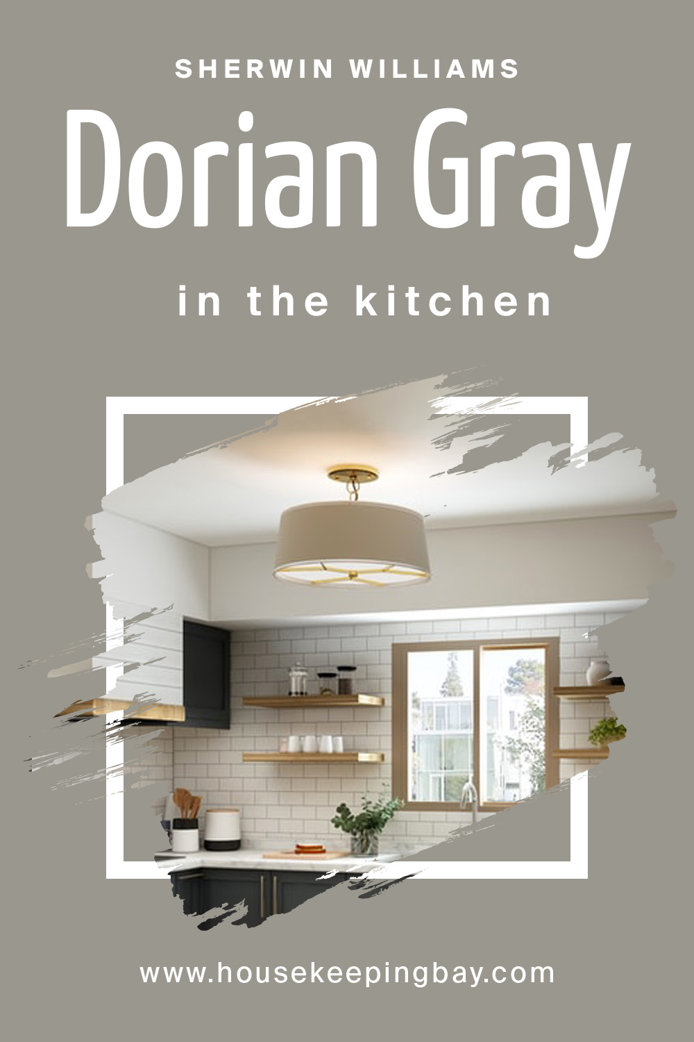
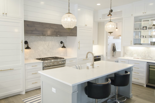
Dorian Gray by Sherwin Williams in Kitchen
An ideal choice for lovers of refined and elegant interiors. You will be surprised how good gray looks in a kitchen space. Dilute the gamma with white, add elegant fixtures and appliances to create a stylish kitchen.
In the design of the kitchen, gray shades are an inexhaustible source of inspiration for any designer. For a small kitchen, the ideal solution would be a shade of mountain mist.
Applied to the walls, it will visually enlarge the room. And an apron or tabletop, made in this tone, will bring a touch of freshness and morning coolness. A classic and win-win option is a duet of gray and white.
The set, made in smoky gray tones, will look especially elegant against the background of snow-white walls and a light floor. Milky white furniture surrounded by graphite and wet asphalt looks no less stylish.
housekeepingbay
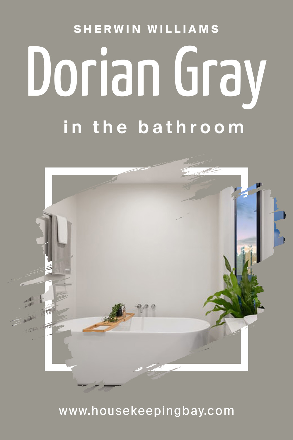
Dorian Gray by Sherwin Williams in Bathroom
If you’re about to use it in your bathroom, this shade is incredibly soothing and relaxing and evokes feelings of coziness and comfort.
You can be sure of the win-win of this option if you design your bathroom in Dorian Gray, and by combining it with your favorite shade, you can make the area as comfortable as possible for yourself.
housekeepingbay
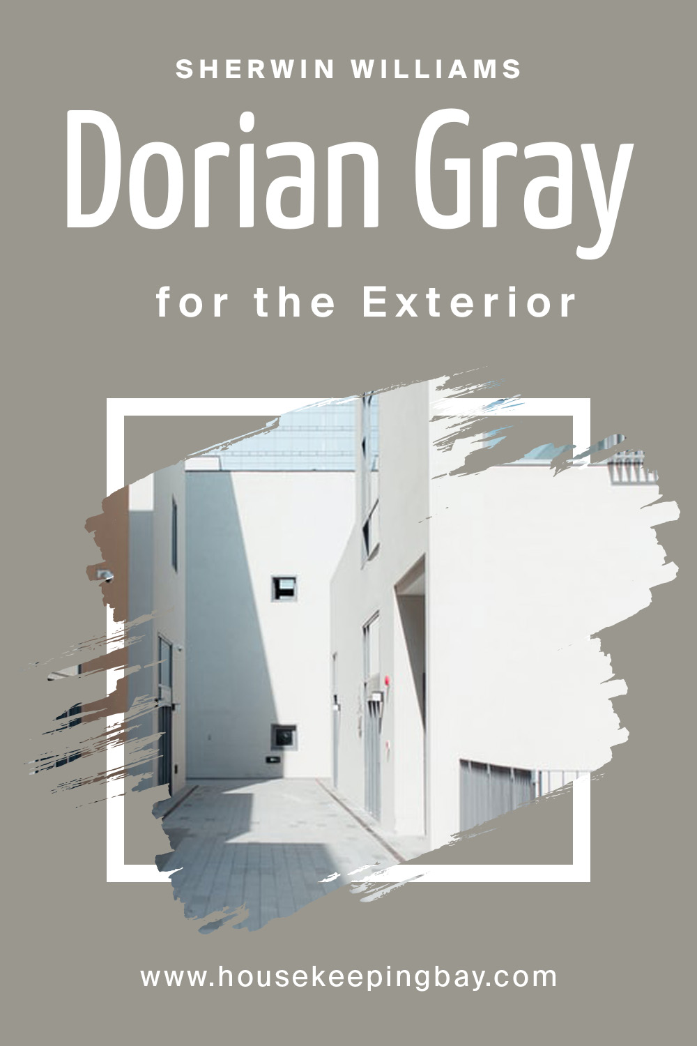
Dorian Gray by Sherwin Williams in Exterior
Dorian Gray by Sherwin Williams is an excellent choice for the outside.
It works well with both warm and cool tones, allowing you to play around with colors and textures.
housekeepingbay
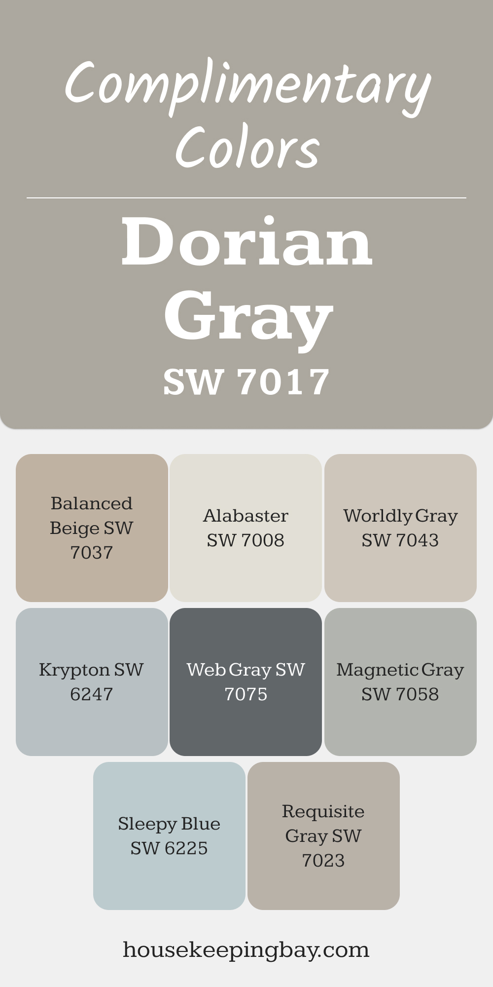
Complimentary Colors for Dorian Gray SW 7017 Paint Color by Sherwin Williams
Dorian Gray pairs effortlessly with Alabaster for a crisp, airy look or with Balanced Beige for a subtle contrast. For those who enjoy cool undertones, Krypton and Sleepy Blue add a refreshing hint of color that complements the timeless gray.
For a bolder approach, consider Magnetic Gray or Web Gray to add depth and character. Requisite Gray and Worldly Gray provide harmonious blends, creating a cohesive palette that’s versatile and inviting.
via housekeepingbay.com
Color Comparison
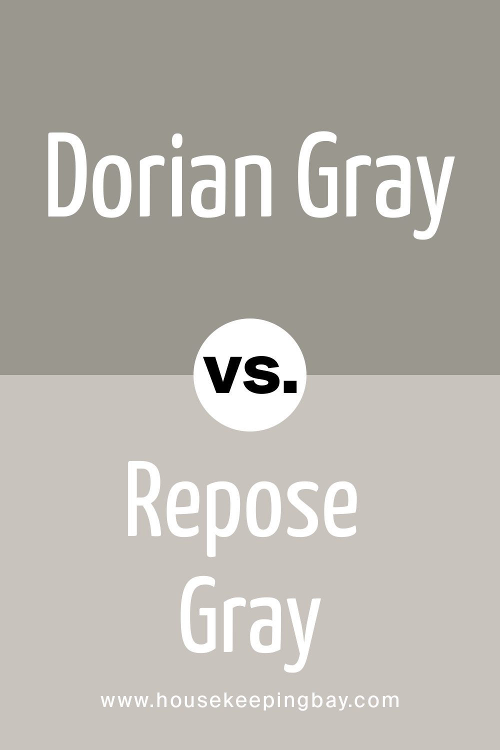
Dorian Gray vs. Repose Gray
Repose Gray is a fantastic warm light gray that we really recommend because it is perfect when it comes to painting all the walls in the house with neutral light tones.
Versatility. This gray is perfect because it not only looks beautiful during the day in natural light but is also one of those rare colors that look great in the dark under artificial light.
When changing the color temperature of the lighting, unpleasant shades do not appear.
In rooms with plenty of natural light, Repose can produce a very faint bluish-gray cast.
housekeepingbay
Related: Repose Gray SW 7015 by Sherwin-Williams
Dorian Gray vs. Dovetail
If you’re looking for something darker than a neutral mid-tone warm gray, then Dovetail is a great choice. It is well suited for interior doors and cabinets.
It is unlikely to be suitable for painting all the walls in the room, but the accent wall of this color will look great.
Dovetail is a win-win for when you want to add contrast to a room but don’t want to use very dark tones to avoid losing the overall lightness.
Dovetail can take on a warmer hue in artificially lit rooms. Although it does not harm too much, the shade remains beautiful.

housekeepingbay
Related: Dovetail SW 7018 by Sherwin Williams
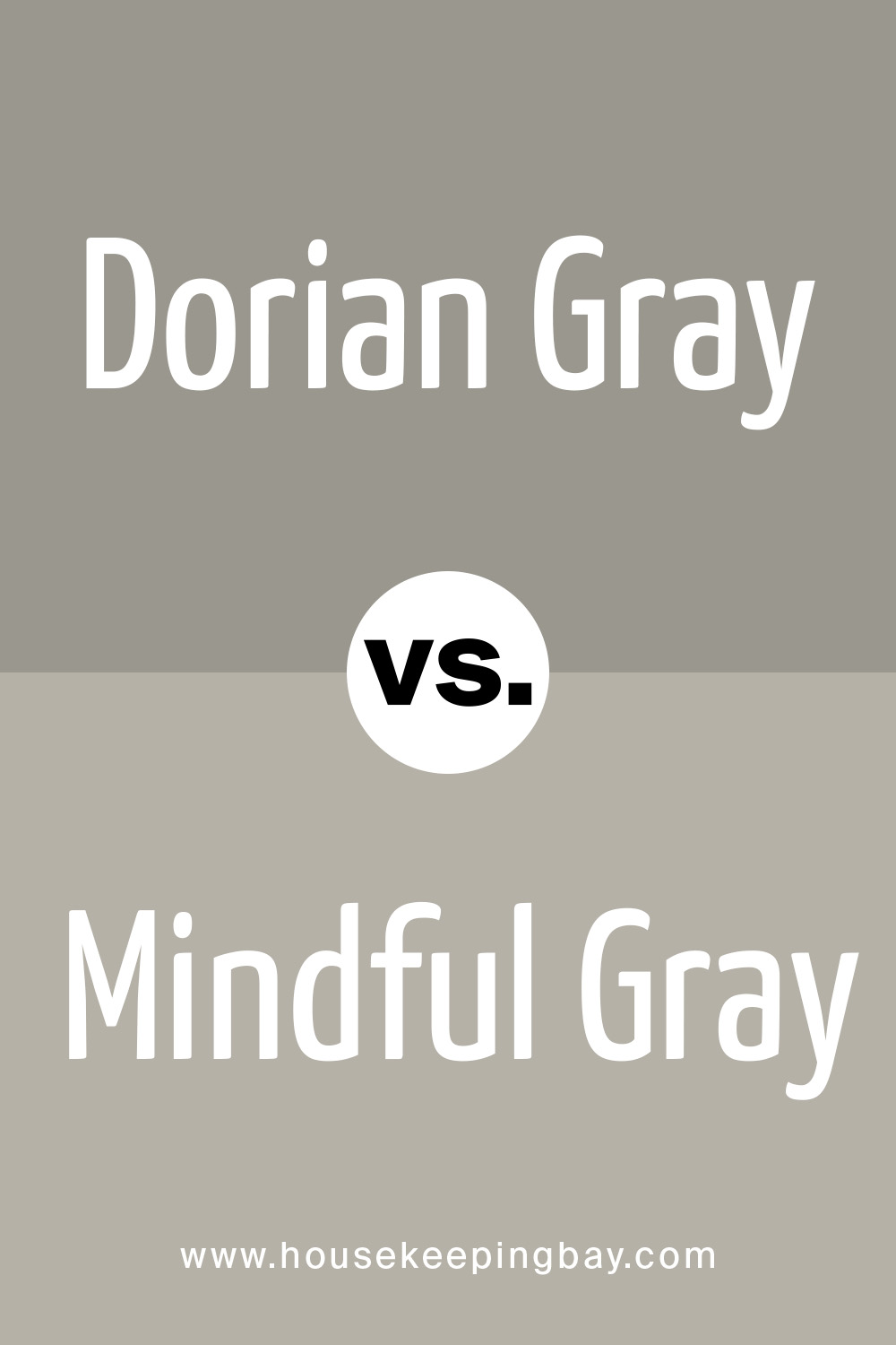
Dorian Gray vs. Mindful Gray
Mindful Gray is one of the prettiest and safest warm grays and is great, especially for furniture.
An extremely versatile warm gray that looks best in cabinets and other furniture, as well as facades. It’s a bit heavy to get a warm gray on the walls, but it’s okay if you’re looking for a warmer, mid-tone gray.
Mindful Gray can look cold but still not lose its splendor in rooms with plenty of natural light.
However, if you want a warm gray that stays warm even in these lighting conditions, then Mindful Gray is not the best solution here.
housekeepingbay
Related: Mindful Gray SW 7016 By Sherwin Williams | Ultimate Guide
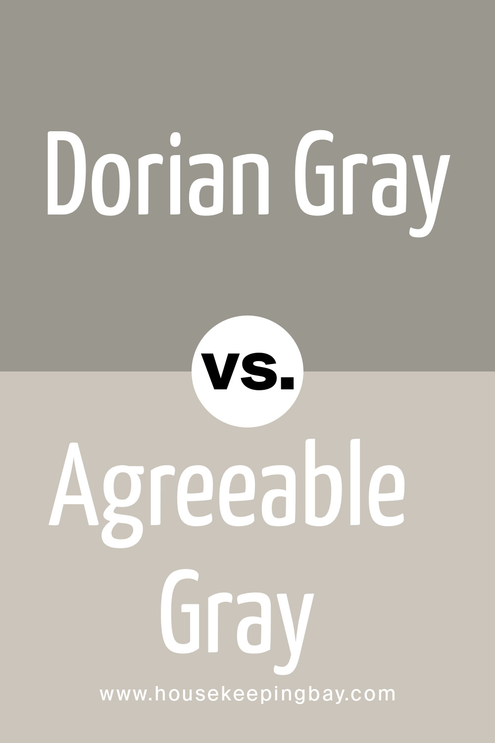
Dorian Gray vs. Agreeable Gray
This is another trustworthy warm light gray that is very close to Repose Gray but slightly warmer and lighter.
This color is often recommended to clients with Dorian Gray as a general color for the entire interior if there is a lot of natural light in the room, as the former can look too white in such conditions.
housekeepingbay
Related:Agreeable Gray SW 7029 by Sherwin-Williams

housekeepingbay
16 thoughts on “Dorian Gray SW 7017 by Sherwin Williams”
Leave a Reply


I have a two toned repose gray top wall and Dorian gray lower wall with pure white molding as the divider in my dining room. I love it. My small kitchen is right next to it and thinking of painting the cabinets Dorian gray and the walls repose gray with an accent wall in Hale Navy or Mysterious by Benjamin Moore. Any advice. My countertops are speckled black and white. I thought Mysterious might be better, as not quite as blue. But I love the navy colors so much.
To me, colors you provided (Dorian Gray, Repose Gray, Hale Navy) are great! Besides, you decide what colors to paint your hone! If you like them, then go for it!
Thank you for introducing SW Dorian Gray in such fine detail. I am thinking about using this color for my South Facing 100+ years old Edwardian House as the main body color but am afraid it may get too light in the sun. I can also use Dovetail as main color but will that become too dark? I have 2 gables with lots of corbels and I don’t want to highlight these features. What sort of medium/dark shade colors can go for the trims? (would not want light color as I am on a busy road with a lot of dust) Will the Urban Bronze or Gaunlet Gray trims make the house very gloomy?
Would love an answer to the above question. Corrina did you happen to choose colors yet? If so, what are they and are you happy with the finished product?
Hey, Wendy! No, I haven’t decided on colors yet. I’m pretty sure I’ll use SW Dorian Gray as a main body color and go for darker grays on my trim as I planned before.
I want to use SW Dorian Gray in my kitchen but I’m not sure whether it’s warm-toned. See, my kitchen walls are now warm-toned white and the furniture is wooden, so the overall palette is in warm colors. That means I need a warm-toned gray as well.
Yes, Dorian Gray is a warm-toned shade of gray. In addition, I’d say this color has plenty of depth which means it won’t look plat on your walls. For the kitchen, it is a great choice as for me! Besides, it’s so universal that you can combine it with other colors successfully.
Hi guys! First of all, thanks for such a detailed guide on Dorian Gray color! I just want to ask you whether it can be used in a hallway if there is a dim light?
Hello! Well, in your case, Dorian Gray would probably not be the best option. See, in a dim light, this color will look darker than it is, thus making the space look smaller. So you should try lighter shades of it or use more white in your hallways. White color can help with making the space look airier.
What if I wanna use dorian gray sherwin williams with navy shade? Any advice and examples are welcome!
Mixing gray and blue colors is a classic combination. Consider making navy your accent point or trim color to enhance the dorian gray paint color and you’ll get a perfect combo.
This is one of the best ever dorian gray sherwin williams reviews I have ever read! So happy to find it. Keep on doing a great job!
Thanks for your kind words! We appreciate that you found our work useful and this is what really keeps us going.
Hi, guys! I don’t have a stud finder, but I do have a metal detector. Do you think this will work to find studs? I`m afraid to miss some. You know what they say, penny-wise, pound-foolish. I just don’t want to ruin everything and do the whole process twice!
What’s up? First of all, I wanted to say that I love this piece because I spent days searching for a good review on Sherwin Williams Dorian Gray color, and finally found a decent one! Thank you guys for sharing. Second, can you advise what color of carpet goes with Dorian Gray by Sherwin Williams?
Hi there! We are really thankful for your reaction and kind words. As for your question, we recommend considering white shades for soft stuff. Find yourself a nice, white or off-white rug or carpet and compliment your room. Good luck with your project!