On the Rocks SW 7671 Paint Color by Sherwin-Williams
A complete guide that will introduce you to this color
Gray color is a go-to option when you want to make your living space look calming and elegant. However, it can be difficult to choose the best-fitting gray that will work in your home due to the wide variety of shades available.
This is why today we will tell you more about one of the shades of gray by Sherwin-Williams. The color is called On the Rocks, and you will learn what kind of gray it is, how it works in different rooms of your home, and how to coordinate it.
Also, we will explain what undertones it has and how it reacts to light. Finally, you will learn what trim colors will work with SW On the Rocks and other helpful information.
via lifefiguredout
What Kind of Color Is On the Rocks SW 7671?
SW On the Rocks color is a bright gray that is neither warm nor cool. As Encycolorpedia says, this shade of gray is pretty versatile, which means it will work well with a broad range of hues in your home. As a result, you should not have much trouble incorporating it into your home interior.
However, you should be cautious with light when using this paint in your home! Although SW On the Rocks does have a tiny hint of warmth, it also has the tendency to reveal its subtle, cool undertones more prominently under strong lighting.
So, if you are looking for a soft and warm-toned gray, this color might not be your best option.
housekeepingbay.com
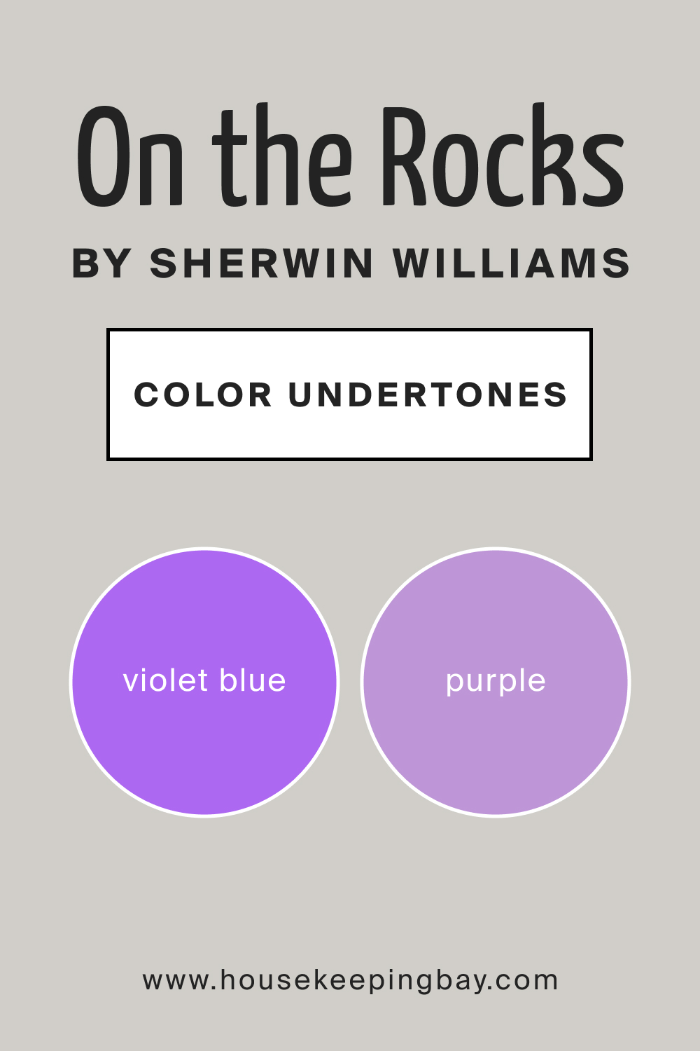
What Undertones Does On the Rocks SW 7671 Have?
Knowing the paint color’s undertones is a must if you want to use it successfully in your home. Undertones can be rather tricky and only seen in specific lighting conditions. As a result, the color you like on a swatch may read completely differently on the wall!
Speaking of SW On the Rocks, it reads pretty softly, thanks to a violet undertone. In some lighting conditions (i.e. north-facing or cool bulbs), this violet undertone can lean slightly cooler though.
Nevertheless, SW On the Rocks will rarely look like a violet-blue color anyway! On the other hand, if you use SW On the Rocks on the walls of a room with solid southern or western afternoon sunshine, this gray color will pick up a little bit of warmth.
housekeepingbay.com
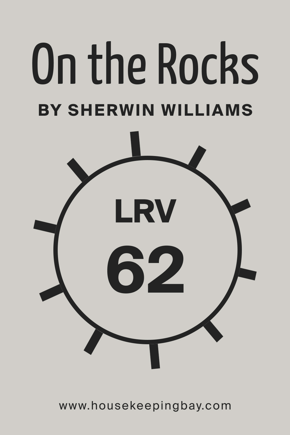
LRV of SW On the Rocks Paint Color
The LRV (light reflectance value) of SW On the Rocks is 62, which means this color is on the lighter side of the LRV scale. By the way, this scale ranges from zero (which is the darkest black) to 100 (which is the purest white). So, the higher the LRV, the lighter the color reads on the walls and the more light it reflects, and vice versa.
housekeepingbay.com
Coming back to SW On the Rocks with its LRV of 62, it will read differently in distinct types of light. For example, if you have a north-facing room, SW On the Rocks will most likely lean more into its gray base. As a result, it will look much colder with a violet-blue hue. But still, it won’t look icy.
On the other hand, if you use this color in a room that has south-facing light or afternoon western sunshine, be ready so that SW On the Rocks may look a bit warmer (but without looking like a warm gray).
housekeepingbay.com
What is LRV? Read It Before You Choose Your Ideal Paint Color
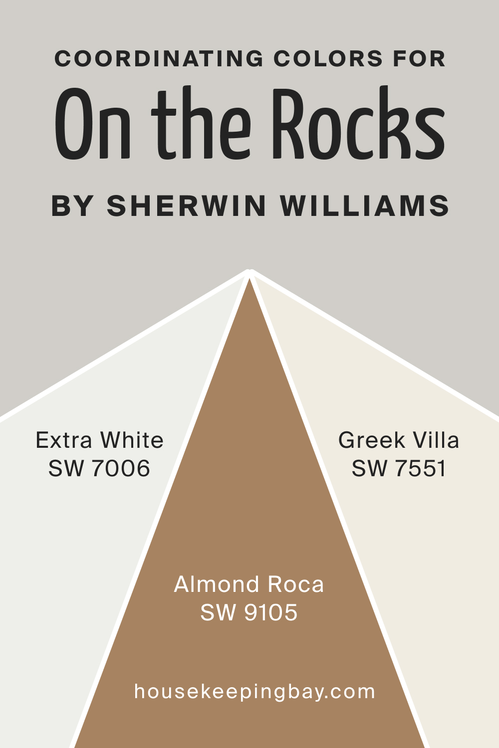
Coordinating Colors For SW On the Rocks
Proper coordinating colors allow you to achieve a harmonious and good-looking palette in your home. But since it’s often challenging for homeowners to select the best colors to coordinate, we have prepared a few ideas for you that will work with SW On the Rocks:
- SW Extra White
- SW Greek Villa
- SW Almond Roca
housekeepingbay.com
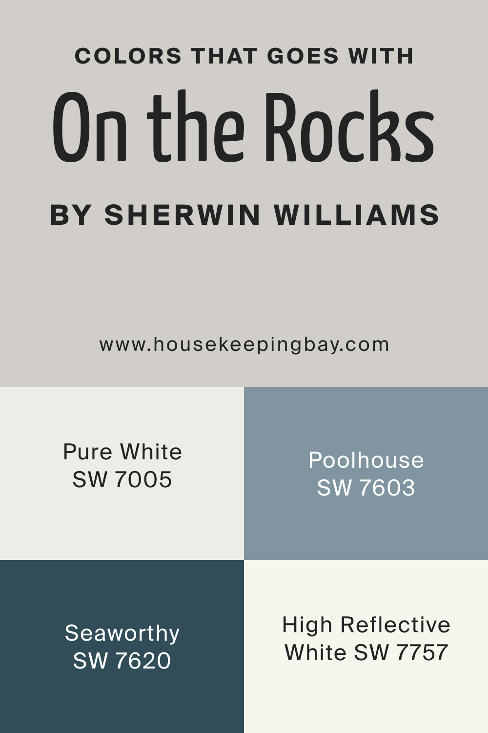
Colors That Go With SW On the Rocks SW 7671
SW On the Rocks is a versatile color, which is why it will work well with quite many colors. For example, you can pair it successfully with the following ones:
- cool gray paint colors that are the same depth or darker
- gray colors with blue or blue-green undertones
- greige, cream or beige paint colors, but only if they’re super muted and in the off-white range!
- whites (SW Pure White, SW High Reflective White)
- blue-gray paint colors
- navy blues (SW Seaworthy, SW Poolhouse)
housekeepingbay.com
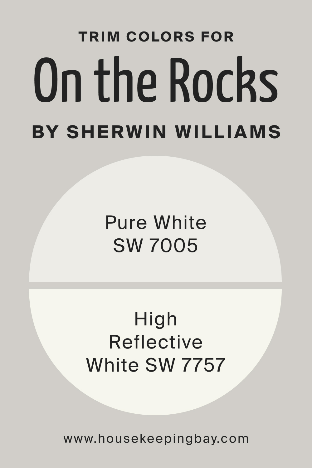
What’s the Best Trim Color For SW On the Rocks SW 7671?
For SW On the Rocks as an interior wall color, we recommend using white on your trim. To be precise, Sherwin-Williams High Reflective White will work perfectly well. But if you like a slightly softer approach, you might want to try Sherwin-Williams Pure White.
White is a versatile color, so you won’t have trouble pairing it with gray like SW On the Rocks!
housekeepingbay.com
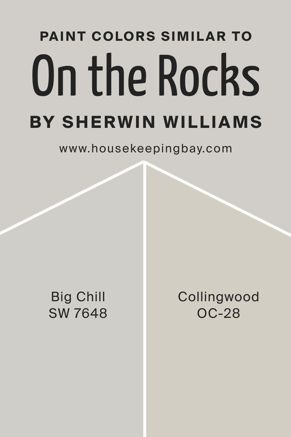
Paint Colors Similar to SW On the Rocks
No matter why you are looking for a similar paint color to use instead of the SW On the Rocks. You must realize that if you are looking for an exact color match (especially in a different brand), you will never find one.
However, there are many colors that look similar, with just a slight difference in their LRVs, undertones and nuances. For example, you might like how these two read:
- Sherwin-Williams’s Big Chill
- Benjamin Moore Collingwood
housekeepingbay.com
Comparing SW On the Rocks With Other Colors
To help you see the unique features and nuances of SW On the Rocks gray color, we have compared it with several other paints that look very similar. As a result, you now have a chance to read and compare what makes this gray unique and why.
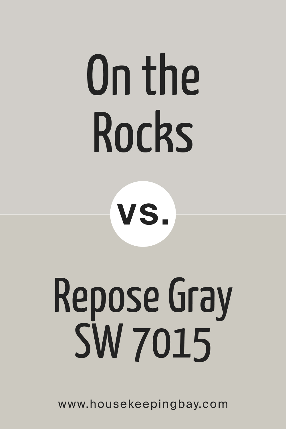
SW On the Rocks vs Repose Gray
SW Repose Gray reads warmer with a more noticeable beige hue compared to SW On the Rocks with its cooler undertones. The light reflectance of these colors is pretty similar, but distinct undertones make them unsuitable for being used in the same space.
housekeepingbay.com
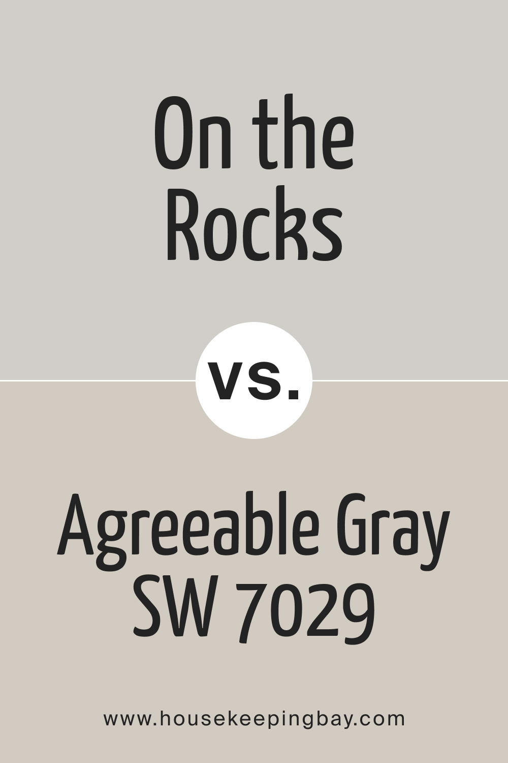
SW On the Rocks vs Agreeable Gray
Compared to SW Agreeable Gray , On the Rocks looks cooler and reveals its violet undertone much more. Due to this imbalance in their hue (violet of SW On the Rocks vs warmer beige of SW Agreeable Gray), these two don’t work well together.
housekeepingbay.com
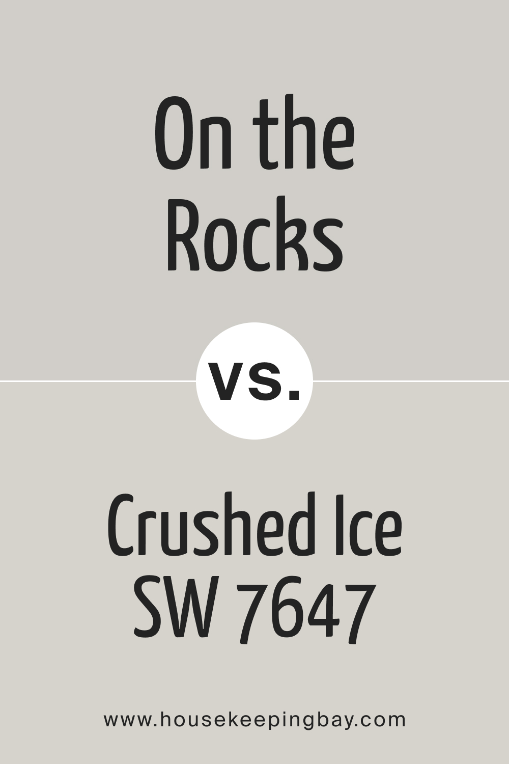
SW On the Rocks vs Crushed Ice
SW Crushed Ice is a tricky color because it has a slightly green undertone. however, in the right interior lighting, it can give off a slight blue or violet undertone. Compared to this color, SW On the Rocks reads grayer and a bit cooler.
housekeepingbay.com
SW On the Rocks vs Big Chill
Sw Big Chill has a soft blue undertone. And since its LRV is 62, it reads almost the same light as SW On the Rocks. In fact, it’s pretty hard to see the difference between them, so you won’t be able to sue them together. But they might work interchangeably.
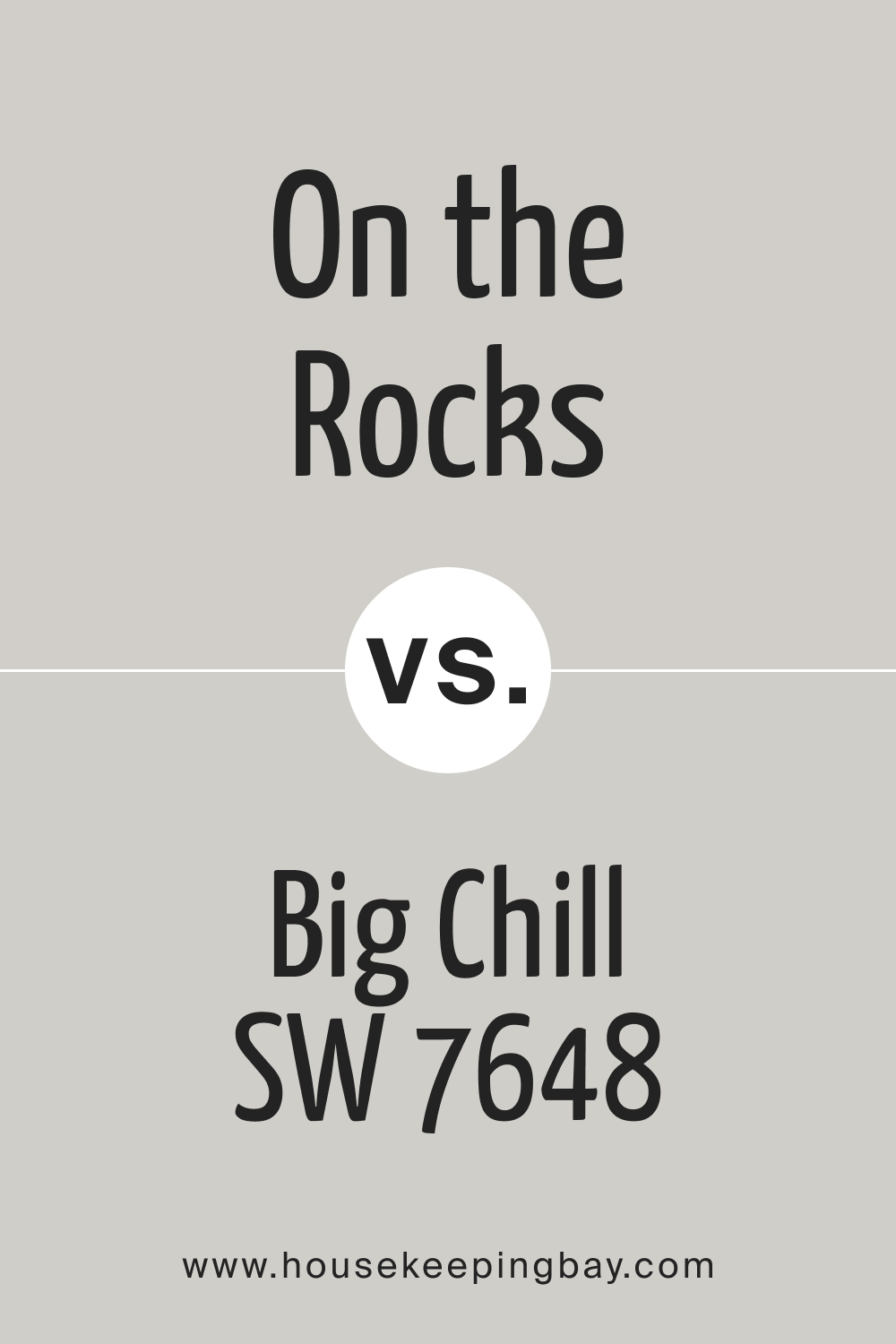
housekeepingbay.com
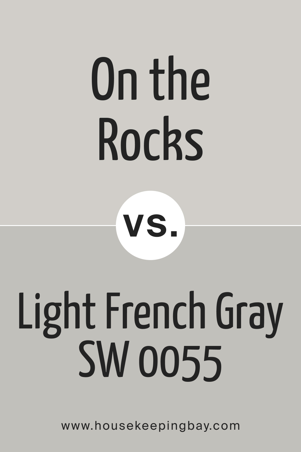
SW On the Rocks vs Light French Gray
SW Light French Gray reads softer and grayer than SW On the Rocks, all because of its vague purple undertone that gives pleasant depth to this color. However, since its LRV is 53, this color looks somewhat deeper than SW On the Rocks.
housekeepingbay.com
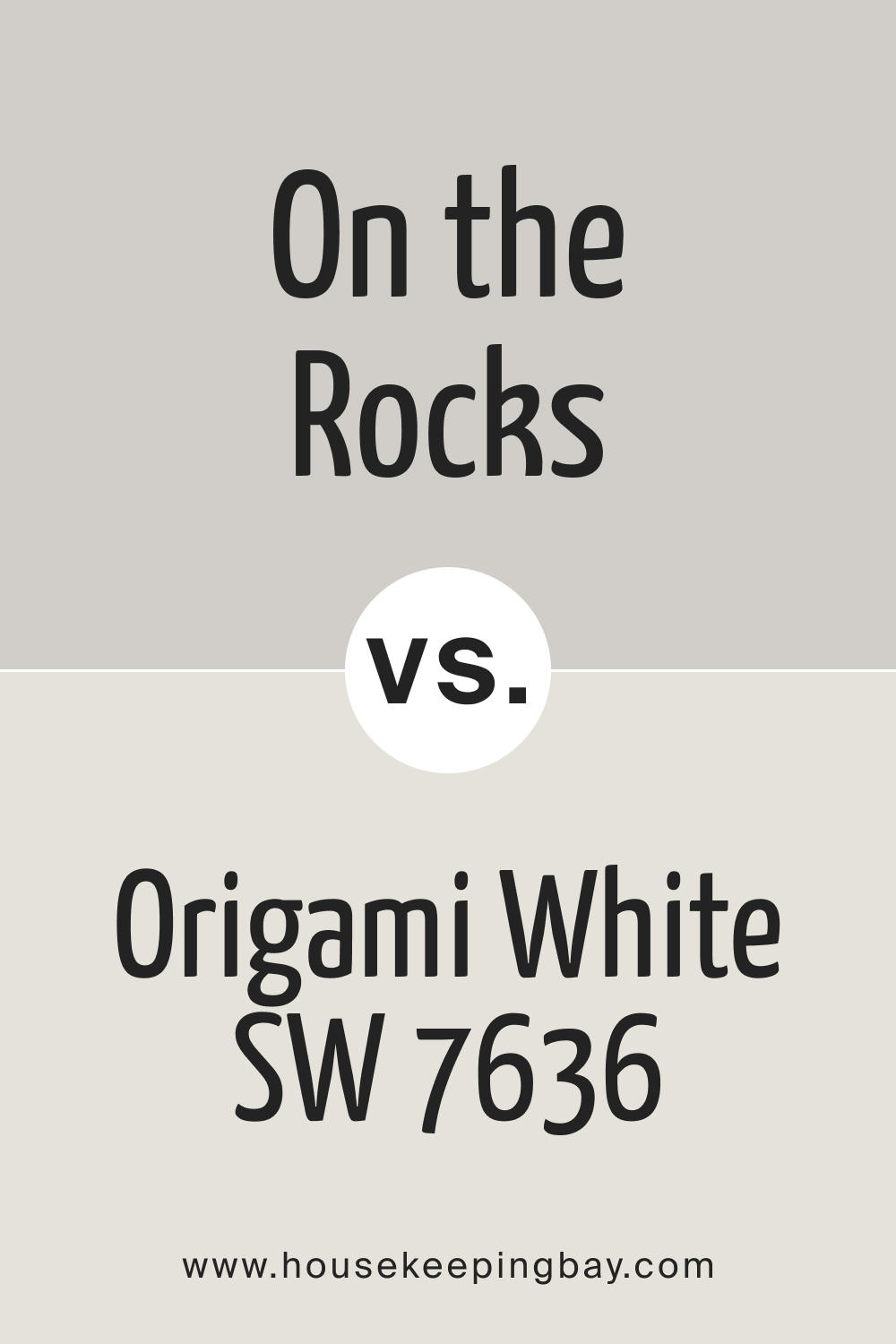
SW On the Rocks vs Origami White
SW Origami White is a white color with a very subtle and barely seen violet undertone. Thanks to this violet hue, SW Origami White pairs nicely with SW On the Rocks, highlighting its gray hue with the brightness of the white.
housekeepingbay.com
Where In Your Home to Use This Color
As we already said, SW On the Rocks is a versatile color. It can work with different colors and suit many spaces in your home. Below, we explained how this shade of gray could work in different rooms.
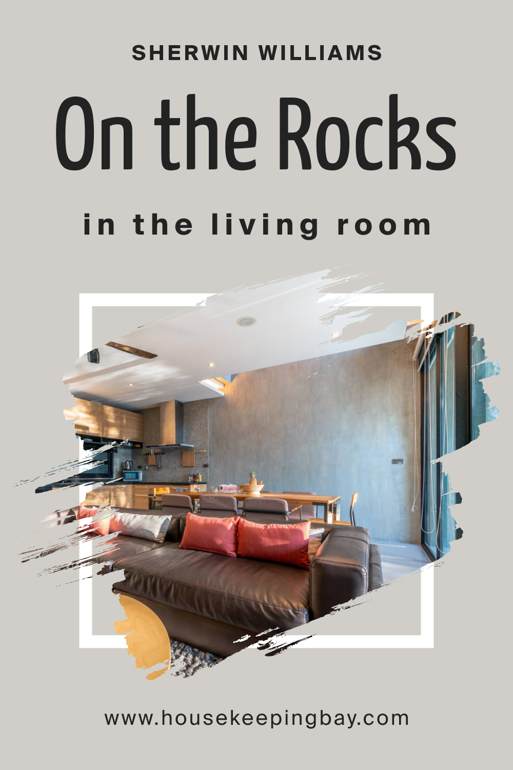
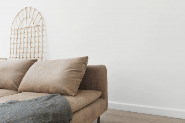
On the Rocks SW 7671 in the Living Room
It can be a nice color for the living room walls, but you must consider the light. If you have a north-facing room, SW On the Rocks will most likely lean more into its gray base. As a result, it will look much colder with a violet-blue hue.
On the other hand, if you use this color in a living room that has south-facing light or afternoon western sunshine, SW On the Rocks may look a bit warmer (but without looking like a warm gray).
housekeepingbay.com
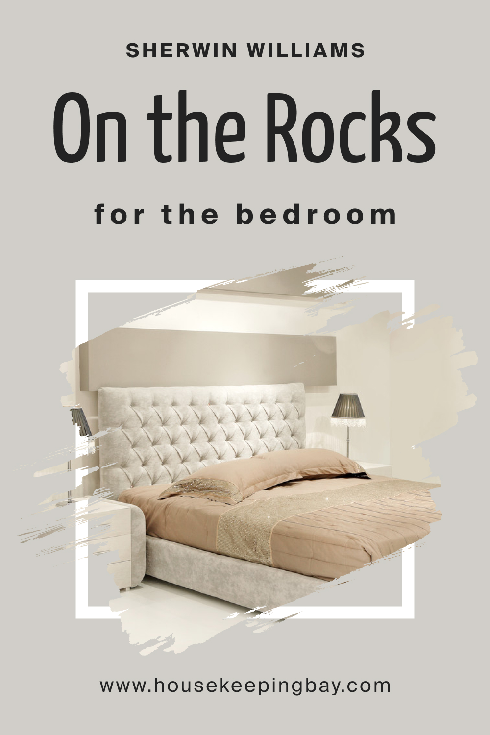
On the Rocks SW 7671 in a Bedroom
Depending on the light, SW On the Rocks may read either cooler or warmer in your bedroom. But you can adjust the way it works there by adding a few decor elements of other colors. E.g., to enhance warmth, add warm-toned colors and to make the space feel cooler, stick to cool-toned colors instead.
housekeepingbay.com
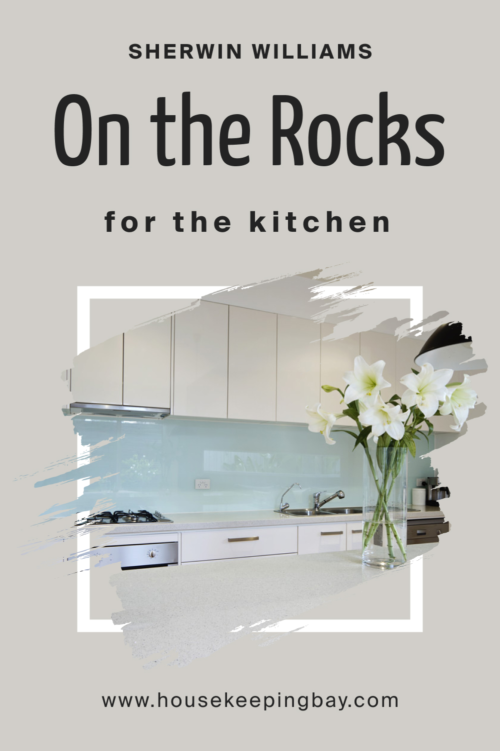
On the Rocks SW 7671 and Kitchen
In your kitchen, you can use this color on all the walls or only paint the accent wall. It’s up to you. But you must consider the light and sample SW On the Rocks in advance. Except for this nuance, it will work great with different textures and materials like marble, steel, and tiles.
housekeepingbay.com
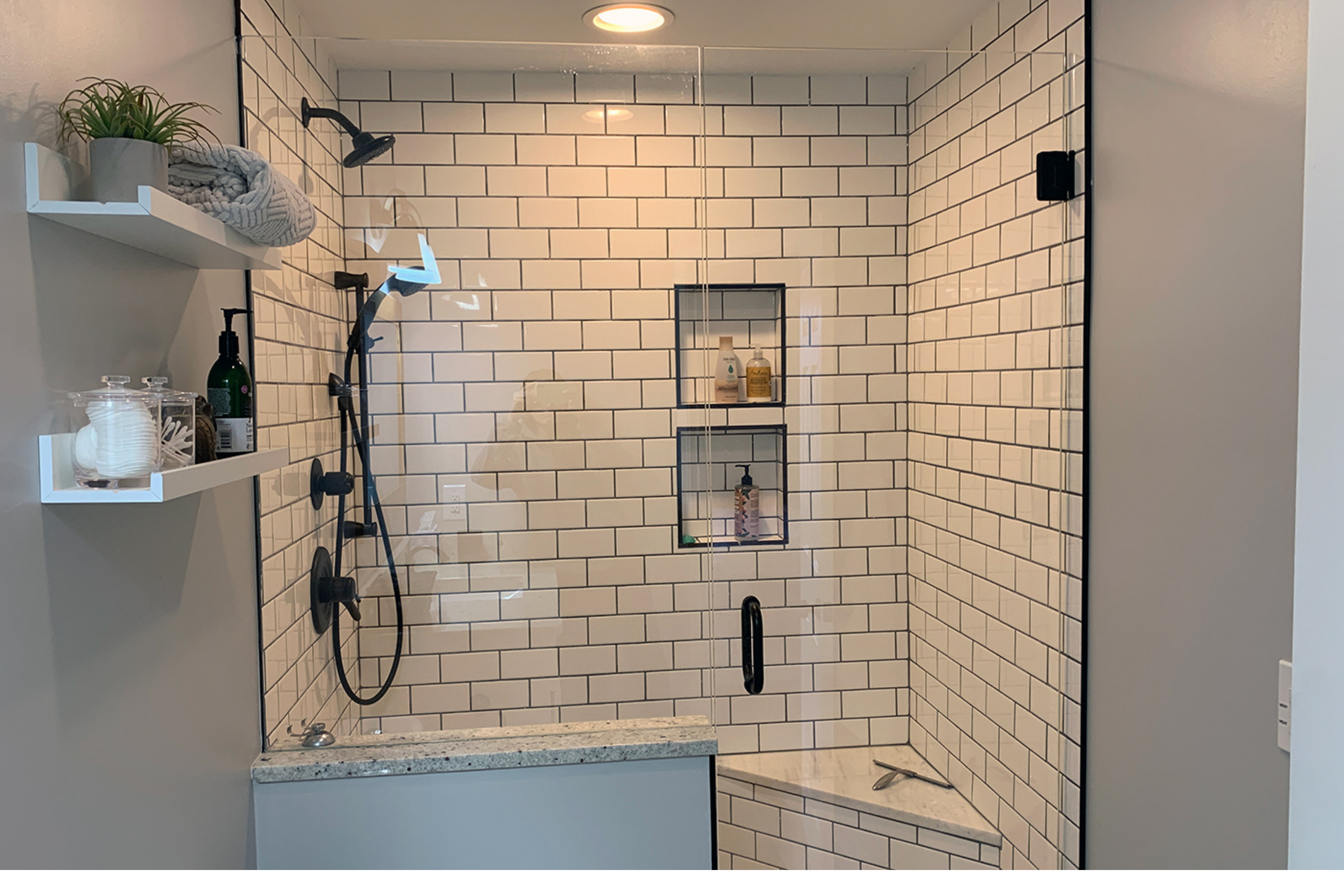
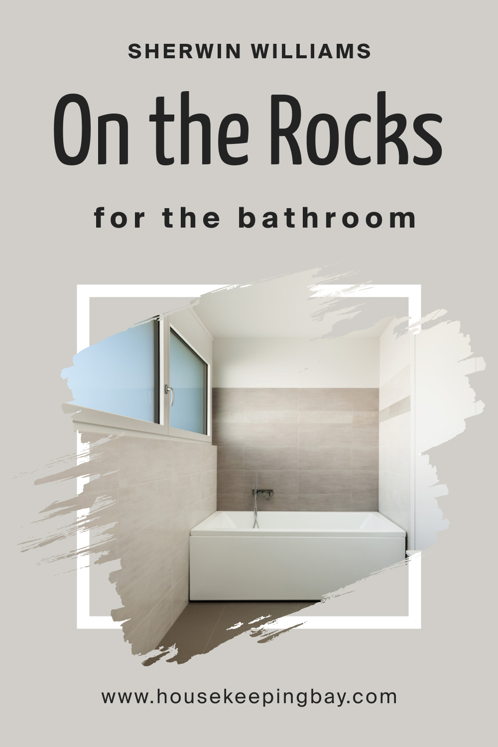
On the Rocks SW 7671 in the Bathroom
Thanks to its balanced nature, SW On the Rocks can be a nice color choice for your bathroom. It’s best if the room has a window and enough natural light. But even if it doesn’t, you can still use this gray color on your vanity sink!
housekeepingbay.com
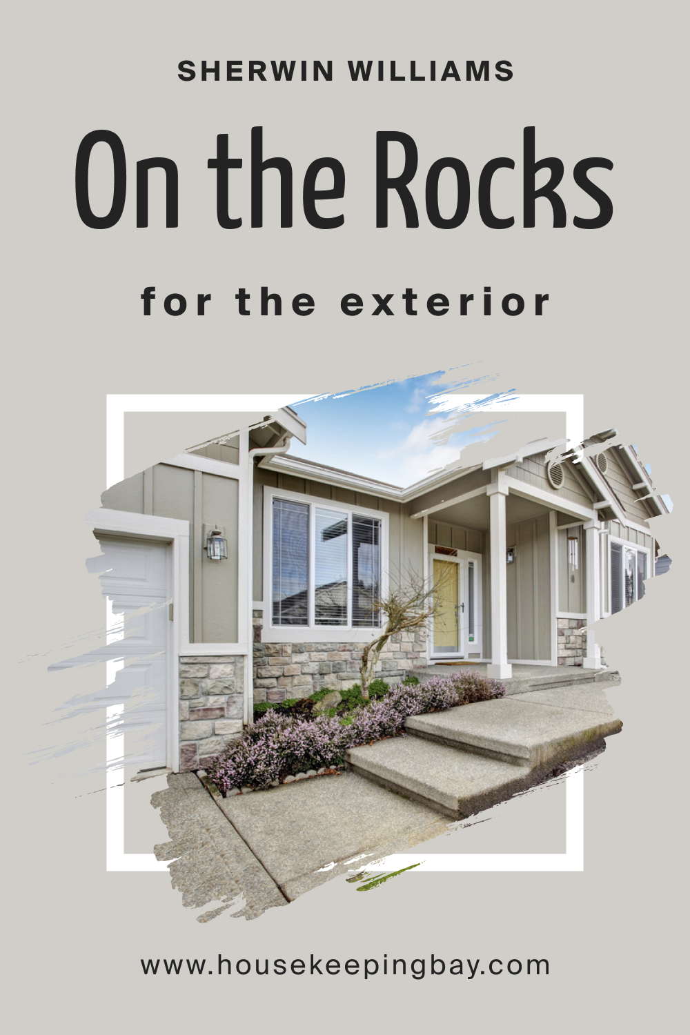
On the Rocks SW 7671 for the Exterior Use
It’s quite a lovely color for exterior walls! It doesn’t read too dark or too light, and this color will hardly seem washed out. However, in direct light, it may read slightly warmer, so keep that in mind!
housekeepingbay.com
Now you know what kind of color SW On the Rocks is. You know its undertones, LRV, trim colors and more. You also learned how it works with other colors and in what rooms it’s best to use it.
housekeepingbay.com
This guide will help you find the optimal space in your home for revealing the beauty of this balanced and calm gray.
Ever wished paint sampling was as easy as sticking a sticker? Guess what? Now it is! Discover Samplize's unique Peel & Stick samples. Get started now and say goodbye to the old messy way!
Get paint samples


Frequently Asked Questions
⭐Is SW On the Rocks popular?
SW On the Rocks isn’t as popular as the warmer end of the gray color family.
⭐Does SW On the Rocks read blue?
No, this shade of gray doesn’t read blue. But it may reveal a slight hint of purple.
⭐Is it a warm or cool color?
This color is neither warm nor cool.
4 thoughts on “On the Rocks SW 7671 Paint Color by Sherwin-Williams”
Leave a Reply


With SW On the Rocks as an exterior wall color, what color would you suggest for the shutters?
I guess a darker gray might work well, or black, as an option. It also depends on the color of your roof, by the way! The roof and the shutters a
I want to paint my exterior walls with SW On the Rocks. Do you think it will work with the black front door?
I guess it will. Gray and black usually work pretty well together. But I’d recommend you use some white as well to make the contrast more noticeable and add a note of crispness.