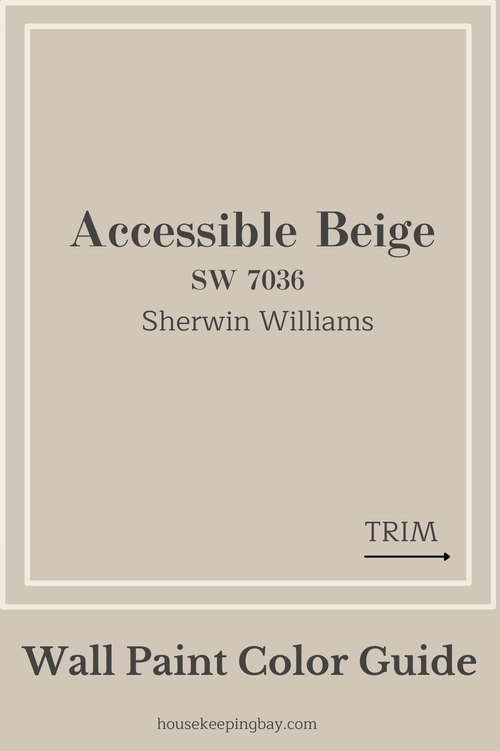
Accessible Beige SW 7036 By Sherwin Williams
All you wanted to ask about this paint color, from its undertones to the most suitable shades it can be combined with
Whenever we are up to a home renovation project that involves the use of paint, this is always about a challenge for most of us! Since most people are pretty far from even the brief knowledge regarding paints, their colors “anatomy”, and the nuances of color combinations, picking the correct wall paint turns into a russian roulette.
Fortunately, there is an option that can become a beacon of salvation to such home painters, and we are talking about neutral colors.
For instance, such as Accessible Beige by Sherwin Williams. This paint color belongs to neutrals, but to be more precise, it can be considered a light warm greige. Unlike most beiges, this one also has gray notes in it, thanks to this, it is not that “dirty” beige as you might think of!
And since it is a rather versatile color, we will tell you what rooms it can be used in, what colors it is best to combine it with, and we will also provide you with the basic information on this neutral greige to convince you that this is exactly what you need for making your home always stylish and cozy!
What Is Accessible Beige As a Paint Color?
Table of Contents
Well, before we lead you through the detailed and precise description of Accessible Beige paint color, its nuances of use and its “anatomy”, let us first of all introduce you to it briefly and explain what this color actually is.
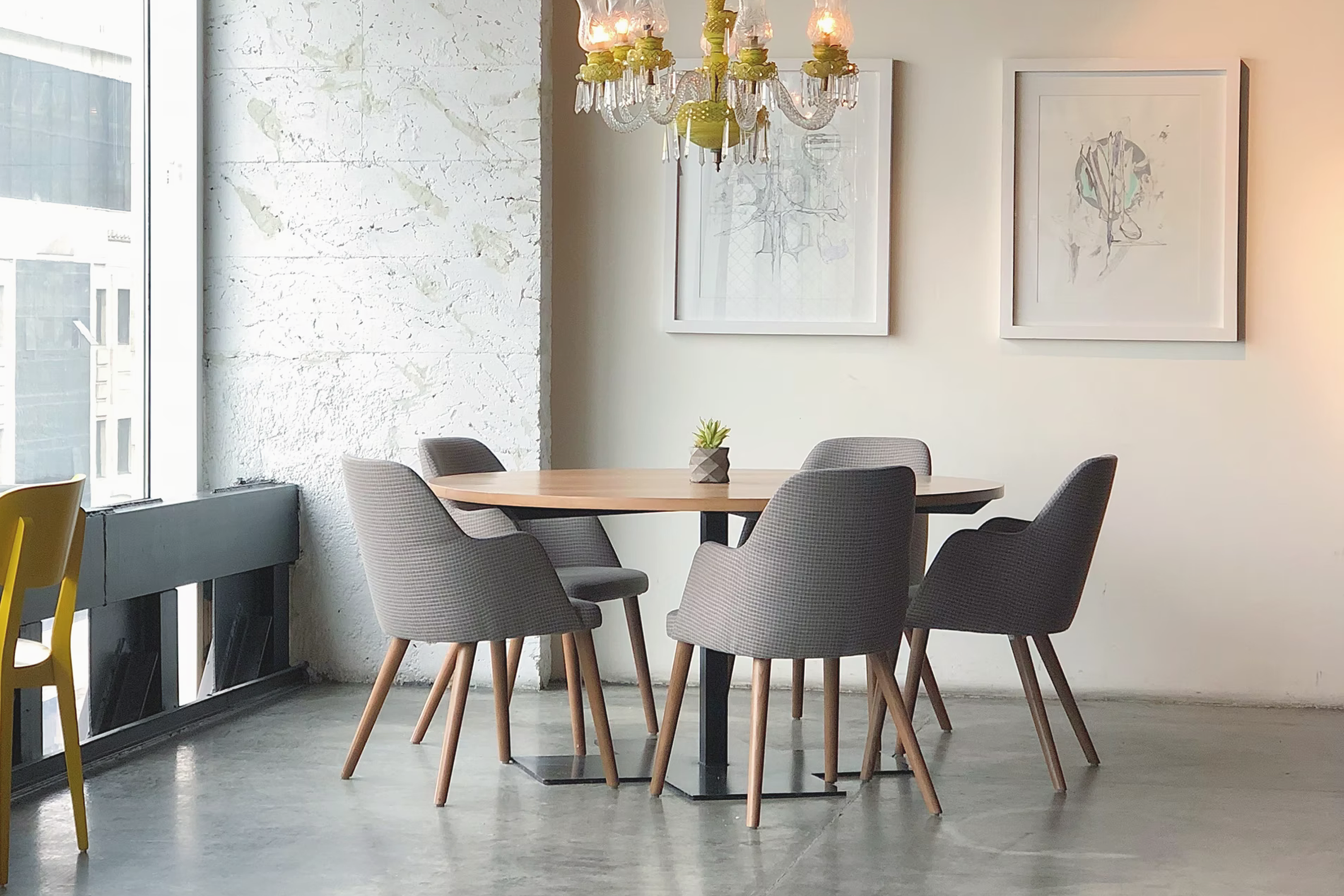
So, in general, Accessible Beige by Sherwin Williams is one of the brand’s top warm and neutral greiges.
The color is rather light and it doesn’t have that dirty look that quite many beige paints are known for. It is possible because Accessible Beige also contains quite a significant note of gray, as Encycolorpedia says. Thanks to it, the paint looks well balanced with beige and gray tones being equally shown.
But if you are worried that Accessible Beige will look yellowish on your walls, be sure that it will not happen! Even though this paint still has more of beige than gray in it, there is not enough yellow which means that it will never be that beigey-beige.
In addition, this paint color is rather versatile being able to look different depending on the exposure and lighting. For instance, if you paint it onto the walls in a north and east-facing room, you can expect the paint to look more on the gray side.
On the other hand, when being painted onto the walls of a south or west facing room, Accessible Beige will reveal way more of its greige warmth.
This is the major reason why so many homeowners prefer this paint color for their interior paint projects. And if you are fond of warm interiors, consider taking this color into account when choosing paint for your home.
Housekeepingbay.com
Housekeepingbay.com
Is Accessible Beige Warm Or Is It Cool?
It’s warm, definitely warm! Accessible Beige is a warm neutral being significantly more yellow and warmer than the other greige paints that have a bit of gray and green in them.
However, it still does not have enough yellow in it to be considered pure beige. This is why Accessible Beige is an ideal pick if you need a paint to update your earthy color schemes!
But even though Accessible Beige is warm itself, if compared with other colors, it may sometimes look a bit like a cool shade or greige. This is why we always recommend you compare the paint you are going to use with other paints used in the room to see how it will look beside them.
Accessible Beige By Sherwin Williams Undertones
When choosing a proper paint for your home, paying attention to its undertones is a guarantee that you will not end up with something completely different from what you initially expected.
If we don’t know for sure what undertones our paint has, it will be pretty hard to predict how it will look on the walls in different lighting and if combined with other colors.
With neutral paint colors, however, it is not always that simple! Quite many of them do have rather clear undertones that are easy to notice, but there are also colors whose undertones are way more sneaky.
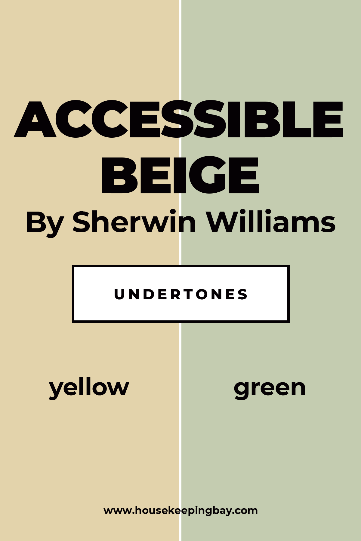
As for the Accessible Beige by Sherwin Williams, its basic undertones that you will easily notice and recognize are yellow.
But in addition, this paint color has green undertones as well! Well, greens mostly come out in the southern exposure. And of course, you should not expect any prominent green, only a slight hint of it.
Nevertheless, pay attention that, if you have many green objects in the room painted with Accessible Beige, the paint will reveal its green background more actively!
Housekeepingbay.com
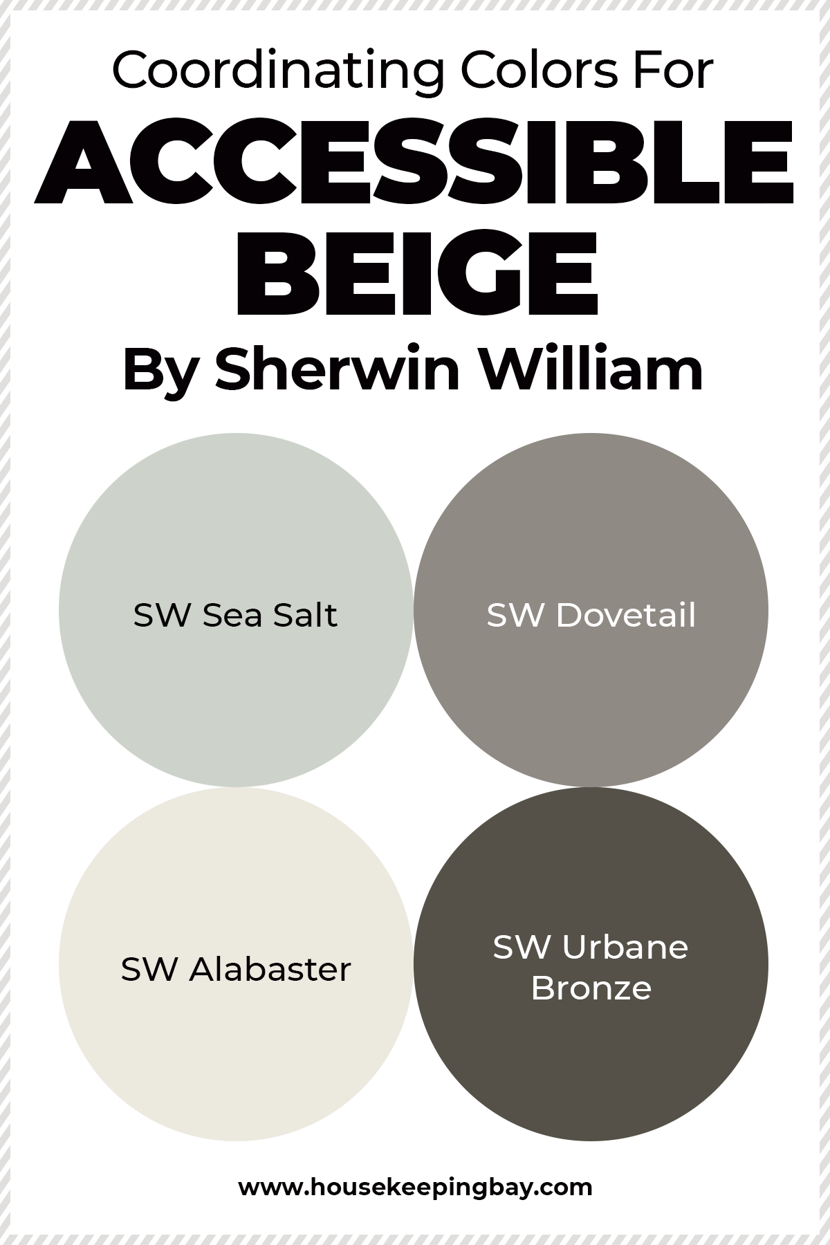
What Are the Best Coordinating Colors For Accessible Beige By Sherwin Williams?
If you do not want your home to look monochromatic, you should think of using other paint colors in your interiors as well. But when it comes to greiges and other neutrals, finding suitable and fitting coordinating colors can become a real challenge!
As for the SW Accessible Beige, its best coordinating color matches will be SW Sanderling, SW Cadet, and SW Aesthetic White. The first two are more intense and have way deeper tones being closer to brown (Sanderling) and deep blue (Cadet). But also, you can make use of such colors of this brand as:
When combined with Accessible Beige, they will create contrast yet harmonious pairs and color combinations that will allow you to put proper color accents in your rooms.
Housekeepingbay.com
What is LRV? Read It Before You Choose Your Ideal Paint Color
The Optimal Trim Color To Use With Accessible Beige
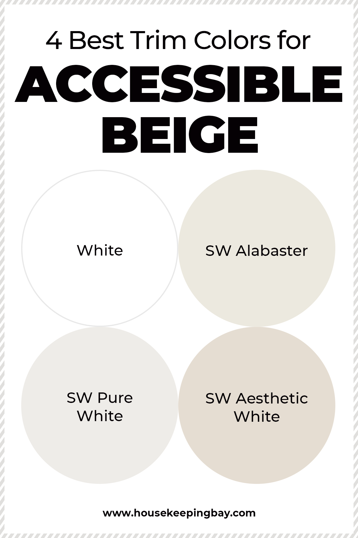
Neutrals go especially well with trims, everyone knows that. And Accessible Beige is not an exception. And just like any other neutral, it goes exceptionally well with white colors, with off whites in particular, for instance, SW Alabaster that has a slight creamy tint.
However, if you need to get a cleaner and more crisp look, stick to SW Pure White or SW Aesthetic White as a trim color.
Housekeepingbay.com
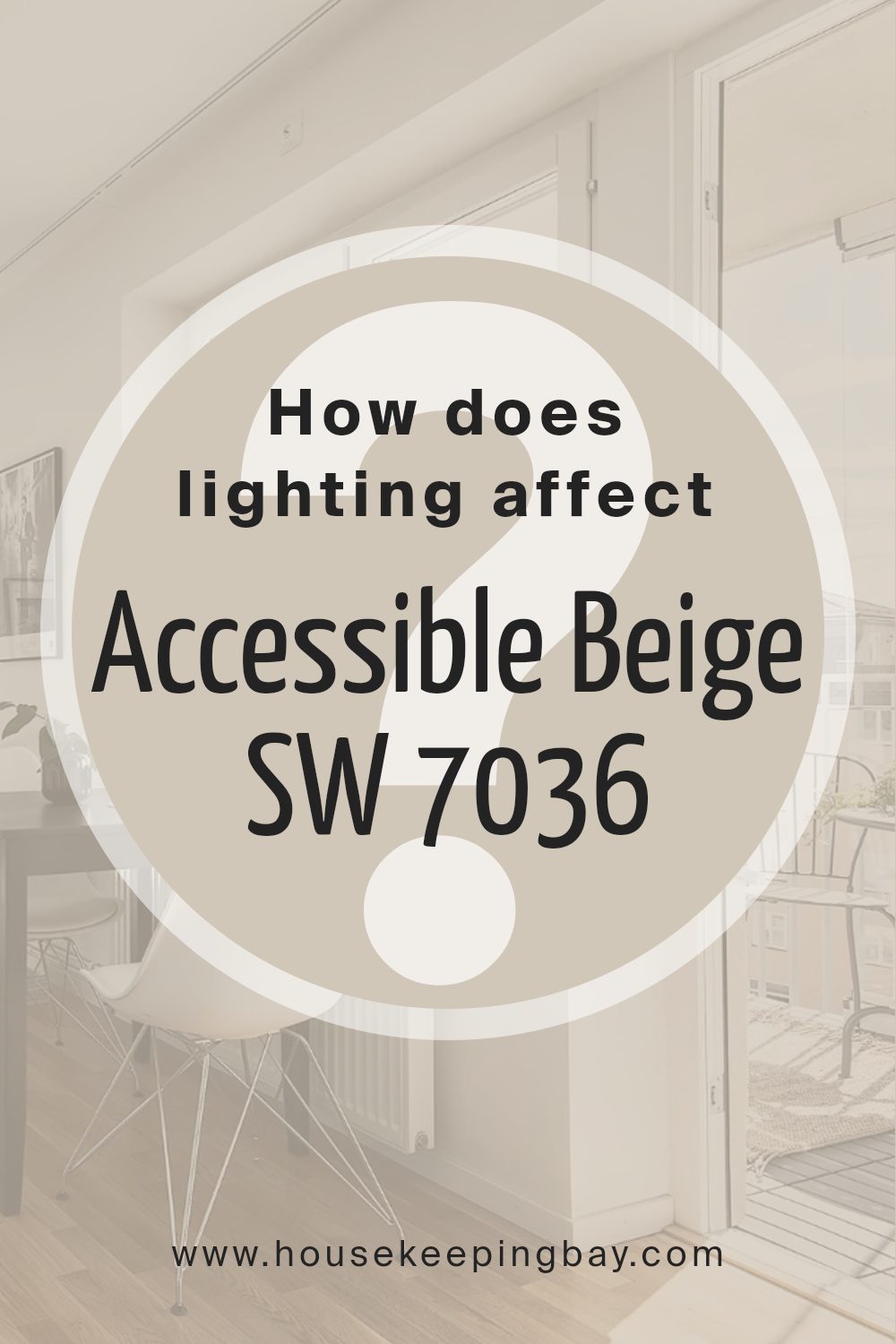
How Does Lighting Affect Accessible Beige SW 7036 by Sherwin Williams?
Lighting plays a crucial role in how colors appear in a space. The perception of any color, including Sherwin Williams’ Accessible Beige SW 7036, can vary significantly under different lighting conditions.
This shade, a soft and warm beige, has the versatility to adapt to various lighting environments, making it a popular choice for many homes.In artificial light, Accessible Beige tends to appear warmer. Incandescent and warm LED lights bring out the yellow and brown undertones of this color, making it feel cozier.
This can be particularly appealing in living spaces and bedrooms where a sense of warmth is often desired.Under natural light, Accessible Beige changes subtly throughout the day.
It will generally look lighter and more true to its color swatch when bathed in natural sunlight. This makes it an excellent choice for areas that receive a lot of daylight, as the true beauty and balance of beige come through vividly.
The orientation of rooms also affects how Accessible Beige looks:
1.North-Faced Rooms: These rooms receive less direct sunlight, which can make colors appear slightly cooler and grayer. In north-facing rooms, Accessible Beige may lose some of its warmth, appearing more muted and subdued.
2. South-Faced Rooms: These rooms enjoy abundant light for most of the day, which can enhance the warm tones of Accessible Beige, making the room feel bright and airy.
3. East-Faced Rooms: Morning light is cooler, so Accessible Beige will look softer and slightly cooler in the morning, gradually warming up as the day progresses.
4. West-Faced Rooms: The intense evening light can cast a golden glow, making Accessible Beige appear warmer and richer towards the end of the day.
In summary, Accessible Beige SW 7036 is a flexible color that adjusts its character depending on the lighting. Whether used in rooms with natural or artificial light, from different cardinal directions, it offers a balance of warmth and neutrality, making it a reliable choice for nearly any space.
Are There Any Similar Paint Colors to Sherwin Williams Accessible Beige?
Sometimes, we just can’t buy the paint color we were initially going to use for our home painting project. The reasons can be different. For example, the store ran out of this particular paint shade or it is only possible to order it online and we can’t wait that long until the paint is delivered.
No matter the cause, it is always good to know what alternative colors we can make use of to refresh our interiors!
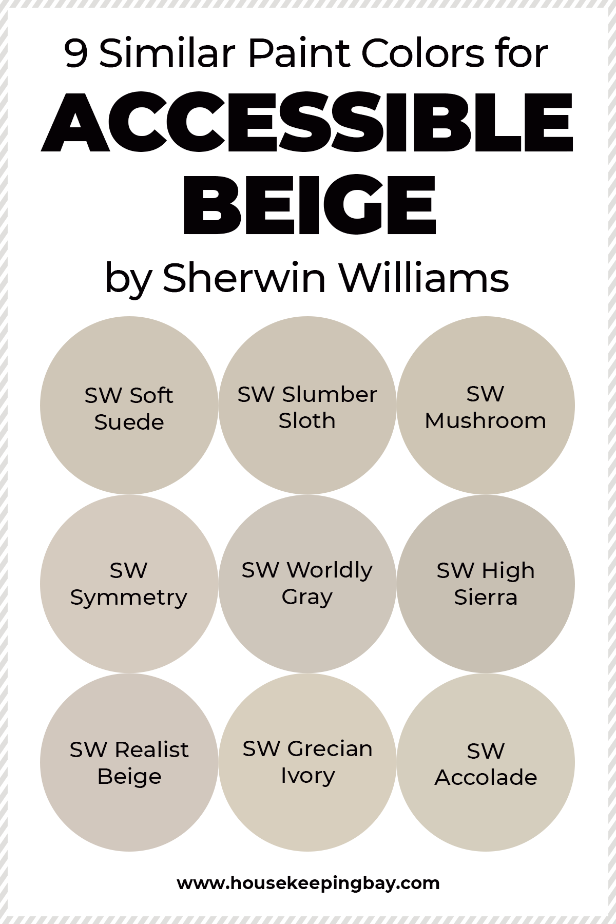
Luckily, the Accessible Beige paint color by Sherwin Williams has quite many similar colors that look almost the same on the wall which means that you will be able to easily find a substitute for it whenever you have that need.
To make a right choice, we would recommend you pay attention to such paint colors as:
- SW Soft Suede
- SW Slumber Sloth
- SW Mushroom
- SW Symmetry
- SW Worldly Gray
- SW High Sierra
- SW Realist Beige
- SW Grecian Ivory
- SW Accolade
All these colors are more or less similar to Accessible Beige in terms of tones with only a few of them being slightly cooler than it is.
Housekeepingbay.com
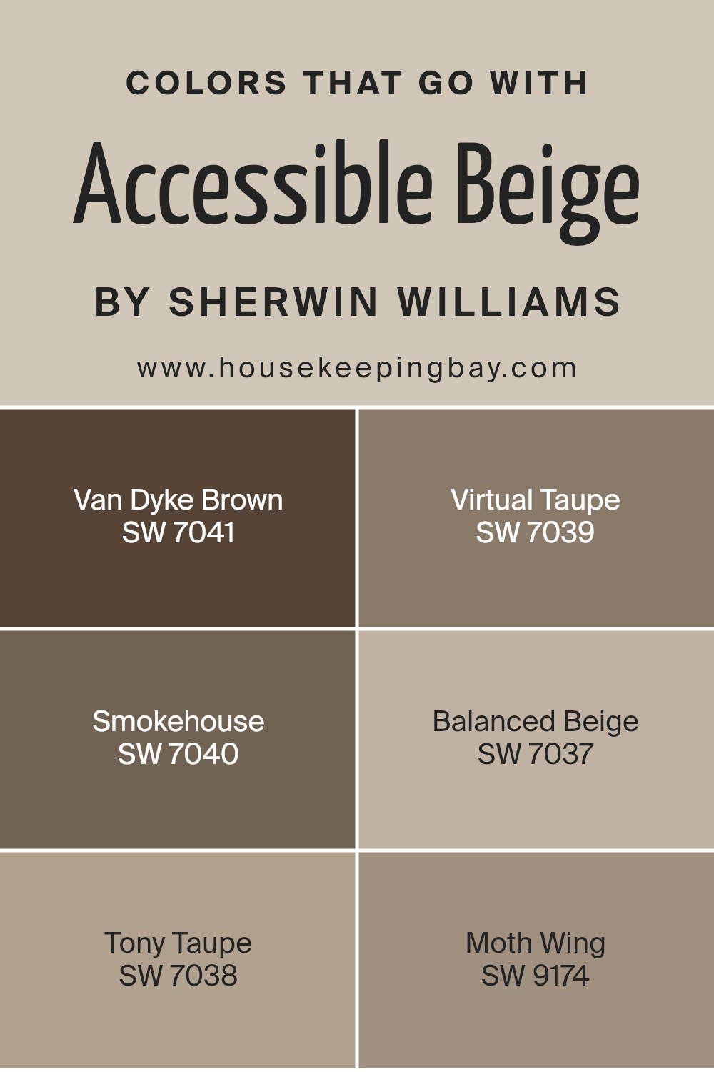
Colors that Go With Accessible Beige SW 7036 by Sherwin Williams
Choosing the right colors to complement Accessible Beige SW 7036 by Sherwin Williams is essential because it ensures that the spaces feel harmonious and aesthetically pleasing. These complementary colors help in creating a cohesive look and bring out the best in the palette.
Van Dyke Brown SW 7041 provides a deep, rich chocolate tone that wonderfully grounds the lighter tones of Accessible Beige.
It helps in adding a sophisticated contrast that’s neither too stark nor overpowering.
Virtual Taupe SW 7039 offers a grayish-brown hue that supports a neutral and versatile backdrop, making it an excellent choice for continuity in design schemes.
Smokehouse SW 7040, with its medium gray shade, offers a gentle contrast that is very compatible with the warmth of Accessible Beige.
This combination is ideal for creating a subtle differentiation without clashing.
Balanced Beige SW 7037 is slightly darker than Accessible Beige, providing a soft transition between the colors that enhances depth and interest to the visual dynamics of a room.
Tony Taupe SW 7038 has a pleasant grayish-brown earthiness that meshes well with more natural elements in decor, bridging the gap between indoor and outdoor aesthetics.
Lastly, Moth Wing SW 9174 is a dusty brown that harmonizes naturally with Accessible Beige, contributing to a smooth and soothing ambiance without drastic shifts in shade.
You can see recommended paint colors below:
- SW 7041 Van Dyke Brown
- SW 7039 Virtual Taupe
- SW 7040 Smokehouse
- SW 7037 Balanced Beige
- SW 7038 Tony Taupe
- SW 9174 Moth Wing
Where Can I Use This Paint Color In My Home?
Sherwin Williams Accessible Beige is a very versatile paint color just like any other neutral greige. Thanks to its mixed gray and beige nature, it can be successfully used in any room or area in your home. It also almost doesn’t matter what the lighting is in there!
Just to make you see how multipurpose it is, we will name you the list of rooms and areas where this paint color will look astonishing:
- living room
- bedroom
- kitchen
- bathroom
- hall
- staircases
- entryway
It can even be used for painting the facades and other exterior buildings, for instance, your garage! And by the way, the cabinets in your kitchen will look really good and refreshed if painted with this color.
Using Accessible Beige In Your Living Room
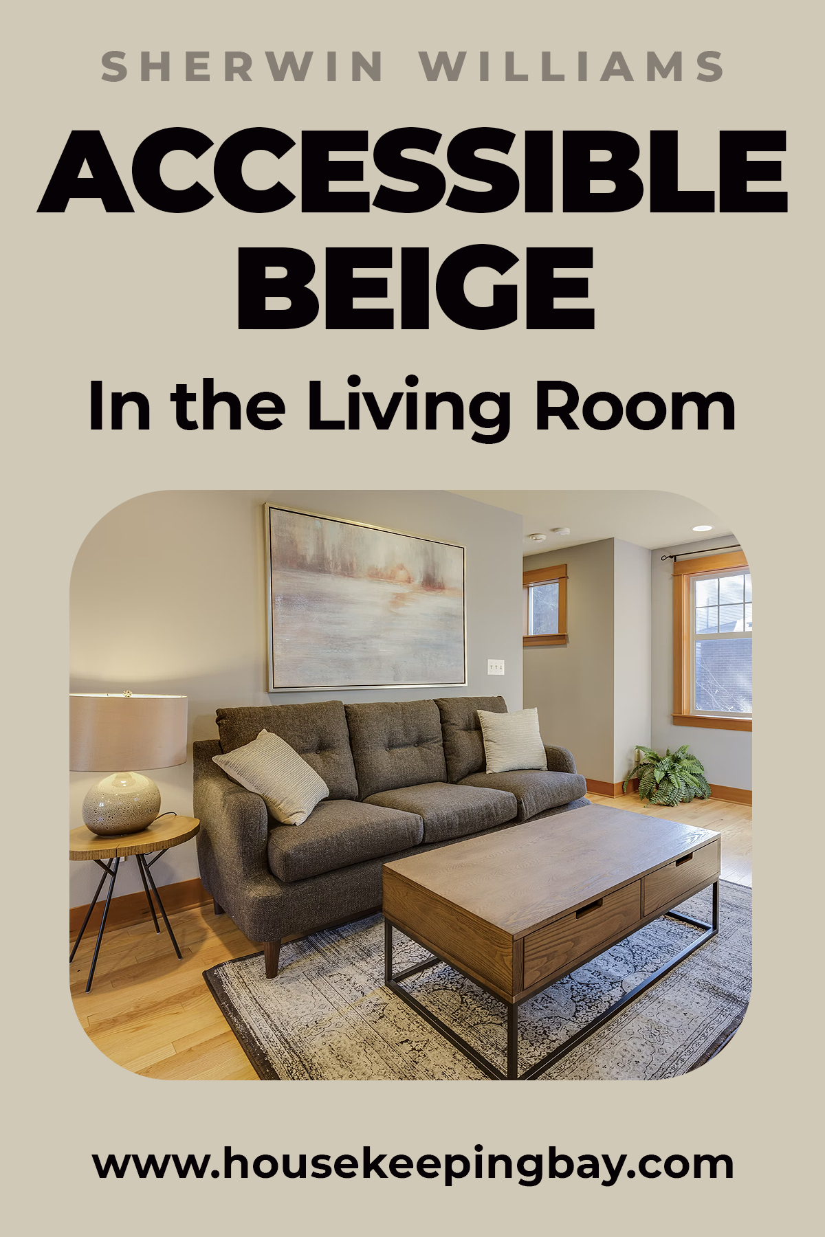
In a living room, Accessible Beige is exceptionally good as an accent color. Yes, we know that most of us are used to using darker colors for the accent wall, but Accessible Beige works really well as an accent because it is so super neutral.
It means that it will work well with many other colors both on the walls and in the room interior (for example, upholstery, carpets, curtains, etc.).
Housekeepingbay.com
Is Accessible Beige Suitable For Bedrooms?
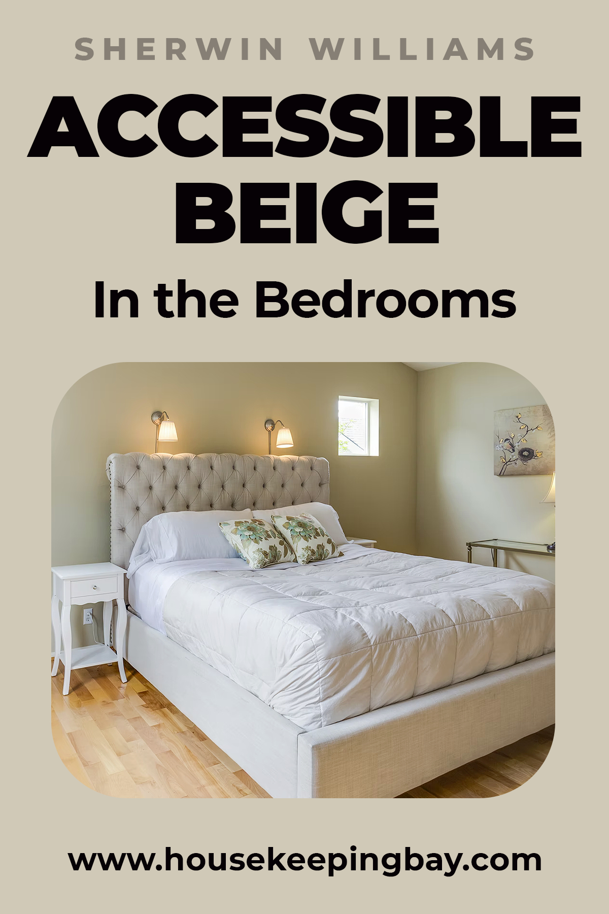
This is also a good wall color for your bedroom, especially if you like warm-toned and tranquil shades. Accessible Beige will create that soothing and cozy atmosphere thanks to its warm beige tones.
And if you choose the right lighting, you can expect to have a perfect space for sleep.
Housekeepingbay.com
Can Accessible Beige Be Used In A Kitchen?
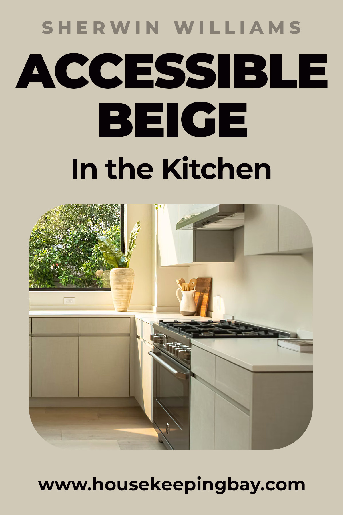
Definitely, it can! Moreover, kitchen walls painted with this color will look great both in a lighter and in a darker room. Since this color reflects pretty much of light, it will make the room look more spacious and airy so that your kitchen will never look too gloomy if painted with Accessible Beige.
Housekeepingbay.com
Related: Best Greige for Kitchen. The Ultimate Guide
Painting Kitchen Cabinets With Sherwin Williams Accessible Beige
But if you don’t feel confident enough to apply this paint onto the kitchen walls straight away, we recommend you start with kitchen cabinets.
Believe it or not, Accessible Beige will create very nice and stylish color accents if used this way.

Housekeepingbay.com
Exterior Use Of Sherwin Williams Accessible Beige
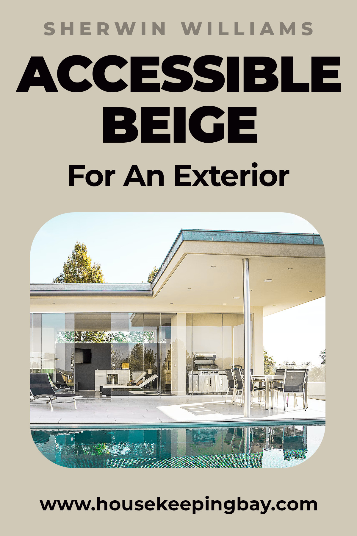
There is one more benefit of SW Accessible Beige that you need to know about. This paint can be used both indoors and outdoors!
Yes, it means you can paint your house facade with it! And moreover, it will work well as both a trim color and an all over color. On the exterior, it will look more like it is the palest creamy limestone.
Housekeepingbay.com
Complimentary Colors for Accessible Beige SW 7036 Paint Color by Sherwin Williams
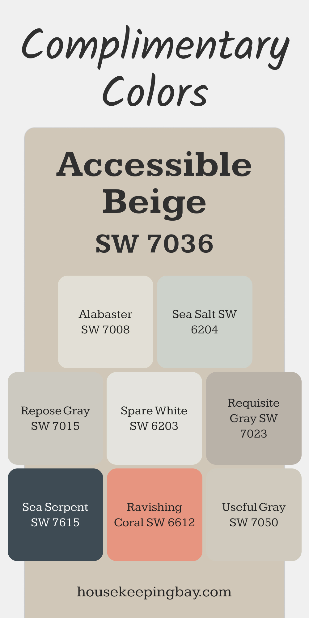
Accessible Beige works beautifully with versatile tones like Repose Gray and Useful Gray, creating a soft and cohesive palette. Alabaster is a great choice to brighten and add contrast, while Sea Salt brings a light and airy feel.
For bolder accents, Ravishing Coral and Sea Serpent add vibrant personality, while Twin Leaf complements the natural warmth of Accessible Beige. Requisite Gray ties everything together with its balanced, timeless charm.
via housekeepingbay.com
How Well Does Accessible Beige Work With Other Greiges?
If you have your interiors painted with neutrals and/or greiges, it may seem to be challenging to combine several of such colors to end up with a harmonious ensemble.
To help you out with this task, we have prepared the descriptions for several pairs of neutral paint colors that will look great with each other.
Accessible Beige vs. Edgecomb Gray
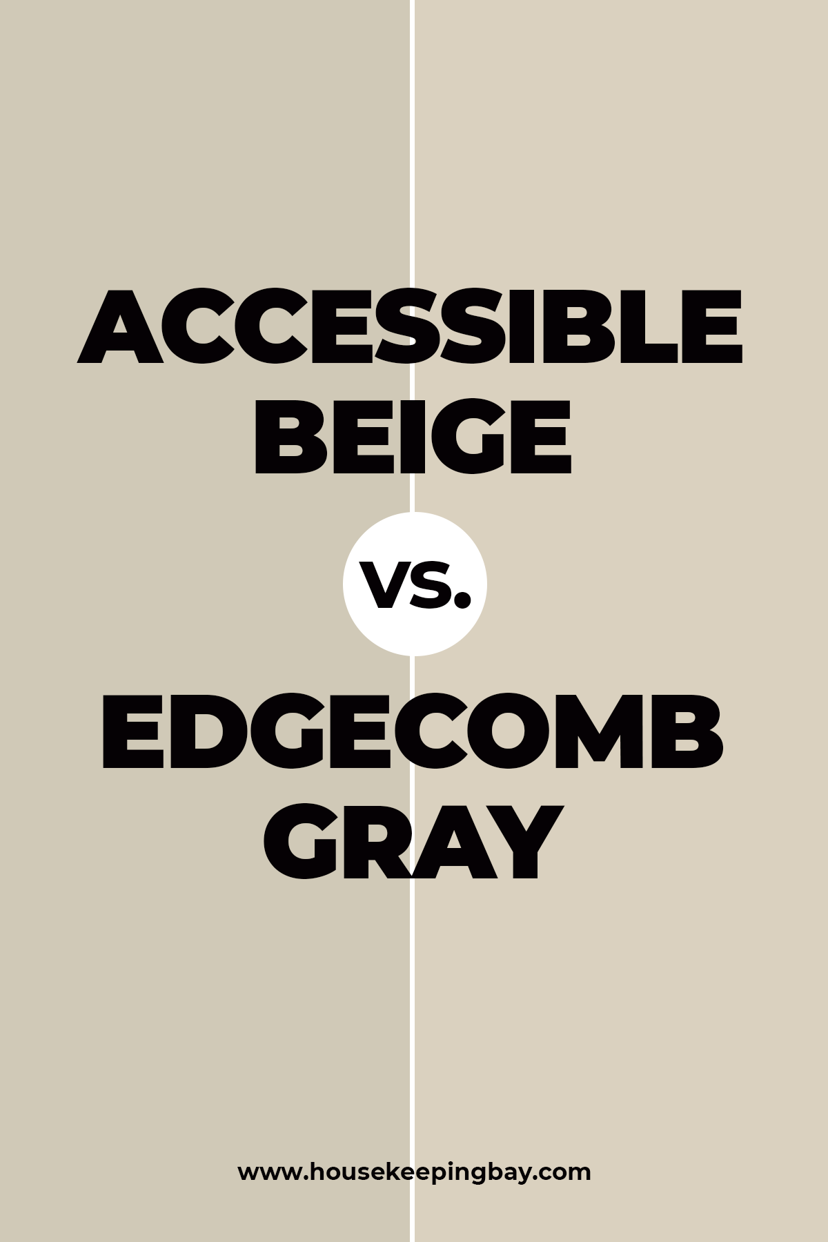
When put side by side, these colors may look almost the same. However, Edgecomb Gray is noticeably lighter carrying more gray undertones than Accessible which has way more of beige and brown in it.
The light reflectance values of these colors are also distinct. Edgecomb Gray’s LRV is 63 and Accessible Gray’s LRV is 58.
Housekeepingbay.com
Related: Edgecomb Gray HC-173 by Benjamin Moore
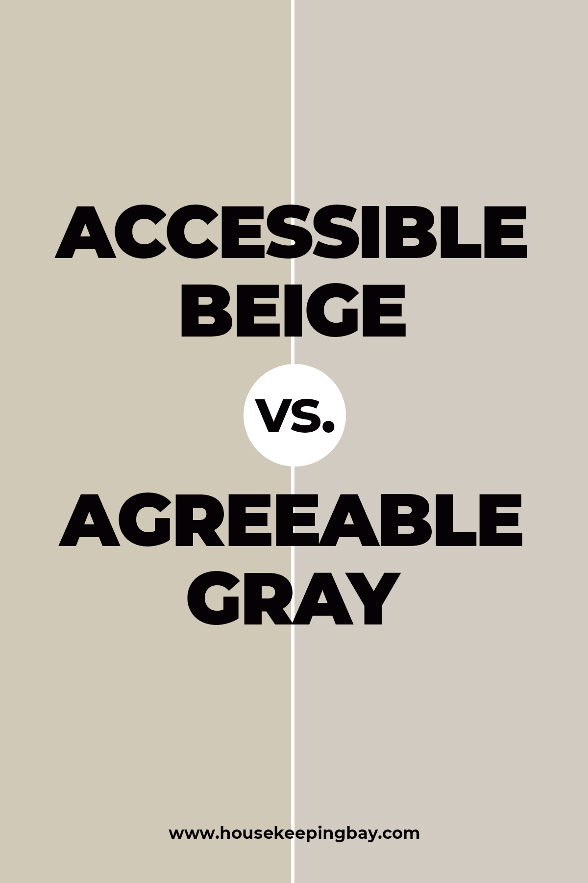
Accessible Beige vs. Agreeable Gray
If you compare these two, you will see that Agreeable Gray is cooler than the Accessible Beige color mostly because it has more of purple and gray undertones in it.
In general, AB looks more beige and AG is more gray with their light reflectance value being almost equal.
Also, AG will look like greige in natural lights, and it will turn grayer in lower lights.
Housekeepingbay.com
Related: Agreeable Gray SW 7029 by Sherwin-Williams
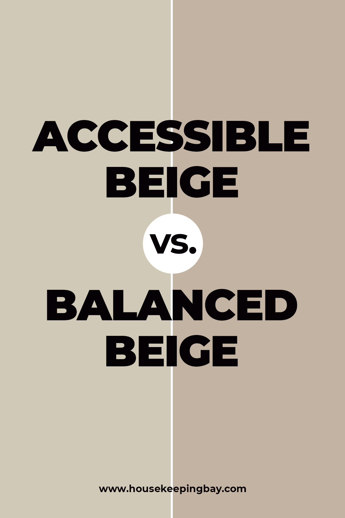
Accessible Beige vs. Balanced Beige
These two beiges are quite distinct despite their similar names. Balanced Beige looks more brown, being also more intense than its “colleague”. Accessible Beige, on the contrary, shows more of purple and gray undertones that makes it look cooler.
In general, Accessible Beige is significantly lighter since Balanced Beige has a significant taupe undertone.
Their LRVs are also different being 46 for Balanced Beige and 58 for its counterpart.
Housekeepingbay.com
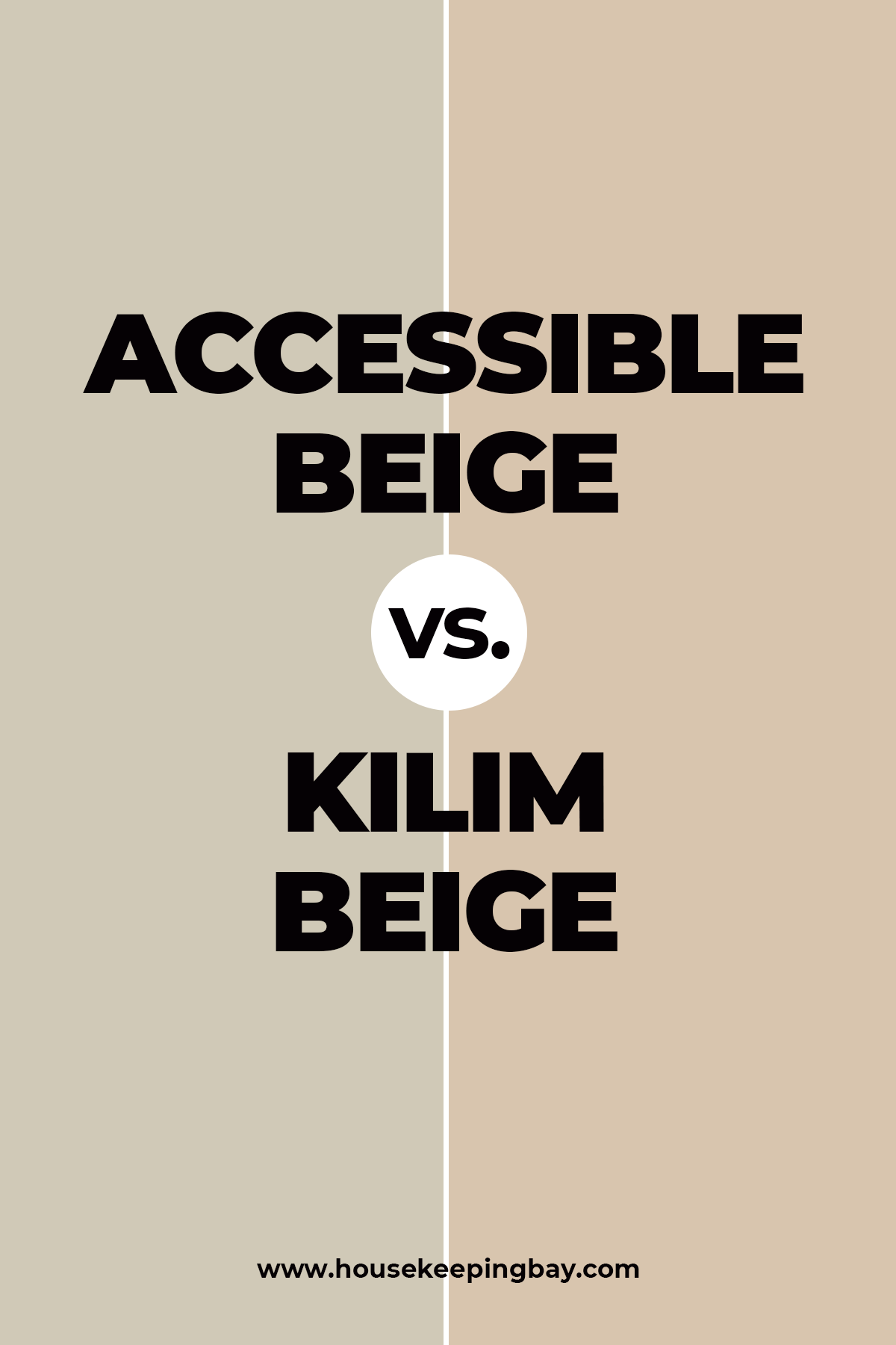
Accessible Beige vs Kilim Beige
These colors are hard to be called similar! Accessible Beige looks way more gray if compared to a Kilim that has a significant sandy beige look. Also, Kilim Beige is much warmer even though it is also considered a light beige color.
Perhaps, because of such a distinction, they don’t look that great if used together in the same room.
Housekeepingbay.com
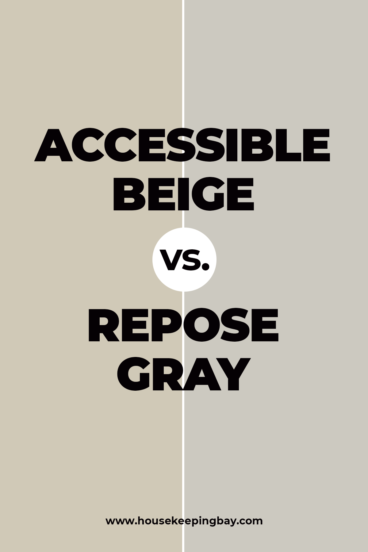
Accessible Beige vs Repose Gray
If we compare these paint colors, we will see that Accessible Beige shows more of its beige and even brownish undertones when being put close to the Repose Gray which looks cool with a prominent gray base.
However, if used together in the same space, these two will not make a perfect match since both colors are rather pale and light.
Housekeepingbay.com
Related: Repose Gray SW 7015 by Sherwin-Williams
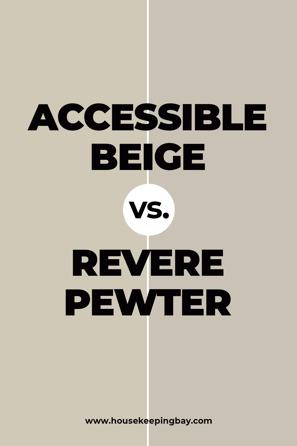
Accessible Beige vs Revere Pewter
Accessible is more warm-toned in comparison to Revere Pewter color , but their light reflectance value is nearly the same being 58 and 55 respectively. Also, AB has more of gray undertones whilst RP looks more gray itself. Nevertheless, both have green undertones that can be revealed under certain lighting conditions.
So, now you know everything about Accessible Beige paint colors, its use, color nuances, its strong and weak sides.
We told you what colors it can be paired with better than with others, and also, you are now aware of all the possible places this paint can be used in your home! With that in mind, you will easily pick up matching paint colors to turn your house into a stylish, modern, and cozy space.
Housekeepingbay.com
This color truly stands out as a top choice for anyone looking to refresh their home with a warm, welcoming feel without overpowering the space. Along with its impressive adaptability in different settings and lighting conditions, Accessible Beige maintains a consistent, soothing presence, allowing it to pair well with various decor styles and color palettes.
My experience has shown that it works beautifully in living areas, bedrooms, and even offices, providing a neutral backdrop that complements both modern and traditional furnishings. Additionally, the paint’s quality underscores its long-lasting finish and consistent application, reinforcing why Sherwin Williams remains a go-to brand for durable and aesthetically pleasing options.
For anyone seeking a reliable and elegant paint color, Accessible Beige should certainly be considered. It has certainly served me well in various projects, achieving a clean, sophisticated look every time.
Ever wished paint sampling was as easy as sticking a sticker? Guess what? Now it is! Discover Samplize's unique Peel & Stick samples. Get started now and say goodbye to the old messy way!
Get paint samples



Frequently Asked Questions
⭐ Is Accessible Beige warm or cool?
It is warm.
⭐ Can I use SW Accessible Beige to paint my garage outer walls?
Yes, this paint will be ok for that.
⭐ Can Accessible Beige be used with very dark colors like deep navy blue or even black?
Yes, this neutral will pair well with such dark colors.
23 thoughts on “Accessible Beige SW 7036 By Sherwin Williams”
Leave a Reply

will accessible beige work with oak cabinets?
Yes! Accessible Beige SW 7036 is a beautiful match for oak cabinets.✨
As a warm greige, it balances out the golden or honey tones in oak without clashing or feeling too yellow. It brings a modern, soft look while still honoring the warmth of the wood. Perfect for creating a cozy, updated kitchen or bath! 🙌
Hope this helps! -M
Is Accessible Beige the lightest color on the color strip?
Choosing between Accessible Beige vs Agreeable Gray, which one woudl you suggest as a good wall color for a living room with a lot of daylight?
If the light is mostly warm (southern, for example), I’d choose Accessible Beige. It’s a nice and balanced beige color with slightly gray undertones. In a well-lit room, it will read pleasantly warm and cozy.
I’m wanting to do accessible beige on my kitchen/bathroom cabinets and all interior doors with alabaster trim. I’m wanting to do alabaster on the walls and ceilings as well. If I throw in a iron ore vent hood with wood trim and iron ore above rock fireplace with a succulent kitchen island, is that too hodge podge. I really want to do retreat or succulent on the island. Will all of that work and come together?
To me, it sounds pretty well, but I’m not a professional interior designer. My guess is that you should advise a specialist!
I want to use the Accessible Beige color on my living room walls. But since the room is not furnished yet, I need your advice. What color palette for Accessible Beige would you recommend?
Well, I guess you need the same muted colors since bright ones will look imbalance with this color. Generally, Accessible Beige looks well with muted light blue color and blue-grays. Also, lighter beiges will do. For bolder accents, you can use black and deep browns. Or muted pink like SW Pink Shadow.
Hello, I am going to paint over my knotty pine walls in an open concept kitchen and living room area. I am thinking about using SW Modern Gray on walls and was going to use either SW Snowbound or Greek Villa on kitchen cabinets, extra white on ceiling and trim. There is not a lot of natural light due to trees blocking it. The most light I get is at the end of the day when it comes in from the west. The island is going to be painted either SW Naval or Smoky Blue. The countertops are Cambria quartz in Travella. Any thoughts on my choices in colors? It is so hard to decide. Thank you!
I guess SW Greek Villa will be better on your cabinets with SW Smoky Blue on the island
I want to use Accessible Beige and Alabaster colors in the same room (kitchen). But will they work nicely together?
I’m sure they will! It’s one of my favorite color combinations! Both are warm enough and have that muted nature that I absolutely adore! I’d also recommend you add some white (e.g., SW Pure White or BM Simply White). Otherwise, your kitchen might read too warm-toned!
Hi! Could you please help me with SW Accessible Beige? What undertones does this color have? Are they beige or gray?
Hey there! This color has gray undertones mostly, as far as I know. Also, this beige paint color has barely noticeable green undertones. But unlike a common belief, it doesn’t have any pink undertones.
Is Sherwin-Williams Accessible Beige a neutral color?
Yes, SW Accessible Beige is considered a warm neutral color (also often referred to as a warm neutral beige) that is pretty versatile in terms of its use in your home.
Hi ! loving the AB on my kitchen walls and want to keep it. aside from the colors listed above any other complimentary colors come to mind that would be good to paint cabinetry?
Thanks in advance.
Would accessible beige pair well with accent walls of dark, hunter green in one room, and a burgundy in the other?
Do you think I can use Accessible Beige in my bathroom? I need to repaint the walls since they have been all white for years! I want something warmer but not too warm. Will AB be ok?
I’m sure it will. I never painted bathrooms with it, but I did apply it in my bedroom and also in a lavatory once. It looks great in any room as for me. It’s neutral so it can be combined with quite many other colors. And besides, it reflects pretty much of light meaning that your bathroom won’t look gloomy.
I’m repainting my living room right now and I’m using Accessible Beige. But I need to pick nic complementary colors to fit this one which is going to be the major color. What colors complement AB better than others?
I’d say you should try one of the following: Dovetail, Sea Salt, Alabaster, or Urbane Bronze. All by Sherwin Williams. I personally used Urbane Bronze in my dining room and I love how it looks!