Krypton SW 6247 by Sherwin Williams
Unveiling Serenity: Your Guide to a Refreshing Hue
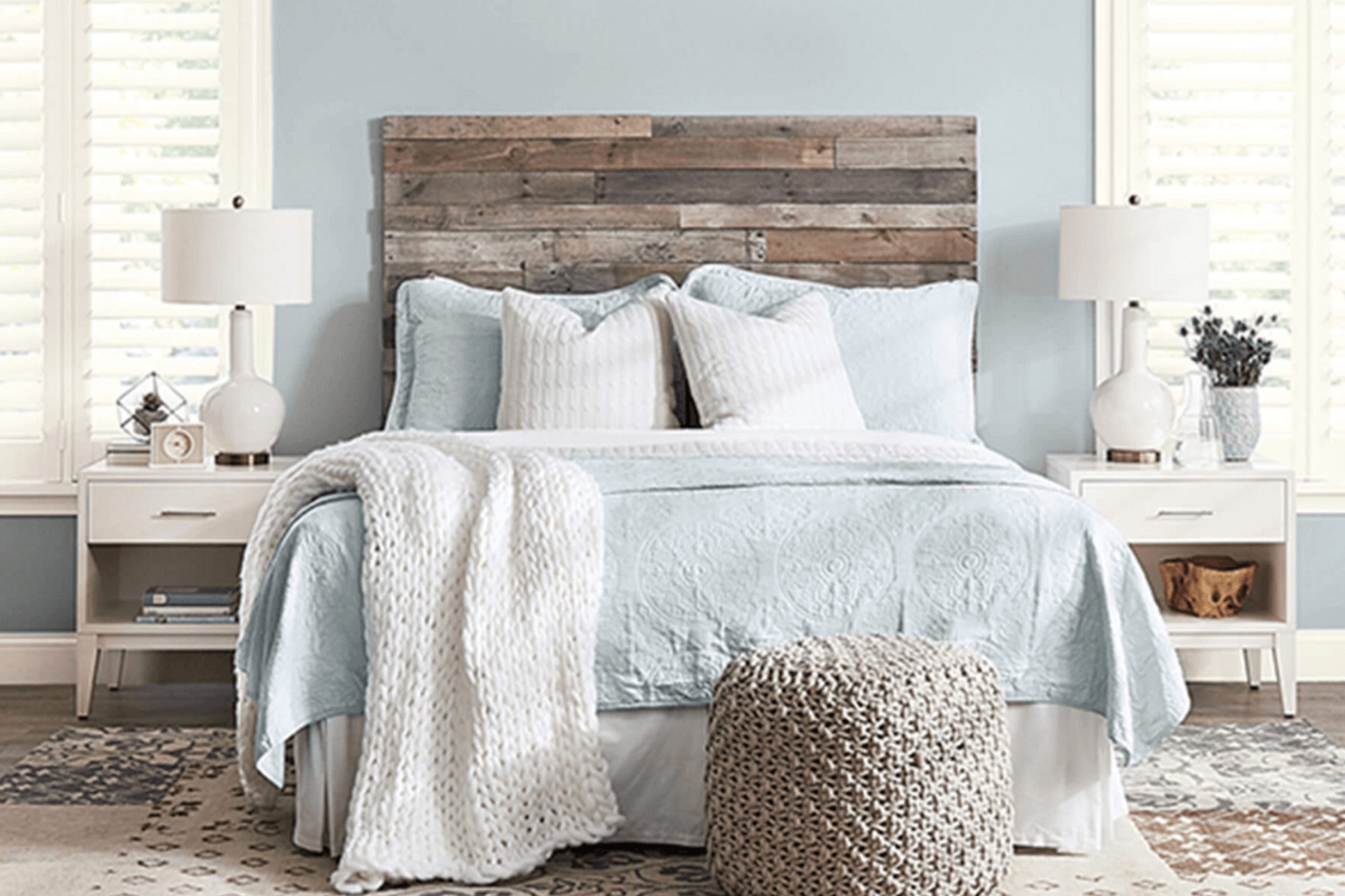
Krypton by Sherwin Williams is a paint color that stands out for its unique beauty and subtle charm. Imagine you are looking for the perfect shade to refresh your space with a modern and airy feel. In that case, SW 6247 Krypton might just be what you need.
This color has a magical way of bringing a sense of calm and sophistication to any room. It’s like a breath of fresh air, transforming your home into a peaceful haven where you can relax and feel at ease.
Krypton has the ability to blend seamlessly with a variety of decor styles, making it a versatile choice for your living room, bedroom, or even your kitchen.
It’s not just a paint color; it’s a mood setter that gently envelopes your space in its serene vibes. If you’re aiming to give your home a fresh look without going too bold or too subtle, Krypton by Sherwin Williams offers the perfect balance.
It’s a choice that reflects a desire for a home that feels both modern and welcoming, without any fuss.
via sherwin-williams.com
What Color Is Krypton SW 6247 by Sherwin Williams?
Table of Contents
Krypton SW 6247 by Sherwin Williams is a unique and versatile shade of blue with subtle gray undertones. This color is cool and soothing, offering a fresh look that can instantly revitalize any room. Krypton works well in modern and contemporary interiors, bringing a sleek and sophisticated vibe.
Its calming effect makes it a great choice for bedrooms and bathrooms where a peaceful atmosphere is desired.
This color pairs beautifully with natural materials and textures. Think of combining it with light woods for a soft, airy feel or darker woods for a more striking contrast. Metals like brushed nickel or stainless steel also complement Krypton SW 6247 well, adding a touch of modernity.
For textiles, consider soft, plush fabrics in neutral tones to maintain the room’s serene atmosphere or add splashes of vibrant colors like mustard or coral for a lively contrast.
Krypton SW 6247 excels in spaces that aim for a balanced, harmonious look. Whether you’re updating a single room or reimagining your entire home, this color can help create a refreshing and stylish space. Its adaptability with various materials and textures allows for a wide range of design aesthetics, from minimalist to eclectic, making it a fantastic choice for any interior.
housekeepingbay.com
Is Krypton SW 6247 by Sherwin Williams Warm or Cool color?
KryptonSW 6247 by Sherwin Williams is a cool, soothing shade of blue-gray that brings a fresh and calm atmosphere to any home. This versatile color suits various spaces, from bedrooms to bathrooms to living rooms, adding a touch of modern elegance without overwhelming the senses.
Its subtle hue pairs well with many colors, making it an ideal choice for those looking to create a harmonious color scheme. KryptonSW 6247 has a unique ability to open up smaller spaces, making rooms feel larger and more airy, while providing a cozy backdrop in larger areas.
This color is particularly effective in rooms with plenty of natural light, where it can shift in tone throughout the day, offering a dynamic yet peaceful quality.
For homeowners seeking a balance between contemporary flair and understated sophistication, KryptonSW 6247 offers a perfect solution.
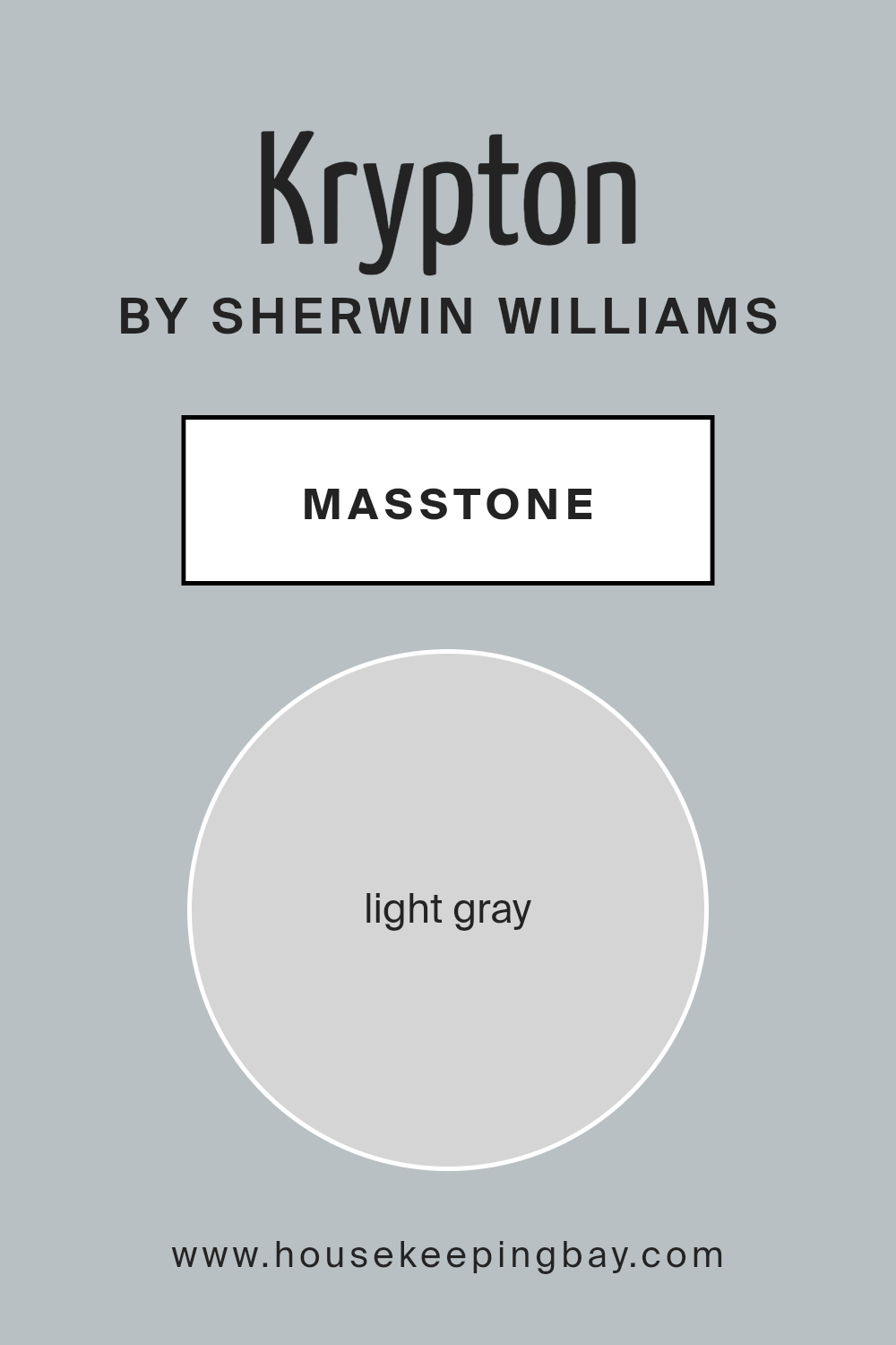
What is the Masstone of the Krypton SW 6247 by Sherwin Williams?
KryptonSW 6247 by Sherwin Williams is a lovely light gray color, with a masstone similar to hex code #D5D5D5. This particular shade of gray operates as a versatile backdrop in many homes. Its lightness provides a feeling of airiness and space, making rooms appear larger and more open.
This is particularly useful in smaller homes or spaces lacking in natural light, as Krypton can help to reflect whatever light is available, thus brightening the area.
The neutrality of Krypton’s hue makes it easy to pair with a wide range of decor styles and colors. Whether you’re leaning towards bold, vibrant accessories or preferring subtle, muted tones, this shade of gray works beautifully without overwhelming the senses.
It acts as a calm and gentle base, allowing other elements in the room to stand out.
Moreover, Krypton’s adaptability means it’s just as effective in creating a serene bedroom sanctuary as it is in setting up a productive home office space. This color is a fantastic choice for those looking to create a peaceful yet stylish environment in their homes.
housekeepingbay.com
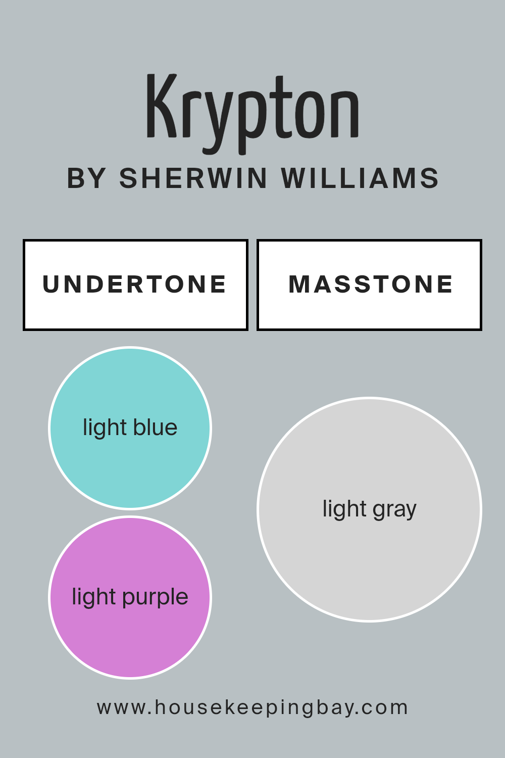
Undertones of Krypton SW 6247 by Sherwin Williams
Krypton SW 6247 by Sherwin Williams is a unique color with a vast range of undertones. These undertones include light blue, light purple, pale yellow, lilac, mint, pale pink, and grey. Each of these undertones plays a significant role in how the color looks and feels in a space.
When we talk about light blue and mint, these undertones give Krypton a fresh and airy feel. They can make a room feel more open and light. The light purple and lilac undertones add a touch of whimsy and softness, perfect for creating a gentle and soothing vibe.
Pale yellow undertones bring in a subtle warmth, making the space more welcoming without overpowering it. The pale pink undertones add a hint of cheerfulness and warmth to the walls, giving them a soft, inviting feel. Lastly, the grey undertone in Krypton makes it very versatile. It can help tone down the brightness of the color, making it easier to integrate into various décor styles.
When applied on interior walls, Krypton SW 6247’s undertones significantly affect the mood and perception of the space. Depending on the lighting and the other colors used in the room, one undertone might become more prominent than the others.
This versatility allows Krypton to adapt to different styles and themes, making it a great choice for those who want a color that can evolve with their changing tastes. The mix of these undertones means the color can complement a wide range of furnishings and décor items, from modern to rustic, creating a cohesive look in any room.
housekeepingbay.com
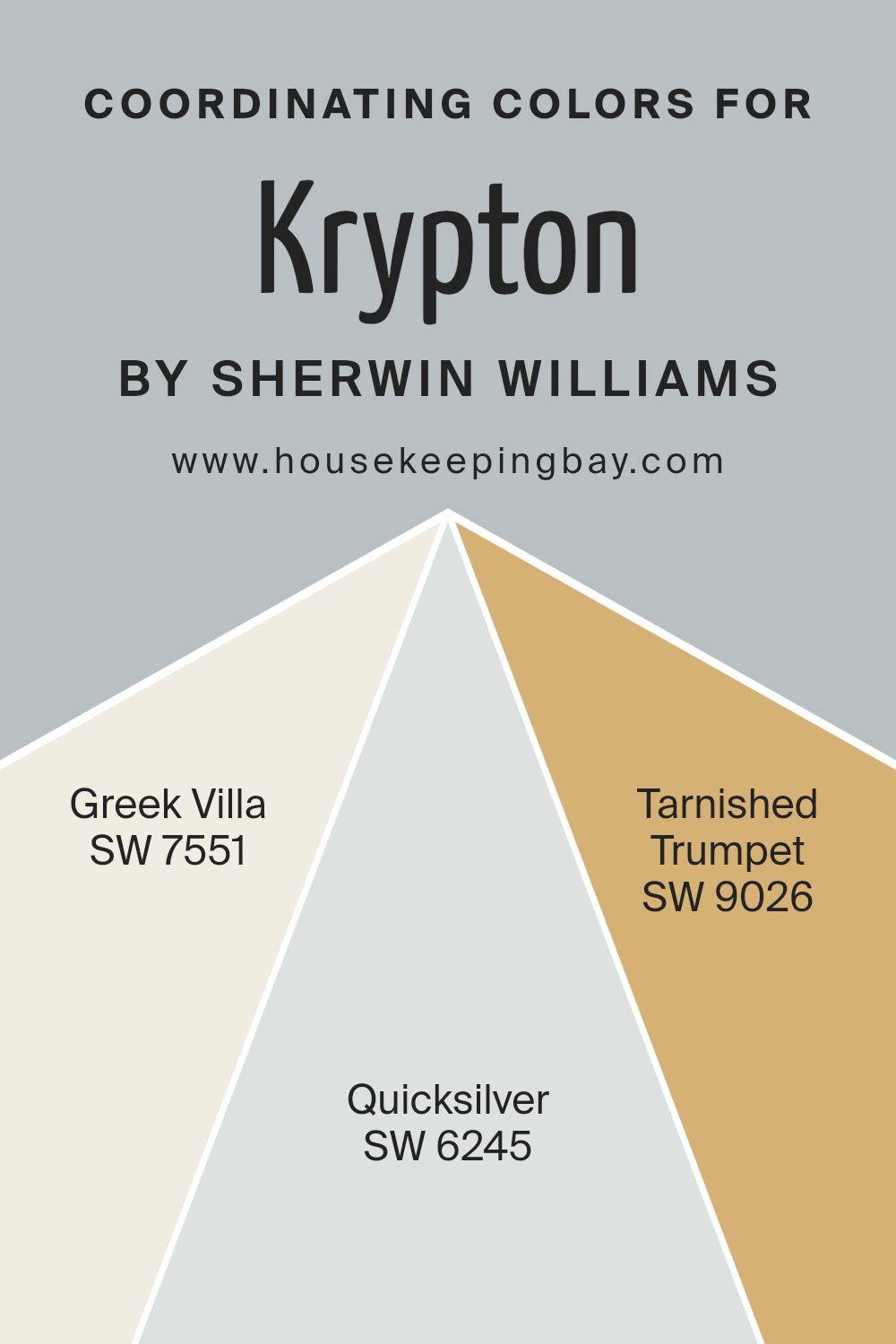
Coordinating Colors of Krypton SW 6247 by Sherwin Williams
Coordinating colors are shades that work well together to create a visually appealing and harmonious look in any space. They can complement or contrast with a primary color, like Krypton SW 6247 by Sherwin Williams, to enhance the overall aesthetic.
Coordinating colors are chosen based on their positions on the color wheel, their saturation, and their brightness, ensuring they support the main hue without overpowering it. This thoughtful selection process allows for a cohesive and balanced design.
For Krypton SW 6247, a cool, soothing gray, three coordinating colors are recommended: SW 7551 – Greek Villa, SW 6245 – Quicksilver, and SW 9026 – Tarnished Trumpet. Greek Villa is a soft, off-white with warm undertones, perfect for creating a gentle contrast with Krypton’s cooler tones, bringing a light and airy feel to any room.
Quicksilver, on the other hand, is a light gray with a hint of blue, echoing the coolness of Krypton but in a lighter shade, allowing for a subtle layering of similar hues.
Tarnished Trumpet adds a surprising twist with its deep, muted gold, providing a sophisticated pop of color that pairs beautifully with the cool greys, adding warmth and depth to the palette. Together, these colors form a versatile and appealing combination that can enhance the look and feel of a space.
You can see recommended paint colors below:
- SW 7551 Greek Villa
- SW 6245 Quicksilver
- SW 9026 Tarnished Trumpet
housekeepingbay.com
How Does Lighting Affect Krypton SW 6247 by Sherwin Williams?
Lighting plays a crucial role in how we see colors. The type of light, whether artificial or natural, can change our perception of a color’s hue, saturation, and brightness. Understanding this can help you choose the right paint color for your space.
Take KryptonSW 6247 by Sherwin Williams as an example. This unique shade can look different under various lighting conditions. Under artificial light, such as LED or fluorescent lighting, KryptonSW 6247 can shift its appearance slightly.
LED lights, which often have a cooler tone, might make this color appear more on the blue side, enhancing its cool undertones. In contrast, warmer-toned incandescent bulbs could make it lean slightly warmer, softening the color and making it feel more inviting.
Natural light brings out the truest form of this color, but the direction of light coming into the room plays a big part. North-faced rooms get less direct sunlight, meaning KryptonSW 6247 could look more muted and cooler in these spaces. This might give the room a calm and serene vibe but could feel too cold for some.
South-faced rooms, however, bask in plenty of sunlight, which can make KryptonSW 6247 appear brighter and slightly warmer throughout the day. This can make the room feel airy and lively, perfect for spaces where you want a refreshing but relaxed atmosphere.
In east-faced rooms, the color will get a soft, warm glow in the morning and become cooler as the day progresses. This means KryptonSW 6247 will have a gentle warmth in the morning, ideal for bedrooms to gently wake up to, before transforming into a cooler, serene backdrop for the rest of the day.
West-faced rooms get the evening light, which is warmer. Here, KryptonSW 6247 might look more inviting and cozy towards the night, perfect for living spaces where you unwind in the evening.
In summary, KryptonSW 6247’s look and feel can significantly shift depending on the lighting. By considering the room’s orientation and the type of light, you can ensure this color works perfectly in your space.
housekeepingbay.com
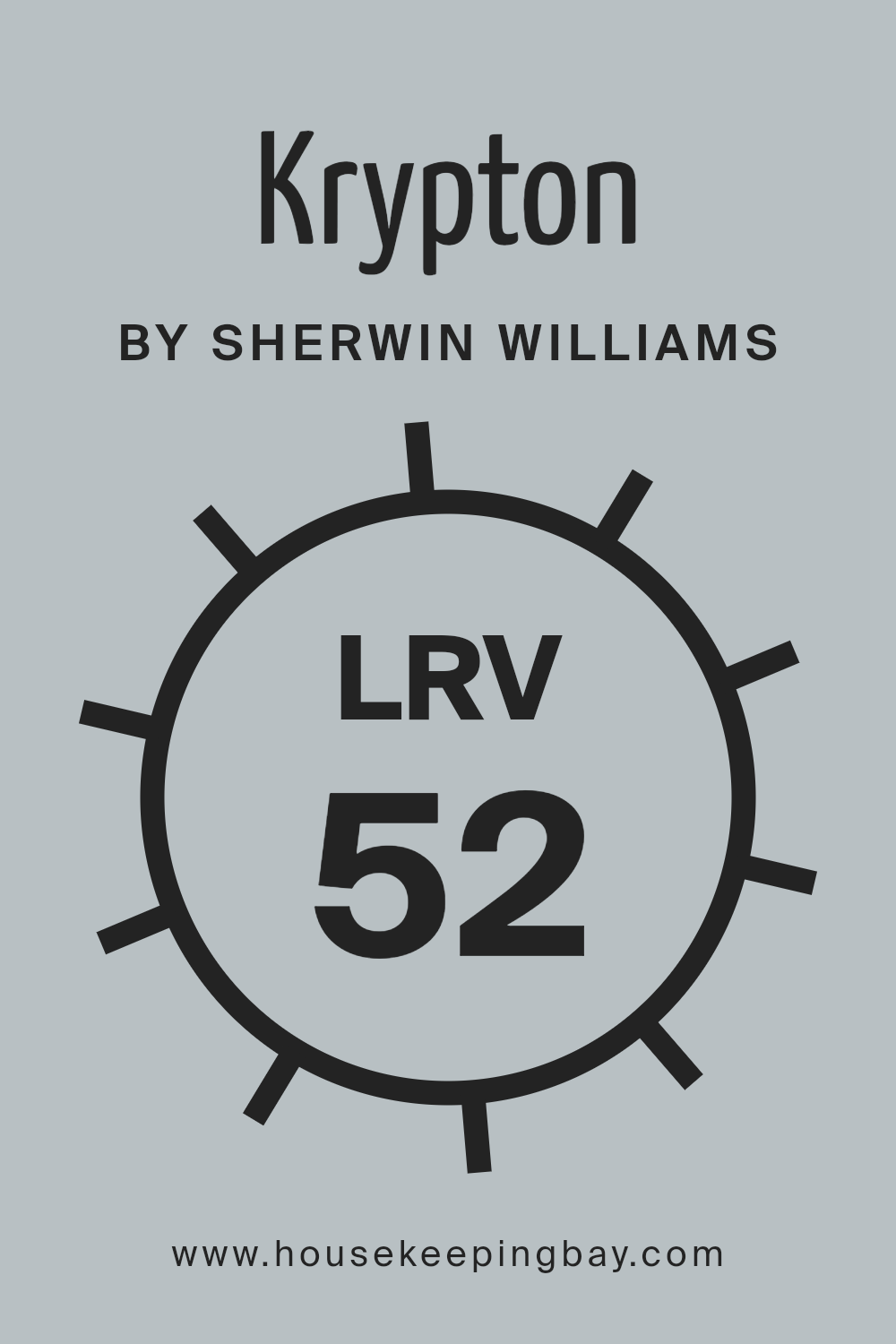
What is the LRV of Krypton SW 6247 by Sherwin Williams?
For KryptonSW 6247 by Sherwin Williams, which has an LRV of 51.939, this means it falls in the middle range of the LRV scale. This particular value suggests that Krypton is a versatile color, capable of bringing a balanced brightness to a room without making it feel overwhelming. In well-lit spaces, this color can enhance the feeling of airiness, while in poorly lit areas, it won’t make the space feel cramped or too dark.
This middling LRV makes Krypton a good choice for various settings, adapting nicely to different lighting conditions throughout the day.
housekeepingbay.com
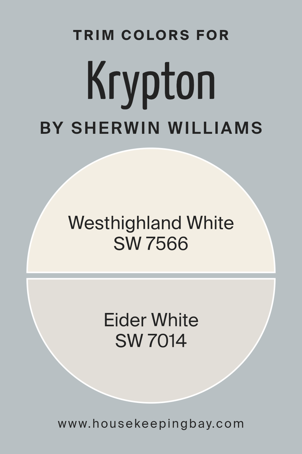
What are the Trim colors of Krypton SW 6247 by Sherwin Williams?
Trim colors are those specific hues selected to accentuate or define the edges and architectural details of a home or a room, such as window frames, doors, skirtings, and moldings. They play a crucial role in enhancing the overall appearance of a space by creating visual contrast or cohesion with the wall colors.
For Krypton SW 6247 by Sherwin Williams, a cool, soothing gray, choosing the right trim colors can significantly impact the ambiance and perception of the space. Trim colors can either blend smoothly with the wall color for a subtle, sophisticated look or stand out to define and highlight architectural features, adding depth and character to the room.
Westhighland White SW 7566 is a warm, creamy white that offers a soft juxtaposition when used as a trim color against the cool tones of Krypton SW 6247, imparting a welcoming, gentle perimeter around the room that softens the overall aesthetic.
Eider White SW 7014, on the other hand, presents a slightly grayer, more neutral tone, ensuring that the transition between the wall color and trim is seamless yet pronounced enough to add dimension and subtle detailing to the space.
Both these colors respond well to natural and artificial lighting, shifting gently to complement the main color throughout the day, while providing a crisp, clean edge that enhances the architectural beauty of a room.
You can see recommended paint colors below:
housekeepingbay.com
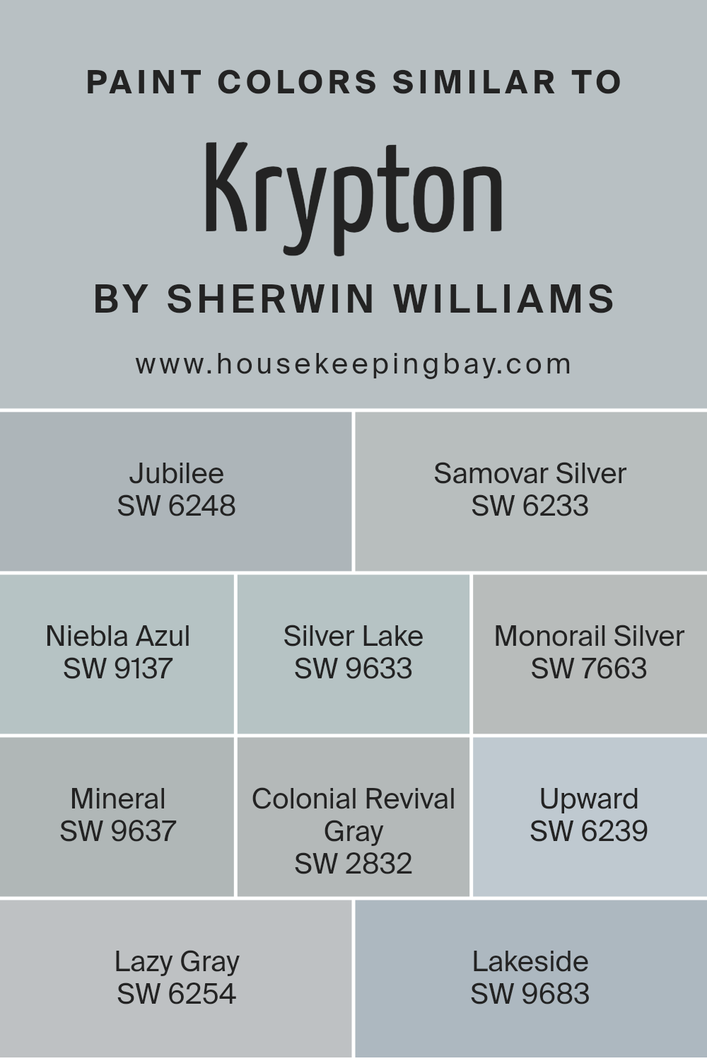
Colors Similar to Krypton SW 6247 by Sherwin Williams
Similar colors play an essential role in interior design and art, as they ensure a cohesive and harmonious look. These colors, when used together, offer a subtle contrast while maintaining a unified theme.
For instance, colors similar to KryptonSW 6247 by Sherwin Williams, like SW 6248 – Jubilee, a muted gray with a hint of lavender, and SW 6233 – Samovar Silver, a light, airy gray, work beautifully together to create a serene atmosphere. SW 9137 – Niebla Azul offers a soft touch of blue, reminiscent of early morning skies, while SW 9633 – Silver Lake adds depth with its slightly cooler gray tone. SW 7663 – Monorail Silver has a metallic edge that brings a modern flair to spaces.
On the other hand, SW 9637 – Mineral, a gentle beige, adds warmth to the palette, harmonizing with SW 2832 – Colonial Revival Gray, which balances between beige and gray for an understated elegance. SW 6239 – Upward and SW 6254 – Lazy Gray lean toward the blue end of the spectrum, offering a refreshing but subdued splash of color, akin to a misty morning. Lastly, SW 9683 – Lakeside introduces a deeper blue-gray, creating a sense of depth and focus in a room.
When these colors are combined, they ensure a fluid transition throughout a space, enhancing the overall aesthetic without overwhelming the senses. This approach allows for a sophisticated yet understated ambiance, making it easy to achieve a professional look in any interior space.
You can see recommended paint colors below:
- SW 6248 Jubilee
- SW 6233 Samovar Silver
- SW 9137 Niebla Azul
- SW 9633 Silver Lake
- SW 7663 Monorail Silver
- SW 9637 Mineral
- SW 2832 Colonial Revival Gray
- SW 6239 Upward
- SW 6254 Lazy Gray
- SW 9683 Lakeside
housekeepingbay.com
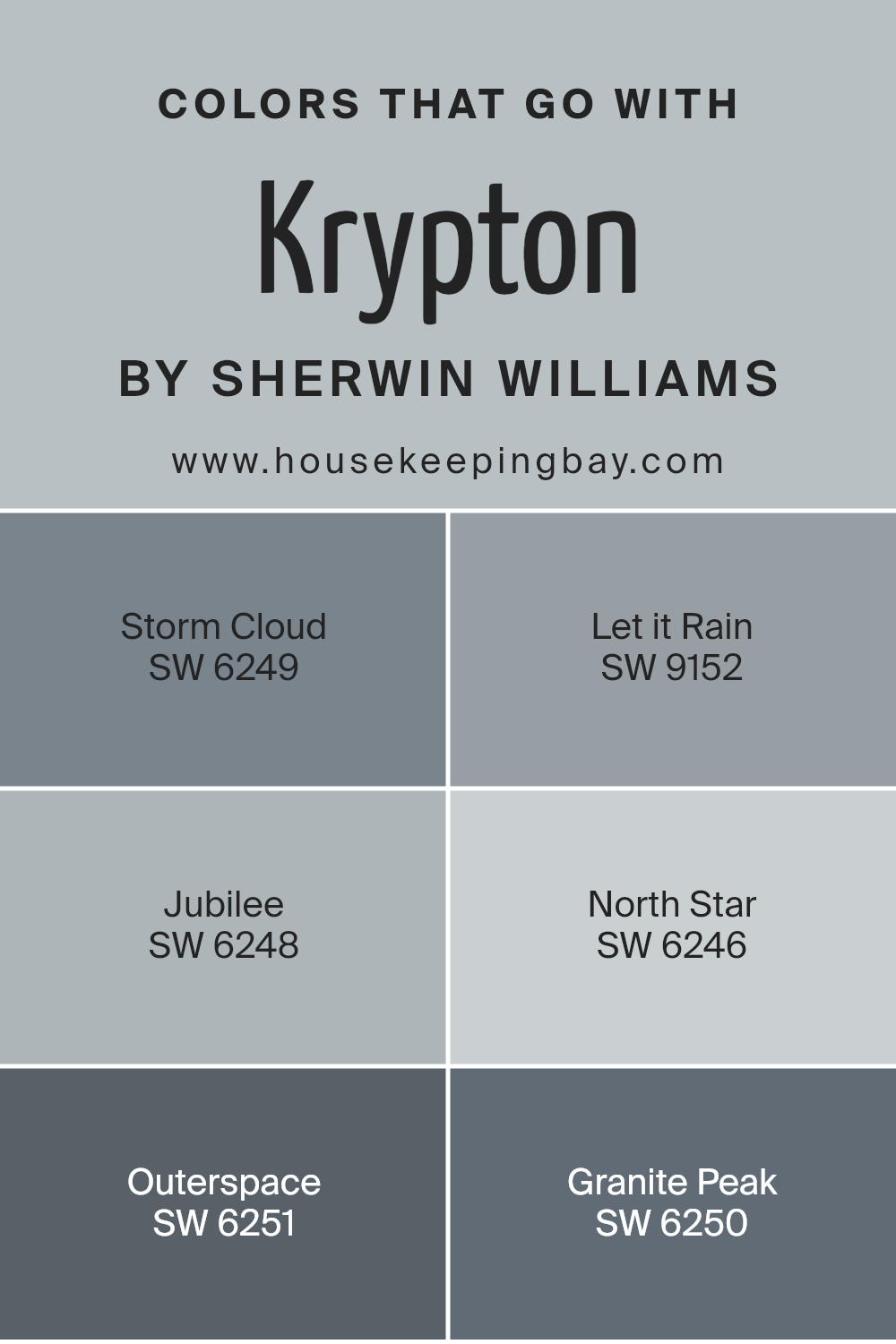
Colors that Go With Krypton SW 6247 by Sherwin Williams
Colors that complement Krypton SW 6247 by Sherwin Williams are vital because they create a harmonious palette for any space, making it more appealing and visually cohesive. Pairing Krypton, a serene light blue-green, with the right hues can balance the atmosphere in a room, giving it a polished look.
When combined, these colors work together to enhance the aesthetic appeal and mood of an area, making it feel more inviting and comfortable.
Storm Cloud SW 6249 is a deep, moody gray with blue undertones, perfect for adding depth to a space. Let it Rain SW 9152, a softer gray, offers a gentle contrast to Krypton, softening the overall feel of a room. Jubilee SW 6248, another gray, leans a bit towards lavender, providing a unique twist that is both sophisticated and subtle.
North Star SW 6246, offers a lighter, almost ethereal option, brightening spaces with its soft, airy presence. Outerspace SW 6251 is a striking charcoal that adds a solid, grounding effect, creating a striking backdrop.
Lastly, Granite Peak SW 6250, a robust gray with blue undertones, ties this palette together, offering strength and serenity to any design. Each of these colors supports Krypton in creating rich, layered, and cohesive spaces without overwhelming the senses.
You can see recommended paint colors below:
- SW 6249 Storm Cloud
- SW 9152 Let it Rain
- SW 6248 Jubilee
- SW 6246 North Star
- SW 6251 Outerspace
- SW 6250 Granite Peak
housekeepingbay.com
How to Use Krypton SW 6247 by Sherwin Williams In Your Home?
Krypton SW 6247 by Sherwin Williams is a unique paint color that can work wonders in any home. This shade has a cool, airy feel, perfect for creating a calm and peaceful atmosphere. Its versatility means it’s great for different rooms, from bedrooms to bathrooms or even living spaces. Krypton can make small areas seem larger and more open, thanks to its light-reflecting qualities.
For anyone looking to refresh their space, Krypton offers a simple yet effective way to do it. It pairs well with both bold and muted tones, allowing for a wide range of decor options. Use it as a base color on walls, then add darker furniture or bright accents for a balanced look. In spaces like the bedroom, it can help set a relaxed vibe, making it easier to unwind.
Applying Krypton SW 6247 can indeed give any home a fresh, updated feel without the need for drastic changes. It’s a practical choice for anyone looking to enhance their living space with a modern and sophisticated touch.
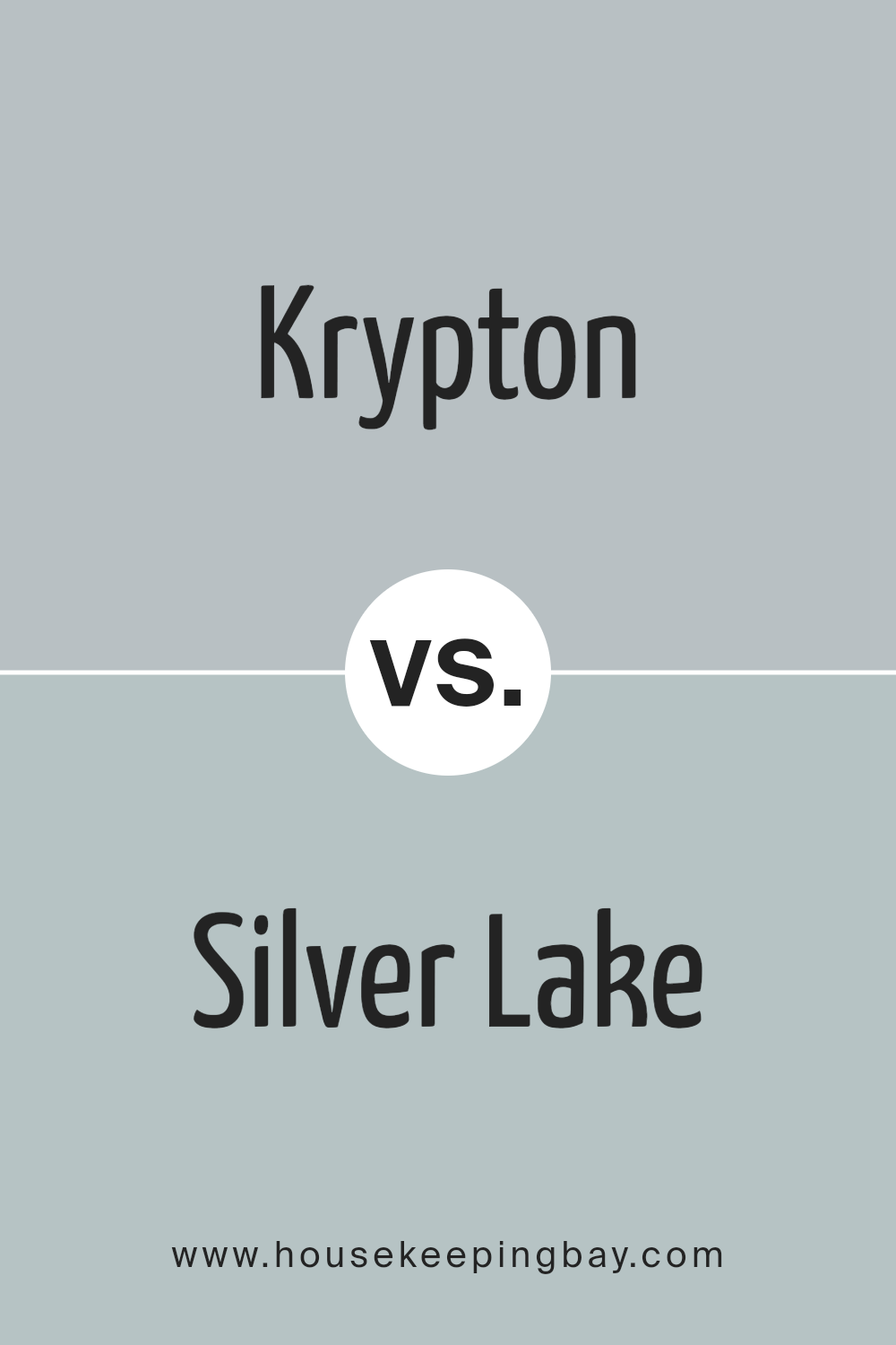
Krypton SW 6247 by Sherwin Williams vs Silver Lake SW 9633 by Sherwin Williams
Krypton SW 6247 and Silver Lake SW 9633, both by Sherwin Williams, offer distinct vibes for any space. Krypton stands out with its deep, serene blue tone, bringing a sense of calmness and sophistication.
It’s a color that adds a cool, refreshing touch, perfect for creating a relaxing atmosphere in rooms. Silver Lake, in contrast, presents a softer, neutral grey that works well in a wide range of settings. This lighter shade is versatile, easy to pair with various decor styles, and can make small spaces appear larger and more open.
While Krypton brings depth and an oceanic feel, Silver Lake offers a subtle elegance and a clean backdrop.
Whether you prefer the tranquil blue of Krypton or the understated elegance of Silver Lake, each color has its unique charm to make any room special.
You can see recommended paint color below:
- SW 9633 Silver Lake
housekeepingbay.com
Krypton SW 6247 by Sherwin Williams vs Samovar Silver SW 6233 by Sherwin Williams
Krypton SW 6247 and Samovar Silver SW 6233, both from Sherwin Williams, offer unique shades for spaces. Krypton presents a cool, serene blue that can create a peaceful atmosphere in any room. Its subtle blue tones can refresh a space, making it feel open and airy.
Samovar Silver, however, leans towards a muted green with silvery undertones, offering a sophisticated and versatile option. This color can add a touch of elegance to any area, seamlessly fitting with various decor styles. While Krypton brings a light, breezy vibe, perfect for enhancing natural light, Samovar Silver delivers a more grounded, earthy feel.
Each color has its own charm, making them suitable for different preferences and room functions. Krypton works well in spaces meant for relaxation, like bedrooms or bathrooms, while Samovar Silver could be a great choice for common areas, creating a cozy and inviting atmosphere.
You can see recommended paint color below:
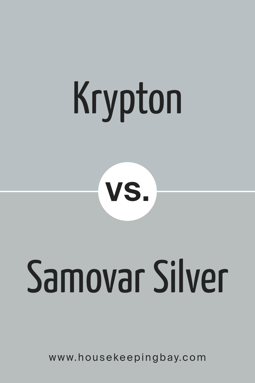
housekeepingbay.com
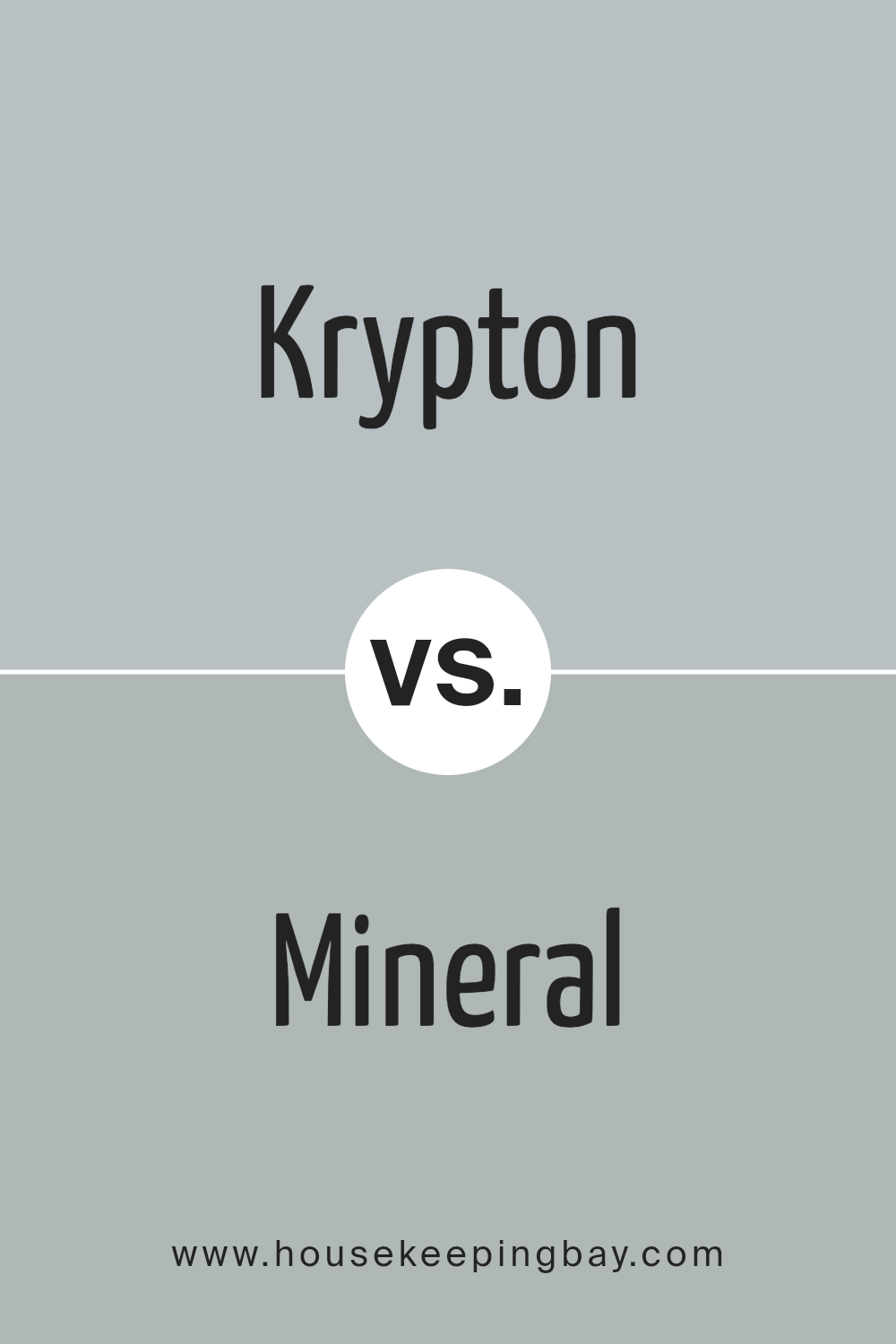
Krypton SW 6247 by Sherwin Williams vs Mineral SW 9637 by Sherwin Williams
Krypton SW 6247 by Sherwin Williams is a soft, serene blue with a cool undertone, offering a peaceful vibe to any space. It brings a sense of calm and can make small spaces appear larger and more inviting. This color is great for bedrooms or bathrooms where you want to create a relaxing atmosphere.
Mineral SW 9637, in contrast, leans towards a neutral territory with its earthy, gray tone. It’s versatile and timeless, perfect for various settings, from modern living rooms to cozy kitchens. Mineral provides a solid foundation for decorating, allowing for bold or subtle accent colors to shine.
While Krypton adds a fresh, airy feel, Mineral serves as a grounding element that complements natural materials and textures well. Both colors reflect Sherwin Williams’ knack for creating paint colors that fit beautifully into a wide range of interior designs, yet they cater to different aesthetic preferences and design needs.
You can see recommended paint color below:
- SW 9637 Mineral
housekeepingbay.com
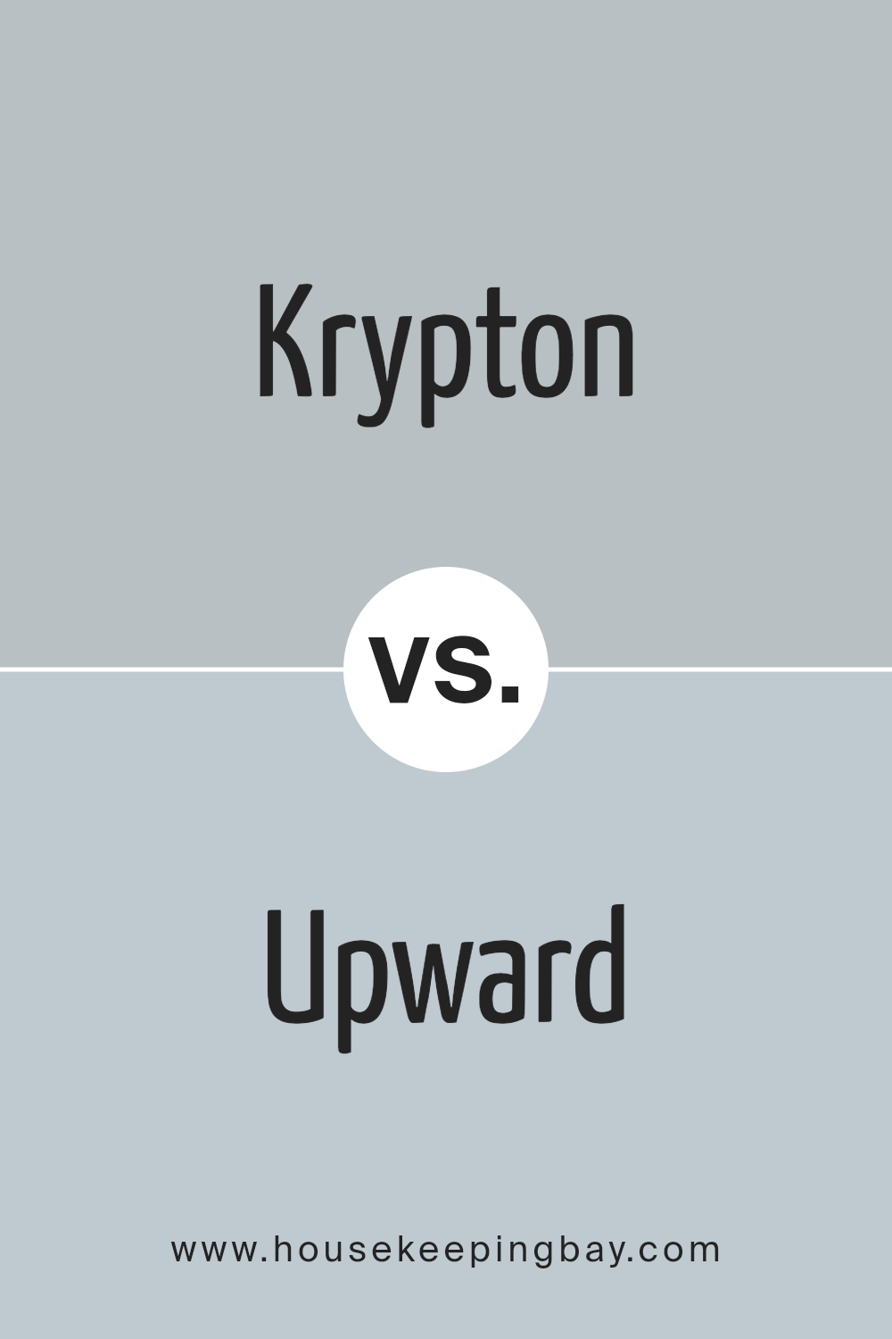
Krypton SW 6247 by Sherwin Williams vs Upward SW 6239 by Sherwin Williams
Krypton SW 6247 by Sherwin Williams is a unique shade of blue with a calm and soothing feel. It has a slightly gray undertone, making it versatile for various spaces, offering a serene and peaceful vibe. This color is ideal for creating a relaxed atmosphere in rooms like bedrooms or bathrooms, where you want a sense of calm.
Upward SW 6239, another Sherwin Williams color, is lighter than Krypton. It leans more towards a soft, airy blue that can make a room feel more spacious and open. Its gentle hue is perfect for areas where you want to bring in a bit of lightness without overwhelming the space with color.
While both Krypton and Upward are blues, they serve different purposes due to their distinct tones. Krypton, with its deeper, grayish tint, is great for a cozy, sophisticated look. Upward, being lighter, works well in achieving a bright, uplifting environment. Choosing between them depends on the mood you want to set for your space.
You can see recommended paint color below:
housekeepingbay.com
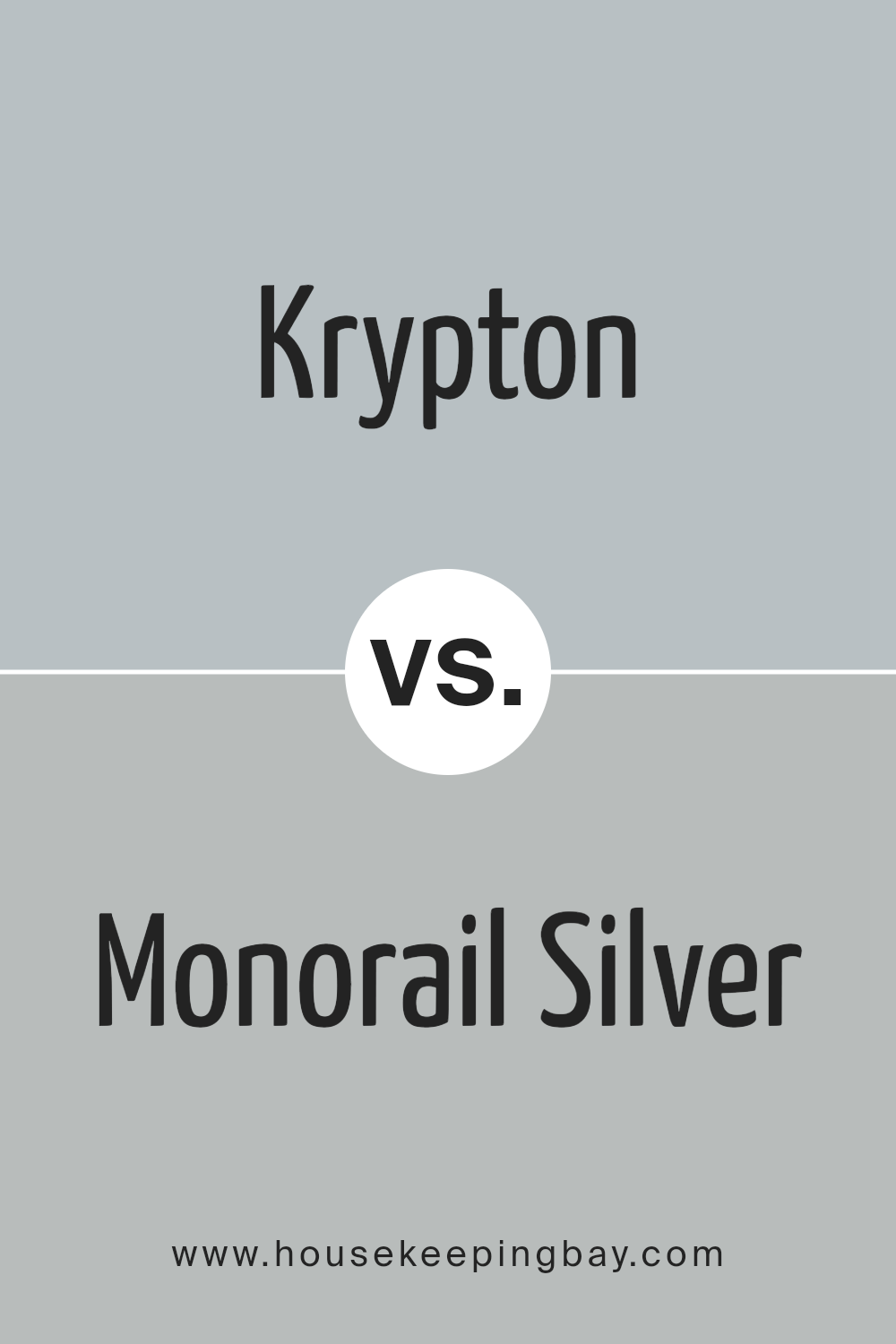
Krypton SW 6247 by Sherwin Williams vs Monorail Silver SW 7663 by Sherwin Williams
Krypton SW 6247 by Sherwin Williams is a soothing, pale blue-grey hue that brings a calm, serene vibe to any space. It’s light enough to make rooms feel airy and spacious, yet has enough depth to add character and a sense of coziness. This color works well in bedrooms and bathrooms, offering a peaceful backdrop that’s easy on the eyes.
Monorail Silver SW 7663, by contrast, is a darker, more pronounced grey with a slight metallic undertone. It has a modern, sophisticated feel, perfect for creating a sleek, contemporary look. This shade is versatile, fitting for kitchens, living rooms, or even exteriors, providing a chic, urban vibe.
While both colors come from Sherwin Williams and share grey undertones, Krypton leans towards a lighter, blue-grey, promoting a tranquil atmosphere. Monorail Silver, with its deeper, metallic grey, offers a bolder, more striking option. Each color serves different aesthetic purposes, but both add beautiful, unique touches to spaces. Whether you’re going for a lighter, airy feel or a sophisticated, modern edge, these colors offer distinct moods and styles.
You can see recommended paint color below:
- SW 7663 Monorail Silver
housekeepingbay.com
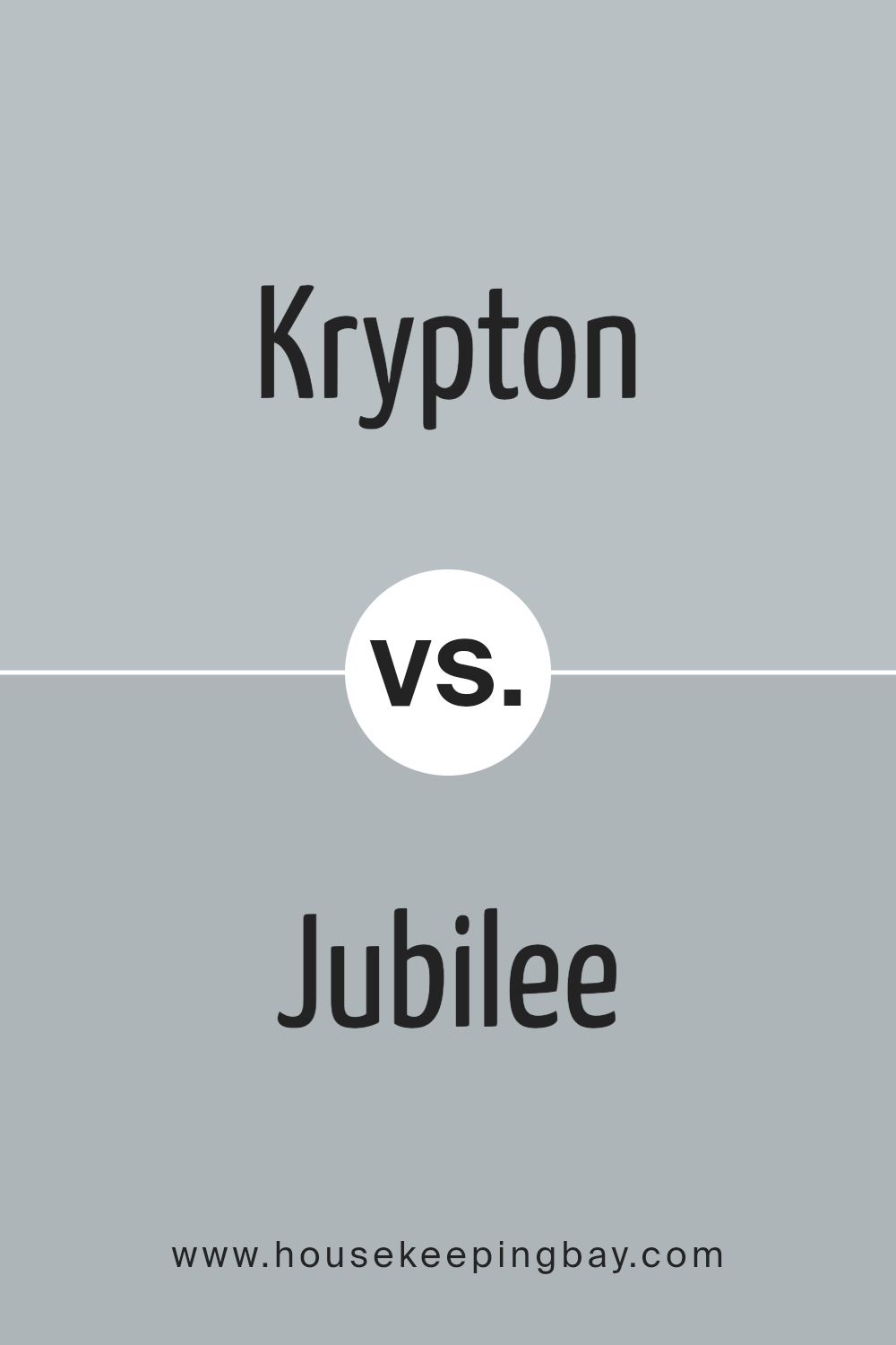
Krypton SW 6247 by Sherwin Williams vs Jubilee SW 6248 by Sherwin Williams
Krypton SW 6247 and Jubilee SW 6248 by Sherwin Williams are two close colors with noticeable differences. Krypton presents a soft, cool blue-gray hue that feels serene and airy in any space. Its subtle blue undertones bring a calm, refreshing vibe, making it perfect for creating a relaxed environment.
In contrast, Jubilee leans more towards a muted, grayish-purple tone, offering a slightly warmer and more inviting atmosphere than Krypton. Jubilee’s unique blend of gray and purple adds a cozy, sophisticated touch to rooms, making it suitable for spaces where a comforting yet modern aesthetic is desired.
While Krypton may be the go-to for a crisp, clean look with a hint of coolness, Jubilee steps in when warmth and subtle depth are preferred, providing a gentle, elegant backdrop. Both carry their unique charm, enriching spaces with their distinct personalities without overwhelming with color.
You can see recommended paint color below:
- SW 6248 Jubilee
housekeepingbay.com
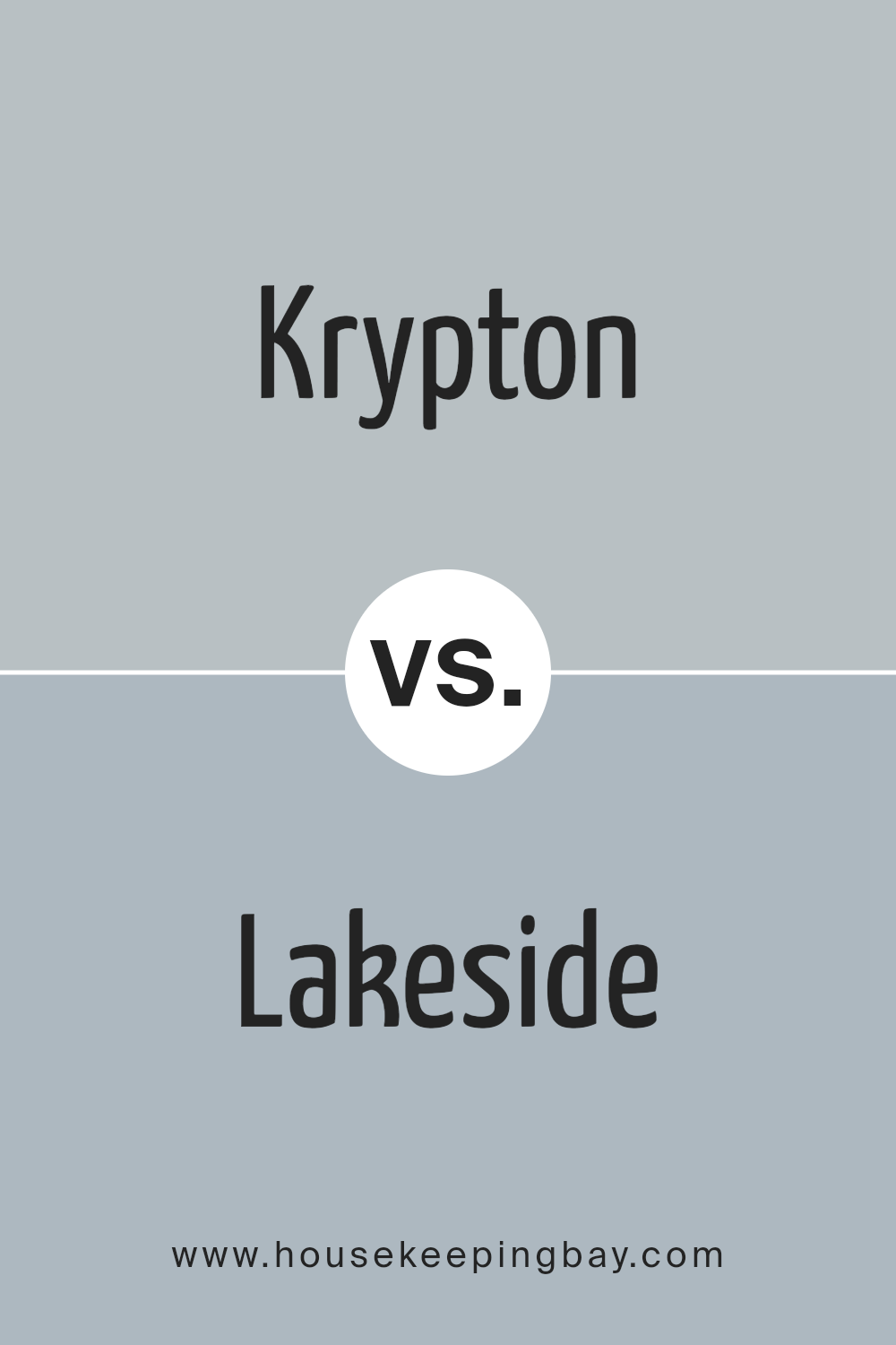
Krypton SW 6247 by Sherwin Williams vs Lakeside SW 9683 by Sherwin Williams
Krypton SW 6247 and Lakeside SW 9683 are two colors from Sherwin Williams with their own unique appeal. Krypton SW 6247 leans towards a soft, soothing gray with a gentle blue undertone. It’s a versatile color that works well in various spaces, providing a calm and serene backdrop. Its subtle blue hue brings in a sense of coolness, making it ideal for creating a relaxed atmosphere.
Lakeside SW 9683, however, offers a different vibe. It’s a deeper, more pronounced blue that carries a bit more energy and depth. This color can add a significant impact to a room, giving it a fresh and vibrant feel. It’s perfect for those looking to add a splash of color without overwhelming a space.
While both colors share a base in blue, Krypton SW 6247 is much lighter and more muted, offering a hint of tranquility. Lakeside SW 9683, with its stronger, more vivid blue, provides a lively contrast. Choosing between them depends on the desired mood and intensity of color in the room. Krypton is great for a subtle, peaceful space, while Lakeside is ideal for making a bolder statement.
You can see recommended paint color below:
- SW 9683 Lakeside
housekeepingbay.com
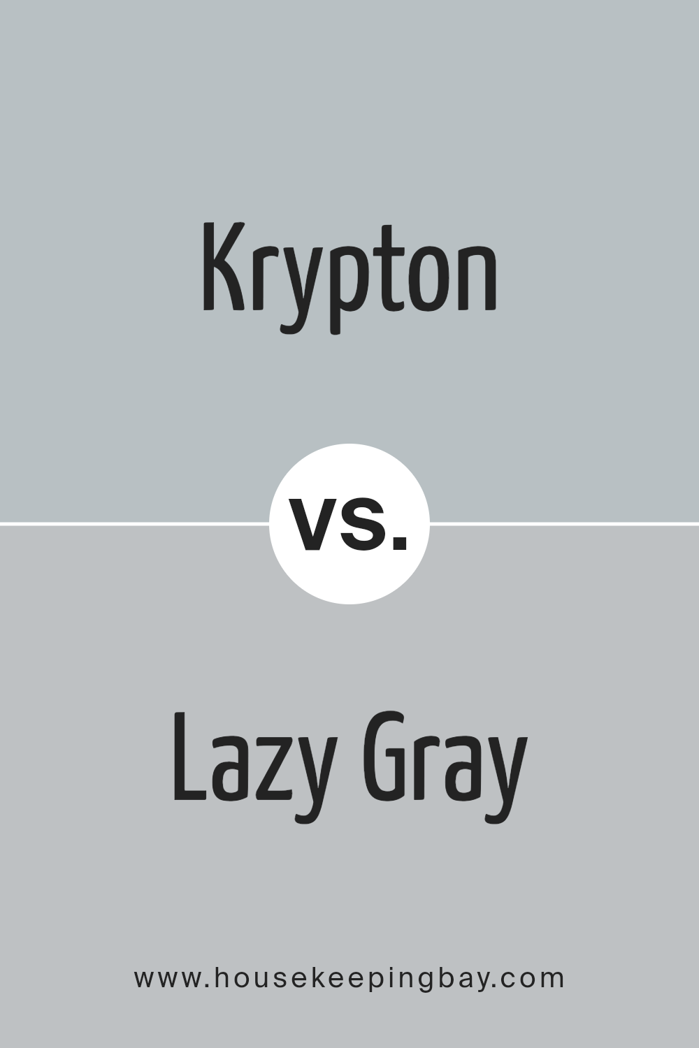
Krypton SW 6247 by Sherwin Williams vs Lazy Gray SW 6254 by Sherwin Williams
Krypton SW 6247 by Sherwin Williams is a unique color that brings a calm and serene atmosphere to any space. It has a cool undertone that leans towards the blue end of the spectrum, making it perfect for creating a peaceful and refreshing vibe. This color works well in bedrooms or bathrooms where a soothing effect is desired.
Lazy Gray SW 6254, also by Sherwin Williams, offers a lighter and more neutral option. While still maintaining a cool undertone, this shade is closer to a true gray, providing a versatile backdrop for various decor styles and color schemes. It’s excellent for living areas and kitchens, where a subtle, yet sophisticated look is aimed for.
Both Krypton and Lazy Gray share cool undertones, but their intensity and depth set them apart. Krypton’s deeper, more pronounced blue influence offers a distinct calmness, whereas Lazy Gray’s lighter, more understated gray creates a clean and open feel. Depending on the mood you want to achieve, each color has its unique charm, with Krypton adding depth and Lazy Gray offering neutrality.
You can see recommended paint color below:
- SW 6254 Lazy Gray
housekeepingbay.com
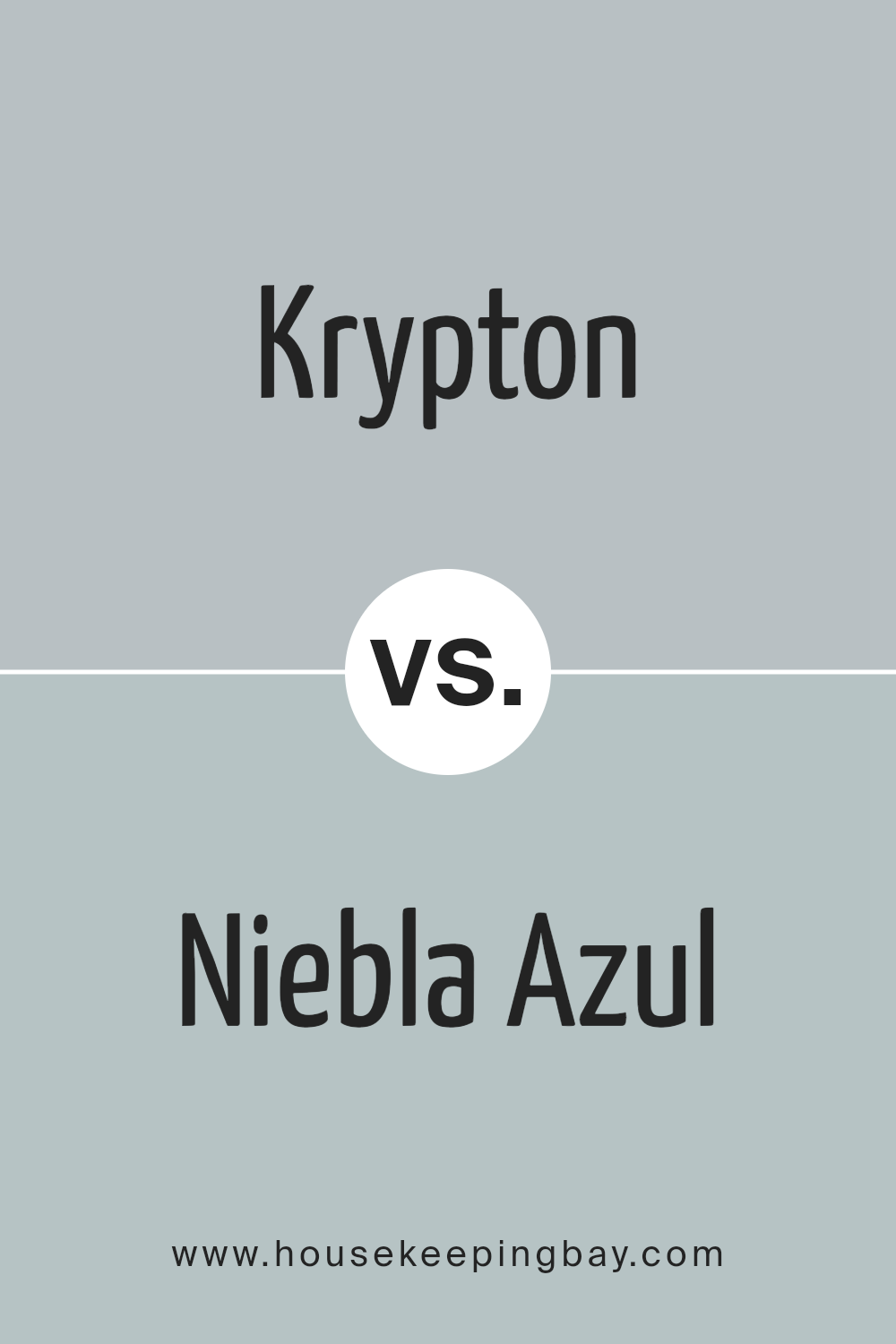
Krypton SW 6247 by Sherwin Williams vs Niebla Azul SW 9137 by Sherwin Williams
Krypton SW 6247 by Sherwin Williams is a light, airy blue with a touch of green, offering a subtle, refreshing vibe to any space. It’s like a breath of fresh air in a room, perfect for creating a serene and inviting atmosphere. This color works wonders in spaces that aim for a calm and peaceful ambiance. It is versatile, fitting well in bedrooms, bathrooms, and living areas, where a light, soothing presence is desired.
In contrast, Niebla Azul SW 9137, also by Sherwin Williams, presents a slightly deeper and richer blue tone. While still in the realm of calming colors, Niebla Azul carries a bit more depth, adding a sense of sophistication and strength to the environment.
This color suits spaces that benefit from a bit more color intensity but still maintain that overall feeling of calmness. Both colors share a blue base, but Niebla Azul leans towards creating a cozier and slightly more impactful visual experience in a space.
Choosing between Krypton and Niebla Azul comes down to preference for lightness and subtlety versus depth and richness within the spectrum of tranquil blues.
You can see recommended paint color below:
- SW 9137 Niebla Azul
housekeepingbay.com
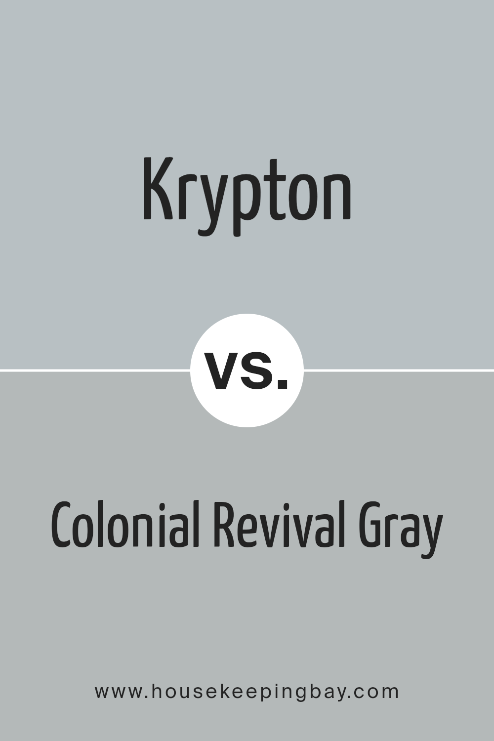
Krypton SW 6247 by Sherwin Williams vs Colonial Revival Gray SW 2832 by Sherwin Williams
Krypton SW 6247 by Sherwin Williams is a unique, soothing blue with a grayish tint, offering a calm and cool vibe to any room. It’s perfect for those looking to create a serene space, reflecting a gentle, peaceful ambiance. This color leans towards a modern, sophisticated look but still feels welcoming and cozy.
Colonial Revival Gray SW 2832, also by Sherwin Williams, brings a different vibe. This color is a warmer, soft gray that pairs well with both traditional and contemporary decor. Its versatility makes it a go-to choice for adding a touch of elegance without overpowering a room. This shade of gray works beautifully in spaces that aim for a refined yet inviting atmosphere.
Both colors, Krypton and Colonial Revival Gray, offer distinct qualities. Krypton leans more towards a cooler, crisper feel, ideal for a refreshing and modern aesthetic. Whereas Colonial Revival Gray provides a warmer, more classic look that’s effortlessly chic and cozy.
Depending on the mood and style you want to achieve, each color has its unique charm to enhance your space.
You can see recommended paint color below:
- SW 2832 Colonial Revival Gray
housekeepingbay.com
Conclusion
In wrapping up our chat about SW 6247 Krypton by Sherwin Williams, it’s clear that if you’re eyeing a refreshing change or yearning to give your space a sleek and airy vibe, this shade is worth considering. Krypton isn’t just another blue paint; it carries a unique softness that blends well with various decor styles, making it a versatile choice for your home. Whether you’re updating the look of your living room or bringing a sense of calm to your bedroom, Krypton has the potential to beautifully shift the atmosphere of any room.
What’s great about Krypton is its ability to pair effortlessly with different colors and materials. Imagine it alongside warm wooden textures or contrasting with bright white trims. The possibilities are vast, and it encourages you to play with ideas to find the perfect match for your home.
If you’re thinking about giving your walls a fresh coat of paint, Krypton offers a splendid balance of modern elegance and cozy vibe. It’s a color that simply transforms spaces without overwhelming them, making your home feel more inviting and peaceful.
So, why not give it a go and see how it can enhance your living environment?
After all, seeing is believing, and Krypton might just be the color you’ve been looking for to breathe new life into your space.
housekeepingbay.com
Ever wished paint sampling was as easy as sticking a sticker? Guess what? Now it is! Discover Samplize's unique Peel & Stick samples. Get started now and say goodbye to the old messy way!
Get paint samples


