Sea Salt SW-6204 by Sherwin Williams + 26 Real Home Pics
Coordinating and accent colors, trim color, undertones and more.
If you are fond of calm and reserved colors in your home, you definitely consider gray paints to be applied on your interior walls.
Gray is a somewhat universal color: it comes in different varieties, both warm and cool, which allows you to adjust it to the specific room and lighting to create a desired effect. And also – and it’s probably the best feature of this color! – gray can be easily combined with quite many other colors.
So if you feel unsure whether or not such a paint color as Sea Salt by Sherwin Williams will suit your interiors, let us provide you with more information on this subject!
From this article, you will learn what color it is, learn its undertones and trim color, as well as coordinating and accent colors.
In addition, we will describe how Sea Salt will look in different rooms and how this paint color reacts to different types of lighting.
And this is really important, since lighting influences the way the color will display on the walls.
So after you read this article, you will be able to easily figure out whether this color is suitable for you or not, and what room (or rooms) it should be used.

Credits: Spacejoy, via Unsplash.com
What Type Of Color Is Sea Salt SW-6204?
Table of Contents
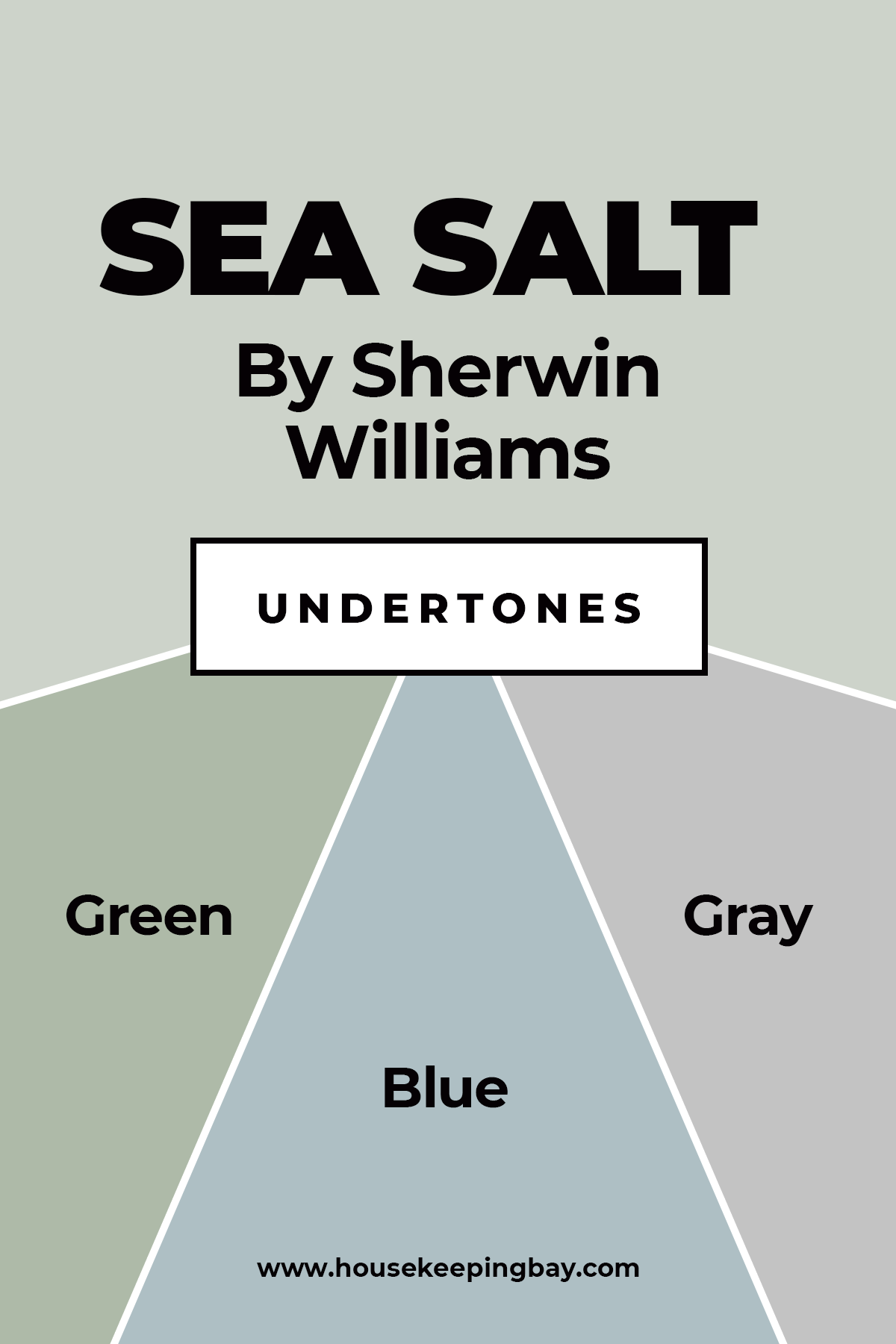
If you take a look at the Sherwin Williams Sea Salt SW-6204, you may think that this color is gray. However, technically, it would be more correct to call it greenish blue.
As Encycolorpedia says, it is a very beautiful paint color that is reminiscent of a pale green sea with the sun shimmering through it, though not as bright.
Sea Salt is a really interesting color, because how it looks depends on lighting and what other colors are around it. You could say that it is a sort of chameleon.
For example, when paired next to a blue, sea salt looks gray! And if you compare this color to a true gray, SW Sea Salt will look green!
And when you place Sea Salt with green, it almost takes on a pale bluish hue.
Housekeepingbay.com
SW Sea Salt Undertones
As you could already guess, this wonderful paint color has several different undertones. They are green, blue, and gray. Green and gray take the most of the color, whilst blue can slightly be noticed. However, it is also there.
If you take a look at the Sherwin Williams color strip, you will see that the colors that sit below the Sea Salt get more and more green.
However, this particular shade is often considered the lightest one on the strip.
Housekeepingbay.com
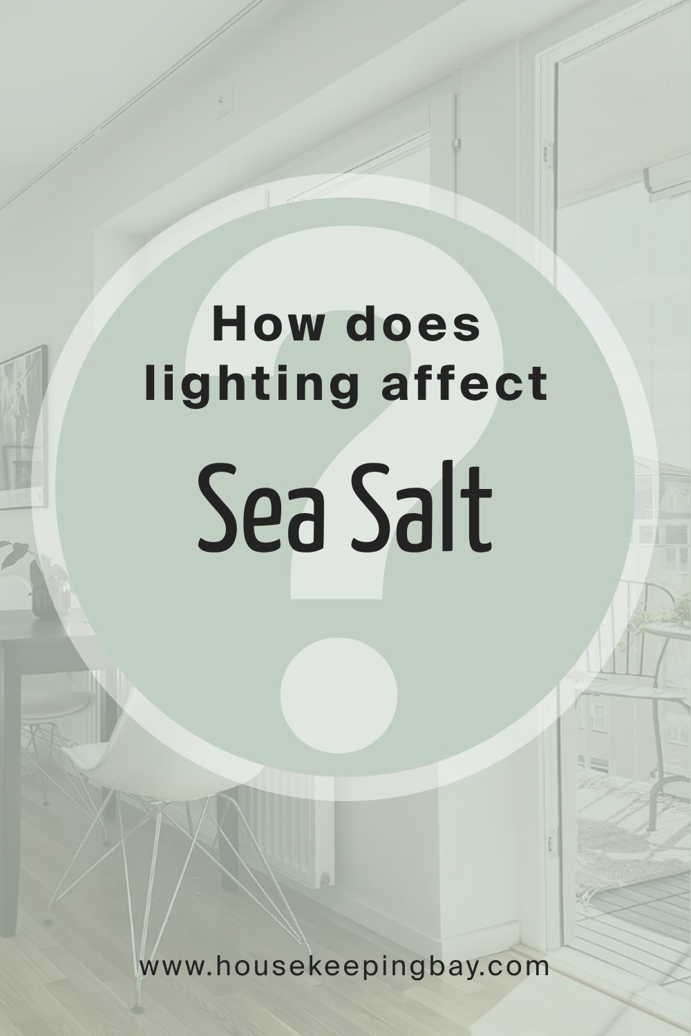
How Does Lighting Affect Sea Salt?
Sherwin-Williams Sea Salt-SW 6204 is one of the most popular soft green-grays, having a very, very subtle blue undertone. This color is really, really light-sensitive; it changes often from greenish to bluish to grayish, depending on the light type. Here’s what you might expect in different lighting:
- Natural Light: In most rooms with plenty of natural light, Sea Salt tends to feel airy and light with much of its soft green coming through. In south-facing rooms that get the warmth of direct sunlight, the green undercurrents come out and leave Sea Salt fresh and beachy. In rooms with cooler natural light, as in those that face north, Sea Salt is more grey, toning toward blue as an undertone, which gives a soothing, soft look.
- Warm Artificial Light -(incandescent or warm LED): The undertones of green in Sea Salt are pulled more with warm lighting, which makes the tone feel warmer and cozier. This kind of lighting tends to downplay the blue, so Sea Salt acts more like a soft, misty green that is stunningly appropriate when creating a relaxing, spa-like vibe.
- Cool Artificial Light (Cool LED or Fluorescent): With cool lighting, the blue undertones within Sea Salt are emphasized, making it feel cooler and somewhat more grayish-blue. That will inherently give it a more coastal look, or at least somewhat more modern, but it’s going to feel considerably cooler-and less green.
- Less Light/Shadowed Spaces: Sea Salt in less-lit areas or shadowed spaces can be pretty subdued and usually leaning toward a gray tone with just a hint of green or blue. In these spaces, it appears darker but still manages to maintain a soothing, subtle presence.
In general, the combination of green, gray, and blue in Sea Salt makes it flexible for a wide range of lighting conditions-tenderly between warm and cool. It works well in rooms for which one wants a calm, soothing backdrop, as it does not overpower these rooms.
housekeepingbay.com
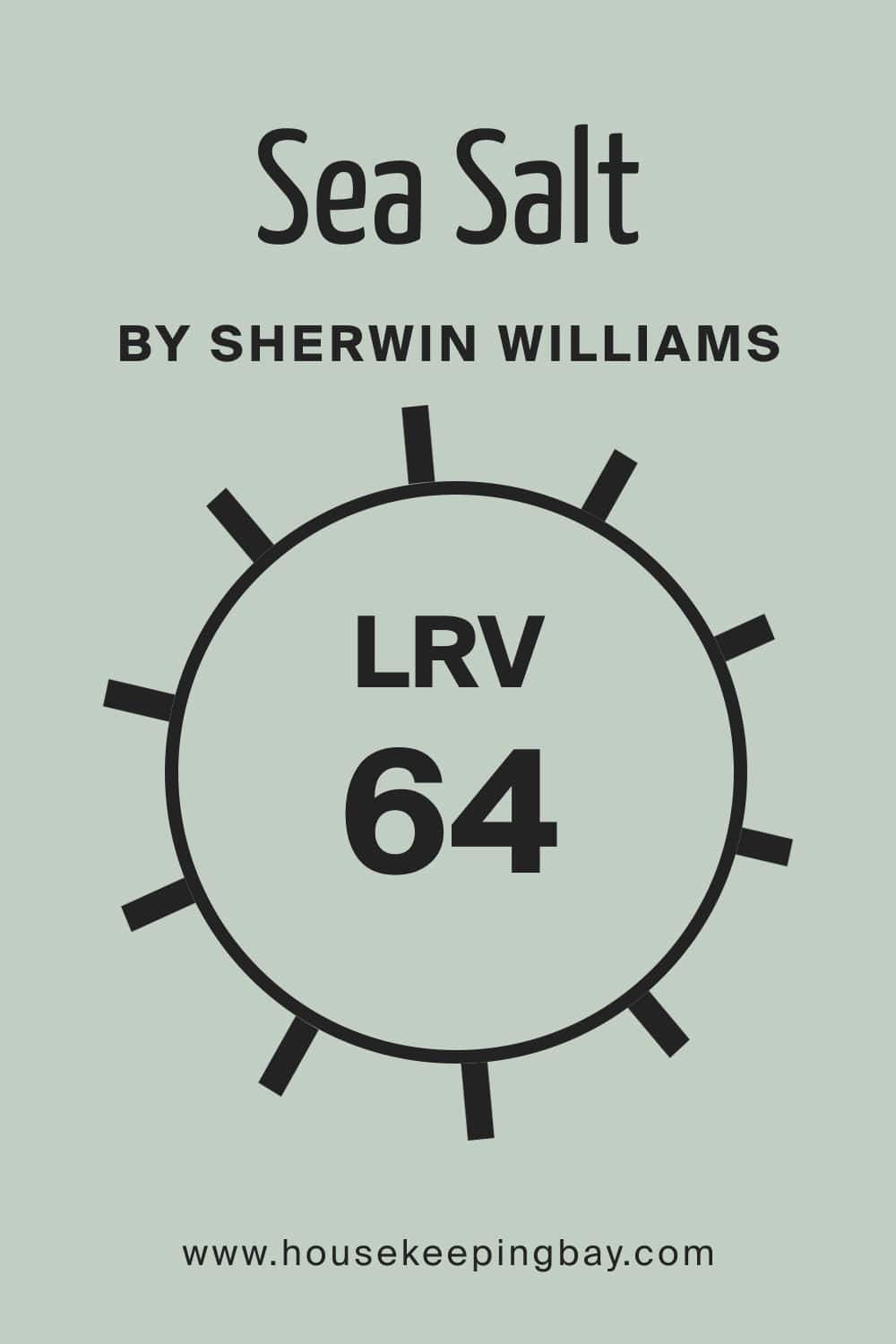
What is an LRV of Sea Salt?
When picking the paint color for your interior walls, you want to be sure that it will not change significantly after you apply it.
Especially when it comes to such a “shapeshifter” as Sea Salt! With its tricky undertones, you need to be very careful with where you are going to use it.
The light reflectance value of this color is 64. It means that this color will be able to make the room feel brighter and lighter by reflecting pretty much natural and artificial light back into the space.
However, this color is not that super light to be able to turn a dark room into a light on! It will also not help you to save an overly wash-out room and make it look like a reasonably well-lit one.
housekeepingbay.com
What is LRV? Read It Before You Choose Your Ideal Paint Color
Is Sea Salt a Warm Or a Cool Color?
If you are concerned about how light this paint color is, keep the following in mind. SW Sea Salt is a cool color that just barely hints at warmth.
And since cool colors are typically calming, this enables it to go well in many different rooms in a home. One of the things that so many people love about SW Sea Salt is the spacious, relaxing feel that it gives to a room.
Being a cool color also means that it tends to give depth to a room, making it feel larger than it is.
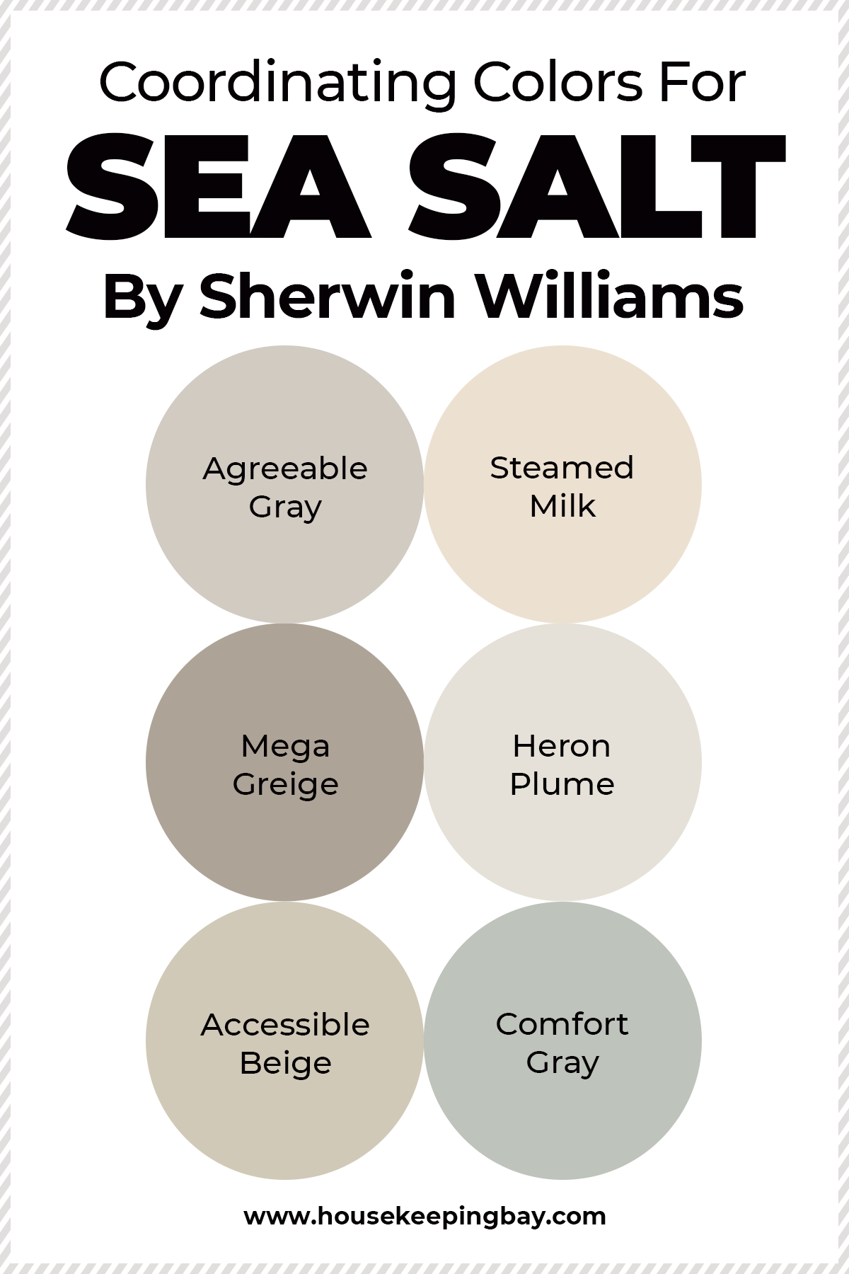
Coordinating Colors For the SW Sea Salt
When you start a painting project in your home, you want to know for sure what colors can be combined with each other and which ones can not.
Like that, you will be able to avoid a scenario when you have two different paints on the walls that don’t fit each other or look way too contrasting!
As for the SW Sea Salt, this color is pretty versatile since it goes well with grays, whites, beiges and greiges.
And below you can check out some examples of good coordinating colors for Sea Salt are:
Housekeepingbay.com
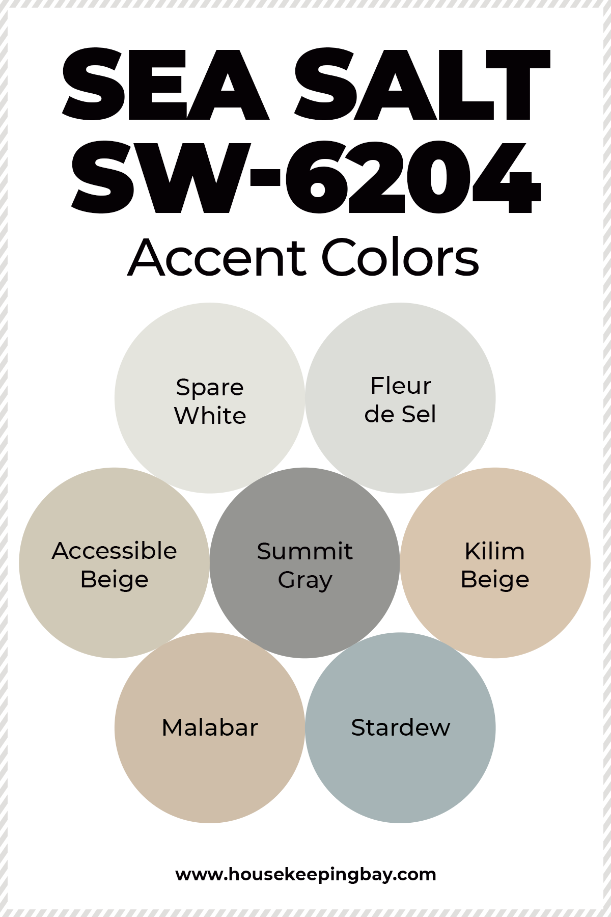
SW Sea Salt Accent Colors
Thinking of accent colors that will fit SW Sea Salt, you should consider using one of those that are suitable for combining with it.
As you already know, Sea Salt works well with greiges, beige colors, grays, and whites.
To be precise, you can opt for one of the following paint color if you are looking for an appropriate accent paint color:
Those will work with SW Sea Salt better than many others.
Housekeepingbay.com
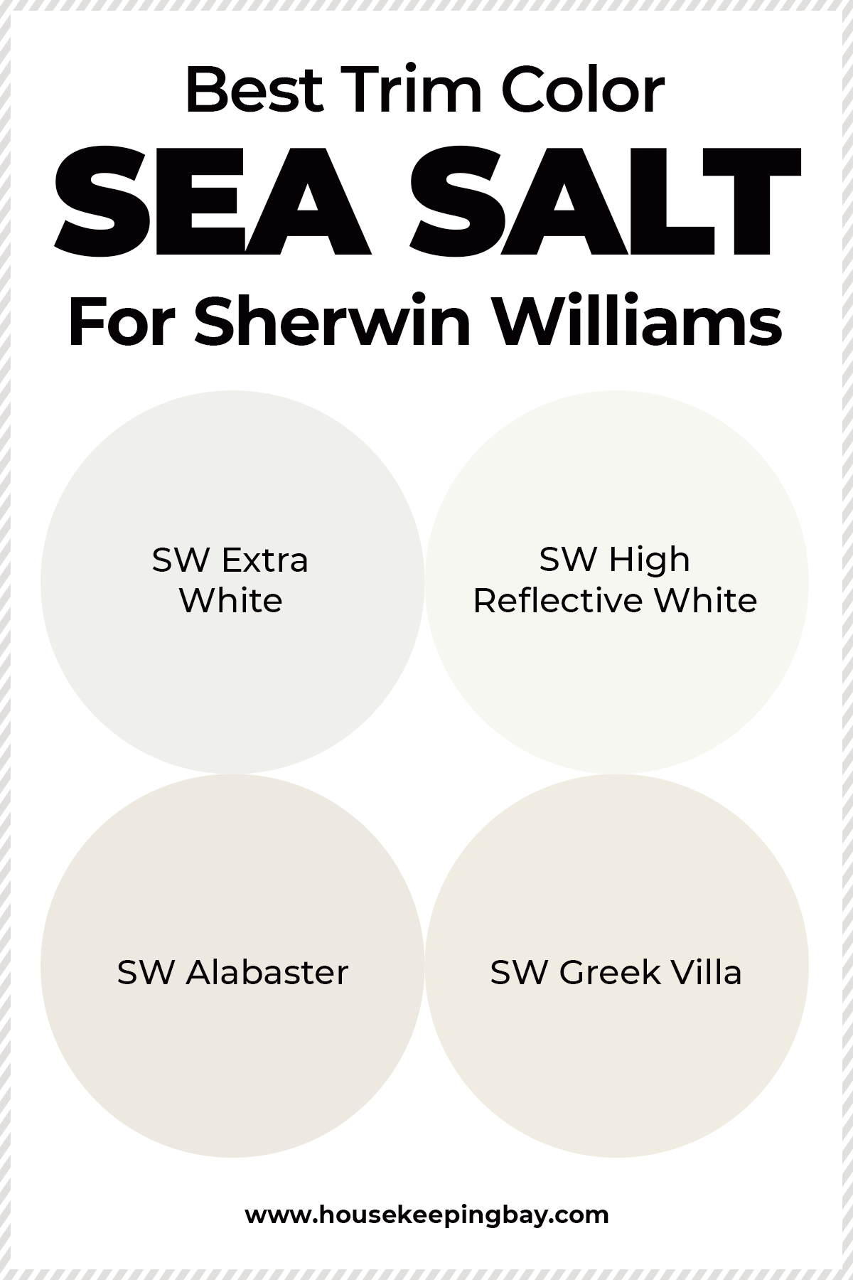
What Is the Best Trim Color For Sea Salt SW-6204?
When it comes to choosing a trim color, white is almost always a win-win option.
With SW Sea Salt, it will work as well since this bluish green pair wonderfully with quite many whites, including off-whites and clean whites.
In particular, you can use the following white paints to use them as trim colors:
Like that, whether you need an off-white or a clean white, you can choose from this list.
Housekeepingbay.com
Where Sea Salt SW-6204 Can Be Used In Your Home?
Even though Sea Salt by Sherwin Williams is a rather tricky color, it still can be used rather widely in your home!
In particular, it will work well in many rooms and on quite many surfaces.
And below, you can find where exactly this paint will do its best.
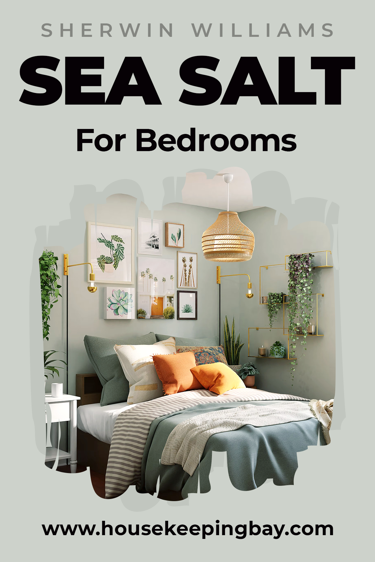
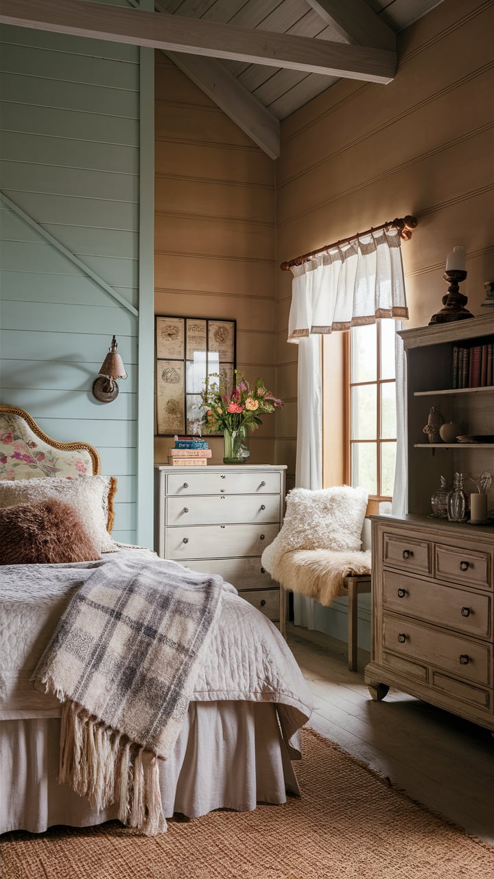
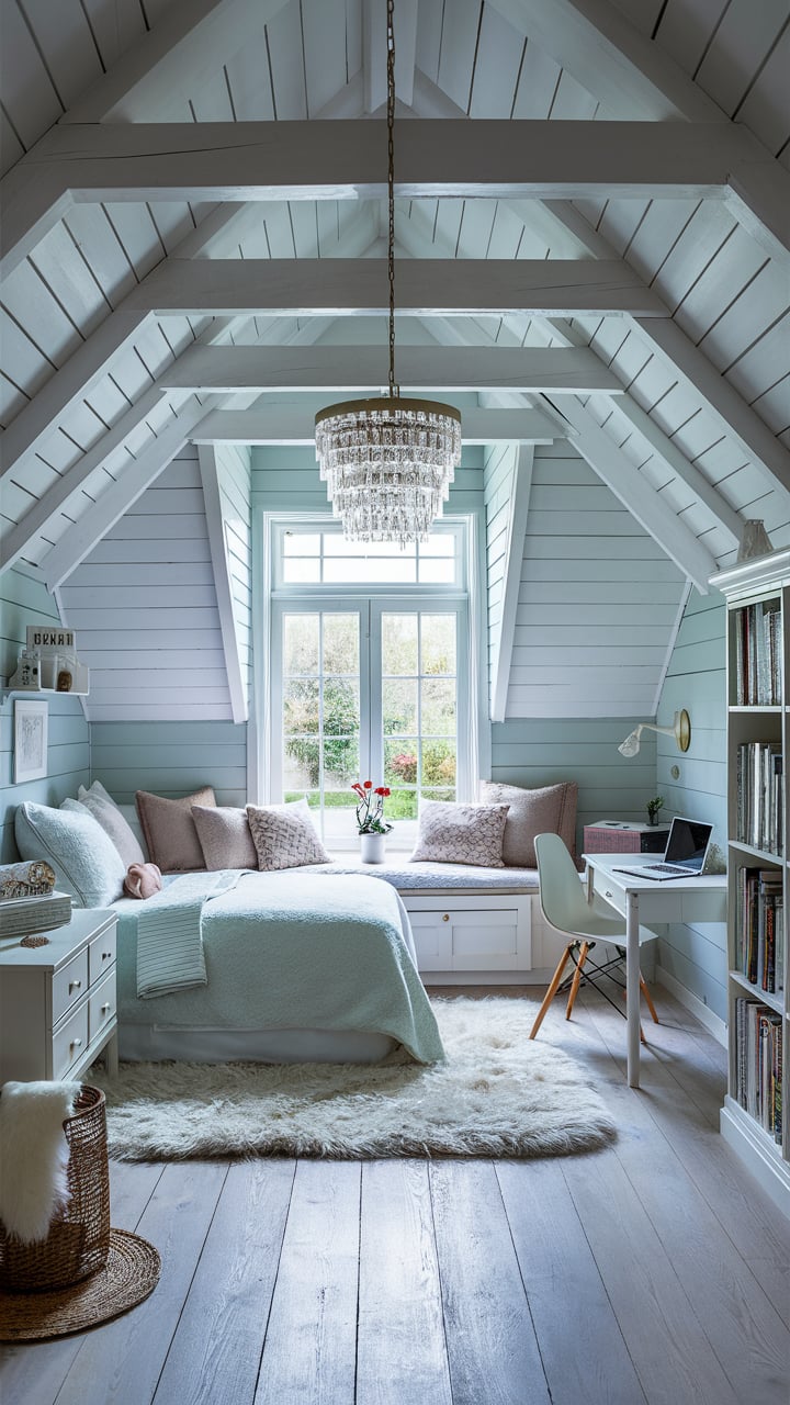
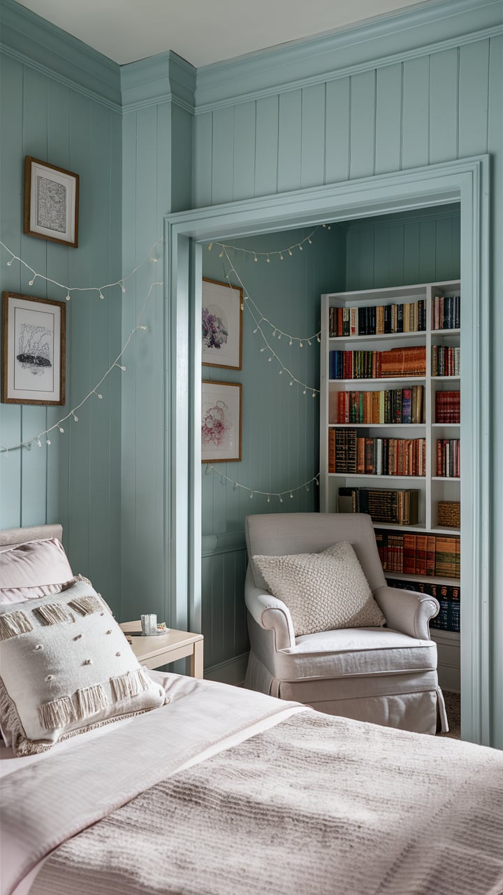
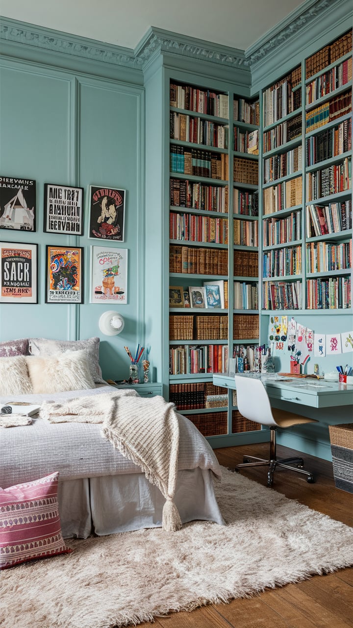
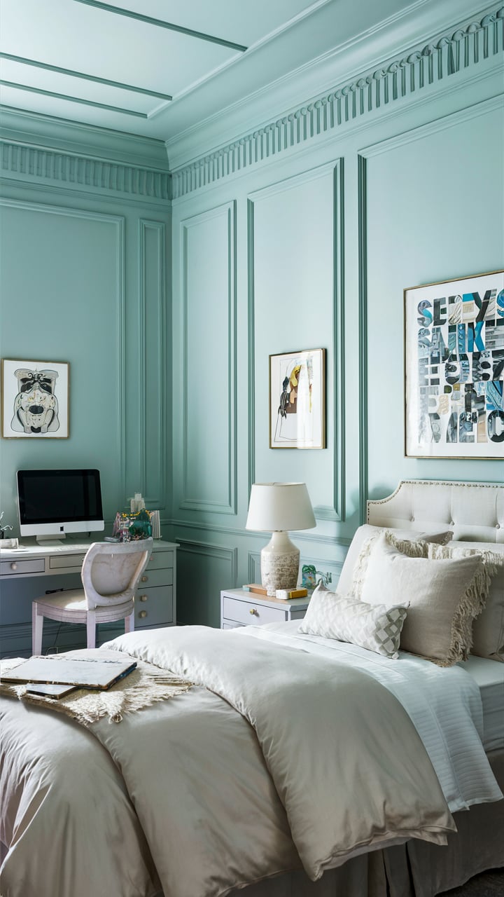
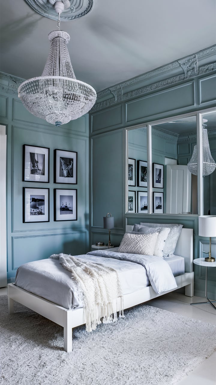
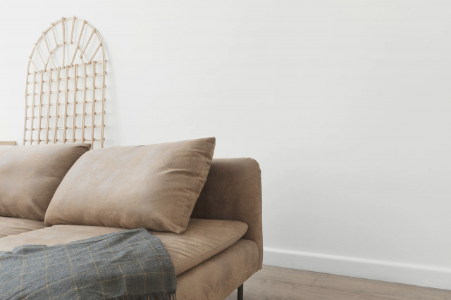
SW Sea Salt For Bedrooms
For bedrooms, this is a perfect color since it creates a calming and tranquil atmosphere, even though you might think that the color is a bit cool.
But if you are ok with that nuance, feel free to paint your bedroom walls with it.
Housekeepingbay.com
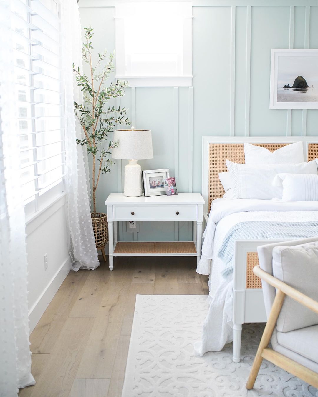
via instagram @chelseehood
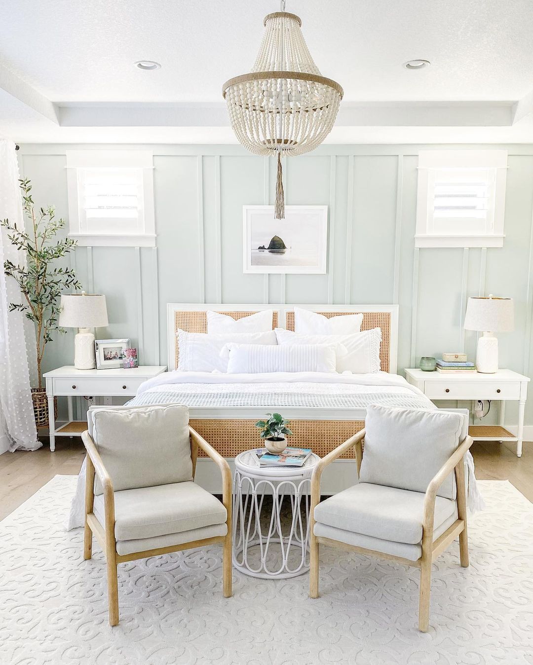
via instagram @chelseehood

via instagram @to_mimishousewego
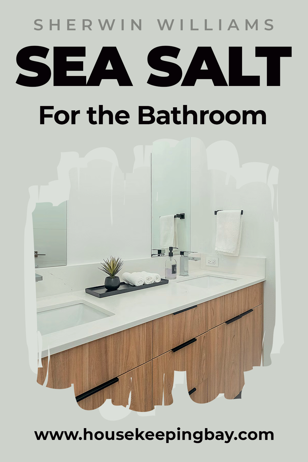
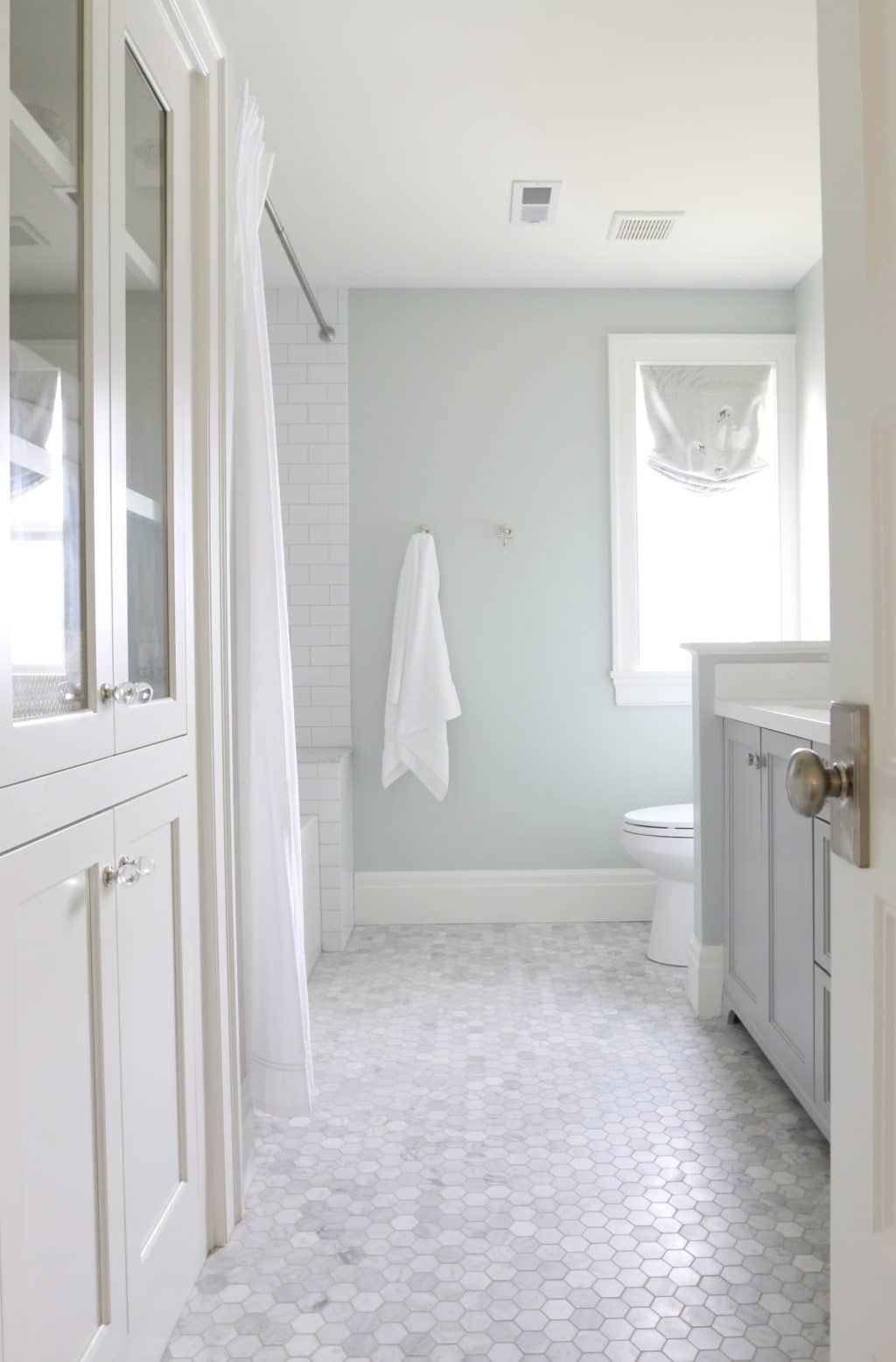
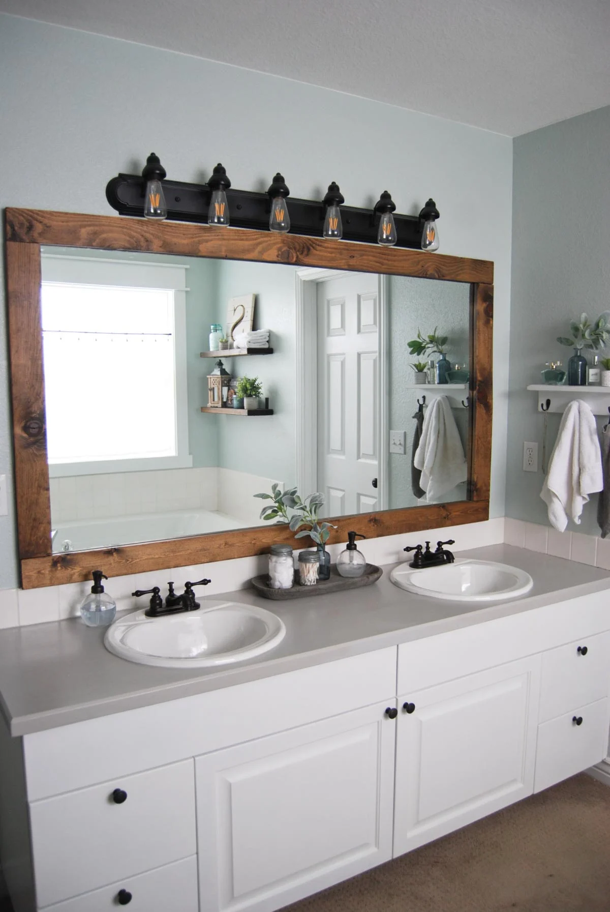
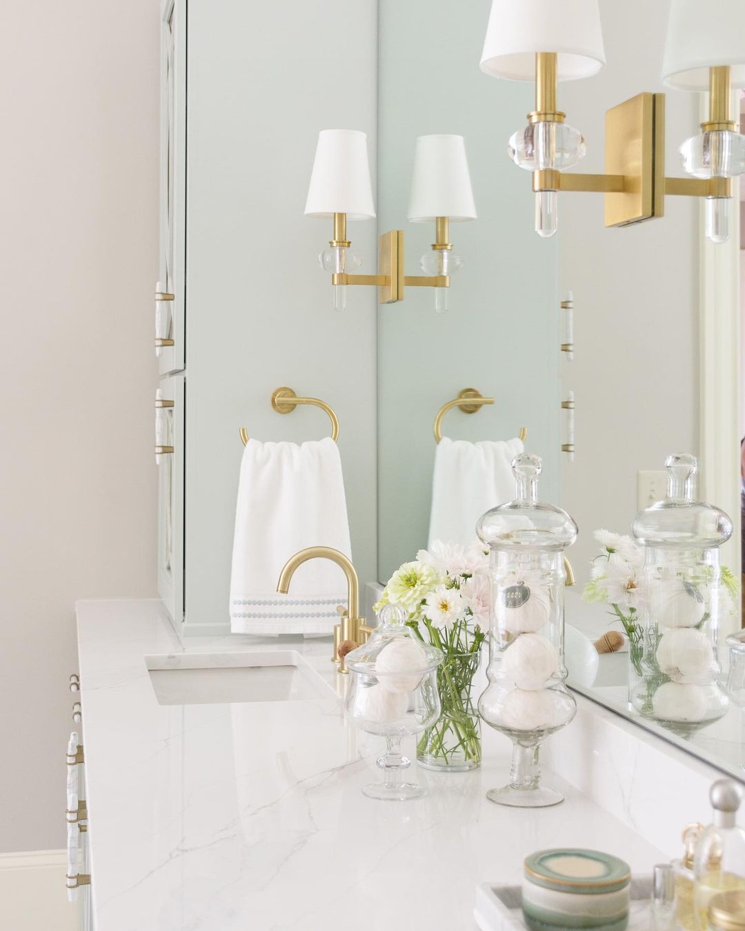
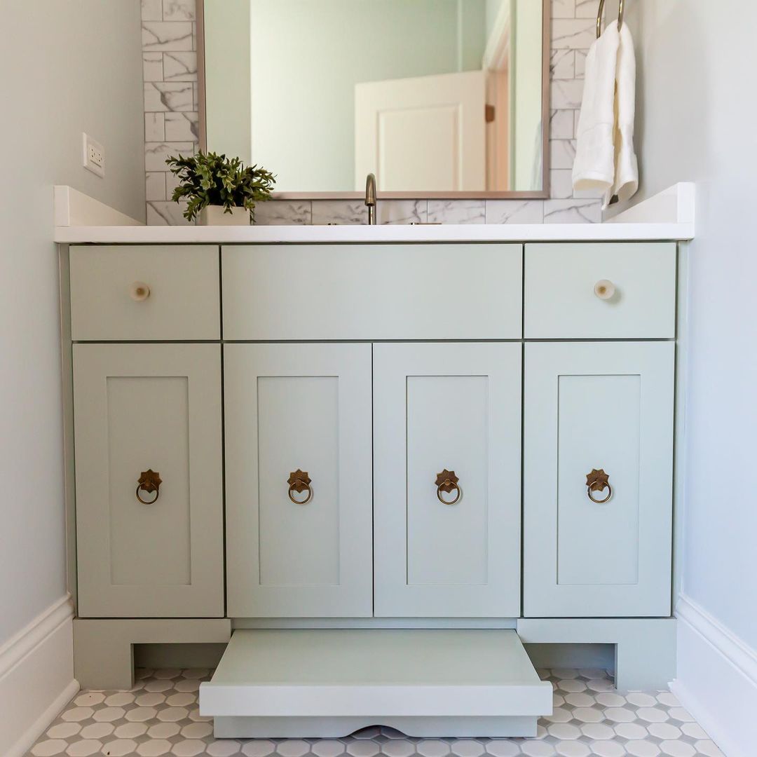
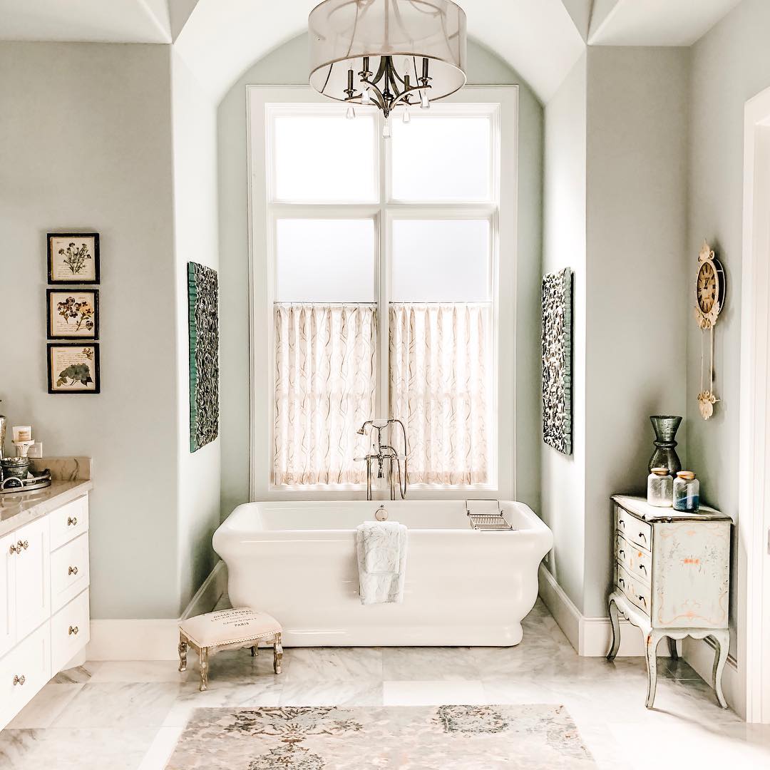
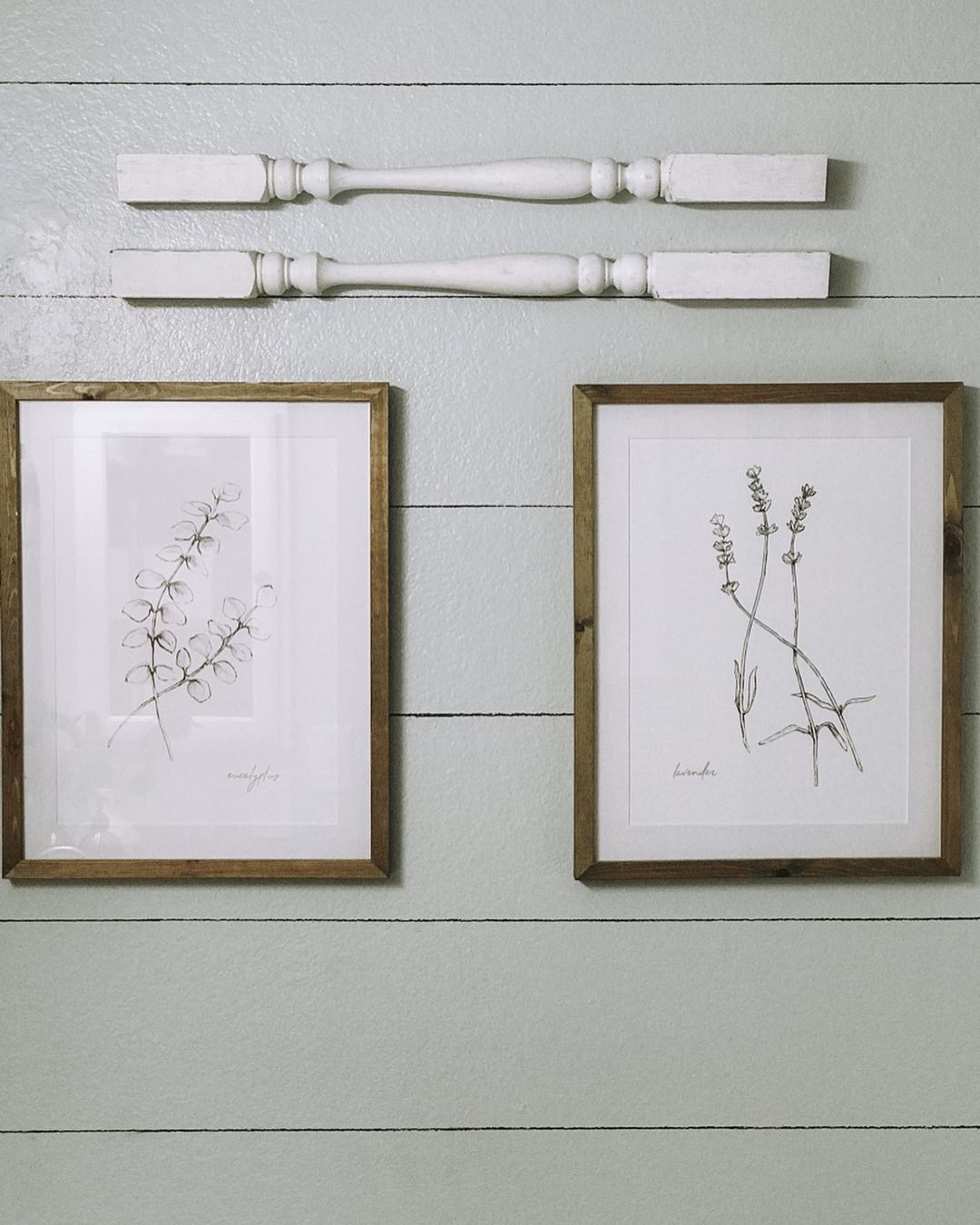
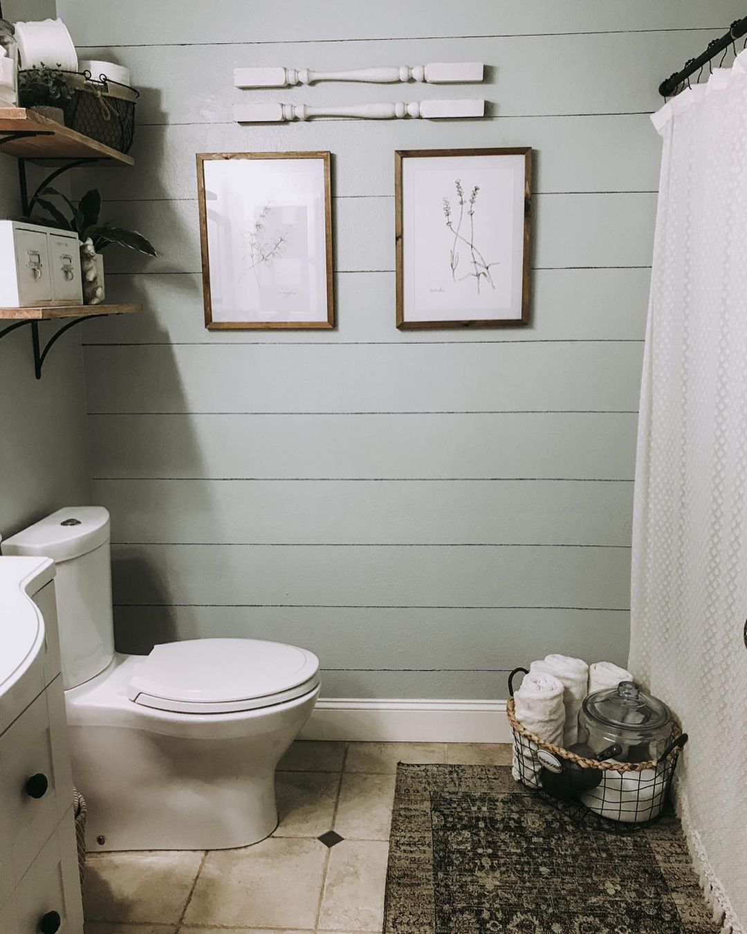
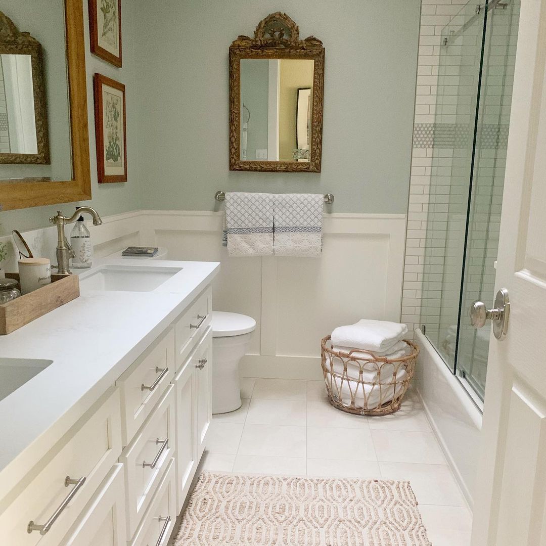
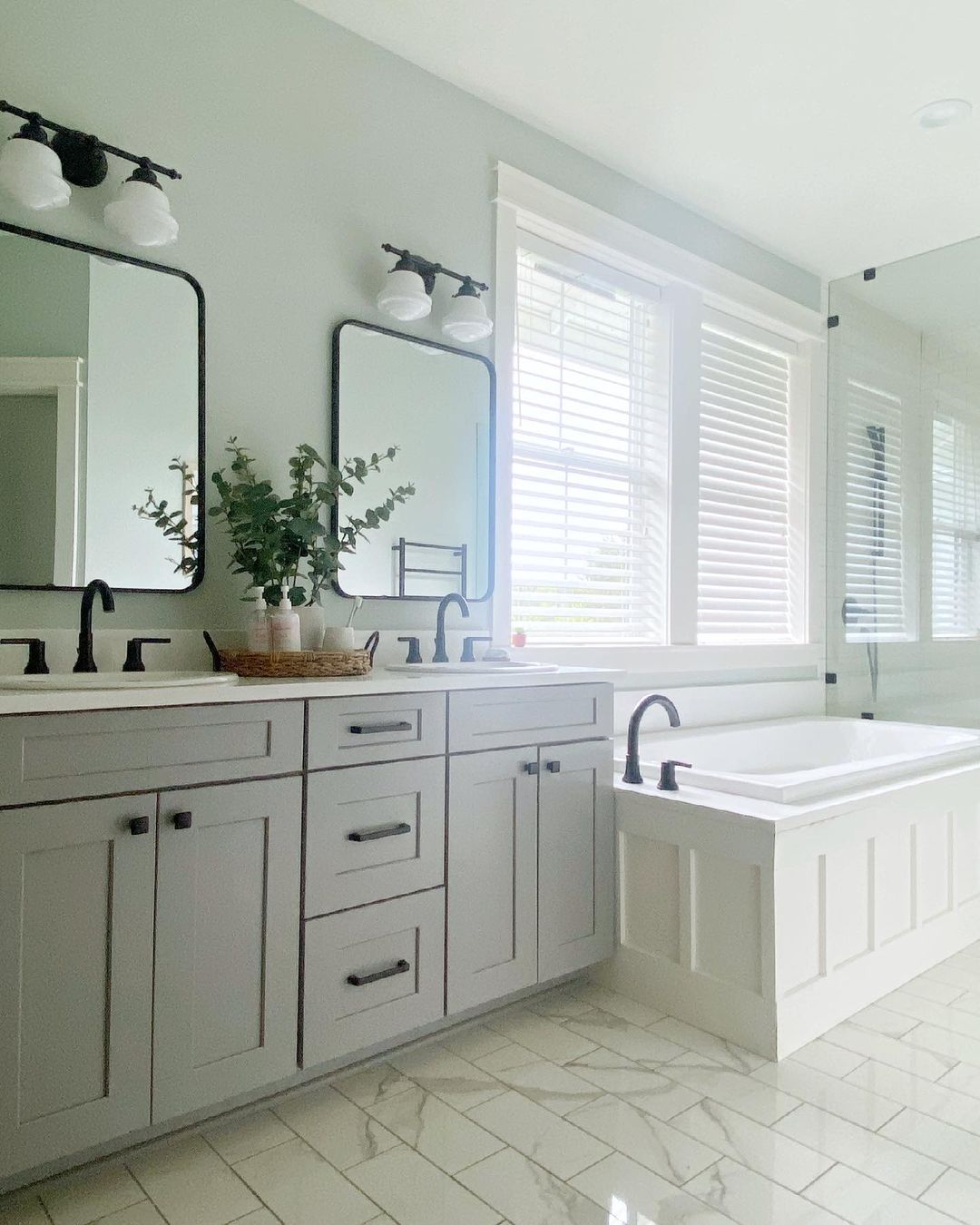
SW Sea Salt And Bathroom
For bathrooms, SW Sea Salt is a perfect match! Its watery and cool appearance fits this room ideally.
It is tranquil, calming and clean looking. It tends to look as though it has a bit more color in a bathroom, as there is typically a lot of white in a bathroom from the toilet and sink.
Housekeepingbay.com
via studio-mcgee.com
via emilysprojectlist.com
via instagram @dwellbycheryl
via instagram @oakleyhomebuilders
via instagram @to_mimishousewego
via instagram @littlesteelehouse
via instagram @littlesteelehouse
via instagram @stuga_hem
via instagram @revivalhomedesigns
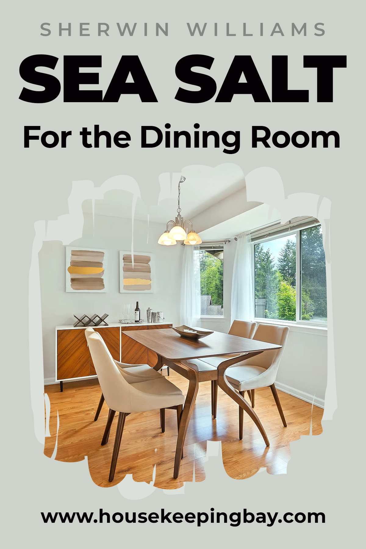
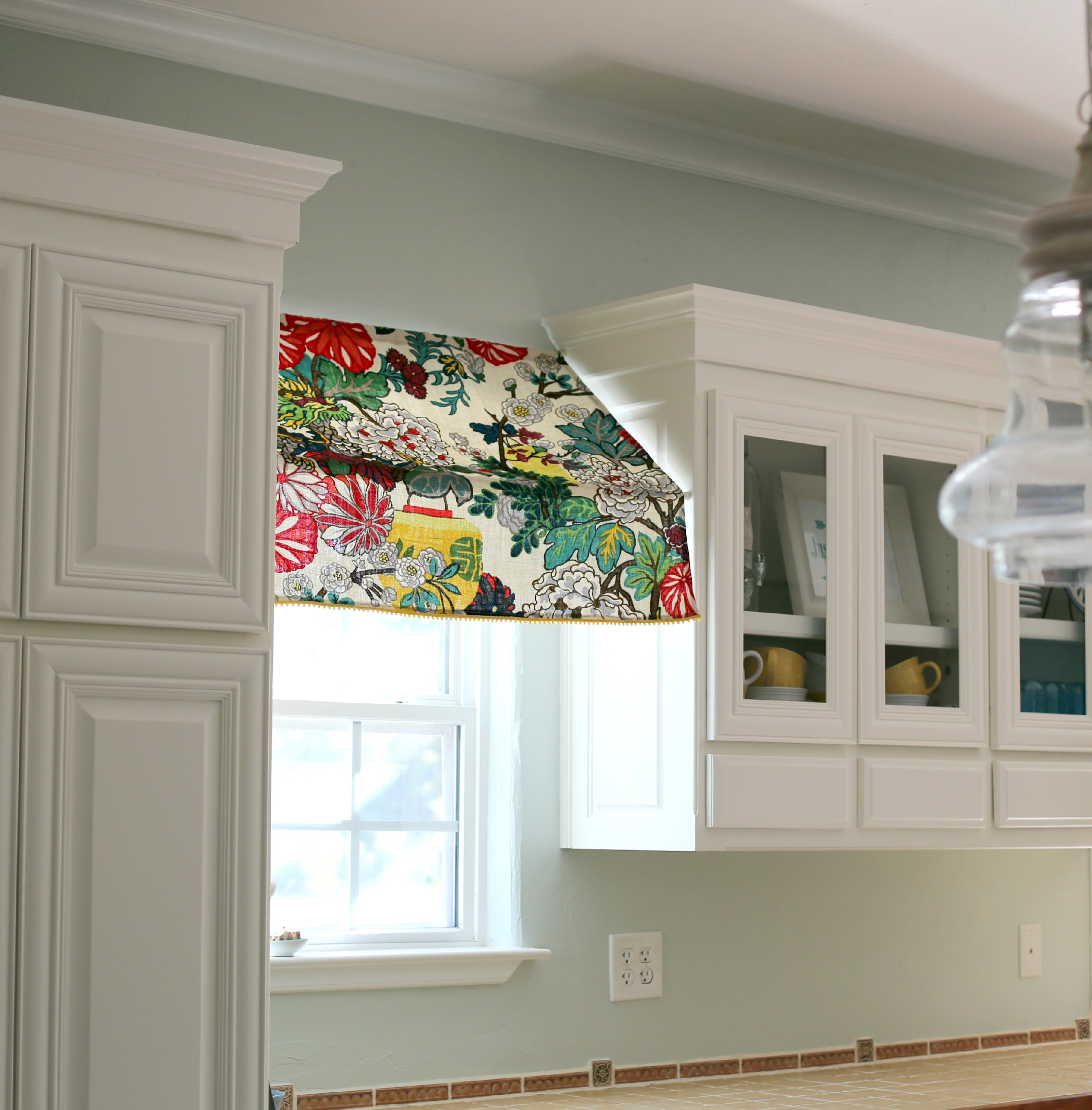
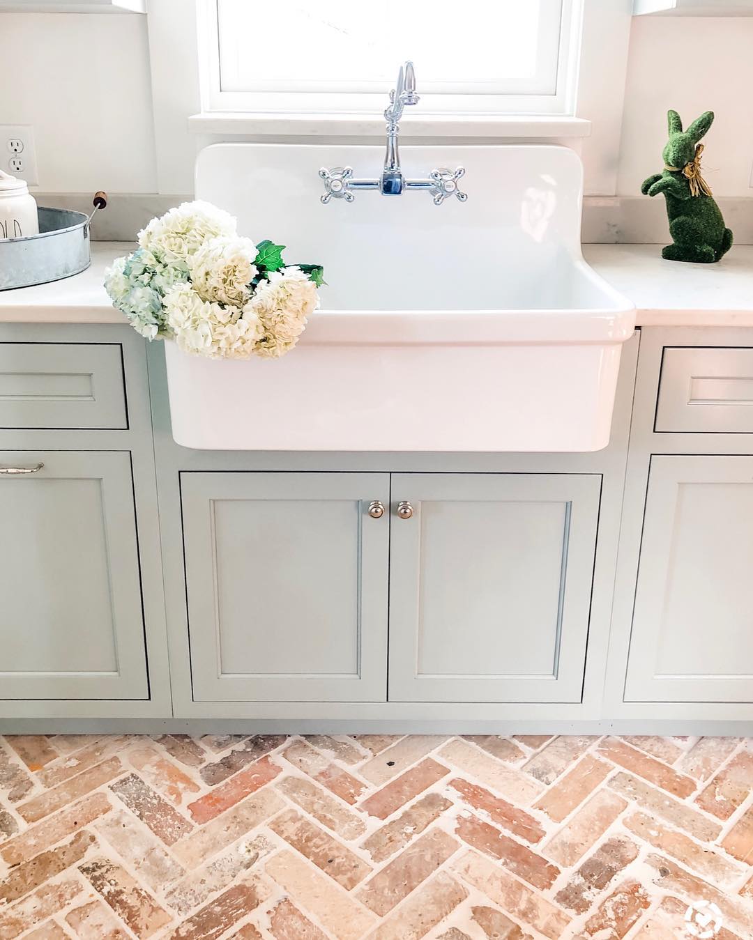
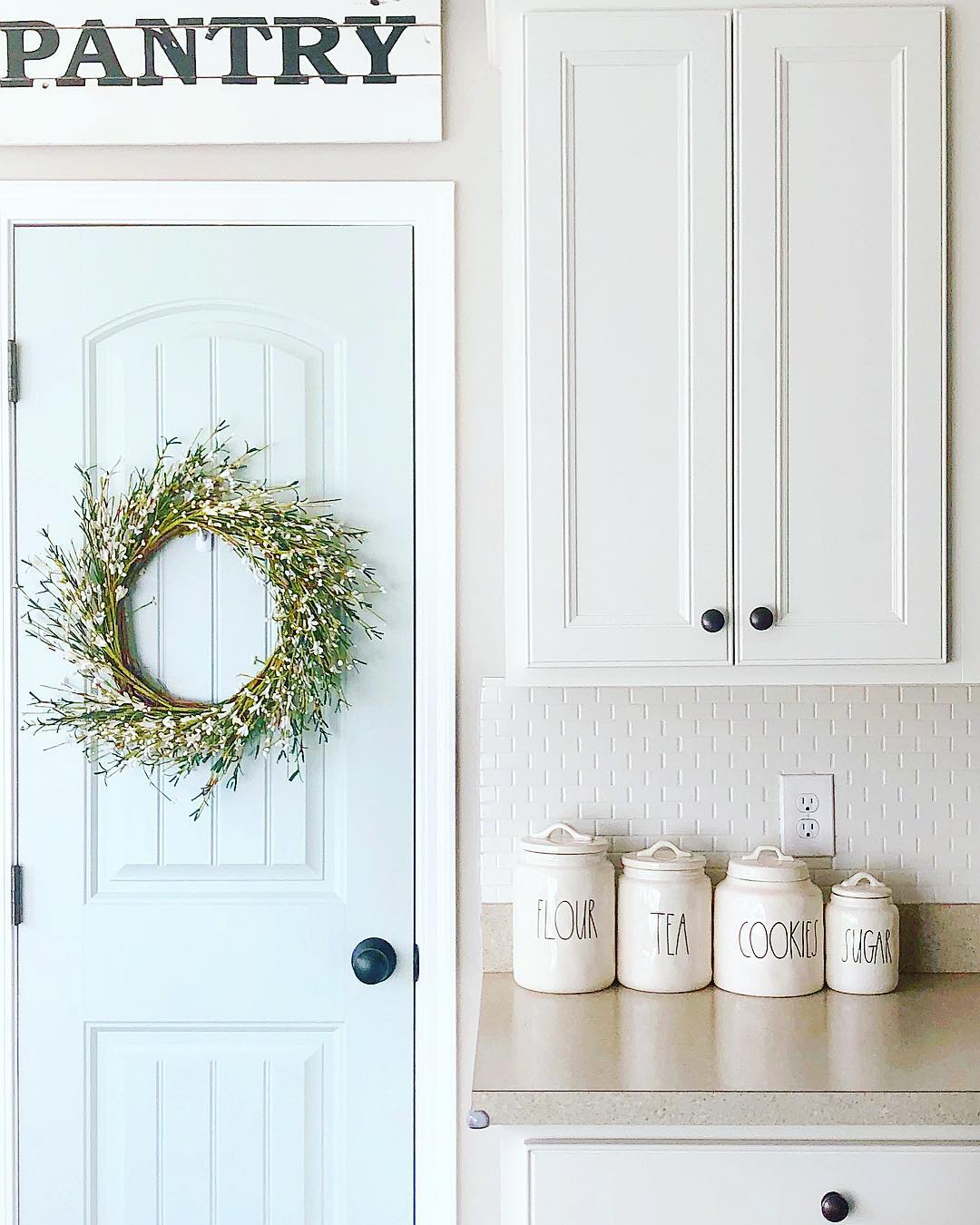
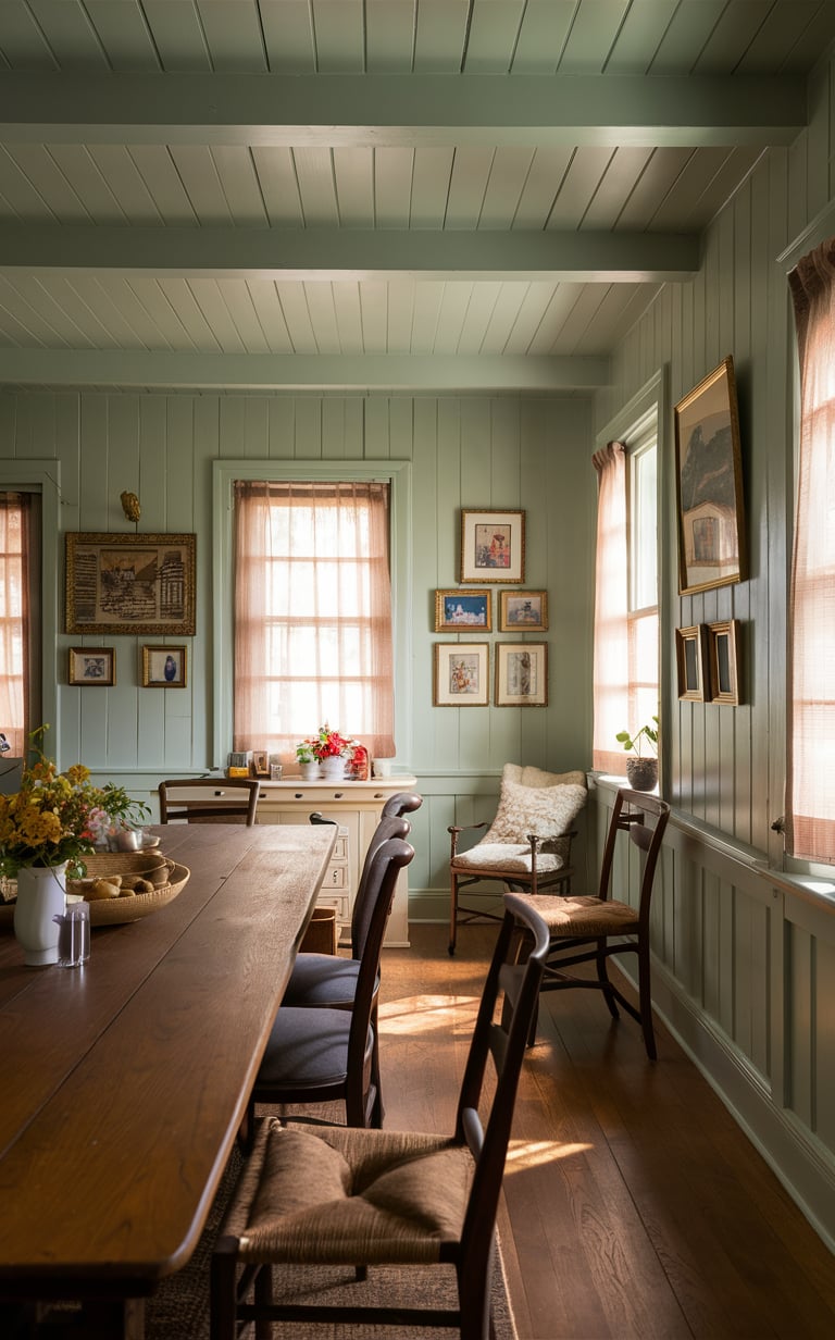
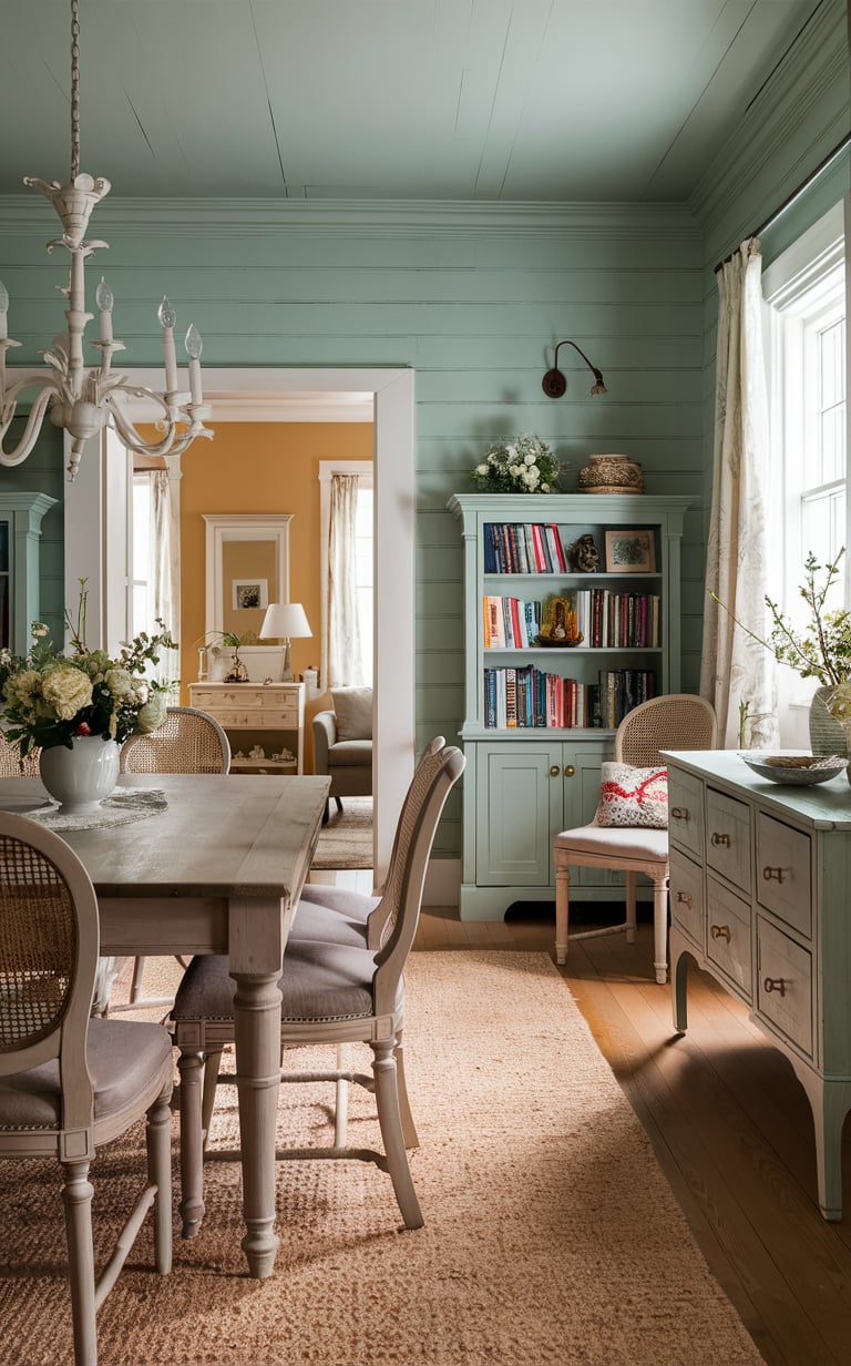
Will SW Sea Salt Suit Your Dining Room and Kitchen?
As for the dining room, you might want to use another color, a bit warmer, perhaps.
However, it’s all very personal. If you enjoy cooler shades and you don’t mind your dining room looking a bit chilling, SW Sea Salt would be a good match.
Again, you need to remember about its undertones: grayish hue that tends to show up in this paint can make this color look pretty neutral in certain types of lighting.
Housekeepingbay.com
via misformama.net
via instagram @justanotherfarmhouse
via instagram @carlaaston
via instagram @farmhouse4010
via instagram @simple.loving.home
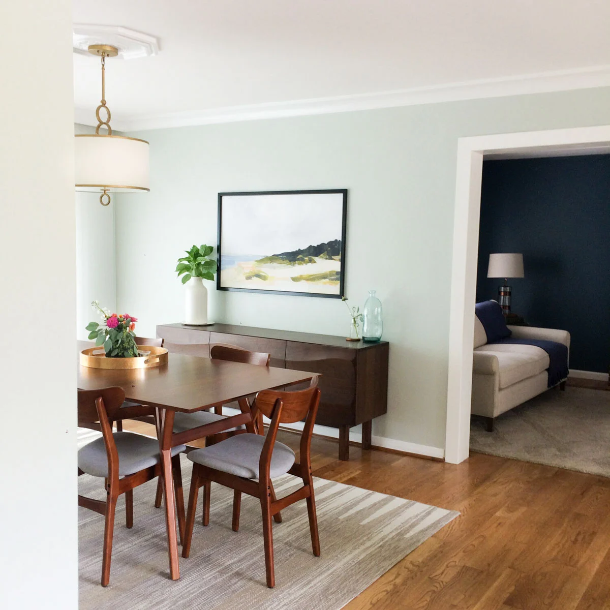
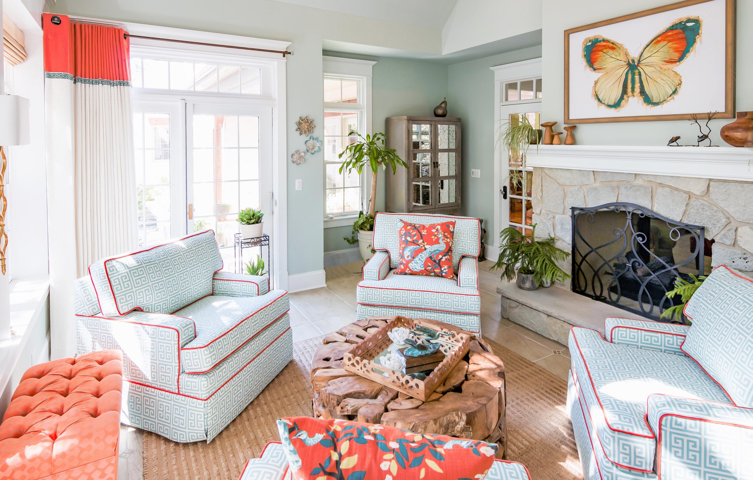
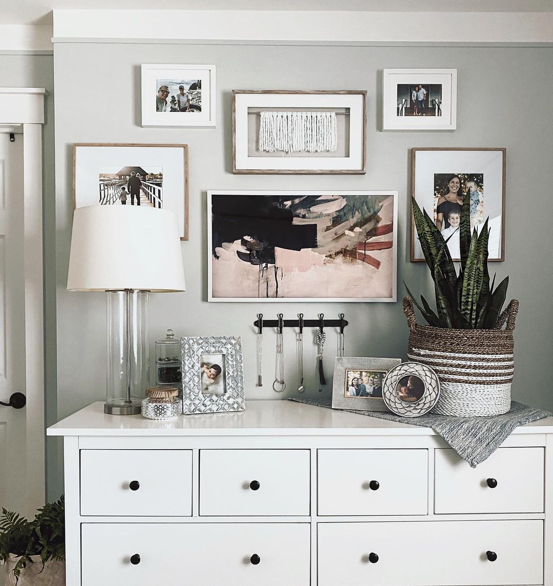
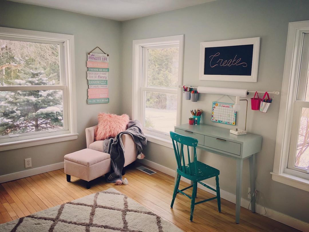
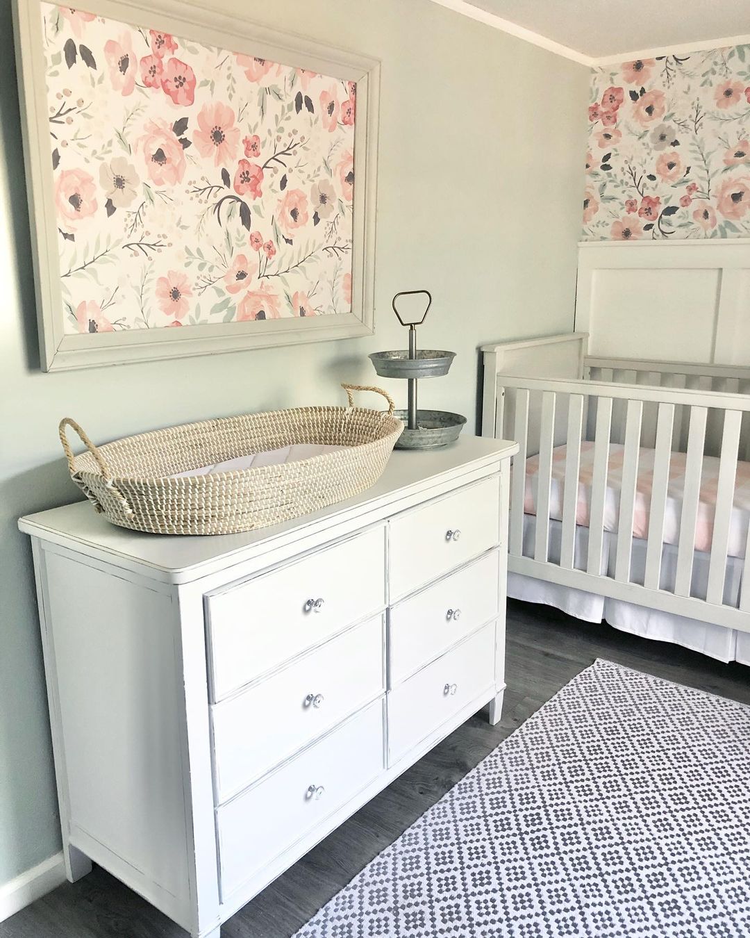
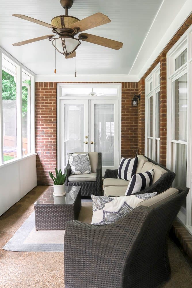
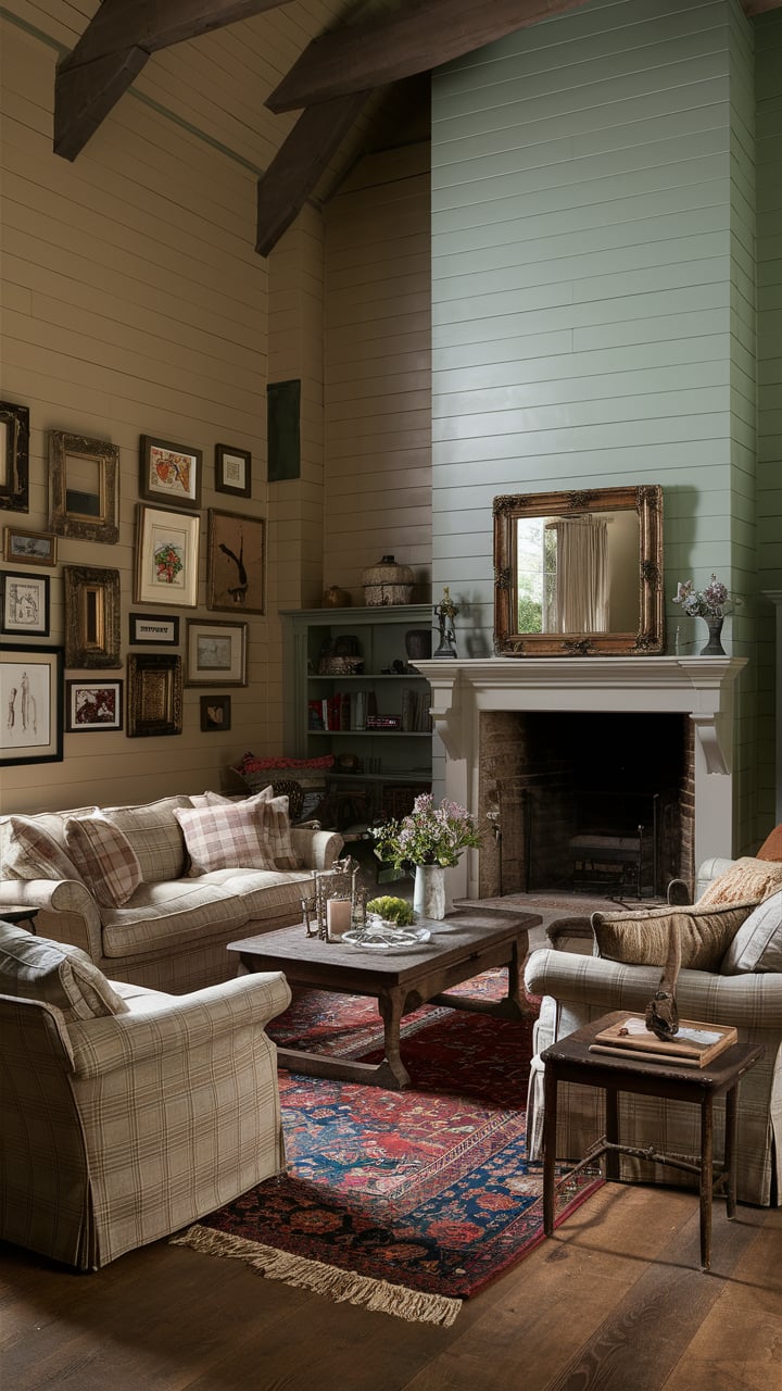
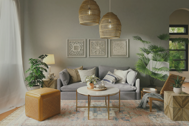
Sea Salt for the Walls Real Life Pictures
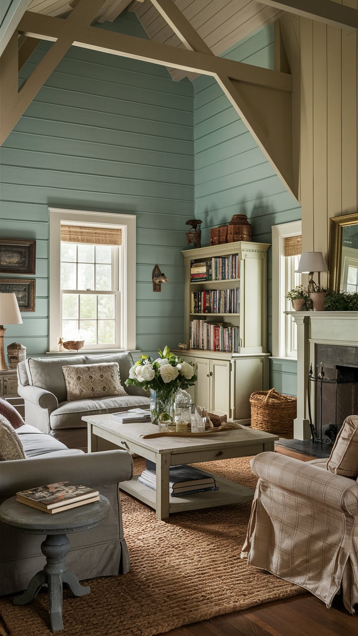
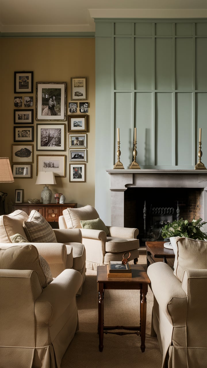
Sea Salt by Sherwin Williams is a great choice for a living room! It’s a soft, soothing blend of light green and gray that creates a calming atmosphere.
It works well with both natural light and artificial light, making your space feel airy and relaxed. Pair it with white or off-white trim for a fresh look.
via westhollar.com
via instagram @gretchenblack
via newperspectivedesign.com
via instagram @akrenovat
via instagram @e.b.byfarmandsea
via craftyteacherlady
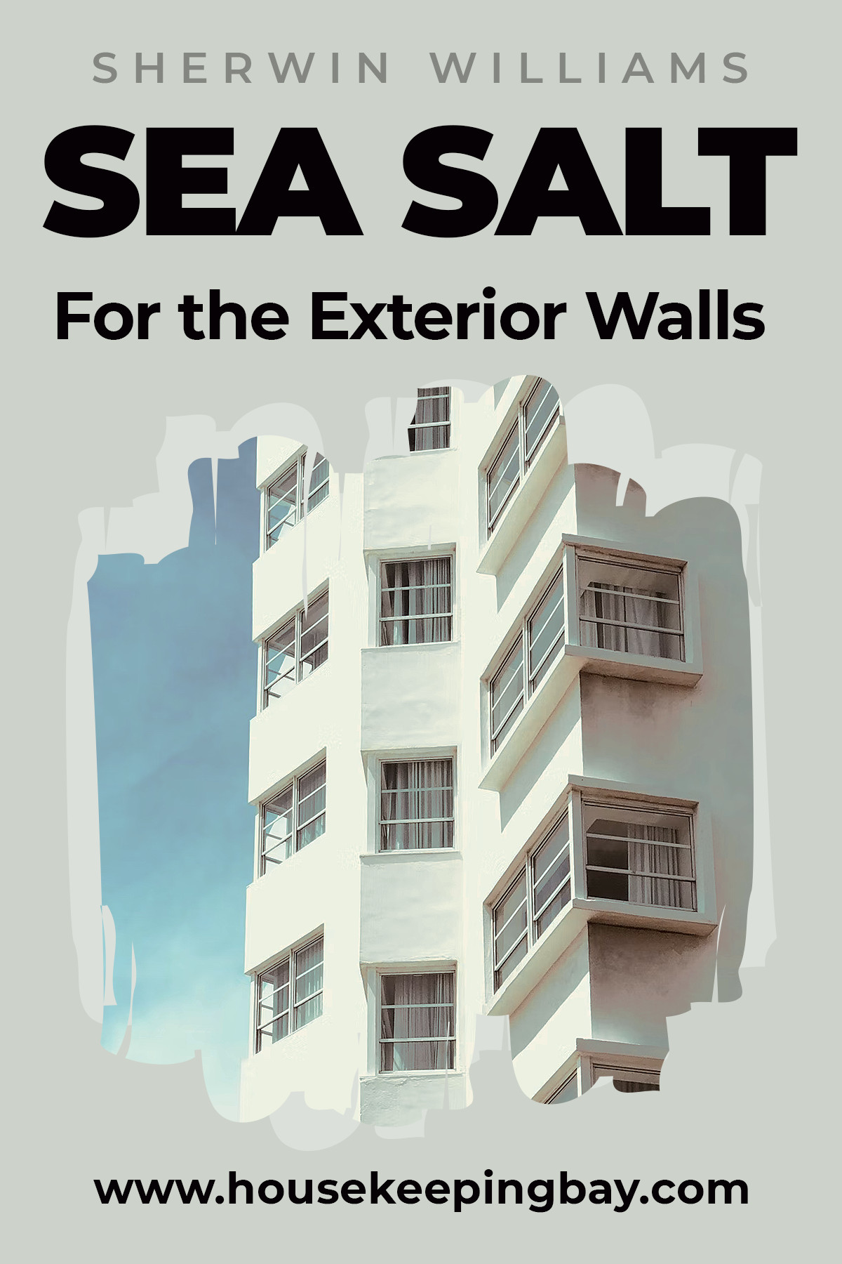
Can Sea Salt SW-6204 Be Used On the Exterior Walls?
This is one more useful feature of this paint color: it can be used both indoors and outdoors.
However, if you decide to paint your facade with it, consider the light you mostly have outside.
If you mostly have sunny weather, the color will look fine, but on a cloudy day, it may reveal its gray and greenish undertones.
Housekeepingbay.com

via instagram @beshfamfarmhouse

via theturquoisehome.com
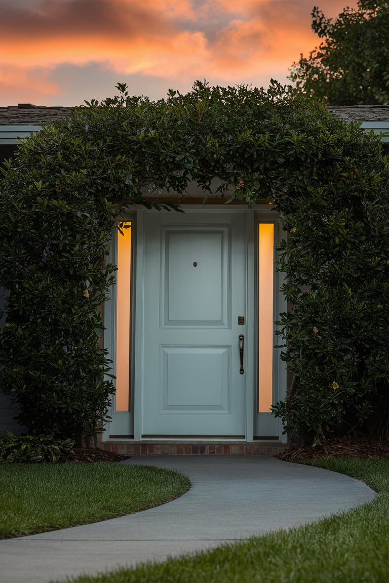
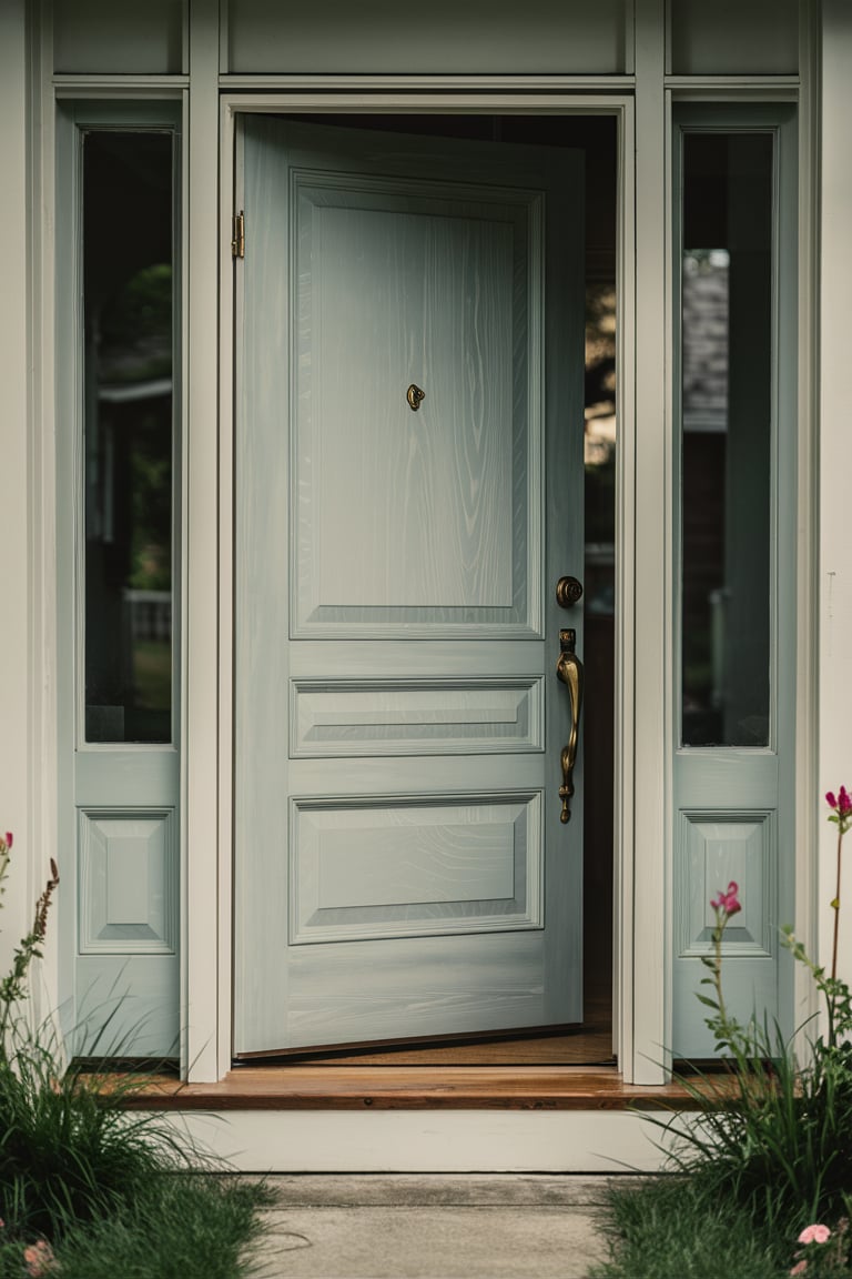
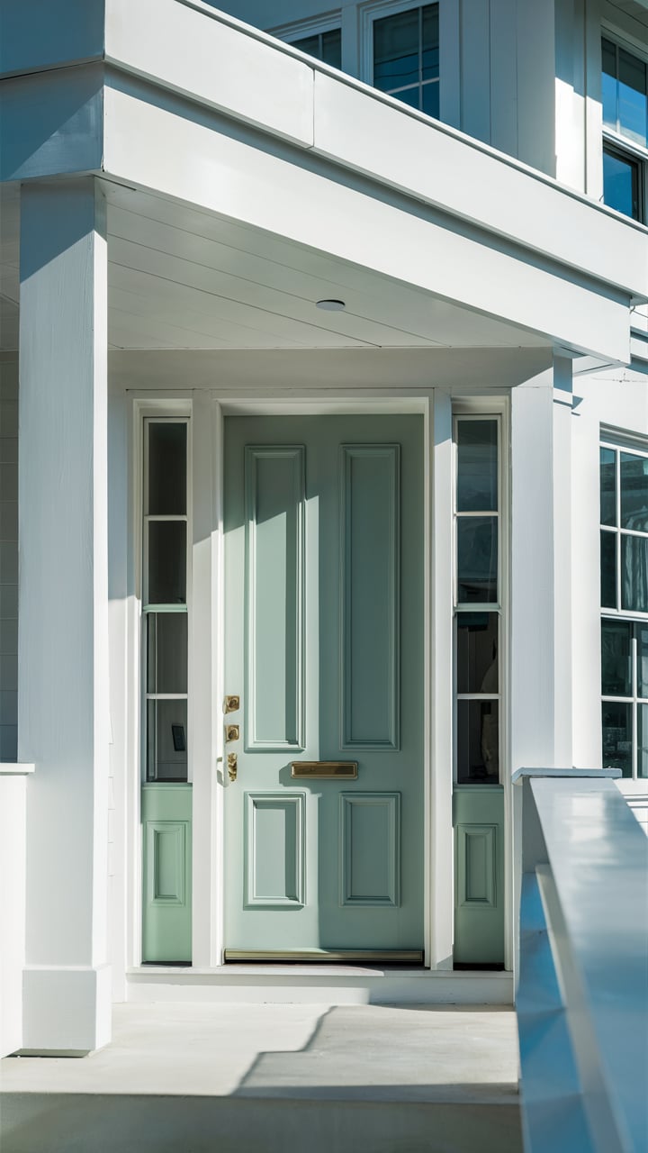
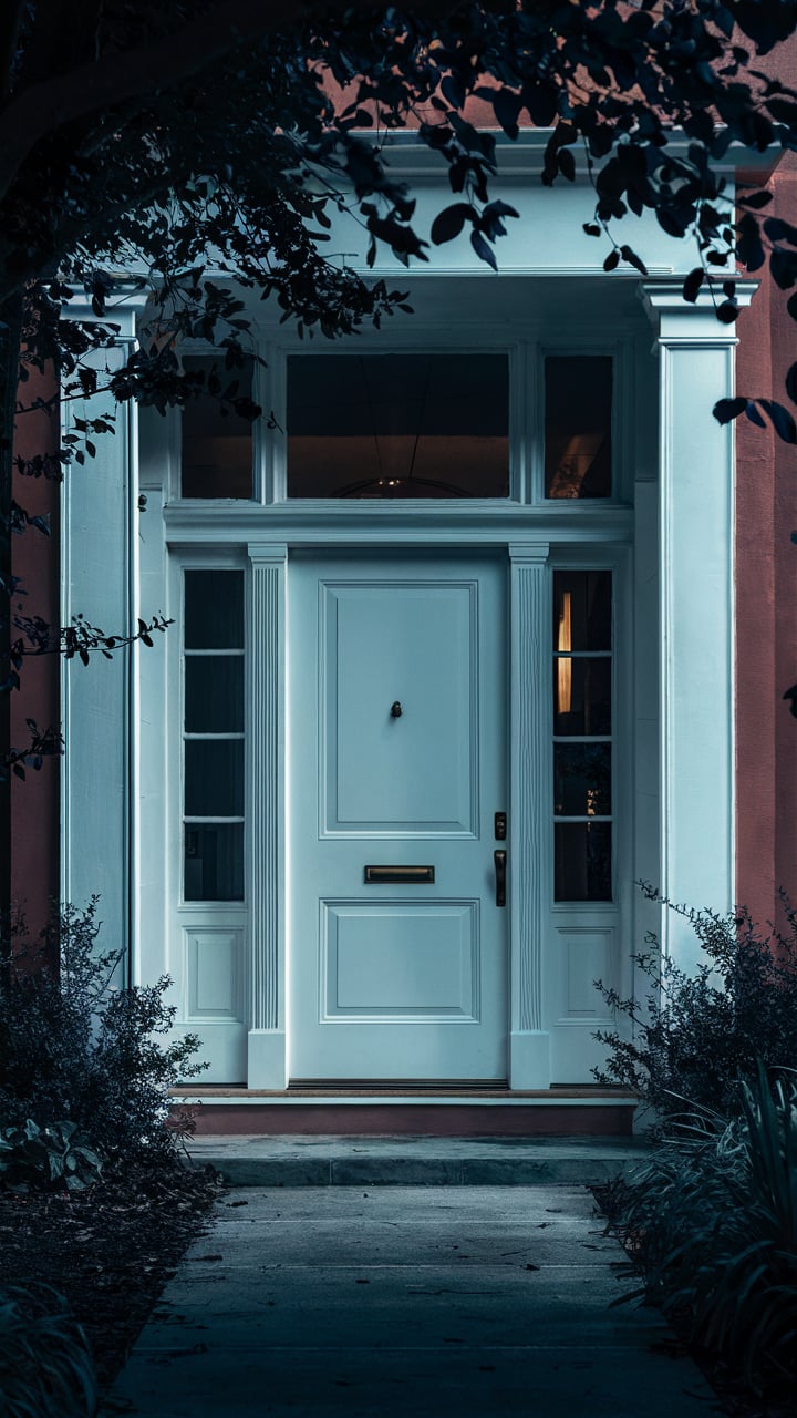
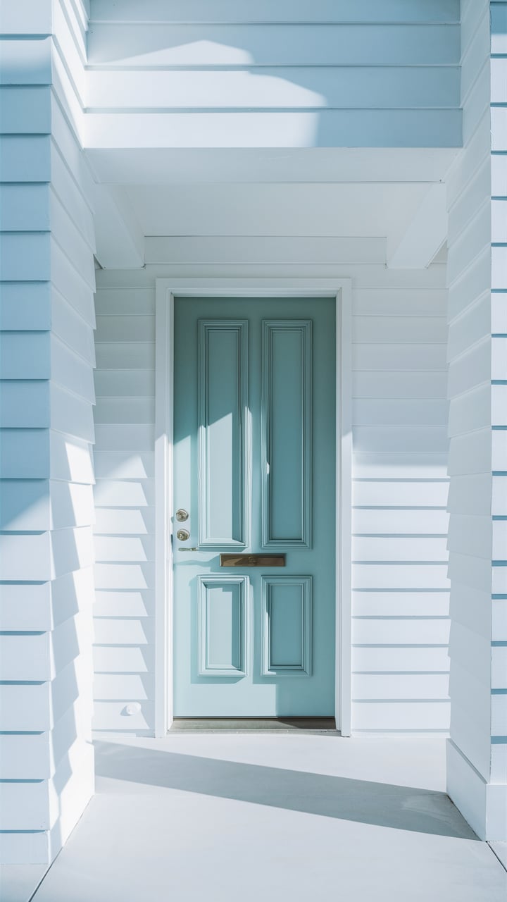
Painting an Entryway With SW Sea Salt
Sherwin Williams Sea Salt paint color can even be used for your front door!
However, you need to be careful and check how well your entryway is lit.
If there is enough daylight there, the color will look more or less neutral displaying more of the light gray undertones.
But if your entryway lacks natural light, be ready to see a greenish tint on its walls!

Housekeepingbay.com
via theturquoisehome.com
Sea Salt Sherwin Williams for the Accent Wall
Sea Salt by Sherwin Williams is a versatile and calming color, perfect for creating an accent wall in any room.
This soft, muted green with subtle blue undertones brings a sense of tranquility and sophistication to your space.
An accent wall painted in Sea Salt can become a focal point, drawing attention and adding depth without overwhelming the room.
Whether you choose to highlight a wall in your living room, bedroom, or even a bathroom, Sea Salt provides a serene backdrop that complements a variety of decor styles, from coastal to modern farmhouse.
Visualisation:
housekeepingbay.com ai
housekeepingbay.com ai
housekeepingbay.com ai
housekeepingbay.com ai
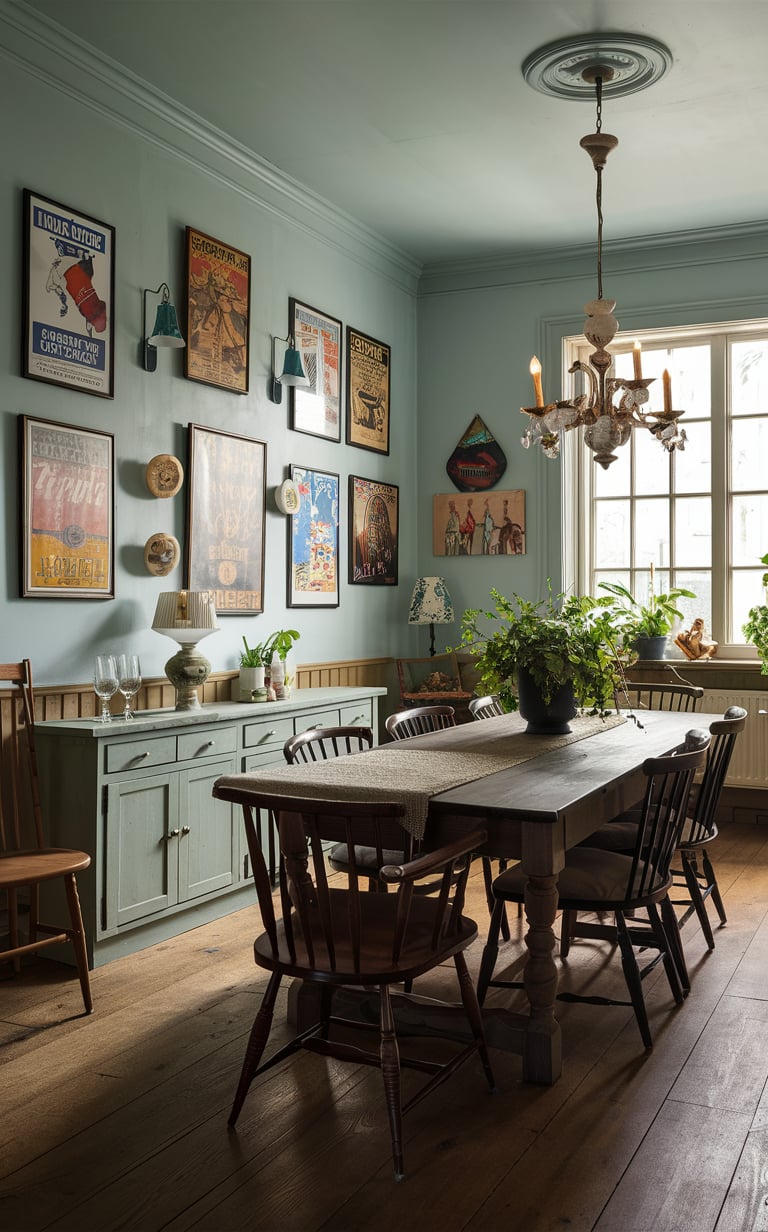
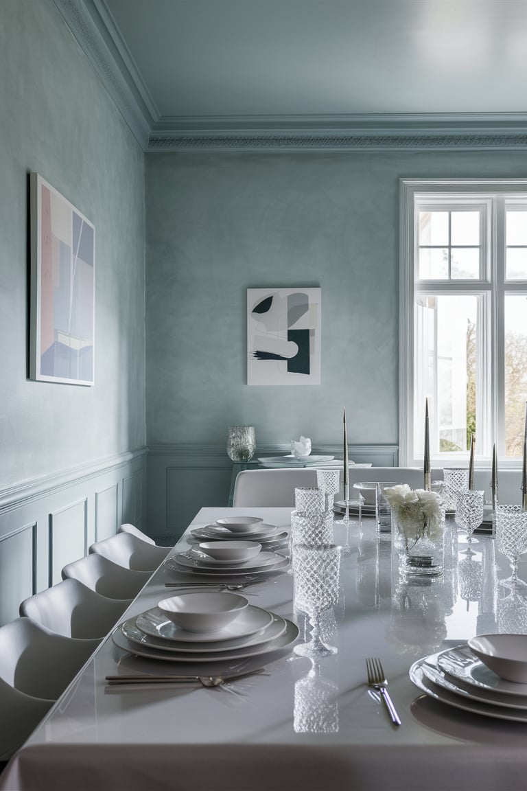
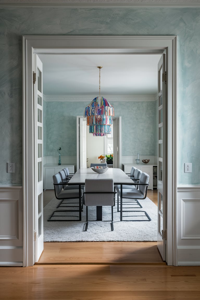
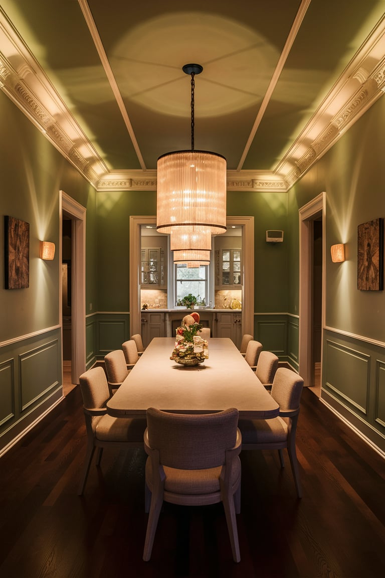
Sea Salt Sherwin Williams Dining Room
Transform your dining room into an inviting and serene space with Sea Salt by Sherwin Williams. This color works beautifully in dining areas, providing a soothing environment that encourages relaxation and conversation.
Pair it with white trim and natural wood furniture for a fresh, coastal look, or with dark accents and metallic finishes for a more sophisticated ambiance. Sea Salt’s ability to adapt to different lighting conditions means it will always look elegant, whether you’re hosting a dinner party or enjoying a quiet family meal.
Visualisation:
housekeepingbay.com ai
housekeepingbay.com ai
housekeepingbay.com ai
housekeepingbay.com ai
housekeepingbay.com ai
housekeepingbay.com ai
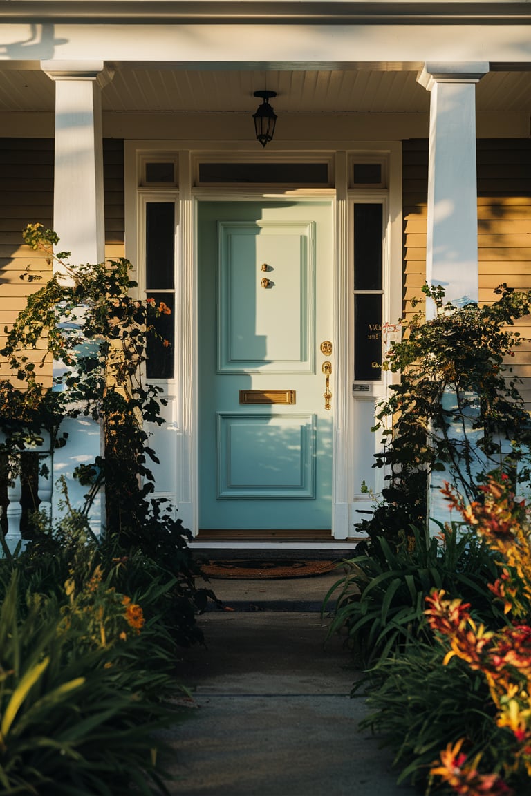
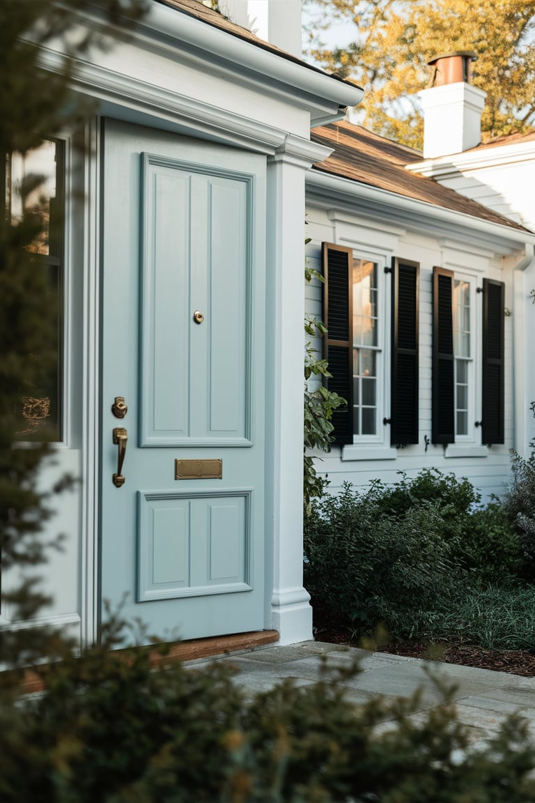
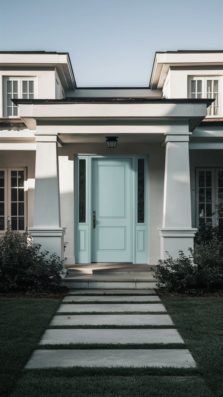
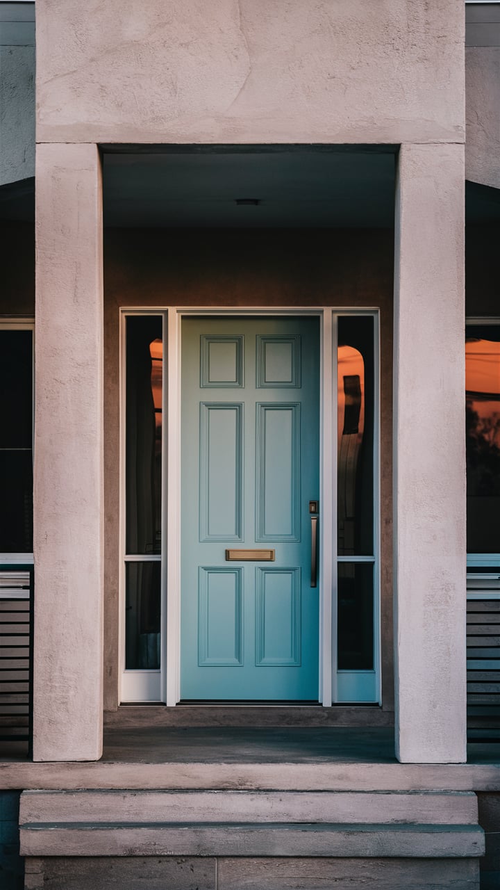
Sea Salt Sherwin Williams Front Door
Make a welcoming statement with Sea Salt by Sherwin Williams on your front door.
This charming color adds a touch of coastal elegance to your home’s exterior, setting the tone for a warm and inviting entryway. Sea Salt’s soft green hue with a hint of blue makes it an excellent choice for complementing various exterior materials, including brick, stone, and siding. Pair it with a classic white or darker shades for the trim to create a visually appealing and balanced look that enhances your home’s curb appeal.
Visualisation:
housekeepingbay.com ai
housekeepingbay.com ai
housekeepingbay.com ai
housekeepingbay.com ai
housekeepingbay.com ai
housekeepingbay.com ai
housekeepingbay.com ai
housekeepingbay.com ai
housekeepingbay.com ai
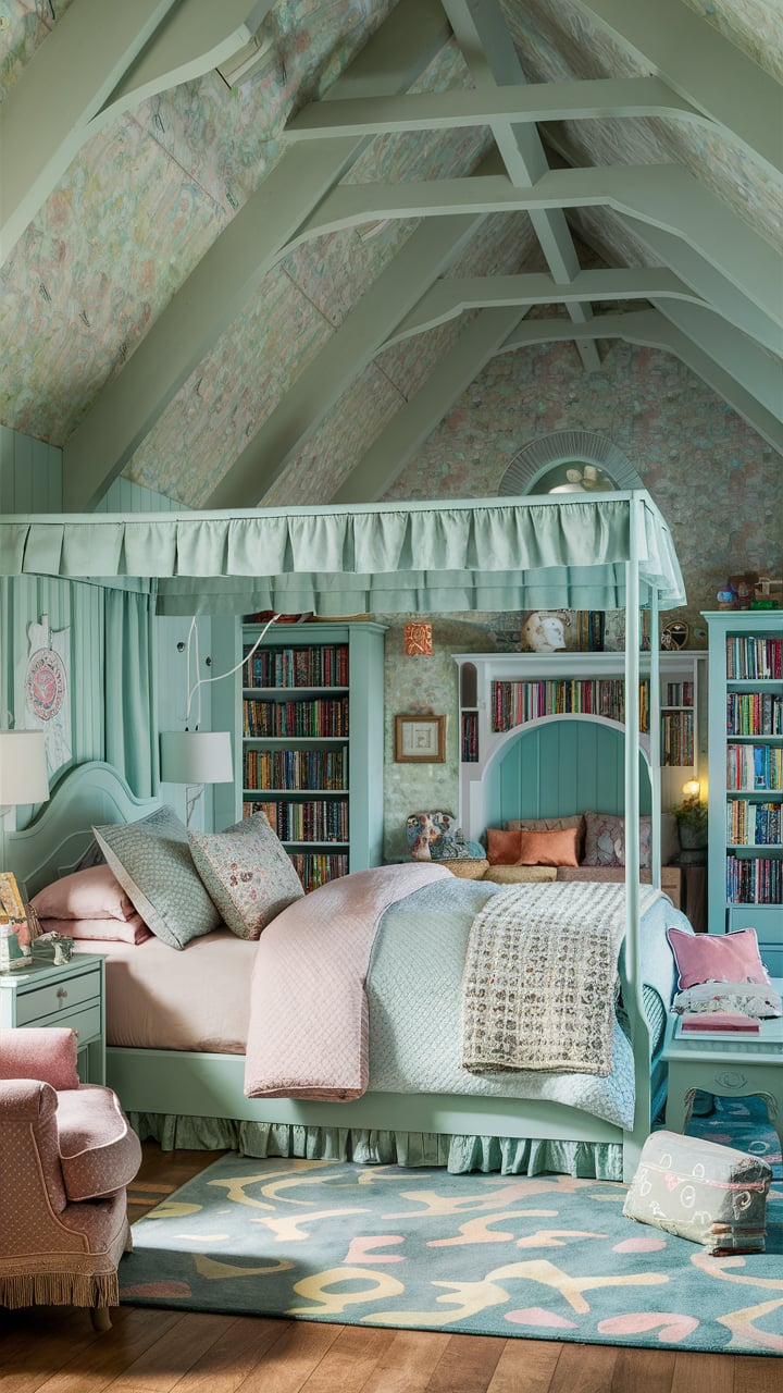
Sea Salt Sherwin Williams Girls Bedroom
Create a serene and dreamy bedroom for your girl with Sea Salt by Sherwin Williams. This gentle color provides a soothing backdrop that’s perfect for rest and relaxation.
It pairs beautifully with soft pastels, white furniture, and playful decor elements, making it a versatile choice for a variety of themes, from nautical to garden-inspired.
Sea Salt’s subtle sophistication ensures the room will grow with her, remaining stylish and fresh through the years.
Visualisation:
housekeepingbay.com ai
housekeepingbay.com ai
housekeepingbay.com ai
housekeepingbay.com ai
housekeepingbay.com ai
housekeepingbay.com ai
housekeepingbay.com ai
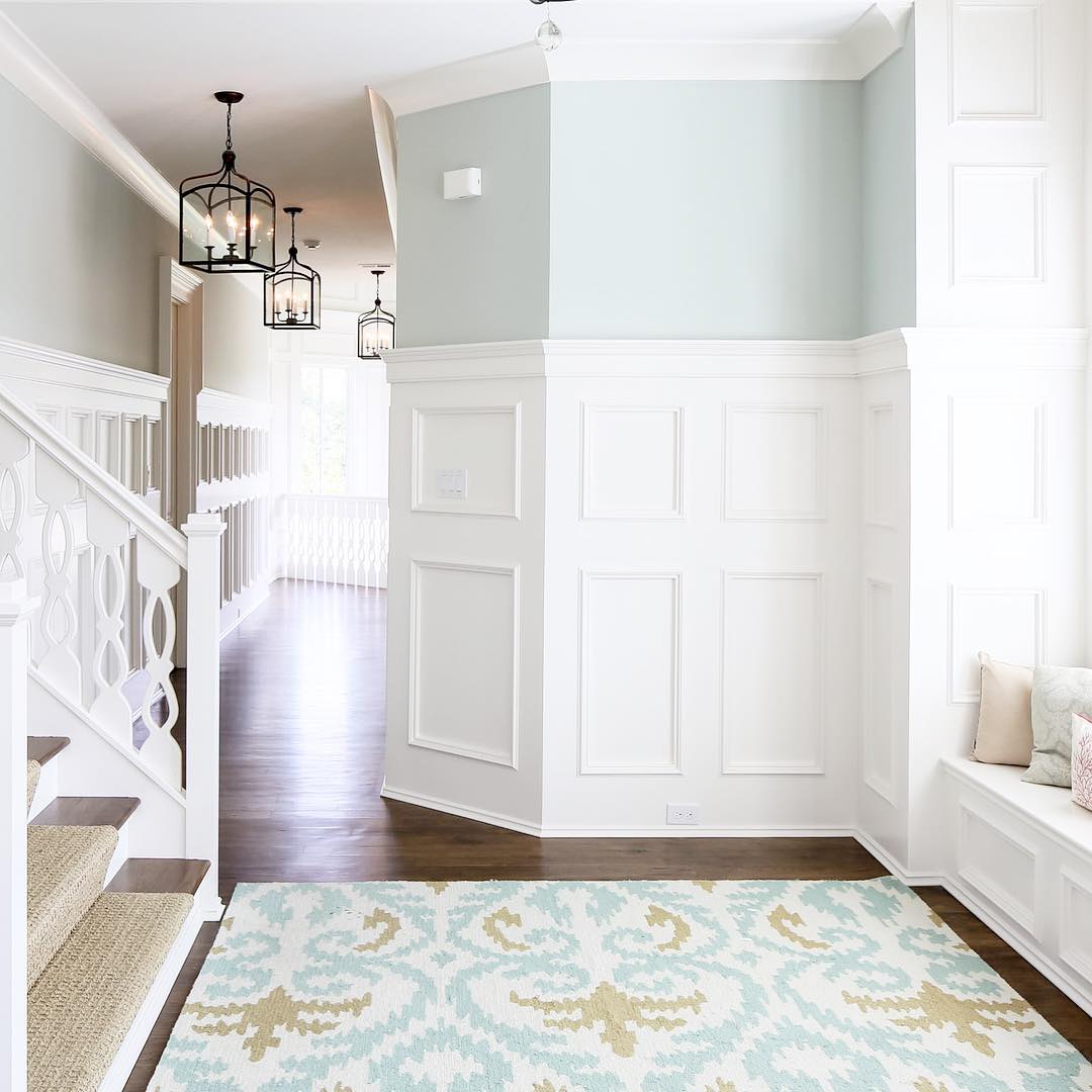
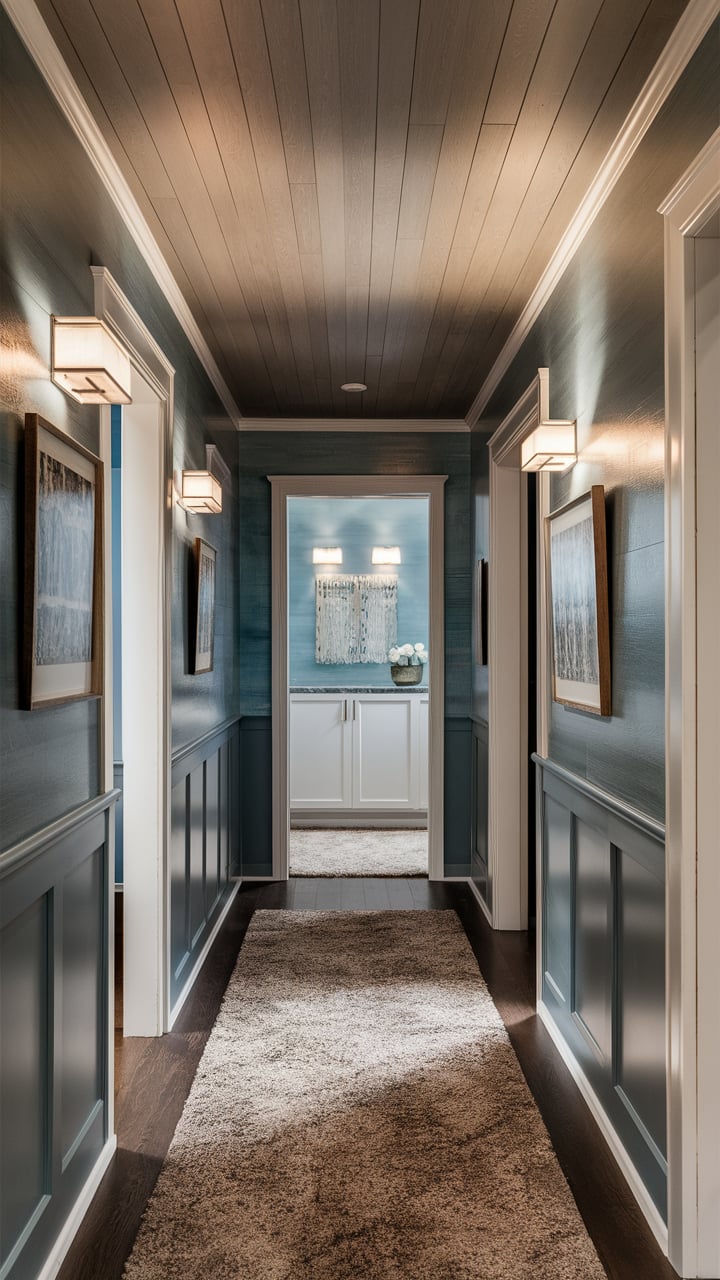
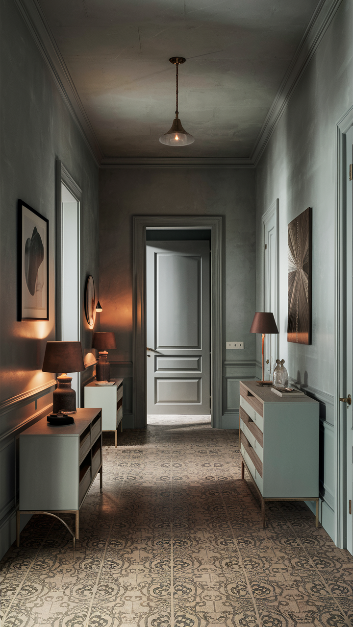
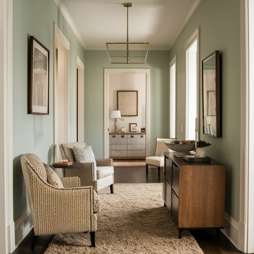
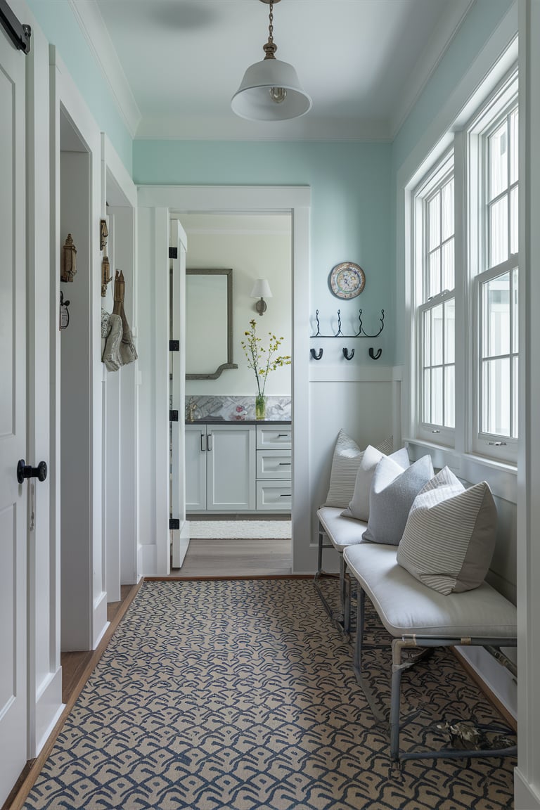
Sea Salt Sherwin Williams Hallway
Enhance your hallway with the calming hue of Sea Salt by Sherwin Williams. This color is ideal for hallways, as it brightens the space while providing a sense of tranquility.
Sea Salt’s soft green and blue undertones create a welcoming atmosphere, making your home feel more open and connected. Pair it with white or light gray trim to keep the look crisp and clean, and consider adding mirrors or light fixtures to further enhance the airy feel.
Visualisation:
housekeepingbay.com ai

housekeepingbay.com ai
housekeepingbay.com ai
housekeepingbay.com ai
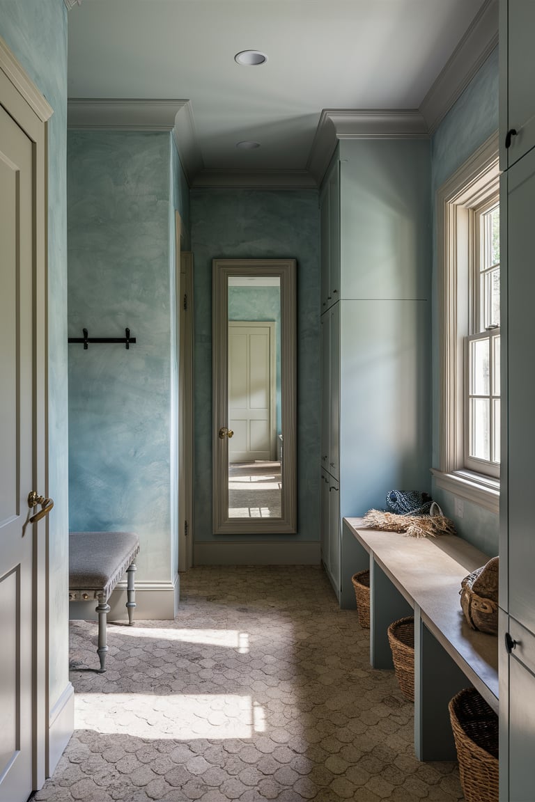
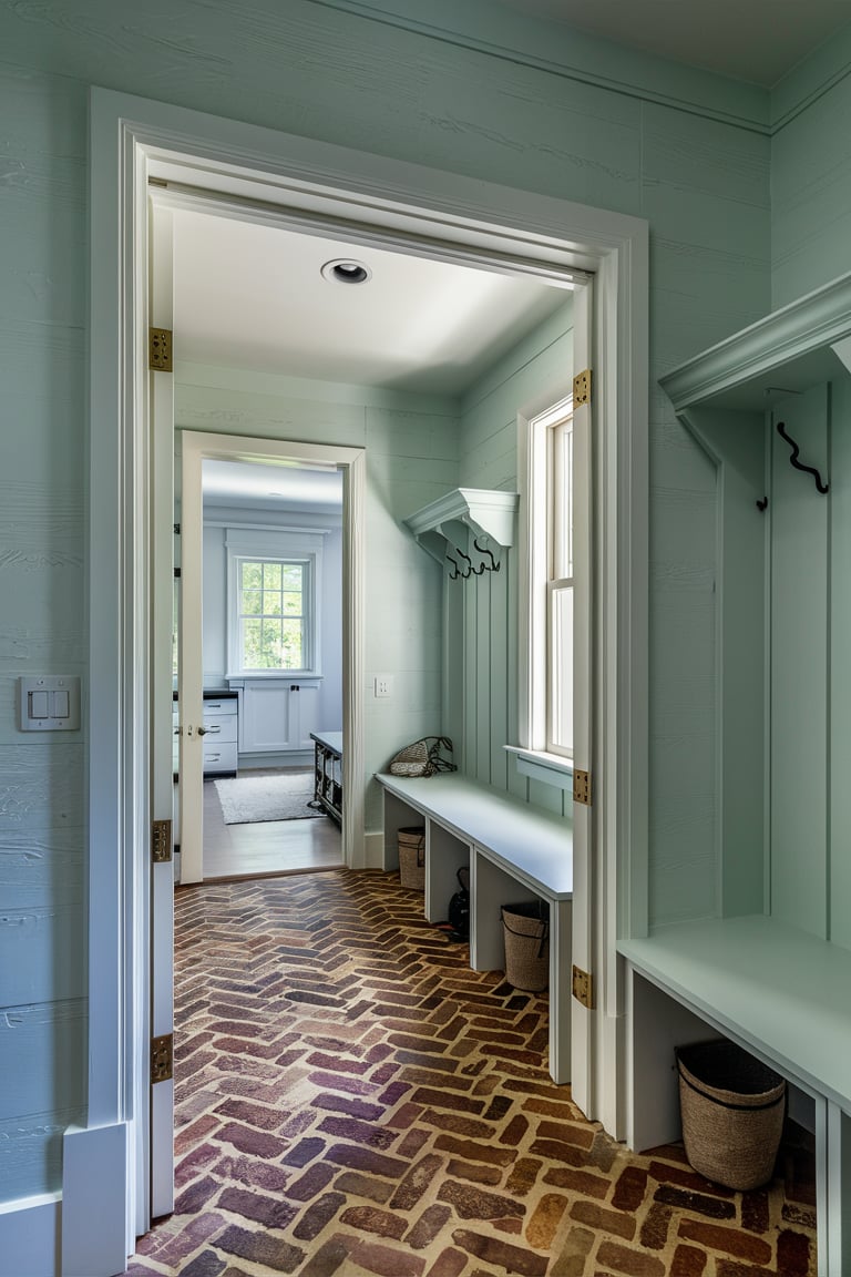
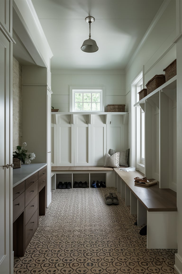
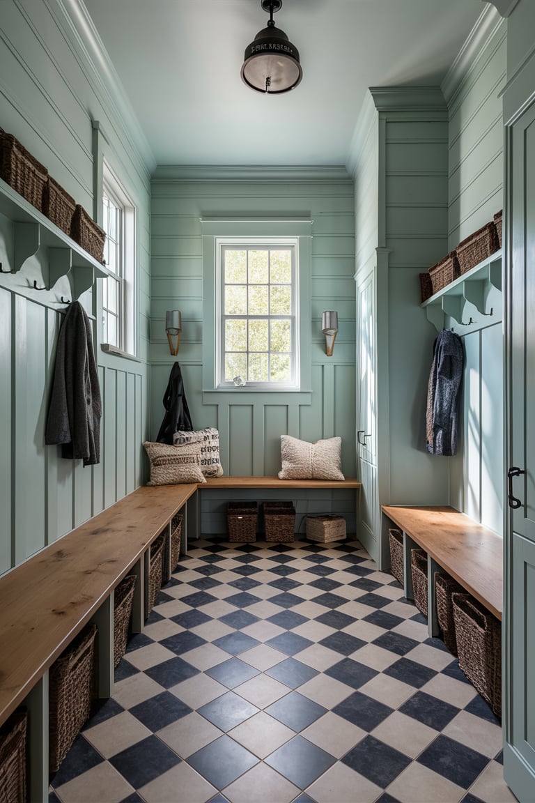
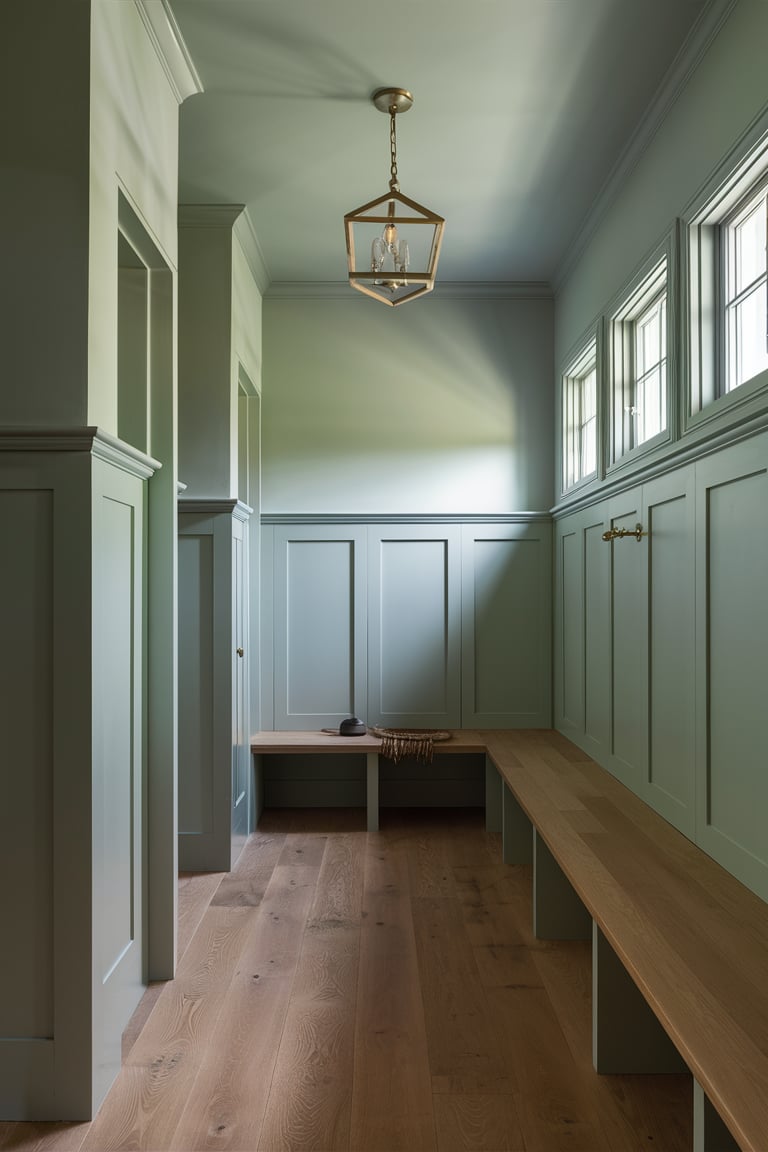
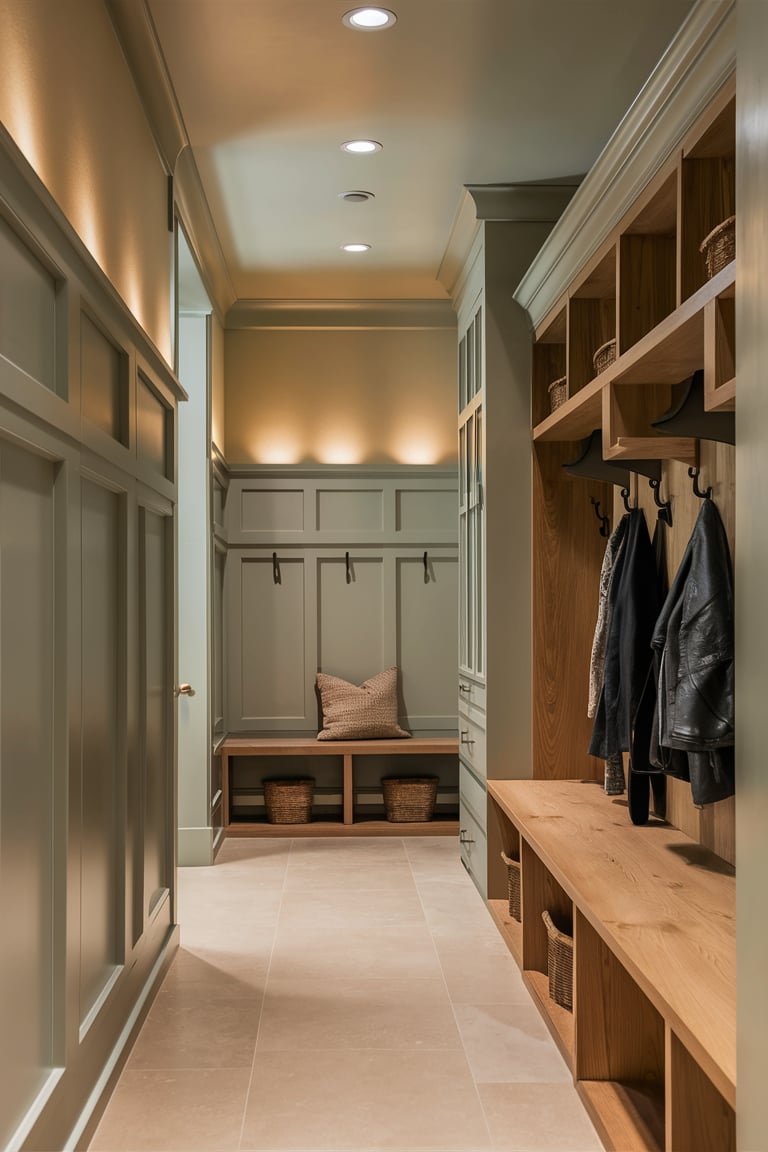
Sea Salt Sherwin Williams Mudroom
Bring a touch of elegance to your mudroom with Sea Salt by Sherwin Williams. This color is perfect for creating a clean, organized space where you can transition from the outdoors. Sea Salt’s soothing tones help to mask dirt and scuffs, making it a practical yet stylish choice for this high-traffic area. Pair it with natural wood accents and durable flooring to create a functional and inviting mudroom that stands up to everyday use.
Visualisation:
housekeepingbay.com ai
housekeepingbay.com ai
housekeepingbay.com ai
housekeepingbay.com ai
housekeepingbay.com ai
housekeepingbay.com ai
housekeepingbay.com ai
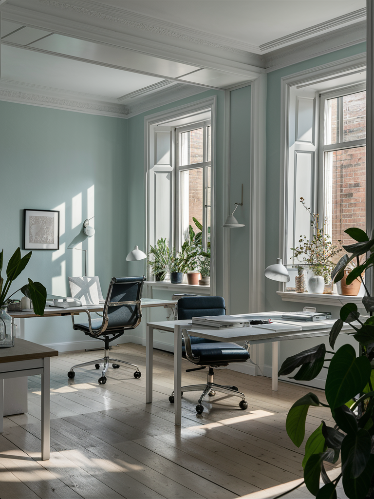
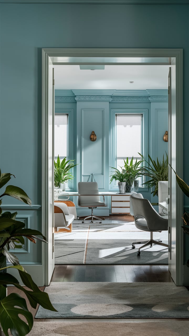
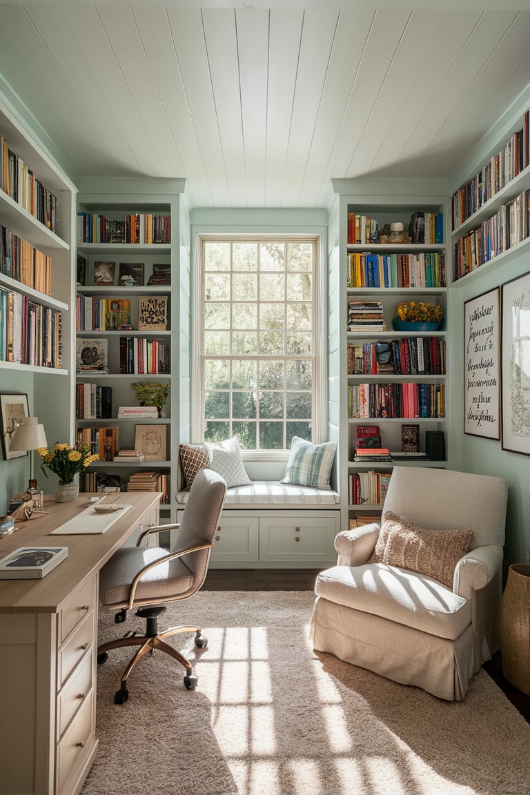
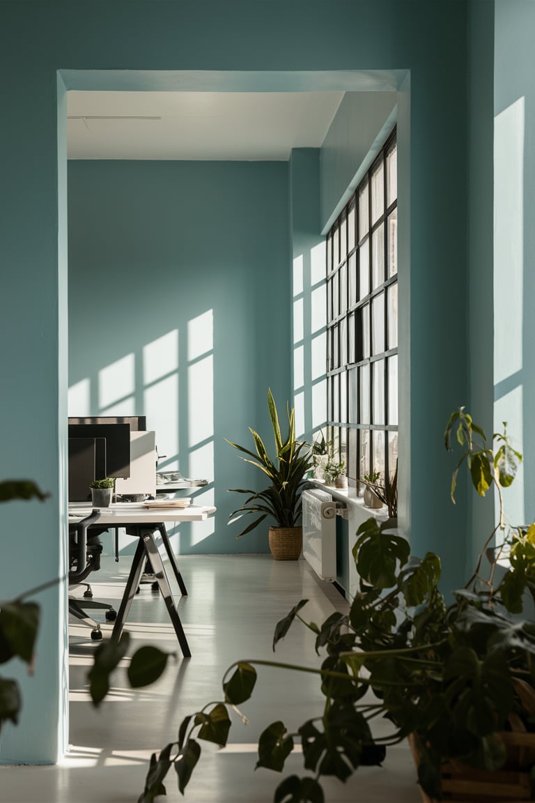
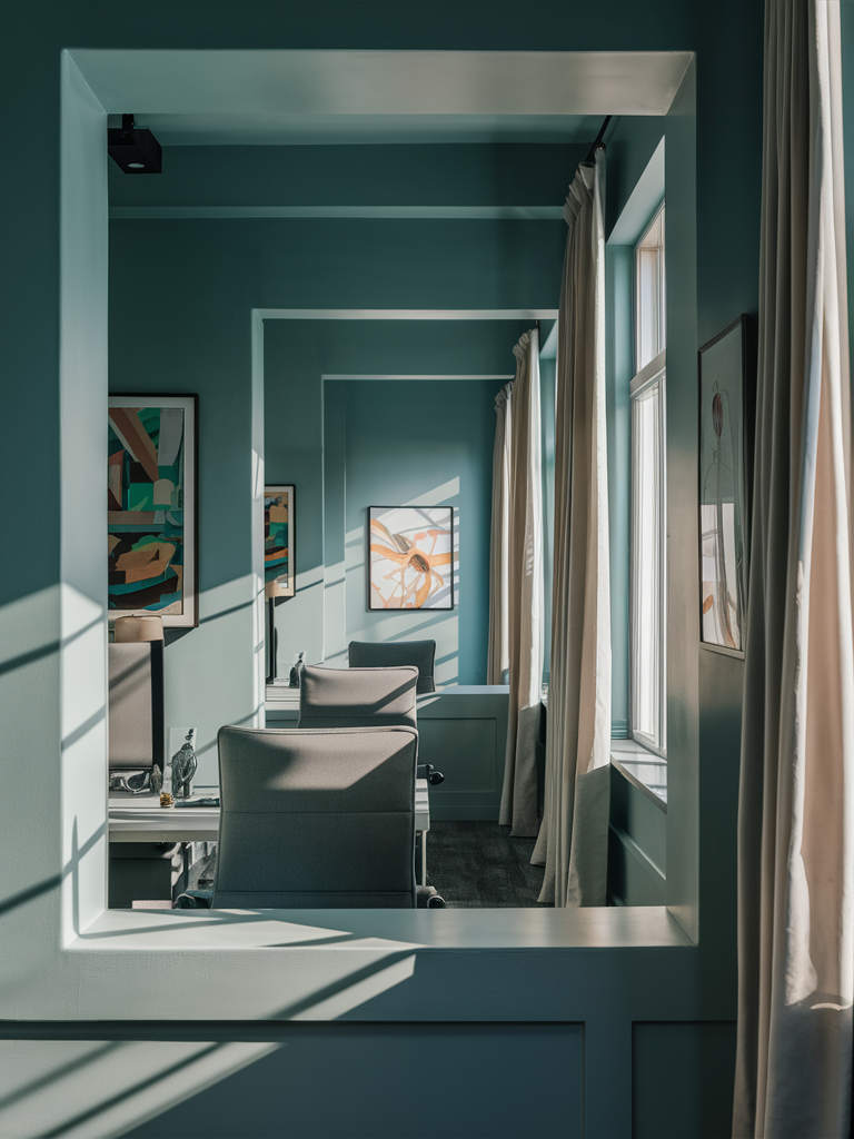
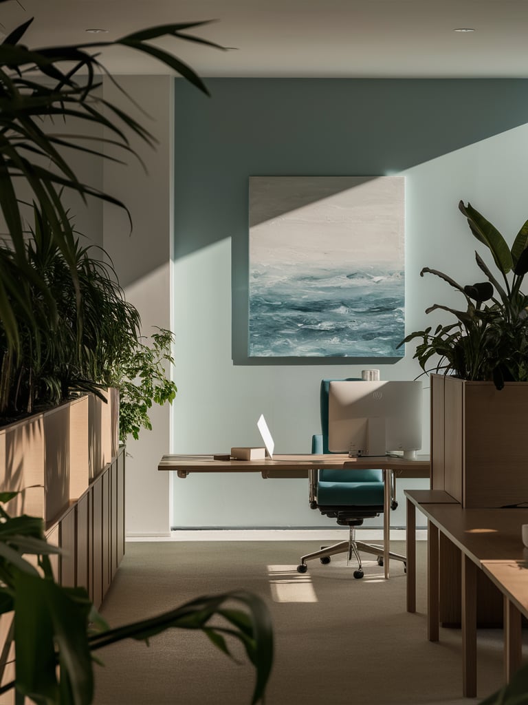
Sea Salt Sherwin Williams Office
Create a productive and peaceful workspace with Sea Salt by Sherwin Williams in your office. This calming color promotes focus and reduces stress, making it an excellent choice for a home office environment. Sea Salt’s versatility allows it to blend seamlessly with various furniture styles and decor elements, from modern desks and ergonomic chairs to cozy reading nooks.
Add plants and natural light to enhance the serene ambiance, and enjoy a workspace that inspires creativity and concentration.
Visualisation:
housekeepingbay.com ai
housekeepingbay.com ai
housekeepingbay.com ai

housekeepingbay.com ai
housekeepingbay.com ai
housekeepingbay.com ai
housekeepingbay.com ai
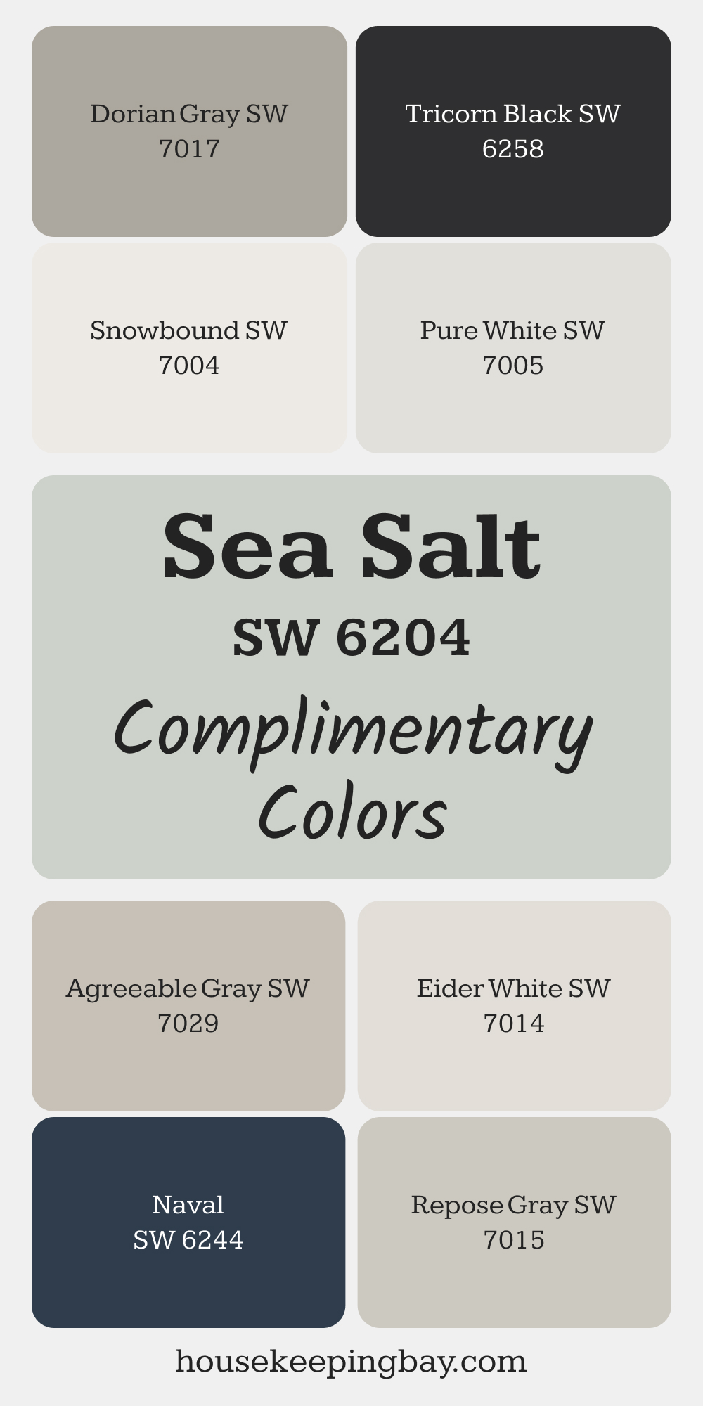
Complimentary Colors for Sea Salt SW 6204 Paint Color by Sherwin Williams
Sea Salt by Sherwin Williams pairs beautifully with both cool and warm tones. Snowbound and Pure White brighten the space, creating a crisp backdrop that lets Sea Salt shine.
Dorian Gray and Agreeable Gray add subtle contrast while maintaining a cohesive look.
For a bolder pairing, Tricorn Black and Naval bring depth and drama. Eider White and Repose Gray round out the palette with their soft, versatile appeal, making them easy to coordinate for a harmonious feel.
via housekeepingbay.com
Colors That SW Sea Salt Can Be Used With
What colors would go with Sherwin Williams Sea Salt?
If you are also curious about this issue, we suggest you check out a few pairs of colors we have prepared below.
Like that, you will see what colors would look better with Sea Salt than others.
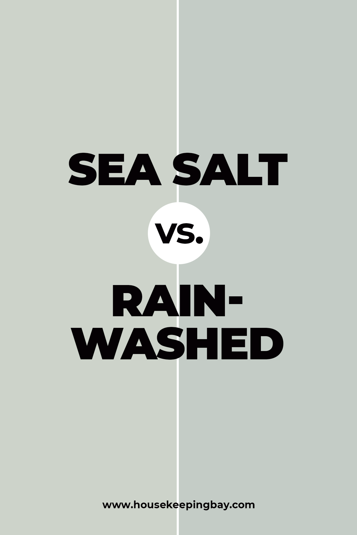
Sea Salt vs. Rainwashed
Let’s compare Sherwin Williams Rainwashed vs Sea Salt.
If you like Sea Salt, but want a color that leans more toward blue, check out Rainwashed.
Rainwashed and Sea Salt are very similar, except that Rainwashed leans blue with a hint of green and Sea Salt leans green with a hint of blue.
Both are great colors, and would provide the same calming effect in a room without being overpowering.
Housekeepingbay.com
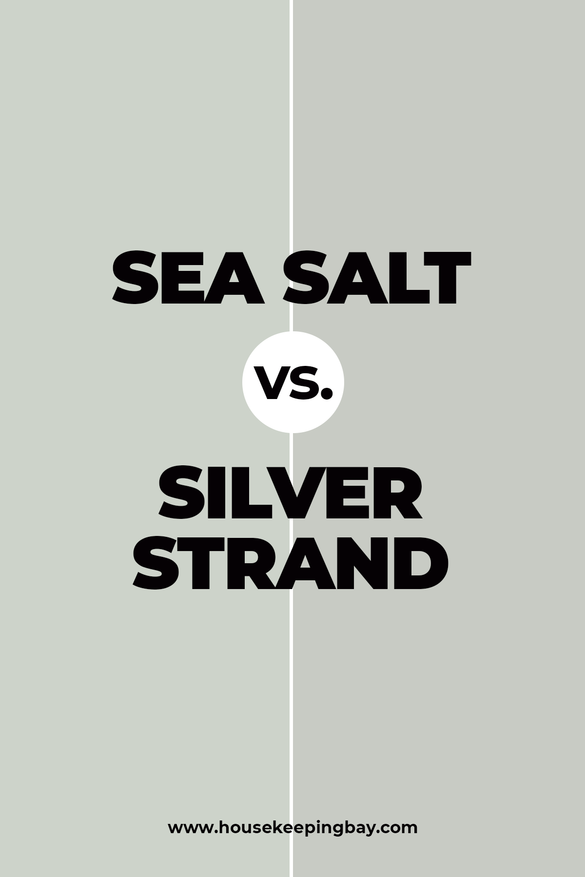
Sea Salt vs. Silver Strand
If we compare Sherwin Williams Silver Strand vs Sea Salt, we will see that they look very much alike.
The only slight difference is that Sea Salt displays rather significant greenish undertones whilst Silverstrand looks more gray (though also with a green hue).
This is why you can use these colors interchangeably in fact since nobody will see the difference.
Housekeepingbay.com
👉Check the WHOLE HOUSE SEA SALT COLOR PALETTE HERE👈
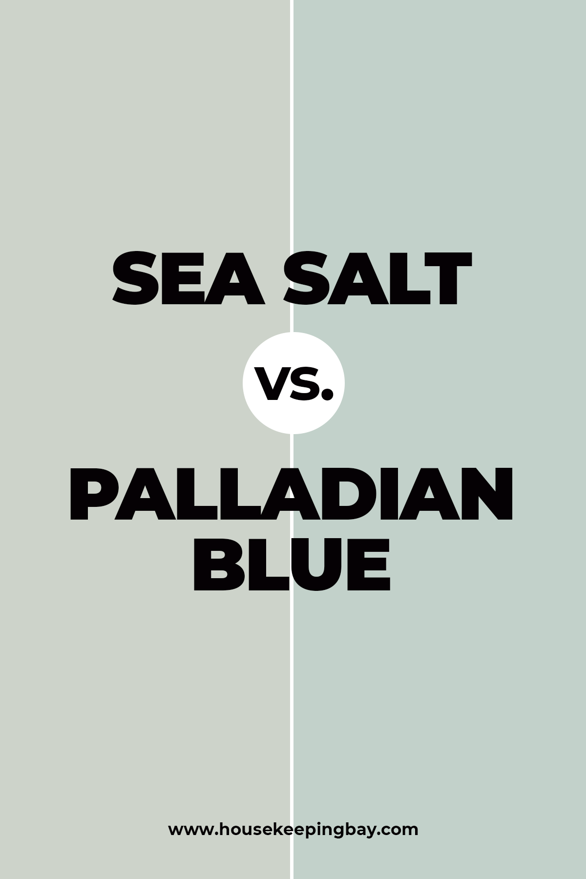
Sea Salt vs. Palladian Blue
Shortly speaking, Palladian Blue looks like a darker version of Sea Salt. Palladian Blue leans way more towards turquoise with significant greenish undertones in comparison to a way lighter Sea Salt.
These colors can’t be used together, but if you’re looking for a darker version of Sea Salt, consider Palladian Blue for sure.
Housekeepingbay.com
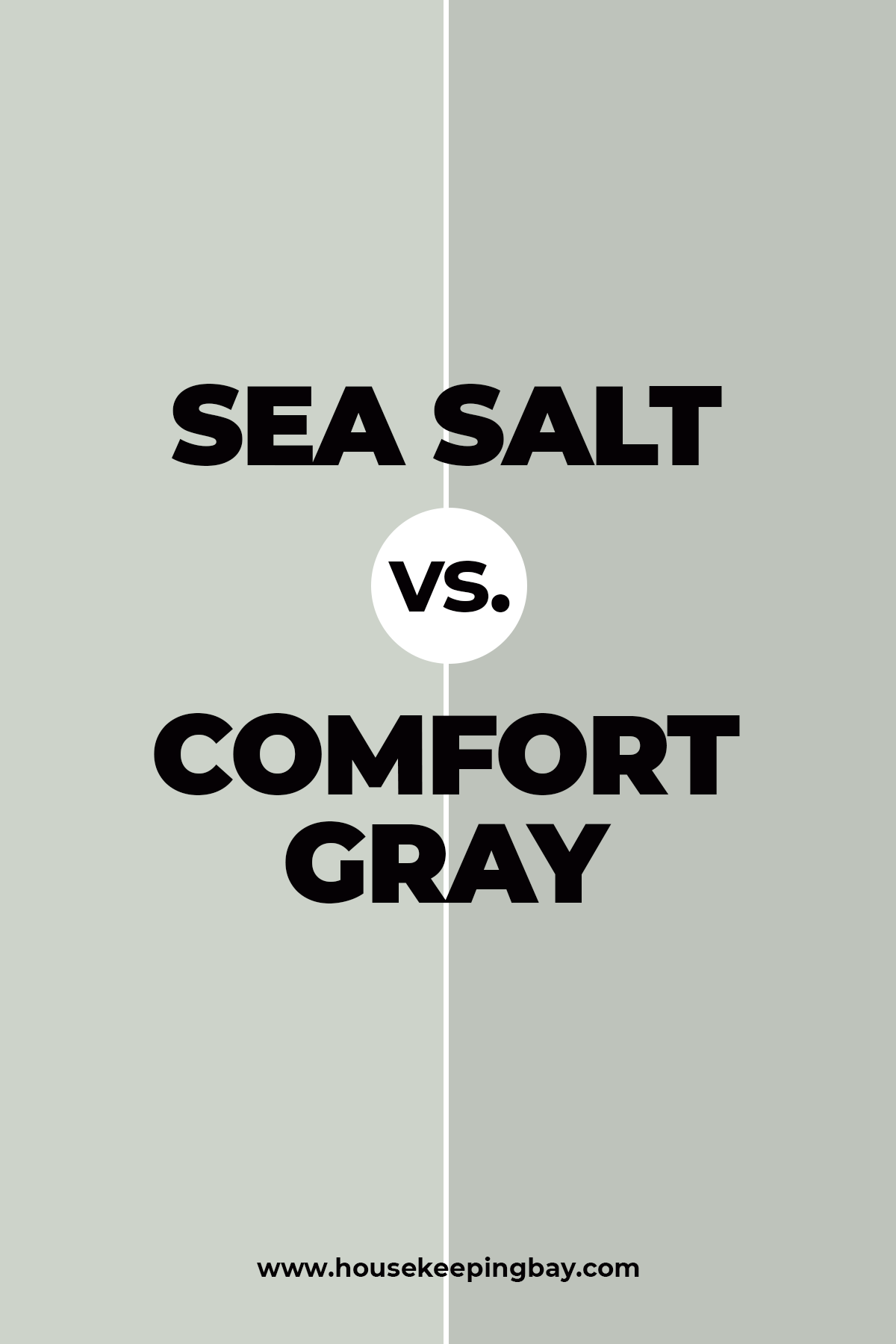
Sea Salt vs Comfort Gray
These two look pretty nice together, but they need one more darker color to create a really harmonious combination.
Comfort Gray is somewhat darker with more prominent greenish notes in it.
Sea Salt, in its turn, looks a bit cooler revealing more gray undertones if you put these two colors side by side.
Housekeepingbay.com
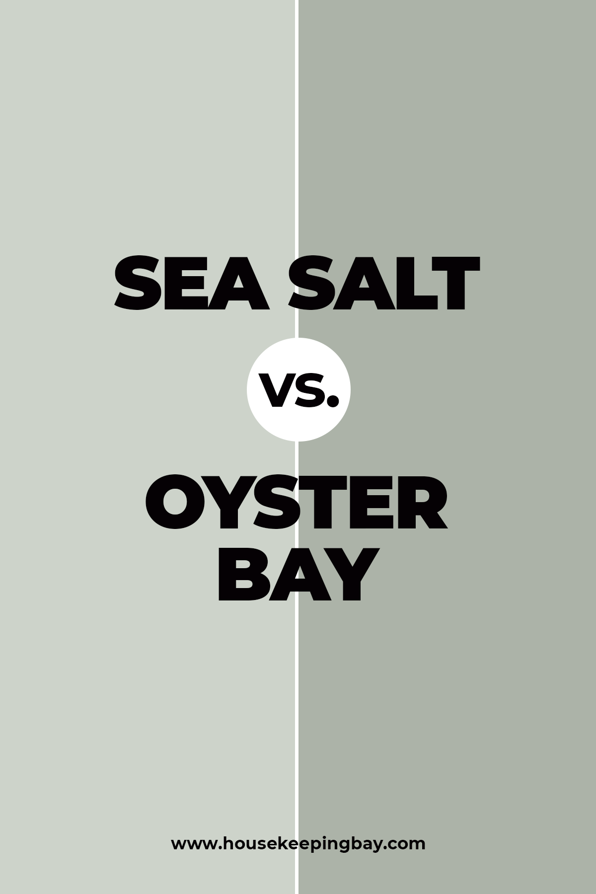
Sea Salt vs Oyster Bay
Oyster Bay is way greener to begin with!
Its subtle green hue creates a significant contrast in comparison to a lighter Sea Salt which looks very diluted in comparison to its counterpart.
But still, we would not recommend using them together since they have the same nature.
Housekeepingbay.com
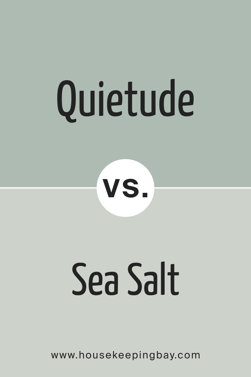
Sherwin Williams Quietude vs. Sea Salt
Choosing between Sherwin Williams Quietude and Sea Salt can be challenging, as both colors offer a serene and calming atmosphere. Quietude is a deeper, more saturated blue-green that exudes a sense of tranquility and depth, making it ideal for creating a cozy, intimate space. In contrast, Sea Salt is a lighter, more airy green with subtle blue undertones, perfect for brightening up a room and making it feel more open and inviting.
Depending on your desired mood and the lighting in your space, either color can provide a beautiful, soothing backdrop for your home.
So, with these recommendations and information, you will now be able to find a proper use for the SW Sea Salt in your home!
Housekeepingbay.com
Ever wished paint sampling was as easy as sticking a sticker? Guess what? Now it is! Discover Samplize's unique Peel & Stick samples. Get started now and say goodbye to the old messy way!
Get paint samples


Frequently Asked Questions
⭐ What is Behr equivalent to Sherwin Williams Sea Salt?
It’s Behr Brook Green.
⭐ What’s Sherwin Williams Sea Salt Benjamin Moore equivalent?
It’s Wickham Gray.
⭐ What color compliments Sherwin Williams Sea Salt?
Sea Salt goes well with whites, grays, and beiges/greiges.
21 thoughts on “Sea Salt SW-6204 by Sherwin Williams + 26 Real Home Pics”
Leave a Reply


Hey there. As far as I know, SW By the Sea is a shade of blue. It’s neither too dark nor too light. A mid-tone blue, I’d say. I’m not sure, but seems like it’s a cool-toned color that looks pleasantly blue on the walls. It’s quite pronounced, so it might not be the ideal go-for color for painting the walls. But for color accents, it could work really well!
SW By the Sea is a shade of blue that’s not too dark or too light, but right in the middle. It’s a cool blue, which means it has a calm and refreshing feel. It’s quite noticeable when used on walls, so it might be a bit much if you use it everywhere. But, it would be great for adding a splash of color to smaller areas or as an accent on things like trim or a single wall
Is Sea Salt by Sherwin-Williams a nice color for bedroom walls?
Generally, you can paint your bedroom walls with SW Sea Salt, of course. But it will be more suitable for those who enjoy cooler tones in their bedrooms. If you want to have a cozy and warm vibe there, you’d better opt for softer and warmer colors like greiges of lighter beiges.
Hi! Could you please help me? I’m picking the best color for my house exterior walls, and I have a question. Will Sea Salt by Sherwin-Williams work well on exterior walls?
Hello! Technically, this color can be used on exterior walls. But you need to consider its undertones. This paint color may read bluish, lean into green, or look gray depending on the lighting. E.g., on cloudy days, it will most likely read grayish whilst on a sunny day, it’s more likely to read greener.
Hi! Could you please explain the difference between Sherwin-Williams Sea Spray and SW Sea Salt? They look absolutely the same to me!
Hello! These colors may read pretty much alike indeed. But they are not the same. SW Sea Spray is slightly darker than Sea Salt, and has a little bit more green undertones. On the other hand, SW Sea Salt has a bit more yellow/neutral to it than SW Sea Spray.
Hi Melinda,we are putting the color fromsherwin Williams Sea Salt in our Master bedroom and it’s a big room having hard time figuring out what color of rug to get my husband doesn’t want any pattern in the carpet and we have a dog.We want to get the carpet at Home Depot and get the medium cost carpet what would you think for carpet color.Thank You,Becky B.
Hello, Becky! With SW Sea Salt on the walls, you might want to try a light gray carpet. Also, lighter shades of blue might work well (I’d recommend muted blues that are not striking bright!)
Can I use sea salt when I have mostly white but my counter is a olive like color?
Hello! If your olive green counter is dark enough, Sea Salt will work well with it. But with lighter and more saturated green colors(i.e. grass green shades), it might not look good enough.
Yes, that’s a good idea.
Do you think Sherwin-Williams Sea Salt is a good color for the bathroom walls? My bathroom is fairly light thanks to the window, and I really love this color! But I’m afraid it might look dull on the walls.
Hi! I don’t think it will look dull, to be honest. I had SW Sea Salt in my bedroom for a few years, and it read a very light blue with a slight hint of green and gray undertone. My bedroom also has plenty of daylight, so I guess the lighting conditions are almost the same with your bathroom.
I have been painting my living room sea salt but it is pulling so much blue I don’t like it. Can I paint a wall a different color to help pull the green and gray ?
Hi! I need your advice folks. Can Sea Salt by Sherwin Williams be used on kitchen cabinets?
I believe it can! At least I used it a couple of years ago to paint my cabinets, and I repainted them with another color this year simply because I got tired of the previous color.
Can I use Sherwin Williams Sea Salt color for our nursery? I’m in doubt since it seems to me that it’s a bit too cool.
I guess it’s all personal. I would not use it for a nursery because I find this color rather cool just like you said. I’d use something warmer and lighter, something beige or greige, perhaps. But rely on your feelings. If you feel comfy in a room painted with this color, then it’s fine!
I have the same color in my nursery