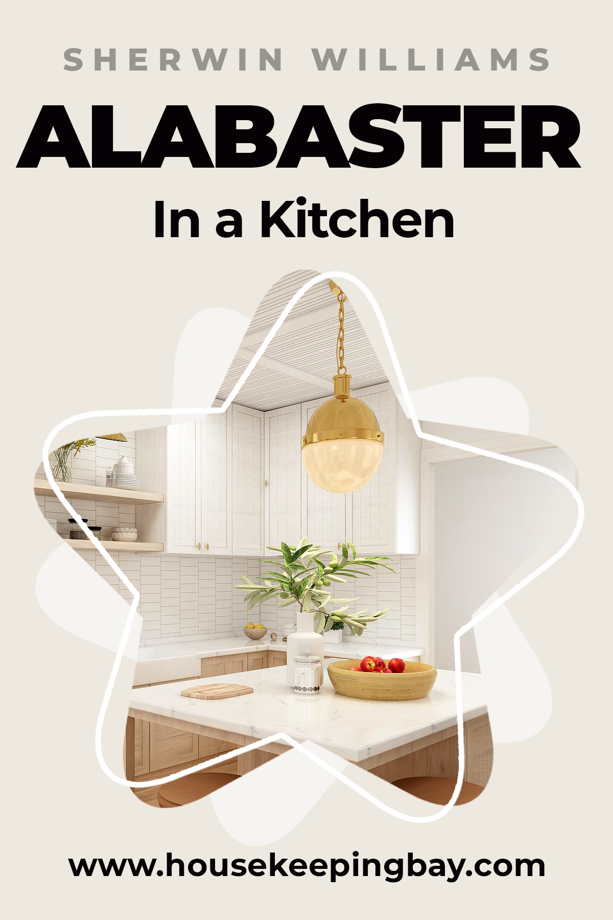
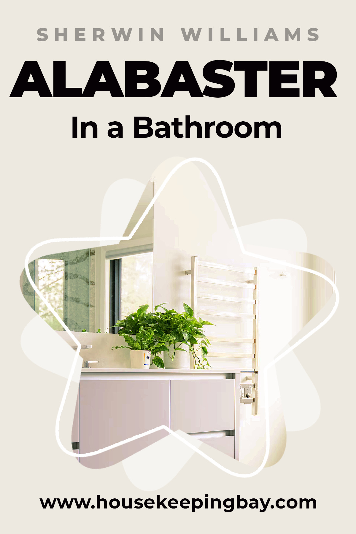
Alabaster SW 7008 by Sherwin Williams
Create an original design for your house by using SW 7008 Alabaster color.
This time we will focus on a pretty and versatile color that looks great in any room.
Alabaster by Sherwin Williams is a nice, subtle shade of white. It is by no means simple, but rather special, which makes it worthy of your attention.
First time this tone appeared in the collections of Sherwin Williams in 2016. In 2019 it became very popular, and is still relevant today. To give you an understanding of this color, we need to go a little deeper into history.
The shade of white got its name thanks to the mineral alabaster, which is used to create gypsum powder and carve statues.
This mineral has been used by mankind for thousands of years, is well known and popular.
When was the last time you happened to be in a white-toned room, did you feel comfortable or, on the contrary, felt bad and couldn’t relax?
White and it’s shades is one of those colors that many homeowners avoid because they are afraid that the room will not look cozy and welcoming.
In fact, white is the most refreshing color. It makes the home clean and smart-looking and brings a touch of sophistication to the interior.
Alabaster by Sherwin Williams is a white shade that will bring you a luxury and opulence atmosphere.
Credits: Sidekix Media, via Unsplash.com
What color is Alabaster by Sherwin Williams?
Table of Contents
This popular shade is renowned for its warm, creamy white hue, which exudes subtle undertones of beige and gray.
These characteristics give Alabaster a soft, inviting appearance that avoids the starkness of pure white while remaining refreshingly neutral.
A Versatile Choice for Any Setting
One of the standout features of Alabaster is its incredible versatility.
Whether you’re designing a traditional or modern space, this color adapts effortlessly. It pairs beautifully with a broad spectrum of colors, from bold, vibrant hues to soft pastels and muted tones. This adaptability makes it an excellent choice for various applications, including main walls, trim, and accent pieces.
Enhancing Interiors with Light and Warmth
In living rooms, Alabaster creates a clean, bright backdrop that enhances natural light, making spaces feel open and airy. Its warm undertones contribute to a cozy and restful environment in bedrooms, promoting relaxation and comfort.
In kitchens and bathrooms, Alabaster offers a fresh, timeless look that complements both classic and contemporary fixtures and finishes.

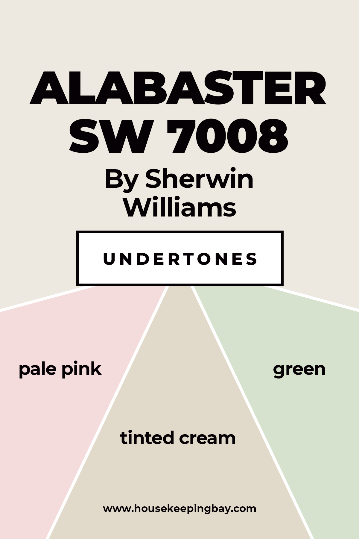
Alabaster Undertones
Sherwin Williams Alabaster is white color. It is not cold, rather warm, as Encycolorpedia says.
The shades closest to it are ivory, off-white, and taupe. Unlike beige, alabaster does not have yellow-brown blotches.
Though alabaster is a special shade of white, it can also be tinted cream, pale pink or greenish, depending on the lightning options and coordinating colors.
Alabaster is a wonderful color that blends perfectly with almost all shades in the interior. However, one of the most interesting combinations will be neutral colors, i.e. white, gray and black.
A wonderful combination of alabaster with slightly softer shades, such as powdery pink or blue, is an idyllic decoration if you look for options to design a child’s bedroom.
Housekeepingbay.com
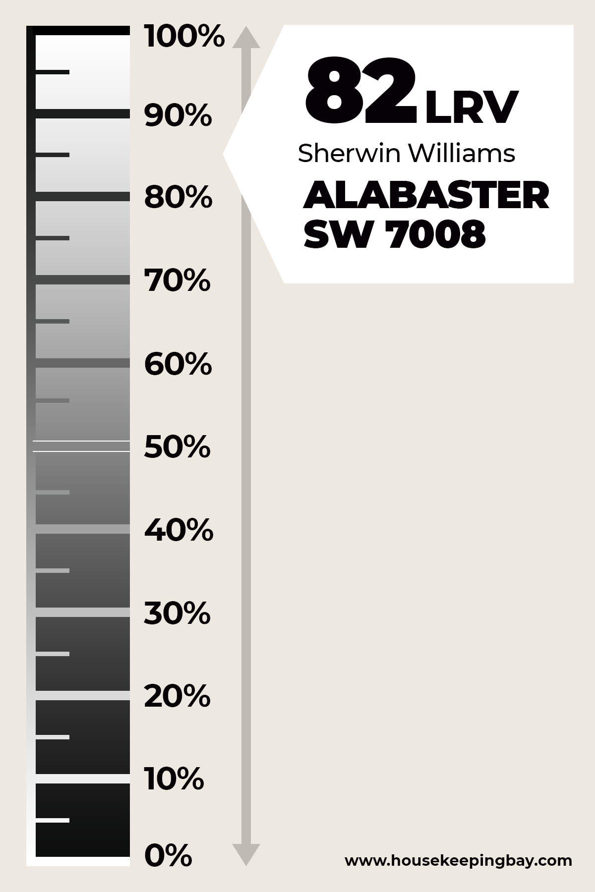
What is LRV Of Alabaster?
To understand how different alabaster is from pure white, let’s compare their light reflectance.
Keep in mind that the basic snow-white color’s LVR is 100, that is, it completely reflects the light.
Alabaster’s LVR is 82. It is at the upper end of the spectrum, it reflects a lot of light, visually expands the space, but at the same time it is warmer than pure white.
What is LRV? Read It Before You Choose Your Ideal Paint Color
Housekeepingbay.com
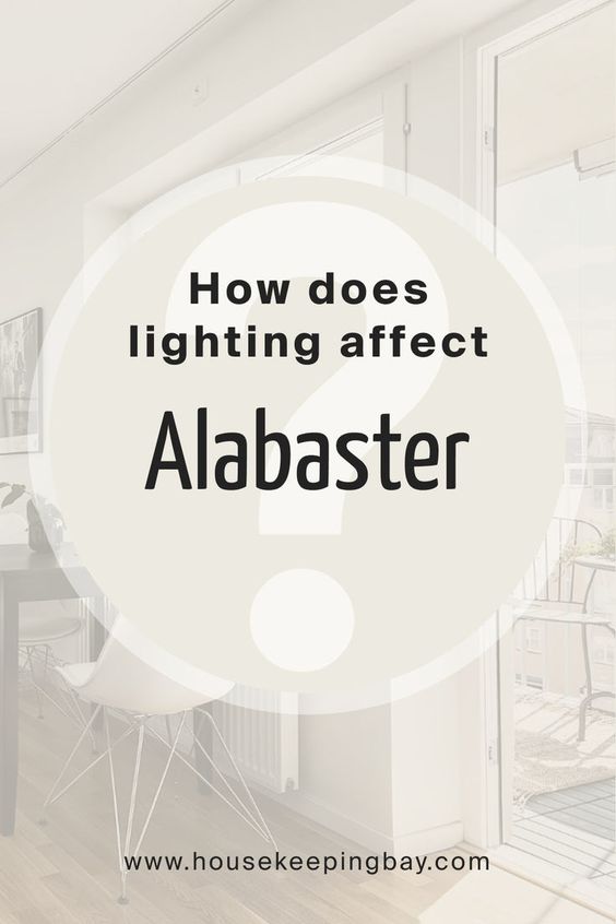
How does lighting Affect Alabaster?
Alabaster is a versatile and popular paint color, but like all paint colors, its appearance can be significantly influenced by the lighting conditions in a space.
Understanding how lighting affects Alabaster can help you make informed decisions about where and how to use this beautiful hue in your home.
Natural Light
North-Facing Rooms:
In north-facing rooms, which typically receive cooler, indirect light, Alabaster can appear slightly more muted and cool. The soft, warm undertones of Alabaster help to counteract the coolness of the northern light, maintaining a balanced and inviting feel without becoming overly warm or creamy.
South-Facing Rooms:
In south-facing rooms, which benefit from abundant, warm natural light throughout the day, Alabaster tends to look brighter and warmer. The natural light enhances its creamy undertones, creating a glowing and welcoming ambiance. This makes Alabaster an excellent choice for living rooms, kitchens, and other spaces where warmth and light are desired.
East-Facing Rooms:
East-facing rooms receive warm, yellow light in the morning and cooler, bluish light in the afternoon. In these spaces, Alabaster may appear warmer in the morning and more neutral or slightly cool in the afternoon. This dynamic shift can add interest and depth to the room’s overall feel.
West-Facing Rooms:
West-facing rooms experience cooler light in the morning and warm, golden light in the afternoon and evening. Alabaster will look neutral to slightly cool in the morning hours, transitioning to a warmer, more radiant hue as the day progresses. This makes it a versatile choice for rooms used throughout the day, as it adapts beautifully to changing light conditions.
Artificial Light
- Under warm white bulbs (2700K to 3000K), Alabaster’s creamy undertones are accentuated, creating a cozy and inviting atmosphere. This type of lighting is ideal for bedrooms, living rooms, and dining areas where a warm and comfortable ambiance is desird.
- Cool white bulbs (4000K to 5000K) can make Alabaster appear slightly cooler and more neutral. This lighting works well in spaces like kitchens, bathrooms, and workspaces where a brighter, more energetic feel is preferred. The cooler light can help Alabaster maintain its fresh and clean appearance without feeling too sterile.
- Daylight bulbs (5000K to 6500K) mimic natural daylight and can make Alabaster appear its most neutral. This type of lighting is excellent for areas where true color rendition is important, such as art studios or spaces with a lot of natural elements. Daylight bulbs can enhance Alabaster’s versatility, allowing it to harmonize well with other colors and materials in the room.
instagram @velvetbrumby
Lighting plays a crucial role in how Alabaster by Sherwin Williams is perceived. By understanding how different lighting conditions affect this versatile paint color, you can choose the best locations and lighting setups to showcase its beauty.
Whether in natural or artificial light, Alabaster adapts gracefully, maintaining its warm, inviting charm while complementing a wide range of interior styles and color schemes.
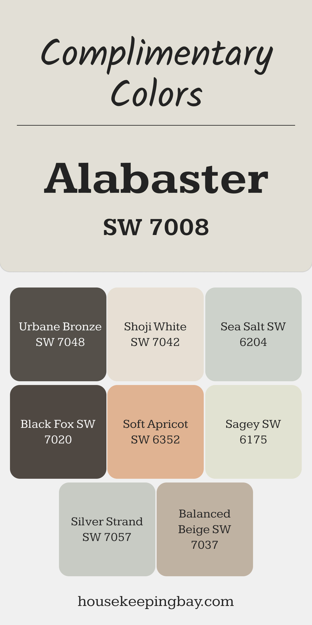
Complimentary Colors for Alabaster SW 7008 Paint Color by Sherwin Williams
Alabaster pairs beautifully with Shoji White and Balanced Beige for a soft, cohesive look. These shades create a gentle contrast that enhances brightness without feeling stark. Silver Strand and Sea Salt add a subtle hint of cool tones, perfect for creating a relaxed and inviting atmosphere.
For a bolder combination, try Urbane Bronze or Black Fox to bring depth and contrast. Sagey and Soft Apricot offer a touch of color, adding character while keeping the palette fresh and versatile.
via housekeepingbay.com
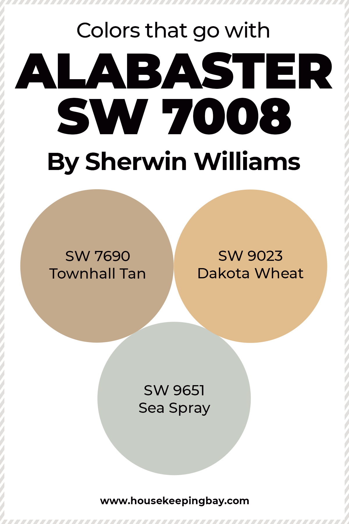
Colors that go with Alabaster
With various shades of white and beige, on the one hand, alabaster will create a gentle and soothing composition. On the other hand, alabaster will look great in the company of black and its shades.
The contrast created by the two colors will be expressive and sophisticated.
Alabaster, of course, belongs to neutral shades, so it goes well with any colors.
The manufacturer recommends the following combinations:
- SW 7690 Townhall Tan , a variation of beige color with LVR 42. This is a soft and harmonious combination of shades.
- SW 9023 Dakota Wheat , a yellow-beige shade with LVR 54. This combination creates warmth and unobtrusiveness at the same time.
- SW 9651 Sea Spray with LVR 61. Fresh, light, cool soft blue.
However, these are just recommendations.
You can combine alabaster with anything from pure white to rich Oxblood color.
According to the designers, alabaster needs to be next to something brighter so that the interior does not turn out to be too neutral and boring.
Housekeepingbay.com
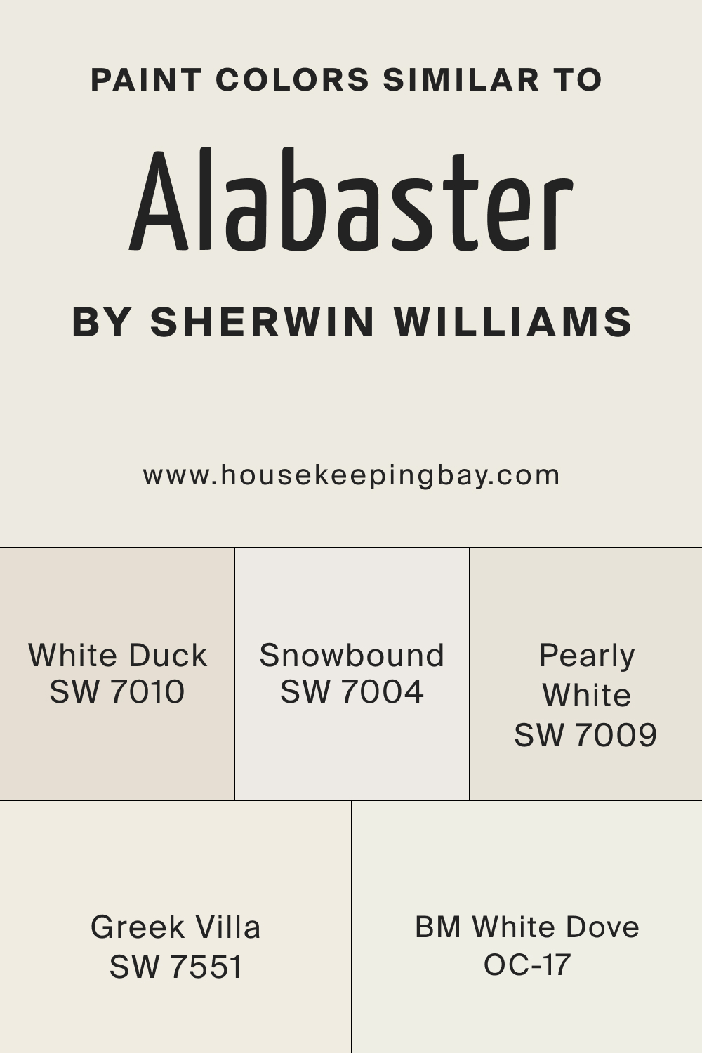
Colors similar to Alabaster SW 7008
If you love the warmth and versatility of Alabaster by Sherwin Williams but are looking for alternative options, there are several colors from Sherwin Williams and other brands that offer a similar aesthetic. Here are a few notable options:
- Snowbound SW 7004 – is a bright white with subtle warm undertones. It is slightly cooler than Alabaster, making it a great choice if you want a crisp, clean look with a touch of warmth.
- White Duck SW 7010 – is a warm, creamy off-white that leans more towards beige. It has a bit more depth compared to Alabaster, making it a good option for spaces where you want a touch more color while maintaining a neutral palette.
- White Dove OC-17 – is a soft, warm white with a hint of gray, similar to Alabaster. It provides a slightly cooler undertone, making it an excellent choice for creating a light and airy feel in any room.
- Greek Villa SW 7551 – is a warm white that is very close to Alabaster in terms of warmth and brightness. It’s a versatile color that works well in both traditional and modern spaces.
- Pearly White SW 7009 – is a light, warm white with a soft, creamy appearance. It is slightly less warm than Alabaster but still provides a cozy and inviting feel.
Alabaster by Sherwin Williams is a beloved choice for its warm, creamy white hue and versatility. If you’re exploring similar colors, options like Snowbound, White Duck, White Dove, Greek Villa, Pearly White, Swiss Coffee. These alternatives provide a range of subtle differences in undertone and brightness, allowing you to find the perfect shade for your space.
A neutral color palette of these tones creates a peaceful space that still feels luxurious enough.
These soft tones work well with natural wood tones and dark metallic accents for a balanced space.
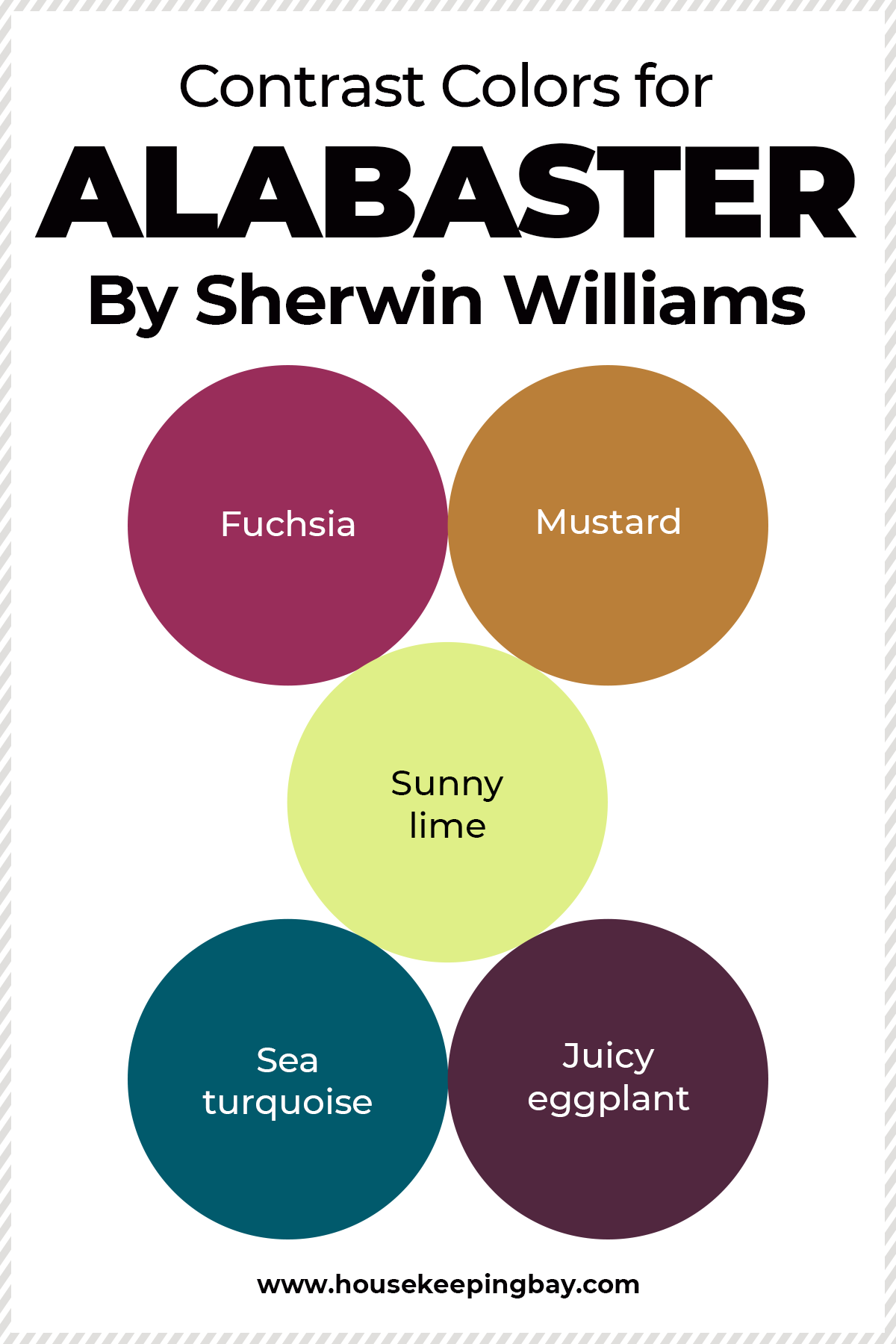
Contrast colors for Alabaster
Alabaster color can be considered as a universal base.
It can be combined with saturated bright colors. Fuchsia, mustard or sunny lime, sea turquoise or juicy eggplant are perfect companions for alabaster if you like bold and exclusive designs.
For example, by placing a sofa in rich color against an alabaster wall, you create an intriguing focal point.
Natural wood looks great against such a background, including furniture made of wood.
Green, blue and yellow scales will also add a special chic to the alabaster.
In any case, this shade from the family of whites is a good choice for interiors in any style.
Some options you might like to compliment the alabaster in your design:
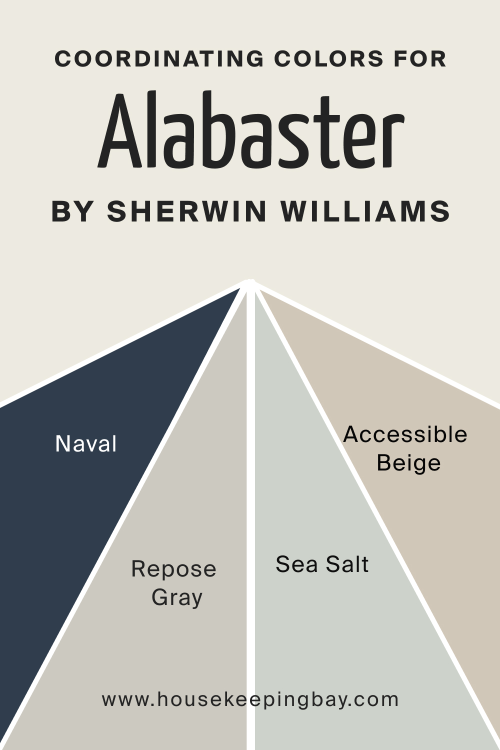
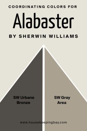
Coordinating Colors for Alabaster by Sherwin Williams
Choosing the right coordinating colors can enhance the elegance and warmth of Alabaster (SW 7008) by Sherwin Williams.
Here are six excellent options that pair beautifully with Alabaster:
- Urbane Bronze SW 7048 – is a deep, sophisticated dark brown with gray undertones. This rich color adds depth and contrast to Alabaster, creating a balanced and harmonious look. It’s perfect for accent walls, cabinetry, or trim, bringing a touch of modern elegance to your space.
- Gray Area SW 7052 – is a warm gray that complements the creamy undertones of Alabaster. It provides a subtle, sophisticated contrast without overpowering the softness of Alabaster. This color works well for larger areas like walls, offering a cohesive and refined appearance.
- Accessible Beige SW 7036 – is a warm, versatile beige with gray undertones. It complements Alabaster’s creamy warmth, creating a harmonious and cozy palette. This color is perfect for living areas, bedrooms, and other spaces where you want a comfortable and inviting atmosphere.
- Sea Salt SW 6204 – is a soft, muted green with hints of gray. It adds a serene and refreshing touch to spaces decorated with Alabaster, providing a gentle contrast without overwhelming the room. This color is ideal for bathrooms, bedrooms, and kitchens, where a calm and relaxing environment is desired.
- Repose Gray SW 7015 – is a light gray with warm undertones. It provides a sophisticated and subtle contrast to Alabaster, creating a balanced and elegant look. This color works well in living rooms, bedrooms, and kitchens, offering a neutral yet refined backdrop.
- Naval SW 6244 – is a deep, rich navy blue that pairs beautifully with Alabaster. The bold, dramatic tone of Naval adds a striking contrast, making it perfect for accent walls, cabinetry, or statement pieces. This combination brings a touch of classic elegance and modern flair to any space.
By incorporating these coordinating colors, you can create a cohesive and stylish design that highlights the beauty of Alabaster while adding visual interest and depth to your space.
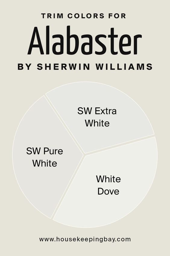
Trim Colors for Alabaster by Sherwin Williams
When choosing trim colors to pair with Alabaster , there are several excellent options to enhance and complement this warm, creamy white.
Here are three popular trim colors that work beautifully with Alabaster:
- Extra White (SW 7006): This crisp, clean white provides a sharp contrast to Alabaster’s warm undertones, creating a bright, fresh look. It’s an excellent choice if you want to highlight architectural details and add a modern touch to your space.
- Pure White (SW 7005): Pure White is a versatile, neutral white that complements Alabaster without being too stark. It offers a soft, seamless transition that enhances the overall warmth and coziness of the room, making it ideal for both traditional and contemporary settings.
- White Dove (OC-17) by Benjamin Moore: Although not a Sherwin Williams color, White Dove is a popular choice due to its soft, warm white hue with subtle gray undertones. It blends harmoniously with Alabaster, providing a gentle, elegant finish that works well in various lighting conditions.
These trim colors help highlight Alabaster’s inviting nature while adding depth and definition to your space. Choose the one that best fits your desired aesthetic to create a cohesive and polished look.
Best Ways to Use Sherwin Williams Alabaster
In fact, there are no rules that impose or prohibit the use of alabaster in your house or apartment. Professional designers recommend using it in small rooms because it makes them larger.
However, it is also an excellent background in a spacious living room, literally connecting all its parts together.
Alabaster is a great companion for a variety of designs and styles.
You can use combinations of alabaster and its go-to colors and shades in modern designs like Fusion, contemporary, pop art, neoclassicism, postmodernism, futurism, eclecticism, boho, hi-tech, scandinavian… and many others.
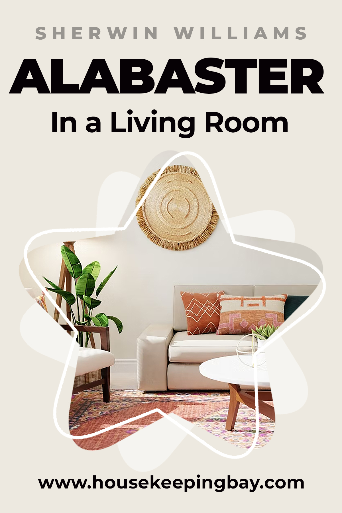
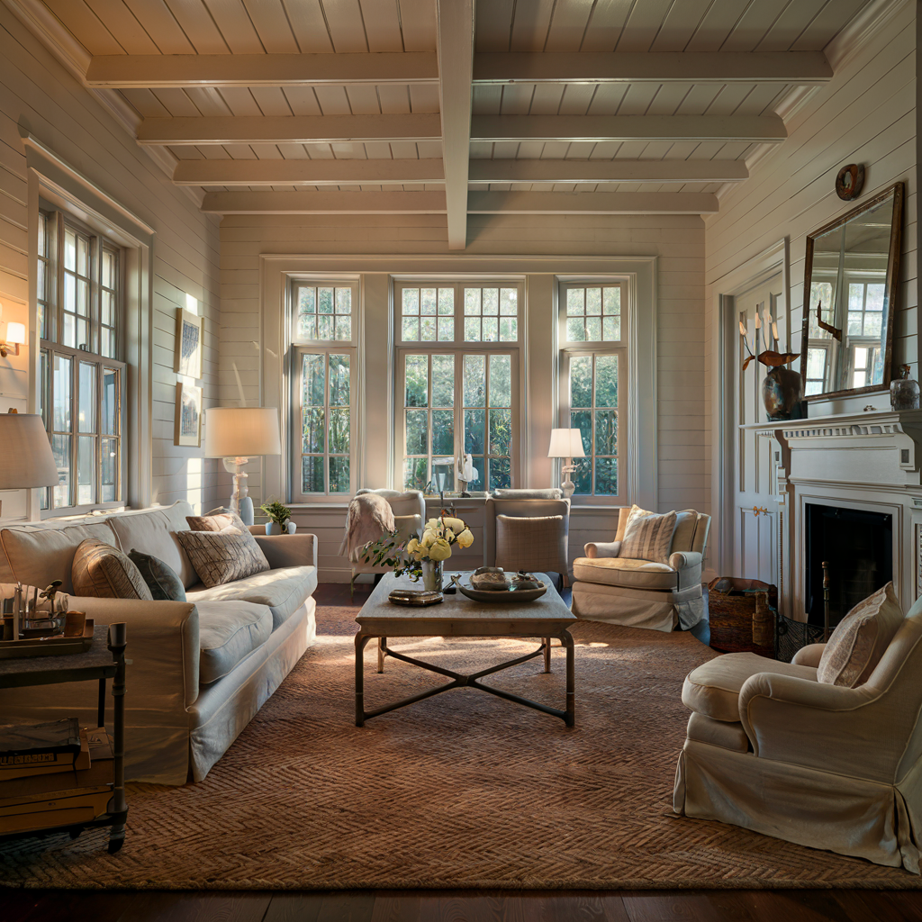
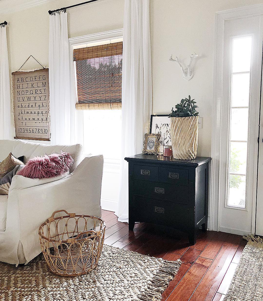
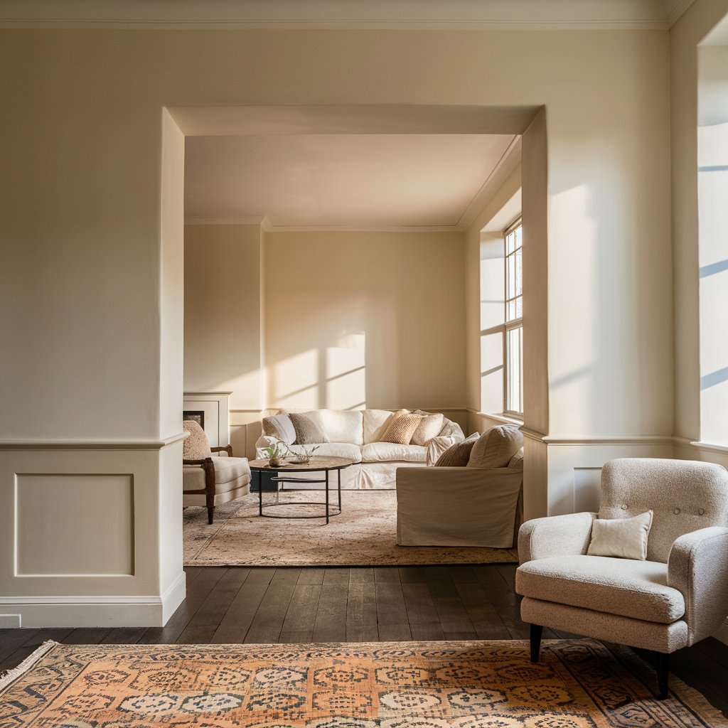
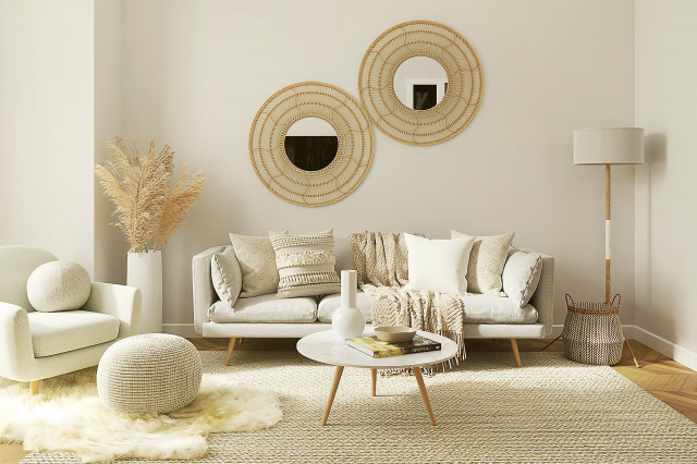
Alabaster in a Living room
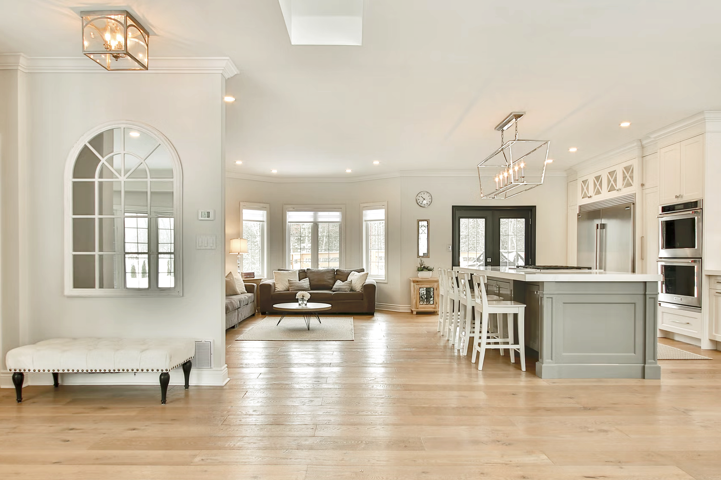
Off-white living rooms look great in large houses and small apartments. Designers recommend using this tone in the design of flooring, walls or ceilings.
The interior with beige and alabaster is great for any style: it makes the shade versatile and popular.
Off-white color palette is considered the most calm and relaxing. It is positively perceived by a person and has a good influence on the nervous system. For many, a living room in beige tones is associated with home comfort and an atmosphere of peace.
Housekeepingbay.com
Visualisations:
via housekeepingbay ai
via housekeepingbay ai
instagram via societyofsumner
instagram via societyofsumner
via housekeepingbay ai
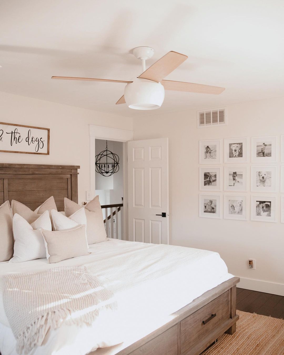
Alabaster in a Bedroom
White color has always been considered a symbol of calmness and balance.
It is easy to create an original interior design in light colors if the bedroom is decorated with off-white shades like milky, creamy, creamy, and alabaster.
They smoothly blend into each other, even when using seemingly contrasting colors, and bring freshness and softness to the atmosphere at the same time.
A bedroom in neutral colors like alabaster and beige or cream is an ideal option for people who value their peace most of all.
A bright and serene interior will allow the owners of such a room to enjoy sleep, and the morning awakening will become really pleasant.
Housekeepingbay.com
fashionablykay
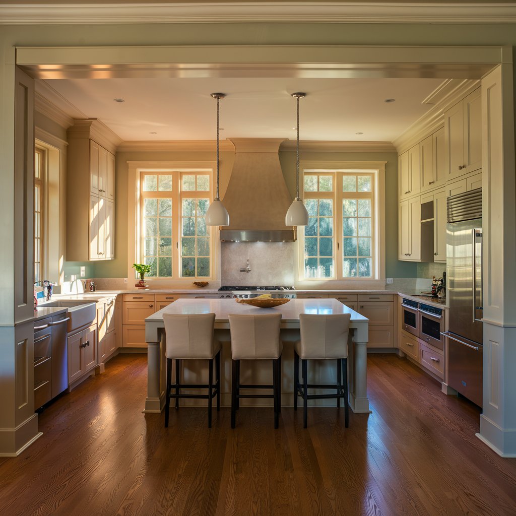
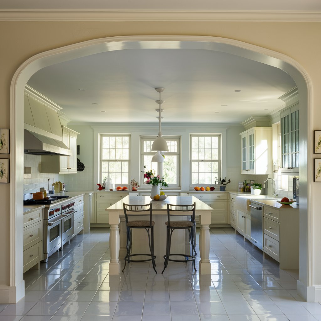
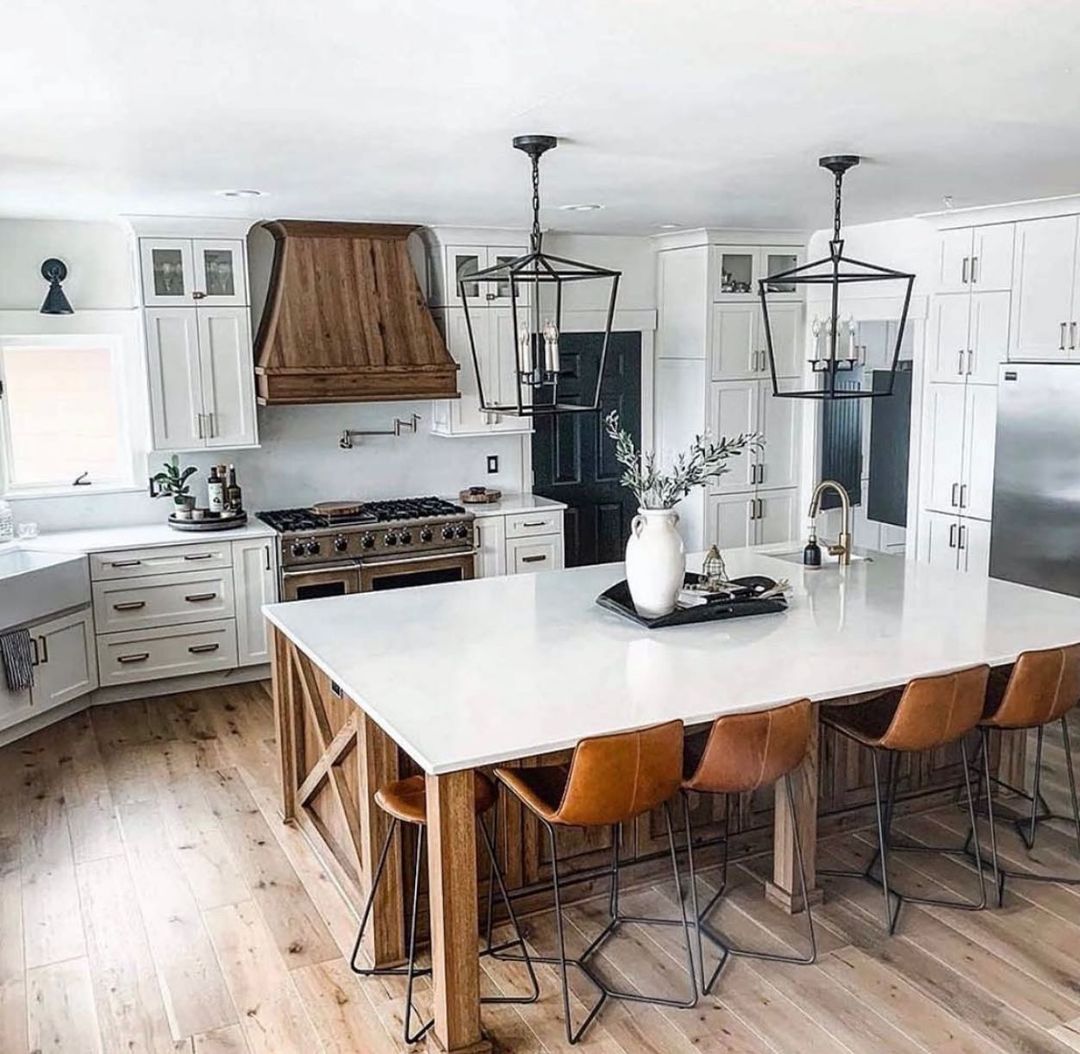
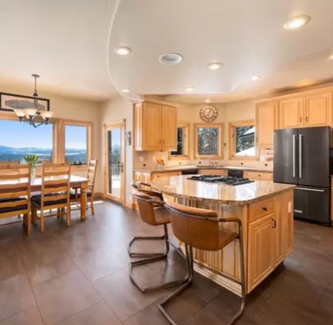
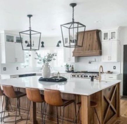
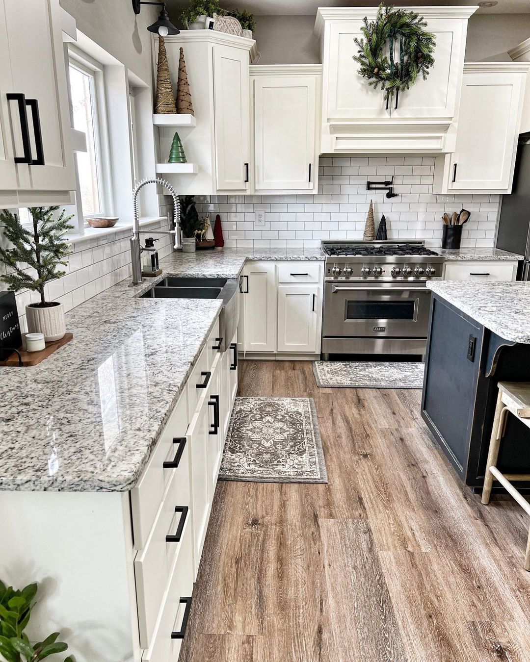
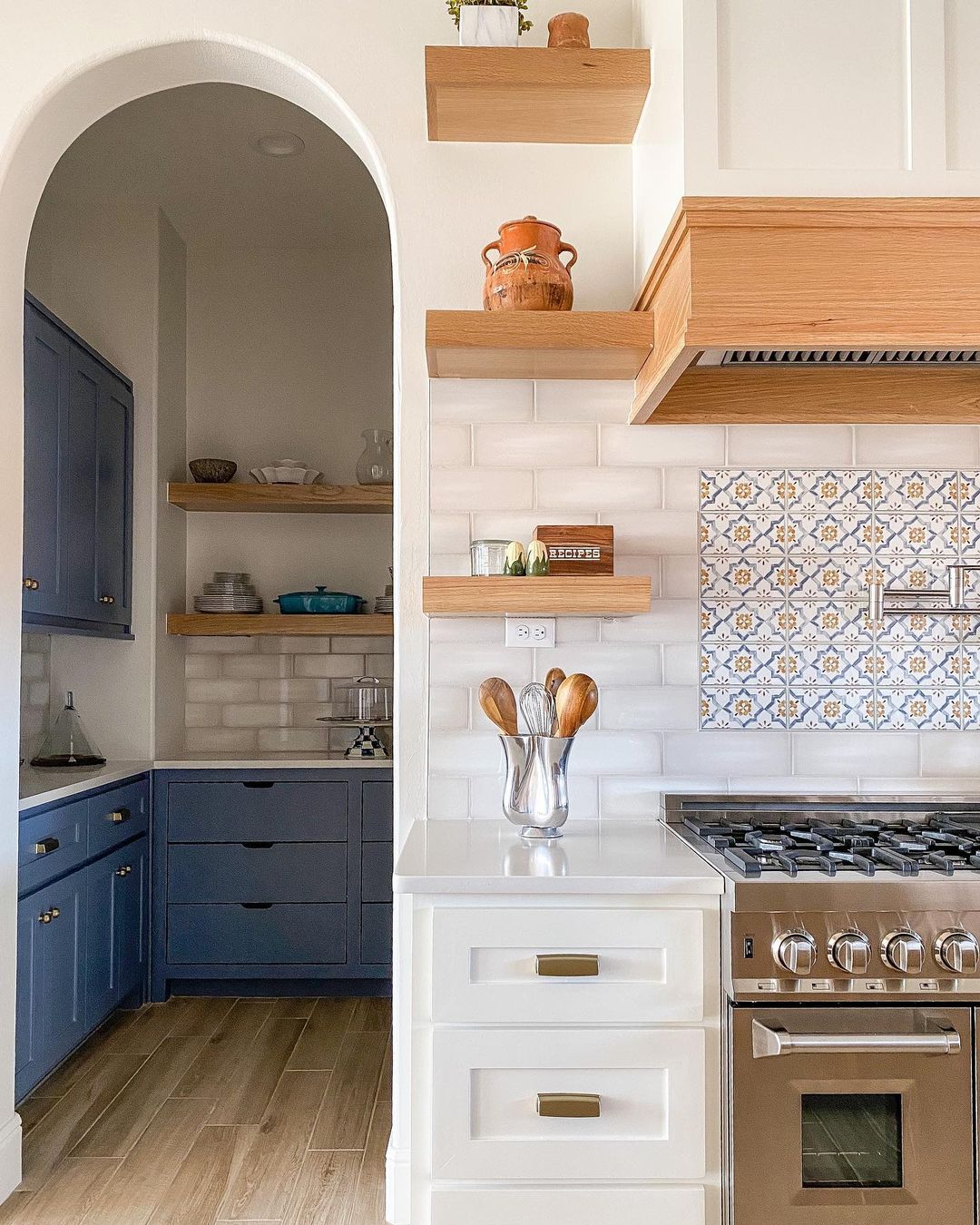
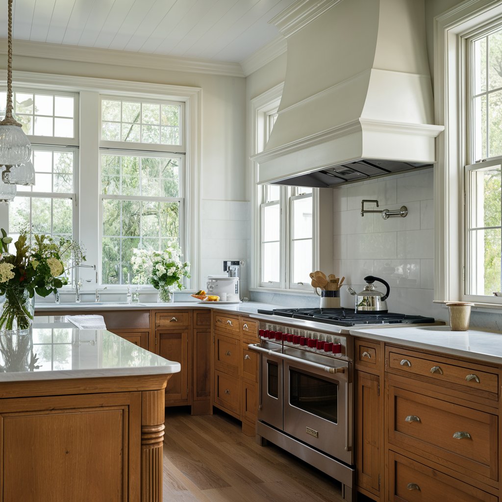
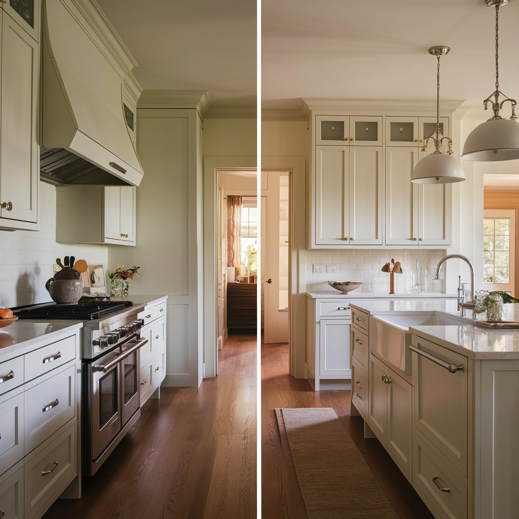
Alabaster in a Kitchen
Every owner of the house dreams of a kitchen, which would become not only a space for preparing delicious food, but also a cozy place for a good time with family and friends.
Alabaster and its coordinating colors is the perfect combination of harmony, comfort, coziness and elegance.
If you don’t want to decorate the kitchen in one color, then you can vary the caramel and sand halftones.
They will place the necessary accents and will not disturb the overall bright atmosphere.
Caramel shades will make the kitchen luxurious, creamy ones will give warmth, wheaten ones will visually expand the room.
The following color combinations will also be harmonious: beige with brown, beige with green, beige with pink, beige with gray.
Housekeepingbay.com
Visualisations:
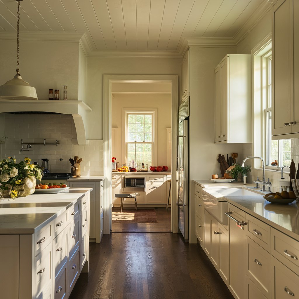
via housekeepingbay ai
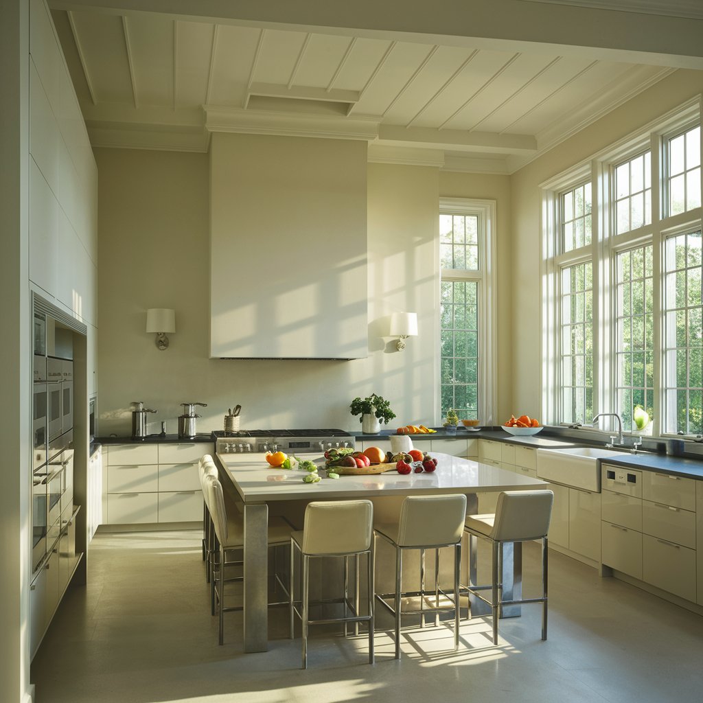
via housekeepingbay ai
via housekeepingbay ai
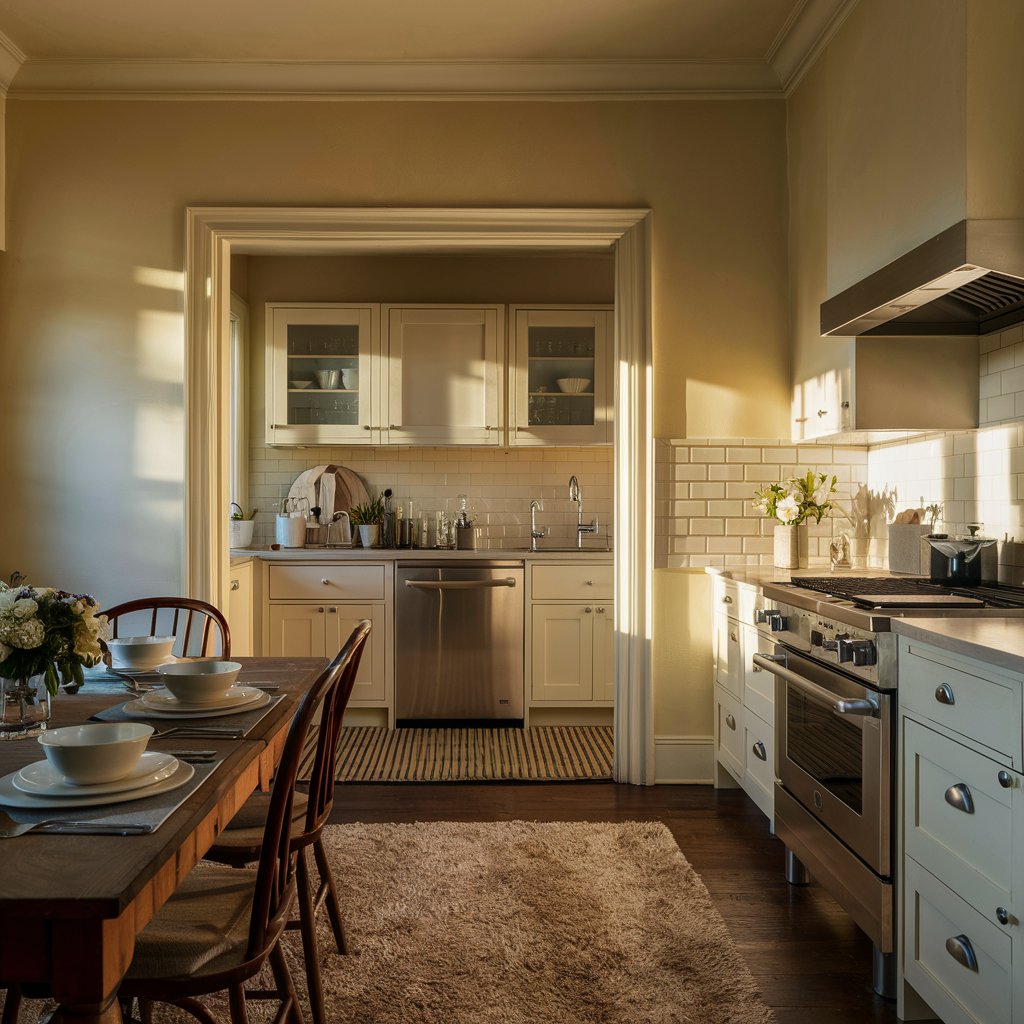
via housekeepingbay ai
via housekeepingbay ai
instagram via @kristatgilbert2
instagram via @ kristatgilbert
@kristatgilbert
instagram via @ bear_creek_home
instagram via @haciendahomedesign
via housekeepingbay ai
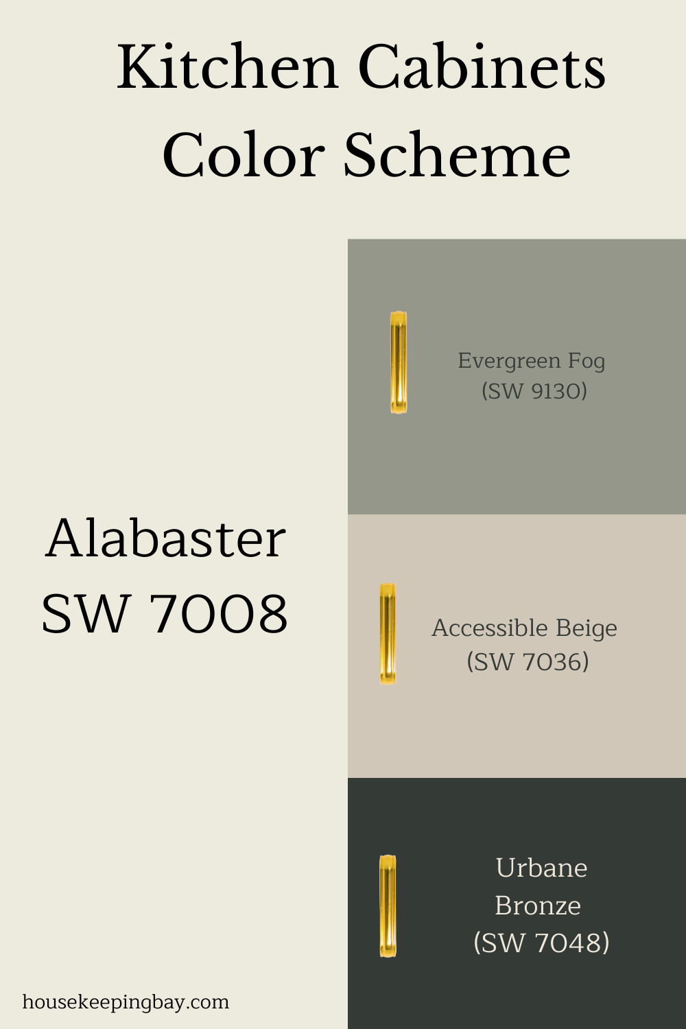
Soft, Creamy, and So Easy to Work With Kitchen Cabinets Colors Scheme
If you’ve ever wanted a white that doesn’t feel cold or too stark, Alabaster is a total gem. It’s warm, creamy, and gentle—like the perfect vanilla scoop in a sea of icy grays 😄
This pin shows some gorgeous pairing ideas for kitchen cabinets:
-
Evergreen Fog SW 9130 – a soft green-gray that brings calm vibes
-
Accessible Beige SW 7036 – a reliable beige that always behaves
-
Urbane Bronze SW 7048 – moody, rich, and bold (but not scary!)
One of the gals in my group used Alabaster for her uppers, Urbane Bronze for the lowers, and popped in some brushed brass pulls. It was elegant but still felt relaxed—like a fancy kitchen that you’re not afraid to cook spaghetti in.
Alabaster works so well as the “main” color because it plays nice with everything. It gives just enough warmth to make a space feel cozy, without turning yellow or muddy. And when paired with something like Evergreen Fog or Accessible Beige? It’s a chef’s kiss combo
If your kitchen gets a lot of natural light, Alabaster will glow softly. In dim spaces, it still holds its own and doesn’t go flat. That’s what makes it one of the best cabinet whites for both modern and traditional kitchens.
housekeepingbay.com
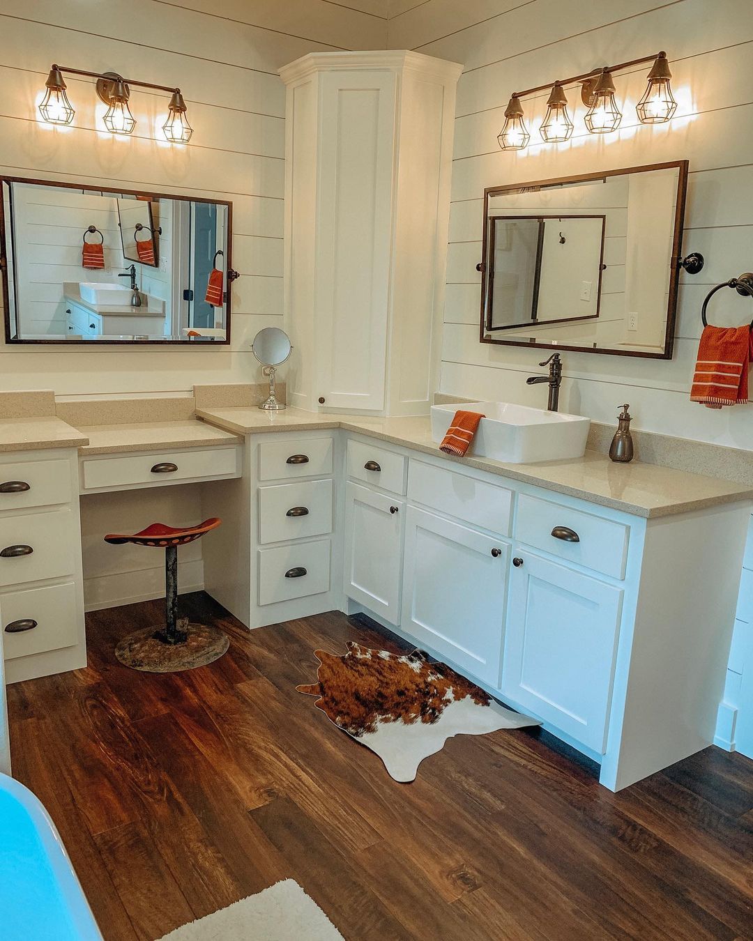
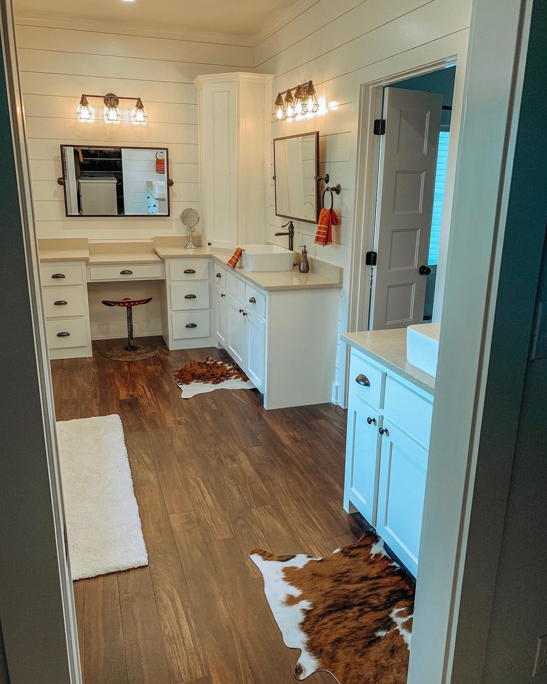
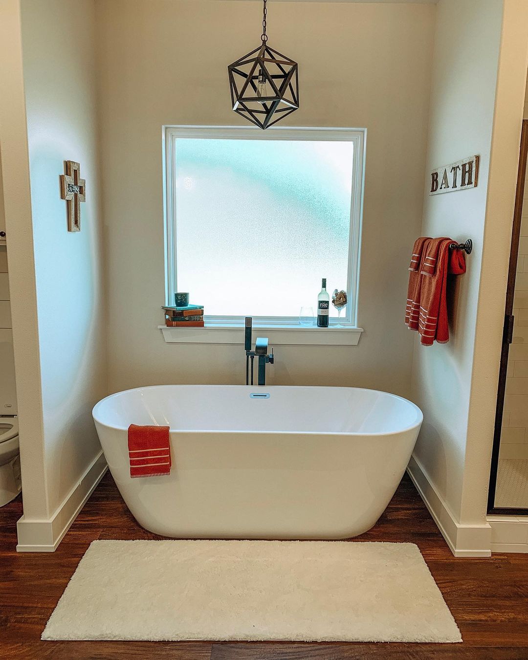
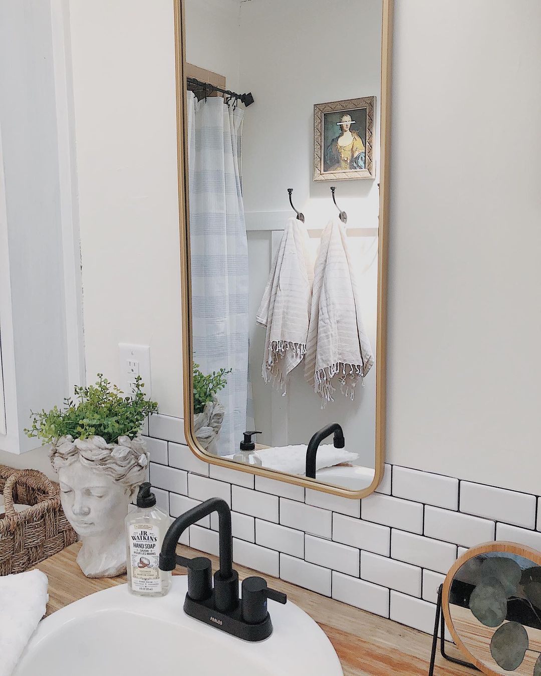
Alabaster in a Bathroom
Bathroom design in white tones attracts with its versatility, neutrality and elegance.
It is the perfect backdrop for an original sanitary ware or an exclusive wall mural.
A classic off-white bathroom or a modern loft in gray-beige tones will look great in any option.
Alabaster is able to balance bright colors and neutralize the presence of too dark tones.
Luxurious natural stone, matte and glossy tiles, brick and wood are just a small part of the materials that will be appropriate in an alabaster bathroom.
This color scheme is chosen for small typical apartments and country houses, used in hotels.
Housekeepingbay.com
instagram @velvetbrumby
instahram via @velvetbrumby
instagram via @velvetbrumby
instagram via @societyofsumner
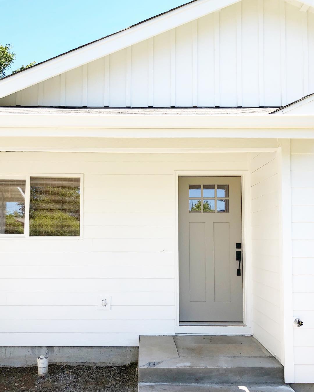
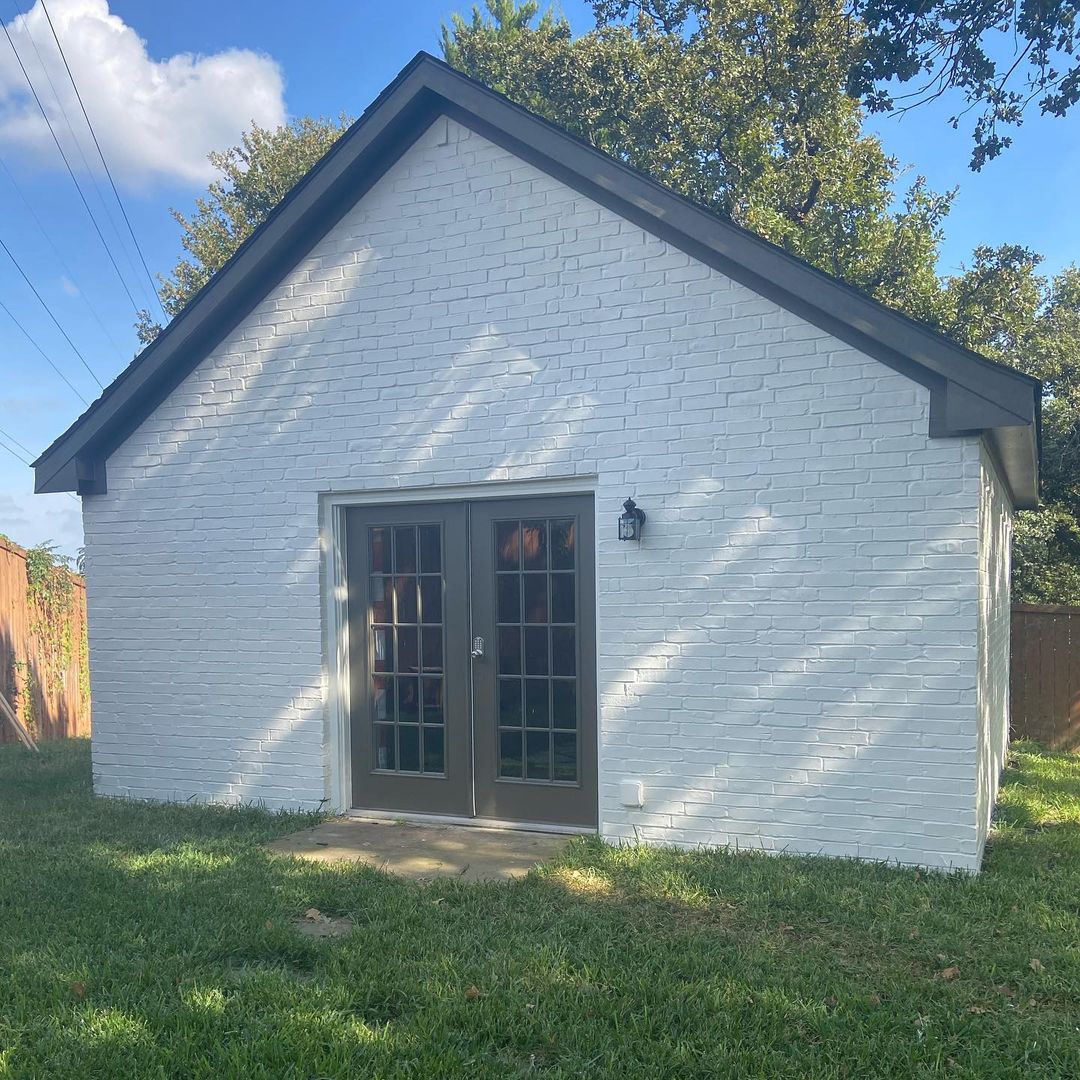
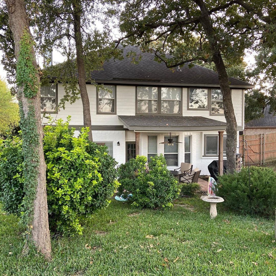
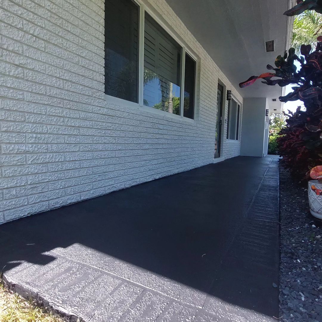
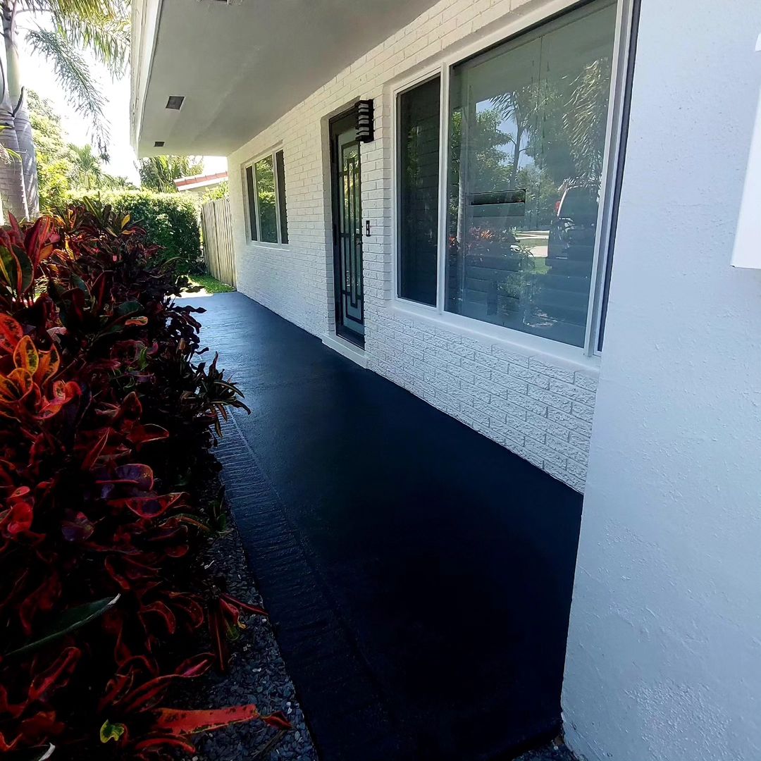
Alabaster in an Exterior
The choice of the color of the facade and its other elements is influenced by their shape, surface (texture), material from which it is made.
The right choice of color can completely change the perception of the building, visually increase or decrease the house.
Combining the color palette, you can make the house deeper, looking up, or vice versa, the main thing is to feel the measure.
The brighter the color, the shorter its lifespan, as it is more susceptible to the effects of sunlight on it.
Black color is the worst option, as it attracts the most ultraviolet rays, which means that the period of its operation is minimal.
The best option would be to use white and light colors that can last for many years.
A pure white color looks elegant, but also cannot look beautiful for a long time, it will quickly begin to fade and turn yellow.
It is best to use alabaster color and its shades.
This Sherwin Williams paint color does not fade, it does not turn yellow, and dust on such a facade will not be noticeable.

instagram via mydivinehome

instagram via kellofaplan
instagram via kellofaplan
instagram via kellofaplan
instagram via sarahpaintsllc
instagram via sarahpaintsllc
instafram via homeonmaui
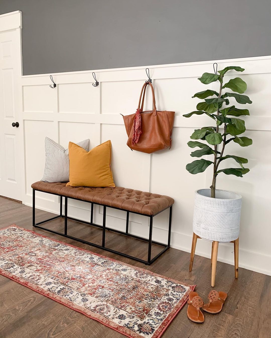
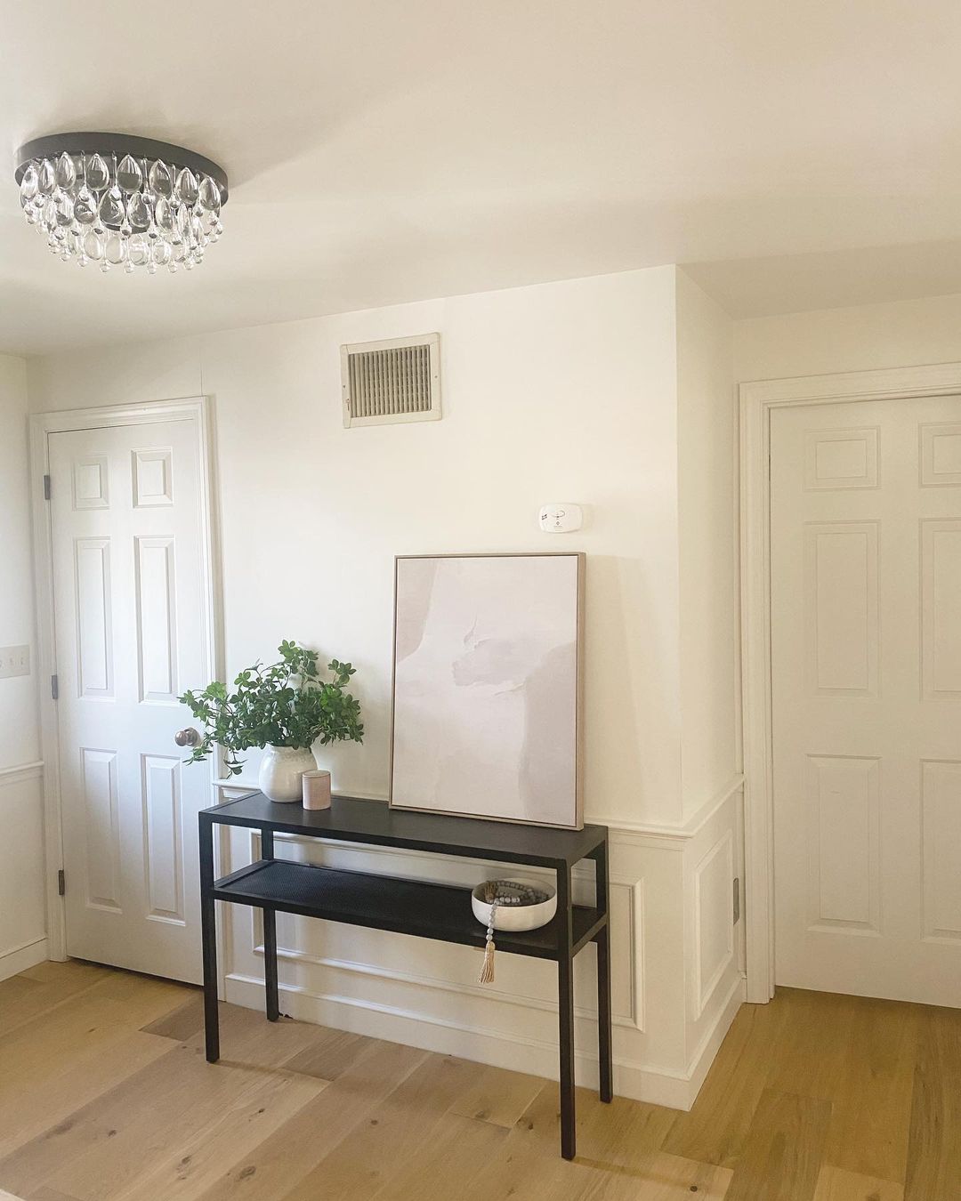
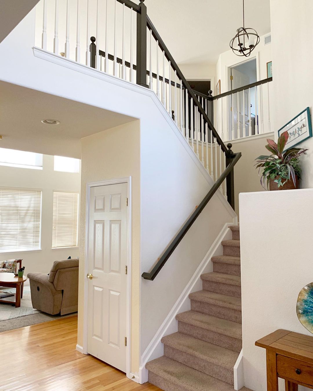
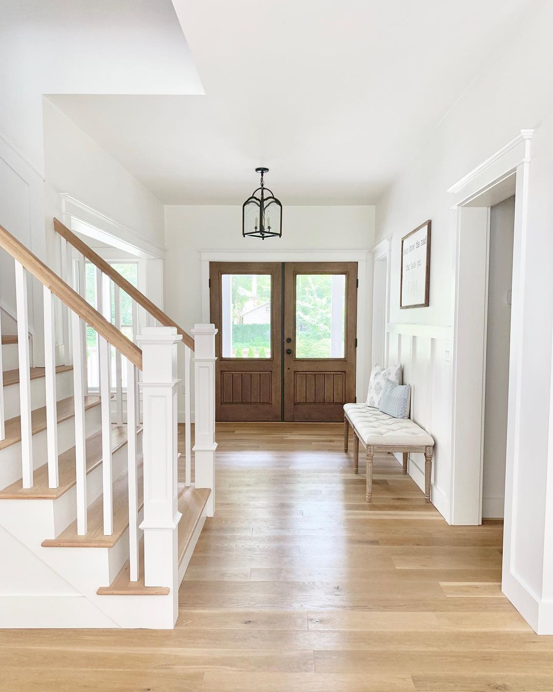
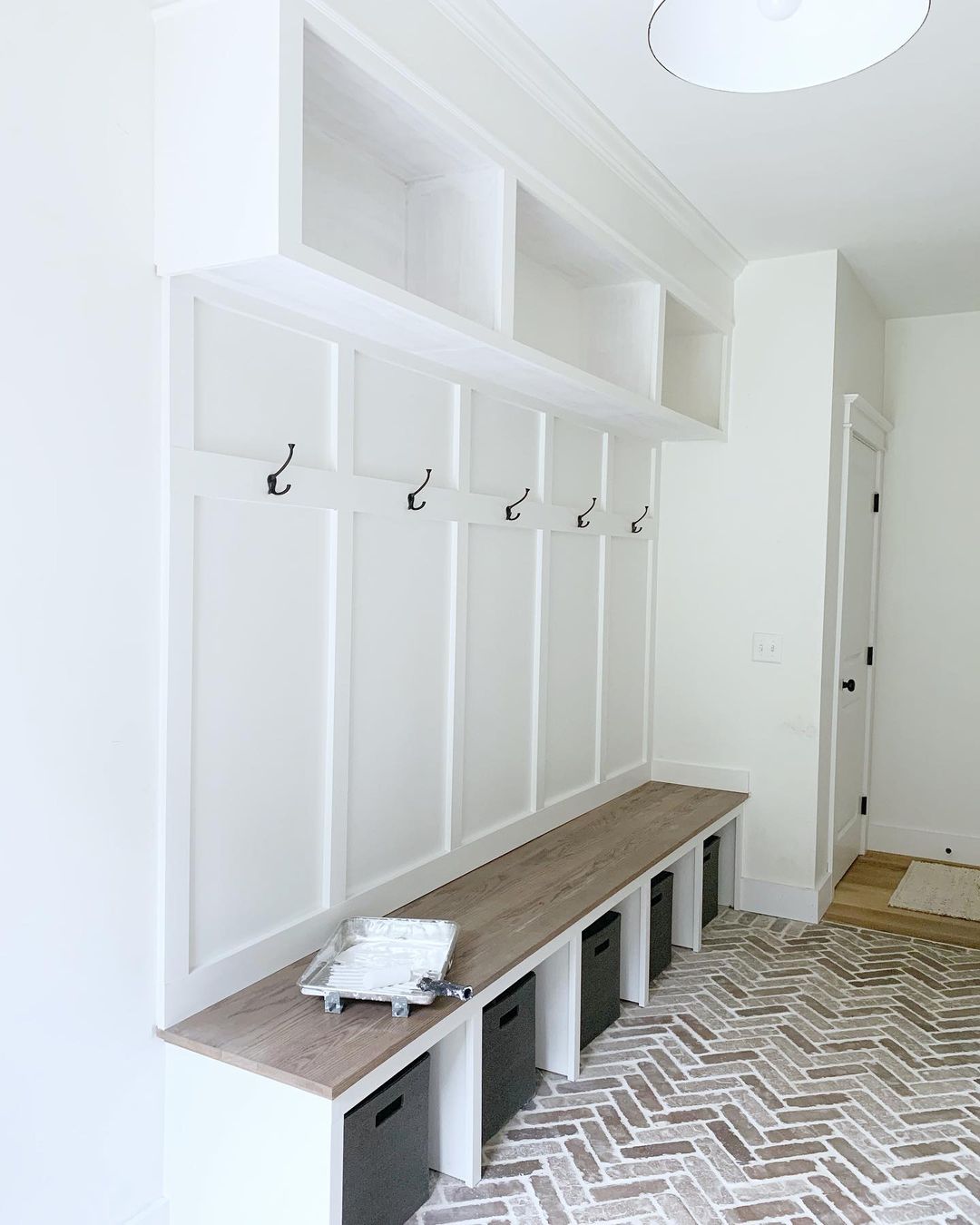
Alabaster for the Hallways and Mudroom
For Hallways: Pair Alabaster with neutral decor elements like light gray rugs, white furniture, and metallic accents. Incorporate wooden frames and greenery for a touch of warmth and nature.
For Mudrooms: Use Alabaster on walls with darker cabinets in colors like Urbane Bronze or navy blue. Add rustic hooks, baskets, and benches to create a functional and stylish space.
instagram via brodiealefever
instagram via handry.home
instagram via handry.home
instagram via the.painted.piano
instagram via the.painted.piano
instagram via simplymicheleb
instagram via simplymicheleb
Alabaster vs. Chantilly lace (by Benjamin Moore)
Alabaster (SW 7008) by Sherwin Williams is a warm, creamy white with hints of beige and gray, creating a cozy and inviting feel. It’s great for spaces where you want warmth and comfort, like living rooms and bedrooms. Alabaster softens light, making rooms feel gentle and welcoming.
Chantilly Lace (OC-65) by Benjamin Moore is a pure, bright white with almost no undertones, giving a crisp and clean appearance. This color is perfect for modern spaces like kitchens and bathrooms, where you want a fresh, open feel. Chantilly Lace reflects light beautifully, making spaces look bright and airy.
In short, choose Alabaster for a warm, cozy vibe and Chantilly Lace for a bright, modern look.
Housekeepingbay.com
Visualisation:
via housekeepingbay ai
Alabaster vs. Dover white
Alabaster is a warm, creamy white with subtle beige and gray undertones. It creates a cozy, inviting feel, making it versatile for various spaces.
Dover White (SW 6385) by Sherwin Williams is a warm white with more noticeable yellow undertones. It’s brighter and gives a space a cheerful, sunny vibe, ideal for kitchens, bathrooms, and areas where you want a light, uplifting feel.
In short, Alabaster is great for a soft, cozy atmosphere, while Dover White adds a brighter, more cheerful touch to a room.
Housekeepingbay.com
Alabaster vs. Greek villa
Greek Villa is also a warm white as Alabaster, but it has a slightly cleaner and brighter appearance compared to Alabaster.
Greek Villa has less noticeable undertones, making it feel more neutral while still maintaining a warm and welcoming vibe.
In short, Alabaster is perfect for a cozy, slightly warmer look, while Greek Villa offers a cleaner, brighter warmth for a more neutral yet inviting space.
Housekeepingbay.com
Alabaster vs. Pure white
With its gray tint, Pure White creates a softness that makes rooms bright without being harsh.
It can be difficult to find true neutral colors.
This tone sits right in the middle between warm and cool beiges and looks classy.
This fine balance helps create a versatile space that works with many different design styles.
Housekeepingbay.com
Alabaster vs. Snowbound
If you’re looking for a shade that feels a little cooler, look no further than Snowbound
This neutral color has gray undertones that are perfect for enhancing a space where furniture and décor are mostly cool tones.
This is a neutral mid-tone color, great for creating a monochromatic color scheme.
Use snowbound as your middle color, opting for lighter and darker shades to complete your interior paint scheme.

Housekeepingbay.com
Alabaster vs. Blank Canvas Behr
Blank Canvas: A neutral, off-white with slight gray undertones, often cooler in appearance compared to Alabaster.
Blank Canvas lacks the warm, creamy feel of Alabaster, giving it a more modern and crisp look that works well in minimalist and contemporary designs. Its cooler undertones create a fresh and clean atmosphere, making it an ideal choice for spaces that need a neutral, clean backdrop. This color pairs beautifully with bold accents and metallic finishes, allowing for striking visual contrasts.
In minimalist interiors, Blank Canvas can serve as an unobtrusive base that lets architectural elements and furnishings stand out.
It works particularly well in spaces with plenty of natural light, where its cool tones can enhance the sense of openness and brightness.
Additionally, Blank Canvas can be used effectively in high-traffic areas like kitchens and bathrooms, where a clean, sophisticated look is desired. Overall, Blank Canvas offers a versatile and contemporary alternative to the warmer tones of Alabaster.
Alabaster vs. True White
True White: A pure, bright white with no noticeable undertones, providing a stark, clean look.
This color contrasts sharply with Alabaster’s warmth and creaminess, making it perfect for ultra-modern or high-contrast designs. True White is often used in spaces that emphasize cleanliness and simplicity, such as kitchens, bathrooms, and contemporary living areas.
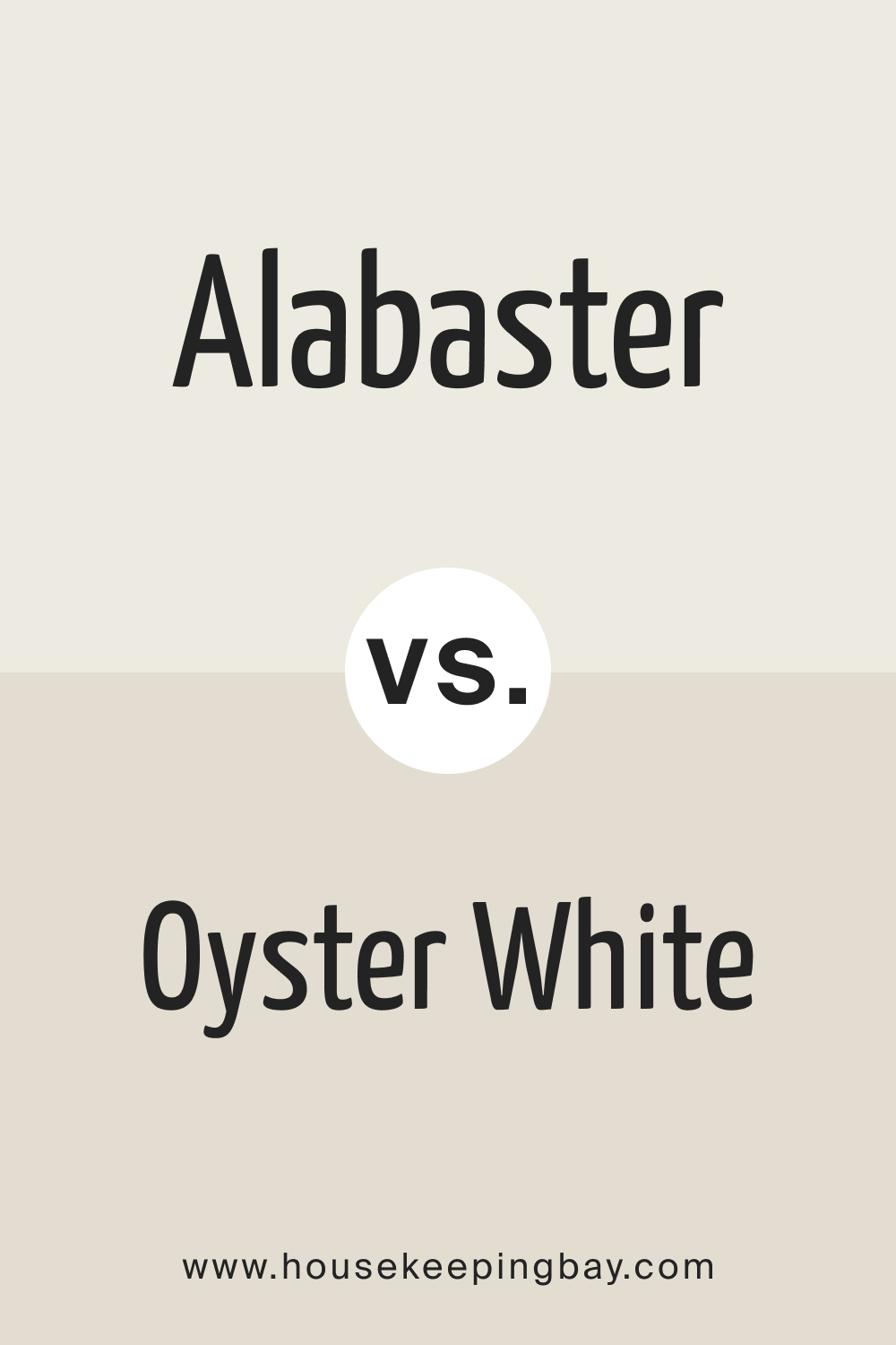
Alabaster vs. Oyster White
Oyster White (SW 7637): A neutral white with subtle gray and green undertones, making it slightly cooler than Alabaster.
This sophisticated and muted color works well in both traditional and modern settings, providing a serene and calming atmosphere. Oyster White is perfect for areas where a gentle, understated white is desired, such as bedrooms and living rooms.
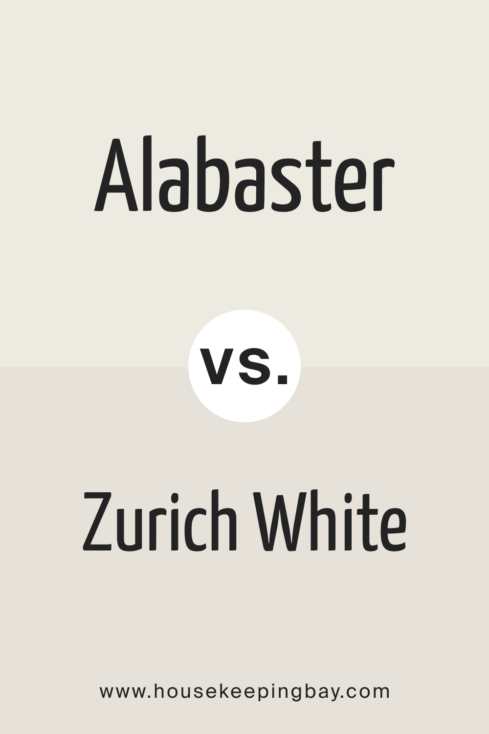
Alabaster vs. Zurich White
Zurich White (SW 7626): A soft white with neutral gray undertones, giving it a cooler and more modern appearance compared to Alabaster.
Zurich White maintains a balanced, neutral feel that works well in various lighting conditions, making it versatile for different rooms. Ideal for creating a calm and contemporary atmosphere, it pairs beautifully with both warm and cool accents.
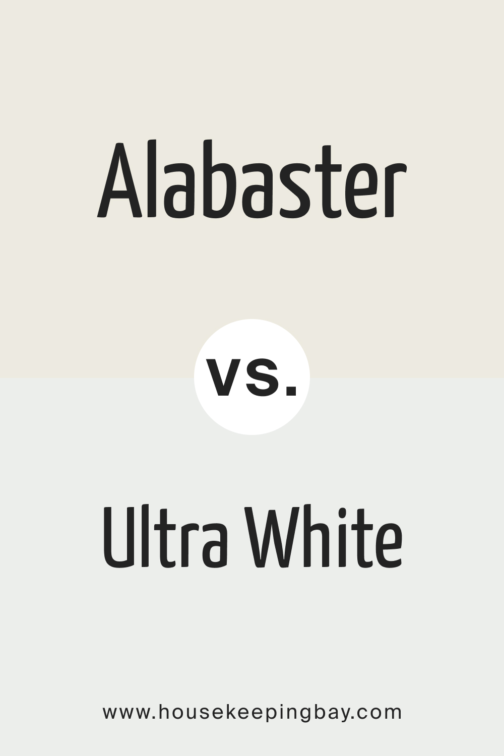
Alabaster vs. Ultra White
Ultra White CC-10: A bright, pristine white with no undertones, offering a very clean and crisp appearance.
This stark color contrasts with the warmth of Alabaster, making it perfect for ultra-modern or minimalist designs that require high brightness and clarity. Ultra White is often used in spaces that emphasize light and openness, such as art galleries, modern kitchens, and sleek bathrooms.
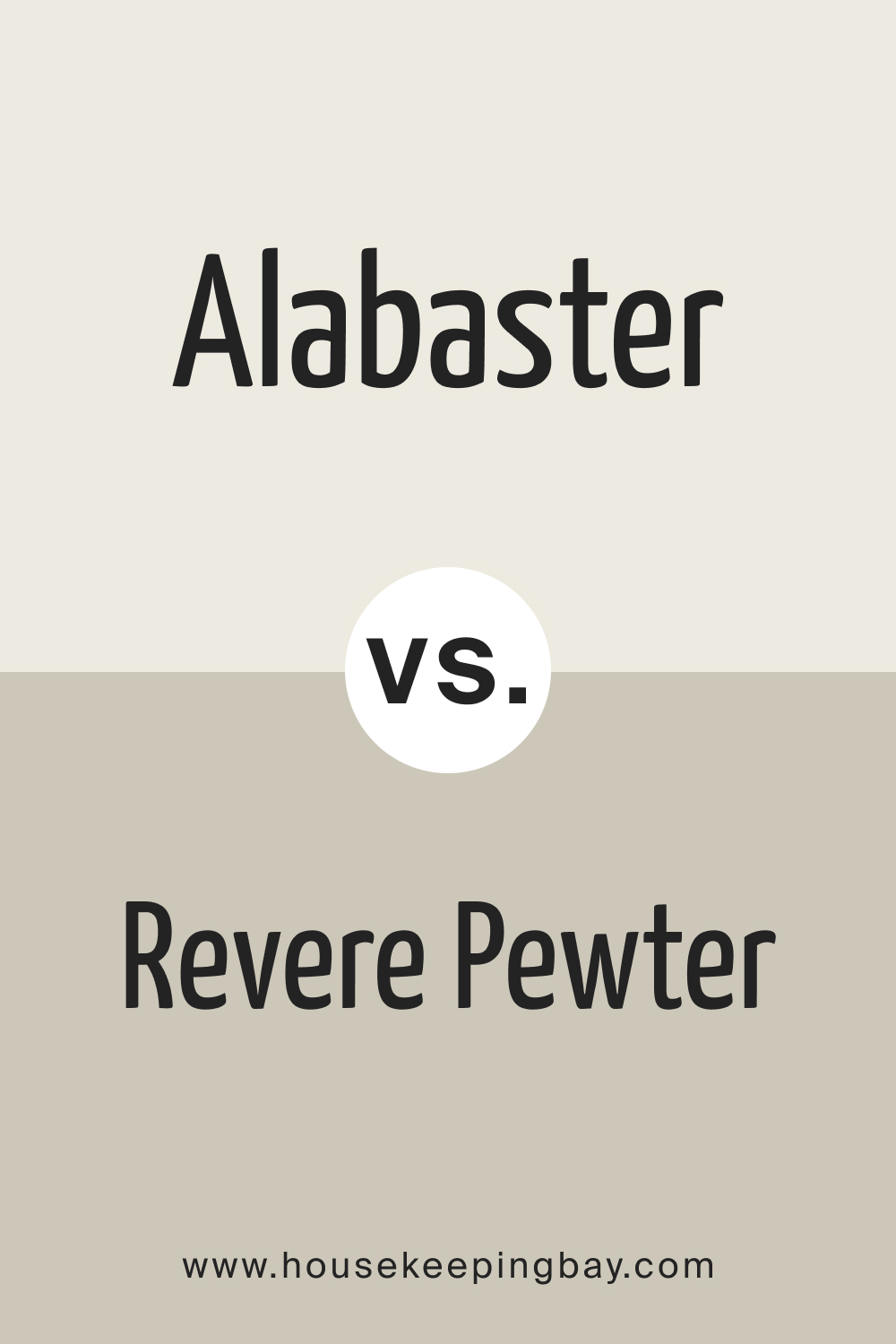
Alabaster vs. Revere Pewter
Revere Pewter (BM HC-172): A light gray with warm undertones, often appearing more beige in certain lighting.
Revere Pewter provides a richer, more complex alternative to the simplicity of Alabaster, adding depth and warmth to a space without overwhelming it. Ideal for living rooms, dining rooms, and other areas where a sophisticated, yet cozy ambiance is desired.
Alabaster vs. White Flour
White Flour (SW 7102): A soft, warm white with subtle beige undertones, similar to Alabaster but slightly less creamy.
White Flour offers a gentle, welcoming feel without being too stark, making it perfect for creating a cozy and inviting atmosphere. This color is well-suited for bedrooms, family rooms, and other spaces where warmth and comfort are a priority.
Alabaster vs. Incredible White
Incredible White (SW 7028): A very light gray with slight warm undertones, giving it a more muted appearance than Alabaster.
Incredible White offers a modern, sophisticated look while maintaining a sense of warmth, making it ideal for spaces that need a subtle, versatile neutral. It works well in open-concept homes, providing a seamless flow between rooms.
Alabaster vs. Jogging Path
Jogging Path (SW 7638): A warm, light gray with taupe undertones, providing a more complex and grounded feel compared to Alabaster.
Jogging Path works well in creating a cozy, earthy ambiance, making it suitable for living rooms, bedrooms, and other areas that benefit from a touch of warmth and character. This color pairs beautifully with natural materials like wood and stone.

Alabaster vs. Kestrel White
Kestrel White (SW 7516): A soft beige with warm undertones, offering a richer and more traditional feel than Alabaster.
Kestrel White creates a warm, inviting environment, perfect for classic or rustic designs. Ideal for spaces looking for a touch of warmth and comfort, this color works well in dining rooms, studies, and other areas that benefit from a cozy, timeless aesthetic.
Alabaster vs. Linen White
Linen White (BM OC-146): A light, creamy beige with warm undertones, similar in warmth to Alabaster but slightly darker.
Linen White provides a cozy, traditional feel, making it great for creating a homely and welcoming atmosphere. This color is perfect for family rooms, kitchens, and other spaces where a warm, comforting vibe is desired.
![Alabaster vs. Linen White]](https://housekeepingbay.com/wp-content/uploads/2022/02/Alabaster-vs.-Linen-White.jpg)
Alabaster vs. Marshmallow
Marshmallow (SW 7001): A warm white with subtle pink undertones, giving it a softer and more delicate appearance than Alabaster.
Marshmallow adds a touch of sweetness and charm to any space, making it perfect for creating a gentle, inviting environment. This color works well in nurseries, bedrooms, and other areas where a soft, calming ambiance is desired.
Alabaster vs. Natural Choice
Natural Choice (SW 7011): A warm, light beige with slight gray undertones, offering a more neutral and balanced look than Alabaster.
Natural Choice provides a sophisticated and versatile backdrop, making it ideal for spaces that require a calm, understated elegance. This color works well in living rooms, hallways, and other areas where a subtle, refined appearance is desired.
Alabaster vs. Heron Plume
Heron Plume (SW 6070): A light, warm gray with subtle taupe undertones, creating a more modern and muted feel compared to Alabaster.
Heron Plume offers a soft, neutral palette that works well in various lighting conditions, making it great for spaces that need a quiet, sophisticated ambiance. This color is ideal for bedrooms, bathrooms, and other areas where a serene and calming environment is desired.
Now you have a full guide on Alabaster paint color. You know not only what type of color it is, what undertones it has, and how it reads in different lighting.
You are also aware of the optimal color combinations this paint will work with. All this will help you use this paint in your home not only wisely but also effectively since we explained what rooms it might be best to use in.

Housekeepingbay.com
Ever wished paint sampling was as easy as sticking a sticker? Guess what? Now it is! Discover Samplize's unique Peel & Stick samples. Get started now and say goodbye to the old messy way!
Get paint samples


Frequently Asked Questions
⭐ What is Alabaster LRV?
The Sherwin Williams Alabaster SW 7008 color has an LRV of 82.
⭐ What paint colors are similar to Alabaster?
The manufacturer offers SW 9503 Cheviot, SW 7100 Arcade White, and SW 7102 White Flour.
⭐ Is Sherwin Williams Alabaster color suitable for an eco-friendly house?
Most Sherwin Williams paints are good for eco-friendly designs and sustainable living persons.
9 thoughts on “Alabaster SW 7008 by Sherwin Williams”
Leave a Reply


Hello! Could you please help me? I’m trying to pick the best white for my bedroom (I need the white that reads warm enough, but not too creamy), but I can’t choose between SW Alabaster and SW-7005 Pure White by Sherwin-Williams! Both seem to be warm and a bit creamy to me. Could you tell me which color looks more cool-toned?
Hello! SW Pure White has very neutral and barely seen undertones. Compared to SW Alabaster, Pure White reads noticeably less warm and less creamy too. Apparently, it will fit your bedroom better than SW Alabaster.
Hello. Could you please suggest at least a couple of white paint colors similar to Sherwin-Williams Alabaster? It’s ok if they are from other brands, have slightly other undertones/LRV, or read a bit warmer/cooler. Thanks!
Hello! We can suggest you the following paint colors that can be used instead of the Alabaster white color by Sherwin-Williams: Behr Silver Leaf, BM Dune White, Farrow&Ball Wevet, PPG Ageless, and Valspar Creme Fraiche.
Hi! I’d like to try a black-and-white palette in one of my rooms (my study, to be precise), and I’m planning to use Sherwin-Williams 7069 Iron Ore on the accent wall and door. Other walls are supposed to be white and I consider using SW Alabaster. Do you think these two will work together?
Hello! Yes, this pair of colors can work pretty well! Both are warm-toned and read soft enough to work harmoniously in the same space. Besides, since they are black and white, they’ll create a classic and timeless color scheme, elegant and reserved! But you should note that SW Alabaster will enhance the warmth of the Iron Ore black color.
Hi! Could you please tell me which color, SW-7004 SNowbound or Sherwin-Williams Alabaster reads creamier on the walls?
Hello! SW Alabaster will look warmer and creamier than SW Snowbound because of its subtle beige undertones. SW Snowbound has a slight taupe (violet-pink) undertone.
Great article! Thanks for sharing useful info and tips. Me and my husband have recently bought a new house in Oklahoma. Any advice for painting the outside of the house with alabaster and greek villa colors?