The Best Warm Neutral Paint Colors from Sherwin Williams & Benjamin Moore Favorites
Find the perfect cozy, inviting shade for your home
When it comes to choosing paint colors, warm neutrals are some of the most reliable and inviting options. They make a home feel comfortable without overwhelming the space with too much color. Whether you’re designing a cozy living room, a relaxing bedroom, or a welcoming kitchen, warm neutrals create a soft backdrop that works with almost any style.
I’ve worked with countless homeowners who want a color that isn’t too stark or too bold—something that feels natural but still adds warmth.
That’s exactly what warm neutrals do. They have subtle undertones of beige, cream, taupe, or greige (a mix of gray and beige), making them more inviting than cooler grays or stark whites.
Sherwin Williams and Benjamin Moore offer some of the best warm neutral shades. Their paints are high quality, long-lasting, and available in a variety of tones.
But with so many options, how do you pick the right one? I’ll break down the best warm neutrals from both brands and share tips on how to choose the perfect shade for your home.
housekeepingbay.com
What Makes a Warm Neutral?
Not all neutrals are the same. Some lean cool, with blue or green undertones, while others feel warm, with hints of beige, cream, or even soft yellow. If you’ve ever painted a wall gray, only to have it look blue in certain lighting, you know how tricky undertones can be!
Warm neutrals are perfect for creating a cozy, inviting feel. They work well in any room and complement different design styles, from modern to traditional.
But choosing the right warm neutral depends on a few key factors.
Undertones Matter
Even within warm neutrals, you’ll find subtle differences. Here’s what to look for:
- Beige and tan: Classic warmth, great for a traditional or rustic look.
- Greige (gray + beige): A balanced mix of warm and cool, perfect for a modern feel.
- Creamy whites: Soft and airy, ideal for a bright but warm space.
- Taupe: A mix of brown and gray, slightly deeper but still neutral.
Lighting Changes Everything
A color that looks perfect in a store or on a paint swatch can appear completely different in your home. Here’s why:
- Natural light: North-facing rooms tend to bring out cooler tones, while south-facing rooms enhance warmth.
- Artificial light: Soft white or warm bulbs will enhance the warmth in a neutral, while cool LED lighting can make it look dull or gray.
- Time of day: A color might look warm and golden in the morning but appear darker and more muted at night.
Test Before You Commit
I always tell my clients: never skip the sample stage. Before you paint an entire room, try a few swatches on different walls and check them throughout the day. This small step can save you from choosing a color that doesn’t work in your space.
Best Warm Neutral Paint Colors by Sherwin Williams
Sherwin Williams has an incredible selection of warm neutrals that suit any space. Whether you want a soft beige for your living room, a creamy white for your kitchen, or a cozy greige for your bedroom, they have something for every style.
Here are some of my go-to warm neutrals, categorized by room for easy reference.
housekeepingbay.com
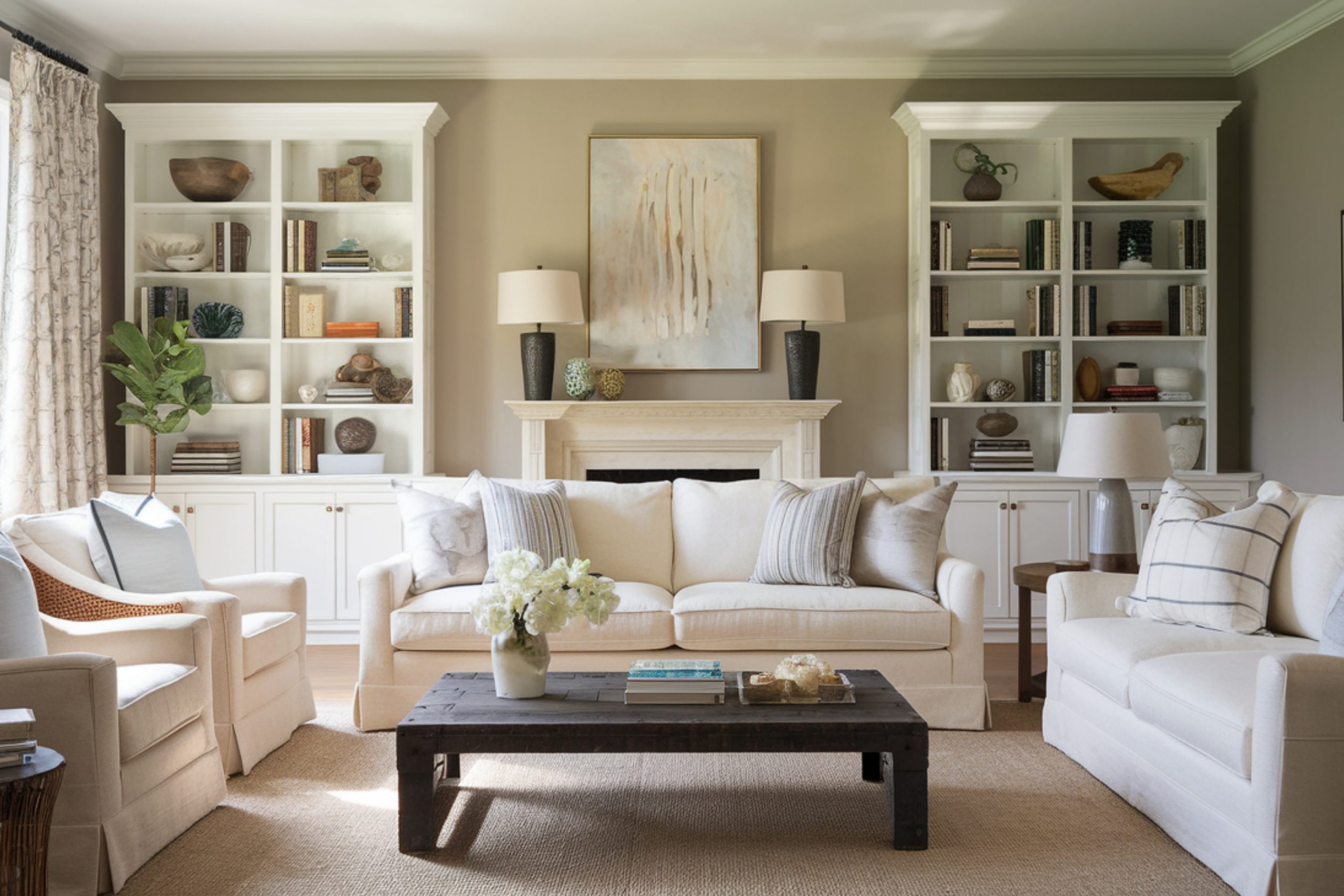
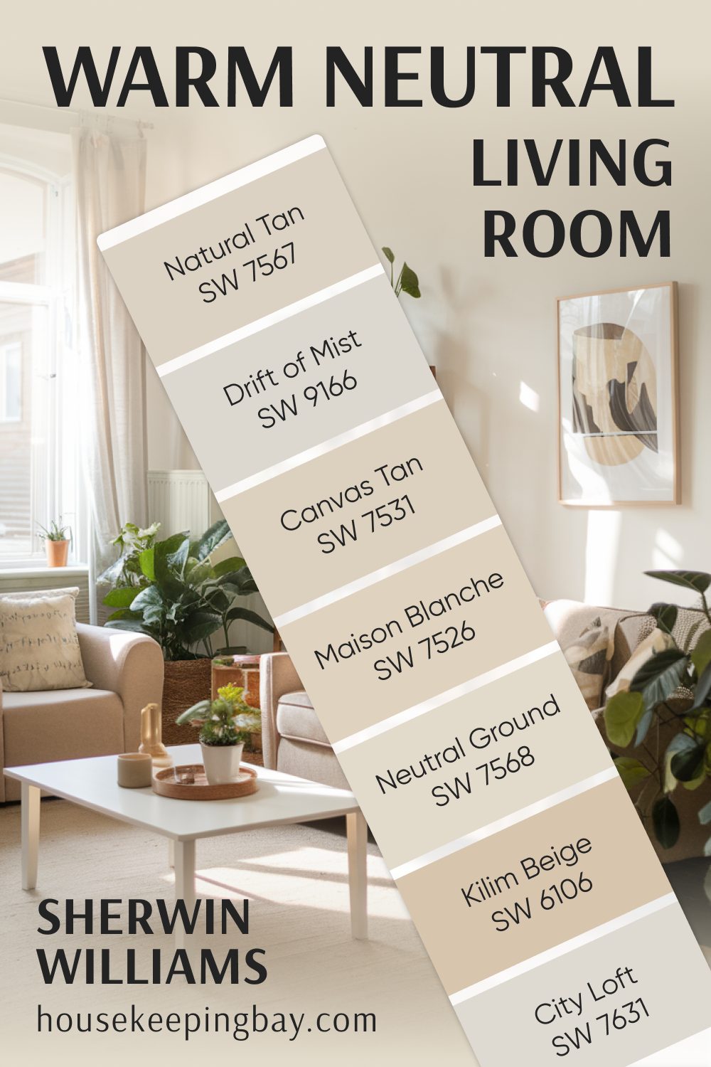
Warm Neutral Living Room Colors
A living room should feel welcoming and comfortable, and warm neutrals are perfect for achieving that. These shades work well with both natural light and cozy evening lighting, making them a safe and stylish choice.
- Canvas Tan SW 7531 – A light tan with just enough warmth to keep it soft without looking too yellow.
- Natural Tan SW 7567 – A neutral beige with no strong undertones, making it incredibly versatile.
- Kilim Beige SW 6106 – A rich beige with subtle warmth, perfect for traditional or boho styles.
- Neutral Ground SW 7568 – A soft off-white with a hint of beige, great for a light and airy feel.
- Drift of Mist SW 9166 – A warm greige that works beautifully in modern or minimalist spaces.
- City Loft SW 7631 – A barely-there warm gray with a soft, cozy feel.
- Maison Blanche SW 7526 – A creamy beige with a slight golden undertone, adding warmth without overpowering.
housekeepingbay.com
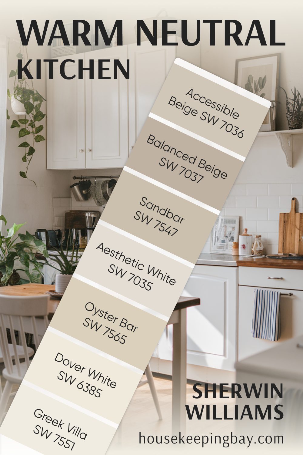
Warm Neutral Kitchen Colors
A warm neutral in the kitchen helps create a space that feels bright yet inviting. These shades pair well with wood tones, white cabinets, and even bold accent colors.
- Accessible Beige SW 7036 – One of the most popular warm neutrals, a soft greige that works with almost anything.
- Balanced Beige SW 7037 – A deeper beige with taupe undertones, great for contrast with white cabinets.
- Aesthetic White SW 7035 – A warm off-white with a subtle beige undertone, perfect for a fresh, clean look.
- Oyster Bar SW 7565 – A soft, creamy neutral with a warm undertone that feels timeless.
- Sandbar SW 7547 – A warm, sandy beige that pairs beautifully with wood and natural textures.
- Greek Villa SW 7551 – A warm white with just a hint of beige, keeping it soft and inviting.
- Dover White SW 6385 – A creamy off-white that adds warmth without feeling too yellow.
housekeepingbay.com
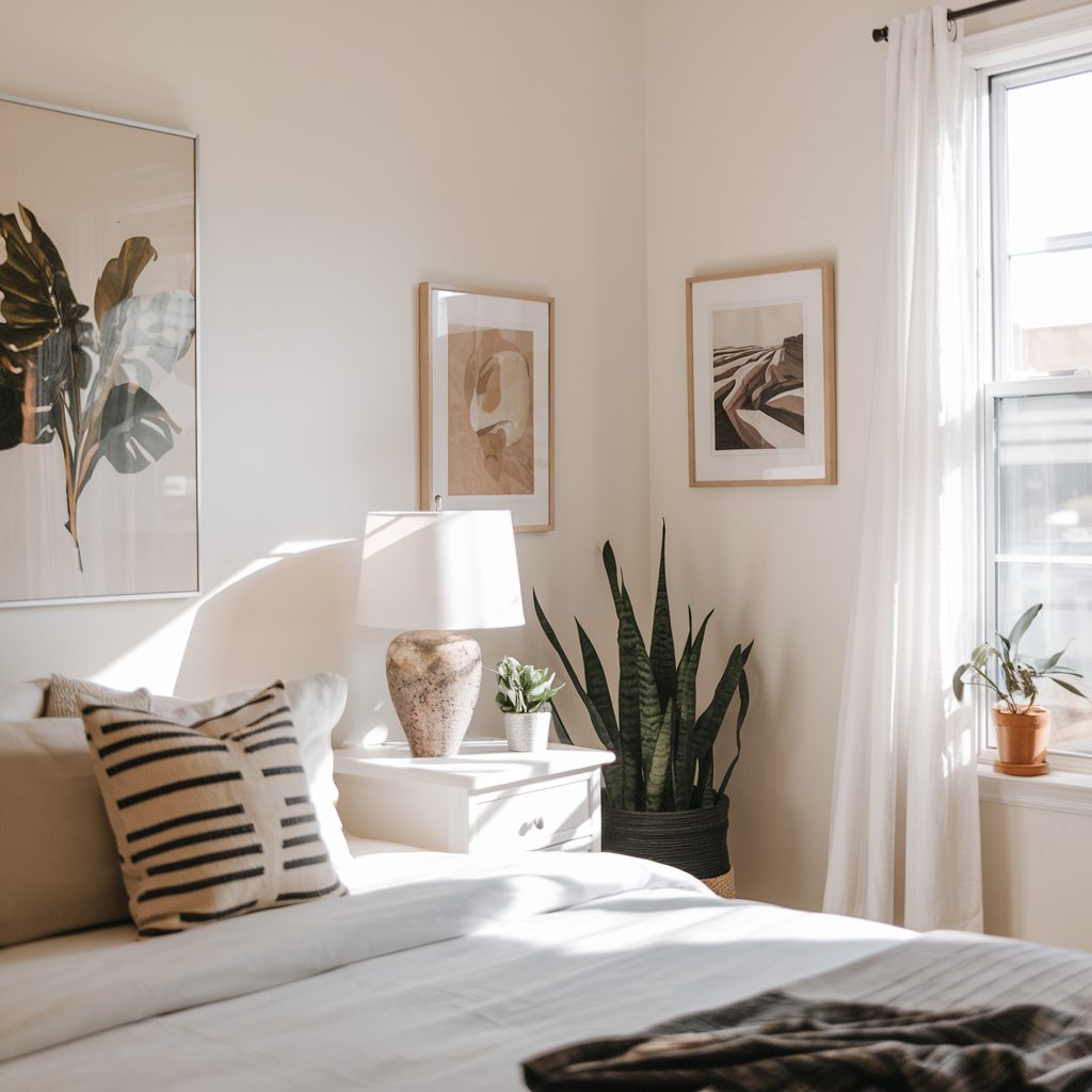
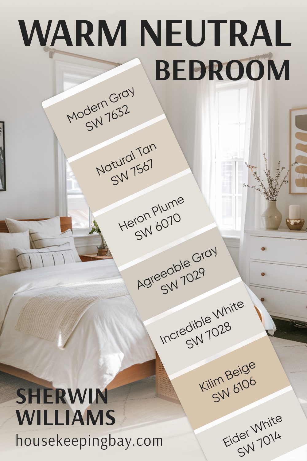
Warm Neutral Bedroom Colors
Bedrooms should feel restful and calming, and warm neutrals help achieve that by adding softness without overwhelming the space.
- Modern Gray SW 7632 – A warm gray with a slight taupe undertone, perfect for a cozy bedroom.
- Natural Tan SW 7567 – A classic neutral beige that works with almost any bedding or decor.
- Agreeable Gray SW 7029 – One of Sherwin Williams’ best-selling greiges, with a perfect balance of warm and cool tones.
- Incredible White SW 7028 – A very light greige that keeps a bedroom feeling bright yet warm.
- Kilim Beige SW 6106 – A richer beige that pairs beautifully with darker wood furniture.
- Heron Plume SW 6070 – A soft, airy neutral with a slight taupe undertone.
- Eider White SW 7014 – A barely-there warm white, perfect for a minimalist bedroom.
Sherwin Williams has a warm neutral for every room and style. Whether you want something light and airy or deep and cozy, these shades provide a perfect backdrop.
housekeepingbay.com
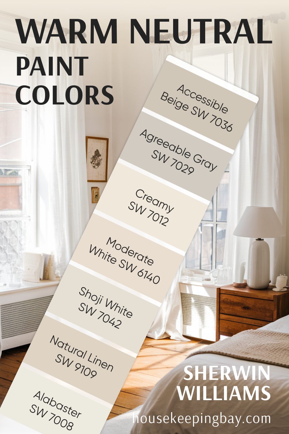
More Warm Neutral Paint Colors by Sherwin Williams
Some warm neutrals don’t fit into just one category—they work beautifully in multiple rooms. These colors are great if you want a seamless flow throughout your home, creating a soft and inviting atmosphere.
- Accessible Beige SW 7036 – A soft, warm greige that adapts well to different lighting.
- Agreeable Gray SW 7029 – A balanced greige that works in both modern and traditional spaces.
- Alabaster SW 7008 – A creamy off-white, perfect for walls, trim, or even cabinets.
- Natural Linen SW 9109 – A light beige with subtle warmth, great for a neutral yet cozy feel.
- Shoji White SW 7042 – A warm white with a slight taupe undertone, giving it more depth.
- Moderate White SW 6140 – A soft, creamy white that feels inviting and warm.
- Creamy SW 7012 – A true creamy white that isn’t too yellow or too stark.
If you’re looking for a neutral that works in multiple rooms, these are all safe choices!
housekeepingbay.com
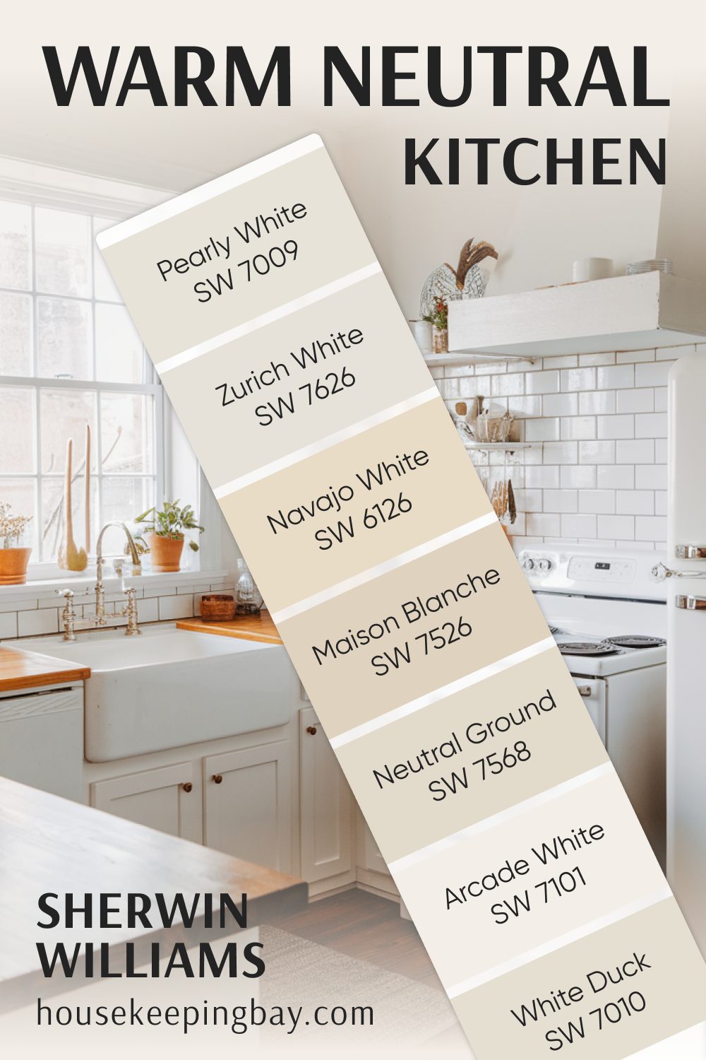
Warm Neutral Kitchen Colors
A kitchen should feel bright, clean, and welcoming, and warm neutrals help create that balance. These shades work beautifully with white cabinets, natural wood, or even bold accent colors.
- Navajo White SW 6126 – A creamy beige with a warm, slightly golden tone.
- Neutral Ground SW 7568 – A light, warm beige that keeps a kitchen feeling fresh.
- Maison Blanche SW 7526 – A soft beige with a hint of warmth, great for a timeless kitchen look.
- Zurich White SW 7626 – A warm off-white that doesn’t feel too stark.
- Pearly White SW 7009 – A soft, slightly warm white that works beautifully on cabinets or walls.
- Arcade White SW 7101 – A warm white with a subtle beige undertone, adding depth to a space.
- Origami White SW 7636 – A delicate off-white that pairs well with both cool and warm tones.
- White Duck SW 7010 – A creamy off-white that looks beautiful in natural light.
If you want a kitchen that feels inviting but still fresh and clean, these shades are perfect!
housekeepingbay.com
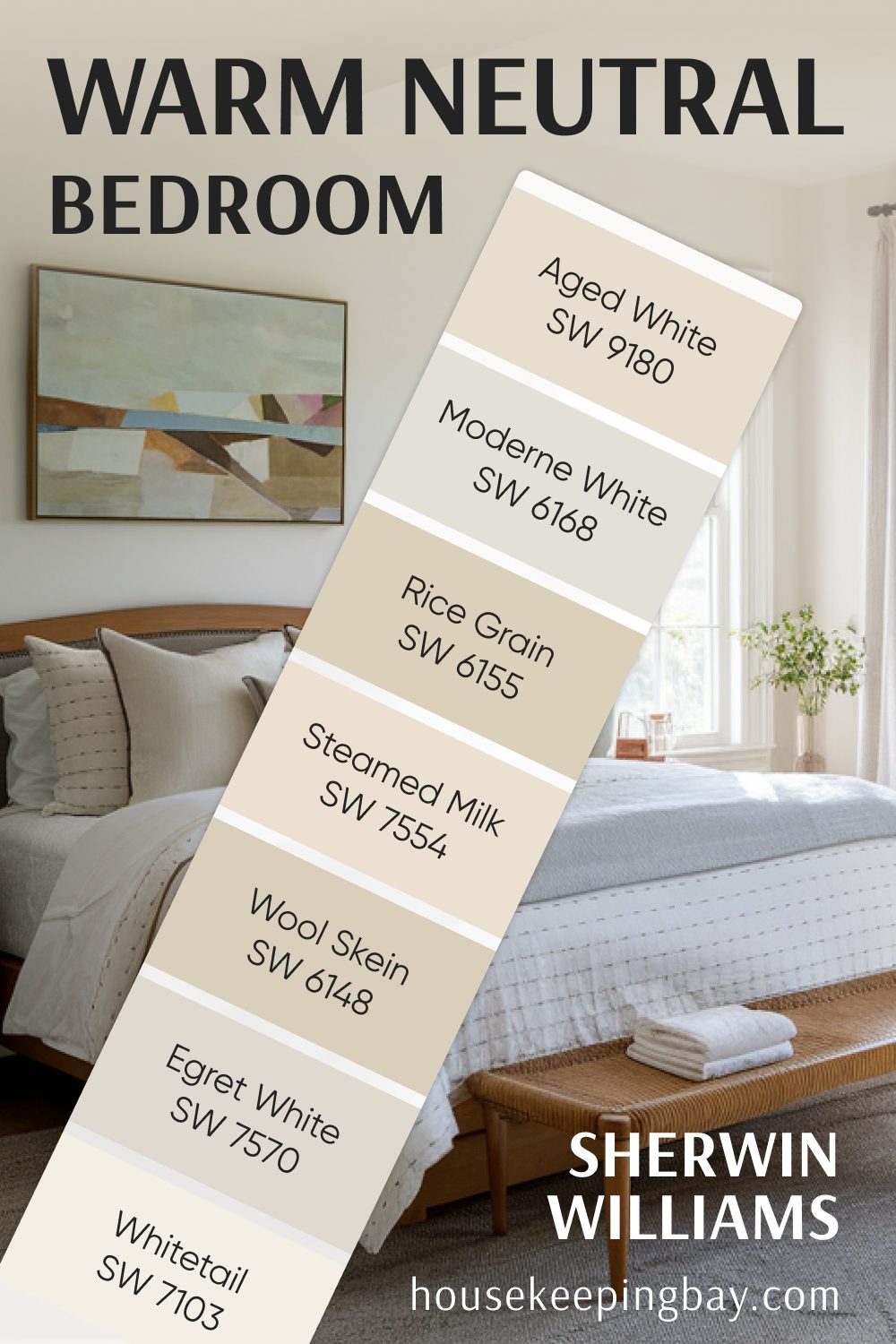
Warm Neutral Bedroom Colors
Bedrooms should be calming, and warm neutrals help create a relaxing retreat. These colors feel soft and cozy, making the space perfect for rest.
- Egret White SW 7570 – A warm off-white with a touch of taupe.
- Wool Skein SW 6148 – A soft beige with a subtle warmth, great for a cozy bedroom.
- Steamed Milk SW 7554 – A creamy white with a hint of warmth that makes a room feel soft and inviting.
- Modern White SW 6168 – A slightly warm off-white, perfect for a clean but cozy look.
- Whitetail SW 7103 – A bright, creamy white that works beautifully in bedrooms with natural light.
- Rice Grain SW 6155 – A light beige with a golden undertone that adds warmth without being too dark.
- Aged White SW 9180 – A warm, soft off-white that pairs beautifully with wood tones.
These shades create a peaceful bedroom atmosphere without feeling too dark or heavy.
housekeepingbay.com
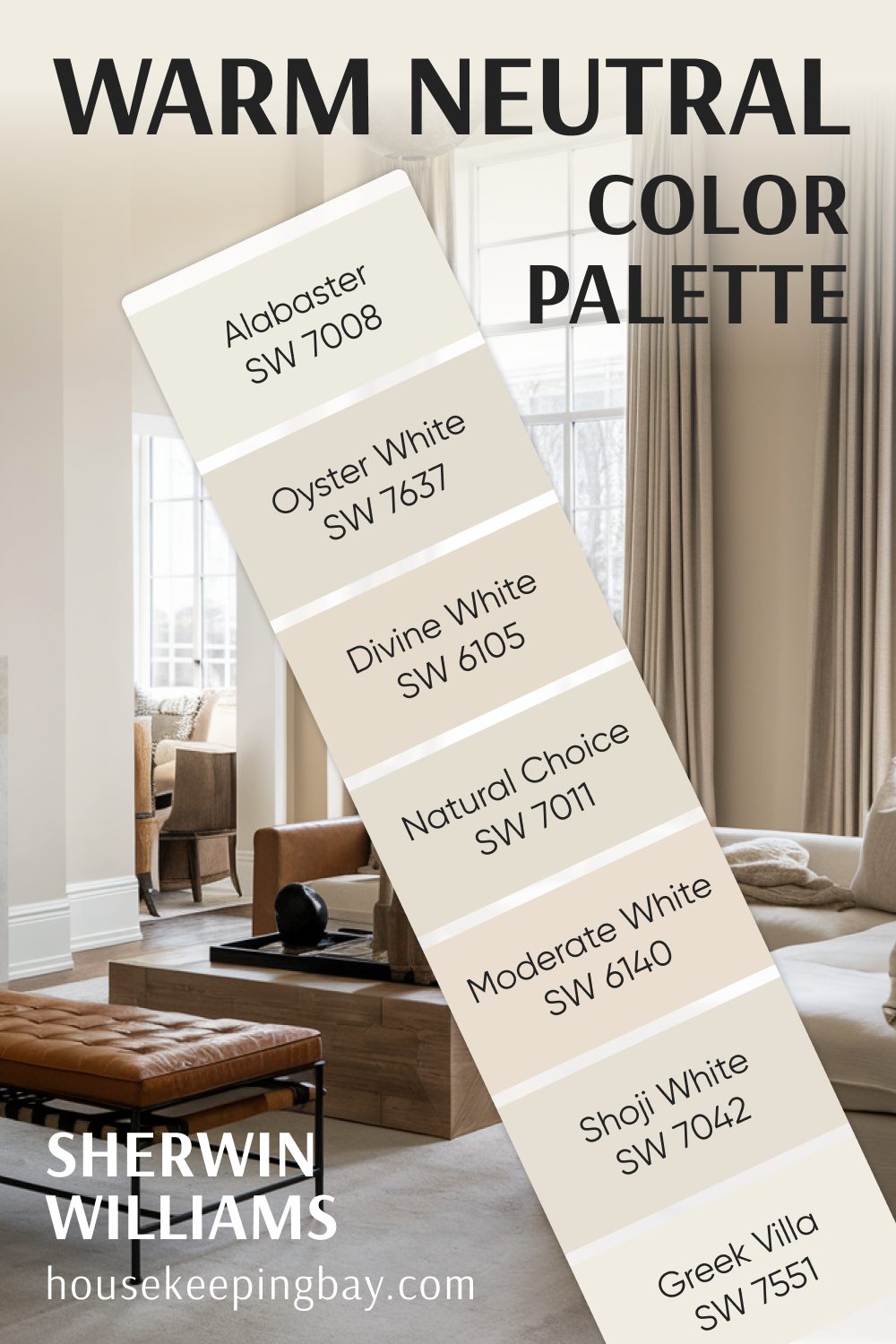
Warm Neutral Color Palette by Sherwin Williams
If you’re looking for a cohesive palette to use throughout your home, these warm neutrals work beautifully together.
- Shoji White SW 7042 – A warm white with a slight taupe undertone.
- Alabaster SW 7008 – A soft, creamy white that feels welcoming.
- Greek Villa SW 7551 – A warm, off-white with a touch of beige.
- Oyster White SW 7637 – A light beige with a natural, soft warmth.
- Natural Choice SW 7011 – A balanced neutral that works in any space.
- Moderate White SW 6140 – A creamy white with a bit more depth.
- Divine White SW 6105 – A warm, soft beige that pairs well with white trim.
This palette is perfect for creating a seamless, inviting look throughout your home.
housekeepingbay.com
Best Warm Neutral Paint Colors by Benjamin Moore
Benjamin Moore is another go-to brand for warm neutrals. Their paints have a rich, smooth finish, and their color selection includes some of the most loved shades in home design.
If you’re looking for soft beiges, creamy whites, or warm grays, Benjamin Moore has plenty of options that create a cozy, inviting feel.
Here are some of my favorite warm neutrals from Benjamin Moore, organized by room to make choosing easier.
Warm Neutral Living Room Colors
Living rooms need a color that feels welcoming and pairs well with different decor styles. These warm neutrals from Benjamin Moore are great options:
- Manchester Tan HC-81 – A soft, sandy beige that works beautifully in both bright and dim lighting.
- Muslin OC-12 – A warm neutral with a slight creamy undertone, perfect for a cozy living space.
- Pale Oak OC-20 – A light greige with just enough warmth to avoid looking too gray.
- Shaker Beige HC-45 – A rich, warm beige that adds depth without feeling too dark.
- Feather Down OC-6 – A warm off-white with subtle beige undertones, great for a soft, airy look.
- Stone Hearth CC-490 – A medium greige that works well with both modern and traditional decor.
- Edgecomb Gray HC-173 – A light greige with warm undertones, one of Benjamin Moore’s most popular neutrals.
Warm Neutral Kitchen Colors
A warm neutral kitchen feels inviting and pairs well with different finishes, from wood to marble to painted cabinets. These Benjamin Moore shades are perfect for the space:
- Swiss Coffee OC-45 – A soft, warm white that works beautifully on walls or cabinets.
- Natural Cream OC-14 – A creamy beige that keeps the kitchen feeling light and fresh.
- Revere Pewter HC-172 – A classic warm greige that pairs well with both warm and cool tones.
- Cloud White OC-130 – A timeless off-white with a hint of warmth, great for trim or walls.
- Wind’s Breath OC-24 – A soft, warm neutral with a slight taupe undertone.
- Lenox Tan HC-44 – A rich tan that adds warmth and depth to the kitchen.
- Ballet White OC-9 – A warm, creamy neutral that feels light and sophisticated.
housekeepingbay.com
Warm Neutral Bedroom Colors
Bedrooms should feel calming, and these warm neutrals create the perfect restful atmosphere:
- Classic Gray OC-23 – A very light warm gray that works beautifully in bedrooms.
- Balboa Mist OC-27 – A soft greige with warm undertones, perfect for a soothing space.
- Navajo White OC-95 – A creamy off-white with a hint of warmth, making it feel cozy.
- Almond OC-96 – A soft beige with warm undertones, great for a neutral bedroom.
- Clay Beige OC-11 – A rich beige that works well with wood tones and soft lighting.
- Seapearl OC-19 – A warm off-white that keeps a bedroom feeling light and airy.
- Collingwood OC-28 – A balanced greige that feels soft and inviting.
Benjamin Moore’s warm neutrals offer something for every style, whether you prefer a soft off-white or a rich beige. These colors provide a timeless backdrop that works in any home.
How to Choose the Right Warm Neutral for Your Space
With so many beautiful warm neutrals to choose from, it can be overwhelming to pick just one. I’ve seen homeowners struggle with this decision, only to realize later that their chosen color looks completely different on their walls than it did on the paint swatch.
To avoid that frustration, here are some expert tips to help you find the perfect warm neutral for your home.
1. Consider the Room’s Lighting
Lighting changes everything when it comes to paint colors. The same shade can look warm and inviting in one room but dull and flat in another.
- North-facing rooms – Natural light from the north tends to be cooler, bringing out gray undertones. Choose a warm beige or a soft creamy white to balance it out.
- South-facing rooms – These get plenty of warm light throughout the day, making almost any neutral work. Just be careful—some beiges may appear too yellow in bright sunlight.
- East-facing rooms – The morning light is bright and warm, but by afternoon, it cools down. A soft greige or beige can help maintain warmth.
- West-facing rooms – Afternoon and evening light is warm and golden. A warm neutral with a slight gray or taupe undertone can prevent the space from feeling too yellow.
2. Look at Your Existing Furniture and Finishes
Your paint color should complement the materials already in your home. Before deciding, take a look at:
- Wood tones – Do you have warm wood floors, dark cabinets, or light oak furniture? Some neutrals enhance wood’s natural warmth, while others can clash.
- Countertops and backsplash – If you’re painting a kitchen, hold up paint swatches next to your counters and backsplash to see how the colors interact.
- Furniture and decor – If you have cool-toned gray sofas, a beige with too much yellow might feel off. A greige could be a better fit.
3. Use Paint Samples the Right Way
I always tell my clients: Never rely on a tiny paint chip! The best way to test a color is by using a sample in your actual space. Here’s how to do it right:
- Paint large swatches – Instead of a small square, paint a 2×2 ft patch on different walls.
- Check at different times of day – A color may look perfect in the morning but completely different in the evening.
- Compare with other elements in the room – Place the swatch near your flooring, trim, or furniture to see how it interacts.
- Use peel-and-stick samples – If you don’t want to paint directly on your walls, brands like Samplize offer large peel-and-stick samples.
4. Decide on the Right Undertone
Even within warm neutrals, undertones vary. Choosing the wrong undertone can make your space feel off.
- Beige with yellow undertones – Feels warm and sunny (e.g., Kilim Beige SW 6106).
- Greige (gray + beige) – A balanced neutral that works with warm and cool tones (e.g., Agreeable Gray SW 7029).
- Creamy off-whites – Soft and inviting without feeling stark (e.g., Alabaster SW 7008).
- Taupe-based neutrals – Slightly deeper and great for adding warmth without looking too brown (e.g., Edgecomb Gray HC-173).
5. Don’t Forget the Trim and Ceiling Color
The color of your trim and ceiling can impact how your warm neutral looks. A bright white trim can make a neutral appear darker, while a creamy white trim can enhance warmth.
Some great trim colors that work with warm neutrals:
- Sherwin Williams Alabaster (SW 7008) – A soft white with warmth
- Benjamin Moore Chantilly Lace (OC-65) – A crisp, clean white
- Sherwin Williams Pure White (SW 7005) – A bright white that isn’t too stark
6. Think About the Mood You Want to Create
Every color influences how a space feels. Warm neutrals can set different moods depending on their depth and undertones:
- Light warm neutrals (e.g., Pale Oak, Accessible Beige) → Bright, airy, and fresh
- Mid-tone neutrals (e.g., Balanced Beige, Shaker Beige) → Cozy and inviting
- Deeper warm neutrals (e.g., Stone Hearth, Lenox Tan) → Rich, grounding, and elegant
If you want a relaxed and casual feel, go for a light greige or creamy beige. If you prefer something more dramatic, choose a deeper warm neutral.
Final Thought on Choosing the Right Warm Neutral
Take your time! The best color is the one that works with your space, your lighting, and your style.
Warm neutrals are incredibly flexible, but choosing the right shade makes all the difference in creating a space that feels just right.
