Stone Hearth 984 Paint Color by Benjamin Moore
Discover this color to use it in your home correctly
When you think of a gray color, you imagine a typical “foggy” shade of gray. However, this color is far more complex than you could think! There is plenty of shades of gray out there, and some of them might not look gray at all.
Today, we will tell you about one of these beautiful and soft grays called Stone Hearth by Benjamin Moore. You will learn what undertones the color has, how it reacts to light, and what LRV it has.
Also, we will tell you more about its coordinating and trim colors and explain where in your home it’s best to use this shade of gray.
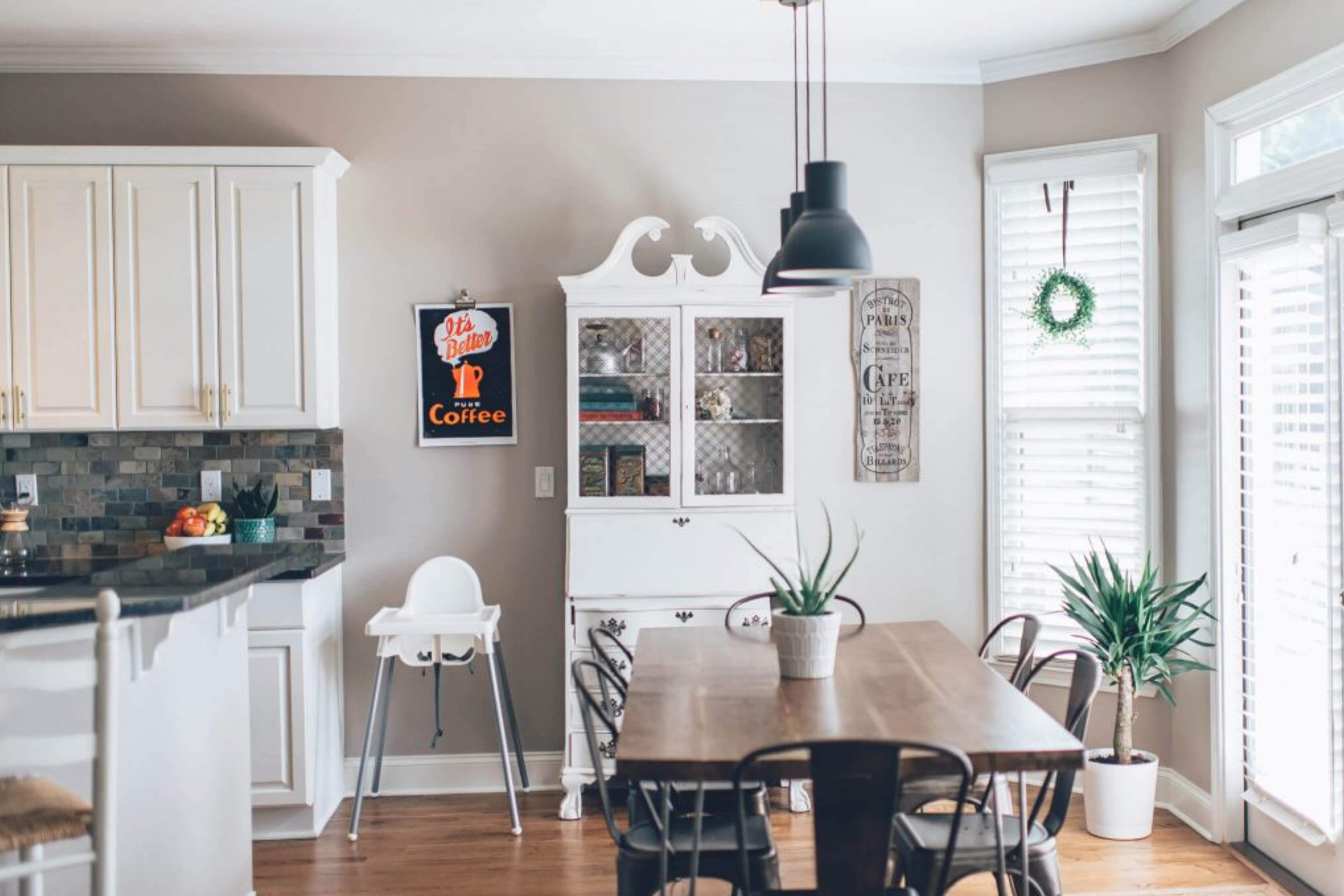
via livingletterhome
What Kind of Color Is Stone Hearth 984?
As we have already said, the Stone Hearth color belongs to the family of gray colors. But unlike most grays, this one possesses a hint of warmth, which adds a stony hue to the color.
Thanks to this stone-like appearance, this paint color can bring surprising depth and texture to a space!
As Encycolorpedia says, this color is also referred to as a mushroom color, which means it reads somewhere between a greige and a true taupe. Generally, this color will not look boring or dull in your home!
Thanks to its undertones, the Stone hearth color will read warm and neutral, going from light to dark, depending on where you use it in the room.
housekeepingbay.com
Table of Contents
What Undertones Does Stone Hearth Paint Color Have?
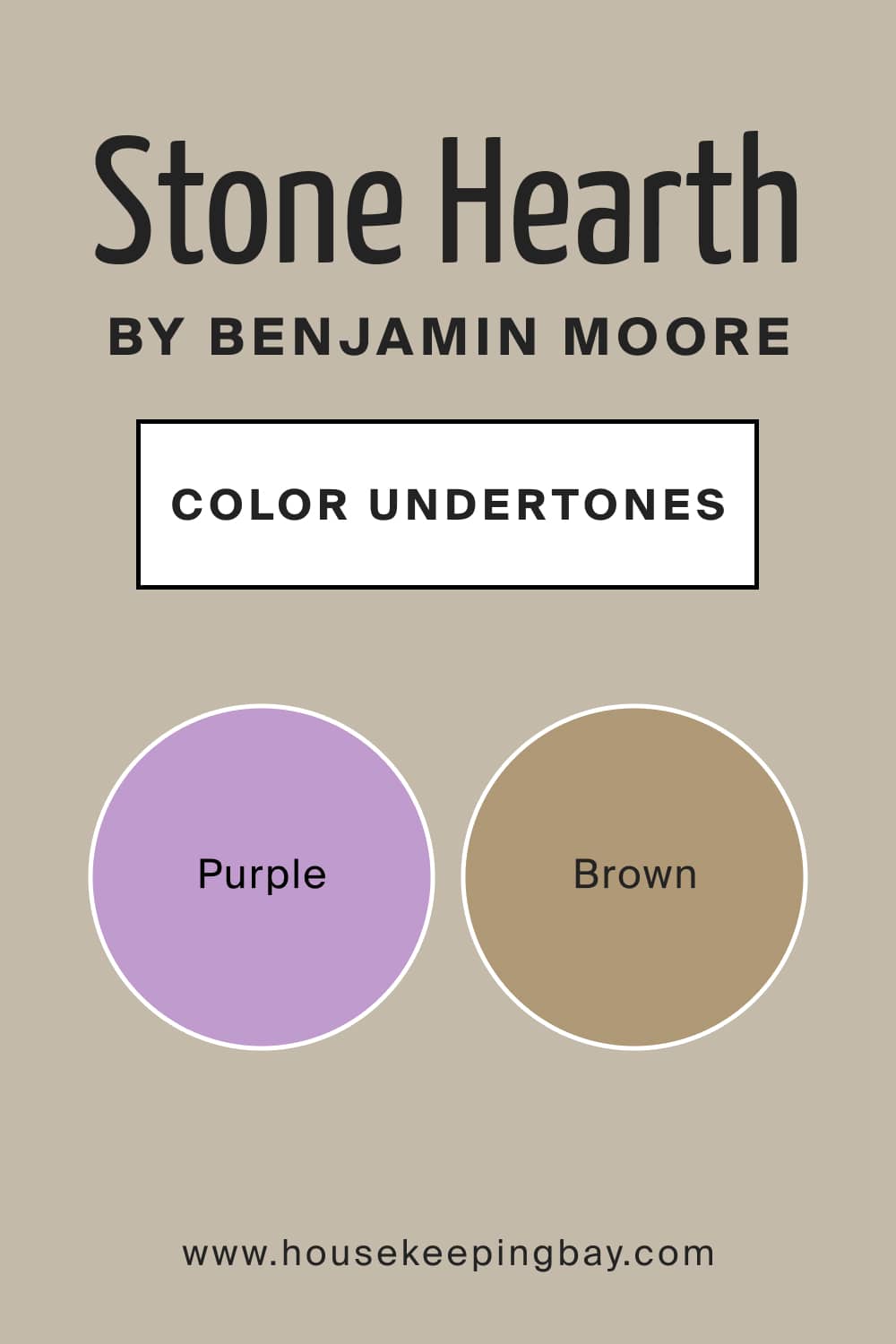
Since we have mentioned undertones, let’s dig deeper and see what they are and how they affect the way this gray color works. The Stone Hearth paint color definitely has some purple undertones! Due to this feature, this gray will often lean toward working as a cool-toned color.
However, it also has brown undertones! And because of its brown side, the color feels warmer when you use it on your walls. This warmth may disappear only if you have a lot of direct sunlight in a room with south-facing windows.
housekeepingbay.com
Is It a Warm Or Cool Color?
Basically, the Stone Hearth paint color by Benjamin Moore reads pleasantly balanced in tone. In other words, you can’t call it only warm or cool-toned since both these sides are harmonised.
In certain lighting conditions (e.g., in warmer light), this mushroom gray may read slightly warmer. However, it will never read cool due to keeping its warmth anyway.
LRV of Stone Hearth 984 Paint Color
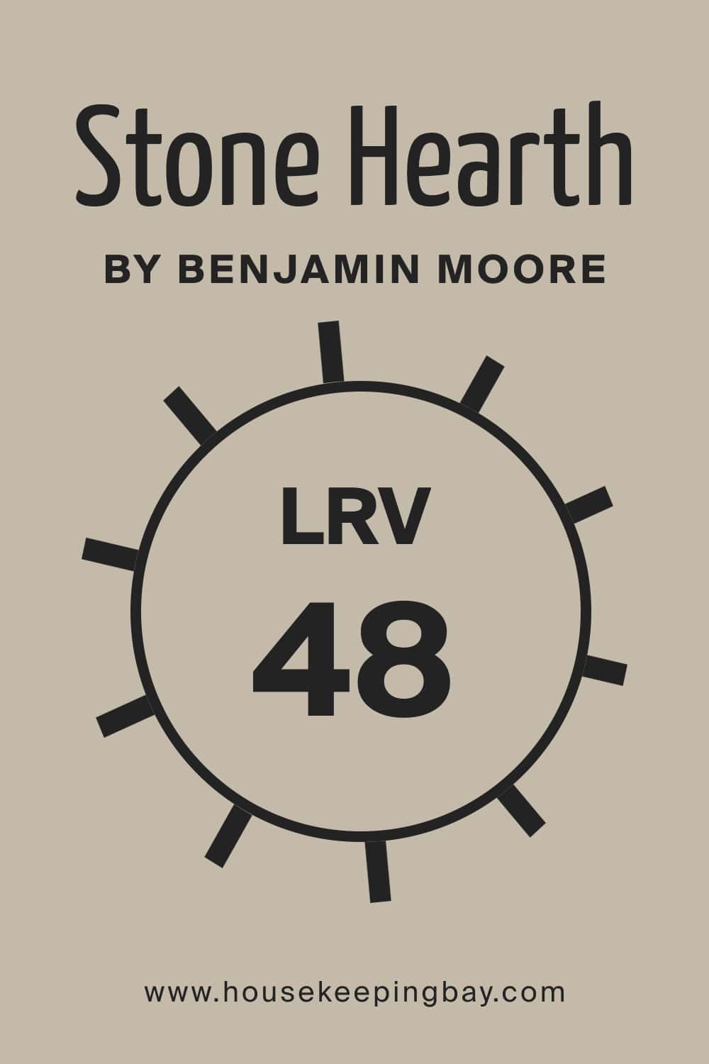
The LRV (light reflectance value) of the Stone Hearth color is 48. It means this stoney gray reads neither too dark nor very bright on the walls. In rooms with less natural light, it will show its mid-toned, taupe side more clearly.
However, in rooms with plenty of natural light, this mushroom gray will read like a warm neutral color.
housekeepingbay.com
By the way, let’s remind you of the meaning of LRV! LRV stands for the light reflectance value and shows the amount of light the color reflects from the wall.
The LRV scale ranges from zero to 100, where zero is black, and 100 is pure white. The higher the percentage of LRV, the brighter the color, and vice versa!
housekeepingbay.com
What is LRV? Read It Before You Choose Your Ideal Paint Color
Stone Hearth 984 Coordinating Colors
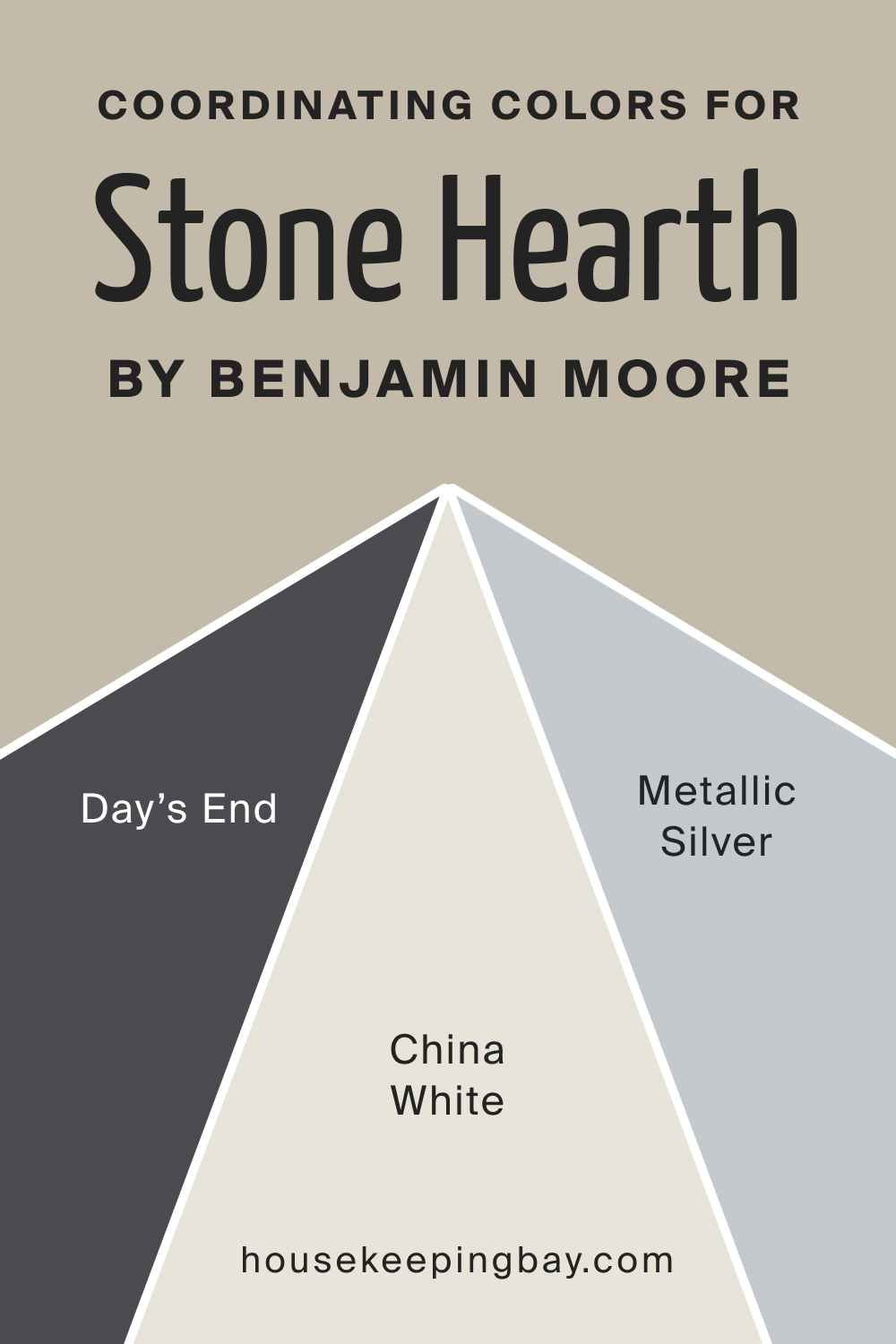
To achieve a balanced color palette in your interiors, it’s essential to pair the wall color with colors that coordinate it best of all. With proper coordinating colors, you can highlight the natural beauty of the main color in the room, making it work better and read more pronounced.
For the Stone Hearth paint color by Benjamin Moore, we would recommend the following colors as coordinating ones:
- OC-141 China White
- 2132-60 Metallic Silver
- 2133-30 Day’s End
housekeepingbay.com
Similar Colors to Use Instead of the Stone Hearth Paint Color
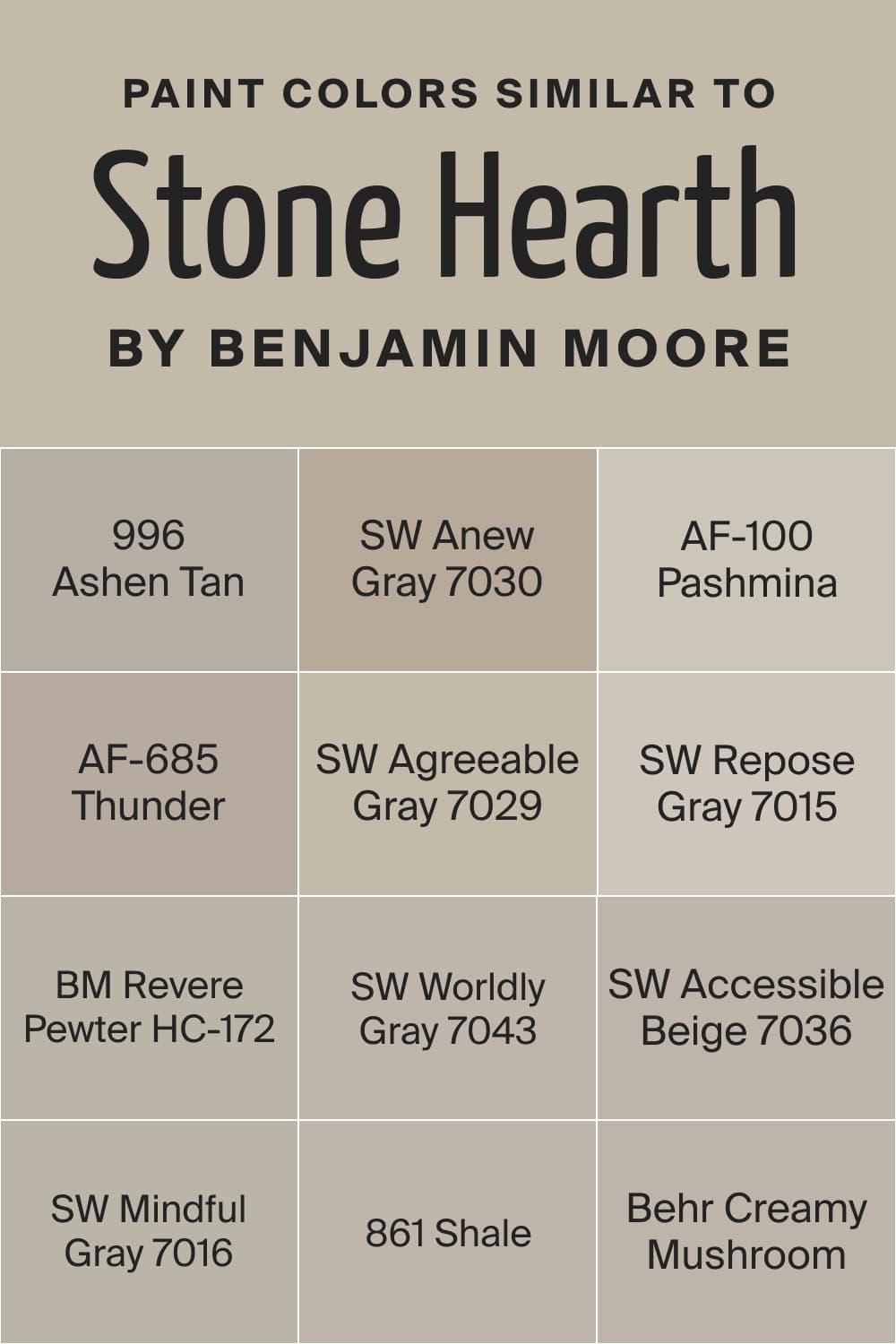
It can sometimes be challenging to pick the most similar-looking colors to use instead of the paint you initially chose for your home painting project. The trickiest part is to define what colors have similar undertones and read almost the same as the initial color.
For the Stone Hearth color with its purple and brown undertones, it’s not an easy task to pick the most suitable substitute colors! This is why we have prepared a list of the best color matches:
- 996 Ashen Tan
- 861 Shale
- SW Anew Gray
- AF-100 Pashmina
- AF-685 Thunder
- SW Agreeable Gray
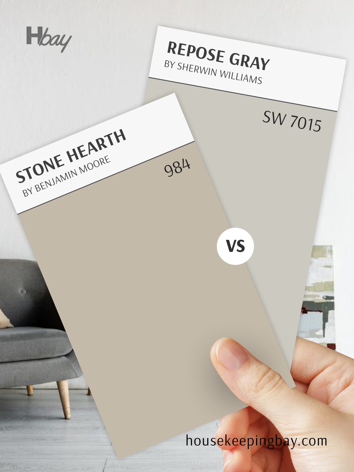
- SW Repose Gray
- BM Revere Pewter
- SW Accessible Beige
- SW Mindful Gray
- Behr Creamy Mushroom
- SW Worldly Gray
Of course, you must realize that none of them is a 100% match! Some minor distinctions in tone will be present anyway, making the substitute colors read warmer or cooler, lighter or deeper.
housekeepingbay.com
Colors That Go With Stone Hearth Paint Color
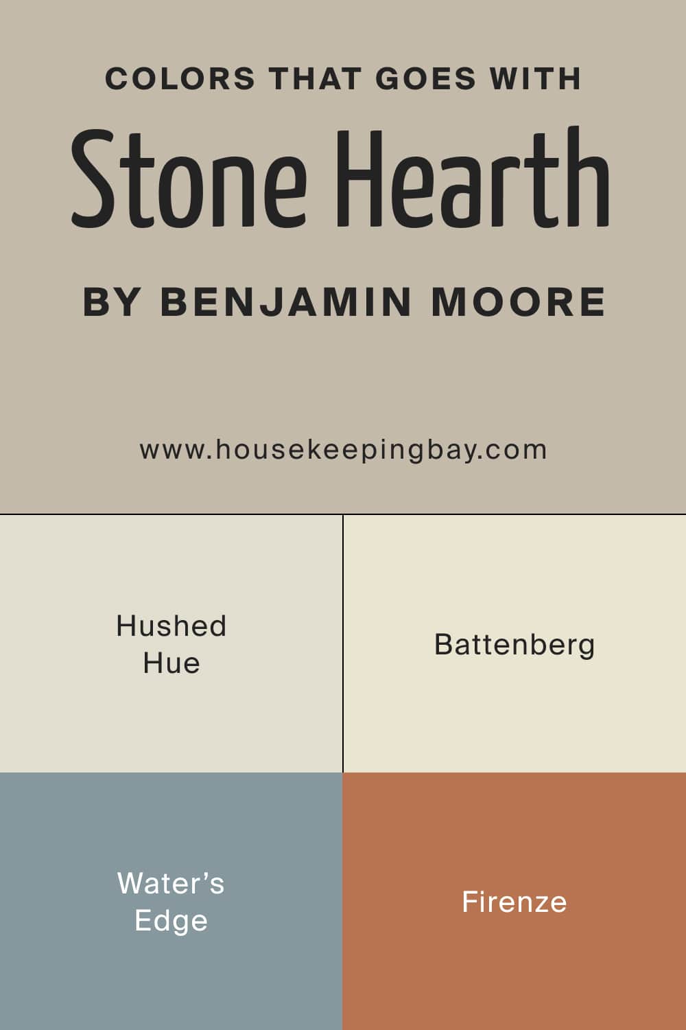
To achieve a good-looking and eye-pleasing color palette in your home, you must select the colors correctly. All of them must work well with each other to create a harmonious and cooperative palette.
We recommend the following paint color to use them with the Stone Hearth gray for the best effect:
- 1520 Hushed Hue
- 1635 Water’s Edge
- AF-70 Battenberg
- AF-225 Firenze
housekeepingbay.com
What Is the Best Trim Color to Use With the Stone Hearth Paint?
White is an optimal paint color to use on trim due to its versatility and a wide selection of shades and tone options. You can easily pick the white that will work best with the color used on the walls!
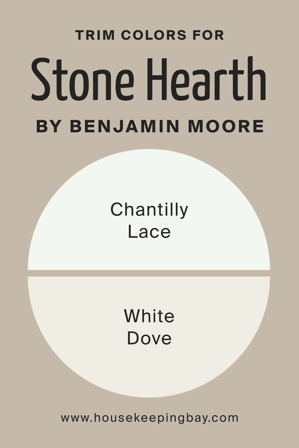
For the Stone Hearth as a wall color, we recommend you use the following white colors on your trim:
- Benjamin Moore Chantilly Lace (an ideal balanced white with no prominent undertones for a crisp look)
- Benjamin Moore White Dove (a lovely warmer white to highlight the warmth of the Stone Hearth gray)
housekeepingbay.com
Color Pairings with Stone Hearth
Stone Hearth is a versatile taupe with soft gray undertones that pairs beautifully with a range of complementary colors. Its grounded warmth and balanced tone make it an excellent choice for both modern and classic spaces.
Here are some top color pairing to enhance Stone Hearth’s natural appeal:
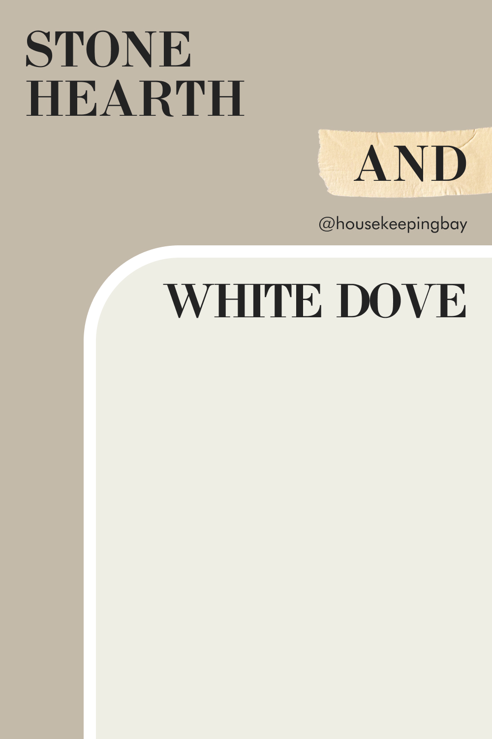
Stone Hearth (984) and White Dove (OC-17)
Stone Hearth and White Dove create a soft, warm palette that’s both timeless and welcoming. Stone Hearth offers a balanced taupe with subtle gray undertones, grounding the space with a gentle warmth. White Dove, a creamy off-white, brightens the look with its soft warmth, adding an airy, light feel.
Together, these colors make a perfect pair for living rooms, dining areas, or bedrooms. Stone Hearth provides the warmth and depth, while White Dove adds brightness, creating a cozy yet fresh atmosphere ideal for any home.
housekeepingbay.com
Comparing Stone Hearth Paint Color With Other Colors
When you can compare the color you chose for your walls with other paints that look nearly the same, you can better see the distinctions between similar shades of the same color.
Below, you can find several pairs of colors that look almost the same, but they still have specific differences. This way, you will understand what makes the Stone Hearth gray color unique.
Stone Hearth (984) vs Revere Pewter (HC-172)
Stone Hearth and Revere Pewter are two warm neutrals that offer a unique take on cozy interiors. Stone Hearth leans towards a taupe with subtle gray undertones, bringing a soft warmth that feels grounded and earthy. Revere Pewter, a classic greige, has a hint of coolness, giving it a more refined, balanced feel.
These colors work well in different settings depending on the desired mood. Stone Hearth’s warmth makes it ideal for living rooms or bedrooms where a cozy vibe is desired, while Revere Pewter’s slightly cooler tone is perfect for open spaces or shared areas needing a sophisticated, timeless appeal.
housekeepingbay.com
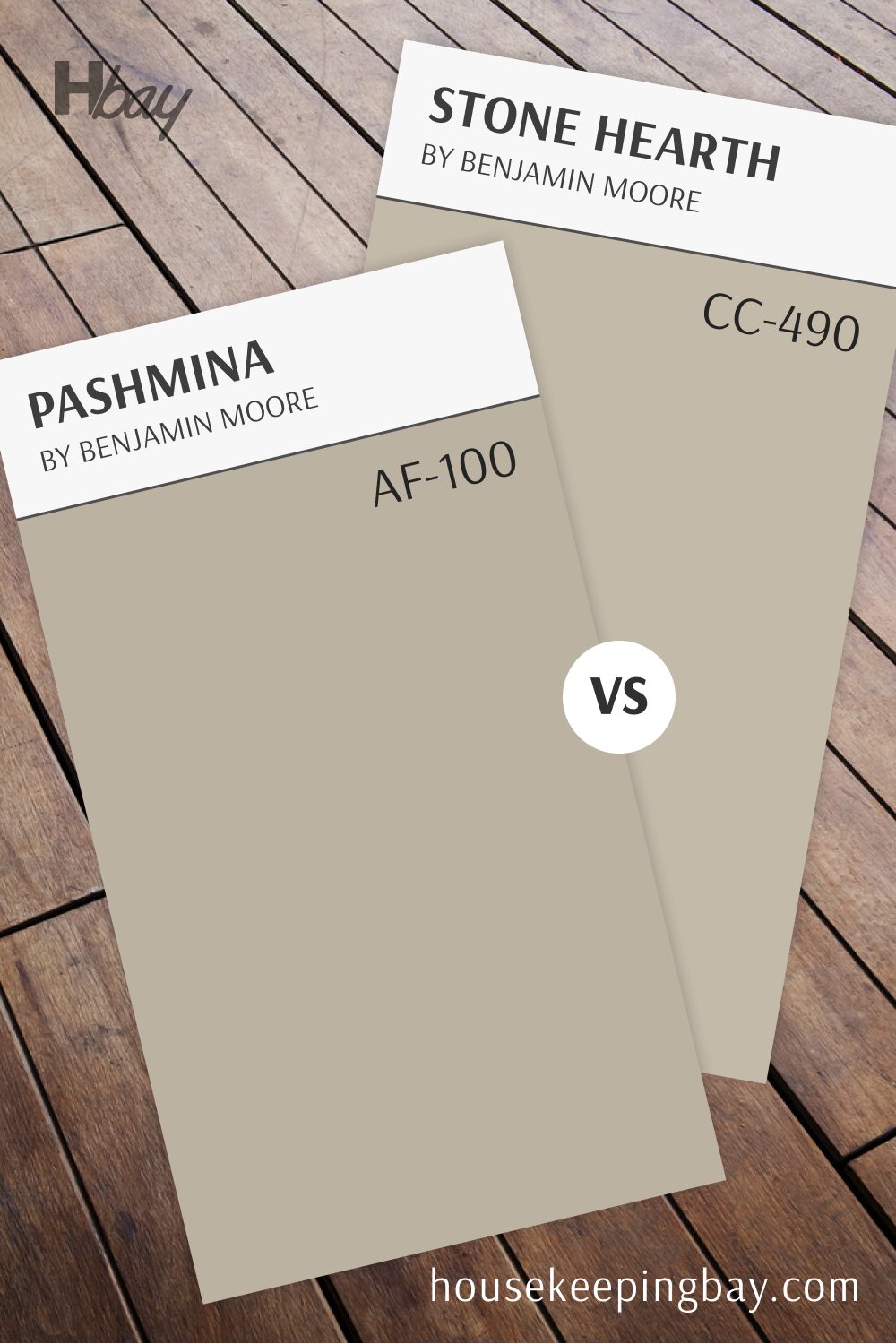
Stone Hearth (984) vs Pashmina (AF-100)
Stone Hearth and Pashmina both bring depth and warmth but have distinct undertones that set them apart. Stone Hearth’s taupe-gray undertone creates a warm, approachable base that adds comfort and subtle style. Pashmina, a deeper greige, has a touch of richness that adds a bit more drama to any room.
Ideal for creating a cozy, layered look, these colors are perfect for adjacent rooms. Stone Hearth is great for rooms that need a soft, inviting feel, while Pashmina’s richer tone works beautifully as an accent wall or in spaces where you want a touch of elegance.
housekeepingbay.com
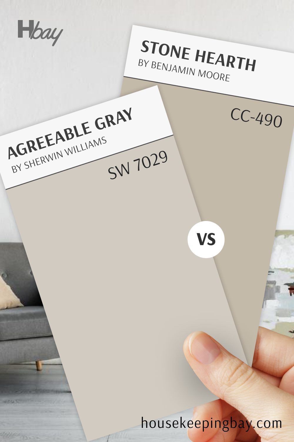
Stone Hearth (984) vs Agreeable Gray (SW 7029)
Stone Hearth and Agreeable Gray offer two versatile, warm neutrals with different personalities. Stone Hearth’s taupe with gray undertones brings a cozy, earthy quality to any room. Agreeable Gray, on the other hand, is a balanced greige with a light, airy feel, creating a fresh, modern backdrop.
This pairing is ideal for creating a harmonious look with subtle contrast.
Stone Hearth adds warmth and depth, perfect for bedrooms or accent areas, while Agreeable Gray keeps spaces feeling bright and open, making it ideal for living rooms or kitchens.
housekeepingbay.com
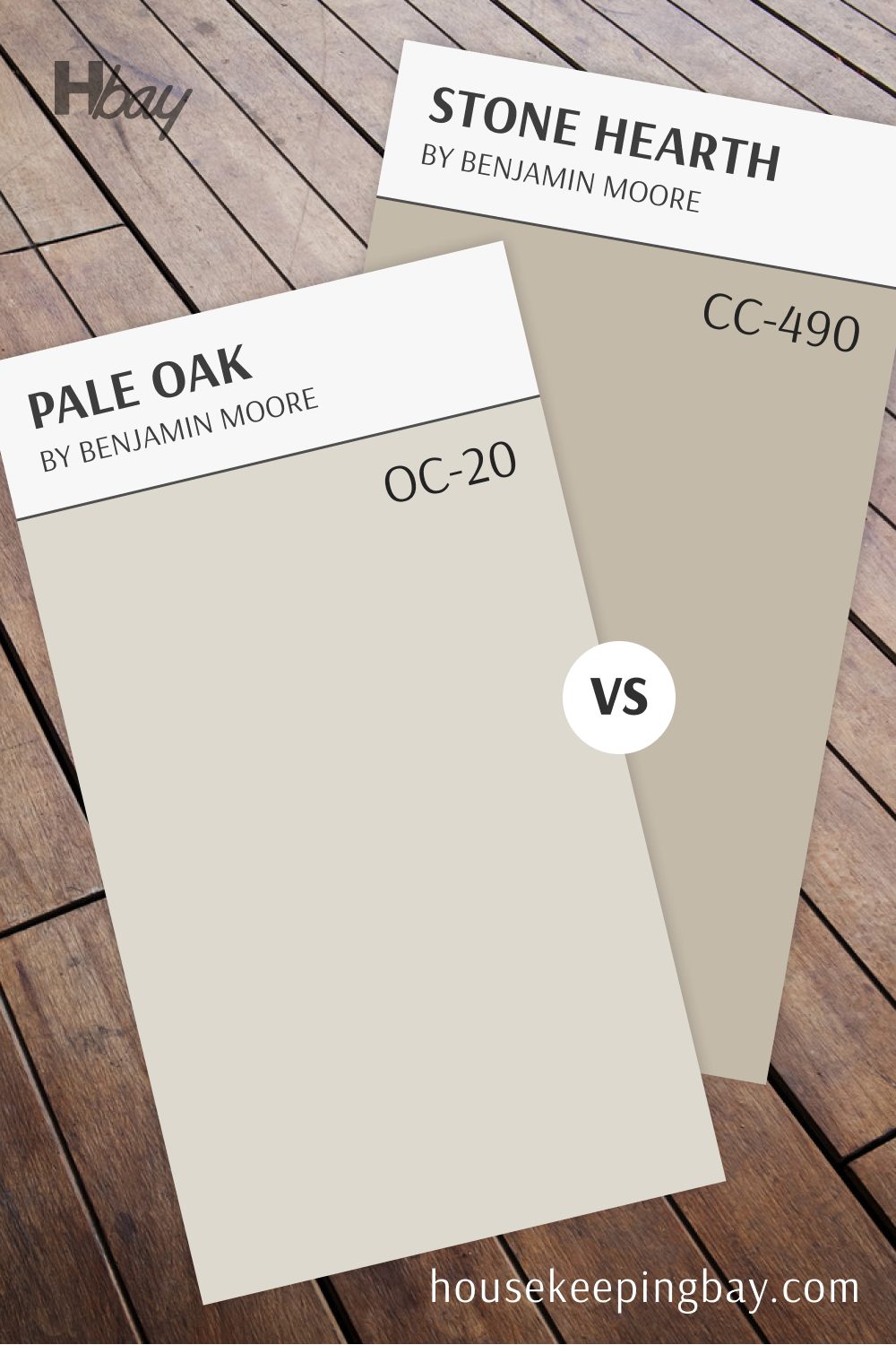
Stone Hearth (984) vs Pale Oak (OC-20)
Stone Hearth and Pale Oak create a soft, neutral palette with warmth and lightness. Stone Hearth’s taupe undertones provide a cozy, grounded feel, while Pale Oak’s light gray-beige tone adds a gentle brightness, making the space feel open and inviting.
This pairing is perfect for rooms that need both depth and an airy touch.
Stone Hearth is great for accent walls or focal areas, while Pale Oak keeps the overall look fresh, ideal for living rooms, hallways, or any space where you want a balanced, welcoming ambiance.
housekeepingbay.com
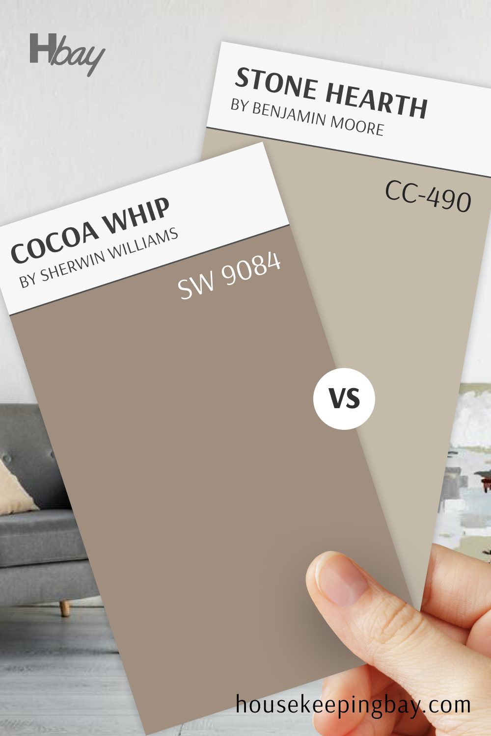
Cocoa Whip (SW 9084) vs Stone Hearth (984)
Cocoa Whip and Stone Hearth bring warmth and versatility to any room. Cocoa Whip is a soft brown with cozy, earthy undertones, perfect for adding depth and comfort. Stone Hearth, with its taupe-gray tone, is slightly lighter and more versatile, creating a calm, balanced foundation.
Both colors are excellent choices for cozy interiors. Cocoa Whip adds a warm richness, ideal for accent walls or intimate rooms, while Stone Hearth keeps the space open and inviting.
Together, they create a layered, comforting atmosphere that’s perfect for living rooms, bedrooms, or dens.
housekeepingbay.com
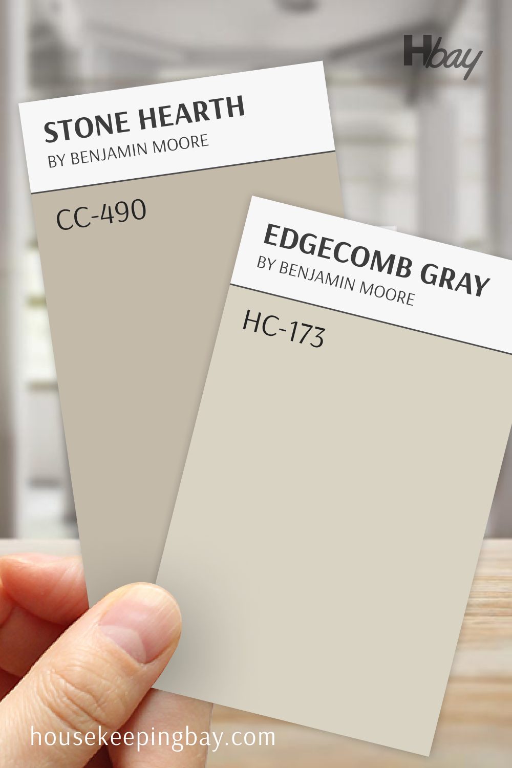
Edgecomb Gray (HC-173) vs Stone Hearth (984)
Edgecomb Gray and Stone Hearth are warm neutrals that create a serene, inviting look. Edgecomb Gray is a soft, balanced greige that works well in any lighting, offering a light, airy feel. Stone Hearth, with its taupe undertone, brings a touch of warmth, adding depth without overwhelming.
This pairing is ideal for creating a gentle flow between rooms.
Edgecomb Gray keeps spaces feeling light and open, making it perfect for larger areas, while Stone Hearth provides a cozier feel, ideal for bedrooms or accent walls. Together, they create a cohesive, calm environment.
housekeepingbay.com
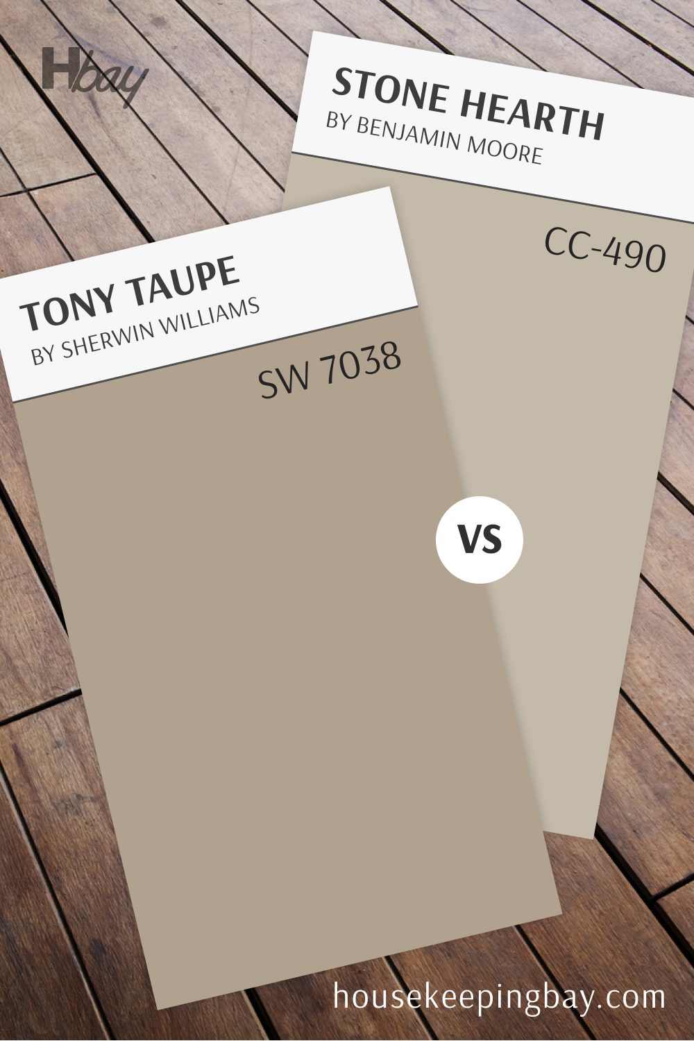
Tony Taupe (SW 7038) vs Stone Hearth (984)
Tony Taupe and Stone Hearth bring two warm, earthy tones with subtle differences. Tony Taupe, a rich taupe with warm undertones, adds depth and a grounded feel to any room. Stone Hearth, with its softer gray-taupe tone, is slightly lighter, providing a cozy yet versatile look.
These colors work beautifully together for a layered effect. Tony Taupe is great for accent walls or areas needing a stronger presence, while Stone Hearth keeps the look approachable and balanced.
Together, they create a warm, welcoming atmosphere that’s perfect for living rooms, dining rooms, or bedrooms.
housekeepingbay.com
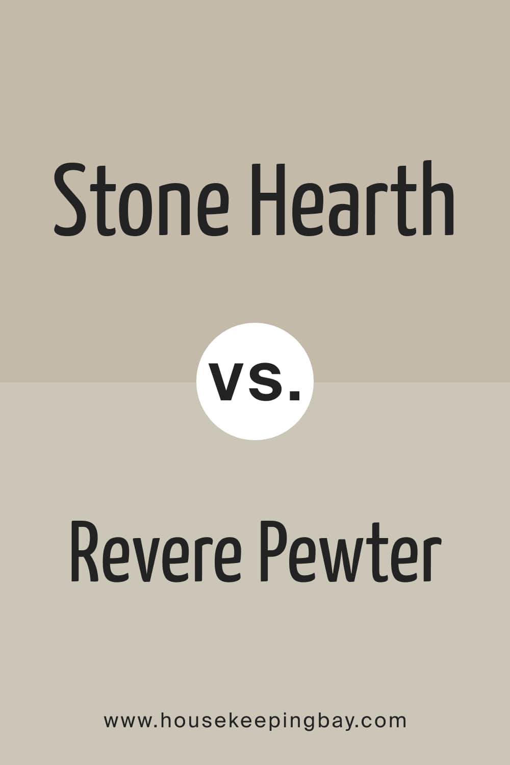
Stone Hearth vs. Revere Pewter
BM Revere Pewter has yellow and beige undertones, unlike the Stone Hearth with its purple and brown undertones. If you compare these colors closely, you will see that Stone Hearth reads much warmer with a more prominent brown hue, whilst its counterpart looks grayish.
housekeepingbay.com
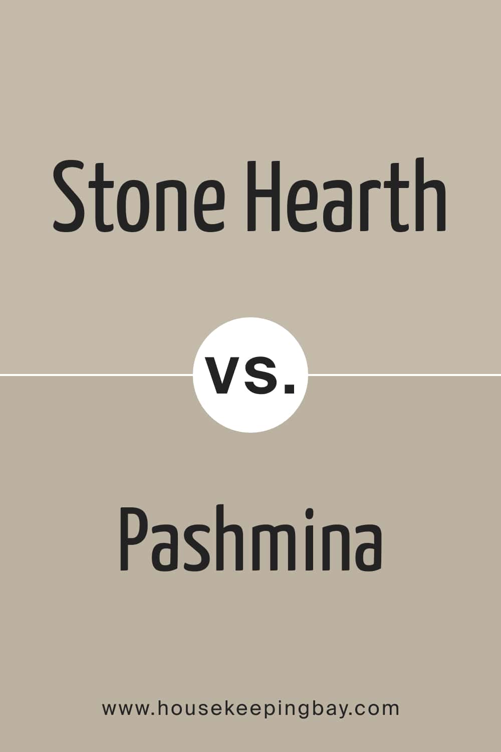
Stone Hearth vs. Pashmina
The undertones of these colors are different. BM Pashmina has a very slight and barely seen green undertone, whilst BM Stone Hearth has purple and brown undertones. This is why, if you put them side by side, you will see the Pashmina color reading noticeably greener!
housekeepingbay.com
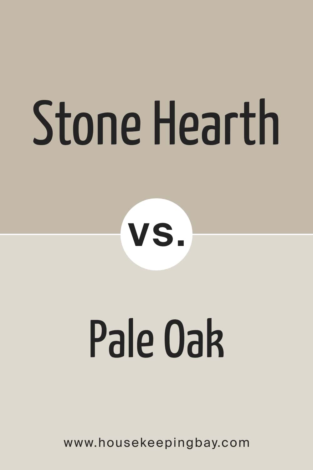
Stone Hearth vs Pale Oak
BM Pale Oak is a light greige with warm taupe and yellow undertones, which makes it distinct from the Stone Hearth with a noticeable brown hue. Also, their LRVs differ.
BM Pale Oak has an LRV of 69, and BM Stone Hearth has an LRV of 48. As a result, the Pale Oak color reads noticeably lighter.
housekeepingbay.com
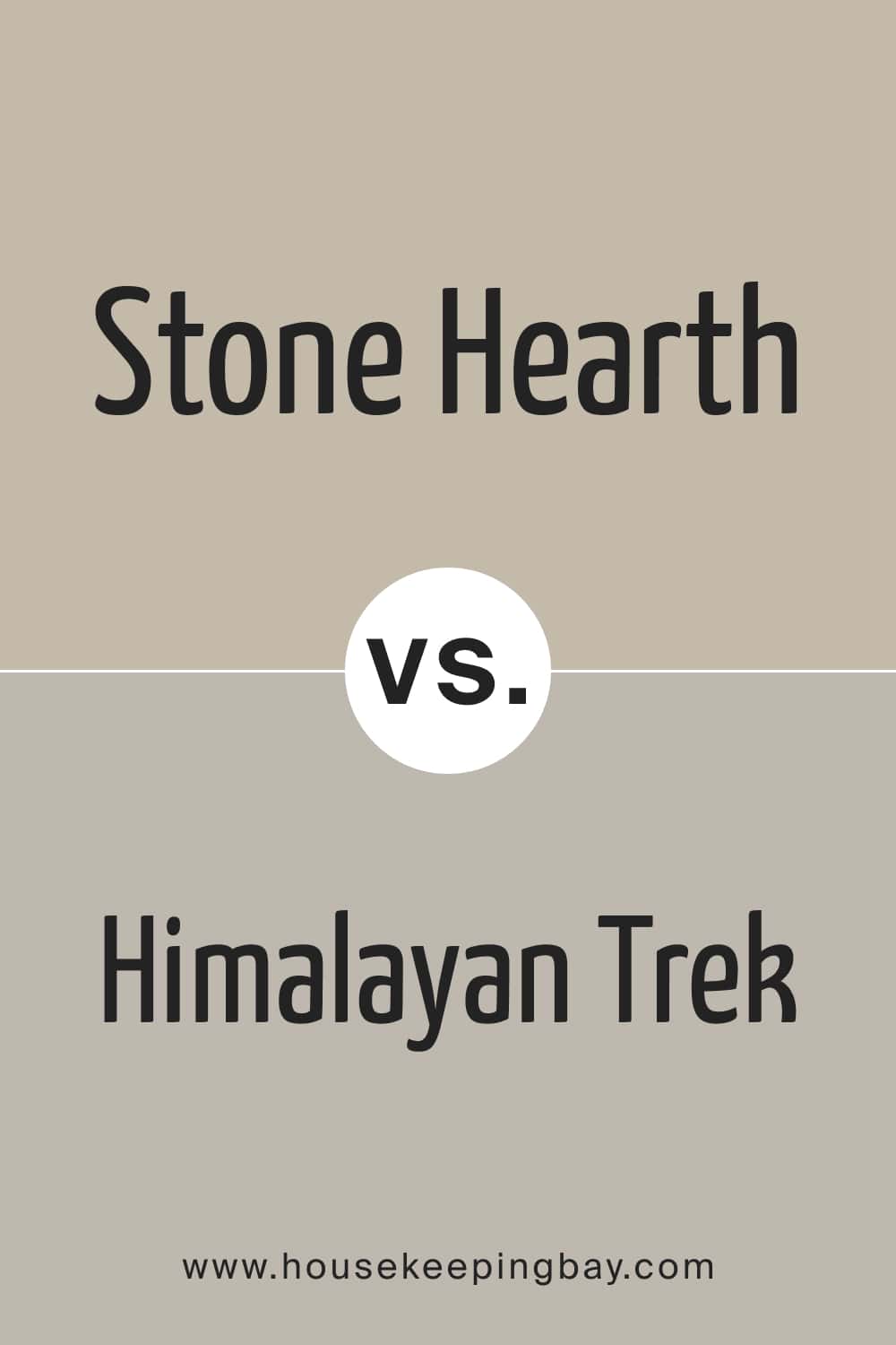
Stone Hearth vs Himalayan Trek
BM Himalayan Trek is a mid-tone neutral with warm gray undertones. It does read much grayer than Stone Hearth, which looks clearly brownish compared to it. But there is also a couple of similarities. First, the neutral tone is what makes these colors related. Also, the LRVs of these colors are very close (47 for the Himalayan Trek and 48 for the Stone Hearth).
housekeepingbay.com
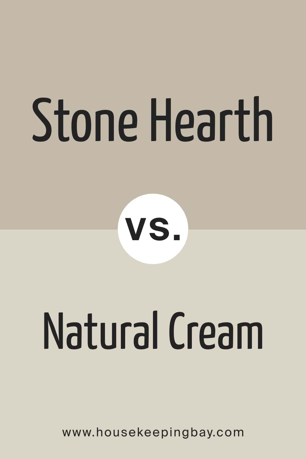
Stone Hearth vs Natural Cream
BM Natural Cream is a warm, soft neutral between a warm white and a mushroom color. It is greige, with soft undertones. Since these colors share the mushroom hue, they look rather similar.
It’s the LRV that makes them different. The Stone Hearth color has an LRV of 48, and BM Natural Cream has an LRV of 70, which makes it a lighter one of the two.
housekeepingbay.com
Where In Your Home Stone Hearth 984 Color Can Be Used?
Despite rather tricky undertones, BM Stone Hearth is a versatile color that will work in many spaces in your home. Besides, this mushroom gray will be a nice color option to use on exterior walls too! Below you can get more detailed information on how it works in different rooms.
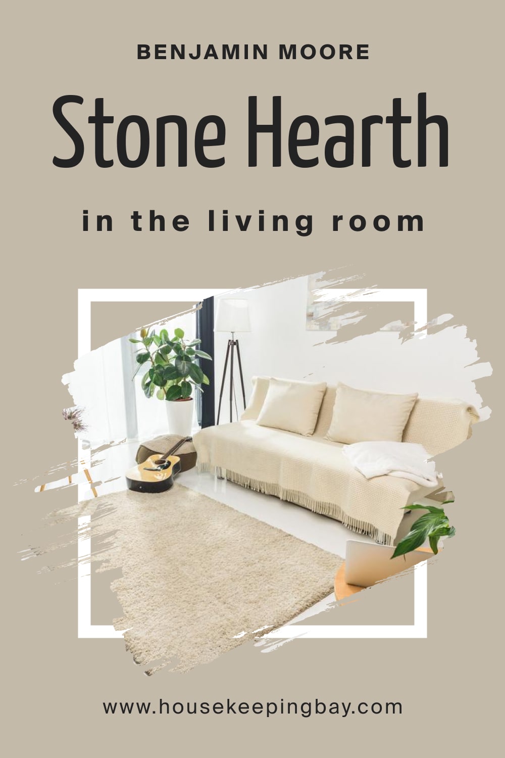
Stone Hearth 984 and Living Room
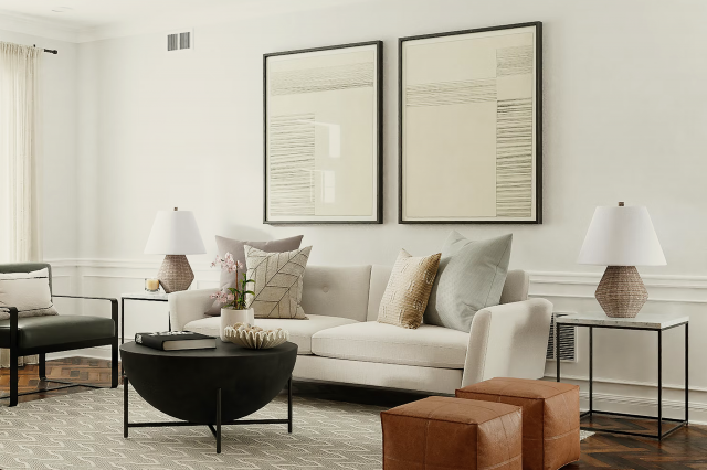
This neutral gray with brown undertones can be a nice color for the living room walls if you crave a soft and cozy vibe there. With its balanced softness, the Stone Hearth paint will add enough warmth to the space without making it overwhelmed.
Pair it with brighter whites on trim, and the color will make your living room look elegant, modern, and very homey!
housekeepingbay.com
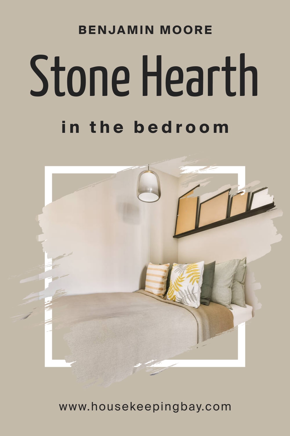
Stone Hearth 984 in a Bedroom
This is one of the best colors to use on bedroom walls! Due to the softness and pleasant warmth, BM Stone Hearth will easily create a relaxing and soothing atmosphere there, which is exactly what you need to sleep well!
housekeepingbay.com
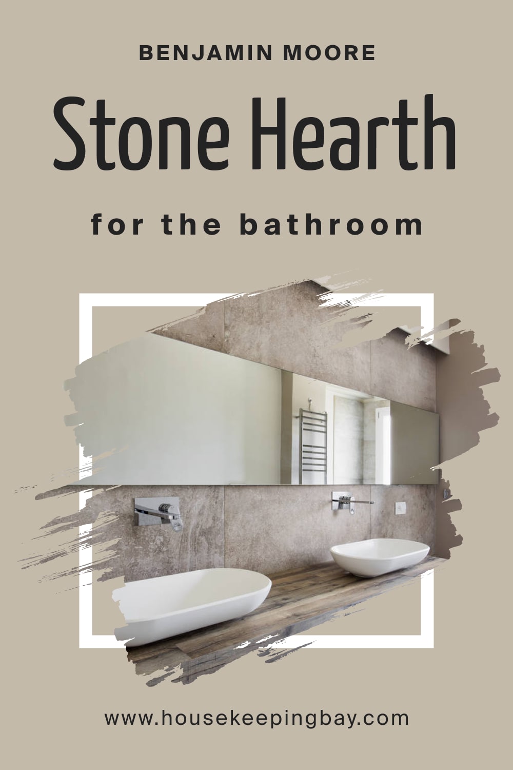
Stone Hearth 984 for the Bathroom
Note that this warmer gray might not work on all bathroom walls, but you can still make it work for you! Paint an accent wall with it, or use it for color accents (e.g., on your vanity sink or cabinets).
But if your bathroom is spacious and well-lit, don’t hesitate to paint it all with BM Stone Hearth! Just ensure there’s also enough white there.
housekeepingbay.com
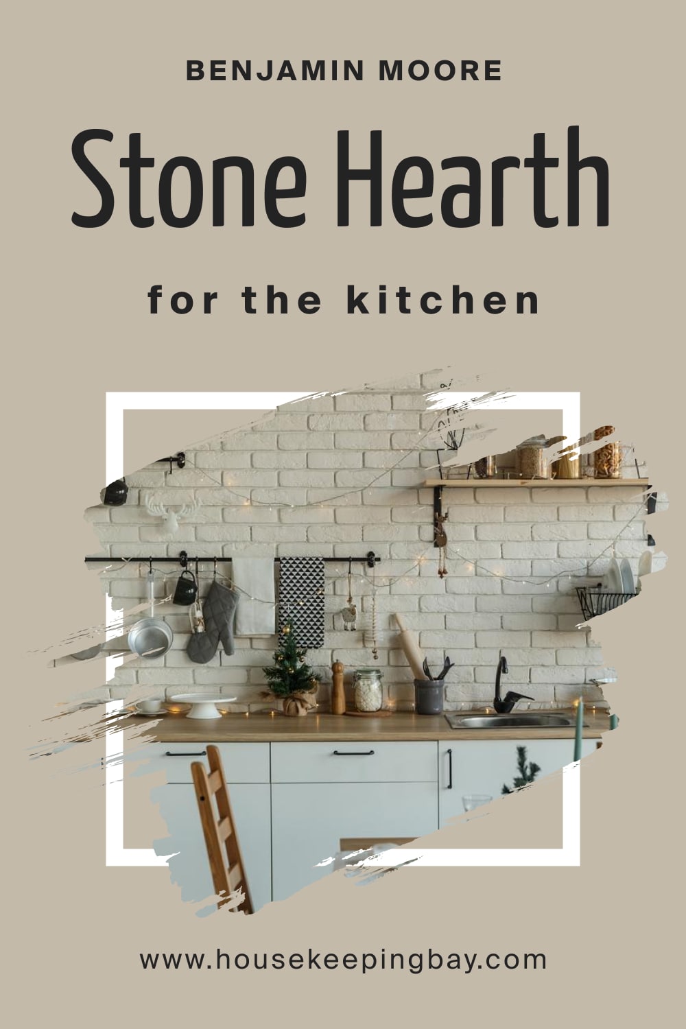
Stone Hearth 984 on the Kitchen
This color will work successfully on your kitchen walls, but it will also look great on cabinets only with the walls being white. It depends on how big the kitchen is and how well it is lit.
For a smaller space with poor/dim light, we’d recommend you limit this color to the cabinets to avoid making the room read smaller.
housekeepingbay.com
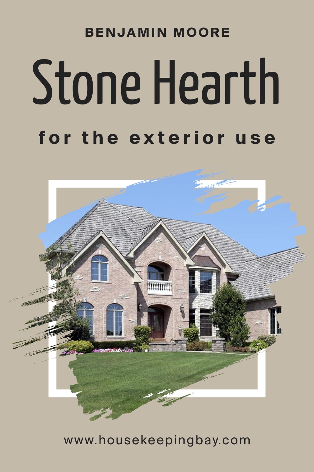
Stone Hearth 984 for the Exterior use
On exterior walls, BM Stone Hearth works surprisingly well! It will make your house look stylish and modern, adding a warm and welcoming vibe.
Pair this wall color with white trim and shutters (if you have them), and paint your front door white too. This will add a pinch of crispness to the facade and refresh the warmth of the Stone Hearth.
housekeepingbay.com
Now you know what kind of color BM Stone Hearth is and how it works in different spaces. You know its undertones, LRV, trim colors, and more.
With all this, you will easily find the best place in your home to use this stoney gray with warmer brown undertones and a hidden pinch of purple!
housekeepingbay.com
Ever wished paint sampling was as easy as sticking a sticker? Guess what? Now it is! Discover Samplize's unique Peel & Stick samples. Get started now and say goodbye to the old messy way!
Get paint samples




Frequently Asked Questions
⭐What color collection does the Stone Hearth color belong to?
The Stone Hearth color is part of the Benjamin Moore Classics color collection.
⭐Does this color only have one color code?
The Stone Hearth paint color has a code 984, but it is also known as CC-490.
⭐Does this color read the same in any lighting?
No, the Stone Hearth color may read differently depending on the lighting conditions.
4 thoughts on “Stone Hearth 984 Paint Color by Benjamin Moore”
Leave a Reply


Hello! Could you please help me with the trim color for BM Stone Hearth? I want to know whether brighter and crisp whites like BM Super White or even brighter shades of white will work with it. Thanks a lot!
Hello! Technically, you can use this white for the trim, but we would recommend you softer and less crisp shades of white to coordinate them with the Stone Hearth color better.
Does BM Stone Hearth have green undertones? I tried to sample it in my kitchen, but it seems to me it reads slightly greenish…Maybe, the problem is that I have dark green marble countertops there, and my kitchen windows face the garden (so trees might make the space read green too). Am I right? Does this gray have a green hue?
Hello! This color can’t read green or show green undertones/hue because there’s no green in it. BM Stone Hearth has warm brown undertones and a barely seen hint of purple, but no green. Perhaps, the green color you already have in your kitchen creates this visual effect.