Collingwood OC-28 by Benjamin Moore
Where Style Feels Effortless
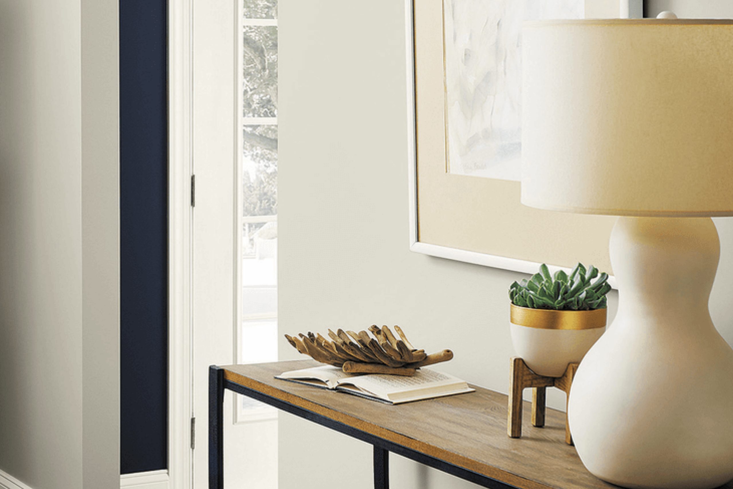
Collingwood OC-28 from Benjamin Moore is a warm gray that manages to bridge both contemporary and classic styles. When you’re choosing paint for your space, finding the right shade can set the tone for the entire room. Collingwood OC-28 offers a soft and inviting atmosphere, making it perfect for living rooms, bedrooms, or any space where you seek a touch of sophistication without being too bold.
What makes Collingwood stand out is its subtle undertones that adapt to various lighting conditions, offering a different vibe throughout the day. In natural light, it maintains a beautiful balance between gray and beige, giving a cozy and welcoming environment.
As the lighting shifts, you might notice the hue’s gentle elegance revealing itself in new ways, maintaining a harmonious feel.
Pick this color if you want flexibility without overwhelming intensity. It’s a choice that suits any style, offering timeless appeal with a modern twist.
Whether you are going for a clean look or mixing it with bold decor, Collingwood OC-28 provides a neutral backdrop that complements a vast array of colors and furnishings.
Let your home reflect your personality with a shade that subtly supports sophistication and comfort in equal measures.
via hackrea.net
What Color Is Collingwood OC-28 by Benjamin Moore?
Collingwood OC-28 by Benjamin Moore is a beautiful greige (gray-beige) color that combines sophistication with warmth. Its neutral hue has soft undertones, making it adaptable to various lighting conditions, which means it can appear warmer or cooler depending on the room.
This color fits beautifully in many interior styles, such as modern, contemporary, Scandinavian, and transitional. In modern settings, it adds warmth to sleek lines and minimalistic designs. In Scandinavian spaces, its soft tone complements natural materials while maintaining a light, airy feel.
For transitional styles, it acts as a perfect backdrop, balancing both traditional and contemporary elements.
Collingwood OC-28 pairs well with a variety of materials. It looks lovely with natural wood, whether in the form of flooring or furniture, enhancing the wood’s character while maintaining a serene atmosphere. For a more modern touch, consider pairing it with metals, such as brushed nickel or matte black, which will provide a nice contrast against the neutral backdrop.
Textural elements like linen, wool, or woven baskets add depth and visual interest, harmonizing effortlessly with this versatile shade. Overall, Collingwood OC-28 offers a timeless, neutral foundation that enhances both bold and subtle design elements, creating a cohesive and inviting space.
housekeepingbay.com
Is Collingwood OC-28 by Benjamin Moore Warm or Cool color?
Collingwood OC-28 by Benjamin Moore is a versatile paint color that adds a soft, welcoming feel to homes. This light gray shade has warm undertones, creating a cozy and inviting atmosphere. Its neutral tones make it a perfect backdrop for various interior styles. Whether your furnishings are modern or traditional, this color complements them well.
In living rooms, Collingwood OC-28 provides a calming effect, making the space perfect for relaxation and conversation. It also works well in bedrooms, offering a serene environment conducive to restful sleep.
In kitchens, the subtlety of this color can highlight natural wood cabinets and sleek appliances alike.
The way it reacts to light is another key feature. In natural sunlight, Collingwood OC-28 appears lighter and brighter, while in artificial lighting, it maintains its warmth without overwhelming the space.
This adaptability ensures rooms feel consistently comfortable and balanced.
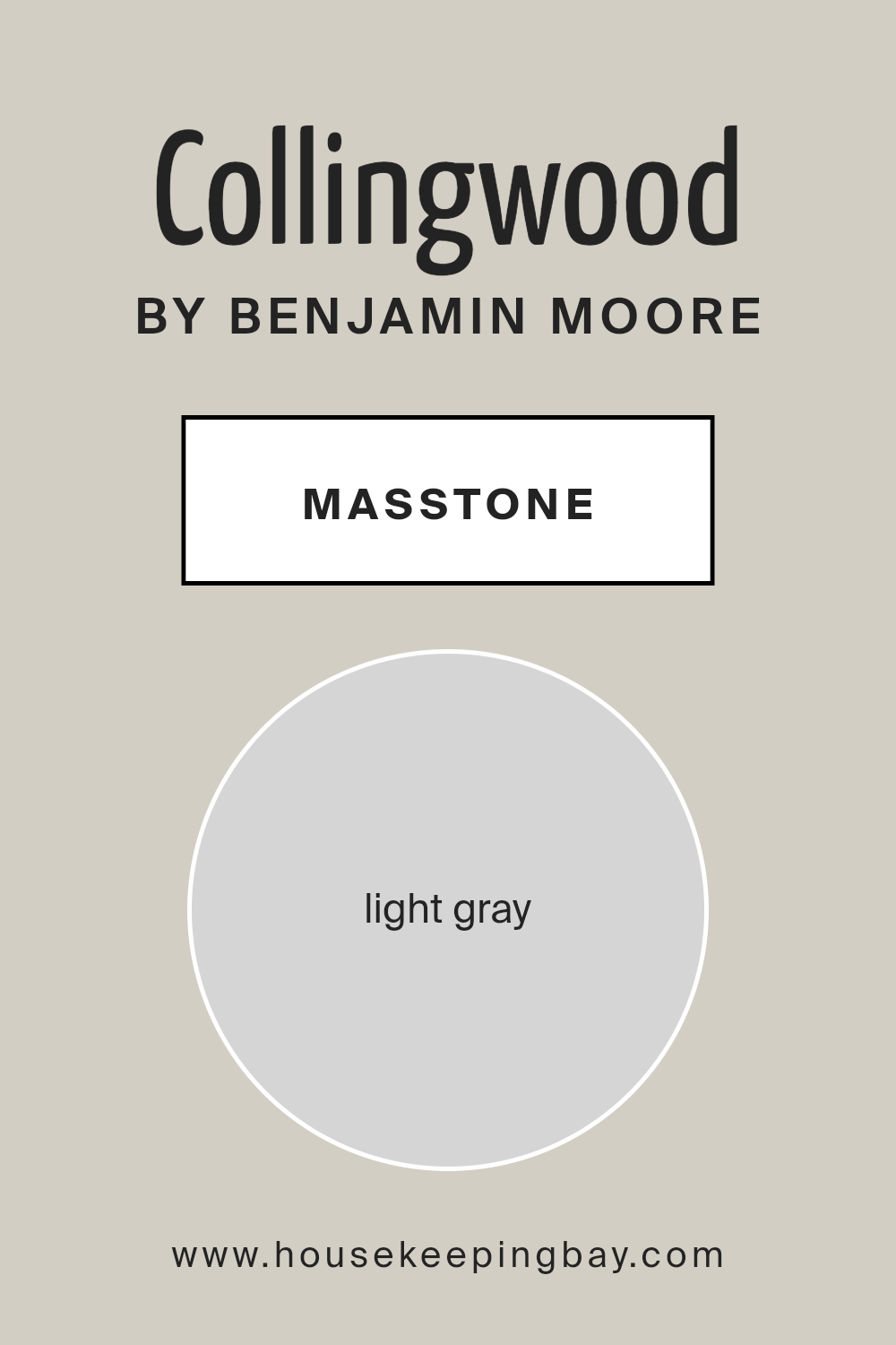
What is the Masstone of the Collingwood OC-28 by Benjamin Moore?
Collingwood OC-28 by Benjamin Moore is a light gray color (#D5D5D5) that offers a perfect balance of warmth and neutrality. This shade is versatile, making it work well in various spaces within the home. Because it is a light gray, it doesn’t overpower a room, allowing the space to feel airy and open. It works especially well in living rooms and kitchens, where you want a bright, fresh look.
The subtle warmth in Collingwood ensures that the gray doesn’t feel too cold or stark, creating a cozy atmosphere. Additionally, this color complements different styles of décor.
Whether you prefer modern, traditional, or rustic themes, Collingwood can blend with furniture and accents easily.
Because it is a gentle neutral, it allows other colors in the room to stand out, making it a great backdrop for colorful artwork or furniture pieces. Overall, Collingwood OC-28 brings light and harmony into home interiors.
housekeepingbay.com
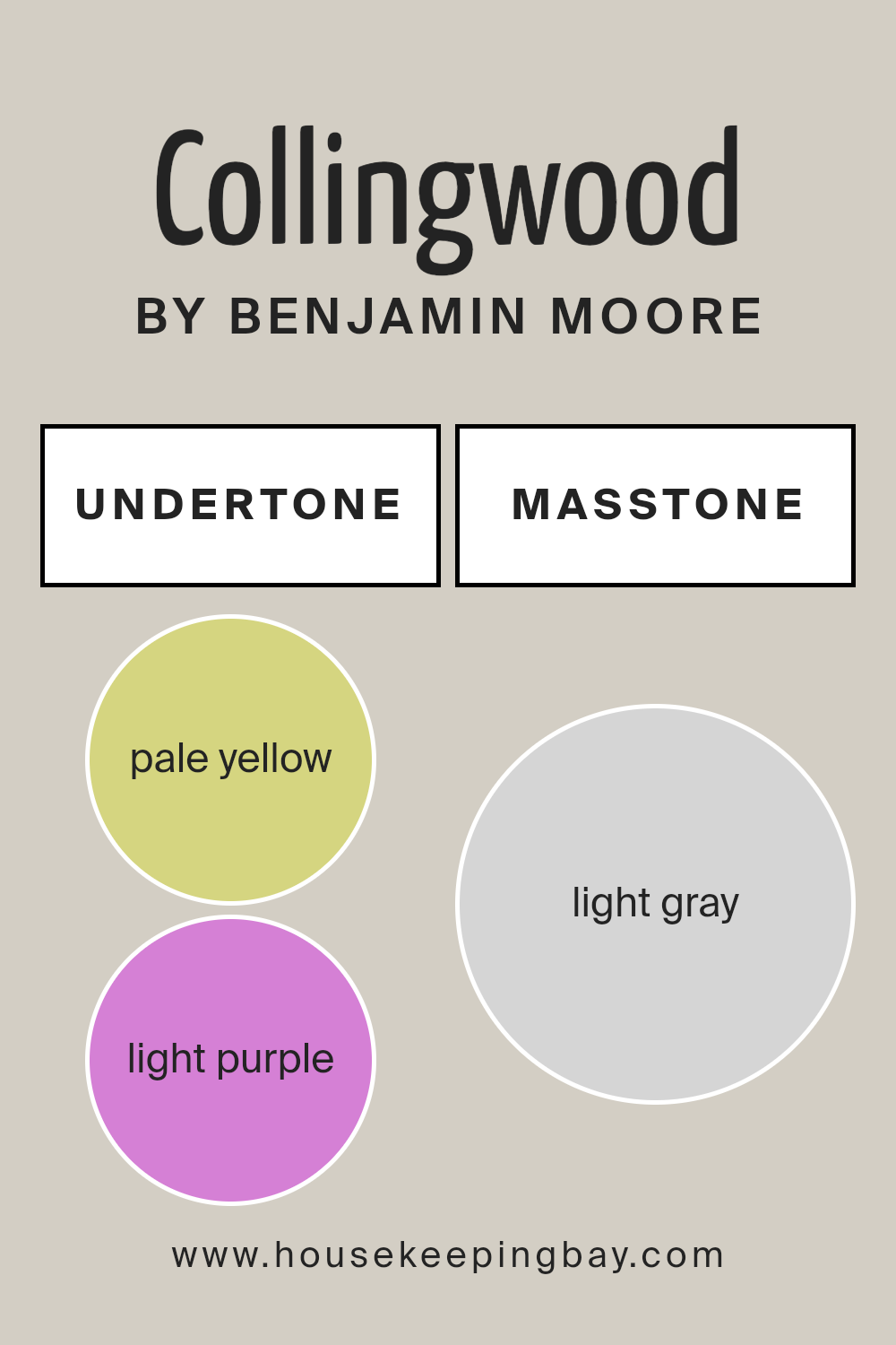
Undertones of Collingwood OC-28 by Benjamin Moore
Collingwood OC-28 by Benjamin Moore stands out as an intriguing neutral paint color with a complexity resulting from its varied undertones. Undertones refer to the subtle hues that lie beneath the surface of a color, influencing its overall appearance and how it interacts with other colors nearby.
For Collingwood OC-28, its undertones include shades such as pale yellow, light purple, light blue, pale pink, mint, lilac, and grey. Each of these undertones has the potential to subtly shift the perception of the paint depending on lighting and surrounding decor.
For instance, the grey undertone provides a soft, grounding effect, making it a stable choice for walls. This enhances the paint’s flexibility and makes it a good backdrop for various color schemes.
The presence of light pastel undertones like pale yellow or light blue can add warmth and softness, creating a welcoming atmosphere. The hints of light purple or lilac offer a slight coolness, lending a sophisticated, calming quality.
These undertones allow Collingwood OC-28 to adapt well to different environments, whether bathed in warm sunlight or cooler artificial lighting. As a result, it can convey different vibes, from cozy and inviting to sleek and modern, making it versatile for any room.
housekeepingbay.com
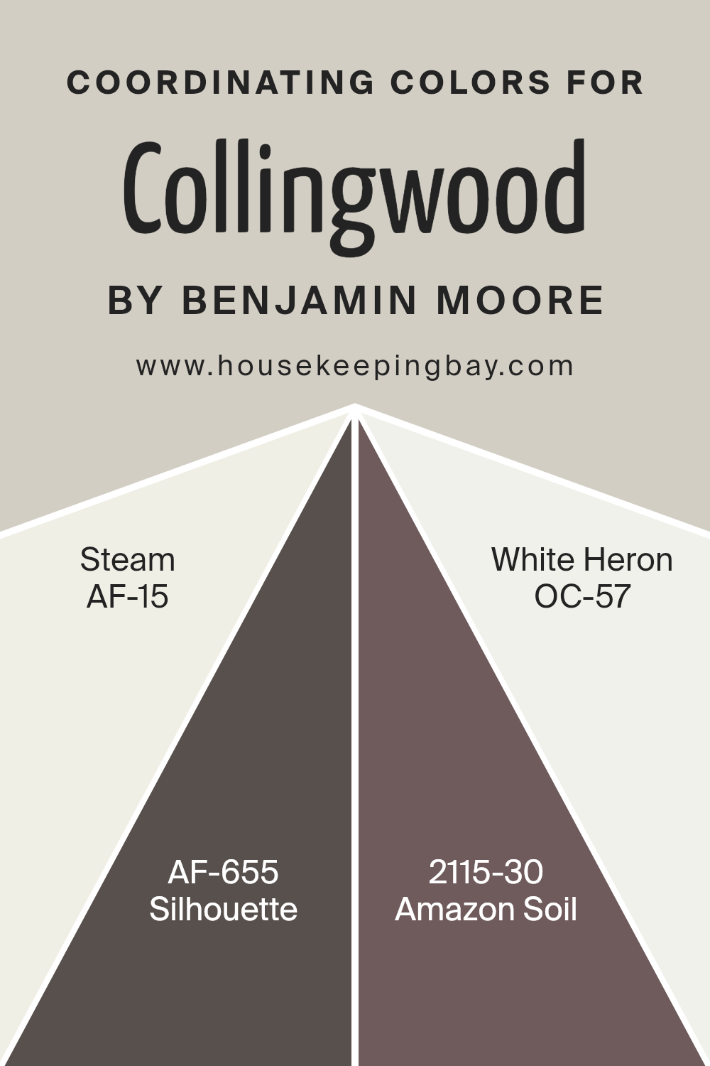
Coordinating Colors of Collingwood OC-28 by Benjamin Moore
Coordinating colors are hues that complement one another, creating a balanced and harmonious look when used together in a space. When selecting paint colors, like those coordinating with Benjamin Moore’s Collingwood OC-28, it’s important to choose shades that enhance and support one another.
Collingwood is a neutral with soft gray undertones that acts as a versatile backdrop. Its coordinating colors bring out its depth while adding character to any room.
AF-15 Steam is a soft white that offers a clean, fresh feel, acting as a perfect base or trim color. It highlights other shades without overwhelming them. AF-655 Silhouette, on the other hand, is a rich, warm charcoal that adds depth and drama, providing a modern touch when paired with lighter tones.
For something earthy, 2115-30 Amazon Soil offers a deep brown that grounds a space with its cozy, inviting feel. Finally, OC-57 White Heron is a crisp, classic white, ideal for creating contrasts or adding lightness.
Together, these colors form a cohesive palette that can enhance the mood of a room, creating a space that feels thoughtfully designed and well-balanced.
You can see recommended paint colors below:
- AF-15 Steam
- AF-655 Silhouette
- 2115-30 Amazon Soil
- OC-57 White Heron
housekeepingbay.com
How Does Lighting Affect Collingwood OC-28 by Benjamin Moore?
Lighting plays a crucial role in how we perceive colors. It can change the appearance of paint on your walls, like Collingwood OC-28 by Benjamin Moore. This particular shade is a light gray with warm undertones, which means it can look different depending on the kind of light it receives.
In natural light, Collingwood OC-28 can appear quite different as the day’s light shifts. In rooms with north-facing windows, this color may appear slightly cooler. These rooms get less direct sunlight, so the gray tones in Collingwood might be more pronounced.
The color can take on a slightly bluish tint because north-facing light is often cooler and softer.
On the other hand, in south-facing rooms, Collingwood OC-28 will look warmer and brighter. These rooms receive direct sunlight for most of the day, enhancing the warm undertones in the paint and giving the space a cozy feel.
In east-facing rooms, the color will appear bright and crisp during the morning when the sunlight is strongest. As the day progresses, the light becomes softer, and the color might look a bit more muted. In the evening, without much natural light, the color can lean more towards its gray tones.
West-facing rooms experience the opposite: in the morning, Collingwood OC-28 will appear more muted, but in the afternoon and early evening, as the sun sets, the paint will glow warmly, emphasizing its beige and taupe undertones.
Under artificial light, the appearance of Collingwood OC-28 can vary depending on the type of bulbs used. Incandescent lighting, which gives off a warm, yellowish light, will make the color look warmer and more beige. LED or fluorescent bulbs, which can emit cooler or more neutral light, may highlight the gray tones in the paint.
Understanding these lighting differences helps in choosing the right space for Collingwood OC-28.
housekeepingbay.com
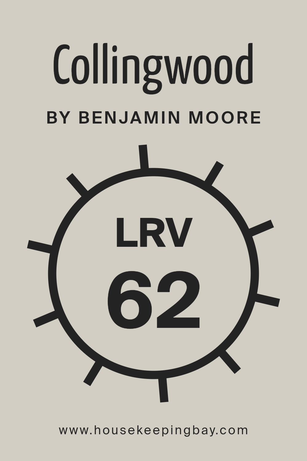
What is the LRV of Collingwood OC-28 by Benjamin Moore?
LRV, or Light Reflectance Value, measures the percentage of light a paint color reflects. It ranges from 0 to 100, where 0 is absolute black, reflecting no light, and 100 is pure white, reflecting all light. LRV helps in understanding how light or dark a color might appear once applied to walls.
The higher the LRV, the more light the color reflects, making spaces seem brighter and larger. Conversely, colors with lower LRV absorb more light, making rooms appear smaller and cozier.
For Collingwood OC-28 by Benjamin Moore, with an LRV of 61.52, it’s a mid-range color that reflects a fair amount of light without being overly bright or too dark. This means it can brighten up a room without overwhelming it. Collingwood is a soft, warm gray, which makes it versatile and appealing in various lighting conditions. It can create a balanced and inviting atmosphere, working well in both small and large spaces.
Due to its medium LRV, it manages to maintain its hue without drastic changes when natural or artificial light hits, ensuring consistent color throughout the day.
housekeepingbay.com
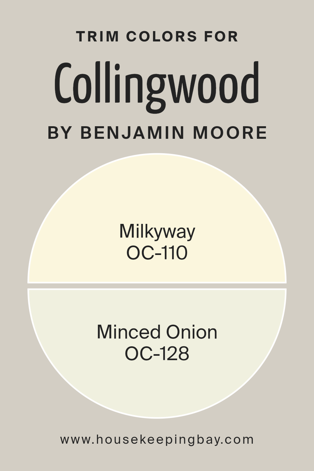
What are the Trim colors of Collingwood OC-28 by Benjamin Moore?
Trim colors play an important role in home design by accentuating architectural details and providing a clean transition between walls and other surfaces. When paired with Collingwood OC-28 by Benjamin Moore, trim colors like OC-110 Milkyway and OC-128 Minced Onion can enhance the room’s overall look.
Milkyway, a soft off-white, brings warmth and subtle brightness, creating a gentle contrast that makes the walls stand out without being harsh. Minced Onion, on the other hand, leans into a creamy hue, adding a touch of sophistication while blending seamlessly with Collingwood’s versatile gray.
Choosing the right trim color is essential because it can change the perception of space, outline features like windows and baseboards, and even affect the room’s mood. For instance, using Milkyway as a trim provides a subtle, inviting frame to Collingwood’s neutral gray, helping define the space.
Meanwhile, Minced Onion adds a hint of depth and richness, enhancing the overall elegance of the room. Both colors not only complement Collingwood OC-28 but also bring out its versatility, making spaces feel cohesive and thoughtfully designed.
You can see recommended paint colors below:
- OC-110 Milkyway
- OC-128 Minced Onion
housekeepingbay.com
Colors Similar to Collingwood OC-28 by Benjamin Moore
Similar colors play an important role in design by creating a cohesive and balanced environment. When you use colors that are close to each other on the color wheel, they harmonize well. For example, Collingwood OC-28 by Benjamin Moore is a versatile, soft gray with a warm undertone, making it a popular choice for both modern and traditional spaces.
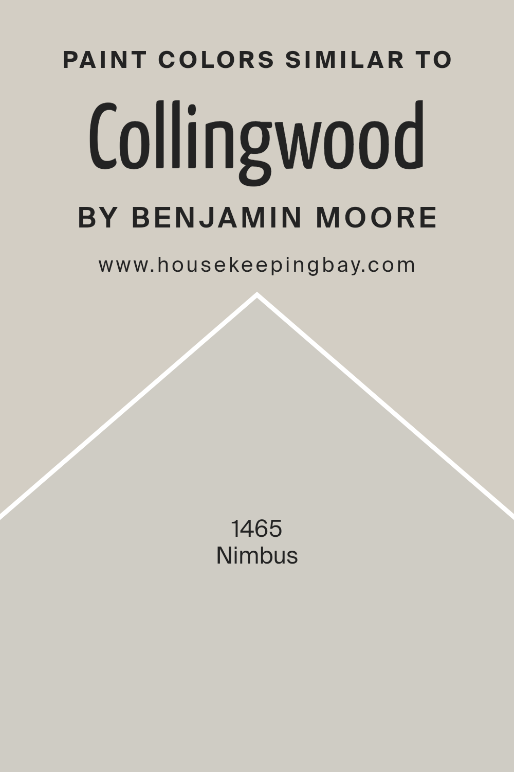
Using similar shades like Nimbus 1465 enhances this harmony. Nimbus is a gentle, cool gray that has a slightly more bluish tint than Collingwood, but still maintains a sense of calm and sophistication. The subtle differences between these colors allow them to complement each other, offering a varied yet unified look.
Utilizing these similar colors in a room helps create a seamless flow and rooted feel. The way Nimbus and Collingwood work together can make spaces appear larger and more open, as the colors transition smoothly from one to another without stark contrasts.
This sense of connection can be particularly effective in multi-room settings, where different walls or accent pieces use these tones to maintain consistency while adding depth.
Together, these shades provide a serene backdrop, allowing the room’s decor and furnishings to shine. In essence, using similar colors helps achieve a stylish, well-balanced interior that feels thoughtfully designed.
You can see recommended paint color below:
- 1465 Nimbus
housekeepingbay.com
How to Use Collingwood OC-28 by Benjamin Moore In Your Home?
Collingwood OC-28 by Benjamin Moore is a popular paint color choice for home interiors. This neutral shade pairs a warm-gray hue with subtle undertones of beige. Its versatility makes it a great option for various spaces.
In the living room, Collingwood creates a comfortable and inviting atmosphere that works well with both modern and traditional decor. Its soft tone allows for easy matching with colorful furnishings or accent pieces.
In the bedroom, Collingwood provides a soothing backdrop conducive to relaxation. Pairing it with crisp white trim can give the room a clean and fresh look. For a kitchen or dining area, Collingwood complements wood tones and stainless steel, offering a cohesive feel without being overpowering.
Bathrooms also benefit from its calming tone, making them feel larger and open. Overall, Collingwood OC-28’s flexibility makes it a reliable choice throughout the home, adding warmth and sophistication to every space.
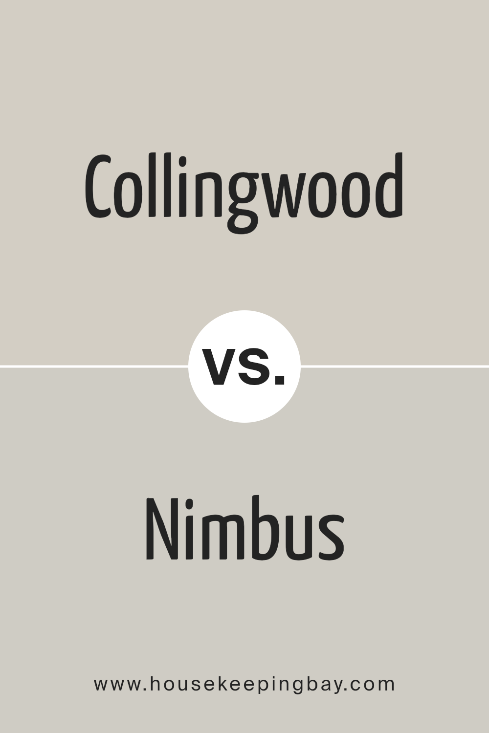
Collingwood OC-28 by Benjamin Moore vs Nimbus 1465 by Benjamin Moore
Collingwood OC-28 and Nimbus 1465, both by Benjamin Moore, offer subtle distinctions suitable for various spaces. Collingwood OC-28 is a light gray with a hint of warmth. This touch of warmth, with faint beige undertones, makes it feel inviting and cozy, perfect for living rooms or bedrooms where you want a gentle ambiance.
Nimbus 1465 is also a gray, but it leans towards a cooler tone. Its undertones include blue and green, making it feel crisp and modern. It’s well-suited for spaces where a fresh and airy environment is desired, such as kitchens or bathrooms.
While both colors are neutral and versatile, Collingwood provides a slightly warmer, more traditional feel. Nimbus, with its cooler undertones, offers a more contemporary look. Choosing between them depends on the mood and style you wish to create in your space. Both shades effectively complement various decor elements.
You can see recommended paint color below:
- 1465 Nimbus
housekeepingbay.com
Conclusion
Collingwood by Benjamin Moore, designated as OC-28, offers a perfect blend of sophistication and versatility in interior and exterior design. When I first applied this neutral hue, I noticed its unique ability to adapt to various lighting conditions, filling spaces with warmth and comfort.
This shade of gray is neither too cool nor too warm, making it an ideal backdrop for any style of decor. I’ve found it pairs beautifully with both bold and subtle accents, allowing for a harmonious balance in any room.
Using Collingwood in different areas of my home, I appreciated its ability to create a calming environment, perfect for lounging or entertaining guests. Its understated elegance doesn’t overshadow the room’s elements but instead subtly enhances them.
While experimenting with different rooms, I observed how it seamlessly complements wood tones and metallic finishes, adding a layer of sophistication to my design.
What impresses me most about Collingwood is its timeless appeal. It works well across various design trends and styles, which means I won’t have to repaint frequently to keep up with changing tastes. Overall, OC-28 brings both elegance and adaptability to my space, making it one of my top choices for a neutral paint.
housekeepingbay.com
Ever wished paint sampling was as easy as sticking a sticker? Guess what? Now it is! Discover Samplize's unique Peel & Stick samples. Get started now and say goodbye to the old messy way!
Get paint samples


