Aesthetic White SW-7035 Color by Sherwin-Williams
A guide that will introduce this beautiful color to you in detail
Most of us think white is a plain and boring color that can’t add life to a room. We tend to believe that rooms painted all white look too sterile and hospital-like. However, this is not true! And today, we are going to prove that to you.
In this article, you will find information about a beautiful white paint color called Aesthetic White by the Sherwin-Williams brand. In particular, we will tell you what kind of white it is, what undertones it has, and how it may react to different types of lighting in your home.
Also, you will learn how to coordinate it correctly and what colors should be used for it. We will explain in what rooms the Aesthetic White color will work best of all, and many more valuable things!
via color regent
What Kind of White Color is Aesthetic White SW-7035?
Table of Contents
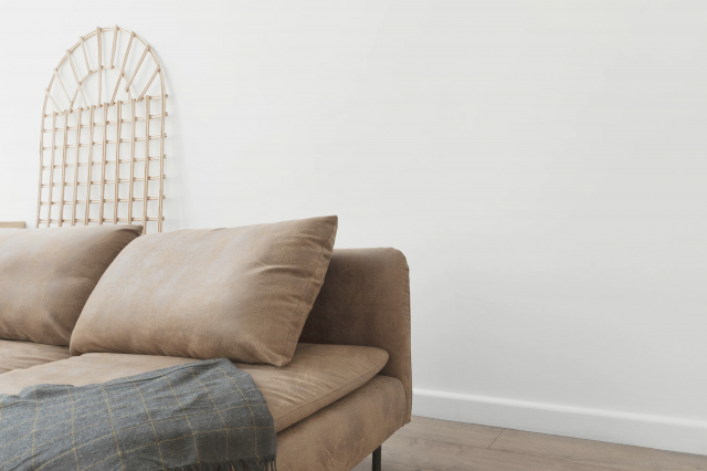
Aesthetic White SW-7035 paint color can be considered the perfect shade of off-white, as Encycolorpedia says. It is warm enough, but it can still brighten up a room in a way only white paint can.
Sherwin-Williams Aesthetic White will bring a calm and relaxed vibe into any space you use it in. And since it is an off-white paint color, it will create an illusion of a larger space. This is why you should definitely consider this white if you need to paint a small room to make it seem bigger!
housekeepingbay.com
Aesthetic White SW-7035 Undertones
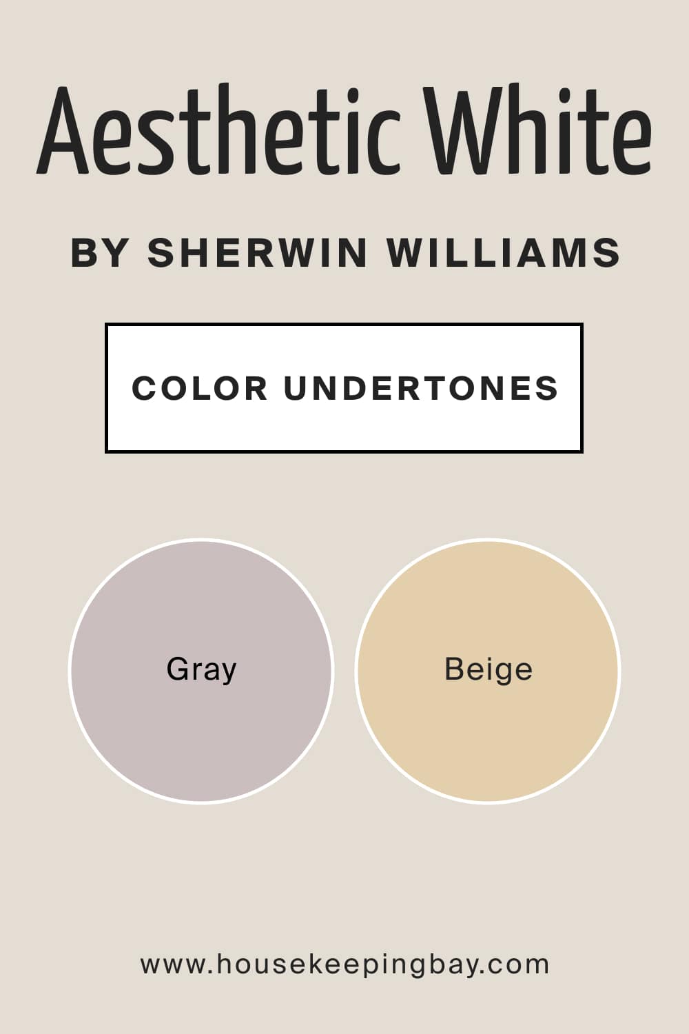
Before you use paint on your walls, you should remember that any color has undertones. Well, almost any. And those undertones can be pretty complex, showing up at the most inappropriate time and place! This is why you should always learn what undertones the color has in advance. This way, you will avoid regretting your color choice later.
Speaking of SW Aesthetic White, this color is a chameleon! Depending upon the lighting in a room and architectural conditions, this white can either look beige or gray! But this is exactly what makes it so challenging because beiges and greiges are known as “shapeshifters” among the colors.
This is why we strongly recommend you use color samples to try them at home to see how exactly this off-white may read in your space since, in different rooms and different lighting, it will definitely look a bit distinct.
housekeepingbay.com
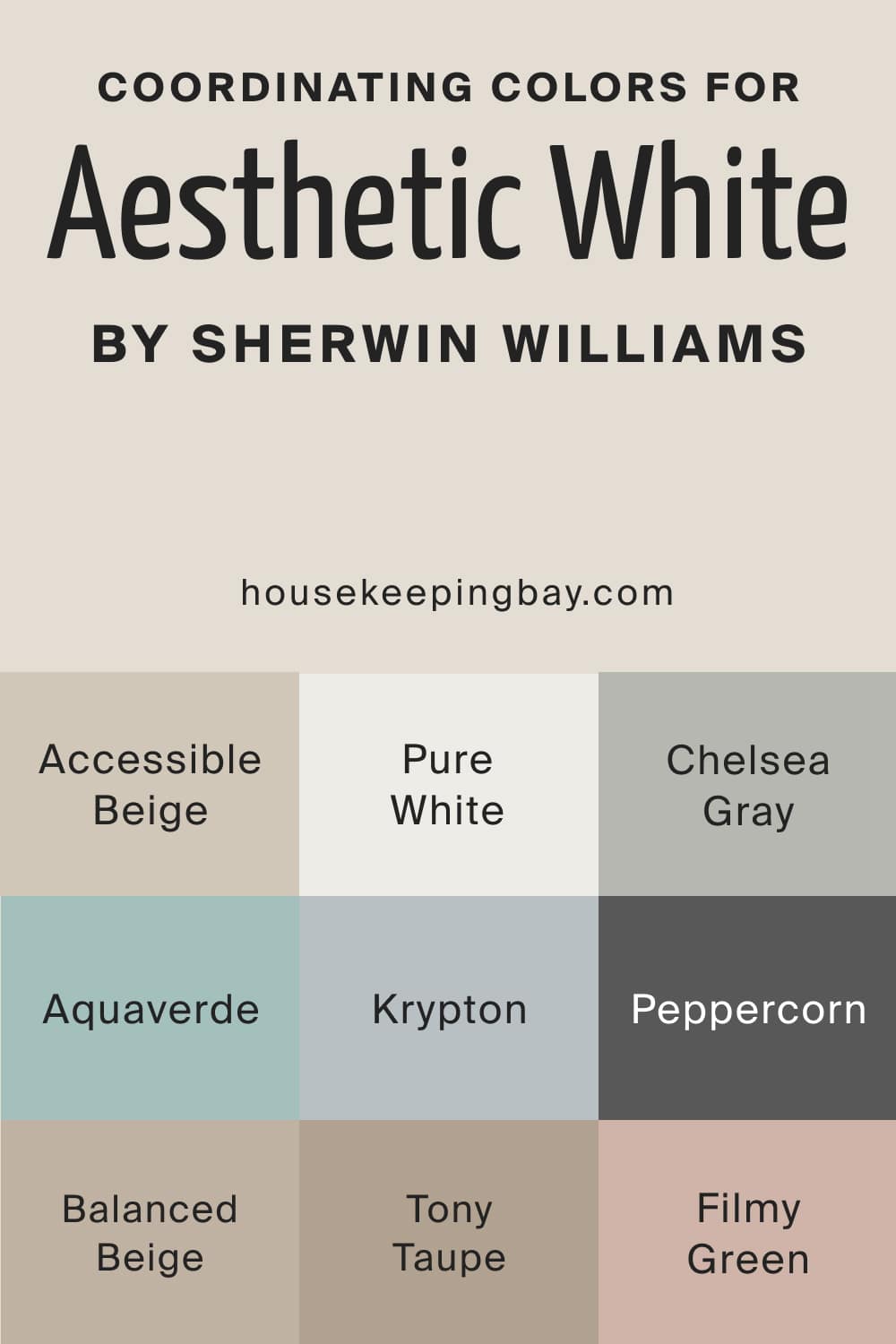
Aesthetic White SW-7035 Coordinating Colors
Coordinating colors help you create a more balanced and eye-pleasing color palette in your home. If you want to use SW Aesthetic White color on your walls, consider these paints as coordinating colors:
- SW Pure White
- SW Chelsea Gray
- SW Aquaverde
- SW Accessible Beige
- SW Balanced Beige
- SW Tony Taupe
- SW Krypton
- SW Peppercorn
- SW Filmy Green
You can use one of them or all three, it depends on your preferences and taste. In any case, they will look fabulous with the Aesthetic White paint.
In general, SW Aesthetic White pairs great with sky blues, lighter teals, lighter or darker grays, lemon yellow, browns, bronze, and sage greens. If you want to add some metallic accents, choose matte black, brushed brass, or even chrome and nickel.
housekeepingbay.com
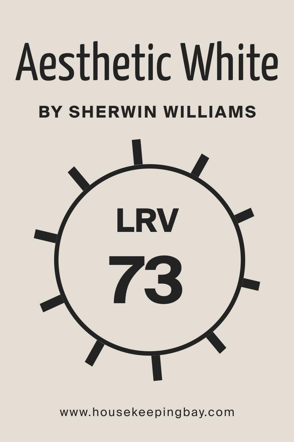
What Is an LRV of Aesthetic White SW-7035?
LRV stands for Light Reflectance Value. This measurement shows how much light a color can reflect when it is applied to the wall. The higher the percentage of the LRV, the lighter the color, and vice versa.
housekeepingbay.com
The LRV of Sherwin-Williams Aesthetic White is 73, which means this white is bright enough, but it will not be glowing on your walls like a lantern! Also, when this white gets in direct contact with natural hitting light, you should expect the undertones to get washed away.
And don’t forget that this paint color will work differently in different lighting conditions. For instance, in the north-facing rooms, it will appear slightly cool and grayish. On the other hand, in the west or south-facing rooms, this white paint color will appear slightly warmer.
housekeepingbay.com
What is LRV? Read It Before You Choose Your Ideal Paint Color
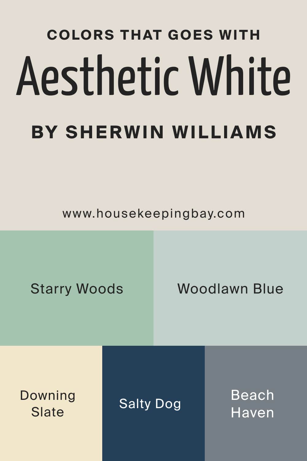
Colors That Go With SW Aesthetic White Color
To create a stylish and balanced color scheme in your home, you should be able to combine paint colors respectively, depending on their undertones, LRVs, and other factors that matter. Below, we have prepared a list of paint colors that you can use with the Aesthetic White paint color, and be sure that they will work together.
- SW Downing Slate
- SW Salty Dog
- Beach Haven
- Starry Woods
- SW Woodlawn Blue
housekeepingbay.com
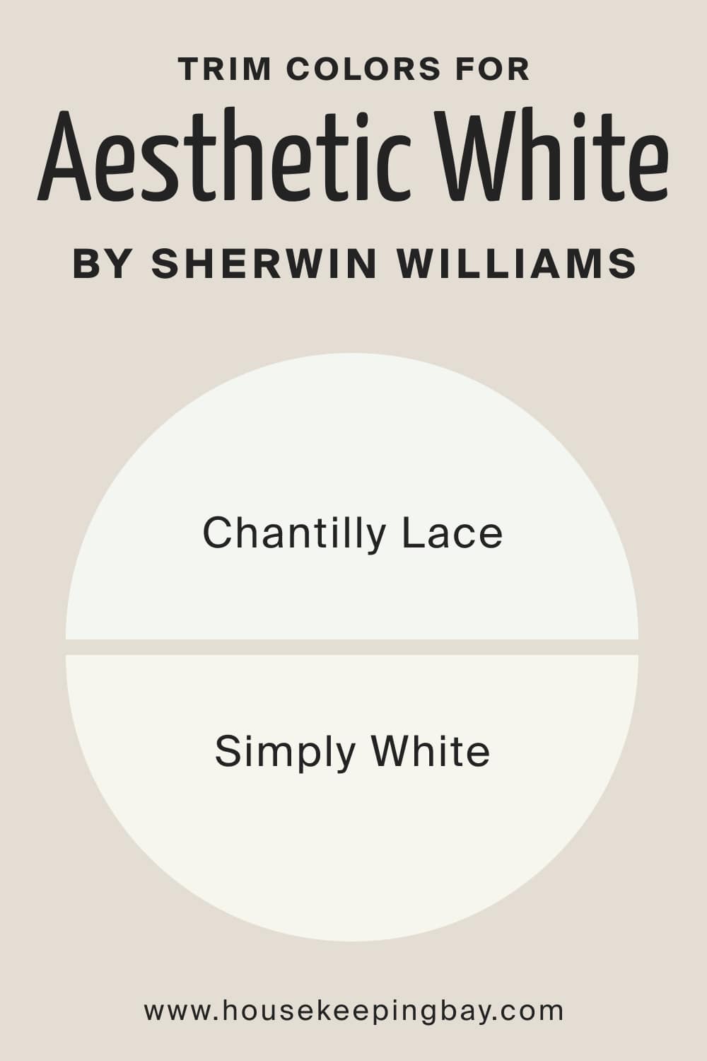
What Is the Best Trim Color of Aesthetic White SW-7035 ?
White is a traditional trim color that can be used with any color on the walls. And since SW Aesthetic White is soft and warm enough, you should use a brighter and lighter white but not too stark. Stick to warmer whites without the yellow hue, for example:
housekeepingbay.com
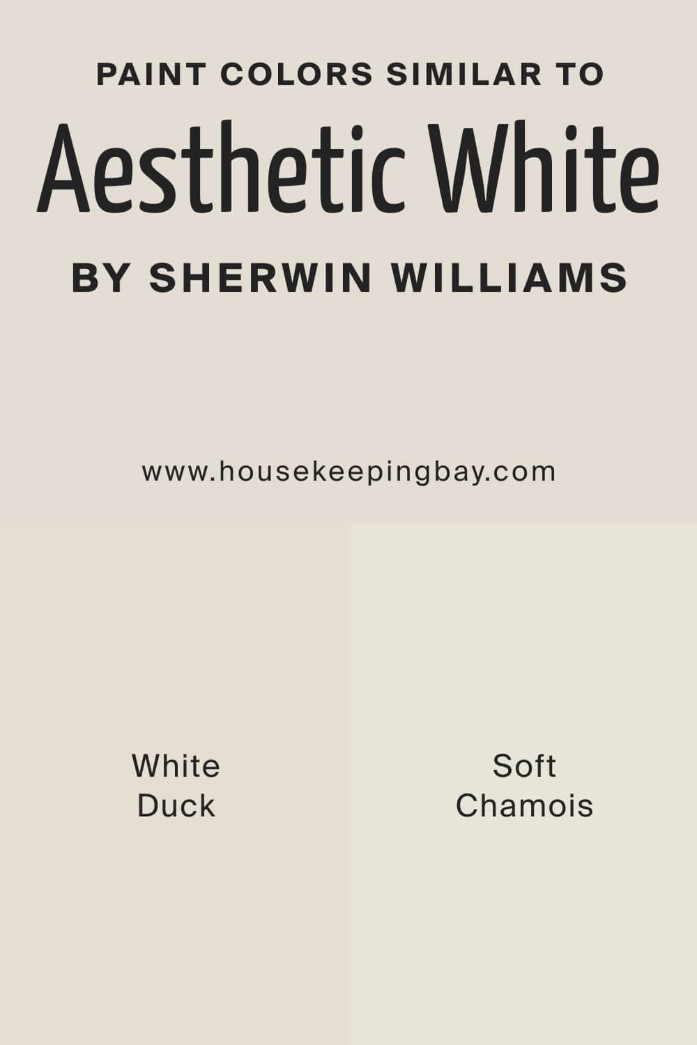
Similar Colors to Use Instead Of Aesthetic White SW-7035
Even if you are sure you want this particular white on your walls, you should still have a couple of substitute colors to use instead of it. This will help you to choose the right shade of white in case you decide that the existing one is not quite suitable. For SW Aesthetic White paint color, the following ones can be sued as similar colors:
- SW White Duck
- SW Soft Chamois
housekeepingbay.com
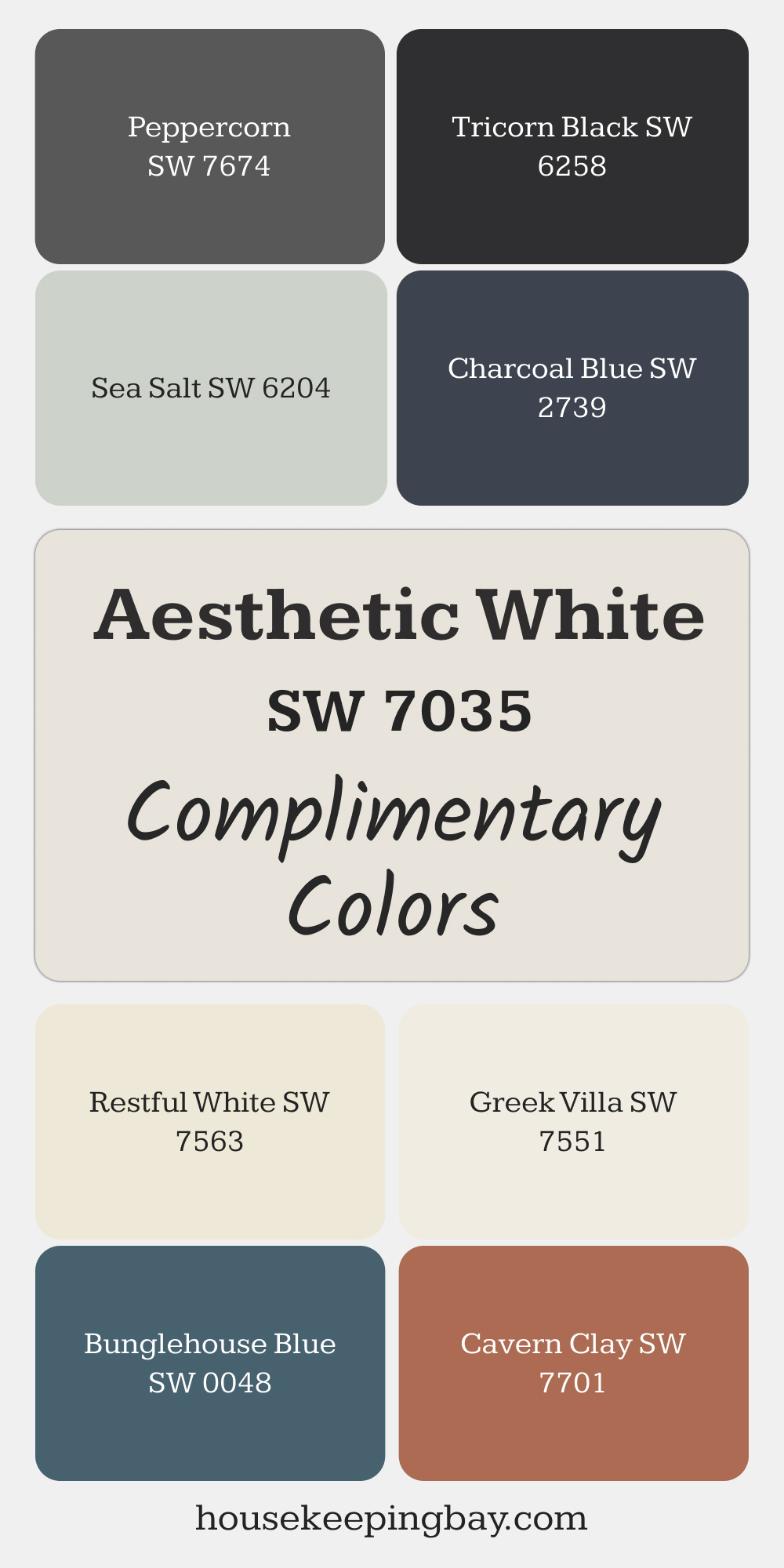
Best Complimentary Colors for Aesthetic White SW 7035
Aesthetic White SW 7035 by Sherwin Williams is a gentle off-white with just enough warmth to feel inviting without leaning yellow or beige. It’s easy to use in different rooms and styles, and it benefits from well-matched supporting colors. Below is a handpicked list of shades that work beautifully with it, whether you’re planning a full palette or just need accent ideas.
Peppercorn SW 7674 is a deep graphite that adds contrast and definition next to the softness of Aesthetic White.
Tricorn Black SW 6258 offers a rich black perfect for accents like doors or furniture, bringing clarity to the palette.
Sea Salt SW 6204 brings a gentle, cool green-gray touch that adds a fresh, calming feel.
Charcoal Blue SW 2739 is a dark, muted blue with gray undertones that complements furnishings and décor elements.
Restful White SW 7563 is a creamy light shade that enhances the light and airy feel of the space.
Greek Villa SW 7551 offers another warm white option that supports a cohesive, welcoming look.
Bunglehouse Blue SW 0048 is a deep, muted blue-green that adds balance and interest through textiles or cabinetry.
Cavern Clay SW 7701 is a warm terracotta tone that stands out beautifully against soft whites and brings coziness to the mix.
Where In Your Home to Use Aesthetic White SW-7035 Paint?
Although white is considered a universal color, it doesn’t mean you can use it anywhere in your home with the same significant effect! Depending on undertones and lighting, different shades of white may read differently and work differently in various rooms and areas of your home.
This is why we recommend you check out how SW Aesthetic White will read in your home, depending on the room it’s used in.
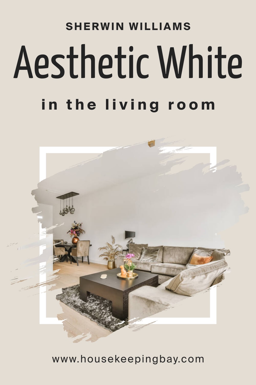
Aesthetic White SW-7035 in the Living Room
SW Aesthetic White can give your living room a perfect modern vibe. Since it is a warm white, it will make your space feel warmer, cozier, and brighter. Generally, SW Aesthetic White works best with gray and beige upholstery and other decorative accessories of these colors.
housekeepingbay.com
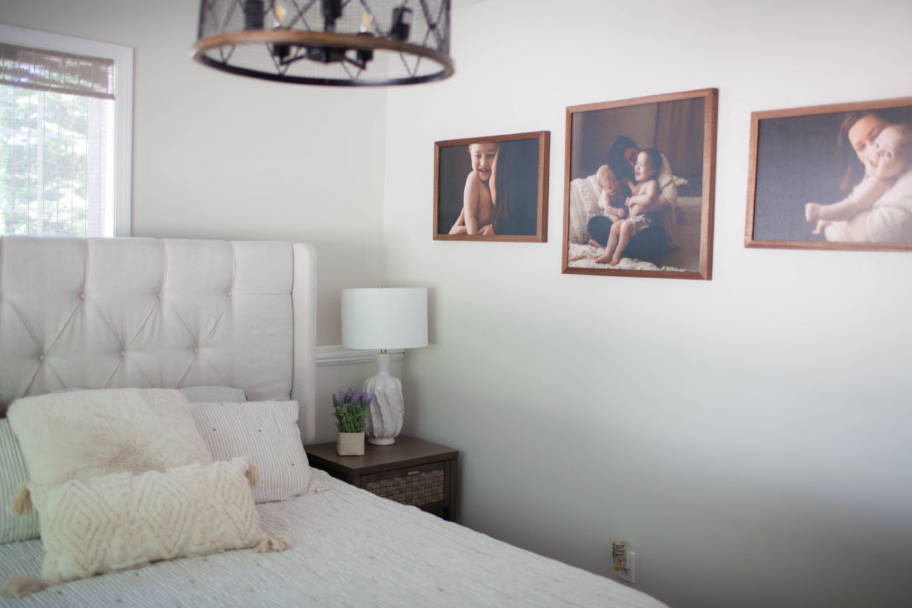
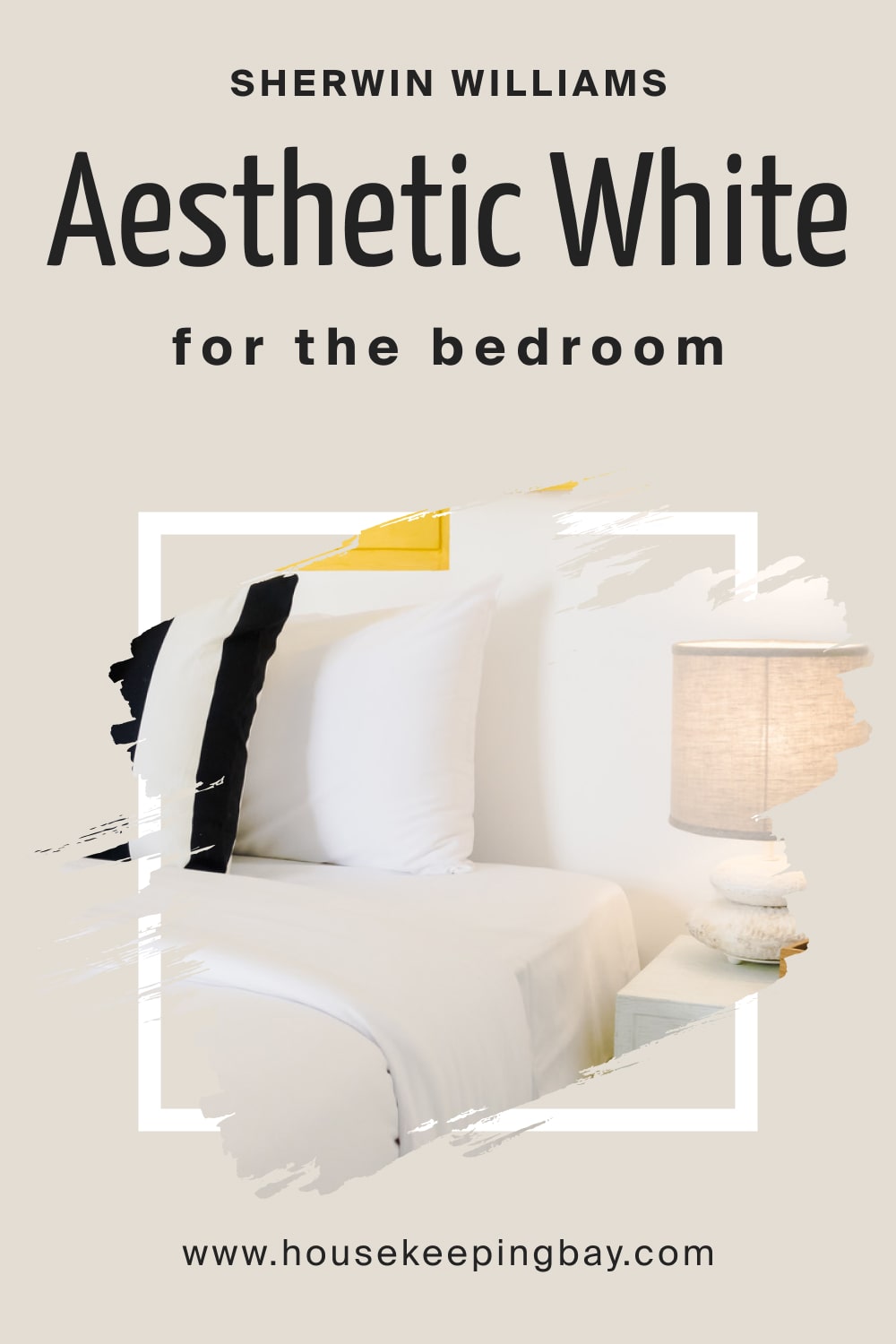
Aesthetic White SW-7035 and Bedroom
This off-white color will look lovely on the walls of your bedroom. Of course, you might want to add some color to the room not to make it look boring! You can add contrast and make the space read visually interesting and varied by using shades of dark gray, blue, or dark green on the throw pillows, artwork, or rugs.
Faux fur, woven materials, and indoor plants will also be successful solutions.
housekeepingbay.com
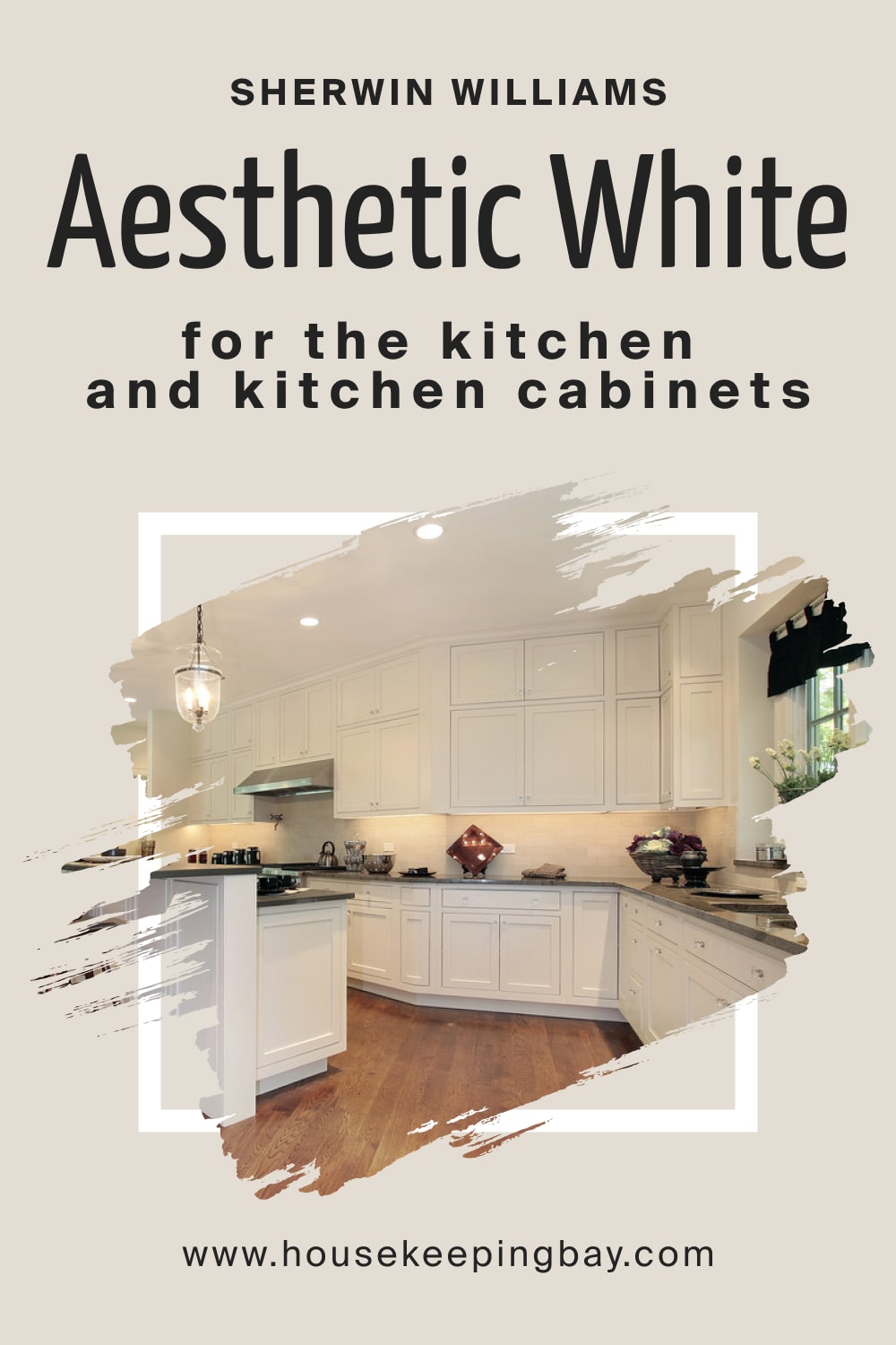
Aesthetic White SW-7035 for the Kitchen
SW Aesthetic White will always be trendy in kitchens. It will create a warm and welcoming atmosphere, making your kitchen feel lighter, airier, and brighter. If you have brass, matte black, or chrome knobs and pull handles in your kitchen, they will look great with this white!
For your backsplash, you can either choose a contrasting emerald green or deep blue tile, but something subtle like off-white or beige will also be nice.
housekeepingbay.com
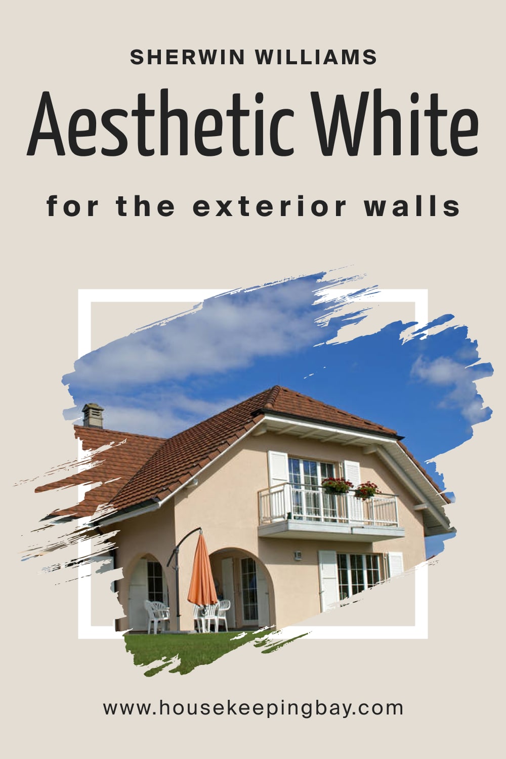
Aesthetic White SW-7035 for the Exterior Use
Since this white color is timeless, feel free to use it on most exterior design styles. It will work particularly well for transitional, farmhouse, Tudor, and classical design styles. Besides, you can always choose this off-white paint color for trims, moldings, and door or window frames.
Now you know the basics about this white color that can help you use it correctly both indoors and outdoors.
housekeepingbay.com
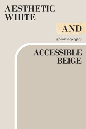
Aesthetic White SW 7035 and Accessible Beige SW 7036
Aesthetic White and Accessible Beige are a perfect pairing for a warm, neutral space. Aesthetic White brings a soft, creamy tone with a hint of warmth, creating a light backdrop that feels both fresh and inviting. Accessible Beige adds a touch of depth and coziness, providing a slightly richer, grounded tone next to Aesthetic White’s soft warmth.
Together, these two colors create a balanced, versatile look that works well in living rooms, bedrooms, or kitchens. Aesthetic White keeps the space light, while Accessible Beige adds dimension and warmth, making this duo ideal for a classic, comfortable atmosphere.
via housekeepingbay.com
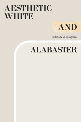
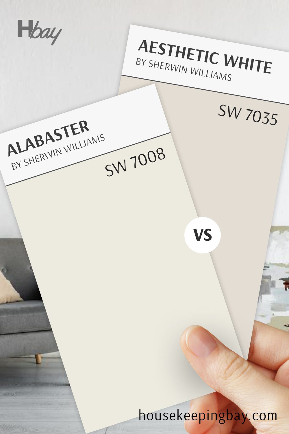
Aesthetic White SW 7035 and Alabaster SW 7008
Aesthetic White and Alabaster make a beautiful combination for those who love soft, light neutrals. Aesthetic White has a touch of beige, giving it a hint of warmth that pairs seamlessly with Alabaster’s creamy, inviting white. Together, they create a clean, subtle look with just enough contrast to keep the space interesting.
Alabaster works well as a trim color or on cabinets, adding brightness without starkness against Aesthetic White’s gentle tone.
This pairing is ideal for creating an open, airy feel in spaces like bedrooms, bathrooms, or any room where a fresh, relaxed vibe is desired.
via housekeepingbay.com
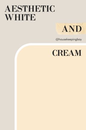
Aesthetic White SW 7035 and Cream
Pairing Aesthetic White with a Cream color brings a warm, inviting look that feels cozy and bright. Aesthetic White, with its subtle warmth, creates a balanced, neutral foundation, while cream adds a touch more warmth, creating a harmonious and soft palette.
This combination is perfect for spaces where you want a comfortable, calming ambiance, such as living rooms or bedrooms. Together, Aesthetic White and cream make a versatile, timeless pair that works beautifully in traditional and modern settings alike.
via housekeepingbay.com
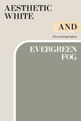
Aesthetic White SW 7035 and Evergreen Fog SW 9130
Aesthetic White and Evergreen Fog create a serene, nature-inspired look that feels both fresh and grounding. Aesthetic White offers a warm, neutral background that complements the earthy green-gray tones of Evergreen Fog, resulting in a balanced and calming palette.
Evergreen Fog adds depth and an organic feel, making this pairing perfect for bedrooms, living rooms, or even entryways where a tranquil vibe is desired. Together, they bring a subtle contrast that feels modern yet connected to nature, ideal for creating a peaceful, welcoming space.
via housekeepingbay.com
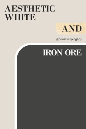
Aesthetic White SW 7035 and Iron Ore SW 7069
Aesthetic White and Iron Ore create a striking contrast that feels elegant and modern. Aesthetic White’s soft, warm undertones provide a light, neutral background, which pairs beautifully with the bold, deep tones of Iron Ore. This combination is perfect for those looking to add a bit of drama without overwhelming the space.
Iron Ore can be used as an accent wall or on cabinetry to ground Aesthetic White’s lightness.
This duo is ideal for creating a balanced look, with Aesthetic White bringing softness and Iron Ore adding depth, making it a great choice for modern, sophisticated interiors.
via housekeepingbay.com
Aesthetic White SW 7035 and Navy Blue
Aesthetic White and Navy Blue bring a timeless and refined pairing that feels both fresh and bold. Aesthetic White’s warm neutral tone complements Navy Blue’s deep, rich color, creating a striking contrast that adds sophistication to any space.
Navy Blue works well as an accent color, adding depth and interest, while Aesthetic White keeps the look light and airy.
This combination is ideal for bedrooms, dining rooms, or living areas where a classic, polished look is desired, bringing a perfect balance of brightness and depth.
Comparing SW Aesthetic White With Other Whites
This brief comparative guide will help you see how different shades of white may work together and what makes seemingly the same color look so distinct. This way, you will train your perception and imagination to be able to tell the difference between distinct shades of white in the future.
Aesthetic White SW 7035 vs Alabaster SW 7008
Aesthetic White and Alabaster are two soft whites with subtle differences in warmth. Aesthetic White has a touch of beige, giving it a slightly warmer feel, while Alabaster leans more toward a creamy, inviting white that feels soft but not overly warm.
These colors work beautifully as neutrals, with Aesthetic White offering a more balanced, light greige undertone and Alabaster providing a gentle warmth. The choice between them depends on whether you prefer a hint of beige or a slightly creamier white for your space.
housekeepingbay.com
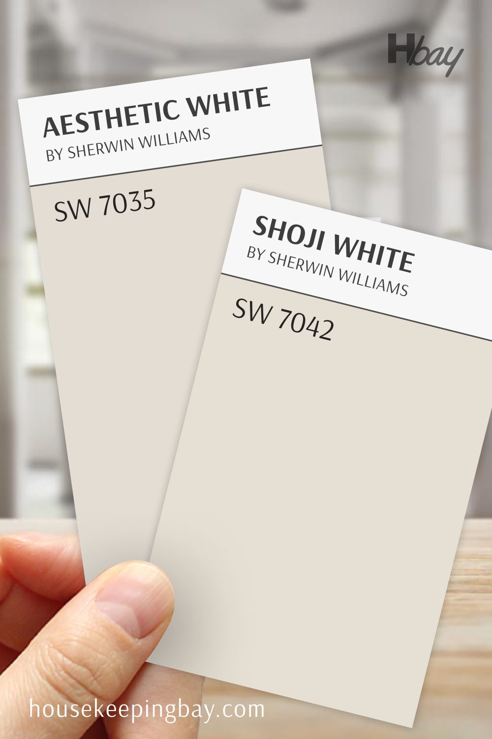
Aesthetic White SW 7035 vs Shoji White SW 7042
Aesthetic White and Shoji White are both warm neutrals that bring softness to a room, with subtle differences in undertone. Aesthetic White leans more neutral with a touch of beige, while Shoji White has a slightly warmer, creamy undertone, adding a touch more coziness.
Both colors create a warm, welcoming atmosphere, with Shoji White giving a bit more warmth. Together, they provide a choice between a balanced, soft white and a warmer, more inviting tone, perfect for different styles and lighting.
housekeepingbay.com
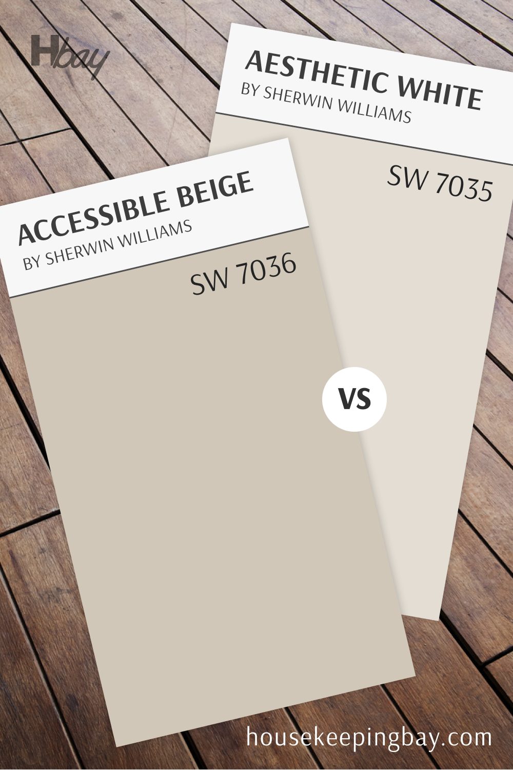
Accessible Beige SW 7036 vs Aesthetic White SW 7035
Accessible Beige and Aesthetic White are two warm neutrals that offer different levels of depth and warmth. Accessible Beige is a warm beige with a subtle greige undertone, making it feel cozy and grounded. Aesthetic White, in contrast, is a light, warm white with a hint of beige, giving it a brighter, softer look.
Accessible Beige is ideal for creating a warm, comforting space, while Aesthetic White provides a more airy, light feel. Together, these colors offer options for those looking to create a cozy ambiance or a brighter, softer look in their home.
housekeepingbay.com
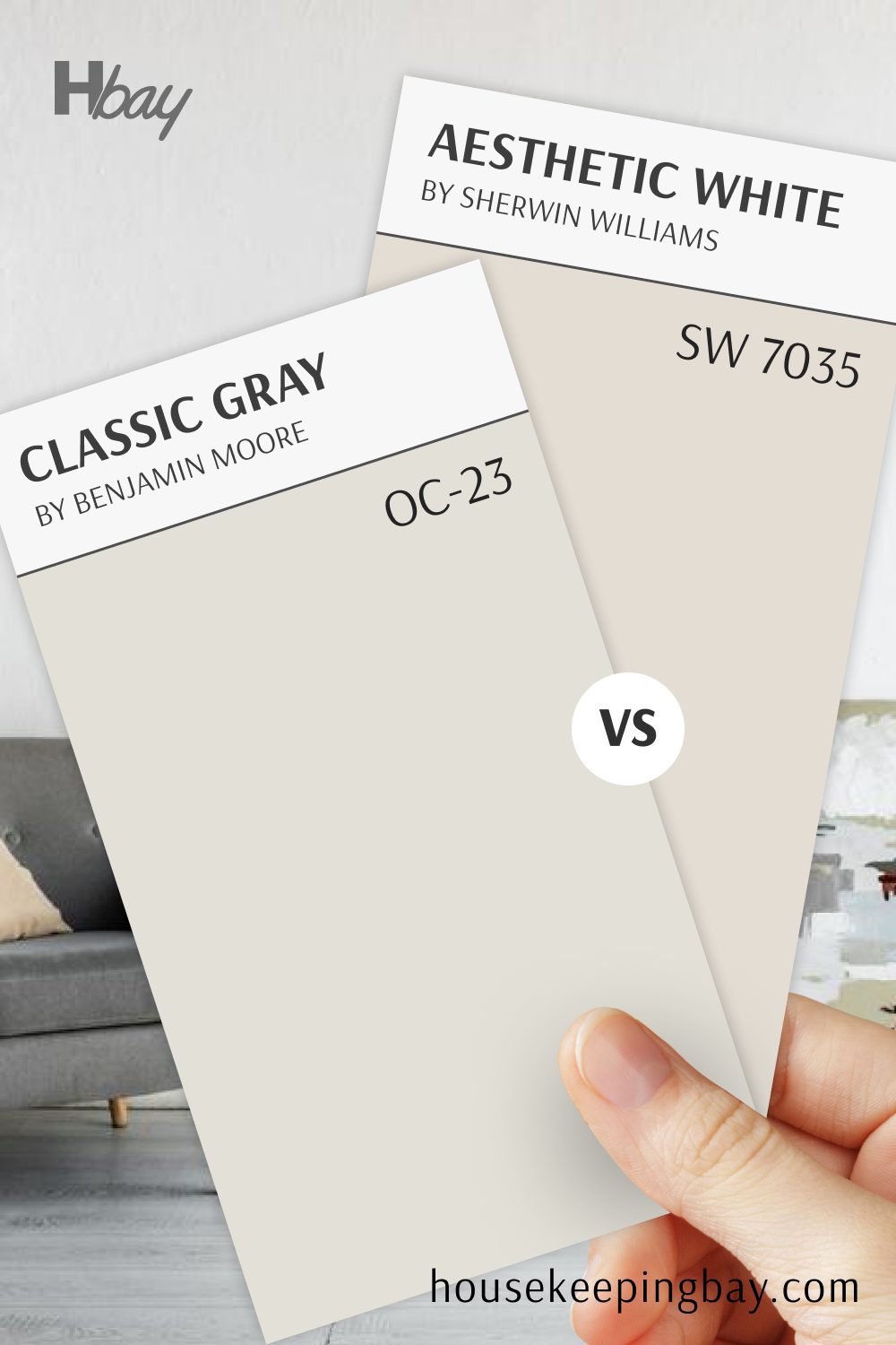
Aesthetic White SW 7035 vs Classic Gray OC-23
Aesthetic White and Classic Gray bring two unique takes on soft neutrals. Aesthetic White has a warm beige undertone, giving it a gentle warmth, while Classic Gray by Benjamin Moore is a light, cool gray with just a hint of warmth, creating a soft, balanced look.
Classic Gray offers a slightly cooler, more modern feel, while Aesthetic White brings a bit more warmth, making it feel inviting and cozy. Both colors are versatile neutrals, perfect for spaces where you want a light, soft background without strong undertones.
housekeepingbay.com
Aesthetic White SW 7035 vs Dover White SW 6385
Aesthetic White and Dover White are both warm whites, but they each bring different levels of warmth to a room. Aesthetic White has a touch of beige, giving it a soft, balanced feel, while Dover White is creamier with a hint of yellow, adding a warmer, more inviting glow.
Dover White works well in spaces where you want a cozy, sunlit look, while Aesthetic White offers a more subtle warmth. Together, they give you a choice between a softer, more neutral white and a creamier, cozy option.

housekeepingbay.com
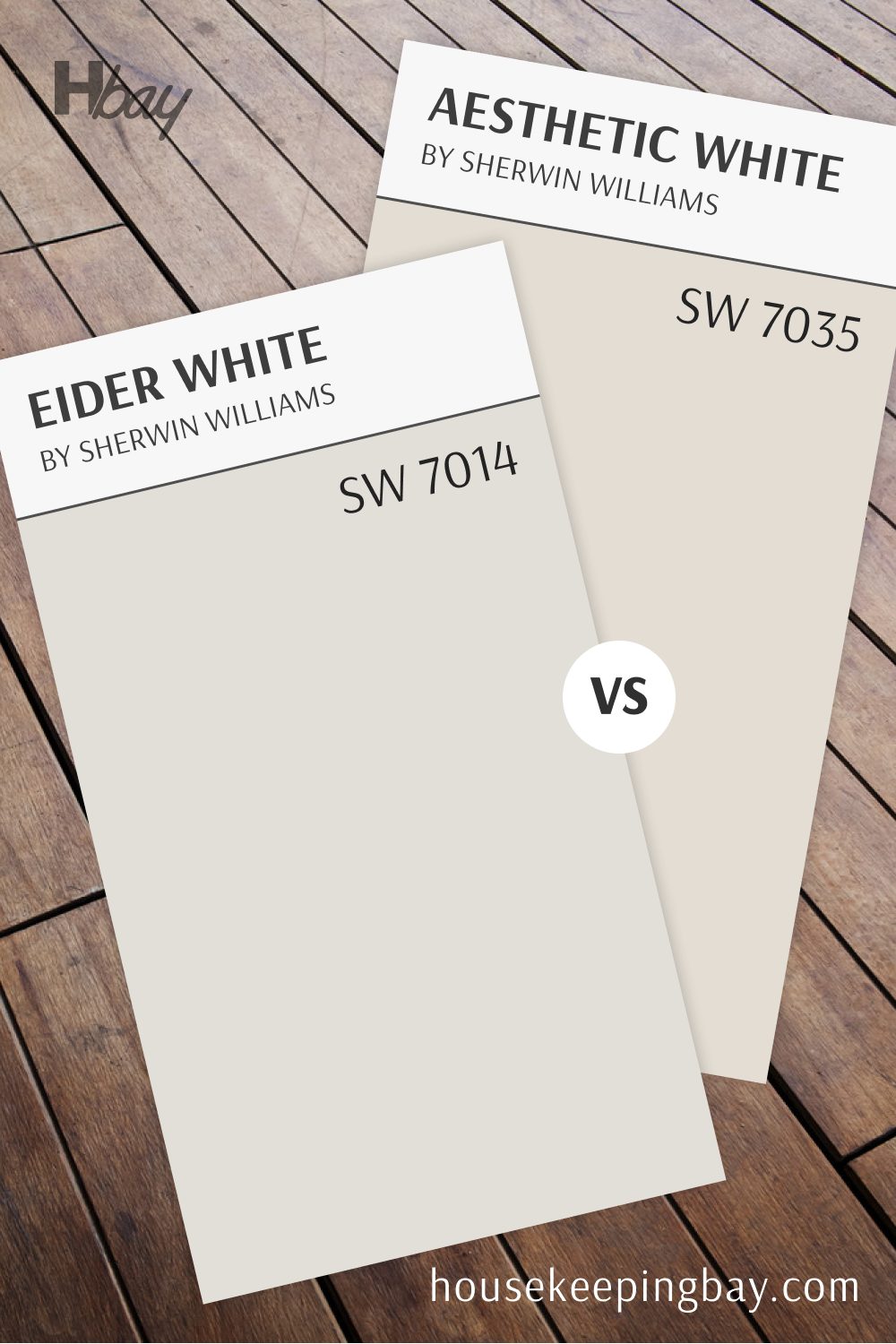
Aesthetic White SW 7035 vs Eider White SW 7014
Aesthetic White and Eider White both bring a soft, subtle color to a space, with distinct undertones. Aesthetic White has a warm beige undertone, making it feel cozy and inviting. Eider White, on the other hand, has a slight gray undertone that adds a cooler, more modern look.
Eider White is ideal for spaces needing a touch of coolness, while Aesthetic White offers gentle warmth.
Together, they provide options for different vibes, with Aesthetic White creating a cozy atmosphere and Eider White bringing a crisp, modern feel.
housekeepingbay.com
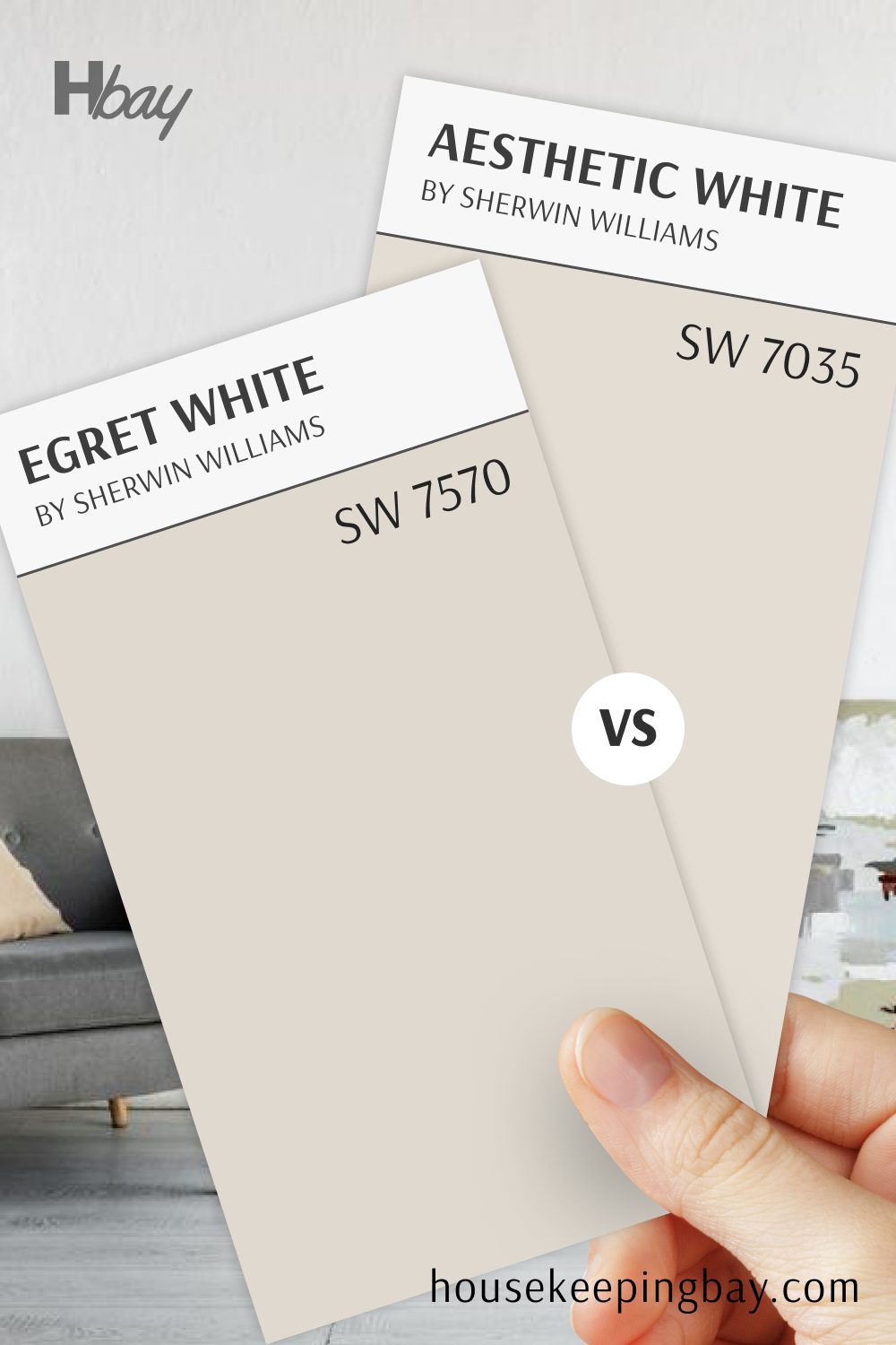
Aesthetic White SW 7035 vs Egret White SW 7570
Aesthetic White and Egret White both bring warmth to a space, but each has a unique undertone. Aesthetic White leans slightly more beige, giving it a soft, balanced warmth, while Egret White has a subtle pink undertone, adding a hint of warmth with a unique softness.
These colors are versatile and adaptable, with Egret White offering a bit more warmth. Together, they provide a choice between a soft beige-neutral and a slightly warmer tone, ideal for any style.
housekeepingbay.com
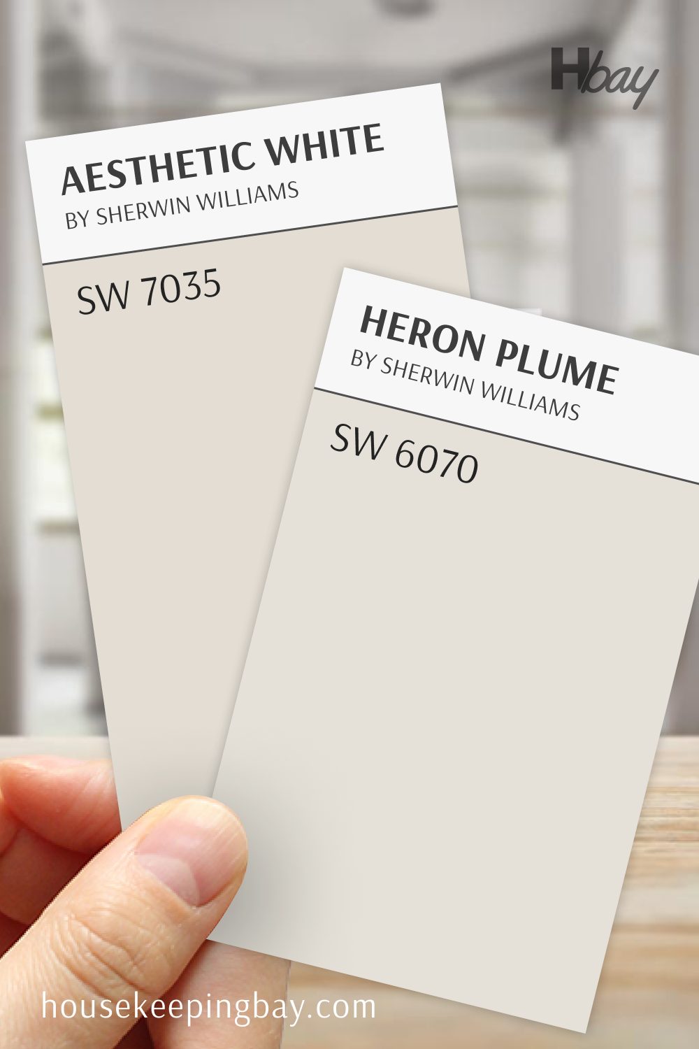
Aesthetic White SW 7035 vs Heron Plume SW 6070
Aesthetic White and Heron Plume are warm, neutral tones that each bring a subtle sophistication. Aesthetic White has a beige undertone, making it feel cozy and balanced, while Heron Plume leans more toward a light, creamy gray.
Heron Plume provides a cool, understated elegance, while Aesthetic White adds a touch of warmth. The choice between them depends on whether you prefer a cozy, warm feel or a slightly cooler, refined neutral.
housekeepingbay.com
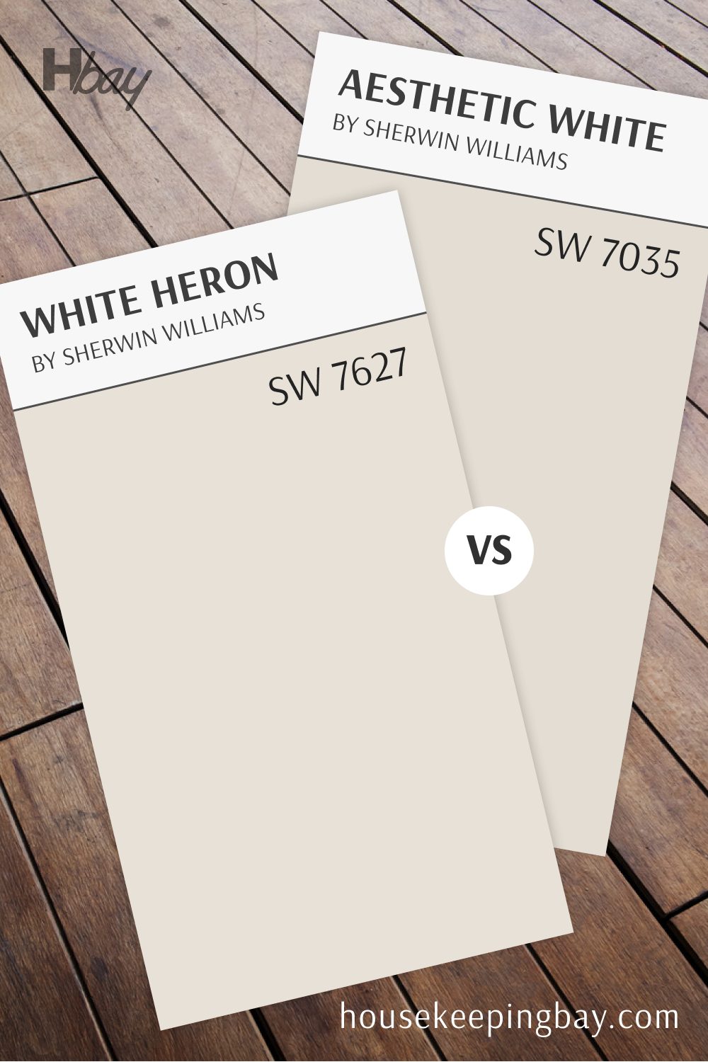
White Heron OC-57 vs Aesthetic White SW 7035
White Heron and Aesthetic White are both light, soft neutrals that bring a fresh look to a room.
White Heron, by Benjamin Moore, is a clean, cool white with a subtle gray undertone, creating a modern, bright feel. Aesthetic White, in contrast, has a warm beige undertone, adding a hint of softness.
White Heron works well for those who want a crisp, cool white, while Aesthetic White offers a slightly warmer, cozy vibe. Both are versatile choices, but they each create distinct atmospheres depending on the desired effect.
housekeepingbay.com
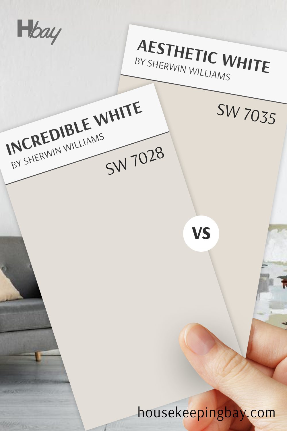
Aesthetic White SW 7035 vs Incredible White SW 7028
Aesthetic White and Incredible White are both soft, warm neutrals that add a light, airy feel to any room. Aesthetic White has a slight beige undertone, while Incredible White leans more toward a soft gray, giving it a slightly cooler appearance.
Incredible White provides a modern, subtle gray tone, while Aesthetic White adds gentle warmth. This choice offers two light neutrals, one with a hint of gray and the other with a soft, warm beige undertone.
housekeepingbay.com
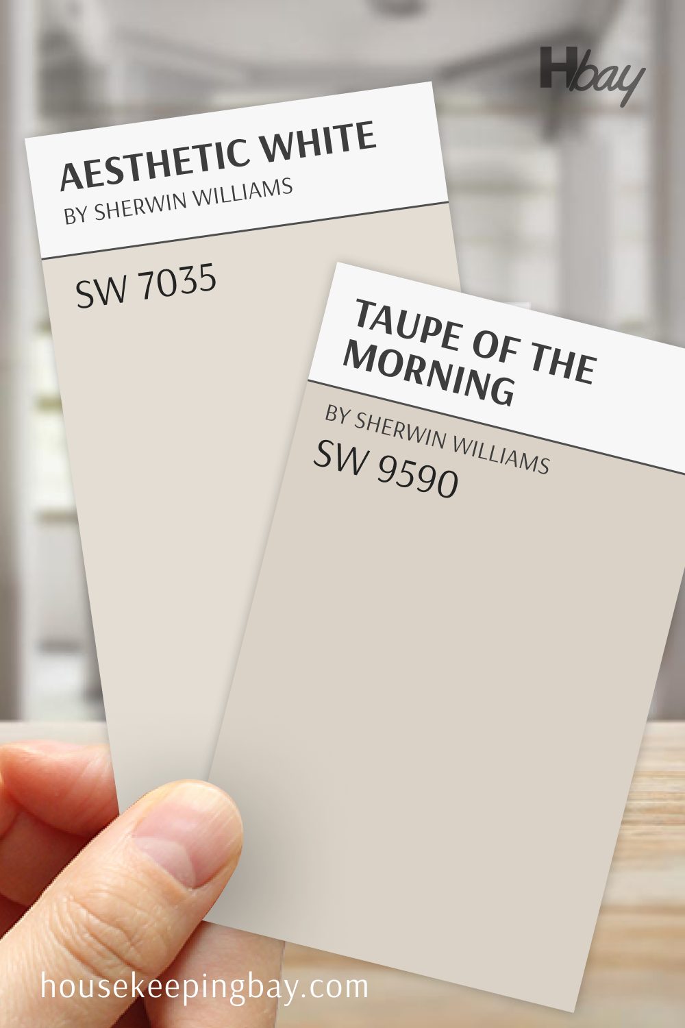
Taupe of the Morning SW 9590 vs Aesthetic White SW 7035
Taupe of the Morning and Aesthetic White are two warm neutrals with different levels of depth. Taupe of the Morning has a soft taupe tone, offering a bit more depth and warmth than Aesthetic White’s subtle beige undertone.
This pairing offers a choice between a slightly richer, taupe-inspired neutral in Taupe of the Morning and a light, versatile tone in Aesthetic White, ideal for creating a cozy, layered look in any space.
housekeepingbay.com
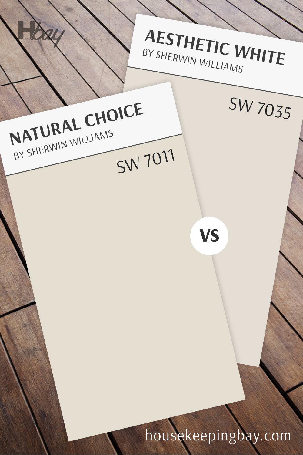
Aesthetic White SW 7035 vs Natural Choice SW 7011
Aesthetic White and Natural Choice are warm neutrals, each bringing a gentle warmth to a room. Aesthetic White has a beige undertone, while Natural Choice has a bit more creaminess, adding a softer, inviting glow.
Natural Choice provides a touch more warmth, making it feel cozier, while Aesthetic White offers a balanced, soft warmth. Together, they create a light and welcoming atmosphere, perfect for traditional and modern spaces.
housekeepingbay.com
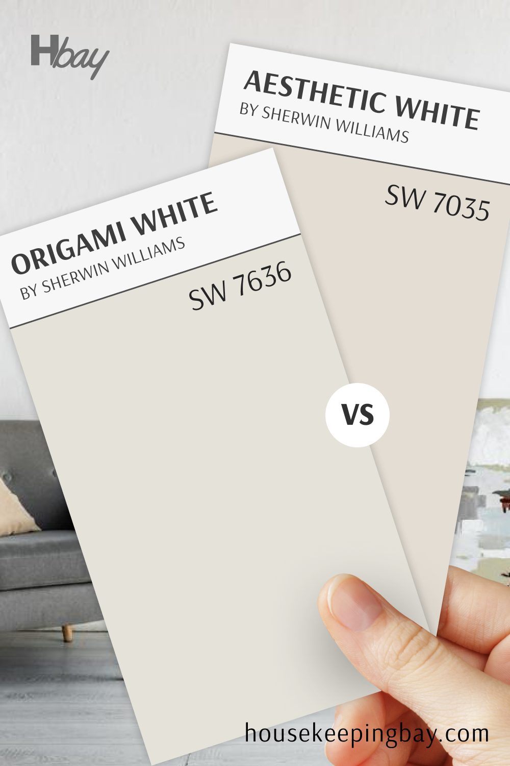
Aesthetic White SW 7035 vs Origami White SW 7636
Aesthetic White and Origami White are both warm neutrals with subtle differences. Aesthetic White has a beige undertone, adding gentle warmth, while Origami White has a hint more gray, giving it a slightly cooler tone.
Origami White is perfect for a modern, understated look, while Aesthetic White adds a bit of softness. Together, they provide a choice between a warm beige-white and a light, cooler tone that can suit any space.
housekeepingbay.com
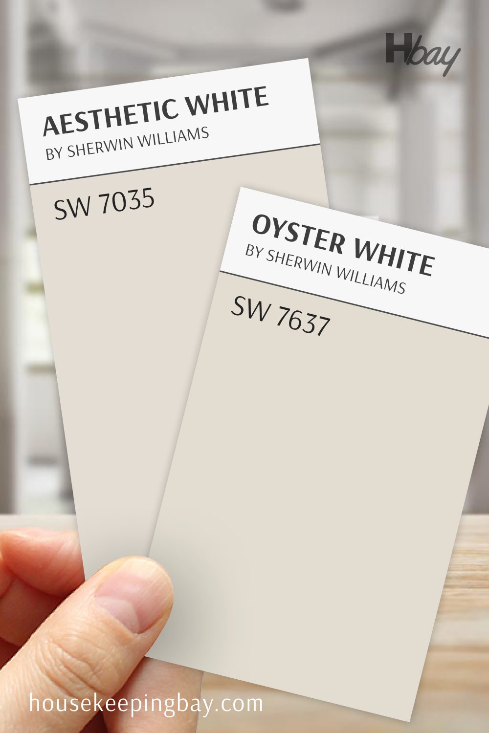
Aesthetic White SW 7035 vs Oyster White SW 7637
Aesthetic White and Oyster White bring warmth with distinct undertones. Aesthetic White has a soft beige undertone, while Oyster White has a creamy, slightly earthy feel, adding a subtle, inviting glow.
Oyster White works well for a cozy, relaxed feel, while Aesthetic White offers a bit more brightness and balance. Together, they bring two warm, neutral options perfect for creating a serene and welcoming space.
housekeepingbay.com
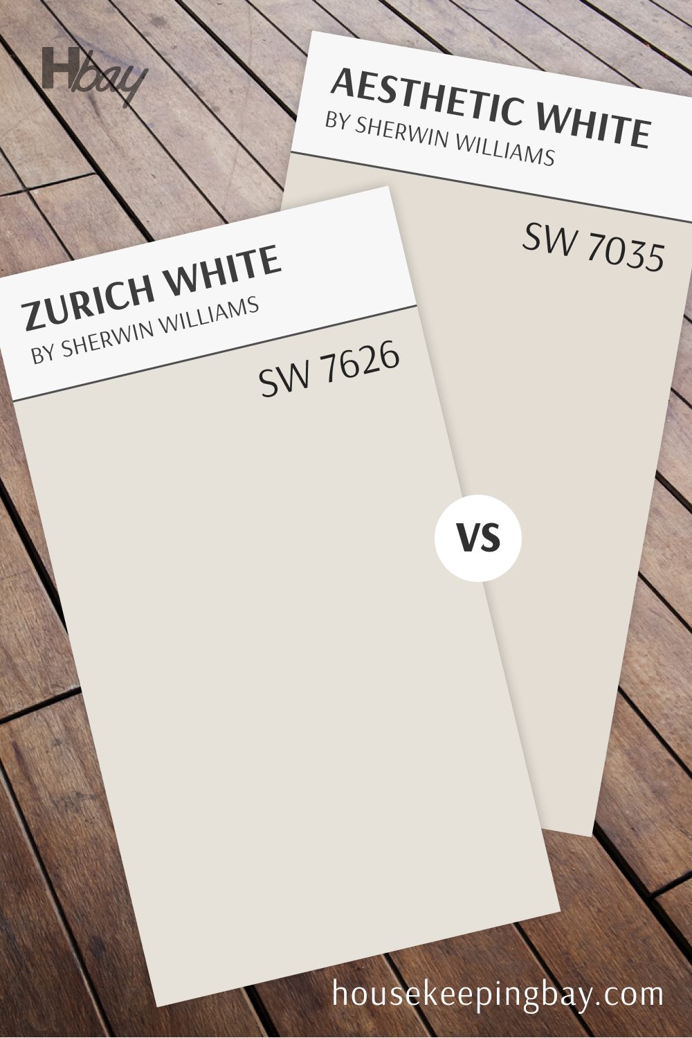
Aesthetic White SW 7035 vs Zurich White SW 7626
Aesthetic White and Zurich White both offer light, neutral warmth, but Zurich White has a slightly cooler undertone. Aesthetic White’s beige warmth feels cozy, while Zurich White leans more toward a soft, light gray, creating a fresh, modern feel.
Zurich White is ideal for a cool, airy look, while Aesthetic White provides gentle warmth.
This pairing is perfect for spaces where you want a light, versatile backdrop with options for both warmth and coolness.
housekeepingbay.com
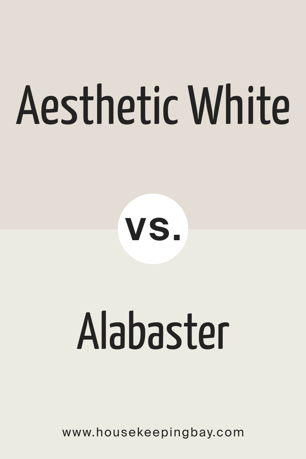
Aesthetic White vs. Alabaster
These colors are soft and warm-toned, but SW Aesthetic White reads more beige than its counterpart. Also, Alabaster is lighter, although it also has beige undertones (which are much lighter). However, these two can be used together since they look pretty well.
housekeepingbay.com
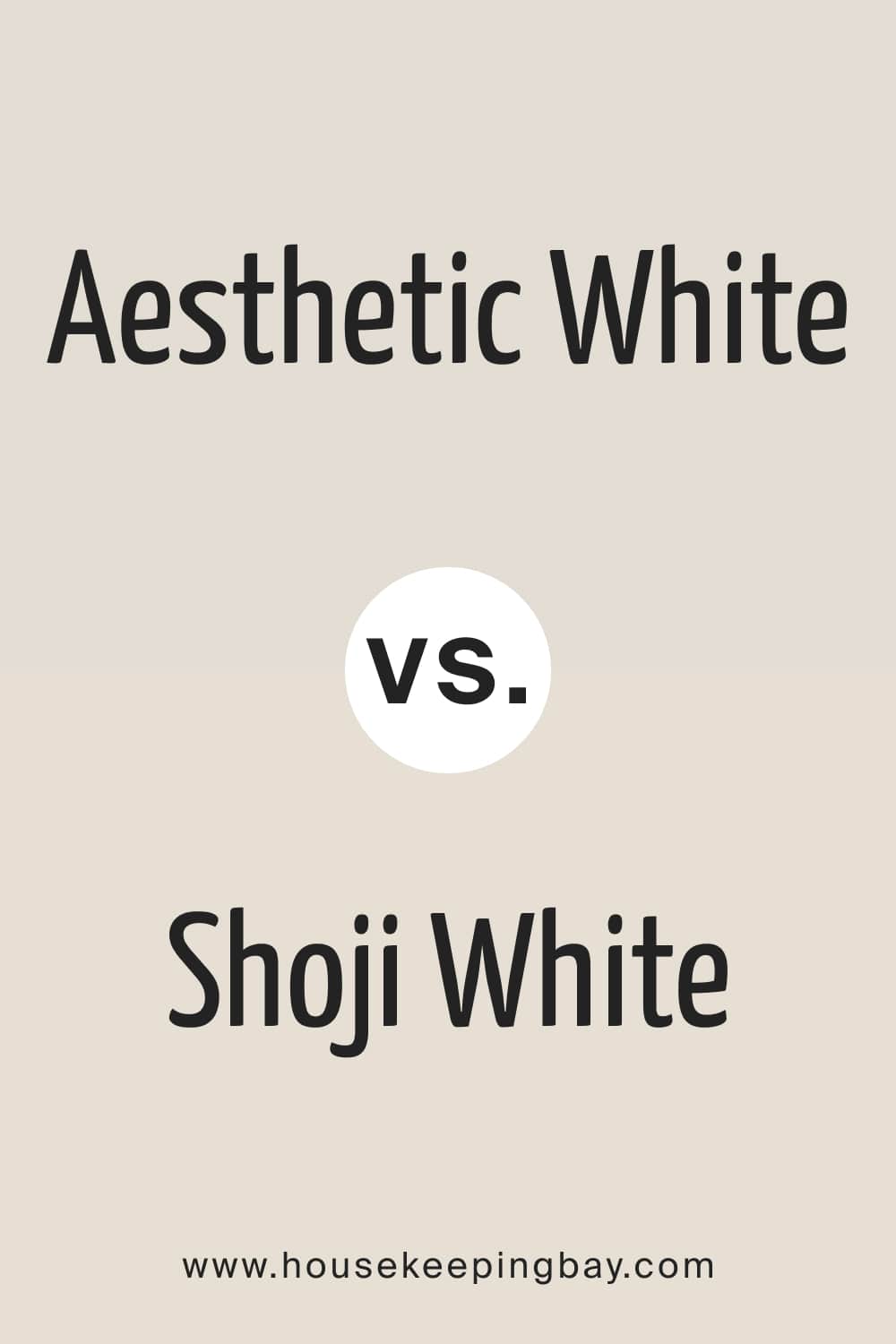
Aesthetic White vs. Shoji White
While Shoji White and Aesthetic White have similarities. They have almost the same LRVs, are warm, neutral paint colors, and both belong to the greige family. However, Shoji White has more beige than Aesthetic White. Also, Shoji White is a bit creamier with a bit more yellow to it.
housekeepingbay.com
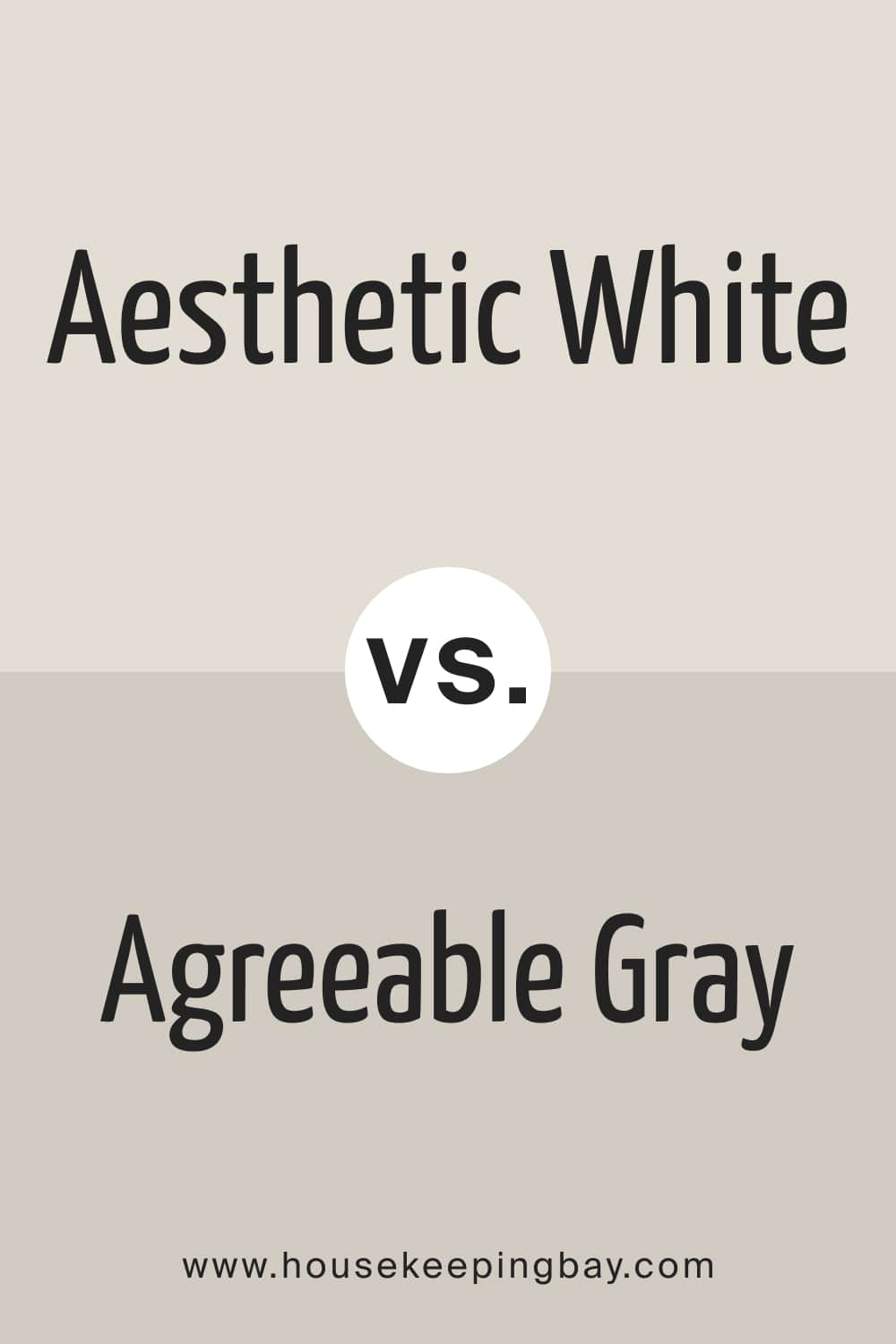
Aesthetic White vs. Agreeable Gray
Agreeable Gray is a warm greige paint color with green undertones. Due to its warmth, it reads deeper and somewhat darker than SW Aesthetic White. Also, Agreeable Gray shows its greenish undertones quite noticeably if you put it side by side with the Aesthetic White paint color.
housekeepingbay.com
Aesthetic White vs. Accessible Beige
The Accessible Beige color is beige with gray undertones . Compared to SW Aesthetic White, it reads darker and warmer, with a pronounced beige hue (looks almost like cocoa!). In comparison, SW Aesthetic White reads grayer next to it.
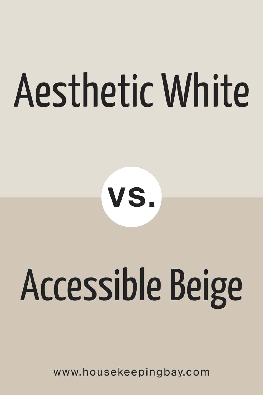
housekeepingbay.com
Aesthetic White vs. Pale Oak
The Pale Oak color by Benjamin Moore can be described as a light greige with warm, yellow undertones. But next to SW Aesthetic White, it’s very hard to notice that yellowness. Instead, the color reads a pronounced greige.
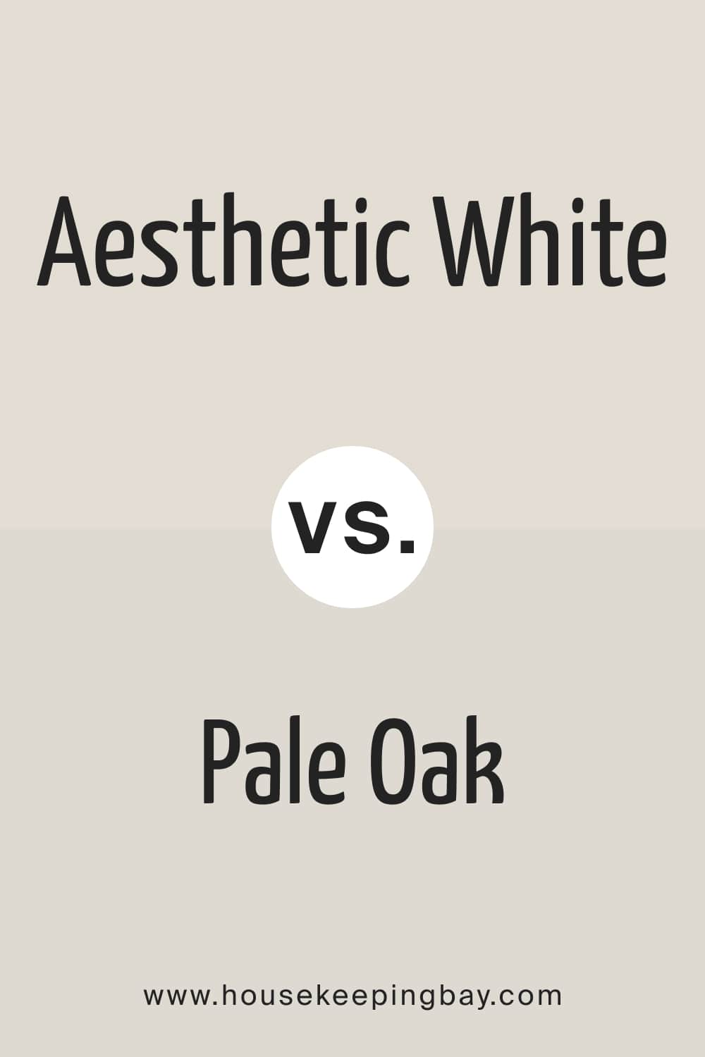
housekeepingbay.com
Aesthetic White vs. Swiss Coffee
Benjamin Moore Swiss Coffee is a warm and welcoming color with slight gray, yellow, and green undertones. Compared to SW Aesthetic White, it reads a bit lighter with a barely noticed green-yellow back.
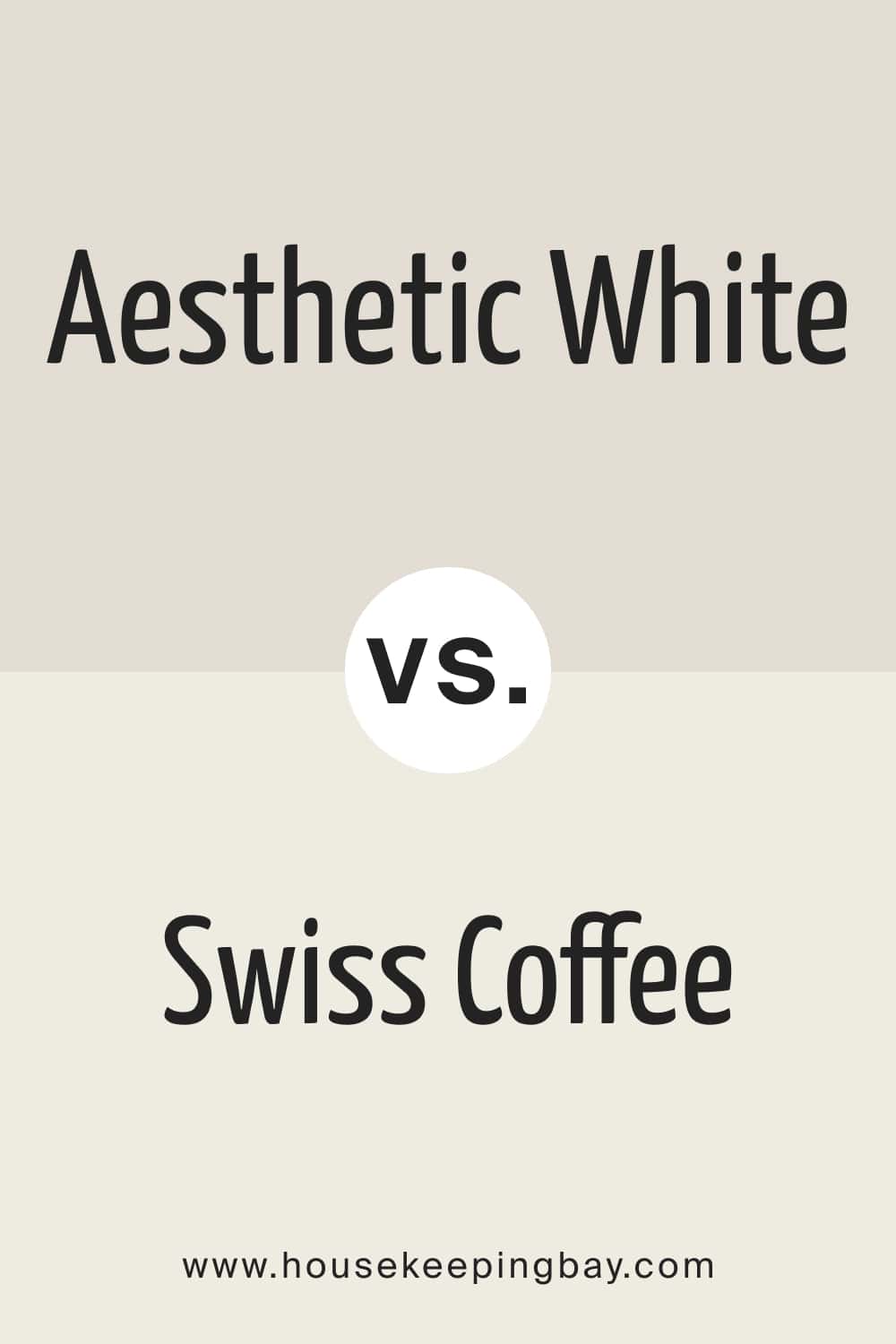
housekeepingbay.com
Well, this is a complete guide on the Aesthetic White paint color by Sherwin-Williams. Now you know what kind of white it is and how to use it in your home correctly to make this color show its beauty and style.
housekeepingbay.com
housekeepingbay.com
Ever wished paint sampling was as easy as sticking a sticker? Guess what? Now it is! Discover Samplize's unique Peel & Stick samples. Get started now and say goodbye to the old messy way!
Get paint samples


Frequently Asked Questions
⭐Does SW Aesthetic White read too warm?
No, it doesn’t. This color is moderately warm and reads nicely on interior walls.
⭐Will SW Aesthetic White work with neutrals?
Yes, this white can work nicely with such neutrals as grays, blues, and greens.
⭐Is Aesthetic White a lighter version of Accessible Beige?
Yes, it is. SW Aesthetic White will be a lighter alternative to Accessible Beige. Its LRV is 73, as compared to Accessible Beige’s 58.
3 thoughts on “Aesthetic White SW-7035 Color by Sherwin-Williams”
Leave a Reply


Hi! Please, help me to solve my problem. See, I painted my kitchen walls with SW Aesthetic White, but now I don’t know what color to use on my backsplash since the furniture is black. Could you recommend a nice and not too contrasting color? Thanks!
Hello. Thank you so much for your articles! They are always informative and contain only the most useful information, without all that bla-bla-bla useless stuff that many paint color blogs have.
Hello! Thanks for your appreciation and warm words! Indeed, some sources have little useful information on the subject. But we are happy that you found the right one for you!