Wind’s Breath OC-24 by Benjamin Moore
A Gentle Whisper of Elegance
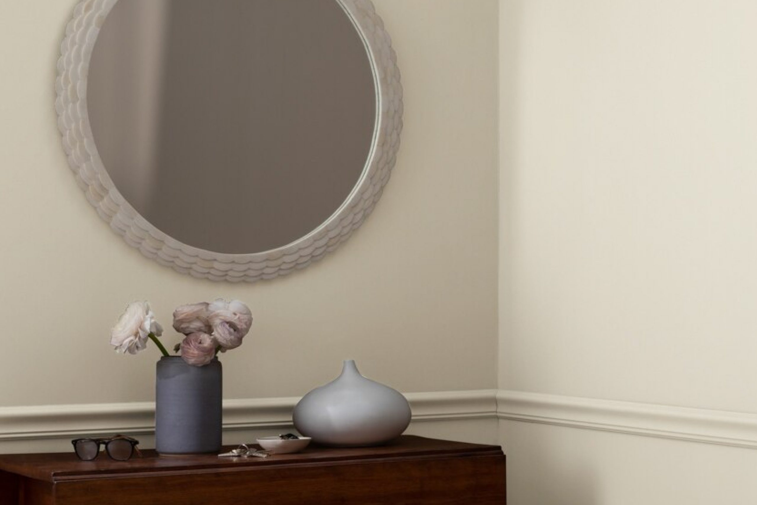
In the world of paint colors, OC-24 Wind’s Breath by Benjamin Moore stands out for its unique qualities. You might notice its subtle tones working perfectly with both modern and traditional decor, making it a great choice for various spaces in your home.
Imagine your living room, bedroom, or kitchen adorned with this color. It has a slightly muted, off-white hue that gives a peaceful and inviting feel. Its versatility means it can create a soothing retreat or serve as a perfect backdrop for your favorite artwork and furniture.
As you consider your color choices, OC-24 Wind’s Breath offers a reliable option. Its understated presence lets other elements shine while maintaining a pleasant atmosphere. You can pair it with earthy shades or bright accents for a balanced look. In every season, it provides a comforting warmth that makes any space feel like home.
Choosing the right paint color can have a big impact on your environment. With OC-24 Wind’s Breath, you are choosing a gentle and timeless shade that speaks softly yet makes a significant impression.
via benjaminmoore.com
What Color Is Wind’s Breath OC-24 by Benjamin Moore?
Wind’s Breath OC-24 by Benjamin Moore is a delicate and soft neutral color. It effortlessly merges beige and gray tones, offering a gentle warmth without overwhelming a space. This shade feels light and airy, making rooms appear spacious and welcoming. The subtlety of Wind’s Breath makes it versatile for many interior styles.
In a modern or minimalist setting, Wind’s Breath serves as an excellent backdrop, allowing furniture and art to stand out. Its gentle hue complements the clean lines and simple forms often found in these styles.
Scandinavian interiors also benefit from this color, enhancing the natural light and maintaining the serene, cozy vibe typical of Nordic design.
In terms of materials, Wind’s Breath pairs beautifully with natural wood tones, such as oak or walnut, which highlight its warmth. It also works well with soft textiles like linen and cotton, creating a relaxed and comfortable atmosphere. Incorporating metal accents such as brushed nickel or matte black can add a touch of sophistication and contrast.
For a coastal or beachy interior, this color serves well against elements like sisal rugs, wicker furniture, and light, breezy curtains. Overall, Wind’s Breath is adaptable, making it a popular choice for those seeking a harmonious and inviting home interior.

housekeepingbay.com
Is Wind’s Breath OC-24 by Benjamin Moore Warm or Cool color?
Wind’s Breath OC-24 by Benjamin Moore is a warm, soft beige that adds a gentle touch to any space. Its neutral tone complements a variety of design styles, making it versatile for different rooms. This color creates a cozy, welcoming atmosphere in living rooms, where it pairs beautifully with both dark and light furniture. In bedrooms, it provides a serene backdrop, promoting relaxation and comfort.
In kitchens, Wind’s Breath enhances natural wood tones or contrasts nicely with white cabinetry. Its subtle warmth avoids the starkness of cooler grays, offering a balanced look that suits both traditional and modern homes. The color also adapts well to changing light conditions throughout the day.
Under bright sunlight, it reveals warmer undertones, while in dimmer settings, it maintains a soft, comforting presence. Overall, Wind’s Breath OC-24 subtly enhances room aesthetics, offering a gentle, adaptable background for various decor items.
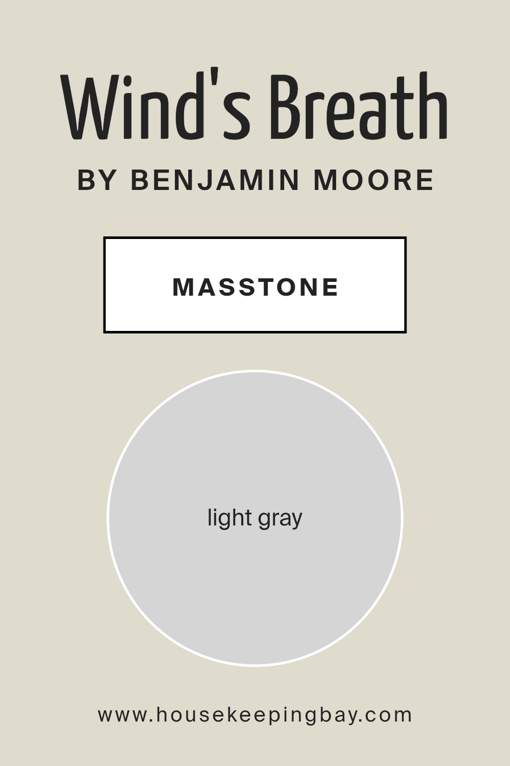
What is the Masstone of the Wind’s Breath OC-24 by Benjamin Moore?
Wind’s Breath OC-24 by Benjamin Moore is a light gray with masstone #D5D5D5. Its soft and neutral tone makes it highly versatile for any home. This color works well in creating a calm and soothing atmosphere, perfect for living rooms, bedrooms, or even bathrooms. The light gray works beautifully to open up spaces, making them feel larger and brighter.
Because it is a neutral shade, it pairs effortlessly with other colors. You can combine it with bold colors for a striking contrast or keep it paired with other neutrals for a subtle, sophisticated look. Wind’s Breath also complements various textures and materials, from sleek modern furniture to rustic wooden pieces.
Using Wind’s Breath can also enhance the natural light in a room, reflecting it gently and giving the space an airy feel. It offers flexibility with decor choices, supporting both minimalistic designs and more eclectic styles.
housekeepingbay.com
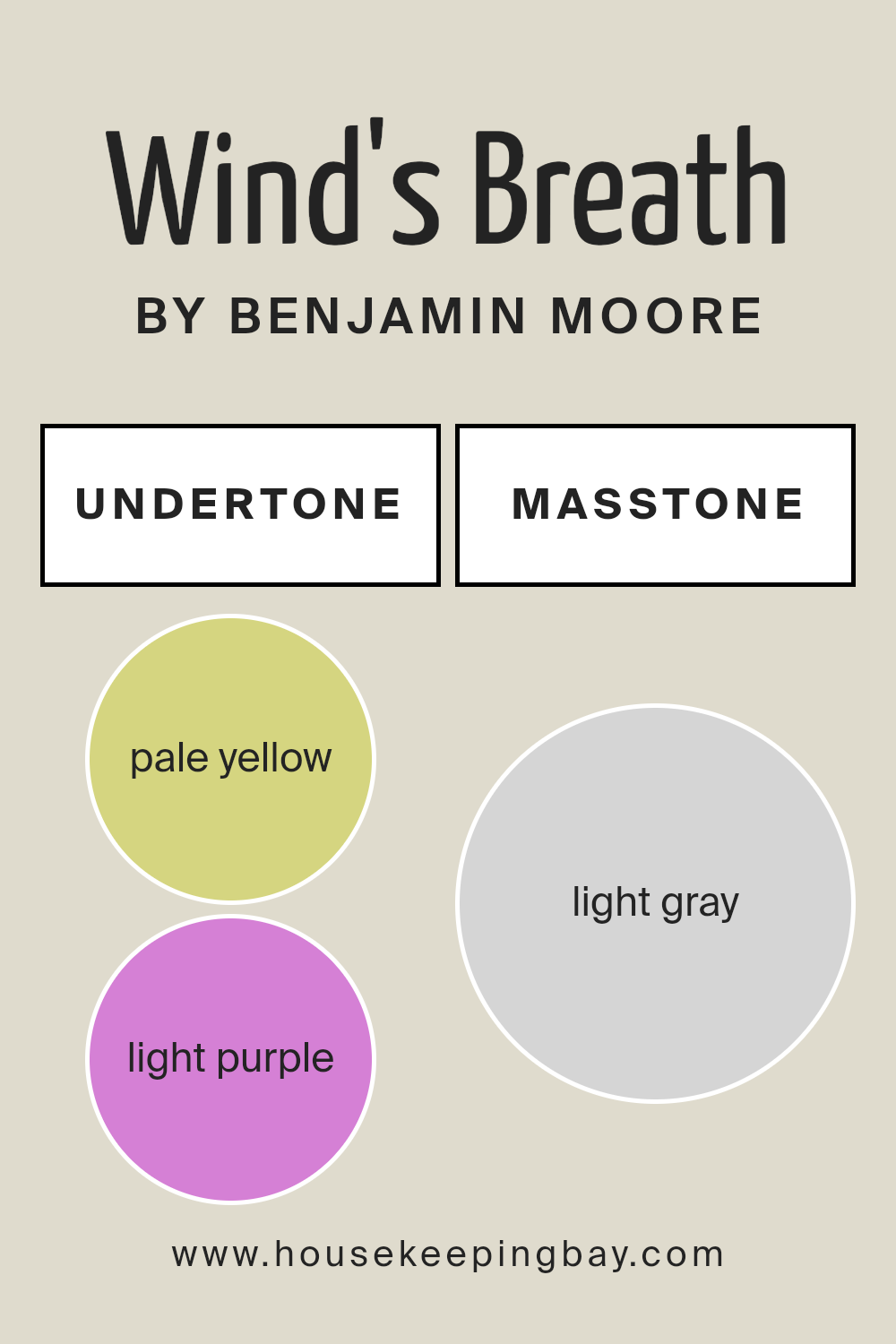
Undertones of Wind’s Breath OC-24 by Benjamin Moore
Wind’s Breath OC-24 by Benjamin Moore is a soft, versatile neutral with a rich blend of undertones. These undertones can subtly change the perception of the paint. Pale yellow can add a warm, inviting feel, while light purple might introduce a hint of sophistication. Light blue can evoke calmness, and pale pink adds a touch of softness.
Mint undertones bring a fresh, lively vibe, while lilac offers a gentle hint of elegance. Grey undertones provide balance, grounding the color and making it flexible in many settings.
In a room, Wind’s Breath OC-24 can look different depending on lighting and surroundings. Bright, natural light may highlight warmer undertones like pale yellow and pale pink, making the space feel cozy and welcoming. In contrast, artificial lighting in the evening might bring out grey and light blue undertones, creating a cooler, more serene atmosphere.
When paired with warm furnishings, mint and lilac undertones may appear more prominently, adding depth and character. On the other hand, in a cooler setting, grey and light blue undertones might become more noticeable, offering a calm and composed feel.
Overall, the undertones in Wind’s Breath OC-24 provide a subtle dynamism that adapts to its environment, making it a favorite in interior design.
housekeepingbay.com
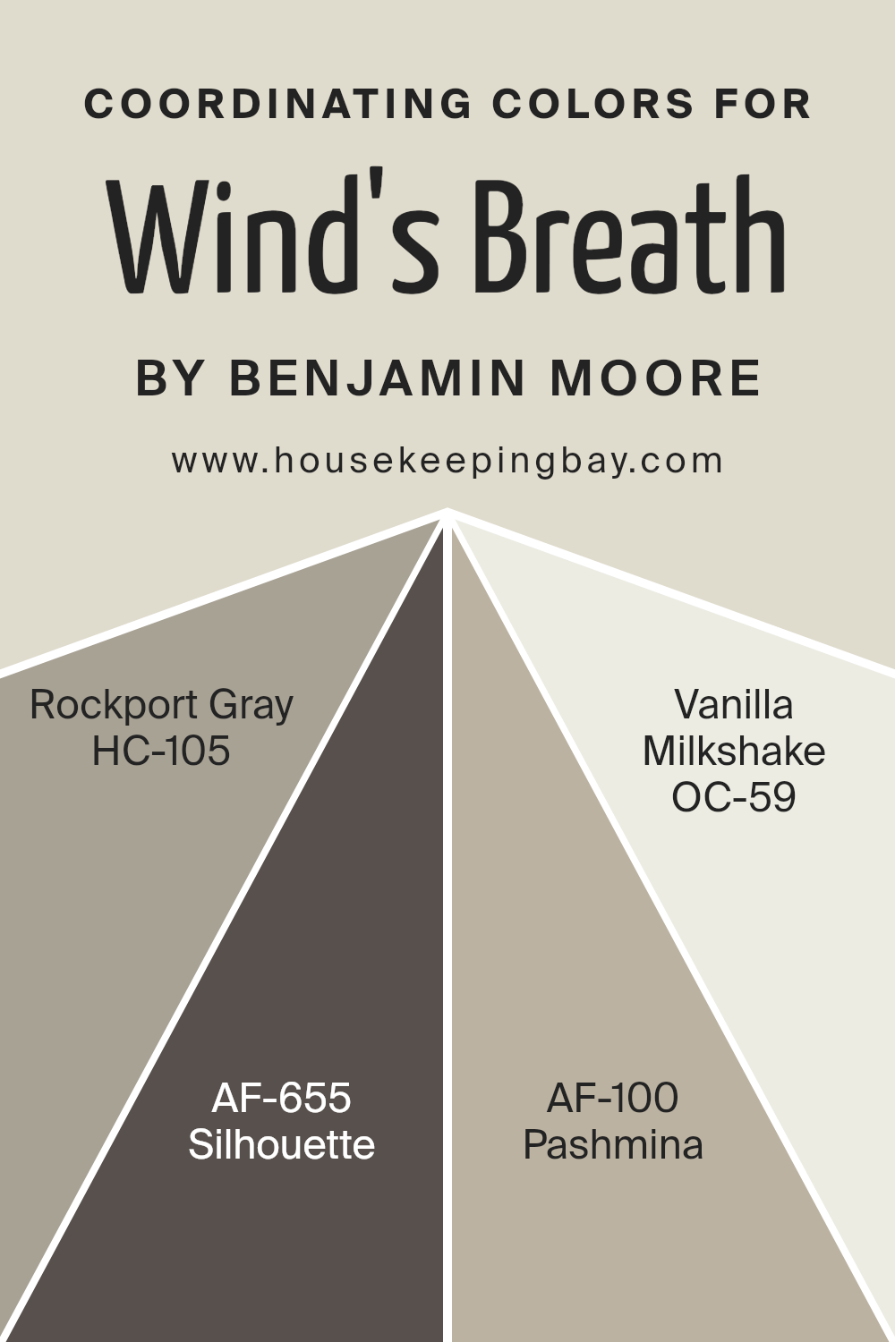
Coordinating Colors of Wind’s Breath OC-24 by Benjamin Moore
Coordinating colors are hues that complement each other, creating a balanced and harmonious look in any space. When you choose coordinating colors, you are selecting tones that work well with a main color—like Wind’s Breath OC-24 by Benjamin Moore.
This soft, neutral shade serves as the centerpiece, offering a gentle warmth that is extremely versatile. To create a cohesive atmosphere, you can pair Wind’s Breath with coordinating shades to add depth and interest to a room.
For instance, Rockport Gray HC-105 is a timeless, medium gray that brings a grounded, reliable feel. It has subtle undertones that allow it to mesh beautifully with both warm and cool palettes, acting as a perfect anchor.
On the other hand, Silhouette AF-655 offers a deeper, more dramatic contrast. This rich color adds a layer of sophistication and intensity, making it an excellent choice for accent walls or furniture. Pashmina AF-100 steps in as a warm, complex greige, blending beige and gray in a way that feels inviting and comforting.
It’s quite versatile, providing a seamless transition between other neutrals. Finally, there’s Vanilla Milkshake OC-59, a soft, creamy white that feels light and refreshing.
It effortlessly brightens spaces, offering a crisp backdrop that enhances the warmth of Wind’s Breath. Together, these colors create a well-balanced, inviting environment.
You can see recommended paint colors below:
- HC-105 Rockport Gray
- AF-655 Silhouette
- AF-100 Pashmina
- OC-59 Vanilla Milkshake
housekeepingbay.com
How Does Lighting Affect Wind’s Breath OC-24 by Benjamin Moore?
Lighting plays a crucial role in how we perceive colors. The color of an object can change dramatically depending on the type of light it is exposed to. Wind’s Breath OC-24 by Benjamin Moore is a warm, soft neutral color that can appear differently under various lighting conditions.
When placed in natural light, Wind’s Breath can look bright and creamy. In artificial light, particularly warm LED or incandescent lamps, the color tends to look cozier and slightly warmer, which can enhance its comforting feel.
Now, let’s consider how Wind’s Breath looks in rooms with different orientations:
1. North-facing rooms: These rooms receive cooler, indirect light. Wind’s Breath might appear a bit more subdued or grayer in such spaces. The lack of direct sunlight can make the color seem less warm, giving it a more subtle and calm appearance.
2.South-facing rooms: These rooms benefit from abundant, warm natural light throughout the day. Wind’s Breath can appear brighter and more vibrant in these spaces. The warm tones in the light will enhance the warmth in the color, making it feel very welcoming and cheerful.
3.East-facing rooms: Morning light in east-facing rooms is bright and has a slightly blueish undertone. In the early hours, Wind’s Breath can seem cooler and a bit crisp. As the day progresses, the color becomes warmer as natural light diminishes.
4.West-facing rooms: These rooms enjoy a warm, glowing light in the afternoon and early evening. Wind’s Breath will take on a cozy, golden hue in this setting, making it feel inviting. Earlier in the day, when light is not as direct, the color might appear softer and more subdued.
In summary, Wind’s Breath OC-24 color can shift from warm to cool depending on the directionality and quality of the light, making it a versatile choice for various rooms.

housekeepingbay.com
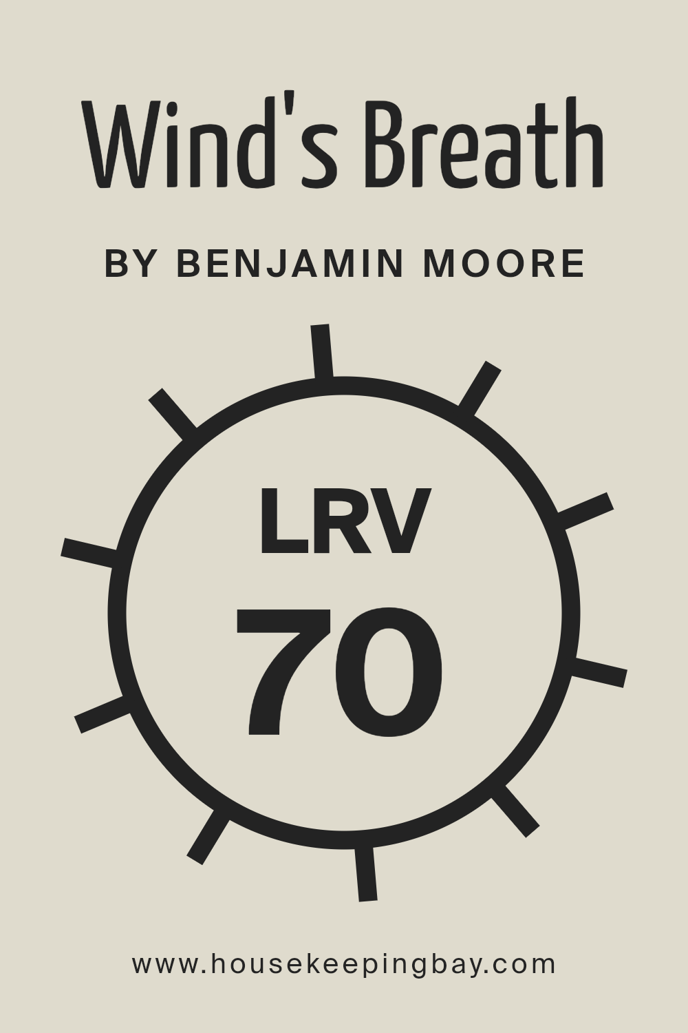
What is the LRV of Wind’s Breath OC-24 by Benjamin Moore?
Light Reflectance Value, or LRV, is a measurement that tells us how much light a color will reflect. It is on a scale from 0 to 100. A color with an LRV of 0 is completely black, meaning it absorbs all light, while a color with an LRV of 100 is completely white, reflecting all light.
The higher the LRV, the more light the color reflects, making a room feel brighter and more open. This value is especially important when choosing paint for rooms because it can significantly change how a color appears in different lighting conditions.
For Wind’s Breath OC-24 by Benjamin Moore, with an LRV of 69.59, the color reflects a good amount of light, making it a great choice if you want to brighten up a space. This light reflection can make a room feel more spacious and airy.
The color itself is a soft, neutral shade, which means it can adapt well to different lighting throughout the day, maintaining a pleasant appearance. With such an LRV, Wind’s Breath will not absorb too much light, helping the room avoid feeling too dark, yet it will not reflect so much light that it feels overly bright.
This makes it a versatile color for living rooms, bedrooms, or any other space in need of a gentle lift in brightness.
housekeepingbay.com
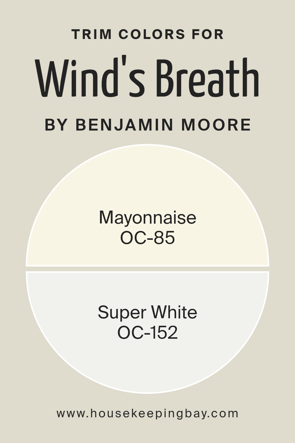
What are the Trim colors of Wind’s Breath OC-24 by Benjamin Moore?
Trim colors are the hues used around the edges of walls, windows, and doors, helping define spaces and adding an extra layer of detail to a room. They’re crucial when working with wall colors like Wind’s Breath OC-24 by Benjamin Moore because they can enhance its subtle nuances or provide a contrasting effect that complements the main color.
Wind’s Breath is a soft, warm neutral with a hint of gray that creates a cozy ambiance. When selecting trim colors like OC-85 Mayonnaise and OC-152 Super White, they can either blend smoothly or stand out, highlighting architectural features.
OC-85 Mayonnaise by Benjamin Moore is a warm, creamy white with a hint of yellow. This gives it a cozy and inviting feel, making it a gentle complement to Wind’s Breath. On the other hand, OC-152 Super White is a crisp and clean white with cool undertones.
Using Super White as a trim provides a sharp contrast that frames Wind’s Breath elegantly, bringing a modern, fresh appearance to the space.
Together, these trim colors serve not only to border rooms but also to influence the mood and style within, ensuring that Wind’s Breath is presented in the best possible light.
You can see recommended paint colors below:
- OC-85 Mayonnaise
- OC-152 Super White
housekeepingbay.com
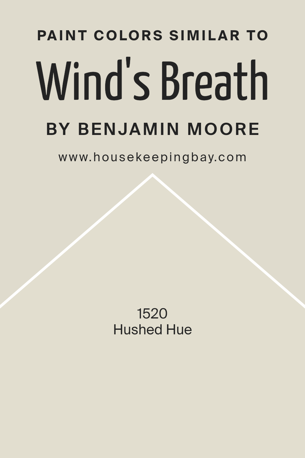
Colors Similar to Wind’s Breath OC-24 by Benjamin Moore
Similar colors to Wind’s Breath OC-24 by Benjamin Moore play a key role in creating harmony within a space. They effortlessly connect various design elements, helping to maintain a cohesive look while allowing subtle variations in tone and mood. These similar colors create a soothing backdrop, lending a sense of calm and balance without overpowering other features of a room.
One such hue is 1520 – Hushed Hue, offering a gentle warmth that softens spaces and contributes to a relaxed atmosphere. This soft color promotes a sense of openness and light, making rooms appear airy and welcoming.
Wind’s Breath OC-24 boasts a delicate undertone that feels grounded yet light, perfectly paired with Hushed Hue. Together, these colors bring out the best in each other, with Hushed Hue adding a touch of inviting warmth and Wind’s Breath providing a gentle, neutral base.
These tones effortlessly blend to enhance each other without stark contrasts, making them ideal for spaces where a subtle yet sophisticated look is desired.
They provide a versatile foundation that complements various décor styles, from modern to traditional, helping to tie together eclectic elements into a unified whole. Through their understated grace, these colors contribute to a comforting and serene environment.
You can see recommended paint color below:
- 1520 Hushed Hue
housekeepingbay.com
How to Use Wind’s Breath OC-24 by Benjamin Moore In Your Home?
Wind’s Breath OC-24 by Benjamin Moore is a soft, warm neutral color that can bring a cozy atmosphere to any space. Its gentle hue makes it versatile, working well in living rooms, bedrooms, and even kitchens. When using Wind’s Breath, consider pairing it with white trims for a clean, fresh look. This color creates a backdrop that allows furniture and decor to stand out without overwhelming the senses.
In a bedroom, Wind’s Breath can provide a calming environment, making it a perfect choice for walls. In living rooms, it pairs nicely with wooden accents and natural textures, enhancing a warm, inviting feel. If used in kitchens, this color complements both modern and traditional styles, adapting nicely to different design elements.
Overall, Wind’s Breath offers a simple, elegant foundation for home decor, making spaces feel open and welcoming while adding a subtle touch of sophistication.
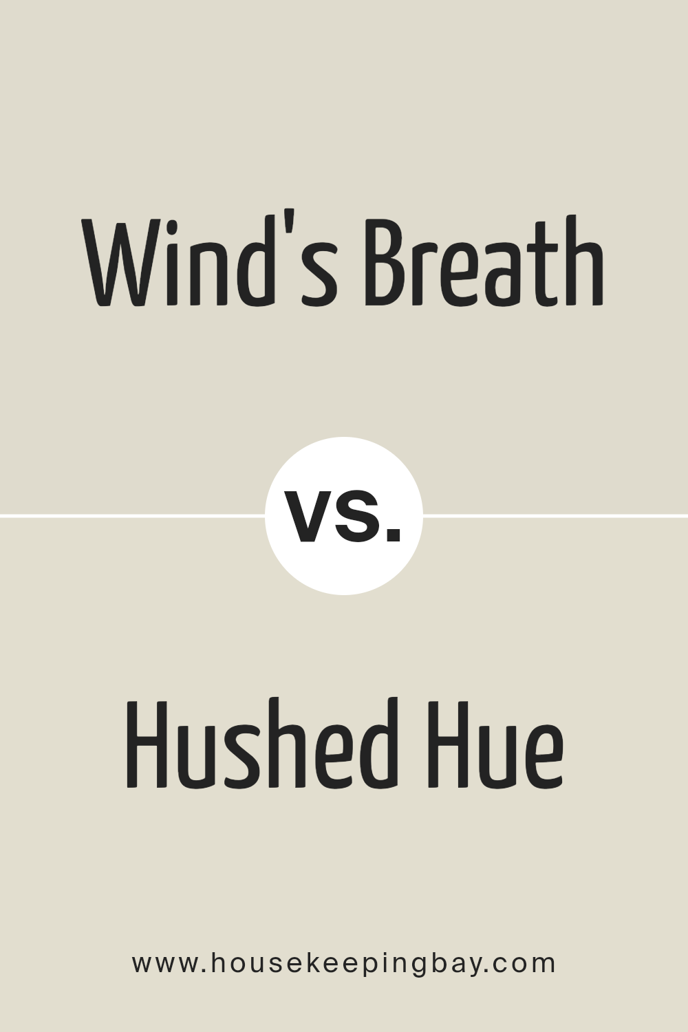
Wind’s Breath OC-24 by Benjamin Moore vs Hushed Hue 1520 by Benjamin Moore
Wind’s Breath OC-24 by Benjamin Moore is a versatile, soft neutral with warm undertones. It offers a subtle hint of beige, which makes it an excellent choice for creating an airy, inviting space. This color pairs well with both warm and cool accents, allowing it to adapt to various design styles and settings. It’s perfect for living rooms, bedrooms, or any area where you want a calm, soothing atmosphere.
Hushed Hue 1520, another Benjamin Moore color, is a muted, light-toned shade with a slightly green undertone.
It provides a gentle touch of color without overwhelming the senses. This hue works well in spaces where you want a bit of color but still desire a neutral backdrop.
It’s great for kitchens or bathrooms, offering a fresh, clean look.
Both colors offer a serene feel, yet Wind’s Breath leans more towards warmth, while Hushed Hue adds a touch of subtle freshness.
You can see recommended paint color below:
- 1520 Hushed Hue
housekeepingbay.com
I sense an invitation to appreciate the subtle nuances that colors bring into our lives, particularly how OC-24 offers a breath of fresh air through its soft and gentle hue.
There’s a certain vitality and lightness in OC-24 that brings a sense of calm and openness, effectively transforming any space it touches.
Through Moore’s descriptions and insights, I feel encouraged to think more deeply about the choices we make in our own spaces. How we can use color, not just as decoration, but as a tool to enhance our living environments. The narrative guided me to a greater appreciation of color’s ability to communicate emotions and create harmony.
In reading this work, I’ve gained a richer understanding of how OC-24 can shift energies in a room, inviting a peaceful, airy quality into everyday life.
The conclusion leaves me considering the transformative power of color and the ways in which it can subtly, yet profoundly, affect our day-to-day experiences.
housekeepingbay.com
Ever wished paint sampling was as easy as sticking a sticker? Guess what? Now it is! Discover Samplize's unique Peel & Stick samples. Get started now and say goodbye to the old messy way!
Get paint samples


