Balanced Beige SW 7037 by Sherwin Williams
Perfect Harmony in Your Space: The Ultimate Beige That Unites Warmth and Style
Let’s talk about SW 7037 Balanced Beige by Sherwin Williams. Imagine finding the perfect neutral shade that brings warmth and comfort to your space without overwhelming it. Balanced Beige is that kind of color. It’s not just any beige.
It’s a carefully crafted tone that strikes just the right balance between warm and cool, making it incredibly versatile. You can use it in any room, whether you want to create a cozy backdrop in your living room or a serene ambience in your bedroom.
What sets Balanced Beige apart is its ability to adapt. Depending on the lighting and the colors around it, it can shift from a subtle warm hue to a richer, deeper tone. This means you get a color that feels personalized and reacts to the character of your space. It’s like having a color that’s in tune with your home’s natural rhythm.
Pairing it with other colors is a breeze. Think of it as a team player that gets along with bold and muted tones alike. Whether you’re leaning towards a modern, minimalist look or something more traditional, Balanced Beige provides a solid foundation that lets you play around with your decor.
So, if you’re looking for a paint color that brings out the best in your home, giving it that cozy, welcoming vibe, Balanced Beige by Sherwin Williams could be the answer. It’s a testament to the beauty of finding just the right balance in color.
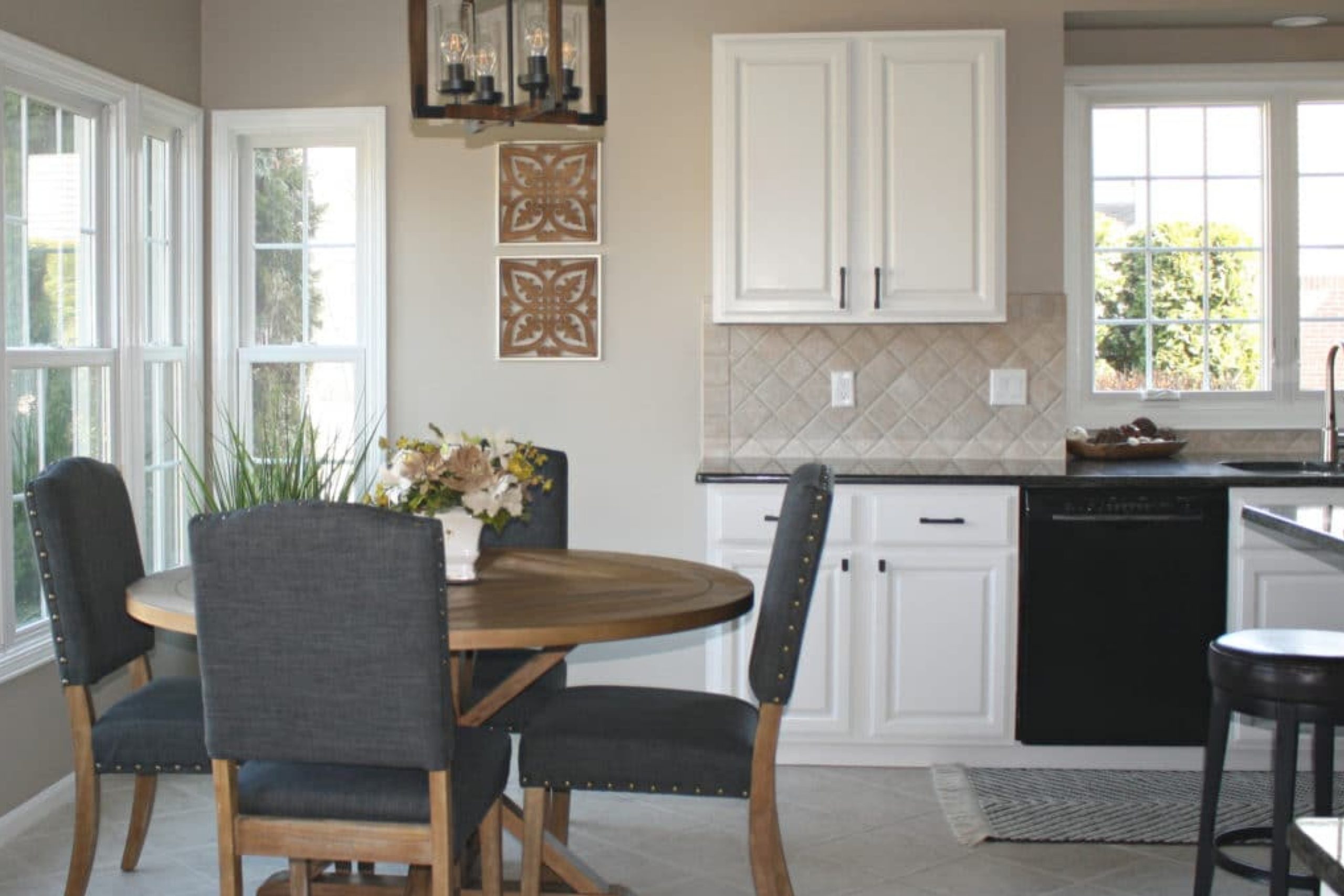
via kylieminteriors.ca
What Color Is Balanced Beige SW 7037 by Sherwin Williams?
Table of Contents
Balanced Beige SW 7037 by Sherwin Williams is a versatile neutral color that adds warmth and calm to any space. This subtle beige has a harmonious blend of warm and cool tones, making it a perfect backdrop for various interior styles. From modern minimalism to cozy traditional, Balanced Beige delivers a soothing ambiance. Its neutral palette allows for endless color combinations, working exceptionally well with both bold hues and soft pastels for a balanced look.
Ideal for creating a welcoming atmosphere, Balanced Beige pairs beautifully with natural materials like wood, bringing out their warmth, while against metals, it highlights their sleekness. Fabrics in cotton, linen, or wool add layers of texture against this serene backdrop, enhancing the sense of comfort and well-being.
In spaces aiming for a rustic charm, Balanced Beige complements exposed brick, stone, and reclaimed wood, adding to the rustic vibe without overwhelming the senses. For a more contemporary feel, pairing it with glass and polished metal accents can give a room a fresh, modern edge.
This color truly shines in interior styles that prioritize comfort, warmth, and a connection with nature. Whether it’s the foundation of a minimalist scheme or a soft counterpoint in a more eclectic decor, Balanced Beige offers a solid base that supports various design elements, allowing personal styles and tastes to come to the forefront.
housekeepingbay.com
Is Balanced Beige SW 7037 by Sherwin Williams Warm or Cool color?
Balanced Beige SW 7037 by Sherwin Williams is a versatile color that offers a warm, inviting backdrop for any room in a home. Its neutral tone makes it easy to pair with a variety of décor styles, from modern to rustic. This shade of beige carries a subtle warmth that can make spaces feel cozy and comfortable, without overwhelming the senses.
Since Balanced Beige is not too dark nor too light, it works well in spaces with varying amounts of natural light, adapting to the environment to maintain a consistent look throughout the day. This quality helps in creating a soothing atmosphere that’s perfect for living rooms, bedrooms, and even home offices where a calm, focused environment is desired.
Additionally, Balanced Beige acts as an excellent canvas for homeowners looking to introduce color through furniture, artwork, or accent pieces. It supports other colors, allowing them to shine without competing for attention. This characteristic makes it a practical choice for those wanting to refresh their home’s look without making drastic changes.
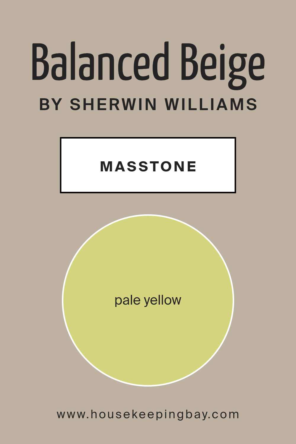
What is the Masstone of the Balanced Beige SW 7037 by Sherwin Williams?
Balanced Beige SW 7037 by Sherwin Williams, with its masstone of Pale Yellow (#D5D580), brings a unique, soft warmth to any home. This gentle hue is not just beige; it carries an undertone that lightly touches upon yellow, adding a subtle lift to spaces without overwhelming them.
When used in homes, this color works wonders by creating a cozy, inviting atmosphere. It’s versatile, meaning it can fit perfectly in various rooms, regardless of their style or the amount of natural light they receive.
The pale yellow influence helps to brighten rooms in a soft manner, making spaces appear larger and more open, yet without the starkness sometimes brought by pure white. This characteristic makes Balanced Beige an excellent choice for living rooms, bedrooms, and even kitchens, where it complements a wide range of decor and furniture colors.
Its ability to blend seamlessly with other hues allows for creative design flexibility, ensuring any home feels welcoming and warm.
housekeepingbay.com
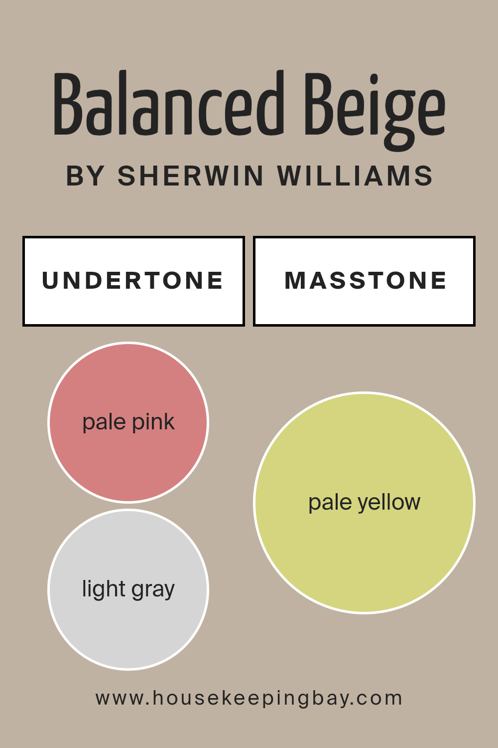
Undertones of Balanced Beige SW 7037 by Sherwin Williams
Balanced Beige SW 7037 by Sherwin Williams is a unique color with a mix of subtle undertones that greatly influence its appearance in different settings. This neutral shade has hints of pale pink, light gray, light purple, mint, grey, light blue, lilac, yellow, orange, light green, and olive. These undertones play a key role in how we perceive the color, making it versatile and adaptable to various interior designs.
When applied to interior walls, Balanced Beige comes to life in a way that depends on its surroundings and lighting. For instance, in sunlight, the yellow and orange undertones might make the color seem warmer, while in a room with less natural light, the gray or light purple undertones could give it a cooler feel.
This chameleon-like ability allows Balanced Beige to harmonize with a wide range of decor styles, from modern to rustic.
The presence of such diverse undertones also means that Balanced Beige can complement a plethora of other colors. Furniture and decorations in mint, lilac, or light blue can bring out the cooler undertones, creating a serene atmosphere. Meanwhile, pieces in orange, yellow, or olive can emphasize its warm undertones, making a room feel more inviting.
Ultimately, the undertones of Balanced Beige SW 7037 affect its appearance on interior walls by subtly shifting its base color in response to light and surrounding elements.
This shift not only impacts the color’s compatibility with different design schemes but also its ability to enhance the aesthetic appeal of a space in a way that’s both sophisticated and understated.
housekeepingbay.com
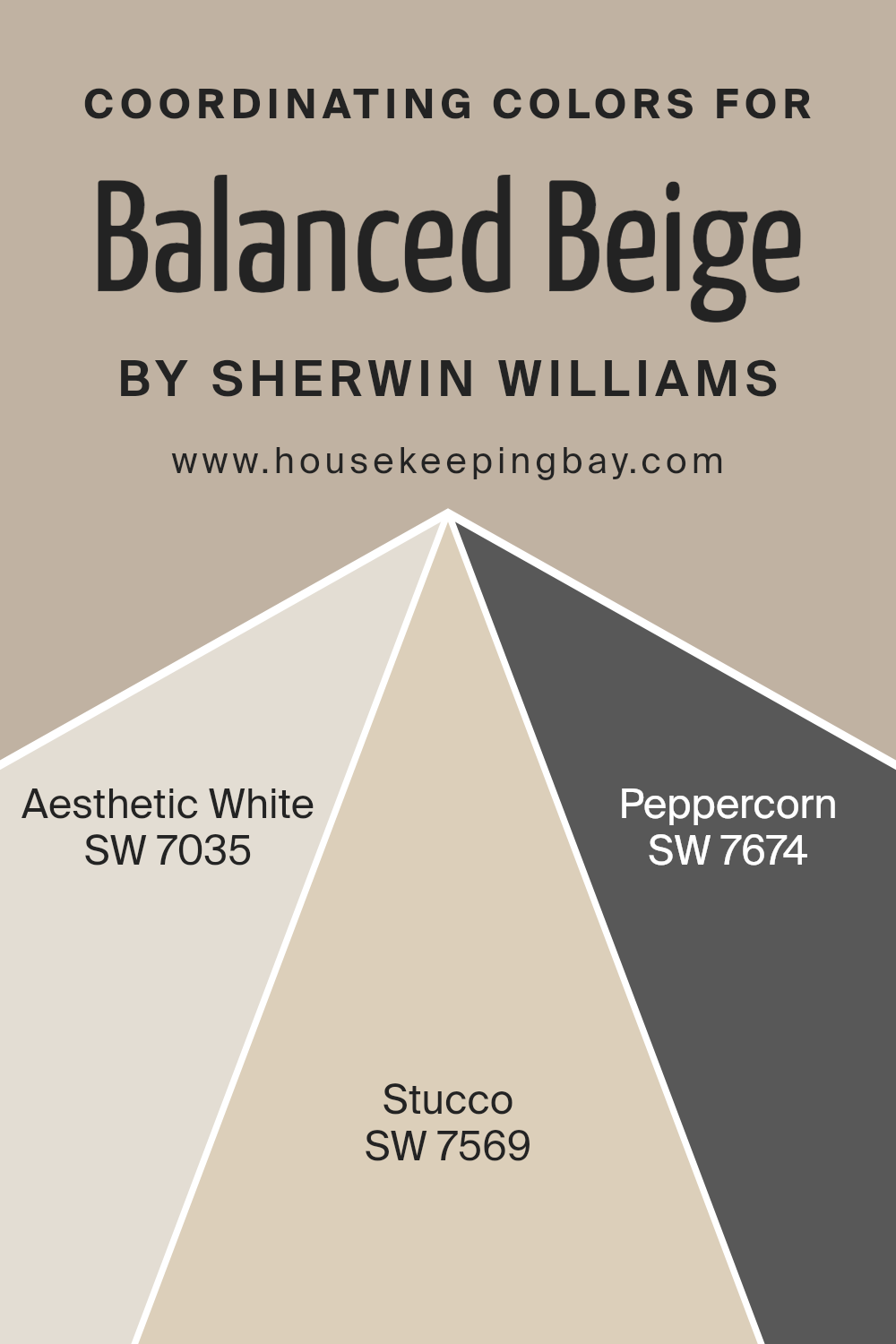
Coordinating Colors of Balanced Beige SW 7037 by Sherwin Williams
Coordinating colors are shades that work well together to create a harmonious and visually appealing look in any space. These colors complement each other and can enhance the overall feel of a room without overpowering it.
When used with a neutral base like Sherwin Williams’ Balanced Beige SW 7037, coordinating colors help to add depth and character. Balanced Beige is a warm, inviting shade that serves as a perfect backdrop for a wide range of decor styles.
The synergy between Balanced Beige and its coordinating colors such as Aesthetic White SW 7035, Stucco SW 7569, and Peppercorn SW 7674, creates a seamless look. Aesthetic White is a soft, warm white with a subtle hint of beige that pairs beautifully with the grounding nature of Balanced Beige, adding a gentle brightness to any room.
Stucco, on the other hand, is a mid-tone khaki that brings an earthy richness, enhancing the warmth of Balanced Beige without overwhelming the senses. Finally, Peppercorn offers a striking contrast with its deep charcoal gray.
This color provides a bold accent that can make architectural details pop or add sophistication to a space when used thoughtfully. Together, these coordinating colors make it effortless to achieve a polished and inviting space that feels cohesive.
You can see recommended paint colors below:
housekeepingbay.com
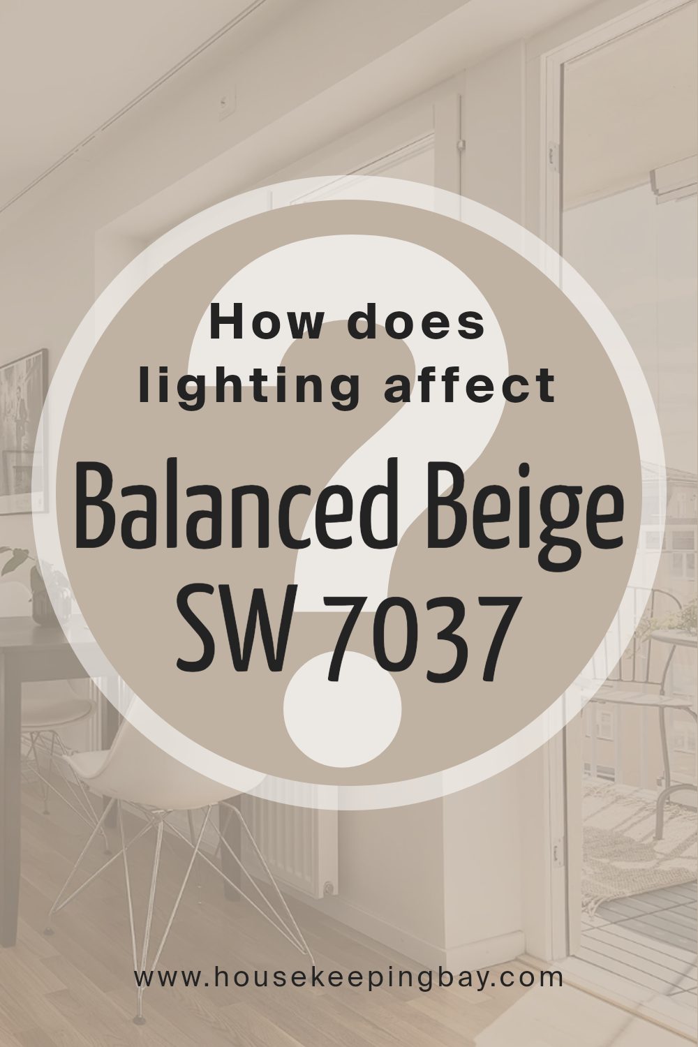
How Does Lighting Affect Balanced Beige SW 7037 by Sherwin Williams?
Lighting plays a big role in how we see colors. The same paint can look different under various light sources. Balanced Beige SW 7037 by Sherwin Williams is no exception. This color, like many others, changes its appearance depending on the light – making it look warmer, cooler, lighter, or darker.
In artificial light, Balanced Beige tends to become warmer. Indoor lights, especially those with a yellow tone, can make this shade look cozy and soft. It turns into a welcoming color, perfect for living rooms or bedrooms where you want a sense of calm and comfort.
However, under natural light, Balanced Beige can have a different effect. It may appear lighter and show more of its true beige nature. This quality makes it a versatile choice for any room, adapting to the changing light throughout the day.
In north-faced rooms, light is cooler and can make colors look slightly bluer. Here, Balanced Beige might seem a bit cooler and more neutral, making the space feel calm and soothing without feeling cold.
South-faced rooms get plenty of warm light, which can make colors look brighter and richer. In these rooms, Balanced Beige will feel warmer and more inviting, enhancing the coziness of the space.
East-faced rooms receive bright morning light, making colors look crisp and vibrant. In the morning, Balanced Beige will appear lively and fresh, creating a cheerful atmosphere. As the day progresses and the light changes, the color will maintain a balanced and soothing feel.
West-faced rooms experience the warm, intense light of the afternoon and evening. In these conditions, Balanced Beige can look deeper and warmer, offering a relaxing backdrop perfect for winding down at the end of the day.
So, lighting doesn’t just affect how we see Balanced Beige SW 7037; it can also influence the mood and feel of a room, highlighting the flexibility and adaptability of this shade.
housekeepingbay.com
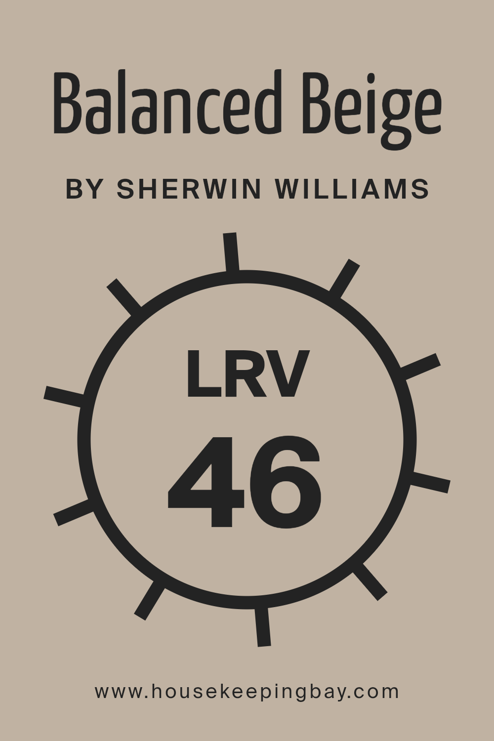
What is the LRV of Balanced Beige SW 7037 by Sherwin Williams?
Balanced Beige SW 7037 by Sherwin Williams, with an LRV of 45.6, sits in the mid-range of the scale. This means it has a balanced quality of reflecting and absorbing light, making it a versatile color that doesn’t swing too dark or too light.
In rooms with lots of natural sunlight, Balanced Beige will likely appear lighter and more open, offering a warm and inviting atmosphere. On the other hand, in spaces with less light, it can bring a cozy and comforting feel without making the room feel too enclosed or dark.
This LRV value makes Balanced Beige a great choice for various spaces and lighting conditions, ensuring it adapts well to different environments without losing its inherent beauty.
housekeepingbay.com
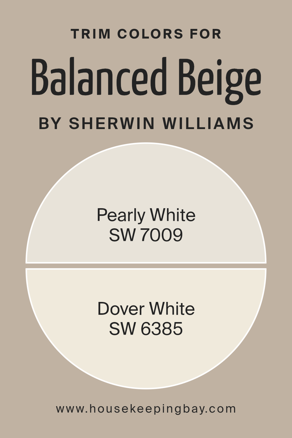
What are the Trim colors of Balanced Beige SW 7037 by Sherwin Williams?
Trim colors are essentially the colors used for painting the edges, frames, and borders of rooms, like door frames, window casings, and skirting boards. These colors play a crucial role in defining the spaces and adding contrast or complementarity to the wall colors.
For the shade Balanced Beige SW 7037 by Sherwin Williams, picking the right trim color is vital because it can either subtly highlight the soft warmth of the beige or create a delicate boundary that enhances the overall look of the room.
Trim colors can significantly influence the perception of the main color, making it appear more cohesive or distinct, depending on the chosen contrast level.
Pearly White SW 7009 is a soft, creamy white with a touch of warmth. This color is perfect for creating a seamless transition between Balanced Beige and the trim, giving a cohesive and gentle ambiance to the room.
It doesn’t starkly contrast with Balanced Beige, which means it can provide a smoothly blended appearance. Dover White SW 6385, on the other hand, is a brighter, more radiant white. It offers a bolder edge to rooms, creating a distinct frame that highlights the walls with a more pronounced difference from Balanced Beige.
Dover White is ideal for those looking to add a fresh burst of brightness around the edges of their space, making the beige walls stand out in a subtle yet notable manner.
You can see recommended paint colors below:
housekeepingbay.com
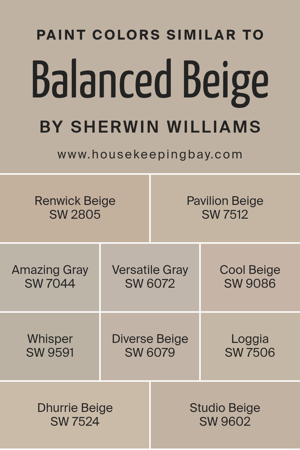
Colors Similar to Balanced Beige SW 7037 by Sherwin Williams
Similar colors play a vital role in design and decor, acting as the foundation for creating a cohesive and harmonious space. By using shades like Balanced Beige SW 7037 from Sherwin Williams and its counterparts, one can achieve a look that feels pulled together and thoughtfully designed.
Colors such as Renwick Beige SW 2805 and Pavilion Beige SW 7512 offer subtle differences in tone that complement each other, allowing for a seamless flow throughout a room.
Amazing Gray SW 7044 and Versatile Gray SW 6072 introduce a gray undertone, providing a modern twist on traditional beige while maintaining warmth. Cool Beige SW 9086 and Whisper SW 9591 lean towards a cooler palette, perfect for those seeking a softer, more understated look.
Furthermore, Diverse Beige SW 6079 and Loggia SW 7506 extend the palette into deeper, richer territories, offering depth and contrast when paired with lighter shades. Dhurrie Beige SW 7524 finds a middle ground with its earthy touch, ideal for adding a sense of grounding to a space.
Lastly, Studio Beige SW 9602 rounds out the selection by offering a muted backdrop, perfect for highlighting decor and art. Utilizing these similar colors allows for a flexible color scheme that can adapt to changing tastes and decorations, ensuring a timeless appeal that remains both sophisticated and inviting.
You can see recommended paint colors below:
- SW 2805 Renwick Beige
- SW 7512 Pavilion Beige
- SW 7044 Amazing Gray
- SW 6072 Versatile Gray
- SW 9086 Cool Beige
- SW 9591 Whisper
- SW 6079 Diverse Beige
- SW 7506 Loggia
- SW 7524 Dhurrie Beige
- SW 9602 Studio Beige
housekeepingbay.com
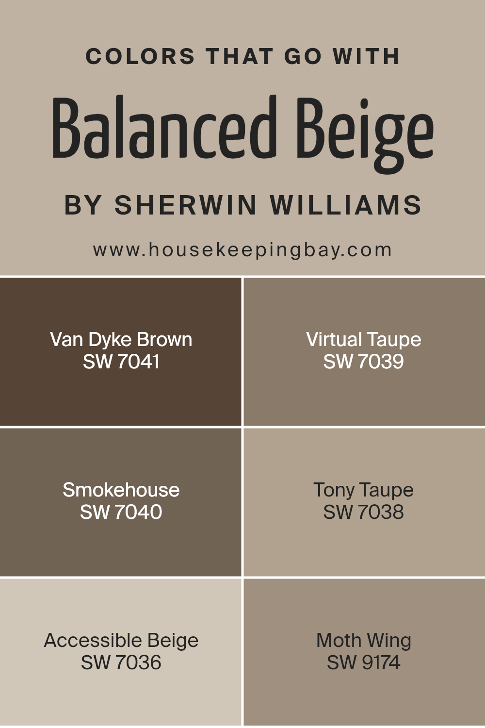
Colors that Go With Balanced Beige SW 7037 by Sherwin Williams
When coordinating colors with Balanced Beige SW 7037 by Sherwin Williams, it’s important because it ensures a cohesive and appealing look in any space. Balanced Beige is a versatile neutral that can act as a foundation for a room, setting a warm and inviting tone.
By choosing the right colors to go with it, such as Van Dyke Brown, Virtual Taupe, Smokehouse, Tony Taupe, Accessible Beige, and Moth Wing, you can create an atmosphere that feels coordinated and thoughtfully designed. These colors work well with Balanced Beige because they share similar undertones, making the transition between colors smooth and pleasing to the eye.
Van Dyke Brown is a deep, rich brown that adds a sense of depth and warmth, making it great for accent walls or furniture. Virtual Taupe, slightly lighter, lends a sophisticated and earthy touch, ideal for creating a cozy feel. Smokehouse offers a smoky, muted shade that pairs beautifully for a subtle contrast.
Tony Taupe is a harmonious blend with Balanced Beige, providing a seamless look that is both elegant and understated. Accessible Beige leans towards a lighter palette, brightening rooms while staying in harmony with Balanced Beige’s warmth.
Lastly, Moth Wing introduces a soft, muted touch of color, perfect for adding visual interest without overpowering. Together, these colors complement Balanced Beige, enhancing its natural charm and creating inviting spaces.
You can see recommended paint colors below:
- SW 7041 Van Dyke Brown
- SW 7039 Virtual Taupe
- SW 7040 Smokehouse
- SW 7038 Tony Taupe
- SW 7036 Accessible Beige
- SW 9174 Moth Wing
housekeepingbay.com
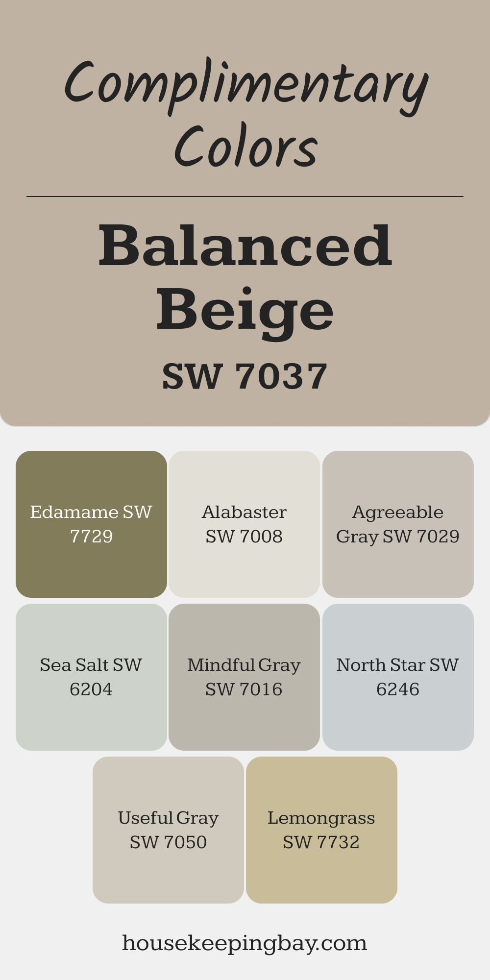
Complimentary Colors for Balanced Beige SW 7037 Paint Color by Sherwin Williams
Balanced Beige pairs beautifully with a range of complementary colors. Alabaster and Agreeable Gray offer a light, airy contrast, while Mindful Gray and Useful Gray add subtle depth for a cohesive look. These shades blend seamlessly for a polished finish that’s easy to live with.
For a touch of color, try Sea Salt or North Star to introduce cool tones. Lemongrass and Edamame bring a natural, earthy vibe, creating a fresh and inviting atmosphere.a
via housekeepingbay.com
How to Use Balanced Beige SW 7037 by Sherwin Williams In Your Home?
Balanced Beige SW 7037 by Sherwin Williams is a warm, welcoming paint color that works wonders in making any space feel cozy and inviting. This versatile shade brings a soft, neutral backdrop to your home, fitting well in living rooms, bedrooms, kitchens, or even hallways. Think of it as a canvas, allowing your furniture and decor to shine, while also providing a subdued, calming effect.
Using Balanced Beige in your home means you get a color that pairs easily with other hues. Whether you lean towards bold, dark furniture or lighter, airy fabrics, this color supports a range of styles – from modern to rustic. It’s particularly good for spaces where you want a touch of warmth without overwhelming the senses.
Consider Balanced Beige for a room makeover. It can refresh walls, brighten dim spaces, and bring a sense of harmony. Plus, it’s great for sellers looking to make their homes appealing to potential buyers, thanks to its broad appeal.
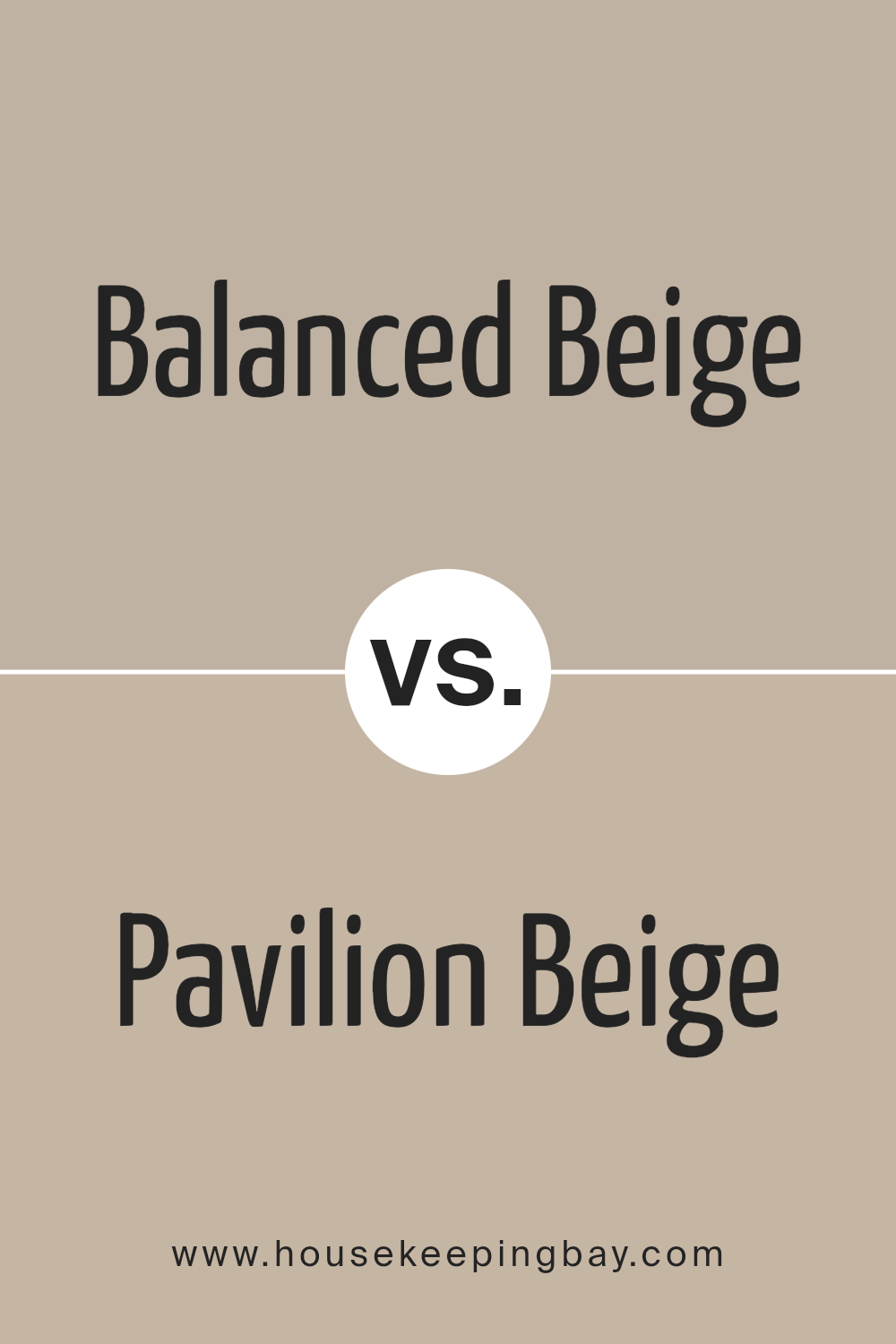
Balanced Beige SW 7037 by Sherwin Williams vs Pavilion Beige SW 7512 by Sherwin Williams
Balanced Beige SW 7037 and Pavilion Beige SW 7512 by Sherwin Williams are two beautiful shades that offer subtle differences for those looking to freshen up their space. Balanced Beige leans towards a warmer, cozier tone, perfect for creating a welcoming and comfortable atmosphere in any room.
It has a soft, nurturing presence that can make spaces feel more inviting. In contrast, Pavilion Beige is slightly cooler and lighter, offering a clean and serene backdrop that can make a room feel more spacious and calm. This color is great for those who prefer a more understated elegance.
While both colors belong to the beige family, their unique undertones can significantly affect the mood and visual temperature of a space. Choosing between them comes down to personal preference and the specific ambience someone wants to achieve in their home. Each brings its own charm, whether you’re aiming for warmth with Balanced Beige or a crisp, airy feel with Pavilion Beige.
You can see recommended paint color below:
- SW 7512 Pavilion Beige
housekeepingbay.com
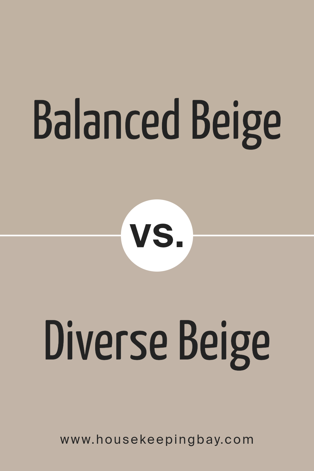
Balanced Beige SW 7037 by Sherwin Williams vs Diverse Beige SW 6079 by Sherwin Williams
Balanced Beige SW 7037 and Diverse Beige SW 6079 by Sherwin Williams are both warm and versatile shades, yet they have their unique characteristics. Balanced Beige leans towards a light to medium tone, providing a cozy and serene background that fits well in various settings, from living spaces to bedrooms.
It pairs elegantly with both light and dark accents, offering flexibility in interior design. Diverse Beige, in contrast, has a slightly richer hue, bringing a more pronounced warmth to rooms. This shade can create a welcoming atmosphere, making spaces feel more inviting and homely.
It works particularly well in areas with natural light, highlighting the depth of its color. While both shades offer the neutrality and flexibility associated with beige, Balanced Beige offers a softer approach, whereas Diverse Beige presents a bit more richness and warmth, giving each their own appeal depending on the desired aesthetic and mood in a space.
You can see recommended paint color below:
- SW 6079 Diverse Beige
housekeepingbay.com
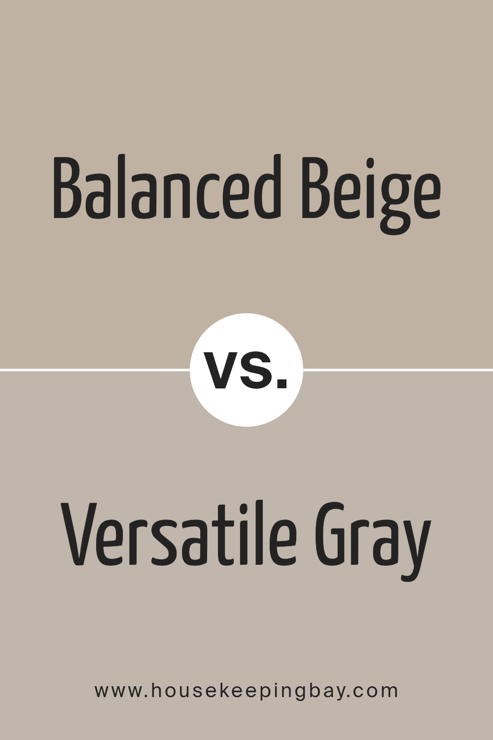
Balanced Beige SW 7037 by Sherwin Williams vs Versatile Gray SW 6072 by Sherwin Williams
Balanced Beige SW 7037 and Versatile Gray SW 6072, both by Sherwin Williams, offer unique touches to spaces but in different ways. Balanced Beige leans towards a warm, inviting tone. It adds a cozy feel, perfect for creating a welcoming atmosphere in any room. This color works well in spaces where comfort and relaxation are key. It pairs nicely with a wide range of decor, from modern to rustic, making it highly adaptable.
Versatile Gray, as its name suggests, is a flexible color. It has a cooler undertone compared to Balanced Beige, providing a more neutral backdrop. This color suits various settings, from office spaces to bedrooms, without overwhelming the space.
It’s particularly good for those seeking a minimalist or contemporary look. When matched with vibrant accents, Versatile Gray stands out, allowing for creative design choices.
While both colors offer their unique appeal, the choice between them depends on the desired mood and aesthetic. Balanced Beige radiates warmth and welcome, whereas Versatile Gray offers a sleek and neutral canvas for interior design.
You can see recommended paint color below:
- SW 6072 Versatile Gray
housekeepingbay.com
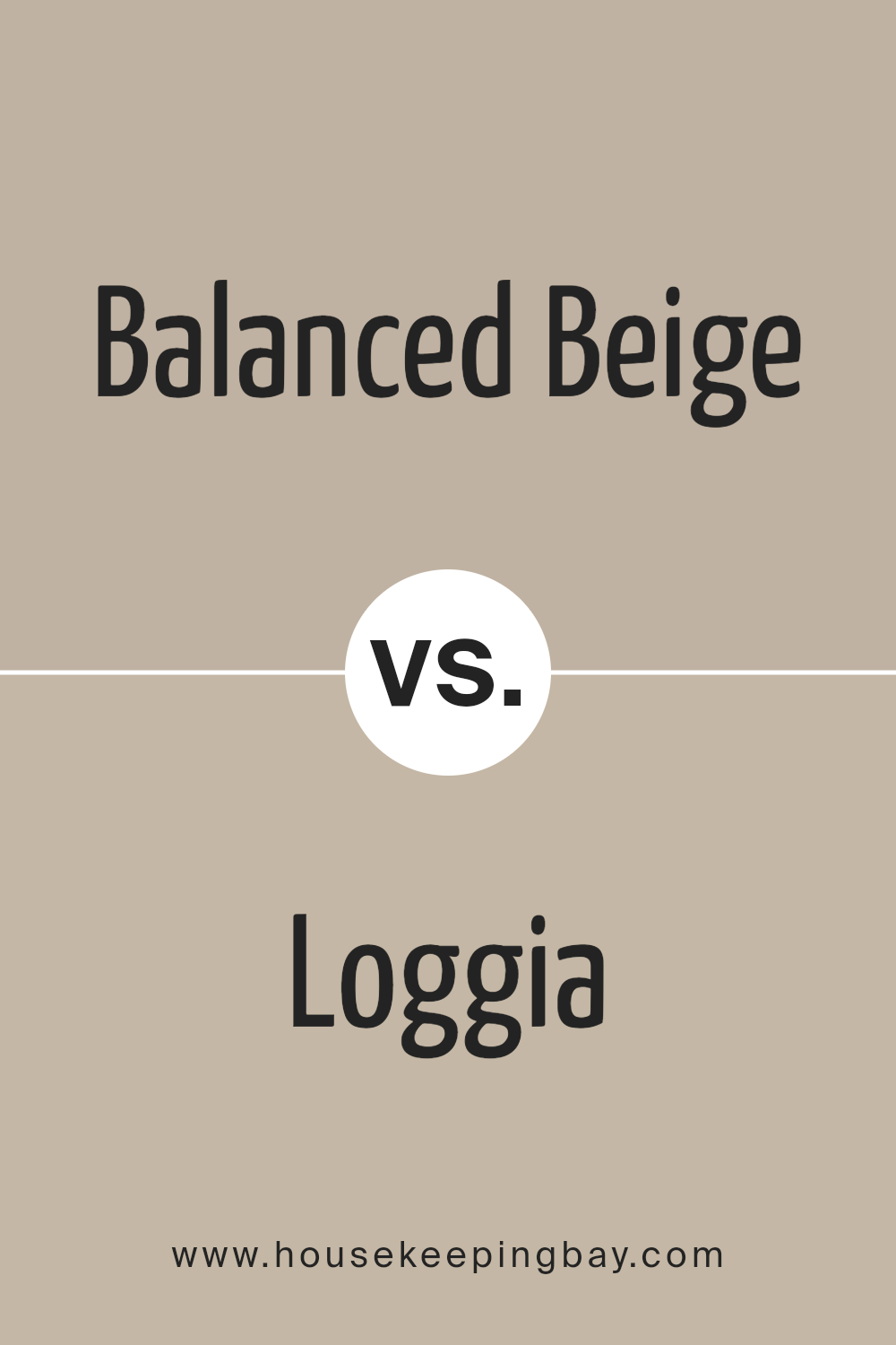
Balanced Beige SW 7037 by Sherwin Williams vs Loggia SW 7506 by Sherwin Williams
Balanced Beige SW 7037 by Sherwin Williams is a warm, neutral color that gives a cozy feel to any room. It’s a versatile shade that pairs well with a variety of decor styles, from modern to traditional. This color can make spaces feel inviting and comfortable without being too dark or overwhelming.
Loggia SW 7506, also by Sherwin Williams, is another neutral but with a different tone. It leans more towards a muted, earthy hue that brings a sense of calmness to an environment. It’s slightly darker than Balanced Beige, making it a great choice for creating a soothing and grounded atmosphere in a space.
Both colors are great for those looking to achieve a subtle and refined look in their interiors. Balanced Beige leans more towards a light, airy feel, making rooms look larger and more open. Loggia, with its deeper tone, offers a rich backdrop, perfect for highlighting decor and furniture. While each has its unique charm, your choice between the two would depend on the specific mood you want to create in your space.
You can see recommended paint color below:
- SW 7506 Loggia
housekeepingbay.com
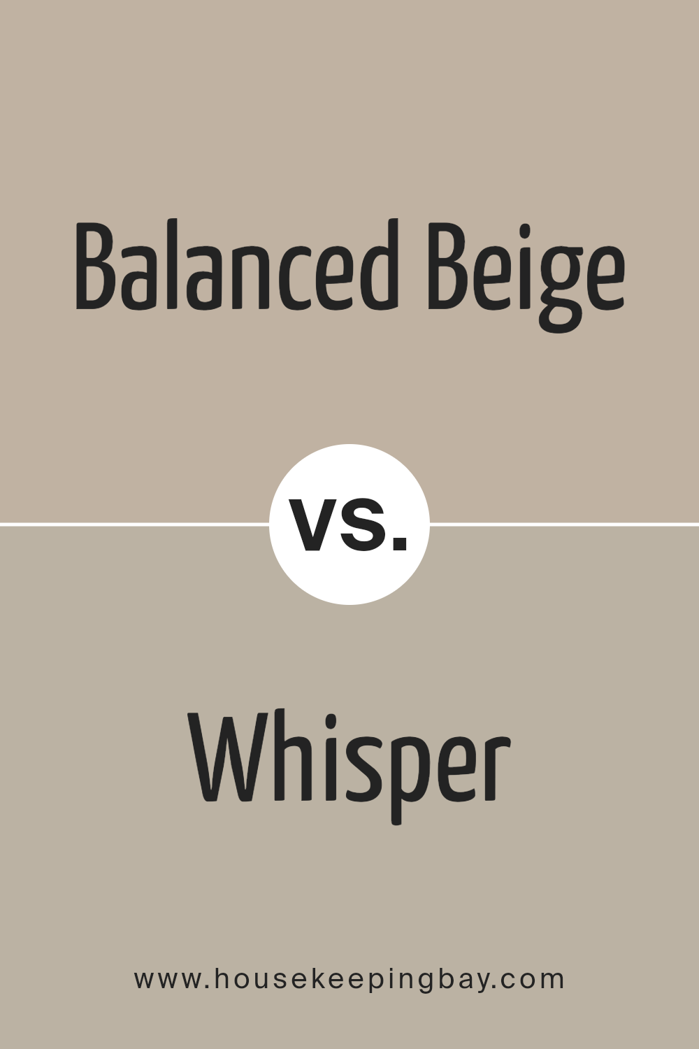
Balanced Beige SW 7037 by Sherwin Williams vs Whisper SW 9591 by Sherwin Williams
Balanced Beige SW 7037 by Sherwin Williams is a warm and inviting neutral tone. This color offers a soothing base that can complement various decor styles, making it versatile for any room. Its richness adds coziness to spaces, perfect for creating a relaxed and welcoming atmosphere. Balanced Beige pairs well with both bright and dark colors, allowing for creative freedom in designing a room.
Whisper SW 9591 by Sherwin Williams, contrasts with Balanced Beige by being a much lighter and softer shade. Whisper brings a gentle and airy feel to interiors, acting as a subtle background that can help small spaces appear larger and more open. This color is ideal for achieving a minimalist and clean look, providing a canvas that highlights other elements of a room’s decor.
While both colors share a base in neutrality, Balanced Beige leans towards adding warmth and depth, whereas Whisper leans toward lightness and simplicity. Each color has its own charm, catering to different aesthetic preferences and functional needs within a home.
You can see recommended paint color below:
- SW 9591 Whisper
housekeepingbay.com
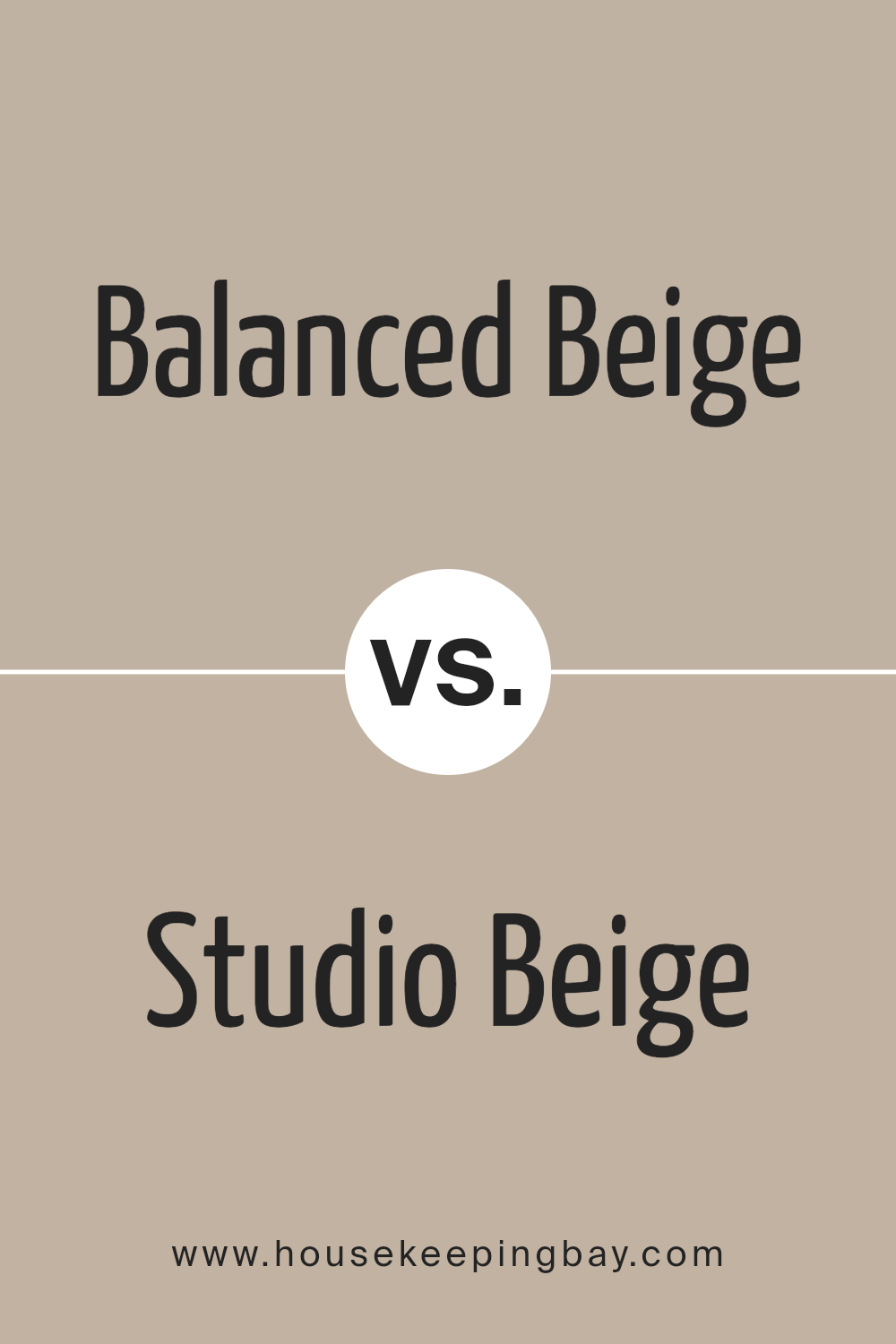
Balanced Beige SW 7037 by Sherwin Williams vs Studio Beige SW 9602 by Sherwin Williams
Balanced Beige SW 7037 by Sherwin Williams is a warm, welcoming neutral shade. It’s perfect for creating cozy, inviting spaces. This color leans more towards a soft, creamy beige with a hint of gray, making it versatile for different interior designs. It pairs well with a wide range of colors, from bold to soft palettes, enhancing the overall look of a room without dominating it.
Studio Beige SW 9602, by contrast, is a slightly deeper beige. It has a richer, more pronounced color depth than Balanced Beige, offering a stronger statement in spaces. This shade is ideal for adding warmth and sophistication. Its depth makes it particularly suited for areas that benefit from a more anchored, secure feeling.
Both colors are beautiful options for those looking to introduce neutral tones into their decor. While Balanced Beige brings a lighter, airier feel, Studio Beige offers warmth and depth, making each unique in its right.
You can see recommended paint color below:
- SW 9602 Studio Beige
housekeepingbay.com
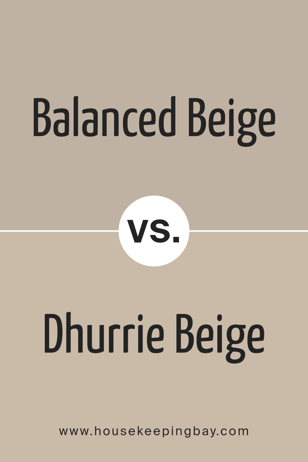
Balanced Beige SW 7037 by Sherwin Williams vs Dhurrie Beige SW 7524 by Sherwin Williams
Balanced Beige SW 7037 by Sherwin Williams and Dhurrie Beige SW 7524 by Sherwin Williams are both from the same color family but offer distinct vibes for a space. Balanced Beige leans towards a soft, warm gray undertone, offering a neutral and versatile backdrop.
It fits well in any room, providing a comforting and inviting atmosphere without overwhelming the senses. This color works great in spaces where you want a cozy yet sophisticated feel.
Dhurrie Beige, however, has a slightly more pronounced beige essence, bringing a warmer and richer feel to interiors. It can add depth to a space while maintaining a sense of airiness and light. This shade pairs nicely with a wide range of decor, making it a solid choice for those wishing to add a bit of warmth to their interiors without veering into darker color territory.
While both colors share a beige base, Balanced Beige offers a cooler, more muted approach, making it perfect for contemporary or minimalist styles. Dhurrie Beige, with its warmer undertones, is ideal for creating a welcoming, snug environment. Choosing between them depends on the desired mood and decor style of the room.
You can see recommended paint color below:
- SW 7524 Dhurrie Beige
housekeepingbay.com
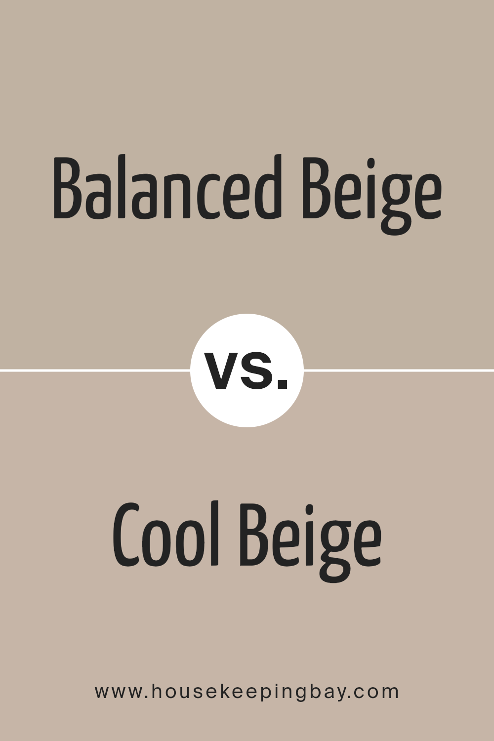
Balanced Beige SW 7037 by Sherwin Williams vs Cool Beige SW 9086 by Sherwin Williams
Balanced Beige SW 7037 by Sherwin Williams is a warm, inviting neutral with a subtle gray undertone. It offers a cozy feel to any room, making spaces feel grounded and serene. Its versatility allows it to pair well with both vibrant and muted tones, acting as a solid foundation for various design styles.
Cool Beige SW 9086, also by Sherwin Williams, leans more towards a lighter, more muted beige with a hint of gray. This color brings a fresh, airy feel to interiors, making rooms appear more spacious and open. It works well in spaces with lots of natural light, enhancing a crisp, clean aesthetic.
While Balanced Beige adds warmth and depth, Cool Beige provides a lighter, more refreshing touch. Both colors contribute to a calm and neutral palette, but their different undertones and lightness levels mean they serve slightly different purposes in interior design. Whether you’re looking for a comforting, earthy vibe or a bright, minimalist look, these beiges have you covered.
You can see recommended paint color below:
- SW 9086 Cool Beige
housekeepingbay.com
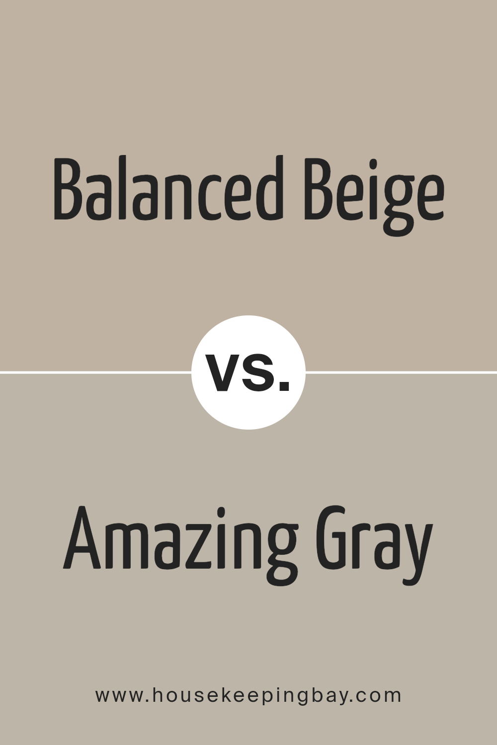
Balanced Beige SW 7037 by Sherwin Williams vs Amazing Gray SW 7044 by Sherwin Williams
Balanced Beige SW 7037 by Sherwin Williams is a warm, inviting shade that brings a cozy and comfortable vibe to any room. Its earthy tones make it a perfect base, allowing other colors to pop without overpowering the space. This color works well in living areas and bedrooms where a soothing atmosphere is desired.
Amazing Gray SW 7044, also by Sherwin Williams, is a versatile, neutral gray that can complement various decor styles. It has the ability to make spaces feel more spacious and airy, providing a subtle, sophisticated backdrop. Amazing Gray pairs well with both warm and cool accents, making it ideal for those looking to create a modern yet timeless look.
While Balanced Beige leans towards a warmer, more welcoming feel, Amazing Gray offers a crisp, clean canvas for interior spaces. Both colors are incredibly adaptable, but the choice between them depends on the desired ambiance: cozy and earthy with Balanced Beige or sleek and contemporary with Amazing Gray.
You can see recommended paint color below:
housekeepingbay.com
Balanced Beige SW 7037 by Sherwin Williams vs Renwick Beige SW 2805 by Sherwin Williams
Balanced Beige SW 7037 by Sherwin Williams is a versatile neutral color. It’s a warm beige that has a comforting and inviting quality. This color works well in spaces where you want a cozy, yet sophisticated feel. It pairs nicely with a wide range of decor, making it a popular choice for homeowners looking for something both practical and appealing.
Renwick Beige SW 2805, by contrast, is a deeper, richer beige. It brings a more pronounced warmth to a room, creating a feeling of snugness and comfort. This color is ideal for those wanting to add a bit of character and depth to their space without overwhelming it with dark colors.
Renwick Beige goes well with natural materials like wood and stone, enhancing the room’s overall warmth.
While both colors share a base in beige, Balanced Beige leans towards a lighter, more neutral backdrop, offering a sense of calm and simplicity. Renwick Beige, though still neutral, shifts towards a stronger presence, perfect for adding warmth and a hint of tradition.
Each color offers distinct advantages, making them suitable for a variety of applications and personal preferences.
You can see recommended paint color below:
- SW 2805 Renwick Beige
housekeepingbay.com
Conclusion
Concluding on SW 7037 Balanced Beige by Sherwin Williams, we see it’s a color that truly lives up to its name, offering a perfect harmony of warmth and neutrality. This shade stands as an ideal choice for anyone looking to add a touch of sophistication and natural elegance to their space without overwhelming it.
Imagine your rooms bathed in this gentle hue, creating a cozy yet refined backdrop that complements various decor styles, furniture, and accessories with ease.
For you, Balanced Beige is more than just a paint color; it’s a foundation upon which you can build and personalize your living spaces. It offers a versatile canvas that adapts to your evolving tastes and preferences over time. Whether you’re aiming for a minimalist look or a more dynamic aesthetic with bold accents, Balanced Beige provides a solid starting point.
Moreover, its timeless quality ensures that your choice remains stylish and relevant, regardless of the changing trends. By opting for SW 7037 Balanced Beige, you’re making a smart, future-proof investment in your home’s aesthetic appeal and overall ambiance.
So, if you’re ready to refresh your walls with a color that combines beauty, flexibility, and enduring appeal, Balanced Beige by Sherwin Williams is a choice that won’t disappoint. It’s a color that warmly invites you into each room, promising a space where you feel comfortable, inspired, and, most importantly, at home.
housekeepingbay.com
Ever wished paint sampling was as easy as sticking a sticker? Guess what? Now it is! Discover Samplize's unique Peel & Stick samples. Get started now and say goodbye to the old messy way!
Get paint samples


