Best Farmhouse Colors From Benjamin Moore And Sherwin-Williams
Learn what colors will look best of all for a farmhouse
If you want to restyle your home and choose a Farmhouse interior design, the key factor you should consider is the color. Depending on the paint colors you use in your home, the entire interior might look different. But if you use unsuitable colors that don’t fit this interior design, your Farmhouse-style home will most likely look not quite as it should be.
In this article, we will share several color palettes that are considered the most suitable for a Farmhouse interior style. We will present colors from the two most famous paint brands, Benjamin Moore and Sherwin-Williams.
You will learn about interior color palettes for living rooms and other spaces in your home, as well as multiple color schemes you can choose from to make your Farmhouse-style home look colorful and varied.
housekeepingbay.com
Light Sherwin-Williams Farmhouse Colors For Interior Space
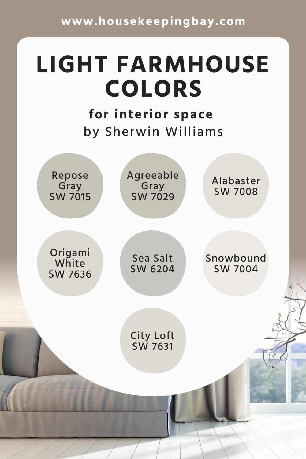
To create a relaxed and calming atmosphere in your Farmhouse-style home, opt for the light color palette by Sherwin-Williams. This palette contains colors that were specifically selected to match this interior design and create a homey vibe:
- SW Repose Gray
- SW Agreeable Gray
- SW Alabaster
- SW Snowbound
- SW Sea Salt
- SW Origami White
- SW City Loft
Also, there are a few other colors in it. Thanks to the fact that all these colors are pretty light and balanced in tone, you can use this palette in any room, from the kitchen to the bedroom or bathroom.
Also, all the colors in this palette match well with each other without making a room look washed out. As a result, you can combine them in any way you want. In each case, you will get great results!
housekeepingbay.com
Table of Contents
Dark Sherwin-Williams Farmhouse Colors For Interior Space
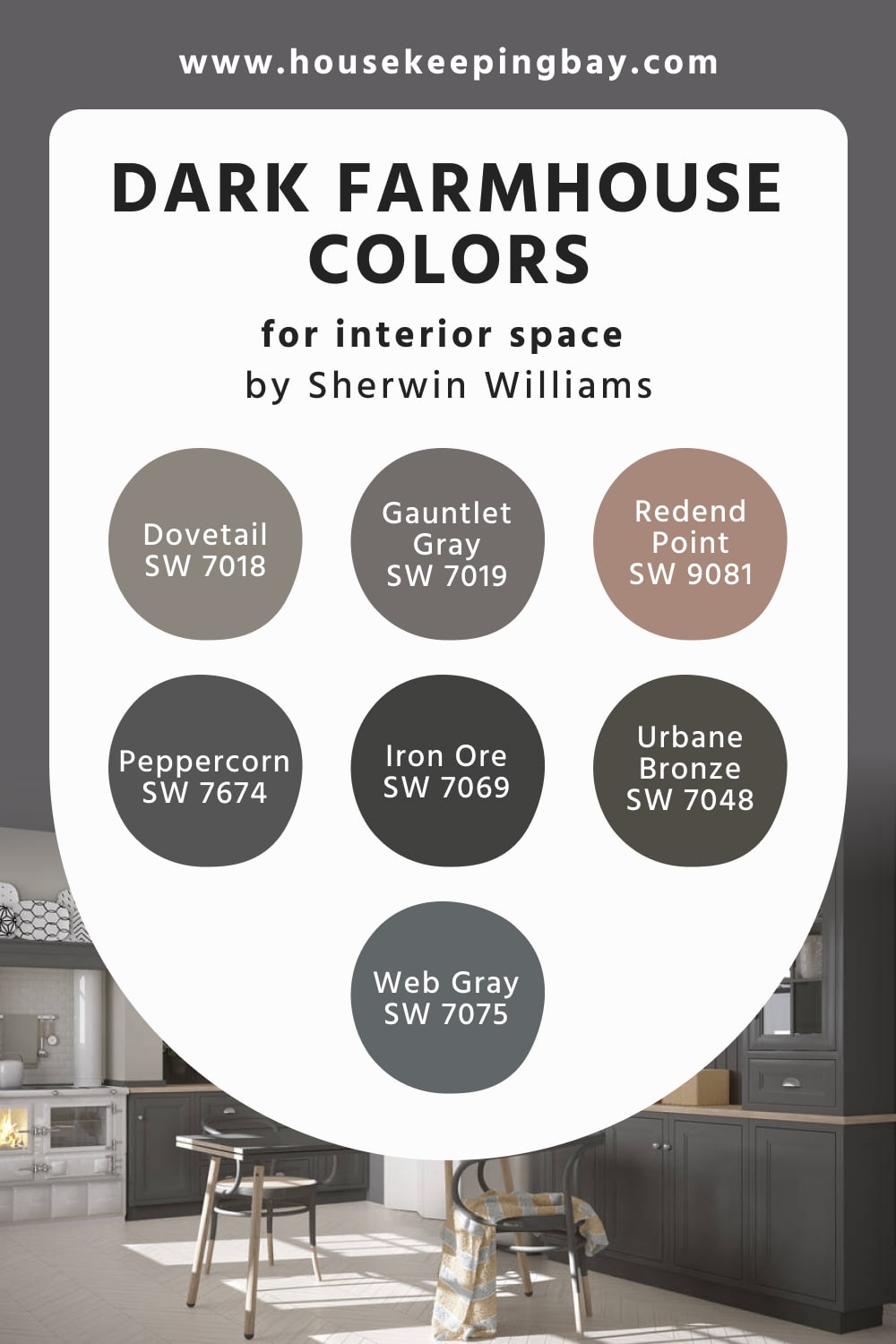
This palette is much darker than the previous one, and it will be more suitable for those who prefer saturated and deep colors in their homes. You can find the following colors in it:
This color palette consists of dark gray and dark brown colors mostly, with only one color being red (SW Rednend Point). However, even this red is somewhat muted and doesn’t read brightly. In fact, it looks a bit like a lighter terracotta color.
If you choose this color palette for your home, combine it with whites to make the space read less gloomy and dark. In fact, even if you have white walls and ceilings, you can use colors from this dark palette to add accents to your living space (e.g., you can use these colors on cabinets, drawers, or furniture upholstery!).
housekeepingbay.com
Light Sherwin-Williams Farmhouse Colors For Exterior Space
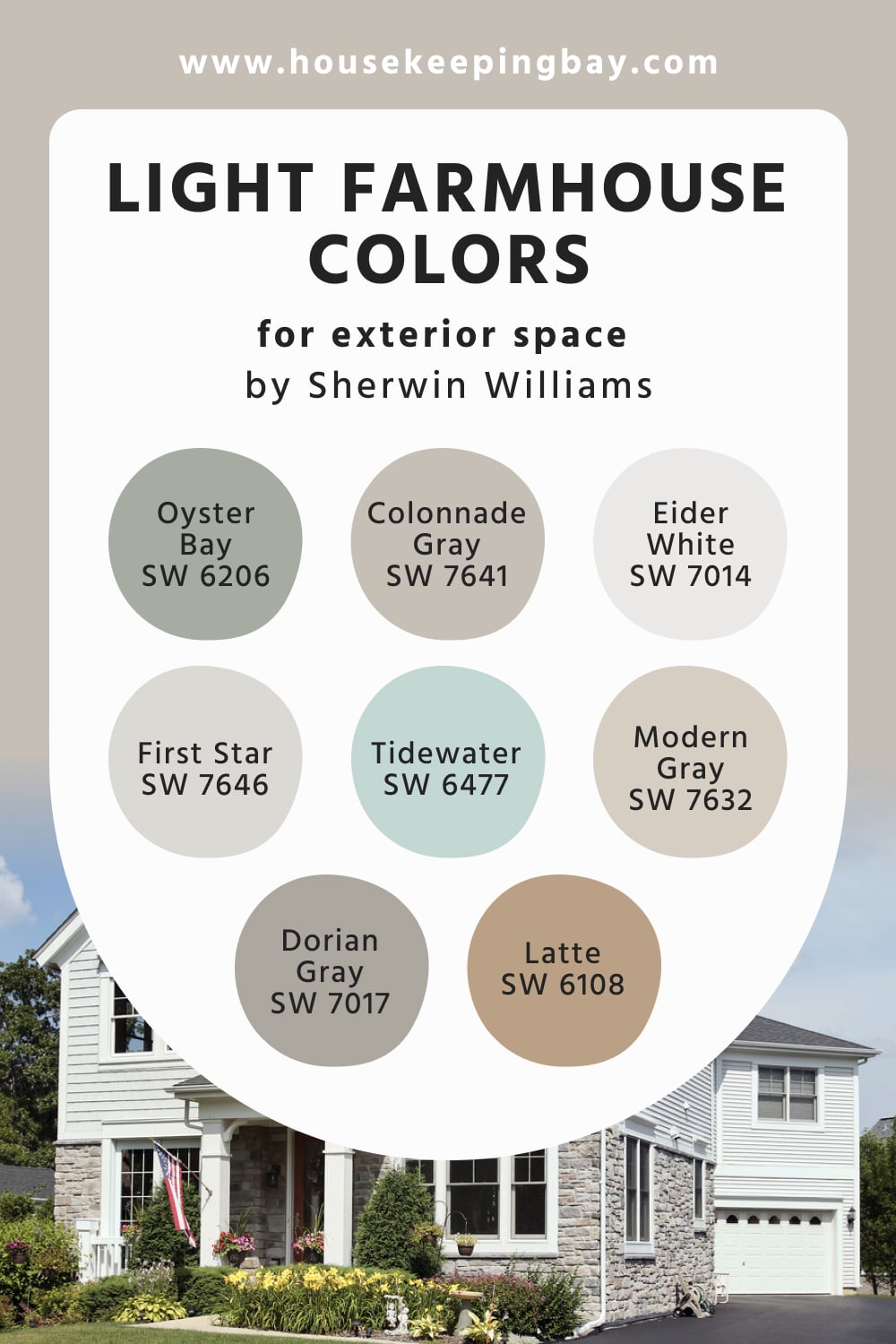
The palette consists of pleasantly muted and calm colors, such as:
- SW Dorian Gray
- SW First Star
- SW Oyster Bay
- SW Eider White
- SW Tidewater
- SW Latte
- SW Modern Gray
- SW Colonnade Gray
Also, there are a few other colors in it. Since all the colors are selected so that they match each other well and coordinate each other successfully, you can use any of them in pairs or use several colors to create your own color combinations that will make your facade work!
housekeepingbay.com
Dark Sherwin-Williams Farmhouse Colors For Exterior Space
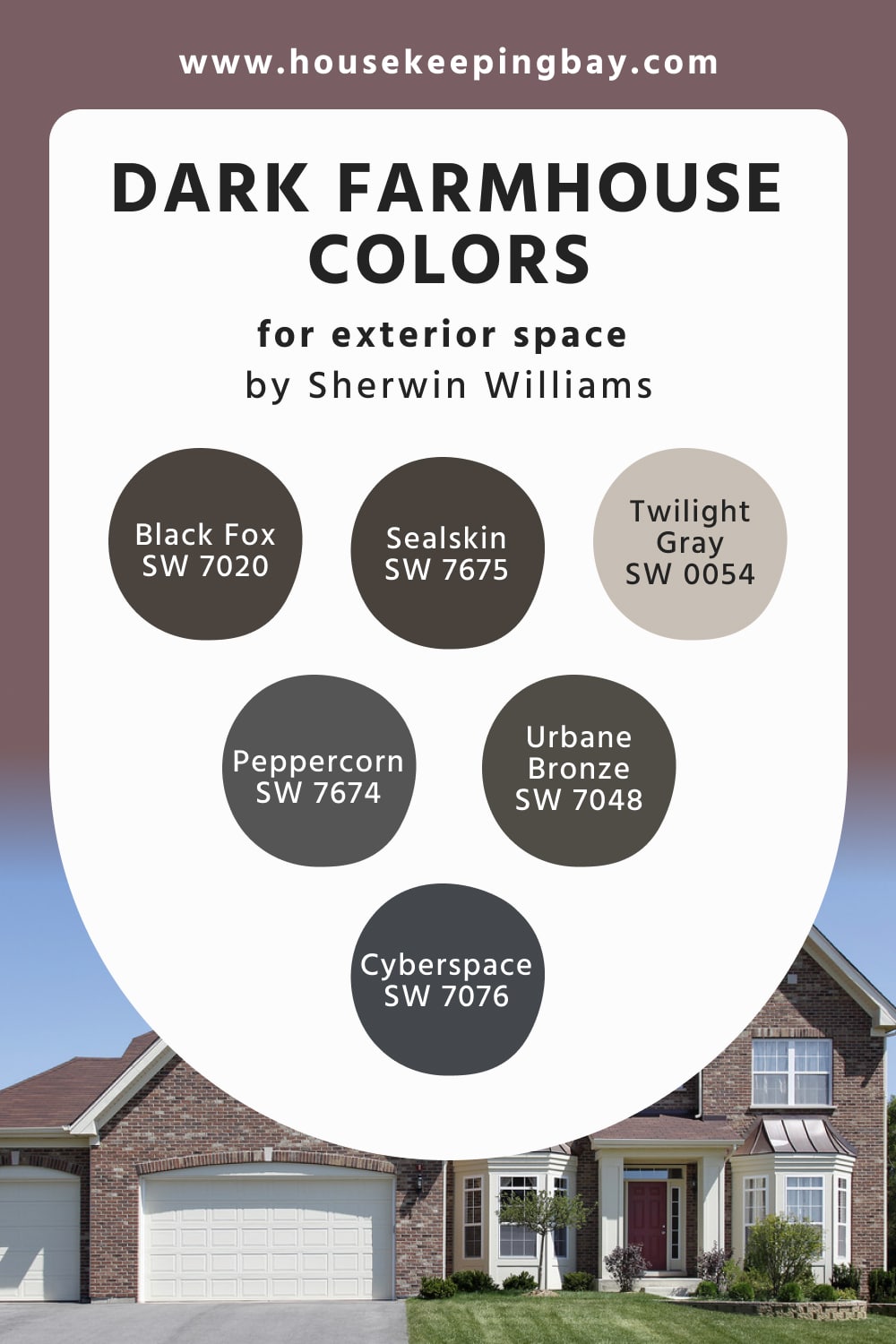
The colors that this palette consists of are very dark and deep, which is why they are only used for exterior painting projects:
- SW Black Fox
- SW Sealskin
- SW Twilight Gray
- SW Peppercorn
- SW Cyberspace
- SW Urbane Bronze
However, you should not fear that your house will look moody with them! This palette contains a reasonably light color called SW Twilight Gray, which can work as exterior wall color successfully. And you can use other, darker colors (e.g., SW Black Fox or SW Urban Bronze) to add accents on the roof or other surfaces.
Besides, even with such dark colors, you can still play with the palette since the colors in it are different, from dark browns like SW Sealskin to deep blue like SW Cyberspace.
housekeepingbay.com
Light Benjamin Moore Farmhouse Colors For Interior Space
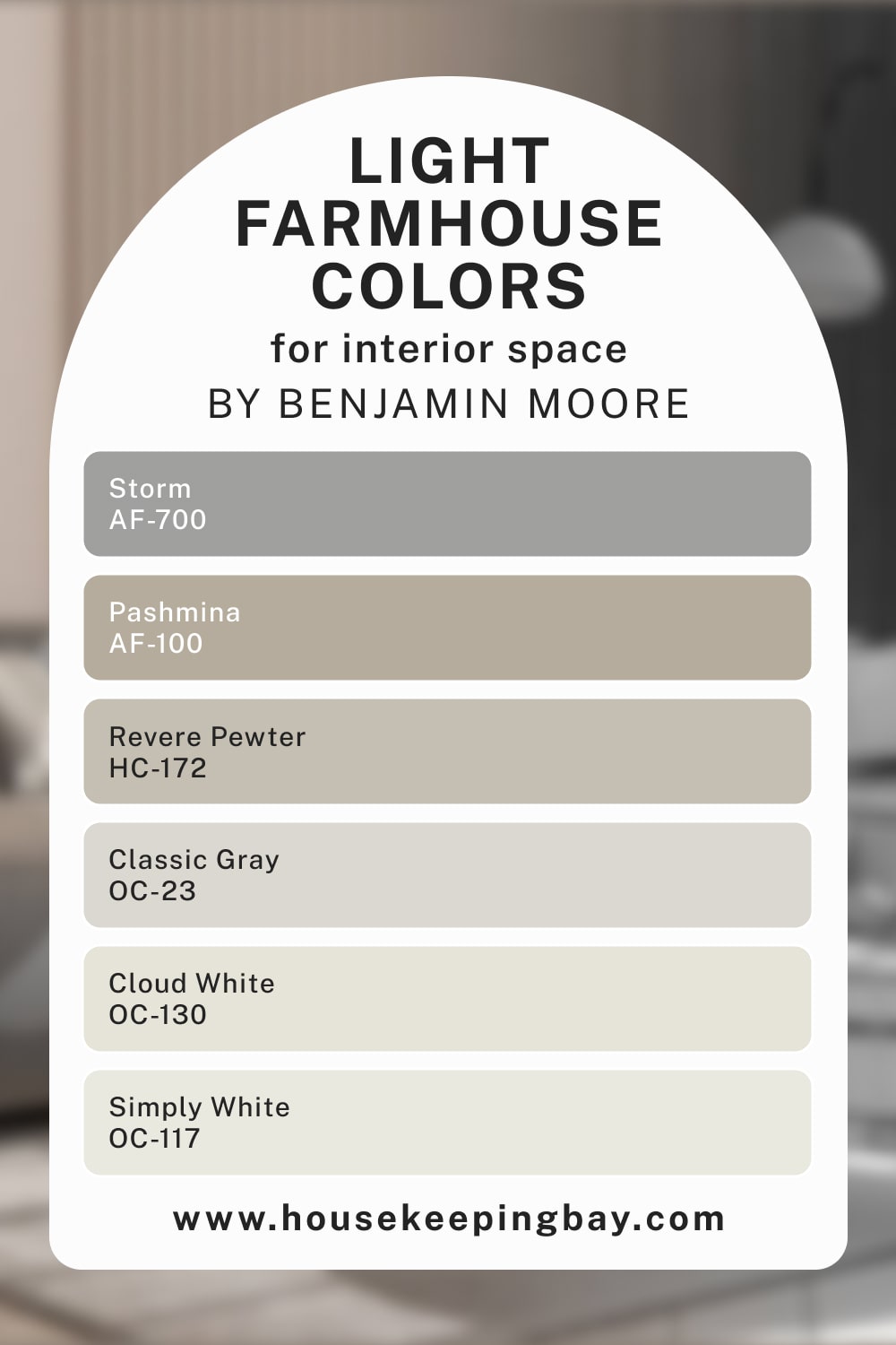
This color palette will be an ideal choice for those who prefer lighter and calmer shades in their living space. The light color palette by Benjamin Moore contains such colors as:
These and a few other colors create a balanced and tranquil atmosphere due to perfectly balanced tone and excellent coordination. You can use all of them or only choose a few colors to apply in your home. In any case, your interiors will look elegant, homey, and relaxing.
housekeepingbay.com
Dark Benjamin Moore Farmhouse Colors For Interior Space
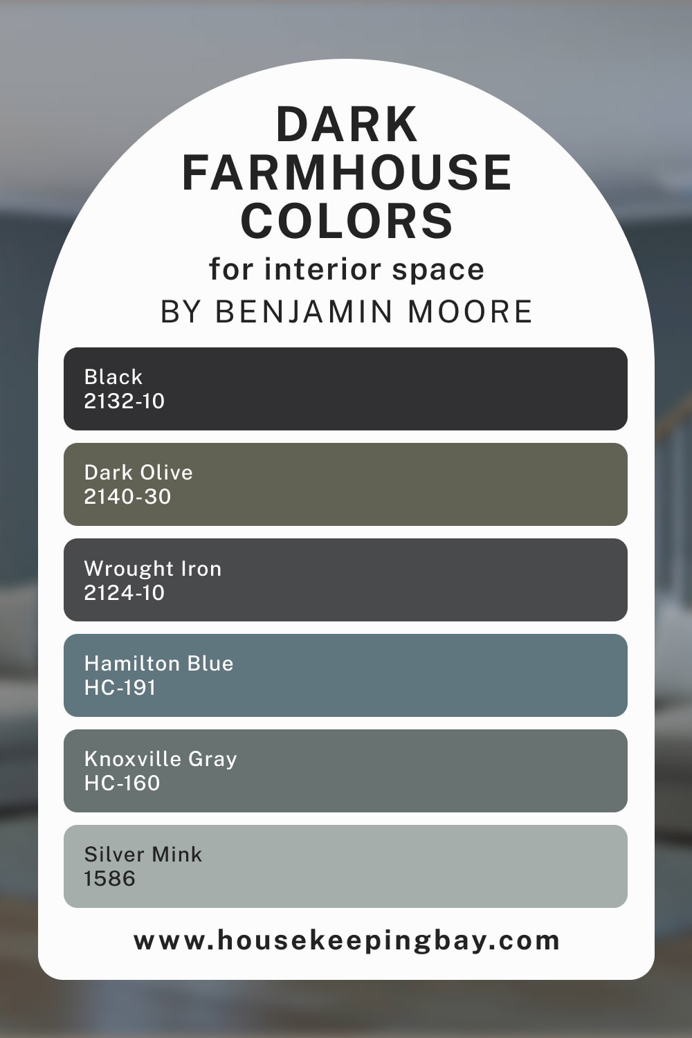
If you are fond of darker colors in your living space, you should consider this color palette by Benjamin Moore! Here are a few colors this palette consists of:
- BM Black
- BM Dark Olive
- BM Wrought Iron
- BM Hamilton Blue
- BM Silver Mink
- BM Knoxville Gray
Although it’s called dark, it also contains lighter colors (e.g., BM Silver Mink) that enlighten it a bit. As a result, if you combine the colors correctly and use enough white, your interior will not look gloomy and dark! By the way, this palette will be helpful if you want to have a dark blue color in the palette for your living room.
housekeepingbay.com
Light Benjamin Moore Farmhouse Colors For Exterior Space
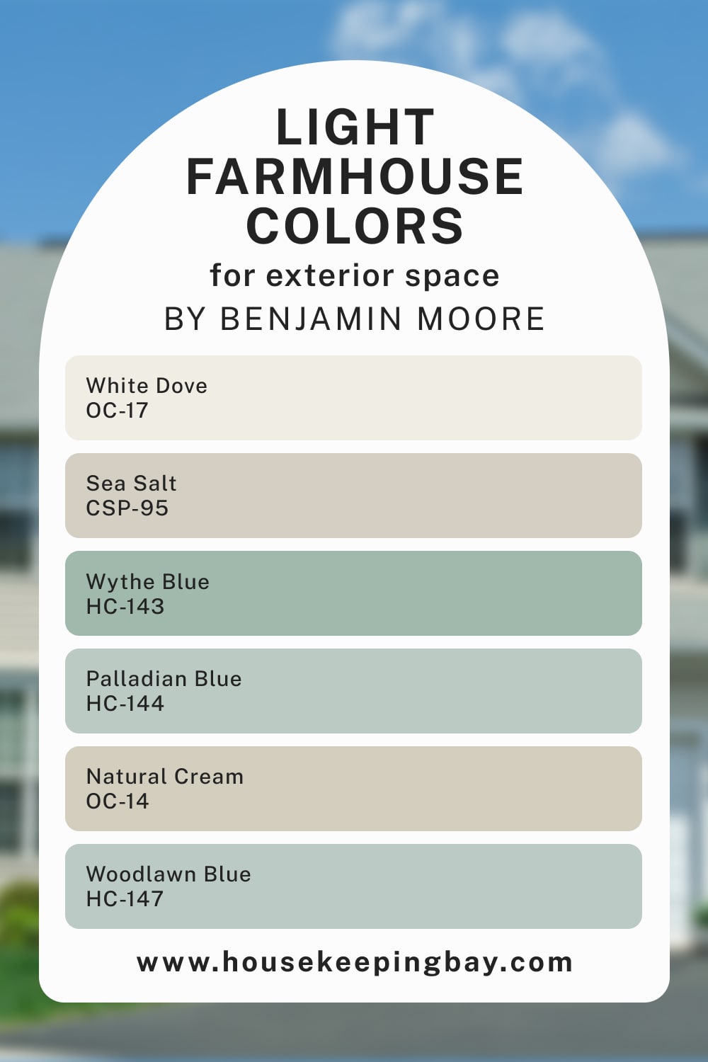
The colors that this palette consists of may seem a bit unusual for exterior paint colors at first. In particular, you can find the following colors in it:
- BM White Dove
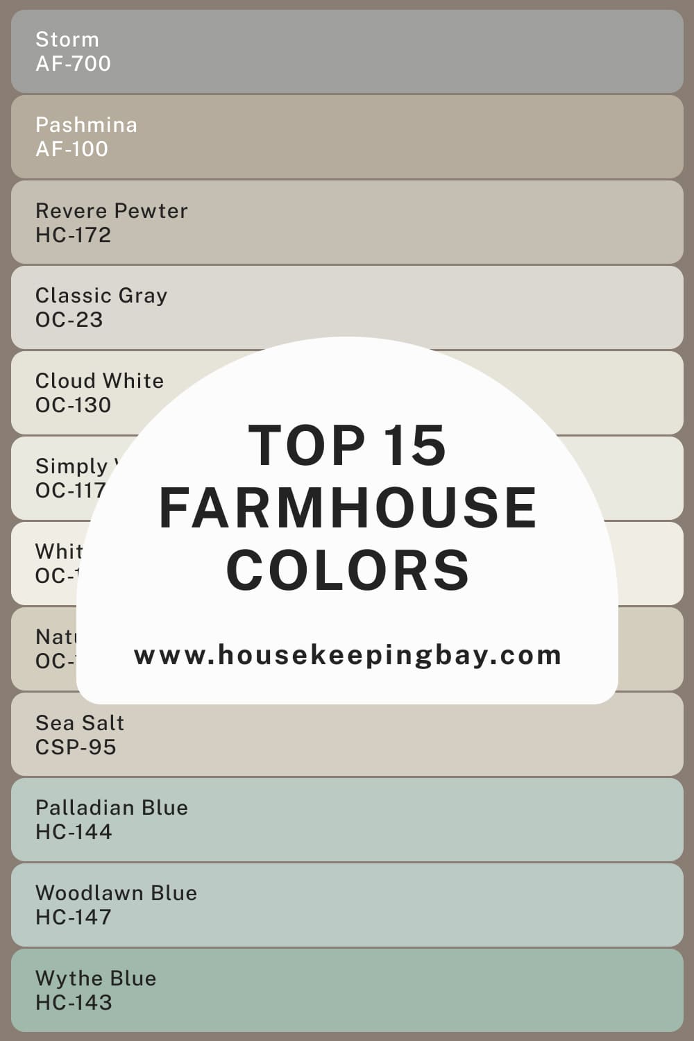
- BM Wythe Blue
- BM Sea Salt
- BM Palladian Blue
- BM Natural Cream
- BM Woodlawn Blue
In general, the palette creates a relaxed and balanced vibe. Also, due to the pretty light-toned colors, it will work great on exterior walls of houses that are located in sunny areas and on the seaside.
housekeepingbay.com
Dark Benjamin Moore Farmhouse Colors For Exterior Space
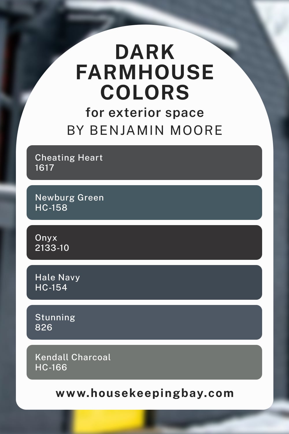
If you are looking for darker colors to use on your exterior walls, we recommend you consider this color palette by Benjamin Moore. Just check out the colors it consists of!
- BM Cheating Heart
- BM Onyx
- BM Newburg Green
- BM Hale Navy
- BM Stunning
- BM Kendall Charcoal
It may seem to be somewhat moody, though. But with the help of enough white, you can make it read less overwhelming. Besides, there is a lighter color in this palette too, which is BM Kendall Charcoal. But generally, we would not recommend you use too many colors from this palette on the same facade!
housekeepingbay.com
Popular Farmhouse Color Palette
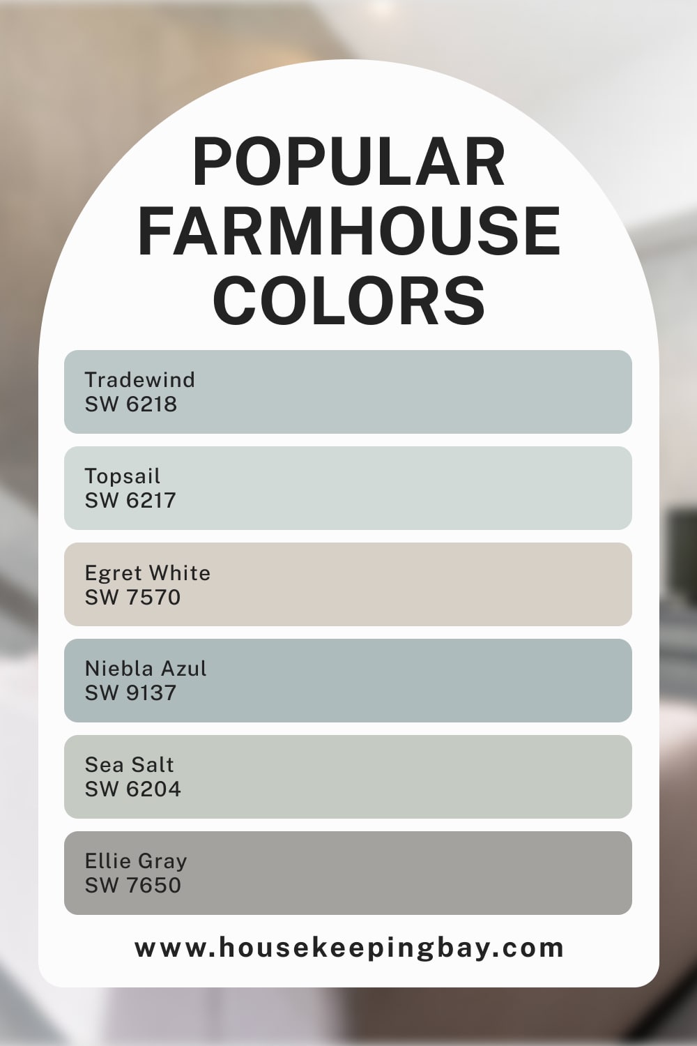
Are you searching for a living room color palette with a light blue color? Then you should consider this one! This palette contains the following paint colors:
- SW Tradewind
- SW Topsail
- SW Egret White
- SW Niebla Azul
- SW Sea Salt
- SW Ellie Gray
The Popular color palette contains colors that are most commonly used for a Farmhouse design. Besides, since this palette contains lighter colors and many of them are blue, it will add your living space a calming and refreshing vibe. All the colors pair nicely with whites, so you won’t have problems making your interior look lighter yet colorful enough!
housekeepingbay.com
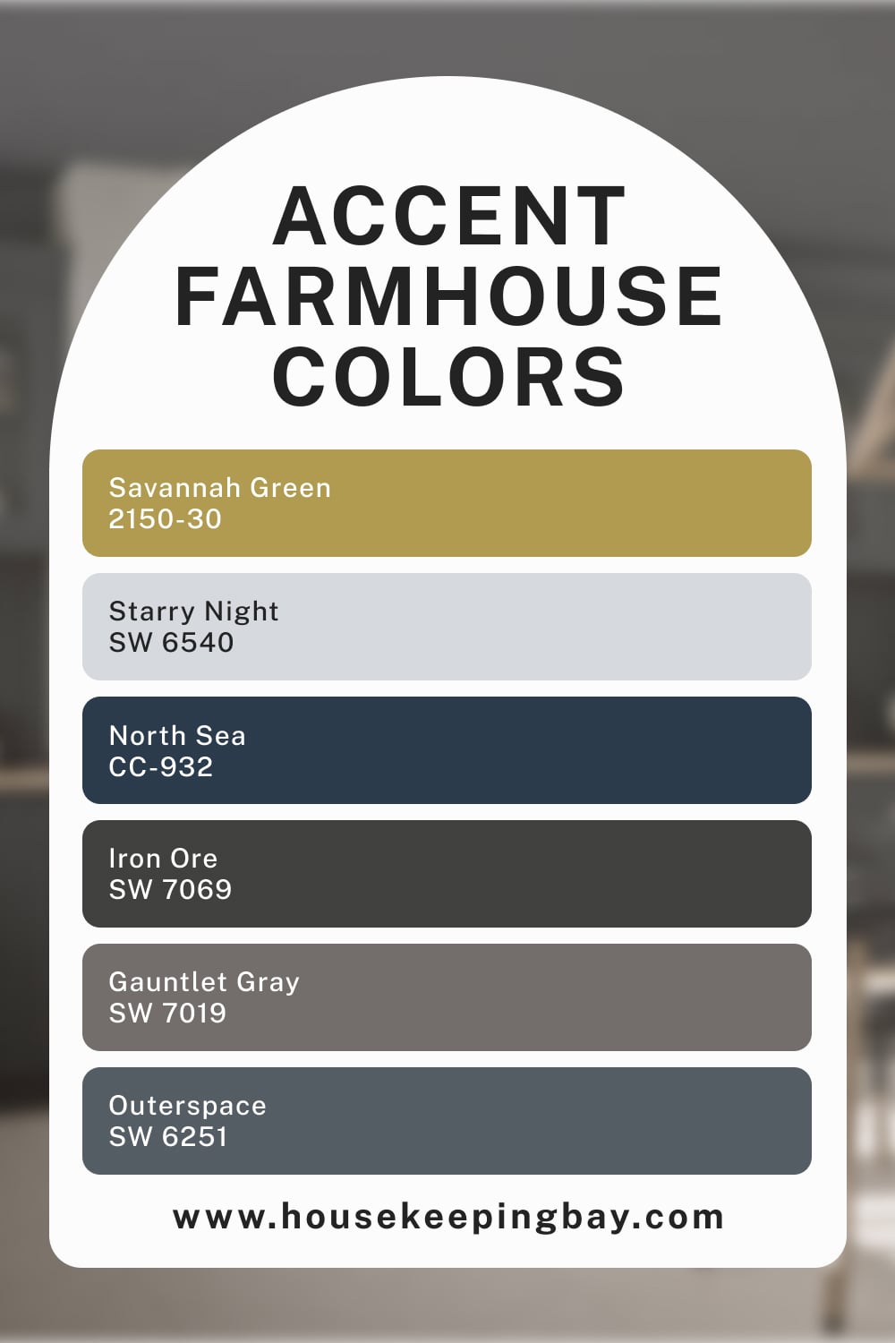
Accent Farmhouse Color Palette
For a living room (or any other room) color palette with a yellow color, the Accent color palette can be a handy choice. These are the colors it contains:
- BM Savannah Green
- SW Starry Night
- BM North Sea
- SW Iron Ore
- SW Gauntlet Gray
- SW Outerspace
Except for the yellow color (BM Savannah Green), this palette also contains light blue (SW Starry Night) and deeper blue colors (SW Outerspace, BM North Sea). Altogether, these colors create a balanced yet pretty dark palette that will make your interior look attractive and stylish.
housekeepingbay.com
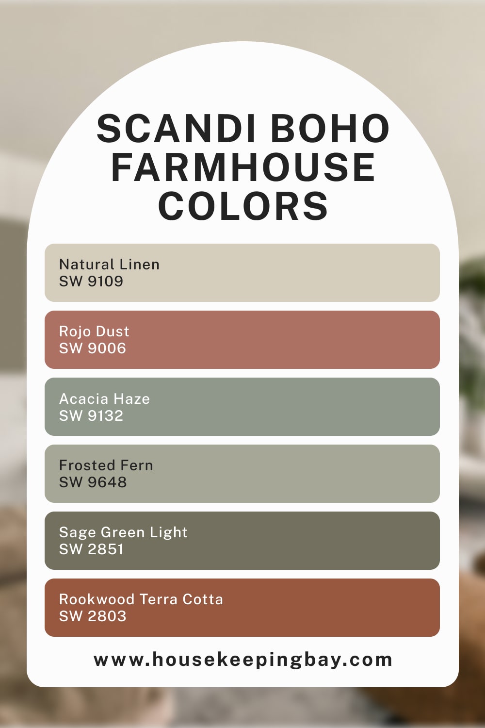
Scandi Boho Farmhouse Color Palette
To add some dark green color to your living room palette, you can use the Scandi Boho color palette. Except for the green (SW Sage Green Light), it also contains greenish gray colors (SW Acacia Haze, SW Frosted Fern), SW Rojo Dust, and SW Rookwood Terra Cotta, which are the two muted red colors. This is the list of colors that this palette contains:
- SW Natural Linen
- SW Rojo Dust
- SW Rookwood Terra Cotta
- SW Acacia Haze
- SW Frosted Fern
- SW Sage Green Light
The overall impression of this palette is calm and reserved, although it will definitely not make a space look washed out due to the varied colors it contains!
housekeepingbay.com
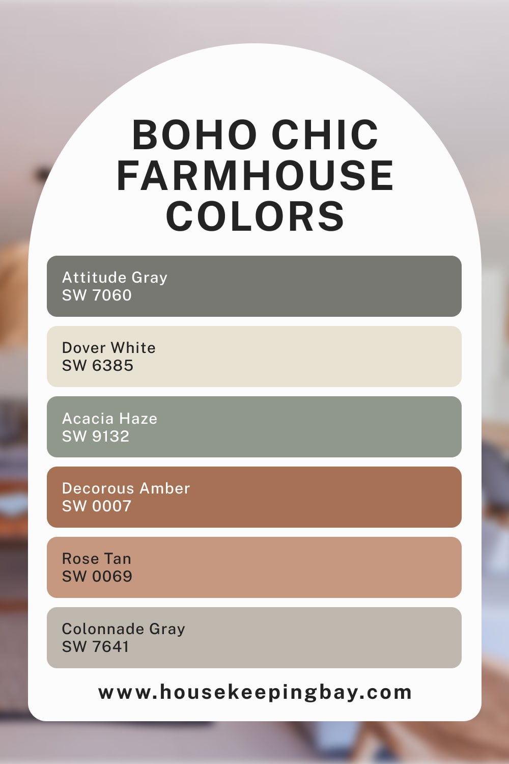
Boho Chic Farmhouse Color Palette
If you are looking for a color palette that is varied and colorful yet calming and muted, the Boho Chic palette is definitely the one you need! It consists of muted greenish gray colors like SW Acacia Haze, as well as gray (SW Colonnade Gray, SW Attitude Gray) and muted red colors (SW Decorous Amber, SW Rose Tan). There is also a warm white in it (SW Dover White).

This is what the complete list of colors looks like:
- SW Acacia Haze
- SW Colonnade Gray
- SW Attitude Gray
- SW Decorous Amber
- SW Rose Tan
- SW Dover White
Due to such a wide variety of colors, this palette will make any interior look cheerful and vivid without turning it into a space overloaded with bright and pronounced colors. Instead, you will get a relaxed yet interesting color combination that will catch one’s eye!
housekeepingbay.com
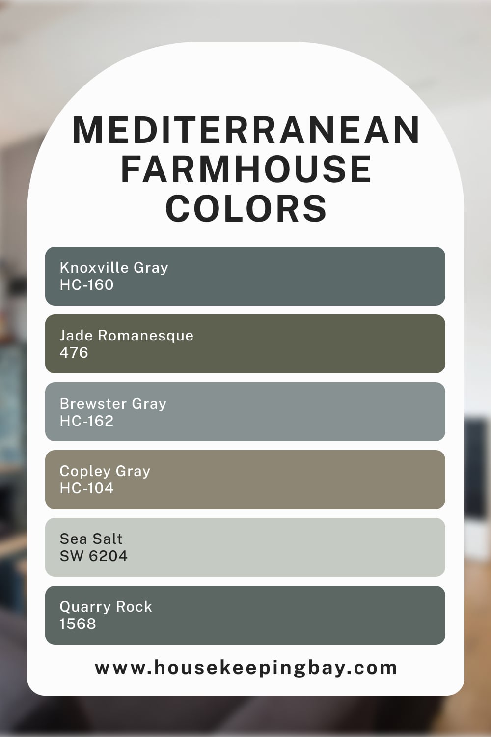
Mediterranean Farmhouse Color Palette
The dark green color in this palette might not be the best option for a living room, but all other colors can be easily incorporated into a living room design, as well as any other room design in your home. The Mediterranean palette mainly consists of bluish-gray colors such as BM Knoxville Gray, Brewster Gray, and Quarry Rock. Also, you can find a deep green in it (BM Jade Romanesque) and a grayish neutral with a soft green cast (BM Copley Gray).
The complete list of colors looks like this:
- BM Knoxville Gray
- BM Brewster Gray
- BM Quarry Rock
- BM Jade Romanesque
- BM Copley Gray
- SW Sea Salt
Thanks to the presence of lighter colors like BM Sea Salt and BM Brewster Gray, this palette doesn’t look too gloomy. However, we would recommend you add lighter colors or better whites to it when using its colors in your interior design! This will make the room read lighter and less “heavy.”
These were the color palettes that are considered the most suitable for a Farmhouse interior style. However, you can also find several exterior palettes on this list that will match this home style very well.
housekeepingbay.com
What Is a Farmhouse Style?
There are many home styles out there, but the Farmhouse style is one of the coziest ones. This style creates a homey and calming atmosphere in a house by using lighter and muted colors, as well as natural materials like hardwood and stone. This style brings simple and clean aesthetics, making interiors look airier and more spacious due to the use of lighter colors.
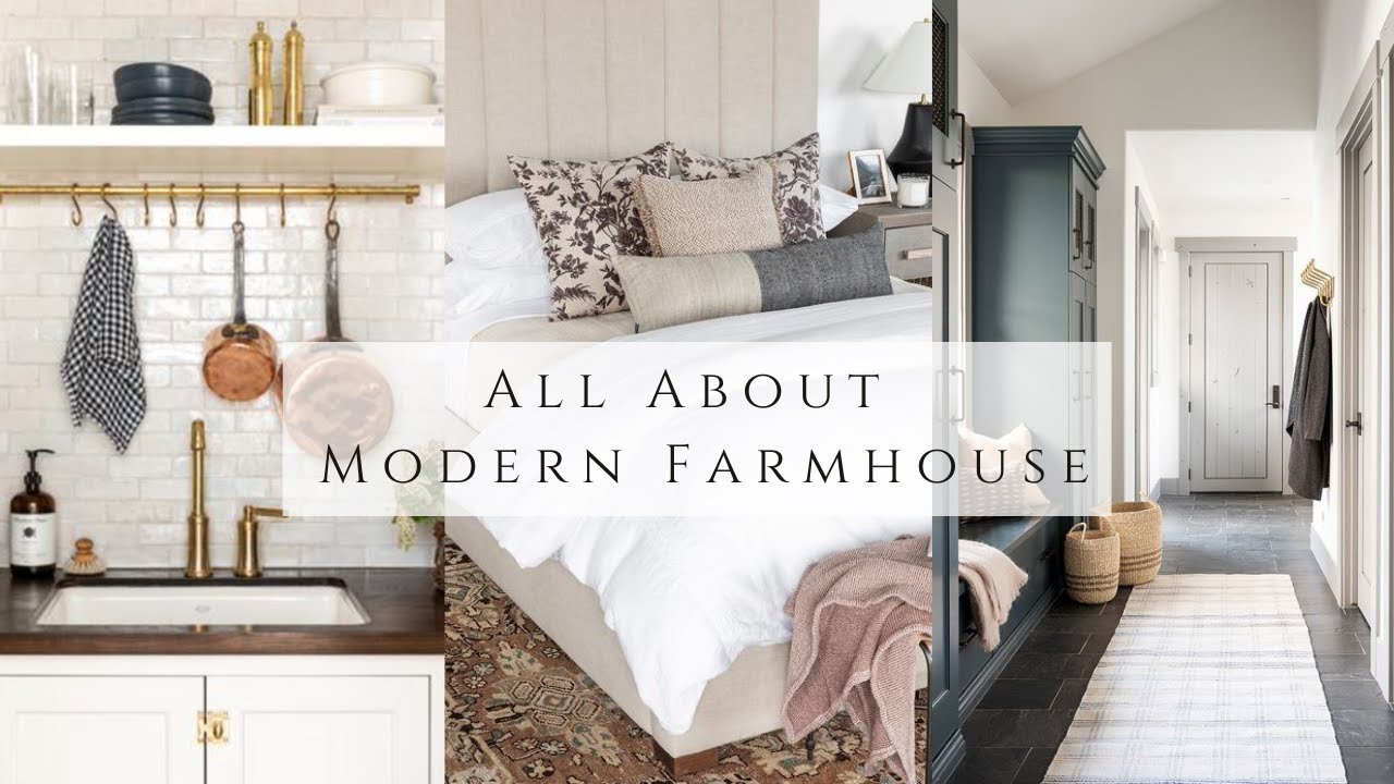
However, it doesn’t mean you can’t use darker colors for this home style! On the contrary, the Farmhouse home style welcomes black and dark greens or dark blue colors as well! You just need to ensure you don’t use too much of them to avoid making the space look too “heavy.”
This home style uses neutral color palettes, which is why all the colors are mostly muted and calm, with balanced tones and moderate light reflectivity. Also, you will hardly find bright and juicy colors in such homes. However, a Farmhouse interior does not look washed out! Thanks to quite a wide variety of colors used in it, it can still create a vivid and pleasant atmosphere with different colors.
Now you know what color palettes would look better in a Farmhouse-style home. We shared several palettes for interior and exterior use, which means you have a wide selection of colors, both lighter and darker. This will help you to choose the palette that will fit your home perfectly well!
Ever wished paint sampling was as easy as sticking a sticker? Guess what? Now it is! Discover Samplize's unique Peel & Stick samples. Get started now and say goodbye to the old messy way!
Get paint samples




Frequently Asked Questions
⭐Is Farmhouse a modern home style?
Not quite. The traditional Farmhouse style dates back to farmhouses of the old days. But there’s the Modern Farmhouse style that is indeed a new one.
⭐Does the Farmhouse style use only light colors?
No, it also uses blacks and darker colors (e.g., greens and blues), but mostly for making accents.
⭐Can I use live plants in my Farmhouse-style home?
Absolutely! Green plants are actually an inevitable part of this style!

