Wrought Iron 2124-10 by Benjamin Moore
Unveiling Elegance in Shades of Mystery
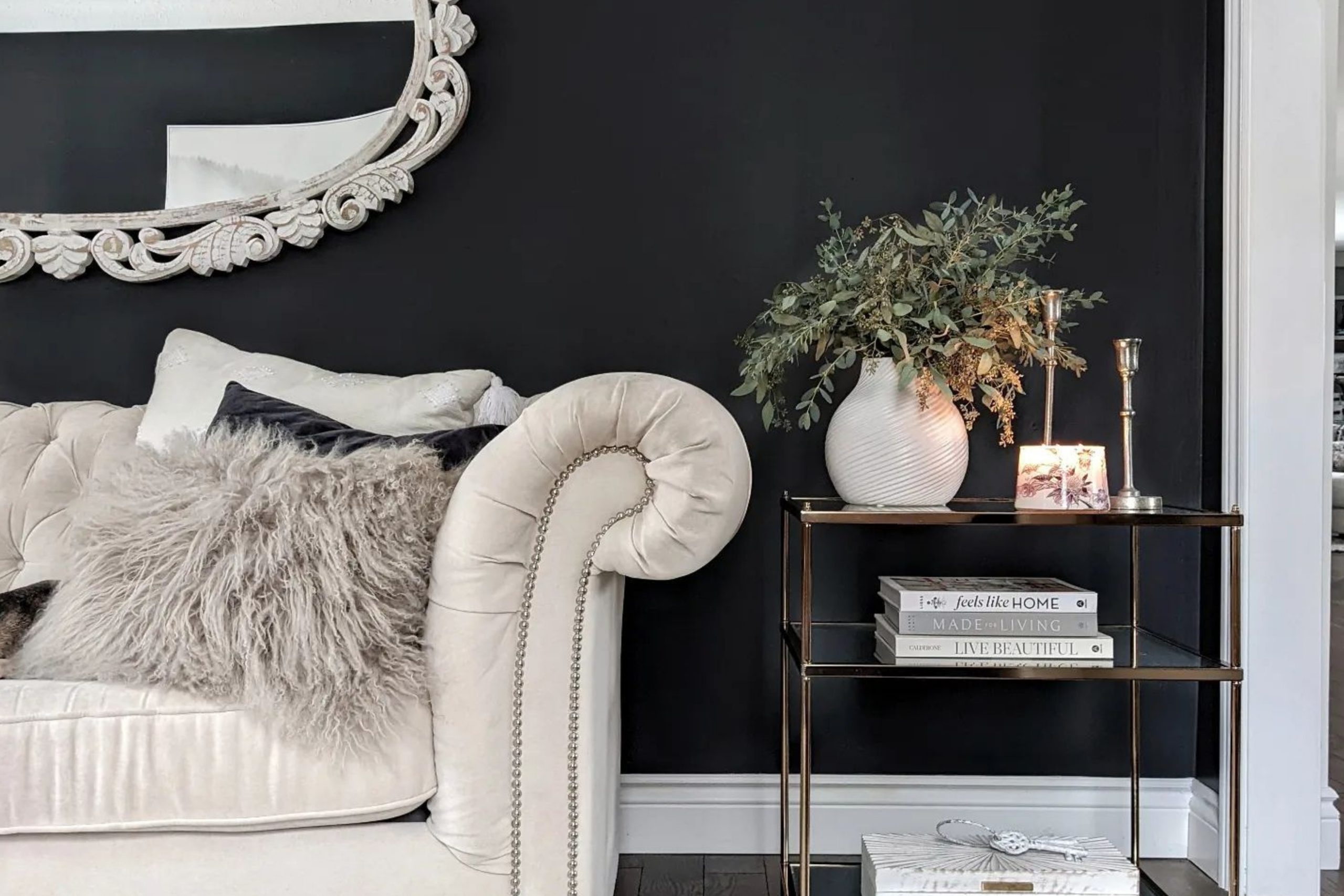
Let’s talk about a color that might just change the way you think about your space: 2124-10 Wrought Iron by Benjamin Moore. Picture a hue that brings the strength and timeless elegance of wrought iron into your home, offering a sophisticated backdrop that highlights your decor, furniture, or art.
Wrought Iron by Benjamin Moore isn’t just a simple black; it’s a deep, nuanced shade that can add dramatic flair or create a cozy, enveloping atmosphere, depending on how you use it. Think of it as the perfect balance between boldness and subtlety, making everything around it pop while standing strong on its own.
Whether you’re looking to refresh a single room or planning a full home makeover, starting with Wrought Iron as your base could open up a world of possibilities.
It’s like laying down a versatile foundation that works brilliantly with bright whites, soothing neutrals, or even bold color splashes. Jump right in to see how this color could transform your space into something truly your own.
via blacksburgbelle.com
What Color Is Wrought Iron 2124-10 by Benjamin Moore?
Table of Contents
Wrought Iron 2124-10 by Benjamin Moore is a dark, almost black hue with hints of navy blue underneath. This rich color offers a sophisticated vibe that can add depth and character to any room. Its versatility means it can work well in various interior styles, particularly industrial, modern farmhouse, and even traditional settings.
Wrought Iron 2124-10 acts as a strong base that can complement lighter shades, bringing balance and harmony to a space.
In terms of materials and textures, this color pairs beautifully with natural wood, whether it’s light oak or dark walnut, enhancing the warmth and natural feel of the wood. Metals, like brushed nickel or copper, also go well with this shade, adding a touch of elegance and contrast.
For textiles, think about incorporating velvet for a rich texture or linen for a more casual look, both of which will complement the depth of Wrought Iron 2124-10 without overwhelming the space.
Using this color in an interior can add a dramatic flair without making the room feel too dark or heavy. It works exceptionally well for accent walls, cabinetry, or even doors and trim, providing a grounding element that ties the room together.
housekeepingbay.com
Is Wrought Iron 2124-10 by Benjamin Moore Warm or Cool color?
Wrought Iron 2124-10 by Benjamin Moore is a rich, deep color that adds sophistication and depth to any home. Its unique shade, which closely resembles a dark charcoal with hints of navy, makes it a versatile choice for various spaces whether you’re painting an accent wall, cabinets, or an exterior.
Wrought Iron can serve as a bold statement or a neutral backdrop, depending on how it’s used. In well-lit areas, this color appears softer and can make a room feel cozy and inviting. In spaces with less natural light, it provides a dramatic flair, adding character and moodiness.
This color pairs beautifully with bright whites, offering a crisp contrast, or with soft grays and natural wood tones for a more understated look. Wrought Iron’s flexibility in blending with different styles and preferences makes it a favorite among homeowners looking to add a touch of elegance and modernity to their living spaces.
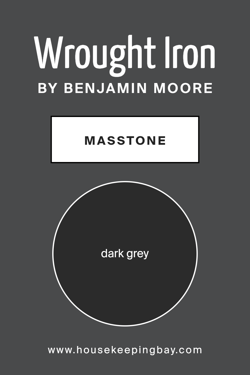
What is the Masstone of the Wrought Iron 2124-10 by Benjamin Moore?
Wrought Iron 2124-10 by Benjamin Moore is a paint color whose masstone, or main color when the paint is thick and undiluted, is a dark grey, specifically hue #2B2B2B. This deep, rich grey brings a sense of strength and sophistication to any space.
When used in homes, this color has a grounding effect, making rooms feel more anchored and cozy. It’s exceptionally versatile, working well in various settings, from modern to traditional. In spaces with lots of natural light, Wrought Iron can appear a bit lighter, showcasing subtle nuances of its grey tones.
In less brightly lit areas, it offers a formidable presence, adding depth and character. This color pairs beautifully with a wide range of other colors, from bright whites to warm woods, making it a popular choice for homeowners looking to add a bit of elegance without overwhelming a room.
Its ability to act as both a striking feature color and a complementary backdrop makes it a smart pick for walls, cabinetry, or accent features in the home.
housekeepingbay.com
Undertones of Wrought Iron 2124-10 by Benjamin Moore
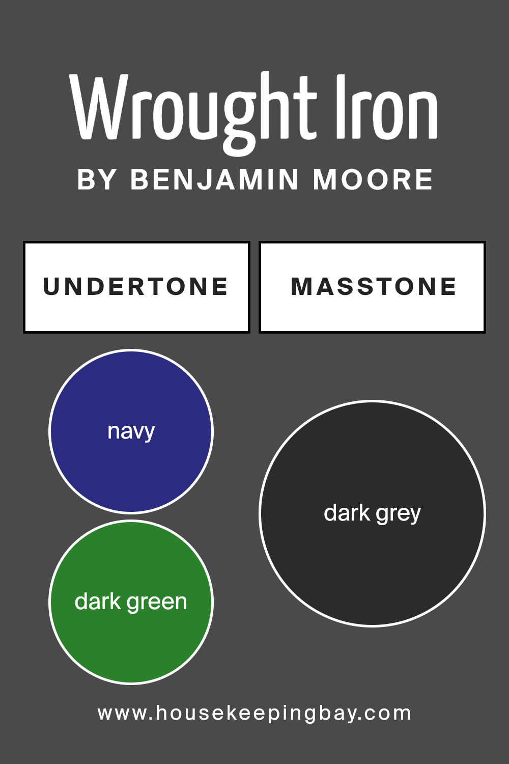
Wrought Iron 2124-10 by Benjamin Moore is a unique color with complex undertones that significantly influence its appearance. This color can show hints of navy, dark green, brown, dark turquoise, purple, olive, and grey.
These undertones play a crucial role in how we perceive the color, as they can emerge differently depending on the lighting and surrounding colors. For instance, in a well-lit room or when placed next to lighter shades, the navy or dark turquoise undertones might become more visible, giving the wall a cooler feel.
Conversely, in dimmer light or when paired with warm colors, brown or olive undertones might stand out, making the space feel cozier.
On interior walls, Wrought Iron 2124-10’s versatility comes from these underlying colors. The presence of dark green and olive can add a touch of nature-inspired serenity, making it suitable for spaces meant for relaxation. Purple and brown undertones can introduce a subdued warmth, ideal for creating inviting living areas or bedrooms.
The grey undertone serves as a neutral base, ensuring that despite its depth, Wrought Iron 2124-10 retains a balanced, adaptable quality. This adaptability means it can fit various design styles and preferences, subtly shifting in mood depending on the room’s specific characteristics and décor, making it a dynamic choice for interior walls.
housekeepingbay.com
Coordinating Colors of Wrought Iron 2124-10 by Benjamin Moore
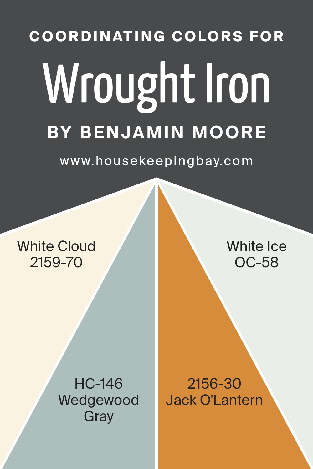
Coordinating colors are meant to complement a primary paint color, creating a cohesive and appealing look in any space. For example, when dealing with a robust shade like Wrought Iron 2124-10 by Benjamin Moore, a deep, dark gray with subtle undertones, finding the right coordinating colors can make all the difference.
These shades work together to balance the ambiance of a room, ensuring that the primary color stands out without overwhelming the space.
White Cloud 2159-70 offers a gentle contrast to the assertive Wrought Iron, providing a fresh, airy feel to the room. It’s like a soft whisper against a stormy sky, bringing in a sense of calmness. Wedgewood Gray HC-146, on the other hand, acts as a bridge between the light and dark shades.
It’s a medium tone that shares the coolness of Wrought Iron but with a softer edge, perfect for creating a harmonious flow. Jack O’Lantern 2156-30 introduces a playful leap into color, a vibrant orange that adds warmth and energy to spaces dominated by cooler tones.
Finally, White Ice OC-58, the lightest of them all, offers a subtle freshness, almost like morning frost, adding a refined touch without competing for attention. Together, these coordinating colors support and enhance the depth and complexity of Wrought Iron, offering versatile options for designing a space that feels both balanced and beautifully layered.
You can see recommended paint colors below:
- 2159-70 White Cloud
- HC-146 Wedgewood Gray
- 2156-30 Jack O’Lantern
- OC-58 White Ice
housekeepingbay.com
How Does Lighting Affect Wrought Iron 2124-10 by Benjamin Moore?
Lighting plays a crucial role in how we see colors. The type of light, whether natural or artificial, can change the appearance of a color significantly. Take the color Wrought Iron 2124-10 by Benjamin Moore, for instance. This shade is a deep, charcoal gray that can look different under various lighting conditions.
In artificial light, such as LED or incandescent bulbs, Wrought Iron can appear warmer or have a slightly brighter edge. The warmth or coolness of the artificial light can push it towards a softer gray or highlight its deep undertones, making it more dynamic and rich in appearance.
Under natural light, the color transforms throughout the day. Sunrise and sunset can bathe the color in a warm glow, softening its intensity. During midday, when the sun is highest, Wrought Iron may look more true to its swatch, showing its depth without the influence of warm or cool light.
In rooms facing north, light is cooler and can make Wrought Iron appear more steadfast and bold, enhancing its deep, charcoal qualities. These rooms don’t get a lot of direct sunlight, so the color maintains a consistent and sophisticated look throughout the day.
South-facing rooms get a lot of sunlight, which can make the color appear lighter and bring out hidden undertones. Wrought Iron in a south-facing room may reveal more of its gray aspects, softening its impact and providing a different feel throughout the day.
East-facing rooms see the most change in this color. Morning light can make Wrought Iron look softer and more welcoming, while the absence of direct light in the afternoon and evening can return it to its deeper, more enigmatic state.
West-facing rooms offer a reverse of the east-facing experience. Afternoons and evenings fill the room with warm light, potentially making Wrought Iron take on a softer, warmer appearance, while mornings will see it in its true deep, charcoal state.
In summary, the lighting direction and source play significant roles in how we perceive the color Wrought Iron 2124-10. Its appearance can shift from a warm, inviting gray to a steadfast, deeper charcoal depending on the light it’s under, showcasing the dynamic nature of colors under varying lighting conditions.
housekeepingbay.com
What is the LRV of Wrought Iron 2124-10 by Benjamin Moore?
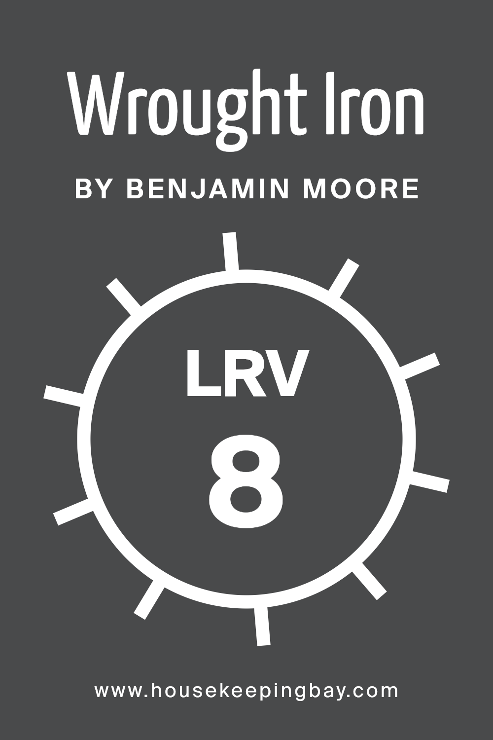
For the color Wrought Iron 2124-10 by Benjamin Moore, which has an LRV of 8.17, it’s on the lower end of the scale, meaning it reflects very little light. This low LRV indicates that Wrought Iron 2124-10 is a very dark color, which can significantly impact the appearance and feel of a space.
In rooms with plenty of natural light, this color can add depth and drama, giving the space a sophisticated look.
However, in poorly lit rooms, it might make the space feel smaller or more enclosed. When using a color with such a low LRV, it’s important to consider lighting, both natural and artificial, to ensure the room maintains a balanced and appealing ambiance.
housekeepingbay.com
What are the Trim colors of Wrought Iron 2124-10 by Benjamin Moore?
Trim colors are specific paint hues selected to highlight or complement the main color applied on walls, doors, windows, and other architectural details of a room or exterior. Choosing the right trim color can enhance the overall appearance of a space, creating a cohesive look that ties the elements of the room together.
In the case of Wrought Iron 2124-10 by Benjamin Moore, a deep, rich color with a striking presence, selecting the right trim colors is crucial to balance its intensity and bring out its best qualities without overwhelming the space.
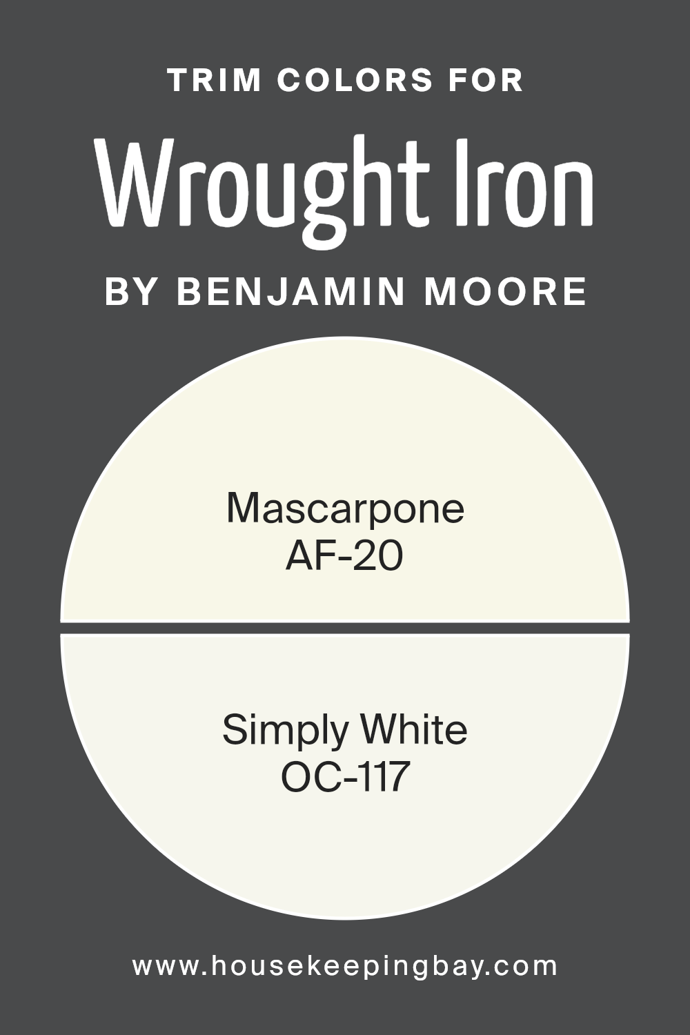
For Wrought Iron 2124-10, two excellent choices for trim colors are AF-20 – Mascarpone and OC-117 – Simply White by Benjamin Moore. Mascarpone is a warm, creamy white that offers a soft contrast to Wrought Iron, adding a touch of lightness and warmth to spaces that feature this dark hue.
This combination can make a room feel inviting and cozy. On the other hand, Simply White is a bright, clean white with a slight hint of warmth. It provides a more striking contrast against Wrought Iron, which can help to define architectural details more crisply.
By pairing Wrought Iron with either of these trim colors, you can achieve a balanced, polished look that enhances both the depth of the darker hue and the crisp freshness of the trim.
You can see recommended paint colors below:
- AF-20 Mascarpone
- OC-117 Simply White
housekeepingbay.com
Colors Similar to Wrought Iron 2124-10 by Benjamin Moore
In design, selecting similar colors is key to creating a harmonious and visually appealing space. Colors that share a close relationship on the color wheel, or have similar undertones, can subtly tie together elements of a room, making the space feel cohesive.
For instance, colors like those similar to Benjamin Moore’s Wrought Iron 2124-10 work wonders in achieving a sophisticated yet understated look. This particular shade is a deep, almost mystical gray that serves as a versatile backdrop for both modern and traditional settings.
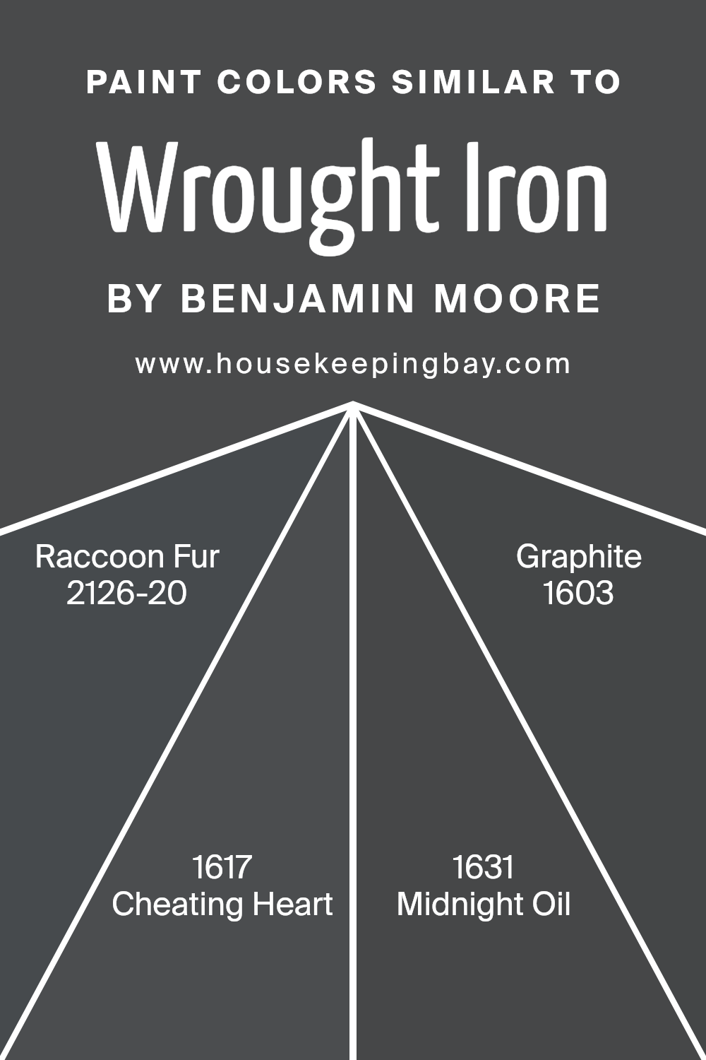
Similar colors, such as Raccoon Fur 2126-20, Cheating Heart 1617, Midnight Oil 1631, and Graphite 1603, follow in the same vein, each presenting a unique variant of dark gray that can effortlessly complement each other or stand alone as the main color in a room.
Raccoon Fur 2126-20 is a rich, deep gray with navy undertones, offering a sense of depth and warmth. Cheating Heart 1617 is a tad lighter, presenting as a soft charcoal that works well in spaces that need a gentle yet still dark splash of color. Midnight Oil 1631 adds a vibrant twist, as it leans towards the bluer side of gray, bringing a moody but refreshing feel to any room it adorns. Graphite 1603 rounds out this collection as the lightest of the bunch, providing a steel-like gray that can lighten up a space while maintaining the sophisticated palette initiated by Wrought Iron 2124-10. Through these similar colors, designers and homeowners alike can craft spaces that are both cohesive and full of character, using the subtle nuances of each shade to add layer and texture to their design projects.
You can see recommended paint colors below:
- 2126-20 Raccoon Fur
- 1617 Cheating Heart
- 1631 Midnight Oil
- 1603 Graphite
housekeepingbay.com
Colors that Go With Wrought Iron 2124-10 by Benjamin Moore
Choosing the right colors to pair with Wrought Iron 2124-10 by Benjamin Moore is crucial for creating a harmonious and appealing space. Wrought Iron is a deeply saturated shade that can act as a strong foundation for a variety of color schemes.
When you pair it with the right colors, you can achieve a balanced and cohesive look in any room. These companion colors, carefully selected to complement Wrought Iron, help in crafting a space that feels both sophisticated and welcoming.
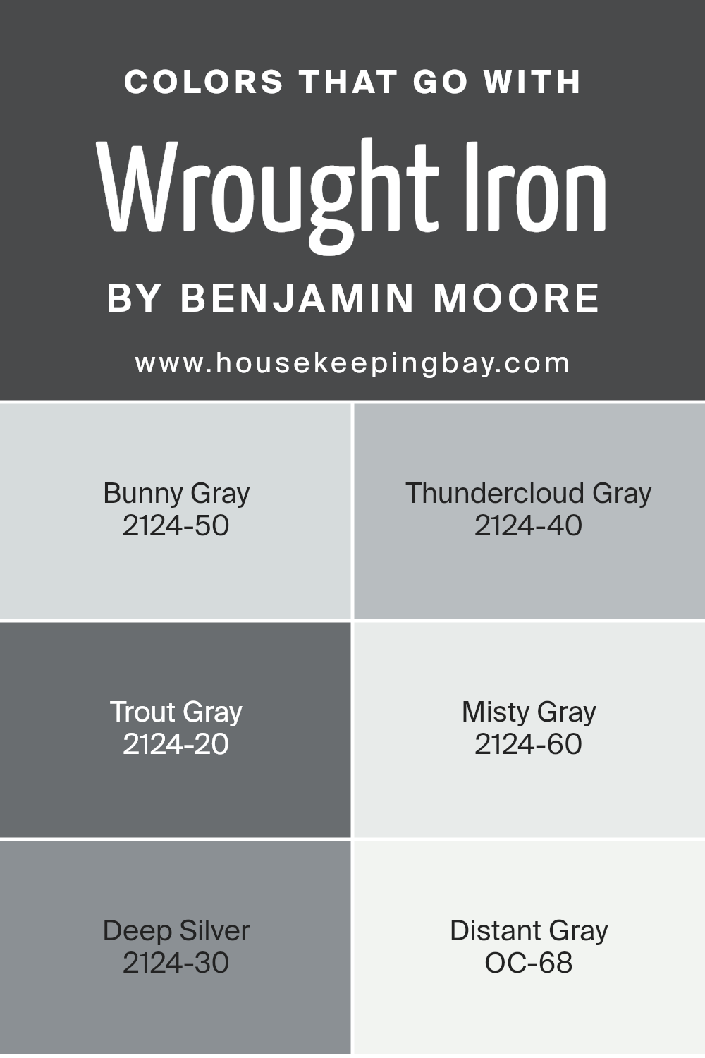
Bunny Gray 2124-50, for example, is a soft, light gray that adds a gentle contrast to the boldness of Wrought Iron, creating a serene and airy feel. Thundercloud Gray 2124-40, a little deeper, brings a sense of solidity and depth, perfect for adding a layer of complexity to the design.
Trout Gray 2124-20, on the darker side, matches the intensity of Wrought Iron, offering a striking and robust pairing suitable for a dramatic effect. For a softer approach, Misty Gray 2124-60 introduces a hint of warmth, ensuring the space feels cozy and inviting.
Deep Silver 2124-30, with its unique blend of gray and blue, injects a touch of elegance and refinement into the mix. Lastly, Distant Gray OC-68, almost ethereal in its lightness, contrasts sharply with Wrought Iron, making the darker shade pop and bringing a refreshing lightness to the overall palette. Together, these colors work in harmony to enhance the visual appeal of Wrought Iron, enabling you to create a space that’s both stylish and comfortable.
You can see recommended paint colors below:
- 2124-50 Bunny Gray
- 2124-40 Thundercloud Gray
- 2124-20 Trout Gray
- 2124-60 Misty Gray
- 2124-30 Deep Silver
- OC-68 Distant Gray
housekeepingbay.com
How to Use Wrought Iron 2124-10 by Benjamin Moore In Your Home?
Wrought Iron 2124-10 by Benjamin Moore is a paint color that offers a strong statement for any room. Think of it as a dark, almost black shade, but with a hint of blue that adds a unique depth. It’s perfect for those looking to add a bold touch to their home without going full black.
You can use Wrought Iron in various ways. For example, painting an accent wall can add a dramatic flair to your living room or bedroom. This color also works great on exterior doors and trim, giving your home’s facade an elegant upgrade.
If you have a piece of furniture that needs a new life, Wrought Iron can give it a chic, modern look. Even in a small bathroom, using this color can create a cozy, sophisticated space. Wrought Iron pairs well with bright whites or soft neutrals, allowing for endless decor possibilities.
Transform your space with this rich, versatile color for an effect that’s both stylish and timeless.
Wrought Iron 2124-10 by Benjamin Moore vs Graphite 1603 by Benjamin Moore
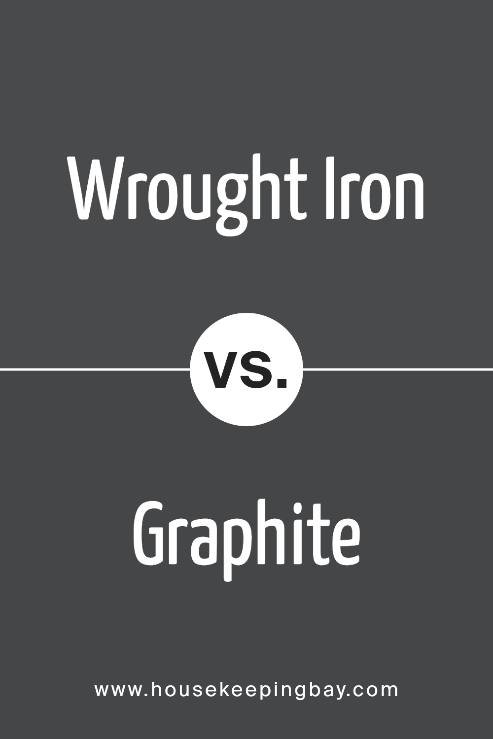
Wrought Iron 2124-10 by Benjamin Moore is a deep, almost black, shade with hints of blue undertones. It gives off a strong, bold vibe, making it great for spaces where a striking statement is desired. This color works well in modern decors or to accent more traditional settings, providing a sophisticated contrast without being too overpowering.
Graphite 1603, also by Benjamin Moore, is a lighter, more muted gray. It leans towards a softer look, suitable for creating a cozy, inviting atmosphere. Graphite’s versatility allows it to blend seamlessly with various color palettes, making it an excellent choice for those looking to achieve a balanced, harmonious space.
While Wrought Iron lends itself to dramatic flair, Graphite offers a gentler approach for elegant yet understated rooms. Both colors bring their unique character to interiors, but their impact and mood-setting capabilities differ, catering to different aesthetic preferences and design needs.
You can see recommended paint color below:
- 1603 Graphite
housekeepingbay.com
Wrought Iron 2124-10 by Benjamin Moore vs Raccoon Fur 2126-20 by Benjamin Moore
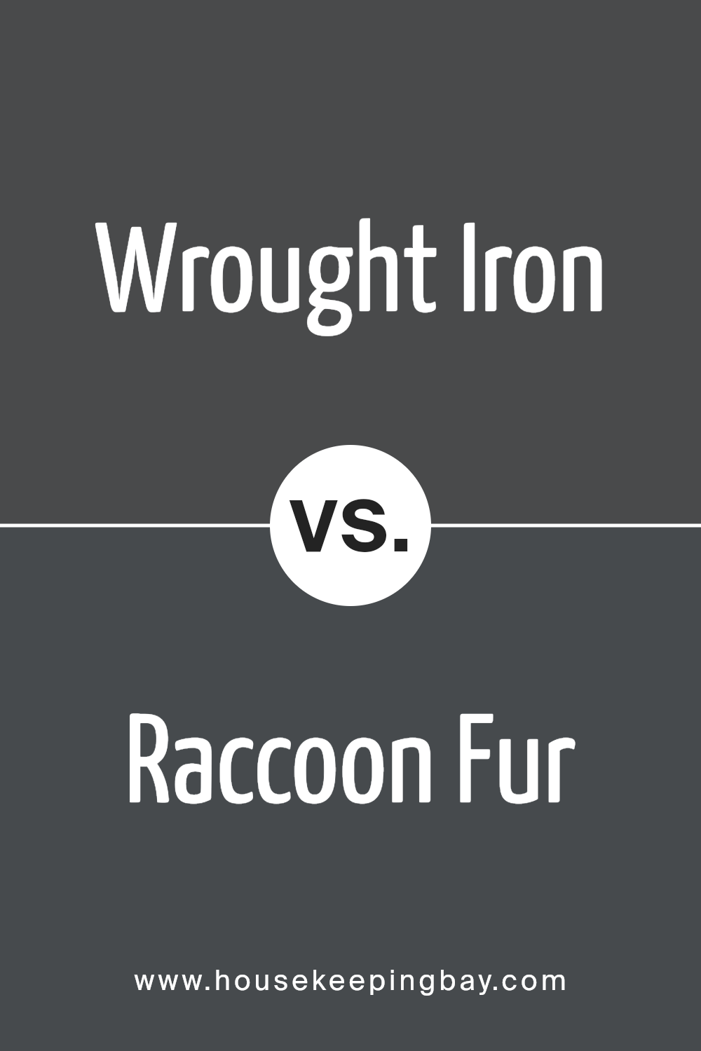
Wrought Iron 2124-10 by Benjamin Moore is a deeply saturated color, offering a strong presence with its almost black hue that hints at an underlying blue. It brings a sophisticated touch to spaces, making it perfect for accent walls or statement pieces in interior design. This color can make rooms feel more grounded and cozy, adding a sense of depth without overwhelming the space.
Raccoon Fur 2126-20, also by Benjamin Moore, shares some similarities with Wrought Iron but leans more towards a darker, nuanced gray with blue undertones. It’s not as intense as Wrought Iron, providing a softer alternative for those looking to add a dark color to their palette without going too close to black.
Raccoon Fur is versatile, working well in various lighting conditions to create a mood that is both refined and inviting.
While both colors offer a rich depth, Wrought Iron has a more intense, almost black quality, whereas Raccoon Fur provides a softer, more nuanced approach with its blend of gray and blue. These differences make them suitable for different applications in home decor, depending on the desired impact and mood in a room.
You can see recommended paint color below:
- 2126-20 Raccoon Fur
housekeepingbay.com
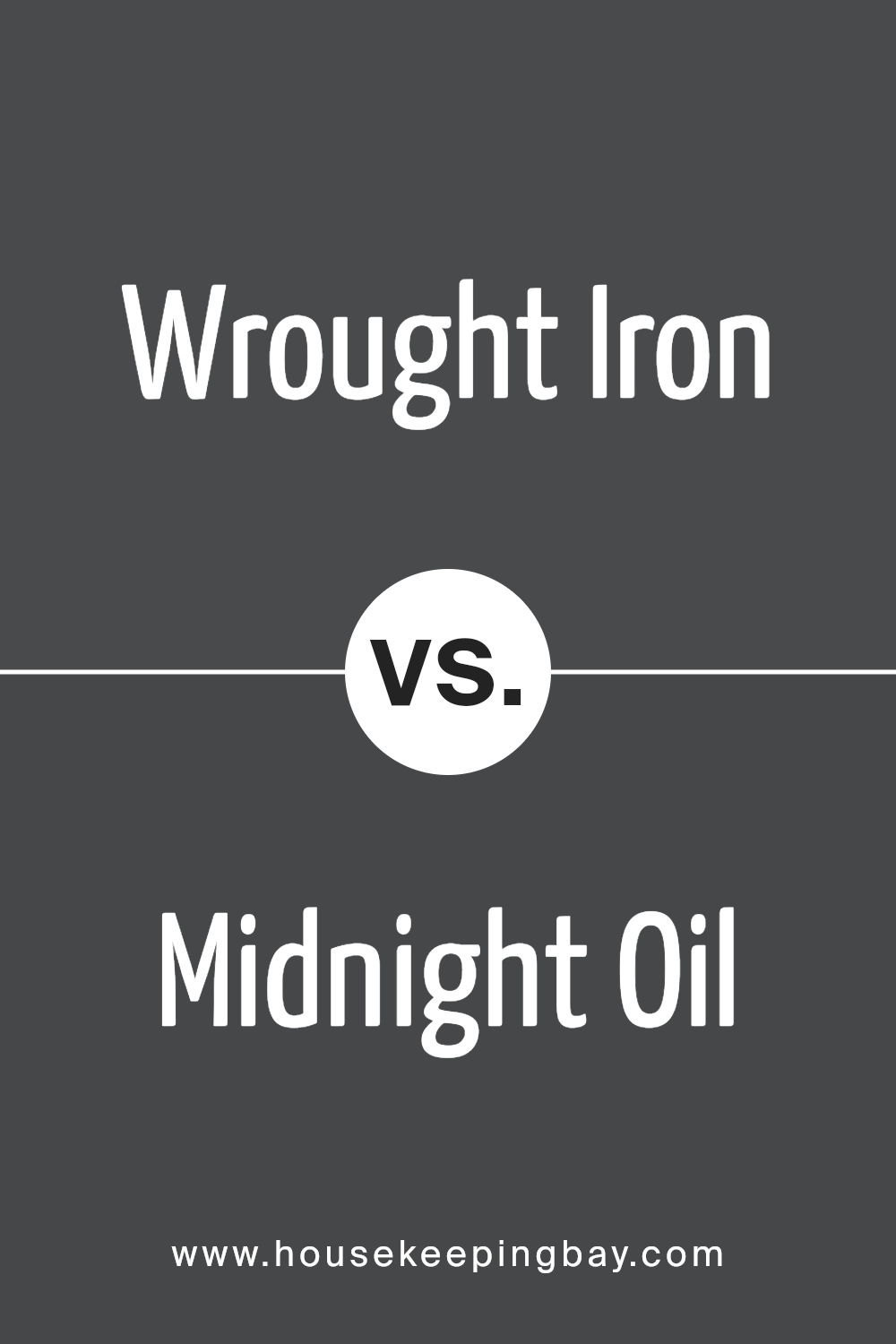
Wrought Iron 2124-10 by Benjamin Moore vs Midnight Oil 1631 by Benjamin Moore
Wrought Iron 2124-10 by Benjamin Moore is a deep, dark gray with just a hint of blue. It has a strong, almost charcoal quality, making it a bold choice for spaces. This color is versatile, working well in a variety of settings, from modern to traditional, providing a sophisticated backdrop that complements both vibrant and muted tones.
Midnight Oil 1631 by Benjamin Moore, however, is a rich navy that leans more towards the sophisticated side of the spectrum. It’s not just dark; it has depth. Unlike Wrought Iron, which carries a cooler, almost stark contrast, Midnight Oil brings warmth to spaces, offering a cozy, inviting vibe. Its deep blue hues can make a room feel more intimate and are perfect for creating a statement.
Both colors are striking options for anyone looking to add some drama to their environment. Wrought Iron is more universal, fitting effortlessly into any color scheme, while Midnight Oil provides a specific character, ideal for those seeking to introduce a bit of warmth and intimacy into their spaces.
You can see recommended paint color below:
- 1631 Midnight Oil
housekeepingbay.com
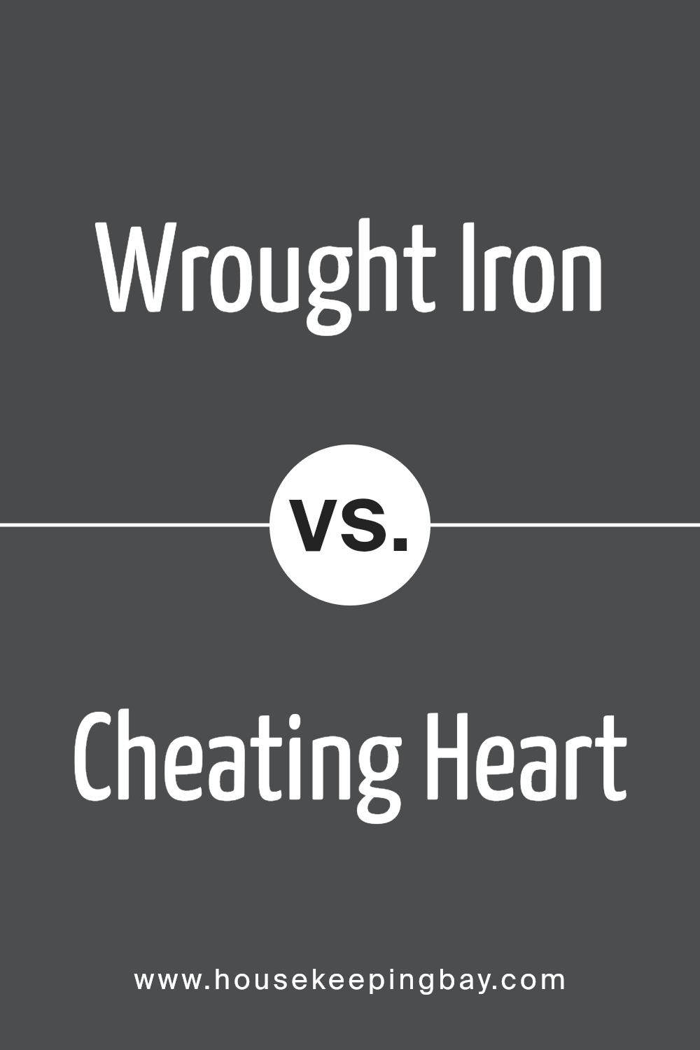
Wrought Iron 2124-10 by Benjamin Moore vs Cheating Heart 1617 by Benjamin Moore
Wrought Iron 2124-10 by Benjamin Moore is a bold, deep gray with a strong presence. This color feels like a classic, adding a sense of sophistication and strength to any space. It’s great for making a statement, whether on a front door or as an accent wall in a room. It can complement various decor styles, from modern to traditional.
Cheating Heart 1617, also by Benjamin Moore, is a darker shade that leans more towards a soft, charcoal black. It offers a cozy, intimate vibe, making it perfect for spaces where you want depth without the starkness of pure black. This color works well in bedrooms, living areas, and even on cabinetry, providing a rich, enveloping atmosphere.
Both colors carry their unique appeal. Wrought Iron stands out for its versatility and timeless elegance, while Cheating Heart provides a more intimate and cozy setting. Choosing between them depends on the mood and style you aim to create in your space.
You can see recommended paint color below:
housekeepingbay.com
Conclusion
In summary, 2124-10 Wrought Iron by Benjamin Moore is a paint color that has the power to make a significant impact in your home. If you’re looking for a color that’s bold yet doesn’t overpower, Wrought Iron is a perfect choice.
Think of it as a dark charcoal with a twist, offering a sophisticated look without the starkness black sometimes brings. This shade is versatile, suiting various spaces and styles, whether you’re updating your living room, bedroom, or even the exterior of your house.
It pairs wonderfully with a wide range of complementary colors, from soft neutrals to more vibrant tones, allowing for a myriad of design options. By choosing Wrought Iron, you’re not just painting your walls; you’re adding depth and character to your space.
It’s ideal for creating a focal point or adding a touch of drama to an otherwise muted palette. So if you’re aiming to refresh your space with something that stands out but still feels harmonious with your current decor, Wrought Iron by Benjamin Moore could very well be the solution you’ve been looking for.
Give your home the update it deserves with a color that brings both beauty and a sense of personality.
housekeepingbay.com
