16+ Best House Color Schemes
Preparing a house design project? Make sure you didn't skip this color palette guide!
Painting and renovating bring you excitement and a bit of anxiety at the same time.
On the one hand, it is always an incredible feeling of something new in your house.
On the other hand, you should choose and plan your repairing processes.
Especially when it comes to painting work.
What colors should you choose? What type of design to choose? Does this or that room need trim paint, or should you keep a monochrome palette? All of these questions are overwhelming, aren’t they?
If you have a painting project coming up, you’re probably asked yourself one of them at least.
Don’t worry! We are here to help you figure out where to start. So, let’s get straight to choosing the best house color schemes!
How to Decide on House Interior Colors?
Table of Contents
Even the modest interior will look cozy and stylish based on a competent combination of colors.
If your favorite shade is dazzling ultramarine, acid lime, or wild fuchsia, this does not mean that there is no place for it in a comfortable residential interior.
Well-placed accents, properly-chosen tones, and appropriate contrasts will allow any shade to settle in space without violating color harmony.
The unconditional source of harmony and beauty for all people is nature. You can create inspired color schemes and use them in your apartment.
The color scheme of a harmonious interior always consists of 5 shades.
Three of them are primary, and two others are coordinating. Coordinating or complementing shades are usually neutral tones, against which bright strokes of color or color contrasts can bloom.
Use more primary colors in the interior of one room.
It can become overloaded and unbalanced, resulting in which staying in such a space will cause discomfort.
There is a popular belief that the color scheme should be chosen based on the characteristics of the surrounding area. For example, suppose you live in the south or the tropics.
In that case, the interior should be decorated with bright colors or cool colors. And if we are talking about a city apartment, then preference should be given to muted calm shades.
Many designers believe that there are no rules in choosing an interior palette, and you can choose any colors that residents like. However, it seems to us that the truth is always somewhere in the middle.
Imagine that every time you come home through the urban jungle on a cold winter day, you find yourself in an apartment with a monotonous, bold interior. Most likely, such a design will not be comfortable in the long run.
Still, you can always find a compromise solution. And what if we said that we had created more than 16 color schemes that you can use for your apartment? Let’s see what you can go with.
Modern Interior Color Scheme
This color scheme is perfect for apartments and flats with open spaces.
You can use it for any contemporary interior design if you like the bold and nude tones combo.
What comes to your mind when you see these colors?
Inspired by nature, this color scheme includes green, brown, and gray shades. Such a scheme is typical for forests and picturesque mountain sceneries.
If you want to achieve an airy, natural vibe in your apartment, take a look at these colors.
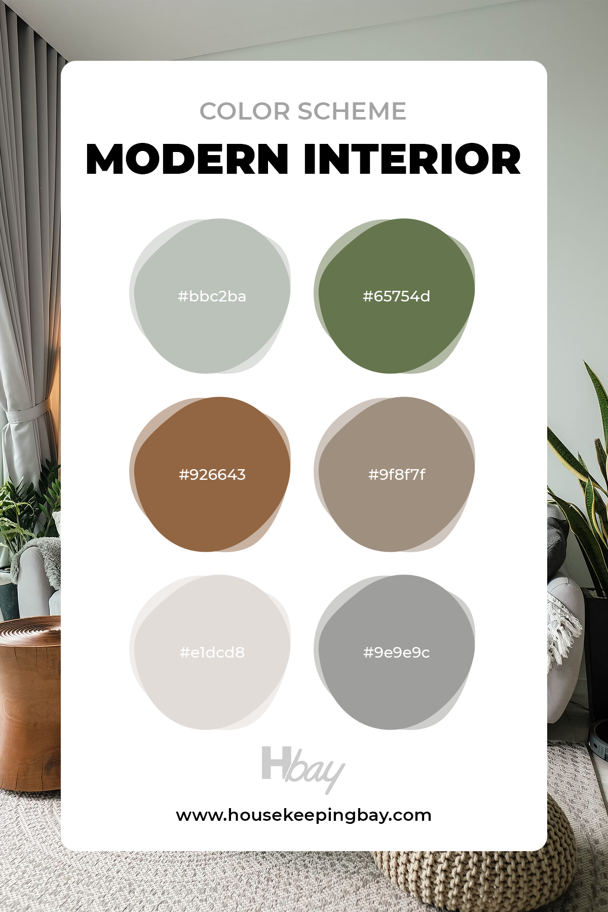
housekeepingbay
Warm Interior Color Scheme
If you are a fan of sunny weather and you want to keep this atmosphere at your home, you can use this warm interior color scheme for your house. It includes bright and neutral colors that will perfectly compliment any apartment design idea.
Warm palettes are applicable for different interior styles.
From classic to any modern conception, you can use this palette that consists of mustard, green, milk chocolate, and dark brown emphasis shades combined with light beige and ivory colors.
With proper prioritization, a warm beige shade fills the equipped room with elegance and a sense of tranquility. It looks good in a company with coffee or chestnut, mustard, or malachite shades.
As the main shade, beige will never look dominant in the interior, so designers recommend not using it to create contrasting combinations.
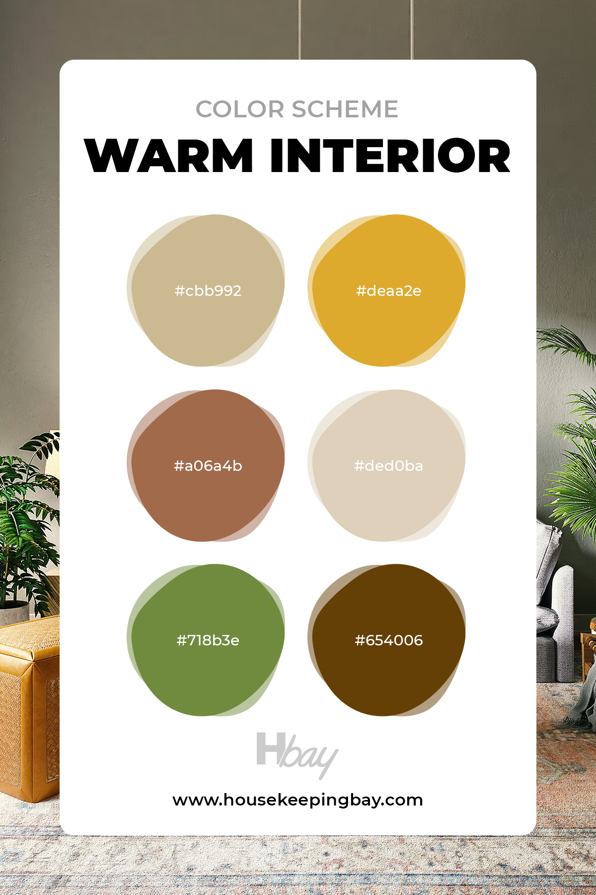
housekeepingbay
Neutral Interior Color Scheme
Want to see some nudes? Oh wait, we mean neutrals! At least we’ve caught your attention again. So, neutral colors are one of the most popular requests for interior designers.
However, many people get different options of neutrals for their apartments, even if they all asked for the same. How does this happen?
Actually, there is a huge variety of neutral colors with different undertones, and obviously, they can be included in different compilations.
The neutral interior color scheme that you can see in a picture is a rather warm option. It includes different shades of beige, khaki, and brown colors. It’s a great solution for giving big spaces an atmosphere of coziness and peacefulness.
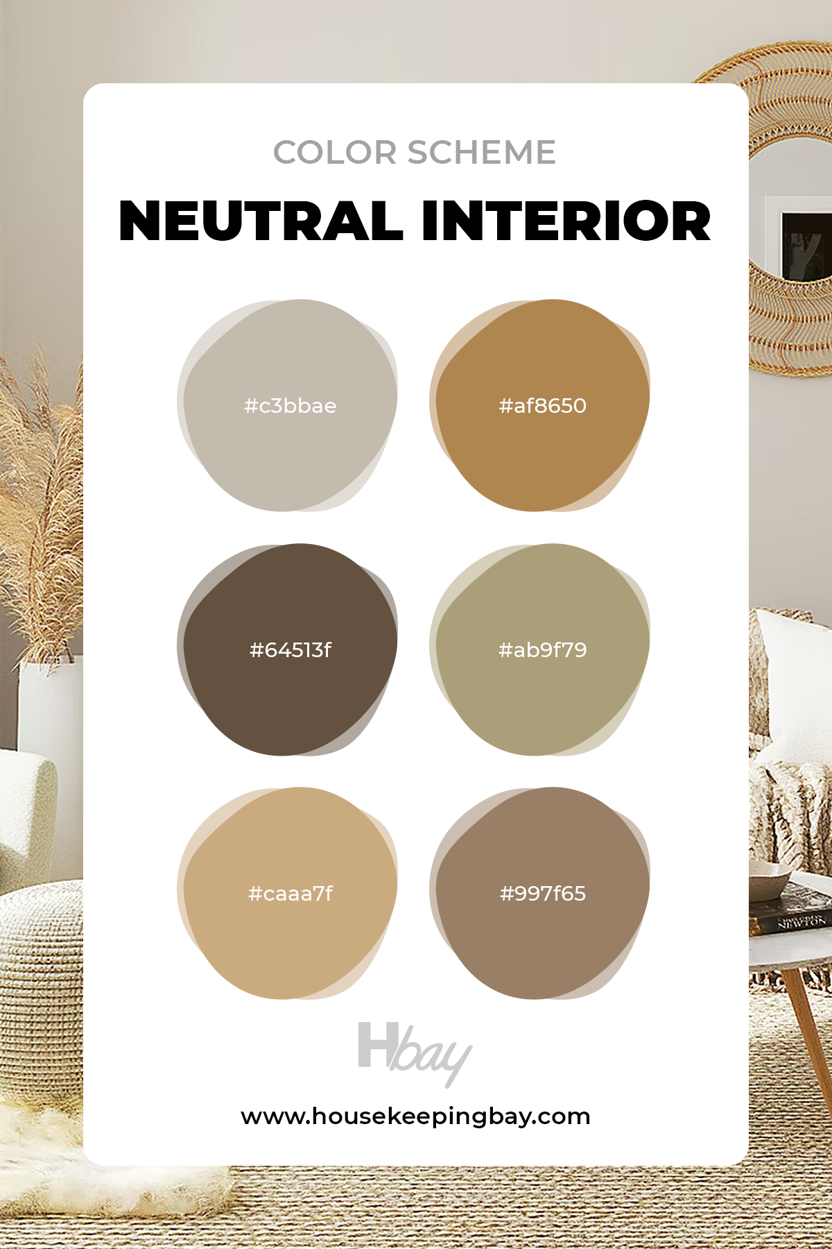
housekeepingbay
Neutral Living Room Color Scheme
If you plan to rearrange and redesign your living room, this color scheme will be a perfect inspo.
Made up of subtle shades that refer to a natural color combination of seashore sand, warm summer wood, and greenery, this color scheme brings a unique atmosphere into your house.
You can divide the colors according to elements of decor and furniture to assemble a great design option.
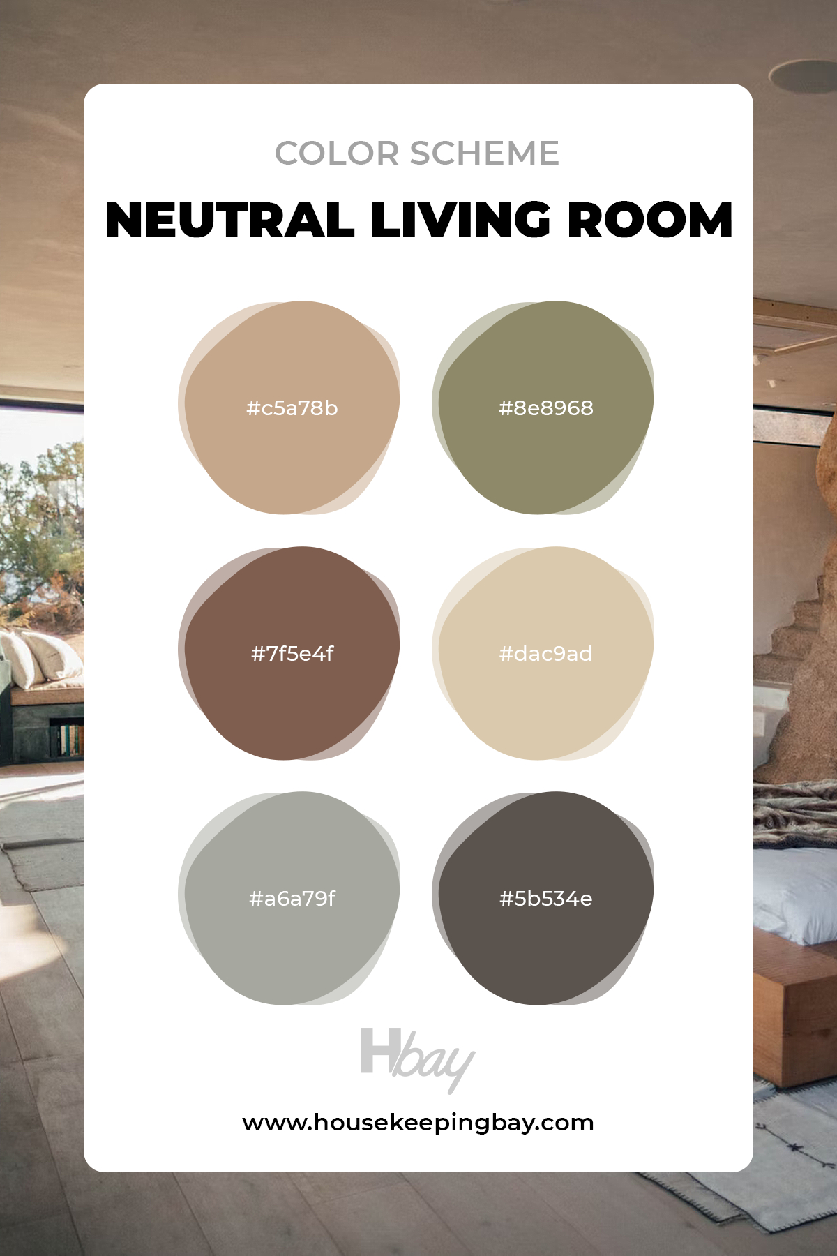
housekeepingbay
Coastal Vibes Color Scheme
Can you feel this warm sea breeze? Yeah, us too!
What a beautiful color compilation for bringing a warm Italian coast to your house.
Using emerald and azure tones mixed with chestnut and gray that are somewhat cooler, you can create an unforgettable atmosphere in your apartment.
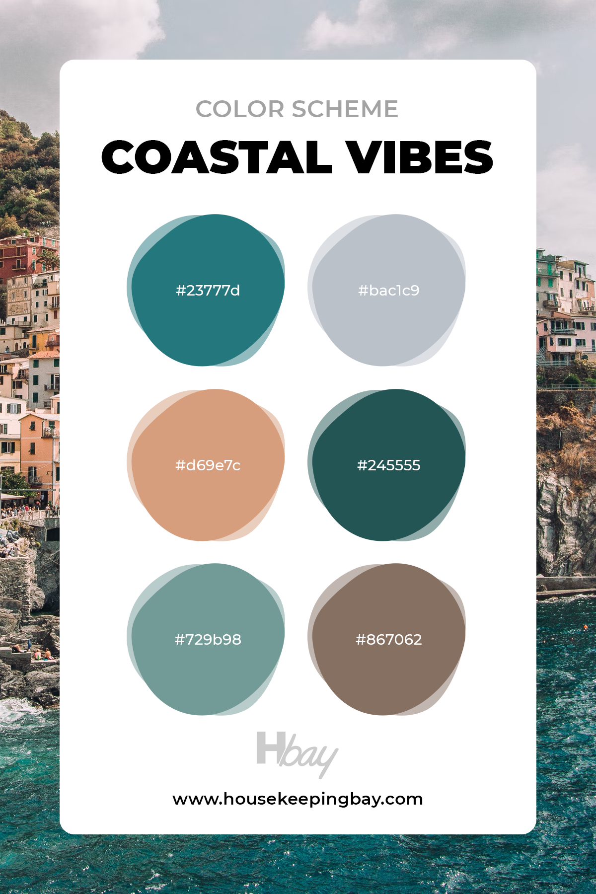
housekeepingbay
Farmhouse Inspiration Color Scheme
If you are more into farmhouse and village living aesthetics, then you might like our farmhouse inspiration palette.
It consists of beautiful shades of green, blue, and taupe colors that are inspired by the typical village house area.
This pleasing palette is a nice addition to a house or apartment in shabby-chic or art-deco design interior.
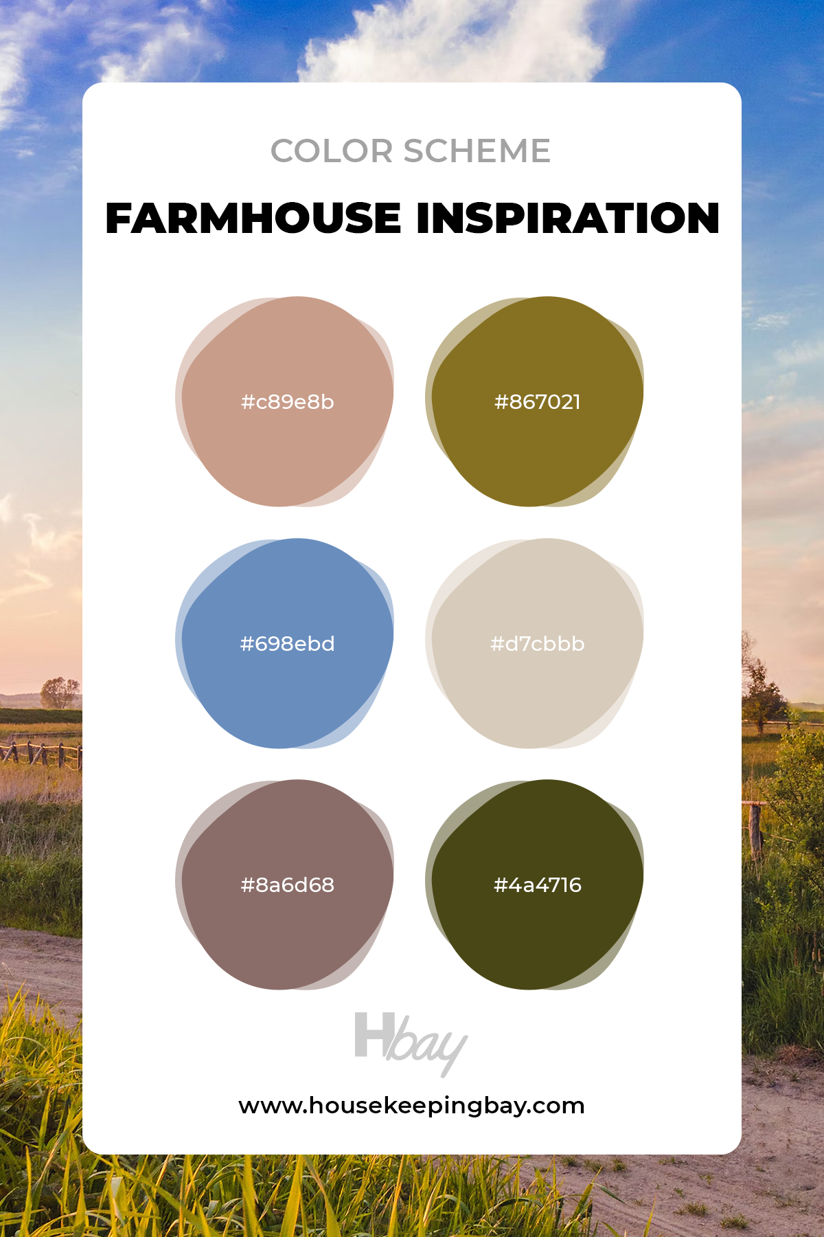
housekeepingbay
Green Inspiration Color Scheme
We created the green inspiration color palette for eco-lifestyle and matching interior designs.
It is a great option for people who like bright and juicy colors but are afraid to overdo them.
The natural colors of the outdoors obviously influence green inspiration. It gives your apartment freshness and is best complemented by flowers and greenery as decoration options.
For painting walls, it is better to use dark shades of the green palette, which will emphasize the restraint of the style.
If we are talking about textiles or furniture upholstery, you might give preference to mint, ultramarine, or emerald.
To maintain an eco-direction, focus on shades of green grass, needles, and other tones that are as close to natural as possible.
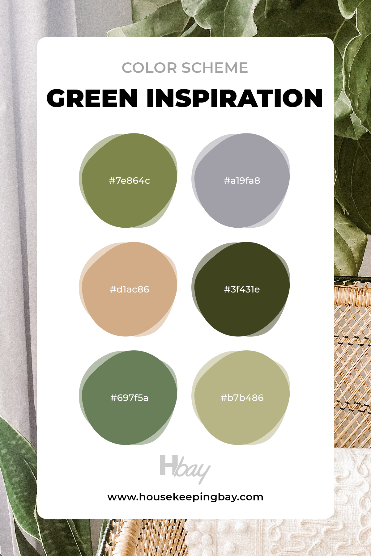
housekeepingbay
Gray Vibes Color Scheme
Fifty shades of Gray might have been cool, but we are cooler!
With only six options of gray shades, you can create a monochrome yet very refreshing color solution for your apartment.
This color scheme is the best when it comes to projects in minimalism, loft, Scandi, or hi-tech style.
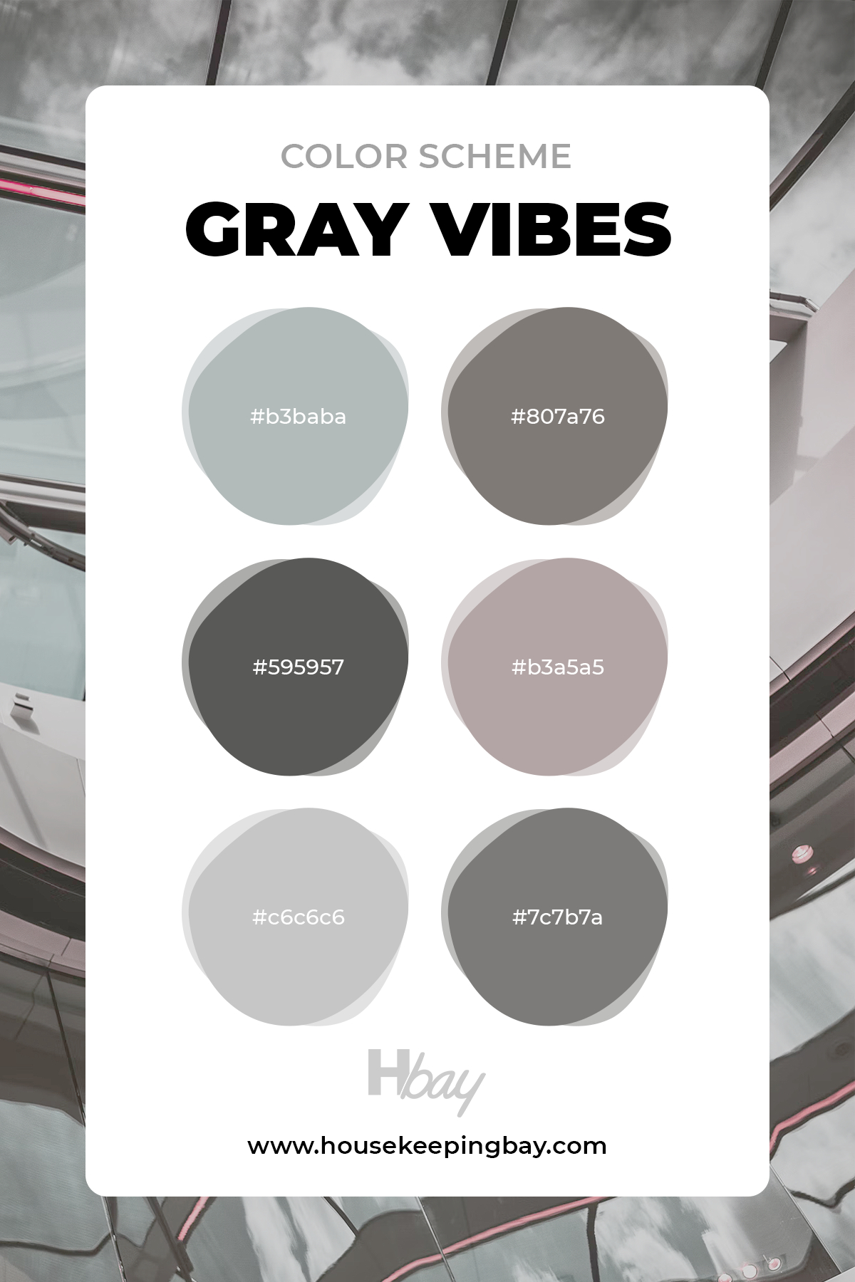
housekeepingbay
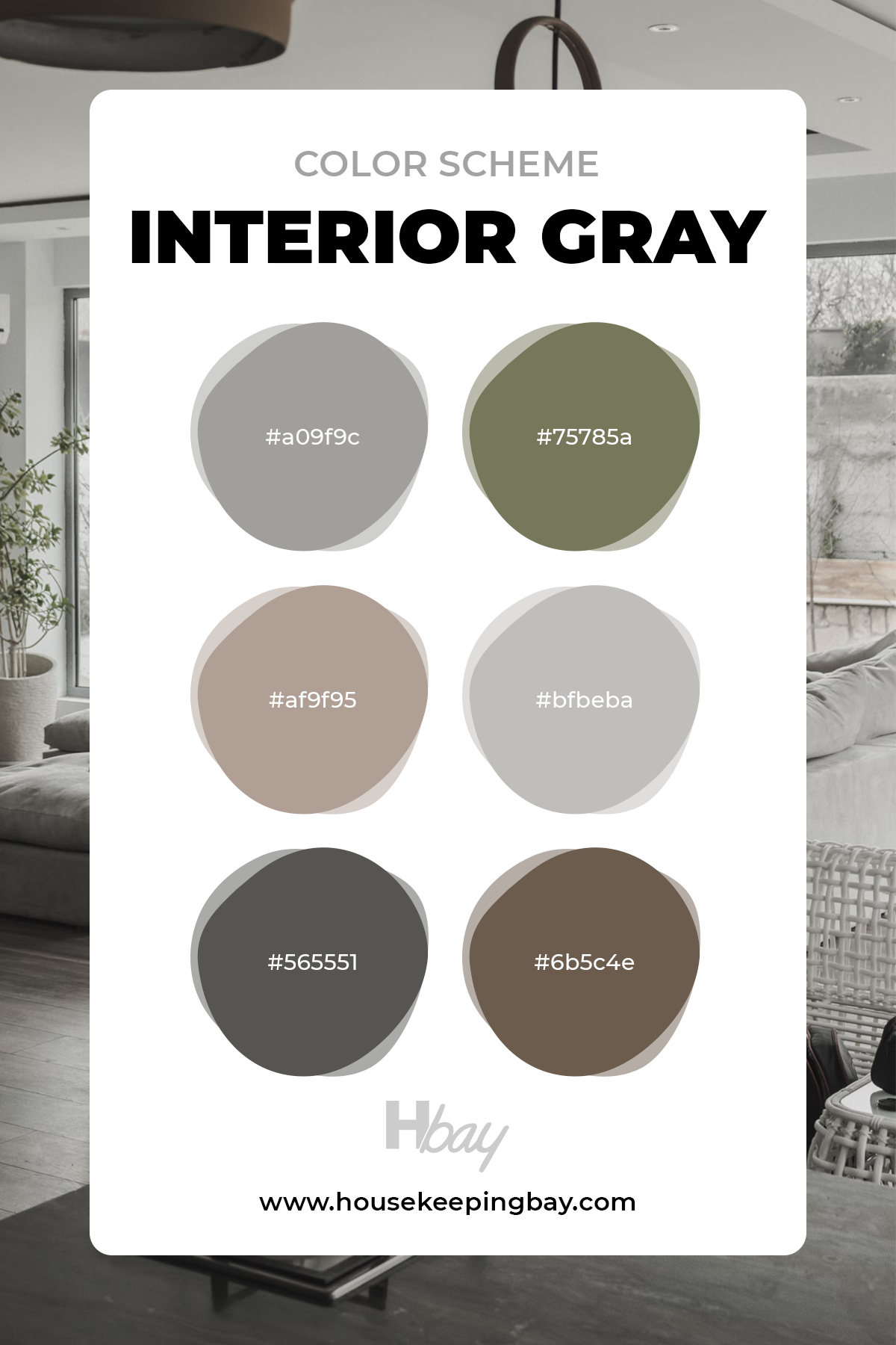
Interior Gray Color Scheme
Are you planning a smartly designed interior for your apartment?
Here’s a beautiful gray color palette that you can implement. This color scheme is designed for modern, minimalistic styles of interior.
The off-white shades with subtle gray undertones are followed by trim colors with brown and green tones.
You can either create a monochrome design or add bright accents of khaki and brown by using details and furniture.
housekeepingbay
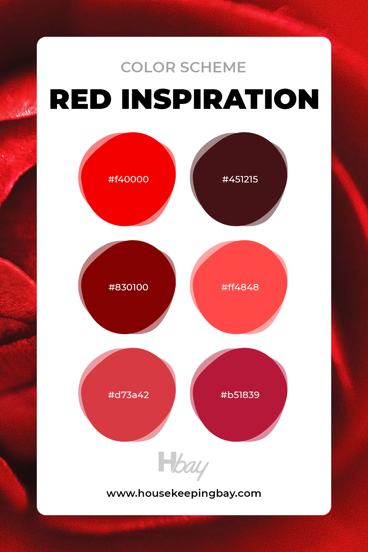
Red Inspiration Color Scheme
Oh, this palette is totally a stand-out!
If you like to be exclusive and bold, express yourself and your unique taste, you can use your house’s red inspiration color scheme.
However, you have to be very attentive to the color distribution. Red shades can be both very fascinating and intimate.
Our recommendation is to use the red color scheme in your bedroom. It will create a unique atmosphere and contribute to the mood.
housekeepingbay
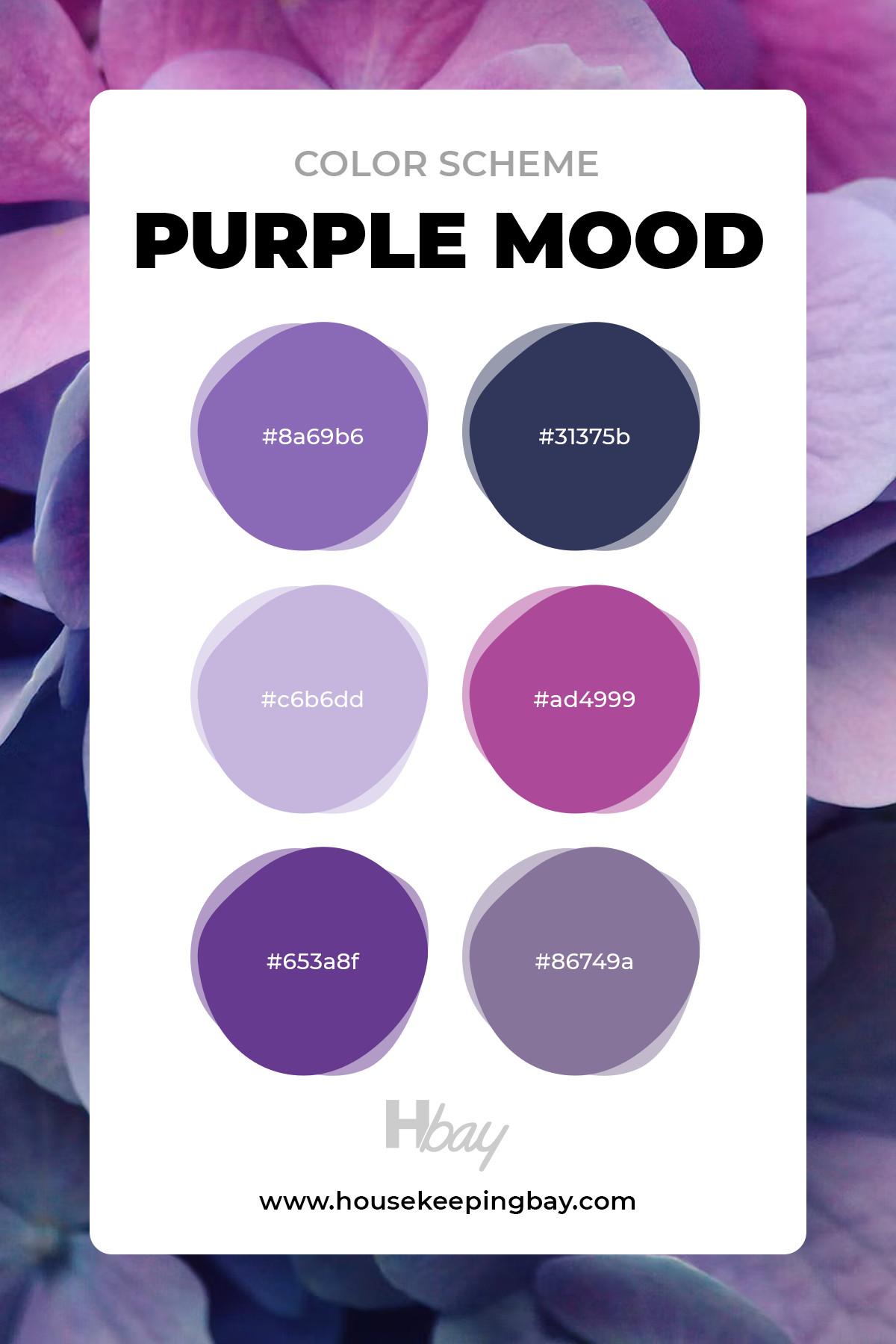
Purple Mood Color Scheme
Speaking about bold color palettes, we can’t skip our purple color scheme. This one is truly euphoric. Yeah, that’s exactly what you are thinking about.
Neon lights of vivid violet color complementing lilac walls or plum-colored sofa? It’s a yes from us!
Don’t forget about the vibey shiny details of decorations.
Apart from that, we recommend such a palette option for the adornment of a child’s bedroom.
It’s a very intense palette, but with the proper distribution of shades and tones, you will get a cozy and pretty room for a baby girl.
housekeepingbay
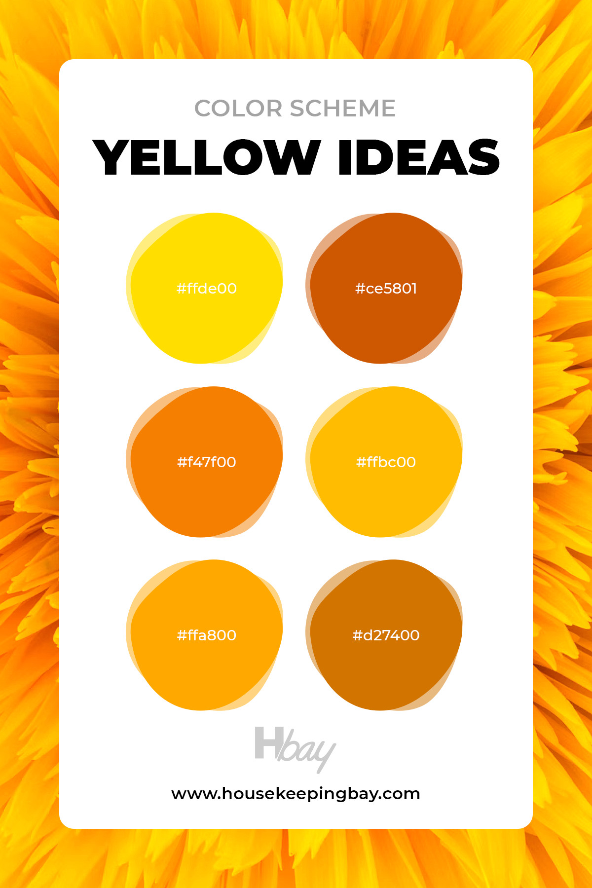
Yellow Ideas Color Scheme
More bright colors! If you are a fan of Van Gogh or simply love to have a lively atmosphere in your apartment, take a look at our yellow ideas color scheme. Using yellow shades in the interior indicates originality and attracts attention.
Moreover, psychologists say that yellow contribute to optimism and gives a feeling of warmth.
Yellow tones in the interior have a generally positive effect on brain function, can increase efficiency, and help you remember information easier.
housekeepingbay
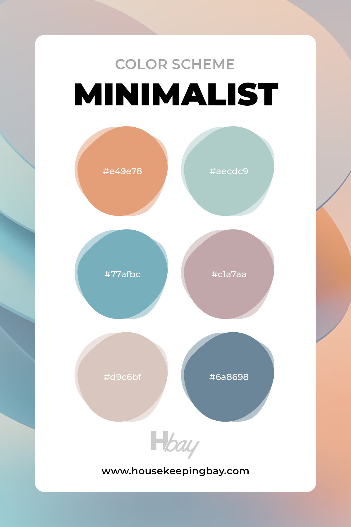
Minimalist Color Scheme
Such a wide variety of bright and vivid shades should be a little bit neutralized by a minimalistic kit of colors.
If the word “minimalism” reminds you of a boring white and gray combination of colors and no decorations, our minimalist color scheme might surprise you.
We’ve composed a scheme of soft sunset shades.
When the sky’s still blue, and you can see how the yellow sun turns a bit orange, bringing this subtle peachy shade to the horizontal line. What a breathtaking view!
housekeepingbay
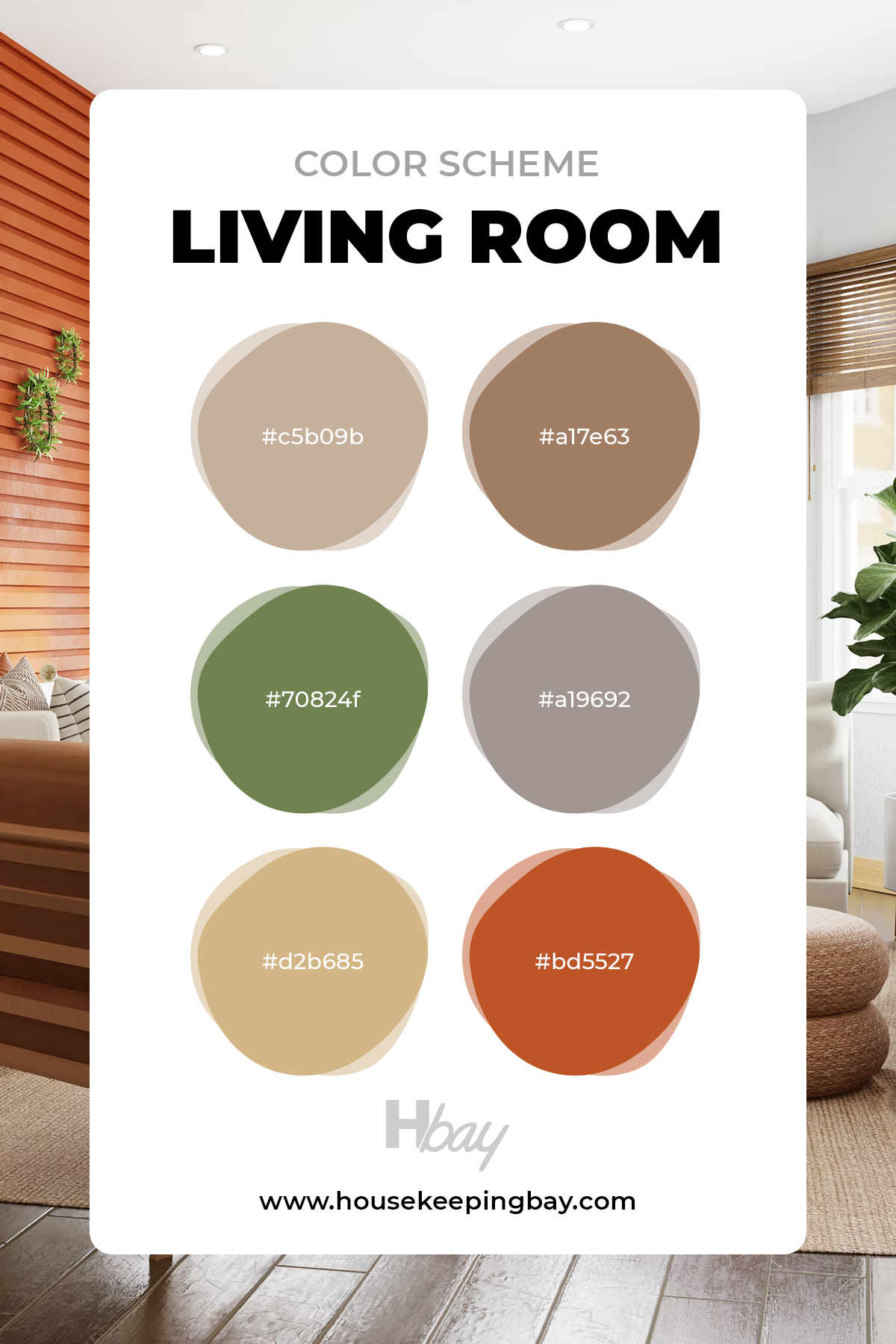
Living Room Color Scheme
The living room is the main room in the house.
The color scheme you use in it can either ruin your life or guarantee a good mood and a desire to return home with pleasure, have a good time, and enjoy the atmosphere.
We at Housekeeping Bay took the responsibility of creating a versatile living room color scheme for every living room option. Whether you have a small or big room, you can decorate it with these colors.
This living room color scheme includes both bright and neutral colors that can be used in any design element.
housekeepingbay
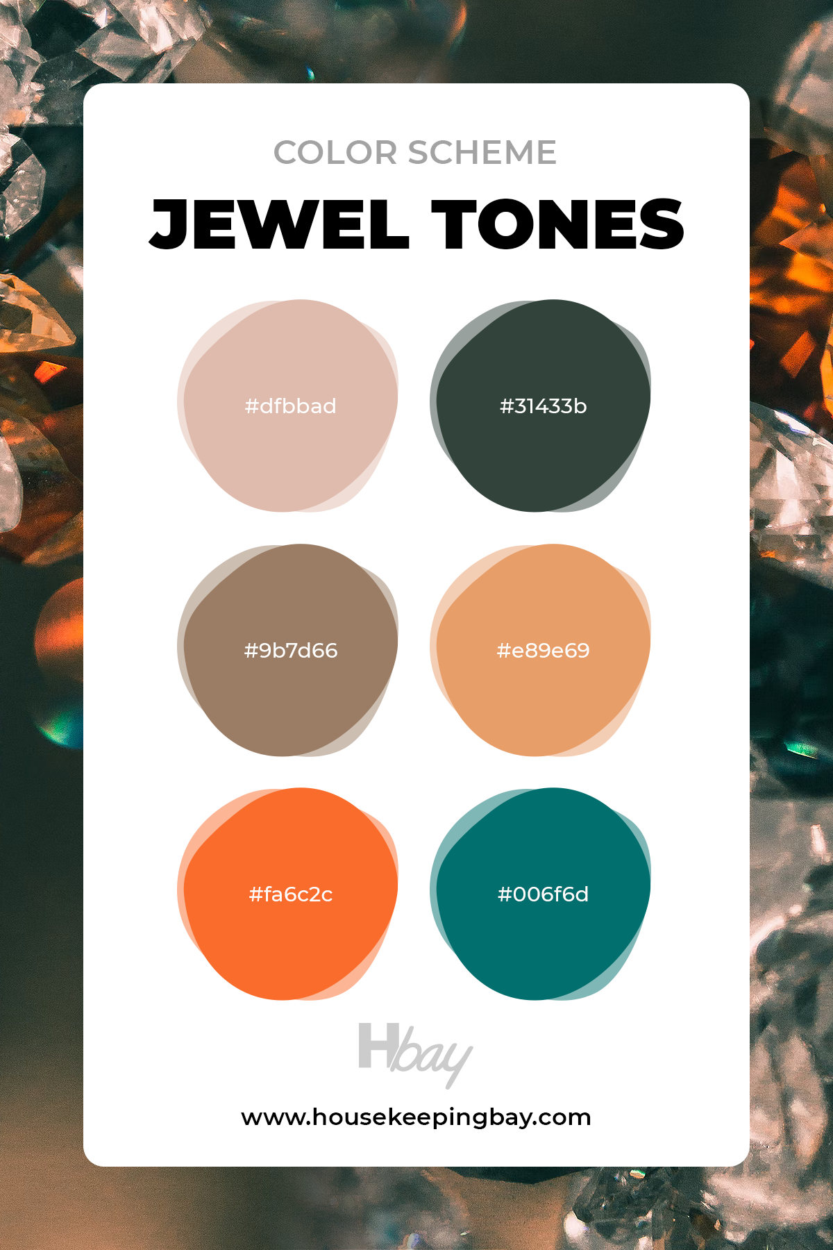
Jewel Tones Color Scheme
Shine bright like a diamond following Riri’s appeal, or are you more into collecting the Infinity stones?
No matter what you choose, our jewel tones color scheme is designed for giving the apartment a bright, memorable coloring.
It has both vivid and dull tones that compliment each other in one space, like precious stones advanced in fine jewelry.
housekeepingbay
Overall Tips for Choosing a Color Scheme
Despite the fact that interior design planning is typically based on the characteristics of the owners’ lifestyle and implemented with their preferences and interests in mind, designers must consider interior fashion trends.
The use of neutral and close to nature colors that produce a pleasant and tranquil ambiance, such as beige, olive, green, blue, or amber, is a key aspect of modern interiors.
At the same time, bright colors like red, samba, or golden, which have shown to be quite effective as highlights, should not be overlooked.
The principle of choosing a stylish shade for the interior
Once you choose the color scheme of your interior, you might want to make it look as harmonious as possible. So, it would help if you correctly determined the ratio of the shades used in the design.
The combination of 60% + 30% + 10% in this case is considered the most rational. 60% of the overall color scheme of the interior, as a rule, should fall on the main shade.
Its various additions should occupy 30%. 10% are bright and catchy accents, without which most modern style trends would seem too cloying and unfinished.
Many factors must be considered when creating a fashionable and stylish interior, including the selection of finishing materials, furniture, textiles, and other details.
The colors you choose can provide warmth and comfort to a room, create the right atmosphere, and highlight the advantages of a certain style solution.
Ever wished paint sampling was as easy as sticking a sticker? Guess what? Now it is! Discover Samplize's unique Peel & Stick samples. Get started now and say goodbye to the old messy way!
Get paint samples


Frequently Asked Questions
⭐What color palette can enlarge a small apartment?
Choose a color scheme with white and gray shades.
⭐Is it possible to mix two color schemes in one space?
It’s not advisable, but if the colors are matching, you can do that.
⭐Which colors are coordinating to blue?
Some of them are slate blue and rust, midnight blue, black, and white.


Is green a good exterior house color for a small house? I like how deep greens look, especially those with cool emerald undertones. But isn’t it too much for the exterior walls if the house is not big?
I guess that darker greens will work on a house of any size. But for a small houses, I’d recommend using lighter greens because they don’t make the construction seem smaller than it is.
I’ve decided to repaint my house but I can’t figure out what color will look best on its walls. Now it’s very light yellow with the white trim. But I’d like something more saturated, although not dark! What could be the best color to paint my house?
Well, you might want to consider darker blues or greens, or opt for darker grays. As an option, red color might also work for you. Also, darker greiges could work well on exterior walls.
Hi! Could you share a few best exterior trim colors, please?
Hello. In most cases, different shades of white are the most popular trim colors people use.
Hello. Could you please recommend a few nice cottage color schemes for exterior walls? The cottage is not very big, and it’s situated in a nice sunny area close to the seaside.
Hello. Since your area should have a lot of sunlight, you might want to use a classic black-and-white color palette. Also, softer blue walls paired with the white trim can work great, appealing to the coastal location of your home. Lighter grays with whites might also work well.
With beige exterior walls, what house color combinations would you suggest as the best looking? I want to paint my house beige, but I don’t know what colors to use on trims and door.
The first color that comes to my mind is white since it works great with beiges. Also, darker browns might work well. Speaking of the front door, I guess the best color option would be a darker red like Redwood Red.
What are the best colors for a bungalow-style house to paint exterior walls? My house is now white but I’d like to repaint it to get more saturation and contrast.
Well, I guess you might want to consider blue-gray colors, as well as earthy greens if you strive for a more colorful look for your house. Also, beige tans, terracotta, or deep mustard yellows might look nice, especially if you live in a sunny area.
I’m going to totally repaint my interior and I want to try out something crazy! The brighter the better! Could you guys suggest any unusual color combinations considering that the rooms have pretty much daylight?
Hmmm, I’d say you could try something like lime-green walls and orange furniture, or deep-blue walls and yellow sofa/armchairs. If the room has plenty of daylight, try deep-blue walls (like SW Naval) and deep-purple furniture with white curtains and beige carpet. Might look a bit gloomy at first but with enough natural light, the colors will read pretty nice, especially if you add golden or brassy elements.
Hi everyone! I’m here for your help folks. See, I have recently painted my living room walls with a rather deep green. The hue is very nice, it’s generally warm-toned buts till has a bit of crispness. And since the room is rather spacious, it incorporates into the interior very well. But now I have problems with the furniture. My old pieces are leather but I don’t like how they look with the green walls. Maybe you could suggest another color/colors instead?
Hello! Have you considered something bright? For instance, orange or yellow? A yellow sofa will look unusual yet very harmonious against green walls. But if you are not into dynamic colors, try out muted hues of deep purple, for example, or the same muted lime-green. Finally, you can always opt for light grays!
I want to repaint my living room so that it resembles Scandinavian style. The room is not very spacious so I thought that light-colored walls would make it bigger. But as fara s I could see, this interior design uses a lot of white color and some darker accents like black or gray. Do you think I could use other colors as well? I’d rather not opt for a monochrome palette.
Hi! Of course you can use other colors! Scandinavian style is not only about black and white! I used to have Scandinavian style at home too, and I had warm-toned white walls, light-gray furniture, and light-beige curtains with floral pattern. You can also use blue accents (e.g. rugs or cushions) or a bit or orange/yellow/brown. White is the basic color here but you can incorporate brighter hues as well.
What about going monochrome white? As a minimalistic design and lifestyle devotee, I would love to learn about off-white options for an apartment.
Thanks for reaching out! Off-white color schemes are amazing and are iconic in terms of modern interior designs. Consider our neutral and gray vibes for inspiration. Like we’ve mentioned above, it is completely okay to mix two schemes in one design if the shades are matching.
I love bright colors in interior design! Thank you guys for the stylish hints, I really enjoyed reading and seeing the colors. But is it okay to put a samba colored sofa in an open space room with soft blue walls?
Hey there! Thank you for such nice feedback! This is what keeps us going, to be honest. So, talking about the samba sofa in your big living room – it’s a YES from us! Compliment the sofa with some matching colored pillows and you’ll get a cozy and stylish design.
Can I paint my furniture gray to put it into a room that is designed similar to the neutral color scheme? I had brown pieces and I think giving a bit of an update will be good for improving the overall living room.
Yeah, feel free to dye the furniture with any shade of gray with a warm undertone. Take a look at colors that match Pantone Warm Gray c 2.