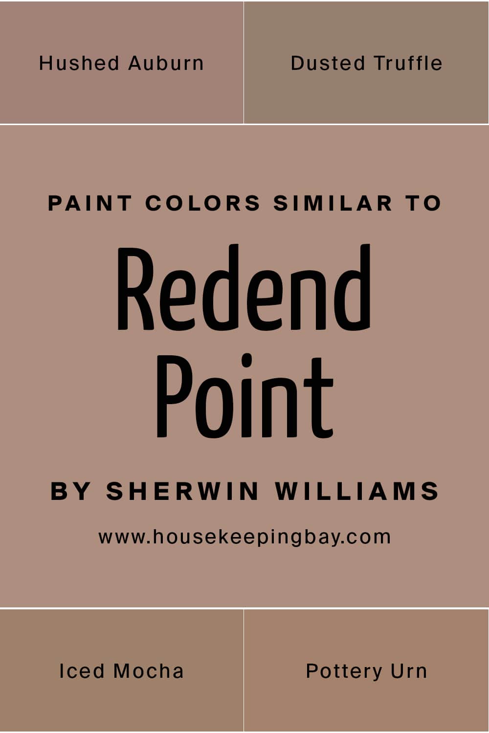
Redend Point Paint Color SW-9081 by Sherwin Williams
A complete description of the color from undertones to rooms it can be used in
Are you planning on refreshing your home’s interior a bit? Then you are probably looking for a paint color that will make your home look cool! At this point, you might want to consider the color that is not a common choice by many. For this purpose, we have a great recommendation for you: SW Redend Point.
Most likely, you are now aware of this color in detail since it is new on the market. So today we are going to introduce you to it. You will learn what color it is, what undertones it has, and how it reacts to light. In addition, we will explain how it will read in different rooms and on different surfaces in your home.
With all that in mind, you will be able to make use of it as fully as possible, turning your home’s interior into a stylish and cozy space filled with color.
society6 via VIstaCReate
What Color Is Redend Point SW-9081?
First of all, let us express our own opinion: this color is amazingly beautiful! It’s not a joke. SW Redend Point is an absolutely lovely blush-beige hue that can be considered a mid-tone neutral. Perhaps, this is the reason why this color has been announced as the Sherwin-Williams 2023 Color of the Year!
As Encycolorpedia says, this color is perfect for those who don’t like too bright or too dark colors since it is not too light or too dark, not too moody or too sweet. However, you can’t call it boring for sure! Unlike well-known beiges and neutrals that people often find too monotonous, this color has its own vibe that’s suggestive of desert tones.
But you should not be afraid that you won’t be able to incorporate this color into your interior! The versatility of this mid-tone neutral allows it to be paired with more cool-toned neutrals, as well as with more colorful paint choices.
In addition, it works great both on its own (and in this case, it reads and acts more as a neutral) and in combination with other colors, for example, beiges (and then it will really look like a color).
housekeepingbay.com
Table of Contents
Undertones of SW Redend Point
Being aware of undertones is a must if you want to use any paint color successfully in your home! See, undertones are often not seen at the first sight, being revealed only in certain conditions. So before you buy a couple of paint cans, we recommend you find out what is hidden under that awesome colorful finish!
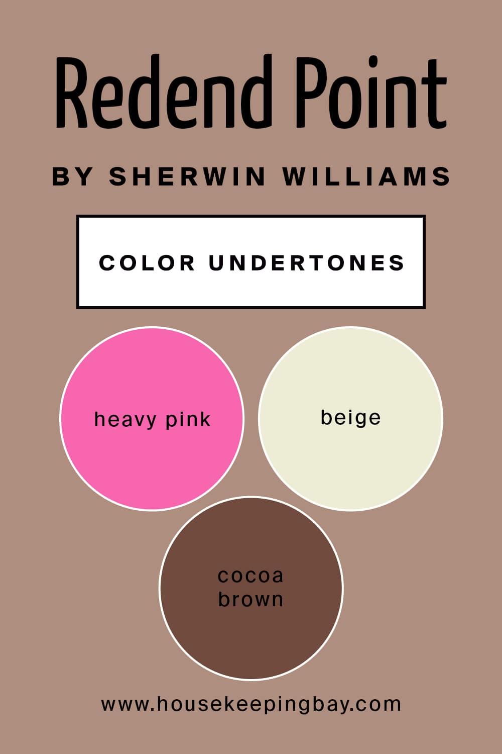
Speaking of SW Redend Point, this mid-tone neutral has heavy pink and blush undertones. The good news is that those undertones can usually be seen with the naked eye. Thanks to these undertones, this color reads as a warm and cozy neutral color with a punch of pink, as well as with a lot of beige and cocoa brown to mute the pink.
housekeepingbay.com
How Does Lighting Affect Redend Point Color?
This color might be a bit tricky since it can read a bit differently depending on how well it is lit. See, due to its mixed undertones that include pink and blush, as well as due to beige in it, SW Redend Point can read either as muted pink or as muted beige on your walls and surfaces.
housekeepingbay.com
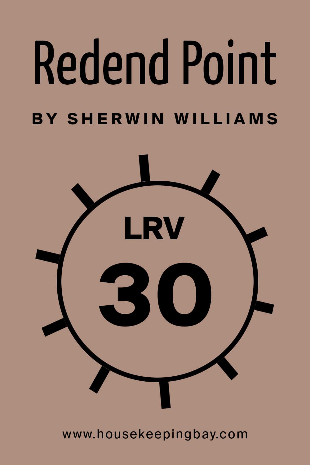
The LRV (Light Reflective Value) of Redend Point is 30, which makes it actually stand on the darker side of the color scale. Also, this is why this color has got a lot of depth to it. So if you want to use this paint in your home, remember that it will feel darker in darker spaces and lighter in brighter rooms.
In a well-lit space, SW Redend Point will read more like a muted pink (but not actually pink!) whilst in a darker room, it can read more of a muted beige with prominent brownish tones in it. But generally, in most spaces, this color will read as mauve or darker blush!
housekeepingbay.com
What is LRV? Read It Before You Choose Your Ideal Paint Color
For sure, Redend Point is a warm-toned color! As you already know, it is a very muted shade that has lots of beige to it as well. And since within that beige, there is a lot of browns and almost a cocoa color, this helps to keep the color from reading cool-toned.
So, now that you know more about this awesome color that Sherwin Williams has presented, you can better imagine how it might work in your home.
Nevertheless, it’s not all that you should know about it. Read on to find out how to use it with other colors and in what rooms it will work best of all.
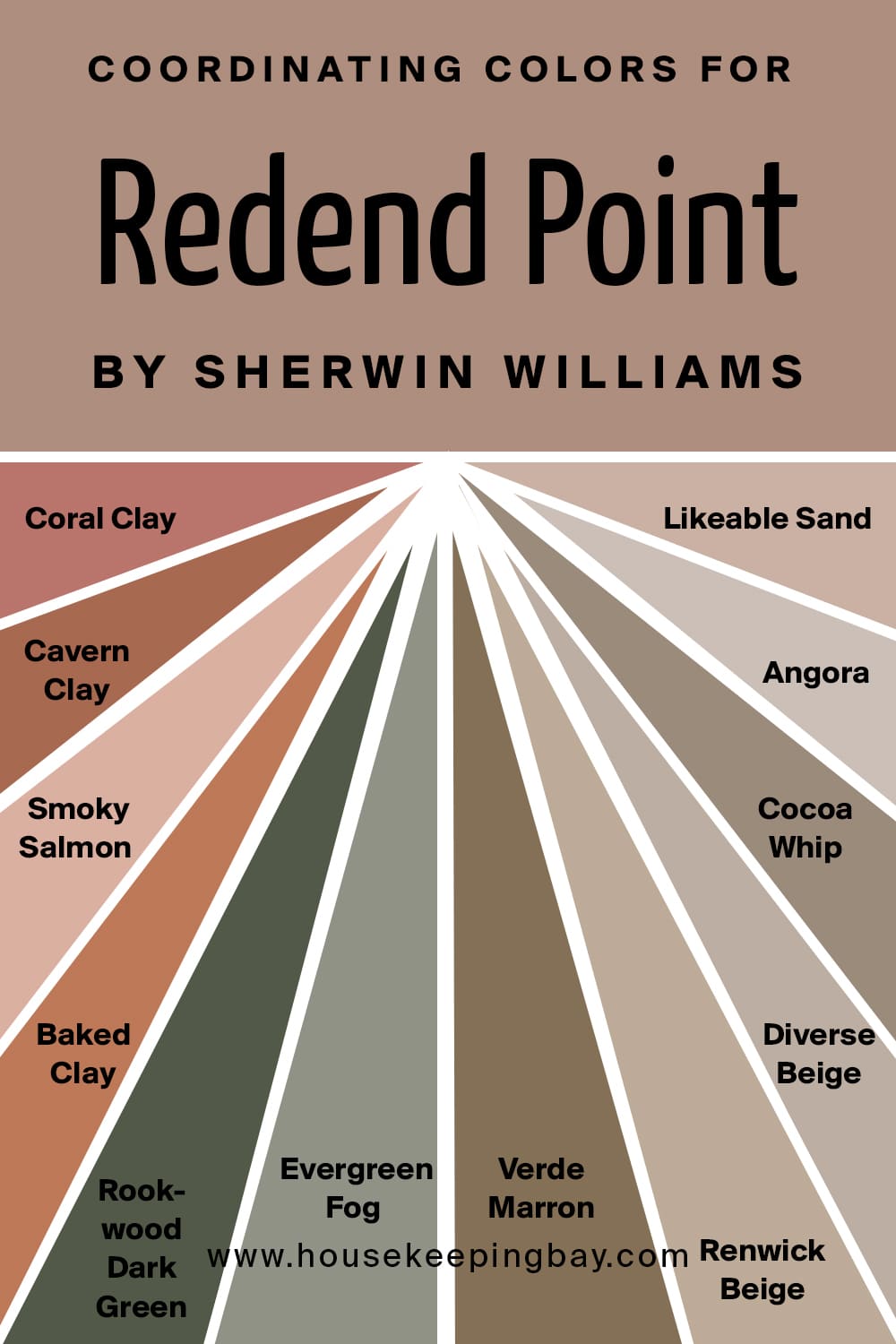
SW Redend Point Coordinating Colors
In terms of coordinating colors, Redend Point has plenty of options to be used with. For example, this color is perfect to pair with terra cotta, earthy greens, and warm neutrals.
Since Redend Point is pretty versatile, it can also be used with a true beige, but in this case, you need to remember that pairing Redend Point with this hue will make the color read pinker! Below, you can find a list of colors that SW Redend Pont can work well with.
Terra Cottas:
- Coral Clay
- Cavern Clay
- Smoky Salmon
- Baked Clay
Earthy Greens:
- Rookwood Dark Green
- Evergreen Fog
- Verde Marron
Warm Neutrals:
- Renwick Beige
- Diverse Beige
- Cocoa Whip
- Angora
- Likeable Sand
housekeepingbay.com
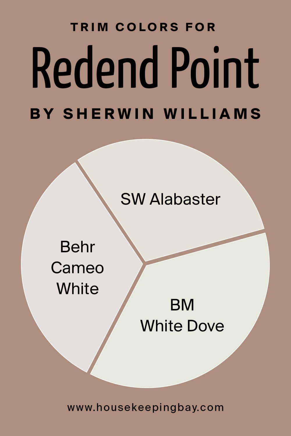
What’s the Best Trim Color of SW Redend Point?
Because of the warm tones to Redend Point, you’d better pair it with softer whites that have a bit of a creamy or warm tone to them. Among such soft white trim colors, we would recommend you consider the following ones in particular:
- Sherwin Williams Alabaster
- Benjamin Moore White Dove
- Behr Cameo White
housekeepingbay.com
Where to Use SW Redend Point Color In Your Home?
When it comes to using this color indoors, some homeowners feel uncertain because Redend Point can hardly be called a color that we are used to. However, as you already know, it is rather versatile! So relax, this mid-tone neutral color with pinky-blush undertones will fit in almost any room!
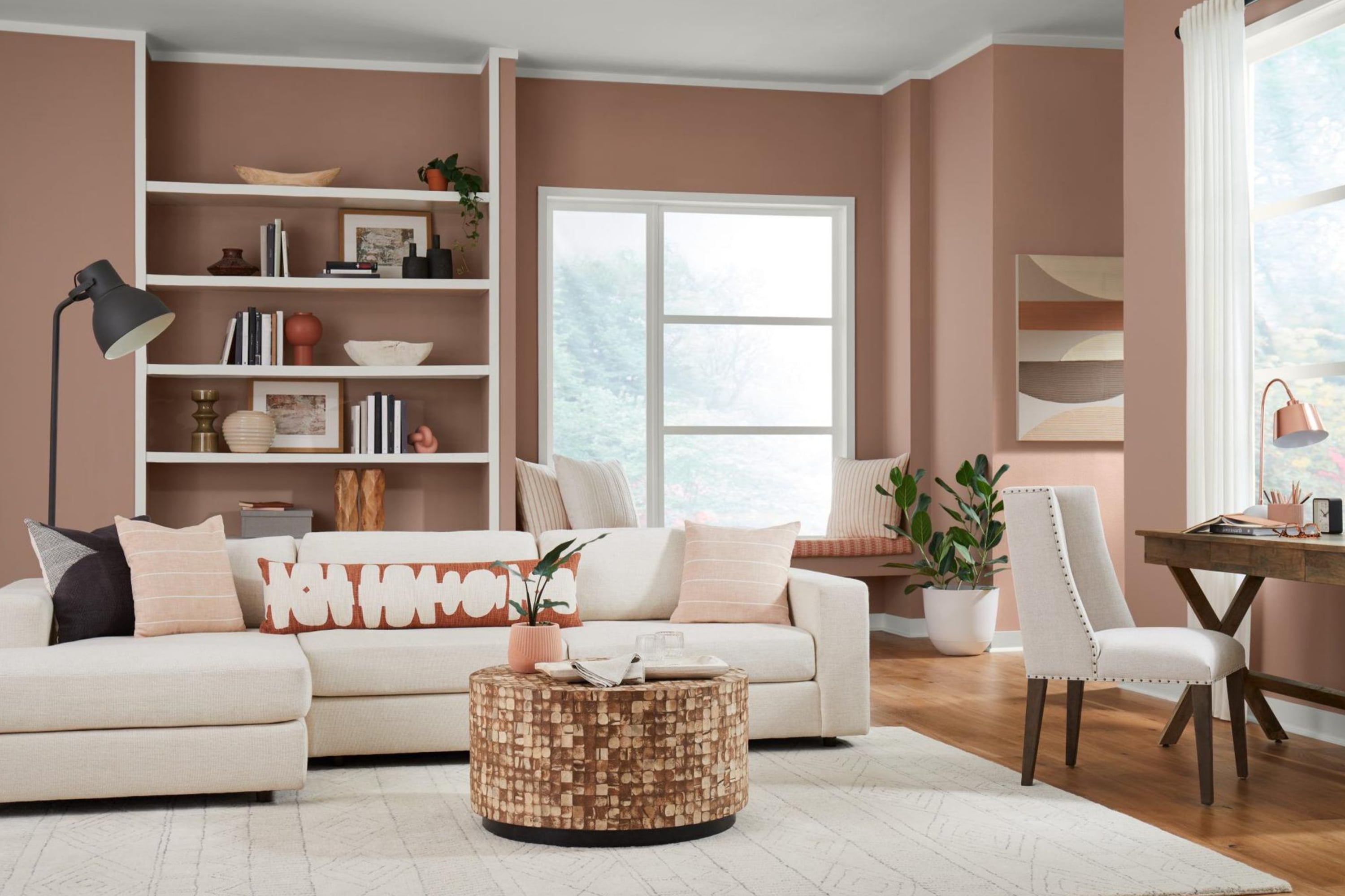
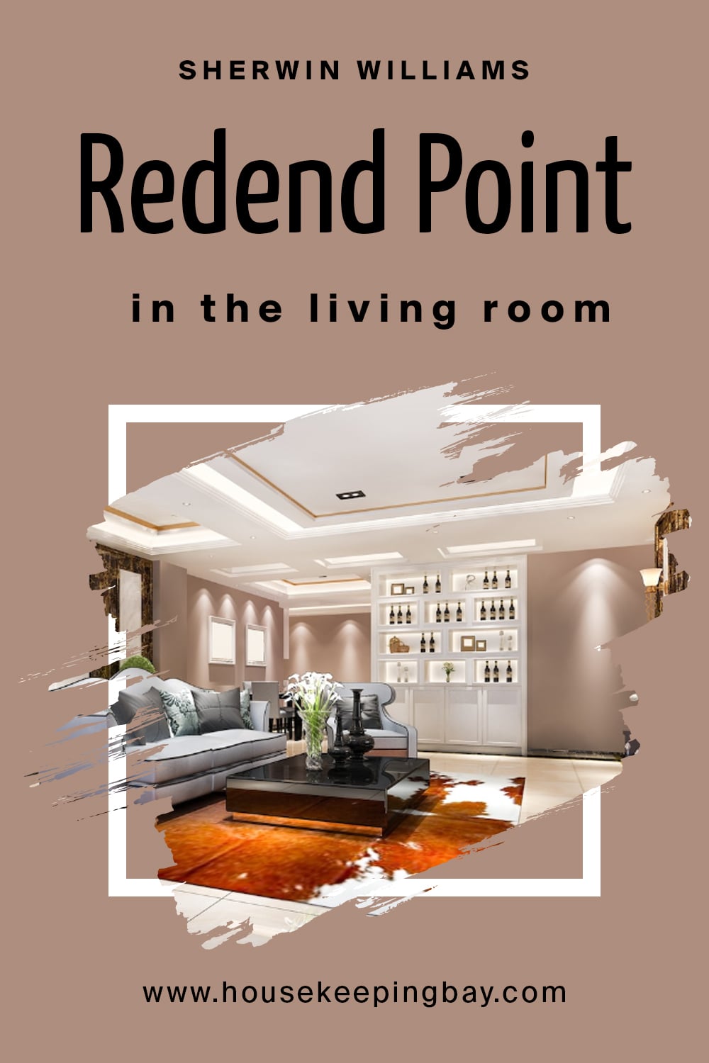
SW Redend Point in the Living Room
If you decide to use it in your living room, make sure you know what type of lighting it has! As we already told you, Redend Point can shift its appearance a bit depending on the light. In a darker room, it will read darker and in a well-lit space, it will reveal it muted pink side beautifully.
Also, this color will be more suitable for living rooms that are spacious enough and are not stuffed with massive furniture. If the room has plenty of furniture pieces in it and its walls are painted with Redend Point, it may create a “suffocating” impression and feeling. Besides, such a room will look smaller.
So if you are an owner of a living room that is big enough, has plenty of natural light in it, and it’s furnished with light-colored furniture, you should consider using SW Redend Point on the walls for sure!
housekeepingbay.com
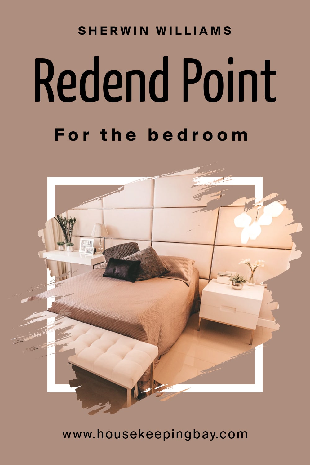
SW Redend Point in the Bedroom
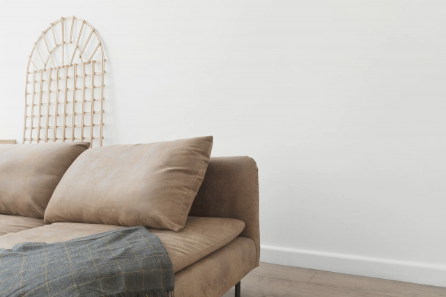
This color can be absolutely lovely for your bedroom! Due to its neutral nature and muted shade, it creates a universal background for other colors and textures to be used in this space. It will look especially balanced and harmonious with lighter sorts of wood and different natural materials like rattan. natural fabrics like cotton and linen will also work great with it!
By the way, you can use this color even if your bedroom is pretty small! Just use it for a few color accents (e.g. blanket, cushions, curtains, etc.) instead of painting the walls with it! Or you might paint an accent wall with Redend Point, leaving the rest of them white.
housekeepingbay.com
SW Redend Point in the Kitchen Cabinets
SW Redend Point works incredibly well on kitchen cabinets! It will work even better if the walls of the kitchen are painted white and the white color goes with SW Redend Point well enough. In this case, feel free to apply this color to the cabinets.
Besides, since Redend Point pairs well with gray and beige, as well as with different textures like wood, it will fit most of the kitchens that have wooden furniture or cabinets of unpainted wood.

housekeepingbay.com
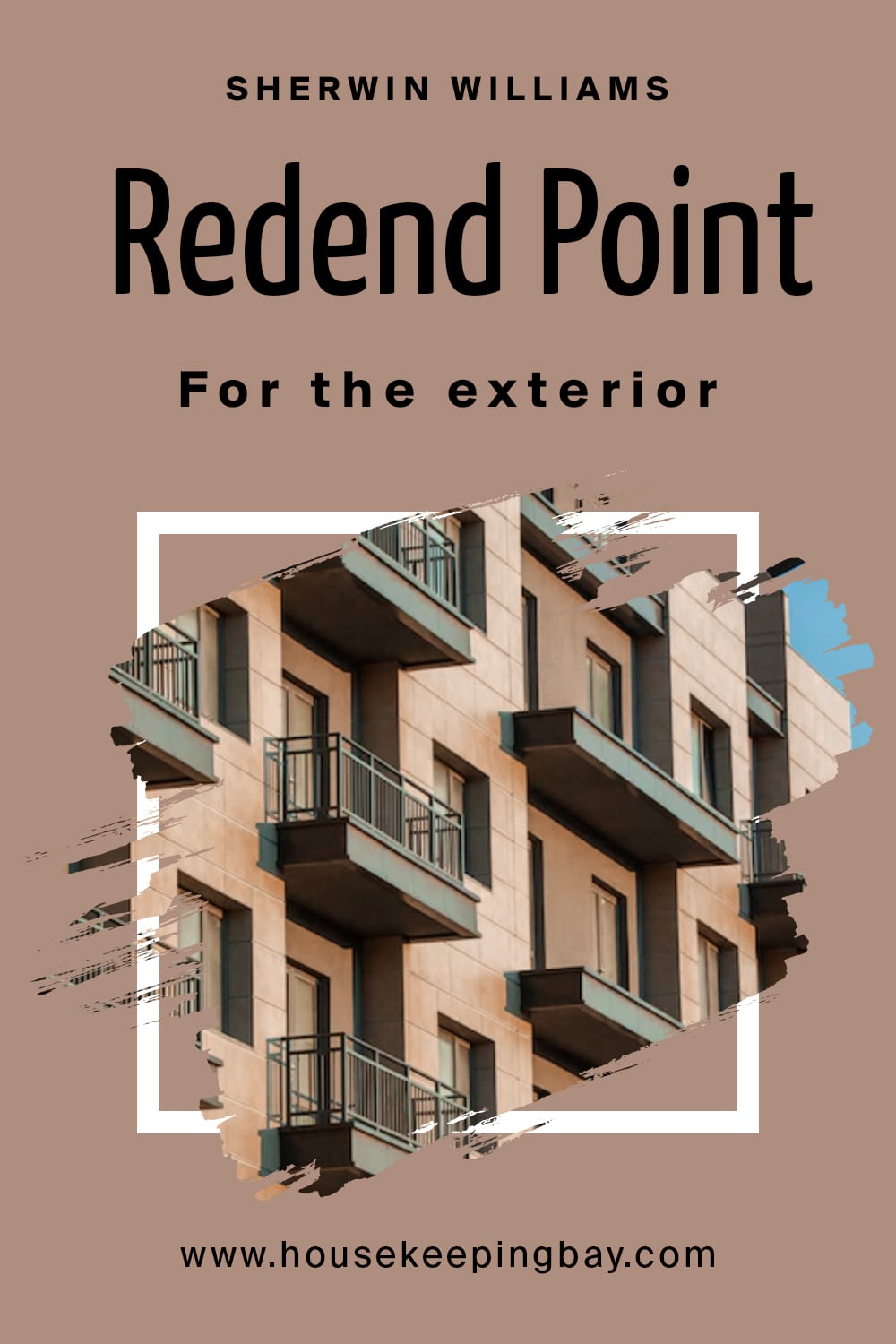
SW Redend Point for the Exterior Use
Can Redend Point be used as exterior paint? Technically, yes, it can. The manufacturer classifies this color as both interior and exterior. However, you should consider the lighting if you want to paint your entire house with it!
If you live in an area with many sunny days, then this color will read more of blushy pink on your exterior walls. Of course, the hue will be muted, you won’t get that bright piggy pink! But still, the pink undertones will come out quite prominently.
But if you live in an area with cloudy weather most of the time, repainting your house with Redend Point may leave you with the house walls of a muted chocolate-brownish shade! That’s how this color reads when it lacks natural light.
So, now you are aware of all the nuances regarding the way this beautiful mid-tone neutral may read depending on the light. In addition, you know what to expect should you use it indoors or outdoors.
housekeepingbay.com
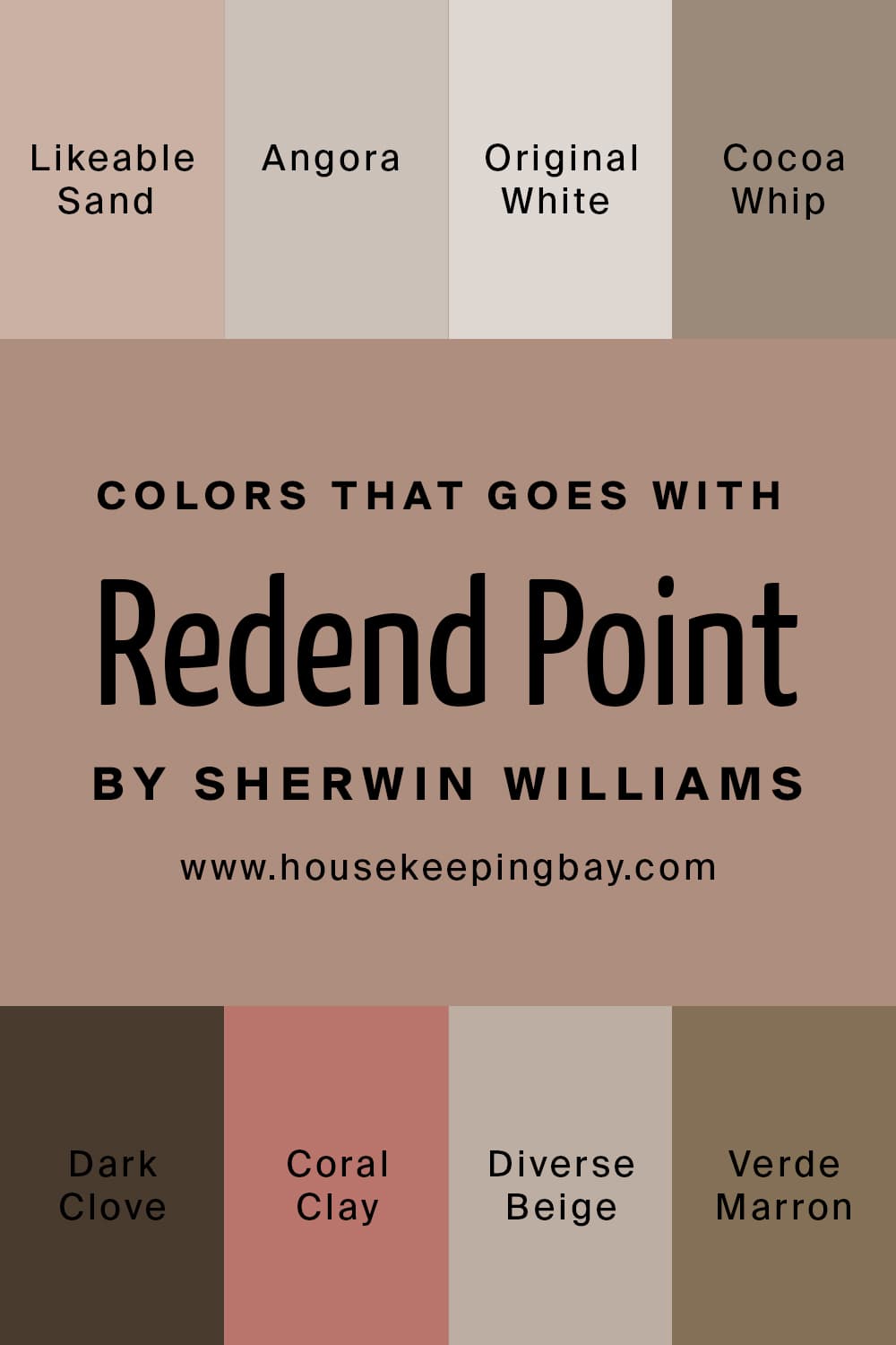
Сolors That Go With SW Redend Point
If you want to use other colors in the same room with the SW Redend Point, you need to know what colors can go well with it. At this point, you should understand that we are not talking about coordinating colors here! We mean colors that can be paired with Redend Point well enough to create a harmonious palette.
Among such colors, we can name a few good options:
- SW-6058 Likeable Sand
- SW-6036 Angora
- SW-7077 Original White
- SW-9084 Cocoa Whip
- SW-9183 Dark Clove
- SW-9005 Coral Clay
- SW-6079 Diverse Beige
- SW-9124 Verde Marron
housekeepingbay.com
Similar Colors of SW Redend Point
There is another thing that is good to know before you start applying the paint color to your walls. See, it can happen that you might want to change the initial paint and shift it for another one that reads and looks almost the same. It can happen because the paint you initially chose didn’t match your interior color palette, as well as for other reasons.
This is why we suggest you check out what other colors may read nearly the same as SW Redend Point:
housekeepingbay.com
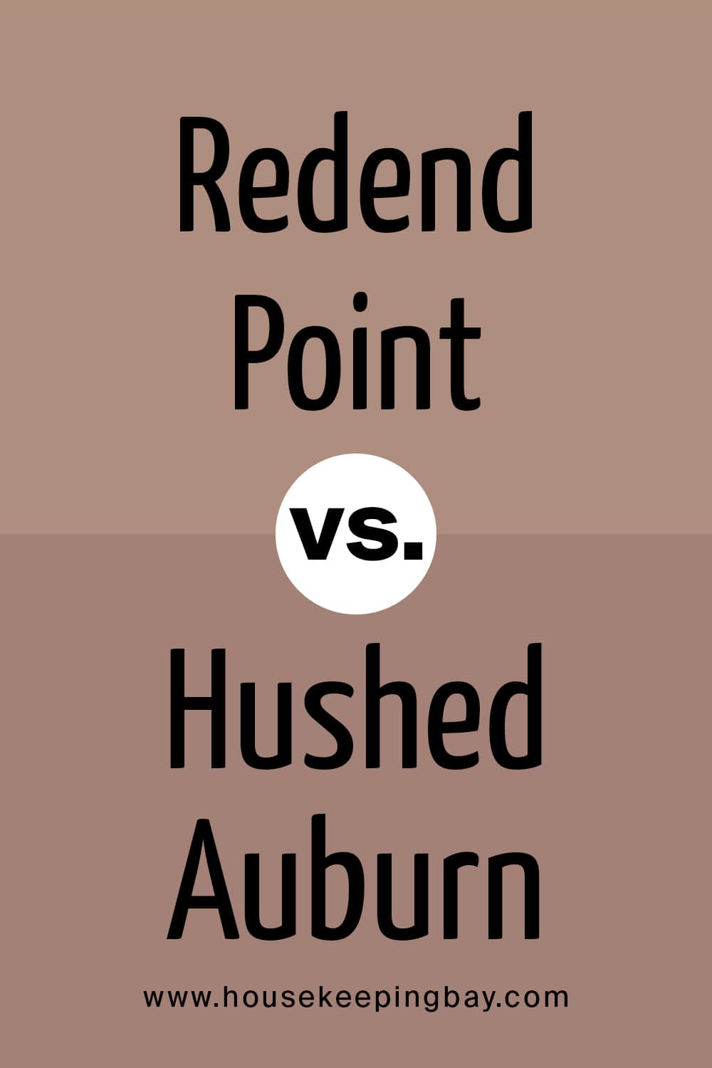
Redend Point vs. Hushed Auburn
These two are pretty much alike. The only significant distinction is that Hushed Auburn has more noticeable pink undertones. Besides, Hushed Auburn is considered to be a red color whilst Redend Point is a neutral blush-beige. However, these two can be used interchangeably quite successfully.
housekeepingbay.com
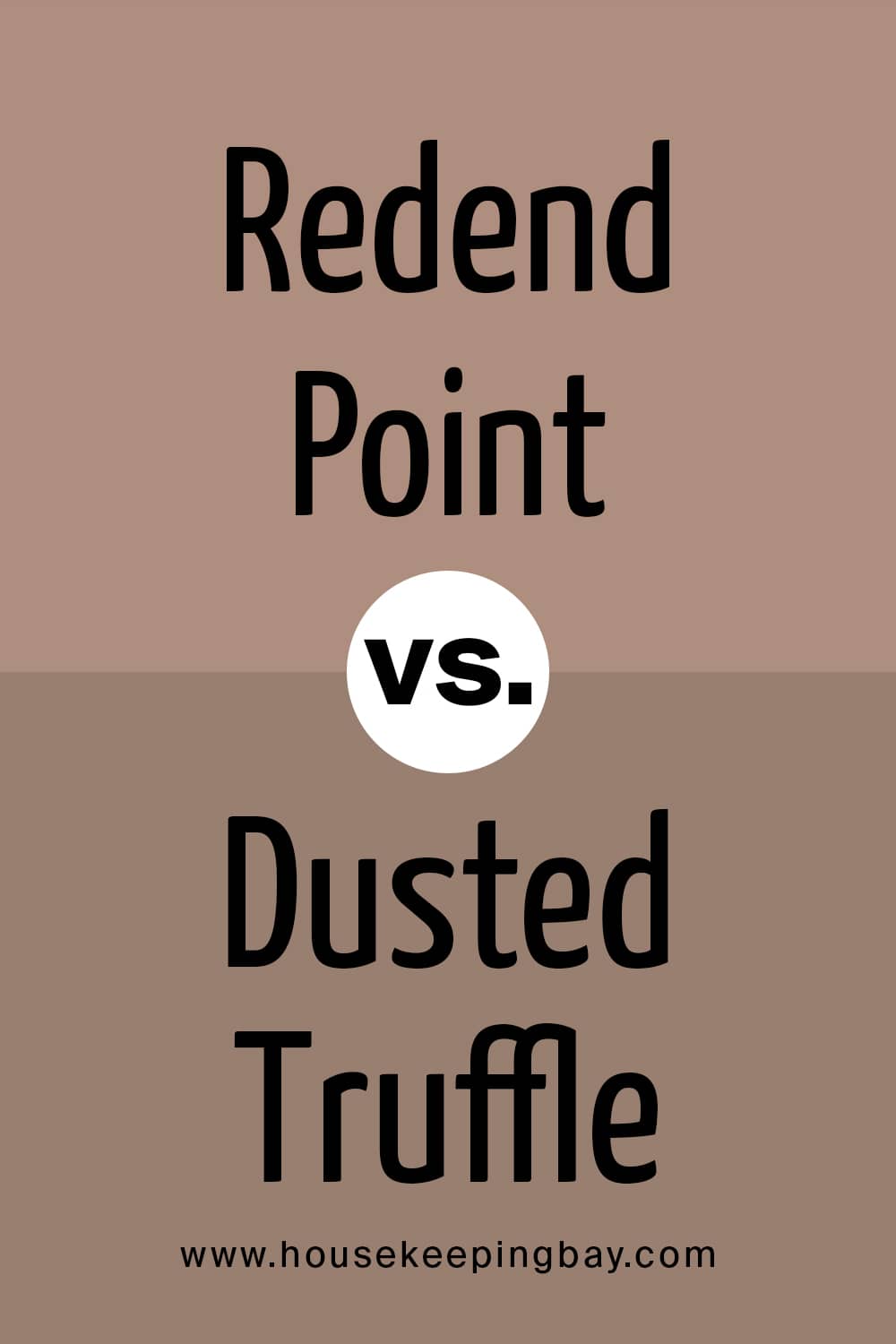
Redend Point vs. Dusted Truffle
Dusted Truffle is often considered a gray-brown paint color but in fact, it is a taupe gray-brown; not too dark, not too light. This balanced nature is what unites it with Redend Point.
Except for that feature, the colors can’t be called alike. Redend Point has prominent blush and strong pink undertones whilst Dusted Truffle reads way more brownish like coffee with milk. Nevertheless, both can be used interchangeably.
housekeepingbay.com
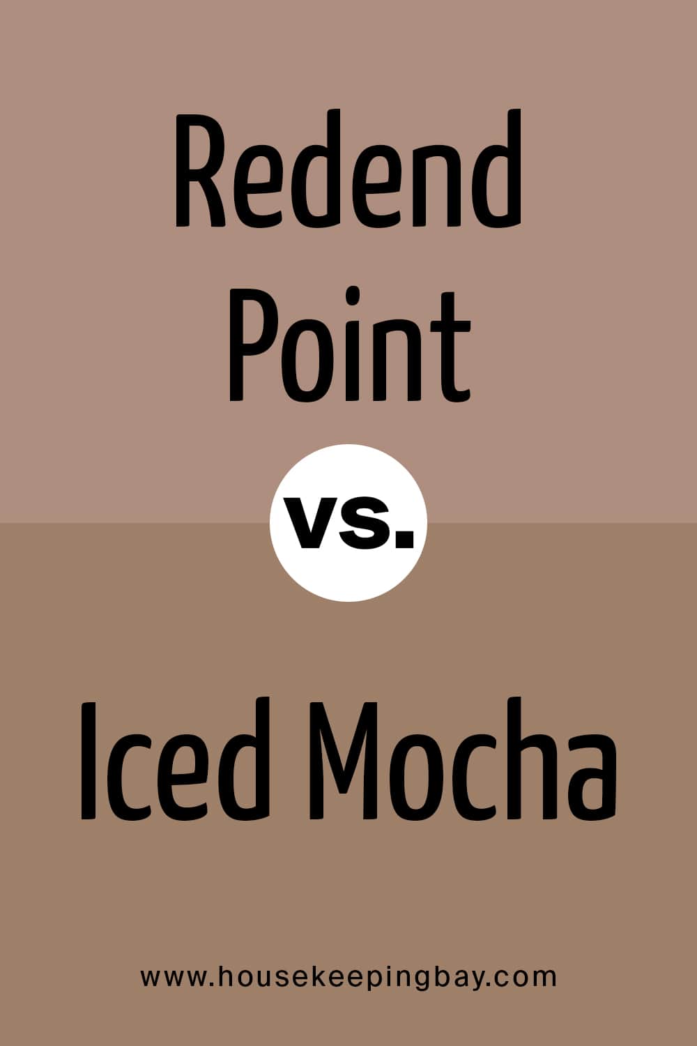
Redend Point vs. Iced Mocha
Iced Mocha reads warmer than Redend Point because Iced Mocha has more brown undertones than Redend Point color. In fact, Iced Mocha is a tan with a yellow undertone whilst Redend Point is a mid-tone beige that reads neutral. But despite such a distinction, they can substitute for each other successfully.
housekeepingbay.com
Redend Point vs Pottery Urn
Pottery urn color is a lovely warm-toned color that is classified as brown. Redend Point is a neutral blush-beige, as you all know. And indeed, if you compare them, you’ll see that Pottery Urn has a bit more of that earthy hue that makes it read pleasantly brownish. But despite of such differences, these colors can be used interchangeably with great success!
housekeepingbay.com
Well, now you know all that you need to be able to use such a beautiful but a bit tricky color as SW Redend Point! You know its undertones and trim colors, you know what rooms it will work best in, as well as what color palette will be the most harmonious for this mid-tone blush-beige.
housekeepingbay.com
Ever wished paint sampling was as easy as sticking a sticker? Guess what? Now it is! Discover Samplize's unique Peel & Stick samples. Get started now and say goodbye to the old messy way!
Get paint samples


Frequently Asked Questions
⭐Is Redend Point a red color?
No, this color is classified as a mid-tone neutral beige with blush and pink undertones.
⭐Does Redend Pont read brown on the walls?
It won’t read clear brown but in darker rooms, the color will indeed reveal its brownish side.
⭐Is Redend Point a trendy color?
More than you could think! This is the Color of the Year 2023 which means that it’s even ahead of the trend!