Urbane Bronze SW 7048 by Sherwin Williams
A deep, earthy brown with a hint of gray warmth
Redecorating your house is always an exciting stage when you can change not only the way your house looks but also the whole vibe and mood you get in the room.
Choosing a paint color either for the walls or your furniture or even for exterior is always quite responsible.
You want everything to go with each other, look modern, simple and cosy! Urban Bronze by Sherwin Williams is exactly what you’re looking for!
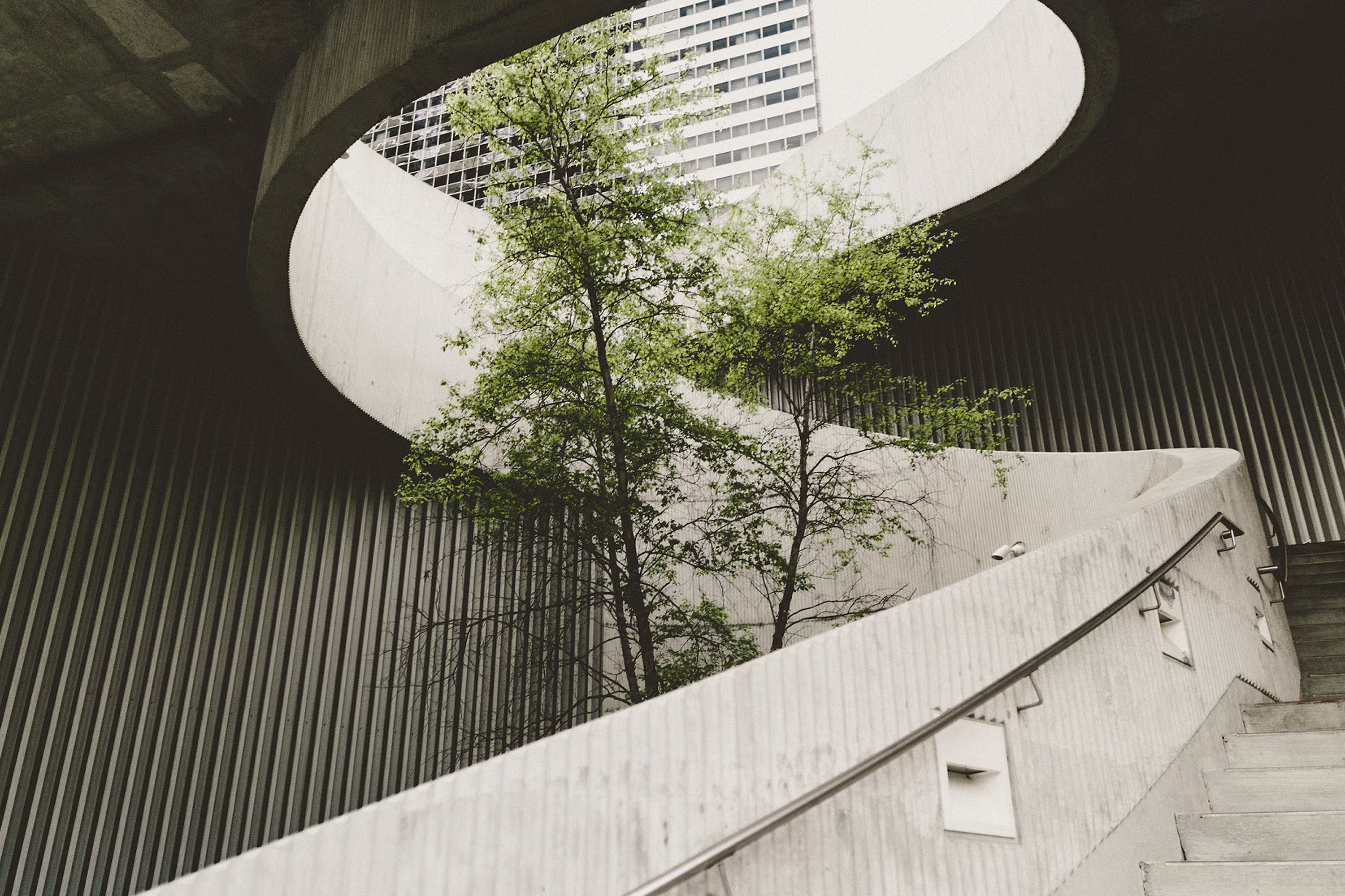
Credits: Alexander Abero, via Unsplash.com
Sherwin Williams Urban Bronze Paint Color
“This warm hue draws from nature for a feeling of relaxation and serenity.” “The moments worth cherishing are right in front of us – sometimes we need a little reminder.”
“Stay grounded with a color whose natural simplicity cultivates a sense of calm from the ground up.”
“Tap into nature with a hue whose warmth and comfort breathe down-to-earth tranquility.”
“Our 2021 Color of the Year, Urbane Bronze, captures that simple sophistication every space is searching for”, – and this is how Sherwin Williams herself describes urban bronze color.
We couldn’t agree more!
One of the most calming and minimalistic colors which gives you that luxury and rich interior is urban bronze. Moreover, it will fit almost every interior and exterior style, no matter what you have.
Interestingly, some people call it just dark brown or bronzy, others see it as grey or sometimes even dark green, as Encycolorpedia says!
housekeepingbay.com
Table of Contents
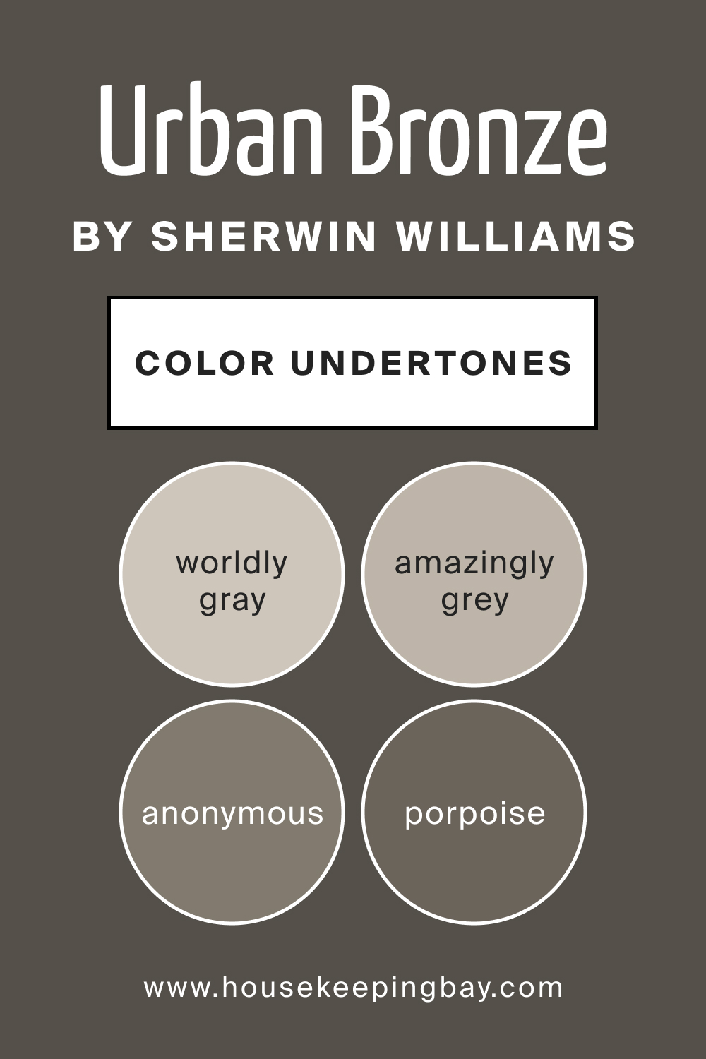
Sherwin Williams Urban Bronze Paint Color Undertones
As it was mentioned before, people see absolutely different undertones in Urban Bronze, but you`re likely wondering what color is urban bronze really?
The official website of Sherwin Williams says that it has multiple undertones, which actually comes from grey! So it starts with Worldly gray, then goes Amazingly grey.
Both of them are closer to beige and are quite warm. Then goes Intellectual grey and Anonymous. They start the colder line of urban bronze color palette.
The next is called Porpoise and is actually the closest to Urban Bronze. It`s dark enough and gives the same minimalistic and down-to-earth cosyness to your design.
housekeepingbay.com
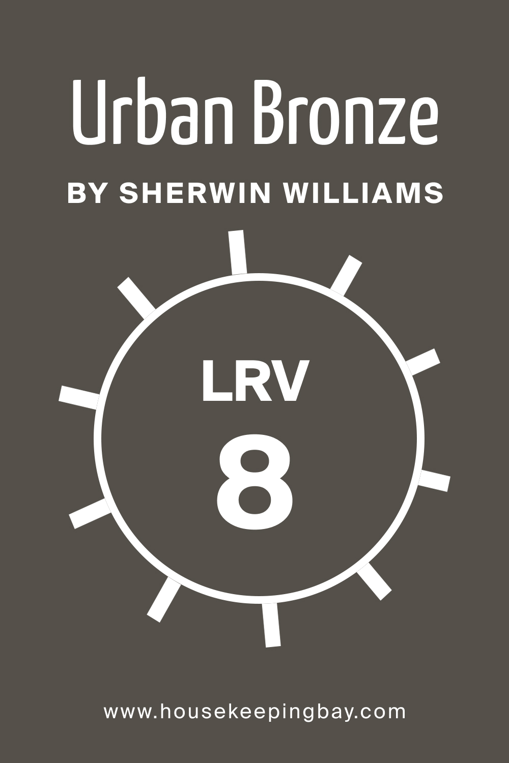
Sherwin Williams Urban Bronze Paint Color LRV
So, moving on to LRV (Light Reflectance Value) which Urban Bronze has a meaning of 8 and it is low.
So, not to get you confused, the Light Reflectance Value scale goes from 1 to 100, where 1 is the darkest and 100 is the lightest color.
Since Urban Bronze LRV is 8, it means that it’s almost a completely dark color and it will match and contrast well with light colors.
housekeepingbay.com
What is LRV? Read It Before You Choose Your Ideal Paint Color
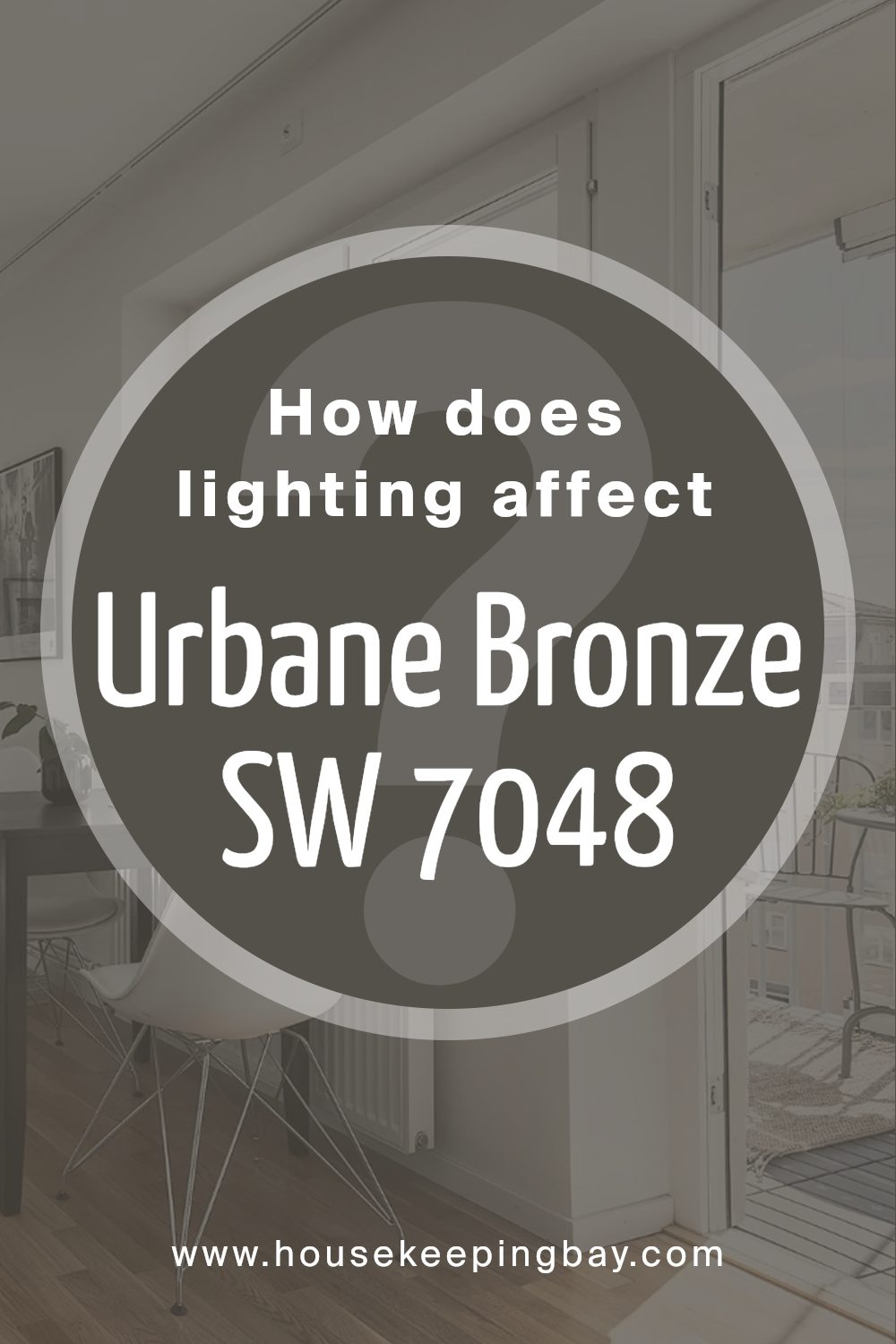
How Lighting Affects Urbane Bronze SW 7048
Urbane Bronze can shift its appearance depending on the lighting in your home. In north-facing rooms, it may feel deeper and more muted, with a stronger charcoal look. This direction can make the color feel moodier during the day.
In south-facing spaces, where the light is brighter and warmer, the brown undertone becomes more noticeable. The paint feels fuller and richer under consistent daylight.
East-facing rooms bring out a cooler tone in the morning but may look softer as the light fades. West-facing rooms tend to highlight the warmth later in the day, giving it a more relaxed feel in the afternoon and evening.
With cool lighting, like daylight LEDs, Urbane Bronze leans toward gray. Under warm bulbs, the brown base becomes stronger and more noticeable. Try it with different bulbs to see how it responds.
This color looks best when tested in your specific setting, especially near windows or under the lights you plan to use every day.
Coordinating Paint Color For Urban Bronze by Sherwin Williams
Since we already discovered that urban bronze is from the dark color family and has rather dark grey undertones it means only one thing – it will go well with light colors.
So, the official Sherwin Williams website gives us their recommendations on how to coordinate urban color with other Sherwin Williams colors.
They offer to match it with extra white first of all, which will help to discover the whole depth of the urban bronze in contrast with white.
If extra white is too light and cold for you, and you want to have something more calming, then the other option they have is shoji whte, which is way warmer than the extra white.
One more tone which will work well with urban bronze paint color is Ivoire. Ivoire is almost a sandy color which gives you warmth and a welcoming atmosphere.
This serene color pairs beautifully with metal, wood and stone.
A complex combination can be called a composition consisting of 3 or more shades. For example, bronze is combined with:
- dove, creating a subdued warm-cold contrast that is very often used to emphasize the warm, bright nature of the base tone;
- coniferous, this is a natural palette that recalls the forest color. Soft, unobtrusive and relaxing. It also has thermal contrast, but not as pronounced as with gray.
You can complement the combination with shades of beige, dark blue and dark gray, all of them will work as urban bronze trim colors.
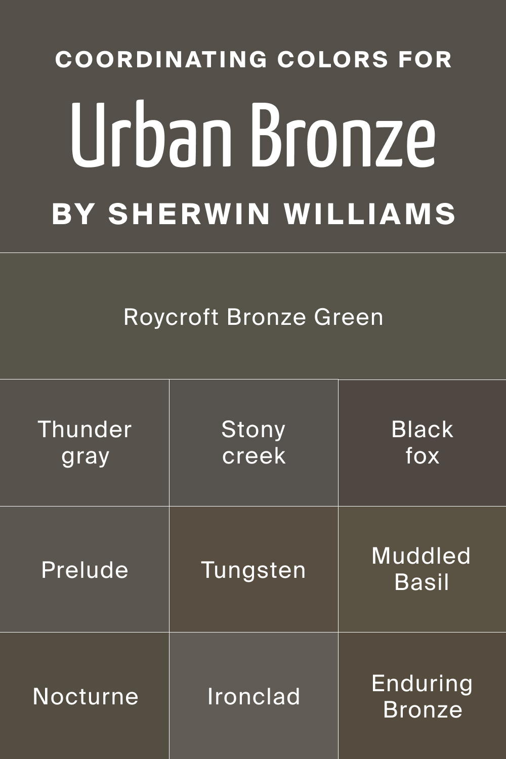
For obvious reasons, there are some colors which are quite similar to urban bronze and the official resource of the manufacturer states that those are:
- Thunder gray;
- Prelude
- Stony creek ;
- Black fox ;
- Nocturne ;
- Roycroft Bronze Green ;
- Tungsten;
- Ironclad ;
- Enduring Bronze ;
- Muddled Basil
housekeepingbay.com
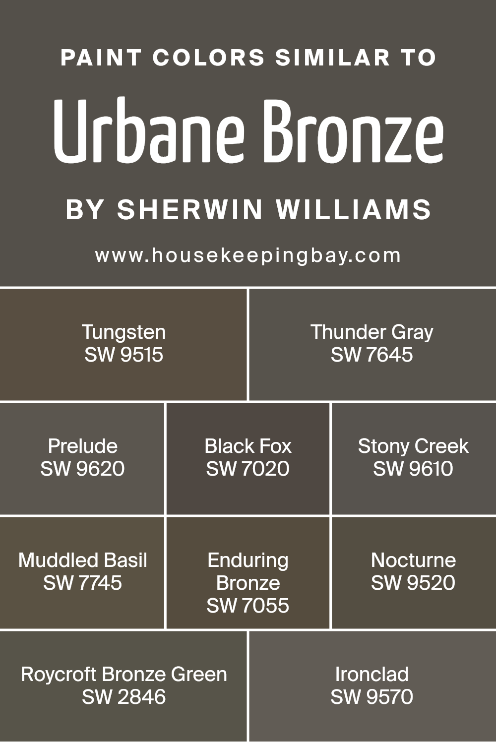
Paint Colors Similar to Urbane Bronze SW 7048
Urbane Bronze SW 7048 is rich, bold, and grounded. If you’re searching for options with a similar look and feel, here are Sherwin Williams shades that match the depth and earthy tone. These alternatives work well for accent walls, trim, cabinetry, and exteriors:
-
Tungsten SW 9515 – dark with brown and gray undertones
-
Thunder Gray SW 7645 – moody with a cooler edge
-
Prelude SW 9620 – deep with muted warmth
-
Black Fox SW 7020 – strong brown-black base
-
Stony Creek SW 9610 – grounded gray-brown mix
-
Muddled Basil SW 7745 – brown with a touch of olive
-
Enduring Bronze SW 7055 – bronze tone with natural depth
-
Nocturne SW 9520 – dark with subtle softness
-
Roycroft Bronze Green SW 2846 – deep with green hints
-
Ironclad SW 9570 – firm and muted charcoal
Each one brings a grounded feel and works beautifully in cozy or modern settings.
Best Trim Color Pairs For Urban Bronze by Sherwin Williams
Combination of bronze and orange colors of Urban Bronze Color
In fact, brown, and also so bright, is a dark shade of orange, so the combination with it will be in the same color scheme, the first will be a shadow of the second.
The harmony of such a combination will be light, unobtrusive, and the composition will be deep.
The color is made up of peach, sea buckthorn, golden-copper, dark orange, red.
Bronze pairs with red as a warm, related shade of Urban Bronze Color
The color scheme looks natural due to the unifying red tone that is part of the brown. Complex, muted reds can be both warm and have wine undertones.
The combination includes alizarin, tomato, cherry, wine, maroon.
Combination of bronze and pink of Urban Bronze Color
Soft, romantic, it should not be harsh, even if the shade of pink is dark.
Warm, moderately muted shades will look best in combination.
The palette is made up of royal pink, cotton candy, strawberry, dark pink, lingonberry.
Bronze and warm green of Urban Bronze Color
Combination is pleasant, enveloping, natural, like greens and thin twigs with fresh bark. Shades in their composition have a unifying yellow, which supports harmonies.
However, it is better to take complex, soft tones of greens against bright and sonorous ones. The combination involves green tea, chartreuse, protective, coniferous, brown-green.
Combination of bronze and blue of Urban Bronze Color
It is not only a representative of a rich thermal contrast, but also an additional pair.
This color is one of the most beloved in all areas. Marine hues are preferred, as the bronze builds on the red-orange tone, and the blue-green is complementary to it.
The color scheme is built from gray-green-blue, thrush egg color, sea wave, dark blue-green, blueberry.
Bronze and purple of Urban Bronze Color
Highlighting its red undertone, as it is what unites these colors.
Soft lilac and red-violet hues add spice and sophistication to the main tone.
The composition includes lilac-lilac, lilac amethyst, red-violet, plum, eggplant.
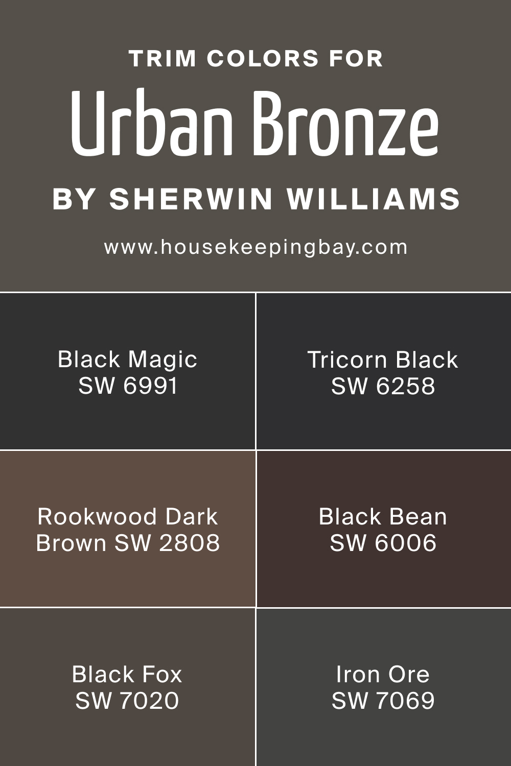
Bronze is paired with white, grey, beige and black as neutrals of Urban Bronze Color
Each of them emphasizes this color in its own way: soft white brings lightness, beige
Warm grays of Urban Bronze Color
Smooth out, and cold ones sharpen, black richly emphasizes. The palette consists of creamy, beige, gray-beige, slate, wet asphalt.
- Iron Ore SW 7069
- Black Fox SW 7020
- Tricorn Black SW 6258
- Rookwood Dark Brown SW 2808
- Black Magic SW 6991
- Black Bean SW 6006
housekeepingbay.com
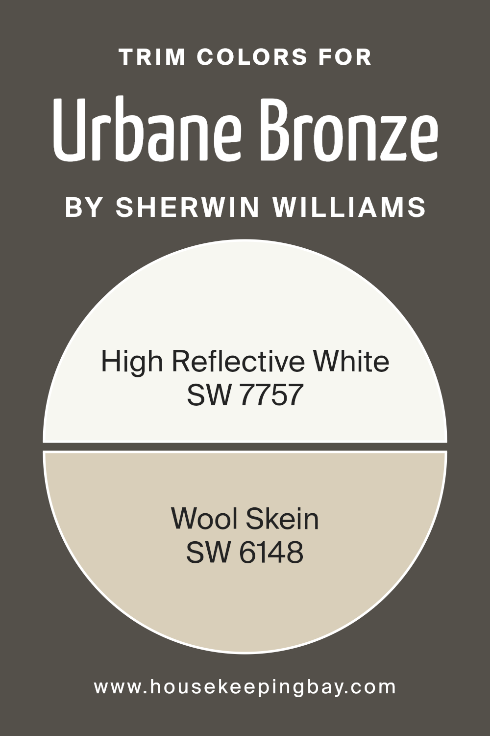
Pairing the right trim helps Urbane Bronze stand out without clashing. These two Sherwin Williams options give clean contrast and balance:
-
High Reflective White SW 7757 – crisp and bright, ideal for modern or classic trim
-
Wool Skein SW 6148 – warm and soft, blends gently without sharp edges
Both choices work well depending on whether you want more contrast or a smoother flow between wall and trim.
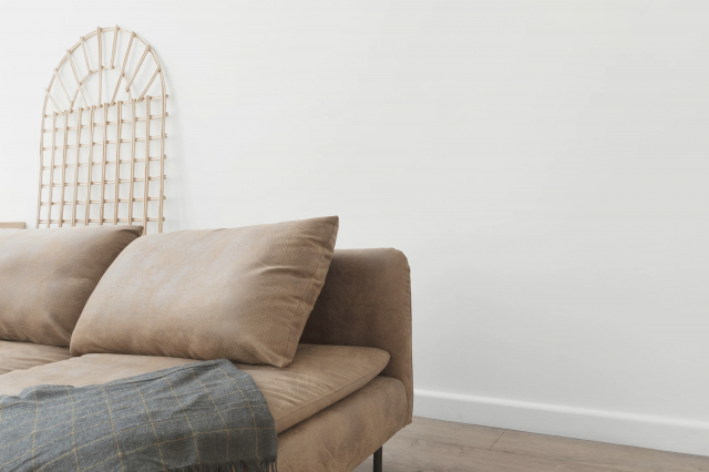
How to use Sherwin Williams Urban Bronze Paint Color?
Bronze in the interior looks expensive and elegant. Its closest relative is red terracotta.
As a shade close to dark, the tone contrasts with white. In such a composition, it is worth paying attention to textures.
Green accents make the bronze-brown interior look luxurious. It reveals exotic splendor.
Blue enhances the color of bright brown, emphasizing its warm, rich image, but at the same time the combination is more rigorous than the previous one.
A lot of this shade in the interior or just outlined accents – it doesn’t matter, the juiciness of bronze and at the same time a calming effect will allow you to bring pleasure in any of its quantities.
This serene color pairs beautifully with metal, wood and stone.
Natural materials like wood finishes, stone accents, and mixed metals ties this earthy neutral back to its nature-inspired roots.
The combination of bronze color in clothes is not catchy, rather seasoned and aristocratic.
Most often, the shade is supported by several brown and beige tones, this gives a feeling of gloss, shine.
Great importance is given to the texture of a product of this shade, any irregularities, hairiness, volume are welcome, because, shimmering with this shade, it acquires the effect of internal light, which refreshes the appearance.
Cold shades are always a priority, they make the main tone warmer. Orange, yellow and gold tones continue it. Green, turquoise, purple next to him look exotic.
Try to move away from stereotypes by creating spacious bright rooms with the help of zoning and deceptive mirrors. Add a small piece of bronze to the interior:
- door hand;
- photo frames;
- the head of the bed.
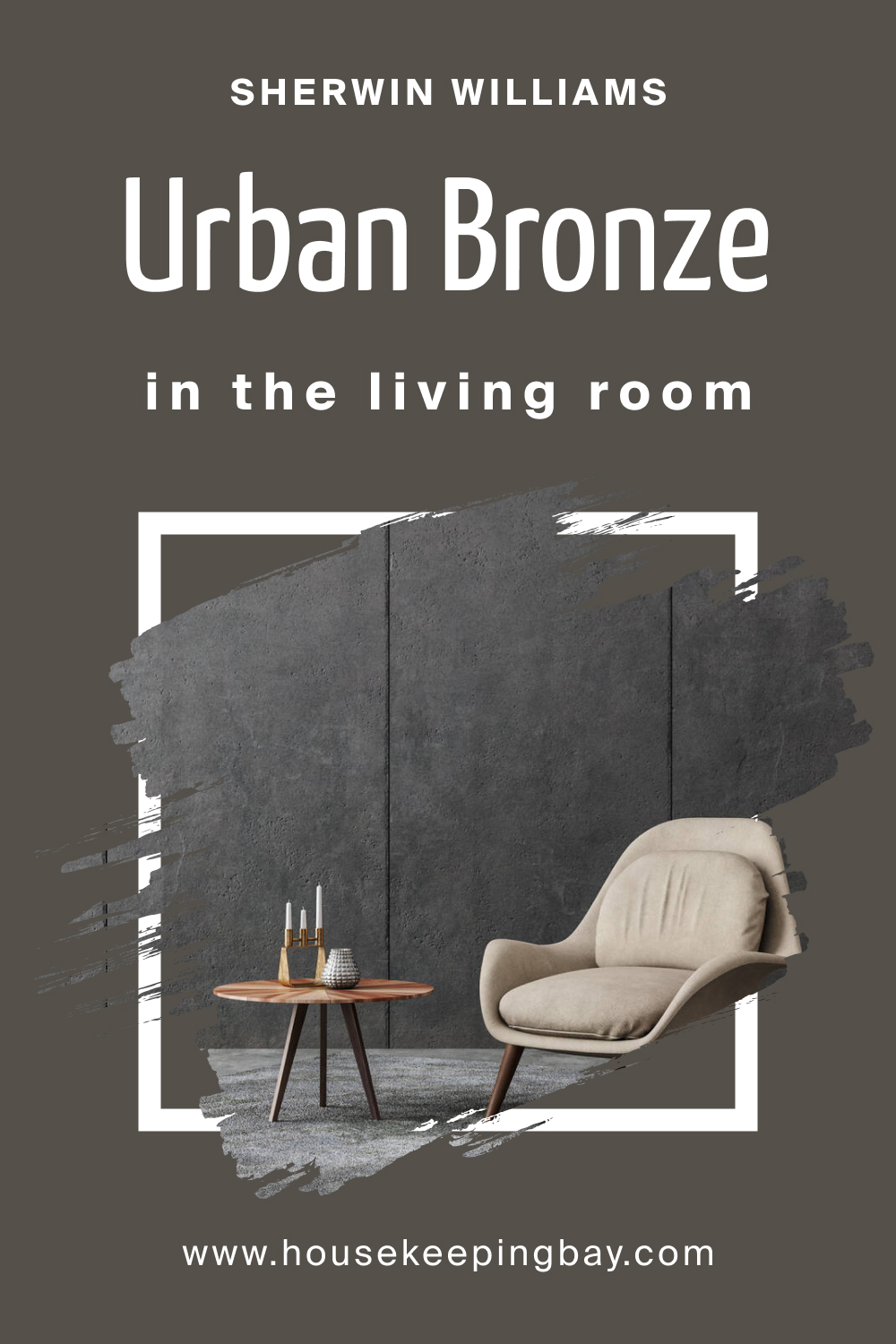
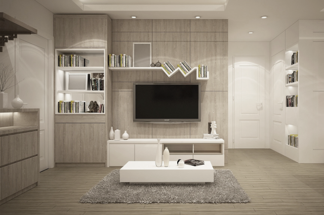
Sherwin Williams Urban Bronze Paint Color for living room
You can transfer the atmosphere of wealth to different rooms. The only condition for a successful project is to remember the functional purpose of the room.
The direct purpose that bronze wallpapers have is easy to implement in the very first room which guests will enter.
A golden hue in any manifestation will indicate the richness of the finish.
Tones in the range of the dark red area will certainly make the space too cramped and dark, but they will add a color of peace, peace and quiet.
Bright shades, closer to yellow, will delight the eye with anticipation of the holiday.
Choosing the color of curtains is of great importance for the interior. With this attribute, you can expand or narrow the space, you can get rid of excessive sunlight or add shine to the room.
Bright and warm colors help to add light, while cool tones in curtains can make a room appear calmer and darker.
housekeepingbay.com
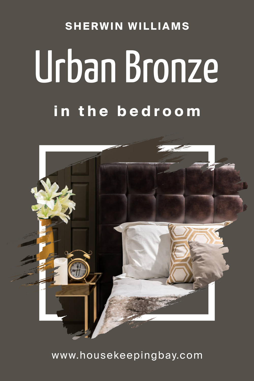
Sherwin Williams Urban Bronze Paint Color in bedroom
According to psychologists, brown tones in the interior of the bedroom contribute to complete relaxation, and speed up falling asleep.
Completely decorated with different shades of this elegant color, the room looks incredibly stylish and gentle.
A friendly alliance of brown and beige will fill the bedroom with calmness and serenity, while violet notes will add sensuality and romantic mystery.
housekeepingbay.com
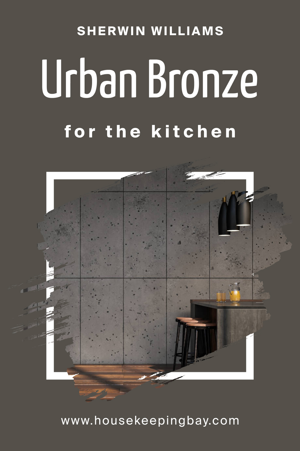
Sherwin Williams Urban Bronze Paint Color in kitchen
Urban bronze kitchen cabinets are also very appropriate. It not only gives the room an exquisite solidity, but also improves appetite, allowing you to get maximum pleasure from the meal.
In addition, kitchen furniture in rich brown shades is quite practical, since the slightest pollution will not immediately catch the eye on it.
Bronze is the perfect solution for spacious rooms. Such shades can make the interior luxurious and truly elegant.
housekeepingbay.com
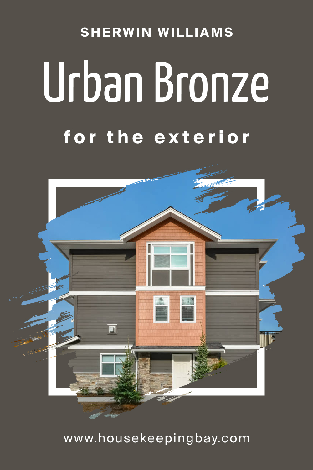
Sherwin Williams Urban Bronze Paint Color in exterior
Since almost all homes have some sort of ever green tree background, bronzy exterior paint colors are our most popular and pleasant earth tone.
Not to be confused with “slate”, which is actually a dark deep gray, Urban Bronze by Sherwin Williams is more suitable for either larger homes, or homes with what designers call “interesting fronts”.
That means a house with lots of features in the front; plenty of trim to break up all the darkness of the brown, and maybe some rocks or other features to take away some of the strength of the dark color.
In most cases, I would recommend dark Brown Exterior paint colors for ramblers.
Darker colors can miniaturize the house further, and give it a more vintage and unique look.
Of course your house color represents your personality, and if you do not plan on selling your home anytime soon, you must simply choose something you enjoy looking at.
housekeepingbay.com
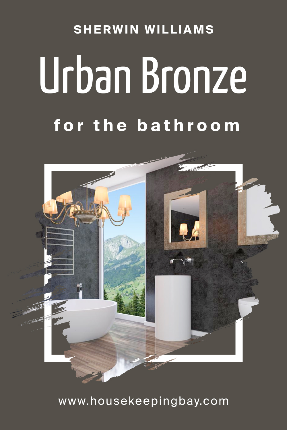
Sherwin Williams Urban Bronze Paint Color for bathroom
The bathroom is another place where a bronze palette will look very luxurious. Competently combining colors, you can create both a gently enveloping and fresh-cool interior.
For the fans of solid-strict bathrooms will like the bright combination of dark brown with sparkling snow-white.
And for a serene rest and relaxation, the community of light brown tones with cream and beige is ideal.
housekeepingbay.com
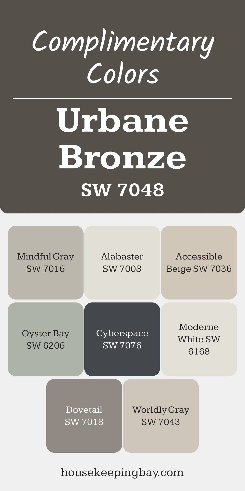
Complimentary Colors for Urbane Bronze SW 7048 Paint Color by Sherwin Williams
Urbane Bronze offers a bold and sophisticated backdrop, and pairing it with Worldly Gray or Mindful Gray adds a balanced, soft contrast. Dovetail complements the richness of Urbane Bronze while keeping the overall look cohesive. These shades work beautifully for creating spaces with depth and subtle refinement.
For a lighter touch, Accessible Beige or Moderne White brings brightness, while Alabaster offers a crisp accent. Oyster Bay introduces a hint of green, and Cyberspace provides a bold, dramatic contrast.
via housekeepingbay.com
Comparing SW 7048 Urban Bronze With Other Colors
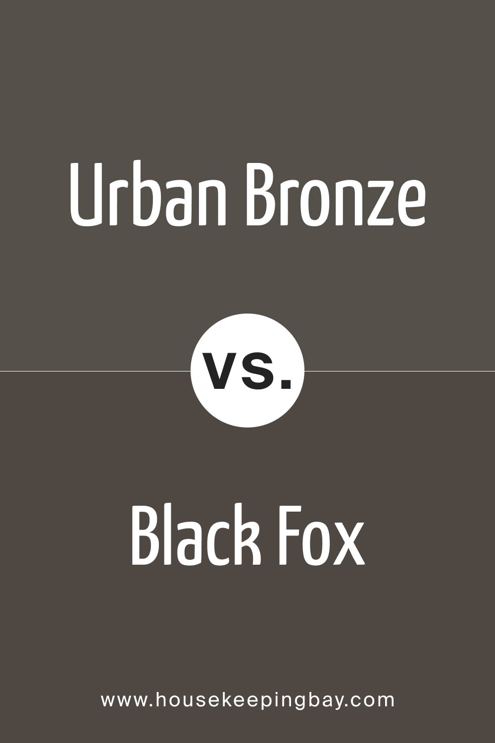
SW Black Fox 7020 vs. SW 7048 Urban Bronze
Even though you might not see the obvious difference between the two from the first sight, but they go very well together.
Using these two in either interior or exterior you may get the perfect monochrome look.
housekeepingbay.com
SW Iron One 7069 vs. SW 7048 Urban Bronze
While Urban Bronze is more of a warm colour, Iron one is way cooler even though they have pretty much the same grey undertone.
It would be fair to admit that both of them will match extra white and sandy, nude, beige colors.
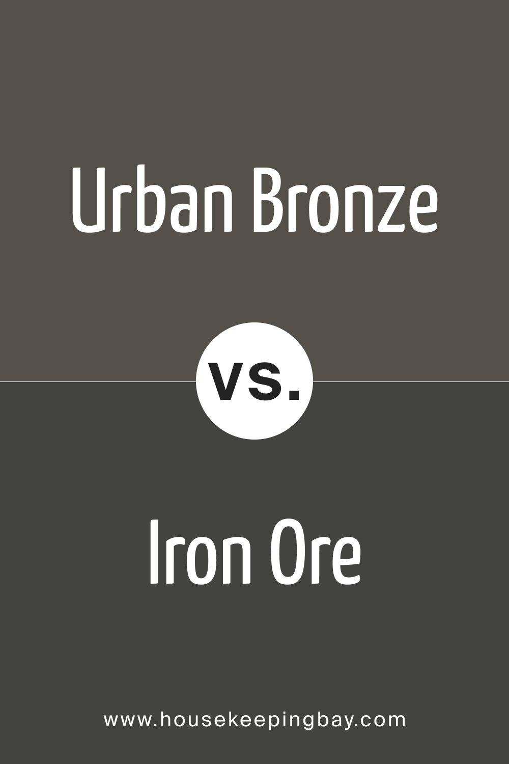
housekeepingbay.com
SW Peppercorn 7674 vs. SW 7048 Urban Bronze
If you are looking for something similar to Urban bronze, but slightly lighter and fresh, then Peppercorn is exactly what you need.
These two will contrast each other and subtly highlight the depth of each color.
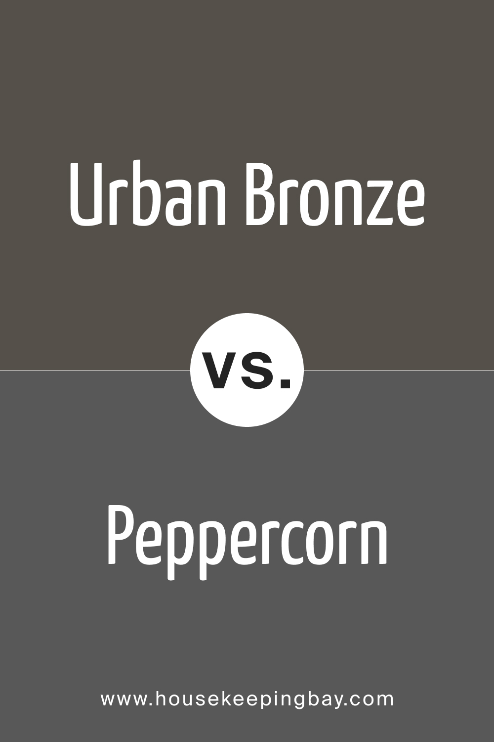
housekeepingbay.com
SW 7032 Warm Stone vs. SW 7048 Urban Bronze
SW Warm Stone is a harmonious blend of gray and brown, creating a neutral that sits right in between those two hues. When compared to Urban Bronze, Warm Stone seems slightly lighter and more on the beige spectrum. Both paints share a subdued and earthy feel, but while Urban Bronze leans more into the depth and darkness of its character, Warm Stone brings forth a slightly warmer and lighter ambiance, perfect for those who wish for a neutral with a hint of more brightness.
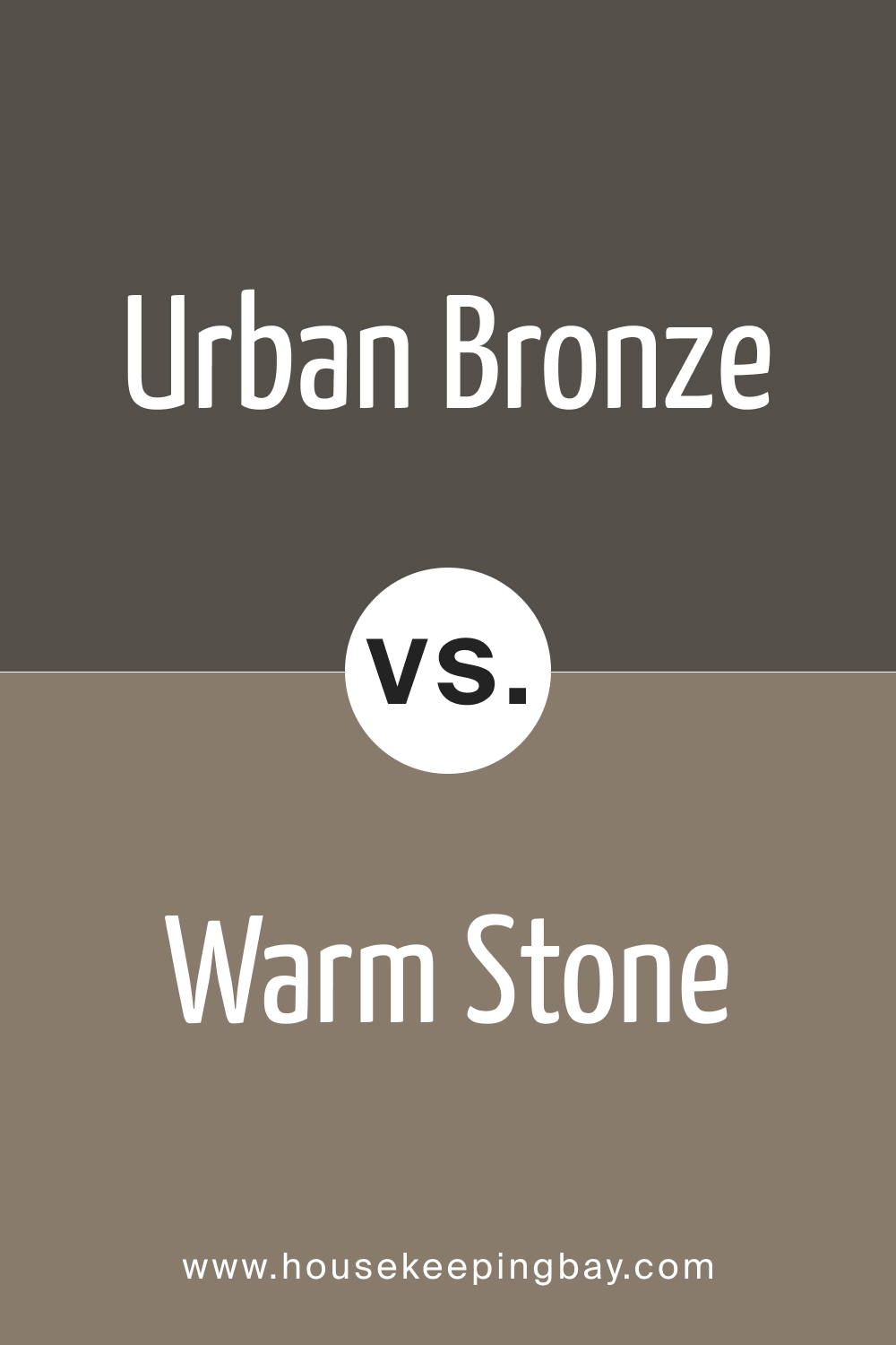
housekeepingbay.com
SW 9594 Settlement vs. SW 7048 Urban Bronze
SW Settlement carries with it a grounded taupe essence, echoing whispers of the past and the comforts of a warm, rustic environment. Next to Urban Bronze, Settlement exudes a more muted and antiqued feel. While both colors can easily anchor a space, Urban Bronze offers a more contemporary flair, whereas Settlement leans into a traditional, timeless aura. It’s the difference between the sleek furniture of a modern loft and the comforting embrace of a heritage cottage.
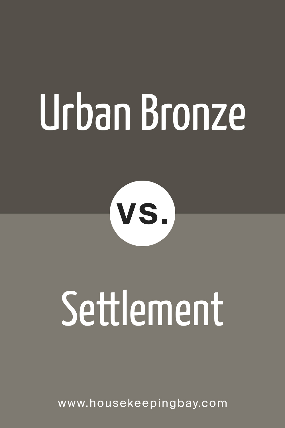
housekeepingbay.com
SW 7047 Porpoise vs. SW 7048 Urban Bronze
SW Porpoise is a true gray that is neither too cool nor too warm. It’s the epitome of neutrality and can adapt seamlessly to various environments. When placed side by side with Urban Bronze, Porpoise appears lighter and more strictly gray, lacking the brown undertones that Urban Bronze flaunts. Both are versatile and can be incorporated into various designs, but while Urban Bronze makes a bold, moody statement, Porpoise offers a more understated, classic feel.
housekeepingbay.com
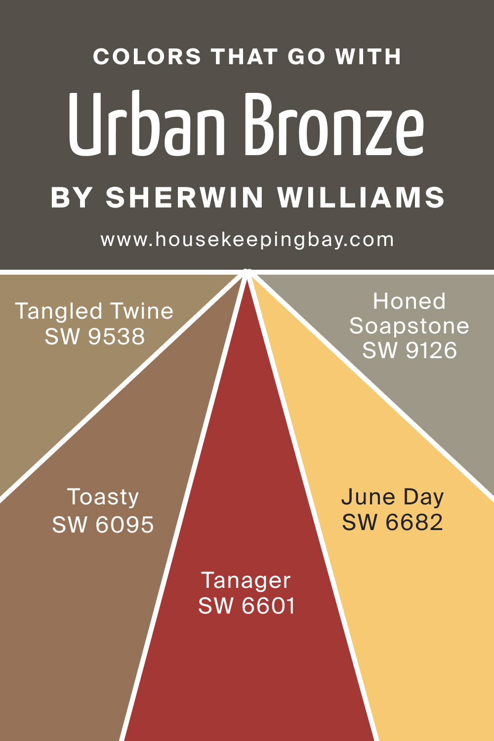
Colors That Go With SW Urban Bronze
SW 7048 Urban Bronze by Sherwin Williams is a versatile neutral that can be paired with a variety of colors to create different moods and atmospheres. Here are some complementary Sherwin Williams colors and descriptions for each:
- SW 6095 Toasty – a soft beige with warm undertones that can instantly bring coziness and warmth to any space. It acts as a gentle neutral, offering a calming backdrop.
- SW 9538 Tangled Twine – offers a rich olive-green undertone that’s both earthy and organic. Tangled Twine brings an element of nature indoors and pairs beautifully with Urban Bronze.
- SW 9126 Honed Soapstone – a soft, muted green-gray that can evoke feelings of tranquility and calm. Its subtle undertone works harmoniously with Urban Bronze, adding depth and dimension to a space
- SW 6601 Tanager – a bold, fiery red with a hint of orange undertones. It’s a spirited hue that can inject energy and warmth into a space, creating a striking contrast when placed alongside the moody Urban Bronze.
- SW 6682 June Day – a sunny, cheerful yellow. Its vibrancy and lightness can act as the perfect counterpoint to the depth of Urban Bronze, bringing a sense of balance and joy.
housekeepingbay.com
Conslusion
Choosing the right shade for the room, such comparisons can be invaluable. The universal shade SW 9506 Warm Winter allows you to create a home that matches the desired atmosphere and style.
housekeepingbay.com
Ever wished paint sampling was as easy as sticking a sticker? Guess what? Now it is! Discover Samplize's unique Peel & Stick samples. Get started now and say goodbye to the old messy way!
Get paint samples


Frequently Asked Questions
⭐ Can I use Urbane Bronze in my lounge?
Yes, you absolutely can. Urbane Bronze looks perfect in both interior and exterior designs.
⭐ What are the Urbane Bronze trim colors?
Shades of beige, dark blue and dark gray will work as urbane bronze trim colors.
⭐ What is the difference between Iron ore and urbane bronze?
Urbane Bronze is slightly lighter and has a warmer undertone than Irone one.
2 thoughts on “Urbane Bronze SW 7048 by Sherwin Williams”
Leave a Reply


Has anyone tried using Urbane Bronze by Sherwin-Williams for kitchen cabinets? I’ve seen a couple of mood boards and am considering it for my upcoming kitchen renovation. I’m curious about how it looks in real-life settings and how it pairs with different countertop materials.
Hi, guys! I found your article very useful. I really don’t know whether to use Urban Bronze in my bedroom. Wouldn’t it be too dark? I want to have a cosy atmosphere.