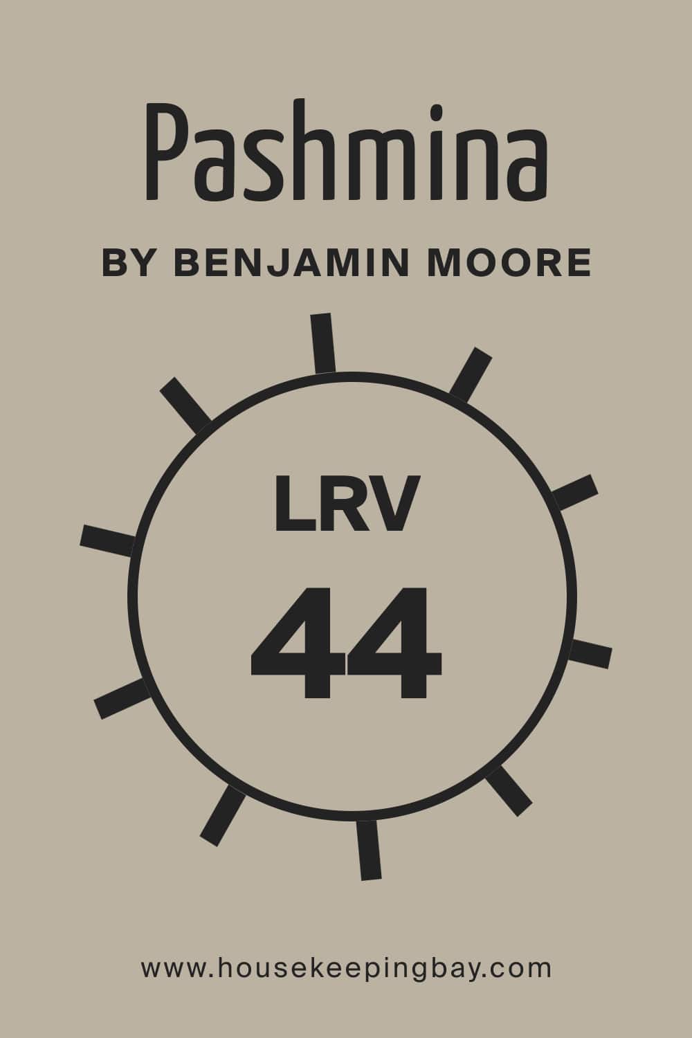
Pashmina AF-100 Paint Color by Benjamin Moore
Discover this beautiful neutral to use in your home
Neutrals are great because of their versatility. You can use these colors anywhere in your home, and be sure they will work successfully. But if you think that you don’t need at least some basic knowledge of color when working with neutrals, you are wrong.
Even with such versatile colors as neutrals, it is essential to understand how the color works in space, what colors it pairs with, and how it reacts to light.
And since today we will be talking about a neutral paint color, you will learn everything you need to know about it!
We will explain how it works in different rooms and lighting, what colors to use to coordinate it, and what color schemes will be more suitable for it.
pinterest.com
What Color Is Pashmina AF-100?
As we already said, the Pashmina paint by Benjamin Moore is a neutral color. As Encycolorpedia says, this is a sophisticated greige that reads neutral and perfectly balanced between warm and cool, light and dark. Thanks to this feature, you can use Pashmina AF-100 almost anywhere.
At first sight, the Pashmina color may seem to be slightly deep greige, but if you take a closer look at it, you will see it is certainly leaning towards the beige end of things rather than to the gray.
Also, this color reads significantly warmer than all the popular greiges we know! Considering all these nuances, it’s hard to call this color 100% universal since it won’t work equally in any space of your home.
housekeepingbay.com
Table of Contents
Undertones of the Pashmina Paint Color by Benjamin Moore
When you know what undertones the paint color has, it allows you to use it correctly in any space of your home. Quite many colors have complex undertones (often more than one undertone) that might not reveal themselves until you use the color in certain types of light.
But these are the paint colors that tend to read completely differently on a swatch and the wall!
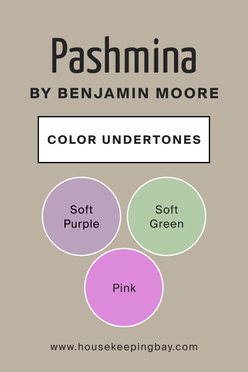
Speaking of Pashmina AF-100, this greige has subtle undertones. But upon closer examination, you may notice a passive greenish undertone. The trick is that this green hue doesn’t always show up.
However, you can make the green side of this color more visible if you pair it with neutrals that have a soft purple or pink undertone.
Due to such tricky undertones, we recommend always sampling the Pashmina paint color before using it in your home! This way, you will avoid any unwanted effect on your walls or other surfaces you plan to paint with this greige color.
housekeepingbay.com
LRV of Pashmina AF-100
The LRV (light reflectance value) of Pashmina AF-100 is 44, which means this color sits in the light-medium range. However, it is still on the heavier side of it. This LRV will affect the way the paint reads in spaces.
housekeepingbay.com
For example, if you have north-facing light or flat afternoon eastern light, the Pashmina paint might lean a bit more into its gray side. Nevertheless, in this case, it will still keep a solid dose of warmth.
On the other hand, in the south-facing or western afternoon light, Pashmina AF-100 can lean into its warmer side without looking beige.
In slightly darker rooms, the Pashmina color could look more like a medium tone, whereas in a light and bright room, it will definitely look brighter, reading more like a light-medium depth paint color.
housekeepingbay.com
Is Pashmina AF-100 a Warm or Cool Color?
Not everyone enjoys cool-toned interiors, which is why it is essential to know the tone of the paint color you want to use in your home. In the case of Pashmina greige, it is pretty well-balanced, being neither warm nor cool-toned.
However, depending on the lighting conditions, this neutral color might read brighter and reveal either beige or gray undertones. But still, it won’t lean towards the cooler side of the tone scale.
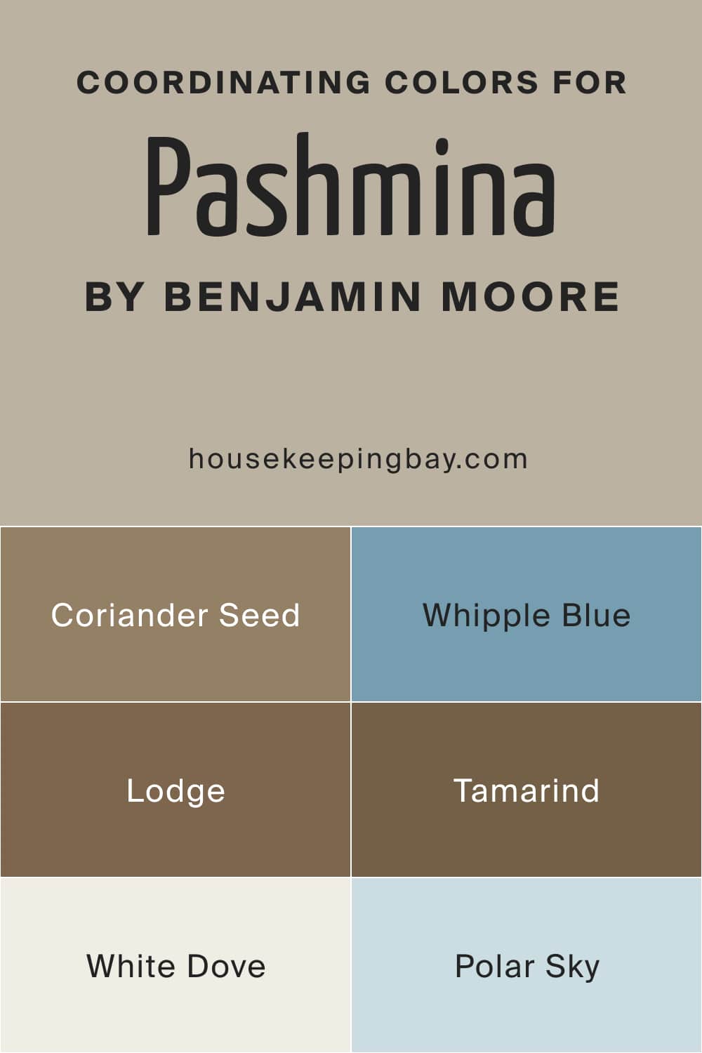
Coordinating Colors to Use With Pashmina AF-100
To be able to achieve a balanced and good-looking color palette in your home, you should know how to coordinate the wall color correctly. If you are working with such a tricky colro as Pashmina AF-100 with its hidden undertones, it’s even more essential to know the coordinating colors!
For this neutral greige with greenish undertones, we recommend using different groups of coordinating colors, depending on the palette you prefer. E.g. for the monochromatic palette, the following coordinating colors will give the best effect:
- AF-110 Coriander Seed
- AF-115 Lodge
- AF-120 Tamarind
For the contrasting color scheme, we would suggest these colors instead:
- HC-152 Whipple Blue
- OC-17 White Dove
- CC-790 Polar Sky
housekeepingbay.com
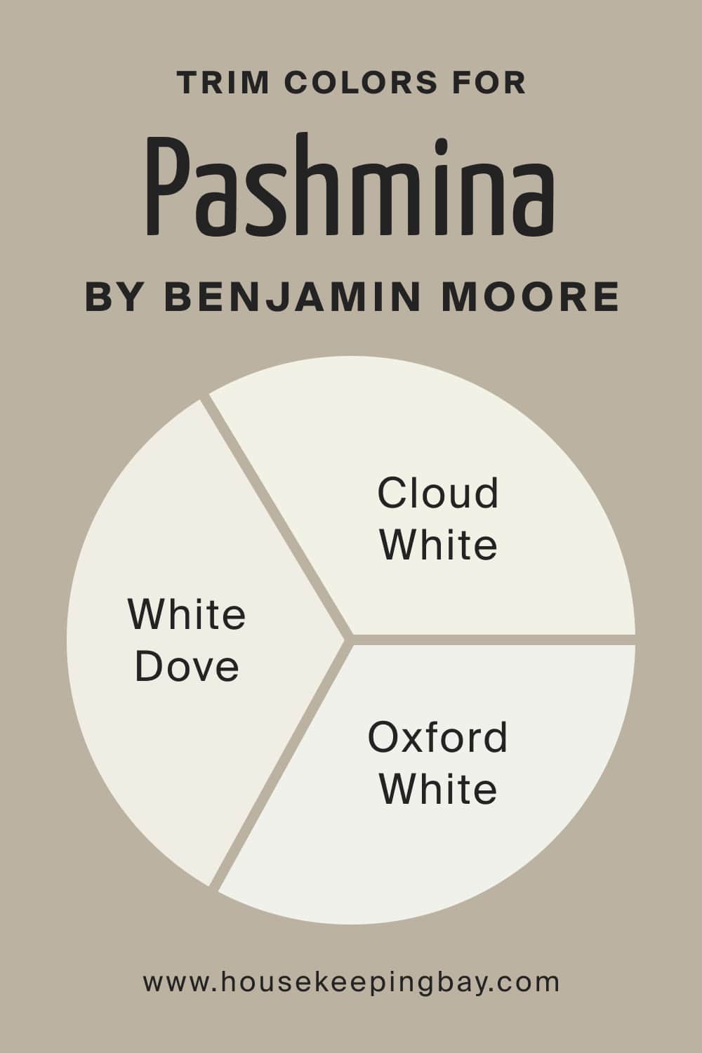
What Is the Best Trim Color For Pashmina AF-100?
White is a traditional trim color used in homes due to its versatility and the ability to pair with most other colors successfully. If you want to choose the most suitable shade of white to use as a trim color with Pashmina AF-100, consider BM Chantilly Lace.
It is a true white paint that will further protrude the original hue of the Pashmina paint. Also, you might want to try the following whites:
housekeepingbay.com
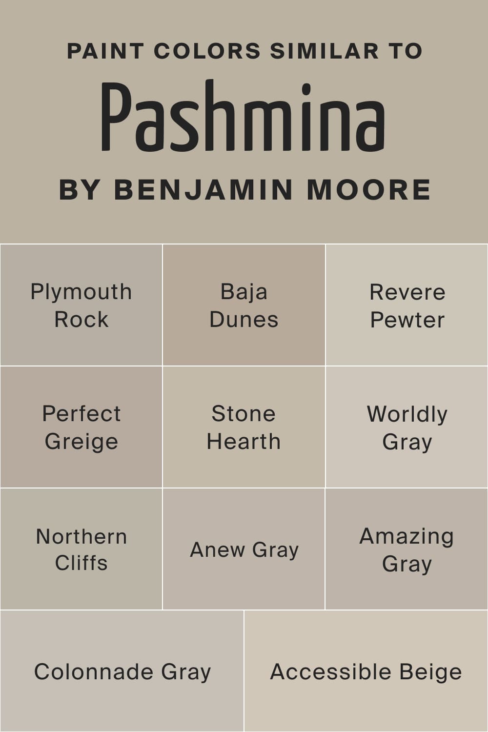
Paint Colors Similar to Pashmina AF-100
It can be challenging to figure out what paint colors can be used instead of the color you chose for your walls. With the Pashmina paint, the task gets even more tricky due to its complex undertones! This is why you might need a hint. Below, you can find a list of colors that read almost the same as the Pashmina AF-100.
- BM Plymouth Rock
- BM Baja Dunes
- SW Perfect Greige
- BM Stone Hearth
- SW Worldly Gray
- BM Northern Cliffs
- BM Revere Pewter
- SW Accessible Beige
- SW Anew Gray
- SW Amazing Gray
- SW Colonnade Gray
However, note that there won’t be a 100% color match here! Each shade of greige on this list is slightly different, sometimes a bit lighter, sometimes a bit deeper.
housekeepingbay.com
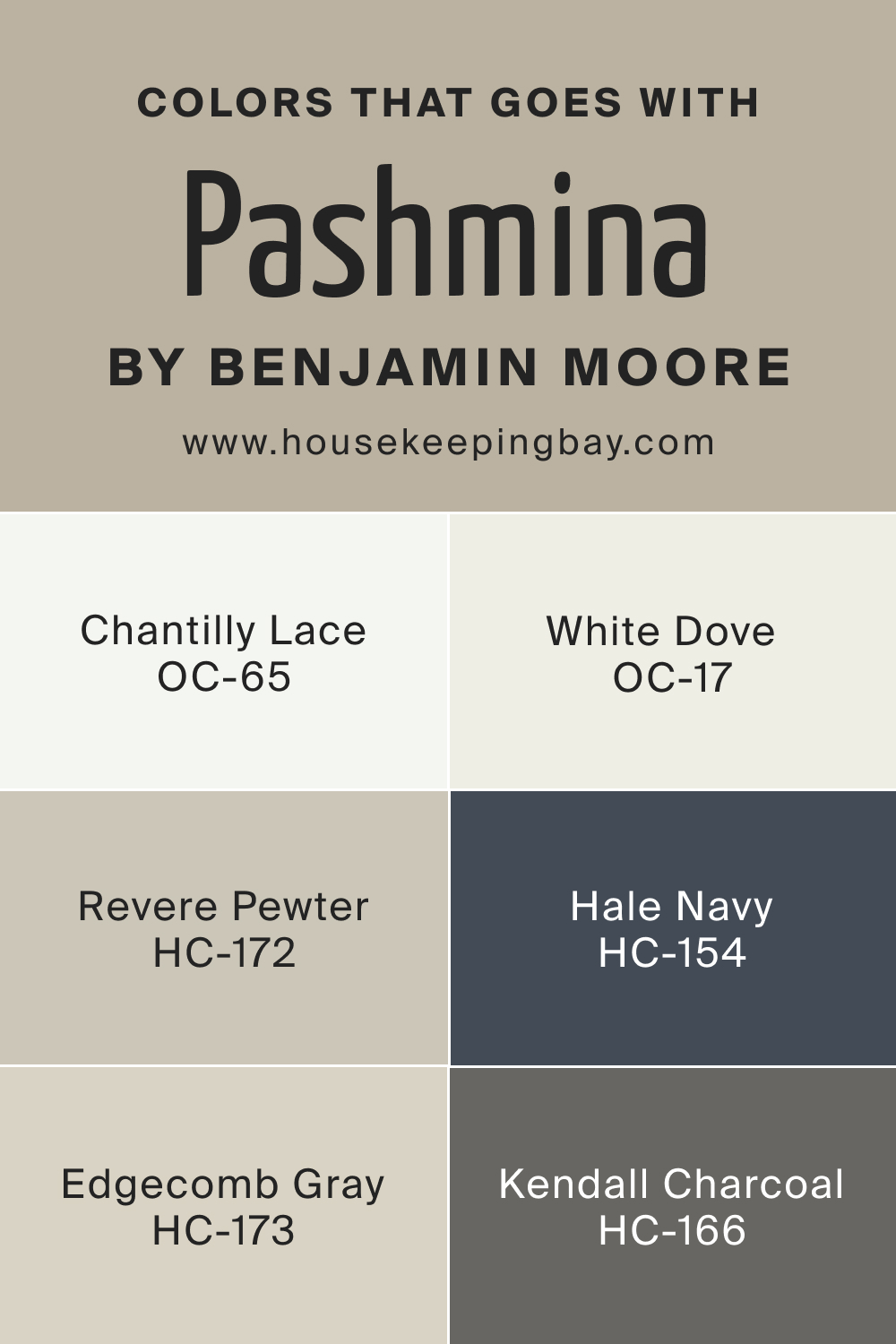
Colors That Go With the Pashmina Paint by Benjamin Moore
If you want your living space to look harmonious in color, it is essential to pair the wall paint with the right colors around the room. For the Pashmina color, we recommend you consider the following paints:
- White Dove OC-17
- Chantilly Lace OC-65
- Revere Pewter HC-172
- Hale Navy HC-154
- Edgecomb Gray HC-173
- Kendall Charcoal HC-166
These colors will highlight the beauty of the Pashmina AF-100 and make it fully reveal its balanced nature in a room.
housekeepingbay.com
Comparing the Pashmina Paint by Benjamin Moore With Other Colors
To help you better understand the distinctions between this warm and balanced greige called Pashmina, we suggest you compare it with other similar colors. This way, you will get the idea of what makes nearly the same paint colors different.
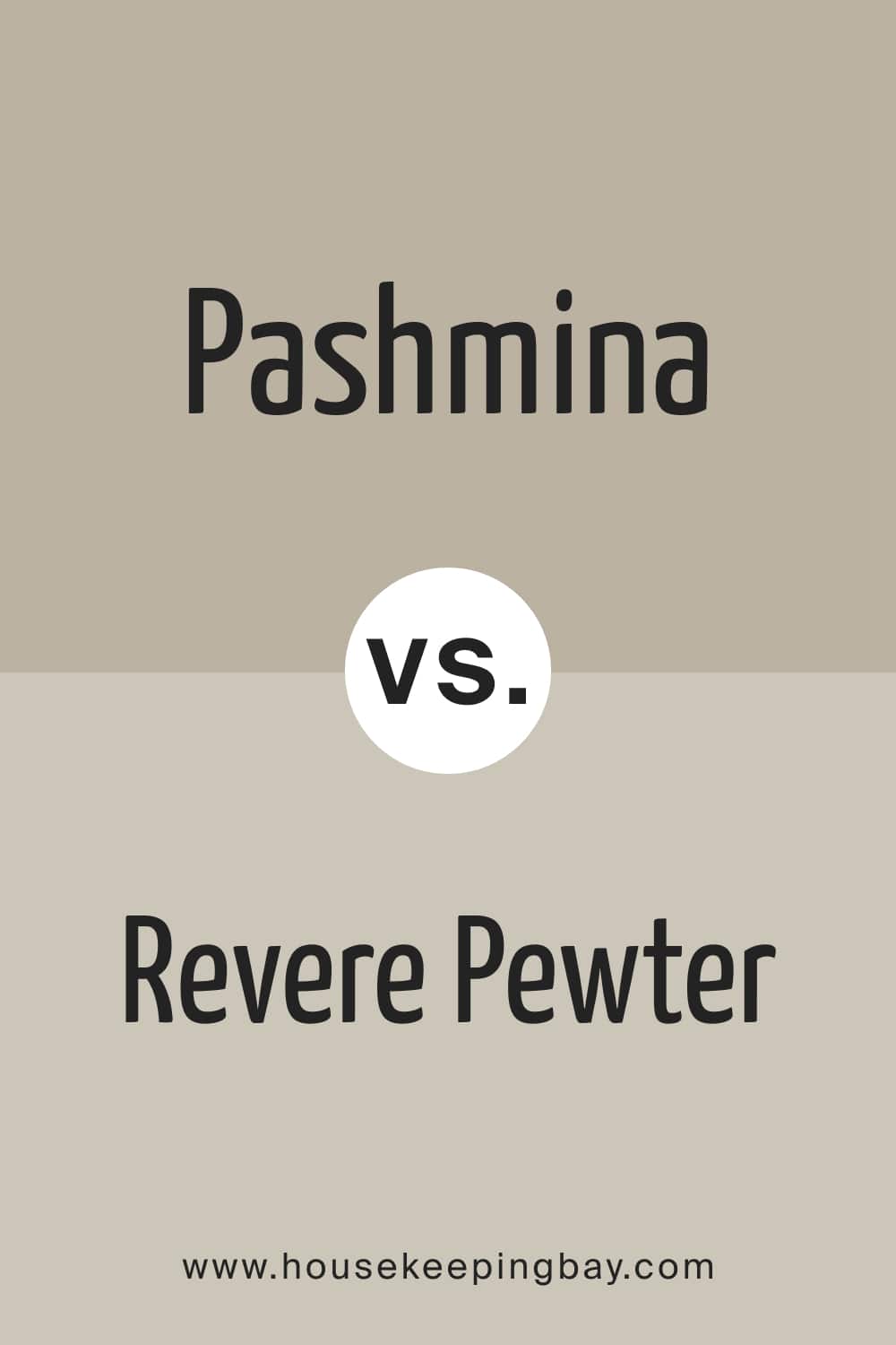
Pashmina vs Revere Pewter
Both colors belong to the Benjamin Moore brand, but they read differently. First of all, the LRV of BM Revere Pewter is 55, whilst Pashmina has 44. It means Pashmina reflects noticeably less light, which results in a deeper and darker appearance.
Also, the Pashmina color is deeper and warmer with a significantly more visible beige hue. Compared to it, BM Revere Pewter reads lighter with a more pronounced grayish tone.
The undertones of these colors are also distinct (greenish for Pashmina and yellow-beige for BM Revere Pewter).
housekeepingbay.com
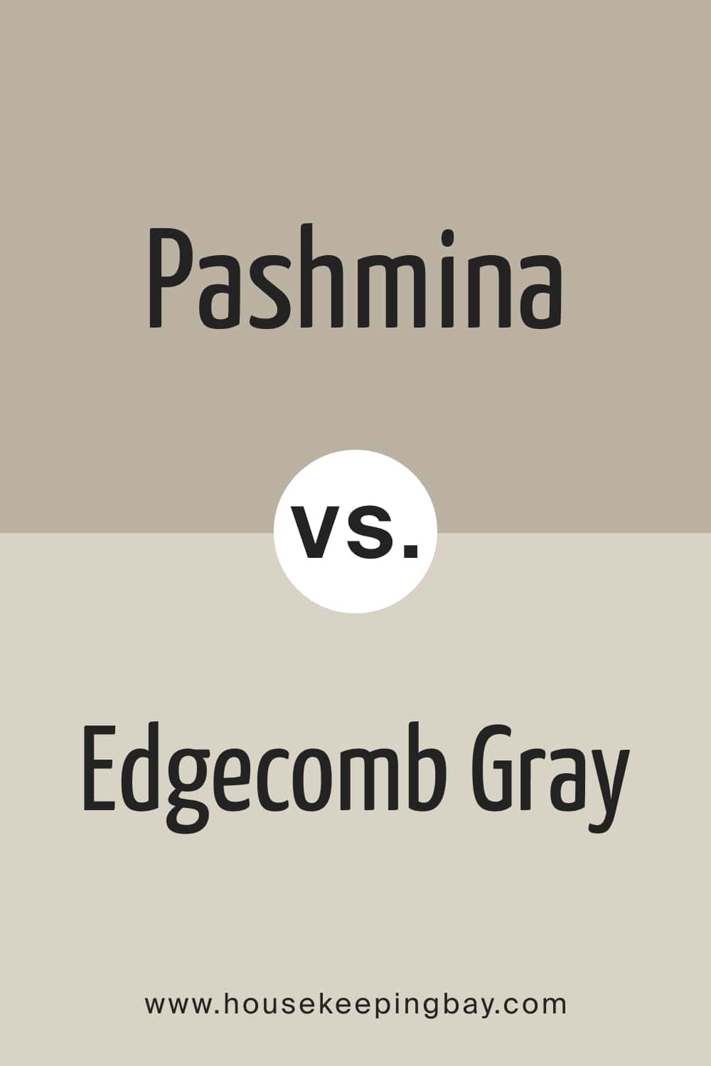
Pashmina vs Edgecomb Gray
These colors are greige, but BM Edgecomb Gray is much lighter than Pashmina. Also, they share similar undertones that are green and barely seen. However, the LRV is what makes these colors different. The LRV of BM Edgecomb Gray is 63, whilst Pashmina has 44.
housekeepingbay.com
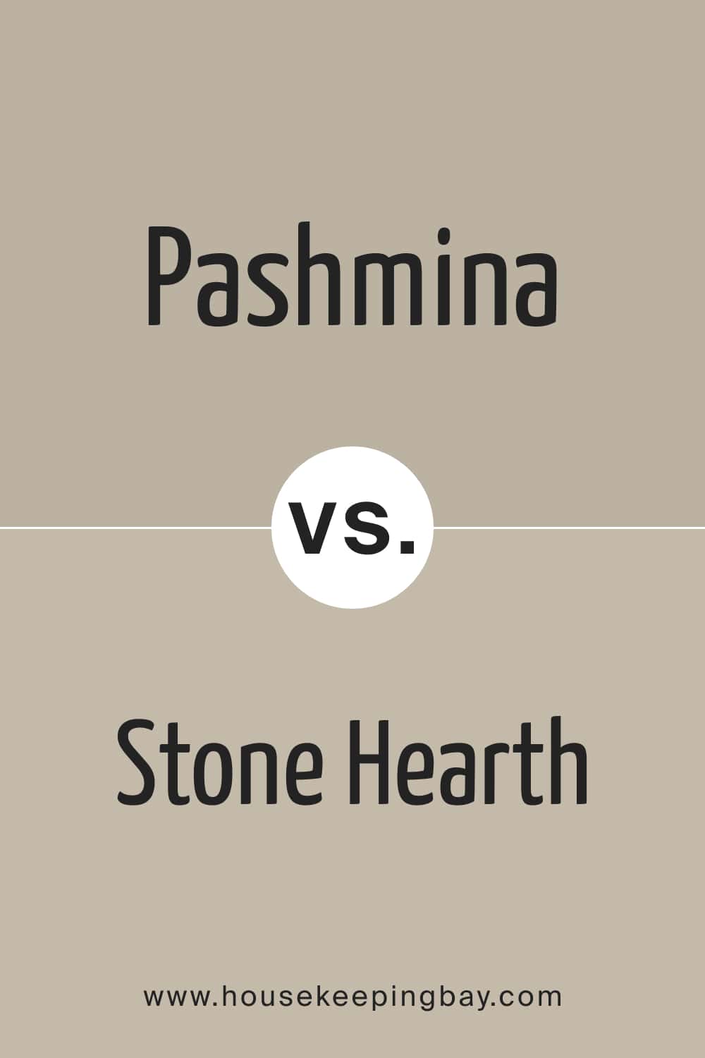
Pashmina vs Stone Hearth
BM Stone Hearth is a tricky color due to its purple and brown undertones! But Pashmina is also not as simple as you might think, having a hidden greenish hue. And if you palace these colors side by side, you will see that green tone pretty clearly! The LRVs of these paints are also distinct. BM Stone Hearth has an LRV of 50, and Pashmina’s LRV is 44.
housekeepingbay.com
Pashmina vs Mega Greige
SW Mega Greige has reddish-pink undertones, but they are typically very delicate and hardly seen. But compared to Pashmina, this pink-red tone shows up very clearly, highlighting the green undertone of Pashmina better!
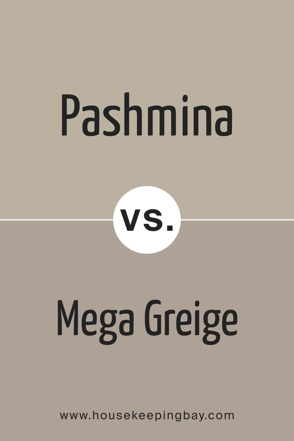
housekeepingbay.com
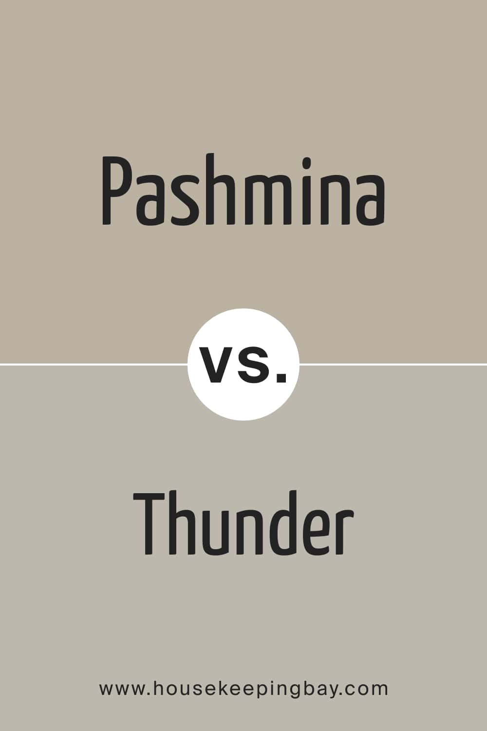
Pashmina vs Thunder
BM Thunder is a mid-toned greige. It doesn’t have any seen undertones, but there is a slight purple undertone that can be noticed sometimes. Compared to Pashmina, BM Thunder reveals its gray side much better, making its counterpart read warmer and more greenish-beige.
housekeepingbay.com
Wher to Use This Neutral Color In Your Home?
As you can see by now, the Pashmina color can hardly be called simple. This is why you might wonder in what rooms it will work best and what spaces won’t benefit from using this greige in them. Below, you can find such a guide that will explain how different spaces might react to this color.
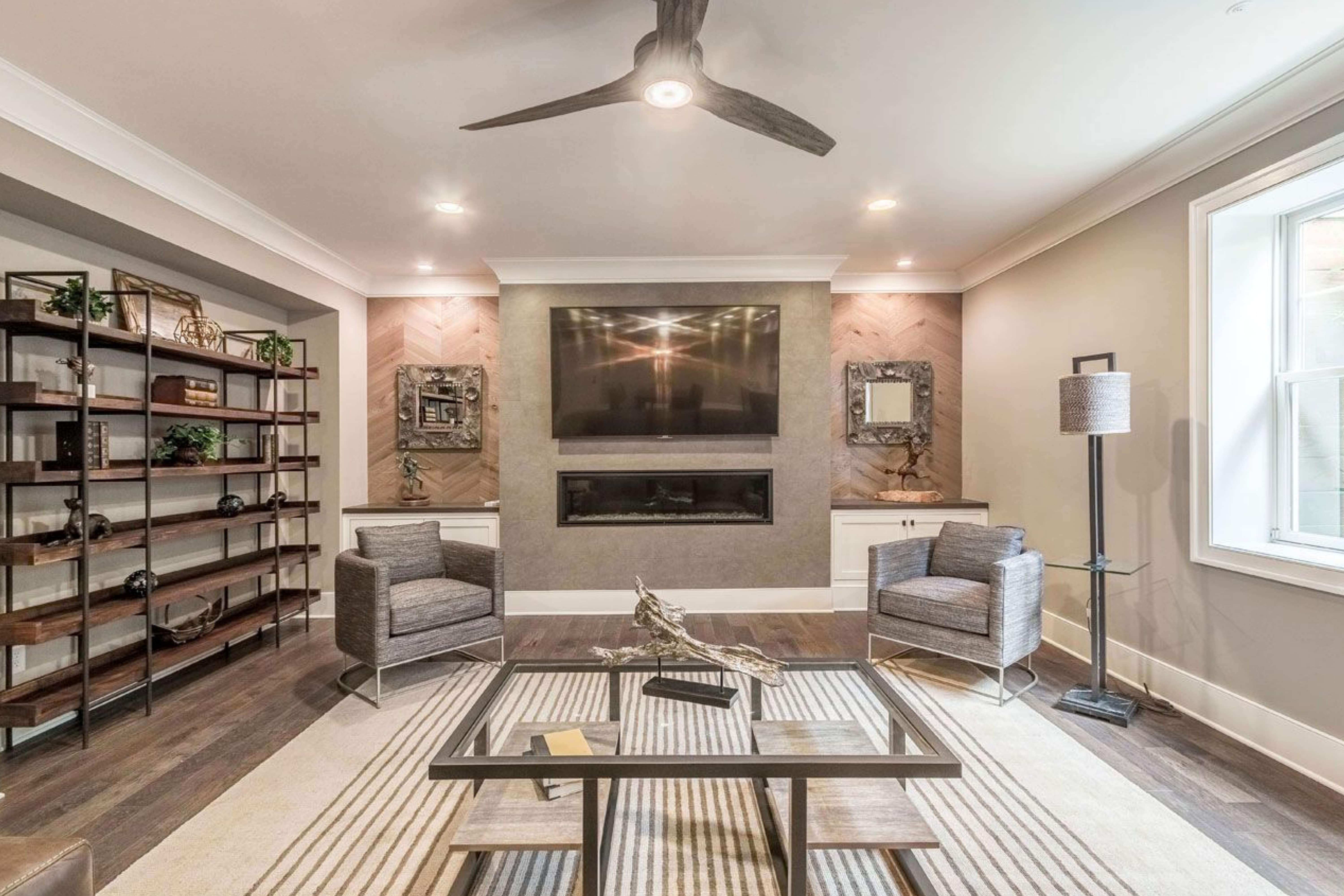
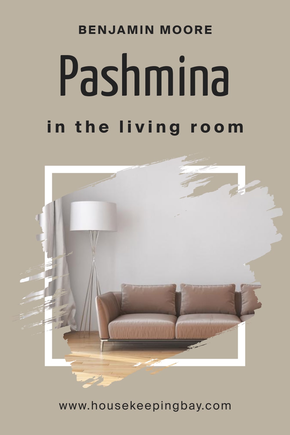
Pashmina AF-100 in the Living Room
Despite being quite tricky, Pashmina is a good color choice for the living room walls. If you paint all the walls in this greige, remember to pair it with creamy whites on the ceiling, trims, and moldings.
This will make the space read brighter. The Pashmina color also works well with woods and ample linen on the upholstery, creating a statement and stylish atmosphere.
housekeepingbay.com
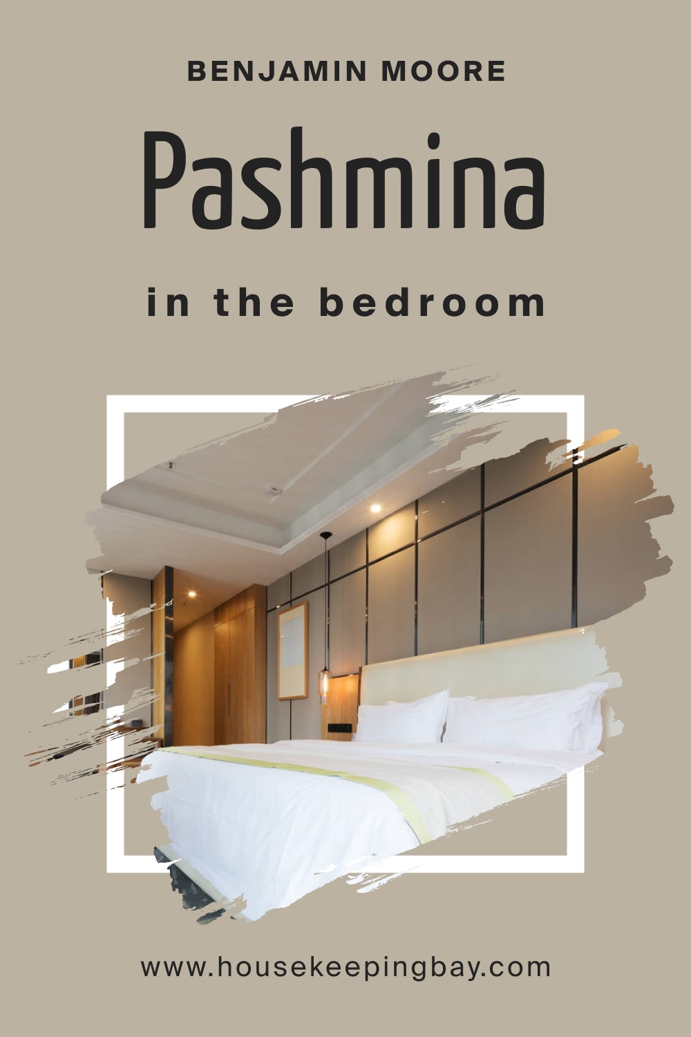
Pashmina AF-100 in a Bedroom
If your bedroom is spacious and has plenty of natural light, Pashmina greige will definitely work in it! You can use it on the accent wall or all the other walls to exhibit a warm and cozy atmosphere.
However, in smaller and poorly-lit bedrooms, you’d better avoid using this greige!
housekeepingbay.com
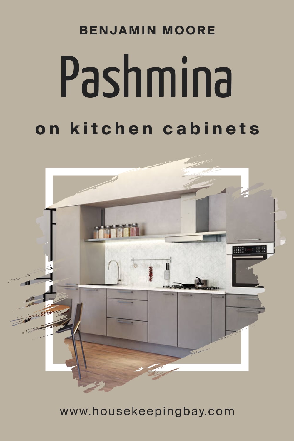
Pashmina AF-100 for the Kitchen/Kitchen Cabinets
This greige is awesome for kitchens! You can paint the cabinets this color, adding a clean white paint on the backdrop walls. For the backsplash, we would recommend choosing beige-toned marble or tiles.
Anyway, the Pashmina color will add a timeless touch to your kitchen and will never be out of trend!
housekeepingbay.com
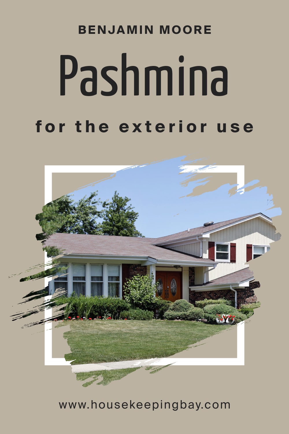
Pashmina AF-100 for the Exterior Use
This greige will please your eye if you use it on exterior walls of a Ranch-style, Mid-Century Modern, Traditional, Contemporary, or Modern style home!
This color pairs nicely with whites and darker grays, as well as wooden textures, to create accents. Also, you can use Pashmina for the trims, moldings, and door and window frames, leaving the walls white.
housekeepingbay.com
Now you know how complex and, at the same time, versatile the Pashmina greige color is! You know its LRV and undertones, as well as how it works in different spaces and light.
Moreover, now you understand what makes it distinct from other colors better. With that in mind, you will incorporate this wonderful and pleasantly warm greige into your home interior easily.
housekeepingbay.com
Ever wished paint sampling was as easy as sticking a sticker? Guess what? Now it is! Discover Samplize's unique Peel & Stick samples. Get started now and say goodbye to the old messy way!
Get paint samples


Frequently Asked Questions
⭐What color collection does Pashmina color belong to?
Pashmina AF-100 is part of the Affinity color collection by Benjamin Moore.
⭐Is Pashmina AF-100 a warm or cool color?
This neutral is perfectly balanced between warm and cool.
⭐Can I use the Pashmina color anywhere around the house?
This neutral greige color can be used almost anywhere, indoors or outdoors.
6 thoughts on “Pashmina AF-100 Paint Color by Benjamin Moore”
Leave a Reply


Thinking of using Pashmina on my kitchen cabinets (traditional shaker style) south facing light but trees right outside (green) we live in the Santa Cruz mts. Thoughts?
Hi Monica! Pashmina is an excellent choice for traditional shaker cabinets, offering a versatile greige with soft taupe-beige undertones that feels warm yet sophisticated. In your south-facing kitchen, the light will generally enhance its warmth, while the green reflection from the trees outside will balance it with a subtle gray tone—perfect for the natural light shifts of the Santa Cruz Mountains. To ensure it works in your space, sample it on a cabinet door and view it throughout the day; pair it with a warm white trim like White Dove OC-17 or Simply White OC-117, and consider antique brass or matte black hardware to highlight its earthy elegance. Hope this helps! -M
Will Pashmina work in the kitchen with marble gray-white countertops? The kitchen walls are white now, and the cabinets are painted light gray. But I’d like to repaint the walls with Pashmina.
I guess Pashmina might work, but you might consider repainting your cabinets into a lighter color. Maybe, white.
Hello! Could you please help me? I fell in love with BM Pashmina, but I’m not sure whether it will work in my bathroom. It’s not very large, but there’s a window and enough natural light. Do you think I should try painting the walls with Pashmina?
Hello! We recommend you sample the color first to see how it will work in your lighting. But generally, if the space has plenty of daylight, Pashmina works nicely there. Anyway, You can always use this color on an accent wall or paint your vanity sink with it should you realize it doesn’t work on all the walls!