Peppercorn SW 7674 by Sherwin Williams
Detailed Guide From The Experts
Redecorating your house is always an exciting stage when you can change not only the way your house looks but also the whole vibe and mood you get in the room.
Choosing a paint color either for the walls or your furniture or even for exterior is always quite responsible.
You want everything to go with each other, look modern, simple and cozy!
Peppercorn by Sherwin Williams is a popular paint color that can be used anywhere from the exterior of your home to even furniture items.
Keep on reading to learn more about this Sherwin Williams Peppercorn paint review in Encycolorpedia.
via crello
Related: 13 Best Greige Paint Colors. Ultimate Guide
Peppercorn by Sherwin Williams Paint Color
So, if you`re looking for a cool, deep but versatile paint color that will fit every style of both interior and exterior design then Peppercorn by Sherwin Williams is exactly what you need!
Peppercorn may be described as a quite neutral shade of gray, one of the most minimalistic colors which really adds that special rich vibe into the design. It will perfectly go with any style: from classic to loft.
Even though gray is called an office color, it does not have to be boring at all. Neutral grays, whites, blacks and shades of brown are the smartest for creating stylish commercial interiors.
Gray refers to quite universal colors. All its shades are unique, so even combining them in one room will look absolutely stunning and breath-catching!
housekeepingbay
Table of Contents
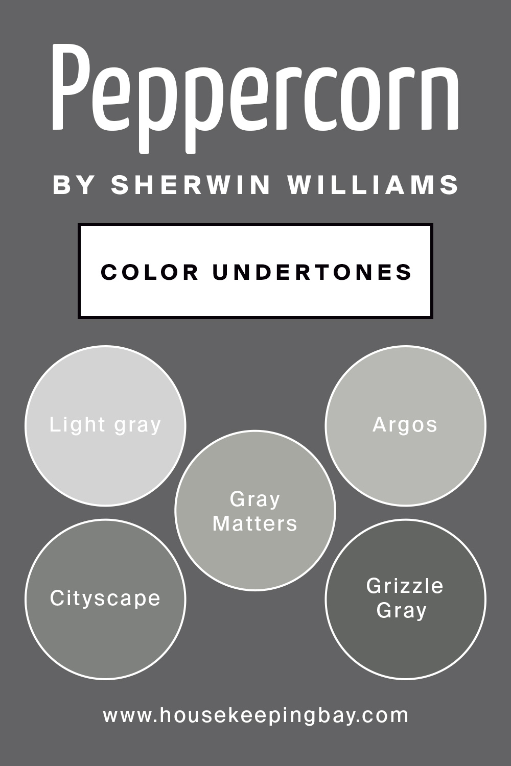
Peppercorn by Sherwin Williams Color Undertones
Interestingly, some people call Peppercorn just light brown or bronzy, others see it as gray or cappuccino color! You`re likely wondering what color Peppercorn really is?
So, the official resource of the manufacturer states that Peppercorn by Sherwin Williams color strip actually comes from light gray!
It starts with Passive , which can be described as a milky light gray color.
Then the next are Argos and Gray Matters which are two pretty similar colors, they look quite warm and close to simple gray. The next two are called Cityscape and Grizzle Gray where one is a tiny bit darker than the previous one, but in general combining these two will give you a perfect monochrome design. Right after them comes Peppercorn.
It is fair to admit that in contrast to its undertones, Peppercorn looks a little bit darker. Though, it will still be associated with dark gray paint colors.
housekeepingbay
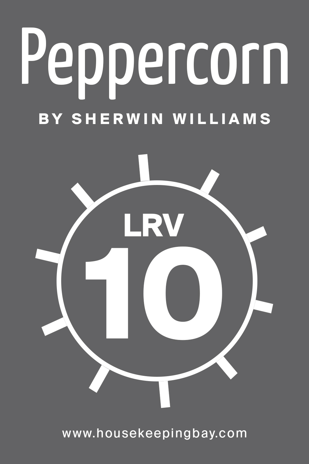
Peppercorn by Sherwin Williams Paint Color LRV
So, moving on to LRV (Light Reflectance Value) which Peppercorn has a meaning of 10 and it is low.
So, not to get you confused, the Light Reflectance Value scale goes from 1 to 100, where 1 is the darkest and 100 is the lightest color.
Since Peppercorn LRV is 10, it means that it’s from a darker side of colors and it will match and contrast well with light colors.
housekeepingbay
What is LRV? Read It Before You Choose Your Ideal Paint Color
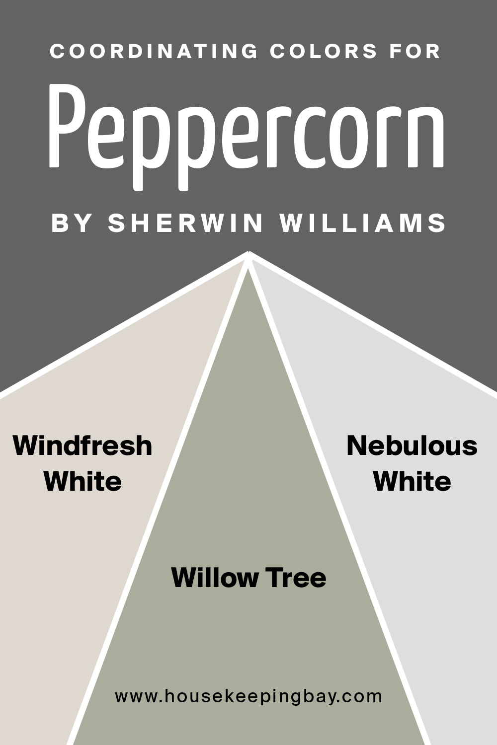
Coordinating Colors for Peppercorn by Sherwin Williams
Since we already discovered that Peppercorn is from the dark color family and has gray undertones it means only one thing – it will go well with light colors!
So, the official Sherwin Williams website gives us their recommendations on how to coordinate Peppercorn with other Sherwin Williams colors.
First of all, they offer to match it with Windfresh White , which is a warm tone of white, also can be described as a bone color.
Next comes Willow Tree which is a total opposite to Windfresh white and is actually one of the best combinations with Peppercorn, since this one has a green undertone mixed with gray.
And last, but not the least is Nebulous White . This one is a dirty white, which has a cool undertone.
housekeepingbay
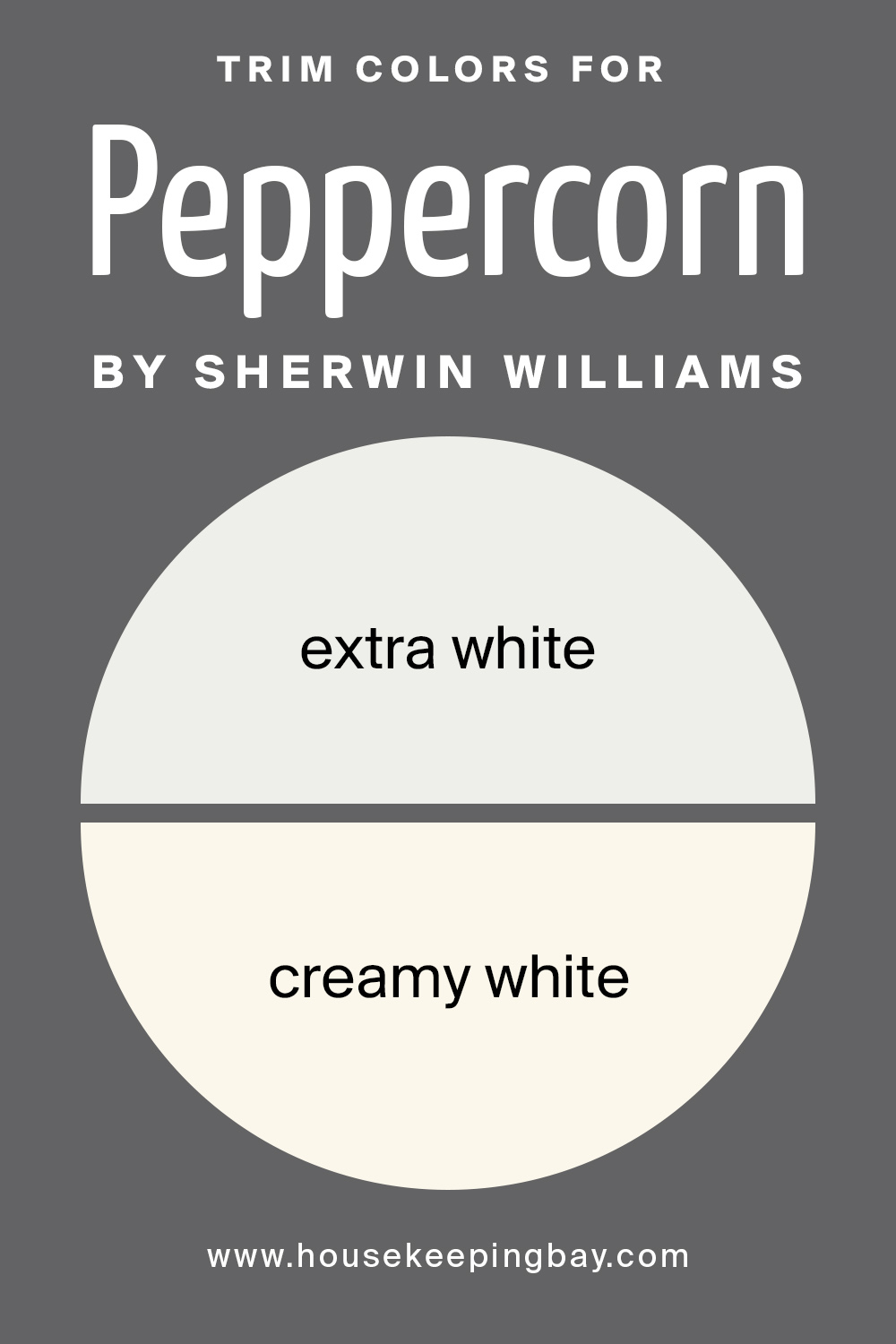
Trim Colors for Peppercorn by Sherwin Williams
Another step in planning your design is choosing a paint trim. So, since Peppercorn is a cool color, using extra white may make the trim look blue-ish, whereas warm white such as creamy white would be way better.
This color is a natural white with subtle undertones, but it will look great without feeling too yellow.
housekeepingbay
Related: Sherwin Williams White Paint Colors | Detailed Guide
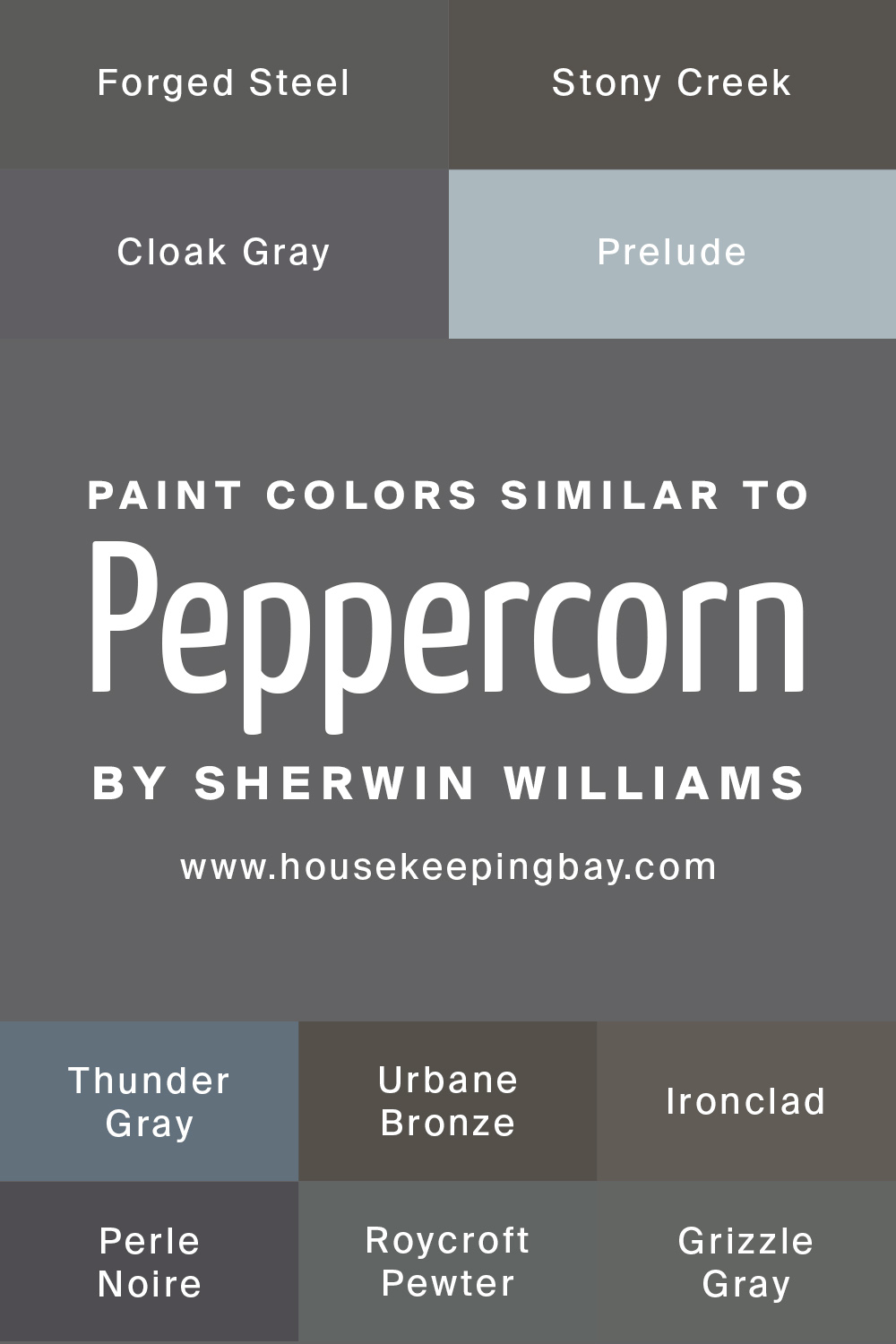
Paint Colors Similar to Peppercorn by Sherwin Williams
If you`re a fan of monochrome in the interior or exterior designs, then you might be looking for colors similar to Peppercorn.
The official website of Sherwin Williams suggests us such, and some of them are:
- Forged Steel
- Stony Creek
- Cloak Gray
- Prelude
- Thunder Gray
- Urbane Bronze
- Ironclad
- Perle Noire
- Roycroft Pewter
- Grizzle Gray
housekeepingbay
How to use Peppercorn by Sherwin Williams?
One of the most popular gray paint colors for painted kitchen cabinets, islands, bathroom vanity, exteriors, doors, whole rooms, feature walls, and more is definitely Peppercorn by Sherwin Williams!
So, as you may have understood, Peppercorn actually fits everywhere, in any style and any room no matter who is going to live in this place, work, or even train.
This color may seem to be boring, but it feels like that only at first glance, and only in poor lighting. In fact, the versatility of the shade allows you to use it in any style: from modern to loft. This is not the only reason why the color is so popular.
The main advantage of gray is its ability to work well with so many shades with totally different undertones.
Peppercorn can be soft and purely defined, rich and elegant. That’s why designers love it. However, be careful, try not to complicate the combination too much so that the room does not look dull. All calm light shades, no matter if it is on wood or metal, are in perfect harmony with Peppercorn!
When gray is a dominating color of the walls and furniture, it harmoniously trims bright and neutral elements of the design.
Related: 16 Ideas of the Boho Color Palette
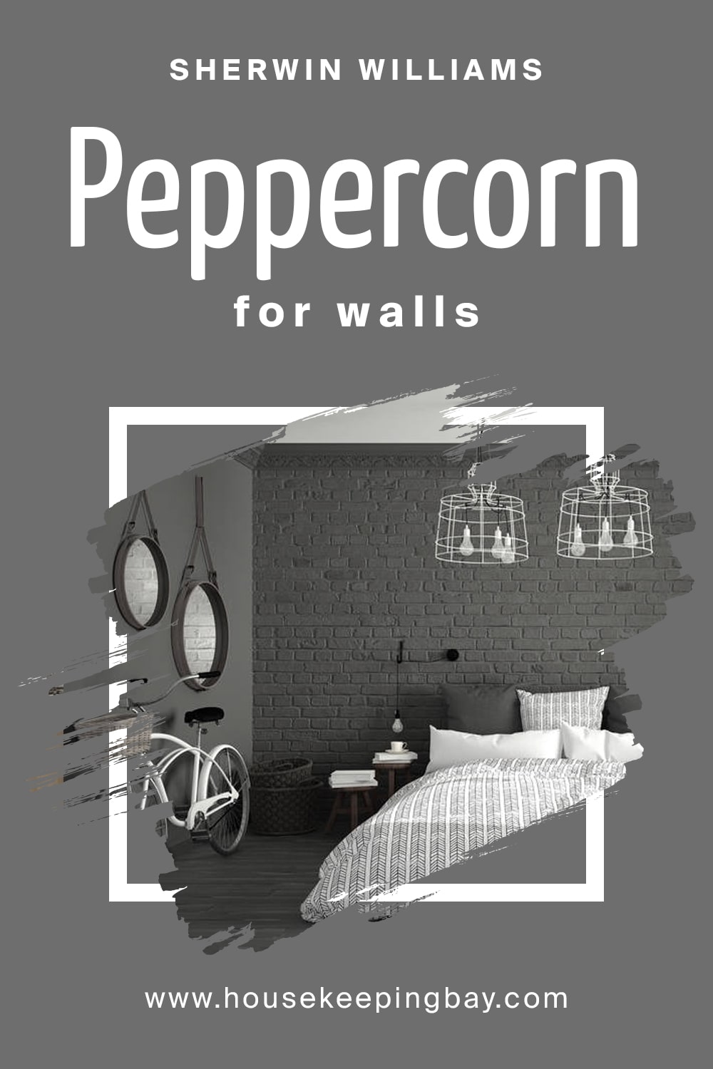
Peppercorn for walls
Covering your walls with Peppercorn (decorative concrete or paint) for a radical change in the interior, will create a modern loft-style setting or an excellent base for minimalism.
However, for wall decoration, shades like gray-blue or gray-pink are way more comfortable. Similar shades in living rooms are more often used, steel natural notwithstanding.
Such colors are definitely suitable for those who made a choice for provence, romantic or classic styles. In addition, when choosing a shade, you need to consider how well the room is lit during the daytime. You can make walls dark gray only in spacious rooms with large windows.
housekeepingbay.com
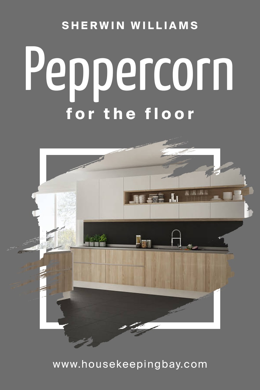
Peppercorn for the floor
The gray floor is the highlight of European classics, techno and Scandinavian styles. In such design projects, graphite flooring blends very naturally with white, gold, or beige walls and accessories.
housekeepingbay.com
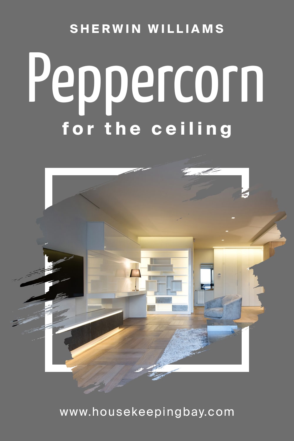
Peppercorn for the ceilings
For the ceiling, you can use only very light grayish tones – pearl gray, silver. It is not recommended to use Peppercorn on ceilings. The ceiling structure itself should be smooth and simple.
Other elements that create a shadow are not welcome if you have chosen a gray scale color. Gray furniture is an original puzzle of the latest expensive interiors. Pale gray colors in saturated basic shades therefore make the atmosphere more “adult” and prestigious.
Silver floor lamps, candlesticks and vases also add status to the interior.
A style that cannot be imagined without gray like Peppercorn in Antique. Real antique interiors are unique and expensive interiors that resemble the furnishings of the houses of Ancient Greece and Ancient Rome.
housekeepingbay.com
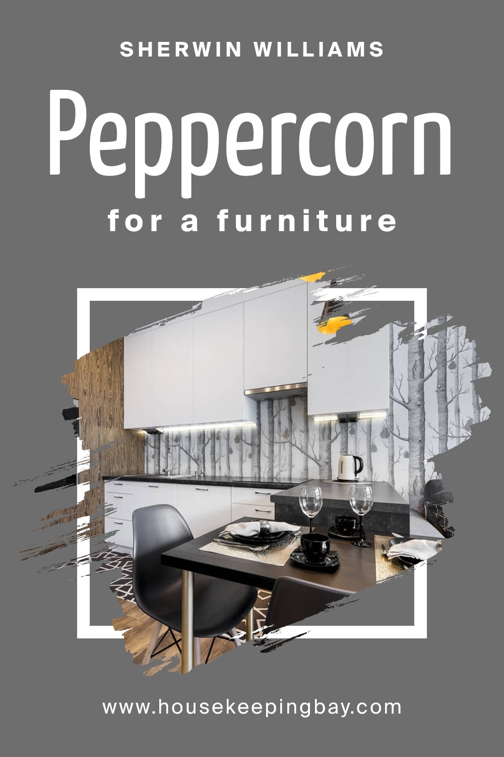
Peppercorn for a furniture
The main materials for decoration are granite, marble, bronze (all with gray walls, columns, figurines in these interior shades). Antique materials are successfully replaced by concrete or gypsum marble, cement-based decorative stone. But the color scheme of the interior remains canonical – gray, beige, sandy.
So, now you see that Peppercorn works well in almost every style, no matter in what room you`re going to use it.
Moreover, different accessories and additional elements in Peppercorn are very modern and always look rich and prestigious.
Not only can you use it in the interior, but also in exterior design. Peppercorn is suitable everywhere!
housekeepingbay.com
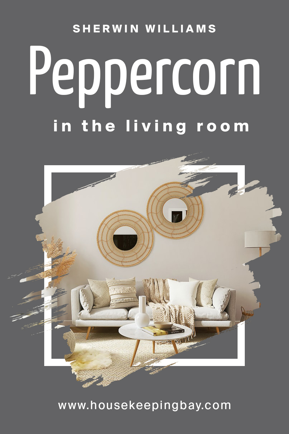
Peppercorn by Sherwin Williams in the living room
When decorating a living room with such shades of gray as Peppercorn, the purpose of this room is that it should be comfortable for both guests and the owners of the place, well designed and not boring. Therefore, when choosing a color scheme, you should consider European or Scandinavian styles.
They are quite welcoming when choosing a gray tone and soft combinations. Gray-blue, gray-yellow will look especially nice.
Try to highlight one of the zones with beige. Something classic like warm natural colors will allow color as Peppercorn to shine beautifully and look very modern. In addition, in a grayish living room, you should definitely organize spot lighting. Especially when it comes to minimalistic style.
housekeepingbay
Related: 12+ Ideas For Your Living Room Color Palette
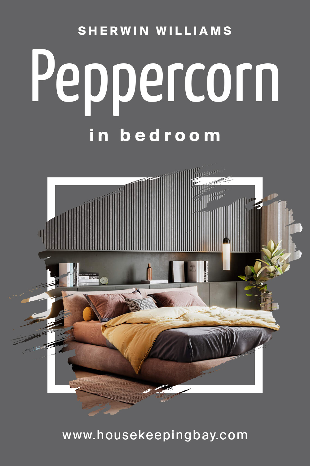
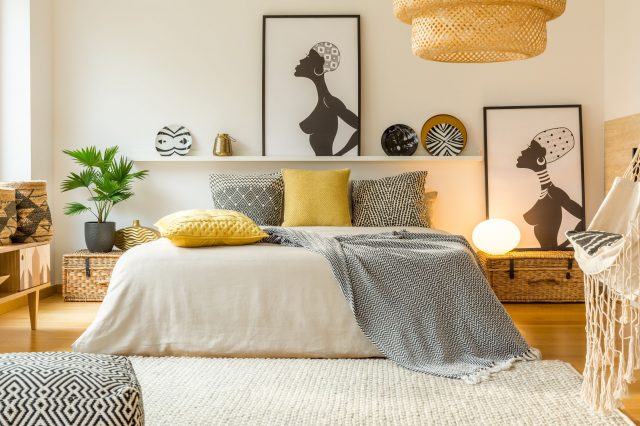
Peppercorn by Sherwin Williams in bedroom
Using Peppercorn in the bedroom is actually very easy! Since natural gray color looks as neutral as possible, it is widely used in so many color combinations. The most classic are with beige, purple or lavender, blue, olive and pink.
Similar combinations are also suitable for a baby’s bedroom, as they are as calming as possible for your eyes.
At the same time, gray will perfectly maintain balance in the children’s bedroom, even when it is filled with bright toys, blue, orange, pink pieces of furniture.
housekeepingbay
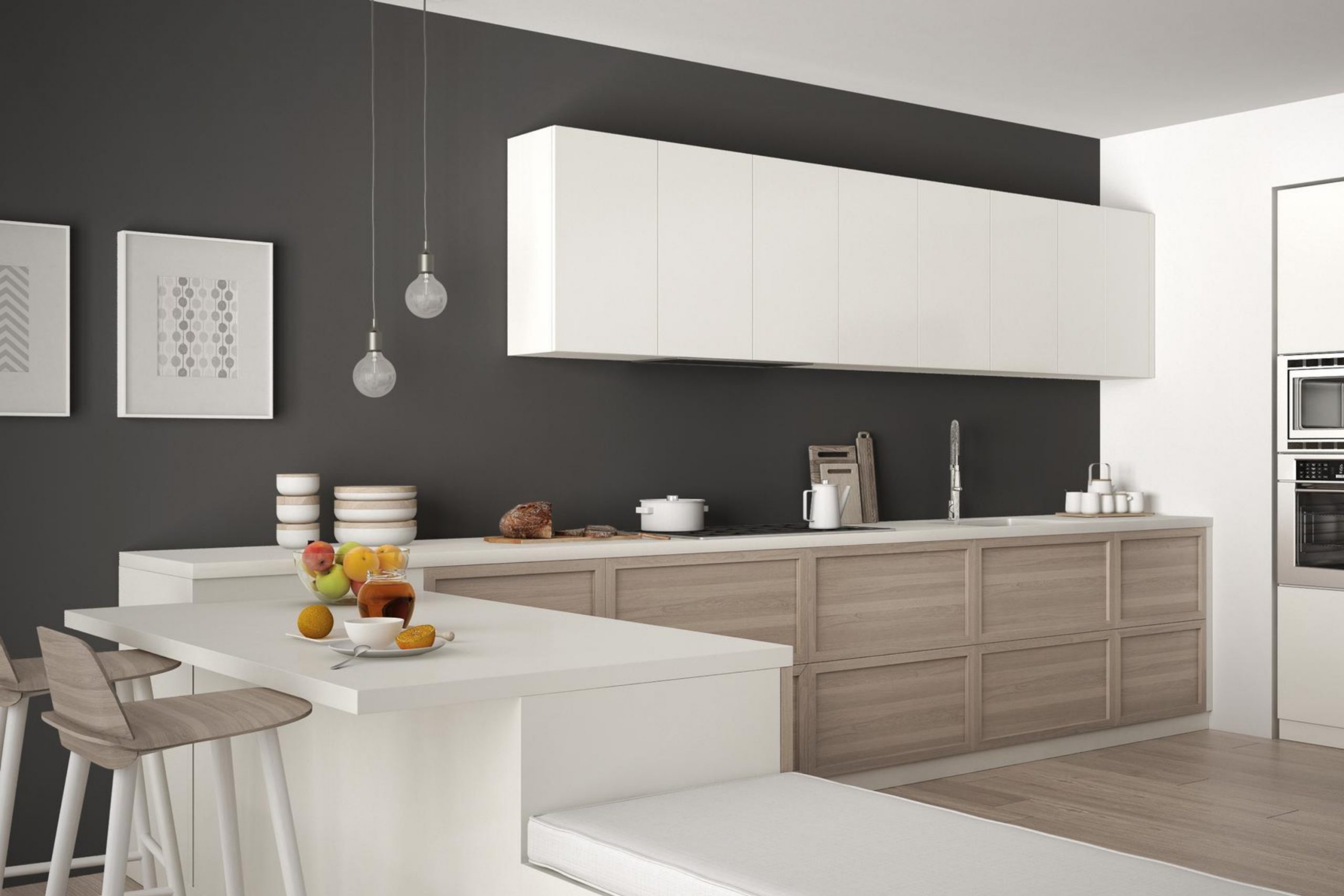
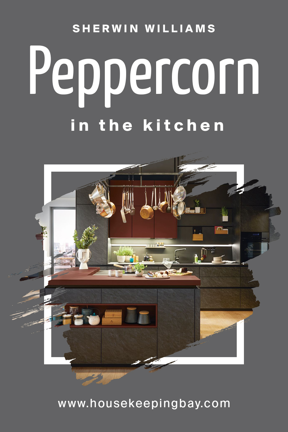
Peppercorn by Sherwin Williams in the kitchen
In the interior of the kitchen, gray tones can be useful if you apply them properly. Matte coverage in so many shades brings a feeling of purity and freshness, while silver and steel hint at luxury and innovation.
In order to make the kitchen area visually larger and more comfortable, you should use pleasant combinations of gray with white or sandy colors. Bright colors are especially important if the kitchen is on the north side of the apartment, so it is poorly lightened.
In general, you can focus on such combinations to use the modern versions of hi-tech, provence or retro styles.
housekeepingbay
Related: Greige In the Kitchen. Detailed Guide
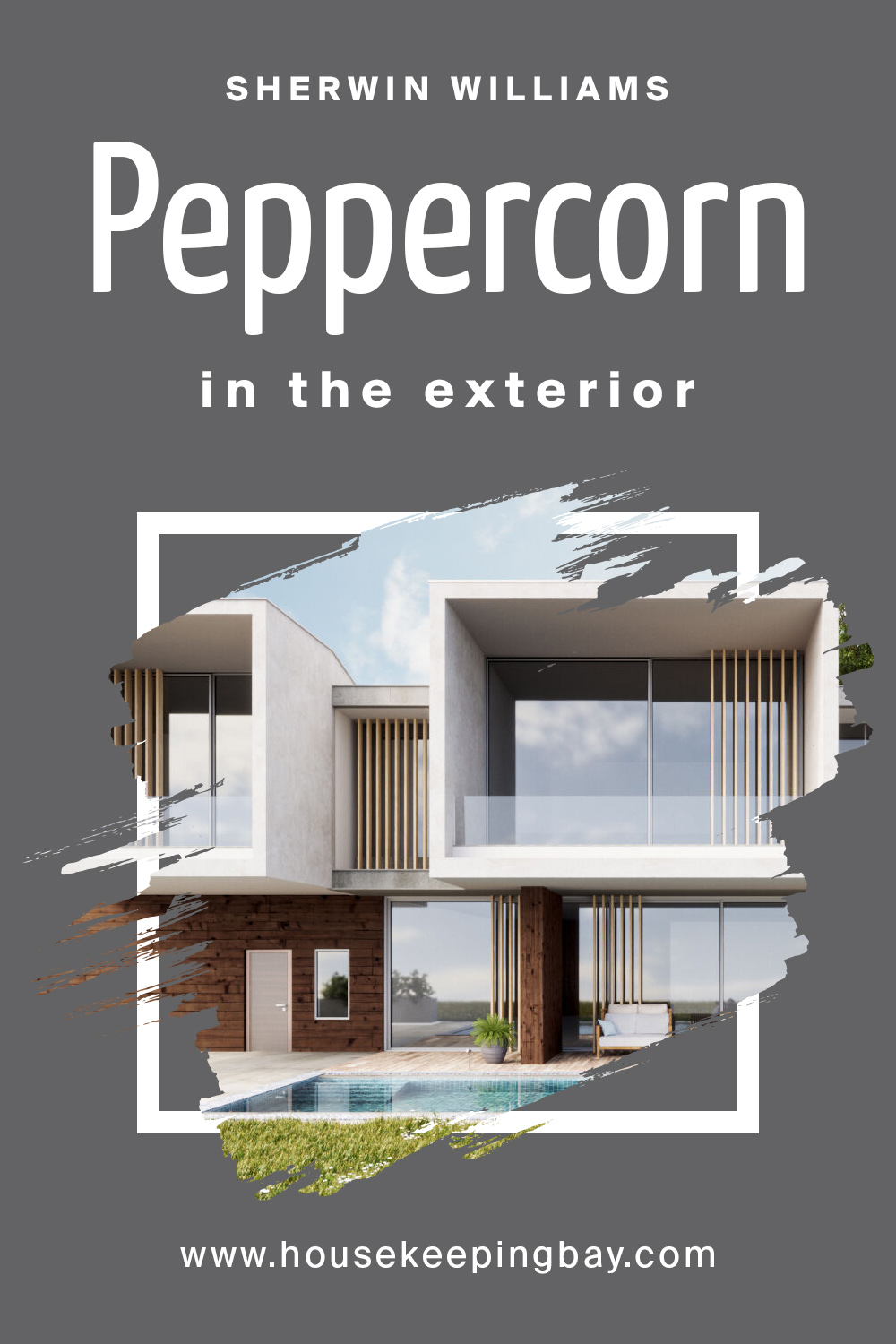
Peppercorn by Sherwin Williams in the exterior
Yellow, red or white walls are somehow boring. It’s nasic and predictable. Gray has been on trend for the past few years, especially when it is properly used in the exterior.
So, building a home in gray colors will look very modern. First of all you shouldn’t care about the style, since gray will match perfectly with any of them. We all know that gray bricks were widely used before the 21 century.
However, design is only developing and new styles and modernism and minimalism, contemporary are welcoming of such shades as Peppercorn in their exterior.
housekeepingbay
Related: 16+ Best House Color Schemes
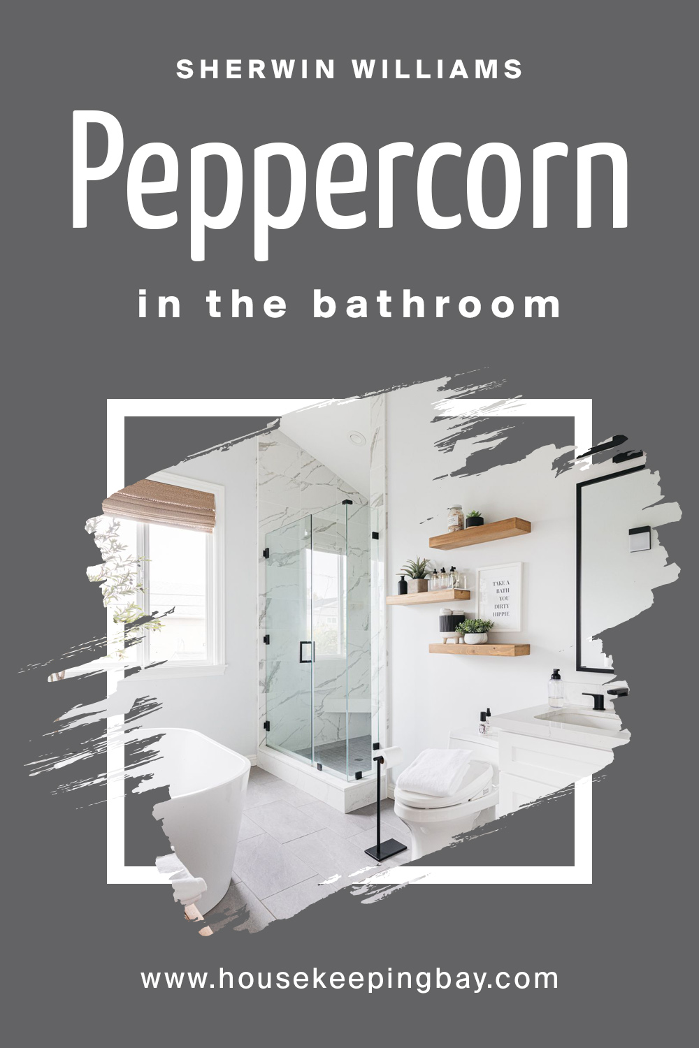
Peppercorn by Sherwin Williams in the bathroom
A bathroom in muted gray-ish shades can be an oasis of peace. It is not recommended to create the interior of the bathroom completely in Peppercorn color if the space area of the place is too small since a feeling of tightness and pressure will be created.
housekeepingbay
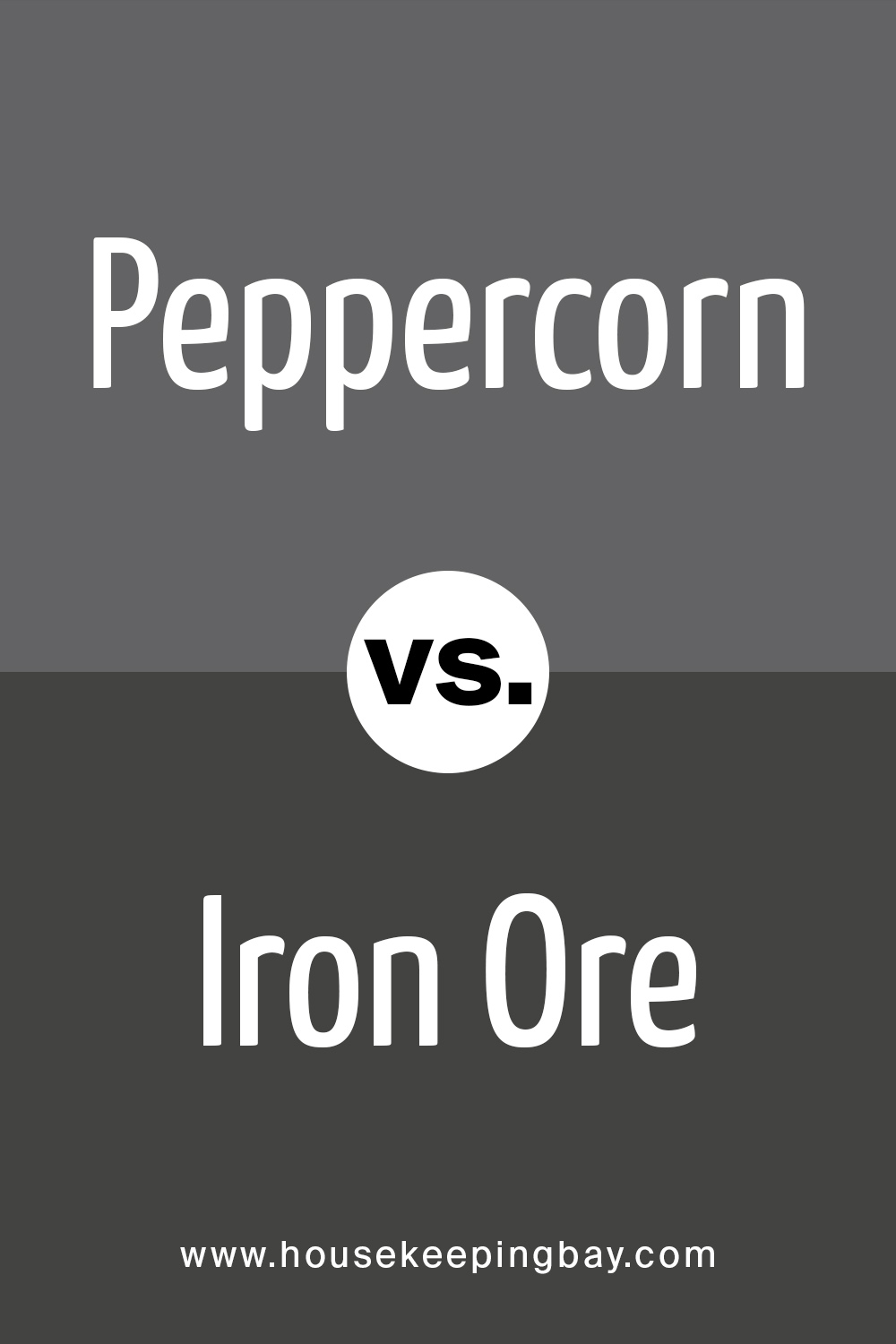
Peppercorn vs. Iron Ore
In comparison with Peppercorn, Iron Ore is way darker. Not only is it more deep, it may also look simply black when using it alone in the interior. However, we would not recommend using these two together, since they will appear to be too dark and uncomfortable in your design.
housekeepingbay
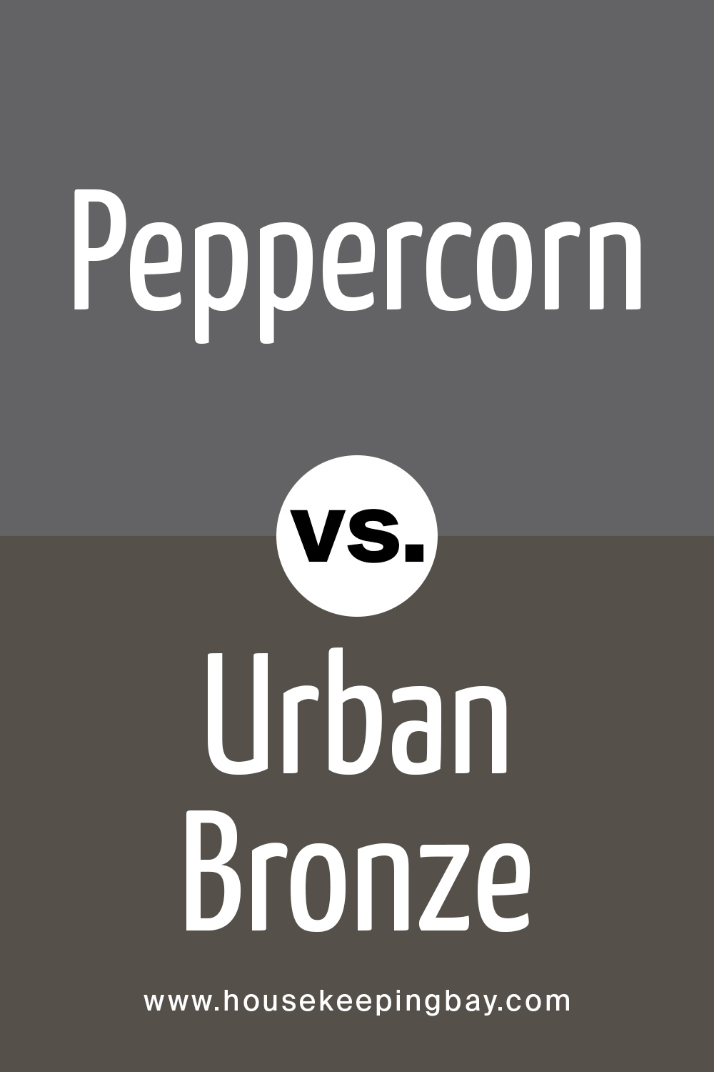
Peppercorn vs. Urban Bronze
If you are looking for something similar to Peppercorn, but slightly darker and smart, then Urban Bronze is exactly what you need. These two will contrast each other and subtly highlight the depth of each color.
housekeepingbay
Related: Urban Bronze SW 7084 by Sherwin Williams
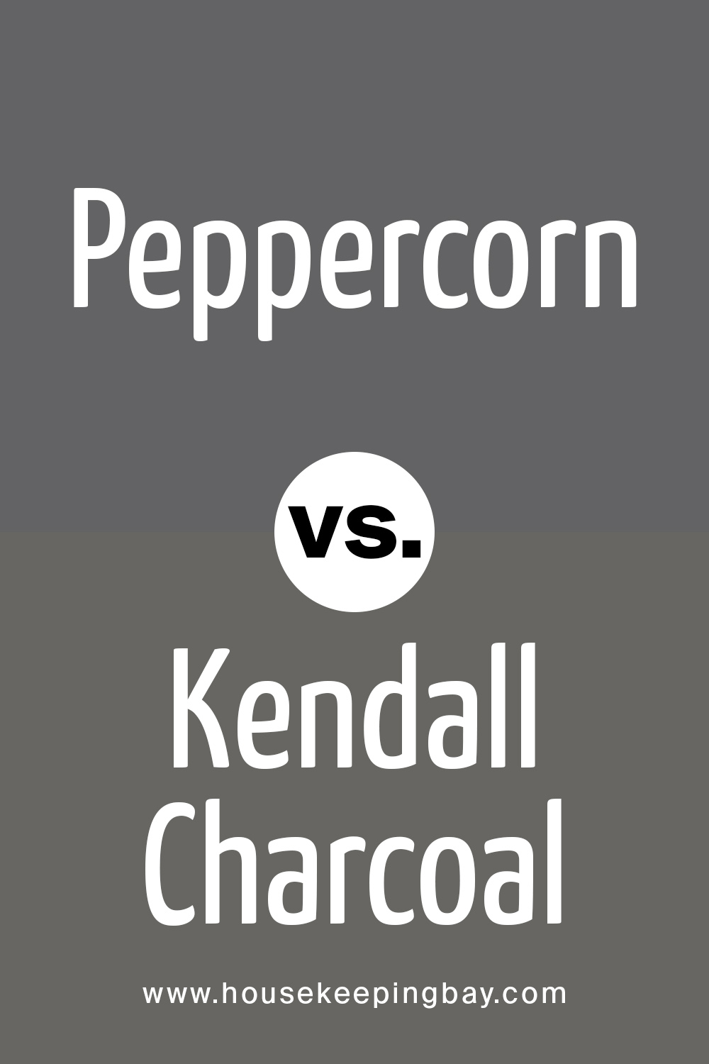
Peppercorn vs. Kendall Charcoal
First thing you need to know when comparing these two is that Kendall Charcoal is by another manufacturer called Benjamin Moore. However, if you are looking for a perfect dupe for Peppercorn, then this one is exactly what you need.
housekeepingbay
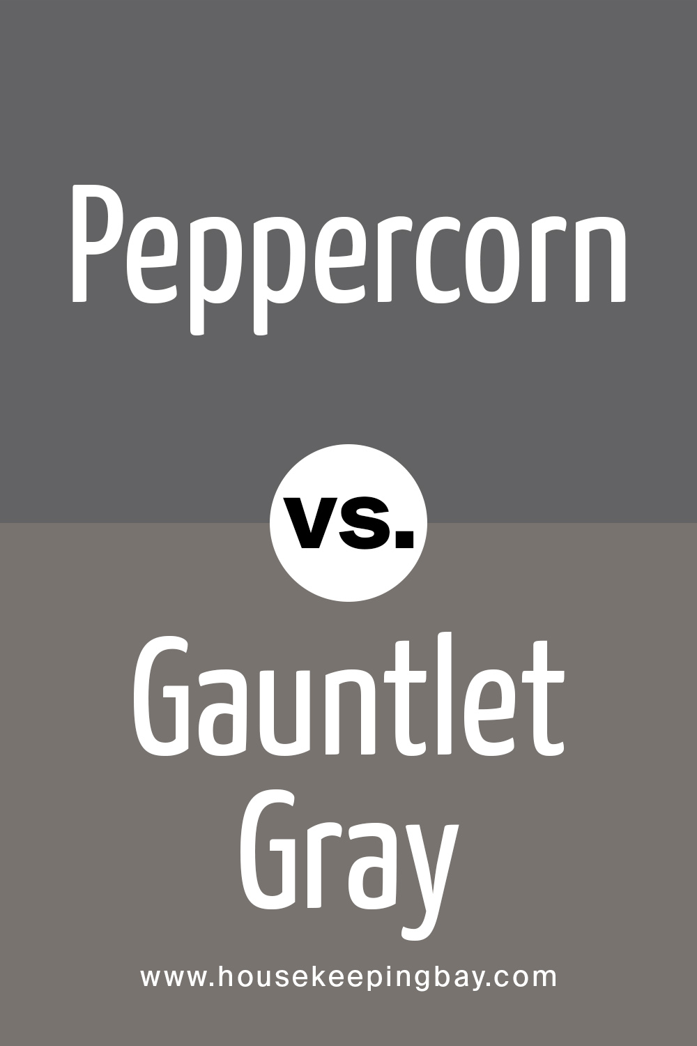
Peppercorn vs. Gauntlet Gray
Even though from the first sight these two may appear to look the same, they are actually rather different. They will match perfectly together since Gauntlet Gray is way lighter than Peppercorn. The combination of these two colors will enlighten your interior design.
housekeepingbay
Peppercorn vs. Tricorn Black
Unlike any other, Tricorn Black is way darker and deeper than Peppercorn. So, combining them in your design will extremely fulfill the color variation of the whole house or apartment. In contrast, they will emphasize the rich and luxurious shades of each other.
housekeepingbay
housekeepingbay
Ever wished paint sampling was as easy as sticking a sticker? Guess what? Now it is! Discover Samplize's unique Peel & Stick samples. Get started now and say goodbye to the old messy way!
Get paint samples


Frequently Asked Questions
⭐Is Peppercorn a warm or a cool color?
It is definitely more of a cool color with a deep gray tone.
⭐What is Peppercorn by Sherwin Williams color strip?
The official resource of the manufacturer states that Peppercorn by Sherwin Williams color strip starts with light gray!
⭐What is the difference between Peppercorn and Urban Bronze?
If you are looking for something similar to Peppercorn, but slightly darker and smart, then Urban Bronze is exactly what you need. These two will contrast each other and subtly highlight the depth of each color.
20 thoughts on “Peppercorn SW 7674 by Sherwin Williams”
Leave a Reply


Hey everyone! I need your help! What do you think: can Sherwin-Williams Peppercorn work on kitchen cabinets?
What color do you think is best to use if exterior walls are painted with Peppercorn by Sherwin-Williams?
I guess that white is a win-win option. It will highlight the depth of SW Peppercorn, making the color really stand out! Besides, you can use either crisper or softer whites to achieve the desired effect.
I want totry SW Peppercorn in my living room on the accent wall. But I have a question. How does lighting affect SW Peppercorn in a room with ample daylight?
I guess this color will read a bit lighter and less “heavy”, but still, it will remain the same saturated and deep.
Does SW 7004 Snowbound work well with Sherwin-Williams Peppercorn?
I’m not a designer, but as for me, these two pair quite well! I see matching undertones in them that read a bit like purple or something. Maybe I’m wrong, but to me, this hue is what makes these colors work well together.
What color palette does Sherwin-Williams Peppercorn work best with?
As for me, this color works best with calm and muted colors (e.g., grays, greiges, light muted greens, etc.), both darker and lighter. It will work great with whites, especially with cooler and crisper hues. Also, SW Peppercorn can pair lovely with golden accents!
I’m considering using SW Peppercorn in my living room as a wall color but I’m slightly uncertain about the general color palette. See, to me, this color matches subtle and muted hues mostly, e.g. greiges, beiges, light grays, etc. But that’t the thing! I want to add more color and vibrance to the space! Do you think this paint will go well with any bright colors like yellow?
I guess it will. At least, I know that Peppercorn matches well with SW Kingdom Gold (which is a warm yellow, a bit muted though) and SW Aged Wine. So if you opt for these two colors or brighter shades of them, I’m sure you will hit the ten!
Hi folks! I’m planning to repaint my entire house and now it’s time to figure out what color it will be. And I’m stuck! I really like SW Peppercorn but I doubt it will be a good idea for painting the entire building. What do you think?
Hi there! I guess it depends on how much light and sun you have in an area where you live. If you mostly have cloudy weather there, then Peppercorn might indeed look a bit gloomy, but if you live in a sunny area, then it’s quite a good option! Especially if you use some white as well (e.g. on the porch and window frames).
Hey guys! Thank you for the article! Planning my design, I found your recommendations quite inspiring. Last but not the least is the exterior. Do you think a fence in Peppercorn will look modern?
Thanks for the question! We already mentioned that using Peppercorn in your exterior is very popular nowadays and goes well in any style. The paint is so universal that it is allowed to cover any surface with it, no matter if your fence is old school wooden or an iron one.
Hi! I love the shade a lot! Do you know whether Peppercorn goes in a matte finish?
Hey! It is actually up to you. It goes either in glossy and matte finish!
Do you think using Peppercorn in a kid’s room will be fine? I`m afraid it will look too dark.
As it was mentioned in the article, peppercorn in mix with such light colors as pink or blue or even green matches well in children’s bedroom.
I am building a new house, our walls are painted Repose gray 50% and the trim is supposed to be high reflective white, kitchen cabinets are high reflective white and the island is to be peppercorn. Do you think these color will work well together?