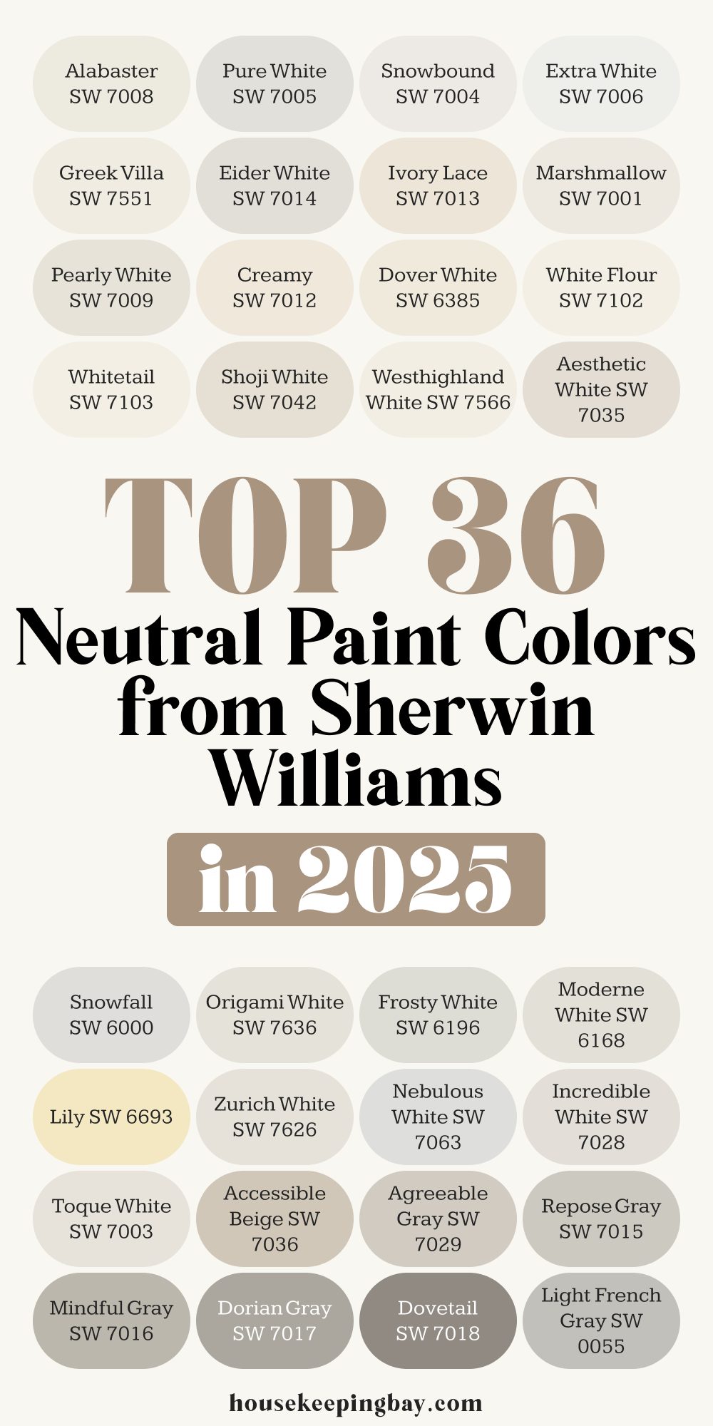
Top 36 Neutral Paint Colors From Sherwin Williams in 2025
The Best Neutral Shades for a Warm and Stylish Interior
Neutral paint colors have been a favorite in home design for years, and it’s easy to see why. They create a calm and inviting atmosphere, make rooms feel bigger and brighter, and work with almost any style.
Whether you love modern minimalism, classic elegance, or cozy farmhouse charm, the right neutral shade can bring everything together seamlessly.
housekeepingbay.com
How Neutral Colors Shape a Room
Color affects how we feel in a space. Soft whites and warm beiges can make a room feel cozy and welcoming, while cool grays create a more modern and sophisticated look.
The right neutral can even change how we perceive a space—lighter shades make a room feel open and airy, while deeper neutrals add depth and character.
housekeepingbay.com
Common Mistakes to Avoid
I’ve seen many homeowners make the same mistakes when choosing neutral paint:
- Ignoring undertones – A beige that looks perfect in the store might turn pink or yellow once it’s on your walls.
- Skipping sample tests – Colors look different depending on the lighting, time of day, and surrounding decor.
- Playing it too safe – Some neutrals can feel too plain without the right contrast in furniture and decor.
Why Lighting Matters
Lighting can completely change how a neutral shade looks. A color that appears soft and warm in the morning might feel dull and gray in the evening. That’s why it’s essential to test paint swatches on different walls and observe how they shift throughout the day.
- North-facing rooms tend to bring out cool, gray undertones.
- South-facing rooms enhance warm tones, making neutrals appear softer.
- Artificial lighting can change a color’s warmth, depending on whether you use cool or warm bulbs.
housekeepingbay.com
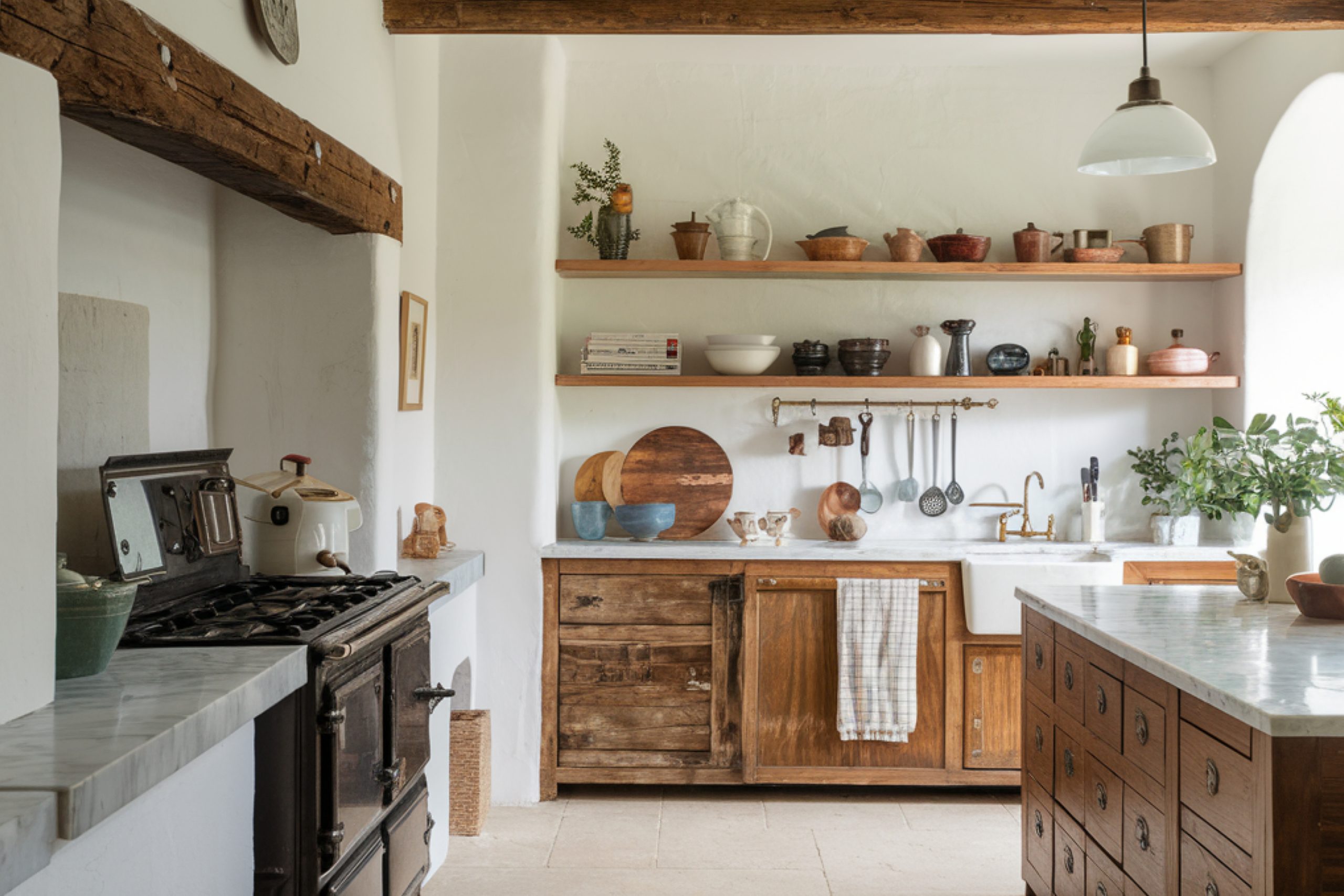
Which Neutrals Work Best in Each Room?
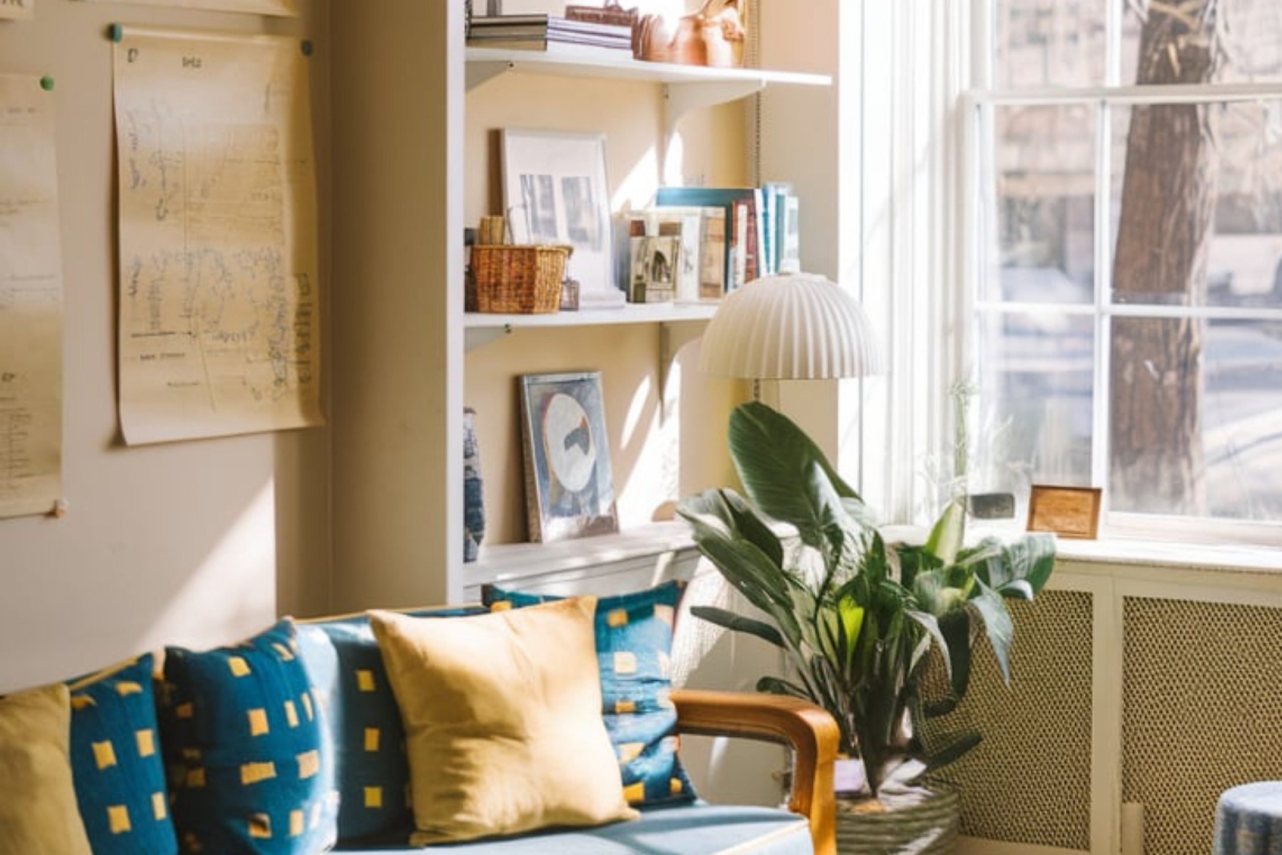
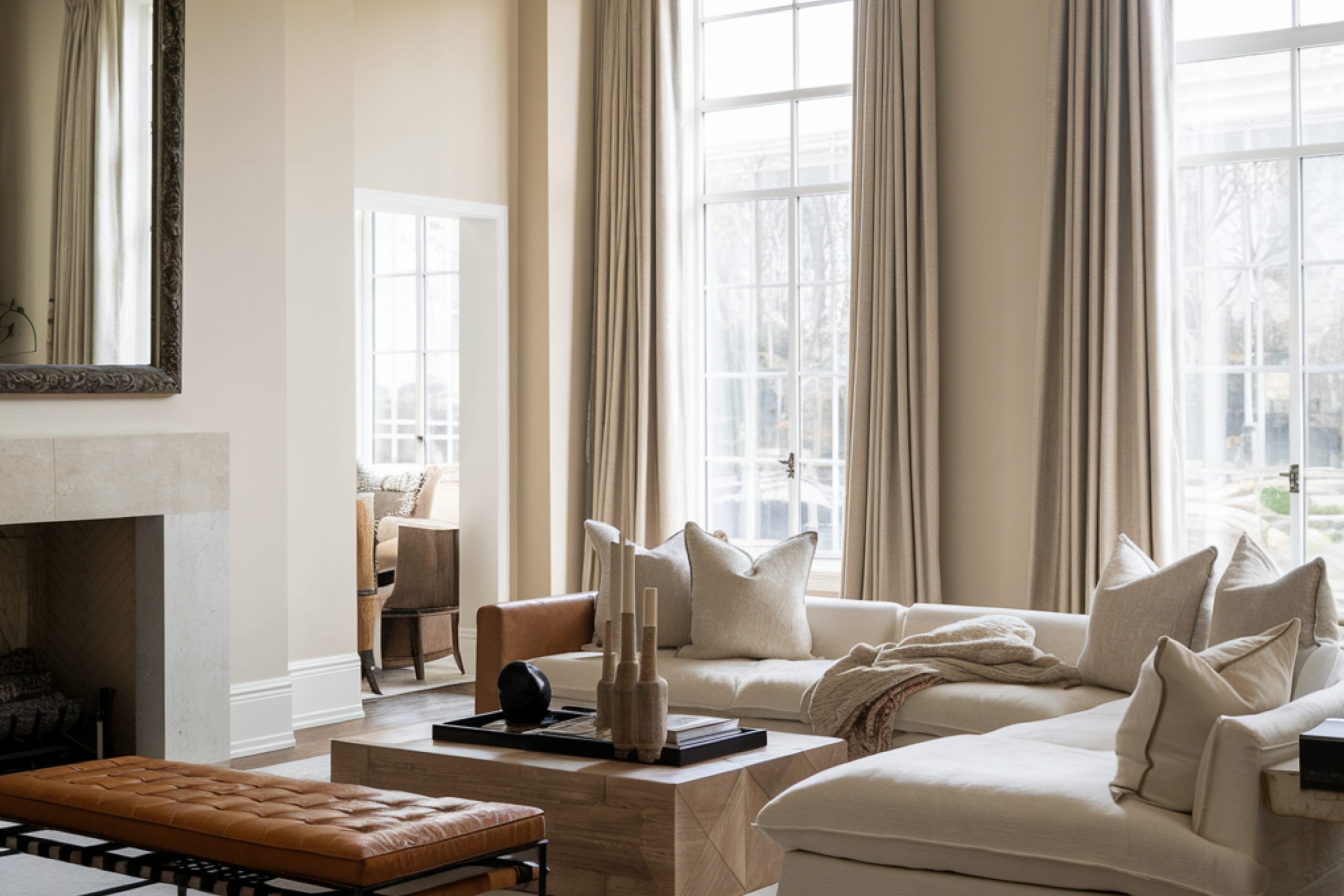
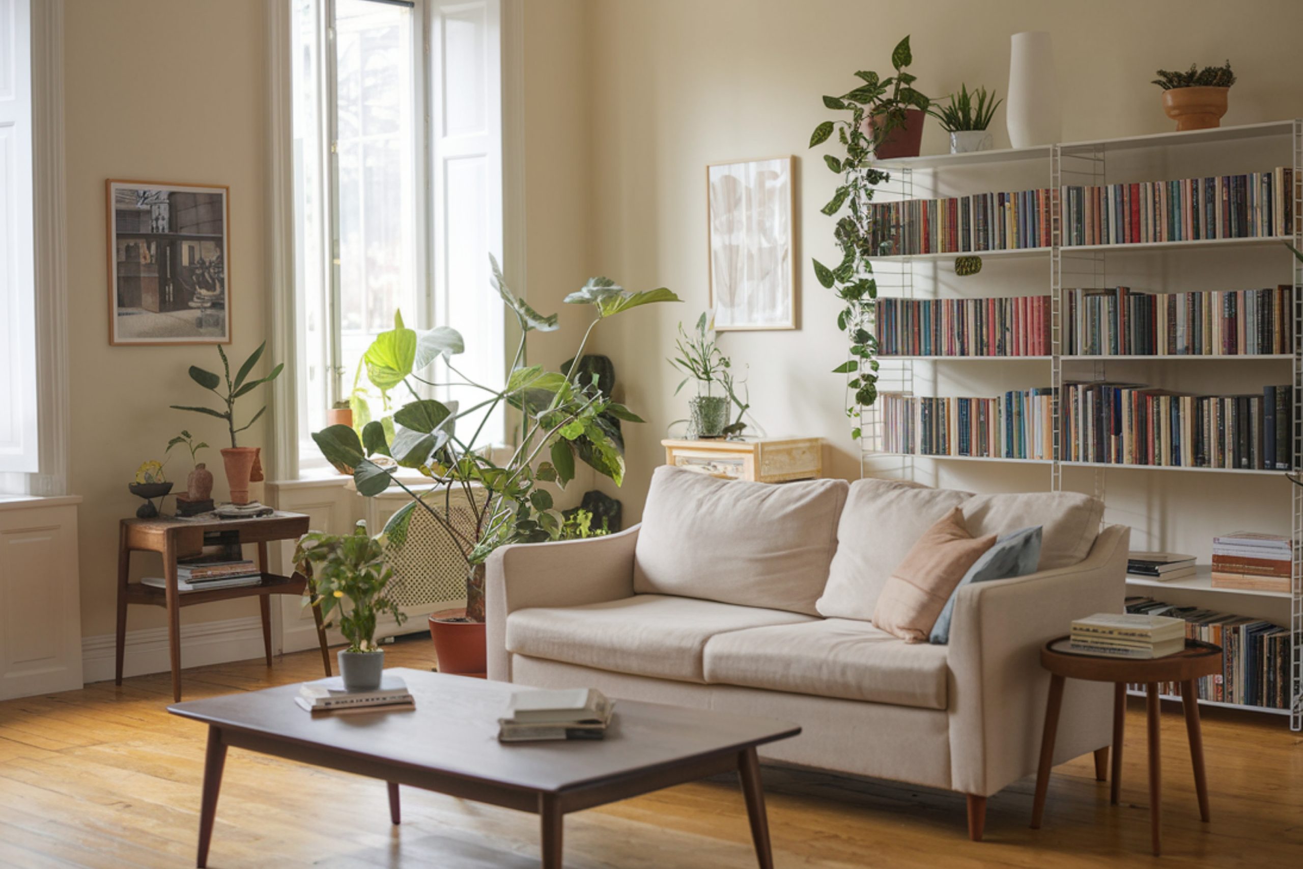
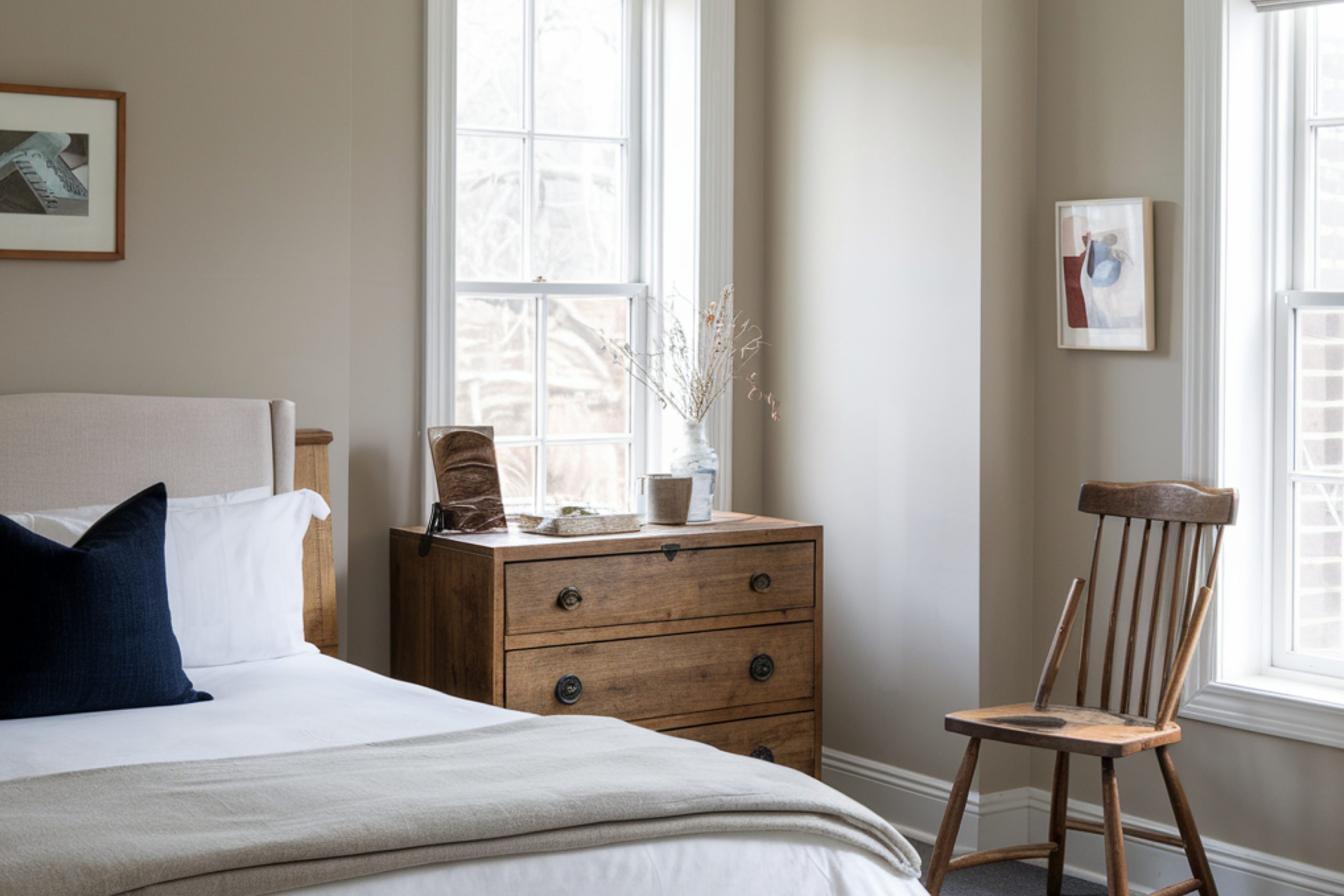
- Living rooms & bedrooms – Soft whites, warm beiges, and greiges create a relaxing feel
- Kitchens & bathrooms – Crisp whites and cool grays offer a fresh, clean look.
- Hallways & open spaces – Versatile greiges work well in transition areas.
- Accent walls – Deeper grays and taupes add depth without overwhelming a space.
In this guide, I’ll walk you through the top 36 neutral shades from Sherwin Williams for 2025, divided into whites, beiges, and grays. I’ll also share expert tips on how to choose the right one for your home.
Light Neutral Shades
Some people think white paint is just… white. But there are warm whites, cool whites, and even whites with a hint of gray or beige.
Choosing the right one depends on the lighting in your space and the mood you want to create.
Whites and Creams
- Alabaster SW 7008 – A soft, warm white that doesn’t feel too yellow or too stark. Perfect for cozy, welcoming spaces.
- Pure White SW 7005 – A clean white with just a touch of warmth. Great for trim, ceilings, and modern spaces.
- Snowbound SW 7004 – Has a slight gray undertone, making it a cooler white. Ideal for pairing with darker colors.
- Extra White SW 7006 – One of the brightest whites Sherwin Williams offers. Perfect for crisp, contemporary spaces.
- Greek Villa SW 7551 – A warm, creamy white that feels soft and inviting. Works well in traditional and farmhouse styles.
- Eider White SW 7014 – A very pale gray-white with a hint of warmth. Works well in north-facing rooms.
- Ivory Lace SW 7013 – A soft, creamy off-white with subtle warmth. Looks beautiful in classic homes.
- Marshmallow SW 7001 – A warm, slightly pinkish white that adds coziness to a room.
- Pearly White SW 7009 – A warm white with a barely-there gray undertone.
- Creamy SW 7012 – Just like the name, it’s a soft, creamy white with a touch of warmth.
- Dover White SW 6385 – A warm, slightly yellow white. Works well in traditional homes.
- White Flour SW 7102 – A soft, buttery white that’s great for bedrooms and living rooms.
- Westhighland White SW 7566 – A warm white with a hint of beige, making it feel cozy and inviting.
- Shoji White SW 7042 – A greige-toned white that works well in minimalist spaces.
- Aesthetic White SW 7035 – A subtle blend of white and beige, making it a soft, neutral shade.
- Whitetail SW 7103 – A bright, clean white with just a hint of warmth.
- Snowfall SW 6000 – A cool-toned white that works well with blues and grays.
- Origami White SW 7636 – A soft, off-white with a greige undertone.
- Frosty White SW 6196 – A crisp white with a touch of coolness.
Beige and Greige Tones
Beige is back, but today’s beige is much more subtle than the yellow-heavy tones from the early 2000s.
Many of the best neutrals now fall into the greige category—a mix of gray and beige, making them incredibly versatile.
Warm Neutral Colors
- Lily SW 6108 – A light beige with a warm, earthy feel.
- Zurich White SW 7626 – A soft, warm greige that pairs beautifully with wood tones.
- Nebulous White SW 7063 – A barely-there beige with a slight gray undertone.
- Moderne White SW 6168 – A warm off-white that leans toward beige.
- Incredible White SW 7028 – A subtle greige with a soft, airy feel.
- Toque White SW 7003 – A white with a warm beige undertone—ideal for trim and walls.
- Accessible Beige SW 7036 – One of Sherwin Williams’ most popular greiges. Warm but not too yellow.
- Agreeable Gray SW 7029 – A balanced greige that works in almost any room.
Gray and Greige Shades
Grays can be tricky because some have cool blue undertones, while others lean toward warm taupe. The key is choosing a gray that complements your lighting and furniture.
Cool and Warm Gray Tones
- Repose Gray SW 7015 – A soft, neutral gray that works in almost any space.
- Mindful Gray SW 7016 – A warm gray that pairs well with wood tones and white trim.
- Dorian Gray SW 7017 – A mid-tone gray with a hint of warmth, great for cabinets.
- Dovetail SW 7018 – A deeper gray with taupe undertones. Works well for accent walls.
- Light French Gray SW 0055 – A true gray with no obvious undertones. Great for a modern look.
- Passive SW 7064 – A cool, airy gray that pairs well with blues.
- Gray Screen SW 7071 – A soft, cool gray with a slight blue undertone.
- Worldly Gray SW 7043 – A warm greige that looks sophisticated in any room.
- Anew Gray SW 7030 – A slightly darker greige, perfect for open-concept spaces.
housekeepingbay.com
How to Choose the Perfect Neutral Color
Picking the right neutral isn’t just about choosing a pretty swatch. Here’s what I always tell my clients:
- Consider the lighting. A color that looks warm in a bright room might feel too dark in a dimly lit space.
- Test samples. Paint a few large swatches on different walls and check them at different times of day.
- Think about your decor. Cool neutrals pair well with blues and whites, while warm neutrals work better with earthy tones.
- Don’t forget the undertones. Some neutrals have pink, yellow, or green undertones that may clash with your furniture.
- Use contrast. If your walls are light, add depth with darker furniture or trim.
housekeepingbay.com
Neutral paint colors will never go out of style, but the key to making them work is choosing the right shade for your space.
Whether you prefer crisp whites, soft beiges, or modern grays, Sherwin Williams offers a wide range of timeless neutrals to fit every style.
housekeepingbay.com
