Toque White SW 7003 by Sherwin Williams
The Perfect Shade to Light Up Your Space
Embarking on a design journey can often feel like navigating uncharted waters, especially when searching for the perfect paint color to elevate your space. In the vast ocean of possibilities, one shade that consistently serves as a beacon of versatility and serene beauty is SW 7003 Toque White by Sherwin Williams.
A favorite among homeowners and interior designers alike, Toque White is far from your average white paint. It strikes a delicate balance between warmth and coolness, making it an ideal backdrop for a wide array of design styles and color palettes.
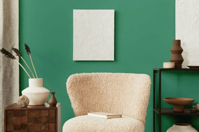
Toque White’s subtle undertones provide a warmth that is inviting and soothing, yet it retains enough neutrality to serve as a backdrop for bolder colors or to stand alone for a minimalist aesthetic. Its adaptability makes it an excellent choice for various applications, from living rooms and bedrooms to kitchens and bathrooms.
Not only does it brighten spaces, promoting a sense of airiness and cleanliness, but it also creates an illusion of expansiveness, making it especially beneficial for smaller rooms or spaces with limited natural light.
This article delves into the nuances of SW 7003 Toque White, guiding you through its best uses in home décor, compatibility with different lighting conditions, and companion colors.
Whether you’re embarking on a major renovation or simply refreshing a single room, understanding the subtle artistry of Toque White can transform your space into a sanctuary of calm and sophistication.
via pixels
What Color Is Toque White SW 7003 by Sherwin Williams?
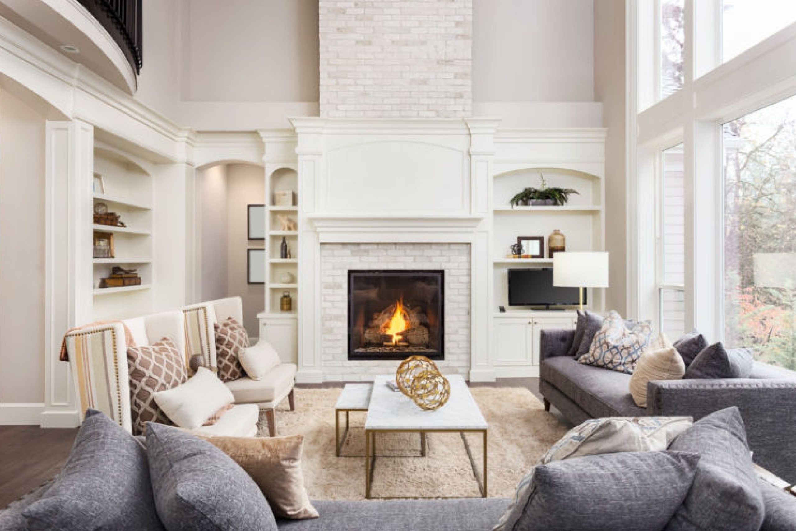
Toque White SW 7003 by Sherwin Williams is not merely a paint color; it’s a subtle statement of elegance and versatility. Bridging the gap between pure white and gentle ivory, Toque White exudes a soft, warm undertone that makes spaces feel inviting and serene.
This color is like a chameleon, capable of adapting to various lighting conditions, subtly shifting its mood from the freshness of the early morning to the cozy warmth of dusk. It brings a sophisticated yet unassuming backdrop to any room, allowing furnishings and art to speak, while it whispers tranquility.
This hue is particularly adept at complementing a wide range of interior styles. In minimalist setups, it reinforces the aesthetic of simplicity and light, creating a canvas that makes sparse decor stand out. In more traditional spaces, Toque White brings a fresh, updated look without losing the warmth and character inherent to classic designs.
It’s especially harmonious in Scandinavian, farmhouse, and coastal interiors, where its light-reflecting qualities enhance a sense of openness and airiness.
Toque White pairs wonderfully with a variety of materials and textures, enhancing its adaptability. With natural wood, it highlights the warmth and organic beauty of grain patterns; with metals, it softens industrial edges; and alongside textured fabrics like linen or wool, it adds depth and interest.
Whether on walls, trim, or cabinetry, Toque White SW 7003 by Sherwin Williams brings a timeless elegance that is both grounding and uplifting.
housekeepingbay.com
Table of Contents
Is Toque White SW 7003 by Sherwin Williams Warm or Cool color?
Toque White SW 7003 by Sherwin-Williams is a warm and inviting neutral shade that brings a soft, serene ambiance to any space. This color, existing within Sherwin-Williams’ extensive palette, provides homeowners and designers with the perfect canvas to create timeless and elegant interior spaces.
Distinguished by its subtle undertones and creamy complexion, Toque White has the unique ability to adapt to various lighting conditions, casting a cozy, gentle glow that enhances the room’s overall appeal.
In home interiors, Toque White acts as an excellent backdrop for both bold and muted color schemes. It offers a harmonious balance, allowing furniture and decor to stand out without overwhelming the senses. Its versatility extends to various design styles, from modern minimalist to rustic chic, providing a seamless blend that elevates the aesthetic of the home.
Moreover, Toque White reflects light beautifully, contributing to the illusion of a more spacious and open environment. This characteristic is particularly beneficial in smaller rooms or spaces with limited natural light, making them feel more airy and inviting.
Whether applied on walls, trim, or cabinets, Toque White SW 7003 exudes warmth and sophistication, creating a sense of tranquility and comfort that makes a house truly feel like a home.
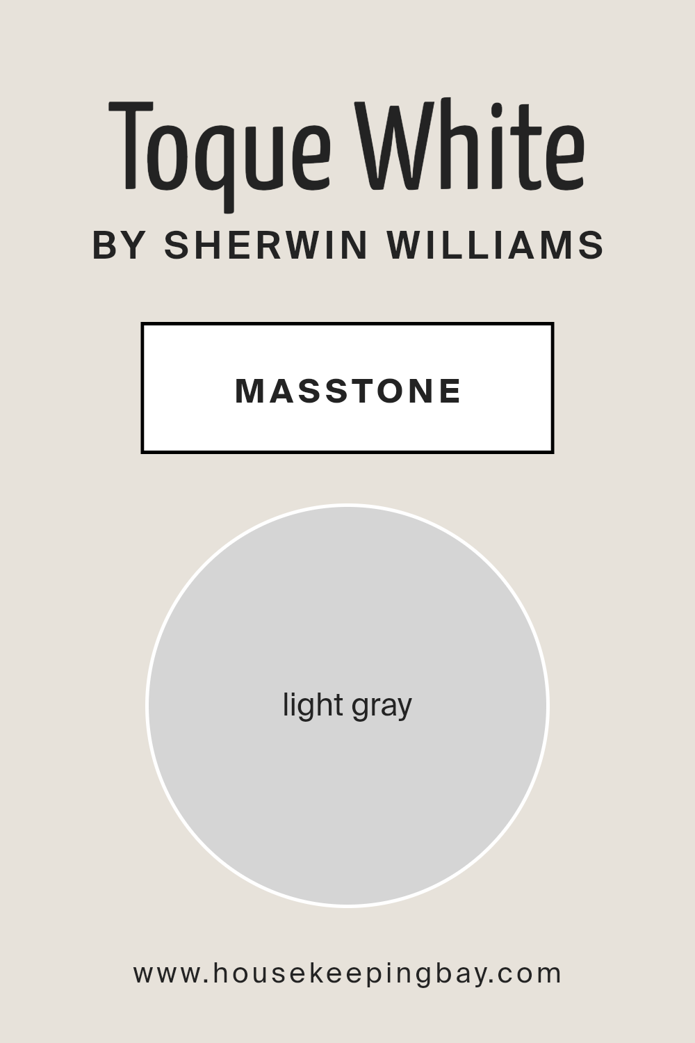
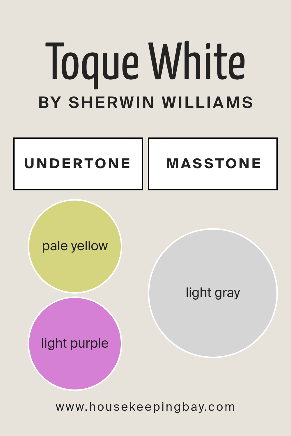
What is the Masstone of the Toque White SW 7003 by Sherwin Williams?
Toque White SW 7003 by Sherwin Williams presents a masstone of light gray, captured visually as a hexadecimal value of #D5D5D5, imbuing it with a serene and versatile appeal. This particular shade of gray is neither too stark nor too warm, making it an exceptional choice for homeowners seeking a balanced, neutral backdrop that adapts seamlessly across various interior styles—from minimalistic and modern to cozy and traditional.
The inherent simplicity and understated elegance of Toque White’s light gray masstone contribute to its ability to enhance the sense of space and light within a home, creating an inviting atmosphere that feels both open and tranquil.
The color’s lightness plays a significant role in its functionality; it reflects natural light beautifully, making rooms appear brighter and more spacious. Furthermore, it serves as an excellent foundation for layering with accent colors, textures, and patterns.
Toque White’s adaptability ensures it complements a wide range of decor elements, from bold art pieces and lush fabrics to natural wood finishes and metallic accents, allowing for personal expression while maintaining a cohesive look. Its calming hue can also contribute to a peaceful and restful environment, especially beneficial in bedrooms and living spaces.
This blend of functionality, aesthetics, and versatility makes Toque White SW 7003 a popular choice for creating sophisticated and welcoming homes.
housekeepingbay.com
Undertones of Toque White SW 7003 by Sherwin Williams
Toque White SW 7003 by Sherwin Williams is a subtly complex color that, at first glance, seems to be a simple, soothing white. However, its depth is revealed through its undertones, which include pale yellow (#D5D580) and light purple (#D580D5). These undertones play a critical role in how the color is perceived and can significantly affect the ambiance of a room.
Undertones are the underlying hues that contribute to a paint color’s overall appearance but might not be immediately noticeable. They can enhance or soften the primary color, depending on the lighting and surrounding colors. The presence of pale yellow undertones adds a hint of warmth, creating an inviting and comfortable atmosphere.
It brings a soft glow to rooms, especially under natural light, making spaces feel more open and airy. On the other hand, the light purple undertones introduce a touch of sophistication and depth. This subtle complexity can help balance out the warmth with a cooler, more serene vibe, ensuring the color doesn’t lean too warm in well-lit, sun-drenched spaces.
When applied to interior walls, Toque White SW 7003 transforms the space based on its interacting undertones. In natural daylight, the pale yellow undertones can make the room feel cozy and sunlit, even on cloudy days.
Meanwhile, in artificial lighting or during the evening, the light purple undertones can emerge more, lending a tranquil and refined quality to the space.
This interplay between the undertones ensures that the walls remain dynamic and adaptable to changing light conditions, making Toque White a versatile choice that complements a wide range of decor styles and color palettes. The selection of this nuanced white allows homeowners to achieve a balance between warmth and elegance, making spaces feel welcoming yet sophisticated.
housekeepingbay.com
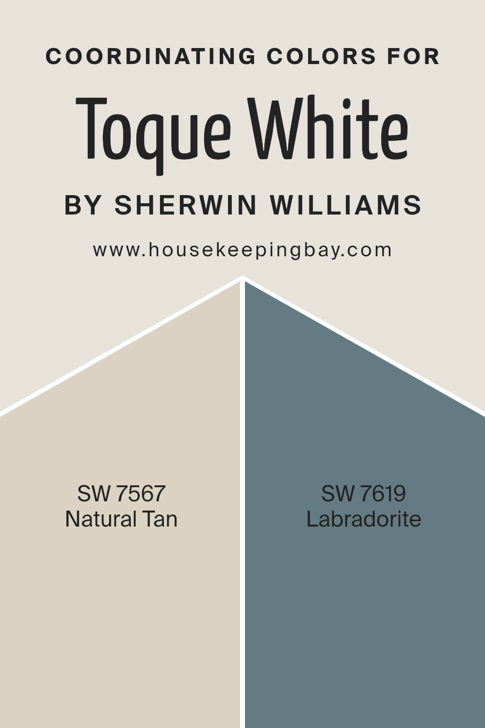
Coordinating Colors of Toque White SW 7003 by Sherwin Williams
Coordinating colors are hues that harmoniously complement each other, enhancing the overall aesthetic of a space. These colors, when used together, create a cohesive look that can either contrast or seamlessly blend with the primary color. In the realm of interior design, picking coordinating colors involves selecting shades that align with the main color’s undertone and intensity, ensuring an elegant and balanced visual impact.
For instance, Toque White SW 7003 by Sherwin Williams, a sophisticated and versatile off-white, serves as an excellent backdrop for a wide range of color schemes. Its warm, yet neutral undertone makes it a perfect canvas for creating inviting and serene environments.
Among the colors that coordinate splendidly with Toque White SW 7003 are SW 7567 – Natural Tan, and SW 7619 – Labradorite. Natural Tan is a warm, mid-tone beige with earthy undertones. This color mirrors the warmth of Toque White but adds depth and complexity, making it ideal for a space that seeks a touch of coziness without overwhelming. On the other hand, Labradorite is a unique, deep blue-gray hue that exudes sophistication and depth.
Its ability to pair with Toque White lies in its cool undertones, which provide a striking yet harmonious contrast to the creamy warmth of Toque White, making it suitable for accent walls, furniture, or decor that aims to add a bold yet refined statement to the room.
You can see recommended paint colors below:
- SW 7567 Natural Tan
- SW 7619 Labradorite
housekeepingbay.com
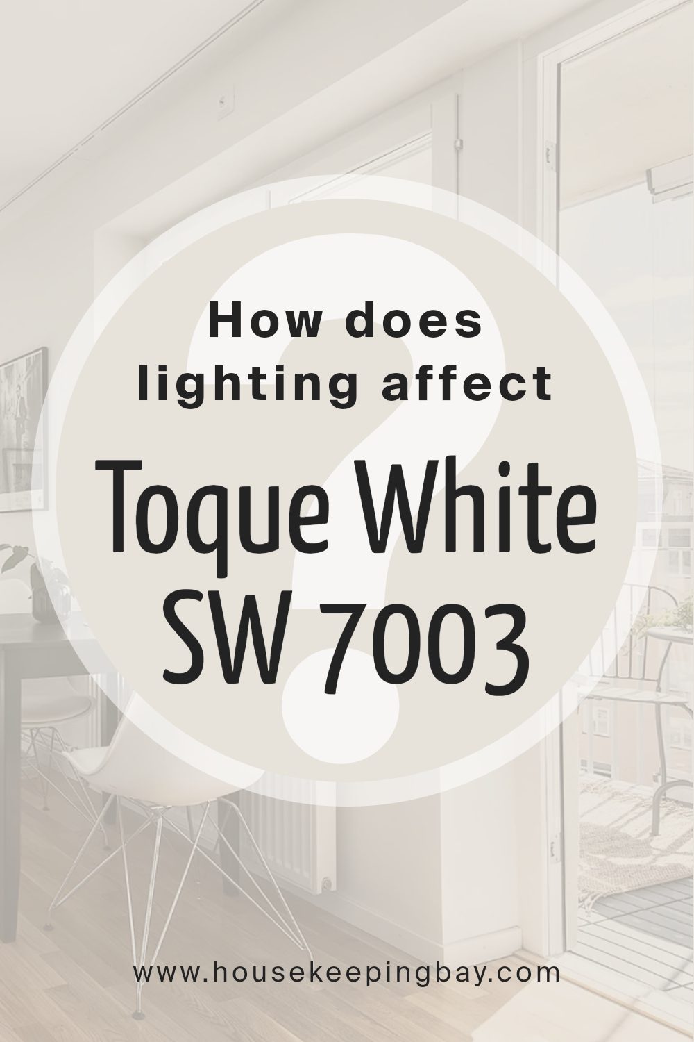
How Does Lighting Affect Toque White SW 7003 by Sherwin Williams?
Lighting plays a pivotal role in how we perceive colors, and understanding this interplay can significantly affect the aesthetic ambiance of a space. Color, in essence, is reflected light, meaning that the quality, intensity, and type of light in a room can alter how a particular color looks. Different light sources can change the hue, saturation, and brightness of colors, influencing moods and perceptions.
Take, for example, the color Toque WhiteSW 7003 by Sherwin Williams. This shade, a subtle and warm off-white with a slight gray undertone, can vary dramatically under different lighting conditions.
In artificial light, the type of bulbs used can affect how Toque White appears. Incandescent bulbs, with their warm, yellowish glow, can enhance the warm undertones in Toque White, making it appear cozier and more inviting. LED or fluorescent lighting, emanating a cooler, bluish tone, could make Toque White lean more towards its gray undertones, presenting a crisper, more neutral appearance.
Natural light brings its dynamics, influenced by the direction windows face. In north-faced rooms, which receive cooler, indirect light throughout the day, Toque White may appear more muted, with its gray undertones becoming more pronounced, creating a serene and tranquil atmosphere.
South-faced rooms, bathed in warm, direct sunlight for most of the day, can bring out the warm undertones of Toque White, making the space feel bright and welcoming.
East-faced rooms enjoy the warm, golden tones of morning sunlight, which can make Toque White appear softer and slightly warmer in the morning, transitioning to a true neutral or cooler tone as the light fades. West-faced rooms catch the afternoon and evening light, which can intensify the warm undertones of Toque White, especially during sunset, when the light has a golden hue, enhancing the coziness of the space.
In summary, Toque WhiteSW 7003’s rendition can be significantly influenced by lighting. Its subtle balance between warm and cool undertones means it can shift from a cozy, warm hue in south and west-facing rooms or under incandescent light, to a more serene, neutral shade in north-facing rooms or under cooler, artificial light.
This versatility makes it an excellent choice for various spaces, provided the lighting is considered to achieve the desired effect.
housekeepingbay.com
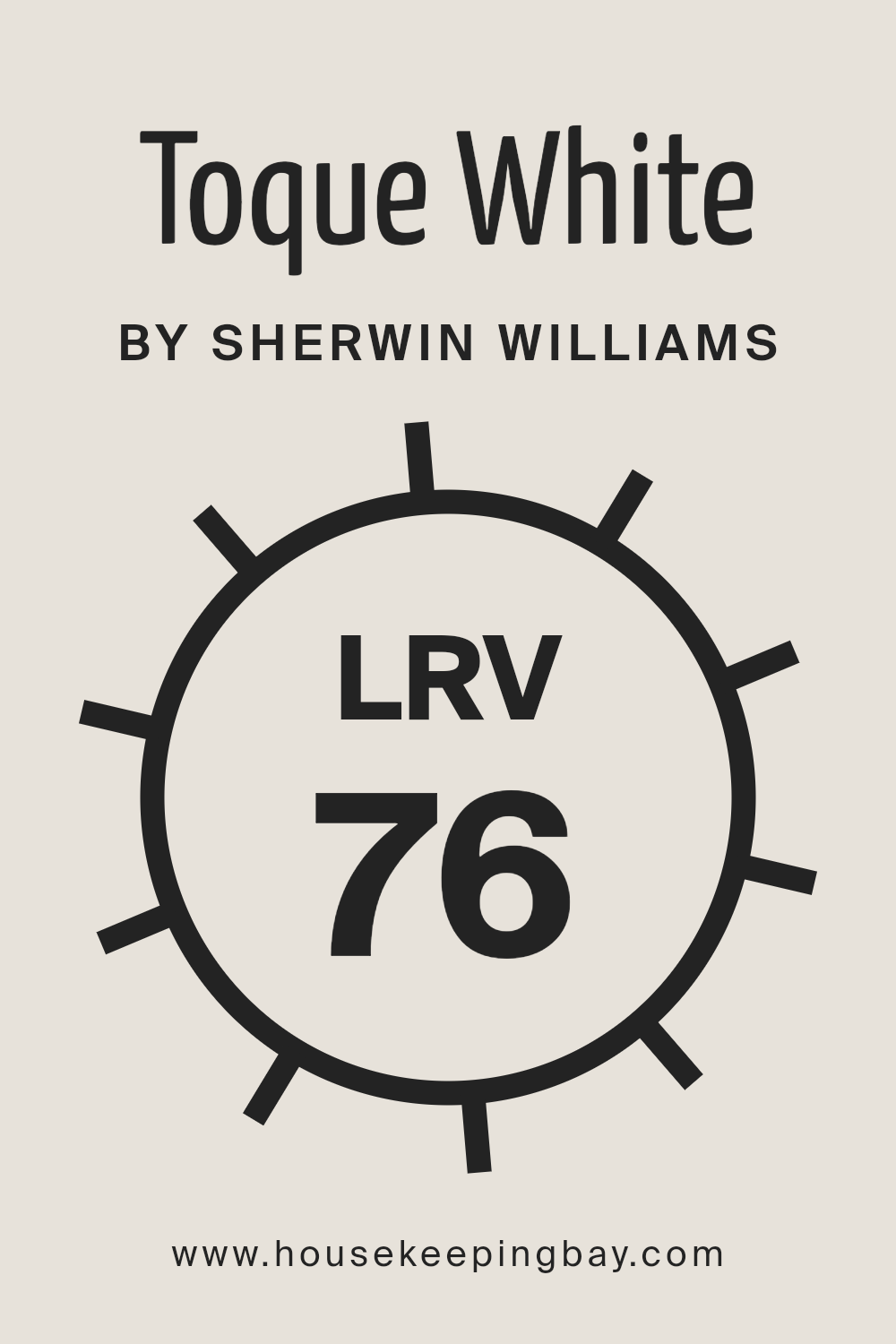
What is the LRV of Toque White SW 7003 by Sherwin Williams?
Light Reflectance Value (LRV) measures the percentage of light a paint color reflects back into the room from all light sources. It is expressed on a scale from 0 to 100, with 0 being absolute black, absorbing all light and heat, and 100 being pure white, reflecting all light and heat back into the room.
LRV is an essential tool in the design process, as it helps predict how light or dark a color will look on the walls. The perceived color on walls can significantly change depending on the amount of natural daylight or artificial lighting in a room.
A higher LRV can make a room appear more spacious and brighter, as more light is reflected back into the room. Conversely, lower LRV colors can make a room feel cozier and smaller by absorbing more light.
For Toque White SW 7003 by Sherwin Williams, which has an LRV of 76.093, this means it is on the lighter end of the spectrum.
With such a high LRV, this color is excellent for creating a bright, airy feel in a space, making it particularly suitable for smaller rooms or spaces with limited natural light. It will reflect a significant amount of light, enhancing the natural brightness of the room and potentially making it seem more expansive and welcoming.
This also means that Toque White can serve as a versatile backdrop, capable of complementing a wide range of decorating styles and palettes.
It’s important to consider how different lighting conditions throughout the day will interact with this high LRV value, as it can affect the color’s warmth and overall hue on the walls.
housekeepingbay.com
What is LRV? Read It Before You Choose Your Ideal Paint Color
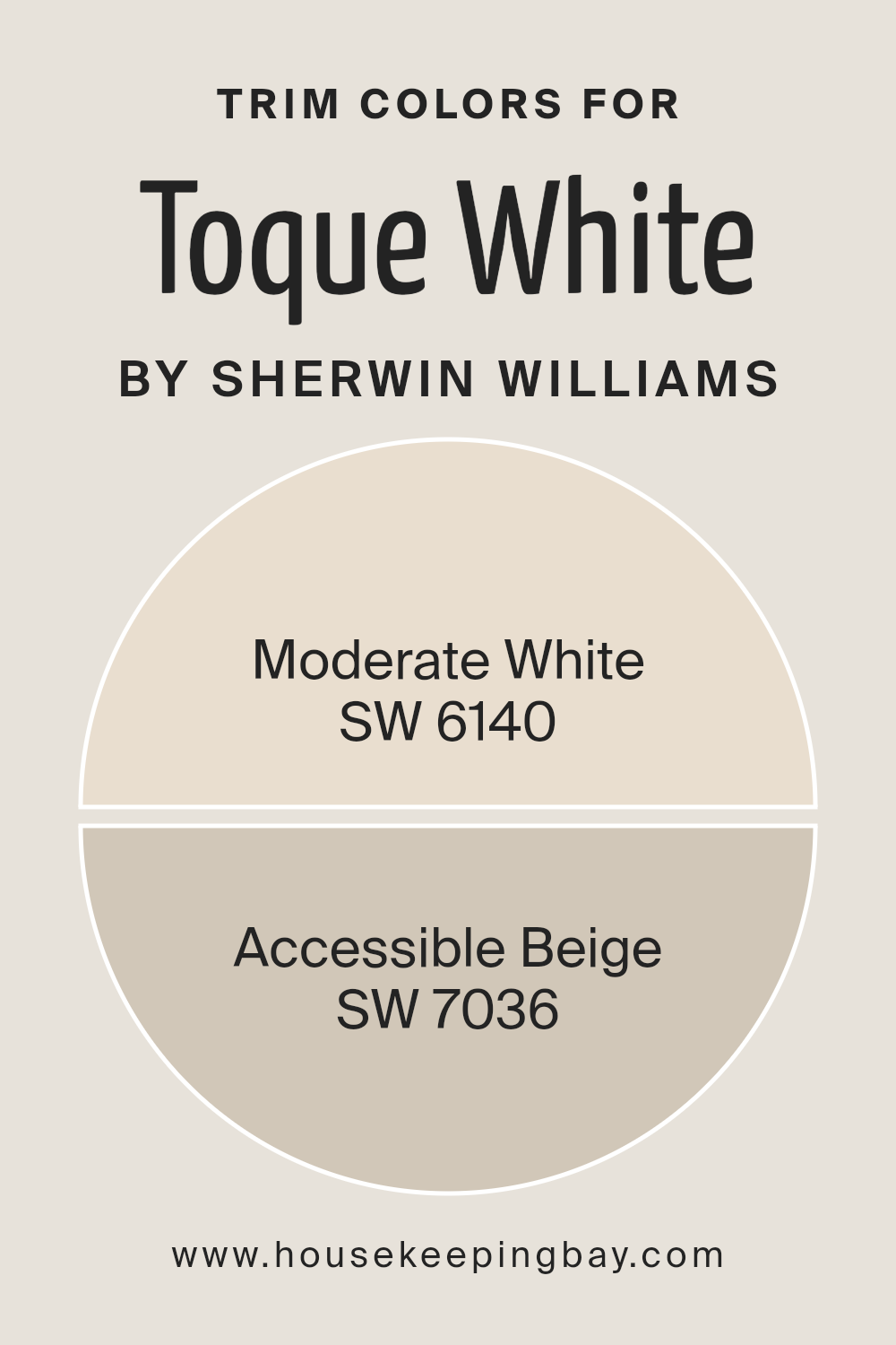
What are the Trim colors of Toque White SW 7003 by Sherwin Williams?
Trim colors play a vital role in the overall aesthetic and feel of an interior space, acting as a defining outline that enhances architectural features and complements the main wall colors. For Toque White SW 7003 by Sherwin Williams, selecting the right trim colors is crucial in creating a cohesive and appealing look.
Toque White is a soft, warm white that provides a serene and welcoming atmosphere. It serves as a versatile backdrop that can be elegantly accented with the right shades. Utilizing SW 6140 – Moderate White or SW 7036 – Accessible Beige as trim colors can subtly elevate the beauty of Toque White, adding depth and character to the space.
These trim colors ensure a smooth transition between walls and trim, showcasing a refined and polished environment.
Moderate White SW 6140, a lighter shade, offers a gentle contrast against Toque White, bringing a soft, airy feel that enhances the room’s brightness and sense of space. It meshes well with Toque White, creating a harmonious blend that is soothing to the eyes.
On the other hand, Accessible Beige SW 7036, provides a warmer, more pronounced contrast, grounding the room with its earthy tones.
This color introduces a touch of sophistication and natural appeal, making the space feel more grounded and inviting. Both colors serve to accentuate the elegance of Toque White, allowing its subtle warmth to stand out, thereby crafting an interior that feels coherent, stylish, and welcoming.
You can see recommended paint colors below:
housekeepingbay.com
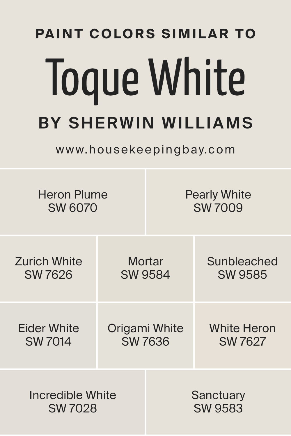
Colors Similar to Toque White SW 7003 by Sherwin Williams
Similar colors play a crucial role in design and decoration, offering subtle variations that can drastically influence the mood and aesthetic of a space.
Colors akin to Toque White SW 7003 by Sherwin Williams, such as Heron Plume, Pearly White, Zurich White, Mortar, Sunbleached, Eider White, Origami White, White Heron, Incredible White, and Sanctuary, provide a palette that ranges from soft and inviting to crisp and clean, enabling nuanced expressions within a coherent color scheme.
These shades offer a delicate balance, allowing for seamless transitions and depth in design, underlining the importance of tonal harmony in achieving a desired interior atmosphere.
Heron Plume whispers a hint of warmth, perfect for creating a serene, inviting space, while Pearly White illuminates with a subtle, natural sheen, echoing the quiet beauty of a dawn-lit pearl. Zurich White brings a sophisticated softness, ideal for elegant, understated backgrounds.
Mortar introduces a gentle grounding effect, offering a firm base without overpowering. Sunbleached captures the essence of time-worn elegance, evoking a sense of calm and nostalgia. Eider White, with its muted whisper of gray, balances cool and warm tones beautifully.
Origami White, delicate and refined, suggests simplicity and purity. White Heron stands out as a crisp, clean statement, embodying the freshness of early morning.
Incredible White shifts softly into neutral territory, offering flexibility and subtlety. Lastly, Sanctuary breathes a peaceful, calming air into spaces, inviting tranquility and reflection. Each color, while similar, contributes its unique voice to the symphony of design, proving the essential role of nuanced color choices in creating harmonious, appealing interiors.
You can see recommended paint colors below:
- SW 6070 Heron Plume
- SW 7009 Pearly White
- SW 7626 Zurich White
- SW 9584 Mortar
- SW 9585 Sunbleached
- SW 7014 Eider White
- SW 7636 Origami White
- SW 7627 White Heron
- SW 7028 Incredible White
- SW 9583 Sanctuary
housekeepingbay.com
How to Use Toque White SW 7003 by Sherwin Williams In Your Home?
Toque White SW 7003 by Sherwin Williams is a versatile and timeless color that brings a subtle warmth and elegance into any space. Its neutral yet warm undertone makes it an excellent choice for those seeking a cozy and inviting atmosphere without overwhelming the senses. This paint color shines in both natural and artificial light, adapting seamlessly to varying lighting conditions throughout the day.
Homeowners can use Toque White in various ways to enhance their living spaces. It works exceptionally well as a main color scheme for walls in living rooms, bedrooms, and kitchens, creating a serene and cohesive look.
Its adaptability allows it to pair effortlessly with a wide range of décor styles, from modern minimalist to rustic chic, making it a universal choice for any interior design project.
Furthermore, Toque White can be used to accent architectural features or highlight artwork, serving as a subtle backdrop that allows other elements to stand out. Its warmth adds depth to small spaces, making them appear larger and more welcoming.
Whether you’re looking to refresh a single room or redesign your entire home, Toque White SW 7003 offers a solid foundation upon which you can build your personalized aesthetic.
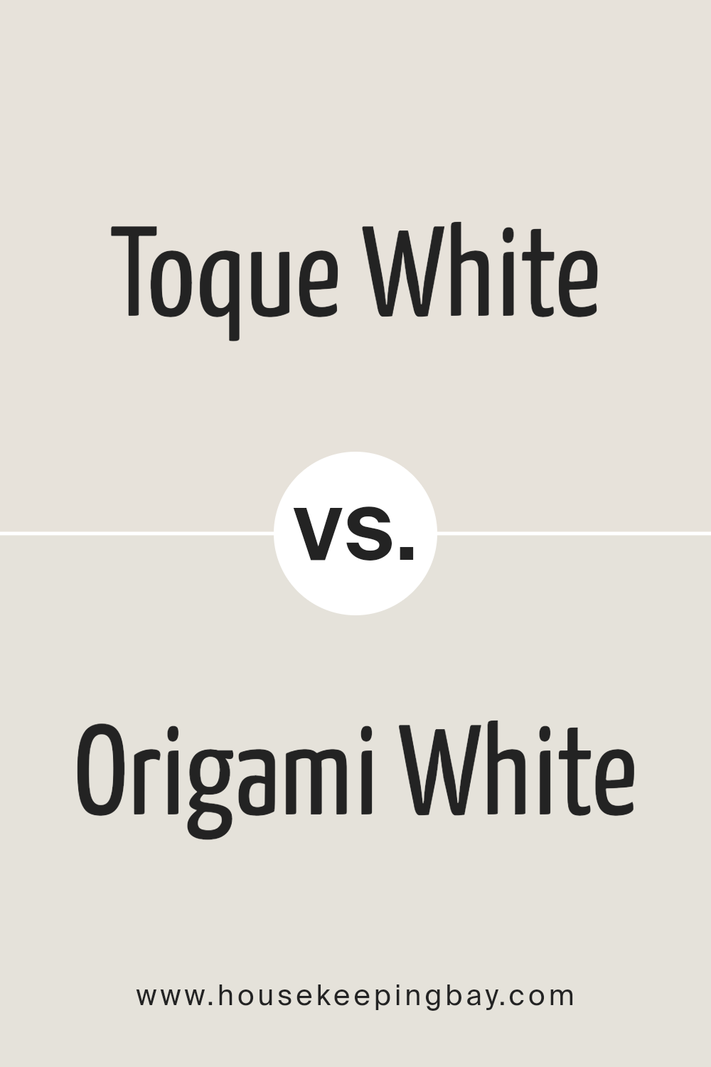
Toque White SW 7003 by Sherwin Williams vs Origami White SW 7636 by Sherwin Williams
Toque White (SW 7003) and Origami White (SW 7636) by Sherwin Williams are nuanced shades that subtly enhance spaces with their respective tones. Toque White, a gentle and warm off-white, leans towards a beige or soft gray under certain lighting conditions, providing a cozy and inviting ambiance. It’s versatile, making it suitable for creating a serene and understated elegance in various settings, from living areas to bedrooms.
In contrast, Origami White presents a slightly cooler, crisper tone, thanks to its understated gray undertones. This color is excellent for spaces that aim for a clean, airy feel, maintaining warmth while introducing a sharper, more contemporary edge.
It shines in well-lit areas, where its nuances become more pronounced, making it an excellent choice for modern living spaces and minimalist designs.
Although both colors exude sophistication and can be applied across a myriad of spaces, Toque White offers warmth and coziness, while Origami White brings a cleaner, more defined aesthetic. The choice between them depends on the desired ambiance and the specific characteristics of the space, including lighting and decor.
You can see recommended paint color below:
housekeepingbay.com
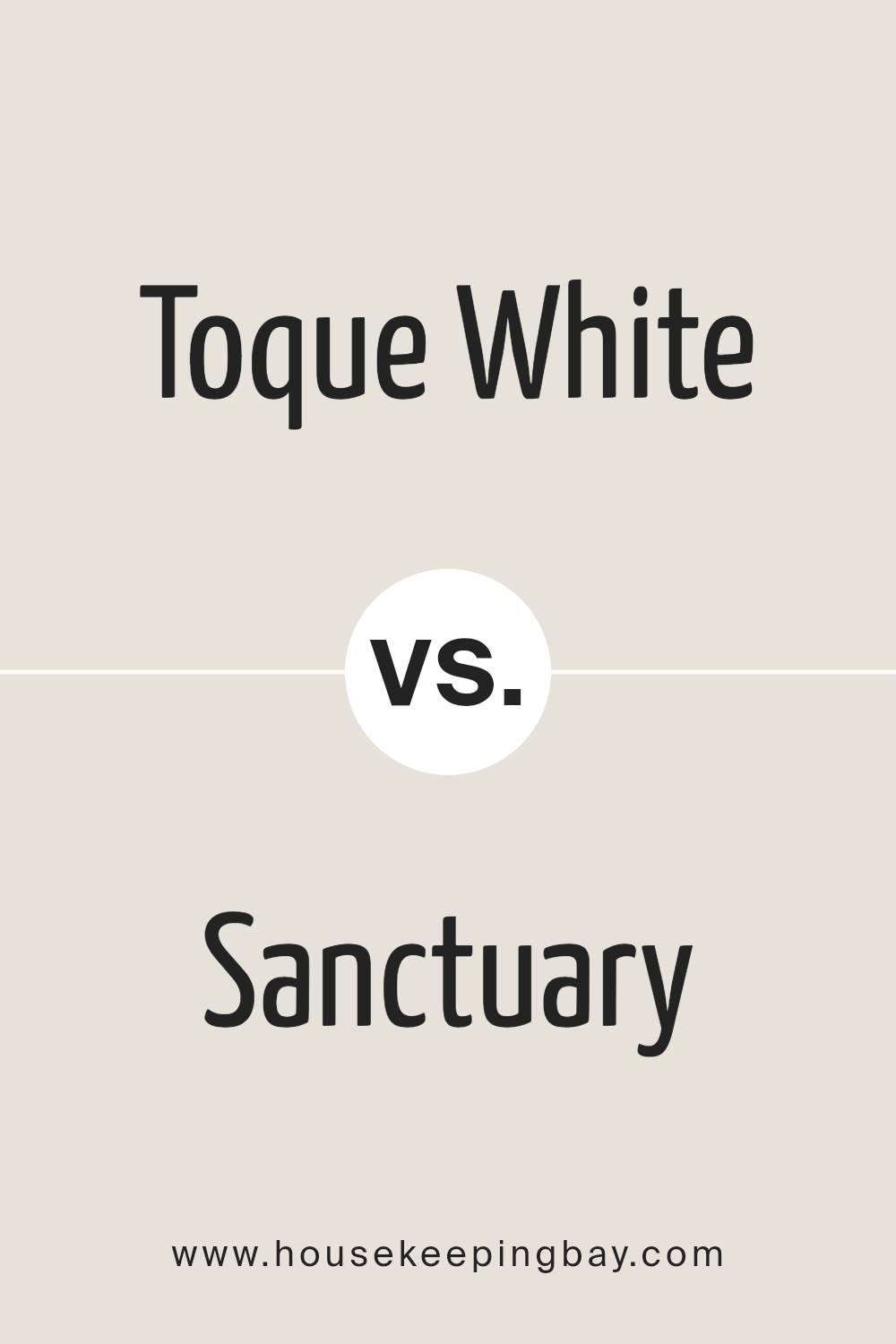
Toque White SW 7003 by Sherwin Williams vs Sanctuary SW 9583 by Sherwin Williams
Toque White SW 7003 and Sanctuary SW 9583 by Sherwin Williams are distinct shades that cater to different aesthetic sensibilities and spaces. Toque White is a soft, warm white with a subtle beige undertone that makes it highly versatile and adaptable to various lighting conditions and design styles.
It embodies a sense of serene simplicity, making it ideal for creating a bright, airy atmosphere. This color can serve as a neutral backdrop in any room, enhancing natural light and providing a sense of expansiveness.
On the other hand, Sanctuary SW 9583 presents a deeper, more resonant hue. It is a rich, sophisticated green with gray undertones, exuding a sense of calm and grounding reminiscent of natural elements. Sanctuary invites an organic, soothing feel into a space, making it perfect for areas where relaxation or concentration is key.
This color has the unique ability to pair well with both warm and cool tones, offering flexibility in design choices.
While Toque White promotes brightness and a sense of openness, Sanctuary leans towards creating depth and an intimate ambiance. Together, they could complement each other well in a space, with Toque White serving as a fresh, neutral canvas punctuated by the character and depth of Sanctuary.
You can see recommended paint color below:
housekeepingbay.com
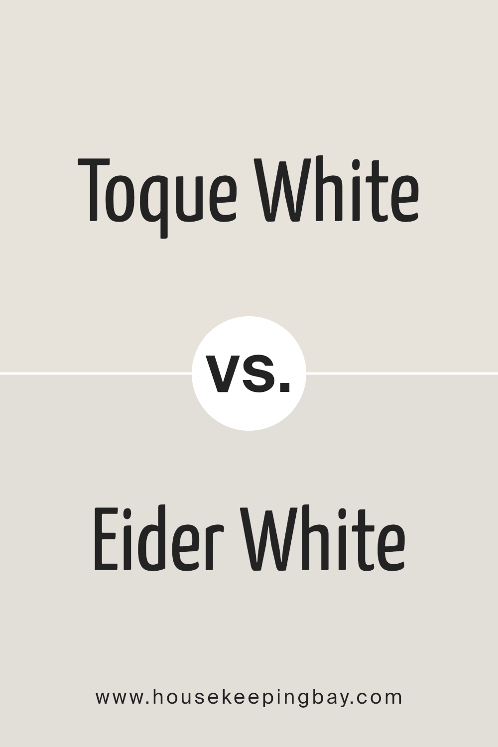
Toque White SW 7003 by Sherwin Williams vs Eider White SW 7014 by Sherwin Williams
Toque White SW 7003 and Eider White SW 7014, both by Sherwin Williams, are subtle, sophisticated shades that lend a serene and refined atmosphere to spaces. Toque White is a soft, warm white with a slightly greige undertone, making it a versatile color that pairs well with both warm and cool palettes. Its understated elegance is perfect for creating inviting, cozy interiors without the starkness sometimes associated with pure white.
Eider White, on the other hand, is a lighter shade that leans toward a cool grayish tone. It offers a hint of warmth but is predominantly recognized for its soothing, calm vibe that makes spaces appear more spacious and luminous.
Eider White can serve as a gentle backdrop, offering a minimalist aesthetic that complements contemporary and traditional designs alike.
While both colors share a base of white, Toque White’s beige undertones offer warmth, whereas Eider White’s cooler, grayish undertones present a fresh, modern feel. Choosing between them depends on the desired atmosphere, with Toque White adding coziness and Eider White bringing an airy lightness to a room.
You can see recommended paint color below:
housekeepingbay.com
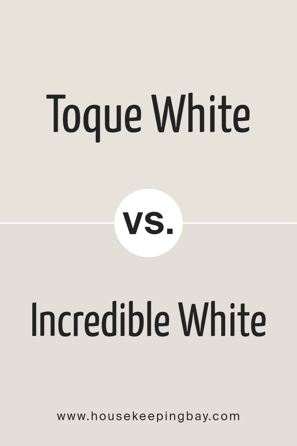
Toque White SW 7003 by Sherwin Williams vs Incredible White SW 7028 by Sherwin Williams
Toque White (SW 7003) and Incredible White (SW 7028) by Sherwin Williams are two nuanced shades that, while sharing a palette base, offer distinct atmospheric qualities to a space. Toque White is a delicate, warm white with subtle beige undertones, providing a cozy and welcoming feel. Its warmth makes it ideal for spaces that aim for a soft, serene aesthetic, illuminating rooms with a gentle glow that enhances natural light.
In contrast, Incredible White leans slightly cooler, though it is still a warm white. It possesses a hint of gray, which gives it a sophisticated edge, making it perfect for modern and minimalistic designs. This color can make spaces appear more spacious and open, reflecting light in a way that creates a crisp, clean look without feeling sterile.
Both colors cater to different design preferences while maintaining versatility. Toque White offers a hint of warmth for an inviting atmosphere, whereas Incredible White delivers a clean, contemporary vibe, making them preferred choices for various interior styles.
You can see recommended paint color below:
housekeepingbay.com
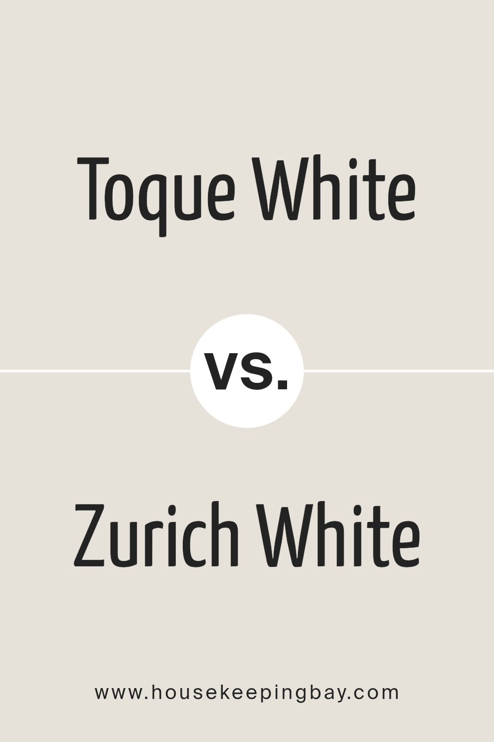
Toque White SW 7003 by Sherwin Williams vs Zurich White SW 7626 by Sherwin Williams
Toque White SW 7003 and Zurich White SW 7626 by Sherwin-Williams are two nuanced off-white shades that offer subtle but distinct differences, catering to various preferences and design applications. Toque White SW 7003 is a soft, warm neutral with a slight greige undertone that makes it incredibly versatile for any space, providing a cozy and inviting atmosphere. Its slightly creamy texture allows it to absorb and reflect light in a way that adds depth and warmth to interiors, making it a popular choice for living areas and bedrooms.
On the other hand, Zurich White SW 7626 leans towards a cooler palette, incorporating a hint of a gray undertone that offers a more modern and crisp appearance. This color is excellent for spaces that aim for a clean, airy feel, such as kitchens and bathrooms, or any room that benefits from a subtle lift.
While both colors are understated and adaptable, their tonal differences are key; Toque White errs on the side of warmth and softness, whereas Zurich White provides a cooler, sharper edge. Both are sophisticated choices but will sway the mood of a room depending on the natural light and accompanying décor, ultimately offering unique paths towards achieving tranquil and elegant spaces.
You can see recommended paint color below:
housekeepingbay.com
Toque White SW 7003 by Sherwin Williams vs White Heron SW 7627 by Sherwin Williams
“Toque White SW 7003” and “White Heron SW 7627” by Sherwin Williams are two nuanced shades of white that can create distinctly different atmospheres in a space. “Toque White” leans towards a soft, warm off-white, incorporating a touch of greige (a blend of gray and beige) in its base.
This subtle complexity makes it a versatile choice, enabling it to warm up a space gently without overwhelming it with color, and it pairs beautifully with a wide range of hues, from soft pastels to bold tones.
On the other hand, “White Heron” presents a crisper, cleaner appearance. It has cooler undertones, reminiscent of the natural elegance and purity associated with a heron’s plumage. This shade reflects light beautifully, making it ideal for spaces that aim for a bright, airy feel. It works particularly well in modern, minimalist designs where the goal is to create a sense of openness and tranquility.
Choosing between these two depends on the desired ambiance and how the space is used. “Toque White” is excellent for creating cozy, inviting spaces, while “White Heron” is perfect for achieving a sleek, luminous environment.
You can see recommended paint color below:
housekeepingbay.com
Toque White SW 7003 by Sherwin Williams vs Sunbleached SW 9585 by Sherwin Williams
“Toque White SW 7003” and “Sunbleached SW 9585” by Sherwin Williams present an intriguing contrast grounded in their distinct undertones and light reflectance values (LRVs). Toque White, a warm neutral with a soft, creamy undertone, offers a sense of solace and serenity to spaces.
This color exudes a quiet elegance, making it a versatile choice for creating a calming and cohesive atmosphere. Its ability to reflect light beautifully makes it a popular choice for a broad range of interior spaces, enhancing openness and warmth.
On the other hand, Sunbleached is a much lighter, almost ethereal color with a distinctly sun-washed appearance. Embedded with pale, sandy undertones, Sunbleached evokes the feel of a beachscape bathed in morning light. It’s a color that speaks of subtle elegance and a laid-back, but sophisticated charm, ideal for spaces intended to be bright, airy, and imbued with a sense of peace.
Despite both being neutrals, Toque White leans towards a classic warmth, offering depth and comfort, whereas Sunbleached strikes a lighter, almost minimalist note. The choice between them hinges on the desired ambiance: Toque White for enveloping warmth and Sunbleached for airy lightness.
You can see recommended paint color below:
housekeepingbay.com
Toque White SW 7003 by Sherwin Williams vs Pearly White SW 7009 by Sherwin Williams
Toque White SW 7003 by Sherwin Williams and Pearly White SW 7009 also by Sherwin Williams, though seemingly similar in their pale, neutral bases, exhibit unique characteristics that distinguish them from one another.
Toque White, a warm and inviting hue, leans slightly towards a creamy off-white, offering a soft, serene backdrop that conjures an ambiance of comfort and simplicity. Its warmth makes it an excellent choice for spaces meant to feel cozy and welcoming, adapting well to natural light to maintain its gentle tone.
In contrast, Pearly White SW 7009, while still maintaining a basis in neutrality, offers a hint of coolness, akin to the subtle luster of a pearl. This color presents a crisp, clean appearance, contributing to a space that feels fresh and bright.
Its cool undertone provides a slightly more modern edge compared to Toque White, making it suitable for contemporary or minimalistic designs that benefit from a hint of sophistication.
While both colors provide a versatile backdrop for a variety of decor styles and themes, the choice between Toque White and Pearly White ultimately hinges on the desired mood and temperature of the space, with the former setting a warmer, cozier tone and the latter offering a cooler, crisper vibe.
You can see recommended paint color below:
housekeepingbay.com
Toque White SW 7003 by Sherwin Williams vs Heron Plume SW 6070 by Sherwin Williams
Toque White SW 7003 and Heron Plume SW 6070 by Sherwin-Williams are two nuanced shades that subtly infuse warmth and elegance into spaces. Toque White is a soft, warm white with a slight creamy undertone. It’s the quintessential neutral, offering a serene backdrop that is both inviting and versatile. This shade can illuminate rooms, reflecting natural light beautifully to create an airy and open feel. It pairs well with a wide range of color palettes, from vivid hues to more muted tones, allowing for flexibility in design choices.
Heron Plume, on the other hand, leans towards a soft, slightly warmer gray with a hint of beige. This nuanced color strikes a fine balance between warm and cool, making it an excellent choice for those wishing to inject a subtle depth into their space without overwhelming it with color.
Heron Plume’s versatility is its strength, as it complements both modern and traditional decors, bridging the gap between stark neutrality and inviting warmth.
Although both colors share a base of neutrality, Toque White’s creamier undertones provide a classic, timeless feel, whereas Heron Plume introduces a modern edge with its greige nuances. Together, these colors can create a harmonious and layered aesthetic, with Toque White brightening spaces and Heron Plume adding sophisticated depth.
You can see recommended paint color below:
housekeepingbay.com
Toque White SW 7003 by Sherwin Williams vs Mortar SW 9584 by Sherwin Williams
Toque White SW 7003 and Mortar SW 9584 by Sherwin Williams are two distinct colors that serve different purposes in interior and exterior design. Toque White is a soft, warm white with a slight undertone of beige, making it a versatile neutral.
This color is ideal for creating a bright, airy feel in a space, offering a subtle backdrop that pairs well with a wide range of decor styles and colors. It’s perfect for walls in living areas, bedrooms, and anywhere you want to enhance natural light.
On the other hand, Mortar SW 9584 presents as a dark, earthy gray with muted green undertones, embodying a sense of depth and sophistication. This hue is more dramatic and is often used for accent walls, exterior trim, or in spaces where a strong, grounding element is desired.
Mortar provides contrast and depth when used alongside lighter colors like Toque White, highlighting architectural features or furniture pieces.
Together, Toque White and Mortar offer a complementary palette that combines light and shadow, warmth and depth, creating spaces that are visually interesting and balanced.
You can see recommended paint color below:
housekeepingbay.com
Conclusion
Toque White SW 7003 by Sherwin Williams is a color that embodies a sense of calm and versatility, making it an exceptional choice for anyone looking to introduce a touch of elegance and understated sophistication to their space.
This hue belongs to a palette that effortlessly straddles the line between warm and cool, allowing it to adapt seamlessly across a wide range of interior designs and themes.
Its muted, soft quality serves as a perfect backdrop for both bold and understated decor choices, enabling it to harmonize with contemporary, minimalist, and even more traditional settings without overpowering the surrounding elements.
The true beauty of Toque White lies in its incredible adaptability and the way it interacts with natural light, subtly shifting in tone and warmth throughout the day. This chameleon-like quality not only adds depth and dimension to spaces but also creates an inviting atmosphere that enhances the overall aesthetic appeal of a room.
Whether it’s used as a primary color scheme for walls, trim, or accents, Toque White SW 7003 encapsulates a balance of simplicity and sophistication, making it a timeless choice for designers and homeowners alike.
Its ability to fuse with various textures and materials further underscores its versatility, affirming its status as a go-to neutral that promises to elevate any interior with a serene and polished look.
housekeepingbay.com
Ever wished paint sampling was as easy as sticking a sticker? Guess what? Now it is! Discover Samplize's unique Peel & Stick samples. Get started now and say goodbye to the old messy way!
Get paint samples