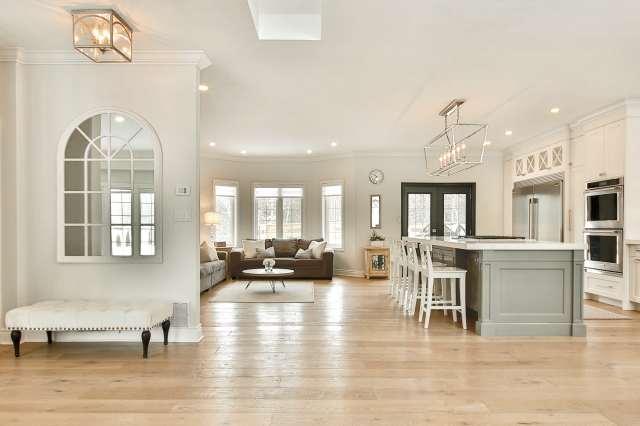
Moderne White SW 6168 by Sherwin Williams
A Timeless Hue for Elegant Spaces
As part of the Sherwin-Williams color palette, Moderne White stands out as a versatile shade that brings a breath of fresh air into any space. This color is not just white; it’s an experience, offering a subtle nuance that complements a broad spectrum of decor styles, from minimalist to contemporary and even transitional designs.
Moderne White is a testament to the power of neutrals in creating serene and inviting environments. Its soft, warm undertones provide the perfect canvas for a variety of textures and color combinations, allowing designers, homeowners, and DIY enthusiasts alike to craft spaces that reflect their personal taste and lifestyle.
Whether it’s applied on walls, trims, or cabinets, SW 6168 Moderne White has the remarkable ability to make spaces appear larger, brighter, and more open—a cherished quality in interior design.Moreover, this article will delve deeper into the practical applications of Moderne White, offering insights into its compatibility with various lighting conditions, coordinating colors, and design tips to make the most out of this beautifully understated shade.
As we explore the versatile nature of SW 6168 Moderne White by Sherwin-Williams, it becomes clear that this color is more than just a backdrop; it’s a statement of style that endures as trends come and go.
vis sherwin-williams
What Color Is Moderne White SW 6168 by Sherwin Williams?
Table of Contents
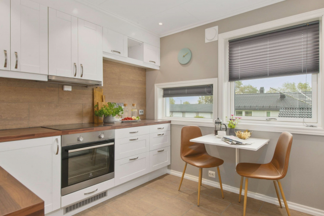
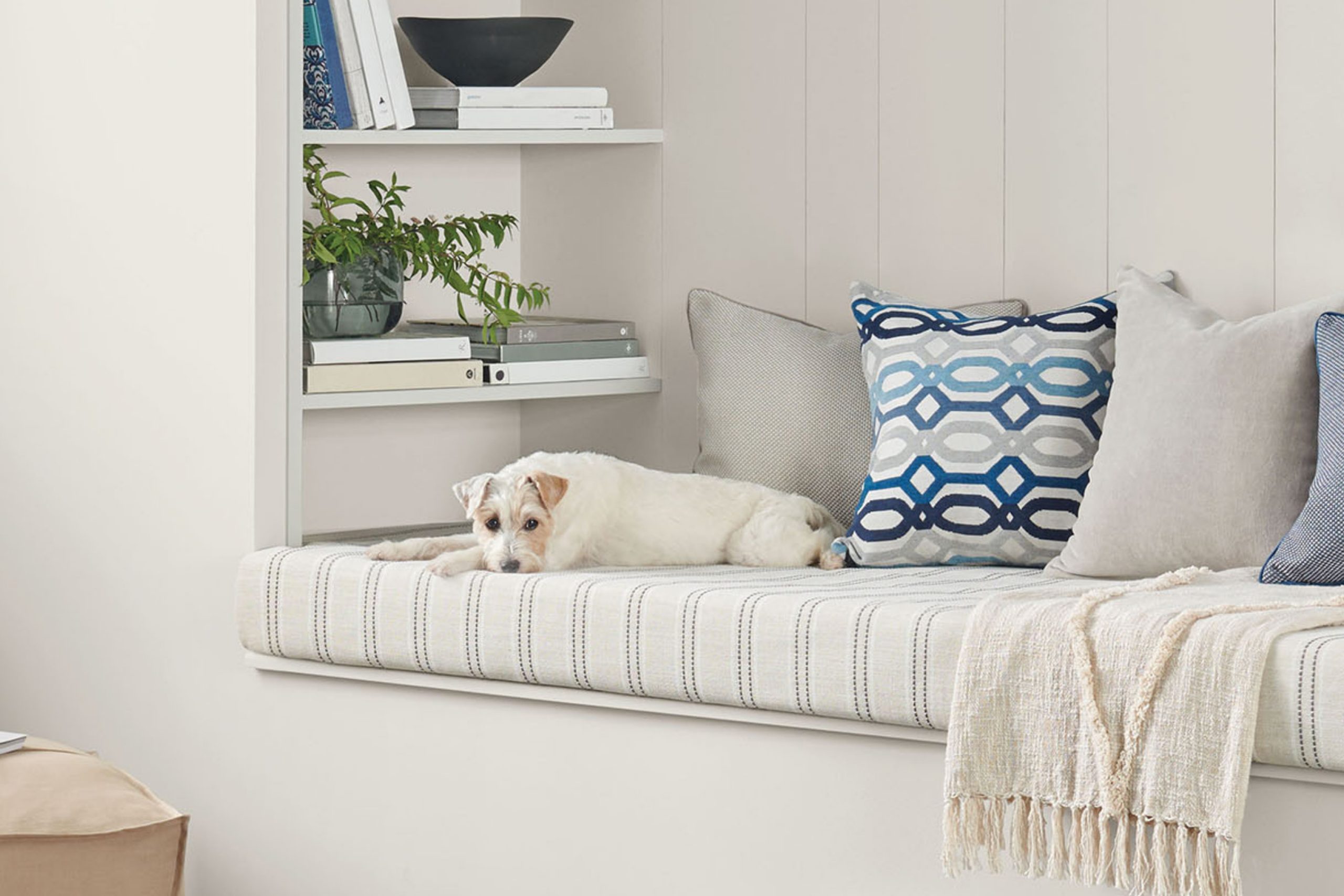
Moderne White SW 6168 by Sherwin Williams is an illustrious shade that exudes a tranquil yet contemporary vibe. This delicate hue falls perfectly within the spectrum of off-whites, offering a hint of warmth without overpowering a space. Its subtle undertone makes it a versatile choice for a myriad of interior styles, radiating a gentle glow that can illuminate rooms, creating a feeling of expansiveness and serenity.
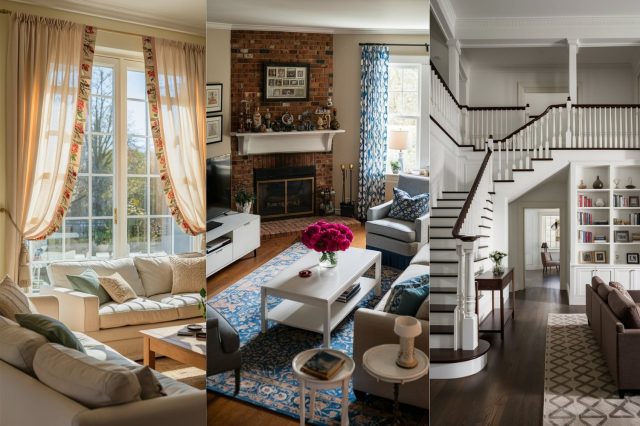
Moderne White shines in interior styles that lean towards the minimalist, Scandinavian, and modern coastal, where the aim is to create spaces that are bright, airy, and soothing. Its understated elegance also makes it a suitable candidate for transitional and contemporary farmhouse designs, where a balance between traditional charm and modern simplicity is desired.
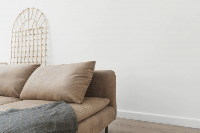
This color provides a pristine backdrop, allowing furniture and art to take center stage, while also contributing to a cohesive and peaceful environment.
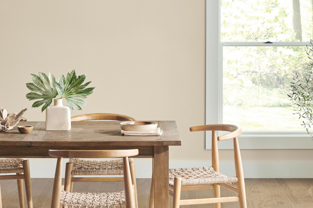
When it comes to pairing materials and textures, Moderne White demonstrates remarkable compatibility. It pairs beautifully with natural wood, from pale birches to rich walnuts, enhancing their warmth and texture. Metals, whether brushed nickel, polished chrome, or matte black, also complement this color, adding a touch of sophistication and contrast.
Textiles in muted or vibrant tones alike work well against a Moderne White backdrop, allowing for a dynamic range of interior expressions. From soft, plush fabrics to sleek leathers, this color supports an array of textures, making it an exceptional choice for creating nuanced and layered interiors.
housekeepingbay.com
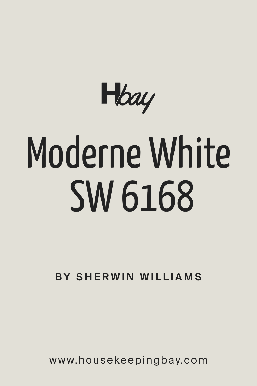
Is Moderne White SW 6168 by Sherwin Williams Warm or Cool color?
Moderne White SW 6168 by Sherwin Williams is an exquisite shade that reinvents the concept of neutral in home decor. This versatile color transcends its stark name, offering a warm, inviting palette that pairs wonderfully with a range of interior styles. Unlike the crisp, sometimes sterile look of pure white, Moderne White leans into serenity and softness, casting rooms in a light that enhances spaciousness without feeling impersonal.
In homes, Moderne White works wonderfully by creating a subtle backdrop that allows furnishings and art to take center stage, all while maintaining a cohesive atmosphere. Its understated elegance makes it ideal for walls, trim, and ceilings, providing a seamless transition between spaces. The color reflects light beautifully, contributing to a brighter, more airy feeling in any room—perfect for spaces lacking in natural light.
Moreover, Moderne White’s adaptability extends to working harmoniously with a spectrum of colors and materials, from rich hardwoods to contemporary metals, making it a favorite among homeowners and designers aiming for a timeless appeal. It embodies a promise of tranquility and openness, ensuring spaces not only look stunning but feel genuinely welcoming.
What is the Masstone of the Moderne White SW 6168 by Sherwin Williams?
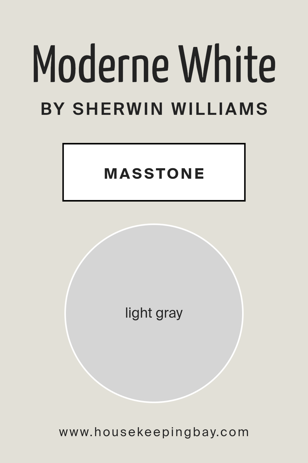
Moderne White SW 6168 by Sherwin Williams, with its masstone of Light Gray (#D5D5D5), is a sophisticated and versatile color choice for homes. This relatively neutral hue bridges the gap between pure white and deeper grays, providing a soft, understated elegance that complements a wide variety of decor styles and color palates. Its light gray masstone captures and reflects natural light, making spaces appear brighter and more spacious, a quality that is particularly beneficial in smaller or darker rooms. This effect enhances the room’s overall ambiance, promoting a sense of calm and serenity.
Furthermore, Moderne White’s ability to adapt to different lighting conditions means it can maintain its beauty and consistency throughout the day, from the soft glow of dawn to the warm light of dusk. This adaptability extends to its compatibility with both cool and warm tones, allowing for a seamless integration with a broad range of materials and textures, from natural wood to metallic finishes.
In essence, Moderne White SW 6168 enriches homes by creating a visually soothing base that invites further creative expression through decor and furnishings, making it an excellent choice for those seeking a blend of modernity and timeless appeal.
housekeepingbay.com
Undertones of Moderne White SW 6168 by Sherwin Williams
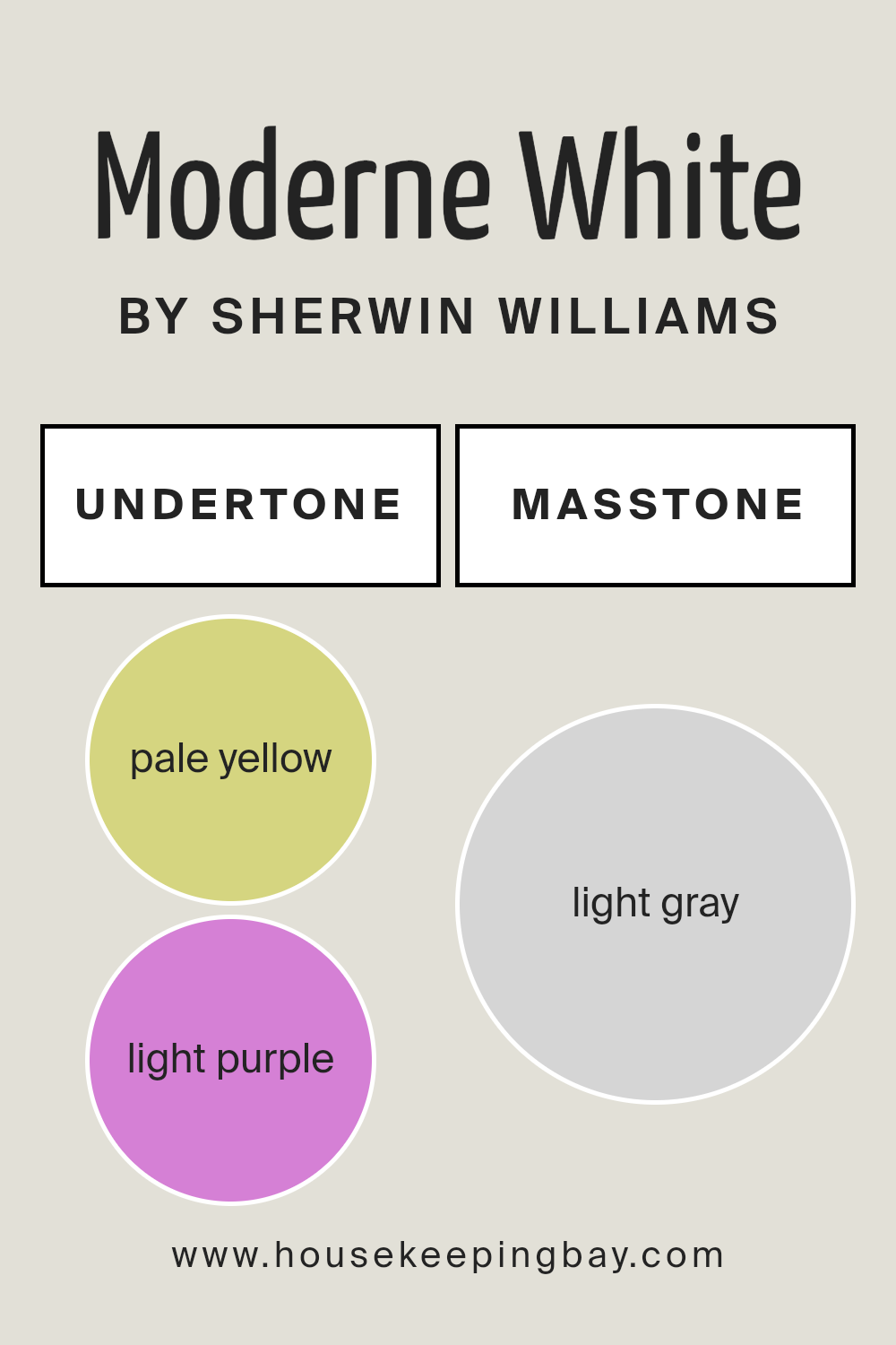
Moderne White SW 6168 by Sherwin Williams is not just a simple shade of white. It carries nuanced undertones of pale yellow (#D5D580) and light purple (#D580D5), which add depth and complexity to its appearance. The presence of these undertones significantly affects how we perceive the color, revealing its true nature under different lighting conditions and against various backdrops.
In general, undertones can subtly alter the mood and visual temperature of a color. Pale yellow undertones infuse Moderne White with a warm, inviting glow, making spaces feel cozy and sunlit. This warmth is particularly advantageous in north-facing rooms, which can appear cooler due to the quality of light.
On the other hand, the light purple undertones introduce a hint of cool sophistication, balancing the warmth with an understated, elegant neutrality. This makes Moderne White extremely versatile, able to adapt and complement a wide range of decor styles and color schemes.
When applied to interior walls, the complex interplay of Moderne White’s undertones becomes even more apparent. In daylight, the pale yellow may become prominent, creating an airy brightness. However, under artificial lighting, the light purple undertones can surface, lending the walls a serene, soft ambiance.
This chameleon-like quality means the color can shift and evolve throughout the day, influenced by the room’s exposure to natural light and the type of artificial lighting used. As a result, Moderne White SW 6168 is not just a backdrop but an active participant in the room’s atmosphere, contributing to the overall aesthetic and mood in surprising and delightful ways.
housekeepingbay.com
Coordinating Colors of Moderne White SW 6168 by Sherwin Williams
Coordinating colors work harmoniously together to enhance the aesthetic appeal of a space, balancing tones and adding depth to design. When it comes to selecting coordinating colors for Moderne White SW 6168 by Sherwin-Williams, a subtle, yet sophisticated palette comes into play.
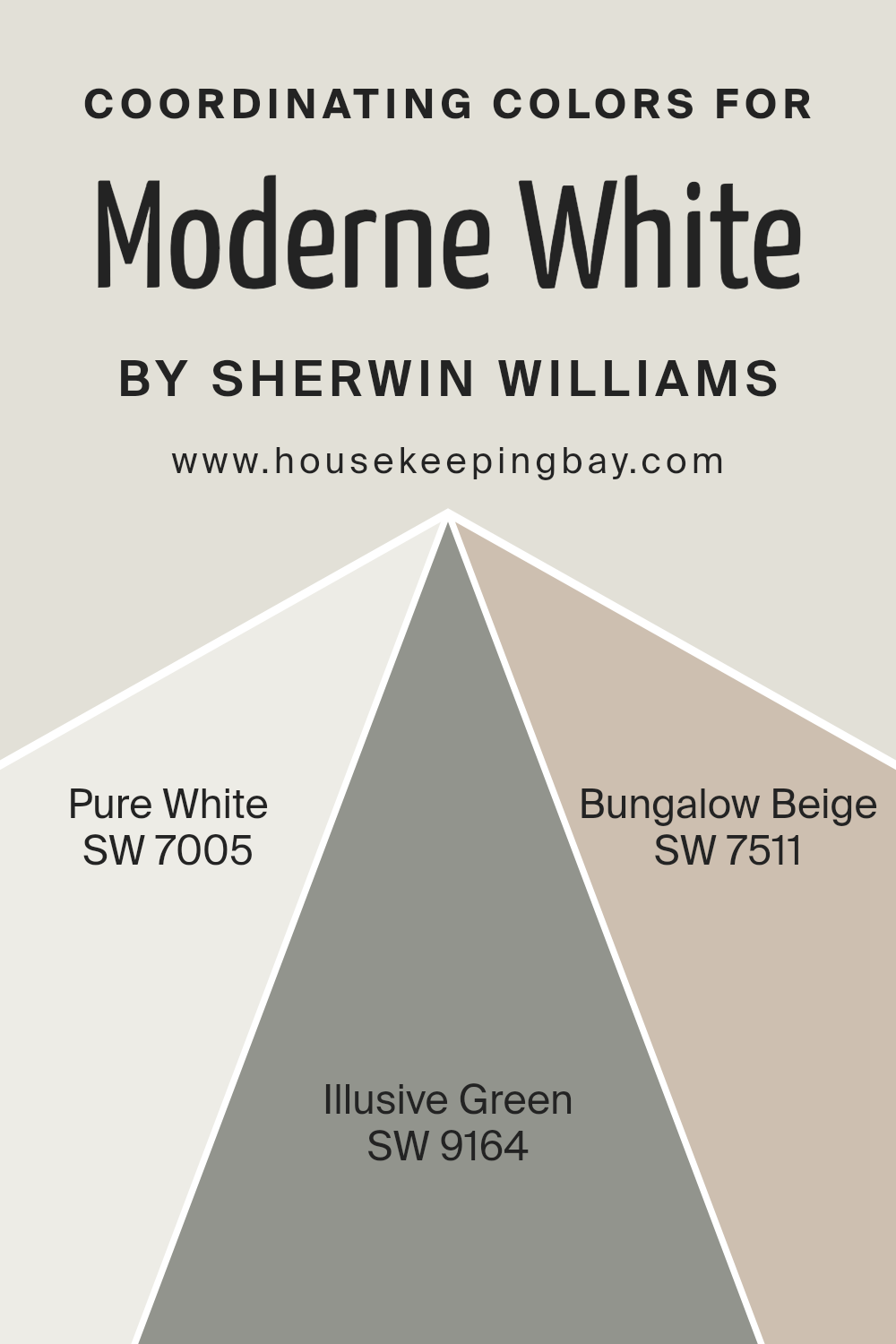
These coordinating shades complement Moderne White’s nuanced tones, creating a cohesive and inviting atmosphere. The selected coordinating colors, namely Pure White SW 7005, Illusive Green SW 9164, and Bungalow Beige SW 7511, each play a distinct role in enriching the primary color, ensuring a seamless blend of warmth and style.
Pure White SW 7005 acts as a clean, crisp complement to Moderne White, offering a fresh, airy feel that enhances the space’s brightness without overpowering the primary hue. Its versatility allows it to act as both a supporting shade and a standalone color, emphasizing the elegant simplicity of modern design.
Illusive Green SW 9164, with its subtle, understated elegance, introduces a soft, natural touch, bridging the gap between interior elegance and the serenity of the outdoors. This shade’s gentle whisper of color adds depth and character without overwhelming the senses.
Lastly, Bungalow Beige SW 7511 brings a warm, inviting undertone to the palette, grounding the lighter shades with its earthy, comfortable presence. This color’s ability to harmonize with both Moderne White and its coordinating colors fosters an ambiance of coziness and sophistication, making any room feel like home. Together, these coordinating colors amplify the beauty of Moderne White, creating a harmonious and balanced design palette.
You can see recommended paint colors below:
- SW 7005 Pure White
- SW 9164 Illusive Green
- SW 7511 Bungalow Beige
housekeepingbay.com
How Does Lighting Affect Moderne White SW 6168 by Sherwin Williams?
Lighting plays a crucial role in how we perceive colors, significantly impacting their appearance and the ambiance they create in a space. The interplay between light and color is crucial in interior design, where the goal often includes crafting spaces that evoke specific moods or aesthetic effects. Colors don’t exist in isolation; they reflect, absorb, and refract light, making their appearance susceptible to the source and type of light they are exposed to.
Sherwin Williams’s Moderne White SW 6168 is a sophisticated, nuanced hue that can beautifully complement various spaces, depending on how it’s illuminated. In artificial light, the quality and type of light bulb (LED, fluorescent, incandescent) can significantly affect Moderne White.
LED lights, which tend to have a cooler tone, might make Moderne White appear crisper and brighter, emphasizing its clean qualities. In contrast, warm incandescent lights can soften Moderne White, bringing forward its underlying warmth, and making spaces feel more intimate and cozy.
In natural light, the appearance of Moderne White shifts throughout the day and depends on the room’s orientation. North-facing rooms receive less direct sunlight, which can make colors appear cooler and somewhat shadowy. Here, Moderne White may seem more subdued, with its cooler undertones gently emerging, fostering a serene and tranquil space.
South-facing rooms bask in abundant sunlight, which can intensify colors. Moderne White will likely appear brighter and more vibrant, its subtle warmth magnified, creating a welcoming and lively environment.
East-facing rooms enjoy the morning light, which is warmer and softer. Here, Moderne White can look especially inviting in the morning, offering a soft, gentle hue that transitions throughout the day as the light changes, becoming cooler and more neutral by the afternoon.
West-facing rooms capture the evening light, which is warmer. Moderne White will respond by revealing its warm undertones more robustly in the afternoon and evening, creating a cozy and comforting atmosphere as the light deepens and enriches its color.
Thus, Moderne White SW 6168’s versatility under different lighting conditions makes it an excellent choice for various spaces and orientations, capable of offering multiple facets of its character depending on the light it’s bathed in.
housekeepingbay.com
What is the LRV of Moderne White SW 6168 by Sherwin Williams?
Light Reflectance Value (LRV) is a measure that indicates the amount of visible and usable light that a color reflects or absorbs when illuminated by a light source. LRV is rated on a scale from 0 to 100, where 0 represents absolute black, absorbing all light and heat, and 100 represents pure white, reflecting all light and heat away.
This value is crucial in design and painting as it helps determine how light or dark a color will appear in a specific environment. LRV affects not just the perception of color but also its functionality, influencing how a room feels in terms of brightness and space.
High LRV colors can make a space appear larger and more open, as they reflect more light, while low LRV colors create a cozier, more intimate feel by absorbing more light.
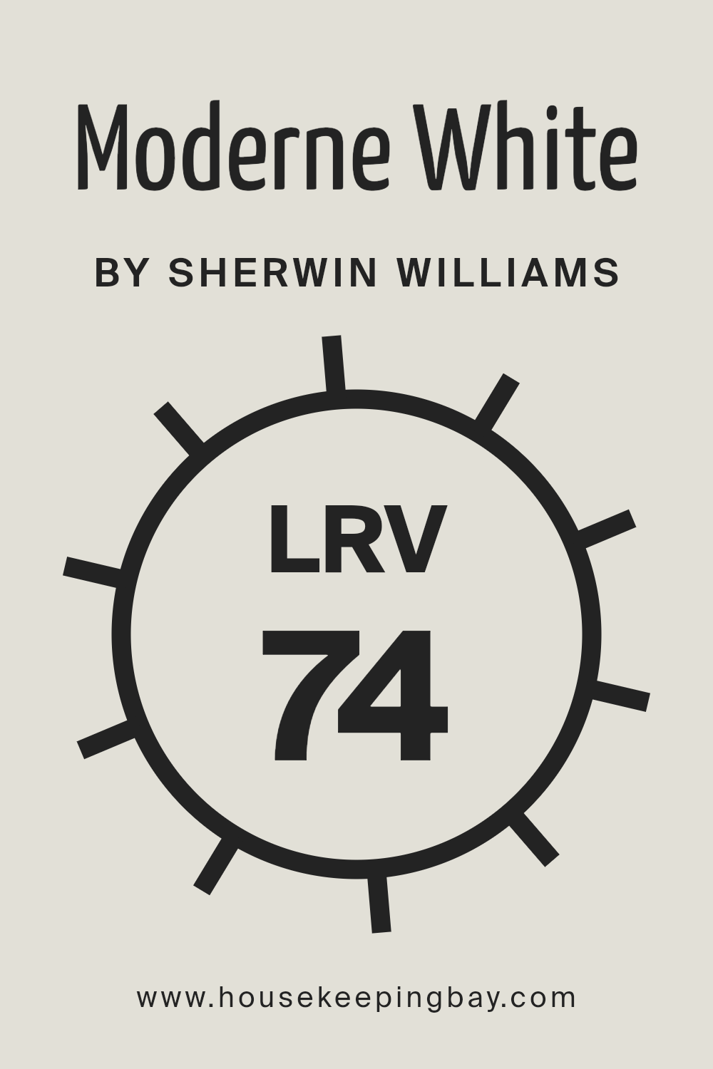
For Moderne White SW 6168 by Sherwin Williams, with an LRV of 74.473, the value lands on the higher end of the spectrum, indicating it is a relatively light color capable of reflecting a significant amount of light. This characteristic makes Moderne White an excellent choice for spaces where the goal is to create a bright, airy feel.
It can help to make smaller spaces appear larger or bring a light-filled, uplifting quality to any room. However, the specific lighting conditions in a space, natural or artificial, will also impact how Moderne White looks on the walls. In brightly lit environments, it will appear even lighter, enhancing its spacious effect.
In spaces with less light, while still reflective, Moderne White may take on a slightly more subdued tone, yet still maintain a sense of openness due to its high LRV. Thus, considering Moderne White’s LRV is crucial when planning the color palette of a space, aiming for a specific atmosphere or aesthetic.
housekeepingbay.com
What is LRV? Read It Before You Choose Your Ideal Paint Color
What are the Trim colors of Moderne White SW 6168 by Sherwin Williams?
Trim colors play a pivotal role in interior design, particularly when paired with wall colors such as Moderne White SW 6168 by Sherwin Williams. These colors, strategically selected for woodwork, door frames, and moldings, frame and accentuate the walls, adding depth, contrast, or harmony to the room’s overall aesthetic.
When used effectively, trim colors can highlight the architectural features of a space, guide the eye, and enhance the cohesive feel of the design scheme. By choosing complementary or contrasting trim colors, designers can either subtly reinforce the primary color palette or inject a surprising element to create a more dynamic interior setting.
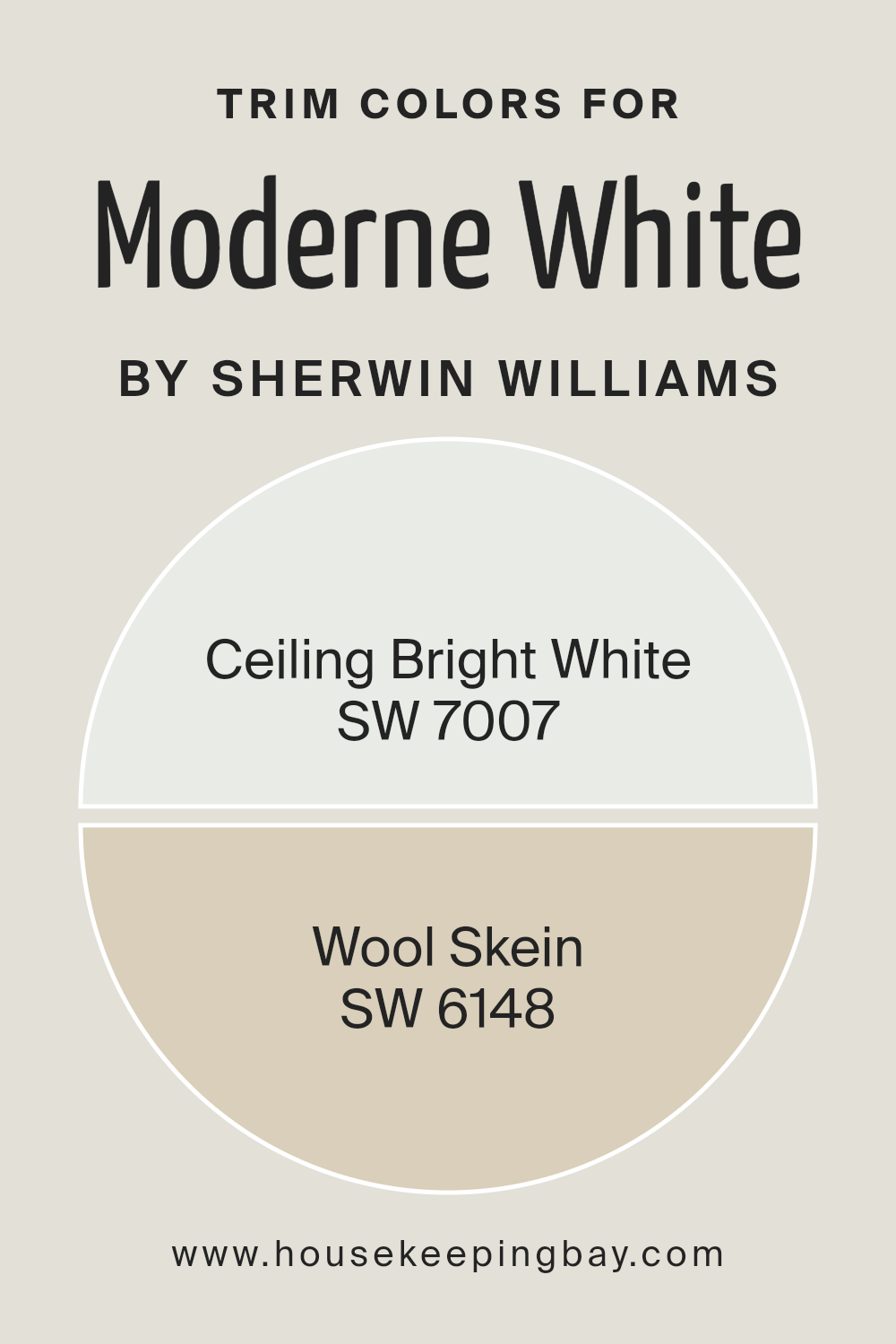
Selecting SW 7007 – Ceiling Bright White as a trim color brings a crisp, clean edge to the softer, nuanced hue of Moderne White, imparting a fresh and airy feel throughout the space. Its pristine quality can make ceilings appear higher and rooms more expansive, offering a serene and uncluttered backdrop that enhances natural light.
On the other hand, SW 6148 – Wool Skein, with its warm, neutral undertones, offers a sophisticated contrast that softly bridges the gap between the walls and trim, adding warmth and complexity to the room. This particular choice introduces an element of earthiness, grounding the space without overwhelming it, creating a harmonious balance that resonates with comfort and elegance.
You can see recommended paint colors below:
- SW 7007 Ceiling Bright White
- SW 6148 Wool Skein
housekeepingbay.com
Colors Similar to Moderne White SW 6168 by Sherwin Williams
Similar colors play a vital role in creating harmonious and cohesive interior designs. By utilizing shades that share a common hue but differ slightly in saturation or lightness, designers can craft spaces that flow seamlessly from one area to the next while still allowing for subtle distinctions between different sections or elements.
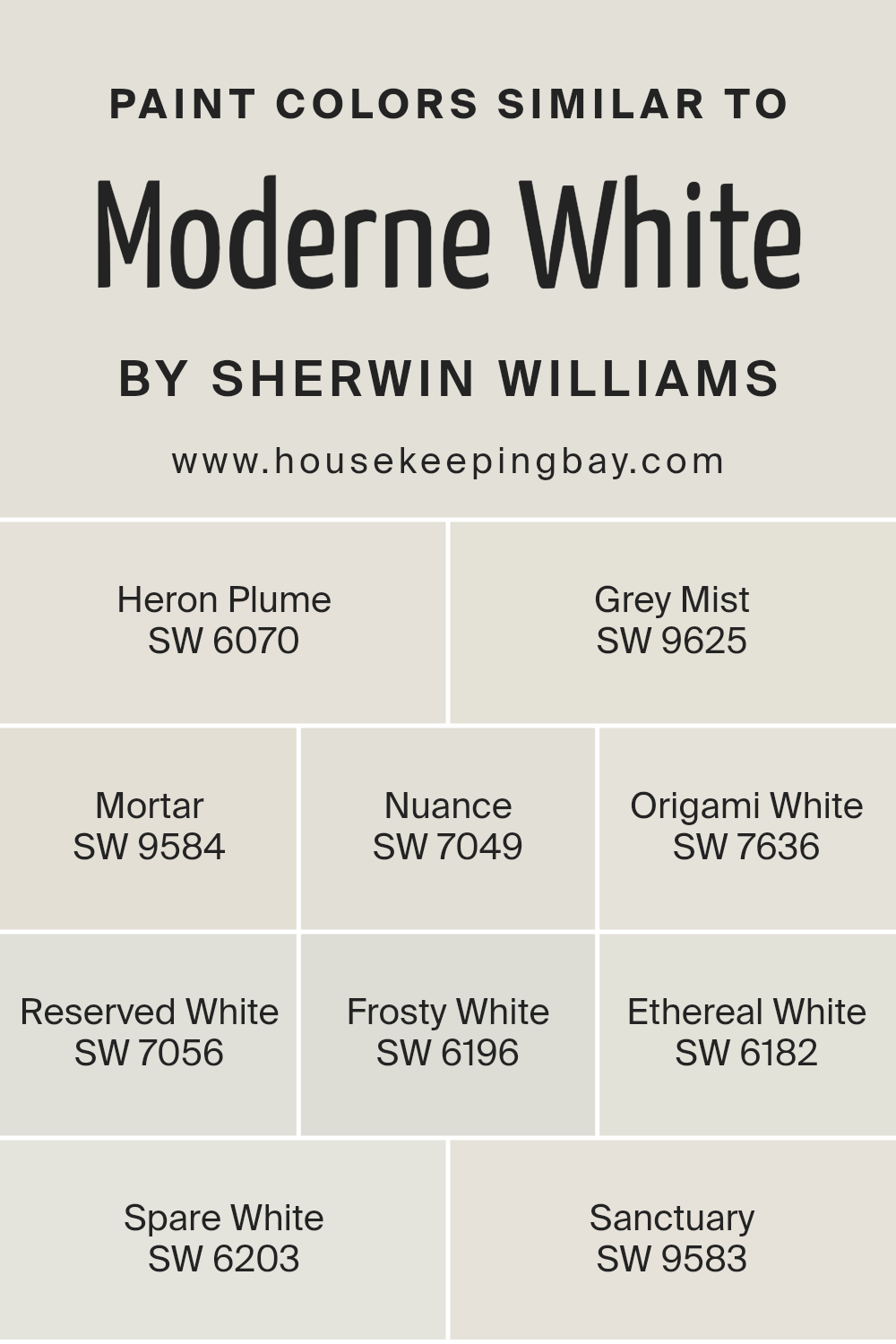
Moderne White SW 6168 by Sherwin Williams serves as a perfect anchor for a palette that seeks to blend warmth and light, offering a backdrop that is both inviting and unobtrusive. When we choose similar colors to Moderne White, such as Heron Plume, Grey Mist, Mortar, Nuance, Origami White, Reserved White, Frosty White, Ethereal White, Spare White, and Sanctuary, we are given a spectrum that ranges from soft, airy tones to slightly deeper, comforting shades.
Heron Plume is a soft, almost ethereal neutral that brings a gentle warmth to spaces, making it ideal for creating a soothing ambiance. Grey Mist offers a hint of coolness, reminiscent of early morning fog, perfect for a serene and tranquil environment.
Mortar, in contrast, introduces a sturdier, earthier feel, suggesting a subtle connection to natural elements. Nuance pairs beautifully with Moderne White, as it introduces depth without overwhelming, perfect for nuanced shadowing in minimalist designs.
Origami White infuses spaces with a crisp, clean aura, lending an origami-like precision to modern aesthetics. Reserved White, as the name suggests, is understated and elegant, providing a quiet sophistication. Frosty White brings a cool, refreshing zing, similar to a gentle winter’s morning, ideal for brightening spaces without starkness.
Ethereal White, true to its name, presents a near-mystical quality of softness and light, perfect for dreamy, light-filled rooms.
Spare White strips back to the essentials, offering a tranquil, open feel that encourages mindfulness. Lastly, Sanctuary envelops spaces in a soft, protective warmth, creating a haven of calm and comfort. Each of these colors, while sharing similarities with Moderne White, possesses its unique character, allowing for a versatile yet coherent palette that can adapt to various design needs and preferences.
You can see recommended paint colors below:
- SW 6070 Heron Plume
- SW 9625 Grey Mist
- SW 9584 Mortar
- SW 7049 Nuance
- SW 7636 Origami White
- SW 7056 Reserved White
- SW 6196 Frosty White
- SW 6182 Ethereal White
- SW 6203 Spare White
- SW 9583 Sanctuary
housekeepingbay.com
How to Use Moderne White SW 6168 by Sherwin Williams In Your Home?
Moderne White SW 6168 by Sherwin Williams is an exquisite paint color that embodies elegance and timelessness. With its soft, warm undertone, it offers a serene backdrop that can easily encompass the essence of modern and traditional decor alike.
This versatile hue can light up any room, from living spaces to bedrooms, providing a soothing ambiance that promotes relaxation and well-being. Its subtle warmth makes it particularly effective in spaces that seek to balance natural light, enhancing the room’s overall brightness without overpowering it.
Using Moderne White in your home can bring a fresh and airy feel to the space. It pairs beautifully with crisp whites for a clean, monochromatic look or acts as a neutral base for bold colors and patterns, allowing artworks or accent pieces to stand out marvelously. In living rooms or open spaces, it creates an inviting atmosphere, while in smaller rooms, like bathrooms or hallways, it helps to visually expand the area, making it appear larger and more open. For those looking to infuse their home with a sense of calm and understated elegance, Moderne White SW 6168 is an impeccable choice.
Moderne White SW 6168 by Sherwin Williams vs Ethereal White SW 6182 by Sherwin Williams
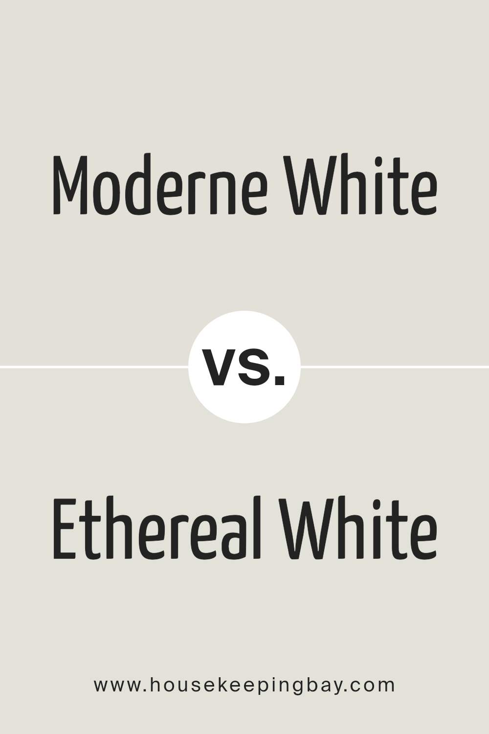
Moderne White SW 6168 and Ethereal White SW 6182 by Sherwin Williams are two subtly nuanced white paints that cater to distinct design needs. Moderne White sits on the warmer side of the spectrum, offering a cozy, inviting ambiance. Its warmth comes from a slight beige undertone that radiates a soft, elegant glow, making it suitable for spaces that seek to balance brightness with a sense of comfort.
On the other hand, Ethereal White leans towards a cooler, more ethereal presence. Its name suggests a light, almost airy quality, which it achieves through subtle gray undertones. This gives it a crisp, clean look, ideal for contemporary settings or spaces aspiring for a minimalist aesthetic.
While both colors respect the purity and simplicity of white, Moderne White provides warmth and elegance, and Ethereal White offers freshness and modernity. Choosing between them depends on the desired mood and the specific design intent of the space.
You can see recommended paint color below:
housekeepingbay.com
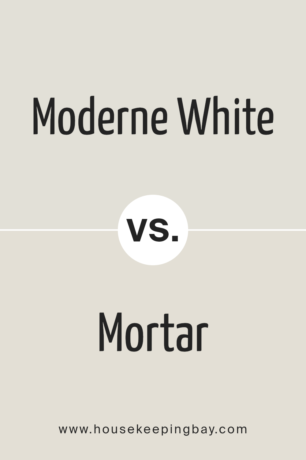
Moderne White SW 6168 by Sherwin Williams vs Mortar SW 9584 by Sherwin Williams
Moderne White SW 6168 and Mortar SW 9584 by Sherwin Williams represent two distinctly different color spaces that evoke unique atmospheres within interior design. Moderne White is a soft, creamy white with warm undertones that exude a sense of serenity and brightness, making spaces appear larger and more inviting. Its versatility allows it to seamlessly integrate into a myriad of design styles, from modern to traditional, acting as a perfect backdrop for art, furniture, and decor.
In contrast, Mortar SW 9584 is a deep, warm gray with earthy undertones, embodying a strong, grounded presence. It brings a sophisticated depth to rooms, offering a dramatic yet comforting hue that pairs well with a wide range of colors, from neutrals to vibrant tones.
While Moderne White illuminates and expands spaces, Mortar anchors and defines them, providing a rich contrast or a harmonious complement to light and airy interiors. Together, these two colors cater to a broad spectrum of design preferences, allowing for dynamic and adaptable color schemes.
You can see recommended paint color below:
housekeepingbay.com
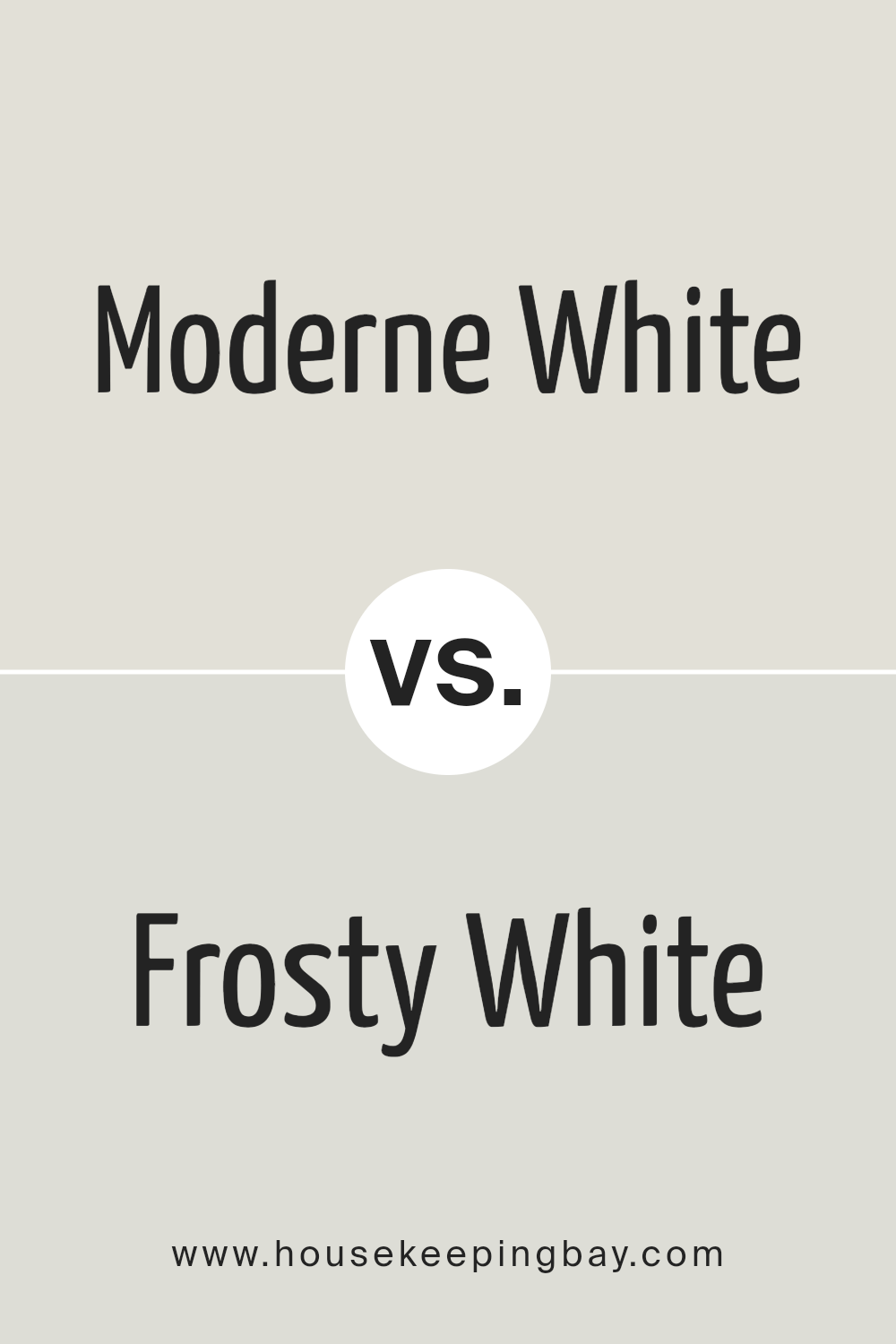
Moderne White SW 6168 by Sherwin Williams vs Frosty White SW 6196 by Sherwin Williams
Moderne White SW 6168 and Frosty White SW 6196, both from Sherwin Williams, showcase distinct tones within the white color spectrum, catering to varied aesthetic preferences and design needs. Moderne White is characterized by its warm, inviting hue, offering a creamy undertone that enriches spaces with a soft, welcoming ambiance. This color is versatile, blending effortlessly with both modern and traditional decors, and works exceptionally well in spaces seeking a hint of warmth without overpowering with color.
Frosty White, on the other hand, leans towards a cooler, more neutral palette. Its crisp, clean appearance brings a sense of freshness and modernity to a space. This shade is particularly adept at enhancing contemporary designs, creating bright, airy rooms that feel spacious and tranquil. Its neutral undertone makes it a perfect candidate for pairing with bold colors, acting as a balancing element in vibrant design schemes.
Choosing between Moderne White and Frosty White depends largely on the desired atmosphere of a space and the existing elements within it. Moderne White’s warmth suits cozy, intimate settings, while Frosty White’s neutrality is ideal for minimalistic, sleek designs.
You can see recommended paint color below:
housekeepingbay.com
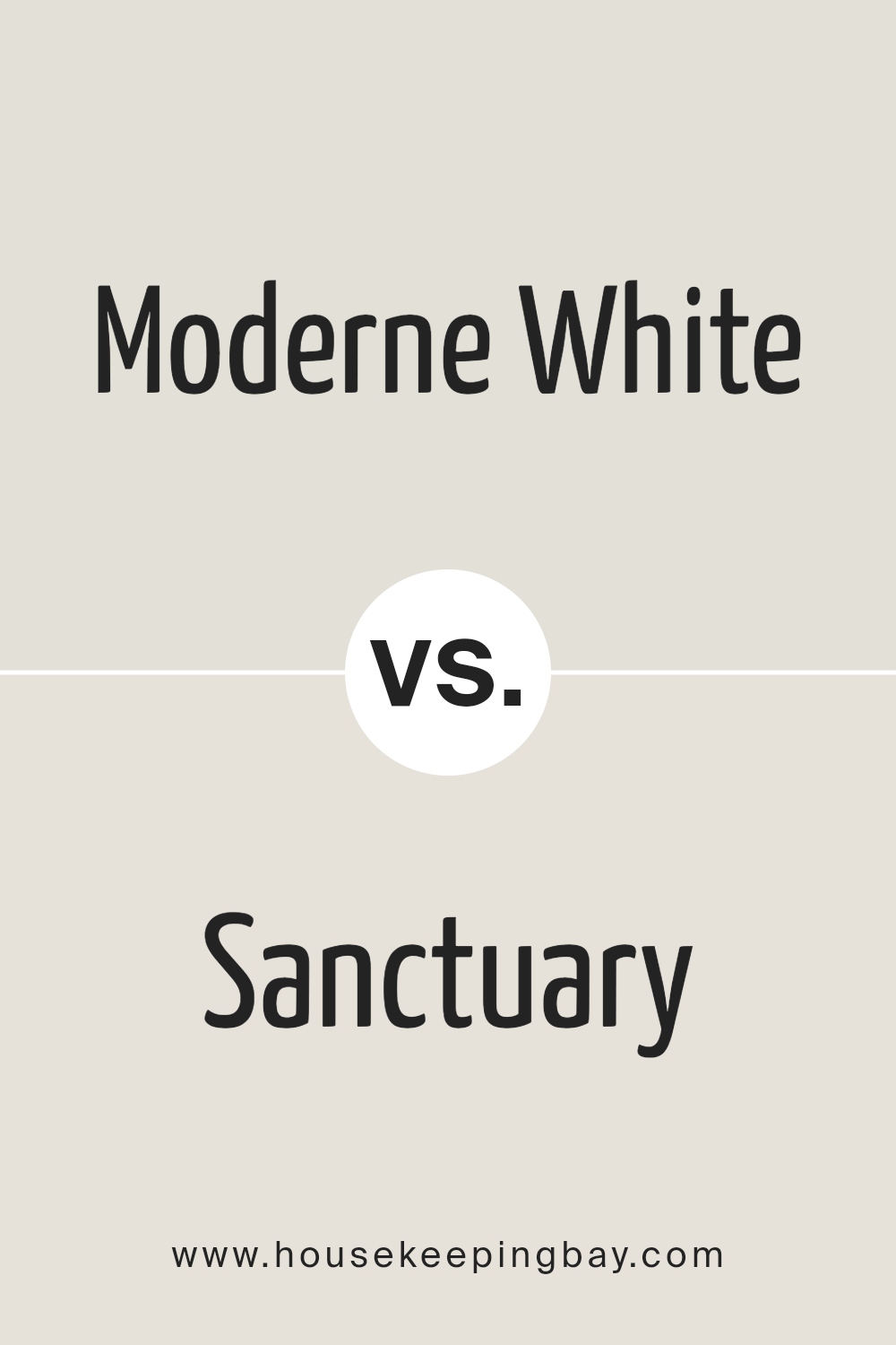
Moderne White SW 6168 by Sherwin Williams vs Sanctuary SW 9583 by Sherwin Williams
Moderne White SW 6168 and Sanctuary SW 9583, both from Sherwin Williams, present an intriguing pair of hues for contemporary interior palettes. Moderne White lives at the cusp of pure white and light beige, offering a whisper of warmth that avoids the starkness sometimes associated with true whites.
Its understated charm makes it a versatile choice for spaces that aim for brightness while maintaining a cozy, welcoming vibe. In contrast, Sanctuary delves deeper into the spectrum of calm and comfort with a beautifully muted green, featuring gray undertones that evoke a sense of tranquility and restfulness.
This color draws inspiration from natural elements, providing a subtle connection to the outdoors and creating a serene backdrop for relaxation.
When comparing these two, Moderne White serves as a brilliant base or accent, promoting light and openness, while Sanctuary introduces depth and an organic feel, perfectly suited for creating a peaceful retreat within a home. Together, they can harmonize modern aesthetics with natural elements, offering a balanced, refreshing look.
You can see recommended paint color below:
housekeepingbay.com
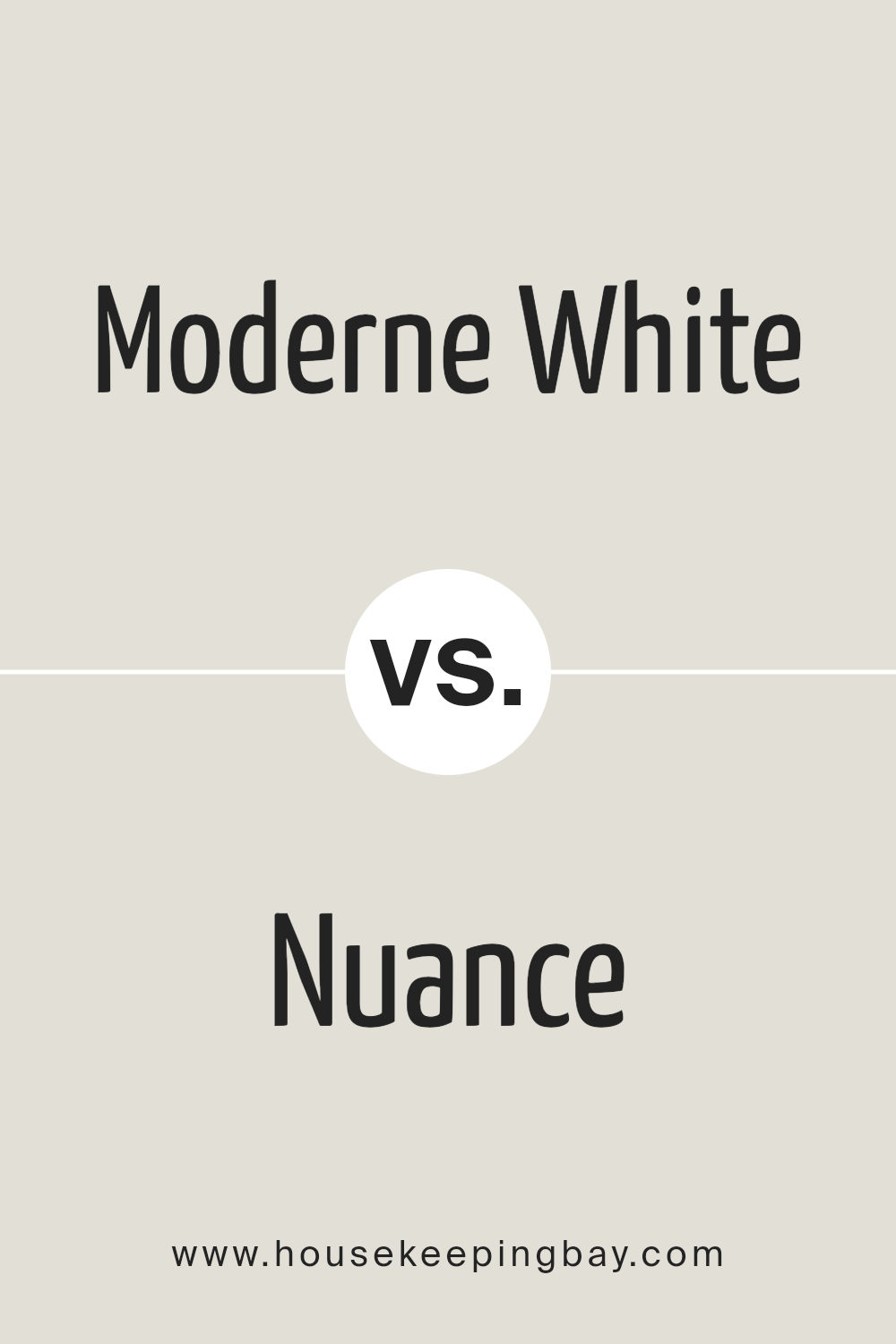
Moderne White SW 6168 by Sherwin Williams vs Nuance SW 7049 by Sherwin Williams
Moderne White SW 6168 by Sherwin Williams and Nuance SW 7049 by Sherwin Williams are two neutral shades that present subtle yet unique characteristics within an interior space. Moderne White, as the name suggests, leans towards a soft, warm white with a comforting and inviting quality.
It exudes a sense of simplicity and purity, making it an excellent choice for creating a light and airy feeling in any room. This color can serve as a perfect backdrop for both vibrant and subdued décor, highlighting architectural details without overwhelming.
Nuance SW 7049, on the other hand, steps into the territory of greige—where gray meets beige. This color embodies sophistication and versatility, offering a deeper, richer alternative to neutral tones. Nuance provides a grounding effect, giving spaces a cozy, enveloping feel. It is well-suited for those looking to add depth and warmth to their interior while maintaining a neutral palette.
Both Moderne White and Nuance offer a canvas for personal style, whether one desires the crispness and brightness of a near-white or the depth and warmth of greige. Moderne White is ideal for enhancing natural light, whereas Nuance adds character and complexity to a space.
You can see recommended paint color below:
housekeepingbay.com
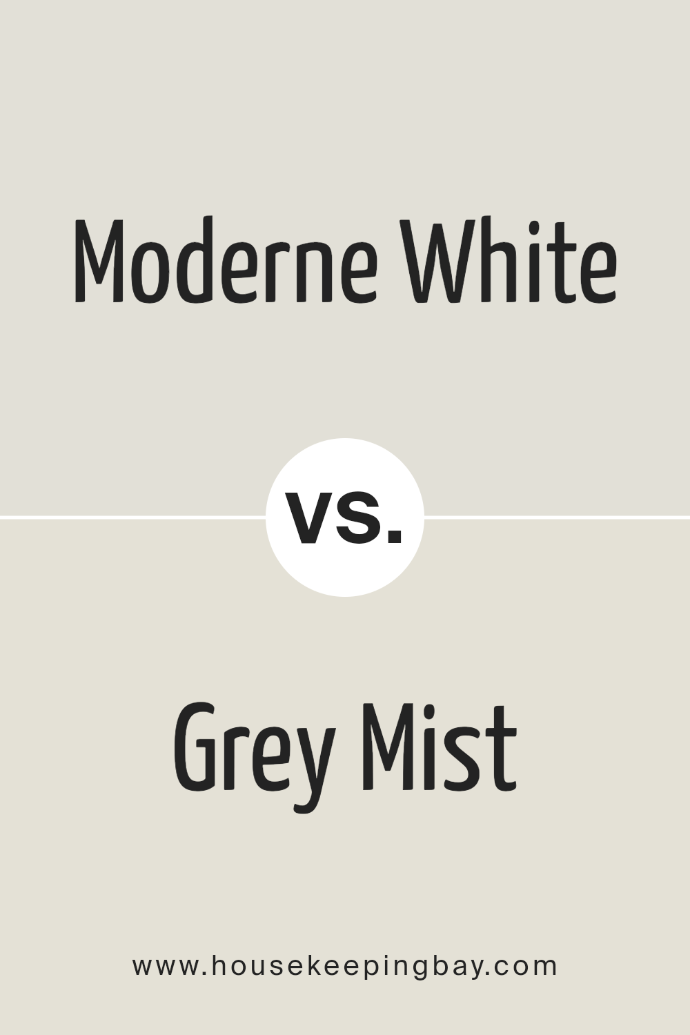
Moderne White SW 6168 by Sherwin Williams vs Grey Mist SW 9625 by Sherwin Williams
Moderne White SW 6168 by Sherwin Williams and Grey Mist SW 9625 by Sherwin Williams are two intriguing colors that offer distinct vibes and aesthetic appeals. Moderne White is a serene and inviting off-white that exudes a soft, warm glow. It has a gentle creamy undertone that makes spaces feel more expansive and luminous, perfect for creating a subtle, calming ambiance in any room. This color is versatile, pairing well with a wide range of decors and styles, from modern to traditional.
On the other hand, Grey Mist is a light, airy grey with subtle blue-green undertones, giving it a cool, soothing presence. This color has the ability to transform spaces into tranquil havens, providing a fresh, contemporary look. Grey Mist’s understated elegance makes it ideal for achieving a minimalist aesthetic or as a neutral backdrop that complements bolder colors.
While both colors promote a sense of calm and elegance, Moderne White leans towards a warmer, inviting palette, whereas Grey Mist offers a cooler, more serene atmosphere. This contrast allows each color to stand out uniquely, catering to different aesthetic preferences and design needs.
You can see recommended paint color below:
housekeepingbay.com
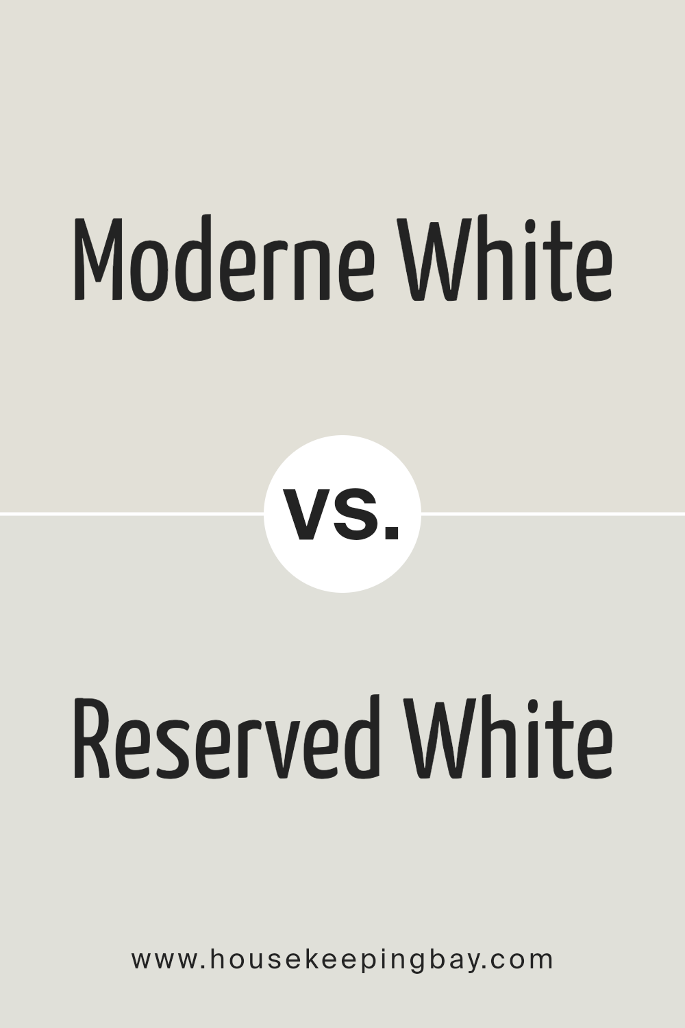
Moderne White SW 6168 by Sherwin Williams vs Reserved White SW 7056 by Sherwin Williams
Moderne White SW 6168 and Reserved White SW 7056, both by Sherwin Williams, present subtle yet distinct differences within the white color space, making them unique choices for different settings and design aesthetics. Moderne White leans towards a warm, inviting tone with a softness that exudes an aura of elegance and comfort. Its warmth is conducive to creating an atmosphere that is cozy and approachable, making it an excellent choice for living spaces that aim for a welcoming and soothing ambiance.
Conversely, Reserved White SW 7056 steps back slightly with a cooler, more neutral stance. This color maintains a sophisticated edge, providing a clean and crisp background that complements contemporary and minimalist designs. It is particularly effective in spaces that seek to emphasize simplicity and modernity, where the intention is to create an environment that feels open, airy, and uncluttered.
The choice between Moderne White and Reserved White hinges on the desired emotional tone and aesthetic of a space. Where Moderne White brings warmth and softness, Reserved White delivers neutrality and clarity, each offering a distinct palette to craft environments that reflect individual style and purpose.
You can see recommended paint color below:
housekeepingbay.com
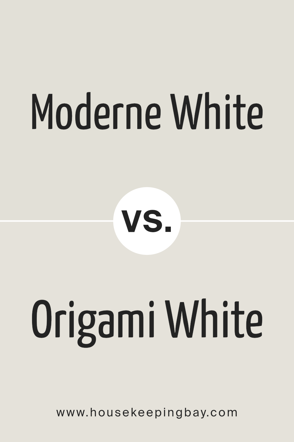
Moderne White SW 6168 by Sherwin Williams vs Origami White SW 7636 by Sherwin Williams
Moderne White SW 6168 and Origami White SW 7636, both from Sherwin Williams, are two nuanced shades that offer subtle yet distinct atmospheres within interior spaces. Moderne White, as the name suggests, is a modern, fresh shade of white that leans towards a soft, warm tone, providing a welcoming yet contemporary feel to rooms. It reflects a significant amount of light, making spaces appear larger and more open, which is perfect for minimalist or modern decor styles seeking a touch of warmth.
On the other hand, Origami White SW 7636 has a slightly cooler undertone compared to Moderne White. It is a versatile color that balances well between warm and cool, making it exceptionally adaptive to various lighting conditions and decorative styles. Origami White can be seen as more of a neutral backdrop, supporting an array of color palettes and furnishings without imposing a specific temperature tone on the space.
Choosing between these two depends on the desired atmosphere and the specific characteristics of the space, such as lighting and decor. Moderne White offers a hint of coziness and warmth, ideal for living areas and bedrooms, while Origami White provides a clean, neutral canvas suitable for any room, enhancing spatial perception and versatility in decorating.
You can see recommended paint color below:
housekeepingbay.com
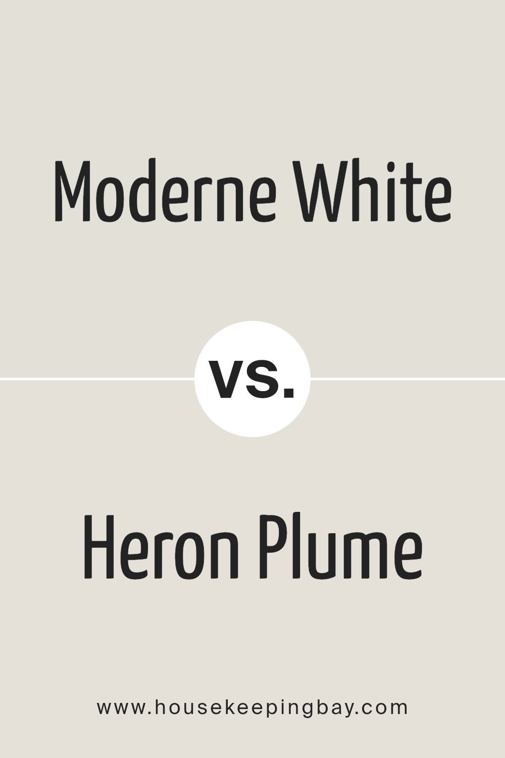
Moderne White SW 6168 by Sherwin Williams vs Heron Plume SW 6070 by Sherwin Williams
Moderne White SW 6168 and Heron Plume SW 6070, both by Sherwin Williams, embody a serene palette, yet they hold subtle differences that set them apart. Moderne White leans towards a soft, warm white that radiates a slight creamy undertone, making it an excellent choice for spaces looking to encapsulate a cozy yet bright ambiance. This color thrives in natural light, showcasing its warmth and providing a soothing backdrop that feels welcoming.
Heron Plume, on the other hand, strays slightly towards the realm of neutrals with a gentle nod to warm gray undertones. It’s a versatile shade that bridges the gap between white and light gray, offering a hint of depth that is both sophisticated and elegant. This color is adept at creating an illusion of spaciousness while maintaining a touch of warmth, making it suitable for a variety of rooms and lighting conditions.
When comparing the two, Moderne White is your quintessential warm white, promoting brightness and airiness, whereas Heron Plume introduces a nuanced complexity with its grayish warmth. Both colors are harmonious yet distinct, allowing them to cater to varied aesthetic preferences and design needs.
You can see recommended paint color below:
housekeepingbay.com
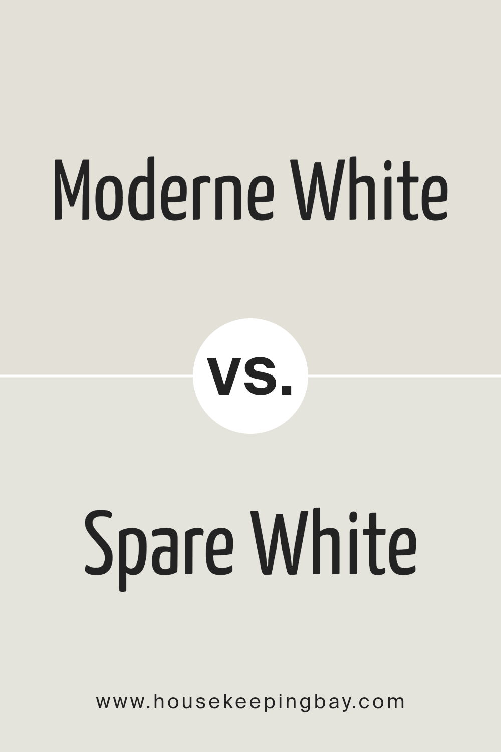
Moderne White SW 6168 by Sherwin Williams vs Spare White SW 6203 by Sherwin Williams
Moderne White SW 6168 and Spare White SW 6203 by Sherwin Williams are both nuanced shades of white, but they carry distinct undertones and atmospheres. Moderne White steps softly into the realm of warm neutrals, giving a cozy, inviting feel to spaces. Its subtle inclination towards a creamy base allows it to radiate a soft glow, making rooms feel more intimate and welcoming.
This quality makes it particularly suitable for living areas and bedrooms where a gentle, calming effect is desired.
On the other hand, Spare White SW 6203 leans towards the cooler end of the spectrum. It harbors a faint hint of gray, which imparts a crisp, clean look akin to a breath of fresh air. This slight coolness makes Spare White an excellent choice for modern, minimalist designs where the goal is to create spaces that feel open, airy, and uncluttered. It’s particularly adept at enhancing natural light, making it a favorite for bathrooms, kitchens, and small spaces.
While both colors embody the essence of simplicity and elegance inherent in white paints, their underlying tones provide distinct moods and effects. Choosing between them boils down to the atmosphere one aims to create: warmth and coziness with Moderne White or crispness and clarity with Spare White.
You can see recommended paint color below:
housekeepingbay.com
Conclusion
Moderne White SW 6168 by Sherwin Williams stands out as a versatile and sophisticated paint color that effortlessly brings an element of calm and understated elegance to any space it graces. Its subtle warmth and minimalistic charm make it a favored choice for homeowners and designers seeking to create serene, inviting environments.
With its ability to act as a neutral backdrop, it supports a wide range of decor styles, from contemporary to traditional, allowing for a seamless integration into various interior spaces. Whether used in living areas to enhance the sense of openness and light or applied in bedrooms for a soft, restful ambiance, Moderne White offers a timeless aesthetic that adapts beautifully to evolving trends and personal tastes.
The strength of Moderne White lies in its exceptional adaptability and the way it complements other colors and materials, enhancing textures and furnishings without overwhelming them. This quality makes it particularly ideal for those looking to achieve a balanced and harmonious interior milieu.
Moreover, its versatility extends beyond the walls; it is equally effective on trim, ceilings, and cabinetry, providing a cohesive look throughout the home.
As a paint color that transcends seasonal styles, Moderne White SW 6168 by Sherwin Williams not only serves as a solid foundation for various design themes but also contributes to a sense of well-being and tranquility, making it a smart and enduring choice for any decorating project.
housekeepingbay.com
Ever wished paint sampling was as easy as sticking a sticker? Guess what? Now it is! Discover Samplize's unique Peel & Stick samples. Get started now and say goodbye to the old messy way!
Get paint samples
