Pearly White 7009 SW Paint Color by Sherwin-Williams
Discover this beautiful white that can add calmness and elegance to your home
White is one of the most widely used colors in our homes. Thanks to its versatility and the ability to work well with most colors, white is very welcomed in any house or apartment. Also, it can brighten the space up, which is why brighter shades of white are often used in smaller rooms to make them seem larger.
But today, we would like to explore another kind of white with you. This color is called Pearly White and it does remind of a pearl a bit. We will explain what kind of white it is, how it works in different rooms, and how to coordinate it correctly.
And of course, from this article, you will get a lot more helpful information and tips that will allow you to use this beautiful hue in your home like a pro!
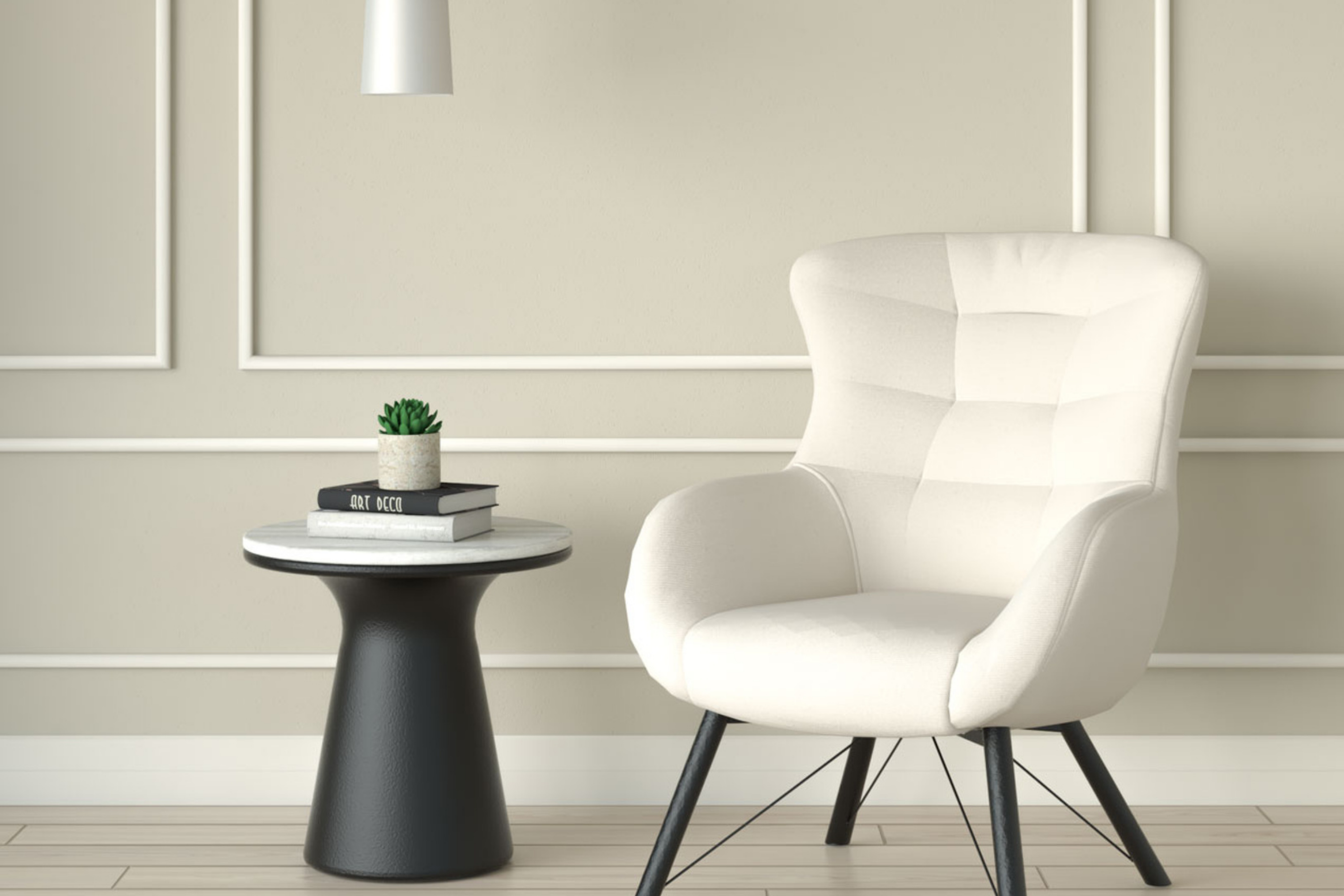
via roomdesign
What Kind of Color Is SW Pearly White 7009?
Table of Contents
SW Pearly White is the color that belongs to the white and pastel color family (hue). Thanks to its balanced hue and calm appearance, SW Pearly White is often considered neutral greige. However, it doesn’t look like typical crisp white we are all used for.
SW Pearly White reads bright yet somewhat soft thanks to beige undertones. At the same time, this beige hue doesn’t make the white seem warm because it’s undertones are cool-toned.
As Encycolorpedia says, this color looks elegant on its own. But also, it can be a lovely way to help darker hues stand out in your home.
housekeepingbay.com
Is It a Warm or Cool Color?
In terms of tone, Pearly White (SW 7009) is considered a warm white color, but it has no prominent yellow undertones unlike most warm-toned colors. This is why this neutral paint color mostly reads neither too warm nor too cold. Thanks to such a balanced nature, you won’t find it displaying that yellowish hue on your interior walls.
However, in terms of undertones, it may also read grey, depending on the lighting conditions in a room.
This color can be a nice option if you want to make a space feel cozier without forcing it to feel too warm. At the same time, due to the warmer tone, SW Pearly White might not work quite well in a cool-toned interior.
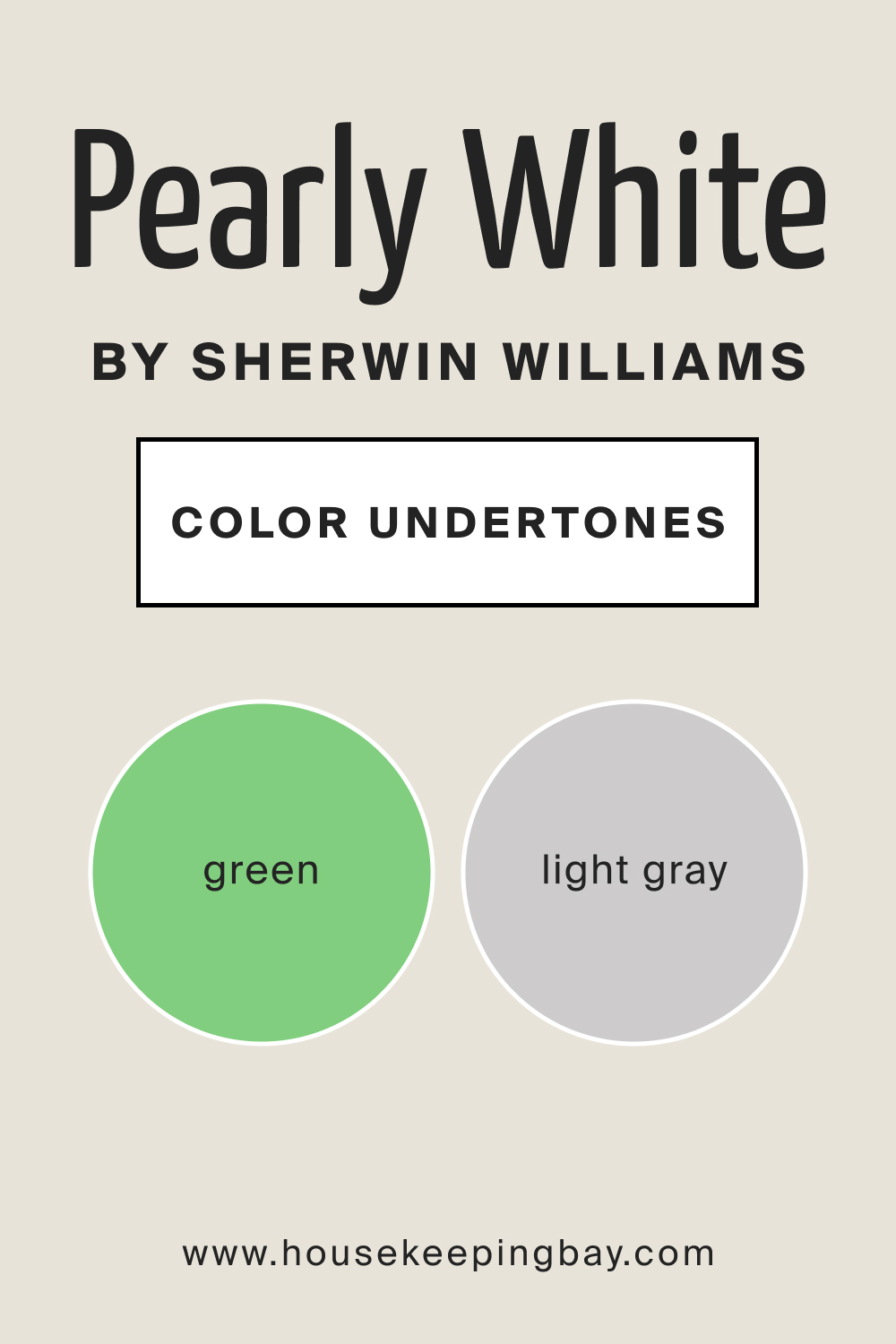
What Undertones Does SW Pearly White Paint Color Have?
Undertones play an essential role in how colors read in your home. Speaking of SW Pearly White, this color is pretty complex.It is a muted cream paint color with soft beige undertones.
However, it may also occasionally show a hint of a green hue, as well as slight grayish undertones in specific lighting conditions. Because of such a tricky nature, this white must be always sampled before you use it in your home!
housekeepingbay.com
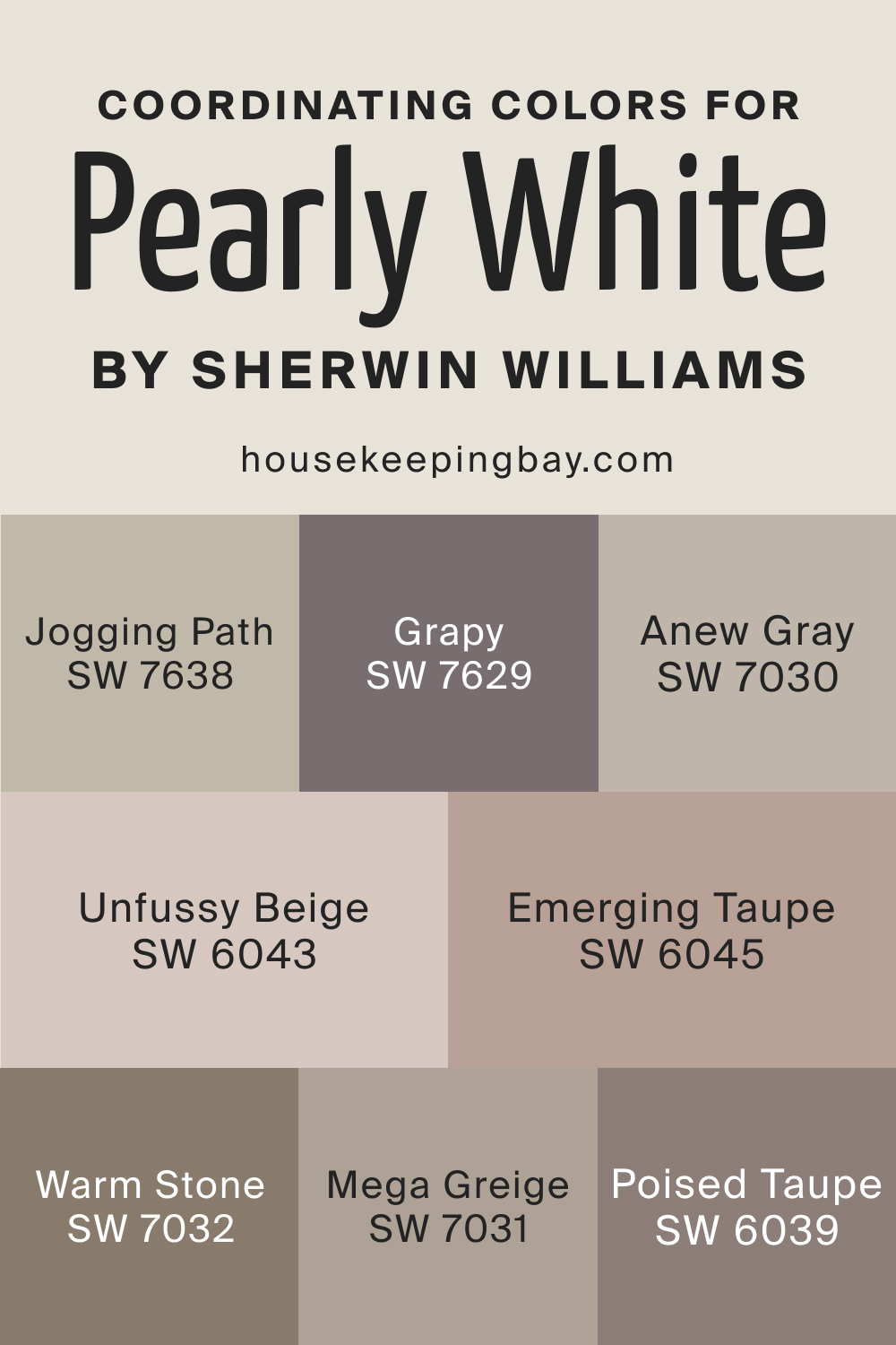
SW Pearly White 7009 Coordinating Colors
Choosing the best coordinating colors is the key if you want to achieve a balanced and good-looking palette in your home.
But it can be challenging to pick up the optimal coordinating colors for such a tricky hue as SW Pearly White! This is why we have prepared a few color suggestions for yout o check out.
The following ones are universal color options:
- SW 7638 Jogging Path
- SW 7629 Grapy
For a monochromatic palette, consider using the following paint colors:
- SW 7030 Anew Gray
- SW 7031 Mega Greige
- SW 7032 Warm Stone
On the other hand, here are a few of the colors you might want to consider for a contrasting color palette.
- SW 6043 Unfussy Beige
- SW 6045 Emerging Taupe
- SW 6039 Poised Taupe
Anyway, you should select coordinating colors depending on the interior design style you have. Generally, since SW Pearly White may show slightly peachy/pink undertones, we recommend pairing it with taupes, mauves, dusty pinks, dusty reds, blush, and also charcoal blue and grays to achieve a contrasting look.
housekeepingbay.com
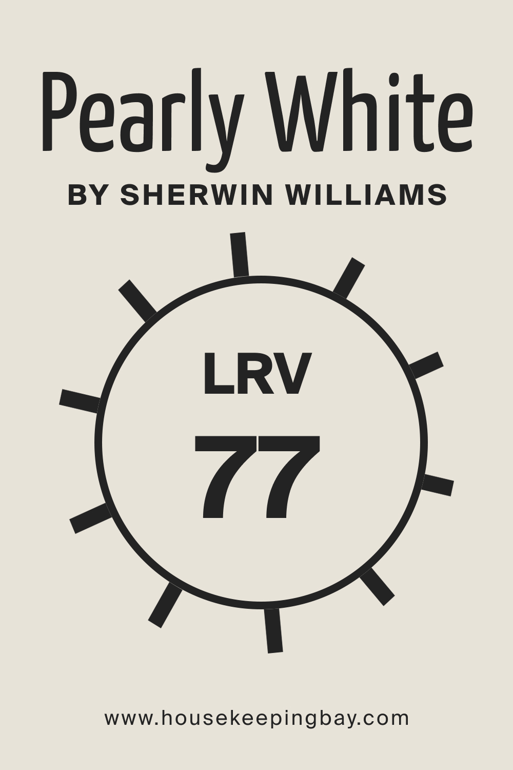
What LRV Does This Color Have and How It Reacts to Light
The LRV (light reflectance value) of SW Pearly White is 77, that means it is an extremely light-toned paint color! For those who don’t know, LRV shows how much light colors can reflect from the wall. The closer the LRV value to 100, the lighter and more reflective the hue. Respectively, colors whose LRVs are reaching zero, read darker and reflect less light.
housekeepingbay.com
Since SW Pearly White is already pretty light, it will tend to read washed out when used in the east or west-facing rooms. Also, in a room with ample natural light, it will most likely look much lighter and brighter.
In east, west, and south-facing rooms, this paint will appear slightly warmer. However, this white hue can still be a good option to use even in the rooms with little to no natural light!
housekeepingbay.com
What is LRV? Read It Before You Choose Your Ideal Paint Color
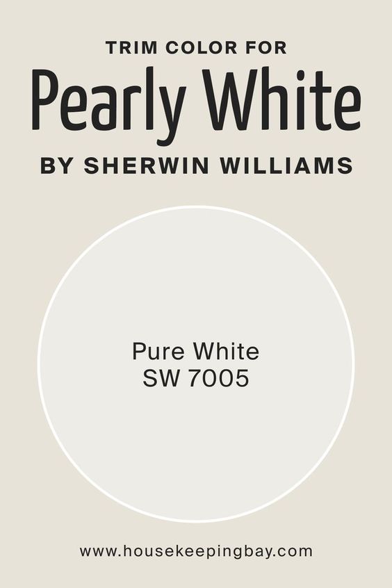
What Is the Best Trim Color to Use With SW Pearly White 7009?
Since white is the most commonly used trim color, you might be wondering how to pair two different whites on the same space. Well, if you have SW Pearly White on your walls, you can use the same color on your trim and even the ceilings!
However, if you want a more clear contrast between the trim and the walls, you might want to consider a lighter and “whiter” white like SW Pure White.
housekeepingbay.com
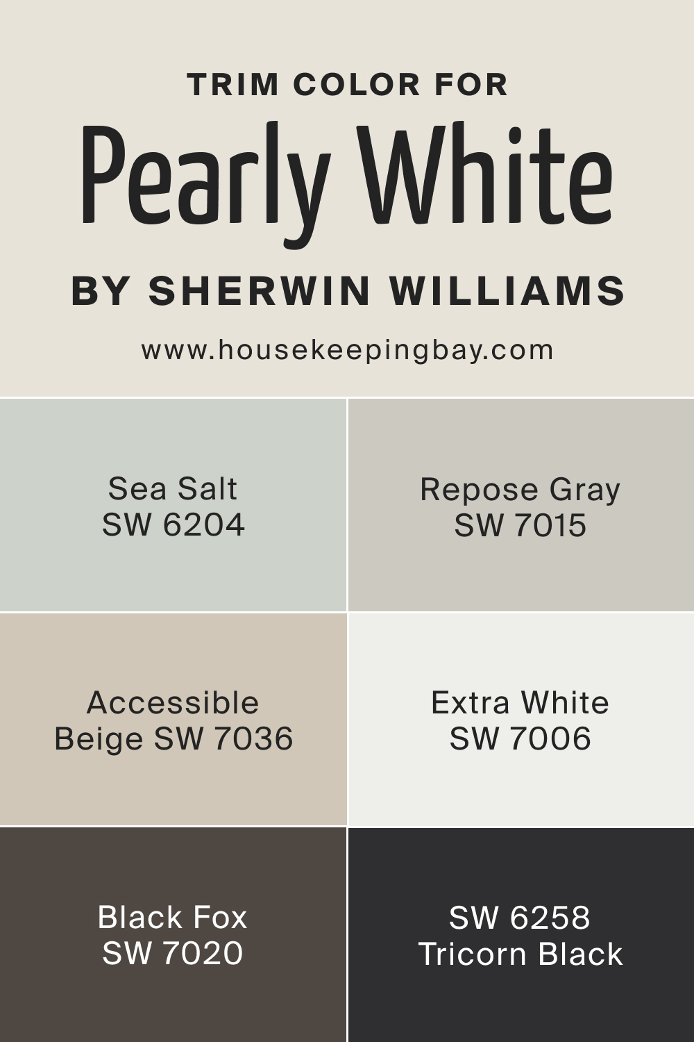
Choosing the right trim color for Pearly White can enhance its elegance and charm. If you want something brighter, you can check the options below.
They offer a range of styles from modern and crisp to warm and cozy.
- Extra White (SW 7006) is a bright, clean white that creates a crisp, modern look, perfect for a fresh contrast with Pearly White.
- Accessible Beige (SW 7036) is a warm, neutral beige that adds a soft, cozy feel, pairing beautifully with Pearly White for a welcoming space.
- Tricorn Black (SW 6258) is a bold, dramatic black that makes a striking statement, giving a sophisticated and elegant look when used as trim.
- Sea Salt (SW 6204) is a serene, pale green that brings a touch of tranquility, complementing Pearly White perfectly and adding a calming vibe to any room.
- Repose Gray (SW 7015) is a versatile, light gray that provides a subtle contrast, working well with Pearly White to create a balanced and harmonious space.
- Black Fox (SW 7020) is a deep, rich brown-black that adds depth and character, creating a warm and inviting atmosphere when paired with Pearly White.
housekeepingbay.com
Visualisations:
housekeepingbay.com
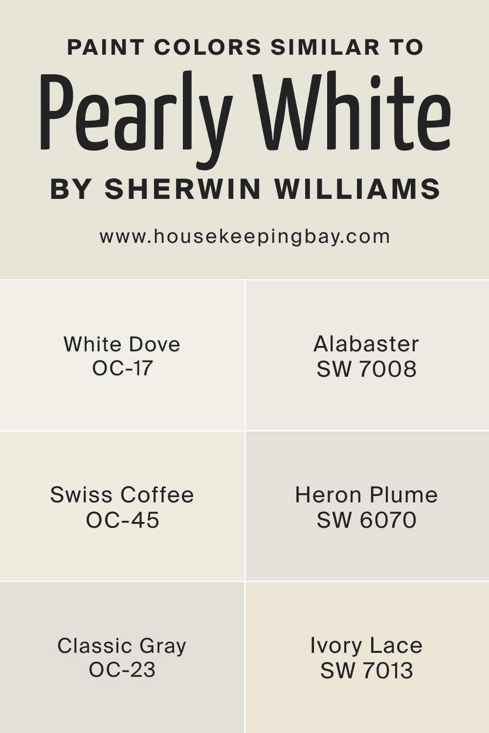
Colors Similar to SW Pearly White 7009
If you can’t use the paint color you initially wanted in your home, you can always opt for one of the similar colors instead. This is why it is good to know what other hues can work as substitutes for the paint color you were going to apply.
Of course, note that you will not find an ideal color match! There are no two totally the same colors. Nevertheless, we can suggest you several alternative whites.
- BM White Dove OC-17
- SW 7008 Alabaster
- BM Swiss Coffee OC-45
- BM Classic Gray OC-23
- SW 6070 Heron Plume
- SW 7013 Ivory Lace
housekeepingbay.com
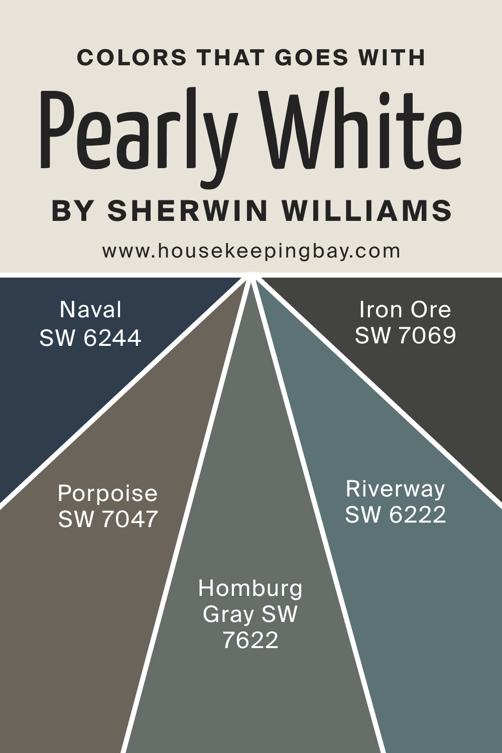
Colors That Go Well With Pearly White 7009 by Sherwin-Williams
Knowing what hues your paint color goes with will help you with making the entire space look balanced and welcoming. As for the SW Pearly White, this neutral can be paired with several colors.
For example, it works well with warm gray paint colors with similar undertones, creams, off-whites, greens, and purples. Below, you can check out which ones exactly will work better:
- SW 7069 Iron Ore
- SW 7047 Porpoise
- SW 6222 Riverway
- SW 7622 Homburg Gray
- SW 6244 Naval
housekeepingbay.com
Where to Use SW Pearly White 7009 In Your Home?
The one great feature of SW Pearly White color is that it is easy to incorporate into your interior. This color can make a great statement in very small and even medium-sized homes. It will make a space seem and feel larger and enhanced.
Also, this white can be easily used in almost any room and on nearly any surface. Moreover, SW Pearly White can also be used as exterior paint. Below, you can find out more about how this calming neutral paint will work in different rooms of your home.
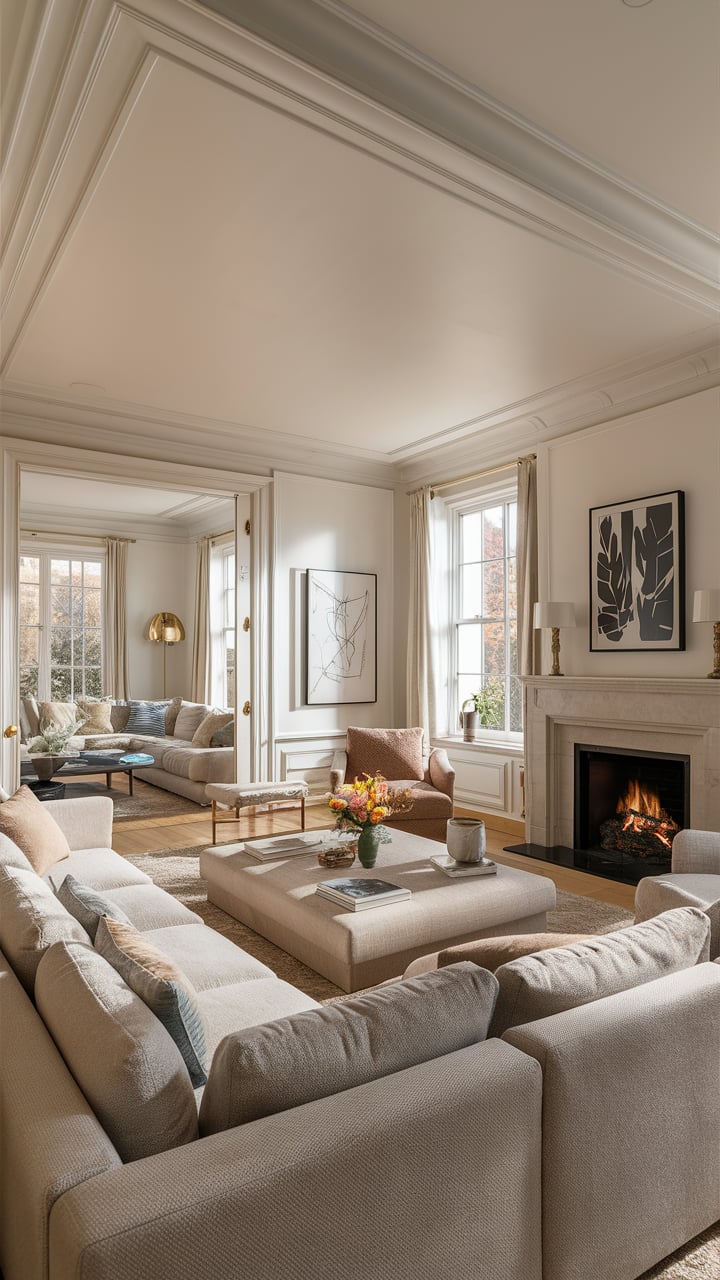
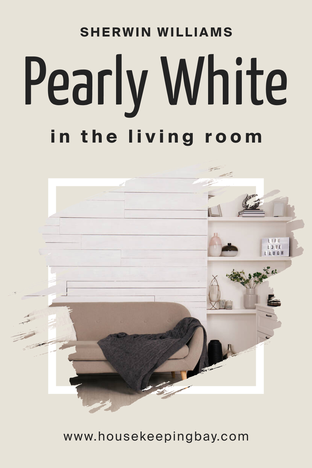
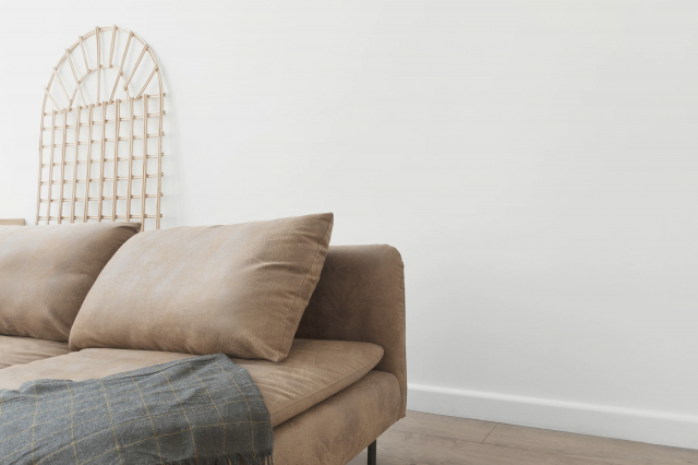
Pearly White 7009 in the Living Room
This white color can add a pleasant and relaxed vibe to your living room, making it feel cozy and welcoming. Also, since SW Pearly WHite reads balanced on the walls, the space won’t feel too warm. You can add brighter whites to your living room through the trim to make it feel fresher and lighter. Also, don’t hesitate to use this white along with hardwood floors and wooden furniture!
housekeepingbay.com
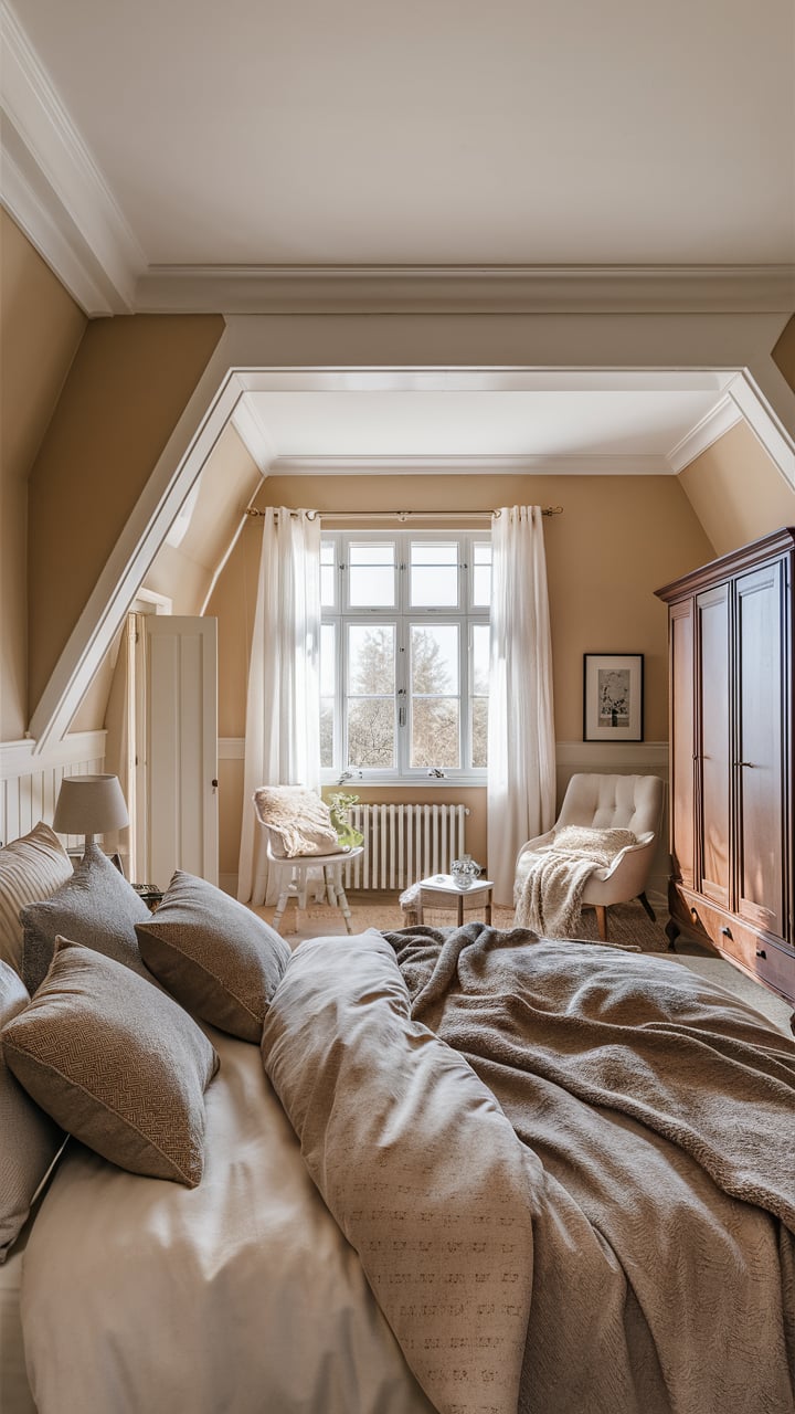
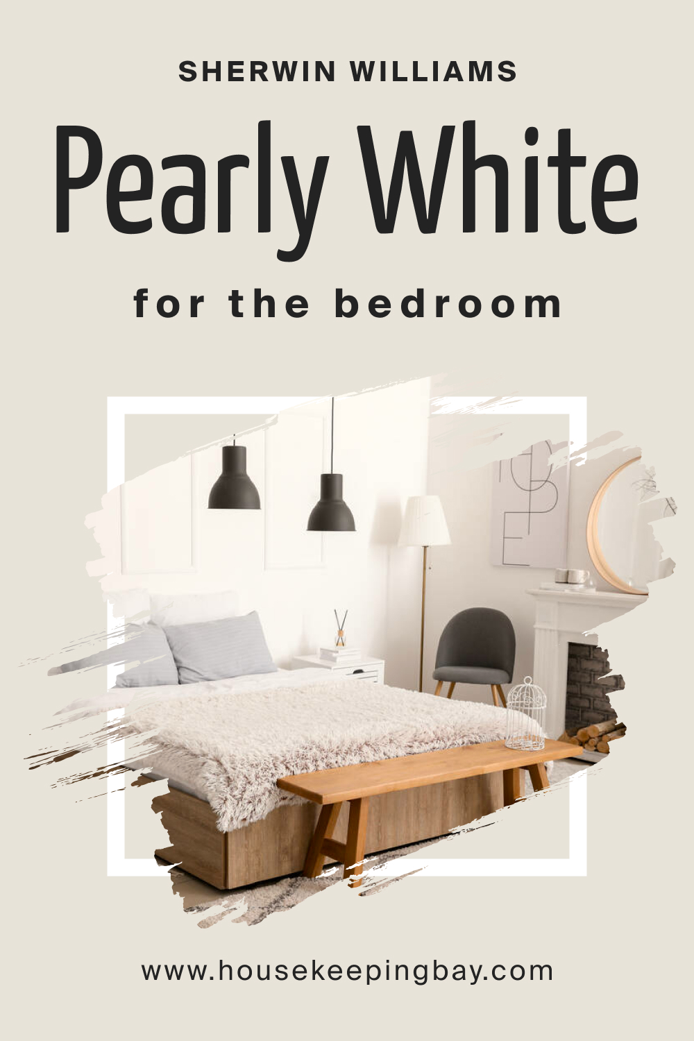
Pearly White 7009 in a Bedroom
SW Pearly White is a lovely hue for bedrooms! It makes your sleeping space feel tranquil and soothing with the help of a balanced warmth this color has. We recommend you use more brighter whites along with this delicate neutral. This will help you make your bedroom feel airier and lighter.
Aslo, SW Pearly White will read lovely in warm artificial lights, so don’t hesitate to use warm bulbs there!
As an option, you might want to use this paint as the neutral or base in your bedroom and pair it with the darker paint for the accent wall. Also, blackout curtains with bold hues like beiges and taupes will add the statement to your bedroom.
housekeepingbay.com
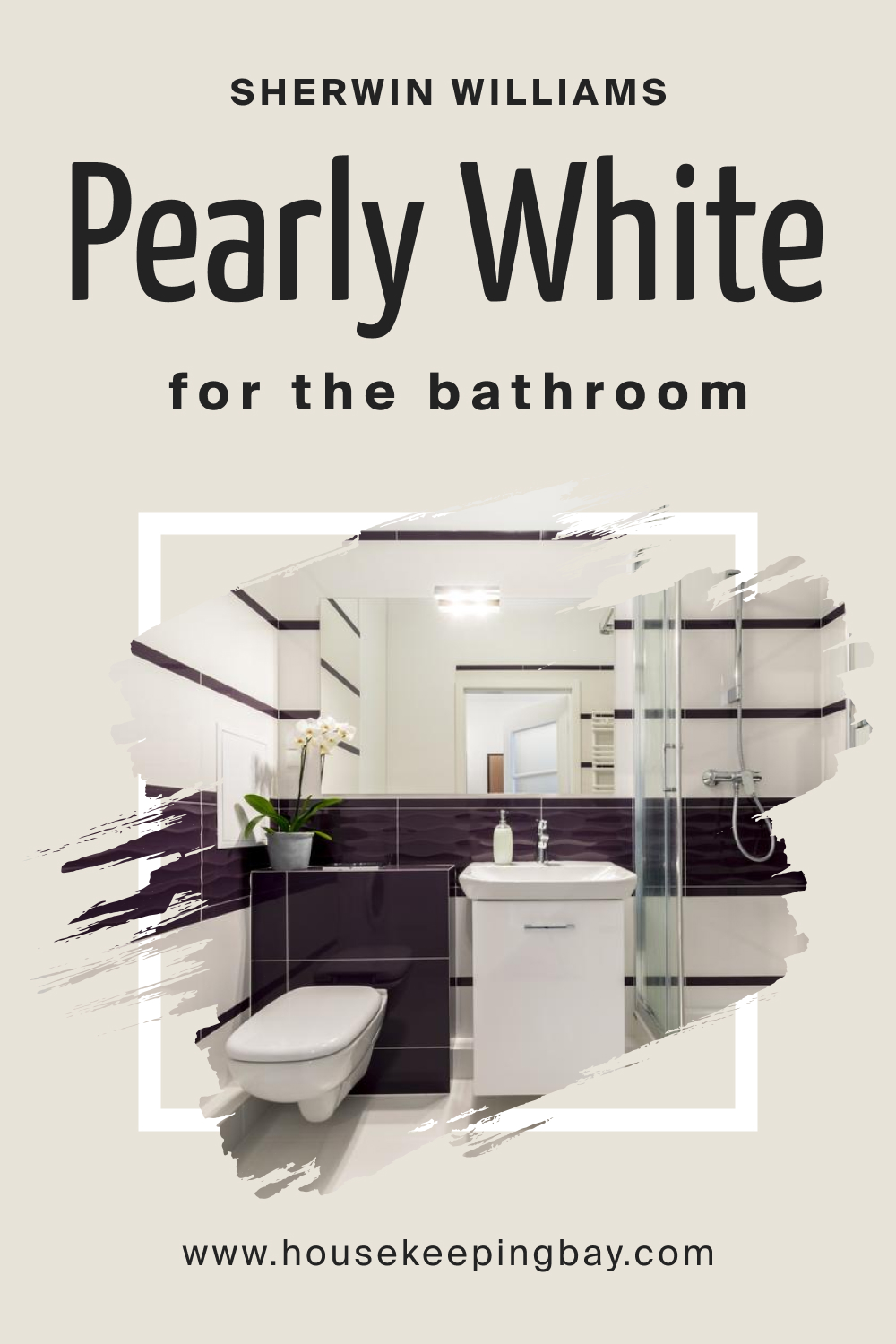
Pearly White 7009 and Bathroom
In a bathroom with enough natural light,SW Pearly White may read quite nicely, creating a relaxed feel. But it can also work in a smaller bathroom that lacks proper light! In this case, ensure there’s enough brighter white there. For best results, we recommend you use this hue for the transitional style and pair it with brass or matte black light fixtures.
housekeepingbay.com
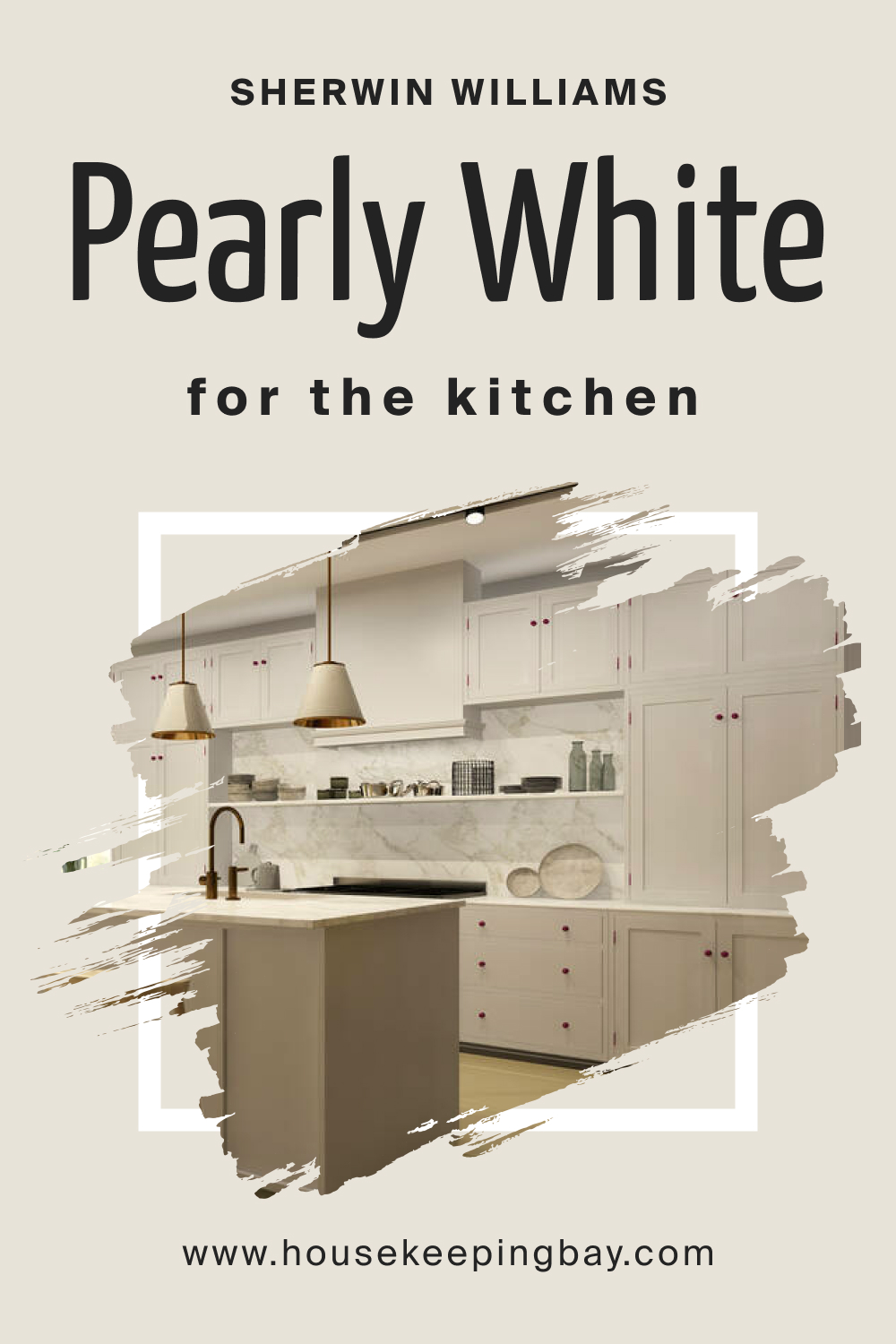
Pearly White 7009 on the Kitchen
In your kitchen, this neutral white can work on upper/lower cabinets, as well as on your kitchen island. But also, you can use it as a wall color and pair with more saturated hues on cabinetry and island (e.g, blues or charcoal). Anyway, this white hue pairs nicely with tiles and wooden surfaces, so it won’t be a problem to make it work in your kitchen no matter where you use it!
housekeepingbay.com
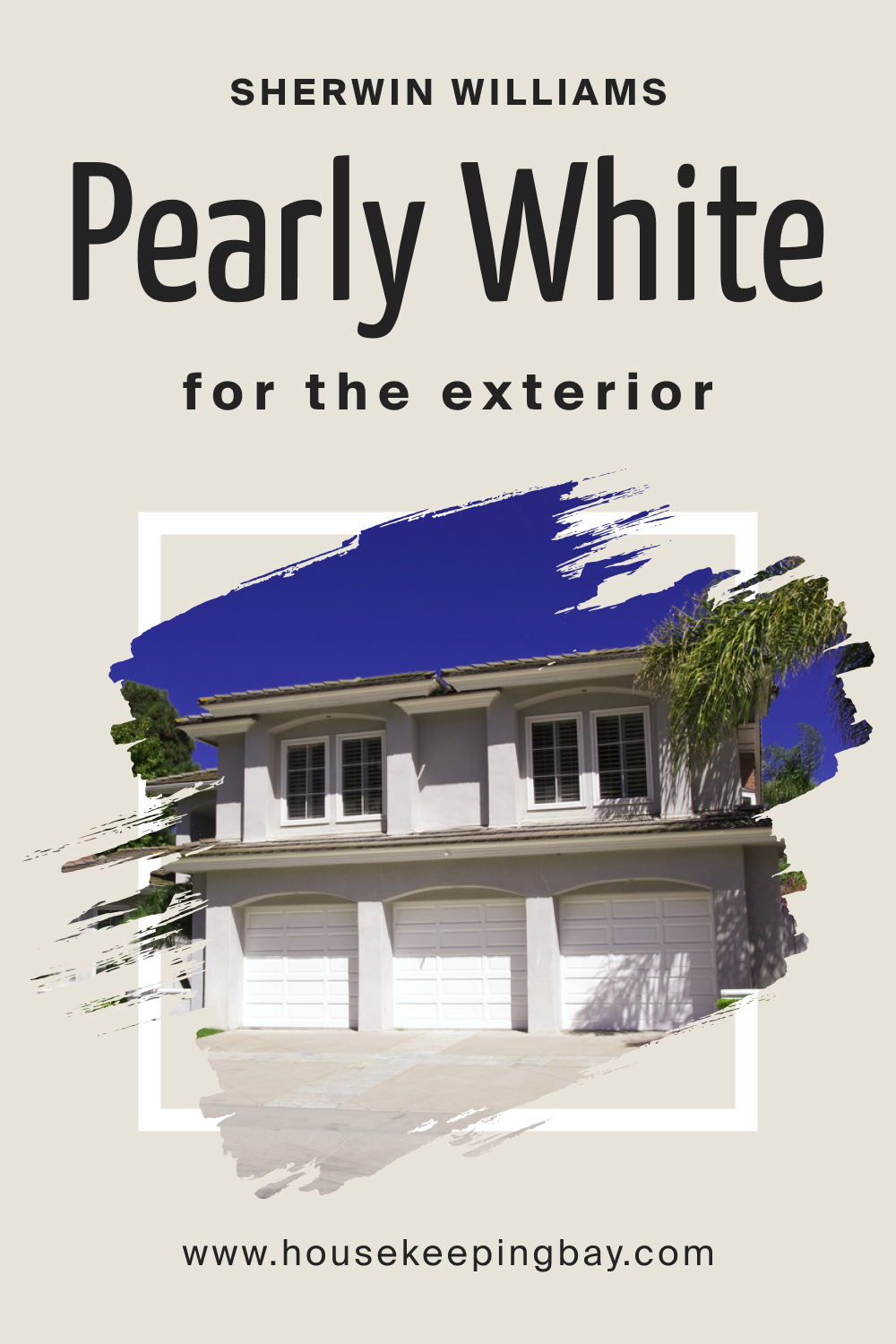
Pearly White 7009 for the Exterior Use
Thanks to its soft and balanced appearance, SW Pearly White works well on exterior walls. Nevertheless, note that in broad daylight, this white will read washed out, being hit by direct sun! But in any case, it won’t look crisp or cold, of course.
SW Pearly White is timeless, which is why you can use it for most of the exterior designs. Besides, this white hue is a good color option to play with, pairing it with darker shutters and front door colors. For instance, you can either pair it with black or grey accents through trims, moldings, and door and window frames.
housekeepingbay.com
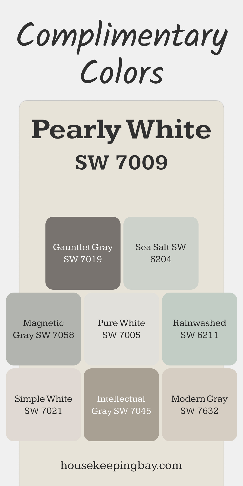
Complimentary Colors for Pearly White SW 7009 Paint Color by Sherwin Williams
Pearly White SW 7009 pairs beautifully with versatile and soothing tones. For contrast, Gauntlet Gray and Magnetic Gray offer bold yet balanced shades, while Modern Gray and Intellectual Gray add subtle depth. These combinations enhance Pearly White’s understated elegance.
For a lighter touch, Pure White or Simple White brighten spaces effortlessly. Sea Salt and Rainwashed bring a gentle pop of color, making them ideal for a fresh, inviting look alongside Pearly White.
via housekeepingbay.com
Comparing SW Pearly White 7009 With Other Colors
To help you see how distinct LRVs and undertones can make colors from the same hue family differ, we compared SW Pearly White with several related hues below. This will allow you to see the differences between similar hues better.
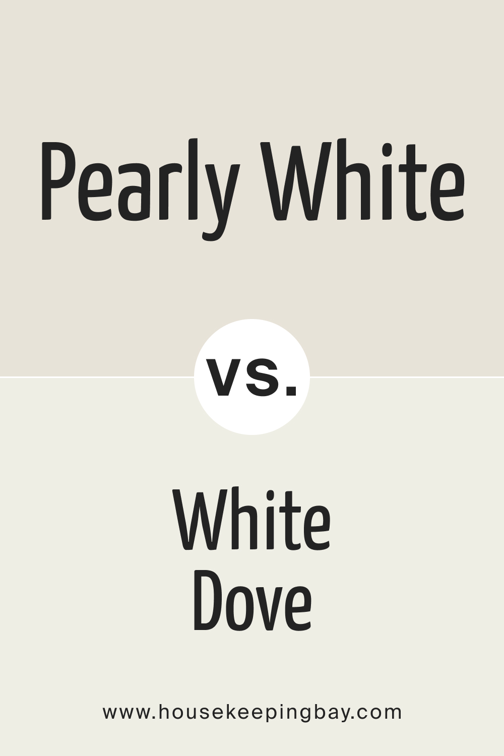
Pearly White vs. BM OC-17 White Dove
While both colors are warm whites, Pearly White leans slightly more towards beige, adding a touch of coziness to your space. In contrast, White Dove’s gray undertones give it a bit more sophistication and versatility. If you’re looking for a color that feels inviting and cozy, Pearly White might be the better choice. However, if you prefer a timeless, versatile white that works well in various settings, White Dove could be the way to go.
Both Pearly White and White Dove are excellent choices, each bringing a unique quality to your interiors. Consider the overall look and feel you want to achieve, and how each color complements your existing décor, to make the best choice for your home.
housekeepingbay.com
Pearly White vs. SW 7008 Alabaster
Both Pearly White and Alabaster are warm whites, but Pearly White leans more towards beige, while Alabaster has a slight hint of yellow. This difference can impact the overall feel of your space. Pearly White tends to create a cozier, more intimate atmosphere, while Alabaster offers a light, airy feel that can make spaces look more open and inviting.
If you want a color that feels slightly cozier and pairs well with a range of trim options, Pearly White might be the best choice. On the other hand, if you prefer a versatile, creamy white that adds a soft glow to your rooms, Alabaster could be the ideal option.
Both colors are excellent choices, each bringing a unique quality to your interiors. Consider the specific mood you want to achieve and how each color complements your existing décor to make the best decision for your home.
housekeepingbay.com
Pearly White vs. SW 7005 Pure White
The primary difference between Pearly White and Pure White lies in their undertones and the overall ambiance they create. Pearly White has beige undertones, which lend it a warmer and cozier feel. In contrast, Pure White is a true white, offering a clean and crisp appearance that can make spaces feel more open and bright.
If you’re looking for a white that adds a touch of warmth and coziness, Pearly White might be the better choice. On the other hand, if you prefer a clean, neutral white that can adapt to various design styles and create a fresh, bright look, Pure White could be the ideal option.
Both colors are excellent choices, each bringing its own unique quality to your interiors. Consider the mood you want to achieve and how each color complements your existing décor to make the best decision for your home.
housekeepingbay.com
Pearly White vs. SW 7042 Shoji White
While both Pearly White and Shoji White are warm whites, Pearly White leans more towards beige, creating a cozier, more intimate atmosphere. In contrast, Shoji White has greige undertones, giving it a softer and more sophisticated look. Shoji White’s muted tone can add depth and interest to a space without overwhelming it.
If you want a color that feels warm and cozy, Pearly White might be the best choice. On the other hand, if you prefer a warm white with a touch of elegance and subtle sophistication, Shoji White could be the ideal option.
housekeepingbay.com
Pearly White vs. SW 7004 Snowbound
The main difference between Pearly White and Snowbound lies in their undertones and the overall ambiance they create. Pearly White has beige undertones, which lend it a warmer and cozier feel. In contrast, Snowbound has gray undertones, offering a cooler and crisper appearance that can make spaces feel more open and modern.
If you’re looking for a white that adds warmth and coziness, Pearly White might be the better choice. On the other hand, if you prefer a clean, cool white that can adapt to various design styles and create a fresh, bright look, Snowbound could be the ideal option.
housekeepingbay.com
Pearly White vs. SW 7551 Greek Villa
Both Pearly White and Greek Villa are warm whites, but Pearly White has a more pronounced beige undertone, creating a cozier, more intimate atmosphere. In contrast, Greek Villa has creamy undertones, giving it a slightly brighter and more classic look.
If you want a color that feels warm and cozy, Pearly White might be the best choice. On the other hand, if you prefer a warm white with a touch of elegance and brightness, Greek Villa could be the ideal option.
housekeepingbay.com
Now you know more about SW Pearly White paint color. It is an exceptional choice for those seeking a warm, inviting white that exudes coziness and elegance. Its subtle beige undertones create a comforting ambiance, making it ideal for living rooms, bedrooms, and other spaces where a welcoming atmosphere is desired.
This versatile color pairs beautifully with a variety of trim options, from crisp whites to darker tones, allowing for endless design possibilities. Whether you’re aiming for a modern, cozy, or classic look, Pearly White offers the perfect balance of warmth and sophistication, making it a timeless addition to any home.
housekeepingbay.com
Ever wished paint sampling was as easy as sticking a sticker? Guess what? Now it is! Discover Samplize's unique Peel & Stick samples. Get started now and say goodbye to the old messy way!
Get paint samples


Frequently Asked Questions
⭐Does SW Pearly White read yellow?
Typically it doesn’t. This neutral leans towards beige more.
⭐Will SW Pearly White work with dark emerald green?
It can work with this green, but this can bring out green undertones of the SW Pearly White!
⭐Does this white work with marble countertops?
Yes, it pairs nicely with marble surfaces.
4 thoughts on “Pearly White 7009 SW Paint Color by Sherwin-Williams”
Leave a Reply


Hi! Thanks for this article so much! I was struggling to figure out whether this color is white or greige, or maybe beige…You’re doing such great job!
Hello! Thanks you for your kind comment! We’re happy to be helpful for our readers!
I have painted my house in SW Pearly White, but now I can’t figure out what color to use on the front door. Could you recommend something to me? Black is not an options, but any other color will be considered. Thanks!
Well, it depends on how you want your front door to look. E.g., if you want a more subtle hue, you might want to try something like SW Delft or even lighter (e..g, SW Topsail). But I guess that chestnut brown may also work lovely on your front door if you’re into a more contrasting look.