Frosty White SW 6196 by Sherwin Williams
Unveiling the Serenity of Winter's Whisper
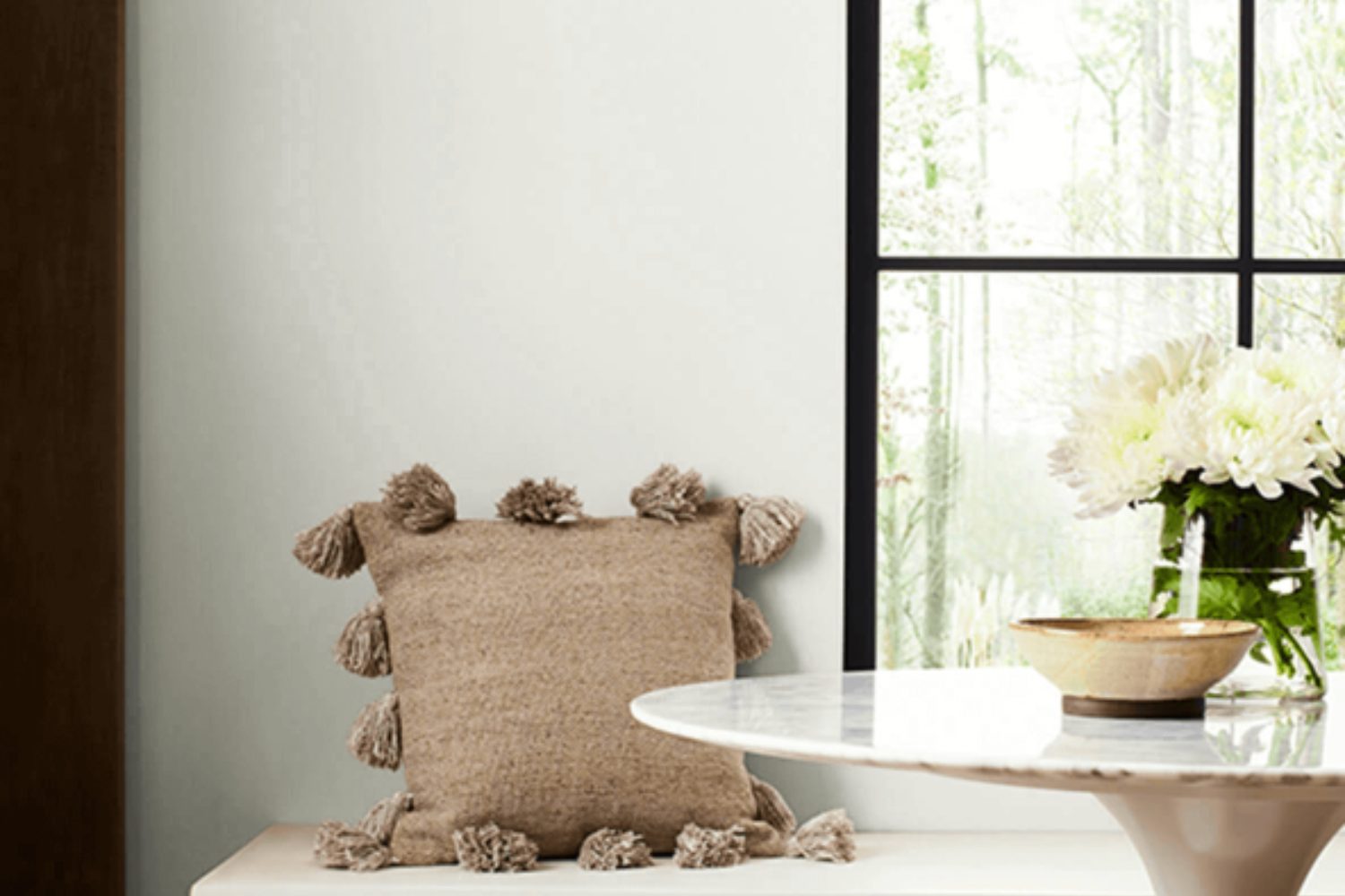
When you’re looking for a paint color that brings in a breath of fresh air to your space, SW 6196 Frosty White by Sherwin Williams might just be the hue you need. This paint color stands out for its ability to blend seamlessly into various settings, offering a clean, pristine look that refreshes and opens up any room. Imagine transforming your space into a serene retreat where every moment feels lighter and brighter.
Frosty White is more than just a paint color; it’s a path to redefining your living space. Whether you’re looking to spruce up your living room, bedroom, or even the kitchen, this color brings in a subtle charm that harmonizes with various decor styles and preferences. Its versatility means you can pair it with bold colors for a dynamic contrast or keep things calm with soft, neutral tones. Plus, it’s perfect for creating a sense of more space, making it ideal for rooms of any size.
Choosing Frosty White is an effortless way to elevate your home’s aesthetic. It’s like a quick refresh button, offering an easy update that can dramatically shift how a room feels and looks. So, if you’re ready to transform your space into a brighter, more inviting place, SW 6196 Frosty White is a fantastic choice to consider.
via Sherwin Williams
What Color Is Frosty White SW 6196 by Sherwin Williams?
Frosty White SW 6196 by Sherwin Williams is a soft, subtle hue that brings to mind the quiet beauty of a snowy morning. This color has a refined and understated elegance that makes it perfect for creating serene and inviting spaces. It’s not a stark white, which means it carries a warmth that can make a room feel cozy yet spacious.
This versatile color works wonders in a variety of interior styles. Whether you’re looking to create a minimalist Scandi vibe, a classic traditional look, or even a modern farmhouse aesthetic, Frosty White can be the backdrop to your vision. It’s particularly effective in small spaces or rooms with limited natural light, as its brightness can help to make these areas appear larger and more open.
Frosty White pairs beautifully with a wide range of materials and textures, adding depth and interest to any room. Natural wood, from light oak to rich walnut, complements its warmth, creating an earthy, welcoming feel. Metals like brushed nickel or brass can add a touch of sophistication, while soft textiles in muted colors or bold patterns provide contrast and visual interest. Whether you’re incorporating plush fabrics, sleek finishes, or rustic elements, Frosty White is a splendid choice that harmonizes with nearly any design element you choose.
housekeepingbay.com
Is Frosty White SW 6196 by Sherwin Williams Warm or Cool color?
Frosty WhiteSW 6196 by Sherwin Williams is a cool, clean shade of white that adds a fresh and airy feel to any room in your home. This particular color is great if you’re looking to brighten up a space or make it appear more spacious. Since it’s a neutral tone, it works really well with almost any other color, giving you a lot of flexibility when it comes to decorating and choosing furniture.
In homes, Frosty White can help create a calm and relaxing atmosphere. It’s perfect for living rooms, bedrooms, and even kitchens, as it reflects natural light beautifully, making the room look vibrant and more inviting. Because of its lightness, it can also help highlight other elements in the room, like artwork or unique furniture, making them stand out as focal points.
This color is especially good for smaller rooms or spaces with limited natural light, as it can help make them feel bigger and brighter. Whether you’re going for a modern, minimalist look, or something more classic, Frosty WhiteSW 6196 offers a versatile backdrop that can support a wide range of styles and tastes.
What is the Masstone of the Frosty White SW 6196 by Sherwin Williams?
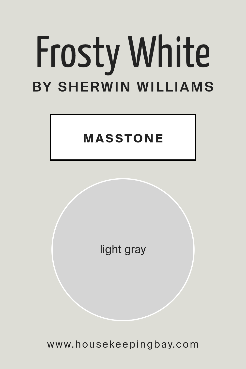
Frosty White SW 6196 by Sherwin Williams has a masstone that looks like a light gray, close to the color code #D5D5D5. This color is super versatile in homes because it brings a fresh, clean look to any room. Imagine a blank canvas; that’s what Frosty White provides. It’s like starting with a clean slate every time you walk into a room. This light gray shade is really good at making spaces feel bigger and brighter because it reflects light well. It’s not too stark like a pure white, so it adds a cozy, soft touch that makes rooms feel more inviting.
Since it’s such a calm and neutral color, Frosty White works well with almost any other color, from bold and bright to soft and subtle. This means you can add your favorite colors through furniture and decorations without worrying about them clashing. Plus, it’s great for people who like changing things up often because it’s easy to match with different styles and themes. Whether you have a modern, minimalist, or cozy country vibe, Frosty White can fit right in and help create a beautiful home environment.
housekeepingbay.com
Coordinating Colors of Frosty White SW 6196 by Sherwin Williams
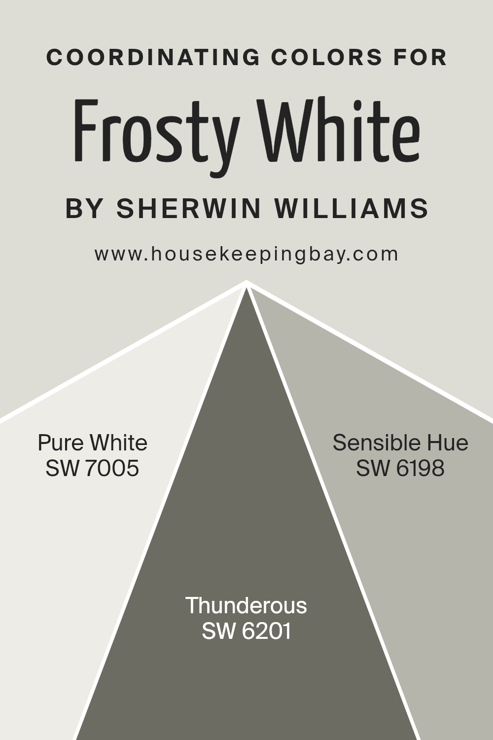
Coordinating colors are hues that work well together to create a visually appealing look in any space, whether on walls, fabrics, or accessories. They can highlight, complement, or subtly blend with the main color to enhance the overall aesthetic appeal of a room. When selecting coordinating colors, consider the color’s undertone, intensity, and how it interacts with natural and artificial light. For instance, Frosty White SW 6196 by Sherwin Williams is a versatile color that pairs beautifully with several other shades to achieve balance and harmony in any room.
Pure White SW 7005 is a clean, neutral white that provides a crisp contrast to Frosty White, offering a fresh and airy feel. It’s perfect for trim, ceilings, or as an accent color, adding a sense of purity and simplicity to any design. Thunderous SW 6201, on the other hand, is a deep, moody gray that adds depth and sophistication.
It works well in spaces that aim for a more dramatic or cozy atmosphere, complementing Frosty White by providing a striking contrast. Sensible Hue SW 6198 is a soft, warm gray with earthy undertones, creating a soothing and inviting space. It naturally complements Frosty White, ensuring a seamless transition between colors for a cohesive and tranquil ambiance.
You can see recommended paint colors below:
- SW 7005 Pure White
- SW 6201 Thunderous
- SW 6198 Sensible Hue
housekeepingbay.com
How Does Lighting Affect Frosty White SW 6196 by Sherwin Williams?
Lighting plays a crucial role in how colors look in any space, and it can dramatically change the appearance of paint colors on your walls. Considering the color Frosty White SW 6196 by Sherwin Williams, its appearance can vary widely under different lighting conditions – from natural light to artificial light.
- In natural light, colors can look very different depending on the direction the light is coming from. North-facing rooms often get less direct sunlight, making colors appear cooler and somewhat shadowy. In a north-facing room, Frosty White might look a bit more subdued and can lean towards a slightly cooler, more muted tone. It won’t be as stark or bright but will maintain a clean, crisp look that enhances the feeling of space.
- South-facing rooms bask in abundant sunlight for most of the day, which can warm up colors. Frosty White in a south-facing room will look brighter and more vibrant, with its underlying warm tones peeking through, giving the space a welcoming and lively feel.
- East-facing rooms receive bright morning light, which is warm and yellow, shifting to cooler, softer light as the day progresses. In these rooms, Frosty White will start the day with a cheerful, bright appearance, gradually transitioning to a cooler, more neutral shade by the afternoon, maintaining a fresh and serene vibe throughout the day.
- West-facing rooms catch the afternoon and evening light, which is warmer and can be quite intense. Frosty White in these rooms might feel warmer during the afternoon and take on a softer glow by sunset, creating a cozy and inviting space that’s perfect for relaxing in the evenings.
- Artificial lighting brings another layer of complexity. Warm lights will enhance the cozy and inviting aspects of Frosty White, making it appear softer and more welcoming, ideal for living spaces. Cooler lights, on the other hand, can make Frosty White appear crisper and brighter, which might be preferred in workspaces or bathrooms for a clean and energizing atmosphere.
In summary, Frosty White SW 6196’s versatility under different lighting conditions makes it a popular choice for many spaces, adapting beautifully to the mood and function of each room.
housekeepingbay.com
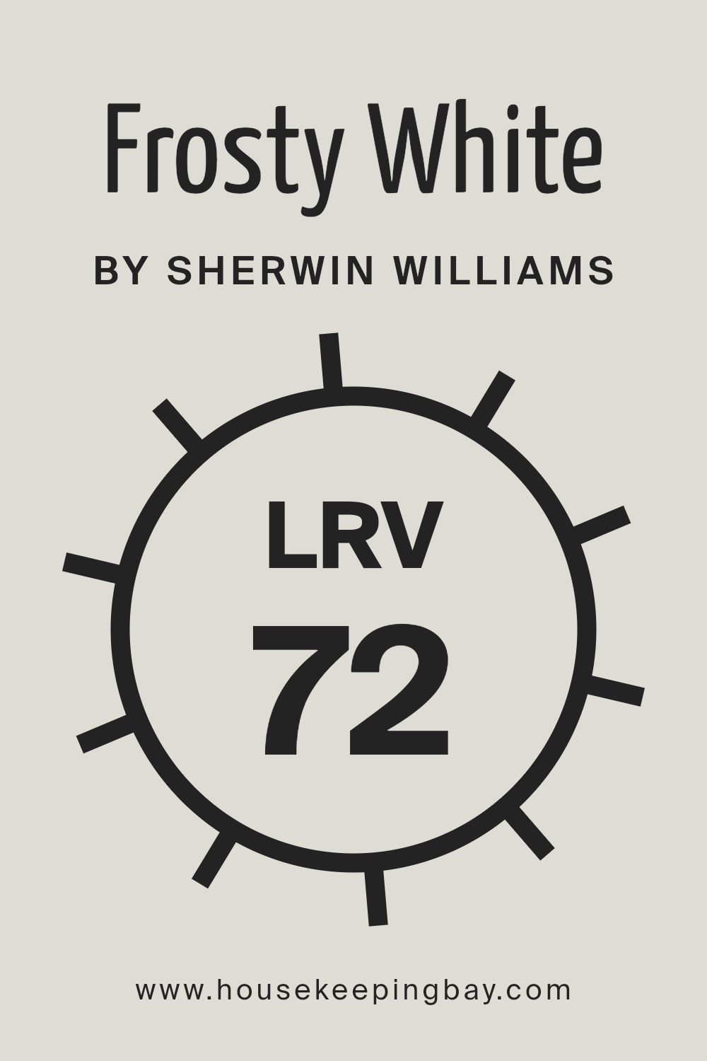
What is the LRV of Frosty White SW 6196 by Sherwin Williams?
For Frosty White (SW 6196) by Sherwin Williams, which has an LRV of 72.027, it’s in the range where it reflects a good amount of light without being too stark or bright. This means that in natural daylight, Frosty White will help make a room feel lively and open, brightening up the space significantly. In spaces with less natural light, it can still help make the room feel brighter than it actually is.
This particular LRV value is versatile because it means Frosty White can be used in a variety of settings and lighting conditions, helping to create a light and welcoming ambiance without overwhelming the senses.
housekeepingbay.com
What are the Trim colors of Frosty White SW 6196 by Sherwin Williams?
Trim colors are essentially the hues selected for the edges or frames around architectural features like doors, windows, and baseboards, as well as for molding and ceilings. These colors play a crucial role in interior design, as they can either subtly complement the main wall color, bringing a sense of harmony and continuity to a space, or stand out by contrasting sharply, thereby outlining and accenting the architectural details of a room.
When considering Frosty White SW 6196 by Sherwin Williams, which is a serene and clean shade, choosing the right trim colors is essential to achieve the desired aesthetic and ambiance in a space.
Ceiling Bright White SW 7007 is an excellent trim choice for rooms painted with Frosty White SW 6196, as this color is a pure and crisp white that can make ceilings appear higher and spaces more expansive, introducing a breath of fresh air into the room. It has the unique ability to blend seamlessly while also brightening the overhead space, thus enhancing natural light.
Worldly Gray SW 7043, on the other hand, offers a subtle contrast as a trim color with its warm, earthy tones. This shade brings a sense of warmth and sophistication to the edges of a room, providing a gentle but noticeable boundary that enriches the overall look. When used alongside Frosty White, both Ceiling Bright White and Worldly Gray serve not only to define spaces clearly but also to create an inviting and cohesive atmosphere.
You can see recommended paint colors below:

housekeepingbay.com
Colors Similar to Frosty White SW 6196 by Sherwin Williams
Within the world of interior design and decoration, the choice of color plays a pivotal role in setting the ambiance of a space, and selecting similar colors can ensure a harmonious and tranquil environment. Similar colors, such as those akin to Frosty White SW 6196 by Sherwin Williams, like SW 7646 – First Star, and SW 7666 – Fleur de Sel, offer subtle variations in hue that allow for consistency in design while injecting slight contrasts that add depth and character to a room. These near-identical shades can create a sophisticated layering effect, making spaces appear larger and more inviting. For instance, First Star is a gentle gray with a soft undertone, perfect for creating a serene backdrop, whereas Fleur de Sel introduces a whisper of warmth, suggesting a cozy, welcoming vibe.
Exploring further, colors such as SW 6168 – Moderne White and SW 9626 – Glacier Bay, draw on different elements of the color spectrum to enhance natural light and articulate a sense of calm. Moderne White, with its creamy presence, adds an element of softness to interiors, contrasting subtly with Glacier Bay’s crisp and airy feel.
On the other hand, colors like SW 7056 – Reserved White and SW 6182 – Ethereal White offer a grounding effect, with Reserved White providing a stable, classic feel, and Ethereal White bringing in an almost invisible touch of pink for a hint of warmth. Delving into more nuanced territory, SW 6189 – Opaline and SW 6203 – Spare White carry understated green and blue undertones respectively, promoting a refreshing and clean aesthetic.
Lastly, SW 9627 – Pacific Fog and SW 9571 – Solstice venture into the realm of cool sophistication, with Pacific Fog embodying the misty hues of a seaside morning, and Solstice reflecting the quietude of the winter solstice sky. Together, these shades epitomize the importance of similar colors in designing spaces that are both visually cohesive and richly layered.
You can see recommended paint colors below:
- SW 7646 First Star
- SW 7666 Fleur de Sel
- SW 6168 Moderne White
- SW 9626 Glacier Bay
- SW 7056 Reserved White
- SW 6182 Ethereal White
- SW 6189 Opaline
- SW 6203 Spare White
- SW 9627 Pacific Fog
- SW 9571 Solstice
housekeepingbay.com
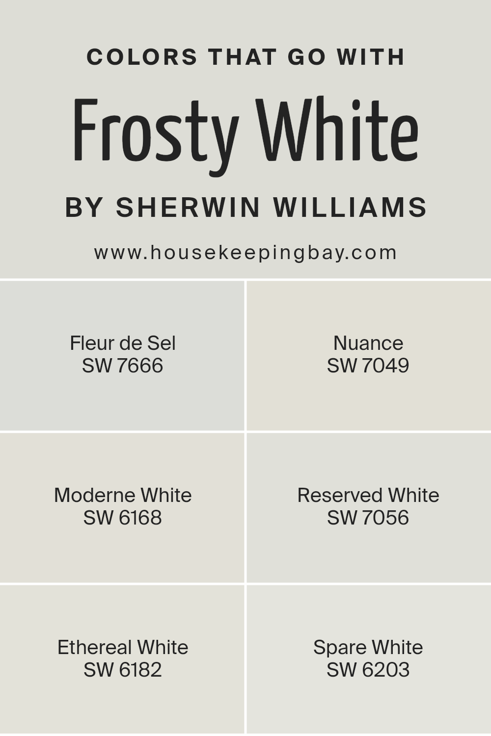
Colors that Go With Frosty White SW 6196 by Sherwin Williams
Choosing the right colors to complement Frosty White SW 6196 by Sherwin Williams can significantly enhance the aesthetics of a space, creating an inviting and cohesive look. These colors are chosen for their harmonious relationship with Frosty White, offering a balanced and visually appealing palette. By selecting colors that blend effortlessly with Frosty White, one can achieve a subtle yet sophisticated ambiance that enhances the room’s overall appeal.
The compatibility of these colors with Frosty White ensures that they won’t clash but will instead provide a seamless transition between shades, promoting a sense of continuity and flow throughout the space.
- Fleur de Sel SW 7666 is a soft, airy gray that brings a sense of calm and serenity, making it perfect for creating a peaceful retreat.
- Nuance SW 7049, on the other hand, is a light greige that offers a warm and inviting feel, ideal for spaces where comfort and coziness are key.
- Moderne White SW 6168 leans towards a warm white, providing a fresh yet inviting canvas that pairs beautifully with the coolness of Frosty White for a harmonious blend.
- Reserved White SW 7056 offers a slightly cooler tone, lending a crisp, clean look that’s perfect for modern and minimalist designs.
- Ethereal White SW 6182 has a touch of softness that can brighten rooms while keeping the atmosphere light and airy.
- Lastly, Spare White SW 6203 has a cool undertone, offering a subtle contrast that enhances the visual interest of a space without overwhelming it.
Together, these colors create diverse yet unified designs that can accommodate a wide range of personal styles and preferences, making Frosty White a versatile and appealing choice for any room.
You can see recommended paint colors below:
- SW 7666 Fleur de Sel
- SW 7049 Nuance
- SW 6168 Moderne White
- SW 7056 Reserved White
- SW 6182 Ethereal White
- SW 6203 Spare White
housekeepingbay.com
How to Use Frosty White SW 6196 by Sherwin Williams In Your Home?
Frosty White SW 6196 by Sherwin Williams is a popular paint color known for its clean and crisp appearance. It’s like a breath of fresh air in any room, making spaces feel more open and airy. This color is incredibly versatile, which means it can be used in a variety of ways around your home.
For those looking to refresh their living room or bedroom, Frosty White can make the area look bigger and more welcoming. It’s perfect for walls, creating a neutral backdrop that allows furniture and decor to stand out. In kitchens, applying Frosty White on cabinets or walls can brighten the space, making it feel clean and organized.
This color also works well in bathrooms, adding a sense of cleanliness and serenity. And, if you’re someone who enjoys changing up decor frequently, Frosty White provides a flexible base that pairs well with almost any color scheme or decorating style.
Overall, Frosty White SW 6196 is a great choice for creating a fresh, inviting home atmosphere.
Frosty White SW 6196 by Sherwin Williams vs Ethereal White SW 6182 by Sherwin Williams
Frosty White SW 6196 and Ethereal White SW 6182 by Sherwin Williams are two light shades that might seem similar at first glance, but they have their unique tones. Frosty White leans towards a cooler, almost icy look, giving off a fresh and clean vibe. It’s the kind of white that can make a space feel more open and bright, especially in rooms with lots of natural light.
Ethereal White, on the other hand, has a slightly warmer tone. This warmth adds a cozy feel to it, making it perfect for spaces where you want to relax and feel comfy, like living rooms or bedrooms. It’s still a very light color, but the warmth makes it more inviting compared to the crispness of Frosty White.
Choosing between them depends on the mood you’re aiming for. Frosty White is great for a modern, minimalist look, while Ethereal White suits a softer, more welcoming space.
You can see recommended paint color below:
housekeepingbay.com
Frosty White SW 6196 by Sherwin Williams vs Glacier Bay SW 9626 by Sherwin Williams
Frosty White SW 6196 and Glacier Bay SW 9626 by Sherwin Williams are both beautiful colors, but they have their unique vibes. Frosty White is like a soft blanket of snow on a quiet winter morning. It’s very light and has a hint of warmth, making it perfect for making rooms feel open and airy. It brings a cozy, gentle atmosphere that’s soothing and calm.
On the other hand, Glacier Bay is a cool, refreshing color, reminding you of icy waters and clear skies. It’s deeper than Frosty White and carries a hint of blue that makes it feel fresh and vibrant. This color is great for creating a crisp, invigorating space that feels alive and full of energy.
If you’re choosing between the two, consider the mood you want to set. Frosty White is great for a soft, serene space, while Glacier Bay adds a lively, fresh touch to a room. Both colors offer a clean, modern look, but they cater to different tastes and atmospheres.
You can see recommended paint color below:
housekeepingbay.com
Frosty White SW 6196 by Sherwin Williams vs Reserved White SW 7056 by Sherwin Williams
Frosty White SW 6196 and Reserved White SW 7056 by Sherwin-Williams are two subtly different shades that can change the vibe of a space. Frosty White leans towards a clean, bright shade that gives off a fresh and airy feel. It’s like the first snowfall, bringing a lightness to any room. This color can make small spaces appear more open and bigger.
On the other hand, Reserved White is a bit warmer and has a cozy touch to it. It doesn’t shout for attention but rather quietly adds sophistication and a sense of calm to the walls. Reserved White can be the perfect backdrop for rooms where you want to relax and feel at ease, allowing other decor elements to shine without competing for attention.
Both colors are quite versatile, but Frosty White might be better for those looking for a crisp, vibrant space, while Reserved White suits those after a softer, more inviting atmosphere. Choosing between them depends on the mood you want to create and the natural light in your room.
You can see recommended paint color below:
housekeepingbay.com
Frosty White SW 6196 by Sherwin Williams vs First Star SW 7646 by Sherwin Williams
Frosty White SW 6196 and First Star SW 7646 by Sherwin Williams are both lovely light shades, but they offer different vibes for your space. Frosty White is a true soft white with just a hint of warmth, making it feel cozy yet bright. It’s perfect for creating a calm, inviting atmosphere in any room, reflecting light beautifully to make spaces appear more open and airy.
On the other hand, First Star SW 7646 leans a bit cooler, bordering on a very light gray. This color adds a subtle modern edge to spaces, offering a bit of depth while still keeping the area feeling open and light. It’s great for those looking for a hint of color without overwhelming a room’s aesthetic.
When deciding between them, think about the mood you’re aiming for. Frosty White is ideal for those who want a classic, warm touch, while First Star suits spaces aiming for a crisp, slightly more contemporary feel. Both colors work wonderfully in a variety of spaces, from living rooms to bedrooms, depending on the ambiance you wish to achieve.
You can see recommended paint color below:
housekeepingbay.com
Frosty White SW 6196 by Sherwin Williams vs Opaline SW 6189 by Sherwin Williams
Frosty White SW 6196 by Sherwin Williams and Opaline SW 6189 by Sherwin Williams are two soothing colors that can transform any space. Frosty White is a clean, bright white. It’s like looking at fresh snow under the morning sun – pure and inviting. It creates a sense of space and clarity, making it perfect for any area you want to feel more open and airy.
On the other hand, Opaline is a gentle hint of green mixed into a soft white, similar to the first whisper of spring seen in the garden. It adds a subtle touch of natural vibes to a room, making it feel calm and relaxing. Imagine being in a peaceful, sunny spot filled with greenery – that’s the essence Opaline brings.
Both colors work beautifully in homes, but while Frosty White opens up a room with its bright simplicity, Opaline offers warmth and a connection to the outdoors with its soft, nature-inspired hue. Depending on the mood you want to create, you might choose the crisp openness of Frosty White or the soft, serene atmosphere of Opaline.
You can see recommended paint color below:
- SW 6189 Opaline
housekeepingbay.com
Frosty White SW 6196 by Sherwin Williams vs Fleur de Sel SW 7666 by Sherwin Williams
Frosty White SW 6196 and Fleur de Sel SW 7666 are both colors by Sherwin Williams that share a subtle, understated beauty, but they hold different moods for spaces. Frosty White, as its name hints, is a very light, almost pure white that has a crisp, clean vibe. It’s like a breath of fresh air in a room, offering a blank canvas that makes other colors pop. Perfect for those who prefer a minimalist style or want to make a small room look bigger.
On the other hand, Fleur de Sel SW 7666 is a touch warmer with its soft, light gray tone. It adds a cozy, soothing feel to spaces, making it great for bedrooms or living areas where you want to relax. It’s like the color of soft morning light, gentle and inviting, perfect for creating a tranquil retreat.
While both colors are light and airy, Frosty White leans towards a sharper, more refreshing look, and Fleur de Sel offers warmth and calm. Choosing between them depends on whether you’re aiming for stark simplicity or gentle warmth in your space.
You can see recommended paint color below:
housekeepingbay.com
Frosty White SW 6196 by Sherwin Williams vs Pacific Fog SW 9627 by Sherwin Williams
“Frosty White SW 6196” and “Pacific Fog SW 9627” by Sherwin Williams are two beautiful colors, but quite different from each other. Frosty White, as its name suggests, is a very light, almost pure white color. It gives a fresh and clean vibe to any space, making it feel more open and bright. This color is perfect if you want to create an airy and spacious look in your room. It’s great for walls, ceilings, and even trim, as it pairs well with almost any decor.
On the other hand, Pacific Fog is a soft, muted gray with a touch of warmth. This color adds a cozy and comfortable feeling to any room. It’s more subdued than Frosty White and brings a sense of calm and sophistication. Pacific Fog is ideal for creating a relaxing atmosphere in bedrooms, living rooms, or any space where you want to unwind.
While Frosty White brightens and opens up a space, Pacific Fog offers a snug and inviting ambiance. Depending on what feeling you want to achieve in your room, you might choose the crisp and clean Frosty White or the cozy and serene Pacific Fog.
You can see recommended paint color below:
housekeepingbay.com
Frosty White SW 6196 by Sherwin Williams vs Moderne White SW 6168 by Sherwin Williams
Frosty White SW 6196 and Moderne White SW 6168 by Sherwin Williams are both subtle shades of white, each offering a unique twist to your space. Frosty White leans towards a cooler tone, giving off a crisp, clean vibe that can make a room feel fresh and airy. It’s like the feeling of walking into a room that’s bathed in soft morning light, making it perfect for spaces where you want to feel rejuvenated.
On the other hand, Moderne White is a bit warmer. It’s the kind of color that makes a place feel instantly cozy and welcoming, ideal for creating a snug, comfortable environment. Think of it as the warmth of the afternoon sun filling your room, offering a tranquil space to relax.
While both colors are white, their different undertones can significantly affect the mood and style of a room. Frosty White works well in modern or minimalist designs, adding a sleek touch. Moderne White, with its warm undertones, suits spaces where a soft, inviting ambiance is desired, perfect for living rooms or bedrooms. In choosing between them, consider the atmosphere you want to achieve in your space.
You can see recommended paint color below:
housekeepingbay.com
Frosty White SW 6196 by Sherwin Williams vs Solstice SW 9571 by Sherwin Williams
Frosty White SW 6196 by Sherwin Williams is a bright, clean color that gives a fresh and airy feeling. It’s like looking at a smooth, white surface that reflects light, making spaces appear larger and more open. This color works great for making small rooms feel more spacious or for creating a crisp, minimalist look.
On the other hand, Solstice SW 9571 by Sherwin Williams is a warmer, soothing hue. It’s a kind of color that reminds you of a soft, comforting blanket or a gentle dawn. Solstice brings a cozy warmth to rooms, creating a snug and inviting atmosphere. It’s perfect for areas where you want to relax and feel at ease.
While Frosty White opens up a space with its light-reflecting qualities, Solstice brings warmth and comfort. Frosty White is ideal for a modern, sleek look, whereas Solstice suits a space where warmth and coziness are desired. These two colors offer distinct vibes – one is crisp and vibrant, the other warm and relaxing.
You can see recommended paint color below:
- SW 9571 Solstice
housekeepingbay.com
Frosty White SW 6196 by Sherwin Williams vs Spare White SW 6203 by Sherwin Williams
Frosty White SW 6196 and Spare White SW 6203 by Sherwin Williams are two light shades, but they have their unique differences.
Frosty White leans more towards a clean and pure white. It’s the kind of white you might think of when you imagine a fresh snowfall or a fluffy cloud. This color can make a room feel open and airy, bringing in a sense of calmness. It’s great for spaces where you want to feel refreshed and peaceful.
Spare White, on the other hand, has a subtle hint of gray. This gives it a cooler tone compared to Frosty White. It’s still light and can brighten up a room, but the gray adds a touch of sophistication and modernity. It’s perfect for those who like their white with a bit more depth, making it great for contemporary spaces.
Both colors are versatile and can be used in various settings, but your choice might come down to the mood you want to set. Frosty White for a purer, serene feel and Spare White for a modern, chic ambiance.
You can see recommended paint color below:
housekeepingbay.com
Conclusion
In wrapping up our exploration of Sherwin Williams’ SW 6196 Frosty White, it’s clear that this color is a top choice for anyone looking to refresh their space with a clean, bright look. Its versatility allows you to easily match it with various decor styles, from modern to rustic. Plus, its ability to make a room feel more open and airy is a huge benefit, especially in smaller spaces or rooms with limited natural light.
If you’re considering a new paint color for your home, Frosty White is an excellent option to consider. It brings a sense of calm and simplicity to any room, acting as a perfect backdrop for bolder colors or standing gracefully on its own for a minimalist vibe. Whether you’re updating a single room or planning a larger renovation, Frosty White has the power to transform your space into a serene and welcoming environment.
So, if you’re ready to give your home a fresh, new look, Frosty White by Sherwin Williams might just be the paint color you’re looking for. Its clean, bright charm is sure to enhance your home’s aesthetic and create a space you’ll love. With Frosty White, you’re just a paintbrush away from a beautiful, refreshed home.
housekeepingbay.com
Ever wished paint sampling was as easy as sticking a sticker? Guess what? Now it is! Discover Samplize's unique Peel & Stick samples. Get started now and say goodbye to the old messy way!
Get paint samples


