Zurich White SW 7626 by Sherwin Williams
A Timeless Echo of Alpine Elegance
As the heart of sophisticated design choices, SW 7626 Zurich White by Sherwin Williams stands as a testament to the power of nuanced neutrals. Striking a delicate balance between warmth and coolness, this particular shade of white offers an understated elegance that can transform spaces into serene sanctuaries or invigorating areas, depending on the accompanying decor.
A part of the extensive Sherwin Williams color palette, Zurich White leans towards a soft, warm undertone that makes it incredibly versatile for a variety of settings and styles, from contemporary to traditional.
Incorporating Zurich White into your home or project can brighten spaces, create an illusion of openness, and serve as a seamless backdrop for bolder colors or design elements. Its adaptive nature allows it to play a supporting role in interior and exterior applications, enhancing the aesthetic and atmospheric quality of any room. Whether applied on walls, trim, or cabinets, its creamy richness provides depth and sophistication.
This article delves into the unique attributes of SW 7626 Zurich White, providing insights into its compatibility with different lighting conditions, color pairings, and design applications.
As we explore the myriad ways Zurich White can be utilized to craft inviting, beautifully coordinated spaces, it’s clear that this shade is more than just a color – it’s a catalyst for creating environments that reflect personal style, comfort, and harmony.
via sherwin-williams.com
What Color Is Zurich White SW 7626 by Sherwin Williams?
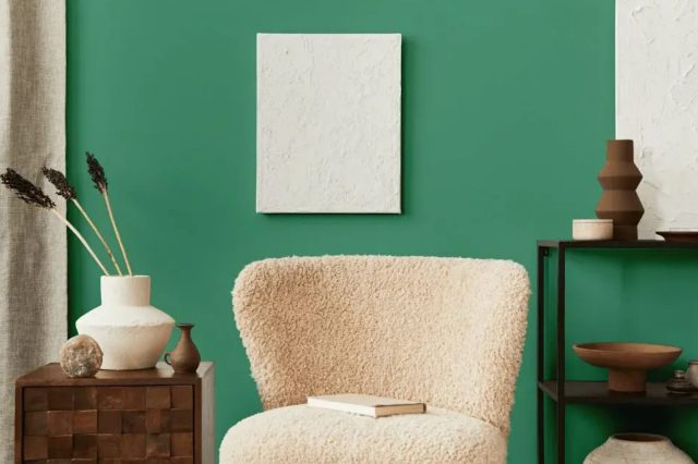
Zurich White SW 7626 by Sherwin Williams is a serene and sophisticated color, embodying a blend of warmth and clarity that can transform spaces into havens of calm and elegance. This hue, with its subtle balance between a soft white and a light gray, exudes a timeless versatility. Its understated nature allows it to adapt seamlessly to a variety of interior styles, making it an ideal choice for those seeking a backdrop that is both inviting and adaptable.
In terms of interior styles, Zurich White shines in spaces inspired by minimalism, modern farmhouse, Scandinavian, and transitional designs. Its inherent neutrality supports an ethos of uncluttered simplicity characteristic of minimalist interiors, while also harmonizing with the rustic textures and comforting ambiances of modern farmhouse aesthetics.
For Scandinavian spaces, which celebrate light and airiness, Zurich White enhances the sense of openness and clean lines. In transitional homes, where the blend of traditional and contemporary elements requires a cohesive backdrop, Zurich White serves as the perfect canvas.
This color pairs exceptionally well with a range of materials and textures, adding depth and dimension to interiors. Natural wood tones, from light oak to rich walnut, complement its warmth, creating environments that feel both grounded and airy. Metallic finishes, whether matte black, polished nickel, or brushed gold, offer a striking contrast to its softness, introducing a touch of sophistication.
Textural elements like woolen throws, linens, and jute rugs bring out Zurich White’s cozy aspects, making spaces more inviting. Through its versatility, Zurich White SW 7626 by Sherwin Williams stands as a timeless choice for those looking to achieve a nuanced, harmonious interior.
housekeepingbay.com
Table of Contents
Is Zurich White SW 7626 by Sherwin Williams Warm or Cool color?
Zurich White SW 7626 by Sherwin-Williams is a nuanced paint color that bridges the gap between a warm white and a soft, light gray. This versatility is key to its popularity in home interiors as it provides a sophisticated, neutral backdrop that can harmonize with a wide range of decor styles and color schemes.
Unlike stark whites, Zurich White carries subtle gray undertones that add depth and warmth, making spaces feel inviting and cozy without sacrificing the brightness that white brings to a room. This attribute makes it an excellent choice for spaces that aim to balance a light and airy feel with a touch of warmth and character.
In homes, Zurich White adapts beautifully to varying lighting conditions, shifting subtly in tone from morning to night, which enhances its compatibility with different settings and accent colors. Whether applied in sun-soaked living rooms or more intimate spaces, it maintains its integrity, supporting a cohesive look throughout the home.
Its ability to act as both a standalone hue and a complementary backdrop for bolder colors or textures makes it a smart pick for homeowners seeking a timeless yet flexible color option.
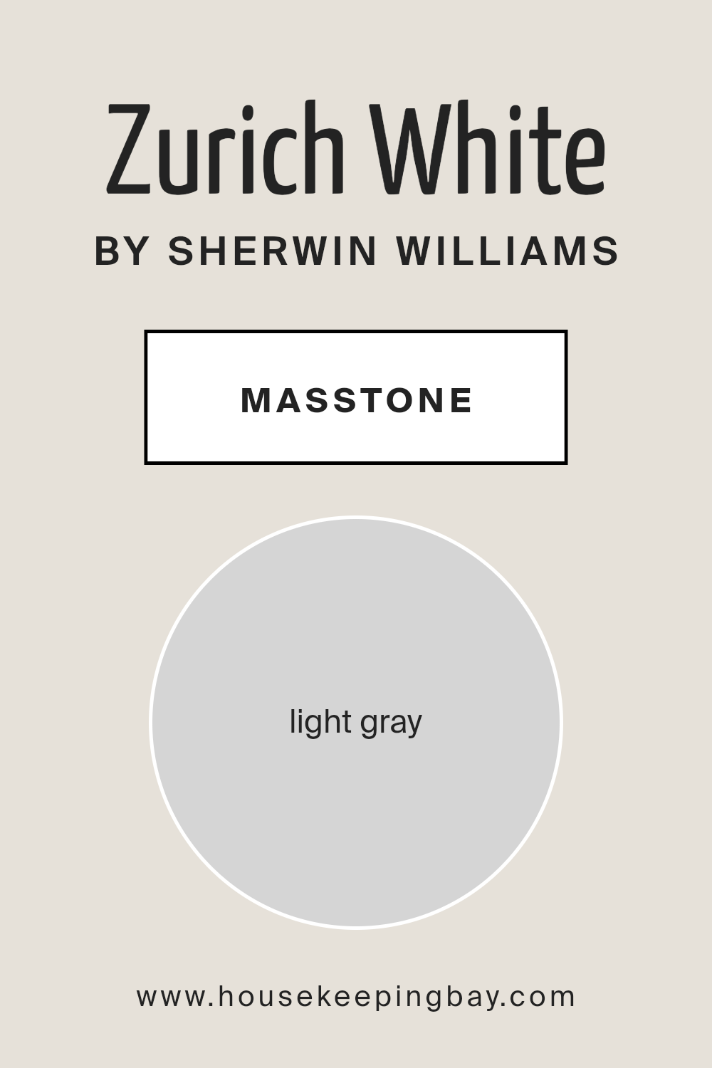
What is the Masstone of the Zurich White SW 7626 by Sherwin Williams?
Zurich White SW 7626 by Sherwin Williams boasts a masstone of light gray, designated by the hex code #D5D5D5. This gentle and subtle hue serves as an incredibly versatile backdrop in home decor, laying a foundation that harmonizes seamlessly with a myriad of color schemes and design aesthetics.
The light gray masstone of Zurich White introduces an airy brightness to spaces, enhancing natural light and contributing to a serene and inviting atmosphere. Its neutrality makes it an ideal choice for walls, providing a soft, understated elegance that complements both contemporary and traditional interiors.
The adaptability of Zurich White’s light gray masstone also means it can transition effortlessly between rooms, maintaining a cohesive look throughout the home. Whether paired with bold accent colors, soft pastels, or other neutral tones, it acts as the perfect canvas, allowing furnishings and artwork to stand out.
Additionally, this color works well in various lighting conditions, subtly shifting in appearance to reveal warm or cool undertones, ensuring a dynamic yet sophisticated visual experience. Its universal appeal and timeless nature make Zurich White SW 7626 a go-to choice for homeowners seeking a balance between style and functionality.
housekeepingbay.com
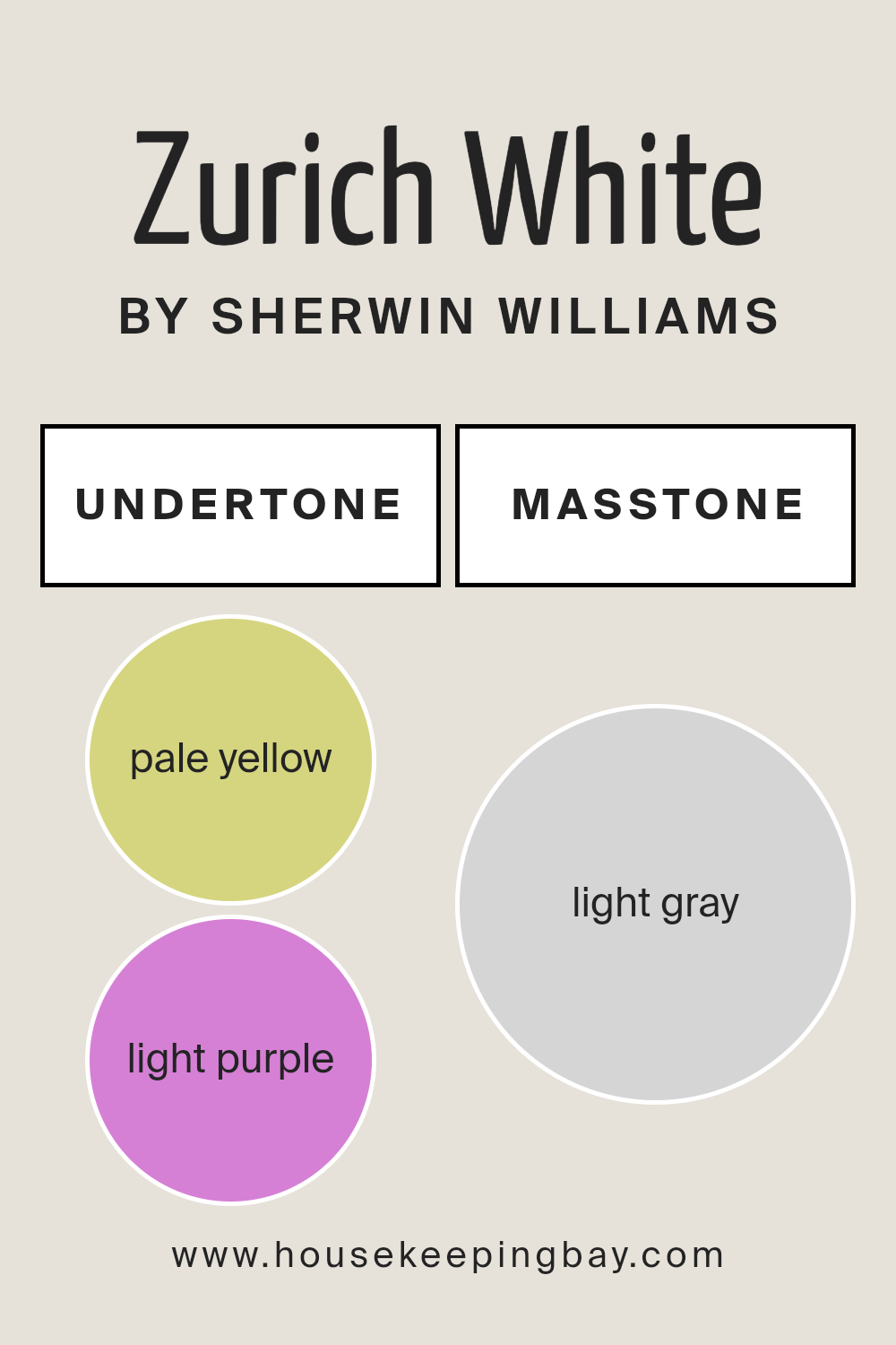
Undertones of Zurich White SW 7626 by Sherwin Williams
Zurich White SW 7626 by Sherwin Williams is an exquisite, versatile paint color that brings a sophisticated and serene ambiance to any space. However, the true beauty of Zurich White lies in its complex undertones, predominantly pale yellow (#D5D580) and light purple (#D580D5). These undertones add a subtle depth and dimension, making Zurich White far from a simple, stark white.
Undertones are crucial in paint colors as they greatly affect how we perceive the color, especially under different lighting conditions. For instance, a color might appear cooler or warmer, lighter or darker, depending on its undertones and the room’s natural and artificial lighting.
Pale yellow undertones imbue a space with a warm, inviting glow, making it feel cozy and comfortable. In contrast, light purple undertones introduce a hint of cool sophistication, adding an unexpected layer of nuance.
When applied to interior walls, Zurich White SW 7626 transforms spaces into airy, bright retreats with an elegant edge. During the day, natural light accentuates its pale yellow undertones, creating a soft, welcoming atmosphere. As the evening progresses and artificial lighting takes over, the light purple undertones might become more pronounced, lending a chic, tranquil vibe.
This dynamic interplay of undertones ensures that walls painted with Zurich White remain engaging and adaptive, gracefully complementing a wide range of decor styles and color palettes. It’s this subtle complexity that elevates Zurich White from a mere wall color to an integral part of a room’s overall design.
housekeepingbay.com
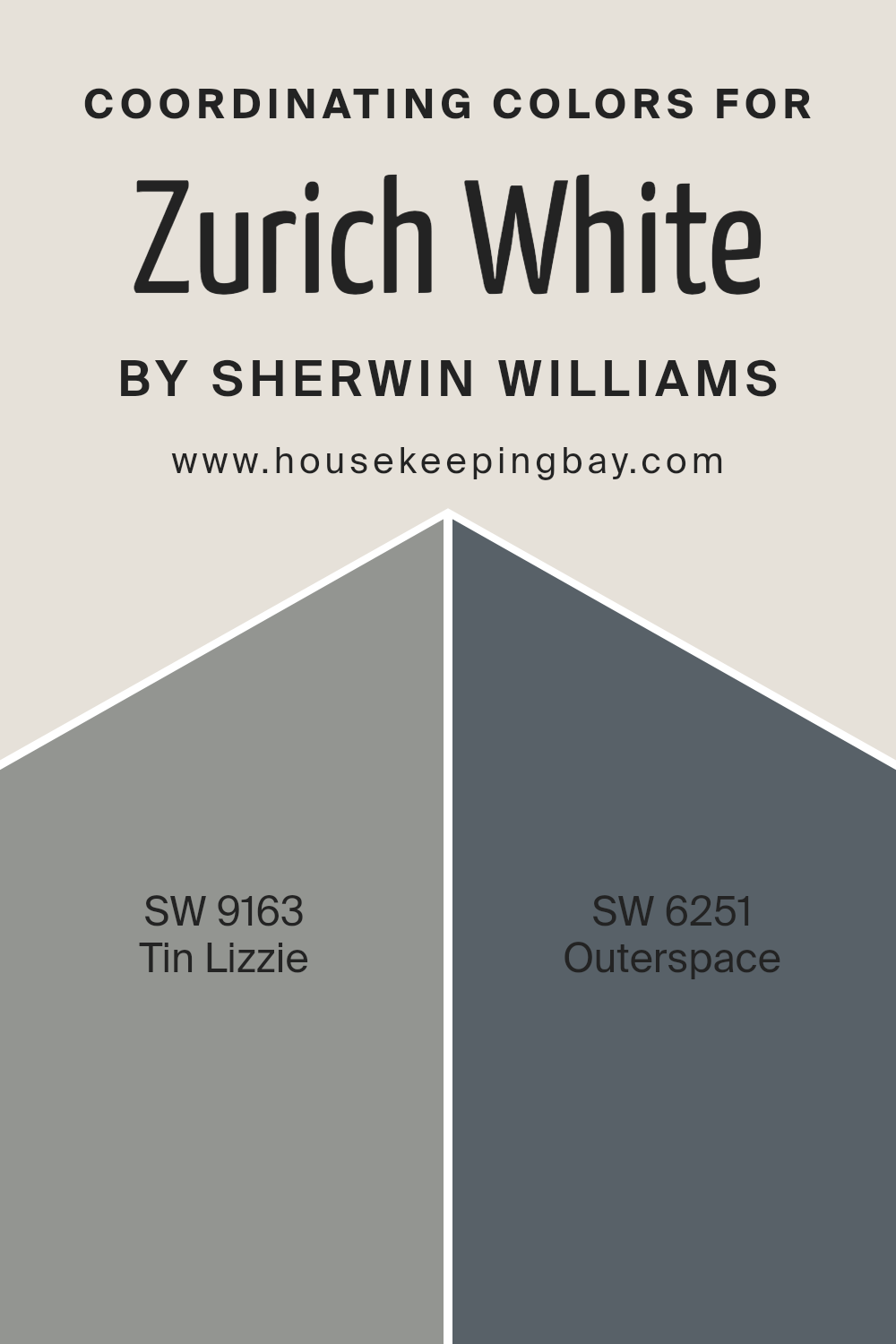
Coordinating Colors of Zurich White SW 7626 by Sherwin Williams
Coordinating colors work harmoniously together to enhance the aesthetic appeal of an interior space, creating a balanced and cohesive look. They are chosen based on their compatibility with a primary color, in this case, Zurich White SW 7626 by Sherwin Williams, a nuanced hue that offers a serene and versatile foundation for any room. Coordinating colors add depth, contrast, and personality, enabling a dynamic yet unified design scheme.
By carefully selecting colors that complement the primary hue, designers can weave together a diverse palette that speaks to personal tastes while ensuring that each element in the room feels connected.
Tin Lizzie SW 9163 is a sophisticated, muted shade of gray with a subtle blue undertone that brings a sense of calm and understated elegance to interiors. It works effortlessly with Zurich White, offering a slight contrast that is both stylish and soothing. This color is perfect for creating a serene space with a hint of modern chic. On the other hand, Outerspace SW 6251 is a deeper, more dramatic hue. It’s a bold charcoal with cool undertones, echoing the vastness and mystery of the night sky.
When paired with Zurich White, Outerspace adds drama and intensity, creating captivating spaces that are striking in their depth. Together, these coordinating colors offer a palette that can move effortlessly from tranquil and grounded to bold and adventurous, depending on how they are applied.
You can see recommended paint colors below:
- SW 9163 Tin Lizzie
- SW 6251 Outerspace
housekeepingbay.com
How Does Lighting Affect Zurich White SW 7626 by Sherwin Williams?
Lighting plays a critical role in how we perceive colors, dramatically affecting their appearance and the ambiance of a space. Different light sources can change the hue, value, and intensity of colors, making them appear warmer, cooler, or displaying different undertones. Understanding this concept is essential when considering paint colors for interiors, such as Zurich White SW 7626 by Sherwin Williams.
Zurich White SW 7626 is a sophisticated, warm, off-white hue with subtle, greige undertones, making it versatile and inviting. Its perception can significantly vary depending on the light source.
Under artificial light, such as incandescent lighting, Zurich White tends to lean towards its warmer side, enhancing cozy, inviting vibes in the evening. LED or fluorescent lighting, cooler in nature, might highlight its grey undertones, giving it a crisper, more neutral appearance.
Natural light, depending on the time of the day and the direction of the light, dramatically influences how Zurich White is perceived. In north-facing rooms, light tends to be cooler and more consistent throughout the day. Here, Zurich White might reveal more of its greige undertones, presenting a serene and tranquil aesthetic. Conversely, in south-facing rooms, which receive a warmer, brighter light, Zurich White can appear warmer and brighter, enhancing its underlying warmth and making spaces feel more open and airy.
East-facing rooms enjoy the warm, bright light in the morning, which transitions to cooler light as the day progresses. In the morning, Zurich White will appear softer and warmer, inviting a lively and cozy feel that transitions to a more balanced, neutral appearance by afternoon.
West-facing rooms experience the opposite, with cooler light in the morning shifting to warmer, golden hues by evening. This change can make Zurich White shift from appearing more neutral and subdued in the morning to significantly warmer and more welcoming in the evening light.
In summary, the appearance of Zurich White SW 7626 by Sherwin Williams is intimately connected to the lighting conditions, varying from warm and inviting under certain artificial lights and southern exposure to more serene and neutral under northern light or cooler artificial sources.
Its versatility makes it an excellent choice for varied applications, adapting uniquely to different spaces and lighting conditions.
housekeepingbay.com
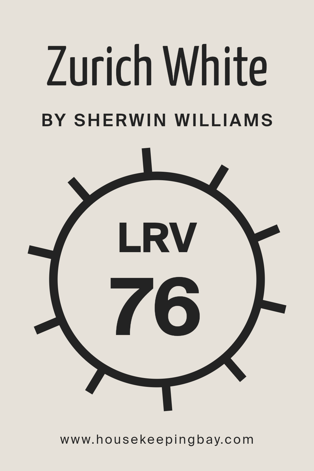
What is the LRV of Zurich White SW 7626 by Sherwin Williams?
Light Reflectance Value (LRV) is a measure used to describe the percentage of visible and usable light that is reflected from a surface when illuminated by a light source. LRV is on a scale from 0 to 100, with 0 being completely black, absorbing all light, and 100 being perfectly white, reflecting all light back to the viewer.
This metric is crucial in design and architecture as it affects how colors and shades appear in different lighting conditions. A higher LRV can make a room feel more spacious and brighter, as more light is reflected around the room. Conversely, colors with a lower LRV can make a space feel cozier and more intimate, absorbing more light and thus appearing darker.
Regarding Zurich White SW 7626 by Sherwin Williams, which has an LRV of 75.85, this value places it in the higher spectrum of light reflectance. This means it is a light color that will reflect a significant amount of light, contributing to a bright and airy feel in a room. Such a high LRV makes Zurich White an excellent choice for spaces where the aim is to enhance natural light or in rooms that are smaller or darker, as it can make them appear more open and well-lit.
However, the perception of Zurich White can still greatly depend on the direction of windows, the amount of natural light, and the types of artificial lighting used, showcasing its versatility and adaptability to various environments and design preferences.
housekeepingbay.com
What is LRV? Read It Before You Choose Your Ideal Paint Color
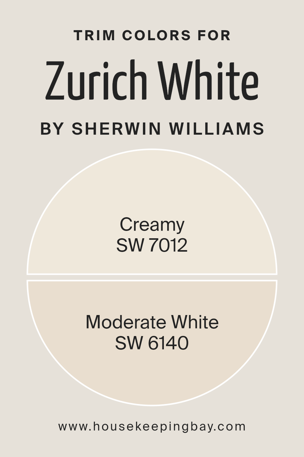
What are the Trim colors of Zurich White SW 7626 by Sherwin Williams?
Trim colors are crucial accents in interior design that highlight architectural features and frame the primary color palette of a room, creating visual harmony and enhancing aesthetic appeal. When it comes to a versatile and widely used color like Zurich White SW 7626 by Sherwin Williams, selecting the right trim colors is essential for defining spaces gracefully and adding depth to the walls.
The choice of trim color can either subtly blend with the primary color for a soft, unified look or contrast sharply to draw attention and create a bold statement. Trim colors not only complement the wall but also enhance the overall ambiance of a room, making the selection process a key step in interior design.
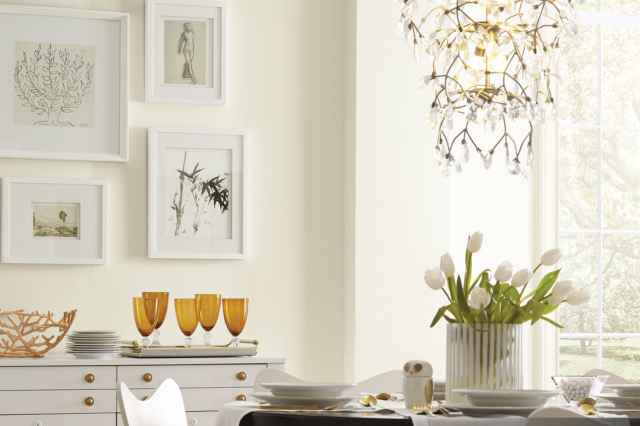
For Zurich White SW 7626, a color that exudes a tranquil and clean feeling, using trim colors like SW 7012 – Creamy and SW 6140 – Moderate White can significantly elevate the room’s aesthetic. Creamy, as the name suggests, offers a soft, warm hue that brings a comforting and creamy brightness to the edges, making spaces feel more inviting and cohesive. It pairs beautifully with Zurich White by softening contrasts and introducing a subtle warmth to the environment.
On the other hand, Moderate White is a lighter, nuanced shade that bridges the gap between stark white and deeper tones, providing a gentle contrast that highlights Zurich White’s clean base without overpowering it.
This thoughtful combination of trim colors enhances the sophistication and visual appeal of spaces painted in Zurich White SW 7626, demonstrating the importance of choosing the right trim to complement the primary wall color.
You can see recommended paint colors below:
housekeepingbay.com
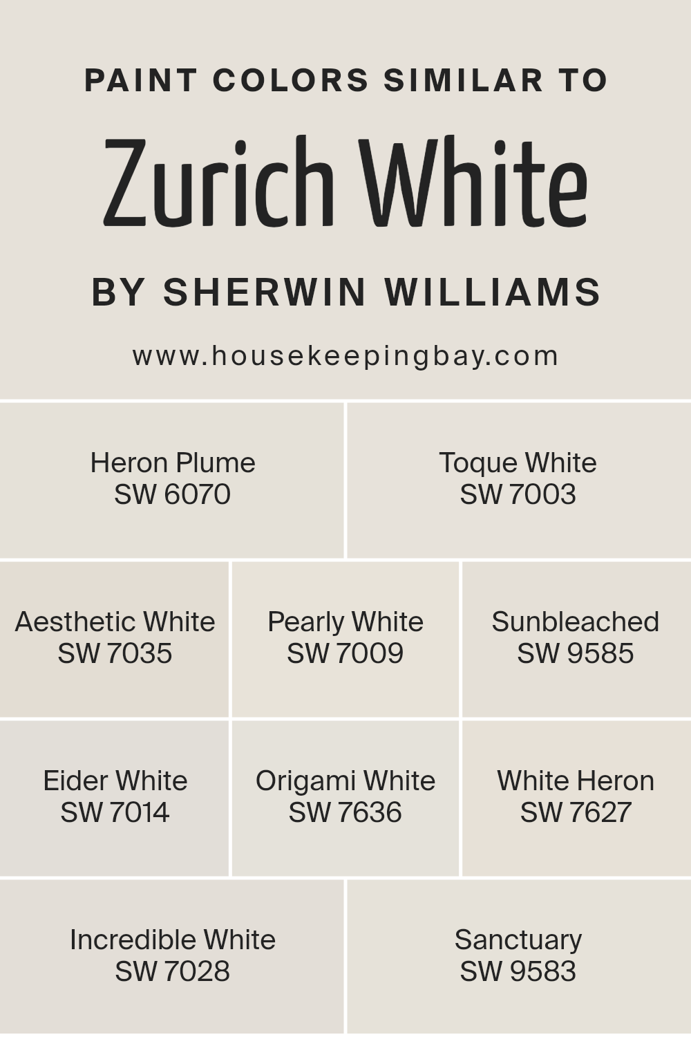
Colors Similar to Zurich White SW 7626 by Sherwin Williams
In the world of interior design, the importance of picking the right color palette cannot be overstated, and having a set of similar colors can greatly enhance the aesthetic and mood of a space. Similar colors, such as those akin to Zurich White SW 7626 by Sherwin Williams, provide a subtle yet impactful way to create depth, harmony, and a seamless transition across different areas of a home or office.
For instance, Heron Plume and Toque White offer a soft backdrop with a hint of warmth, making spaces feel inviting and serene. Aesthetic White and Pearly White lean towards a neutral standpoint, bridging the gap between cool and warm tones, perfect for those seeking balance.
Sunbleached and Eider White introduce a touch of lightness, evoking a sense of freshness and cleanliness without the starkness often associated with pure white.
On the other hand, Origami White and White Heron bring a crisp edge to the palette, lending a modern and sleek look that can make architectural details pop. Incredible White and Sanctuary round off the selection by providing a muted canvas that works well in both brightly lit and dim spaces, adapting to the changing light with a chameleon-like grace.
These colors, while individually unique, share a commonality in their ability to enhance the sense of space, light, and coziness, making them indispensable tools in the art of interior decoration. Their nuanced differences allow for subtle experimentation within a harmonious spectrum, offering endless possibilities for creating environments that reflect personal taste while maintaining classy understatement.
You can see recommended paint colors below:
- SW 6070 Heron Plume
- SW 7003 Toque White
- SW 7035 Aesthetic White
- SW 7009 Pearly White
- SW 9585 Sunbleached
- SW 7014 Eider White
- SW 7636 Origami White
- SW 7627 White Heron
- SW 7028 Incredible White
- SW 9583 Sanctuary
housekeepingbay.com
How to Use Zurich White SW 7626 by Sherwin Williams In Your Home?
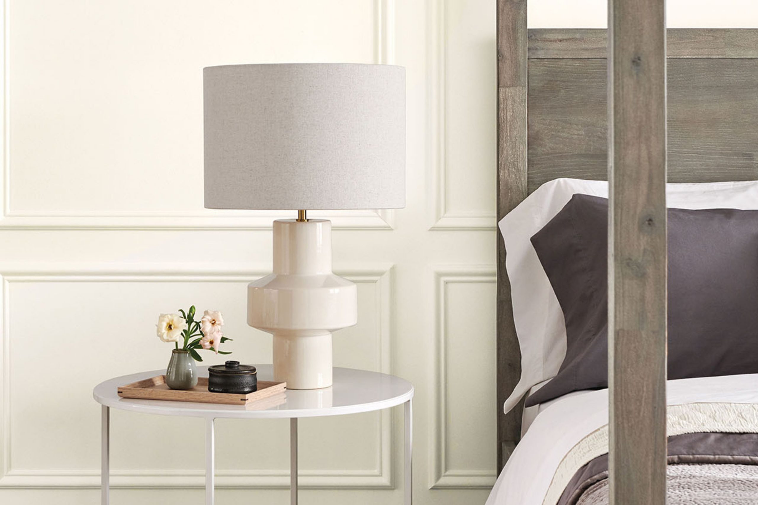
Zurich White SW 7626 by Sherwin Williams is a versatile and sophisticated paint color that can transform any room in your home into a serene and welcoming space. This warm, soft white hue carries a subtle neutrality, making it an exceptional choice for those seeking a color that pairs well with virtually any decor style, from modern minimalist to rustic farmhouse. Its inherent warmth prevents it from feeling stark or cold, a common concern with white shades, thereby creating a cozy and inviting atmosphere.
The adaptability of Zurich White makes it ideal for use in living rooms, bedrooms, and kitchens alike. In living spaces, it can serve as a perfect backdrop for bold artwork and statement furniture, allowing colors and textures to pop. In a bedroom, it can help in crafting a tranquil, restful sanctuary, especially when paired with soft linens and natural textures. Additionally, in kitchens, Zurich White can brighten the space and enhance natural light, making the room feel larger and more open.
Its ability to seamlessly blend with other colors means you can easily add accents or create a monochromatic palette without the space feeling monotonous. Whether you’re aiming for a sleek, modern vibe or a cozy, traditional feel, Zurich White SW 7626 offers a timeless canvas that can evolve with your style over time.
Zurich White SW 7626 by Sherwin Williams vs White Heron SW 7627 by Sherwin Williams
Zurich White SW 7626 and White Heron SW 7627, both by Sherwin Williams, present subtle nuances in their hues that cater to different design aesthetics. Zurich White has a warm, inviting undertone, making spaces feel cozy and comfortable. This color pairs well with natural materials and soft, earthy tones, fostering an environment that feels both welcoming and grounded. Its warmth enhances the ambiance of a room, especially in spaces with ample natural light, where it can add a soft, glowing effect.
On the other hand, White Heron SW 7627 leans towards a cooler spectrum, offering a crisp, clean appearance. It is an excellent choice for modern and minimalist designs, where the aim is to achieve a sharp, clear aesthetic with a refreshing vibe.
White Heron can make small spaces appear larger and more open, providing a neutral backdrop that allows for versatile decor choices. It pairs wonderfully with bold colors, metals, and glass accents, highlighting their characteristics without competing for attention.
Both colors, while seemingly similar at a glance, impart distinct atmospheres and can dramatically influence the mood and style of a space. Choosing between Zurich White and White Heron depends on the desired ambiance, lighting, and accompanying decor within the room.
You can see recommended paint color below:
housekeepingbay.com
Zurich White SW 7626 by Sherwin Williams vs Incredible White SW 7028 by Sherwin Williams
Zurich White SW 7626 and Incredible White SW 7028 by Sherwin Williams occupy adjacent spaces on the color spectrum, offering subtle yet distinct differences that cater to varying design needs. Zurich White leans more towards a warm, welcoming off-white with a slight undertone that hints at beige or soft gray, making spaces feel cozy and inviting.
This warmth makes it well-suited for rooms that seek to capture natural light while retaining a touch of elegance. In contrast, Incredible White steps back slightly in warmth, presenting a more neutral base. It harbors a faintly cooler undertone compared to Zurich White, which allows it to act as a versatile backdrop to both warm and cool color schemes. Incredible White’s neutrality provides a clean, crisp foundation that can make spaces feel more open and airy.
While Zurich White envelopes a room in warmth, Incredible White offers a balanced canvas, adapting fluidly to various styles and lighting conditions, making them perfect companions for creating depth and interest in a cohesive color scheme.
You can see recommended paint color below:
housekeepingbay.com
Zurich White SW 7626 by Sherwin Williams vs Aesthetic White SW 7035 by Sherwin Williams
Comparing Zurich White SW 7626 and Aesthetic White SW 7035, both by Sherwin-Williams, presents an intriguing look into subtle yet distinct differences within the realm of off-whites. Zurich White leans toward a warm, inviting tone with a nuanced blend that slightly edges towards a soft, creamy hue. It provides a sense of comfort and understated elegance, making it a versatile choice for spaces seeking a hint of warmth without overpowering natural light.
On the other hand, Aesthetic White treads a more neutral path. While still warm, it carries a more balanced approach, offering a refined and sophisticated backdrop that is remarkably adaptable across various lighting conditions and design aesthetics.
This color straddles the line between beige and gray, making it an excellent choice for those desiring a neutral palette that warm yet retains an element of crispness.
Both Zurich White and Aesthetic White foster a serene and welcoming environment. The choice between them hinges on the desired undertone: the creamier, cosier feel of Zurich White, or the balanced, versatile neutrality of Aesthetic White.
You can see recommended paint color below:
housekeepingbay.com
Zurich White SW 7626 by Sherwin Williams vs Heron Plume SW 6070 by Sherwin Williams
Zurich White SW 7626 and Heron Plume SW 6070, both from Sherwin Williams, offer subtle yet distinct differences in tone and ambience for interior spaces. Zurich White presents itself as a warm, inviting neutral with its soft, creamy undertones. It carries a certain brightness that can open up a room, making it feel more spacious and airy. This color is versatile, effortlessly complementing a wide range of decor styles and color palettes, adding a cozy, understated elegance to any space.
In contrast, Heron Plume SW 6070 leans towards a slightly cooler, more neutral palette, manifesting a serene and tranquil atmosphere. It still maintains a degree of warmth but with a hint of gray that gives it a contemporary, sophisticated edge. Heron Plume acts as a subtle backdrop that can enhance modern and minimalist decor, providing a calm, soothing vibe.
When comparing the two, the choice between Zurich White and Heron Plume comes down to the desired mood and aesthetics of the room. Zurich White is perfect for those seeking a warm, welcoming space, while Heron Plume suits settings where a chic, tranquil ambiance is desired.
You can see recommended paint color below:
housekeepingbay.com
Zurich White SW 7626 by Sherwin Williams vs Origami White SW 7636 by Sherwin Williams
Comparing Zurich White SW 7626 and Origami White SW 7636, both from Sherwin Williams, reveals nuanced differences in their appeal and applications. Zurich White, a soft, warm white with a hint of gray, evokes a sense of serenity and understated elegance.
This color is extremely versatile, suitable for creating a cozy yet luminous space, making it ideal for living rooms or bedrooms seeking a gentle warmth. On the other hand, Origami White treads a slightly cooler path, owing to its subtle beige undertones, offering a crisp, clean look without becoming stark or clinical.
It’s perfect for spaces that aim to be modern yet inviting, such as kitchens or bathrooms, where the goal is to balance brightness with warmth.
While both colors share the ability to uplift and enlarge a space visually, the choice between Zurich White’s inviting warmth and Origami White’s refreshing neutrality depends on the ambiance one wishes to create.
You can see recommended paint color below:
housekeepingbay.com
Zurich White SW 7626 by Sherwin Williams vs Eider White SW 7014 by Sherwin Williams
Zurich White SW 7626 and Eider White SW 7014 by Sherwin-Williams are two nuanced shades that cater to spaces demanding subtle elegance. Zurich White is a warm, inviting hue with a slightly creamy base, enriching spaces with a cozy, enveloping ambiance. Its warmth makes it ideal for rooms that aim for a soft, welcoming atmosphere, particularly well-suited for living areas and bedrooms where comfort is key.
On the other hand, Eider White SW 7014 leans towards a cooler spectrum with a hint of gray, offering a more modern and sophisticated edge. This color presents a sleek, understated elegance that can make spaces feel more open and airy.
It’s particularly effective in spaces that benefit from a minimalistic or contemporary aesthetic, providing a clean backdrop that complements a wide range of decor.
While both colors share an underlying white base, the primary distinction lies in their temperature and undertones. Zurich White bathes rooms in warmth, creating a serene retreat, whereas Eider White offers a crisp, chic vibe that enhances modern interiors. Choosing between them depends on the desired mood and style of the space to be painted.
You can see recommended paint color below:
housekeepingbay.com
Zurich White SW 7626 by Sherwin Williams vs Sanctuary SW 9583 by Sherwin Williams
Zurich White SW 7626 and Sanctuary SW 9583 by Sherwin Williams serve different moods and decorative goals within a space. Zurich White is a gentle, warm off-white with understated beige undertones, which contributes to its versatility and sophistication. This color illuminates rooms with a soft glow, making it an excellent choice for creating a serene and welcoming atmosphere. It’s particularly suited for walls, trim, and ceilings where the aim is a timeless, airy feel.
In contrast, Sanctuary SW 9583 embodies a deeper, more enveloping presence. This hue is part of Sherwin Williams’ collection that tends towards a subtle, muted olive-green tone, providing spaces with a sense of tranquility, depth, and connection to nature.
Sanctuary, living up to its name, is ideal for crafting a cozy, retreat-like ambiance, suggesting an earthly comfort and groundedness quite different from the ethereal lightness of Zurich White.
Together, these colors could complement each other beautifully within a home, with Zurich White adding expansiveness and light, and Sanctuary offering depth and cosiness, each creating distinct, harmonious spaces.
You can see recommended paint color below:
housekeepingbay.com
Zurich White SW 7626 by Sherwin Williams vs Pearly White SW 7009 by Sherwin Williams
Zurich White SW 7626 and Pearly White SW 7009, both by Sherwin Williams, offer subtle yet distinctive takes on white, enabling a versatile palette for interiors. Zurich White leans towards a warm, inviting tone, marked by its hint of beige, making it exceptional for spaces where a soft, cozy ambiance is desired.
It’s particularly effective in areas with abundant natural light, as its warm undertones are highlighted, creating a serene and welcoming environment. On the other hand, Pearly White SW 7009, while also warm, introduces a slight silvery undertone that imparts an elegant, sophisticated feel.
This nuance makes Pearly White more reflective and slightly brighter than Zurich White, ideal for spaces aiming for a chic, airy feel. Both colors offer excellent backdrops for various decor styles, yet the choice between them hinges on the desired warmth and ambiance of the room. Pearly White’s subtle luminosity suits contemporary spaces, whereas Zurich White’s soft warmth complements traditional or rustic interiors.
You can see recommended paint color below:
housekeepingbay.com
Zurich White SW 7626 by Sherwin Williams vs Toque White SW 7003 by Sherwin Williams
Zurich White SW 7626 and Toque White SW 7003, both by Sherwin Williams, present subtle yet distinct variations in the realm of whites. Zurich White has a slightly warmer and more inviting tone, offering a cozy ambiance to any space. Its warmth comes with a hint of beige, making it a perfect choice for rooms that aim for a soft, neutral background without becoming too stark or clinical. It pairs beautifully with natural materials and can add depth to a minimalist decor.
On the other hand, Toque White SW 7003 leans towards a cooler palette, containing hints of gray that provide a crisp, clean look. This color is exceptional for spaces that desire a modern and fresh feel, as it reflects light in a way that can make a room appear more spacious and airy. It is particularly suited for contemporary designs, acting as a subtle backdrop that complements vibrant accents or furniture.
Although both colors share a base of white, Zurich White’s warmer, beige undertones contrast with Toque White’s cooler, grayish hints, showcasing how variations in white paint can significantly affect the mood and style of a space.
You can see recommended paint color below:
housekeepingbay.com
Zurich White SW 7626 by Sherwin Williams vs Sunbleached SW 9585 by Sherwin Williams
Zurich White SW 7626 and Sunbleached SW 9585, both by Sherwin Williams, offer a subtle yet distinct divergence in ambiance for any space. Zurich White stands out as a warm, inviting hue, possessing a soft, creamy off-white character. It embodies an understated elegance, making spaces feel open and airy, yet cozy. This color is versatile, easily complementing a wide range of décor styles, from traditional to contemporary. It excels in areas where natural light is abundant, enhancing the space with a gentle, welcoming glow.
On the other hand, Sunbleached SW 9585 leans towards a unique, faded charm, reminiscent of weathered wood or the soft, muted tones found in a well-loved garment. This color introduces a rustic, nostalgic feel, ideal for creating a serene, calming atmosphere.
Its light, almost ethereal quality, can make small spaces appear larger, offering a whisper of color that enriches without overwhelming. Sunbleached can serve as a perfect backdrop for spaces designed to evoke tranquility and peace.
While both colors are light and can elevate the perception of space, Zurich White offers warmth and adaptability, and Sunbleached brings a distinct, soft vintage appeal. Together, they represent the spectrum of subtle elegance, each contributing uniquely to the creation of inviting, serene environments.
You can see recommended paint color below:
housekeepingbay.com
Conclusion
The article on Zurich White SW 7626 by Sherwin Williams highlights its versatility and understated elegance, making it a sought-after choice for those seeking a neutral backdrop that exudes warmth and sophistication. Zurich White stands out for its ability to blend seamlessly into a variety of design aesthetics, from minimalist modern to cozy cottage, showcasing its adaptability in reflecting both light and mood within a space.
Its subtle undertones offer a complexity that elevates it beyond a simple white, providing depth and texture that can enhance architectural features and complement a wide range of decor styles.
Embracing Zurich White within interior spaces signifies an appreciation for a color that transcends simple design choices, suggesting a thoughtful consideration of how ambiance and atmosphere are influenced by color. Designers and homeowners alike have noted how it works harmoniously with natural light, shifting subtly throughout the day to create a dynamic yet soothing environment.
This adaptability has cemented Zurich White’s position as a go-to neutral in the Sherwin Williams palette, proving that a carefully chosen shade of white can indeed make a profound impact on the aesthetics and feel of a home, making spaces appear more inviting, spacious, and timeless.
housekeepingbay.com
Ever wished paint sampling was as easy as sticking a sticker? Guess what? Now it is! Discover Samplize's unique Peel & Stick samples. Get started now and say goodbye to the old messy way!
Get paint samples