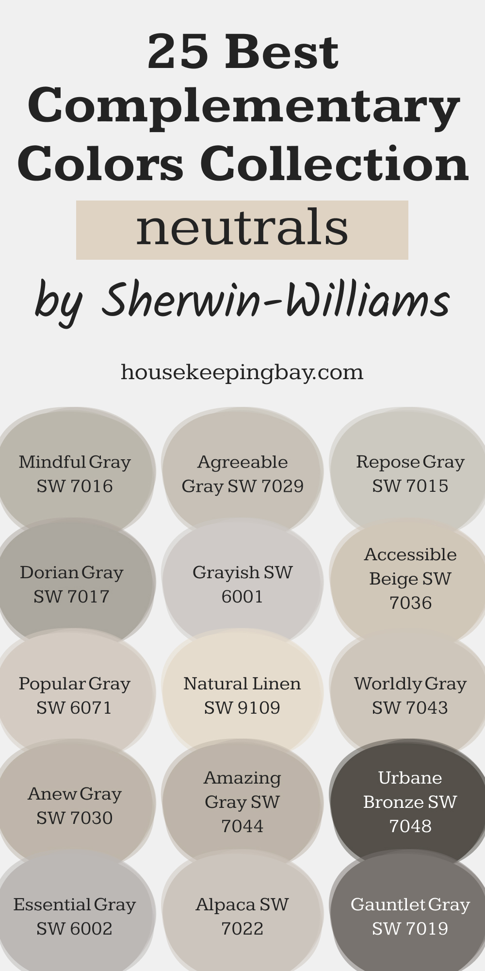
25 Best Complimentary Colors Collection for Neutrals by Sherwin-Williams
Sherwin-Williams' complementary color pairings for every neutral tone
Neutral shades like grays, beiges, and taupes are some of the most popular choices in home design. They provide a timeless, versatile foundation for any space, allowing you to layer in personal touches with ease.
These colors are perfect for creating balance and harmony, making them ideal for nearly every room in your home.
However, the secret to making neutrals shine lies in pairing them with the right complementary colors. The right combination can enhance the beauty of your space, bring depth to the design, and create a cohesive look.
Sherwin-Williams offers a wide range of expertly curated palettes that make finding the perfect match simple. Let’s explore some of their best neutral shades and the complementary colors that work beautifully with them.
via sherwin-williams.com
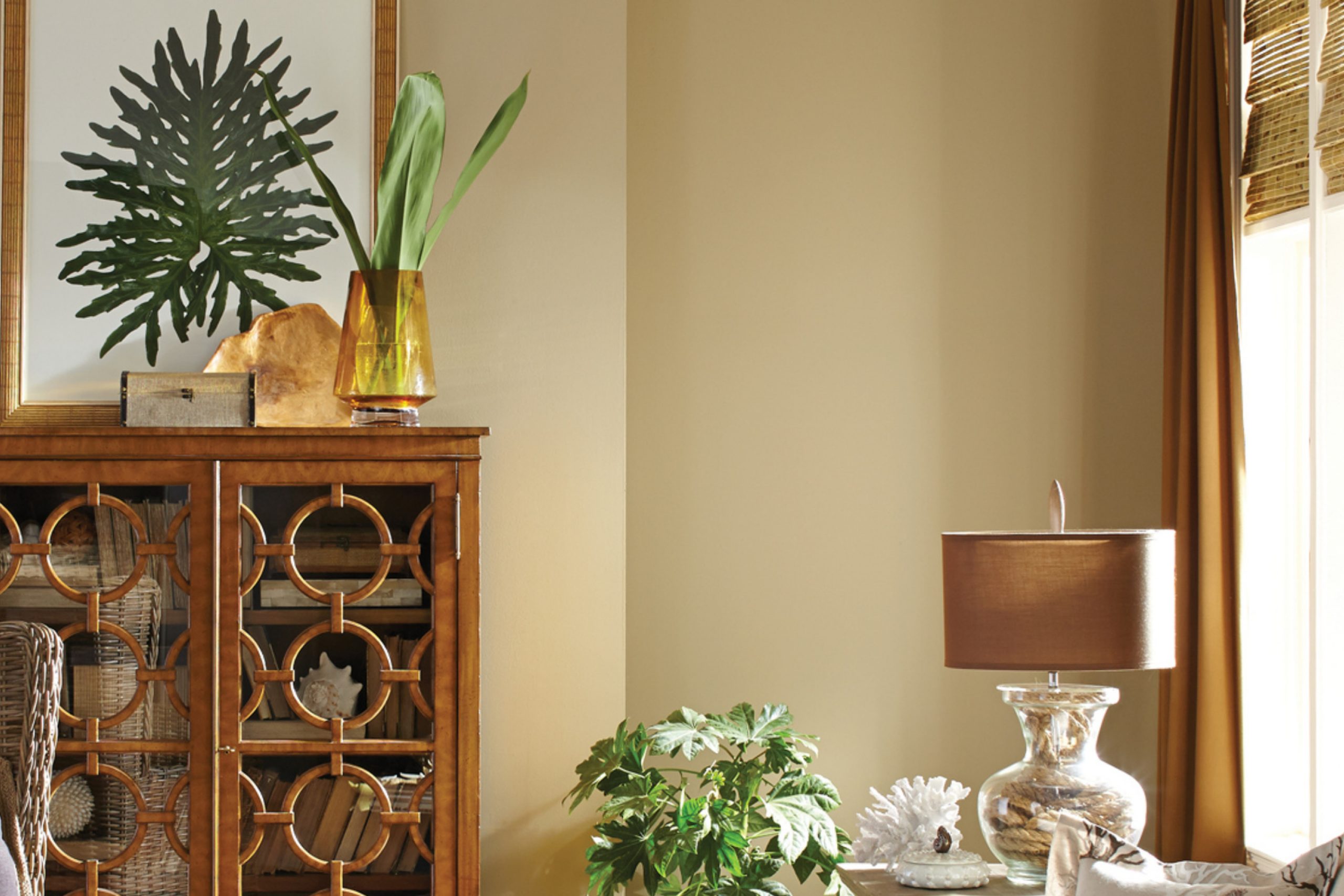
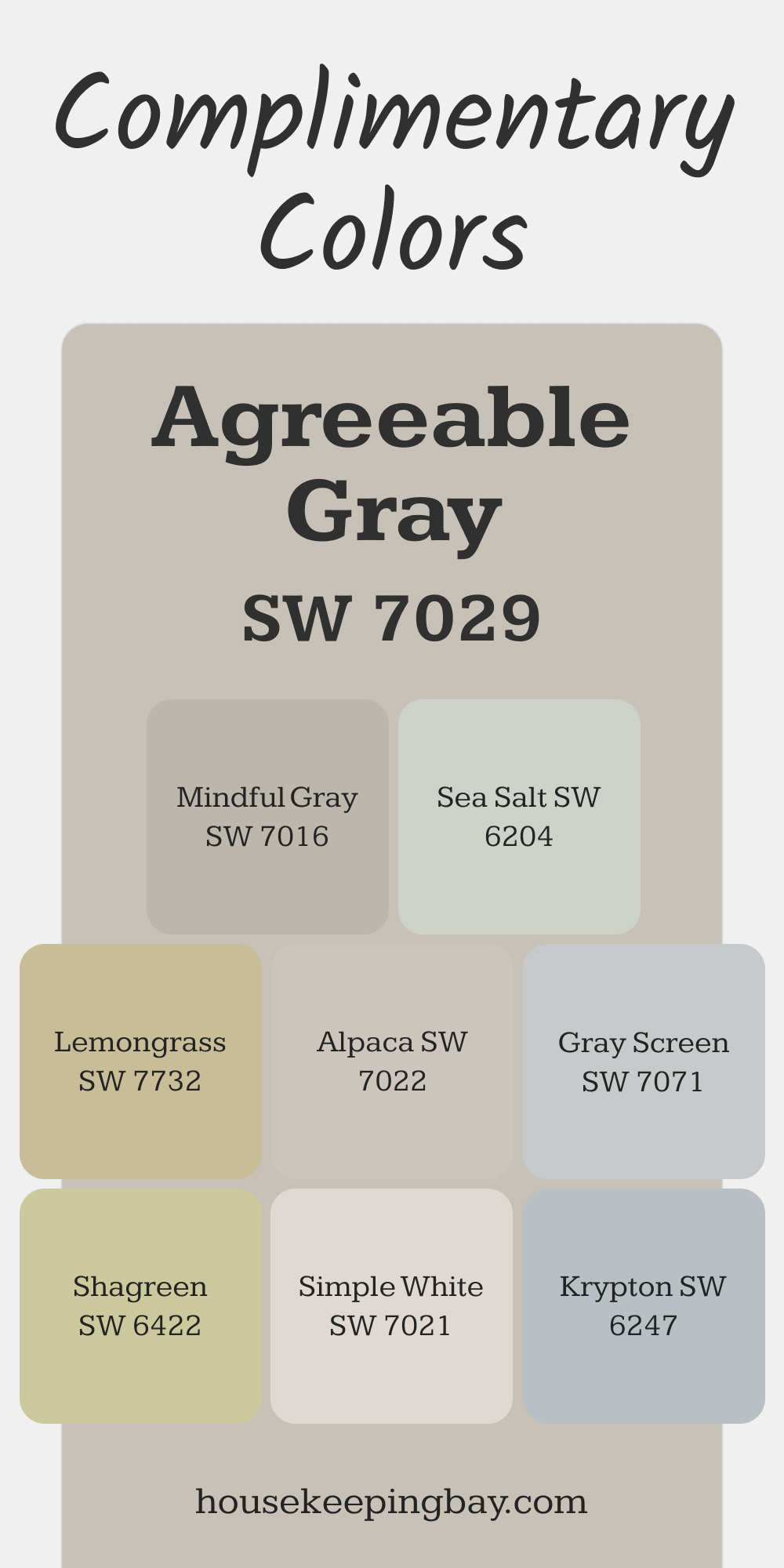
SW 7029 Agreeable Gray
Agreeable Gray is a warm neutral with soft beige undertones that feels welcoming and adaptable.
This shade brings a cozy yet sophisticated charm to open-concept spaces, enhancing natural light and harmonizing effortlessly with various furnishings.
It’s a popular choice for living rooms, hallways, or anywhere you want a calm and balanced ambiance without feeling too stark or overly warm.
Complimentary Colors:
- SW 7016 Mindful Gray: A slightly darker neutral that adds depth when used for trim or accent walls.
- SW 6204 Sea Salt: A soft greenish-gray that adds a hint of coolness and complements Agreeable Gray’s warmth.
- SW 7021 Simple White: A clean and bright white for ceilings and trim to create contrast.
- SW 7071 Gray Screen: A cool gray that offers modern sophistication when paired as a secondary wall color.
- SW 7022 Alpaca: A taupe-inspired shade that enhances Agreeable Gray’s warm undertones.
- SW 6422 Shagreen: A muted green to bring an earthy, organic vibe to the palette.
- SW 7732 Lemongrass: A muted yellow-green for playful pops of color in accessories or accent furniture.
- SW 6247 Krypton: A cool blue-gray that provides a subtle contrast and enhances tranquility.
via housekeepingbay.com
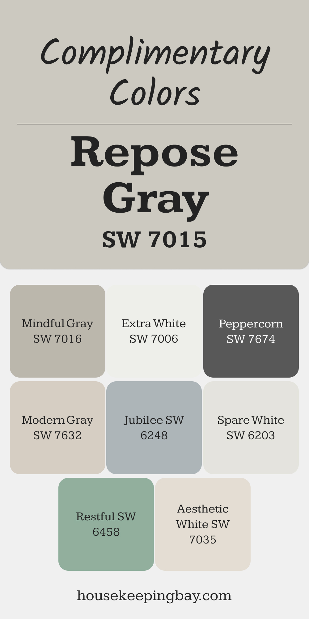
SW 7015 Repose Gray
Repose Gray is a soft neutral that leans slightly warm, offering a delicate balance between modern and timeless. Its understated tone makes it ideal for both modern and classic interiors, especially bedrooms or dining rooms, where it helps create a cozy and refined atmosphere.
Complimentary Colors :
- SW 7016 Mindful Gray: Provides a cohesive look when used in adjoining rooms or as an accent.
- SW 7006 Extra White: A crisp white for ceilings or trim to highlight Repose Gray’s warm undertones.
- SW 6203 Spare White: A subtle green-tinted white that pairs beautifully in kitchens or bathrooms.
- SW 6248 Jubilee: A medium blue-gray for a bold contrast that retains a calming vibe.
- SW 6458 Restful: A gentle green that works well in bedrooms for a fresh, serene look.
- SW 7035 Aesthetic White: A warm off-white for adjoining areas, maintaining a soft, seamless flow.
- SW 7674 Peppercorn: A dark gray for accents or trim, adding depth to the overall palette.
- SW 7632 Modern Gray: A light greige to create a subtle and cohesive transition between spaces.
via housekeepingbay.com
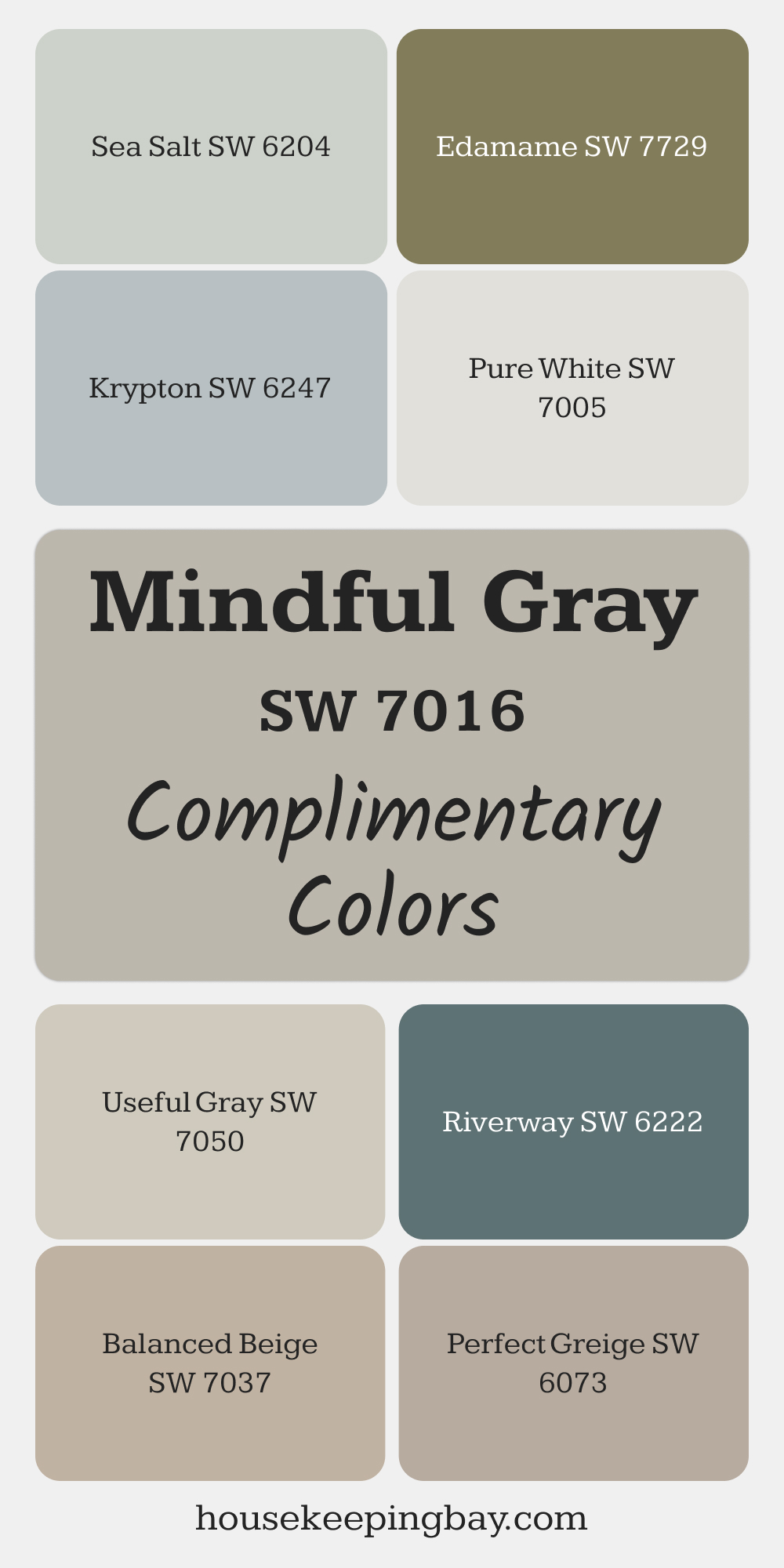
SW 7016 Mindful Gray
Mindful Gray is a balanced neutral that walks the line between warm and cool tones, offering versatility in any space. It’s especially suited for kitchens, home offices, or living rooms where a calm, mid-tone gray can ground the design while leaving room for other colors to shine.
Complimentary Colors :
- SW 7005 Pure White: For a crisp, clean trim and ceiling to highlight Mindful Gray’s depth.
- SW 6073 Perfect Greige: A warm gray-beige that pairs well for a harmonious, layered look.
- SW 6247 Krypton: A blue-gray accent that introduces a cool contrast to the palette.
- SW 7037 Balanced Beige: A warm beige that keeps the overall vibe inviting and cozy.
- SW 7050 Useful Gray: A soft green-toned neutral that complements Mindful Gray beautifully.
- SW 6222 Riverway: A deep teal for bold accents or statement furniture pieces.
- SW 6204 Sea Salt: A light, airy green-gray for bathrooms or smaller spaces.
- SW 7729 Edamame: A rich green accent that adds earthy depth to the scheme.
via housekeepingbay.com
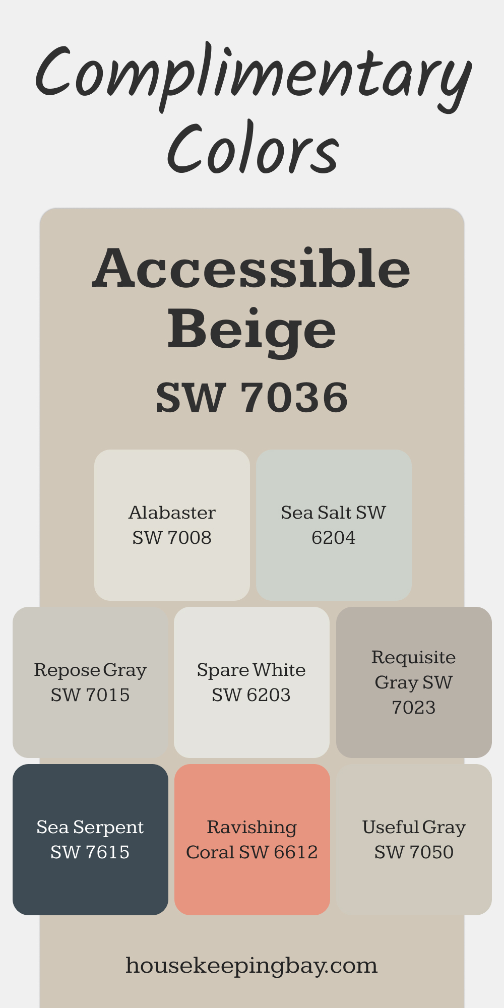
SW 7036 Accessible Beige
Accessible Beige combines warm beige with subtle gray undertones, offering a neutral base that feels modern and timeless. It’s an excellent choice for family rooms or entryways, setting a welcoming and grounded tone that works well with both light and dark furnishings.
Complimentary Colors :
- SW 7008 Alabaster: A warm white for trim or ceilings that enhances Accessible Beige’s warmth.
- SW 7050 Useful Gray: Adds a green undertone for a soft and natural pairing.
- SW 7023 Requisite Gray: A subtle, slightly darker gray to define and balance the space.
- SW 7615 Sea Serpent: A bold, deep blue that creates striking contrast in accents or cabinetry.
- SW 7735 Twin Leaf: A rich, earthy green that pairs beautifully for a nature-inspired palette.
- SW 6204 Sea Salt: Introduces a cool, airy feel that complements Accessible Beige.
- SW 7015 Repose Gray: A cooler neutral to create a balanced and cohesive look.
- SW 6612 Ravishing Coral: A playful pop of color in decor or furniture to add warmth and energy.
via housekeepingbay.com
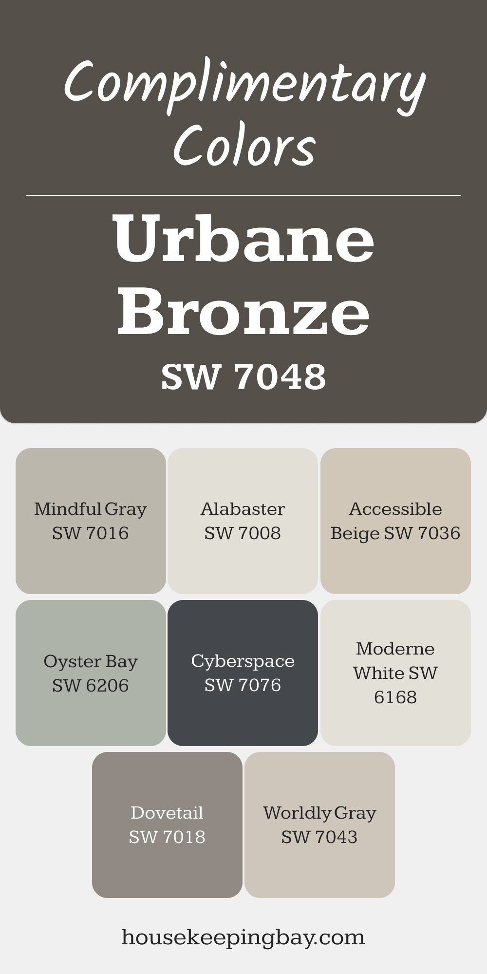
SW 7048 Urbane Bronze
Urbane Bronze is a rich, deep bronze with earthy undertones, ideal for creating drama and sophistication. It works beautifully as an accent wall or cabinetry color in living rooms, kitchens, or even exteriors. Paired with warm neutrals or organic materials, Urbane Bronze creates an elevated, grounded aesthetic.
Complimentary Colors :
- SW 7043 Worldly Gray: A soft, warm gray to balance the boldness of Urbane Bronze.
- SW 7018 Dovetail: A darker neutral to create depth and harmony in adjoining spaces.
- SW 7016 Mindful Gray: A medium gray for a subtle contrast that complements Urbane Bronze.
- SW 7036 Accessible Beige: Adds warmth and softness, making the space feel inviting.
- SW 7008 Alabaster: A bright, clean white for trim or ceilings to create contrast and brightness.
- SW 6206 Oyster Bay: A muted green-gray that adds a refreshing touch to the palette.
- SW 7076 Cyberspace: A deep blue-black for accents that intensify Urbane Bronze’s richness.
- SW 6168 Moderne White: A light, creamy white that keeps the overall look sophisticated yet airy.
via housekeepingbay.com
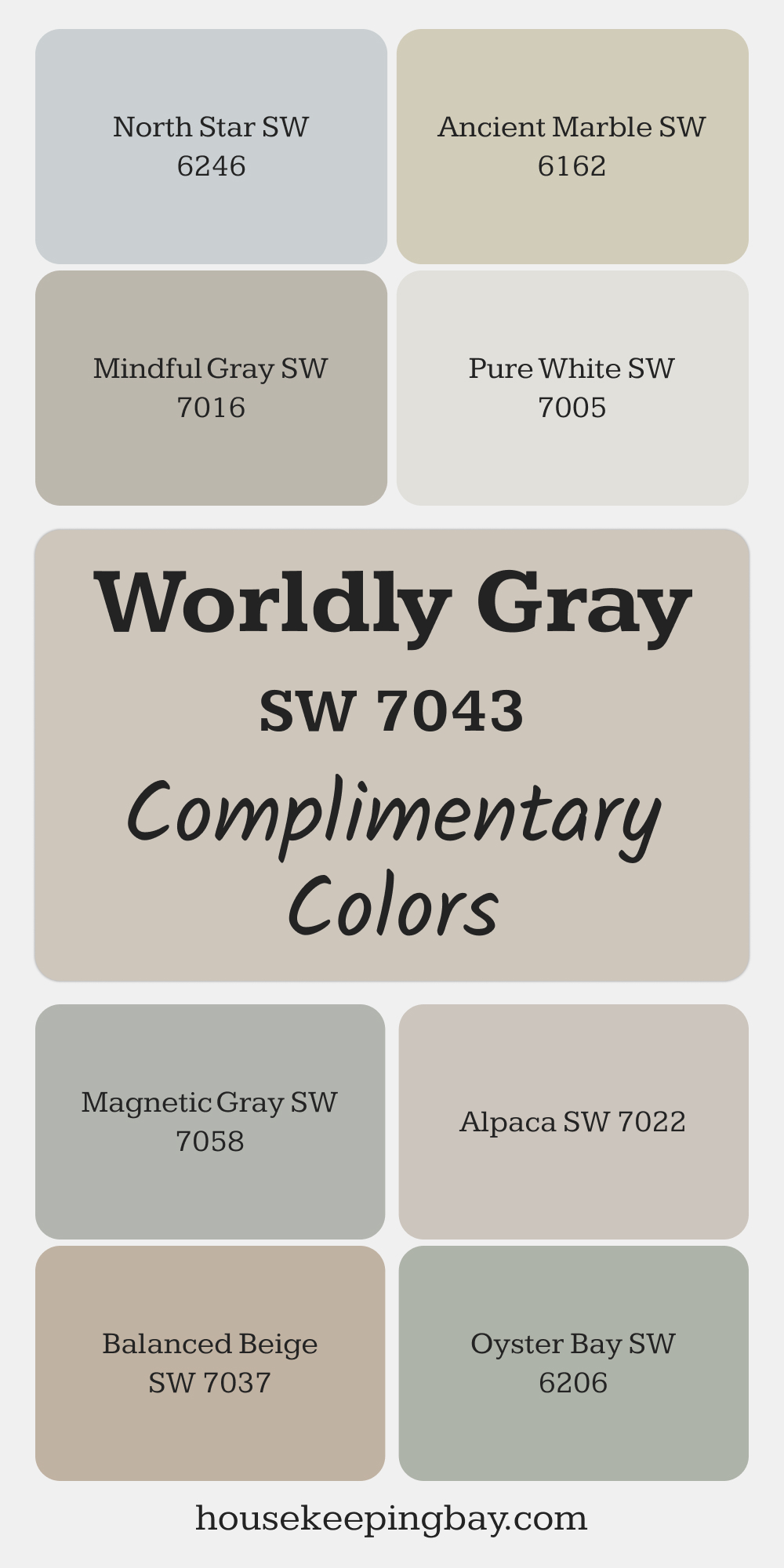
SW 7043 Worldly Gray
Worldly Gray is a soft, warm gray that strikes a beautiful balance between neutral and inviting. It has just enough warmth to avoid feeling cold but retains the versatility of a gray tone.
This color works especially well in kitchens or foyers, where its ability to blend with both warm and cool accents creates a seamless and transitional design.
Complimentary Colors :
- SW 7005 Pure White: A clean, bright white for trim and ceilings to keep the look fresh and open.
- SW 7022 Alpaca: A soft taupe-gray that complements Worldly Gray for a cohesive flow between spaces.
- SW 7037 Balanced Beige: A warm beige to enhance the earthy undertones of Worldly Gray.
- SW 6246 North Star: A soft blue-gray that introduces a cool yet calming contrast.
- SW 7058 Magnetic Gray: A deeper gray for accents or adjoining rooms to create depth.
- SW 6162 Ancient Marble: A muted green-gray for a natural, organic feel.
- SW 6206 Oyster Bay: A medium green-gray that pairs beautifully for a serene atmosphere.
- SW 7016 Mindful Gray: A darker neutral that provides contrast while staying in the same tonal family.
via housekeepingbay.com
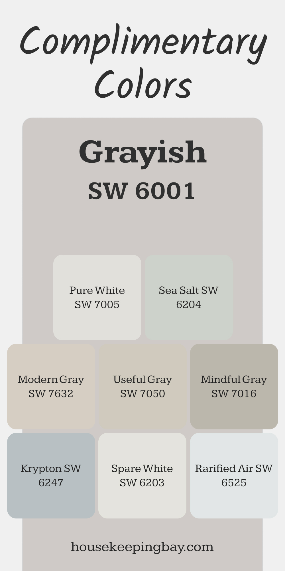
SW 6001 Grayish
Grayish is a light gray with cool undertones, offering a fresh and modern vibe. Its airy quality makes it perfect for smaller spaces like bathrooms or powder rooms, where it helps open up the area while maintaining a clean and serene appearance.
Pairing it with brighter or softer accents adds depth without overwhelming the space.
Complimentary Colors :
- SW 7005 Pure White: A crisp trim color that enhances Grayish’s cool undertones.
- SW 6247 Krypton: A light blue-gray that adds a touch of softness to the palette.
- SW 7050 Useful Gray: A muted green-gray to warm up Grayish’s coolness slightly.
- SW 6525 Rarified Air: A pale blue for a light and cheerful pairing.
- SW 7016 Mindful Gray: A darker gray for depth and contrast in trim or adjacent walls.
- SW 6203 Spare White: A barely-there greenish white to maintain a fresh, open look.
- SW 7632 Modern Gray: A warm gray that provides subtle contrast.
- SW 6204 Sea Salt: A light green-gray that adds a soft, calming accent.
via housekeepingbay.com
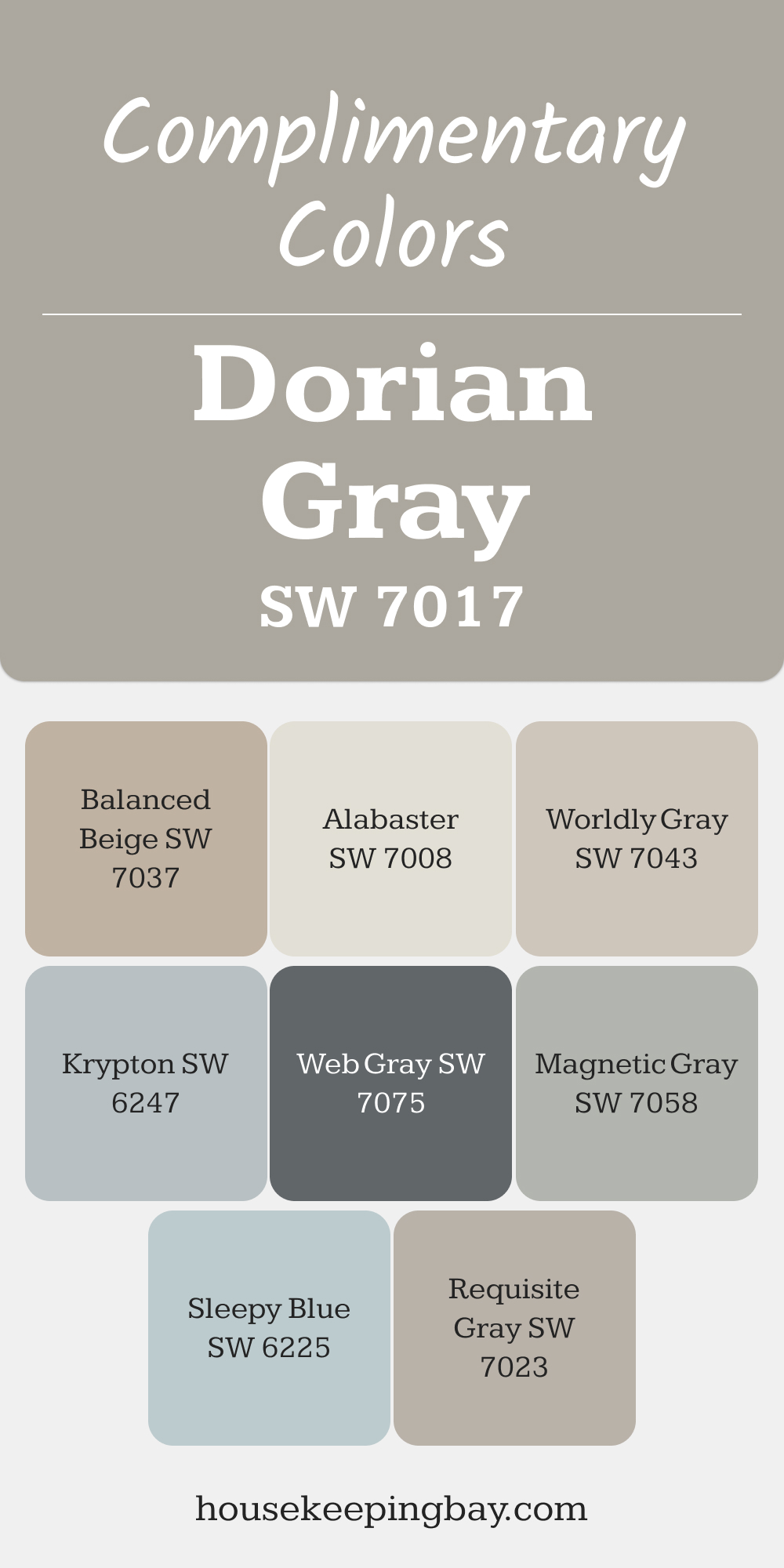
SW 7017 Dorian Gray
Dorian Gray is a medium-tone gray with a hint of warmth, making it perfect for creating a sense of depth and comfort. It’s ideal for dining rooms or libraries, where its richer hue adds sophistication without feeling overpowering.
Its subtle warmth allows it to pair seamlessly with both modern and traditional elements.
Complimentary Colors :
- SW 7008 Alabaster: A soft white for trim and ceilings, adding contrast and brightness.
- SW 7043 Worldly Gray: A lighter neutral to create a layered and harmonious palette.gv
- SW 7037 Balanced Beige: A warm beige that brings out Dorian Gray’s soft undertones.
- SW 7058 Magnetic Gray: A deeper gray for trim or adjoining spaces to add depth.
- SW 7075 Web Gray: A rich charcoal-gray for a bold, contrasting accent.
- SW 6247 Krypton: A soft blue-gray to cool down the overall look and add dimension.
- SW 7023 Requisite Gray: A subtle transition shade for adjoining walls or hallways.
- SW 6225 Sleepy Blue: A calming blue accent that complements Dorian Gray beautifully.
via housekeepingbay.com
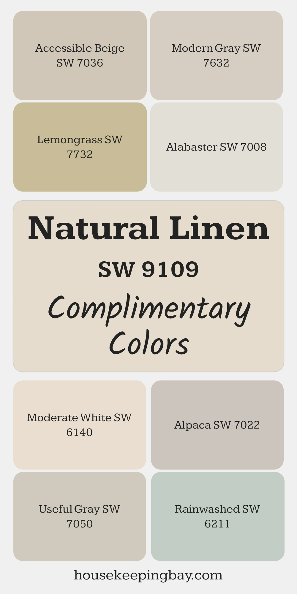
SW 9109 Natural Linen
Natural Linen is a warm beige with creamy undertones, creating a soft and welcoming atmosphere. It’s an excellent choice for bedrooms or sitting areas, especially when paired with textured fabrics or natural wood tones. This color adds a sense of understated elegance to any room.
Complimentary Colors :
- SW 7008 Alabaster: A creamy white for trim and ceilings to enhance the warm tones of Natural Linen.
- SW 7036 Accessible Beige: A slightly darker beige for a monochromatic and cohesive palette.
- SW 7732 Lemongrass: A muted green accent that introduces an organic and refreshing element.
- SW 7022 Alpaca: A taupe-gray to add depth and dimension.
- SW 6219 Rainwashed: A soft blue-green for a coastal-inspired feel.
- SW 7050 Useful Gray: A green-gray to provide subtle contrast and balance.
- SW 7632 Modern Gray: A warm gray for a seamless transition in adjacent rooms.
- SW 6140 Moderate White: A warm, off-white to maintain a light and airy feel.
via housekeepingbay.com
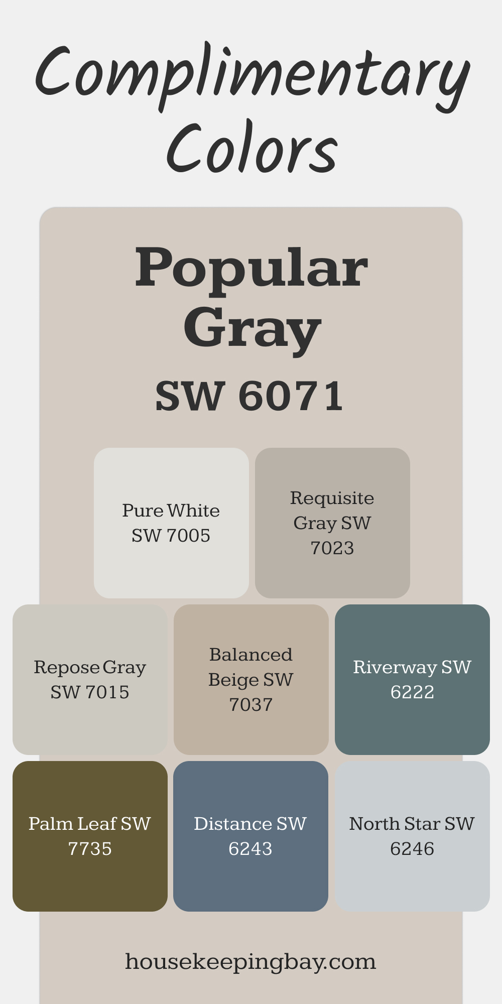
SW 6071 Popular Gray
Popular Gray is a neutral taupe with soft pink undertones that adds a touch of warmth to any room. This color is ideal for entryways or powder rooms, where it creates an inviting and refined atmosphere.
Its subtle warmth makes it especially effective in spaces with cooler lighting.
Complimentary Colors :
- SW 7015 Repose Gray: A cooler gray that creates a soft contrast.
- SW 6246 North Star: A light blue-gray to balance out Popular Gray’s warmth.
- SW 6243 Distance: A muted blue for a striking yet calming accent.
- SW 7023 Requisite Gray: A versatile gray that pairs seamlessly with Popular Gray.
- SW 7005 Pure White: A clean white for trim and ceilings to highlight Popular Gray’s undertones.
- SW 7735 Twin Leaf: A muted green to introduce an earthy and refreshing touch.
- SW 7037 Balanced Beige: A warm beige for a cohesive and layered look.
- SW 6222 Riverway: A deep teal accent that adds drama and contrast.
via housekeepingbay.com
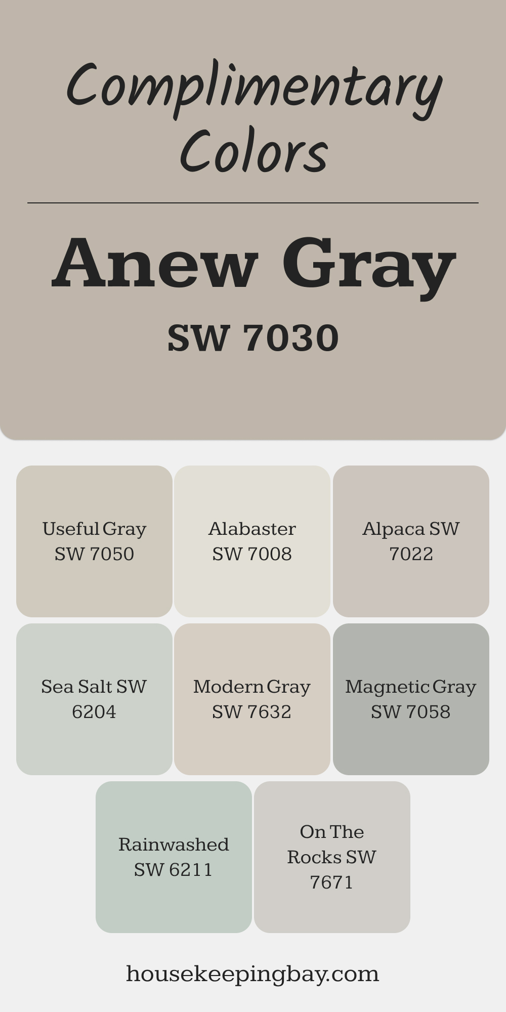
SW 7030 Anew Gray
Anew Gray is a versatile greige that feels modern and understated, making it an excellent choice for open floor plans or transitional spaces.
Its balance of warm and cool tones creates a grounding effect, while its neutrality allows it to work seamlessly with various design styles.
Complimentary Colors :
- SW 7008 Alabaster: A warm white for trim to add lightness and contrast.
- SW 7050 Useful Gray: A green-gray for a soft, natural pairing.
- SW 7022 Alpaca: A lighter taupe-gray that creates a gentle gradient.
- SW 6219 Rainwashed: A soft blue-green for a refreshing accent.
- SW 7058 Magnetic Gray: A deeper gray for adjoining spaces or accent pieces.
- SW 7671 On The Rocks: A cool gray for subtle contrast and modern elegance.
- SW 6204 Sea Salt: A calming green-gray to balance Anew Gray’s warmth.
- SW 7632 Modern Gray: A light greige for a seamless transition in adjoining areas.
via housekeepingbay.com
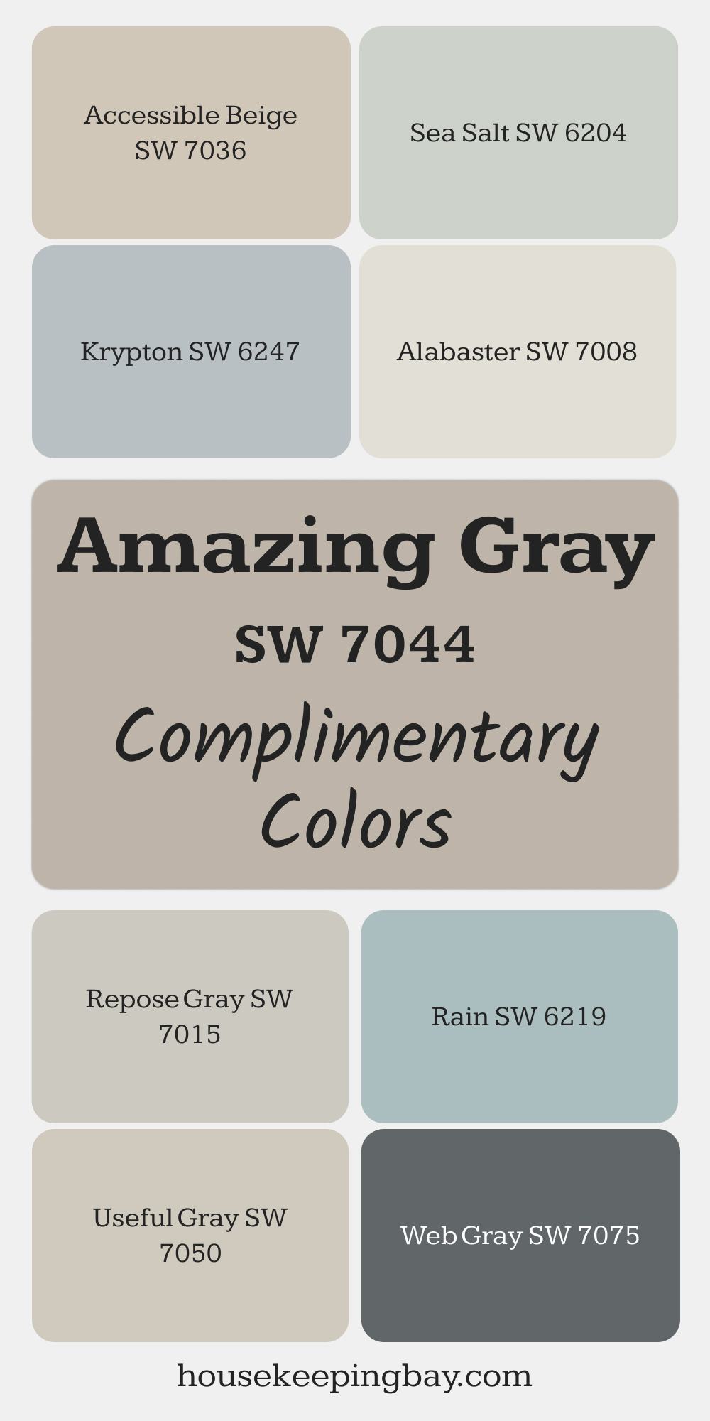
SW 7044 Amazing Gray
Amazing Gray is a deeper, warm gray that exudes a sense of coziness and sophistication. It’s a wonderful choice for accent walls, living rooms, or dining areas, where its richness can anchor the design and create a balanced yet bold aesthetic.
Its subtle warmth allows it to pair beautifully with other neutrals or vibrant accents.
Complimentary Colors :
- SW 7015 Repose Gray: A lighter gray that creates a soft, harmonious transition.
- SW 7036 Accessible Beige: A warm beige that balances Amazing Gray’s depth.
- SW 7050 Useful Gray: A green-gray that enhances Amazing Gray’s natural tones.
- SW 7008 Alabaster: A bright, creamy white for ceilings and trim to lighten the look.
- SW 6204 Sea Salt: A soft green-gray for a refreshing and organic contrast.
- SW 6247 Krypton: A blue-gray accent that introduces a cool and calming element.
- SW 7075 Web Gray: A rich, dark gray for bold contrast in furniture or cabinetry.
- SW 6211 Rain: A soft, muted blue to bring a soothing, serene touch.
via housekeepingbay.com
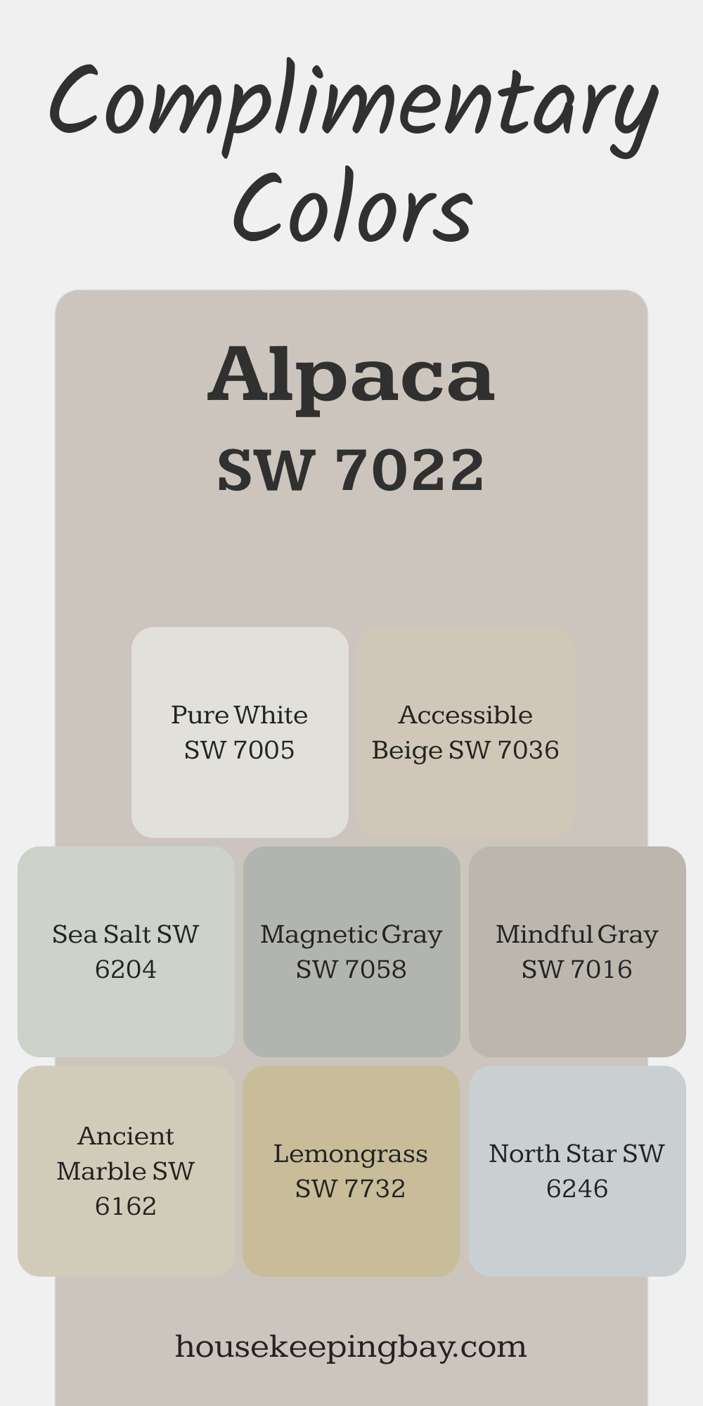
SW 7022 Alpaca
Alpaca is a light, warm gray with taupe undertones, creating an understated yet elegant look. This color is ideal for bedrooms, living rooms, or even offices, where a soothing neutral palette is desired.
Its subtle warmth makes it compatible with both cool and warm accent colors, offering great versatility.
Complimentary Colors :
- SW 7036 Accessible Beige: A warm beige for a harmonious, monochromatic palette.
- SW 7016 Mindful Gray: A slightly darker neutral for depth and contrast.
- SW 7058 Magnetic Gray: A medium gray to add visual interest and balance.
- SW 6204 Sea Salt: A light green-gray for a fresh, calming touch.
- SW 7005 Pure White: A clean white for trim and ceilings to highlight Alpaca’s tones.
- SW 6246 North Star: A pale blue-gray for a cool, serene accent.
- SW 6162 Ancient Marble: A muted green-gray to enhance an earthy, organic feel.
- SW 7732 Lemongrass: A soft, greenish-yellow for a pop of color that feels natural.
via housekeepingbay.com
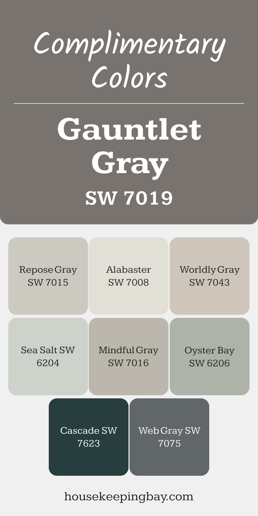
SW 7019 Gauntlet Gray
Gauntlet Gray is a bold, charcoal-inspired gray with warm undertones that adds drama and sophistication to any space. It’s perfect for accent walls, cabinetry, or even exterior facades.
Its deep tone pairs wonderfully with lighter neutrals, metallics, or muted earth tones to create a modern and refined aesthetic.
Complimentary Colors :
- SW 7008 Alabaster: A creamy white that contrasts beautifully for trim or ceilings.
- SW 7043 Worldly Gray: A lighter gray to balance Gauntlet Gray’s depth.
- SW 7015 Repose Gray: A mid-tone gray for smooth transitions between spaces.
- SW 6204 Sea Salt: A light green-gray that adds a soft, organic touch.
- SW 7016 Mindful Gray: A warm gray that creates a cohesive, layered look.
- SW 7075 Web Gray: A rich, dark gray for tonal variation in cabinetry or trim.
- SW 6206 Oyster Bay: A muted green for an earthy, coastal-inspired vibe.
- SW 7623 Cascade: A deep teal accent that adds bold contrast and vibrancy.
via housekeepingbay.com
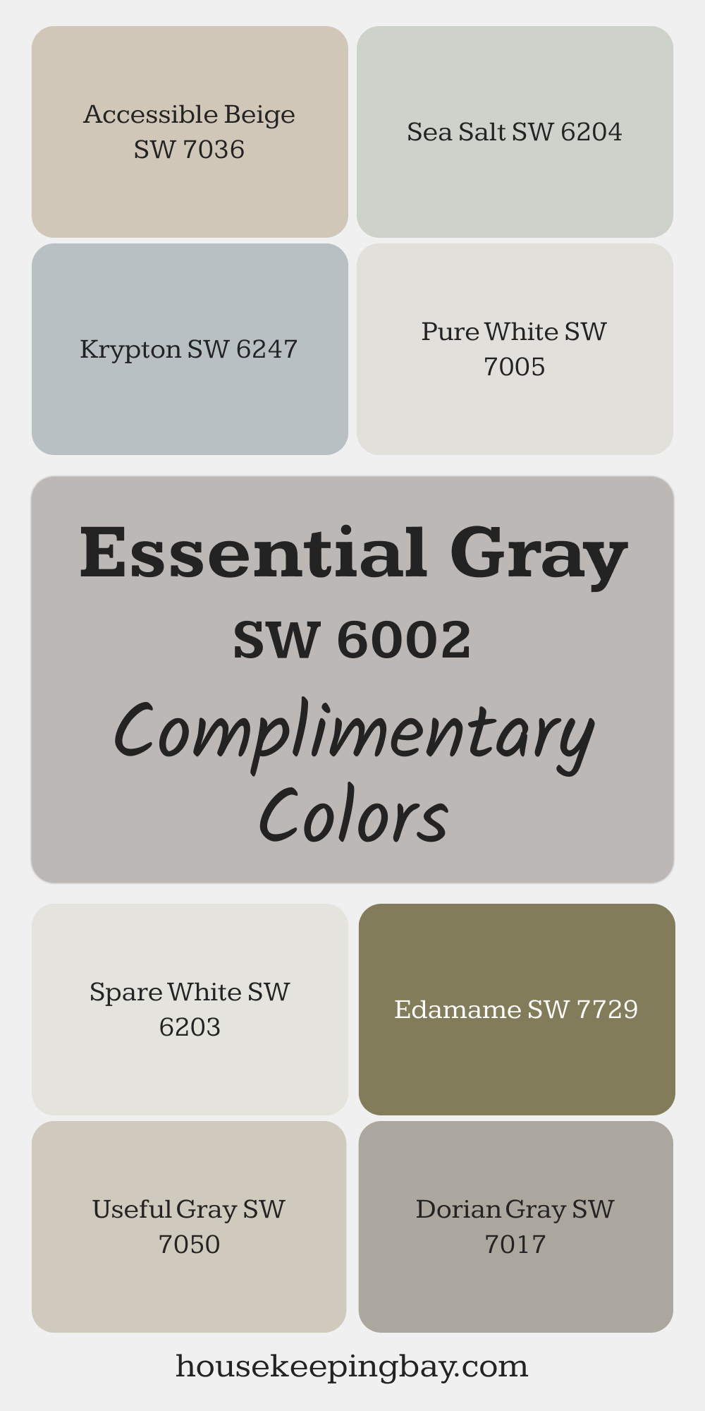
SW 6002 Essential Gray
Essential Gray is a versatile, neutral gray with a hint of warmth that feels clean and balanced. It’s an excellent backdrop for colorful decor, making it ideal for kitchens, home offices, or bathrooms.
Its subtle tone enhances natural light while providing a neutral canvas for other design elements to stand out.
Complimentary Colors :
- SW 7005 Pure White: A bright white for trim to keep the look fresh and modern.
- SW 6247 Krypton: A blue-gray accent for a cool, calming touch.
- SW 7036 Accessible Beige: A warm beige that pairs well for a cohesive, inviting space.
- SW 7017 Dorian Gray: A medium gray for depth and contrast in adjacent rooms.
- SW 6203 Spare White: A light, soft white with green undertones for subtle coolness.
- SW 7050 Useful Gray: A green-gray that enhances the earthy undertones of Essential Gray.
- SW 7729 Edamame: A rich green that adds natural depth and vibrancy.
- SW 6204 Sea Salt: A light green-gray for a tranquil and airy feel.
via housekeepingbay.com
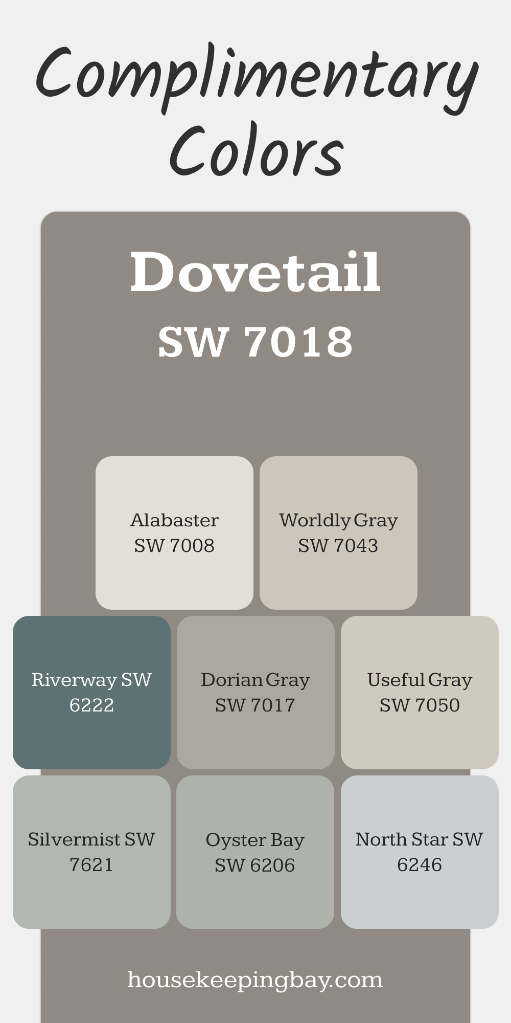
SW 7018 Dovetail
Dovetail is a mid-tone gray with earthy undertones that feels warm and grounding. It’s ideal for dining rooms or bedrooms, where its richness adds intimacy and sophistication.
This color also pairs well with natural wood finishes, metallic accents, or lighter neutrals to create balance and contrast.
Complimentary Colors :
- SW 7008 Alabaster: A bright white for trim or ceilings to contrast with Dovetail’s depth.
- SW 7043 Worldly Gray: A lighter gray to create a seamless transition in adjoining spaces.
- SW 7017 Dorian Gray: A medium gray for a harmonious and layered palette.
- SW 6206 Oyster Bay: A muted green-gray for a fresh, organic touch.
- SW 6246 North Star: A pale blue-gray for a cool and serene accent.
- SW 7050 Useful Gray: A soft green-gray that enhances Dovetail’s earthy tones.
- SW 6222 Riverway: A deep teal for a bold and dynamic accent.
- SW 7621 Silvermist: A soft, silvery blue-gray to add lightness and balance.
via housekeepingbay.com
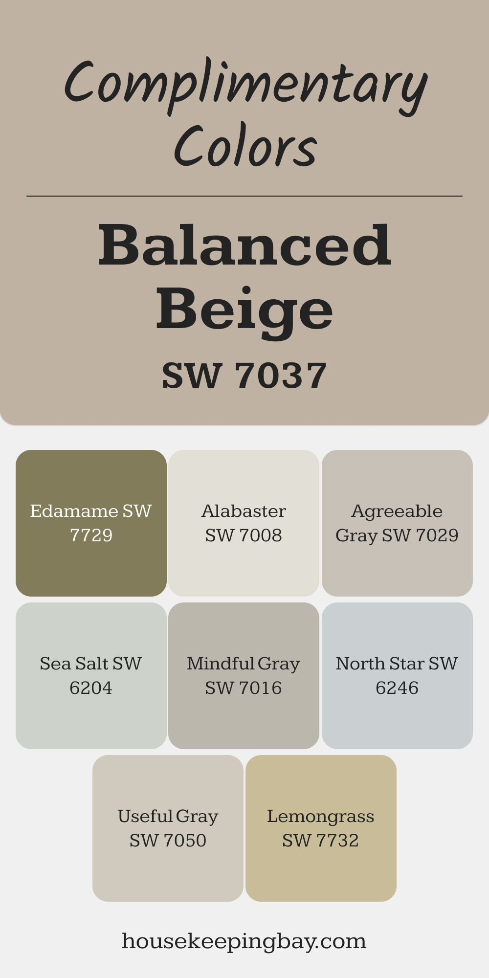
SW 7037 Balanced Beige
Balanced Beige is a warm beige with soft gray undertones, creating a cozy yet sophisticated look. It’s perfect for family rooms, transitional spaces, or anywhere you want to balance warmth and neutrality.
This color pairs effortlessly with both light and dark elements, offering flexibility in design.
Complimentary Colors:
- SW 7008 Alabaster: A creamy white that brightens Balanced Beige in trim or ceilings.
- SW 7029 Agreeable Gray: A warm gray that complements Balanced Beige for seamless transitions.
- SW 7016 Mindful Gray: A medium gray to add depth and contrast to the palette.
- SW 7050 Useful Gray: A green-gray for a natural, organic vibe.
- SW 6204 Sea Salt: A light green-gray to add a fresh, airy quality.
- SW 7732 Lemongrass: A muted green-yellow for a soft, nature-inspired accent.
- SW 6246 North Star: A cool blue-gray to balance the warmth of Balanced Beige.
- SW 7729 Edamame: A rich green for bold accents that feel grounded and natural.
via housekeepingbay.com
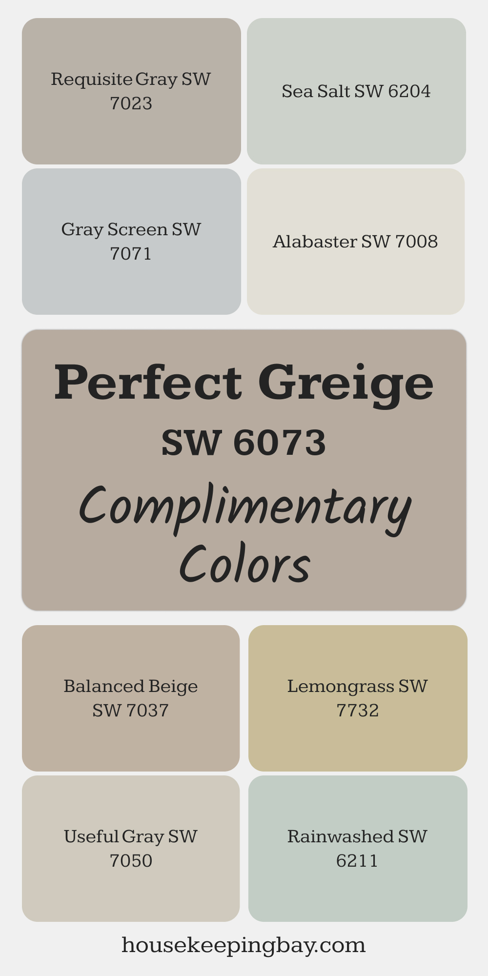
SW 6073 Perfect Greige
Perfect Greige combines the best of gray and beige, resulting in a warm, modern neutral that’s highly versatile. It’s ideal for creating a cozy yet polished look in bedrooms or home offices, where its balance of warmth and neutrality sets a serene tone.
This shade pairs effortlessly with earthy accents or bolder complementary colors to suit any style.
Complimentary Colors :
- SW 7008 Alabaster: A warm white that brightens Perfect Greige and adds contrast for trim and ceilings.
- SW 7023 Requisite Gray: A cooler gray for depth in adjoining spaces or accent walls.
- SW 7037 Balanced Beige: A warm beige that complements Perfect Greige’s undertones for a cohesive look.
- SW 7071 Gray Screen: A cooler gray that offers a modern, contrasting accent.
- SW 7050 Useful Gray: A green-tinted neutral that introduces subtle freshness.
- SW 6204 Sea Salt: A light green-gray for a soft, nature-inspired accent.
- SW 7732 Lemongrass: A muted green that pairs well for a pop of organic vibrancy.
- SW 6219 Rainwashed: A light blue-green for a calming and serene touch.
via housekeepingbay.com
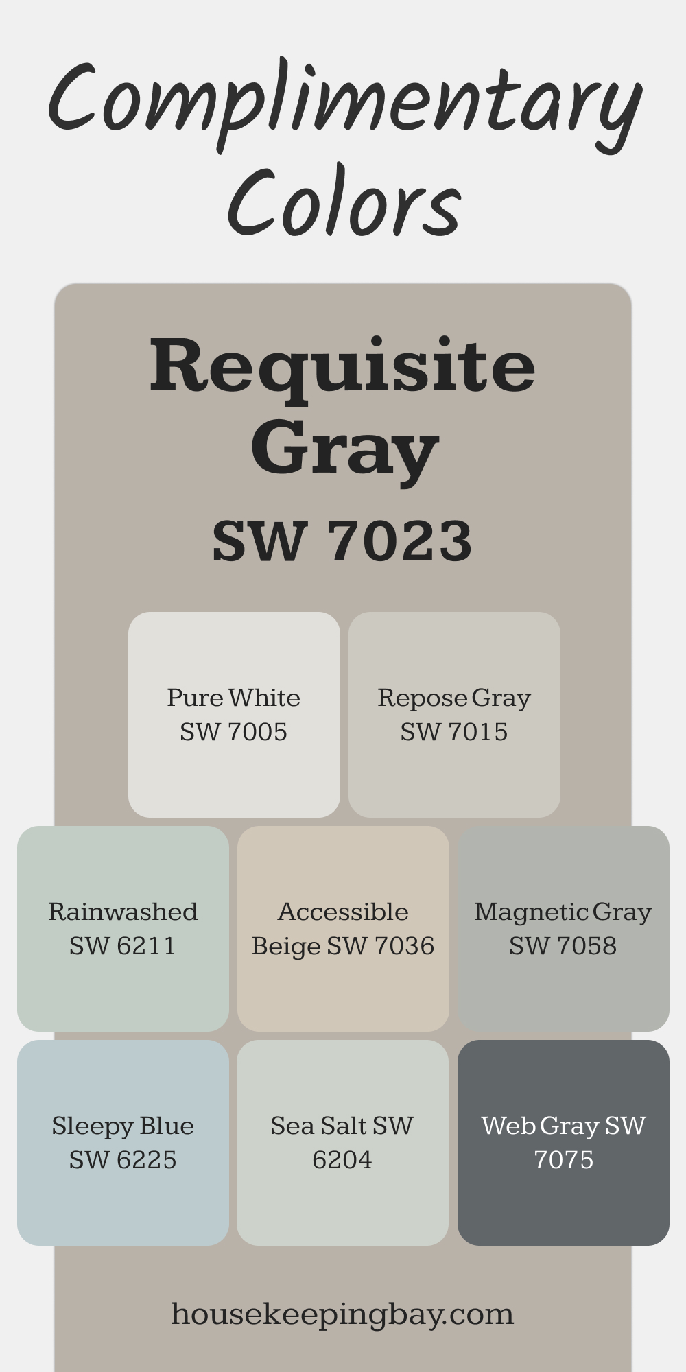
SW 7023 Requisite Gray
Requisite Gray is a cool gray with subtle warmth, making it an adaptable neutral that works well in kitchens, bathrooms, or living areas.
It’s the perfect backdrop for spaces where you want a clean, crisp look that doesn’t feel too cold or stark.
Complimentary Colors :
- SW 7005 Pure White: A bright white for trim and ceilings that highlights Requisite Gray’s subtle depth.
- SW 7015 Repose Gray: A slightly lighter gray for a layered, cohesive palette.
- SW 7036 Accessible Beige: A warm beige to balance the coolness of Requisite Gray.
- SW 7058 Magnetic Gray: A medium gray for depth and contrast.
- SW 6219 Rainwashed: A soft blue-green that adds a calming and refreshing element.
- SW 7075 Web Gray: A rich, dark gray for bold accents like cabinetry or furniture.
- SW 6225 Sleepy Blue: A muted blue for a relaxed and elegant touch.
- SW 6204 Sea Salt: A green-gray accent to introduce a natural, soothing vibe.
via housekeepingbay.com
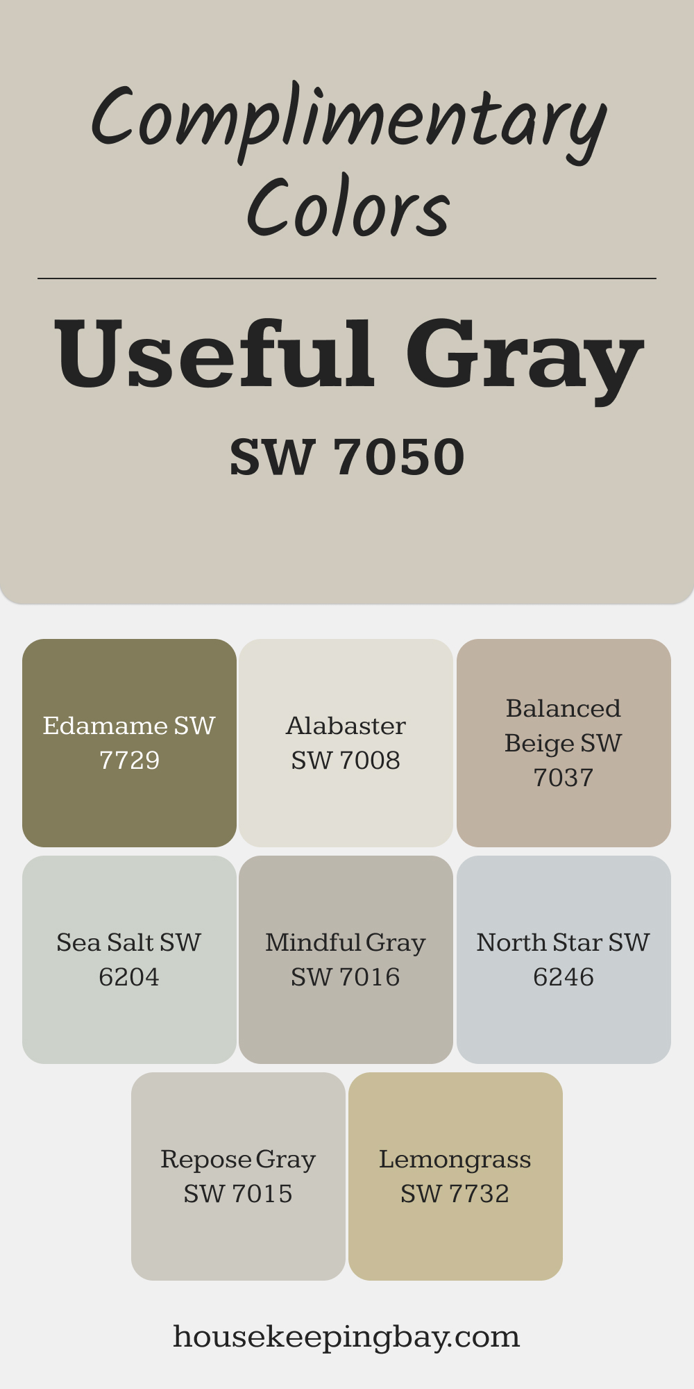
SW 7050 Useful Gray
Useful Gray is a soft neutral with green undertones, creating a calming and natural atmosphere.
It’s perfect for kitchens, mudrooms, or bathrooms, where its subtle color harmonizes beautifully with natural materials and outdoor views.
Complimentary Colors :
- SW 7008 Alabaster: A creamy white for trim and ceilings to brighten and balance Useful Gray.
- SW 7037 Balanced Beige: A warm beige for a cohesive and inviting palette.
- SW 7016 Mindful Gray: A mid-tone gray that provides contrast while maintaining a neutral feel.
- SW 7732 Lemongrass: A muted green for a vibrant, nature-inspired accent.
- SW 7729 Edamame: A rich green that adds earthy depth to the scheme.
- SW 6204 Sea Salt: A light green-gray that enhances Useful Gray’s green undertones.
- SW 6246 North Star: A light blue-gray for a subtle cool accent.
- SW 7015 Repose Gray: A light gray that balances Useful Gray’s warmth for a soft, transitional look.
via housekeepingbay.com
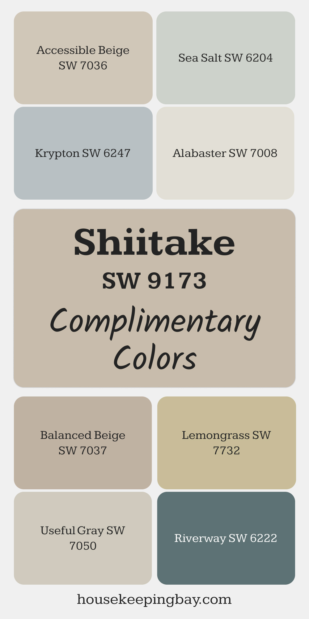
SW 9173 Shiitake
Shiitake is a warm taupe with earthy undertones, ideal for creating a grounded and tranquil environment. This shade is perfect for open living areas or bedrooms, where its subtle warmth enhances both wood tones and soft textiles.
Its adaptability makes it a great choice for transitional or modern design schemes.
Complimentary Colors :
- SW 7008 Alabaster: A warm white for trim and ceilings that enhances Shiitake’s earthy tones.
- SW 7036 Accessible Beige: A slightly lighter beige for a seamless and harmonious pairing.
- SW 7037 Balanced Beige: A warm beige to create a cozy, layered palette.
- SW 7732 Lemongrass: A muted green for a fresh, organic pop of color.
- SW 7050 Useful Gray: A green-gray to complement Shiitake’s natural feel.
- SW 6204 Sea Salt: A soft green-gray for a refreshing, airy accent.
- SW 6247 Krypton: A soft blue-gray to introduce a subtle cool contrast.
- SW 6222 Riverway: A deep teal that adds a bold and dramatic accent.
via housekeepingbay.com
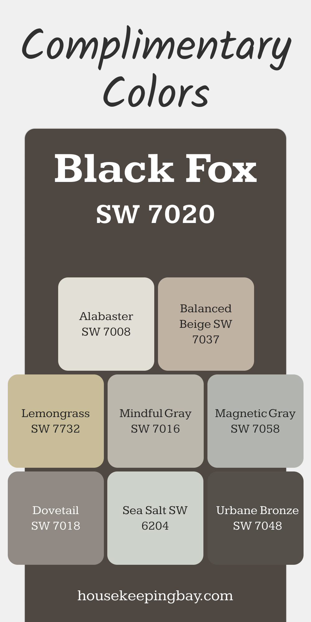
SW 7020 Black Fox
Black Fox is a deep, earthy brown-black that adds bold sophistication to interiors and exteriors. It’s an excellent choice for accent walls, furniture, or trim, where its dramatic tone can anchor a space.
Pairing Black Fox with lighter neutrals or natural textures creates a stunning, balanced aesthetic.
Complimentary Colors :
- SW 7008 Alabaster: A soft white that provides contrast and enhances Black Fox’s richness.
- SW 7048 Urbane Bronze: A dark bronze for a monochromatic and luxurious palette.
- SW 7018 Dovetail: A mid-tone gray to soften and balance Black Fox’s boldness.
- SW 7037 Balanced Beige: A warm beige to lighten the palette while maintaining an earthy feel.
- SW 6204 Sea Salt: A green-gray for a fresh and calming contrast.
- SW 7058 Magnetic Gray: A medium gray to create a layered, sophisticated palette.
- SW 7016 Mindful Gray: A soft gray for a subtle, harmonious pairing.
- SW 7732 Lemongrass: A muted green to add a vibrant, natural accent.
via housekeepingbay.com
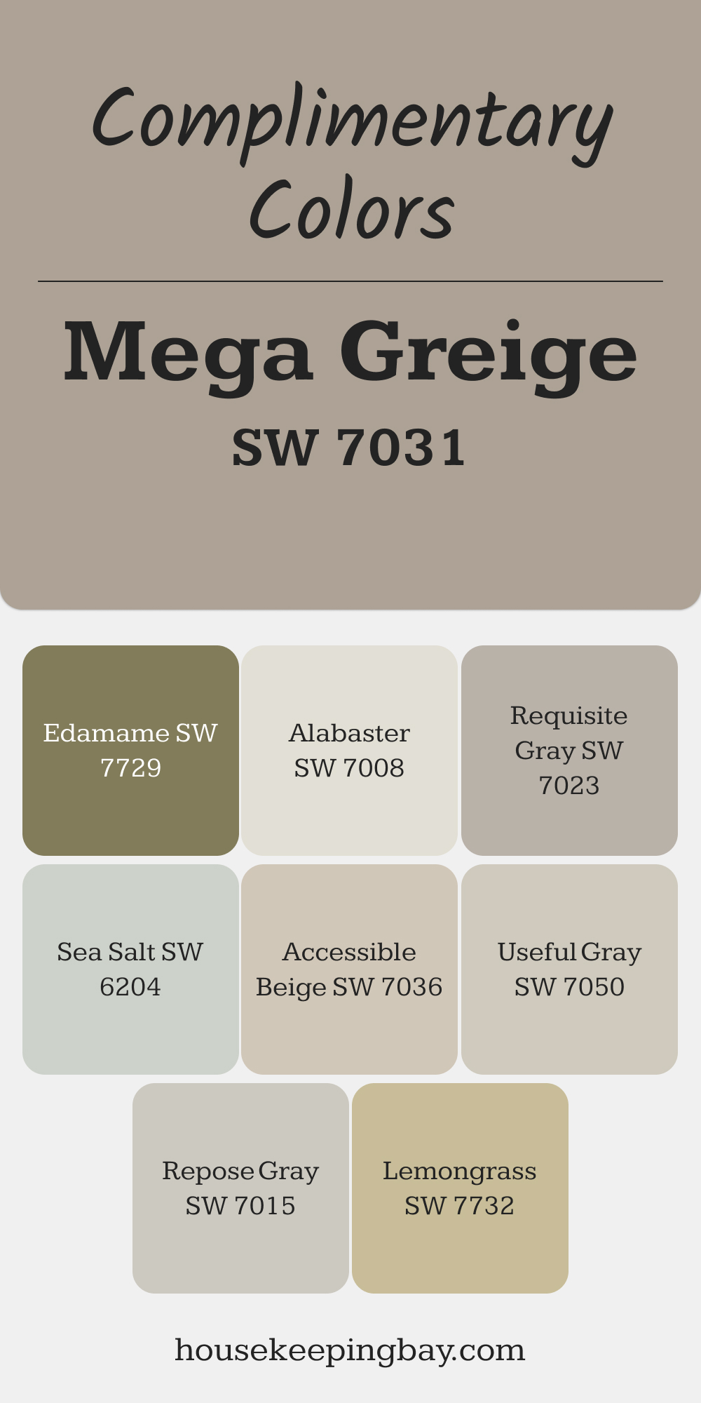
SW 7031 Mega Greige
Mega Greige is a rich, warm greige with strong beige undertones, perfect for creating a cozy and inviting space. It works beautifully in living rooms or family areas, where its warmth adds depth without overwhelming the room.
Pairing it with light neutrals and greens creates a serene, balanced look.
Complimentary Colors:
- SW 7008 Alabaster: A creamy white for trim and ceilings that enhances Mega Greige’s warmth.
- SW 7023 Requisite Gray: A cooler gray for contrast in adjoining spaces.
- SW 7015 Repose Gray: A light, warm gray to complement and balance Mega Greige.
- SW 7050 Useful Gray: A green-gray for a natural, calming accent.
- SW 6204 Sea Salt: A light green-gray for a refreshing touch.
- SW 7732 Lemongrass: A muted green for a natural, earthy pop.
- SW 7036 Accessible Beige: A lighter beige to create a cohesive and harmonious palette.
- SW 7729 Edamame: A deep green to add bold, earthy contrast.
via housekeepingbay.com
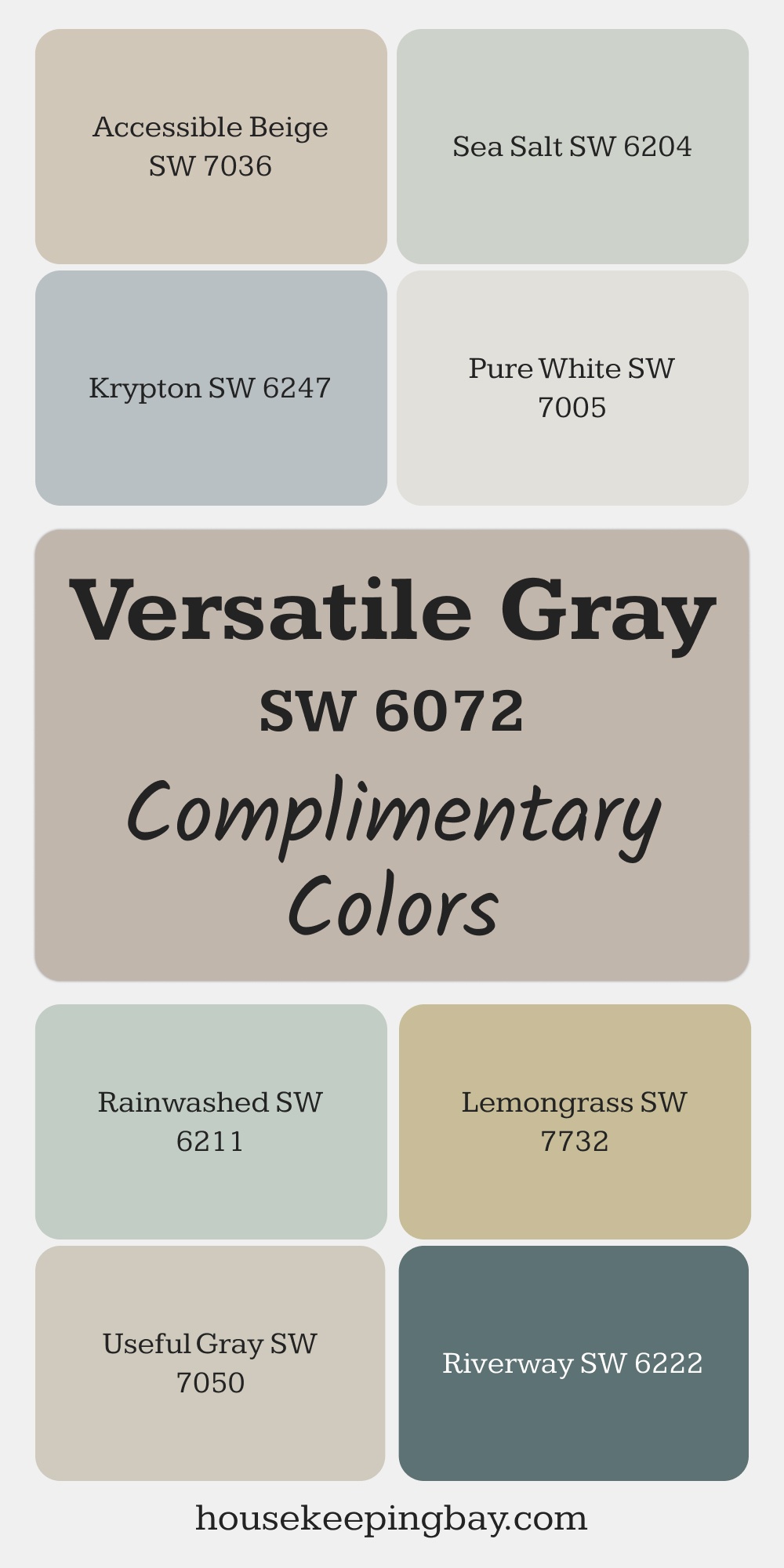
SW 6072 Versatile Gray
Versatile Gray is a warm gray with taupe undertones, making it a perfect choice for both modern and traditional spaces.
This shade works beautifully in dining rooms or foyers, where its subtle warmth can create a welcoming and elegant ambiance.
Complimentary Colors:
- SW 7005 Pure White: A clean white for trim and ceilings to brighten Versatile Gray.
- SW 7036 Accessible Beige: A warm beige that enhances the taupe undertones for a cohesive look.
- SW 7050 Useful Gray: A green-gray that pairs beautifully for a natural, grounded feel.
- SW 6247 Krypton: A soft blue-gray to add a cool, calming contrast.
- SW 6204 Sea Salt: A light green-gray for a fresh and airy accent.
- SW 7732 Lemongrass: A muted green for a vibrant yet subtle pop of color.
- SW 6219 Rainwashed: A soft blue-green that complements Versatile Gray’s warmth.
- SW 6222 Riverway: A rich teal for a bold and sophisticated accent.
via housekeepingbay.com
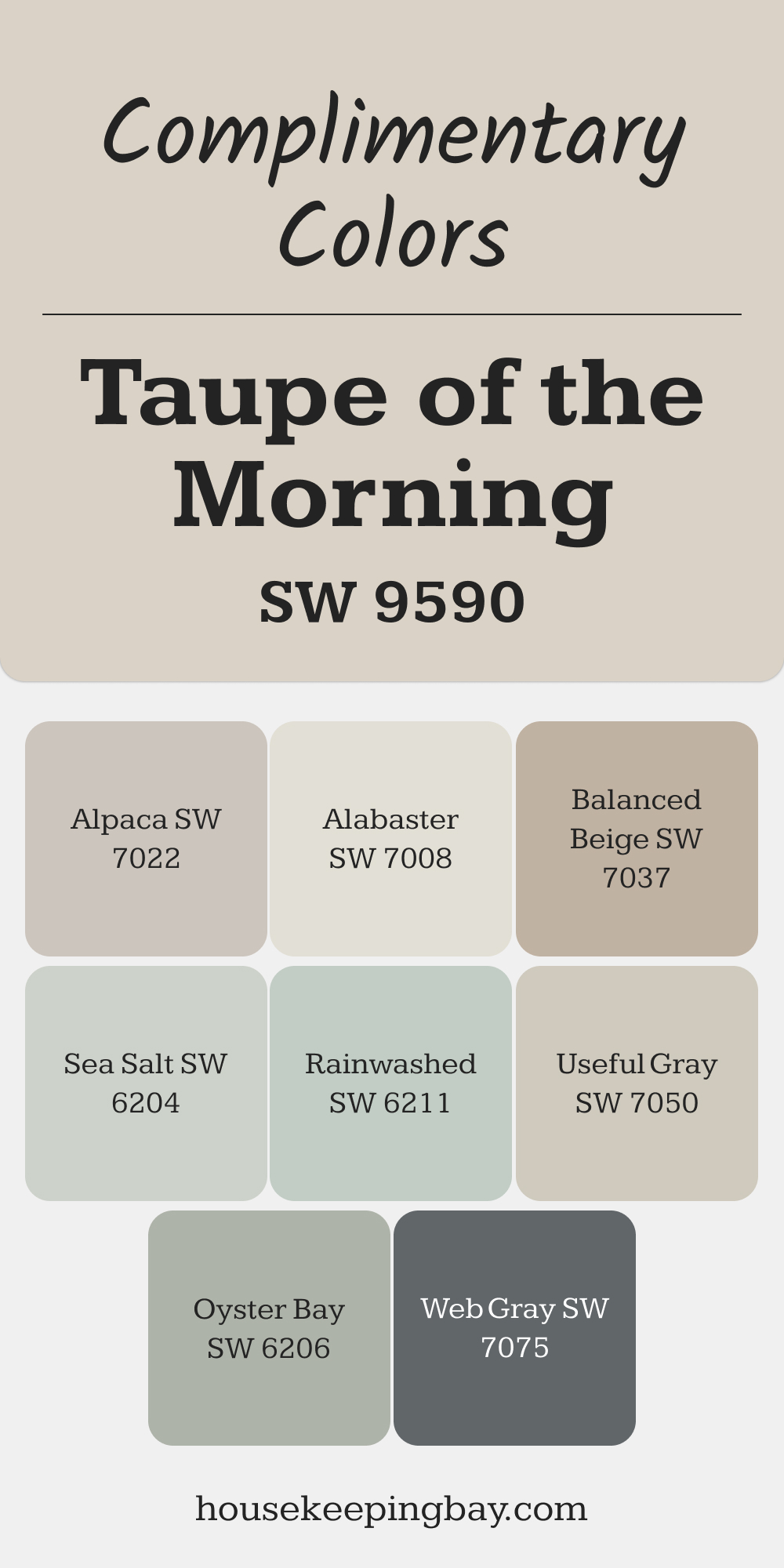
SW 9590 Taupe of the Morning
Taupe of the Morning is a soft, beige-taupe that exudes lightness and elegance while maintaining a grounded feel.
It’s ideal for bedrooms or sitting areas, where its subtle warmth creates a comfortable and serene environment.
Complimentary Colors :
- SW 7008 Alabaster: A creamy white for trim and ceilings to keep the palette bright and cohesive.
- SW 7037 Balanced Beige: A warm beige for a layered and inviting palette.
- SW 7050 Useful Gray: A green-gray for a natural, calming accent.
- SW 7022 Alpaca: A soft taupe-gray that pairs seamlessly for a sophisticated look.
- SW 6204 Sea Salt: A light green-gray for a refreshing and airy feel.
- SW 6219 Rainwashed: A soft blue-green for a serene and tranquil accent.
- SW 6206 Oyster Bay: A muted green-gray for a subtle and organic touch.
- SW 7075 Web Gray: A dark gray for a bold, contrasting accent.
via housekeepingbay.com
Final Thoughts
Neutral shades are the unsung heroes of interior design, offering a versatile and timeless foundation for your home.
Whether you’re designing a cozy living space or a clean and elegant kitchen, Sherwin-Williams’ neutrals provide endless opportunities to craft a harmonious aesthetic.
Pairing these neutrals with complementary colors can transform a space, highlighting architectural features and creating the desired mood.
Don’t be afraid to test combinations using sample swatches and see how they respond to your lighting and furnishings.
For more guidance, consult Sherwin-Williams’ expert tools or reach out to a professional for personalized recommendations. With the right pairings, your home can truly reflect your style while feeling cohesive and inviting.
via housekeepingbay.com
