Useful Gray SW 7050 by Sherwin Williams
Versatility in a Shade: How Gray Adds Sophisticated Balance
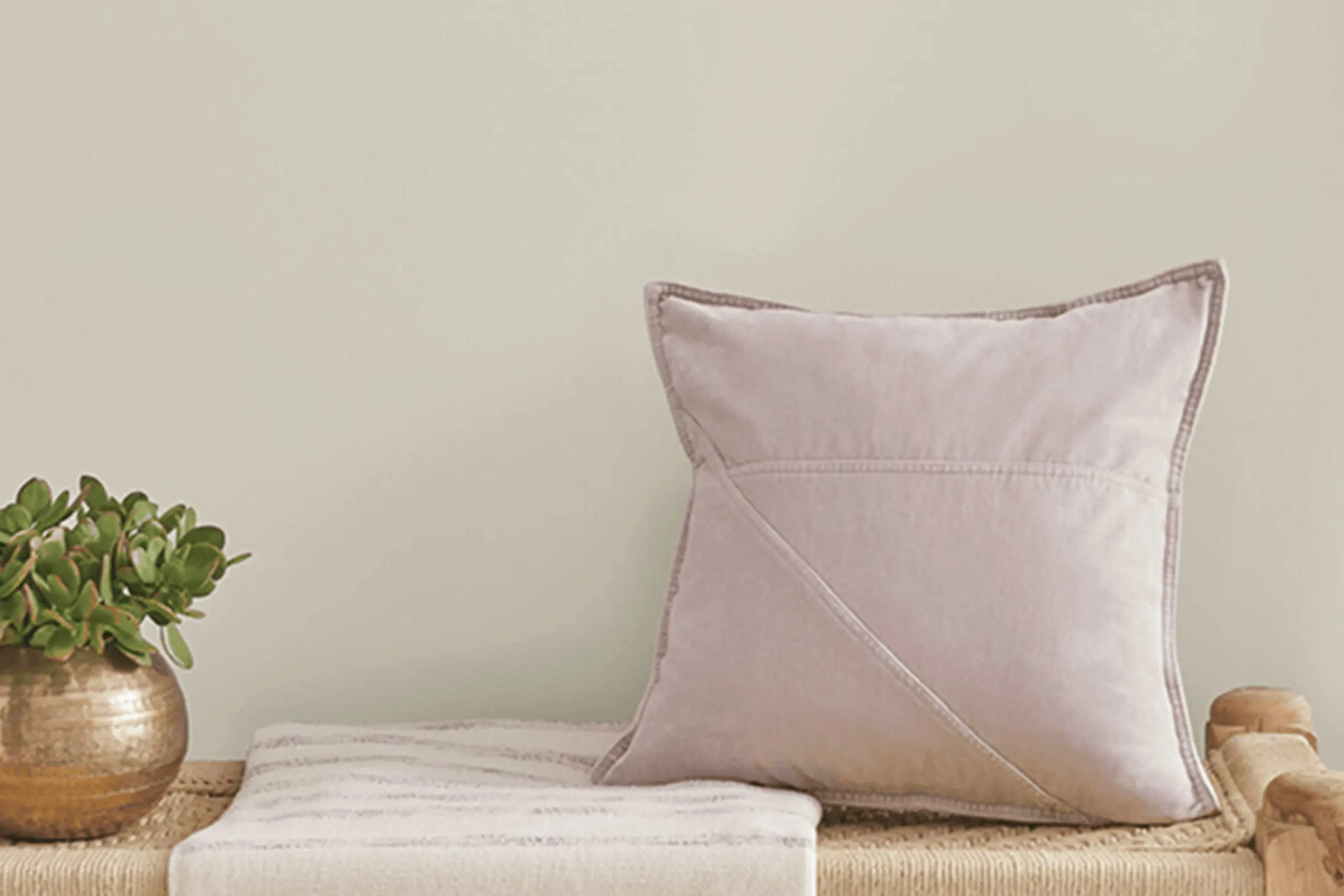
If you’re on the lookout for a paint color that combines versatility with a modern touch, SW 7050 Useful Gray by Sherwin Williams might just be what you need. This unique shade of gray brings a subtle warmth to any space, making it a perfect choice for those who want to refresh their home’s look without going too bold.
Useful Gray has a way of adapting to different lighting conditions, showcasing various undertones that can complement a wide range of decor styles. Whether you’re aiming to give your living room a cozy vibe, your bedroom a serene atmosphere, or your kitchen a clean, contemporary feel, Useful Gray could be the ideal backdrop for your next project.
Its understated elegance allows you to layer in different textures and colors, offering a canvas that supports creativity in your home design.
So, if you’re thinking about giving your space a makeover, consider how Useful Gray could elevate your home’s aesthetic with its subtle charm and adaptability.
via sherwin-williams
What Color Is Useful Gray SW 7050 by Sherwin Williams?
Table of Contents
Useful Gray SW 7050 by Sherwin Williams is a versatile and sophisticated shade that fits a wide range of interior styles. Its unique blend offers a perfect balance between warm and cool tones, making it an ideal choice for those seeking neutrality without the starkness often found in pure grays.
This color works exceptionally well in modern and contemporary settings due to its clean and understated vibe. It’s also suitable for rustic and farmhouse aesthetics, where its warmth enhances natural materials like wood, enhancing the space’s cozy and welcoming atmosphere.
When it comes to pairing with materials and textures, Useful Gray shows its versatility. It complements natural wood tones beautifully, from light pine to dark walnut, creating an earthy and grounded feel.
In spaces with metal accents, like stainless steel or brushed nickel, Useful Gray adds a soft contrast that makes the metallic finishes pop without overwhelming the room. Textiles in white, beige, or even soft pastels like lavender or sage, work wonderfully with this shade, adding depth and interest to the decor.
In sum, Useful Gray SW 7050 is a fantastic choice for anyone looking to create a serene and inviting space, paired perfectly with a variety of materials and textures to fit numerous interior design styles.
housekeepingbay.com
Is Useful Gray SW 7050 by Sherwin Williams Warm or Cool color?
Useful Gray SW 7050 by Sherwin Williams is a versatile color for homes. This shade balances between cool and warm tones, making it a great option for many rooms. By not leaning too far into either temperature, it pairs well with various decor styles. Whether you have a modern, minimalist living room or a cozy, rustic kitchen, Useful Gray can match well, adding a sophisticated touch without overwhelming the space.
This color’s adaptability means it can work in small spaces to give the illusion of more room, or in larger areas to bring a cohesive look. It’s particularly effective in spaces with lots of natural light, as the changing light throughout the day can subtly shift its appearance, keeping the room feeling fresh.
In homes, Useful Gray offers a backdrop that allows furniture and artwork to stand out. It’s practical for homeowners looking for a color that supports various interior changes over time. With Useful Gray, creating a comfortable, stylish home is easily achievable.
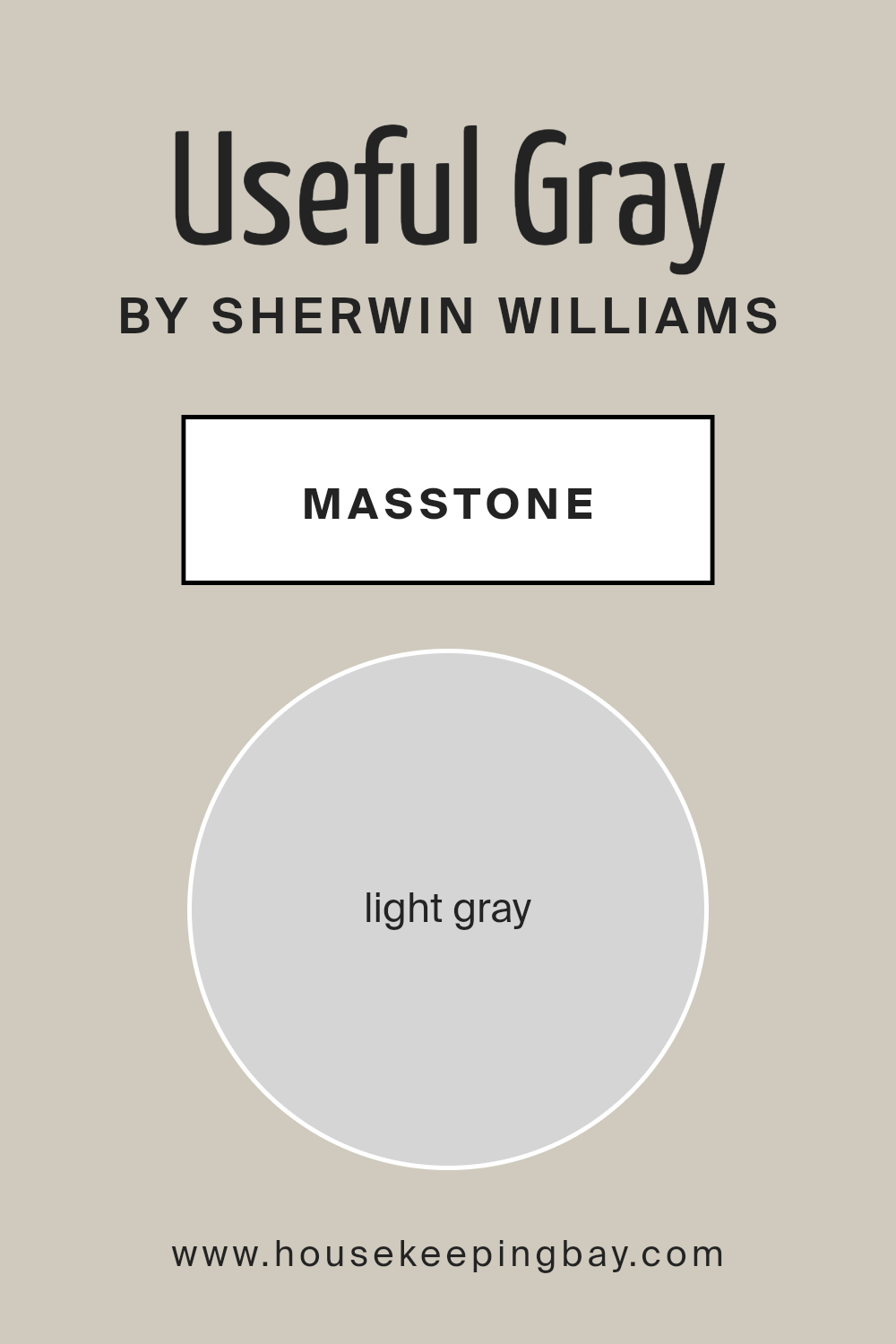
What is the Masstone of the Useful Gray SW 7050 by Sherwin Williams?
Useful Gray SW 7050 by Sherwin Williams is a gentle light gray color, similar to the shade #D5D5D5. This neutral yet inviting tone is perfect for creating a calm and serene atmosphere in homes. Its light gray masstone has a way of making spaces feel more open and airy, providing a subtle backdrop that works well with a variety of decor styles and colors.
Being a neutral color, Useful Gray doesn’t overwhelm but rather compliments. Whether used in a living room, bedroom, or kitchen, it adds just the right amount of warmth without closing in the space.
This color’s versatility allows homeowners to play with textures and accent colors, making it easy to update the look of a room without having to repaint the whole space. Useful Gray adapts well to natural lighting, transforming under different conditions to offer a soft glow or a crisp clarity, depending on the light.
It’s this adaptability that makes Useful Gray a favored choice for creating a cozy yet sophisticated home environment.
housekeepingbay.com
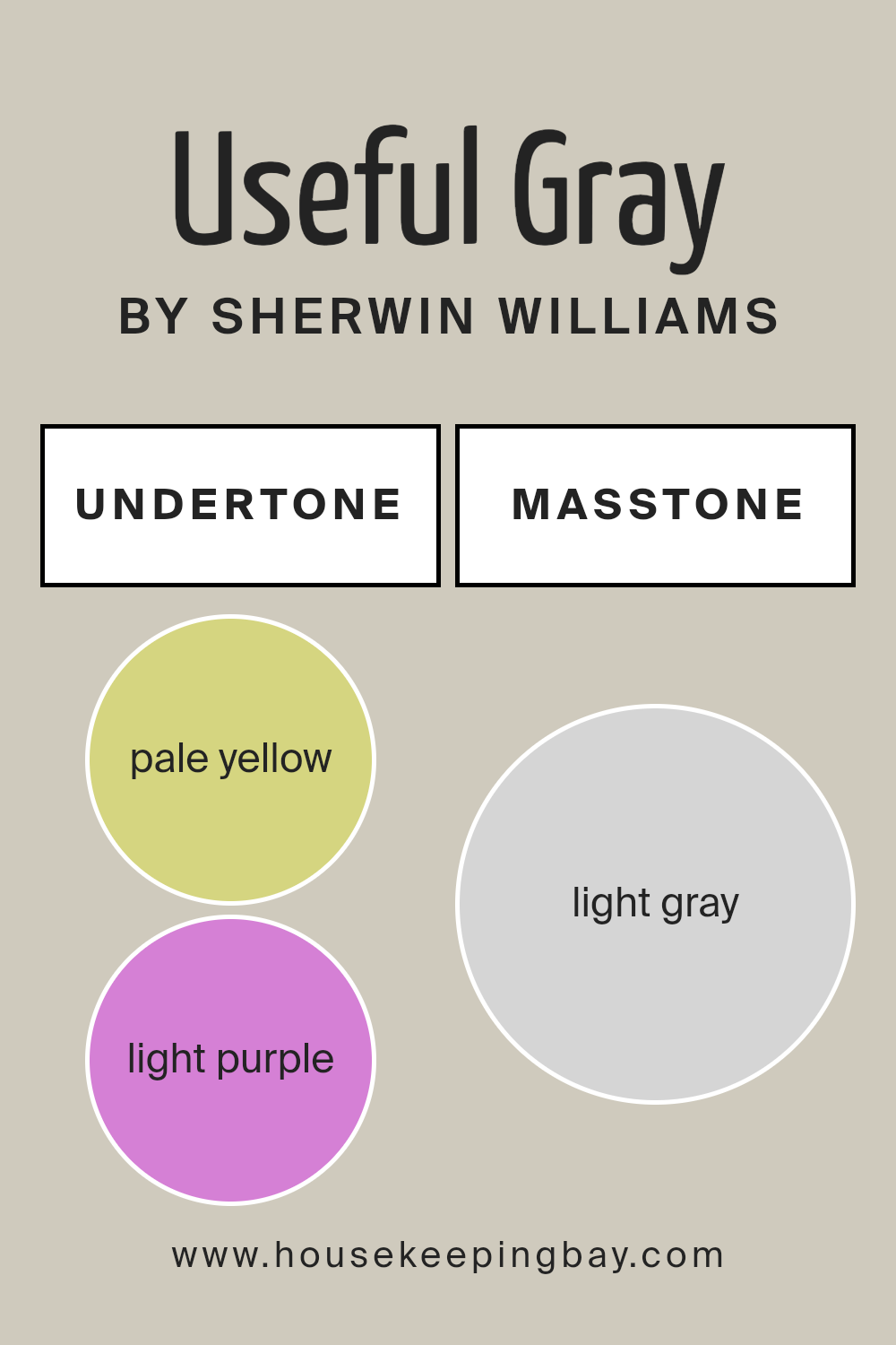
Undertones of Useful Gray SW 7050 by Sherwin Williams
Useful Gray SW 7050 by Sherwin Williams is a unique color. It has a mix of undertones, including pale yellow, light purple, light blue, pale pink, mint, lilac, and gray. These undertones play a big role in how we see the color. Depending on the light and what other colors are nearby, Useful Gray can look different. This is because light can bring out these hidden colors, making the gray seem warmer or cooler.
In interior walls, these undertones affect the mood and feel of a room. For example, in sunlight, the pale yellow or light blue might make a room feel more open and airy. In artificial light, the light purple or lilac might give a cozy feel. The gray undertone keeps it grounded, making sure it doesn’t feel too colorful but still has depth.
The mint and pale pink undertones add a soft touch that can make a space feel more welcoming. This makes Useful Gray a good choice for many rooms, from living rooms to bedrooms. It’s a color that can fit with a lot of styles and preferences because of its complex mix of undertones. So, the way Useful Gray looks on your walls can really change and adjust with the room’s lighting and the colors around it.
housekeepingbay.com
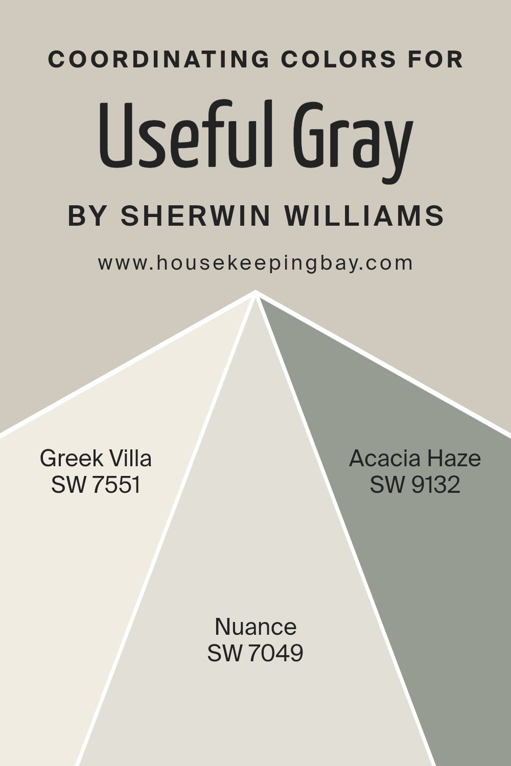
Coordinating Colors of Useful Gray SW 7050 by Sherwin Williams
Coordinating colors are shades that complement each other and work well together, creating a harmonious look in a space. When it comes to Useful Gray SW 7050 by Sherwin Williams, there are specific colors that pair nicely with it, such as SW 7551 – Greek Villa, SW 7049 – Nuance, and SW 9132 – Acacia Haze.
These colors have been chosen because they share a certain balance with Useful Gray, either by contrasting it in a pleasing way or by enhancing its qualities.
Greek Villa SW 7551 is a soft, off-white color with a warm undertone that brings a cozy and inviting feel to a room. It acts as a light, neutral backdrop that makes Useful Gray’s subtle tones stand out. Nuance SW 7049, on the other hand, is a gentle shade of gray with a touch of warmth, working seamlessly with Useful Gray to create a sense of depth and sophistication in any area of your home. Lastly, Acacia Haze SW 9132 offers a deeper, green-gray hue, adding a layer of richness and complexity to the palette.
This color introduces an earthy element that complements the grounded nature of Useful Gray, allowing for a design that is both refined and welcoming. Together, these colors create a balanced and appealing palette that enhances the beauty of Useful Gray.
You can see recommended paint colors below:
housekeepingbay.com
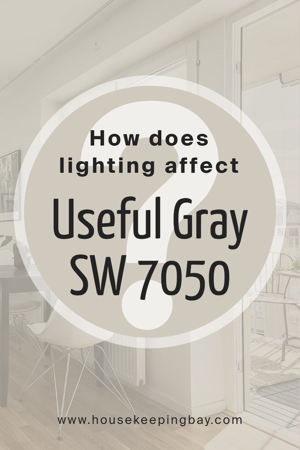
How Does Lighting Affect Useful Gray SW 7050 by Sherwin Williams?
Lighting plays a crucial role in how we perceive colors. The type of light under which a color is viewed can significantly impact its appearance. This concept is especially important when considering wall colors for interiors, such as “Useful Gray SW 7050” by Sherwin-Williams.
Under artificial light, Useful Gray can appear warmer or cooler depending on the bulb’s temperature. Cooler bulbs can bring out the gray’s subtle blue undertones, making the room feel more serene. Warmer bulbs, on the other hand, can make the same gray paint look more inviting and cozier by enhancing its beige components.
In natural light, the appearance of Useful Gray shifts throughout the day. Morning light in east-facing rooms is cooler, making the color appear more muted and soft. As the day progresses, especially in west-facing rooms, the color warms up, welcoming a more vibrant tone by afternoon and evening when the sunlight is at its warmest.
North-facing rooms receive less direct sunlight, meaning Useful Gray could look more consistently soft and subtle throughout the day, maintaining its true gray essence. This makes north-facing rooms ideal for achieving a calm and steady look.
Conversely, south-facing rooms bathe in abundant daylight, which can amplify the warmer tones in Useful Gray, making the spaces feel brighter and more airy. The light in these rooms can make the color look lighter and more dynamic throughout the day.
Understanding these nuances helps in choosing the right room for Useful Gray SW 7050 based on the atmosphere you wish to create.
Whether seeking a cozy corner with artificial light or a bright, lively space bathed in natural light, how Useful Gray interacts with the room’s orientation and lighting types can guide your choice, ensuring your space looks just the way you envision.
housekeepingbay.com
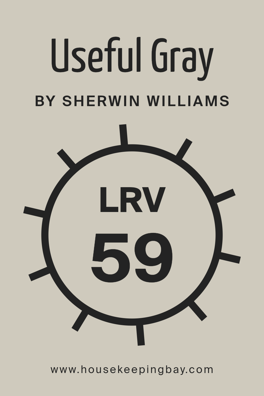
What is the LRV of Useful Gray SW 7050 by Sherwin Williams?
Now, taking the color Useful Gray SW 7050 by Sherwin Williams with an LRV of 59.103, it sits in the middle of the scale. This means it doesn’t lean too heavily towards being either very bright or very dark. It’s a sort of neutral territory. In a room, this gray will have a balanced behavior; during the day in a well-lit room, it will seem lighter and more open, but as the evening comes and the light changes, it will offer a more subdued, calming feeling.
The mid-range LRV of Useful Gray makes it versatile for spaces that get varying amounts of natural light, adapting subtly to different times of the day without overwhelming the senses.
housekeepingbay.com
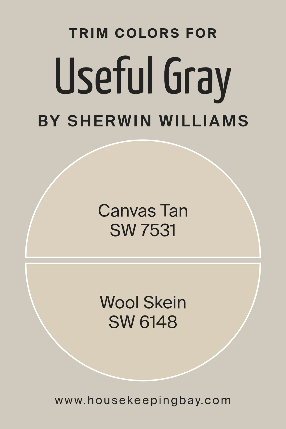
What are the Trim colors of Useful Gray SW 7050 by Sherwin Williams?
Trim colors are essentially the colors used for painting the trims of a room, which include door frames, window frames, baseboards, and crown moldings. They play a critical role in defining and accentuating the overall look of a room.
For a wall painted in Useful Gray SW 7050 by Sherwin Williams, choosing the right trim color can significantly enhance its appearance and feel. The idea is to select trim colors that compliment or contrast with the wall color in a way that highlights the room’s features and pulls the entire look together.
Using SW 7531 Canvas Tan as a trim color provides a soft, warm contrast to Useful Gray, creating a welcoming and cohesive look. Canvas Tan is a light, warm beige that adds a subtle warmth to the edges of a room, making the space feel inviting. On the other hand, SW 6148 Wool Skein offers a slightly richer tone, with its gentle, neutral beige adding depth and interest to the trim.
This color pairs well with Useful Gray, ensuring the room maintains a harmonious balance without overpowering the soothing essence of the wall color. Both Canvas Tan and Wool Skein are excellent choices to complement Useful Gray, each bringing its unique charm to the room’s overall aesthetic.
You can see recommended paint colors below:
- SW 7531 Canvas Tan
- SW 6148 Wool Skein
housekeepingbay.com
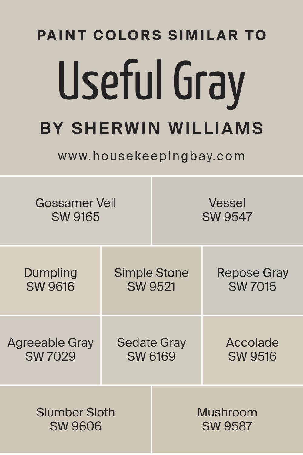
Colors Similar to Useful Gray SW 7050 by Sherwin Williams
Similar colors play a vital role in creating a cohesive and visually appealing design by allowing for subtle variations in hue and tone that can add depth and texture to a space without overwhelming it with contrast.
When colors like those similar to Useful Gray SW 7050 by Sherwin Williams, such as Gossamer Veil SW 9165, Vessel SW 9547, Dumpling SW 9616, Simple Stone SW 9521, Repose Gray SW 7015, Agreeable Gray SW 7029, Sedate Gray SW 6169, Accolade SW 9516, Slumber Sloth SW 9606, and Mushroom SW 9587, are used together, they create a harmonious look that feels both unified and dynamic.
These shades range from light and airy to cozy and grounding, offering options for every design goal and mood one aims to achieve in a room.
Gossamer Veil SW 9165 is a soft, warm gray that brings a soothing presence, while Vessel SW 9547 leans toward a darker, more mysterious gray with a hint of green. Dumpling SW 9616 offers a cheerful, light-hearted beige, and Simple Stone SW 9521 presents itself as a neutral, balanced gray with earthy undertones.
Repose Gray SW 7015 provides a light, refreshing gray that can brighten spaces, and Agreeable Gray SW 7029, true to its name, is a versatile, mid-toned gray-beige that works well in any setting. Sedate Gray SW 6169 is a calm, muted gray with a sense of stability, and Accolade SW 9516 introduces a darker, more profound gray that anchors spaces. Slumber Sloth SW 9606 whispers a soft, serene gray, ideal for relaxation, and Mushroom SW 9587 rounds out the collection with its rich, warm beige that creates a cozy, inviting atmosphere.
Together, these colors support a range of design approaches, from minimalist to eclectic, by tying different elements and textures together for a cohesive and inviting look.
You can see recommended paint colors below:
- SW 9165 Gossamer Veil
- SW 9547 Vessel
- SW 9616 Dumpling
- SW 9521 Simple Stone
- SW 7015 Repose Gray
- SW 7029 Agreeable Gray
- SW 6169 Sedate Gray
- SW 9516 Accolade
- SW 9606 Slumber Sloth
- SW 9587 Mushroom
housekeepingbay.com
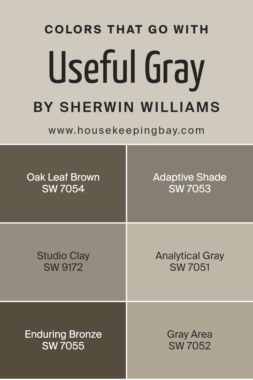
Colors that Go With Useful Gray SW 7050 by Sherwin Williams
Choosing colors that complement Useful Gray SW 7050 by Sherwin Williams is crucial because it ensures that your space maintains a cohesive and appealing look. Useful Gray is a versatile neutral that can serve as a perfect backdrop for a range of coordinating colors, making it essential to select shades that harmonize well with it.
Colors like Oak Leaf Brown, Adaptive Shade, Studio Clay, Analytical Gray, Enduring Bronze, and Gray Area are specifically chosen to complement Useful Gray due to their ability to blend seamlessly and enhance the overall ambiance of a space.
Oak Leaf Brown adds a touch of earthiness, providing a warm contrast to the cool undertones of Useful Gray, while Adaptive Shade, a lighter gray, offers a subtle variation in hue for a sophisticated yet nuanced palette. Studio Clay brings in a hint of softness, its muted tones echoing the quiet sophistication of Useful Gray.
Analytical Gray, similar yet distinct, shares a gray base with Useful Gray but introduces a slight variation that adds depth and complexity to interiors.
Enduring Bronze introduces a richer, deeper color, lending a robust and comforting feel to the environment. Lastly, Gray Area serves as a bridge between the cooler tones of Useful Gray and the warmer accents among the chosen colors, ensuring a balanced and harmonious visual flow.
These colors work together to create an inviting and cohesive space that feels thoughtfully curated and effortlessly stylish.
You can see recommended paint colors below:
- SW 7054 Oak Leaf Brown
- SW 7053 Adaptive Shade
- SW 9172 Studio Clay
- SW 7051 Analytical Gray
- SW 7055 Enduring Bronze
- SW 7052 Gray Area
housekeepingbay.com
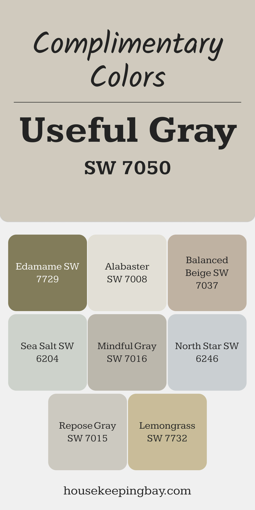
Complimentary Colors for Useful Gray SW 7050 Paint Color by Sherwin Williams
Pair Useful Gray with Alabaster for a fresh, light backdrop, or Balanced Beige for a cohesive, grounded feel. Mindful Gray and Repose Gray blend beautifully, adding depth and subtle contrast. These combinations work well together, creating harmony throughout your home.
For a pop of color, try Lemongrass or Edamame to bring in a natural, lively energy. Sea Salt offers a soft, airy touch, while North Star introduces a cool, refreshing vibe for a well-rounded palette.
via housekeepingbay.com
How to Use Useful Gray SW 7050 by Sherwin Williams In Your Home?
Useful Gray SW 7050, by Sherwin Williams, is a versatile color that works well in many parts of a home. This shade is a soft, warm gray that feels cozy and inviting, making it perfect for living areas, bedrooms, and even kitchens. It has a unique ability to blend with other colors, whether you’re pairing it with bright accents for a cheerful vibe or with darker tones for a more sophisticated look.
For those looking to freshen up their space, Useful Gray is an ideal choice. It’s not too dark or too light, striking a nice balance that can make small rooms appear larger and give larger rooms a more intimate feel. In rooms with lots of natural light, this color adds a calm, soothing aura, while in spaces with less light, it introduces warmth and depth.
Using Useful Gray in your home can also help unify different areas, creating a cohesive look throughout. It’s great for walls, but you can also consider it for cabinets or furniture pieces for a subtle, refined touch. Whether you want to update a single room or your entire home, Useful Gray provides a solid foundation that’s easy to work with, enhancing your space without overwhelming it.
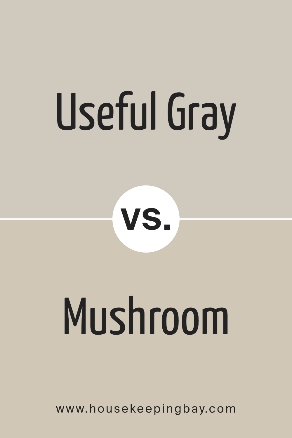
Useful Gray SW 7050 by Sherwin Williams vs Mushroom SW 9587 by Sherwin Williams
Useful Gray SW 7050 by Sherwin Williams is a neutral, muted gray that carries a slight warmth, making it versatile for various spaces. This gray is not too overpowering, offering a soft backdrop that can easily pair with a wide range of decor and color schemes. Its understated elegance allows it to adapt seamlessly, providing a soothing atmosphere without dominating the space.
Mushroom SW 9587, by contrast, brings a richer and earthier tone to the palette. This color leans more towards a beige-brown, reminiscent of natural elements and providing a cozy, welcoming feel to interiors. Mushroom’s depth adds character and warmth, making it ideal for creating inviting spaces.
While it shares the neutrality of Useful Gray, Mushroom offers a different kind of warmth, leaning towards a more organic feel.
Both colors have their unique charm. Useful Gray excels in creating a calm, neutral canvas, while Mushroom adds a touch of nature-inspired warmth, making each suitable for different aesthetic preferences and design goals.
You can see recommended paint color below:
housekeepingbay.com
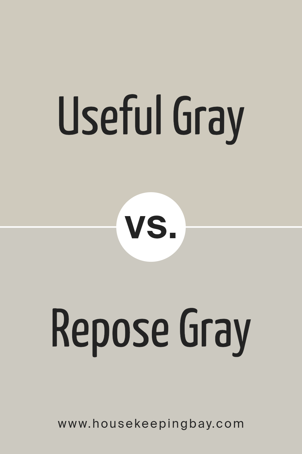
Useful Gray SW 7050 by Sherwin Williams vs Repose Gray SW 7015 by Sherwin Williams
Useful Gray SW 7050 and Repose Gray SW 7015, both by Sherwin Williams, offer distinct yet subtle differences in their shades. Useful Gray carries a soft, warm gray tone that slightly leans towards a taupe, making it versatile and cozy for any space.
It’s particularly suited for rooms where a hint of warmth is desired without straying too far from a neutral gray palette. Repose Gray, meanwhile, presents a lighter, cooler gray that provides a more modern and airy feel. It’s excellent for spaces aiming for a fresh, contemporary look.
Both colors share a gray base, but the warmth of Useful Gray contrasts with Repose Gray’s cooler undertones, making them suitable for different design aesthetics and lighting conditions. In essence, Useful Gray offers a warm, inviting atmosphere, while Repose Gray brings a clean, modern vibe to a space.
You can see recommended paint color below:
- SW 7015 Repose Gray
housekeepingbay.com
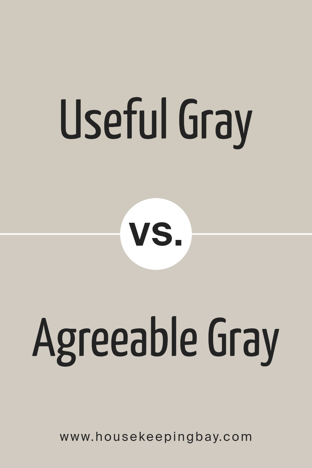
Useful Gray SW 7050 by Sherwin Williams vs Agreeable Gray SW 7029 by Sherwin Williams
Useful Gray SW 7050 and Agreeable Gray SW 7029 by Sherwin Williams are both popular choices for those looking to add a modern yet neutral backdrop to their spaces. Useful Gray leans towards a more muted, almost silvery gray shade, providing a subtle, sophisticated vibe to any room.
It’s perfect for spaces where you want a calm, understated elegance without overwhelming the senses. Agreeable Gray, though, is a bit warmer, with a hint of beige that makes it incredibly versatile. It’s the kind of color that works in any room, under any lighting condition, giving spaces a cozy, welcoming feel.
While both colors are gray, Agreeable Gray’s warmth makes it an ideal choice for creating a snug, inviting atmosphere, whereas Useful Gray offers a cooler, more refined aesthetic. In essence, choosing between them depends on the mood you’re aiming for: inviting warmth with Agreeable Gray or cool sophistication with Useful Gray.
You can see recommended paint color below:
housekeepingbay.com
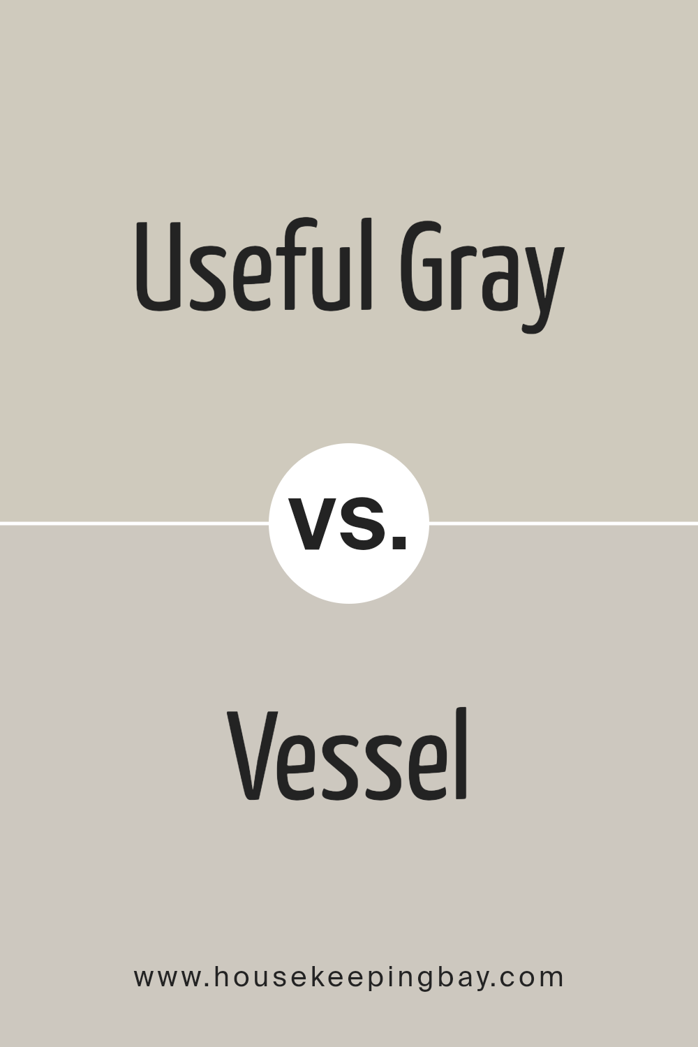
Useful Gray SW 7050 by Sherwin Williams vs Vessel SW 9547 by Sherwin Williams
Useful Gray SW 7050 and Vessel SW 9547 are both colors by Sherwin Williams, but they have distinct differences. Useful Gray is a soft, gentle gray with warm undertones, giving spaces a cozy and inviting feel. It’s versatile, fitting well in various settings without overpowering the room. Think of it as a neutral backdrop that can complement a wide range of decor styles.
Vessel, in contrast, is a deeper, richer color with a teal hue that adds a bold and sophisticated touch to spaces. Unlike the subtlety of Useful Gray, Vessel makes more of a statement. It’s ideal for creating focal points in a room or for adding depth and interest to an area.
While Useful Gray offers a light, airy foundation, suitable for creating a tranquil atmosphere, Vessel brings energy and personality, perfect for those looking to inject some character into their spaces. Both colors serve different purposes but are equally beautiful in their own right.
You can see recommended paint color below:
- SW 9547 Vessel
housekeepingbay.com
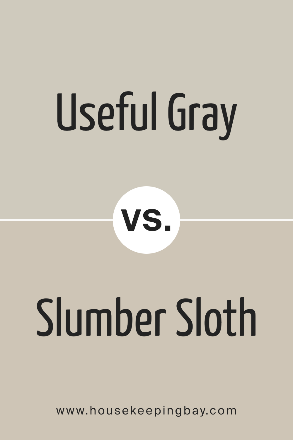
Useful Gray SW 7050 by Sherwin Williams vs Slumber Sloth SW 9606 by Sherwin Williams
Useful Gray SW 7050 by Sherwin Williams is a light to mid-toned gray that carries a subtle warmth, making it versatile for various spaces. Its gentle undertone ensures it pairs well with both cool and warm palettes, offering a serene backdrop that’s neither too stark nor too inviting. This color is ideal for those seeking a neutral with depth, as it adapts well to changing light conditions, showcasing different aspects of its personality throughout the day.
Slumber Sloth SW 9606 by Sherwin Williams is a bit darker and veers towards the taupe side of gray, providing a cozy yet sophisticated feel. Its richness adds an element of comfort to rooms, making spaces feel more grounded and secure.
This color works exceptionally well in bedrooms or study areas where a sense of calm and focus is desired. Its ability to blend with a wide range of decor styles also makes it a practical choice for bringing warmth to modern and traditional designs alike.
Both colors offer unique takes on the gray spectrum, with Useful Gray leaning towards a lighter, adaptable neutral, while Slumber Sloth presents a deeper, soothing taupe-gray.
You can see recommended paint color below:
- SW 9606 Slumber Sloth
housekeepingbay.com
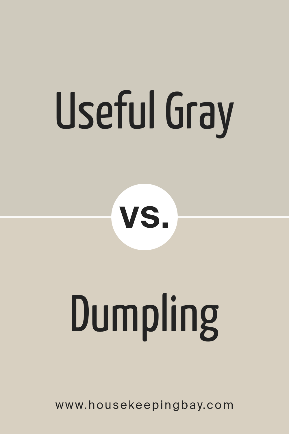
Useful Gray SW 7050 by Sherwin Williams vs Dumpling SW 9616 by Sherwin Williams
Useful Gray SW 7050 by Sherwin Williams is a versatile, neutral gray with a slight warmth to it, making it a perfect choice for rooms where you want a cozy yet sophisticated feel. Its subtlety allows for easy pairing with a wide range of decor and colors, serving well as a backdrop in both modern and traditional settings. The warmth in Useful Gray ensures that it doesn’t feel too cold or industrial, instead giving a soft and inviting atmosphere to spaces.
Dumpling SW 9616 by Sherwin Williams, however, is a lighter, creamy shade that leans towards a soft, off-white with a hint of warmth. This color is ideal for creating a bright, airy feel in a room, making it feel more spacious and open.
Dumpling works particularly well in spaces that seek to achieve a gentle, soothing vibe without the starkness that sometimes comes with pure white. It pairs beautifully with a wide array of colors, adding a touch of coziness without overwhelming the senses.
Both colors offer their unique charm and can significantly enhance a space depending on the chosen aesthetic. Useful Gray suits those looking for depth and sophistication, while Dumpling is perfect for an open, airy, and welcoming space.
You can see recommended paint color below:
housekeepingbay.com
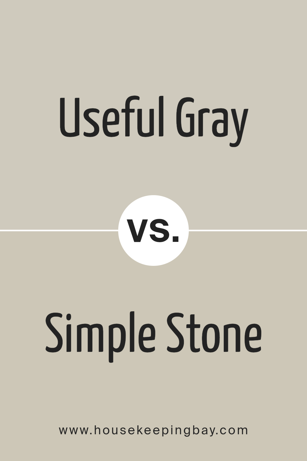
Useful Gray SW 7050 by Sherwin Williams vs Simple Stone SW 9521 by Sherwin Williams
Useful Gray SW 7050 by Sherwin Williams is a warm neutral gray that brings a cozy, soft vibe to any space. It has a touch of beige, making it versatile and welcoming, perfect for rooms where you want a gentle, inviting atmosphere. This color pairs well with both bright accents and darker hues, giving you flexibility in decorating.
Simple Stone SW 9521 by Sherwin Williams, in contrast, leans more towards a cooler, muted palette. It offers a subtle, sophisticated backdrop that works exceptionally well in modern and minimalistic designs. Its understated elegance is great for creating a serene, peaceful environment. This color is ideal for those who prefer a clean, contemporary look in their spaces.
Both Useful Gray and Simple Stone bring their unique charm to interiors, but their distinct undertones and warmth levels set them apart. Useful Gray adds warmth and coziness, while Simple Stone offers a cooler, refined elegance, making each suitable for different aesthetic preferences and design needs.
You can see recommended paint color below:
- SW 9521 Simple Stone
housekeepingbay.com
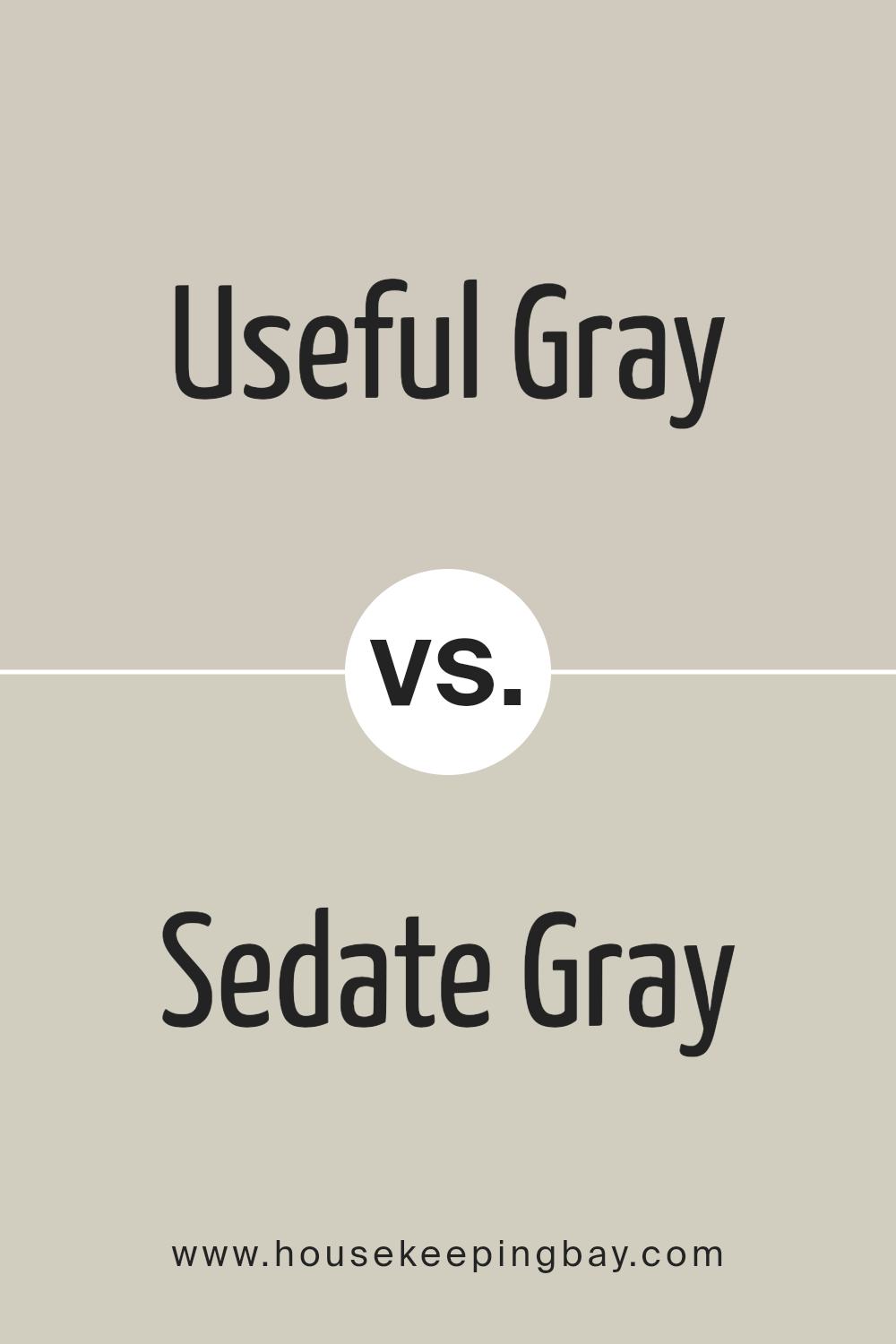
Useful Gray SW 7050 by Sherwin Williams vs Sedate Gray SW 6169 by Sherwin Williams
Useful Gray SW 7050 by Sherwin Williams is a warm, gentle gray with a slight hint of taupe, making it a versatile choice for many spaces. It brings a soft, neutral backdrop that can blend easily with various decor styles, from modern to traditional. This color feels inviting and cozy, creating a comfortable atmosphere in rooms.
Sedate Gray SW 6169 is another gray shade but leans more towards a cooler, more muted tone. It works well in spaces where a calm and serene feeling is desired. Sedate Gray is a bit lighter than Useful Gray, offering a subtle contrast when used together or in different rooms for a cohesive look throughout the home.
Both colors are excellent choices for those looking to achieve a modern, yet timeless look in their home. While Useful Gray adds warmth, Sedate Gray introduces a cooler, more serene vibe. Depending on the room’s purpose and the desired mood, either color can help achieve a beautiful, refined space.
You can see recommended paint color below:
housekeepingbay.com
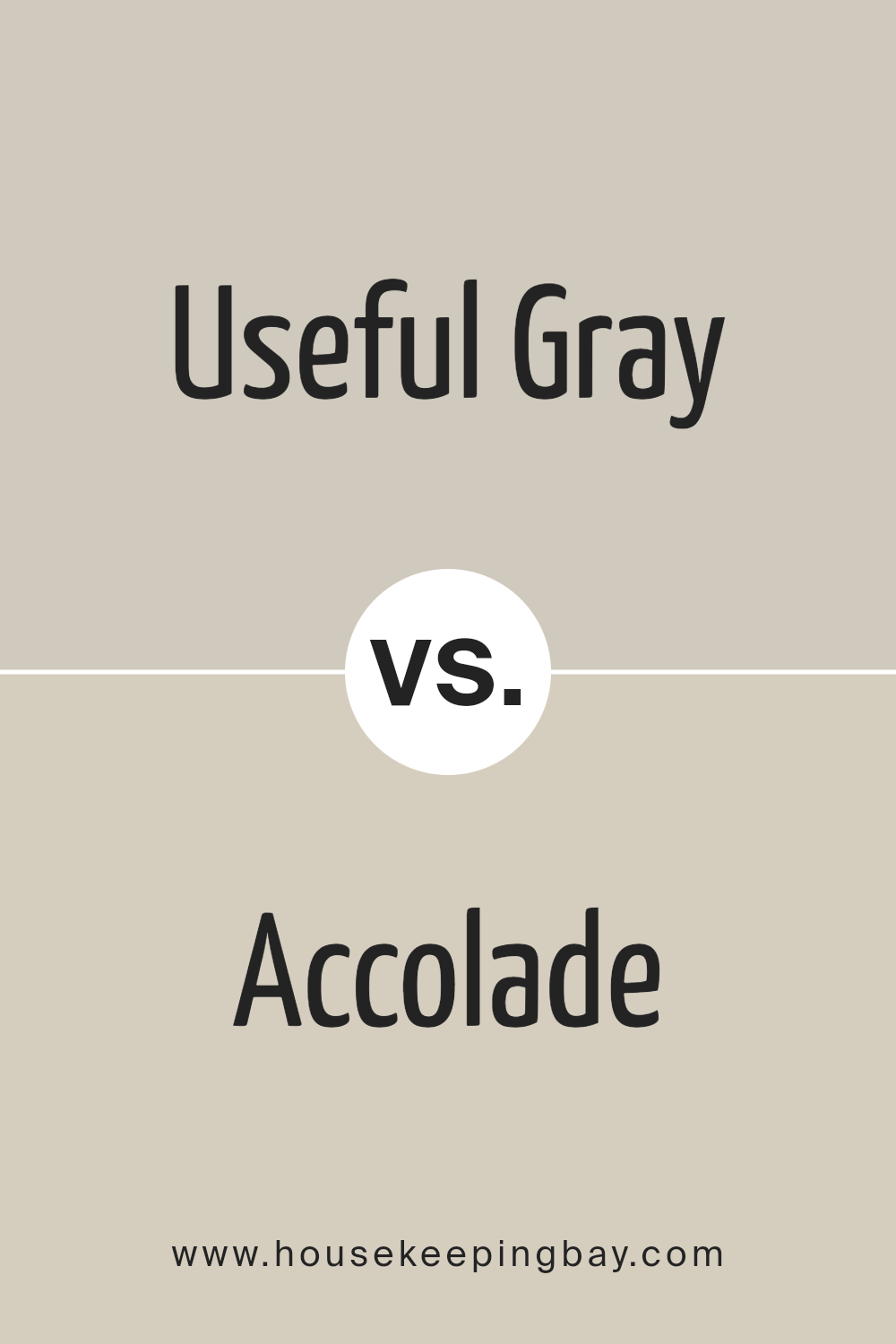
Useful Gray SW 7050 by Sherwin Williams vs Accolade SW 9516 by Sherwin Williams
Useful Gray SW 7050 by Sherwin Williams is a subdued, neutral gray with a warm undertone, making it a versatile choice for many spaces. It evokes a sense of calmness and simplicity, ideal for creating a serene environment. This color fits well in rooms aimed for relaxation and focus, as its gentle hue blends seamlessly with various decors.
Accolade SW 9516, conversely, is a lighter, more delicate shade. It leans towards a soft, almost creamy hue, offering a brighter and more airy feel compared to Useful Gray. Accolade can make small rooms appear larger and more inviting, illuminating spaces with its subtle warmth.
While Useful Gray provides a solid, comforting foundation suitable for a wide range of settings, Accolade brings in lightness and a sense of freshness. Each color has its unique appeal, catering to different tastes and purposes. Whether looking for depth and warmth or lightness and expansion, both options present appealing qualities without overwhelming the senses.
You can see recommended paint color below:
- SW 9516 Accolade
housekeepingbay.com
Useful Gray SW 7050 by Sherwin Williams vs Gossamer Veil SW 9165 by Sherwin Williams
Useful Gray SW 7050 and Gossamer Veil SW 9165, both by Sherwin Williams, are subtle and warm neutrals, but they have distinct tones that set them apart. Useful Gray has a cooler, more muted presence, making it a versatile choice for spaces that aim for a balanced, understated look.
It leans towards a mid-tone gray that provides a solid foundation for both contemporary and traditional settings. Gossamer Veil, however, is lighter and carries a soft warmth that brightens rooms gently. It leans more towards beige with a hint of gray, offering a soothing backdrop that’s slightly warmer compared to Useful Gray.
This color works well in spaces aiming for a light, airy feel. Both colors are adaptable and can complement a wide range of decor styles, but their unique undertones mean they each bring a different energy to a room. Useful Gray adds depth without overpowering, while Gossamer Veil creates a sense of openness and light.
You can see recommended paint color below:
housekeepingbay.com
Conclusion
In wrapping up our thoughts on Sherwin Williams SW 7050, Useful Gray, it’s clear that this color offers a versatile and stylish choice for anyone looking to refresh their space. With its unique mix of gray tones, it pairs beautifully with various decor styles, making it a smart pick for both modern and traditional homes. Whether you’re updating a single room or revamping your entire house, Useful Gray brings a fresh and inviting atmosphere, balancing warmth and coolness in a way that few other colors can.
You’ll find that this paint can serve as a subtle backdrop for vibrant accessories or stand proudly on its own for a minimalist chic look. It’s particularly effective in areas where natural light plays a significant role, as it can shift in tone from the warm embrace of the morning to the cooler shades of dusk, adding depth and interest to your walls without overwhelming your senses.
For anyone on the hunt for a paint color that combines sophistication with flexibility, Useful Gray is a go-to choice. Its ability to adapt to different lighting conditions and complement a wide range of furnishings means you can achieve the look you desire with less effort.
Whether you’re aiming for a serene retreat or a cozy living space, Useful Gray by Sherwin Williams is up to the task, ensuring you end up with a home that feels both timeless and contemporary.
housekeepingbay.com
Ever wished paint sampling was as easy as sticking a sticker? Guess what? Now it is! Discover Samplize's unique Peel & Stick samples. Get started now and say goodbye to the old messy way!
Get paint samples


