Distance SW 6243 by Sherwin Williams
Serenity in Shades of Blue
In the world of home decor, choosing the right paint color is key to setting the mood and style of your space. SW 6243 Distance by Sherwin Williams is a unique shade that might just be the perfect fit for you.
This color is a deep, bluish-gray that brings a sense of calm and sophistication to any room. Whether you’re looking to revamp your living room, bedroom, or even your kitchen, Distance can add a touch of elegance and modern flair.
The beauty of SW 6243 Distance lies in its versatility. It pairs beautifully with a wide range of decor styles, from contemporary to traditional. If you’re aiming for a cozy, inviting atmosphere, this color can help achieve that by providing a serene backdrop.
Alternatively, if a chic and trendy look is what you’re aiming for, Distance can complement bold and vibrant accents like bright cushions or modern art pieces.
Overall, if you’re considering a new paint color, SW 6243 Distance by Sherwin Williams offers a lovely option that is both stylish and practical. It’s a choice that can truly transform your space with its deep, soothing hue and the ability to match a variety of settings and themes.

sherwin-williams.com
What Color Is Distance SW 6243 by Sherwin Williams?
DistanceSW 6243 by Sherwin Williams is a deep, saturated blue-gray hue that conveys sophistication and a sense of calmness. Equally versatile and dramatic, it works well as an accent wall or as a main color in a room. Its neutral undertone makes it a fantastic choice for various interior styles, particularly modern, minimalist, and coastal themes.
This color pairs beautifully with natural materials such as wood, stone, and linen, enhancing their organic textures. Wood, whether light oak or rich walnut, complements DistanceSW 6243 by adding warmth to the cool tone of the paint, creating a balanced aesthetic.
Stone accents, like marble or slate, can inject a touch of luxury and raw texture when paired with this shade.
In rooms with plenty of natural light, DistanceSW 6243 looks almost oceanic, making it perfect for spaces you want to feel serene and secluded. It also works well with metallic finishes such as brushed nickel or aged bronze, which add a touch of refinement to the modern interior.
Ideal for living rooms, bedrooms, or offices, DistanceSW 6243 supports a calm, focused atmosphere. Its ability to blend with multiple decor elements and materials makes it a practical choice for anyone looking to introduce depth and interest into their space without overwhelming it.
housekeepingbay.com
Is Distance SW 6243 by Sherwin Williams Warm or Cool color?
DistanceSW 6243 by Sherwin Williams is a deep, moody blue that brings a rich and sophisticated feel to any room. Used in homes, this shade can create a sense of calm and concentration, which makes it perfect for spaces like home offices or libraries. Its dark tones help in focusing and reducing distractions.
In larger rooms, Distance can make the space feel more intimate and cozy, especially with adequate lighting. In smaller rooms, using it on a feature wall, paired with lighter colors, can add depth without overpowering the room. This color works well with natural materials like wood and stone, enhancing the overall warmth of the interior.
Textiles and decor in contrasting colors like warm yellows or crisp whites can make Distance pop, giving the room a more dynamic look. For those looking to add a touch of elegance and serenity to their home, DistanceSW 6243 is an excellent choice. Its versatility in different settings and combinations makes it a popular option among homeowners.
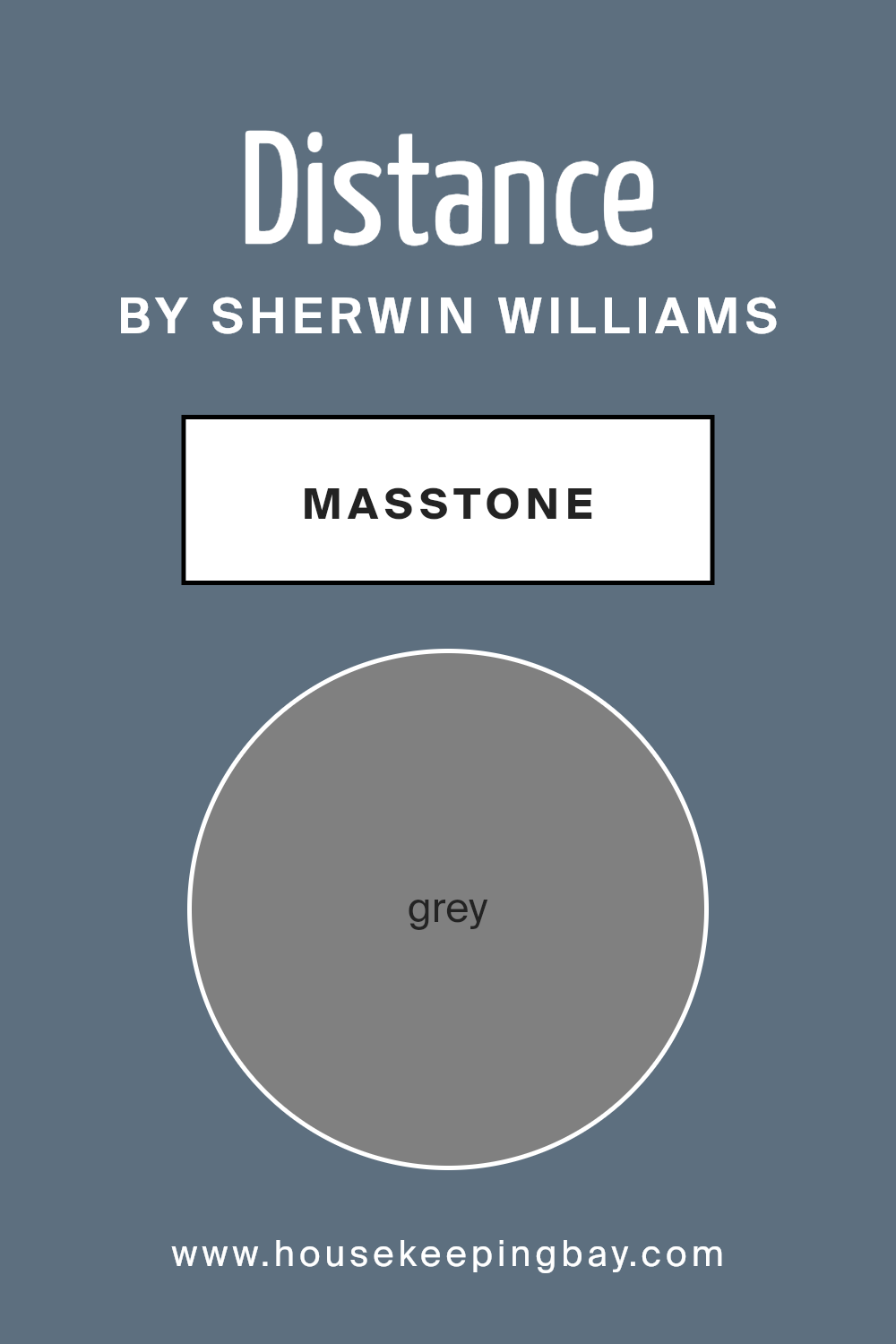
What is the Masstone of the Distance SW 6243 by Sherwin Williams?
DistanceSW 6243 by Sherwin Williams, characterized by its masstone of Grey (#808080), presents a versatile and neutral choice, ideal for home environments. This shade of grey functions as a foundational color, easily harmonizing with various decorating styles from modern to traditional.
Its balanced tone enables homeowners to match it with a wide range of accent colors. For example, pairing it with brighter hues like blues or yellows can bring a pop of color to a room without overwhelming the space. Likewise, combining it with darker shades can give a room a more sophisticated and cohesive look.
As a neutral backdrop, Grey (#808080) allows for flexibility in switching decor over time without the need for repainting. Whether it’s used on walls, cabinets, or accent pieces, DistanceSW 6243 creates a calming, consistent feel that adapts well to multiple spaces and lighting conditions, making it practical for use throughout a home.
This color supports a clean and orderly aesthetic, enhancing the overall sense of space and light in a room.
housekeepingbay.com
Undertones of Distance SW 6243 by Sherwin Williams
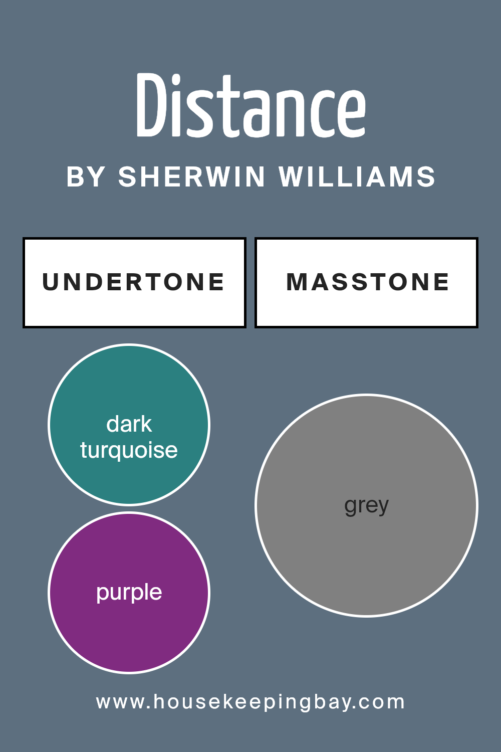
Distance SW 6243 by Sherwin Williams is a unique paint color with a blend of subtlety and depth, influenced by a spectrum of undertones. Understanding undertones in paint colors is crucial because they can significantly alter the perception of the main color under different lighting conditions.
Distance SW 6243 showcases a primary slate gray hue, but it’s the undertones that really define its personality in a space. Dark turquoise, navy, and dark grey give it a cool, serene feel, which makes it an excellent choice for creating a calm and collected atmosphere in a room.
On the other hand, undertones like olive and dark green introduce a touch of nature and earthiness, making the color feel grounded and balanced.
When used on interior walls, these undertones work together to provide a complex backdrop that shifts subtly with changes in natural and artificial lighting. For instance, in a room with abundant natural light, the cooler blue and turquoise undertones might become more pronounced, giving the space a fresher, more vibrant look.
In dimmer, artificial light, the darker greens and navy elements could become more dominant, lending the room a more enclosed and cozy feel.
Moreover, Distance SW 6243’s diverse undertones ensure it can harmonize with various decor elements and color schemes. This versatility allows it to support a wide range of interior styles, from modern minimalist to rustic or eclectic, adjusting its character to complement various furnishings and accessories effectively.
The choice of this color can significantly influence the room’s ambiance, making it appear more open and airy or more intimate, depending on the surrounding lighting and decor.
housekeepingbay.com
Coordinating Colors of Distance SW 6243 by Sherwin Williams
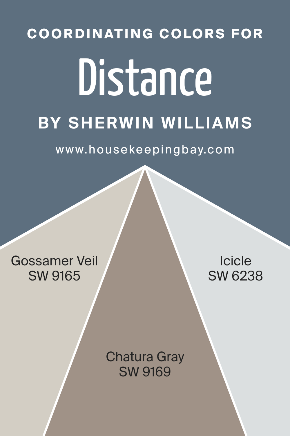
Coordinating colors are chosen to complement a main color, enriching the overall aesthetic without overwhelming it. For Distance SW 6243 by Sherwin Williams, a deep, serene blue, the coordinating colors include Gossamer Veil SW 9165, Chatura Gray SW 9169, and Icicle SW 6238.
These colors work together by balancing the main hue with neutrals that can either soften or enhance the room’s atmosphere, depending on their application in decor elements like furniture, curtains, or wall paint.
Gossamer Veil SW 9165 is a subtle gray with a warm undertone, making it ideal for rooms that aim for a soft and inviting feel. It acts as a gentle backdrop that allows deeper colors like Distance to pop. Chatura Gray SW 9169, a deeper gray, offers a striking contrast that brings a sense of depth and sophistication, perfect for creating focal points in a space.
Icicle SW 6238, the lightest among the options, resembles a fresh, crisp winter morning and works wonderfully to brighten spaces and bring a light, airy quality to balance the intensity of Distance.
By using these coordinating colors, one can achieve a harmonious yet dynamic color scheme that nicely frames the main color, making it stand out while ensuring the space feels cohesive.
You can see recommended paint colors below:
- SW 9165 Gossamer Veil
- SW 9169 Chatura Gray
- SW 6238 Icicle
housekeepingbay.com
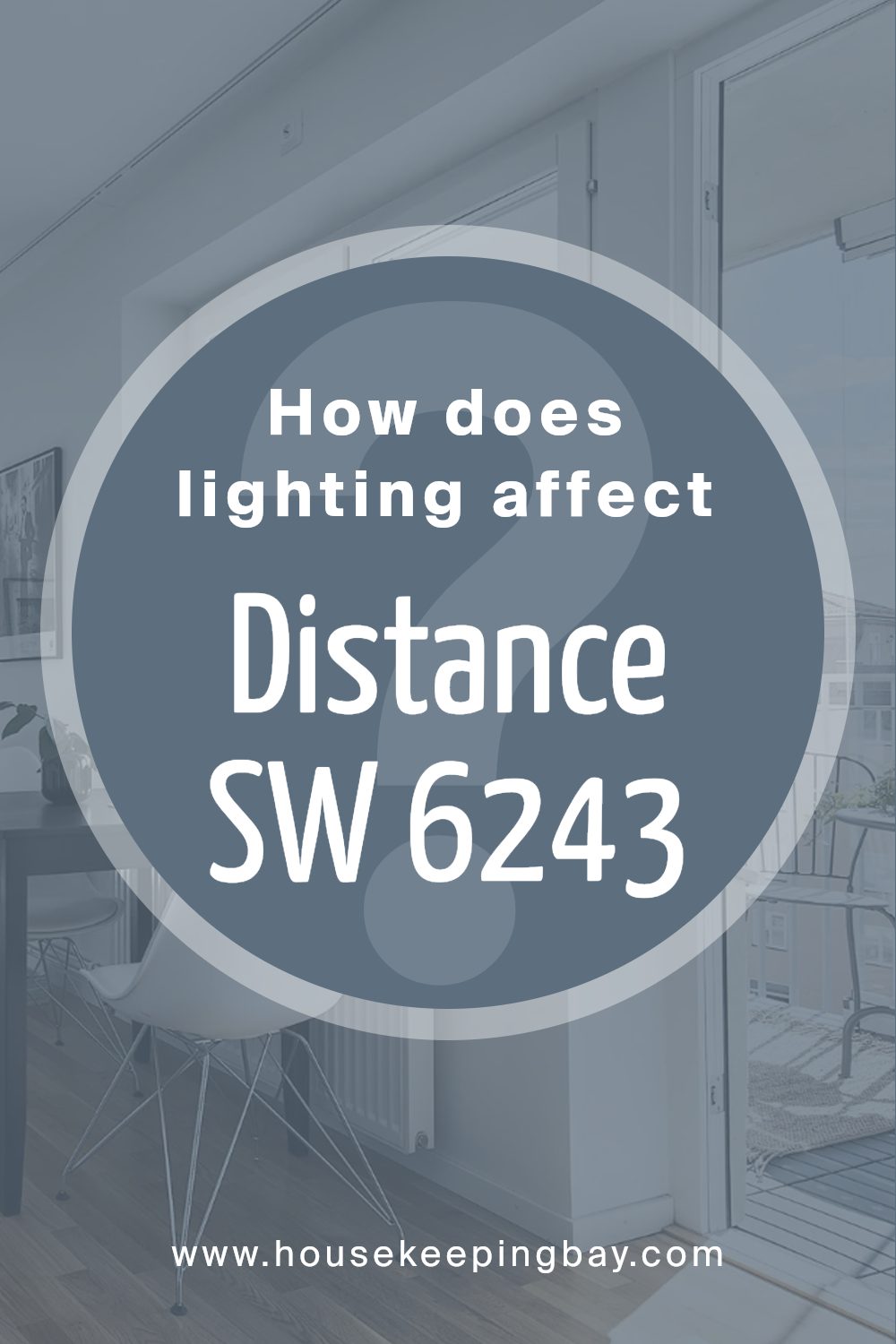
How Does Lighting Affect Distance SW 6243 by Sherwin Williams?
Lighting plays a crucial role in how colors appear in a room, impacting their brightness, tone, and overall mood. Different light sources can change how a color is perceived. DistanceSW 6243 by Sherwin Williams is a deep, cool blue hue that can look quite varied under different lighting conditions.
In artificial light, such as that from incandescent bulbs, Distance takes on a warmer, softer quality. This makes the space feel cozy and more inviting. Fluorescent lighting, being cooler, can enhance the blue tones in Distance, making the color appear slightly bolder and more vivid.
In natural light, the appearance of DistanceSW 6243 varies throughout the day. Morning light in an east-facing room illuminates Distance with a bright, crisp blue as the sun rises. This adds a fresh and lively feel to the room. As the day progresses and natural light shifts, the color can appear more muted.
North-facing rooms receive less direct sunlight, which can make Distance look more shadowy and profound. The color maintains its coolness but with a more subtle and muted tone, ideal for a calming effect in spaces like bedrooms or offices.
South-facing rooms benefit from abundant light most of the day, which can make Distance appear brighter and more vibrant, enhancing the room’s energy and dynamic.
West-facing rooms experience the strongest sunlight in the late afternoon, leading Distance to shift from a softer blue to a more vibrant, punchy shade as the sunlight intensifies. This can create a lively and energetic atmosphere, particularly towards the end of the day.
Understanding these effects can help in deciding where to apply this shade to align with the function and mood desired in each room.
housekeepingbay.com
What is the LRV of Distance SW 6243 by Sherwin Williams?
LRV stands for Light Reflectance Value, which is a measure used to indicate the amount of visible and usable light that a color reflects or absorbs. Painted on a scale from 0 to 100, a higher LRV means the color reflects more light, making it appear lighter, and it can help make a small room feel more spacious.
Conversely, a lower LRV means the color absorbs more light, making it appear darker, which can create a cozy or more enclosed feeling in a space.
Sherwin Williams’ DistanceSW 6243 has an LRV of 15.191, which places it on the darker end of the scale. This means it absorbs a significant amount of light and does not reflect much back into the room. When used on walls, this color will give depth and intensity to the space, potentially making it feel smaller and more intimate.
In rooms with limited natural light, using a color with a low LRV like this might make the space appear quite dark, so it is often used strategically to enhance specific areas or features of a room.

housekeepingbay.com
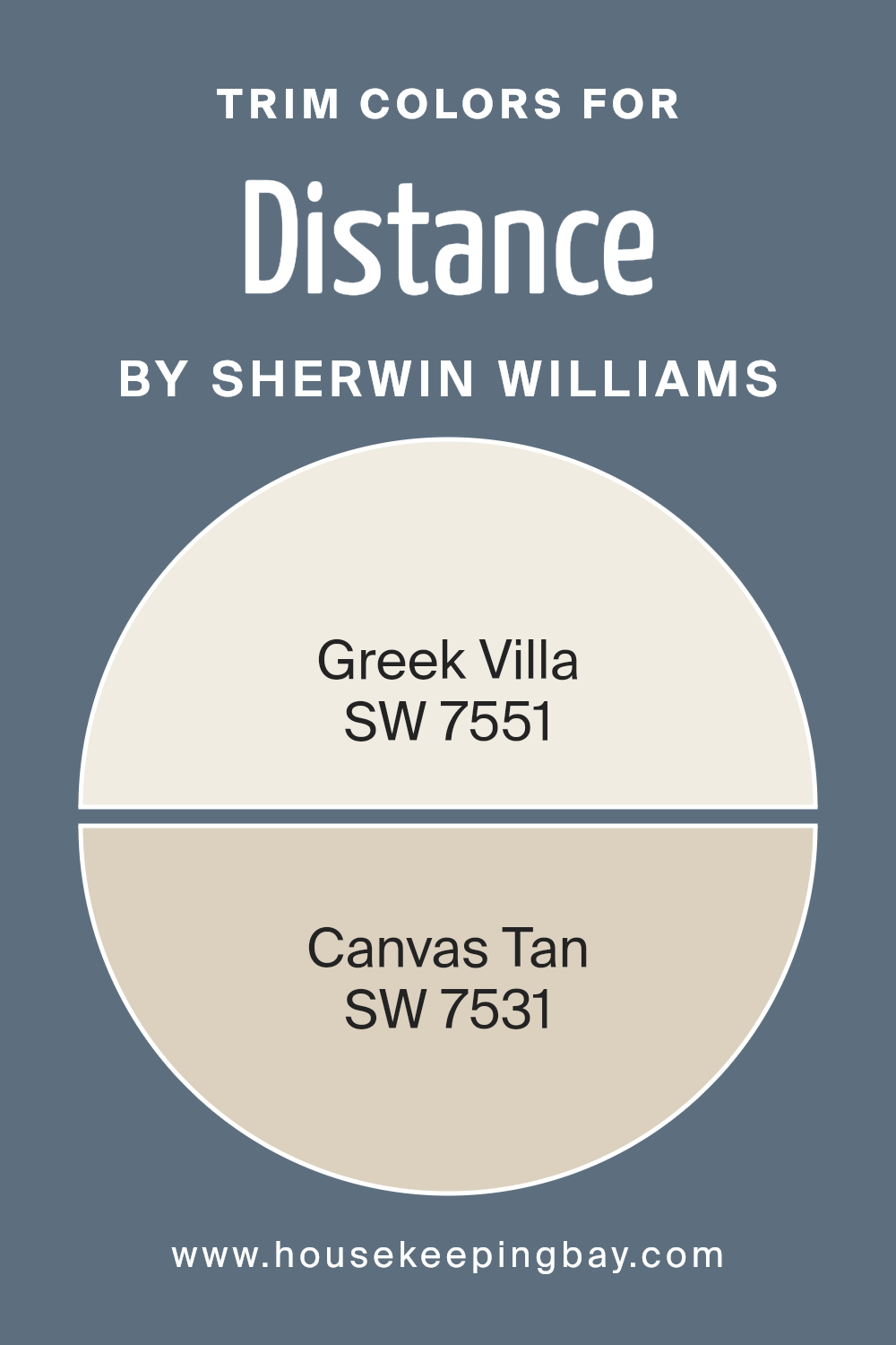
What are the Trim colors of Distance SW 6243 by Sherwin Williams?
Trim colors are specifically chosen paint shades that are used to accentuate and highlight the architectural features of a home, such as door frames, window frames, and skirtings. In the case of Distance SW 6243 by Sherwin Williams, selecting the right trim colors is crucial to ensure that the main hue stands out while maintaining a harmonious look.
SW 7551 Greek Villa and SW 7531 Canvas Tan are excellent choices for trim colors as they both offer a subtle contrast to Distance SW 6243, which can enhance the overall aesthetic appeal of a space without overshadowing the primary color.
Greek Villa SW 7551 is a soft, whitish shade that brings a gentle, refreshing touch to a room, making it appear brighter and more inviting. On the other hand, Canvas Tan SW 7531 provides a warmer, neutral option that gives a cozy and comforting feel to any area it is used in.
Both colors work beautifully with Distance SW 6243, allowing for a smooth visual transition that complements both contemporary and traditional styles, making them a versatile choice for any home.
You can see recommended paint colors below:
housekeepingbay.com
Colors Similar to Distance SW 6243 by Sherwin Williams
Similar colors like those drawn from Distance SW 6243 by Sherwin Williams are crucial for creating a cohesive look in any space. They are variations on a theme, each with slight differences in shade and tone, which allows for flexibility in design while maintaining a harmonious feel.
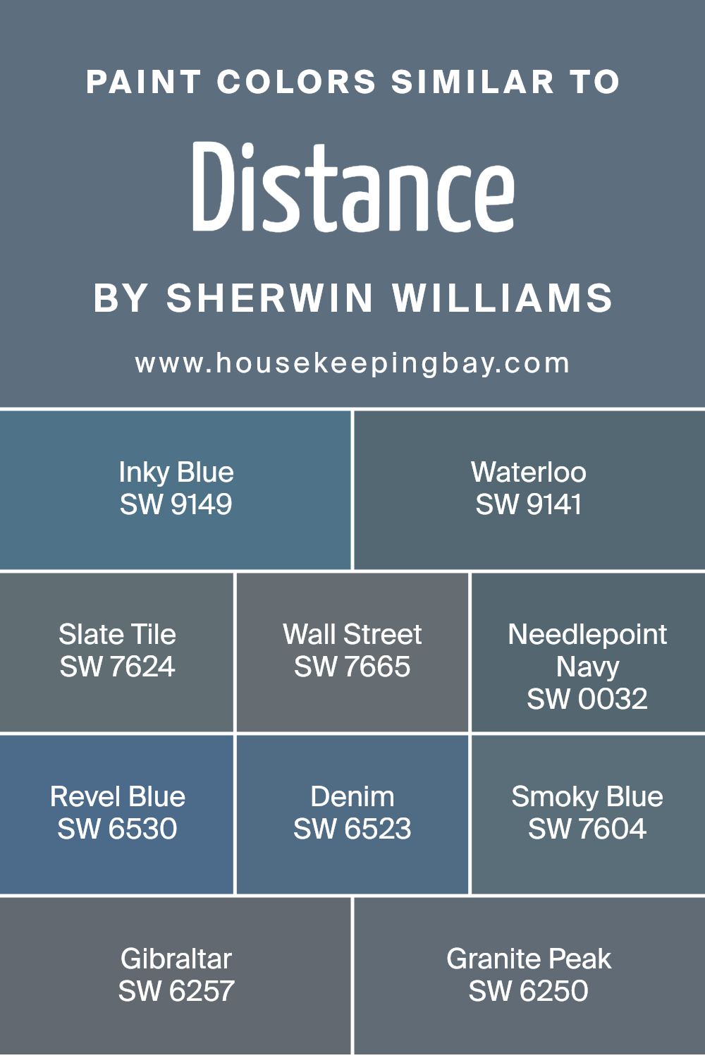
When you choose shades like Inky Blue, Waterloo, or Slate Tile, you’re ensuring that the decor elements blend seamlessly, minimizing contrast and promoting a fluid visual experience. This consistency can help in achieving a balanced aesthetic, making the room feel thoughtfully curated rather than haphazard.
Inky Blue is a deep, rich color, akin to the depths of the ocean at dusk, providing a strong anchor in any palette. Waterloo is slightly lighter, offering a subtle hint of grey, ideal for a sophisticated, moody ambiance. Slate Tile has a robust, earthy feel, perfect for creating a statement without overwhelming a space.
Wall Street is a refined navy, lending an air of professionalism and seriousness. Needlepoint Navy brings a traditional vibe with its classic maritime hue. Revel Blue is vibrant and lively, injecting energy and brightness. Denim is a friendly and casual blue, reminiscent of well-worn jeans.
Smoky Blue exudes a soft, muted quality, ideal for serene environments. Gibraltar presents a stony, solid blue that captures the essence of rocky terrains. Lastly, Granite Peak is the darkest of these, offering shadowy depth and an almost charcoal-like finish, making it perfect for bold, dramatic accents.
You can see recommended paint colors below:
- SW 9149 Inky Blue
- SW 9141 Waterloo
- SW 7624 Slate Tile
- SW 7665 Wall Street
- SW 0032 Needlepoint Navy
- SW 6530 Revel Blue
- SW 6523 Denim
- SW 7604 Smoky Blue
- SW 6257 Gibraltar
- SW 6250 Granite Peak
housekeepingbay.com
Colors that Go With Distance SW 6243 by Sherwin Williams
Colors that pair with Distance SW 6243 by Sherwin Williams play a crucial role in creating a harmonious and visually pleasing space. These colors enhance the aesthetics of any room by providing balance and contrast, ultimately affecting the mood and atmosphere.
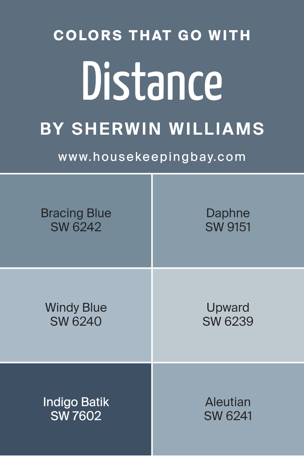
For instance, when you pair Distance with colors like Bracing Blue or Windy Blue, you achieve a serene and cohesive look. Bracing Blue is a deep, soothing blue that adds depth and sophistication, making it ideal for creating a focused ambiance in study rooms or offices.
Windy Blue, on the other hand, offers a lighter, airy feel that works beautifully in bathrooms or bedrooms, promoting a calm and restful environment.
Furthermore, integrating colors such as Daphne and Aleutian alongside Distance introduces a dynamic range to your color scheme. Daphne is a rich, muted purple with a touch of gray that provides an elegant backdrop, suitable for living rooms or dining areas.
Aleutian carries a soft, subtle blue-gray tone that complements neutrals and wood finishes, enhancing the natural elements of a space. Using Indigo Batik or Upward can also influence the character of your room. Indigo Batik, a dark navy blue, brings drama and intensity, perfect for accent walls or furniture pieces.
Upward is a light blue with hints of gray, offering a refreshing and light atmosphere ideal for smaller or less illuminated spaces. By carefully choosing these color combinations, you ensure a well-rounded, attractive setting that adapts to various styles and preferences.
You can see recommended paint colors below:
- SW 6242 Bracing Blue
- SW 9151 Daphne
- SW 6240 Windy Blue
- SW 6239 Upward
- SW 7602 Indigo Batik
- SW 6241 Aleutian
housekeepingbay.com
Complimentary Colors for Distance SW 6243 Paint Color by Sherwin Williams
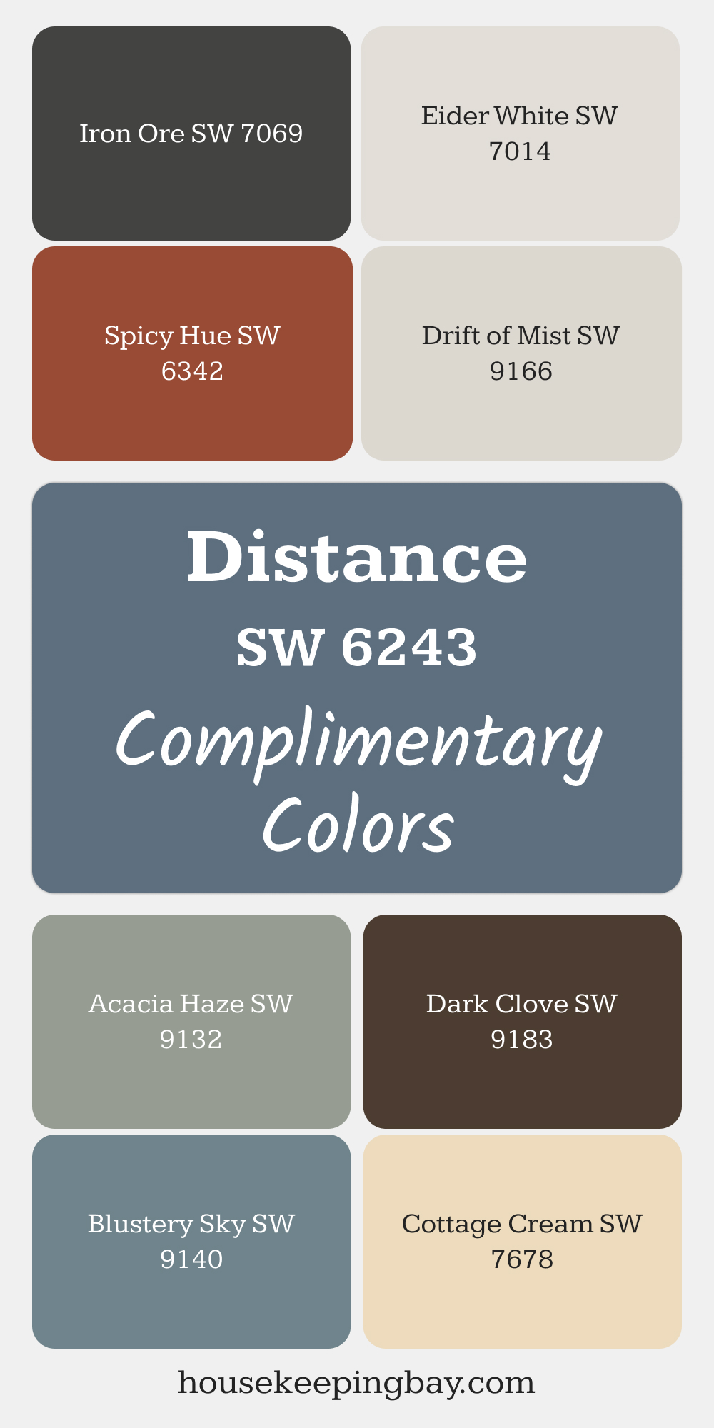
Distance SW 6243 pairs beautifully with soft, light tones like Eider White and Drift of Mist for a balanced and airy look. These colors create a peaceful atmosphere when used together, perfect for living areas or bedrooms.
For more depth, try combining Distance with Iron Ore, Dark Clove, or Acacia Haze. These darker shades add contrast and dimension, offering a rich, sophisticated feel.
Blustery Sky, Cottage Cream, and Spicy Hue bring a pop of color, making each space feel unique and inviting.
via housekeepingbay.com
How to Use Distance SW 6243 by Sherwin Williams In Your Home?
Distance SW 6243 by Sherwin Williams is a deep, grayish-blue paint color that brings a sense of sophistication and calmness to any room in your home. Ideal for creating a serene and inviting space, this color works beautifully in bedrooms, living rooms, or home offices.
The darker hue of Distance SW 6243 provides a striking contrast when paired with lighter colors, making it perfect for feature walls or accent pieces. You can also use it on kitchen cabinets for a chic, modern vibe.
Further, Distance enhances spaces with minimal natural light, offering depth and warmth. Pairing it with crisp whites or soft neutrals in your decor and furnishings will help balance its intensity, ensuring your room feels cozy and well-coordinated. Whether applied in large areas or as subtle touches, SW 6243 can help redefine your space with its rich, serene tone.
Distance SW 6243 by Sherwin Williams vs Smoky Blue SW 7604 by Sherwin Williams
Distance SW 6243 by Sherwin Williams is a deep, intense navy blue that adds a bold touch to any space. It works well in both modern and traditional settings, providing a strong background that can highlight decor and furniture. This color is perfect for creating a cozy, sophisticated ambiance in rooms meant for relaxation or social gatherings.
Smoky Blue SW 7604, conversely, is a softer, more muted shade of blue with a hint of grey. This color is more subdued compared to Distance, making it ideal for spaces where a calm, soothing effect is desired. It pairs well with lighter shades for a serene environment and can be used in bedrooms, bathrooms, or any area where a peaceful atmosphere is key.
Both colors offer unique blue tones, with Distance being more dramatic and Smoky Blue providing a gentle, relaxing vibe. Each can dramatically alter the feel of a room, depending on what atmosphere you want to achieve.
You can see recommended paint color below:
- SW 7604 Smoky Blue

housekeepingbay.com
Distance SW 6243 by Sherwin Williams vs Slate Tile SW 7624 by Sherwin Williams
Distance SW 6243 by Sherwin Williams is a deep blue shade that carries a powerful punch of color. It’s bold and makes a strong statement, perfect for accent walls or furniture to bring a room to life. Contrastingly, Slate Tile SW 7624 is a darker, more subdued gray-blue.
This color is versatile and provides a neutral backdrop suitable for many decorating styles. It works well for creating a sophisticated, calming environment without overwhelming the space. Distance tends to draw attention and can define a space dramatically, while Slate Tile is more about blending in, offering balance and grounding to a room.
Both colors can complement each other well in different parts of a home, depending on the atmosphere you want to achieve. In summary, Distance is more vibrant and daring, whereas Slate Tile is understated and versatile.
You can see recommended paint color below:
- SW 7624 Slate Tile

housekeepingbay.com
Distance SW 6243 by Sherwin Williams vs Denim SW 6523 by Sherwin Williams
Distance SW 6243 and Denim SW 6523 from Sherwin Williams are both unique shades of blue. Distance is a deep, navy blue that gives off a strong, sophisticated vibe. It’s perfect for creating a cozy and serene atmosphere in spaces like living rooms or bedrooms. This color pairs well with light neutrals or rich woods, providing a classic, timeless look.
Denim SW 6523, as the name suggests, is reminiscent of classic blue jeans. It’s a lighter, more vibrant shade compared to Distance. Denim has a cheerful and inviting quality to it, making it suitable for more active areas such as kitchens or kids’ rooms. It blends well with whites, greys, and even some yellows, offering a fresh, casual appeal.
Overall, both colors offer distinct moods and can influence the feel of a space significantly. Distance leans more towards a formal, elegant look, while Denim is laid-back and friendly.
You can see recommended paint color below:
- SW 6523 Denim

housekeepingbay.com
Distance SW 6243 by Sherwin Williams vs Inky Blue SW 9149 by Sherwin Williams
Distance SW 6243 by Sherwin Williams is a deep, muted teal that brings a serene and calm vibe to any space. It has an oceanic feel, perfect for creating a peaceful atmosphere in a room. This color lends itself well to coastal-inspired decor or as a sophisticated backdrop in a modern setting.
In contrast, Inky Blue SW 9149 is a rich, dark navy blue that offers a bold and cozy tone. It’s more intense and saturated compared to Distance, giving it a dramatic flair. Inky Blue works well in spaces meant for relaxation and focus, like studies or bedrooms.
Both colors are versatile but serve different aesthetic purposes: Distance is softer and more subdued, ideal for a tranquil environment, whereas Inky Blue stands out with its depth and striking presence, suiting spaces designed to make a strong style statement.
You can see recommended paint color below:
- SW 9149 Inky Blue

housekeepingbay.com
Distance SW 6243 by Sherwin Williams vs Revel Blue SW 6530 by Sherwin Williams
Distance SW 6243 by Sherwin Williams is a deep, saturated navy blue that creates a feeling of depth and sophistication in any space. Its rich hue can serve as a strong foundation color in a room, perfect for accent walls or cabinetry. It pairs well with neutral tones and metallic accents.
On the contrary, Revel Blue SW 6530 is a vibrant, energetic teal. This color is brighter and adds a lively pop to interiors, making it ideal for spaces intended to have a playful, cheerful vibe. Revel Blue works beautifully in bathrooms, kitchens, or as an accent color, potentially complementing wooden features and neutral backgrounds.
Both colors are bold and can dramatically influence the style and mood of a room. While Distance lends itself to elegance and a more traditional or refined aesthetic, Revel Blue leans towards a fresh, invigorating feel, suitable for more modern and youthful spaces.
You can see recommended paint color below:
- SW 6530 Revel Blue

housekeepingbay.com
Distance SW 6243 by Sherwin Williams vs Granite Peak SW 6250 by Sherwin Williams
The main color, Distance SW 6243 by Sherwin Williams, is a deep, intriguing blue with hints of gray, giving it a sophisticated and versatile appearance. It’s a color that works well in spaces where you want to create a serene, yet impactful atmosphere. Its richness can make a strong statement yet remains balanced enough for various applications, including living rooms or bedrooms.
In contrast, Granite Peak SW 6250, also by Sherwin Williams, leans more towards a charcoal gray with subtle blue undertones. This color is especially useful for adding a modern and sleek look to any room. Its cooler tone contrasts nicely with warmer colors and works well in contemporary settings.
Both colors share a depth that can anchor a room’s aesthetic, but their undertones set them apart—Distance with its bluer base provides a calm oceanic feel, while Granite Peak offers a more stark, stone-like vibe. Each color lends itself well to creating distinctive spaces tailored to specific moods or themes.
You can see recommended paint color below:

housekeepingbay.com
Distance SW 6243 by Sherwin Williams vs Wall Street SW 7665 by Sherwin Williams
Distance SW 6243 by Sherwin Williams is a rich, deep blue color that brings a sense of calmness and sophistication to any space. It can make rooms feel more intimate and cozy, perfect for creating a relaxing atmosphere in living areas or bedrooms. This color pairs well with light neutrals or warm tones, giving flexibility in decor choices.
Wall Street SW 7665, on the other hand, is a dark gray that exudes strong, contemporary vibes. It has a more urban feel, suitable for modern spaces or as an accent in a minimalistic setup. Wall Street can make small areas appear more spacious and is versatile enough to complement various color schemes, from bright colors to more subdued hues.
Both colors offer distinct moods and can dramatically change the feel of a room. Whether you choose the serene blue of Distance or the bold gray of Wall Street depends on the atmosphere you want to achieve in your space.
You can see recommended paint color below:
- SW 7665 Wall Street

housekeepingbay.com
Distance SW 6243 by Sherwin Williams vs Needlepoint Navy SW 0032 by Sherwin Williams
Distance SW 6243 by Sherwin Williams is a deep, blue-gray hue that presents a subtle, muted vibe, ideal for creating a serene and sophisticated atmosphere in any space. Its gray undertones make it versatile for pairing with various decor styles, ranging from modern minimalism to classic colonial.
Needlepoint Navy SW 0032, also by Sherwin Williams, is a richer, more traditional navy blue. This shade is bolder and more pronounced, offering a strong presence that can anchor a room or serve as an accent color. Despite its intensity, it maintains a warm undertone, making it welcoming and ideal for spaces where comfort is key, such as living rooms or bedrooms.
Both colors share a base of blue but differ significantly in their impact and mood. Distance SW 6243 uses gray to soften its appearance, while Needlepoint Navy SW 0032 uses its depth to make a more definitive statement. This makes Distance more adaptable and understated, while Needlepoint Navy is better for bolder, dramatic design choices.
You can see recommended paint color below:
- SW 0032 Needlepoint Navy

housekeepingbay.com
Distance SW 6243 by Sherwin Williams vs Waterloo SW 9141 by Sherwin Williams
Distance SW 6243 and Waterloo SW 9141 by Sherwin Williams are two distinct shades of blue. Distance is a deep, dark blue that evokes a sense of richness and depth, making it ideal for creating a bold statement in a room. It pairs well with lighter colors and can help to create a dramatic contrast.
Waterloo, meanwhile, is a medium slate blue with subtle gray undertones. It has a softer appearance that offers a more muted and subtle aesthetic compared to Distance. Waterloo works well in spaces where a calm and soothing atmosphere is desired.
While both colors can be used to elevate the aesthetics of a space, Distance is more striking and commanding, whereas Waterloo provides a gentle, serene vibe. These characteristics make each color suitable for different decor styles and personal preferences.
You can see recommended paint color below:

housekeepingbay.com
Distance SW 6243 by Sherwin Williams vs Gibraltar SW 6257 by Sherwin Williams
Distance SW 6243 by Sherwin-Williams is a deep, dark blue color with a hint of gray. It conveys a sense of sophistication and can add dramatic flair to spaces. It’s particularly well-suited for creating a moody, cozy atmosphere in rooms like bedrooms or studies.
Gibraltar SW 6257, also by Sherwin-Williams, is a shade lighter than Distance. Gibraltar is more of a mid-tone blue with gray undertones and presents a slightly softer and more versatile appearance. This color is excellent for areas where you want to maintain a sense of calm without going too dark, such as living rooms or bathrooms.
Both colors bring distinct vibes to a space and can be used effectively to accentuate different features or moods within a home. Their cool undertones make them ideal for pairing with crisp whites or contrasting warm hues. Whether choosing Distance for its bold impact or Gibraltar for its gentle charm, both offer unique possibilities in interior design.
You can see recommended paint color below:
- SW 6257 Gibraltar

housekeepingbay.com
Conclusion
SW 6243 Distance by Sherwin Williams is a sophisticated shade of blue-grey that offers a versatile option for anyone looking to refresh their home or office space. This color provides the perfect balance between cool and warm tones, making it easy to incorporate into various decor styles, from modern to traditional.
Its subtle depth allows it to stand out as an accent wall or blend smoothly as a base color, enhancing the overall aesthetic of any room. For individuals planning to repaint their interior spaces, SW 6243 Distance presents a durable and appealing choice that complements a wide range of furnishings and accessories.
This color not only adds a unique charm to your walls but also helps in creating a serene and inviting environment. Whether you are revamping a single room or the entire house, SW 6243 Distance can certainly help achieve an elegant yet cozy atmosphere.
housekeepingbay.com
