Dakota Wheat SW 9023 by Sherwin Williams
Warmth That Transforms Spaces
Welcome to the world of SW 9023 Dakota Wheat by Sherwin Williams, a paint color that turns any space into a cozy sanctuary. Imagine stepping into a room painted with the soothing hue of Dakota Wheat; it’s like wrapping yourself in a warm blanket on a crisp autumn day.
This color brings a unique blend of warmth and comfort to your home, making it the perfect backdrop for creating memories.
Dakota Wheat is not just another shade; it’s a subtle, yet powerful transformation tool for your walls. Whether you’re looking to refresh your living room, bedroom, or even your kitchen, this color adds a touch of elegance without overwhelming your space. Its versatility means it pairs beautifully with a wide range of decor styles, from modern to traditional, making your decorating journey stress-free and enjoyable.
If you’re thinking about giving your home a makeover, consider Dakota Wheat for a change that brings warmth and style. Its inviting tone creates a welcoming atmosphere, turning your house into a home. With Dakota Wheat, your space is not just painted; it’s infused with a sense of tranquility and warmth that you and your guests will love.
Bringing Dakota Wheat into your home means choosing a color that will stand the test of time, offering a perfect balance of warmth and style. Get ready to transform your space into a cozy haven where every moment feels special.
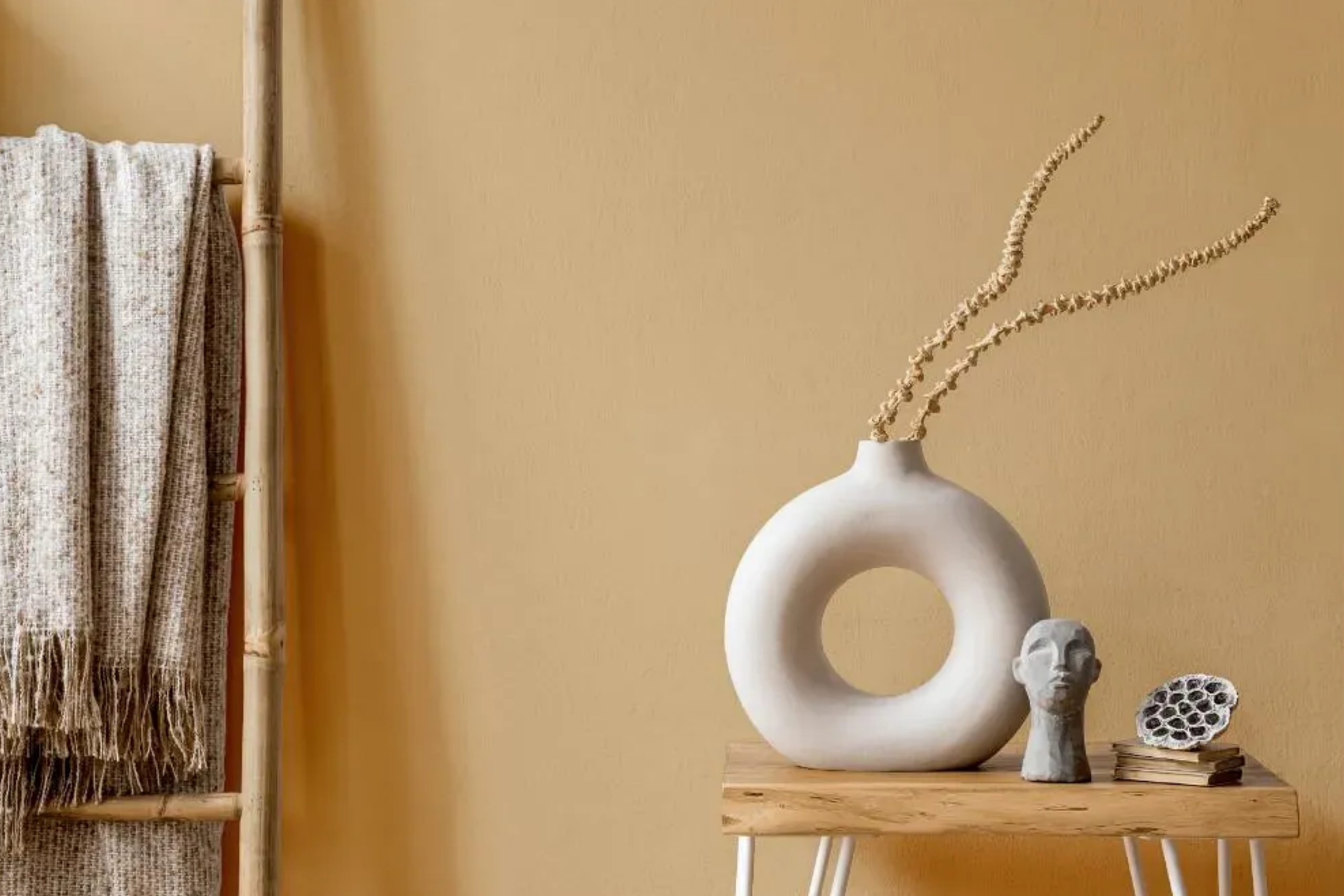
via plan-home.com
What Color Is Dakota Wheat SW 9023 by Sherwin Williams?
Dakota Wheat SW 9023 by Sherwin Williams is a warm and inviting color that can add a cozy touch to any room. It’s a soft, muted hue that resembles the golden shades of wheat fields, bringing a piece of the outdoors into your home. This versatile color works well in a variety of interior styles, offering a neutral backdrop that’s anything but boring.
For a classic look, Dakota Wheat pairs beautifully with traditional wood finishes, from light oaks to rich mahoganies. It also matches well with natural textures like cotton, wool, and linen, lending a timeless and comfortable feel to spaces. In more modern settings, this shade can offer a warm contrast to sleek metals and glass, providing a welcoming balance to minimalist designs.
Farmhouse and rustic interiors are perfect matches for Dakota Wheat, as it complements the natural materials and earthy colors typical of these styles. Yet, it’s also a great choice for contemporary spaces where its warmth can soften clean lines and cool hues.
Pairing Dakota Wheat with materials like leather, jute, and terracotta can enhance its cozy vibe, making it an excellent choice for living rooms, bedrooms, and even kitchens. Whether you’re looking to create a serene retreat or a cheerful family space, Dakota Wheat offers a versatile palette to build upon.
housekeepingbay.com
Is Dakota Wheat SW 9023 by Sherwin Williams Warm or Cool color?
Dakota WheatSW 9023 by Sherwin Williams is a warm, inviting color that can make any room feel cozy and welcoming. This paint color has a soft, neutral tone, which makes it very versatile and easy to use in many different parts of the home. Whether you’re painting your living room, bedroom, or kitchen, Dakota Wheat can add a touch of warmth to the space.
One of the best things about Dakota Wheat is that it works well with other colors. You can pair it with both light and dark colors to create a balanced look. For example, matching it with whites can make a room feel brighter and more open, while pairing it with dark blues or greens can add depth and sophistication to a space.
Dakota Wheat also does a great job of hiding imperfections on walls, making it a practical choice for any room. Its warm hue can make large spaces feel more intimate and cozy, while still keeping smaller rooms feeling airy and spacious.
Overall, Dakota WheatSW 9023 by Sherwin Williams is a great choice for anyone looking to add a touch of warmth and style to their home.
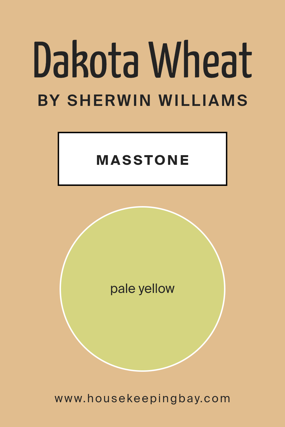
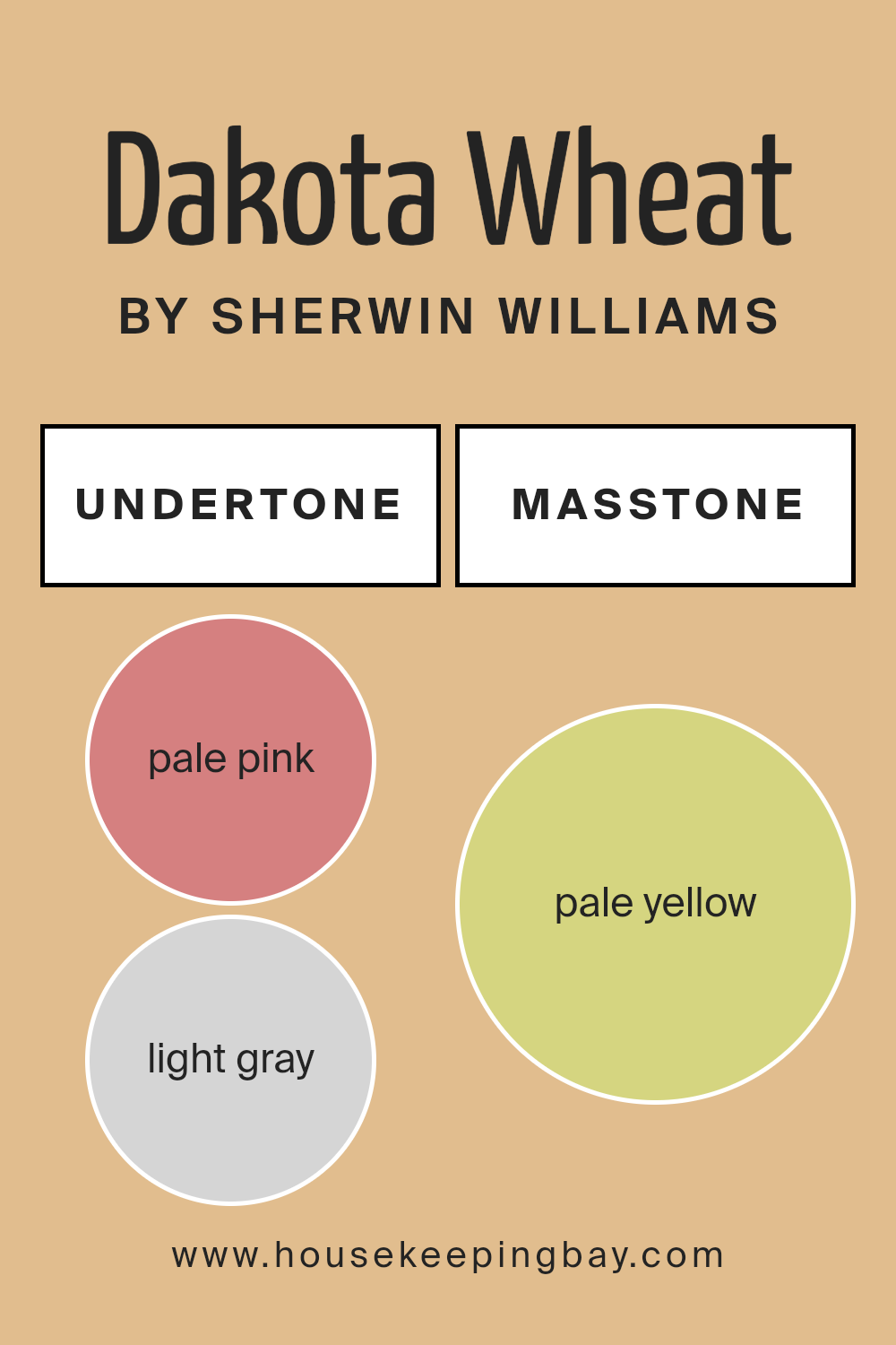
What is the Masstone of the Dakota Wheat SW 9023 by Sherwin Williams?
Dakota WheatSW 9023 by Sherwin Williams has a masstone, or main color, that looks like pale yellow, similar to the color code #D5D580. This color is really easy to use in homes because it has a soft, gentle feeling. Since it’s a kind of yellow, it naturally makes rooms feel warmer and more welcoming. It’s great for places like living rooms or kitchens where you want a cozy vibe.
Because it’s a light color, Dakota WheatSW 9023 can also help small spaces seem bigger and brighter. It’s kind of like letting a bit of sunlight in. This color goes well with lots of other colors. You can pair it with whites or creams for a calm look, or add dark blues or greens to make it stand out more.
So, whether your home has a modern style or something more traditional, this color can fit right in. It’s a friendly, easy-to-use color that can help make your space feel just right.
housekeepingbay.com
Undertones of Dakota Wheat SW 9023 by Sherwin Williams
Dakota WheatSW 9023 by Sherwin Williams has a complex and rich palette of undertones that can significantly change its appearance under different lighting and settings. This paint color is like a chameleon, subtly shifting its display based on the undertones that come forward.
The variety of undertones includes pale pink, light gray, light purple, mint, yellow, grey, orange, light blue, lilac, light green, and olive. Each of these undertones plays a crucial role in how we perceive the primary color, adding depth and complexity to Dakota WheatSW 9023.
When applied to interior walls, the effect of these undertones becomes even more pronounced. In rooms with abundant natural light, the lighter undertones like pale pink, light purple, and mint might make the walls seem softer and more inviting.
In contrast, in spaces with limited natural light or during evening times with artificial lighting, the darker undertones like olive and grey might become more dominant, giving the room a cozier and more grounded feel.
The range of undertones in Dakota WheatSW 9023 allows it to be versatile and adaptable to different interior styles and color schemes. For example, its light gray and light blue undertones can complement a modern, minimalist decor, while the orange and yellow undertones might warm up a space, making it feel more welcoming.
The presence of light green and lilac allows the color to connect with natural elements and can enhance the feeling of freshness and tranquility in a room.
In summary, the various undertones in Dakota WheatSW 9023 impact the color’s overall appearance on walls significantly. Depending on the light and surrounding colors, these undertones can shift the hue from warm to cool, from vibrant to subtle, thereby changing the atmosphere and mood of the space.
This makes Dakota WheatSW 9023 a highly adaptable and dynamic choice for interiors, capable of creating diverse looks and feels within a single space.
housekeepingbay.com
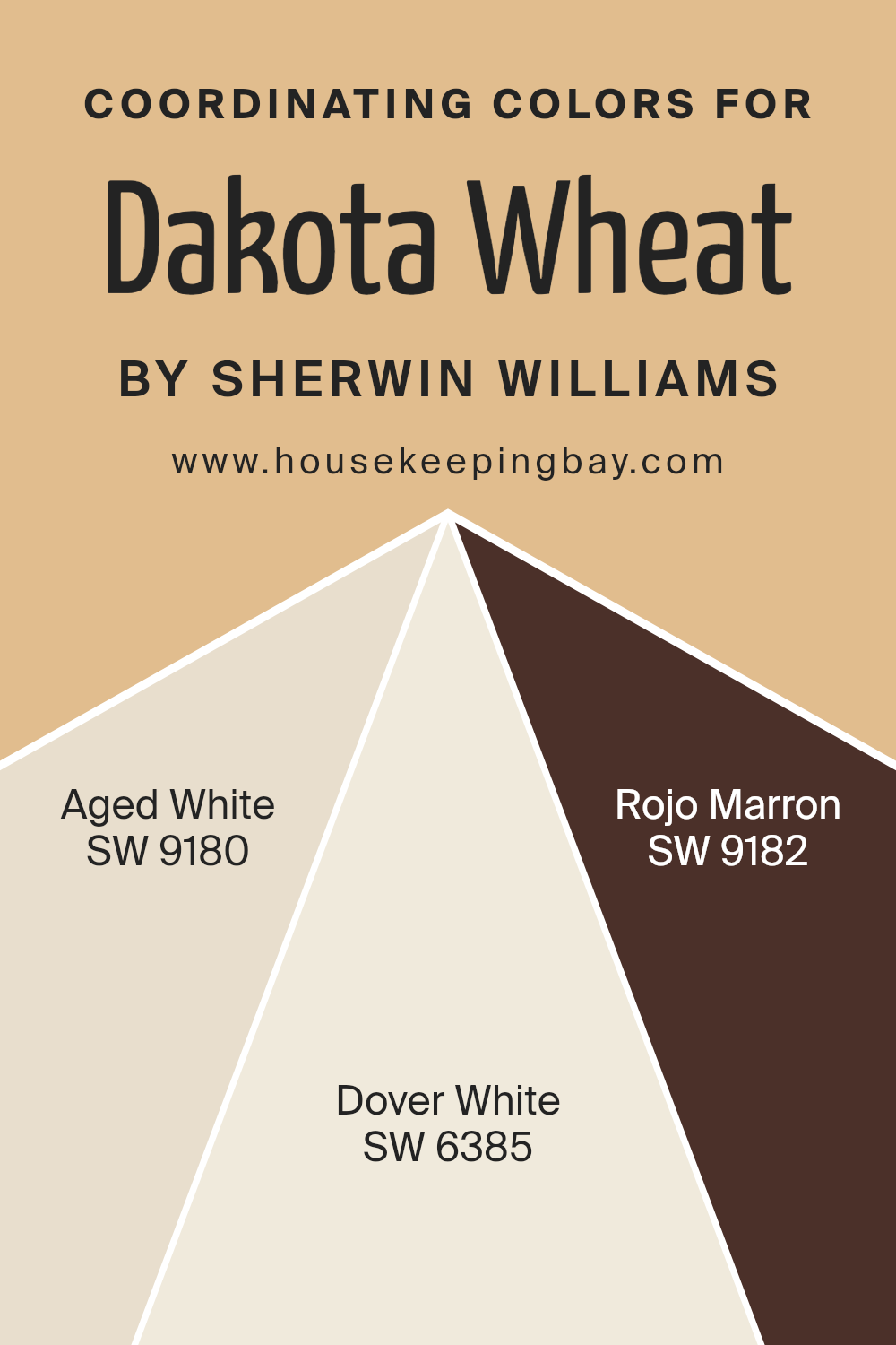
Coordinating Colors of Dakota Wheat SW 9023 by Sherwin Williams
Coordinating colors are shades that complement each other to create visually appealing designs and spaces. They work together to enhance the aesthetic appeal without overpowering the main color, in this case, Dakota Wheat SW 9023 by Sherwin Williams. These coordinating colors, while varied, share a harmony that can transform a space into a cohesive and inviting atmosphere. By using coordinating colors thoughtfully, one can achieve balance and depth in interior design or any project where color plays a key role.
Aged White SW 9180 offers a subtle backdrop that allows Dakota Wheat to shine. It’s a soft, creamy white that brings warmth to a room without creating stark contrasts, making spaces feel more open and airy.
On a different note, Dover White SW 6385 introduces a slightly brighter, yet still gentle, white hue that can illuminate and enlarge spaces, working in perfect tandem with Dakota Wheat for a serene and welcoming effect. Meanwhile, Rojo Marron SW 9182 adds a richer, deeper dimension as a coordinating color.
This earthy, deep red-brown offers a bold contrast to Dakota Wheat, providing an anchor that draws the eye and adds sophistication and warmth to the palette. Together, these colors create a balanced, harmonious look that enriches the main shade without overwhelming it.
You can see recommended paint colors below:
- SW 9180 Aged White
- SW 6385 Dover White
- SW 9182 Rojo Marron
housekeepingbay.com
How Does Lighting Affect Dakota Wheat SW 9023 by Sherwin Williams?
Lighting plays a crucial role in how colors appear to us. In essence, the type of light and its source can change the way we perceive color. Think about a color like Dakota WheatSW 9023 by Sherwin Williams. This color has its own unique look, but lighting can make it appear differently based on the environment it’s in.
In artificial light, colors can vary greatly depending on the type of bulb used. Cool LED lights might make Dakota WheatSW 9023 appear slightly bluer or greyer than it really is, robbing it of its warm, inviting quality. On the other hand, warm, incandescent bulbs enhance the cozy, golden tones of this color, making a room feel more welcoming.
Natural light brings its own variations. Under the broad daylight, Dakota WheatSW 9023 shines in its truest form, displaying its natural, warm, and earthy tone. However, as daylight shifts, so does the appearance of this color.
Now, consider the direction your room faces:
- North-faced rooms get less direct sunlight, which can make colors look cooler and more muted. Here, Dakota WheatSW 9023 might lose some of its warmth, appearing more subdued and slightly cooler.
- South-faced rooms bask in plentiful light for most of the day, which allows Dakota WheatSW 9023 to glow warmly, enhancing its inviting and comforting qualities.
- East-faced rooms enjoy the morning light, which is softer and warmer. Early in the day, Dakota WheatSW 9023 will look particularly vibrant and warm, potentially becoming more neutral as the day progresses and the light changes.
- West-faced rooms get the evening light, which can be warm and golden. In these rooms, Dakota WheatSW 9023 will glow warmly in the afternoons and evenings, showcasing its rich, welcoming hue to its full effect.
Each room’s orientation and the type of light it receives can alter how Dakota WheatSW 9023 is perceived, making it a versatile color that changes mood throughout the day and in different lighting conditions.

housekeepingbay.com
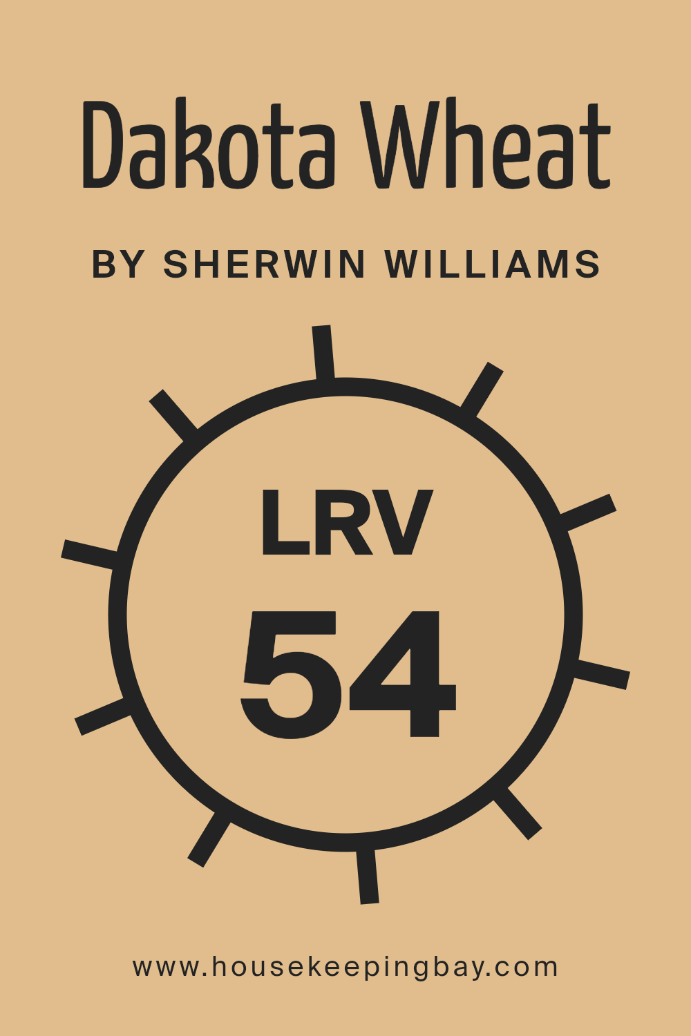
What is the LRV of Dakota Wheat SW 9023 by Sherwin Williams?
This value is super helpful when you’re trying to decide what color to paint a room. Colors with higher LRV make spaces feel more open and airy because they reflect more light around the room. On the other hand, colors with lower LRV absorb more light, making rooms feel cozier but also a bit smaller.
Now, Dakota WheatSW 9023 by Sherwin Williams has an LRV of 54.204. This means it’s on the lighter side of the scale, reflecting over half of the light that hits it. In your home, this color will brighten up a space more than a color with a lower LRV. It’s not super bright, but it’s light enough to make your room feel inviting and warm. Since it’s not too dark or too light, it’s versatile, fitting well in many spaces without making them feel cramped or overly spacious.
Dakota Wheat will especially shine in rooms that get a decent amount of natural light, showcasing its true color and enhancing the overall feel of the space.
housekeepingbay.com
What are the Trim colors of Dakota Wheat SW 9023 by Sherwin Williams?
Trim colors, like the ones recommended for Dakota Wheat SW 9023 by Sherwin Williams, play a crucial role in framing and accentuating the primary colors of walls in any given space. These colors, when chosen with care, can highlight architectural details, create a sense of balance, and bring coherence to a room’s overall design.
For Dakota Wheat, a rich and warm hue, selecting the right trim color is essential to enhance its earthy charm without overwhelming it. Trim colors like Creamy SW 7012 and Alabaster SW 7008 are perfect companions as they offer a subtle contrast that allows Dakota Wheat to shine while ensuring the space feels inviting and harmoniously put together.
Creamy SW 7012 is a soft, inviting white with a hint of warmth that complements Dakota Wheat by softly highlighting the room’s details without stark contrast, making spaces feel more cohesive and gentle.
On the other hand, Alabaster SW 7008 presents a neutral, almost luminous white that brings a crisp freshness to the surroundings. Its ability to reflect light beautifully makes it an excellent choice for trims, giving a room a bright and airy feel while still respecting the natural depth of Dakota Wheat.
Together, these trim colors offer flexibility and a serene backdrop to Dakota Wheat, ensuring the walls are the focal point but also contribute to a well-rounded and welcoming atmosphere.
You can see recommended paint colors below:

housekeepingbay.com
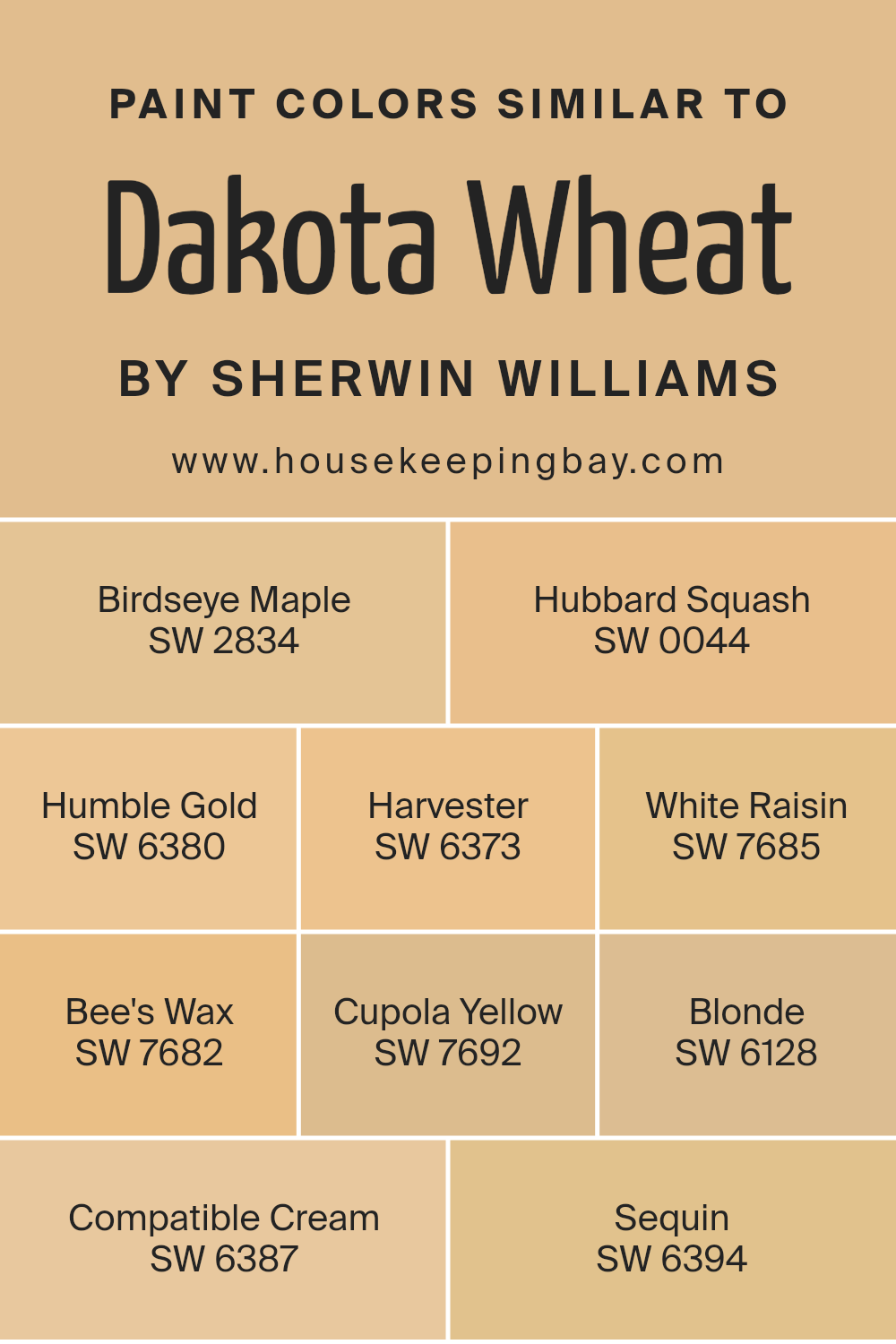
Colors Similar to Dakota Wheat SW 9023 by Sherwin Williams
Similar colors play a crucial role in creating a cohesive and harmonious look in any design or decor project. They have the power to subtly blend together, creating a seamless transition from one hue to the next, which can enhance the overall aesthetic appeal of a space.
When considering similar colors to Dakota Wheat SW 9023 by Sherwin Williams, hues like Birdseye Maple and Hubbard Squash come into play, offering a soft, warm ambiance that mimics the golden hues found in nature.
Birdseye Maple is a light, creamy shade that whispers of early autumn warmth, while Hubbard Squash adds a slightly more saturated note, reminiscent of the richness found in fall harvests.
Moving through the spectrum, colors like Humble Gold and Harvester bring depth with their golden undertones, perfect for adding a cozy glow. Humble Gold is akin to the glistening early morning sunlight, and Harvester carries the fullness of a ripe field.
White Raisin and Bee’s Wax follow suit but with a lighter caress, offering a gentle touch of sunshine to any room. White Raisin is like the soft glow of dawn, and Bee’s Wax has the subtlety of candlelight.
Cupola Yellow, Blonde, Compatible Cream, and Sequin continue the journey through this warm palette. Cupola Yellow stands out as a muted sunshine, casting a soft, welcoming light. Blonde, on the other hand, is reminiscent of sun-kissed fields, providing a neutral background that’s easy to complement.
Compatible Cream offers a delicate balance, acting as a gentle bridge between more assertive colors, while Sequin sparkles quietly in the background, providing a hint of elegance and understated glam. Together, these close relatives of Dakota Wheat create a tapestry of warmth that can make any space feel inviting and homely, proving the importance of similar colors in design.
You can see recommended paint colors below:
- SW 2834 Birdseye Maple
- SW 0044 Hubbard Squash
- SW 6380 Humble Gold
- SW 6373 Harvester
- SW 7685 White Raisin
- SW 7682 Bee’s Wax
- SW 7692 Cupola Yellow
- SW 6128 Blonde
- SW 6387 Compatible Cream
- SW 6394 Sequin
housekeepingbay.com
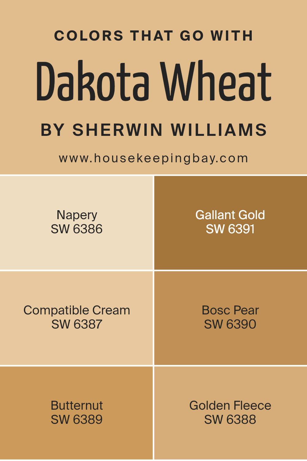
Colors that Go With Dakota Wheat SW 9023 by Sherwin Williams
Choosing the right colors to complement Dakota Wheat SW 9023 by Sherwin Williams is crucial in creating a harmonious and appealing space. Dakota Wheat, with its warm and inviting hue, can act as the perfect neutral backdrop, allowing other colors to stand out while maintaining a balanced and cozy atmosphere.
Colors like SW 6386 – Napery, SW 6391 – Gallant Gold, and the others mentioned, play a significant role in achieving this balance and enhancing the overall aesthetic of a room.
Napery is a soft and subtle shade that adds a touch of elegance without overwhelming the senses. It works wonderfully with Dakota Wheat by providing a gentle contrast that brightens the space. Gallant Gold, on the other hand, brings a bolder touch of warmth, enriching the visual experience with its depth and vibrancy.
Compatible Cream is just as it sounds – a creamy, smooth color that seamlessly blends with Dakota Wheat, offering a soothing visual flow. Bosc Pear introduces a touch of earthy green, subtly infusing nature’s calmness into the mix.
Butternut is another warm accent, slightly deeper than Dakota Wheat, which can add dimension and interest to the palette. Lastly, Golden Fleece provides a lighter, almost ethereal touch of yellow, lifting the overall ambiance with its soft glow.
Together, these colors create a well-rounded and inviting palette that enhances the beauty and versatility of Dakota Wheat, making any space feel more connected and comfortable.
You can see recommended paint colors below:
- SW 6386 Napery
- SW 6391 Gallant Gold
- SW 6387 Compatible Cream
- SW 6390 Bosc Pear
- SW 6389 Butternut
- SW 6388 Golden Fleece
housekeepingbay.com
How to Use Dakota Wheat SW 9023 by Sherwin Williams In Your Home?
Dakota Wheat SW 9023 by Sherwin Williams is a warm, inviting paint color that can make your home feel cozy and welcoming. This color has a rich, earthy tone that mimics the natural shade of wheat, bringing a sense of calm and comfort to any space. It’s perfect for someone looking to add a touch of warmth to their rooms without overwhelming them with a dark or bold color.
Using Dakota Wheat in your home is quite versatile. It can be applied in living rooms to create a snug, relaxed environment where family and friends gather. In bedrooms, this color adds a soft, soothing backdrop, promoting rest and relaxation.
Kitchens and dining areas also benefit from Dakota Wheat, as it complements wooden cabinets and tables, enhancing the room’s natural warmth.
Moreover, Dakota Wheat works well with a variety of decor styles, from rustic to modern, making it a practical choice for anyone looking to update their home’s look. Pair it with whites or creams for a bright, airy feel, or with deep greens or blues for a more grounded, earthy vibe.
Dakota Wheat SW 9023 by Sherwin Williams vs Hubbard Squash SW 0044 by Sherwin Williams
Dakota Wheat SW 9023 by Sherwin Williams is a warm, welcoming color. It’s like a cozy blanket, offering a soft, creamy presence that can make any room feel more inviting. It has a slightly muted vibe, so it’s great for those looking for a color that’s soothing and easy to blend with other tones.
Hubbard Squash SW 0044, in contrast, is a bit more vibrant. This color has a lively, cheerful feel to it, perfect for adding a pop of brightness without being too overwhelming. It leans towards a richer, more saturated hue, making it stand out a bit more than Dakota Wheat.
Both colors are wonderful in their own right. Dakota Wheat is more about creating a gentle, serene atmosphere, while Hubbard Squash brings energy and cheerfulness. Depending on what mood or style you’re aiming for, each has its special charm to offer.
You can see recommended paint color below:
- SW 0044 Hubbard Squash
housekeepingbay.com
Dakota Wheat SW 9023 by Sherwin Williams vs Compatible Cream SW 6387 by Sherwin Williams
Dakota Wheat SW 9023 and Compatible Cream SW 6387, both by Sherwin Williams, offer unique aesthetics to any space. Dakota Wheat is a warm, inviting color with a touch of earthiness, reminiscent of golden fields. Its rich tone adds coziness and depth to rooms, making spaces feel more intimate and welcoming.
In contrast, Compatible Cream is lighter, offering a softer and more serene vibe. This color has a creamy, almost buttery feel that brightens up areas and brings a sense of calm. It’s versatile, working well in spaces that aim for a relaxed and airy atmosphere.
While Dakota Wheat envelops a room in warmth, Compatible Cream opens it up, making it feel larger and more open. Whether you’re looking to create a snug, cozy nook or a bright, soothing sanctuary, these colors present charming options. Choosing between them depends on the mood and ambiance you aim to achieve in your space.
You can see recommended paint color below:
- SW 6387 Compatible Cream
housekeepingbay.com
Dakota Wheat SW 9023 by Sherwin Williams vs Sequin SW 6394 by Sherwin Williams
Dakota Wheat SW 9023 by Sherwin Williams is a warm, cozy color, kind of like the golden tones you might see in a field of wheat. It’s soft and inviting, making it a great choice for spaces where you want to feel relaxed and at home. This color brings a sense of calm and comfort, perfect for rooms where you want to unwind.
Sequin SW 6394, is brighter and more playful. It’s a shade of yellow that’s cheerful and energetic, adding a pop of sunshine to any space. This color is great for areas where you want to boost your mood or stir up creativity, like kitchens or home offices.
Both colors bring warmth to a space, but they do it in different ways. Dakota Wheat offers a subtle, soothing backdrop, while Sequin adds a lively burst of energy. Depending on what vibe you’re going for – calm and serene or bright and cheerful – either could be a great choice.
You can see recommended paint color below:
- SW 6394 Sequin
housekeepingbay.com
Dakota Wheat SW 9023 by Sherwin Williams vs Harvester SW 6373 by Sherwin Williams
Dakota Wheat SW 9023 and Harvester SW 6373, both by Sherwin Williams, offer unique takes on warm, inviting colors. Dakota Wheat is a soft, muted hue, resembling the gentle, golden tones of wheat fields. It brings a cozy and calm feel to spaces, making rooms look airy and light.
In contrast, Harvester stands out with its stronger, more vibrant yellow-orange tone, reminiscent of autumn harvests. It adds energy and warmth to any area, making it feel more lively and welcoming.
While Dakota Wheat is subtle and leans towards a neutral palette, easily blending with various decor styles, Harvester makes a bolder statement. Its richer color can dominate a room, ideally suited for those wanting to infuse their space with character and vibrancy.
Both colors cater to different aesthetic desires, with Dakota Wheat offering a quiet backdrop and Harvester demanding attention and adding brightness.
You can see recommended paint color below:
- SW 6373 Harvester
housekeepingbay.com
Dakota Wheat SW 9023 by Sherwin Williams vs Birdseye Maple SW 2834 by Sherwin Williams
Dakota Wheat SW 9023 and Birdseye Maple SW 2834, both by Sherwin Williams, are unique in their own right. Dakota Wheat is a warm, inviting color that brings to mind golden fields under a sunny sky. It has a cozy, comforting feel that can make any space feel more like home. It’s slightly richer and deeper, offering a touch of earthiness that can add depth and warmth to a room.
Birdseye Maple, meanwhile, is lighter and lends a softer look. It has a gentle, soothing quality, almost like the lightness of early morning sunlight filtering through the trees. This color is excellent for creating a serene, peaceful environment. It’s less intense than Dakota Wheat, providing a subtle elegance that can brighten a room without overwhelming it.
While both colors share a natural, earthy vibe, Dakota Wheat leans towards warmth and richness, whereas Birdseye Maple offers a more subdued and tranquil atmosphere. Each color has its own beauty, perfectly suited to different styles and spaces.
You can see recommended paint color below:
- SW 2834 Birdseye Maple
housekeepingbay.com
Dakota Wheat SW 9023 by Sherwin Williams vs Cupola Yellow SW 7692 by Sherwin Williams
Dakota Wheat SW 9023 by Sherwin Williams is a warm, comforting color. It reminds you of golden fields and has a cozy, inviting vibe. It’s almost like the color of toast or a light brown sugar, making spaces feel snug and welcoming.
On the flip side, Cupola Yellow SW 7692 by Sherwin Williams is brighter and can instantly cheer up a room. It’s a happy color that looks like sunlight, perfect for adding a burst of energy. It’s not as muted as Dakota Wheat; instead, it stands out more and can make a statement.
While Dakota Wheat brings a subtle, earthy warmth, Cupola Yellow adds a lively, refreshing touch. One is more about creating a calm, serene environment, and the other is about infusing joy and vibrancy.
Choosing between them depends on the mood you want to create: Dakota Wheat is great for a relaxed, homey feel, and Cupola Yellow is ideal for spaces that need a bit of brightness and fun.
You can see recommended paint color below:
- SW 7692 Cupola Yellow
housekeepingbay.com
Dakota Wheat SW 9023 by Sherwin Williams vs Humble Gold SW 6380 by Sherwin Williams
Dakota Wheat SW 9023 by Sherwin Williams and Humble Gold SW 6380 by Sherwin Williams are two warm, inviting colors that add coziness to any space. Dakota Wheat is a softer, more neutral shade. It’s like the light, golden-brown color of wheat fields under the sun. This color is subtle and versatile, making it easy to pair with a wide range of decor styles and colors.
Humble Gold, in comparison, is a bolder, deeper shade. It has a rich, golden hue that resembles the warm glow of sunset. This color has a stronger presence and can add a bit of drama and luxury to a room.
While both colors bring warmth and a natural feel to a space, Dakota Wheat is more understated and blends easily into backgrounds, offering a calm, serene vibe. Humble Gold, however, stands out more and can serve as a focal point or accent color, bringing a lively and cheerful energy to a room. Both colors work beautifully together, complementing each other’s strengths.
You can see recommended paint color below:
- SW 6380 Humble Gold

housekeepingbay.com
Dakota Wheat SW 9023 by Sherwin Williams vs Bee’s Wax SW 7682 by Sherwin Williams
Dakota Wheat SW 9023 by Sherwin Williams is a warm, cozy shade that feels a lot like being in a field of golden wheat under the summer sun. It has a natural, earthy vibe, making a room feel inviting and comfortable. This color works great in spaces where you want to relax and feel at peace, like living rooms or bedrooms.
On a different note, Bee’s Wax SW 7682, also by Sherwin Williams, is a lighter, softer hue. It reminds you of the gentle, sunny glow of a beeswax candle. This color adds brightness to a space without overwhelming it, creating a calm and serene atmosphere. It’s perfect for areas where you want a touch of sunshine but still keep the mood soft and gentle.
Both Dakota Wheat and Bee’s Wax bring warmth to a room, but Dakota Wheat leans towards a richer, deeper warmth, while Bee’s Wax offers a lighter, more subtle touch of coziness. Each color creates a welcoming space, but they do it in their own unique ways.
You can see recommended paint color below:
- SW 7682 Bee’s Wax

housekeepingbay.com
Dakota Wheat SW 9023 by Sherwin Williams vs Blonde SW 6128 by Sherwin Williams
Dakota Wheat SW 9023 and Blonde SW 6128 by Sherwin Williams are both warm and inviting shades, but they have some differences. Dakota Wheat is a deeper, earthier color. It brings to mind the rich, golden tones of a wheat field under the summer sun. This color adds a cozy and comfortable feel to any space, making it perfect for creating a welcoming atmosphere.
Blonde SW 6128, however, is lighter and has a softer presence. It’s reminiscent of the light, sunny hues of sand or natural wood. Blonde offers a subtle brightness, lifting the mood of a room without overwhelming it. This shade works well in spaces that aim for a fresh, airy feel.
Both colors share a warmth and natural vibe, making them great choices for creating inviting spaces. Dakota Wheat leans towards a more grounded, rustic appeal, while Blonde tends toward a lighter, more casual elegance. Depending on the desired mood or theme of the room, either color can add just the right touch of warmth and nature.
You can see recommended paint color below:
- SW 6128 Blonde
housekeepingbay.com
Dakota Wheat SW 9023 by Sherwin Williams vs White Raisin SW 7685 by Sherwin Williams
Dakota Wheat SW 9023 by Sherwin Williams is a warm, earthy color, reminding you of golden fields and autumn afternoons. It has a cozy and comforting vibe, making it great for rooms where you want to relax or gather with loved ones. This color feels like a hug from an old friend, familiar and welcoming.
White Raisin SW 7685, also by Sherwin Williams, is lighter and has a sweet, soft quality to it. Think of it as the gentle glow of morning light spilling through a window. It’s not just white; it’s got a hint of warmth that makes spaces feel cheerful and inviting. Perfect for making small rooms look a bit bigger and brighter, White Raisin adds a subtle touch of color without being overwhelming.
Both Dakota Wheat and White Raisin have their unique appeal. Dakota Wheat brings warmth and depth to spaces, while White Raisin offers a lighter, uplifting touch. Depending on what atmosphere you’re going for, each color has its special way of enhancing a room.
You can see recommended paint color below:
- SW 7685 White Raisin
housekeepingbay.com
Conclusion
In summary, SW 9023 Dakota Wheat by Sherwin Williams stands out as a warm and inviting color choice for anyone looking to add a cozy, earthy vibe to their space. This paint color is versatile, making it perfect for creating a welcoming atmosphere in any room of your home, whether it’s the living room, kitchen, or a cozy nook.
Dakota Wheat has a unique ability to blend well with various decor styles, from rustic to modern, ensuring that it enhances the overall aesthetic of your space rather than overpowering it.
Choosing Dakota Wheat can bring a sense of calmness and warmth to your environment, acting as a neutral backdrop that allows your furniture and decor to shine. It’s particularly effective in spaces where you want to promote relaxation and comfort.
Plus, it’s a great option if you’re looking to give your home a fresh, updated look without committing to a bold color that might fall out of fashion.
Overall, if you’re considering a paint refresh that will stand the test of time and adapt to changing trends, Dakota Wheat is a wise choice. Its timeless appeal, coupled with Sherwin Williams’ reputation for quality, means you’re not just painting your walls, you’re enhancing your home’s ambiance for years to come.

housekeepingbay.com
Ever wished paint sampling was as easy as sticking a sticker? Guess what? Now it is! Discover Samplize's unique Peel & Stick samples. Get started now and say goodbye to the old messy way!
Get paint samples


