Clary Sage SW 6178 by Sherwin Williams
A Sublime Serenade in Green
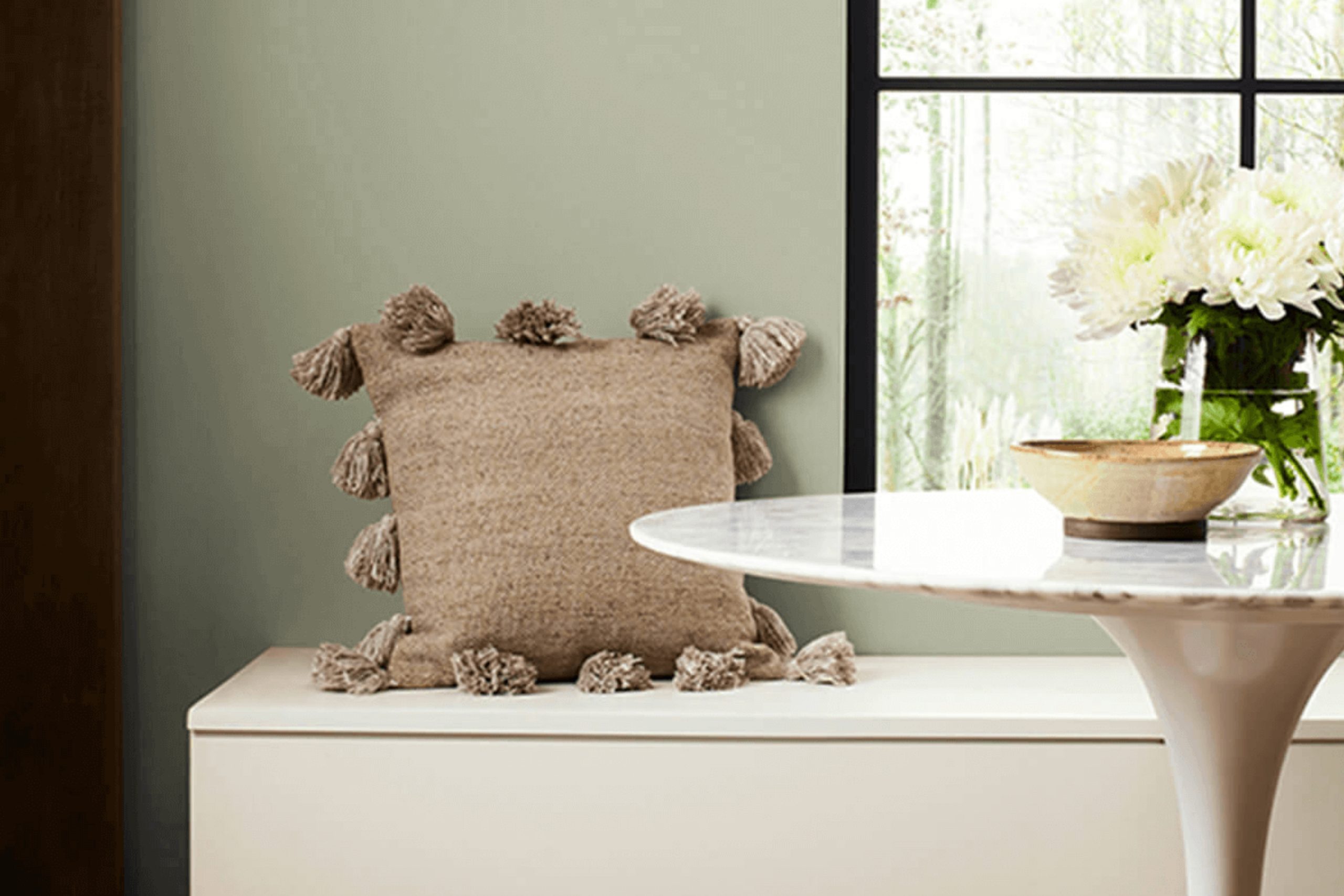
Welcome to an exciting journey where we explore the beautiful hue of SW 6178 Clary Sage by Sherwin Williams! If you’re looking to refresh your space or seeking the perfect color to start your next project, you’ve landed in the right spot. Clary Sage is not just any color – it’s a versatile and timeless green that brings a touch of nature and tranquility into your home.
We understand that picking the right paint color can sometimes feel overwhelming with so many choices out there. That’s exactly why we’re here to guide you through everything you need to know about Clary Sage.
Whether you’re thinking about transforming your living room, bedroom, or even your entire home, Clary Sage offers a unique balance between warmth and coolness, creating a soothing atmosphere that’s hard to beat.
Let’s jump right in and explore why Clary Sage by Sherwin Williams might just be the color that you’ve been looking for. With its earthy tones, it has the power to turn any room into a serene sanctuary, complement almost any decor style, and truly make your house feel like a home.
Ready to find out how to make the most of this stunning color? Let’s get started!
via sherwin-williams
What Color Is Clary Sage SW 6178 by Sherwin Williams?
Clary Sage SW 6178 by Sherwin Williams is a soothing, muted green hue with gray undertones, offering a sense of calm and tranquility to any space. This versatile color has a natural earthiness, making it a perfect choice for those looking to add a touch of nature and serenity to their interior.
Its subtlety balances between green’s freshness and gray’s sophistication, giving it a unique ability to blend seamlessly with various decor styles.
This color works exceptionally well in modern farmhouse, Scandinavian, and rustic interior designs because of its organic vibe. It serves as a beautiful backdrop that complements natural wood finishes, from light oaks to rich walnuts, enhancing the warmth and inviting feel of the space.
Clary Sage pairs wonderfully with soft, textured materials like linen or wool, adding depth and interest to the room. Incorporate it with matte finishes on metals like brass or copper for a touch of elegance without overwhelming the space.
Materials like jute or sisal in rugs or baskets also work well with Clary Sage, reinforcing the connection to nature and adding layers of texture. This color’s adaptability is its strength, making it suitable for living rooms, bedrooms, and even bathrooms, where its calming effect is most appreciated. Whether used on walls or in accessories, Clary Sage SW 6178 brings a fresh and peaceful ambiance to any interior.
housekeepingbay.com
Is Clary Sage SW 6178 by Sherwin Williams Warm or Cool color?
Clary Sage SW 6178 by Sherwin Williams is a unique and soothing color that can transform any room into a peaceful space. This color is like a breath of fresh air, bringing a sense of calmness and tranquility to your home. Its soft green hue with a hint of grey makes it incredibly versatile, allowing it to work well in various rooms, from the living room to the bedroom.
The beauty of Clary Sage lies in its ability to create a serene environment that’s both refreshing and comforting. It’s a color that pairs well with natural light, enhancing its soothing qualities and making spaces feel more open and airy.
Whether you pair it with bright whites for a crisp, clean look or with rich woods for a more earthy, cozy vibe, Clary Sage offers endless possibilities for creating a welcoming atmosphere in your home.
In essence, Clary Sage SW 6178 is more than just paint on the walls; it’s a way to inject a little bit of nature’s calm into your daily life, making your house feel more like a home.
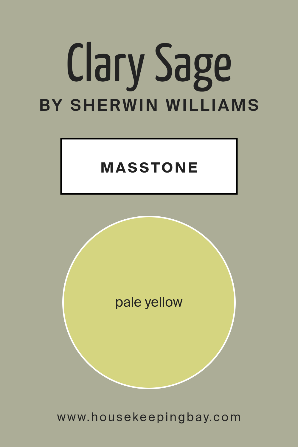
What is the Masstone of the Clary Sage SW 6178 by Sherwin Williams?
Clary Sage SW 6178 by Sherwin-Williams is a unique paint color that at its core has a masstone of pale yellow (#D5D580). This light, muted yellow shade plays a big role in how Clary Sage feels and looks in a home. Imagine the soft, gentle rays of morning sunshine peeking through your window; that’s the warm, soothing vibe Clary Sage brings into a space.
Because of its pale yellow base, it has a natural, earthy appeal, making rooms feel more open and airy.
This color works really well in rooms that need a touch of brightness but where you also want to keep things calm and relaxed. It’s not too bold, so it won’t overwhelm a space. Instead, it creates a subtle backdrop that’s easy to pair with other colors and home decor styles.
Whether it’s the living room needing a refresh or a bedroom calling for a serene atmosphere, Clary Sage adds that perfect hint of lightness without going full-on bright yellow. It’s like having a bit of the gentle outer rays of the sun inside, making the home feel inviting and cozy.
housekeepingbay.com
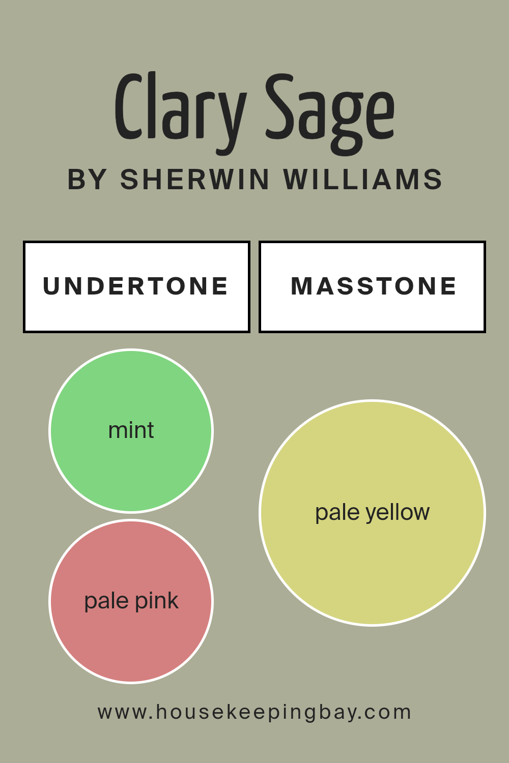
Undertones of Clary Sage SW 6178 by Sherwin Williams
Clary Sage SW 6178 by Sherwin Williams is an intriguing paint color that looks simple at first glance but reveals a complex spectrum of undertones upon closer inspection. These undertones include a variety of shades like mint, pale pink, grey, light gray, light blue, light purple, lilac, yellow, light green, orange, and olive.
Essentially, undertones are subtle colors that lurk beneath the surface of the main color. They can significantly influence how we perceive the primary color, often affecting its warmth, coolness, and how it behaves under different lighting conditions.
In interior spaces, the rich blend of undertones in Clary Sage makes it a versatile and interesting choice. For instance, its mint and light green undertones can bring a fresh and lively vibe to a room, perfect for creating a soothing atmosphere. The hints of pale pink and lilac add a soft, almost imperceptible warmth, making spaces feel more inviting without overwhelming them with color.
Grey and light gray undertones ensure that Clary Sage remains grounded and adaptable to various decor styles, providing a neutral backdrop that complements both bold and subdued color schemes. Light blue and light purple undertones add a touch of coolness, offering a serene and calming effect ideal for bedrooms or bathrooms.
Yellow and orange undertones inject a subtle energy into the space, ensuring that the color doesn’t feel too cool or distant, while the olive undertones contribute to the natural, earthy quality of Clary Sage, making it perfect for creating a cozy and comfortable environment.
Overall, the undertones of Clary Sage SW 6178 by Sherwin Williams work together to make this color adaptable and complex, capable of transforming interior walls based on its interplay with light and surrounding colors.
This paint can snuggle comfortably in various settings, from modern and minimalistic designs to more traditional and eclectic decors, thanks to its rich and layered undertones.
housekeepingbay.com
Coordinating Colors of Clary Sage SW 6178 by Sherwin Williams
Coordinating colors are colors that complement each other well when used together in a space, creating a harmonious and balanced look. They are often used to enhance the main hue without overpowering it, providing depth and contrast to design schemes.
These colors can be found across different shades and tones, but they share a commonality that ties the space together brilliantly.
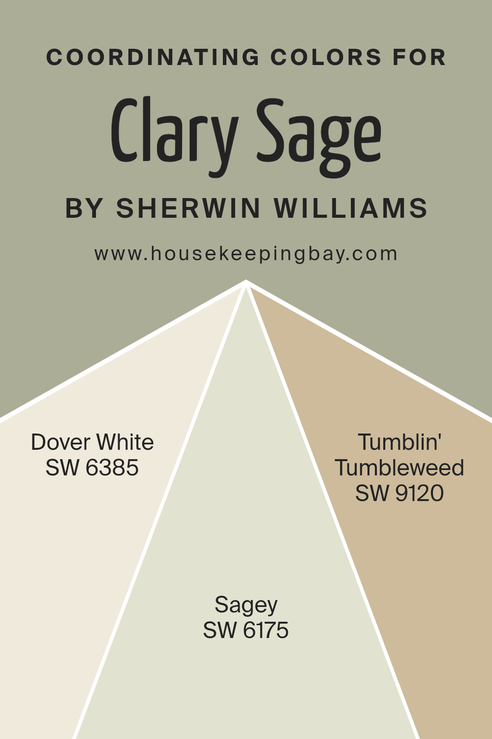
Taking Clary Sage SW 6178 by Sherwin Williams as a primary color, its coordinating colors include SW 6385 Dover White, SW 6175 Sagey, and SW 9120 Tumblin’ Tumbleweed. Dover White is a soft, warm white with a hint of creaminess, making it a perfect backdrop for Clary Sage, allowing the green to stand out without creating a stark contrast.
Sagey, as the name suggests, is a lighter green that shares the same earthy undertones as Clary Sage, offering a subtle option for creating a layered, monochromatic look.
Lastly, Tumblin’ Tumbleweed introduces a neutral, sandy beige into the palette, providing a gentle, complementary contrast that grounds the greens and whites, tying the color scheme together in a natural and inviting way.
These coordinating colors work together to create a cohesive and serene space, drawing from nature-inspired tones that bring peace and harmony into any room.
You can see recommended paint colors below:
- SW 6385 Dover White
- SW 6175 Sagey
- SW 9120 Tumblin’ Tumbleweed
housekeepingbay.com
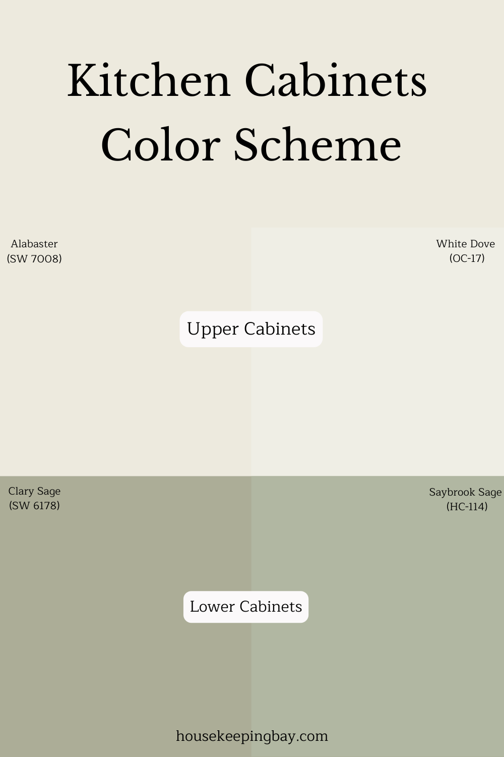
A Cozy Green for Lower Cabinets
If you’re dreaming of a kitchen that feels calm but still has a bit of charm, Clary Sage is a winner . It’s that soft, muted green that makes you feel grounded without being too dark or too bold. In the color scheme from this pin, Clary Sage is used for the lower cabinets, and wow—it brings in a cozy, earthy touch that balances perfectly with those warm whites on top like Alabaster or White Dove.
I had a client last fall who paired Clary Sage lowers with creamy uppers and a butcher block countertop. It was stunning! The kitchen felt clean but still had that “lived-in” warmth that makes you want to stay and sip coffee .
What makes Clary Sage work so well is how it plays with light. In the morning, it looks a little fresher and crisp, and by evening, it turns soft and mellow. If you’ve got wood floors or brass hardware, it really makes them pop too.
This sage green works great in farmhouse kitchens, vintage-style homes, or even just a plain ol’ space that needs a bit of life .
It’s not trendy in a way that’ll feel old in a year—it’s one of those quiet colors that just fits.
housekeepingbay.com
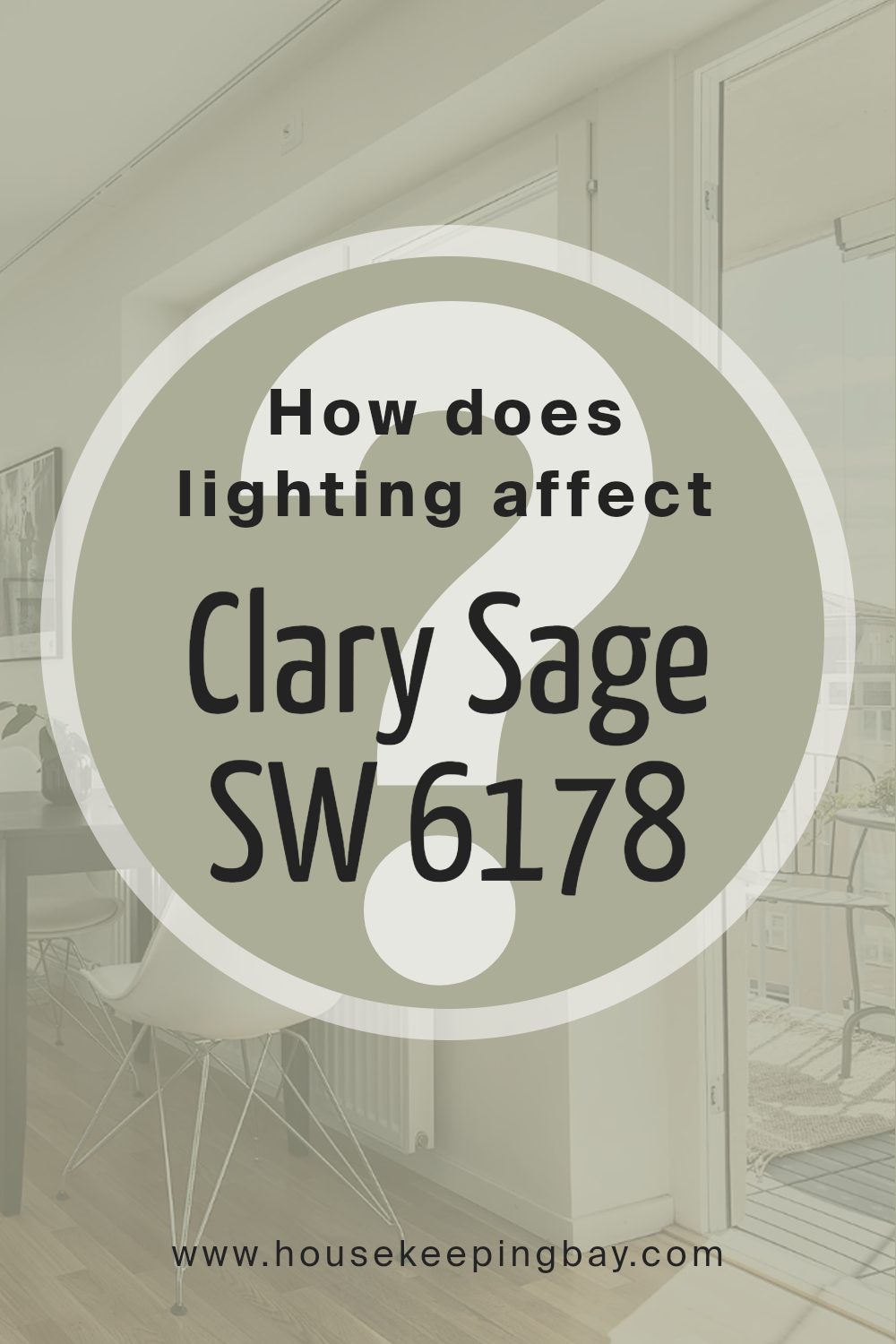
How Does Lighting Affect Clary Sage SW 6178 by Sherwin Williams?
Lighting plays a crucial role in how we perceive colors in our homes or any space, for that matter. It can dramatically alter the appearance of a paint color, making it look different at various times of the day or under different lighting conditions. Let’s use Clary Sage SW 6178 by Sherwin Williams as an example to explore this concept further.
In natural light, Clary Sage shows its true color. Natural light is the most accurate with colors, showcasing them in their purest form. However, the direction of the room can affect how Clary Sage appears. In rooms facing north, natural light can be quite cool and indirect, causing Clary Sage to appear more muted and slightly greener.
The cooler light emphasizes the color’s soothing qualities, making it ideal for creating a calm and tranquil space.
South-facing rooms, on the other hand, receive a generous amount of warm light throughout the day. This warm light can make Clary Sage look brighter and more vibrant, enhancing its warm undertones. The color can become more alive and welcoming in these rooms, perfect for social spaces like living rooms or kitchens.
In east-facing rooms, Clary Sage will be bathed in warm, soft light in the morning, making the color appear slightly warmer and more inviting. As the day progresses, the light becomes cooler, which can cause the color to shift back to a more muted, natural version of itself.
West-facing rooms experience the opposite effect. Cooler, softer light in the morning keeps Clary Sage looking more subdued, while the intense, warm light in the afternoon and evening brings out the color’s vibrancy and depth, making it feel more dynamic.
Artificial lighting also greatly affects how Clary Sage is perceived. Warm artificial lights, like incandescent bulbs, enhance the cozy, inviting qualities of the color, making it seem warmer than it actually is. Cooler artificial lights, such as fluorescent bulbs, might push it to appear more muted and more towards its green undertones.
In summary, the appearance of Clary Sage SW 6178 by Sherwin Williams can vary significantly depending on the light source. Natural light brings out its true color, but the room’s orientation—north, south, east, or west—can alter its warmth and vibrancy. Artificial lighting can either warm up or cool down the color, depending on the type of light bulb used.
housekeepingbay.com
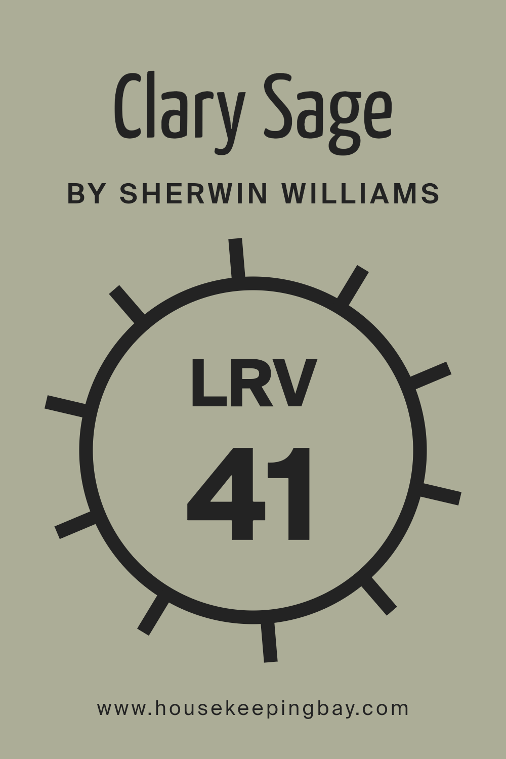
What is the LRV of Clary Sage SW 6178 by Sherwin Williams?
LRV stands for Light Reflectance Value. It’s a measure used to describe the percentage of light a paint color reflects back into a room. Think of LRV like a scale from 0 to 100, where 0 is pure black, absorbing all light, and 100 is pure white, reflecting all light back.
Colors with higher LRVs make rooms feel brighter and more open because they reflect more light. On the other hand, colors with lower LRVs absorb more light, making spaces feel cozier or smaller but can also make them appear darker.
Clary Sage SW 6178 by Sherwin Williams, with an LRV of 40.959, is right in the middle of this scale. It won’t brighten a room like a color with a higher LRV would, nor will it make the space feel very dark.
Instead, it brings a balanced, moderate level of brightness and warmth to the walls. In well-lit spaces, Clary Sage will look lighter and more vibrant, while in rooms with less natural light, it may appear slightly darker, adding a cozy but not overly dark ambiance.
This makes Clary Sage a versatile color, suitable for a variety of spaces and lighting conditions.
housekeepingbay.com
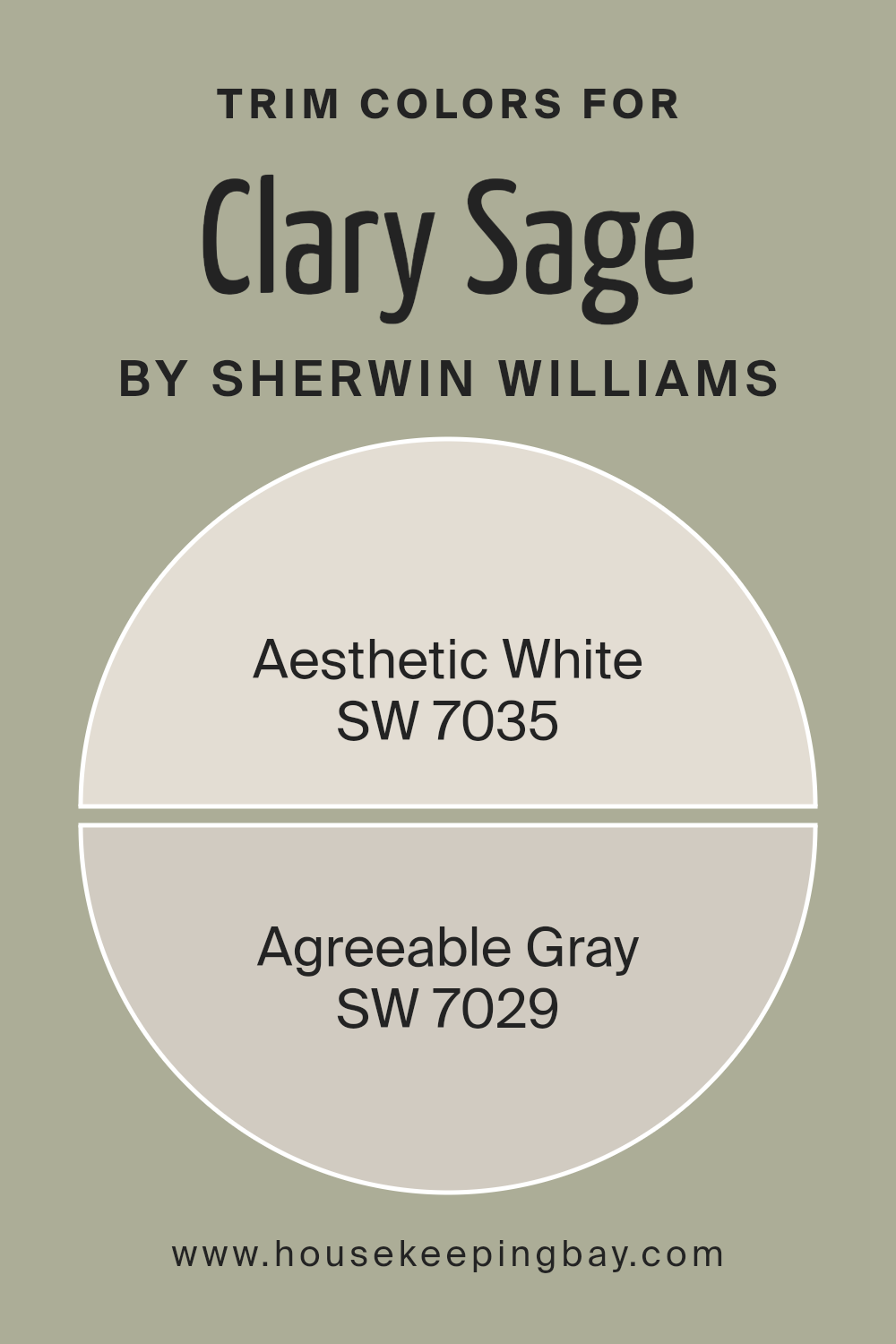
What are the Trim colors of Clary Sage SW 6178 by Sherwin Williams?
Trim colors are the additional colors used on the edges, outlines, or decorative elements of a wall, door, window, or other features in a room, contrasting with or complementing the main color to accentuate details or add a finishing touch to the overall design.
When it comes to a specific paint like Clary Sage SW 6178 by Sherwin Williams, choosing the right trim color is crucial because it can either highlight the unique green-gray hue of Clary Sage, making the walls stand out and give the room a cohesive, polished look, or subtly blend in, maintaining a serene and harmonious atmosphere.
For instance, using Aesthetic White SW 7035 as a trim color alongside Clary Sage creates a soft, subtle contrast that lightens the room’s feel without overpowering the main color. Aesthetic White has a hint of warmth that can make spaces feel inviting and cozy.
On the other hand, Agreeable Gray SW 7029 offers a more neutral option for trim, providing a gentle, seamless transition between the wall and trim. Its versatility bridges the gap between warmer and cooler tones, making it an excellent choice for bringing a balanced, understated elegance to the space.
Both colors support Clary Sage in different but harmonious ways, ensuring your design choices enhance the room’s overall appeal.
You can see recommended paint colors below:
housekeepingbay.com
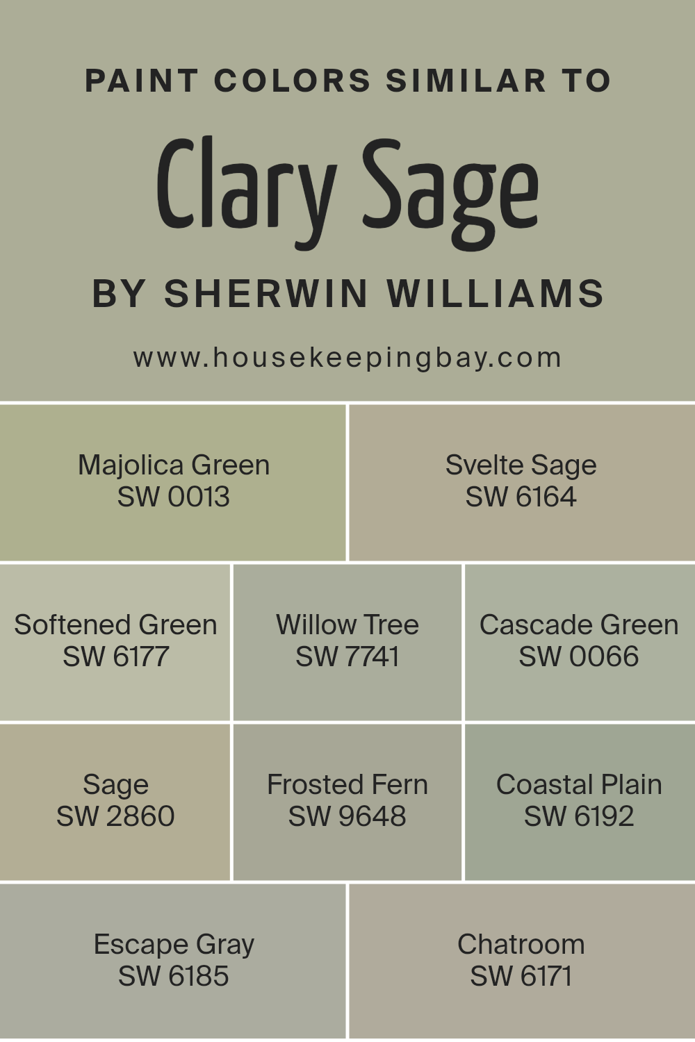
Colors Similar to Clary Sage SW 6178 by Sherwin Williams
When choosing a color scheme for a space, incorporating similar colors can create a seamless and cohesive look that’s pleasing to the eye. Similar colors, like variations of Clary Sage SW 6178 by Sherwin Williams, work together harmoniously because they share a common hue base, making them naturally complementary within a space.
This approach can enhance the aesthetic appeal and create a serene atmosphere by smoothly transitioning between shades. It’s like having different notes of the same melody, adding depth and interest without the discord of contrasting colors.
For instance, Majolica Green SW 0013 introduces a deep, earthy tone that grounds the color palette, giving it a sense of stability and calmness, while Svelte Sage SW 6164 offers a lighter, more subdued option that keeps the space feeling open and airy. Softened Green SW 6177, as its name suggests, provides a gentler touch of green, softening the overall look and feel of the room.
Willow Tree SW 7741 brings in a slightly more saturated hue, adding character and a touch of nature. Cascade Green SW 0066 introduces a fresh, vibrant energy, reminiscent of flowing water. Sage SW 2860 maintains the classic sage look but with a bit more intensity, perfect for adding a focal point.
Frosted Fern SW 9648 leans towards a cooler tone, offering a crisp, refreshing vibe. Coastal Plain SW 6192 blends green and gray for a subdued, sophisticated feel. Escape Gray SW 6185 cleverly merges green with gray undertones, providing an escape into a soothing, muted palette.
Lastly, Chatroom SW 6171 dabbles in the art of subtlety with its complex mix of green and gray, perfect for creating a modern, understated elegance. Together, these colors offer a versatile palette that can be adjusted to fit any mood, style, or preference, making them invaluable for creating visually cohesive and beautiful spaces.
You can see recommended paint colors below:
- SW 0013 Majolica Green
- SW 6164 Svelte Sage
- SW 6177 Softened Green
- SW 7741 Willow Tree
- SW 0066 Cascade Green
- SW 2860 Sage
- SW 9648 Frosted Fern
- SW 6192 Coastal Plain
- SW 6185 Escape Gray
- SW 6171 Chatroom
housekeepingbay.com
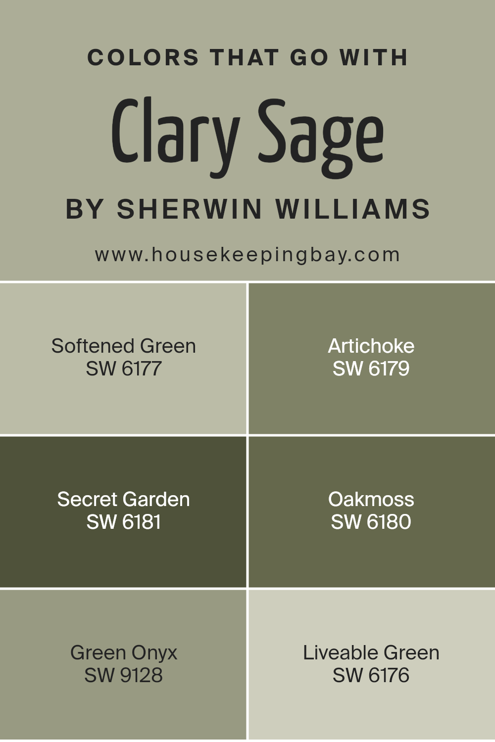
Colors that Go With Clary Sage SW 6178 by Sherwin Williams
Colors that go well with Clary Sage SW 6178 by Sherwin Williams are crucial in creating visually pleasing spaces. Pairing Clary Sage with the right colors enhances the aesthetic appeal and sets the mood of a room, making it feel more cohesive and well-designed.
These coordinated colors are not just about style; they also influence our emotions and perception of space, making it important to choose them wisely.
Starting with Softened Green SW 6177, it’s a gently muted green that brings a serene and calming effect to the surroundings, perfect for creating a tranquil space. Artichoke SW 6179 adds a bit more depth, with its rich, earthy tone that grounds the scheme and offers a sense of stability and warmth.
Secret Garden SW 6181 introduces an element of mystery and elegance, with its darker hue providing a sophisticated backdrop that elevates the room’s character. Oakmoss SW 6180, meanwhile, is a deeper, mossy green that can add a touch of nature-inspired lushness, giving a room an organic, grounded feel.
Green Onyx SW 9128, with its lighter, almost ethereal quality, brightens spaces and introduces a subtle vibrancy. Lastly, Liveable Green SW 6176 is exactly as its name suggests – a livable, adaptable hue that works seamlessly in various settings, offering a fresh and inviting atmosphere.
Together, these colors create harmonious combinations that enhance the natural beauty of Clary Sage, allowing for spaces that are both beautiful and emotionally resonant.
You can see recommended paint colors below:
- SW 6177 Softened Green
- SW 6179 Artichoke
- SW 6181 Secret Garden
- SW 6180 Oakmoss
- SW 9128 Green Onyx
- SW 6176 Liveable Green
housekeepingbay.com
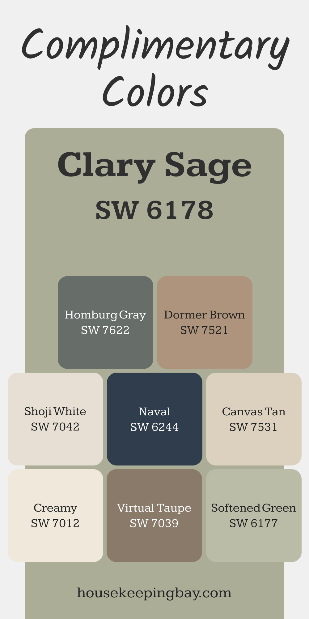
Complimentary Colors for Clary Sage SW 6178 Paint Color by Sherwin Williams
Clary Sage pairs effortlessly with Softened Green and Shoji White for a fresh and inviting look. The subtle green undertones create harmony, while Shoji White adds a touch of brightness. For added contrast, Homburg Gray or Naval provide depth and a bold accent.
Warm neutrals like Creamy, Canvas Tan, and Dormer Brown bring balance and softness to the palette. Virtual Taupe offers a versatile earthy tone that complements the calm yet vibrant essence of Clary Sage.
via housekeepingbay.com
How to Use Clary Sage SW 6178 by Sherwin Williams In Your Home?
Clary Sage SW 6178 by Sherwin Williams is a unique and versatile paint color that brings a touch of nature into your home. This soft, earthy green has a calming effect, making it perfect for any room where you want to create a peaceful and relaxing atmosphere. Imagine using it in your living room or bedroom; it pairs beautifully with both light and dark furniture, enhancing wood tones and brightening spaces without overwhelming them.
For those looking to freshen up their kitchen or bathroom, Clary Sage can add a subtle hint of color that’s both modern and timeless. It works well with white cabinets and tiles, adding depth and interest to these spaces. Additionally, this color can make small spaces appear larger and more open, thanks to its light-reflective qualities.
Not sure if it’s right for your space? Try it on an accent wall or inside bookshelves for a pop of color that’s not too daring. Clary Sage is also great for exterior doors and trim, providing a welcoming warmth to your home’s curb appeal. With Clary Sage SW 6178, the possibilities in your home are broad, so you can put your own creative spin on using this beautiful shade.
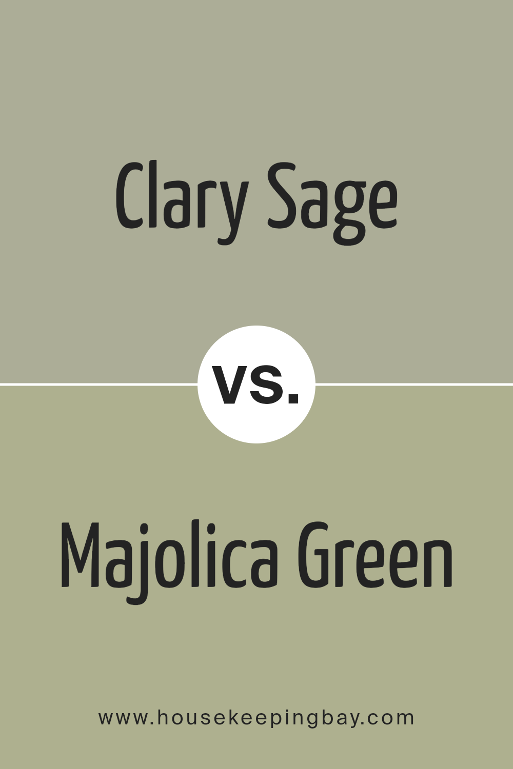
Clary Sage SW 6178 by Sherwin Williams vs Majolica Green SW 0013 by Sherwin Williams
Clary Sage SW 6178 by Sherwin Williams is a soft, muted green with a touch of gray, giving it a soothing and natural feel. It’s a versatile color that feels fresh and can easily blend into various spaces, promoting a tranquil atmosphere. This color is perfect for creating a calm and restful environment in any room.
Majolica Green SW 0013, also by Sherwin Williams, offers a deeper, more traditional green hue reminiscent of lush foliage or the classic glaze on Majolica pottery. It has a richness and depth that adds elegance and sophistication to spaces. While it’s bolder than Clary Sage, it still provides a sense of nature and serenity.
Both colors bring the outdoors in, but Clary Sage does so in a lighter, airier manner, whereas Majolica Green offers a more grounded, anchored feel. Clary Sage is great for those looking for a subtle nod to nature, while Majolica Green suits those wanting to make a stronger statement with color.
You can see recommended paint color below:
- SW 0013 Majolica Green
housekeepingbay.com
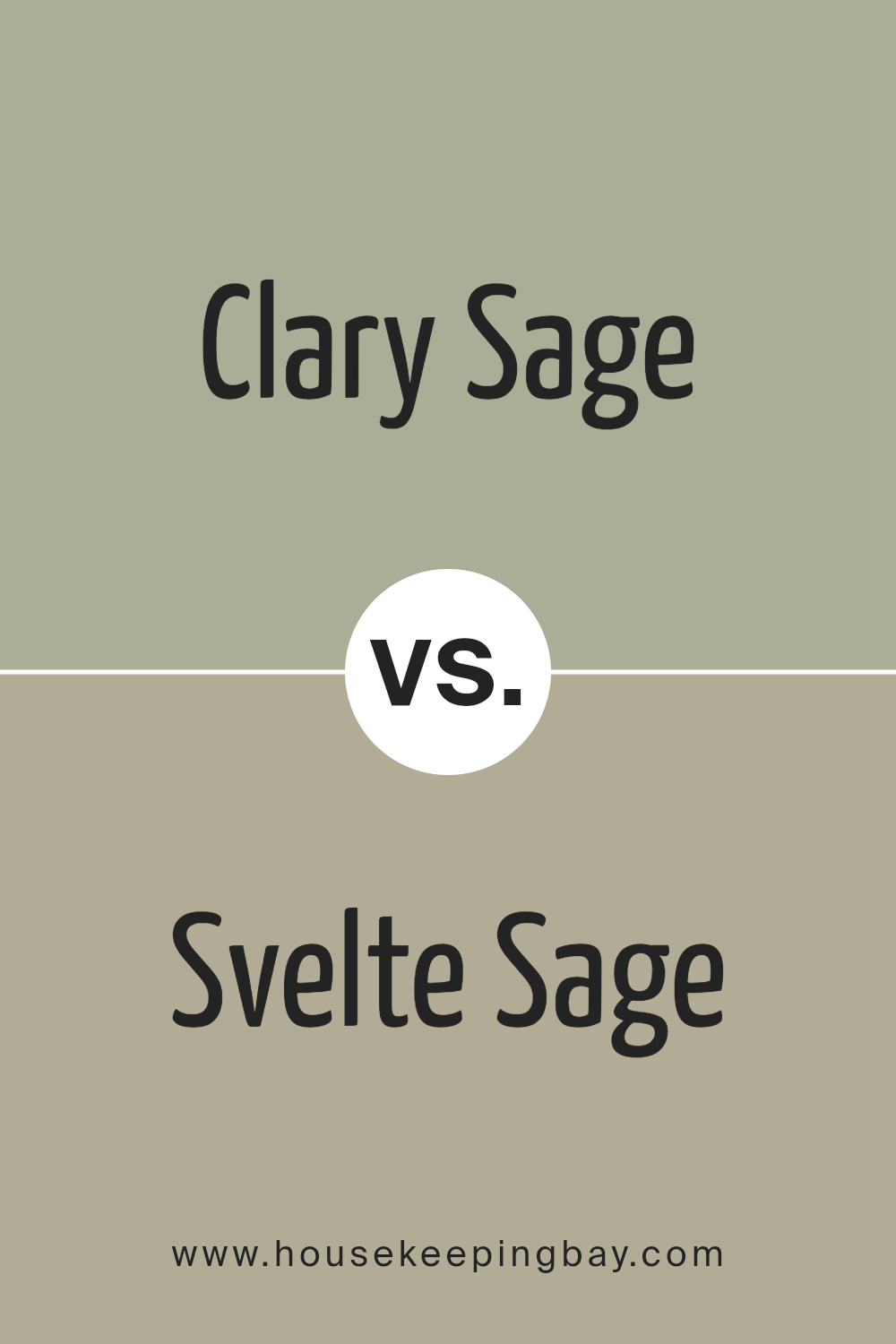
Clary Sage SW 6178 by Sherwin Williams vs Svelte Sage SW 6164 by Sherwin Williams
Clary Sage SW 6178 by Sherwin Williams and Svelte Sage SW 6164 are two unique colors with their own distinct vibes. Clary Sage is lighter and has a more airy feel, giving rooms a fresh, calm atmosphere. This color is great for spaces where you want to relax and unwind, like bedrooms or bathrooms.
It’s like a gentle breath of fresh air whenever you walk into a room painted with it. On the flip side, Svelte Sage is a bit darker and brings a cozy warmth to spaces.
It’s perfect for areas where you want a bit more depth and comfort, such as living rooms or dining areas. While both colors share a sage foundation, offering a hint of nature and tranquility, their differing lightness and warmth can significantly affect how a room feels.
Depending on what vibe you’re going for, either Clary Sage’s refreshing touch or Svelte Sage’s cozy embrace can transform your space beautifully.
You can see recommended paint color below:
- SW 6164 Svelte Sage
housekeepingbay.com
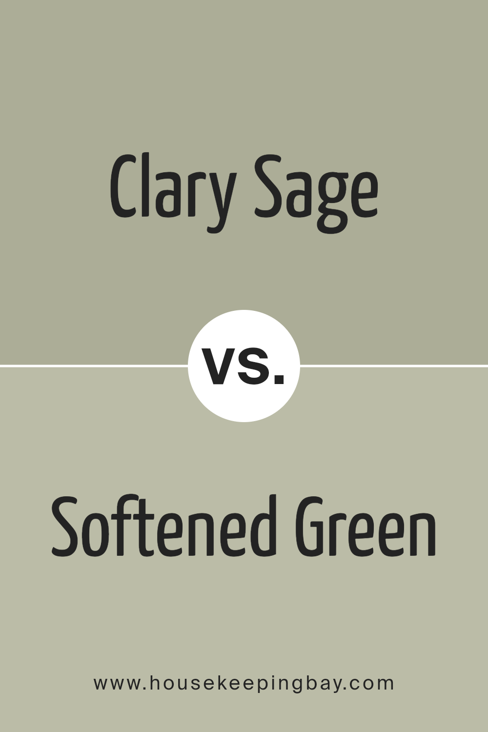
Clary Sage SW 6178 by Sherwin Williams vs Softened Green SW 6177 by Sherwin Williams
The two colors, Clary Sage SW 6178 and Softened Green SW 6177 by Sherwin Williams, sit close to each other on the color spectrum, sharing a green base that feels calm and natural. But they do have their differences. Clary Sage has a deeper, more pronounced green tone that gives it a richer appearance.
It feels like standing in a lush, dense forest, bringing a sense of serenity and depth to spaces. Softened Green, as its name suggests, is lighter and appears more muted.
It’s akin to the gentle hues of early spring leaves or the softness of a well-worn sea glass, offering a feeling of relaxation and lightness to a room. Both colors work well in homes looking to add a touch of nature’s peace and quiet. Yet, between the two, Clary Sage adds depth and drama, while Softened Green provides a breezier, more understated vibe.
You can see recommended paint color below:
- SW 6177 Softened Green
housekeepingbay.com
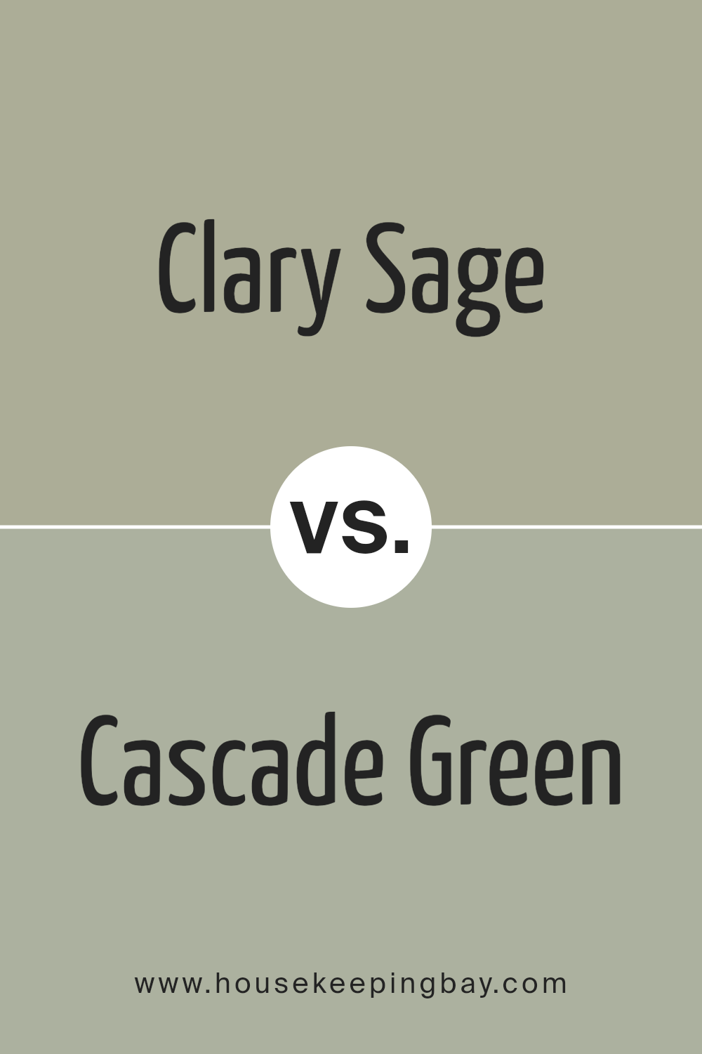
Clary Sage SW 6178 by Sherwin Williams vs Cascade Green SW 0066 by Sherwin Williams
Clary Sage SW 6178 by Sherwin Williams is a soft and soothing green with a hint of gray, making it a perfect choice for a calming and serene environment. It’s a versatile color that can easily fit in many areas of a home, like living rooms or bedrooms, giving them a gentle touch of nature.
Cascade Green SW 0066, by Sherwin Williams, is quite different. This color is brighter and more vivid. It’s a lively green that brings a fresh and energetic feel to any space. It’s great for spaces that need a pop of color or for creating a vibrant, upbeat atmosphere.
While Clary Sage offers a peaceful and grounded vibe, perfect for relaxing settings, Cascade Green stands out with its cheerfulness, ideal for spaces that aim to energize and invigorate. Both colors bring the essence of nature into your home but in their unique ways – Clary Sage with its muted, earthy tones and Cascade Green with its bright, lively essence.
You can see recommended paint color below:
housekeepingbay.com
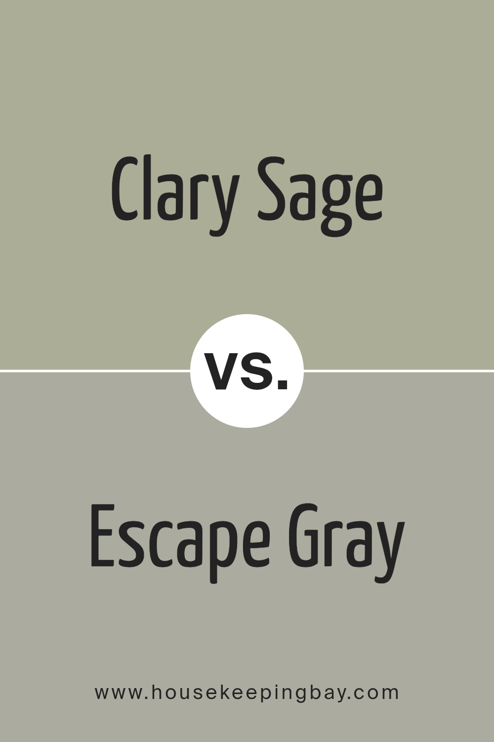
Clary Sage SW 6178 by Sherwin Williams vs Escape Gray SW 6185 by Sherwin Williams
Clary Sage SW 6178 by Sherwin Williams is a soothing, greenish-gray color that brings a sense of calm and serenity to any space. It has a soft, natural vibe that makes it perfect for creating a relaxed and welcoming environment. This color is versatile, working well in both bright and dimly lit rooms, adding a gentle touch of nature indoors.
Escape Gray SW 6185 by Sherwin Williams is another beautiful option, leaning more towards a gray shade with subtle green undertones. It gives a feeling of tranquility and elegance, making it ideal for those looking to add a sophisticated yet comforting touch to their space.
Escape Gray is slightly cooler compared to Clary Sage, providing a serene backdrop that complements various decor styles.
Both colors are great picks for adding a peaceful and chic feel to any room. While Clary Sage brings a bit more green into the mix, emphasizing a connection to nature, Escape Gray offers a cooler, more understated elegance. Each color has its unique charm, making them suitable for creating a serene and stylish space.
You can see recommended paint color below:
- SW 6185 Escape Gray
housekeepingbay.com
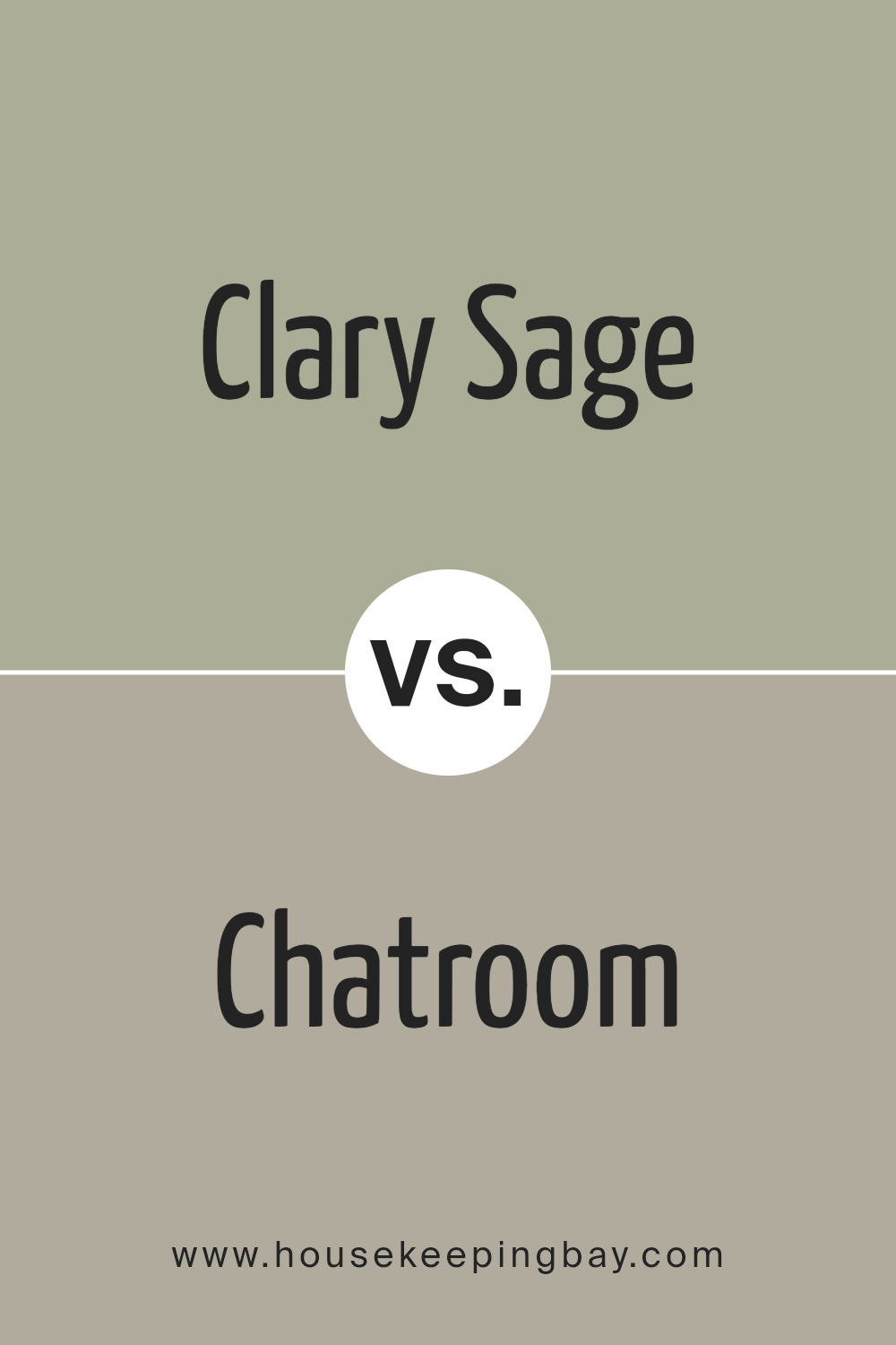
Clary Sage SW 6178 by Sherwin Williams vs Chatroom SW 6171 by Sherwin Williams
The colors Clary Sage SW 6178 and Chatroom SW 6171 from Sherwin Williams are like close cousins in the world of paint. Clary Sage is a soft, soothing green with a hint of gray. It’s like the color of a sage leaf in the early morning light – calming and natural.
It brings a breath of fresh air into a room without being too bold. On the contrary, Chatroom is more reserved. It leans towards a deeper, sophisticated gray with a whisper of green. Its subtlety makes it a great choice for those who prefer a more muted, neutral backdrop that still holds a bit of warmth and earthiness.
Both colors share a calming vibe but in different tones. Clary Sage brings a lighter, airy feel, perfect for illuminating spaces, while Chatroom offers depth, creating cozy, enveloping environments. Together, they show how shades can share a family but have their own unique personalities.
You can see recommended paint color below:
housekeepingbay.com
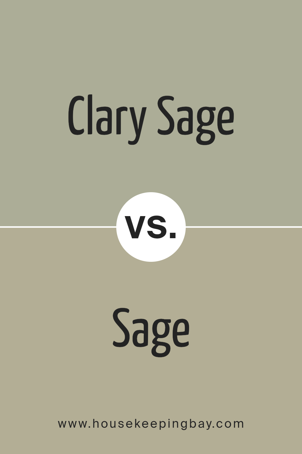
Clary Sage SW 6178 by Sherwin Williams vs Sage SW 2860 by Sherwin Williams
Clary Sage SW 6178 by Sherwin Williams and Sage SW 2860, also by Sherwin Williams, are both beautiful colors, but they have some differences. Clary Sage is a lighter, more muted green, giving it a soft, soothing feel. It’s great for creating a calm and relaxing atmosphere in a room.
On the contrary, Sage SW 2860 is a deeper green, with a bit more intensity. This color is still calming, but it adds a bit more richness and warmth to a space than Clary Sage does.
If you’re deciding between the two for a room, think about the mood you want to set. For a lighter, airier feel, go with Clary Sage. It’ll make the space feel more open and peaceful. But if you prefer something that feels a bit cozier and more enveloping, Sage might be the way to go. It’ll give the room a firmer presence of color while still keeping things tranquil. Both colors work well for creating a nature-inspired look, but their different tones can drastically change the feel of a room.
You can see recommended paint color below:
- SW 2860 Sage
housekeepingbay.com
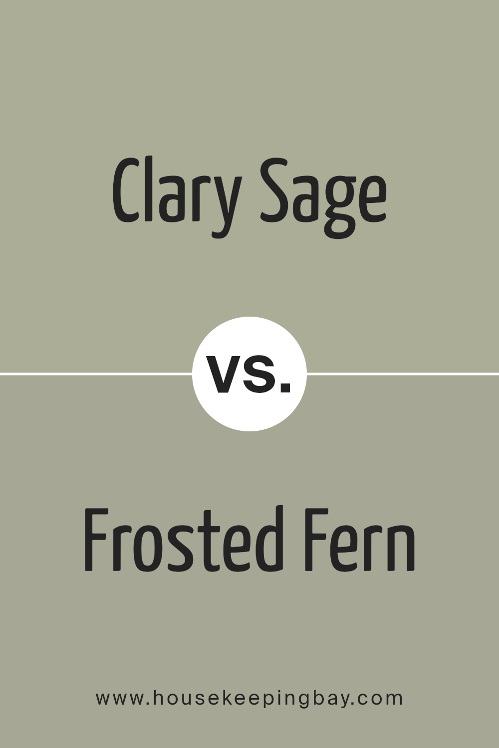
Clary Sage SW 6178 by Sherwin Williams vs Frosted Fern SW 9648 by Sherwin Williams
Clary Sage SW 6178 by Sherwin Williams and Frosted Fern SW 9648, both from Sherwin Williams, offer unique vibes for spaces. Clary Sage is a softer, muted green with a grey undertone. It brings a calm, soothing feel to rooms, perfect for creating a tranquil space. It’s versatile, looking great in living rooms, bedrooms, or bathrooms.
Frosted Fern, in comparison, is a lighter green. This color leans a bit more towards a fresh, airy feel, reminiscent of early spring leaves or a gentle touch of nature indoors. It’s likely to make small spaces appear larger and brighter due to its lightness.
Both colors pair well with natural wood, whites, and neutral tones, but Clary Sage’s deeper tone offers a bit more warmth and depth, making spaces feel more grounded and cozy. Frosted Fern, being lighter, adds a crisp, clean feel to spaces. Choosing between them depends on the atmosphere you want: Clary Sage for depth and warmth, or Frosted Fern for a light, refreshing touch.
You can see recommended paint color below:
housekeepingbay.com
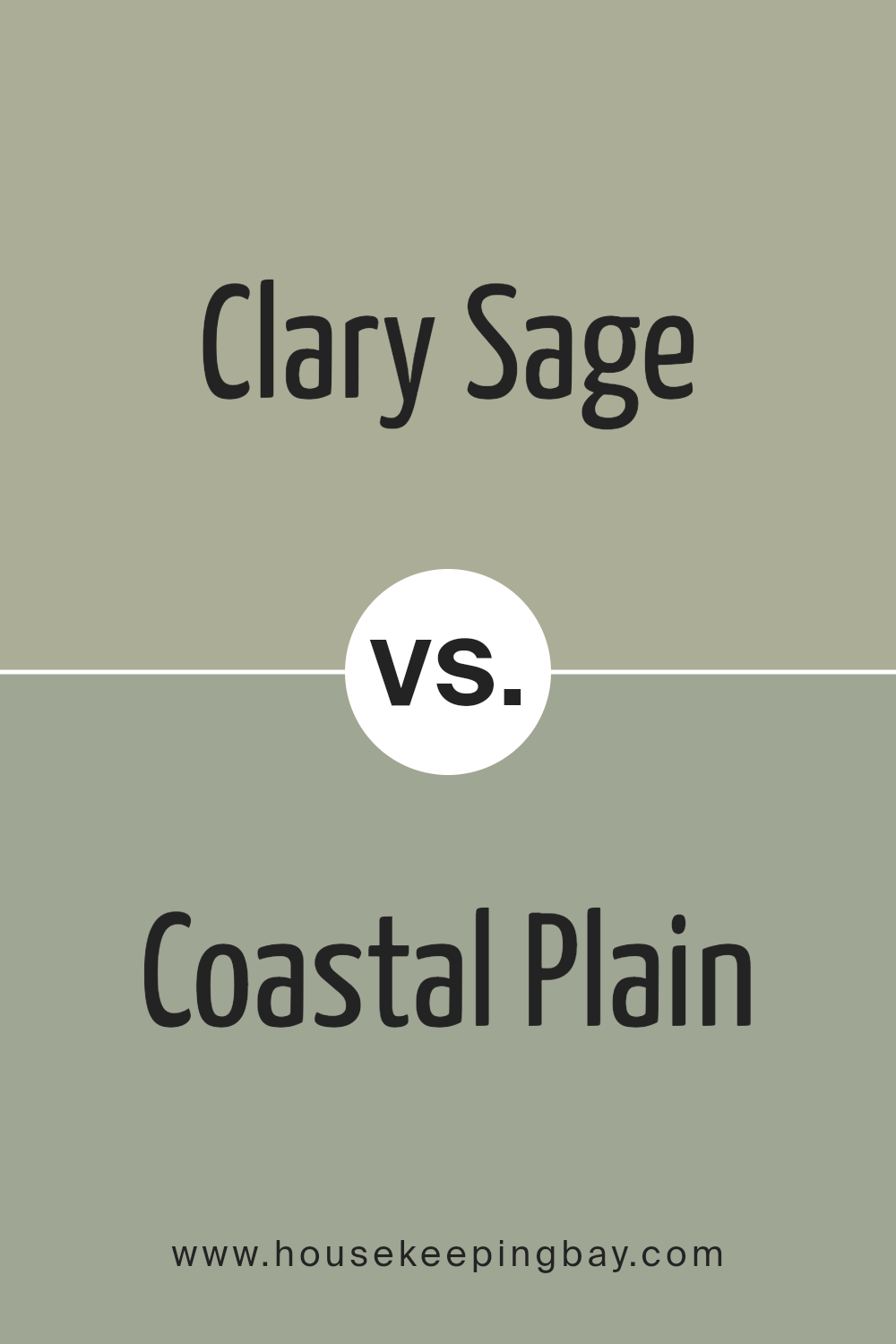
Clary Sage SW 6178 by Sherwin Williams vs Coastal Plain SW 6192 by Sherwin Williams
Clary Sage SW 6178 by Sherwin-Williams is a soft, soothing green that feels like a breath of fresh air. It’s a color that can bring a touch of nature into any space, making it feel more relaxing and tranquil. The lightness of Clary Sage adds a subtle, cozy vibe, perfect for rooms where you want to unwind and relax.
Coastal Plain SW 6192, also by Sherwin-Williams, is a deeper, more grounded green. It has a bit more strength in its tone, offering a sense of stability and comfort to any environment. This color is great for adding a bit of sophistication and depth to a space without overwhelming it.
While both colors share a natural green base, Clary Sage is lighter and softer, creating a more serene and calming effect. Coastal Plain is darker and richer, providing a sense of earthiness and robustness. Each color shines in its own way, making them ideal for different uses or to complement various decor styles and preferences. Whether looking for a gentle lift or a grounded feel, these greens offer lovely options.
You can see recommended paint color below:
- SW 6192 Coastal Plain
housekeepingbay.com
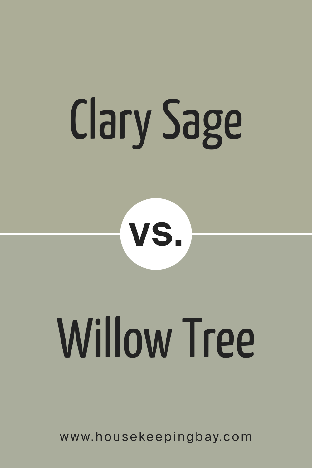
Clary Sage SW 6178 by Sherwin Williams vs Willow Tree SW 7741 by Sherwin Williams
Clary Sage SW 6178 by Sherwin Williams is a gentle, soothing green. It has a soft, muted quality, making it perfect for creating peaceful and relaxing spaces. It’s like the calm hue of sage leaves, bringing a touch of nature indoors. This color works well in rooms where you want to unwind and feel at ease, like bedrooms or living rooms.
Willow Tree SW 7741, also by Sherwin Williams, is another green, but with a stronger presence. It’s deeper and tends to bring more energy to a space. Imagine the rich, lively green of willow leaves dancing in the breeze. Willow Tree is great for adding a bit of vibrancy and can make spaces feel more alive and inviting.
It’s ideal for areas where you want a refreshing but still comforting atmosphere, like kitchens or dining rooms.
Both colors share the same family but offer different moods. Clary Sage is more about calmness and tranquility, while Willow Tree brings energy and liveliness. Choosing between them depends on the vibe you’re looking for in your space.
You can see recommended paint color below:
- SW 7741 Willow Tree
housekeepingbay.com
Conclusion
Wrapping up our thoughts on Sherwin Williams’ SW 6178 Clary Sage, it’s clear this paint color is a standout choice for anyone looking to freshen up their space. Its unique blend of green and gray tones offers a sophisticated, yet calming, effect that can transform any room into a serene haven. Whether you’re updating your living room, bedroom, or even the kitchen, Clary Sage adds a touch of nature and tranquility, making your home feel more inviting and peaceful.
One of the best parts about Clary Sage is its versatility. It pairs beautifully with a wide range of decor styles, from modern minimalist to rustic farmhouse. You can also match it with various colors, whether you prefer warm woods or sleek metals, helping you create a space that truly reflects your personality and style.
If you’re considering a new paint color for your home, Clary Sage is definitely worth your attention. Its ability to create a soothing atmosphere, combined with its adaptability in different settings, makes it a top choice for homeowners looking to add a fresh and cozy vibe to their spaces.
Remember, the impact of color on our mood and home environment is significant, and choosing Clary Sage could be the perfect step toward creating the peaceful, stylish home of your dreams.
housekeepingbay.com
Ever wished paint sampling was as easy as sticking a sticker? Guess what? Now it is! Discover Samplize's unique Peel & Stick samples. Get started now and say goodbye to the old messy way!
Get paint samples


