Kestrel White SW 7516 by Sherwin Williams
Elevating Spaces with Timeless Elegance
herwin-Williams, an industry leader known for its high-quality paints and innovative color options, offers a solution with SW 7516, Kestrel White. This color, part of their vast and diverse palette, stands out for its understated elegance and versatility. Kestrel White is a delicate hue that bridges the gap between white and beige, making it an ideal choice for those who want to create a cozy yet refined aesthetic in their home.
SW 7516 Kestrel White belongs to the neutral family, but it distinguishes itself with a soft, warm undertone that captures and reflects light in a way that can make spaces feel more open and airy. Its adaptability enables it to complement a wide range of décor styles, from modern minimalism to rustic chic.
Whether applied to living room walls, kitchen cabinets, or bedroom backgrounds, Kestrel White offers a timeless backdrop that encourages creativity in decorating.This article delves into the qualities that make SW 7516 Kestrel White by Sherwin-Williams a top choice for homeowners and professionals alike.
We’ll explore its application potential, compatibility with other colors, and tips for maximizing its aesthetic appeal in various settings. Join us as we uncover the charm and utility of Kestrel White, a color that proves neutrals are anything but boring.
vis sherwin-williams
What Color Is Kestrel White SW 7516 by Sherwin Williams?
Table of Contents
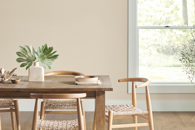
Kestrel White SW 7516 by Sherwin Williams is a serene, soft hue that embodies a harmonious blend of warmth and light, evoking a sense of calmness and refined simplicity. Its subtlety makes it a versatile choice for various interior designs, serving as a perfect backdrop that complements and enhances its surroundings. Unlike stark whites, Kestrel White possesses a creamy undertone that imbues spaces with a cozy, inviting atmosphere, making it an excellent choice for creating a peaceful and airy environment.
This nuanced shade is well-suited for a range of interior styles, from the minimalistic charm of Scandinavian design to the rustic elegance of farmhouse decor. It can effortlessly adapt to transitional and contemporary spaces, where its balanced nature fosters a sleek and sophisticated finish.
Kestrel White’s muted warmth pairs beautifully with natural materials, such as wood, leather, and linen, highlighting their textures and adding depth to the overall aesthetic. It also harmonizes with metals like brass and copper, bringing a touch of glam to the palette.
For textures, Kestrel White works well with smooth and sleek surfaces for a modern look or with rough and rustic textures for a more grounded, earthy vibe. It acts as a canvas that allows textures to stand out, whether it’s the grain of a wood coffee table, the softness of a woolen throw, or the sleekness of marble countertops.
In essence, Kestrel White SW 7516 is a timeless color that offers flexibility, warmth, and elegance, making it an impeccable choice for creating beautiful, cohesive spaces.
housekeepingbay.com
Is Kestrel White SW 7516 by Sherwin Williams Warm or Cool color?
Kestrel White SW 7516 by Sherwin Williams is a nuanced color that exudes an understated elegance, making it a versatile choice for homes. This warm neutral shade is a part of the Whites & Pastels collection and straddles the line between white and light gray, with soft, creamy undertones that add depth and complexity. Its ability to reflect natural light beautifully enables it to adapt to various lighting conditions, ensuring spaces feel airy and inviting.
In homes, Kestrel White brings a sense of calm and serenity, creating a seamless flow from room to room. Its adaptability is its strength, as it complements a wide range of interior styles, from modern minimalism to cozy traditional. It pairs effortlessly with both bold and muted color palettes, allowing homeowners to experiment with accessories and furnishings without altering the room’s foundational tone.
Furthermore, Kestrel White enhances architectural details, making it a fantastic choice for trim work, cabinetry, and walls alike. This color’s ability to elevate spaces while retaining a cozy ambiance makes it a sought-after choice for creating inviting, stylish homes.
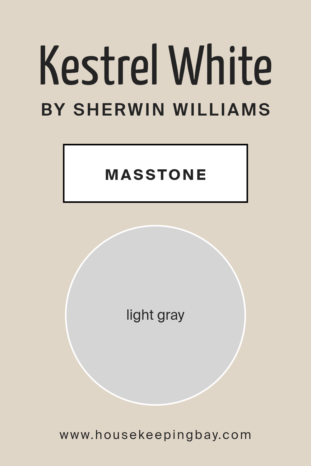
What is the Masstone of the Kestrel White SW 7516 by Sherwin Williams?
Kestrel White SW 7516 by Sherwin Williams is a captivating shade that seamlessly embodies tranquility and versatility in home interiors. Its masstone, a harmonious light gray (#D5D5D5), offers a delicate balance between warmth and coolness, making it an excellent choice for a wide range of design aesthetics.
This inherent neutrality in its base gray tone allows it to adapt and complement various color palettes, furniture styles, and decor elements. The lightness of Kestrel White’s masstone brightens spaces, creating an illusion of more ample room and openness, which is particularly beneficial in smaller or darker areas of the home.
Additionally, its understated elegance promotes a sense of calm and serenity, making it an ideal backdrop for bedrooms, living rooms, and work spaces. When applied to walls, Kestrel White serves as a sophisticated canvas that highlights architectural features and furnishings, allowing for dynamic personalization of the space.
Its versatility, combined with the psychological effects of the light gray masstone, aids in crafting homes that feel both modern and timeless.
housekeepingbay.com
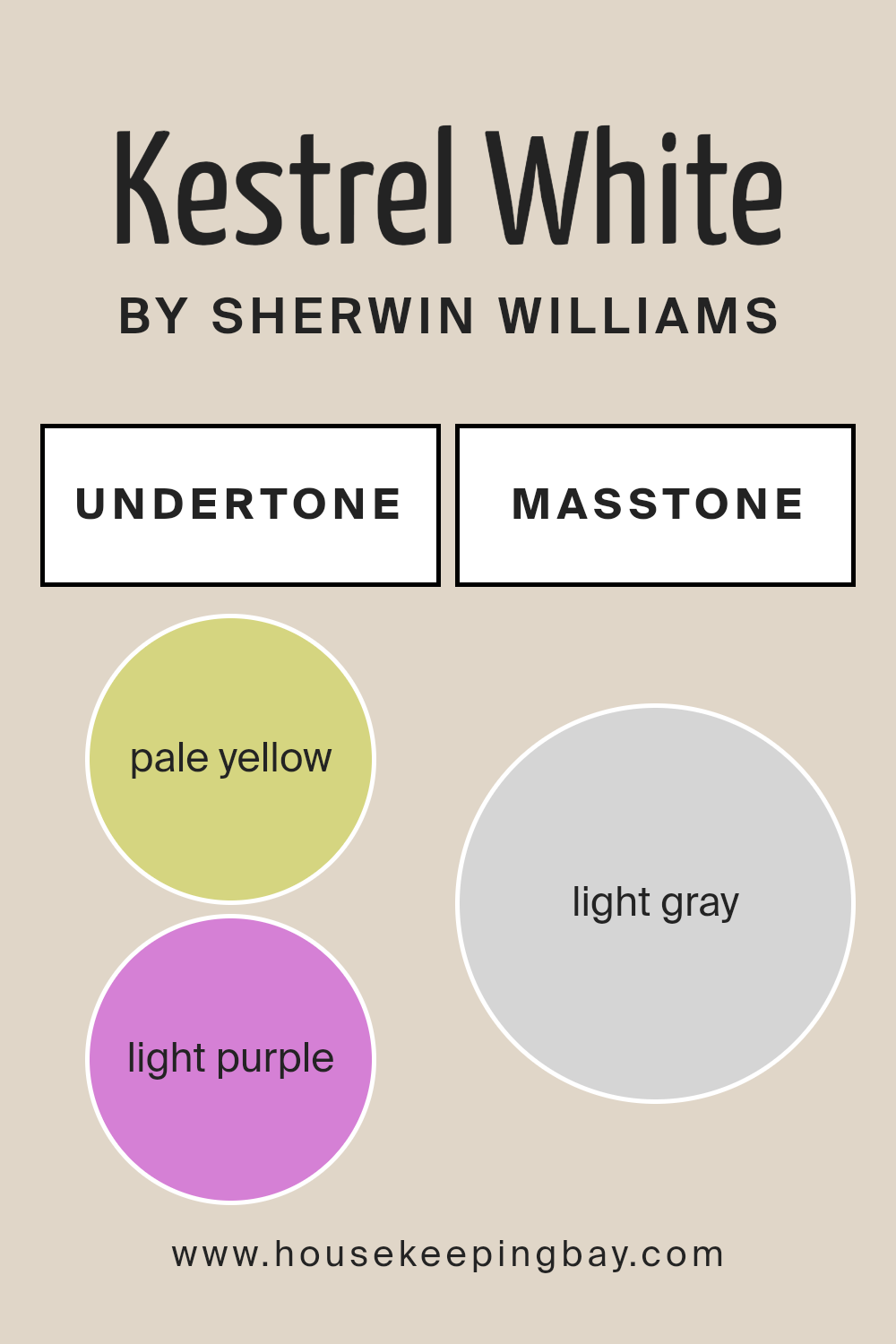
Undertones of Kestrel White SW 7516 by Sherwin Williams
Kestrel White SW 7516 by Sherwin Williams is a sophisticated and versatile paint color celebrated for its inherent ability to add warmth and depth to any space. This hue, at first glance, appears as a nuanced off-white or soft gray, elegantly standing as a testament to its complex composition. What sets Kestrel White apart are its subtly integrated undertones: pale yellow (#D5D580) and light purple (#D580D5). These undertones are not overtly dominant but work behind the scenes to dynamically influence the perception and emotional impact of the color.
Undertones play a crucial role in color perception by subtly altering the character and warmth of the base color. The pale yellow undertone injects a hint of sunlight and warmth, bringing a cozy and inviting energy to rooms. It can make spaces feel more illuminated, especially in rooms that receive ample natural light, enhancing the sense of airiness and openness.
On the other hand, the light purple undertone introduces a touch of cool sophistication, adding depth and an unexpected layer of complexity that prevents the color from feeling flat or sterile.
When applied to interior walls, Kestrel White SW 7516 transitions and interacts with the changing light throughout the day, showcasing a chameleon-like quality. In morning light, the pale yellow undertone may become more pronounced, creating a bright and uplifting atmosphere.
As the day progresses and natural light shifts, the light purple undertone might emerge subtly, lending a calm and serene feel to the environment. This duality ensures that spaces painted with Kestrel White remain engaging and adaptable, capable of complementing a wide range of decor styles and color palettes.
The nuanced balance between warmth and sophistication provided by its undertones makes Kestrel White an exemplary choice for creating refined and harmonious interiors.
housekeepingbay.com
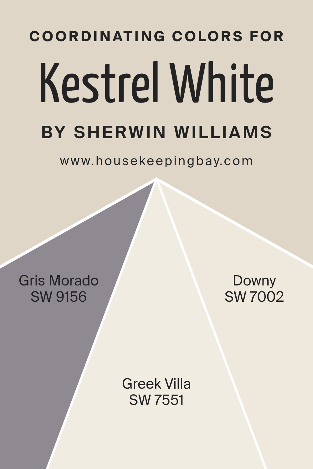
Coordinating Colors of Kestrel White SW 7516 by Sherwin Williams
Coordinating colors are hues that complement one another and are used together to create visually appealing color schemes in interior design, art, and fashion. These colors can either contrast or harmonize with each other, depending on their placement on the color wheel, and the selection of these coordinating shades often depends on the desired mood or effect in a space. For example, Kestrel White SW 7516 by Sherwin Williams, a soft, warm neutral, can serve as a versatile backdrop that allows coordinating colors to stand out or blend in seamlessly, depending on their tones and where they fall in relation to Kestrel White on the color spectrum.
Among the colors that coordinate well with Kestrel White SW 7516 are SW 9156 – Gris Morado, SW 7551 – Greek Villa, and SW 7002 – Downy. Gris Morado, a subdued, sophisticated lavender-gray, adds depth and a touch of elegance, making spaces feel more refined and contemplative.
Greek Villa, on the other hand, is a warm off-white, slightly creamier than Kestrel White, offering a soft transition that enhances the sense of dimension and warmth in a room without overwhelming it. Downy, a light, airy gray with a whisper of blue, introduces a serene, calming element, subtly complementing the warmth of Kestrel White and the other coordinating colors, thus rounding out a palette that is cohesive, yet diverse enough to create interest and visual appeal in any space.
These coordinating colors, when used together, can craft a harmonious and inviting atmosphere, highlighting the versatility and beauty of Kestrel White as a foundational hue.
You can see recommended paint colors below:
- SW 9156 Gris Morado
- SW 7551 Greek Villa
- SW 7002 Downy
housekeepingbay.com
How Does Lighting Affect Kestrel White SW 7516 by Sherwin Williams?
Lighting plays an essential role in our perception of color, with its influence extending far beyond mere brightness to encompass color hue, depth, and contrast. An object’s color, such as Kestrel White SW 7516 by Sherwin Williams, can appear dramatically different under various lighting conditions due to the light’s color temperature and intensity. This phenomenon, known as metamerism, highlights how colors can change when seen under different light sources.
When discussing artificial light, it’s crucial to understand that its quality, ranging from the warm tones of incandescent bulbs to the cooler daylight mimicked by LED lighting, can significantly alter how Kestrel White looks. In the warm glow of incandescent lighting, Kestrel White takes on a softer, creamier appearance, enhancing cozy and inviting atmospheres. Conversely, under the cooler, bluer light of LEDs or fluorescent lights, Kestrel White may appear crisper and brighter, lending itself to a more modern, stark feel.
In natural light, Kestrel White SW 7516’s appearance can vary throughout the day and depend on the room’s orientation. In north-faced rooms, which receive cooler, more indirect light, Kestrel White tends to maintain a consistent, neutral appearance, potentially leaning slightly towards the cooler end of the spectrum, accentuating its crisp, clean aesthetic without appearing stark.
South-facing rooms bathe in warm, abundant sunlight for most of the day, where Kestrel White will glow warmly, embracing a brighter, more inviting tone that maximizes the natural light and enhances the feeling of space.
East-facing rooms see the most change in Kestrel White, appearing warm and bright in the morning light, which can add a cheerful, sunny quality to the space. As the day progresses, the room may lose direct sunlight, causing Kestrel White to appear more neutral or even slightly cool and serene in the evening.
West-facing rooms will experience the opposite effect; Kestrel White may start the day cooler and more subdued, gradually warming and becoming more vibrant in the afternoon to evening as they catch the warmer, golden tones of the setting sun.
Thus, lighting—whether artificial or natural—not only affects the perception of Kestrel White SW 7516 but also plays a crucial role in determining the mood and atmosphere it creates within a space. By understanding these nuances, one can utilize Kestrel White’s versatility to achieve desired effects in interior spaces, making it a timeless choice for a variety of applications.

housekeepingbay.com
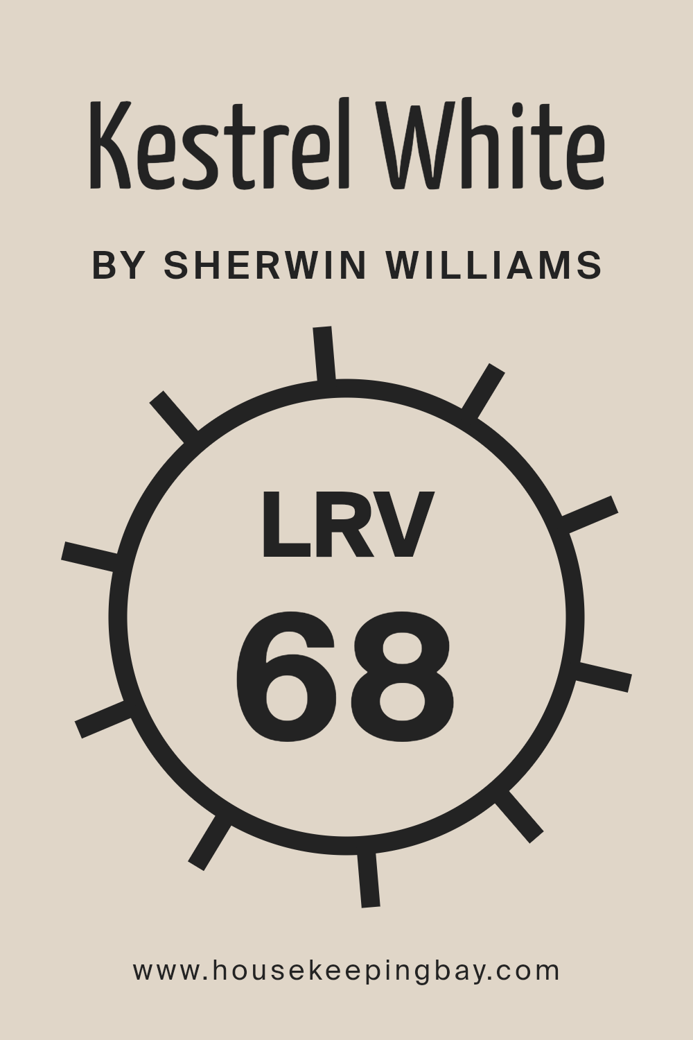
What is the LRV of Kestrel White SW 7516 by Sherwin Williams?
Light Reflectance Value (LRV) is an essential metric used to determine how much light a paint color reflects back into a room, measured on a scale from 0 to 100. A value of 0 signifies that the color absorbs all light, effectively appearing as pitch black, while a value of 100 reflects all light, appearing as pure white.
This scale helps in choosing paint colors according to how bright or dark you want a room to feel. The LRV is crucial in interior design as it affects the perception of space and light within a room. Lighter colors can make a room feel more spacious and brighter because they reflect more light, while darker colors create a cozier or more enclosed feeling by absorbing light.
The LRV of Kestrel White (SW 7516) by Sherwin Williams stands at 68.102, placing it on the lighter end of the spectrum. This means it has a high ability to reflect light, contributing to a bright and airy feel in any space it adorns. In rooms with limited natural light, Kestrel White can help amplify the available light, making the space appear more open and welcoming.
Conversely, in very brightly lit spaces, it can prevent the room from feeling overly stark or glaring, courtesy of its soft, warm undertones. This LRV value suggests that Kestrel White is versatile, performing well in various lighting conditions and pairing easily with other colors for a balanced and cohesive design scheme.
housekeepingbay.com
What is LRV? Read It Before You Choose Your Ideal Paint Color
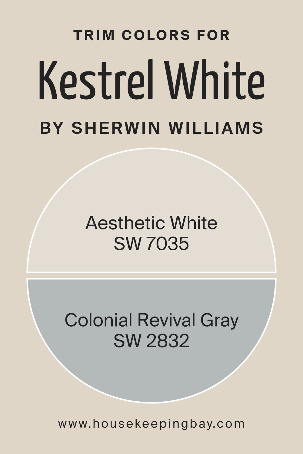
What are the Trim colors of Kestrel White SW 7516 by Sherwin Williams?
Trim colors, in the context of interior or exterior design, serve as an essential element in defining the architectural features of a space or facade. They are used to accentuate details, create depth, and frame the primary colors of walls or surfaces, in this case, Kestrel White SW 7516 by Sherwin Williams.
A well-chosen trim color can enhance the visual appeal of a room, emphasizing the elegance or dynamism of the main color. By selecting a trim color that complements or thoughtfully contrasts with the wall color, designers can achieve a cohesive and harmonious look that highlights the architectural strengths of any space.
When considering Kestrel White SW 7516, a soft and warm white, for the primary wall color, trim options like Aesthetic White SW 7035 and Colonial Revival Gray SW 2832 can be ideal choices. Aesthetic White is a nuanced shade that strikes a delicate balance between a warm and cool tone, providing a subtle contrast to Kestrel White’s inherent warmth without overpowering it. This shade is sophisticated and versatile, making it a great option for a variety of spaces seeking a refined look.
Colonial Revival Gray, on the other hand, offers a deeper contrast with its rich, historical charm that can ground the ethereal presence of Kestrel White, adding a layer of sophistication and depth. This color works beautifully in spaces that aim to marry classic elegance with contemporary design, providing a timeless accent that complements the softness of Kestrel White.
Together, these trim colors not only enhance the beauty of Kestrel White but also contribute to a well-rounded, aesthetically pleasing environment.
You can see recommended paint colors below:
- SW 7035 Aesthetic White
- SW 2832 Colonial Revival Gray
housekeepingbay.com
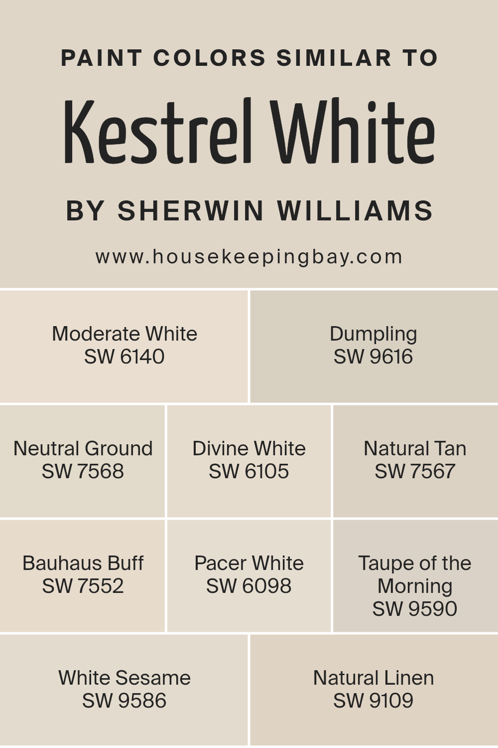
Colors Similar to Kestrel White SW 7516 by Sherwin Williams
Choosing similar colors, like those akin to Sherwin Williams’ Kestrel White SW 7516, plays a crucial role in interior design, offering a harmonious palette that soothes the eye and creates a coherent aesthetic flow. Such colors, including Moderate White SW 6140 or Dumpling SW 9616, work by sharing a common hue base, subtly differing in saturation or brightness, thus enabling a fluid transition from space to space within a home or bringing depth and complexity to a single room.
For instance, Neutral Ground SW 7568 and Divine White SW 6105 echo the light warmth of Kestrel White, while introducing either a hint more earthiness or a touch of divine serenity, respectively. This artful blending of similar tones, like Natural Tan SW 7567 or Bauhaus Buff SW 7552, allows for a nuanced layering of colors that enrich the environment without overwhelming it with contrast.
Moreover, integrating shades such as Pacer White SW 6098 or Taupe of the Morning SW 9590 serves to anchor lighter tones, providing a subtle backdrop that amplifies the space’s overall warmth and inviting quality. Alongside, White Sesame SW 9586 and Natural Linen SW 9109 offer a slight departure into cooler or textured appearances, lending a fresh yet cohesive look when aligned with Kestrel White’s baseline.
Each color, though similar, contributes its unique voice to the symphony of design, whether it’s through the earthy embrace of Natural Tan, the serene clarity of Divine White, the grounded presence of Bauhaus Buff, or the airy lightness of White Sesame.
Balancing these shades successfully results in a sophisticated, layered space that feels intentional and harmoniously composed, demonstrating the power of similar colors in crafting visually pleasing and emotionally resonant environments.
You can see recommended paint colors below:
- SW 6140 Moderate White
- SW 9616 Dumpling
- SW 7568 Neutral Ground
- SW 6105 Divine White
- SW 7567 Natural Tan
- SW 7552 Bauhaus Buff
- SW 6098 Pacer White
- SW 9590 Taupe of the Morning
- SW 9586 White Sesame
- SW 9109 Natural Linen
housekeepingbay.com
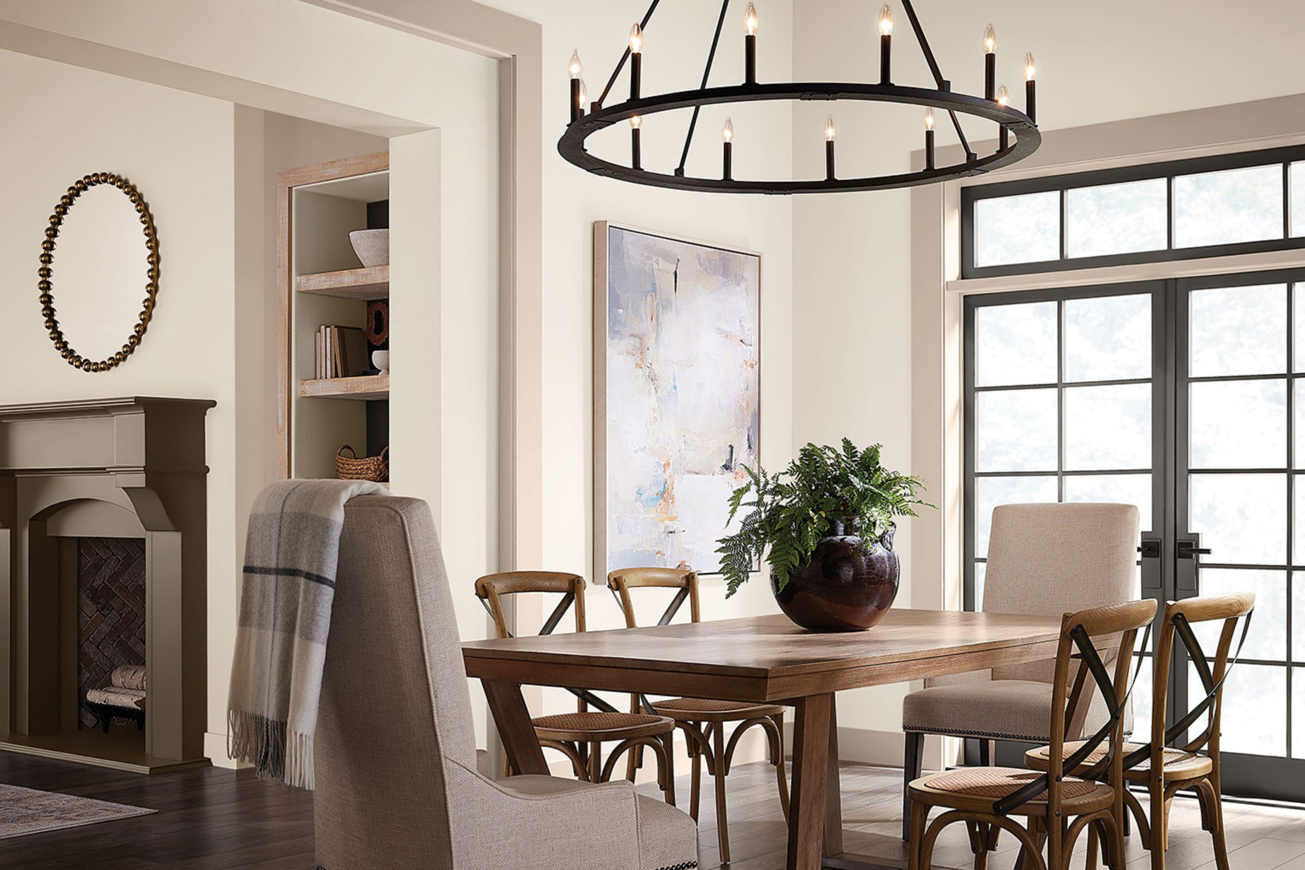
How to Use Kestrel White SW 7516 by Sherwin Williams In Your Home?
Kestrel White SW 7516 by Sherwin Williams is a sophisticated and versatile paint color that bridges the gap between a soft white and a light neutral, providing a serene backdrop to any space within the home. Its understated elegance makes it an ideal choice for those looking to create a calming and welcoming environment. With a subtle warmth, Kestrel White can illuminate spaces, making them appear more spacious and airy, which is especially beneficial in smaller rooms or areas with limited natural light.
Homeowners can leverage Kestrel White across various applications. It works seamlessly in living areas, bedrooms, and bathrooms, offering a cohesive look throughout the home. This color pairs beautifully with a wide range of decor styles, from modern minimalism to rustic country and everything in between.
For a chic, monochromatic scheme, Kestrel White can be used on walls, trim, and ceilings. Alternatively, it serves as a gentle contrast to bolder hues, grounding more vibrant colors or patterns in furniture or textiles. Whether you’re aiming for a soft, neutral palette or seeking a perfect backdrop for bold accents, Kestrel White SW 7516 provides a sophisticated and adaptable option.
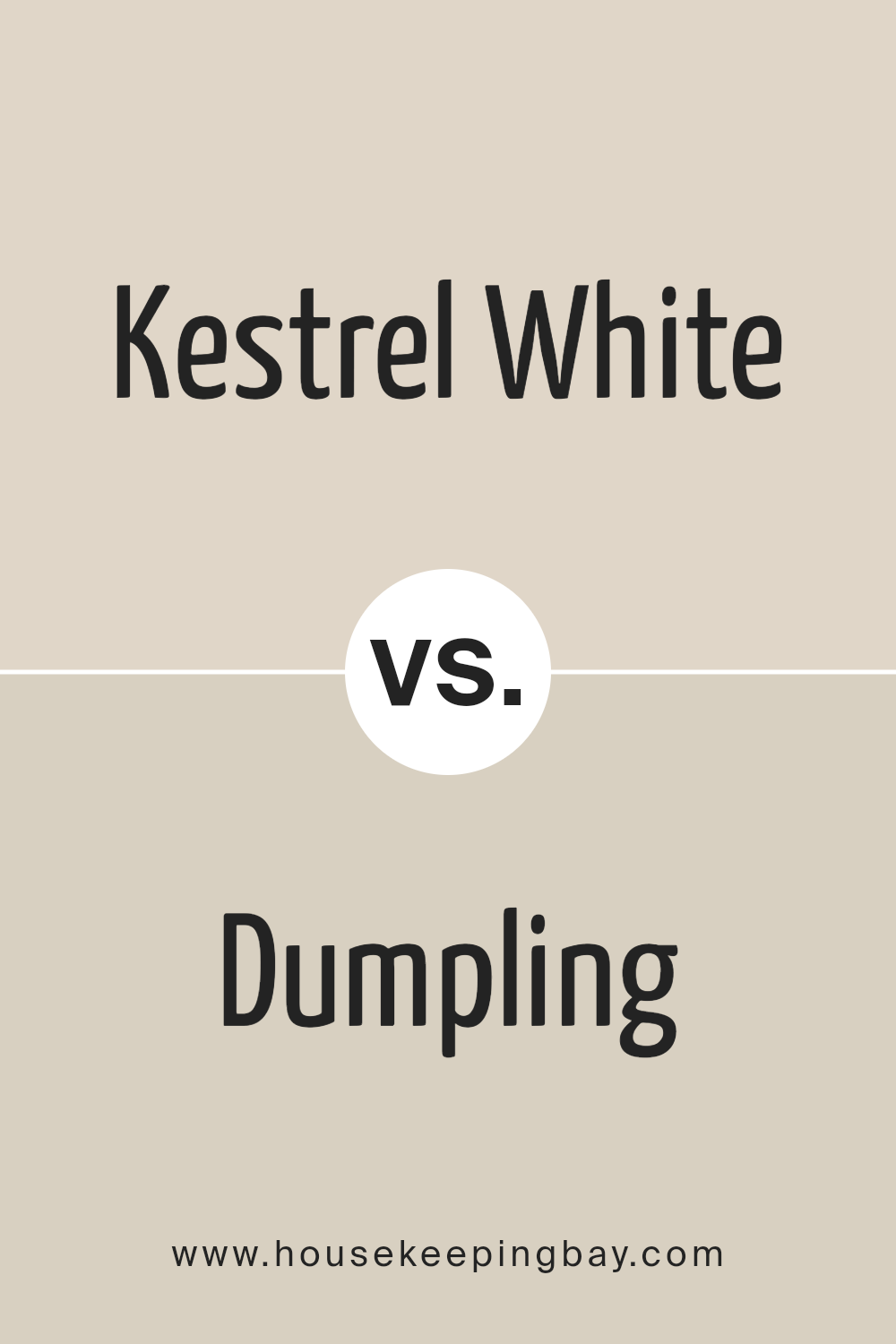
Kestrel White SW 7516 by Sherwin Williams vs Dumpling SW 9616 by Sherwin Williams
Kestrel White SW 7516 and Dumpling SW 9616 are two distinct hues from Sherwin Williams that offer subtle but important differences in their visual appeal and atmospheric influence. Kestrel White is a soft, warm white with creamy undertones, evoking a sense of comfort and spaciousness.
It’s ideal for creating a bright, inviting space, reflecting natural light beautifully and adding a touch of elegance to any room. On the other hand, Dumpling SW 9616 steps away from the neutrality of white, presenting a richer, deeper tone that borders on the lightest tan or off-white category.
It offers warmth and coziness, bringing a more pronounced color presence into a space without overwhelming it with darkness or saturation. Dumpling can add depth and interest to walls, providing a cozy backdrop that complements a wide range of decor styles. While both colors share a warmth that makes spaces welcoming, Kestrel White leans towards luminosity and openness, whereas Dumpling offers depth and a subtle nod to earthy hues.
You can see recommended paint color below:
- SW 9616 Dumpling
housekeepingbay.com
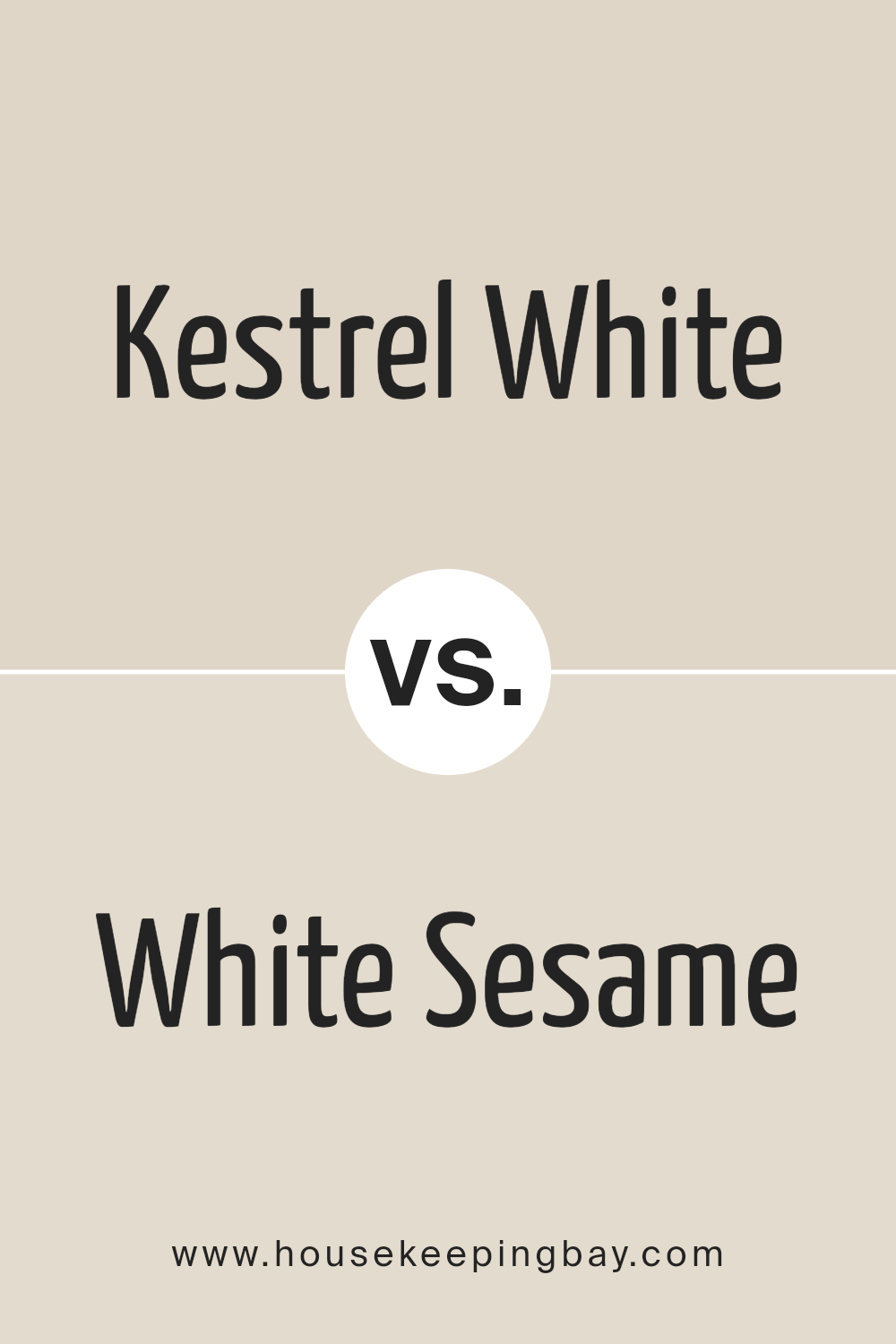
Kestrel White SW 7516 by Sherwin Williams vs White Sesame SW 9586 by Sherwin Williams
Kestrel White SW 7516 and White Sesame SW 9586, both by Sherwin-Williams, illustrate the subtle yet impactful variance that can exist within the spectrum of whites. Kestrel White embodies a soft, warm undertone that imparts a cozy, welcoming feel to spaces. Its creamy nature makes it versatile, easily adapting to different lighting conditions while maintaining its comforting essence.
On the other hand, White Sesame SW 9586 leans slightly towards a cooler palette, featuring a hint of gray that adds a contemporary, sophisticated edge. This nuance makes White Sesame an excellent choice for modern spaces aiming for a clean, minimalist aesthetic. While both colors reflect light beautifully and can make rooms appear larger and more open, Kestrel White offers warmth and traditional comfort, whereas White Sesame serves contemporary elegance and minimalist charm.
The choice between them depends on the desired mood and style of the space, with each providing a unique foundation for decor and architectural details.
You can see recommended paint color below:
housekeepingbay.com
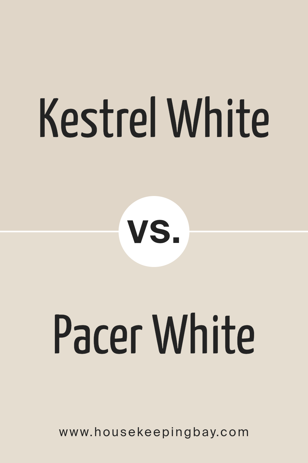
Kestrel White SW 7516 by Sherwin Williams vs Pacer White SW 6098 by Sherwin Williams
Kestrel White SW 7516 by Sherwin Williams and Pacer White SW 6098, also by Sherwin Williams, are both subtle and refined hues that exemplify the versatility of white in interior and exterior design. Kestrel White, a gently warm white with beige undertones, offers a soft, inviting feel to spaces, making them appear cozy and illuminated.
Its warmth is subtle, allowing it to blend seamlessly into environments that aim for a neutral, yet inviting palette. On the other hand, Pacer White SW 6098 leans towards a more muted, soft gray undertone, presenting a cooler appearance. Though still in the white spectrum, Pacer White introduces a subtle sophistication and a modern edge, making it ideal for contemporary spaces that desire a hint of depth without overwhelming the senses.
Together, these colors showcase the breadth of ambiance and mood that can be achieved with white, from the warm, comforting embrace of Kestrel White to the understated, chic sophistication of Pacer White, offering versatile options for designers and homeowners alike.
You can see recommended paint color below:
housekeepingbay.com
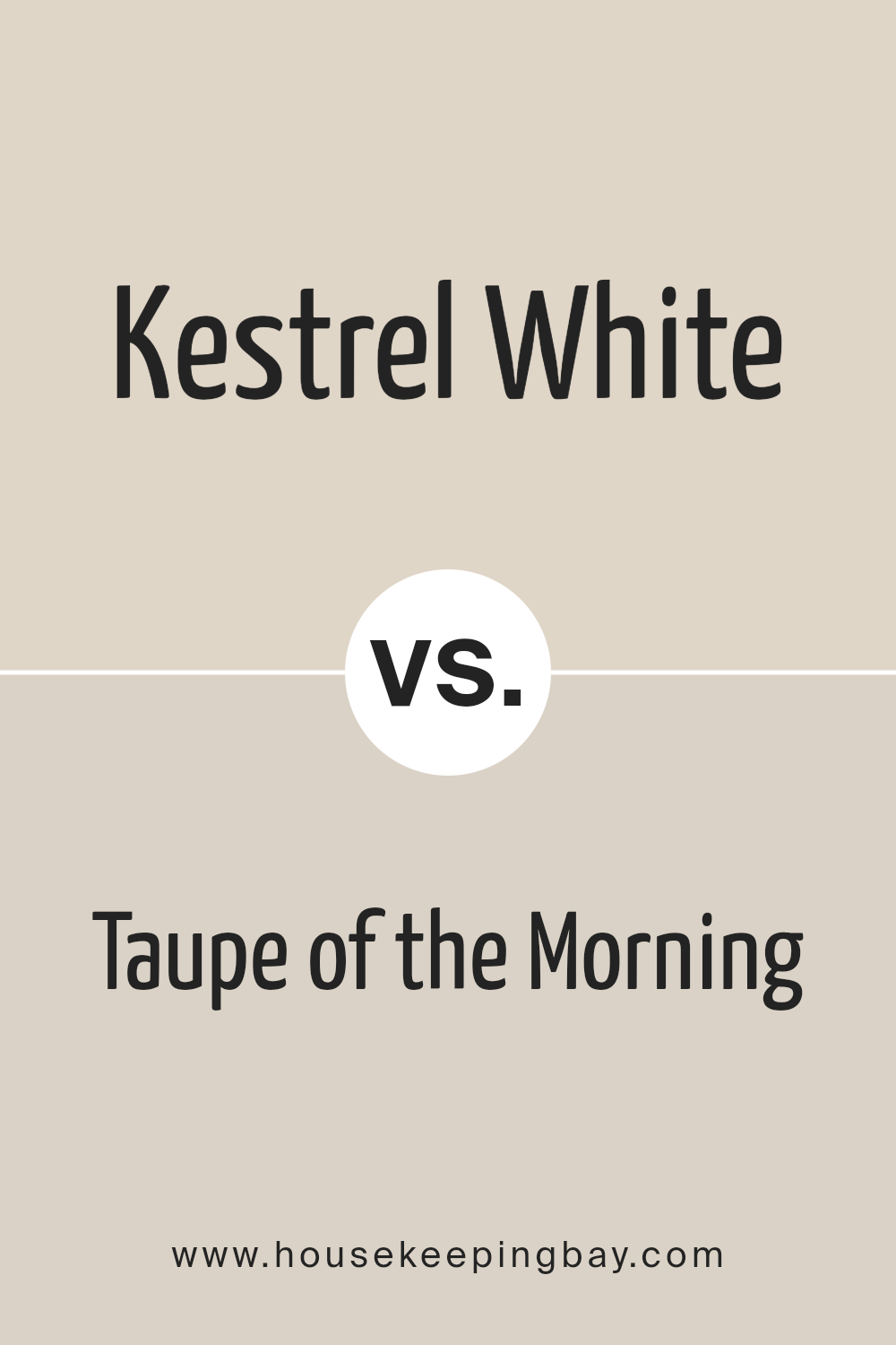
Kestrel White SW 7516 by Sherwin Williams vs Taupe of the Morning SW 9590 by Sherwin Williams
Kestrel White SW 7516 and Taupe of the Morning SW 9590 by Sherwin Williams are two distinctive colors that serve different aesthetic purposes. Kestrel White, as its name suggests, is a soft, warm white with a subtle underlying beige that adds depth and warmth, making it a versatile choice for spaces requiring a neutral backdrop with an inviting ambiance. It has the lightness of traditional white but avoids starkness, providing a cozy, yet bright feel to rooms.
On the other hand, Taupe of the Morning SW 9590 leans into the elegance and richness of the taupe family, offering a darker, more pronounced color. This hue combines gray and brown tones, culminating in a neutral that brings a sense of sophistication and grounding. It’s perfect for creating statement walls or for rooms that seek to convey a sense of calm and collectedness.
While both colors are neutrals, Kestrel White is brighter and leans towards creating airy, light-filled spaces. Taupe of the Morning, conversely, brings depth and an earthier feel to interiors. Their differing tones mean they could complement each other well in a design scheme, with Kestrel White offering a gentle contrast to the more assertive Taupe of the Morning.
You can see recommended paint color below:
- SW 9590 Taupe of the Morning
housekeepingbay.com
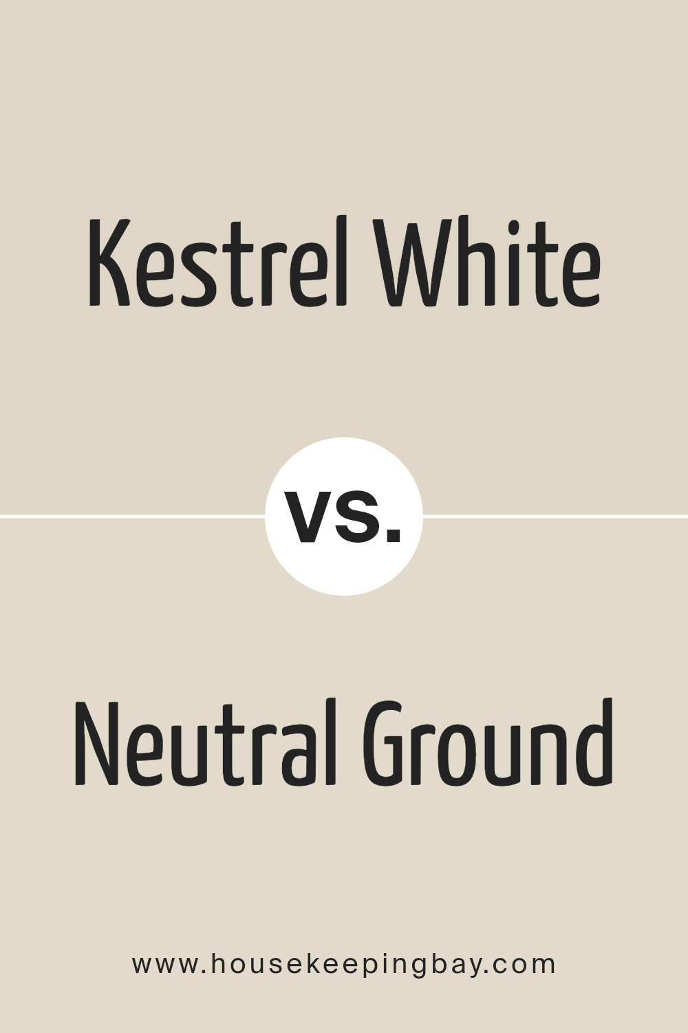
Kestrel White SW 7516 by Sherwin Williams vs Neutral Ground SW 7568 by Sherwin Williams
Kestrel White SW 7516 and Neutral Ground SW 7568, both by Sherwin Williams, present nuanced shades that play within a subtle spectrum of neutrals, making them versatile choices for home interiors. Kestrel White leans towards a warm, soft white with very slight beige undertones, offering a cozy, welcoming feel without the starkness sometimes associated with pure white.
This hue is excellent for spaces that aim for brightness but with warmth, enhancing natural light while maintaining a sense of comfort.
Neutral Ground, on the other hand, shifts slightly away from the white spectrum, residing more firmly in the range of light neutrals or off-whites with a beige base. It provides a stronger presence of color while still maintaining a minimalist aesthetic, bringing a richer, earthy warmth to spaces. This color is more grounding and can serve as a subtle statement or complementary background for both contemporary and traditional settings.
When comparing the two, Kestrel White offers a lighter, airier feel, best suited for enhancing openness and light. Neutral Ground brings a more tangible warmth and depth, ideal for creating a cozy, inviting environment. Choosing between them depends on the desired balance between brightness and warmth in a space.
You can see recommended paint color below:
housekeepingbay.com
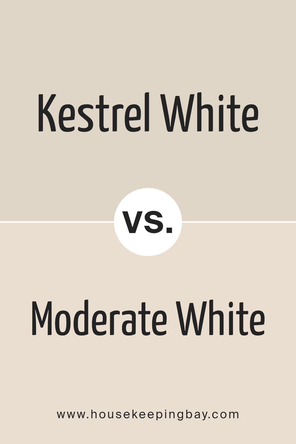
Kestrel White SW 7516 by Sherwin Williams vs Moderate White SW 6140 by Sherwin Williams
Kestrel White SW 7516 and Moderate White SW 6140 by Sherwin Williams are two nuanced shades that, while sharing a foundation in the white family, offer distinct undertones and ambiance for spaces in which they’re applied. Kestrel White leans towards a soft, welcoming warmth with subtle beige undertones that can make a room feel inviting and cozy. This color has the versatility to complement a variety of decors, bringing a gentle depth to walls without overwhelming with color.
In contrast, Moderate White SW 6140 edges more towards a neutral stance, straddling the line between cool and warm. Its undertones are more restrained than those of Kestrel White, offering a cleaner backdrop that still avoids the starkness associated with pure white. This makes it an excellent choice for spaces that require a hint of warmth without the pronounced beige or yellow undertones of warmer whites.
When choosing between Kestrel White and Moderate White, consider the lighting and the mood you wish to create. Kestrel White will infuse spaces with a cozy warmth, making it ideal for living areas and bedrooms, while Moderate White provides a subtle, sophisticated backdrop suitable for a wide range of spaces, maintaining a bright and airy feel without the sterility of cooler whites.
You can see recommended paint color below:
housekeepingbay.com
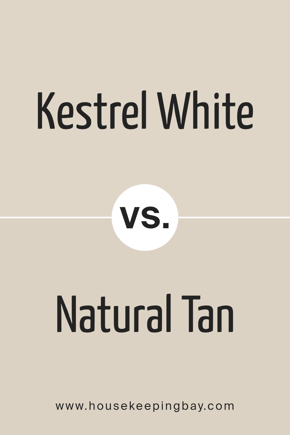
Kestrel White SW 7516 by Sherwin Williams vs Natural Tan SW 7567 by Sherwin Williams
Kestrel White SW 7516 and Natural Tan SW 7567 by Sherwin Williams are two hues that, while sharing a foundational palette, serve distinct design purposes. Kestrel White, subtly warm with its soft, creamy undertone, exudes a sense of calmness and refined elegance. It’s a color that offers a whisper of contrast against pure whites, making it an excellent choice for creating a serene and inviting space. The warmth in Kestrel White adds a touch of coziness to interiors without overwhelming the senses, making it adaptable to various decorative styles, from minimalist to country.
Natural Tan SW 7567, on the other hand, is a richer, deeper color that confidently stands a bit stronger on the walls. Its earthy base provides a welcoming atmosphere, evoking a sense of stability and groundedness. This color can add depth and warmth to a room, making spaces feel more intimate and cozy.
Natural Tan works well in a variety of settings, complementing both modern and traditional interiors with its ability to bring a natural, comforting feel to spaces.
When comparing these two, Kestrel White serves as a soft, neutral backdrop, lending a light, airy feel to a room, while Natural Tan offers more presence, contributing to a sense of warmth and homeliness. Their differences lie in their depth and the mood they set, balancing between subtle elegance and earthy warmth.
You can see recommended paint color below:
housekeepingbay.com
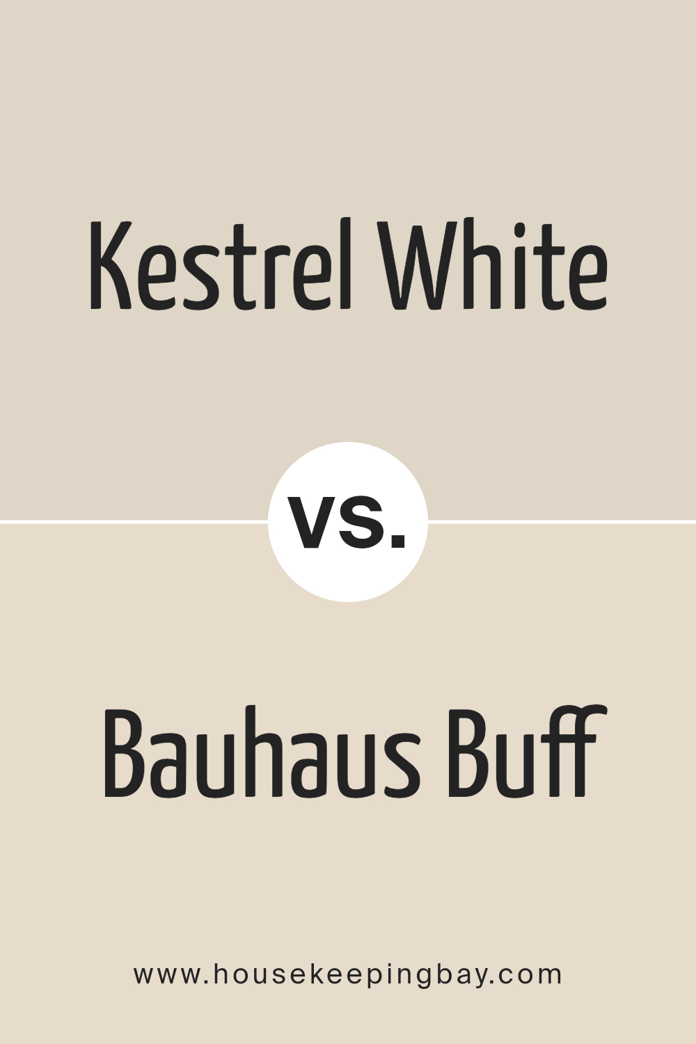
Kestrel White SW 7516 by Sherwin Williams vs Bauhaus Buff SW 7552 by Sherwin Williams
Kestrel White SW 7516 and Bauhaus Buff SW 7552, both from Sherwin Williams, share a soft, neutral palette, but they channel different atmospheres in interior spaces. Kestrel White leans towards a warm, inviting off-white with subtle undertones that can hint at a very light beige or a soft gray in different lighting. This color is adept at creating a bright, airy feel, ideal for spaces meant to be calming and serene. Its versatility in complementing various decor styles makes it a popular choice for walls, providing a neutral backdrop that is both sophisticated and welcoming.
On the other hand, Bauhaus Buff has a deeper, richer hue, embodying the essence of a light, warm taupe. This color brings a slightly more pronounced warmth to a room, reminiscent of the natural tones found in sandy landscapes or soft clay.
Bauhaus Buff is excellent for adding depth to spaces without overwhelming them with color, fostering a cozy, enveloping atmosphere. Its ability to bridge the gap between beige and gray gives it a unique position, making it suitable for those looking to infuse their spaces with a touch of earthiness while maintaining a light and open feel.
While both colors are beautifully understated, Kestrel White offers more freshness and light, whereas Bauhaus Buff introduces warmth and a hint of earthiness, making them both valuable for different aesthetic goals and atmospheres.
You can see recommended paint color below:
housekeepingbay.com
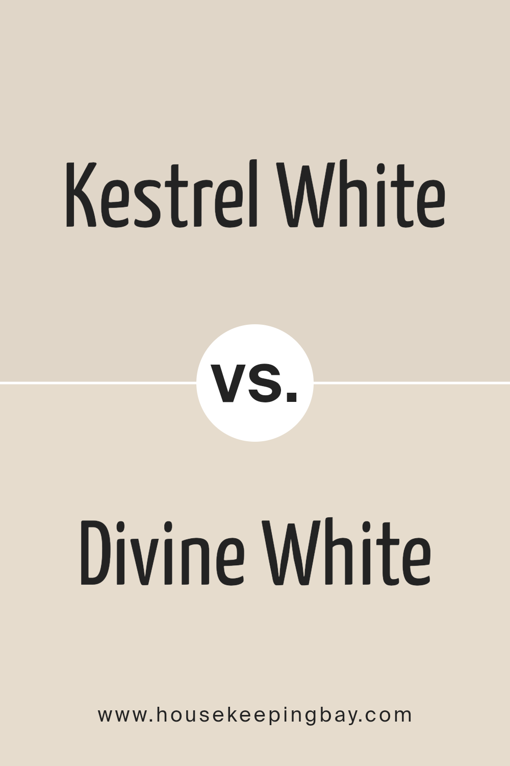
Kestrel White SW 7516 by Sherwin Williams vs Divine White SW 6105 by Sherwin Williams
Kestrel White SW 7516 and Divine White SW 6105, both from Sherwin Williams, present subtle yet distinct differences that cater to varying tastes and design needs. Kestrel White leans towards a soft, warm, and versatile off-white with a hint of grey. It offers a tranquil and airy feel, making it a perfect choice for those who seek a neutral background that harmonizes with a wide array of colors and textures. Its understated elegance can brighten spaces while providing a cozy ambiance.
On the other hand, Divine White SW 6105 shifts slightly warmer with a creamy undertone that adds a layer of sophistication and warmth. This color is ideal for creating a welcoming and inviting environment, particularly in spaces that benefit from a rich, yet subdued backdrop. It pairs beautifully with earth tones and wooden elements, emphasizing a natural and comfortable setting.
Both colors serve as excellent choices for interiors seeking versatility and warmth. However, Kestrel White will appeal more to those desiring a contemporary, minimalist look, whereas Divine White is suited for those aiming for a classic, cozy feel in their decor.
You can see recommended paint color below:
housekeepingbay.com
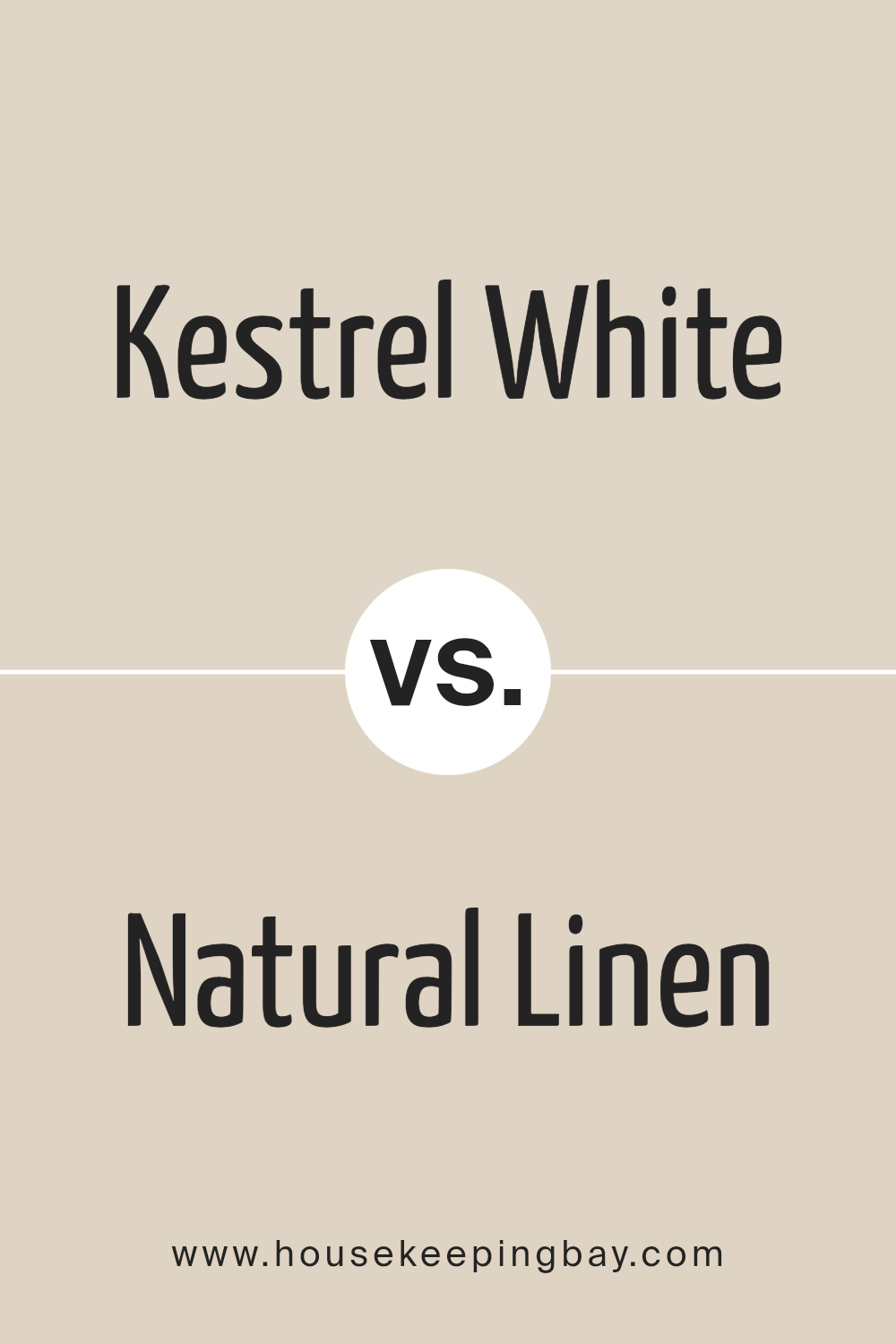
Kestrel White SW 7516 by Sherwin Williams vs Natural Linen SW 9109 by Sherwin Williams
Kestrel White SW 7516 and Natural Linen SW 9109, both by Sherwin Williams, present subtle yet distinct differences that cater to varied aesthetic preferences. Kestrel White offers a soft, warm white tone, providing a serene and inviting ambiance to spaces. Its slight undertone of beige ensures it doesn’t come off as stark, making it versatile for various lighting conditions and design schemes, particularly enhancing environments aiming for a gentle, neutral backdrop.
Natural Linen, on the other hand, embraces a more pronounced beige presence, evoking a sense of warmth and earthiness. This color tends to add a bit more character and depth to walls, making it ideal for those seeking a cozy, welcoming atmosphere without veering too far into deeper color territories. The inherent warmth of Natural Linen makes it a perfect pick for spaces designed to feel lived-in and comfortable.
Both colors exemplify elegance in neutrality, with Kestrel White leaning towards a lighter, airier feel, and Natural Linen offering a tad more richness and warmth. Choosing between them depends on the desired level of warmth and the specific aesthetic one aims to achieve in their space.
You can see recommended paint color below:
housekeepingbay.com
Conclusion
Kestrel White SW 7516 by Sherwin Williams emerges as a captivating choice for those looking to infuse their spaces with a serene and warm ambiance. This particular hue, characterized by its soft, creamy undertone, effortlessly imparts a feeling of calm and subtle elegance to any room it adorns. Kestrel White stands out for its versatility, gracefully complementing a wide range of decor styles, from contemporary to traditional, making it a favored selection among homeowners and interior designers alike. Its ability to reflect natural light beautifully enhances the sense of space, making rooms feel more open and airy, a quality much desired in interior design.
Moreover, Kestrel White’s adaptability extends beyond just aesthetics; it functions harmoniously with various color palettes, serving as an ideal backdrop for bolder colors or as a cohesive element tying together more muted schemes.
This balance between functionality and style underscores its popularity in the market, solidifying its status as a go-to neutral that adds just the right amount of warmth without overwhelming the senses. Whether used as a primary color scheme or as an accent, Kestrel White SW 7516 demonstrates a timeless elegance, ensuring that spaces not only look inviting but also feel genuinely comfortable and inviting.
housekeepingbay.com
Ever wished paint sampling was as easy as sticking a sticker? Guess what? Now it is! Discover Samplize's unique Peel & Stick samples. Get started now and say goodbye to the old messy way!
Get paint samples