Oyster White SW 7637 by Sherwin Williams
Embrace Elegance With A Timeless Hue for Every Space
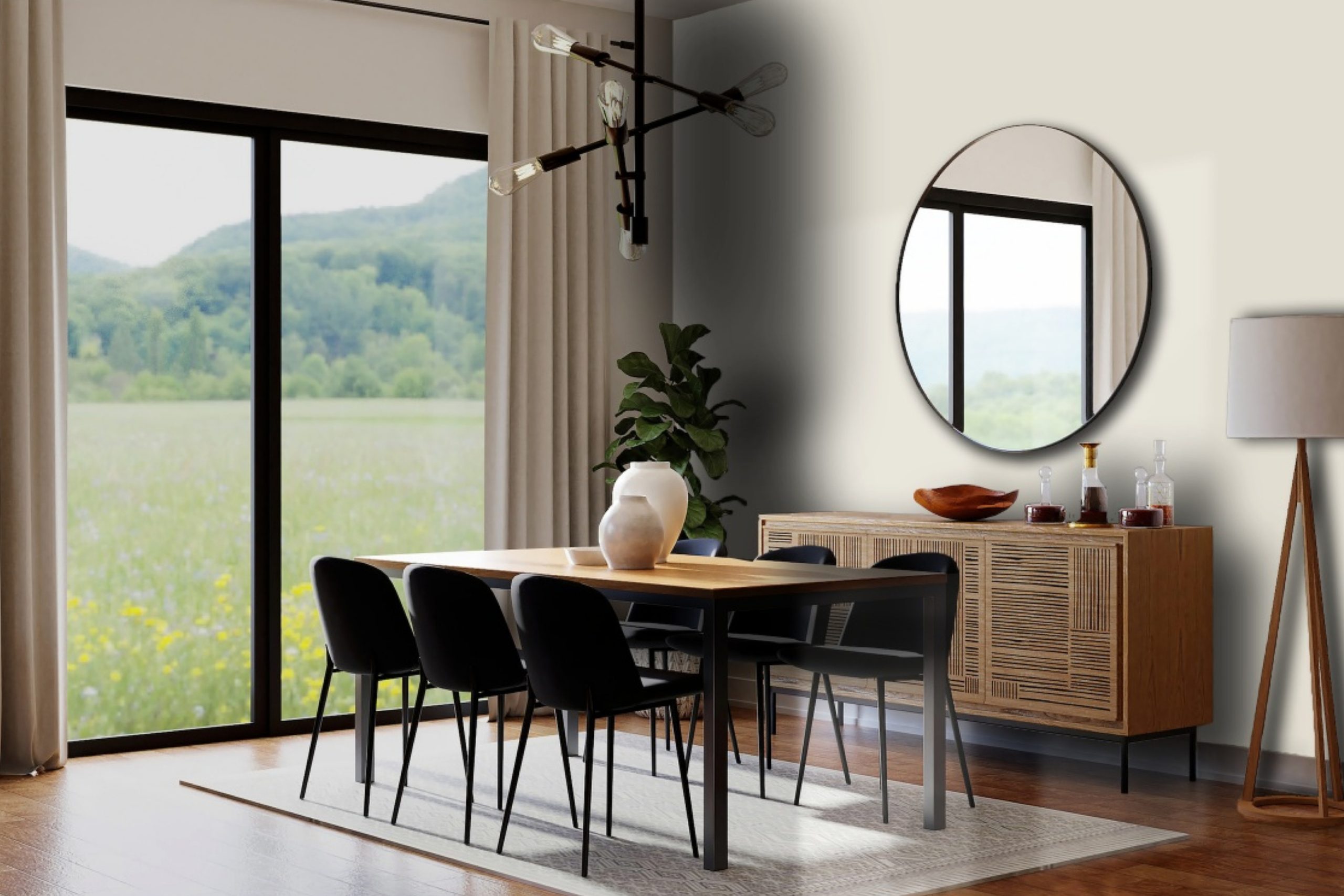
In the vast spectrum of colors offered by Sherwin Williams, SW 7637 Oyster White stands out as a testament to the timeless elegance that neutral shades can bring to any space. This exquisite hue is more than just a color; it’s a subtle nod to the beauty and calmness found in the natural world.
Oyster White belongs to a palette that reflects sophistication and serenity, making it an ideal choice for those seeking to create a peaceful and inviting atmosphere in their home or office.With its soft, warm undertones, Oyster White offers a versatile backdrop that complements a wide range of décor styles, from contemporary to traditional.
This color has the uncanny ability to transform spaces into havens of light and warmth, promoting a sense of well-being and comfort. Whether applied to living room walls, kitchen cabinets, or bedroom backdrops, it provides a canvas that enhances the aesthetics of any room without overwhelming the senses.
Furthermore, SW 7637 Oyster White encourages creativity in design, allowing accent colors and furnishings to truly shine. It pairs beautifully with bold hues, natural elements, and even metallic finishes, proving its flexibility and charm.
As we delve deeper into the characteristics and applications of Oyster White by Sherwin Williams, it becomes clear why this hue is a beloved choice for interior designers and homeowners alike, seeking to infuse their spaces with understated elegance and warmth.
via colorx
What Color Is Oyster White SW 7637 by Sherwin Williams?
Oyster White SW 7637, by Sherwin Williams, is a subtle and sophisticated hue that offers a gentle balance between warmth and neutrality. This color, reminiscent of the inside of an oyster shell, features a delicate blend of off-white with soft, gray undertones, giving it a serene and inviting quality.
Oyster White’s versatility in adaptability to different lighting conditions makes it an ideal choice for a variety of spaces, enhancing the perception of light and space in smaller rooms while adding a subtle warmth to larger, more open areas.
In terms of interior styles, Oyster White’s understated elegance is perfectly suited to Minimalist, Scandinavian, and Coastal designs, where its ability to evoke a sense of calm and cleanliness aligns harmoniously with these aesthetics. Its neutrality serves as a splendid canvas, allowing furniture and decor to take center stage, while also seamlessly integrating with a more classic or traditional setting.
Oyster White pairs exquisitely with a wide range of materials and textures. Natural wood, whether light, like birch or maple, or dark, such as walnut, complements its warm undertones, creating a grounded and cohesive look.
Metallic accents in gold or brass can add a touch of sophistication and glamour, while soft textiles in linens or chunky wool add depth and warmth to the space. In combination with stone textures, like marble or slate, Oyster White achieves an elegant contrast, heightening the sense of luxury and refinement in the interior design.

housekeepingbay.com
Table of Contents
Is Oyster White SW 7637 by Sherwin Williams Warm or Cool color?
Oyster White SW 7637 by Sherwin Williams is a unique paint color that encapsulates the serenity and simplicity of coastal living while remaining versatile enough to adapt to various interior styles. This subtle shade is part of the Warm Neutrals collection, offering a perfect blend of warm undertones that evoke the comforting smoothness of an oyster’s interior. Its muted, creamy hue can act as a sophisticated backdrop, enhancing the brightness of a room without overwhelming it with color. This quality makes Oyster White a preferred choice for homeowners seeking to create a calm and inviting atmosphere.
The way Oyster White works in homes is largely dependent on its ability to balance brightness with warmth. It reflects natural light beautifully, making spaces appear larger and more open, a beneficial attribute for small rooms or areas with limited light.
Furthermore, its neutral character provides an excellent foundation for layering textures and colors, allowing for versatility in home décor. Whether aiming for a minimalist design or a more eclectic approach, Oyster White SW 7637 facilitates a harmonious blend of elements, making it a reliable choice for bringing a sense of peace and cohesion to living spaces.
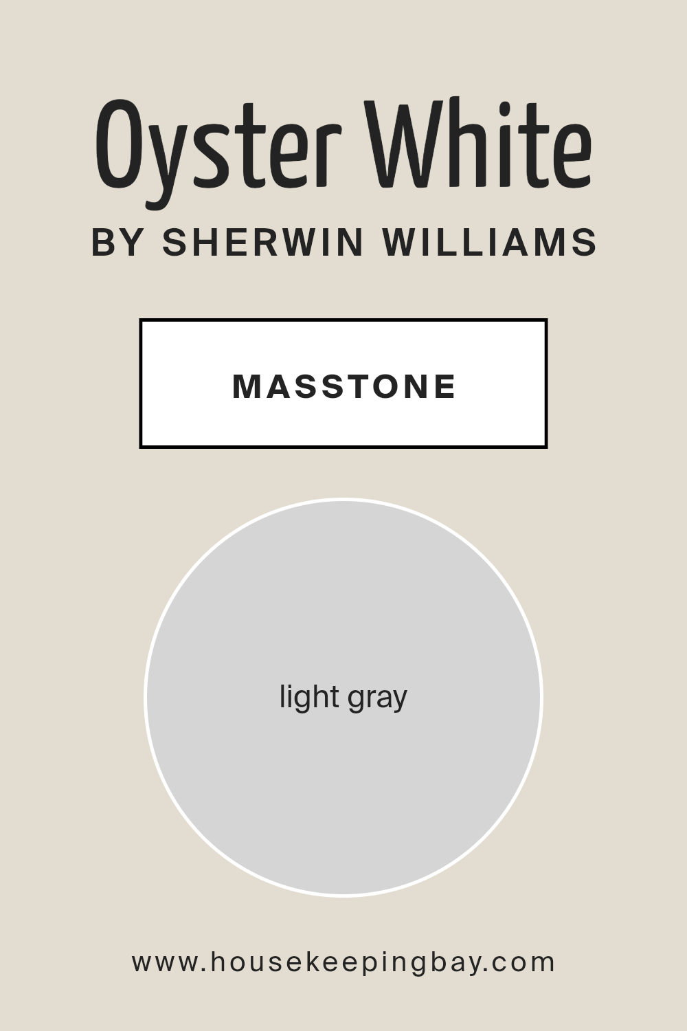
What is the Masstone of the Oyster White SW 7637 by Sherwin Williams?
Sherwin-Williams’ Oyster White SW 7637, with its masstone light gray (#D5D5D5), offers a subtle canvas that enhances the versatility and elegance of homes. This serene hue captures the essence of tranquility, working harmoniously within a wide range of interior styles, from contemporary to traditional. When applied to walls, Oyster White acts as a soft backdrop that effortlessly complements bolder colors, making it an ideal choice for highlighting architectural features or art pieces. Its light gray undertone offers a cool, fresh look, yet possesses enough warmth to create inviting spaces.
Lighting plays a significant role in the perception of Oyster White; natural daylight can bring out its subtle vitality, while artificial lighting deepens its coziness.
This color is especially effective in rooms seeking a sense of spaciousness without feeling stark, providing a perfect balance between warmth and minimalism. It acts as a bridge between different materials and textures, unifying diverse elements within a room.
Oyster White’s adaptability and timeless elegance make it an enduring choice for homeowners aiming to craft spaces that feel both polished and welcoming.
housekeepingbay.com
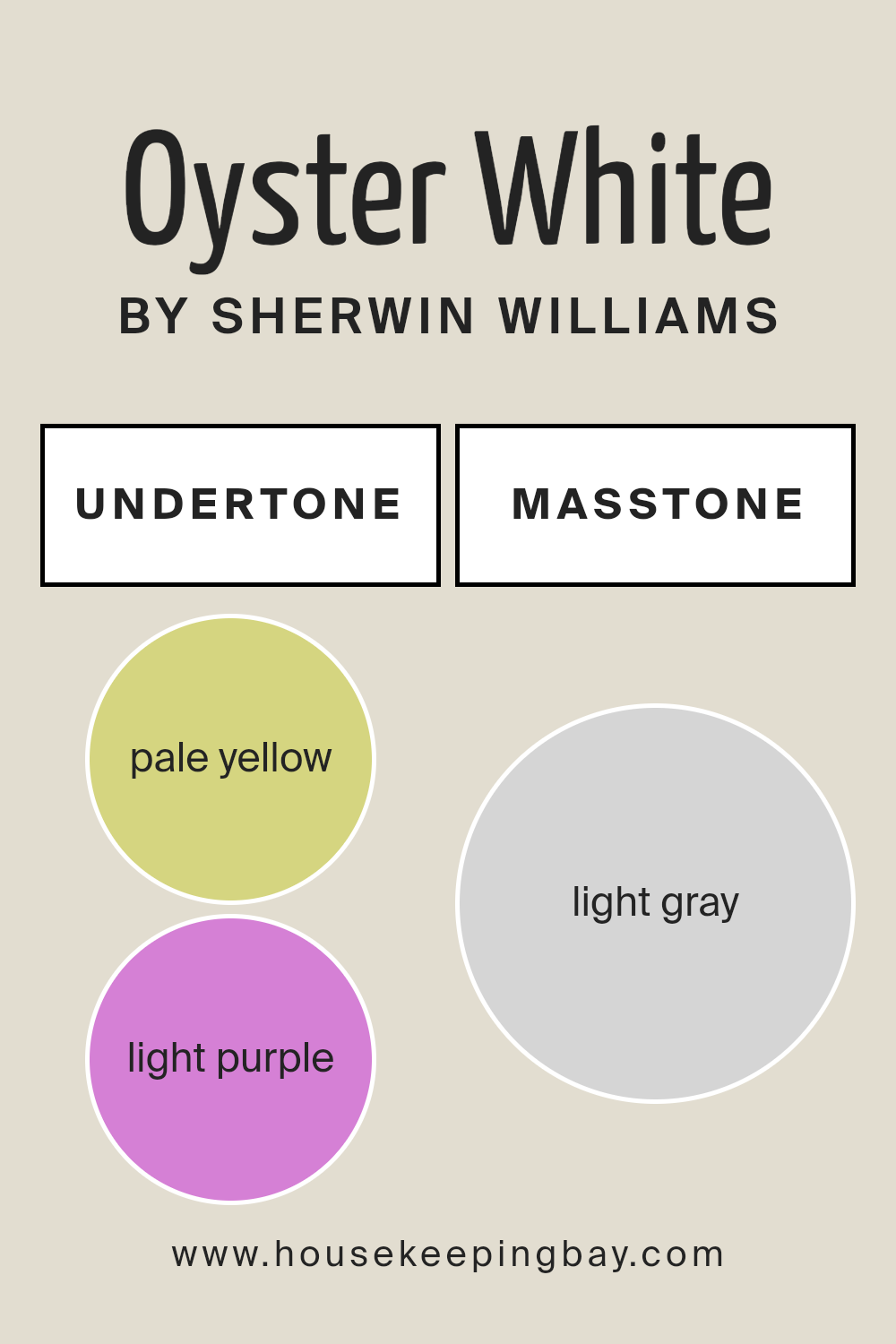
Undertones of Oyster White SW 7637 by Sherwin Williams
Oyster White SW 7637 by Sherwin Williams is a beautifully nuanced paint color that seems simple at first glance but reveals a depth of complexity upon closer inspection, thanks to its subtle undertones. The primary undertones in Oyster White are pale yellow and light purple, colors that might seem at odds but actually complement each other in nuanced ways to create a captivating and versatile hue.
The pale yellow undertone adds warmth and softness, making spaces feel more inviting and cozy. It catches natural light in a way that breathes life into rooms, presenting a gentle glow that can make small spaces appear larger and more open.
On the other hand, the light purple undertone introduces a hint of cool sophistication and depth, balancing the warmth of the yellow to ensure the color remains neutral and flexible in its application. This undertone adds an element of serenity, making it an excellent choice for bedrooms and bathrooms where a peaceful atmosphere is desired.
When applied to interior walls, the interplay of these undertones in Oyster White SW 7637 substantially impacts the color’s perception and the overall ambiance of the room. Depending on the lighting and the colors of the furnishings and decor, either undertone may become more pronounced, allowing the room to transform under different conditions subtly.
This chameleon-like quality can make Oyster White a surprisingly dynamic choice for interior design, capable of both calming and warming a space. Its ability to morph in response to its surroundings makes it a highly adaptable paint color, perfect for creating serene, comfortable spaces that feel both personal and inviting.
housekeepingbay.com
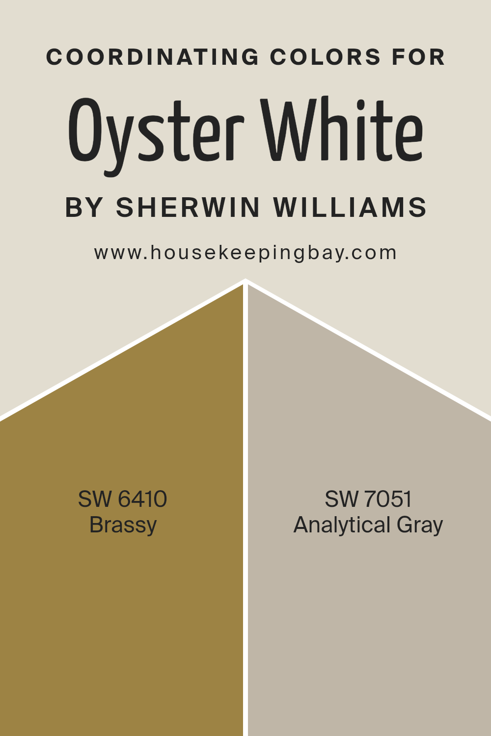
Coordinating Colors of Oyster White SW 7637 by Sherwin Williams
Coordinating colors are essentially hues that work harmoniously together to enhance the aesthetic appeal of a space, creating a cohesive look. They can be used to complement, contrast, or accentuate the primary color palette, providing depth and dimension to the overall design.
Selecting coordinating colors involves considering the color wheel and the relationships between colors, including analogous, complementary, and monochromatic schemes among others.
For Oyster White SW 7637 by Sherwin Williams, a peaceful and versatile shade evoking the softness and warmth of sun-bleached shells, the chosen coordinating colors are Brassy SW 6410 and Analytical Gray SW 7051, which work in concert to promote a sophisticated and balanced environment.
Brassy SW 6410 is a bold and vibrant gold that radiates warmth and energy. It acts as a stunning contrast to the muted tones of Oyster White, injecting a lively spirit into the space while maintaining an air of refined luxury.
This color can lift the ambiance and infuse a room with a sunny glow, making it feel welcoming and invigorating. On the other hand, Analytical Gray SW 7051 serves as the perfect neutral backdrop, straddling the line between gray and beige to offer an understated elegance that complements the softness of Oyster White.
Its adaptability allows it to blend seamlessly with a wide range of décor styles, providing a calming, sophisticated base that enhances the depth and complexity of the overall palette. Together, these colors create a dynamic yet harmonious scheme, elevating the aesthetic of any space.
You can see recommended paint colors below:
- SW 6410 Brassy
- SW 7051 Analytical Gray
housekeepingbay.com
How Does Lighting Affect Oyster White SW 7637 by Sherwin Williams?
Lighting has a profound effect on the perception of color. It can alter the appearance of a color significantly, making it look different at various times of the day or under different lighting conditions. The color Oyster White SW 7637 by Sherwin Williams is no exception. This nuanced hue can shift in appearance from a warm, inviting tone to a cooler, more neutral shade, depending on the lighting.
In artificial light, Oyster White tends to draw out its warmer undertones, offering a cozy and soft appearance. Whether illuminated by incandescent, LED, or fluorescent lighting, each source can influence its perception. Incandescent lights, with their warm glow, can enhance Oyster White’s creamy qualities, making spaces feel inviting.
LED and fluorescent lights, particularly those on the cooler end of the spectrum, can make Oyster White appear more neutral, bringing forward its subtle grey undertones.
Natural light brings its own dynamic play into the perception of Oyster White. Rooms facing north receive a cooler, more consistent light throughout the day, which can emphasize the color’s neutral and slightly cooler aspects, lending a serene and calm feel to the space. This can make Oyster White appear more understated and refined in north-facing rooms.
South-facing rooms bathe in warm, golden sunlight for most of the day, which can enhance Oyster White’s creamy and warm undertones, making spaces feel brighter and more welcoming. This exposure tends to make the color exude warmth and comfort, ideal for living spaces.
East-facing rooms receive morning light, which is cooler and bluer, making Oyster White look crisper and brighter in the morning, gradually warming up as the day progresses. This exposure ensures that the color remains versatile and dynamic, changing character with the time of day.
West-facing rooms are influenced by the warmer, more intense light of the afternoon and evening. In these spaces, Oyster White can appear warmer and richer, especially during sunset, when the golden hues of the light enhance its warmth, creating a cozy and inviting atmosphere.
In conclusion, Oyster White SW 7637’s perception is significantly influenced by lighting conditions, whether artificial or natural, effectively altering its character and the mood it establishes in various spaces.
housekeepingbay.com
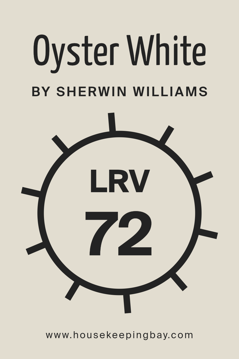
What is the LRV of Oyster White SW 7637 by Sherwin Williams?
Light Reflectance Value (LRV) is a measure of the percentage of visible and usable light that a paint color reflects compared to the light it absorbs. LRV is scaled from 0 to 100, with 0 being absolute black, which absorbs all light, and 100 being pure white, reflecting all light back.
This value is crucial when selecting paint colors as it helps predict how light or dark a color will look in a space. The LRV of a color affects the overall ambiance of a room, the perceived size of a space, and how well lighting – both natural and artificial – enhances or mutes the color.
Higher LRVs make rooms feel more open and airy, as they reflect more light, while lower LRVs create a cozier, more intimate atmosphere by absorbing light.
Oyster White SW 7637 by Sherwin Williams, with an LRV of 72.491, sits on the higher end of the scale, indicating it is a fairly light color that will reflect a good amount of light. This quality makes Oyster White an excellent choice for creating a bright, welcoming space.
In rooms with ample natural light, this color will appear luminous and vibrant, enhancing the sense of openness and size. In spaces with less natural light, its high LRV ensures that it will still help to brighten the area and make it feel more spacious than a darker color would.
The specific LRV of Oyster White cues that it has the versatility to uplift smaller, dim areas while also adding a soft, serene ambiance to well-lit rooms, making it an adaptable choice for various living spaces.
housekeepingbay.com
What is LRV? Read It Before You Choose Your Ideal Paint Color
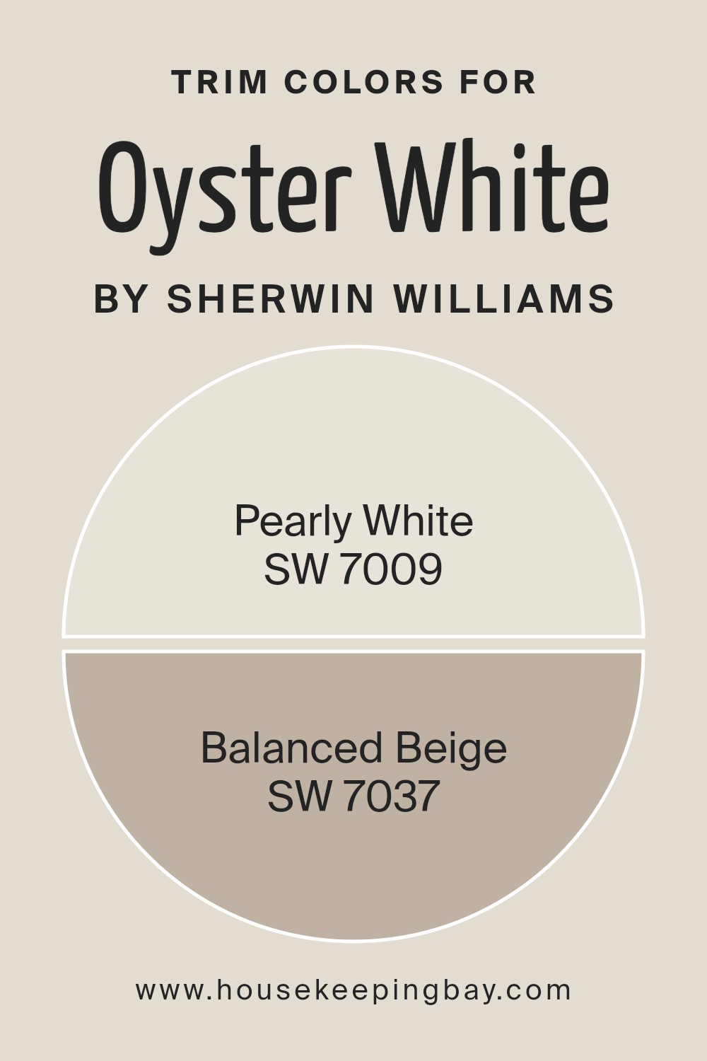
What are the Trim colors of Oyster White SW 7637 by Sherwin Williams?
Trim colors, often utilized as an accent, play a crucial role in defining and enhancing the architectural features of a space. They frame and give finishing touches to walls, windows, and doors, adding depth and dimension to the overall design.
Selecting the right trim color can significantly impact the ambiance and visual aesthetics of a room. For a refined and versatile backdrop like Oyster White SW 7637 by Sherwin Williams, choosing suitable trim colors is especially important to either subtly complement or strikingly contrast the wall color, thereby creating a cohesive or dynamic look.
The idea is to accentuate Oyster White’s warm and inviting undertones without overwhelming its serene and neutral base.
In this context, Pearly White SW 7009 emerges as a delicate and sophisticated choice. With its soft and almost ethereal quality, Pearly White gently enhances the creamy undertones of Oyster White, instilling a seamless transition between the wall and the trim that exudes elegance and harmony.
On the other hand, Balanced Beige SW 7037, with its grounding and richer tone, offers a striking contrast without departing from the warmth that characterizes Oyster White. This color combination brings definition and character to spaces, highlighting architectural details while maintaining a cohesive, warm palette that feels both welcoming and thoughtfully curated.
Together, these trim colors provide versatile options for tailoring the look and feel of spaces adorned in Oyster White, allowing it to shift from softly sophisticated to richly contrasted with just a change in trim.
You can see recommended paint colors below:
- SW 7009 Pearly White
- SW 7037 Balanced Beige
housekeepingbay.com
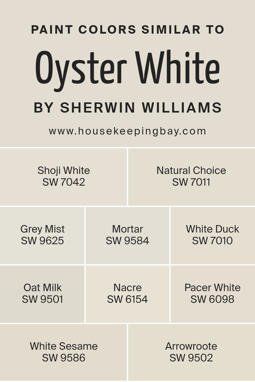
Colors Similar to Oyster White SW 7637 by Sherwin Williams
Similar colors are crucial in design and aesthetics because they create a seamless, harmonious look that can enhance the overall feel and cohesion of a space. By selecting colors that share a common hue, saturation, or lightness, designers can invoke a subtle and sophisticated atmosphere that is both pleasing to the eye and emotionally comforting.
This palette approach allows for gradual transitions within a space, smoothing out abrupt transitions between walls, trim, and accent areas. The similarity in colors can also help in visually expanding a space, making it appear larger and more open than it might with high-contrast colors.
Taking Oyster White SW 7637 by Sherwin Williams as a starting point, we can explore a range of similar colors that elicit a gentle, inviting warmth, perfect for creating serene and welcoming spaces. Shoji White SW 7042 offers a whisper of gray, blending effortlessly with a myriad of designs to introduce a peaceful grounding.
Natural Choice SW 7011 whispers of earthiness, bridging the gap between beige and gray, embodying tranquility. Grey Mist SW 9625, with its ethereal touch, lightly veils spaces in a misty elegance, while Mortar SW 9584 anchors with a firmer, yet subtly warm gray, giving depth without overpowering.
White Duck SW 7010 softly mutters warmth, a tad richer than its counterparts, providing a cozy canvas. Oat Milk SW 9501, with its creamy disposition, pours comfort into every corner it touches, making rooms feel snug and inviting.
Nacre SW 6154 adds a hint of pearl-like luminosity, delicately enhancing natural light. Pacer White SW 6098 introduces a silent strength, its barely-there gray whispering stability.
White Sesame SW 9586 blends almost imperceptibly within this palette, offering a slightly toasted warmth, while Arrowroot SW 9502 concludes with its grounded, earthy tones, bringing a touch of nature indoors.
Each of these colors, while similar, contributes its unique essence, creating a cohesive yet diverse palette that can transform a space with understated elegance.
You can see recommended paint colors below:
- SW 7042 Shoji White
- SW 7011 Natural Choice
- SW 9625 Grey Mist
- SW 9584 Mortar
- SW 7010 White Duck
- SW 9501 Oat Milk
- SW 6154 Nacre
- SW 6098 Pacer White
- SW 9586 White Sesame
- SW 9502 Arrowroote
housekeepingbay.com
How to Use Oyster White SW 7637 by Sherwin Williams In Your Home?
Oyster White SW 7637 by Sherwin Williams is a beautifully understated color that exudes warmth and sophistication. This hue falls somewhere between a soft white and a light beige, making it a versatile choice for any space within the home.
Its subtlety is its strength, offering a canvas that can be adapted to various decor styles, from contemporary to traditional. Its warm undertones ensure that it pairs wonderfully with natural materials such as wood, stone, and textiles, enhancing the cozy and inviting feel of a space.
When considering how to incorporate Oyster White into your home, think about using it as a primary color for living rooms, bedrooms, or dining areas. It’s particularly effective in spaces that receive a good amount of natural light, as the sunlight enhances the color’s warmth, creating an airy and comforting ambiance.
For a more dynamic interior, combine Oyster White with contrasting darker shades or vibrant accent colors in furniture, artwork, or accessories to add depth and interest to your rooms.
Whether you’re aiming for a minimalist aesthetic, seeking to create a serene and calming retreat, or wanting a neutral backdrop that allows your decor to stand out, Oyster White SW 7637 offers a timeless and adaptable solution.
Oyster White SW 7637 by Sherwin Williams vs White Sesame SW 9586 by Sherwin Williams
Oyster White SW 7637 and White Sesame SW 9586 by Sherwin Williams are two nuanced shades that share a common base of white but diverge in their undertones and depth, offering distinct atmospheric effects for interior spaces. Oyster White sits on the warmer side of the spectrum with a subtle beige undertone, creating a cozy and inviting ambiance.
Its warmth is versatile, promoting a serene environment that pairs well with a wide range of colors and textures. On the other hand, White Sesame leans towards a cooler palette, characterized by its gentle gray undertones. This color presents a crisp, clean look emblematic of modern and minimalist design aesthetics.
While both colors reflect an ample amount of light, making rooms appear larger and more open, Oyster White instills a sumptuous softness, whereas White Sesame offers a sleek, contemporary vibe. Each color, therefore, caters to different design preferences, whether one aims for the warmth of a welcoming home or the sharpness of a chic, urban space.
You can see recommended paint color below:
housekeepingbay.com
Oyster White SW 7637 by Sherwin Williams vs Oat Milk SW 9501 by Sherwin Williams
Oyster White SW 7637 and Oat Milk SW 9501 by Sherwin Williams are two sophisticated and versatile paint colors that sit in the realm of warm neutrals. Oyster White is a soft, muted hue with a blend of beige and light gray, providing a calming and serene backdrop for any room. Its subtlety makes it an excellent choice for spaces where a sense of peace and tranquility is desired, blending seamlessly with a wide range of decor styles and color palettes.
On the other hand, Oat Milk is a lighter, creamier shade that leans more towards a warm, inviting beige without strong yellow undertones. Its inherent warmth creates a cozy and comforting atmosphere, making spaces feel welcoming and lived-in.
Comparatively, Oyster White carries a slightly cooler, more neutral tone, lending an air of elegance and understated sophistication, while Oat Milk offers a touch more warmth, conducive to creating a homely feel. Both colors exhibit Sherwin Williams’ quality in offering depth and complexity, but their applications hinge on the desired mood and aesthetic: Oyster White for a neutral, serene environment, and Oat Milk for a warm, inviting space.
You can see recommended paint color below:
housekeepingbay.com
Oyster White SW 7637 by Sherwin Williams vs Arrowroote SW 9502 by Sherwin Williams
Oyster White SW 7637 and Arrowroot SW 9502, both from Sherwin Williams, present a nuanced palate of neutral tones, but exhibit distinct characteristics making each unique. Oyster White leans towards a soft, warm beige with a subtle hint of gray. This color exudes an inviting warmth, making it perfect for creating a cozy and inviting atmosphere in any space. Its understated elegance allows it to blend seamlessly with a wide array of decor styles, from traditional to contemporary.
In contrast, Arrowroot SW 9502 shifts away from beige to introduce a lighter, more ethereal presence. This color hovers at the intersection of off-white and a very light, creamy tan, injecting spaces with a serene and airy quality.
Arrowroot favors environments aiming for a bright, open feel, illuminating spaces with its subtle, natural warmth yet maintaining a sleek, minimalist aesthetic.
While both colors contribute to a tranquil and welcoming environment, Oyster White anchors spaces with a bit more warmth and depth, whereas Arrowroot offers a lighter, cleansing breath of air, perfect for minimalist or Scandinavian-inspired settings.
Choosing between them would depend on the desired balance between coziness and spaciousness in a room.
You can see recommended paint color below:
housekeepingbay.com
Oyster White SW 7637 by Sherwin Williams vs Natural Choice SW 7011 by Sherwin Williams
Oyster White SW 7637 and Natural Choice SW 7011, both from Sherwin Williams, cater to those seeking neutral, serene backdrops for their spaces. Oyster White embodies a soft, warm hue with a subtle blend of beige and gray. This color, slightly leaning towards a sun-kissed limestone, offers an inviting warmth, making it ideal for creating cozy, airy interiors that feel both elegant and lived-in.
Natural Choice, in contrast, anchors itself more firmly in the realm of neutrals with a clear foundation in greige — a blend that straddles the line between gray and beige with remarkable balance. It’s a shade that presents a cooler, more understated elegance than Oyster White.
This color can serve as a tranquil backdrop to a wide range of palettes, enhancing contemporary and traditional designs alike with its versatile, muted charm.
Although closely related in their neutral roots, Oyster White and Natural Choice distinguish themselves through their warmth levels and undertones. Oyster White offers a warmer, inviting atmosphere, while Natural Choice provides a calm, understated elegance, making each suitable for spaces with different lighting and decorative ambitions.
You can see recommended paint color below:
housekeepingbay.com
Oyster White SW 7637 by Sherwin Williams vs Grey Mist SW 9625 by Sherwin Williams
Oyster White SW 7637 by Sherwin Williams and Grey Mist SW 9625 by Sherwin Williams are two subtle yet distinct hues that cater to different aesthetic preferences and design needs. Oyster White is a soft, creamy shade that leans towards a warm neutral. Its underlying beige tones give it a comforting and inviting quality, making it an excellent choice for creating a serene and welcoming atmosphere in spaces like living rooms and bedrooms.
On the other hand, Grey Mist is a light, airy grey that carries a cool undertone. This color is reminiscent of a misty morning sky, providing a calming and soothing effect. Grey Mist’s versatility allows it to blend seamlessly into modern and minimalist decors, offering a fresh and contemporary feel.
While both colors promote a sense of tranquility and space, Oyster White offers warmth and coziness, whereas Grey Mist reflects a more modern, crisp, and tranquil vibe.
Together, they cater to varying tastes and can be used in combination to balance warmth with cool sophistication in a home’s palette.
You can see recommended paint color below:
housekeepingbay.com
Oyster White SW 7637 by Sherwin Williams vs White Duck SW 7010 by Sherwin Williams
Oyster White SW 7637 and White Duck SW 7010 by Sherwin Williams are two sophisticated hues that belong to a neutral palette, offering a calming and versatile backdrop for any space. Oyster White leans towards a warm, creamy undertone that exudes a soft, welcoming vibe. This color is perfect for creating a cozy and inviting atmosphere, making rooms appear brighter and more spacious. It has a gentle hint of gray which adds a layer of sophistication and depth, ensuring that spaces feel calm and collected.
On the other hand, White Duck SW 7010 presents a slightly cooler undertone, leaning towards a beige-gray mix that is highly adaptable and subtle. It stands out for its ability to blend seamlessly with a wide range of decor styles, from modern to rustic, without overwhelming the senses.
White Duck offers a hint of neutrality that works well in spaces that aim for a minimalistic or chic aesthetic, providing a clean, understated backdrop that enhances other design elements.
Both colors are excellent choices for those seeking a neutral but nuanced palette, yet their unique undertones serve different aesthetic and atmospheric purposes. Oyster White delivers warmth and a sense of welcome, while White Duck offers a cooler, more understated elegance.
You can see recommended paint color below:
housekeepingbay.com
Oyster White SW 7637 by Sherwin Williams vs Pacer White SW 6098 by Sherwin Williams
Oyster White SW 7637 and Pacer White SW 6098, both from Sherwin Williams, offer subtle yet distinct differences that can significantly affect the mood and aesthetic of a space. Oyster White leans towards a warm, welcoming hue with a soft, creamy base that introduces a comforting, serene atmosphere.
It gently reflects light, making spaces feel more expansive and airy, while retaining a cozy touch. Its versatility allows it to seamlessly compliment a wide range of decor styles and color schemes, making it an excellent choice for living spaces, bedrooms, and kitchens where a subtle warmth is desired.
On the other hand, Pacer White tilts towards a more neutral stance, balancing between warm and cool tones. This quality makes Pacer White incredibly adaptable, able to serve as a crisp backdrop for both contemporary and traditional settings. It has a slightly more reserved character compared to Oyster White, offering clarity and a sense of calm without the warmth associated with creamy whites. Its neutrality is its strength, particularly in spaces where the aim is to highlight artwork, furniture, or colorful accents without competition from wall colors.
Both Oyster White and Pacer White bring their unique attributes to interior spaces, with Oyster White offering warmth and coziness, and Pacer White presenting a neutral, crisp backdrop conducive to a variety of design aesthetics.
You can see recommended paint color below:
housekeepingbay.com
Oyster White SW 7637 by Sherwin Williams vs Mortar SW 9584 by Sherwin Williams
Oyster White SW 7637 by Sherwin Williams and Mortar SW 9584, also by Sherwin Williams, present a nuanced but distinct contrast in the realm of interior and exterior color palettes. Oyster White belongs to a warm, inviting category of whites.
It’s a soft, creamy white with a delicate hint of beige, making it a versatile choice for spaces seeking a cozy yet bright atmosphere. This color reflects natural light beautifully, enhancing a room’s size and openness without feeling stark or cold.
On the other hand, Mortar SW 9584 is a much deeper, warmer shade that toes the line between a dark gray and brown. It’s a rich, grounding color that imparts a sense of solidity and sophistication. Mortar can serve as a strong accent or focal point in a design scheme, providing dramatic contrast against lighter shades like Oyster White.
Together, Oyster White and Mortar embody a classic, timeless combination. Oyster White offers a soft, luminous backdrop that makes spaces appear larger and more inviting, while Mortar adds depth and definition, creating a compelling visual narrative.
This pairing is particularly effective in achieving a balanced, harmonious look with a dynamic interplay of light and shadow.
You can see recommended paint color below:
housekeepingbay.com
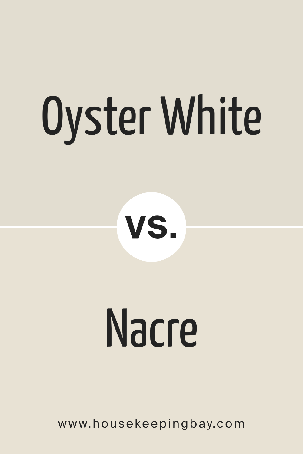
Oyster White SW 7637 by Sherwin Williams vs Nacre SW 6154 by Sherwin Williams
Oyster White SW 7637 and Nacre SW 6154, both by Sherwin Williams, share a nuanced palette rooted in the serene realm of off-whites, yet subtly diverge in tone and ambiance. Oyster White leans toward a soft, peaceful gray with a warm undertone, embodying a sense of calm and understated elegance.
It mirrors the gentle hue of an oyster’s shell, offering a clean and minimalist aesthetic. This color serves as an excellent backdrop, creating a tranquil and inviting space. Nacre, on the other hand, has a cozier feel, with slightly richer and warmer undertones reminiscent of the inner layers of a seashell.
It envelops spaces in a comforting blanket of warmth, making it perfect for areas where a more intimate and welcoming atmosphere is desired. While both colors promote a sense of tranquility and sophistication, Oyster White provides a cooler, more refined veneer, and Nacre, a touch more warmth and depth, fitting a variety of living spaces and design preferences.
You can see recommended paint color below:
housekeepingbay.com
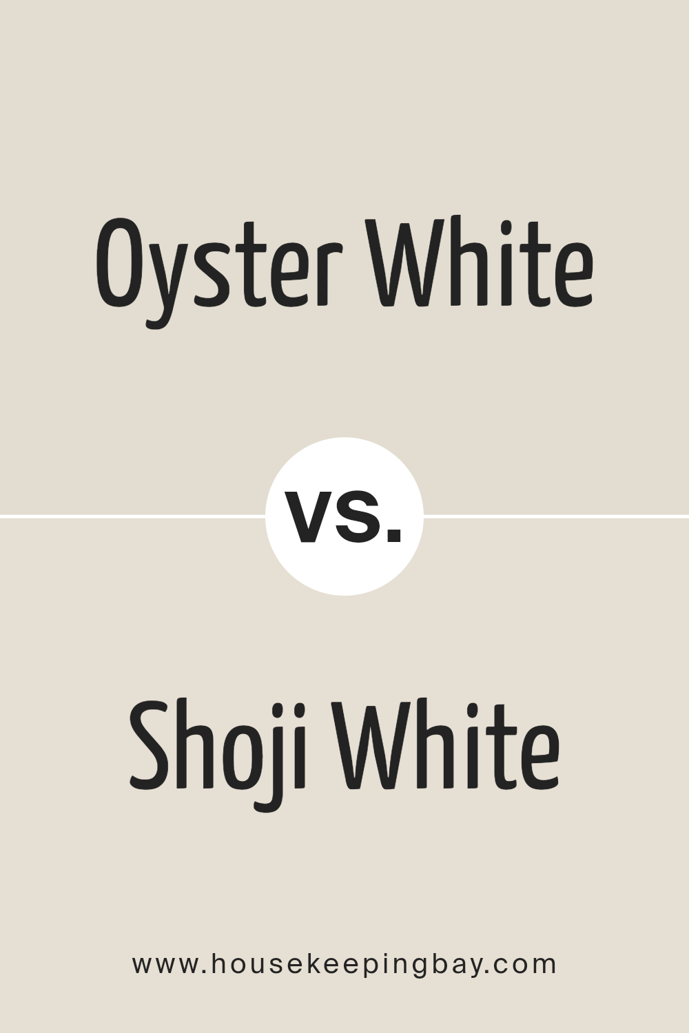
Oyster White SW 7637 by Sherwin Williams vs Shoji White SW 7042 by Sherwin Williams
Oyster White SW 7637 by Sherwin Williams and Shoji White SW 7042 by Sherwin Williams are two nuanced shades that embody the subtle elegance of neutral tones, each bringing its unique ambiance to a space. Oyster White is a soft, warm white with beige undertones, creating a cozy and inviting feel.
It has the versatility to complement various decor styles, from rustic to modern, by adding subtle depth and warmth to walls without overwhelming the space. On the other hand, Shoji White leans towards a slightly cooler palette, with greige (grey+beige) undertones.
This quality makes Shoji White an excellent choice for spaces that aim for a serene and slightly more modern look. While both colors maintain a close relationship with white, Shoji White stands out by providing a crisper backdrop that still retains warmth, making it ideal for well-lit areas or spaces seeking a minimalist aesthetic with a hint of warmth.
In comparison, Oyster White leans into comfort and traditionalism, offering a softer, more enveloping hue.
You can see recommended paint color below:
housekeepingbay.com
Conclusion
Oyster White SW 7637 by Sherwin Williams stands as a beautifully versatile color that seamlessly adapitates to a variety of settings and decor styles. As a hue that embodies tranquility and understated elegance, Oyster White offers a soft, warm backdrop that encourages a sense of calm and collectedness in any space.
Its ability to complement a wide range of colors and materials makes it a preferred choice for designers and homeowners alike who wish to create spaces that feel both welcoming and sophisticated.
In conclusion, Sherwin Williams’ Oyster White SW 7637 emerges as a timeless choice for those looking to infuse their homes with a gentle, inviting atmosphere. Whether applied in bright, sunlit areas to enhance the feeling of space and light, or used in more intimate settings to create a cozy retreat, Oyster White adapts beautifully, ensuring a delicate balance between warmth and elegance.
Its versatility not only lies in its aesthetic appeal but also in its capability to bridge traditional and contemporary styles, proving that this color is indeed a staple for anyone aiming to achieve a refined and harmonious interior.

housekeepingbay.com
Ever wished paint sampling was as easy as sticking a sticker? Guess what? Now it is! Discover Samplize's unique Peel & Stick samples. Get started now and say goodbye to the old messy way!
Get paint samples


