TOP 41 Light Paint Colors for 2025
Why Light Paint Colors Feel So Right
I’ve seen it again and again—when people walk into a room with soft, light colors, their whole body relaxes. There’s something about these gentle tones that makes a place feel clean, calm, and open. That’s what most of us want at home. Not just a nice wall color, but a feeling. And color plays a huge part in that.
For 2025, light paint colors are still leading the way. They’re warmer, softer, and more personal than ever before. The trend is leaning away from harsh bright whites and toward tones that feel lived-in, cozy, and natural.
Whether I’m working on a new build or refreshing a dated room, I always find myself reaching for these shades. Because they work—and they connect.

via housekeepingbay.com
Why Light Paint Colors Still Win in 2025
Table of Contents
Light colors aren’t just pretty—they work hard. I use them in nearly every home I stage or design because they instantly make a room feel cleaner, larger, and brighter.
Even small rooms start to breathe when the walls are painted in soft whites or gentle grays.
People Don’t Just See Color—They Feel It
I had a client last year who walked into a home I staged with Sherwin-Williams Alabaster on the walls. She stopped and said, “This just feels good.” She didn’t know the name of the paint. She didn’t know it was trending. She just felt at ease. That’s the power of the right light color.
It Makes Spaces Feel Bigger (Even When They’re Not)
Here’s something I always remind homeowners: light paint can actually make rooms look larger. Not a trick—just how our eyes work. According to a 2020 study published by the National Institutes of Health, lighter walls can increase the perceived size of a room by up to 30%.
And it’s not just about space. It’s about connection.
A Quote That Says It All
“Color is the first thing we see and the last thing we forget.”
— Leatrice Eiseman, Executive Director of the Pantone Color Institute
link
When someone walks into your home, color makes the first impression. And light paint colors tend to say: “This place is welcoming. You can exhale here.”
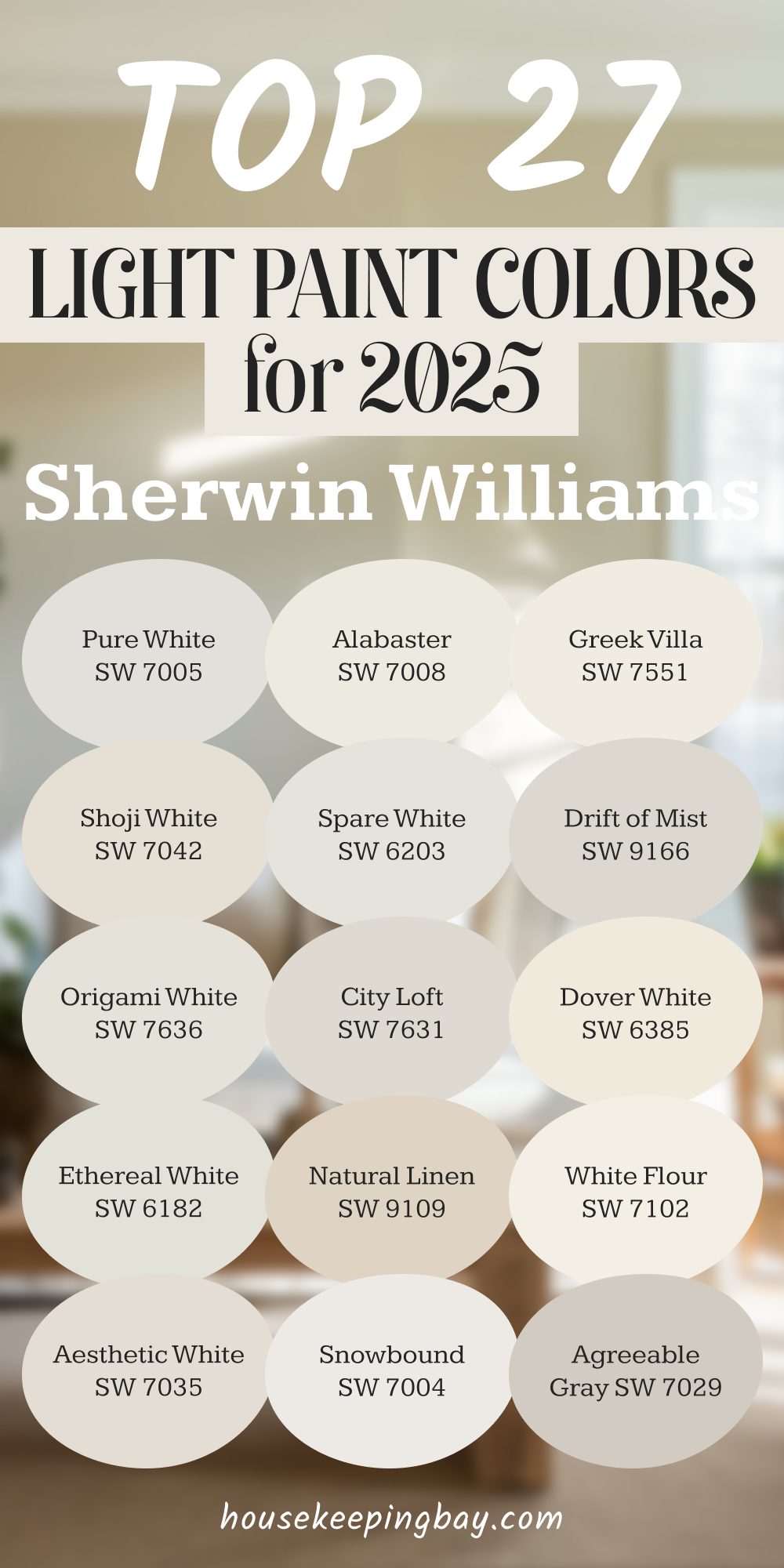
TOP 27 Light Paint Colors for 2025 from Sherwin-Williams
These are the shades I keep coming back to when I want rooms to feel fresh, easy, and lived-in. Sherwin-Williams has really nailed that soft, warm look this year—perfect for anyone who wants their home to feel calm but not cold.
Soft Whites
These are clean, but never harsh. I use them in kitchens, entryways, and bedrooms where I want the light to feel natural.
- Alabaster SW 7008 – My go-to. It works everywhere. It was even named Color of the Year back in 2016, and I still love it now.
- Greek Villa SW 7551 – A little warmer than Alabaster, great for family rooms.
- Pure White SW 7005 – Crisp without being cold. It pairs well with everything.
- Shoji White SW 7042 – Soft, with a hint of beige. Beautiful in older homes.
- Snowbound SW 7004 – Has a slight gray undertone. Lovely with marble or cool-tone woods.
- Spare White SW 6203 – Cool and subtle. I like this in bathrooms.
- White Flour SW 7102 – A warm, gentle white that works well in nurseries.
- Drift of Mist SW 9166 – Misty and soft, with a gray base. Good for open-plan areas.
- Ethereal White SW 6182 – A unique mix of white and soft green-gray. It changes with the light.
- Origami White SW 7636 – Quiet and clean. It feels simple, but styled.
Warm Neutrals
These colors bring in warmth without going yellow. They’re perfect if you want something richer than white, but still soft.
- Aesthetic White SW 7035 – A soft beige-gray. This one looks great with natural oak floors.
- City Loft SW 7631 – Light and modern. I’ve used it in small apartments to open up the feel.
- Dover White SW 6385 – This has more warmth, almost a cream. Pairs nicely with traditional furniture.
- Natural Linen SW 9109 – Very warm, almost sandy. Perfect for cozy bedrooms.
- Accessible Beige SW 7036 – A crowd-pleaser. It’s beige, but updated.
- Agreeable Gray SW 7029 – One of the most popular shades for a reason. It always works.
- Modern Gray SW 7632 – Slightly darker than some others here, but still very soft.
- Egret White SW 7570 – A white-gray with a hint of taupe. I love this for dining rooms.
- Creamy SW 7012 – Soft and inviting. Works especially well with antique pieces.
- Windfresh White SW 7628 – Has a cool undertone, really nice in sunny rooms.
- Ivory Lace SW 7013 – A true ivory. It’s gentle and warm, never too yellow.
- Casa Blanca SW 7571 – This has more depth, almost like aged parchment.
- Nebulous White SW 7063 – Subtle and grayish. Nice in home offices.
- Nacre SW 6154 – A little unexpected—warm with a pearl tone.
- On the Rocks SW 7671 – Light gray, clean, and modern.
These are the colors I keep on hand during consultations. They work across styles—from farmhouse to minimalist—and more importantly, they make people feel good.
via housekeepingbay.com
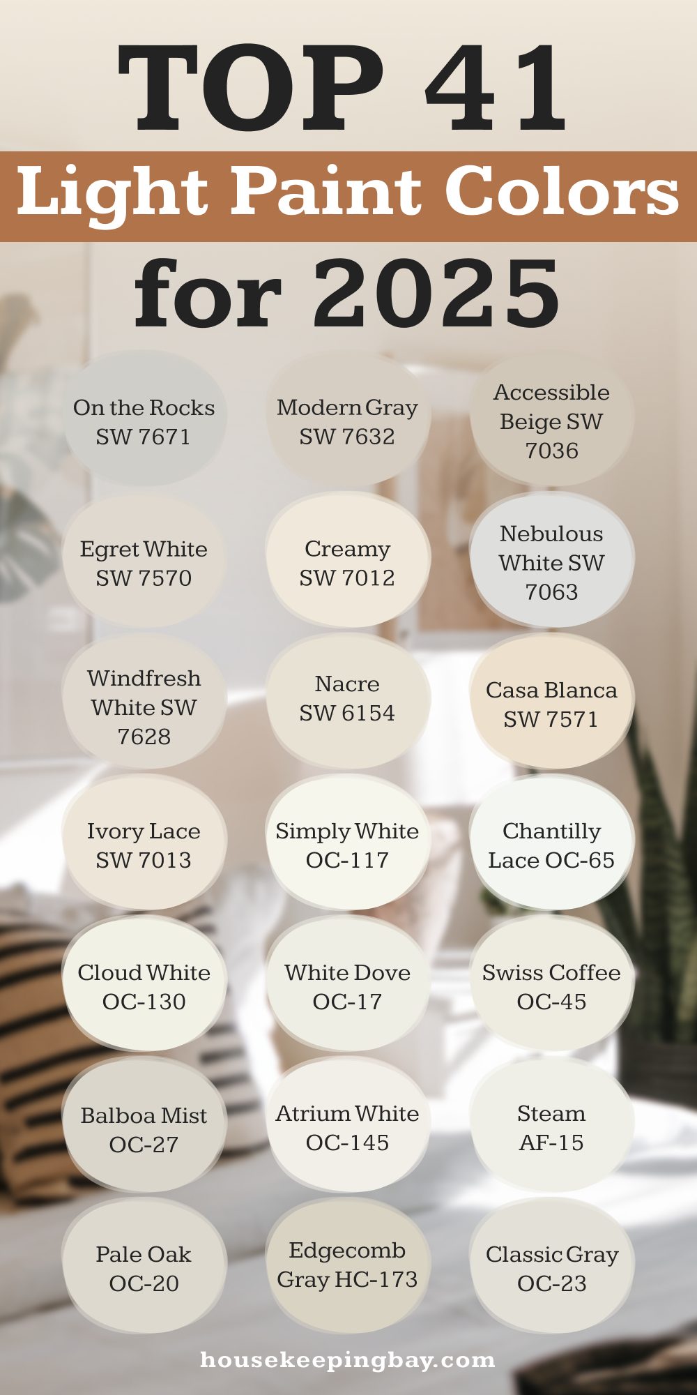
14 Top Light Colors from Benjamin Moore
Benjamin Moore has always had that soft touch. Their light shades feel lived-in without trying too hard. They add character without stealing attention. I often turn to these when I want something just a little more custom or layered.
And honestly? Some of them have saved entire rooms for me.
via housekeepingbay.com
Whites with Character
These are not just white. They have warmth, depth, and a little personality—without being loud.
- Chantilly Lace OC-65 – Crisp and clean. If you want a true white that still feels soft, this is it.
- Simply White OC-117 – Warm and sunny. I used it in a breakfast nook once, and the room glowed.
- White Dove OC-17 – A favorite among designers for good reason. It’s elegant but still friendly.
- Cloud White OC-130 – This one’s been around forever. Creamy, but never too yellow.
- Atrium White OC-145 – Has a whisper of pink. Sounds weird, but in the right light, it feels fresh.
- Steam AF-15 – One of the most calming whites. Beautiful in modern homes.
- Swiss Coffee OC-45 – A cult favorite. It’s soft, warm, and works with almost every trim or floor.
Soft Grays & Taupes
These are for when you want just a hint of color—more depth than white, but still very gentle.
- Pale Oak OC-20 – One of my personal favorites. Not too gray, not too beige.
- Balboa Mist OC-27 – A quiet gray that leans warm. Works great in rooms with mixed lighting.
- Classic Gray OC-23 – Very subtle. Feels clean but not stark. I love it in hallways.
- Edgecomb Gray HC-173 – A warm greige. It’s especially good for older homes with character.
- Calm OC-22 – It lives up to the name. Soft, peaceful, and blends with everything.
- Gray Owl OC-52 – Cooler and crisper than most of these. I use it a lot in coastal homes.
- Wind’s Breath OC-24 – A warm gray-beige. Pairs really nicely with wood accents.
- Horizon OC-53 – Pale and cool. Best in rooms with lots of natural light.
- Moonshine OC-56 – A pale gray with a touch of green. It shifts beautifully throughout the day.
I like to keep these Benjamin Moore shades in my kit when I want something a little extra—a quiet polish that gives rooms their own tone without having to say much.
How I Use These Paints in Real Homes
I don’t just pick a paint color because it’s trending—I pick it because it works. And these colors? They’ve been tested in real homes, with real people, and real light. Some of them have even saved a room that just wasn’t coming together until the paint hit the wall.
What Rooms They Work Best In
Here’s how I usually match the color to the room:
Living rooms:
- Alabaster, Agreeable Gray, Swiss Coffee
- These colors create that “come sit and stay awhile” feeling.
Kitchens:
- Pure White, Simply White, Chantilly Lace
- Clean, bright, and lets your cabinets or backsplash shine.
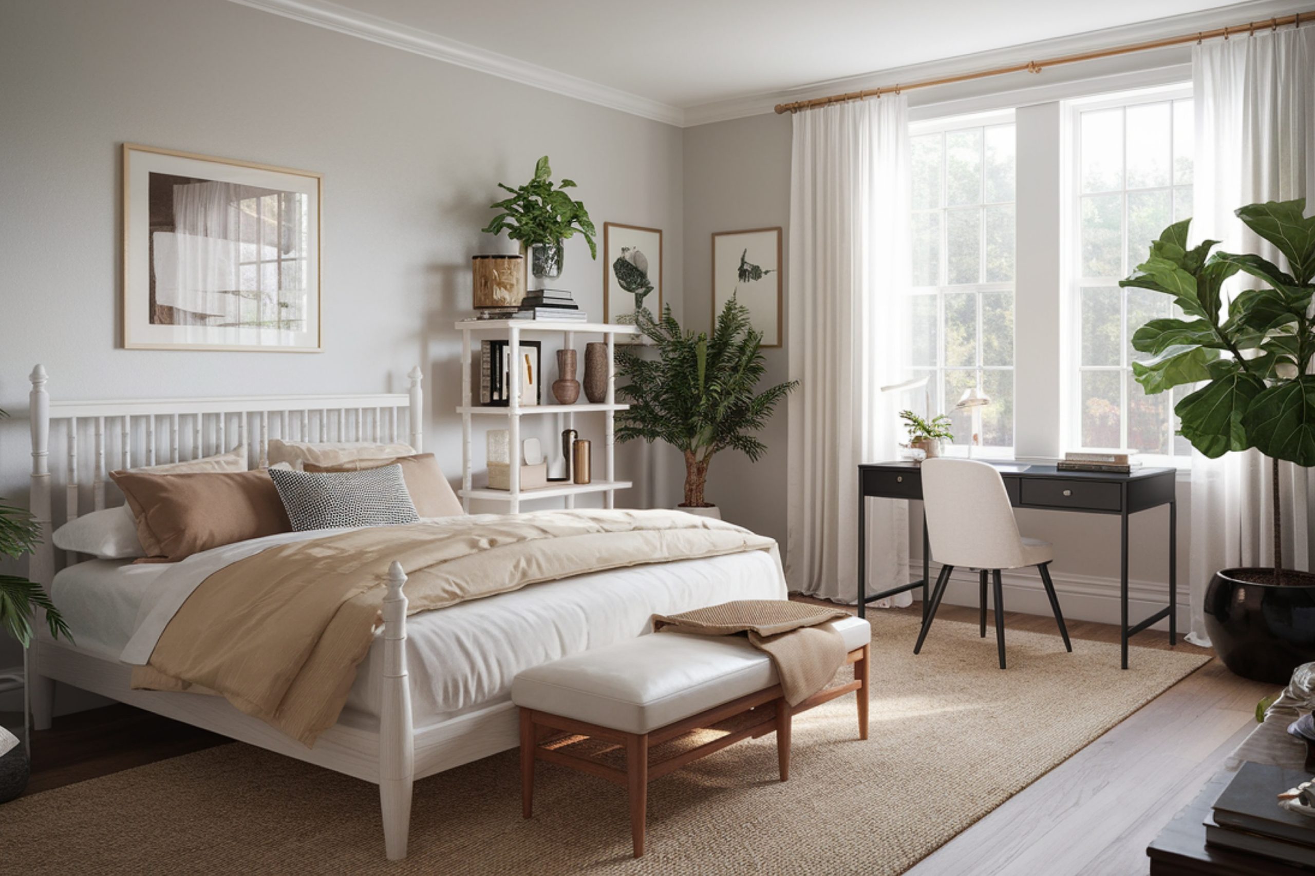
Bedrooms:
- Natural Linen, Balboa Mist, Calm
- These help slow the day down. They’re soft without being boring.
Bathrooms:
- Gray Owl, Steam, Drift of Mist
- They reflect light really well and make smaller rooms feel fresh.
Hallways & entryways:
- Edgecomb Gray, City Loft, Classic Gray
- These give just enough contrast with trim and don’t steal attention.
Natural Light vs. Artificial Light
This is huge. A color that looks amazing in one home might feel dull in another. I always tell clients: test the sample in your room, at different times of day. Natural light can pull warm or cool tones out you didn’t expect.
For example:
- Shoji White can feel creamy in daylight but almost beige under warm bulbs.
- Moonshine sometimes leans green in shady rooms, even though it’s a gray.
Light changes everything.
A Quick Story: Staging a Tough Room
I had a staging job last spring where the dining room was just… stuck. It had heavy trim and not a lot of light. Every color we tried looked too yellow or too flat.
Then I used Benjamin Moore Pale Oak.
Instant fix. The room felt airy but grounded. Buyers walked in and actually commented on how calm it felt. That house sold within 48 hours.
Before You Pick a Color, Remember This
Choosing the right light paint color can feel small, but it changes everything. It’s not just about matching furniture or keeping up with trends. It’s about how you want to feel in your home. And how you want others to feel, too.
So here are a few tips I always give my clients:
via housekeepingbay.com
Quick Tips to Pick the Right One
- Always sample first – Paint a swatch, look at it morning to night. Trust your eyes more than the brochure.
- Check the undertone – Some whites are warm, some cool. That small detail makes a big difference.
- Compare with your flooring and trim – Don’t look at the paint alone. Look at it with the whole room.
- Don’t rush – The best paint decisions come with a little time and daylight.
I know how tempting it is to just pick the prettiest name or the color that looks best on Pinterest. But in real homes, with real families, it’s about comfort. About home feeling like home.
Just My Honest Take
If I had to pick one thing that brings the most peace to a room, it would be light paint colors. Not because they’re trendy—but because they make us breathe easier.
These 41 colors? They’ve helped me turn cold rooms warm, dark corners bright, and blank walls into places people want to stay.
So whether you’re refreshing one room or painting the whole house, start light.
Then watch how your home changes—without changing everything.
via housekeepingbay.com
