Calm OC-22 by Benjamin Moore
Hues of Serenity for Your Space
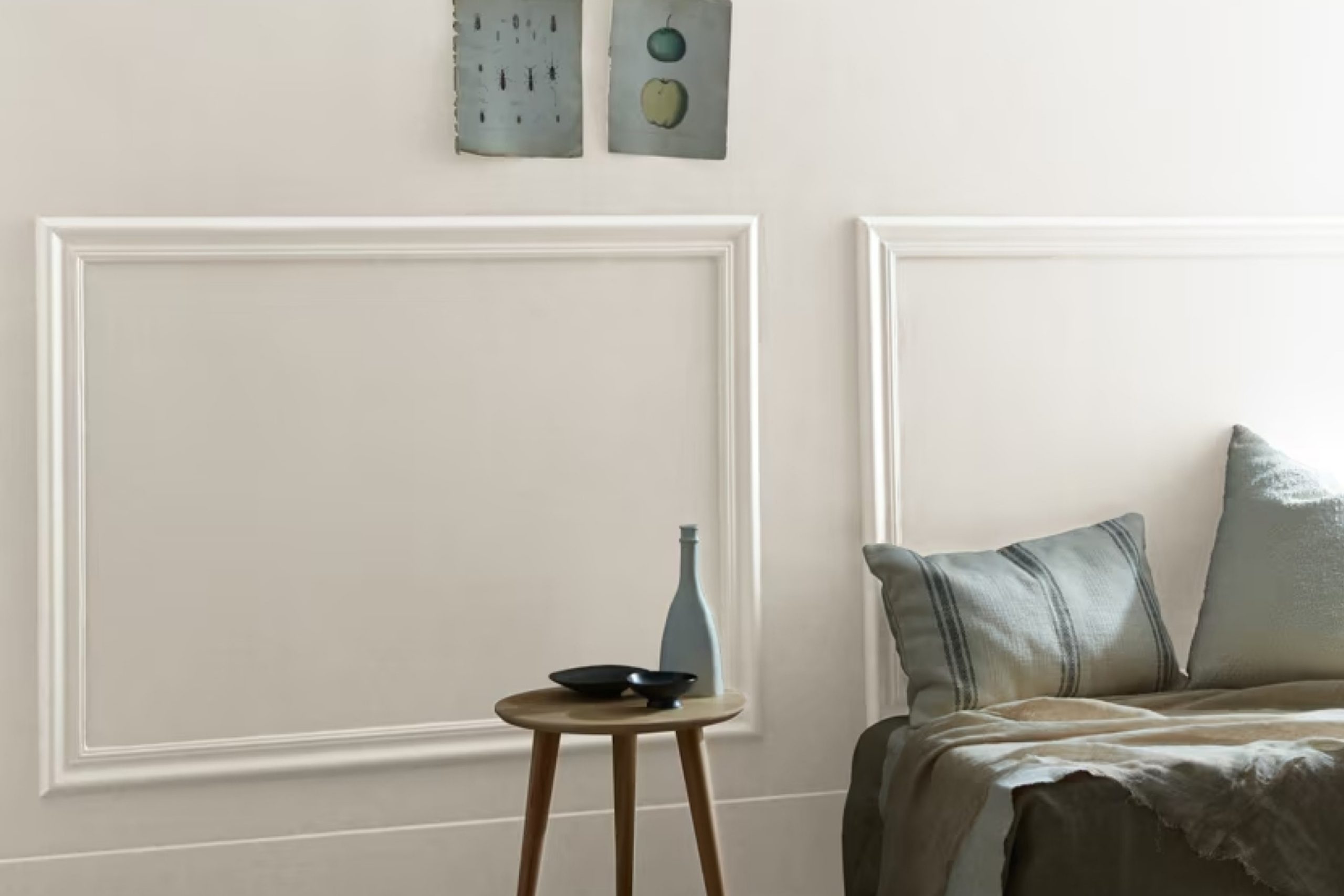
Imagine a color that gently whispers relaxation and peace. OC-22 Calm by Benjamin Moore offers just that. It’s a soft, understated shade that brings a sense of serenity to any space. Picture a gentle breeze on a quiet afternoon or the subtle glow of dawn as it welcomes a new day—this color embodies those moments.
When you introduce Calm into your home, you’re creating a soothing atmosphere. Its subtle hue adapts well to different lighting and spaces, enhancing the beauty of your surroundings without overpowering them.
You’ll find that it pairs effortlessly with various styles and textures, allowing you to create a space that is uniquely yours.
Whether you want to refresh a bedroom, living room, or even a home office, Calm offers a versatile option that maintains its elegance over time. It’s perfect for those who appreciate a quiet backdrop that still feels warm and inviting.
Imagine the possibilities when you use this delicate shade—it’s like welcoming serenity right into your home.
Let Calm be the gentle whisper that soothes your daily routine, making every day feel a bit more peaceful.
via benjaminmoore.com
What Color Is Calm OC-22 by Benjamin Moore?
Table of Contents
Calm OC-22 by Benjamin Moore is a soft, gentle off-white that exudes a soothing presence. It is a versatile color, blending subtle hints of gray, making it an ideal choice for creating restful environments. This shade works beautifully in numerous interior styles, such as minimalist, Scandinavian, and contemporary, where simplicity and cleanliness are key.
In a minimalist setting, Calm OC-22 can stand alone or pair well with other shades of white and earth tones, contributing to a peaceful, clutter-free space. In Scandinavian interiors, it complements natural materials and textures like light woods, wool, and linen, enhancing a cozy, inviting ambiance.
For contemporary spaces, Calm OC-22 harmonizes effortlessly with metallic finishes and sleek furnishings, adding a touch of elegance.
This color works well with various materials. Use it alongside natural wood for a warm, organic feel. Metals like brushed nickel or chrome provide a modern touch, while soft textiles such as cotton or suede introduce comfort and warmth. Similarly, glass and stone surfaces can look more refined with this color as a backdrop.
Overall, Calm OC-22 brings light and clarity, making it easy to create stylish, harmonious, and welcoming rooms.
housekeepingbay.com
Is Calm OC-22 by Benjamin Moore Warm or Cool color?
Calm OC-22 by Benjamin Moore is a soft, warm gray that brings a peaceful feel to any room. This color creates a soothing backdrop, making spaces feel larger and more open. It fits well in living rooms, bedrooms, or bathrooms, offering a sense of comfort and relaxation. The soft tones help reflect natural light, brightening up spaces and adding subtle warmth to the home.
Calm OC-22 works well with both modern and traditional decor. It pairs beautifully with light or dark furniture, allowing for versatile design choices.
When used on walls, it provides a neutral base that complements various textures and patterns in furniture, rugs, and accessories.
This color’s gentle nature makes it ideal for spaces where families gather or individuals unwind. Whether on accent walls or throughout an entire room, Calm OC-22 brings a cohesive, gentle touch to interiors, blending effortlessly with many color schemes and styles.
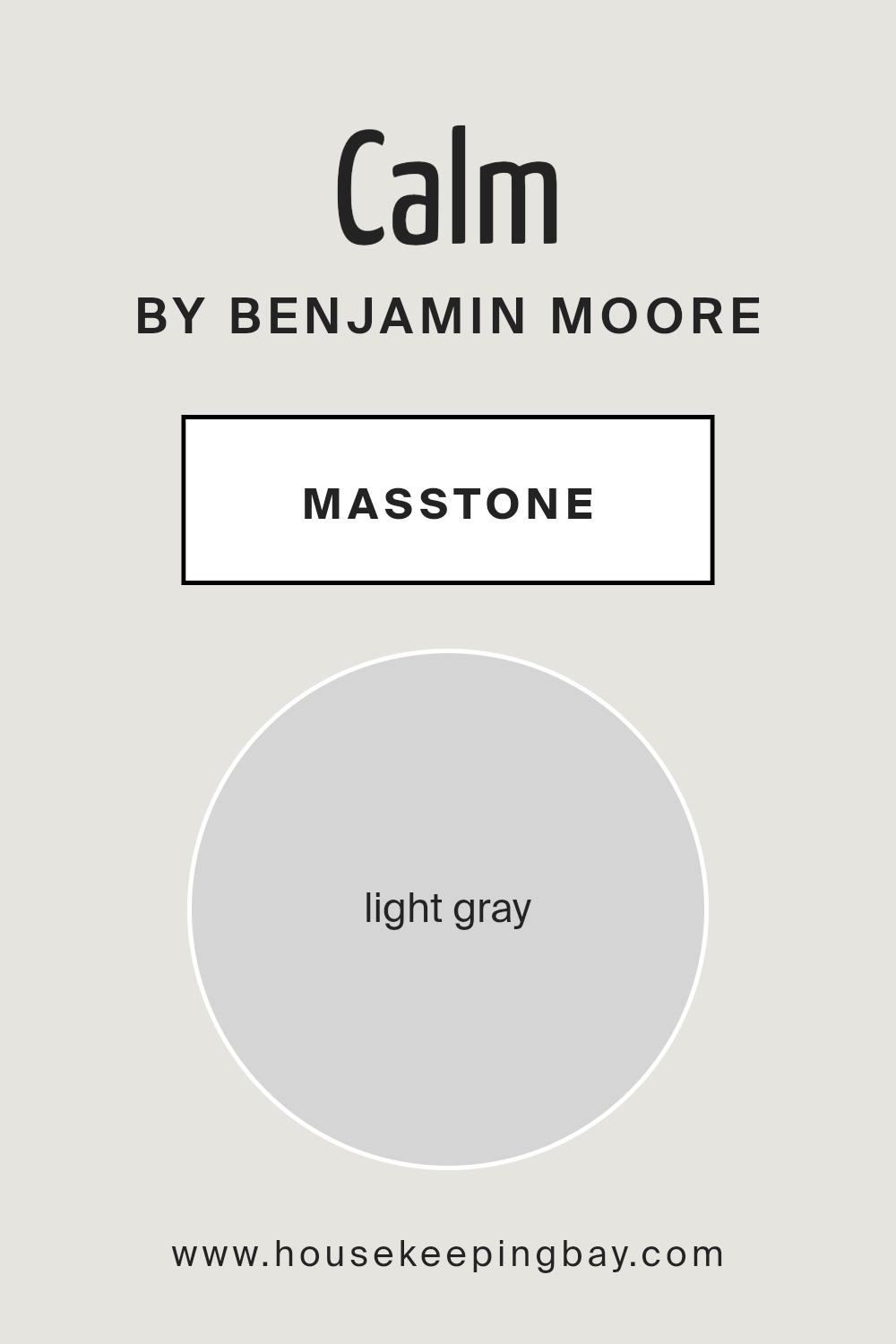
What is the Masstone of the Calm OC-22 by Benjamin Moore?
CalmOC-22 by Benjamin Moore is a light gray color, represented by the masstone #D5D5D5. This shade brings a sense of peace and neutrality to any room. Its soft, gentle hue makes it perfect for creating open, airy spaces. Light gray like CalmOC-22 works well in many areas of a home, from living rooms to bedrooms.
This color easily complements other shades, whether you prefer bold or subtle accents. It pairs naturally with whites, blues, and even deeper colors. CalmOC-22 can brighten up a room, reflecting light and making it feel more spacious.
Using CalmOC-22 in a home creates a relaxed, soothing atmosphere. It provides a clean background that allows furniture and decor to stand out. Furthermore, its versatile nature means it can fit into various styles, from modern to traditional. Overall, CalmOC-22 by Benjamin Moore brings both elegance and simplicity to a space, enhancing the overall feel of your home.
housekeepingbay.com
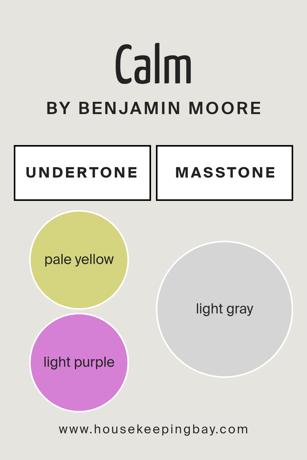
Undertones of Calm OC-22 by Benjamin Moore
Calm OC-22 by Benjamin Moore is an intriguing paint color with a blend of subtle undertones that affect how it appears. Understanding undertones helps us see the depth and complexity in a color. Undertones are the underlying colors that can subtly influence the primary shade, creating different effects based on light and surrounding colors.
Calm OC-22 has pale yellow, light purple, light blue, pale pink, mint, lilac, and grey undertones. These hues work together, influencing how the color feels in any space. The pale yellow brings warmth, making rooms feel cozy and inviting.
The light purple and lilac add a hint of sophistication and depth, giving the color a subtle elegance. The light blue and mint introduce a cool freshness, balancing warmth with a hint of crispness. The pale pink provides softness, adding to the gentle and calming nature of the color.
Lastly, the grey component adds a neutral backdrop, helping the color blend seamlessly with other elements in a room.
On interior walls, these undertones make Calm OC-22 highly adaptable. It can create a serene atmosphere in a reading nook or a welcoming vibe in a living room, adjusting beautifully under different lighting conditions throughout the day.
housekeepingbay.com
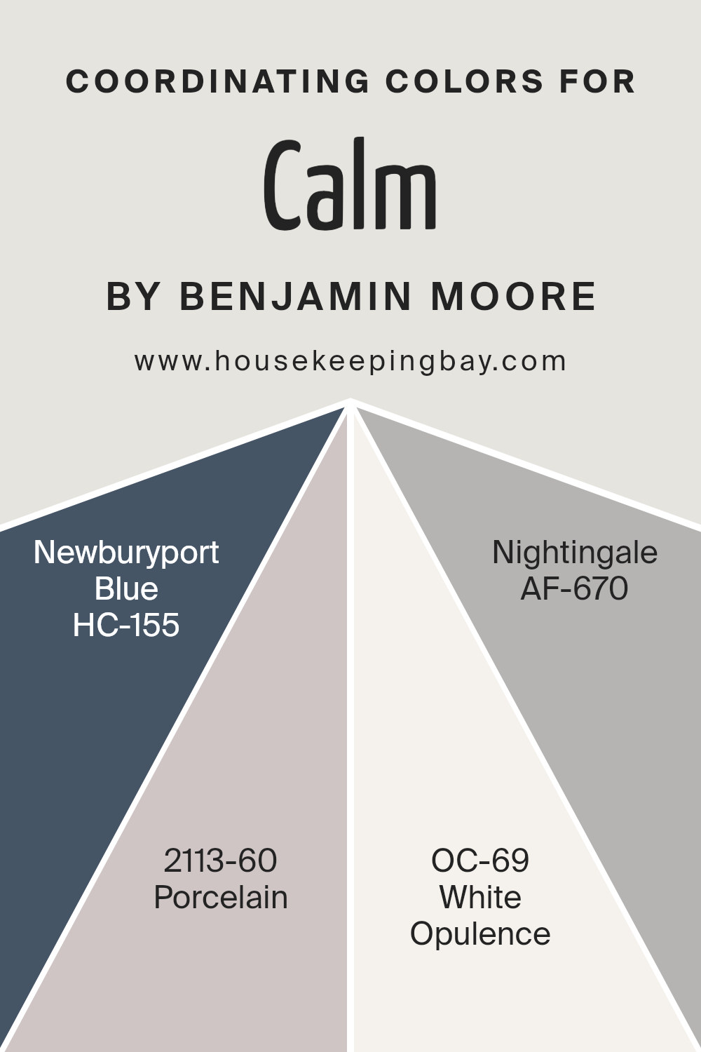
Coordinating Colors of Calm OC-22 by Benjamin Moore
Coordinating colors are shades that work well together in design, creating a pleasing and balanced look. When you select colors that coordinate, they can each highlight the other’s best qualities.
Calm OC-22 by Benjamin Moore is a versatile color that pairs beautifully with Newburyport Blue HC-155, Porcelain 2113-60, White Opulence OC-69, and Nightingale AF-670. Newburyport Blue brings a strong, deep blue to the palette.
It adds a bold touch that can make any space feel more refined.
Porcelain, with its gentle lavender undertone, complements the stronger shades by bringing a soft, subtle warmth to the surroundings.
The delicate nature of White Opulence offers a light and airy feeling, creating an open, bright atmosphere that can balance heavier colors like Newburyport Blue.
Meanwhile, Nightingale introduces a gentle gray that provides a neutral backdrop, tying everything together and allowing for smooth transitions between spaces.
Together, these colors can create a harmonious environment, each contributing its unique character while also working collectively to enhance the overall aesthetic.
Using these coordinating colors efficiently results in a home or office that looks well-thought-out and cohesive, where each color plays its role in supporting and enhancing the others.
You can see recommended paint colors below:
- HC-155 Newburyport Blue
- 2113-60 Porcelain
- OC-69 White Opulence
- AF-670 Nightingale
housekeepingbay.com
How Does Lighting Affect Calm OC-22 by Benjamin Moore?
Lighting plays a significant role in how we perceive colors. Different types of lighting can change the way a color looks in a room. For example, a color might seem warm and welcoming under natural sunlight, but appear muted or harsh under certain types of artificial light.
Calm OC-22 by Benjamin Moore is a soft, light gray with warm undertones. When considering this color in different lighting scenarios, it’s essential to understand how both artificial and natural light can impact its appearance.
In natural light, the color tends to look softer and more neutral. In artificial light, such as fluorescent or LED lighting, Calm OC-22 might appear slightly different. Certain bulbs might bring out more of its warm undertones, while others might make it look cooler.
In north-facing rooms, which generally receive cooler and more muted sunlight, Calm OC-22 may take on a slightly cooler tone. It can appear a bit more gray and less warm because of the subtle light entering the room. This effect tends to create a calming and quiet atmosphere.
In south-facing rooms, where sunlight is usually warmer and stronger, this color will look warmer and lighter. The ample sunlight enhances its warm undertones, making the space feel inviting and bright.
East-facing rooms receive light that changes quickly throughout the day. In the morning, when light is softer and more golden, Calm OC-22 can appear quite warm and welcoming. As the day progresses, the light becomes more neutral, and the color might appear cooler and more subdued.
In west-facing rooms, the light is warmest in the late afternoon and evening. Calm OC-22 may appear cooler earlier in the day but will take on a warmer, richer tone later as the sun sets. This dynamic can add depth and interest to the space, depending on the time of day.
housekeepingbay.com
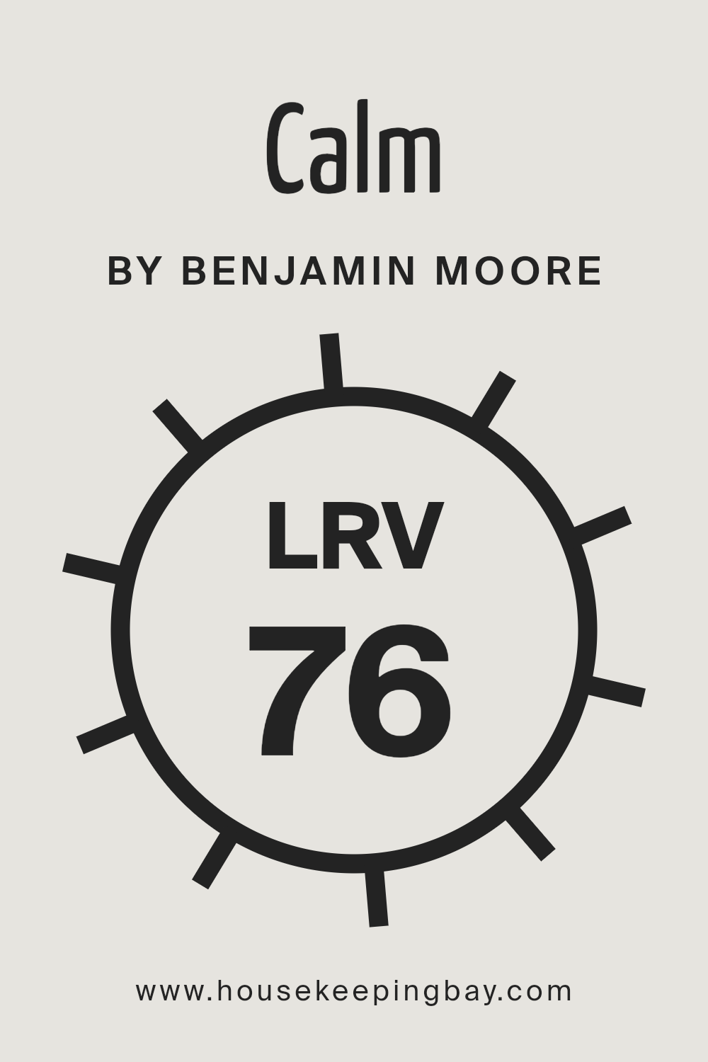
What is the LRV of Calm OC-22 by Benjamin Moore?
Light Reflectance Value (LRV) measures how much light a color reflects. It ranges from 0 to 100, where 0 means the color absorbs all light, appearing very dark, and 100 means it reflects all light, appearing very bright or white. Higher LRV values indicate lighter colors that can make spaces feel bigger and brighter.
On the contrary, lower LRV values belong to darker colors that absorb more light, giving spaces a cozy or dramatic look.
When choosing paint for a room, LRV helps predict how the color will interact with light. Rooms with ample natural light can handle colors with lower LRV, while dim spaces might benefit from higher LRV colors to enhance brightness.
Calm OC-22 by Benjamin Moore has an LRV of 75.83, meaning it reflects a significant amount of light. This high LRV indicates that Calm is a light, airy color, making spaces feel open and refreshed. The color will bounce light around, enhancing room brightness even in spaces with limited natural light.
The balanced brightness of Calm creates a soft, welcoming atmosphere without overwhelming the senses. Ideal for places requiring a serene feel, its reflective quality can make a room appear larger, more open, and pleasant.
housekeepingbay.com
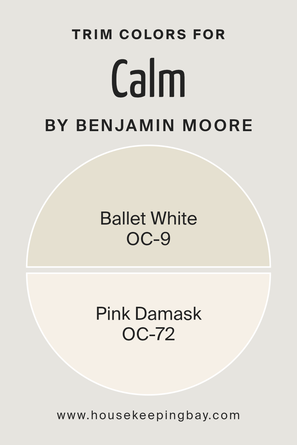
What are the Trim colors of Calm OC-22 by Benjamin Moore?
Trim colors are the shades used for the moldings, door frames, window casings, and baseboards in a room. They play a crucial role in adding definition and emphasis to a space, as well as tying the overall color scheme together. In the context of CalmOC-22 by Benjamin Moore, choosing the right trim colors can enhance the soothing and calm effect that the paint aims to provide.
Trim colors also help in subtly highlighting architectural details, creating pleasant visual contrasts without overwhelming the environment. By picking the right trim colors, one can maintain a cohesive and balanced feel in the room, making the primary wall color stand out more gently.
OC-9 Ballet White and OC-72 Pink Damask are excellent choices for trim colors in a room painted with CalmOC-22. Ballet White is a soft, warm white with subtle undertones that provide a clean and classic look, making it versatile and easy on the eyes.
It complements CalmOC-22 beautifully by offering a seamless transition between the walls and the trim. On the other hand, Pink Damask adds a hint of warmth with its delicate, muted pink tones. This trim color offers a unique yet subtle contrast, enhancing a room’s cozy and inviting atmosphere.
Both these trim colors support the main color without overpowering it, allowing for a harmonious and pleasing space.
You can see recommended paint colors below:
housekeepingbay.com
Colors Similar to Calm OC-22 by Benjamin Moore
Similar colors play an important role in interior design by creating a cohesive and harmonious look in a space. When you choose colors that are close to each other on the color wheel, such as shades with similar undertones, you achieve a serene and unified appearance.
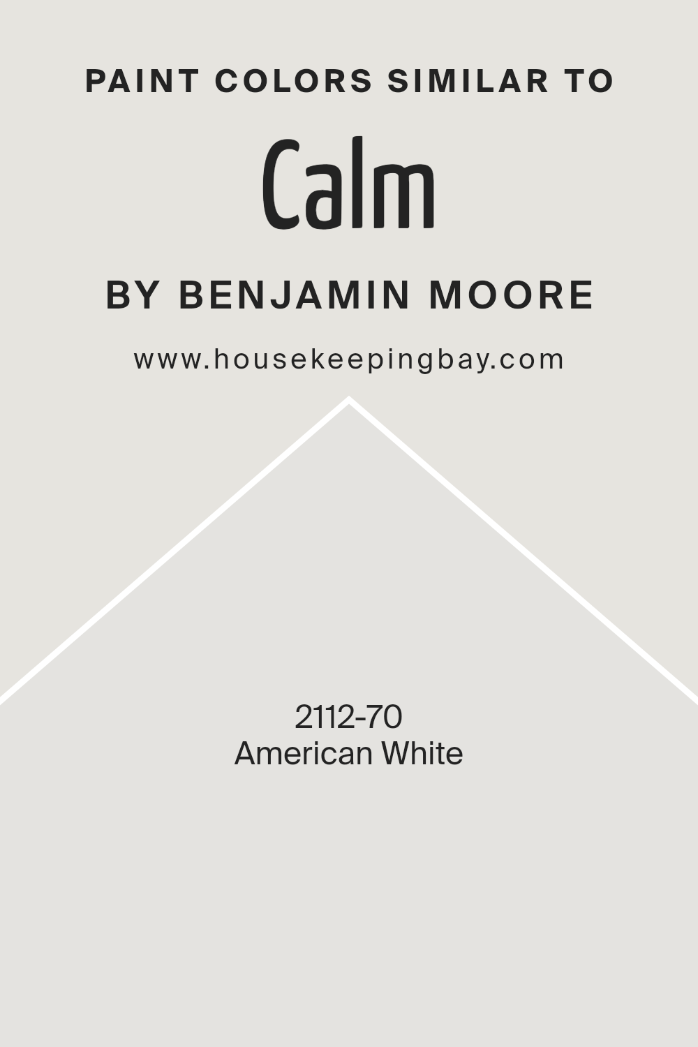
For example, American White 2112-70 by Benjamin Moore provides a soft, gentle hue that can form the foundation for a calm setting. This color carries a subtle warmth, making it versatile and easy to pair with other tones.
Using similar colors can help different elements in a room blend together naturally, allowing each to shine without clashing.
Pearl River 867 adds a light gray touch with a hint of warmth, echoing the feel of American White while offering a bit more depth. Moonshine 2140-60 enriches this palette with its airy gray tone that enhances the soothing ambiance.
Another close companion is Classic Gray OC-23, which offers a light, neutral backdrop that pairs beautifully with other neutral shades while retaining its own charm. Each of these colors complements one another, building a space that feels unified and comfortable.
Together, these colors create a scheme that’s both inviting and tailored, perfect for spaces where subtlety and cohesion are desired.
You can see recommended paint color below:
- 2112-70 American White
housekeepingbay.com
How to Use Calm OC-22 by Benjamin Moore In Your Home?
Calm OC-22 by Benjamin Moore is a soft, gentle off-white paint with subtle gray undertones. This versatile color can be a great choice for any room in your home, offering a serene and inviting atmosphere. It works well in living rooms, bedrooms, or even kitchens, adding a sense of warmth without overwhelming the space.
If you prefer a minimalist or modern style, Calm OC-22 can complement clean lines and simple decor. In a more traditional setting, this shade pairs nicely with wood accents and classic furniture, providing a light backdrop that lets your pieces shine.
Try using it on walls to create a cohesive look or as an accent on doors and trim.
Calm OC-22 also adapts remarkably well to varying light conditions, maintaining a fresh appearance in both natural and artificial light. Its gentle hue can help create a comfortable environment where you can relax and enjoy your surroundings.
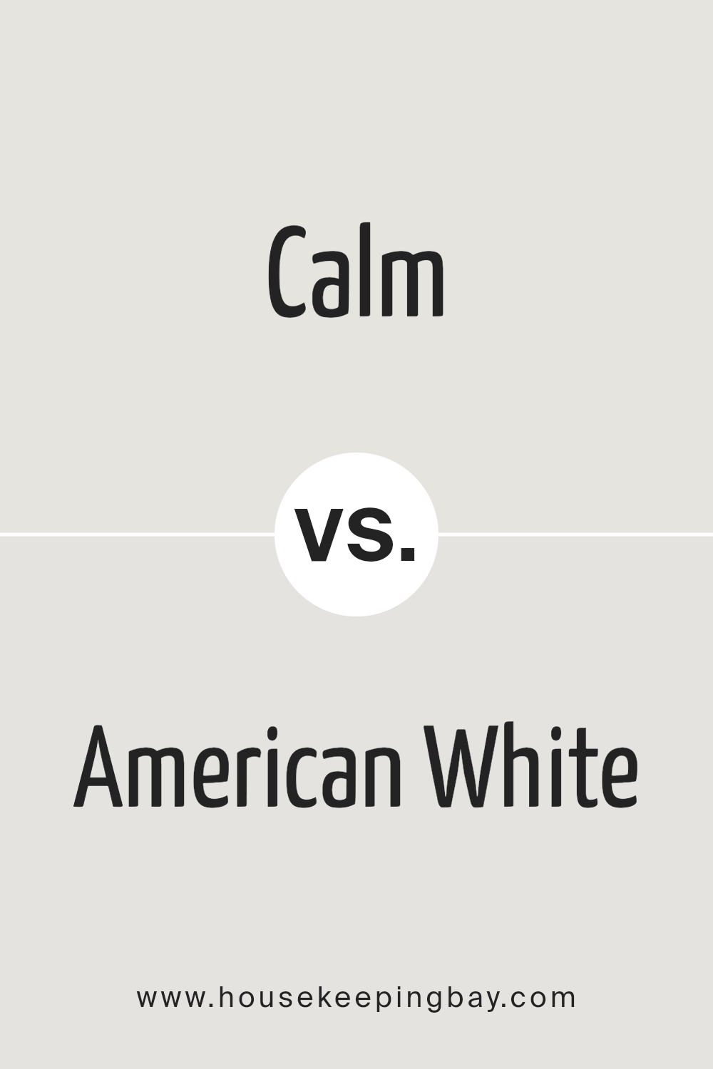
Calm OC-22 by Benjamin Moore vs American White 2112-70 by Benjamin Moore
Calm OC-22 and American White 2112-70 by Benjamin Moore offer subtle, sophisticated hues perfect for various spaces. Calm OC-22 presents a soft, gentle off-white with warm undertones. This color provides a serene backdrop, easing the mind and making spaces feel open and inviting. Ideal for living rooms and bedrooms, it pairs well with both vibrant accents and muted tones.
American White 2112-70, in contrast, is a slightly cooler shade of white. It offers a gentle grey undertone, giving it a classic, timeless feel. This color fits well in modern settings, providing a crisp, clean canvas for furnishings and decor.
Rooms painted in American White often seem brighter and more refined.
Both colors are versatile, enhancing room aesthetics in different ways. Calm OC-22 suits those seeking warmth and coziness, while American White 2112-70 works best for those preferring clean, understated elegance with a hint of coolness.
You can see recommended paint color below:
- 2112-70 American White
housekeepingbay.com
Conclusion
After going through Benjamin Moore’s OC-22 Calm, I’ve realized just how significant the right paint color can be for a space. OC-22 Calm is more than just a shade of paint; it brings a gentle, serene feeling into any room. Its soft, muted tone offers a sense of comfort and relaxation, making it perfect for any area where you want to unwind.
What strikes me about Calm is its versatility. It works harmoniously with a wide range of other colors, from bolder hues to subtle neutrals. This adaptability makes it an excellent choice for those who might like to change up decor or accents without having to repaint the walls.
The color has a timeless quality, fitting seamlessly into both modern and traditional settings. Its subtlety doesn’t overpower a room, allowing the furnishings or architectural details to shine. For someone like me who appreciates a peaceful environment, this paint color feels like an ideal option.
Overall, OC-22 Calm brings a sense of ease to any room. It’s not just about the aesthetic appeal; it’s about creating a harmonious atmosphere that complements daily life.
With Calm, I feel I can create a living space that truly feels like home.
housekeepingbay.com
Ever wished paint sampling was as easy as sticking a sticker? Guess what? Now it is! Discover Samplize's unique Peel & Stick samples. Get started now and say goodbye to the old messy way!
Get paint samples


