Moonshine OC-56 by Benjamin Moore
A complete guide that will introduce this color to you
Picking a paint color for your home may seem to be easy, however, if you are not a specialist in paint colors and you don’t have an eye for colors and shades, choosing what hue is best to use on your walls might become quite a complicated task for you!
This is why people often prefer using subtle and more universal colors like greiges, grays, etc. since they can fit almost any interior.
And today, we would like to talk about one of the paint colors by Benjamin Moore brand called Moonshine OC-56.
At the first sight, this color may appear to be very simple gray, but in fact, we would say it is a bit tricky! Upon closer examination, you will see that this soft shade reveals a strong punch of intoxicating color!
This is why, if you are considering using it in your home, we suggest you read this article first. We will tell you more about the type of color it is, you will learn what undertones this delicate gray has, and how this paint color reacts to different types of lighting.
Finally, we will compare BM Moonshine with a few other similar paint colors so that you could better understand their distinctions.
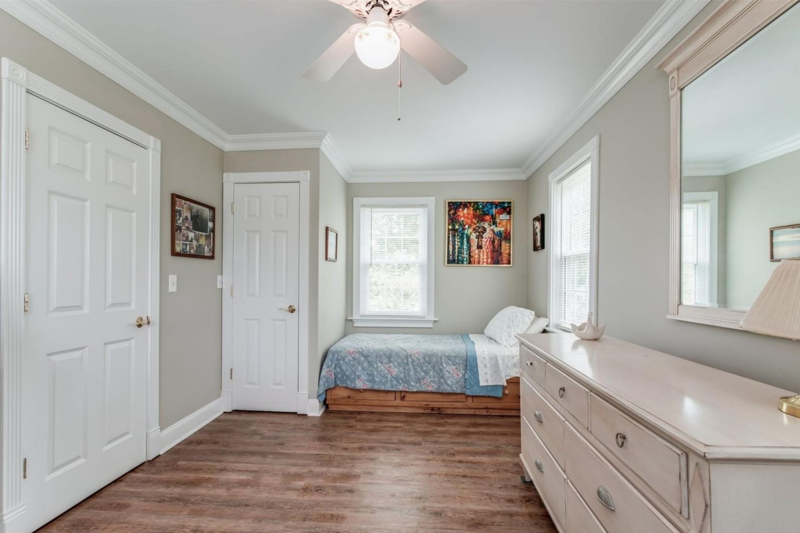
signaturepremier via VistaCreate
What Color Is Moonshine OC-56 by Benjamin Moore?
If you have never seen Benjamin Moore Moonshine in real life and you have no idea of its color palette, you might be wondering what type of color it is. Well, in a few words, Benjamin Moore Moonshine OC-56 (also known as Moonshine 2140-60) belongs to gray colors.
In particular, this color is very delicate and sophisticated, and it is often considered a very light near-neutral shade of gray.
And since it is rather light, it will probably be one of the best choices for you, especially if you are not a fan of dark or very bold and bright paint colors on your interior walls. Find out more accurate color information – look at Encycolorpedia.
At first glance, this color resembles a soft gray color that is slightly cool-toned, and for the most part that is exactly what it is.
However, you should keep in mind that near neutrals like BM Moonshine tend to be influenced by other colors that surround them!
And this is when it is time to talk about this color’s LRV and the way it may react to light.
housekeepingbay.com
Table of Contents
Is BM Moonshine a Warm Or a Cool Color?
BM Moonshine is a cool-toned shade of gray color. However, it can’t be called a very cool-toned paint!
Compared to some other colors like BM Winter Snow, Moonshine is relatively warm, so you should not expect it to read “frosty” on your walls.
Depending on the lighting in a room where it is used, it may reveal more of its cool undertones or, on the contrary, read less chilly. But no matter what, you will not find warm tones in this paint.
Undertones Of BM Moonshine Paint Color
Undertones always matter since they decide how exactly certain paint color will look on your walls. This is why you should always take this nuance into consideration when choosing the paint!Otherwise, you may end up with a color that is not quite what you expected…
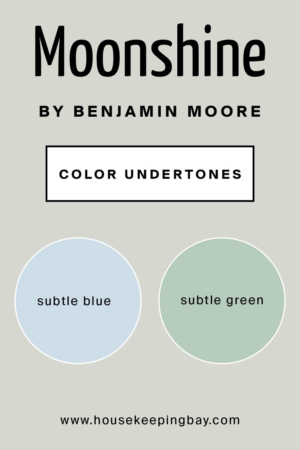
As for the undertones of Moonshine paint color by Benjamin Moore, this paint has subtle undertones of blue and green.
Like all gray colors, Moonshine can be easily influenced by all the elements around it, for example, lighting, decor, etc.
Fortunately, unlike many other grays, this one doesn’t have any sneaky undertones that may suddenly pop up!
So as a rule, if you apply this color to your walls, you should expect it to seem a bit greenish or reveal more of its blue undertones depending on the type of light in the space, as well as the decor elements and other colors present there.
housekeepingbay.com
How Does Moonshine OC-56 by Benjamin Moore React to Light?
When you choose what paint color to have on your walls, it is essential to keep in mind that the same color can look different depending on what type of lighting is around it. It happens because of the LRV rate of the paint color.
LRV, (also known as Light Reflectance Value) is the percentage of light it reflects. It is also a scale that is used by design professionals. Basically, if you take a look at this scale, you will see that zero is the darkest black and 100 is true white paint color.
housekeepingbay.com
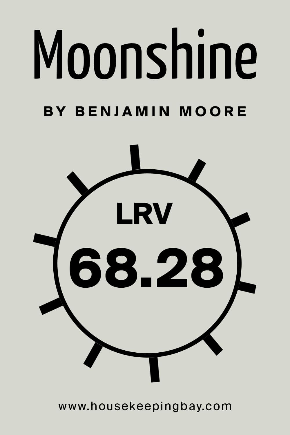
BM Moonshine paint color has an LRV of 68.28, which is not the highest but also not the lowest. It is a little higher than midway which is great for paint colors to be. At the same time, this color may react differently to light.
Let’s say your room is north-facing and you have blue colors used there (e.g. your throw blankets, pillowcases, etc.). In this case, you will most likely see Moonshine come off more on the cool side.
If you have a sufficient amount of light in a room, there is the possibility that this color will look like a neutral gray. This is why you should always test paint samples in your home before applying the paint!
housekeepingbay.com
What is LRV? Read It Before You Choose Your Ideal Paint Color
Coordinating Colors of Moonshine OC-56 by Benjamin Moore
Picking the correct coordinating color to match is a tricky task unless you have a sharp eye for colors, hues, and shades.
However, when it comes to neutral paint colors, they tend to be the easiest to coordinate, especially grays! Just be aware of any undertones the color has.
When talking about Benjamin Moore Moonshine, it has blue and green undertones that can show up. This is why you can do one of two things:
- use colors to enhance those tones
- use colors to dilute those tones
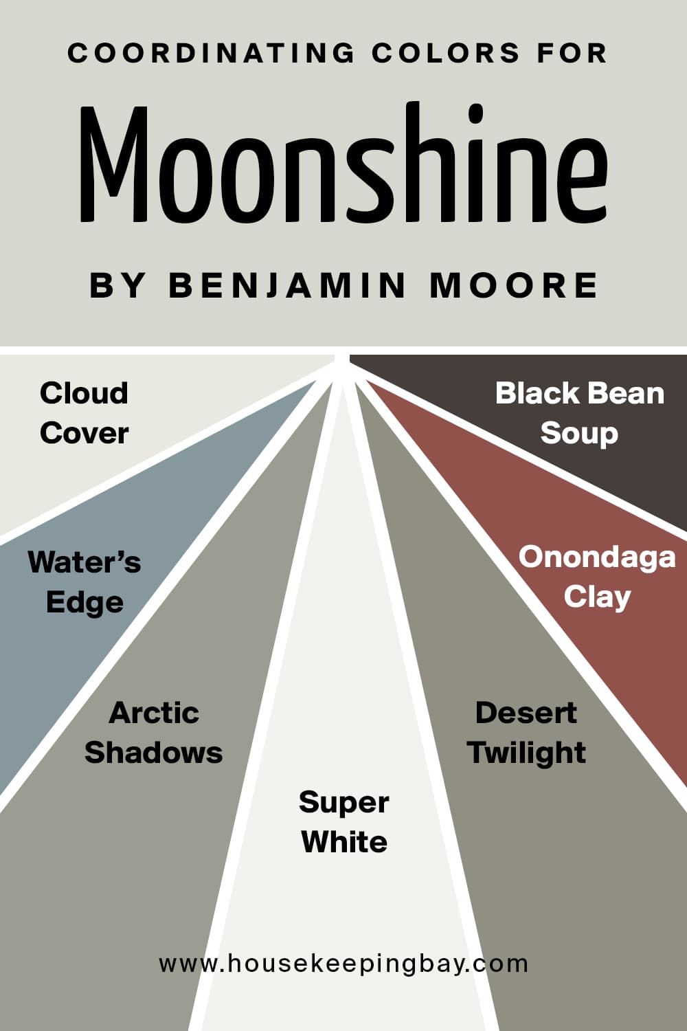
To help you out, we have prepared a list of paint colors that can do both:
- Cloud Cover 855
- Water’s Edge 1635
- Arctic Shadows 1559
- Super White PM-1
- Desert Twilight 2137-40
- Onondaga Clay 1204
- Black Bean Soup 2130-10
They will create a very delicate and stylish color palette since they differ in terms of tones and intensity of color.
housekeepingbay.com
Colors That BM Moonshine Goes With
When you are going to use a certain color in your home, you should be aware of other colors that might look good when paired with it. Like this, you will be able to create a more harmonious color palette.
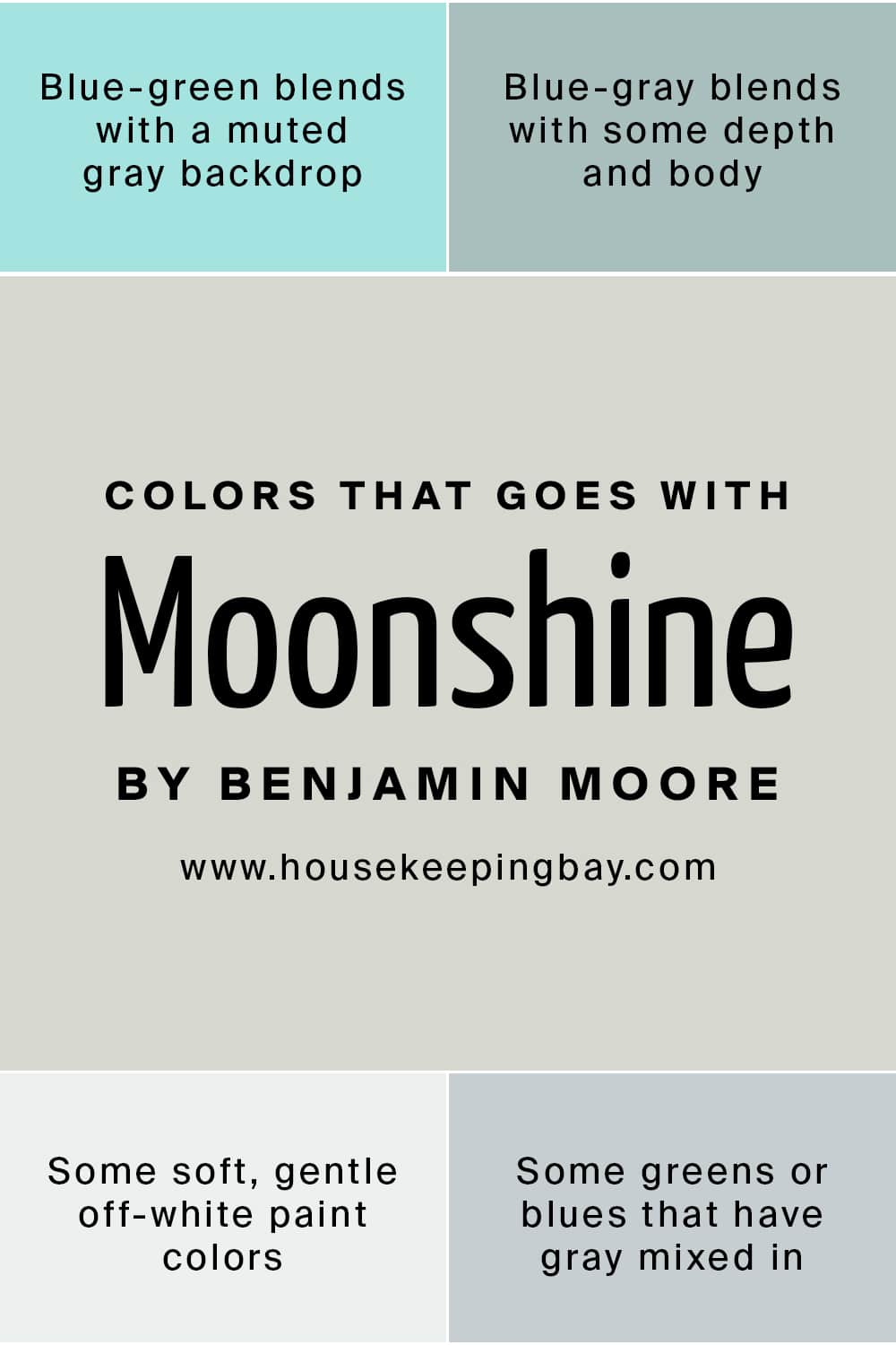
For the BM Moonshine paint, you won’t find it difficult to find the colors that go well with this gray. Any of the following options will make a good match:
- Blue-green blends with a muted gray backdrop
- Blue-gray blends with some depth and body
- Some soft, gentle off-white paint colors
- Some greens or blues that have gray mixed in
housekeepingbay.com
What Is the Best Trim Color For BM Moonshine?
When you decide to refresh your home’s interiors, you often need not only the basic color but the suitable trim color as well.
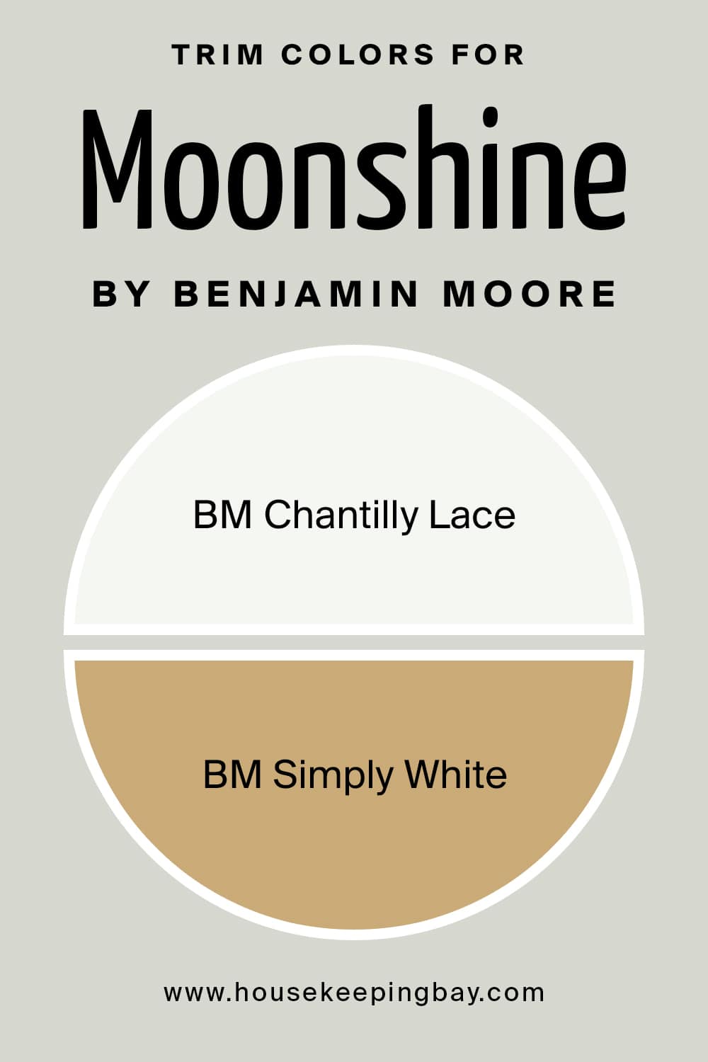
Benjamin Moore Moonshine will look astonishing and great with bright white trim like BM Chantilly Lace , which provides a beautiful contrast.
But of course, you are not limited to only using white color for the trim! BM Moonshine will also make a beautiful pair with honey oak trim.
housekeepingbay.com
Comparing Moonshine Paint Color With Other Colors
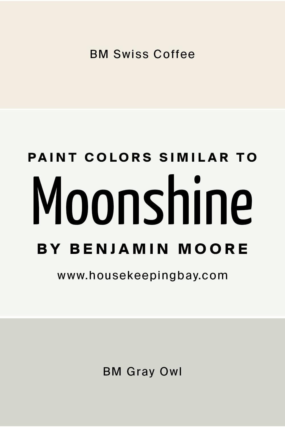
In order to make it easier for you to see the true nature of Benjamin Moore Moonshine OC-56 paint color, and realize what makes it different from other similar colors, we recomend you check out a brief comparison of this soft and warm off-white with a few other paint colors of the similar shade – BM Swiss Coffee and BM Gray Owl.
housekeepingbay.com
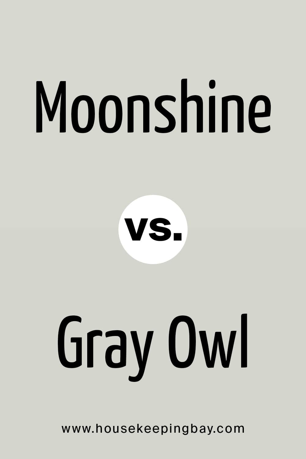
Moonshine vs. Gray Owl
Gray Owl has a soft green undertone that can also look blue in certain light. While the green makes it warmer than other “cool” grays, it will still look like a cool, neutral gray on your wall.
This is what makes Gray Owl similar to Moonshine, which also has blue and green undertones, and this is the reason why these colors can be used interchangeably.
housekeepingbay.com
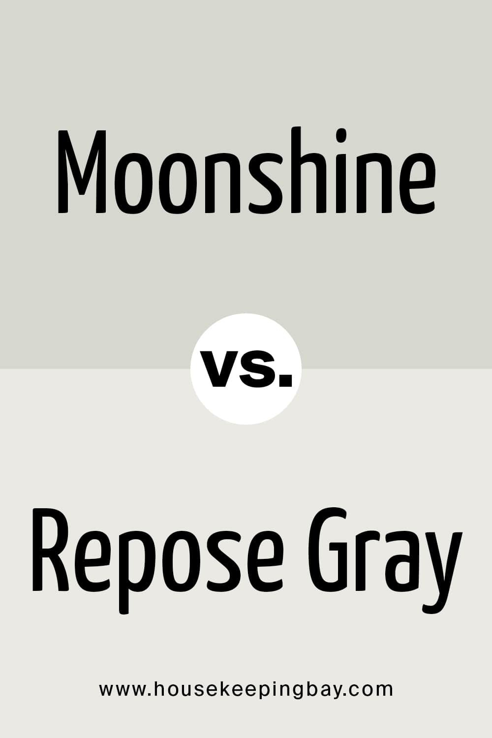
Moonshine vs. Repose Gray
BM Moonshine is much lighter in comparison with Repose Gray plus, Repose Gray has warmer undertones. The two colors look quite harmonious and balanced, but to use them together, you might want one more, more contrasting shade.
housekeepingbay.com
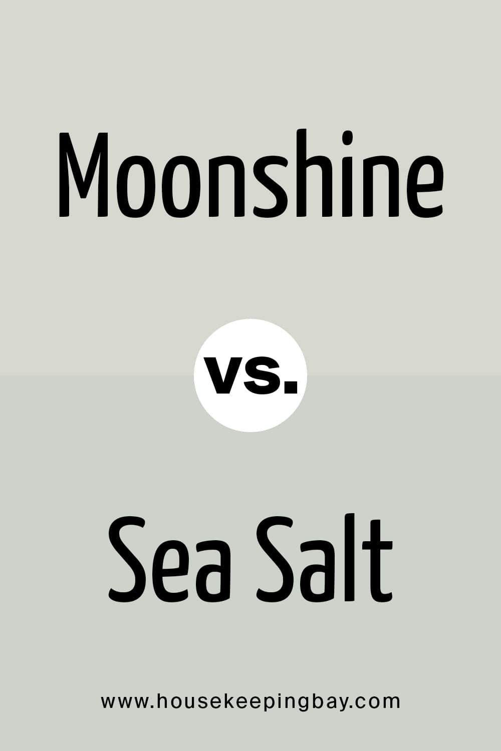
Moonshine vs. Sea Salt
BM Sea Salt basically has blue and gray undertones, which relates it a bit with the Moonshine color since it has blue and green undertones.
However, Sea Salt may also read slightly beige in a warmer light, whilst Moonshine will always remain cool-toned.
housekeepingbay.com
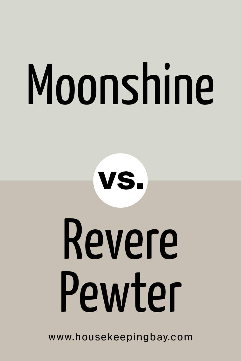
Moonshine vs. Revere Pewter
Revere Pewter has blue, purple/taupe, and green undertones, which makes it somewhat more complicated compared to Moonshine. Plus, if we compare them, we will see that Revere Pewter reads almost light-beige or greige with a greenish hue beside the Moonshine paint.
housekeepingbay.com
Where Moonshine OC-56 by Benjamin Moore Can Be Used?
In order to make the most out of paint color in your home, you need to consider in what rooms and spaces it will work better than in others.
This is why we are going to tell you where BM Moonshine paint color will be more suitable and look harmoniously in your living space.
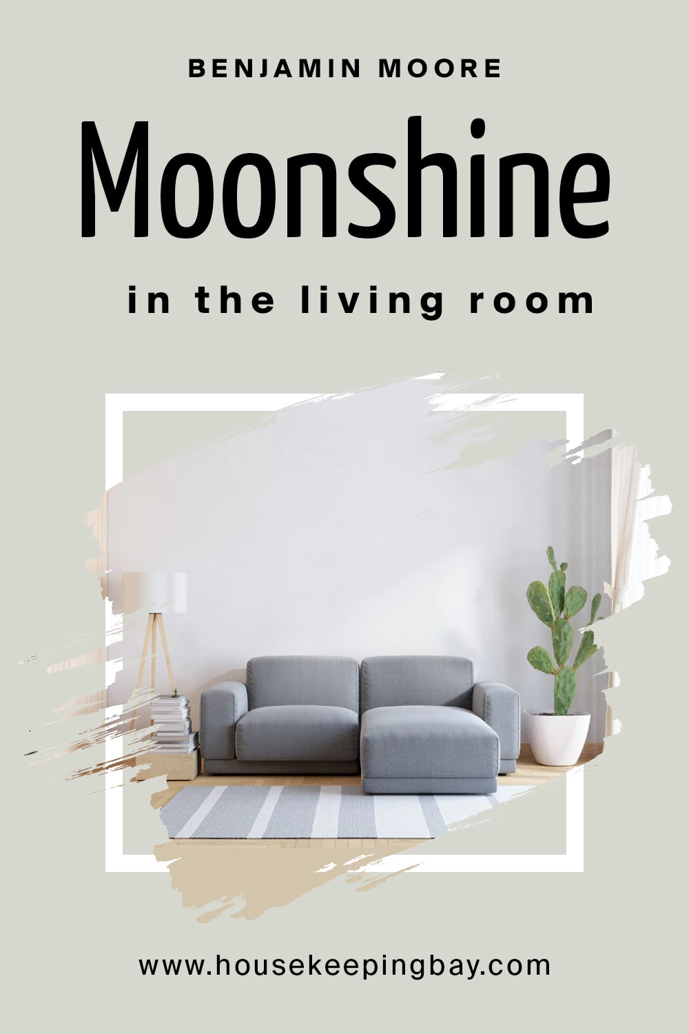
Moonshine OC-56 by Benjamin Moore in the Living Room
Benjamin Moore Moonshine is a perfect match for your living room as a neutral color. This delicate gray will create a calming and elegant atmosphere, as well as allow you to make use of use of bolder, more colorful decor pieces and furniture in the space.
housekeepingbay.com
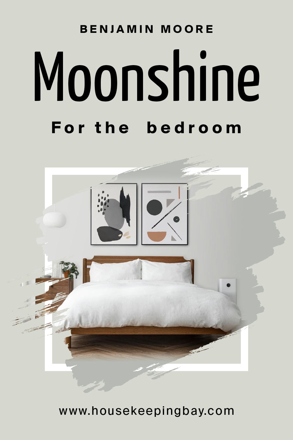
Moonshine OC-56 by Benjamin Moore for the Bedroom
For your bedroom, Benjamin Moore Moonshine is also a very good color. Since this color is neutral gray, it will work perfectly with other colors, allowing you to play with different color palettes!
Besides, since it is a relaxing and peaceful shade of gray, it will suit such a space as a bedroom ideally.
housekeepingbay.com
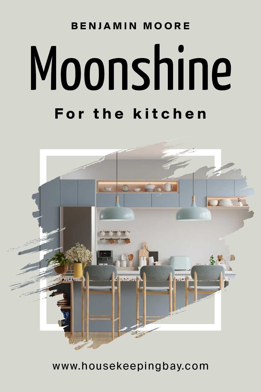
Moonshine OC-56 by Benjamin Moore for the Kitchen
If you prefer light-colored kitchens, consider using this color in yours. It can be paired with many other colors, including darker and more intense ones (blacks, etc.). So as a basic color on the walls, BM Moonshine will definitely fit any kitchen.
housekeepingbay.com
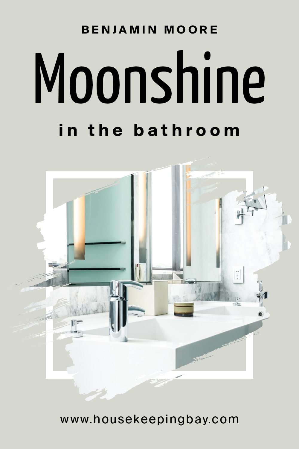
Moonshine OC-56 by Benjamin Moore in the Bathroom
To make your bathroom look more spacious, consider using Moonshine paint color on its walls. It will make the room look brighter and also, this neutral gray can easily be paired with many other colors. So you will not have to worry about finding matching shades for your towels or drawers!
housekeepingbay.com
Moonshine OC-56 by Benjamin Moore for the Exterior
Benjamin Moore Moonshine is pretty versatile, however, not versatile enough to be used as exterior paint. Why is that? See, in direct sunlight, it will most likely look pretty washed out. You will basically lose all sense of the color and it will end up looking white!

housekeepingbay.com
Now you have a complete understanding of the beautiful, delicate and sophisticated Moonshine gray color by Benjamin Moore brand.
Now you know what rooms it will work the best, what undertones and LRV it has, and what similar colors you can use instead.
With this and other information we shared today, you will be able to make this color work in your home much better.
housekeepingbay.com
Ever wished paint sampling was as easy as sticking a sticker? Guess what? Now it is! Discover Samplize's unique Peel & Stick samples. Get started now and say goodbye to the old messy way!
Get paint samples




Frequently Asked Questions
⭐Is BM Moonshine a greige color?
No, this paint color is gray that leans toward the cool tones more. Unlike greiges, it doesn’t have warm undertones.
⭐Will BM Moonshine be good for painting my garage?
Why not? This color is pretty versatile and has no restrictions regarding its interior or exterior use!
⭐Is Moonshine a part of the off-white color collection?
Yes, this color belongs to the off-whites that the brand offers.
4 thoughts on “Moonshine OC-56 by Benjamin Moore”
Leave a Reply





Does it make sense to paint my basement walls with Moonshine? The basement has one small window but there’s still not enoug light, so I’m afraid the color will look a bit, you know, “dirty” on the walls.
If I were you, I’d not hesitate. BM Moonshine is a good choice for basements! The color will come off on the cooler side and you might see more green and blue undertones. But the overall impression will be like of a cool-toned color, not “dirty”.
I want to repaint my house and I’m thinking about BM Moonshine now. Did anyone try it? How did it work on the exterior walls?
I didn’t try it but I saw houses painted with it. Honestly, it looks way too pale, as for me. In broad daylight and under the sun, it even seems white! I’d say, opt for something like SW Riverway: it’s bolder and can be used with lighter colors on trims, etc.