Nacre SW 6154 by Sherwin Williams
Embracing the Serene Sophistication
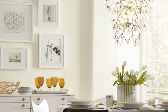
In the realm of interior design, selecting the perfect paint color can transform a simple space into a sanctuary. Among the vast palette available to homeowners and designers, “SW 6154 Nacre” by Sherwin Williams stands out as a beacon of warmth and elegance.
This article delves into the subtle charm of SW 6154 Nacre, a color that captures the essence of natural simplicity while radiating a sophisticated undertone.SW 6154 Nacre belongs to the white and off-white color family, renowned for its versatility and timeless appeal.
This shade, in particular, is inspired by the soft luster of pearls, exuding a serene and welcoming ambiance. It’s a color that balances brightness and warmth, making it an excellent choice for those aiming to create a cozy yet luminous space.
Whether you’re contemplating a serene bedroom, a vibrant living room, or a refreshing kitchen makeover, Nacre provides a solid foundation for a wide range of color schemes and decor styles.This article will explore SW 6154 Nacre in-depth, examining its color composition, ideal usage scenarios, and complementary colors.
Additionally, we’ll provide insights from design professionals on how to best incorporate Nacre into your home, alongside real-world examples that showcase its transformative potential. Join us as we uncover the beauty and versatility of SW 6154 Nacre, a paint color that truly embodies the phrase “simplicity is the ultimate sophistication.
via kind home solution
What Color Is Nacre SW 6154 by Sherwin Williams?
Nacre SW 6154 by Sherwin Williams is a remarkably versatile paint color that embodies a sense of calm and understated elegance. Posing as a warm neutral, it has a soft, creamy appearance that brings a light and airy feel to any space. The color Nacre finds its inspiration in the delicate iridescence of mother-of-pearl, suggesting a hint of opulence without overpowering. This subtle hue has a comforting quality, making it a perfect backdrop for a variety of interior styles.
Nacre SW 6154 thrives in interior designs that favor simplicity and natural elements. Its warm undertones make it an ideal choice for Scandinavian designs, where the focus is on minimalism and comfort. The color also lends itself beautifully to modern farmhouse aesthetics, complementing rustic textures and materials with its soft glow.
Additionally, Nacre can effortlessly enhance a coastal-inspired interior, reflecting the light and serene palette of the beach.
This color pairs exquisitely with a wide range of materials and textures, enhancing its versatility. Natural wood, from pale oak to rich walnut, sits in harmony alongside Nacre, emphasizing the depth and warmth of each. It also complements organic textures like linen, jute, and wool, adding to the tactile experience of a space.
For a touch of elegance, pairing Nacre with polished marble or brushed brass creates a refined contrast, making it perfect for spaces that seek a balance between comfort and sophistication.
In essence, Nacre SW 6154 by Sherwin Williams is more than just a paint color; it is a foundation for creating inviting spaces that feel both refined and effortlessly cozy.
housekeepingbay.com
Table of Contents
Is Nacre SW 6154 by Sherwin Williams Warm or Cool color?
Nacre SW 6154 by Sherwin-Williams is a nuanced paint color that embarks on a unique journey within the realms of interior design. This soft, warm neutral straddles the line between beige and gray, making it a perfect candidate for the increasingly popular greige family. Its understated elegance allows it to seamlessly blend into a variety of design aesthetics, from modern minimalist to cozy and traditional.
In homes, Nacre SW 6154 operates as an exceptional backdrop, enabling furnishings and decor to stand out. Its versatility in complementing natural light conditions during different times of the day adds a dynamic character to spaces.
In well-lit rooms, it can appear almost ethereal, enhancing the sense of spaciousness. Conversely, in areas with lesser light, it introduces warmth, creating inviting environments.
This color’s adaptability makes it ideal for walls, acting as a neutral foundation that encourages experimentations with bolder colors in accessories or furniture. Moreover, its calming nature promotes a serene atmosphere, making it an excellent choice for bedrooms and living areas.
By marrying the best of beige’s warmth with gray’s contemporary edge, Nacre SW 6154 offers a balanced palette that uplifts and transforms homes into harmonious sanctuaries.
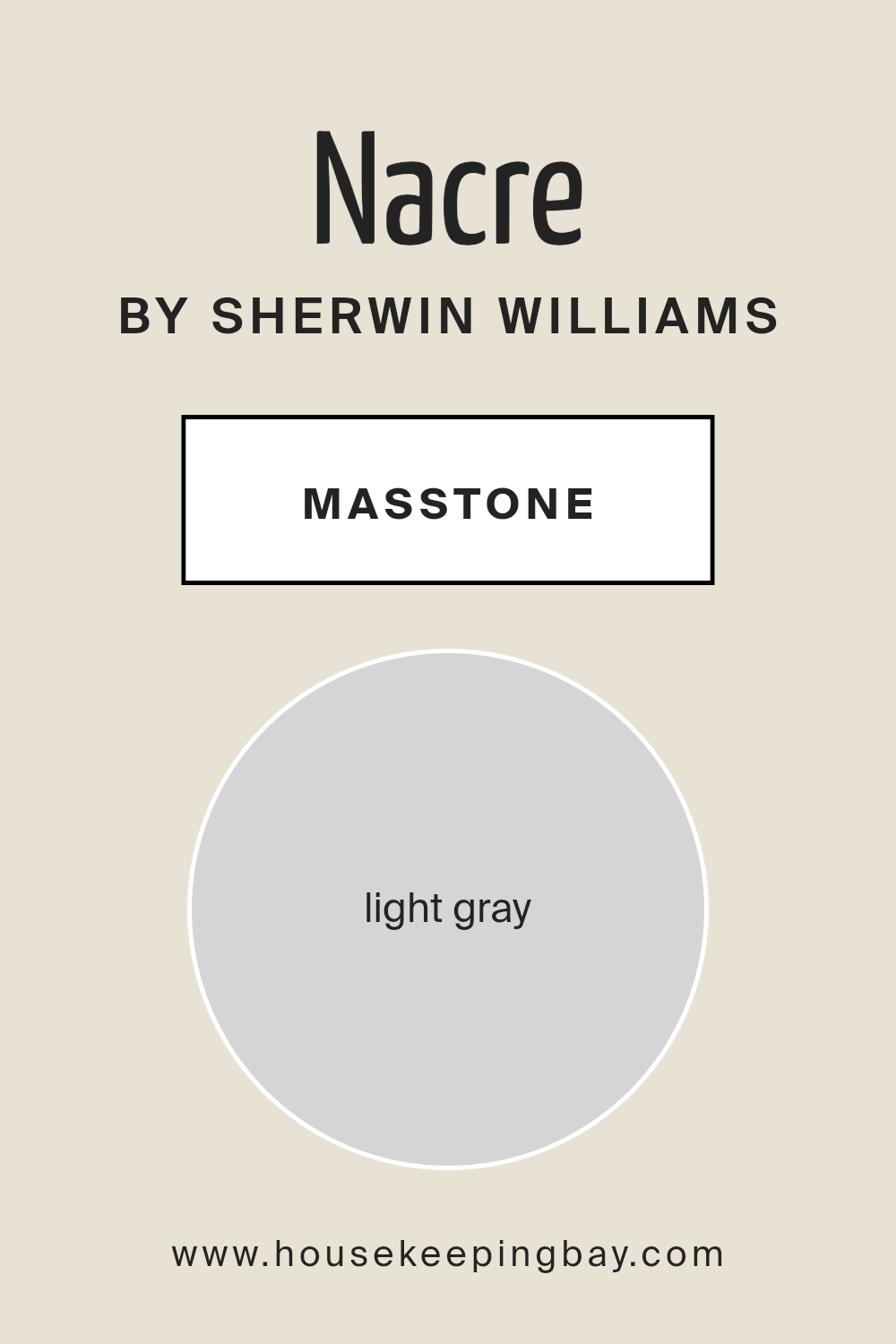
What is the Masstone of the Nacre SW 6154 by Sherwin Williams?
Nacre SW 6154 by Sherwin Williams, with its masstone of Light Gray (#D5D5D5), offers a serene and sophisticated palette for homes. This particular shade of gray is soft enough to act as a neutral backdrop, allowing for a wide range of complementary colors in furniture and accents.
Its lightness brings an airy, open feel to spaces, making rooms appear larger and more inviting. Unlike darker shades, Nacre SW 6154 reflects natural light beautifully, enhancing the brightness of the home during the day and adding a cozy glow when illuminated by indoor lighting at night.
This color’s versatility is one of its most admirable qualities; it suits various decor styles, from minimalist and modern to rustic and traditional. It has the ability to unify disparate elements within a space, providing a calm and cohesive look.
Moreover, Nacre SW 6154’s understated elegance lends itself well to walls, trim, and even cabinetry, making it a go-to choice for homeowners seeking a harmonious and timeless interior.
Its adaptability in complementing both warm and cool tones further elevates its utility, ensuring that spaces are not only beautiful but also imbued with a tranquil and welcoming atmosphere.
housekeepingbay.com
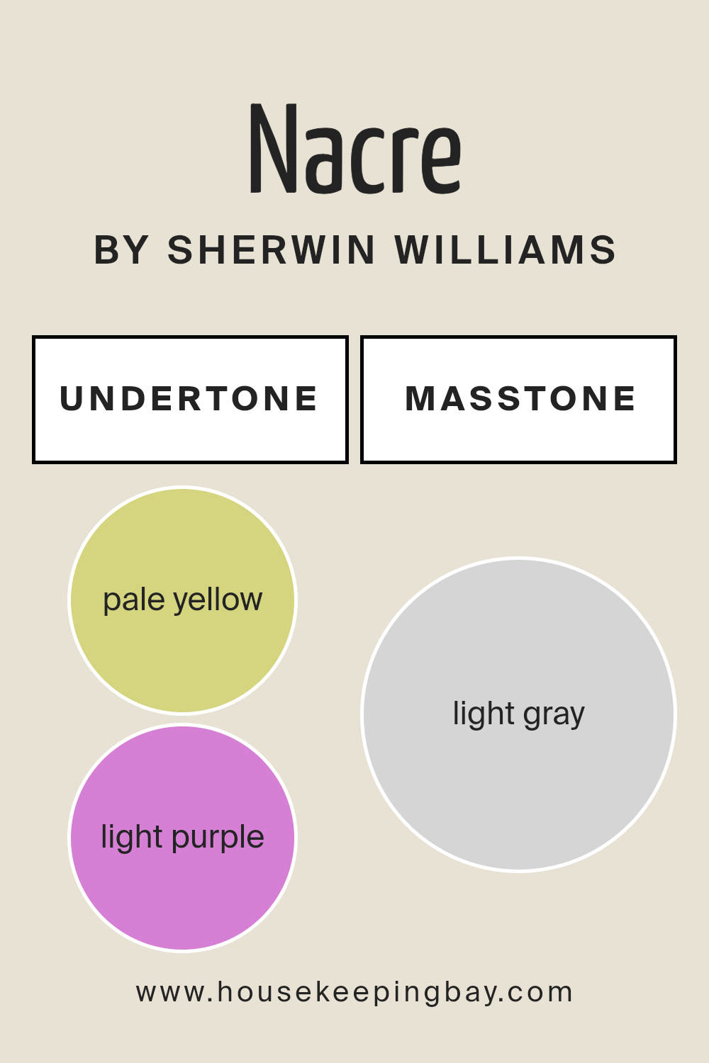
Undertones of Nacre SW 6154 by Sherwin Williams
Nacre SW 6154 by Sherwin Williams is a sophisticated, versatile shade that bridges the gap between a neutral palette and subtle, inviting warmth. While at first glance it boasts a serene and almost ethereal quality, the undertones of pale yellow (#D5D580) and light purple (#D580D5) introduce a layer of complexity and depth that elevate it beyond a simple off-white or beige. These undertones play a crucial role in the color’s perception, affecting the mood and atmosphere it creates in a space.
The pale yellow undertones bring a hint of sunshine and warmth, making spaces feel more inviting and cozy without the intensity of bolder yellows. On the other hand, the light purple undertones contribute to a sense of calm and sophistication, adding an almost aristocratic elegance to the shade.
Together, these undertones allow Nacre SW 6154 to adapt to various lighting conditions and color schemes, reflecting and absorbing light in ways that constantly transform the appearance of the walls it adorns.
When applied to interior walls, Nacre SW 6154 by Sherwin Williams impacts the space by harmonizing with both warm and cool decor elements, thanks to its balanced undertones. In natural sunlight, the pale yellow can make a room feel brighter and more energetic, while artificial lighting can draw out the light purple, adding a layer of tranquility and luxury.
This chameleon-like ability makes Nacre an excellent choice for living rooms, bedrooms, and even kitchens, where the interplay of its undertones with natural and artificial light can create a welcoming atmosphere at any time of the day.
housekeepingbay.com
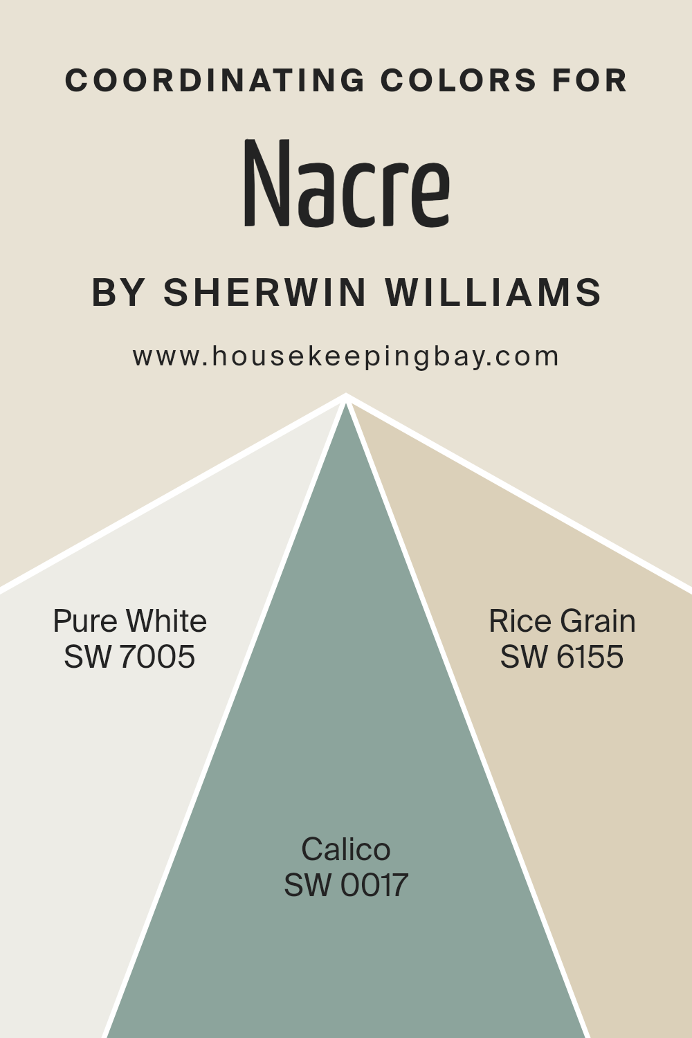
Coordinating Colors of Nacre SW 6154 by Sherwin Williams
Coordinating colors are selected hues that harmonize with a primary color to enhance the ambience of a space, contributing to a cohesive and appealing aesthetic. These colors, when wisely chosen, ensure that the main color, such as Nacre SW 6154 by Sherwin-Williams, stands out while maintaining a seamless blend with the surroundings. The purpose is to create a visually stimulating environment that is also soothing to the senses.
By selecting colors that coordinate well with Nacre, a soft, nurturing off-white shade, the goal is to capture a delicate balance between warmth and light, ensuring that spaces feel both open and inviting.
One of the coordinating colors, Pure White SW 7005, offers a crisp and clean canvas, embodying a sense of freshness that can brighten and enlarge a room by reflecting light. Its purity makes it an ideal backdrop, allowing other elements in the room to shine, including Nacre. Calico SW 0017, another collaborator, brings a subtle hint of earthy warmth.
This barely-there tan imbues spaces with a cozy and grounded feel, enriching the off-white qualities of Nacre without overwhelming the senses. Lastly, Rice Grain SW 6155, a color close in proximity to Nacre, introduces a slightly deeper, more saturated hue.
This choice adds depth and complexity, creating a harmonious gradient effect that enhances textures and shapes within a space. Together, these coordinating colors amplify the beauty of Nacre, enabling a design that feels both coordinated and effortlessly sophisticated.
You can see recommended paint colors below:
- SW 7005 Pure White
- SW 0017 Calico
- SW 6155 Rice Grain
housekeepingbay.com
How Does Lighting Affect Nacre SW 6154 by Sherwin Williams?
Lighting plays a crucial role in the perception of color. The way a color appears can significantly change under different lighting conditions due to the color temperature and intensity of the light source. Natural light, which varies depending on the time of day, weather, and direction of the sunlight, tends to reveal the truest hue of a color. Artificial light, on the other hand, can either warm up or cool down a color, depending on the bulbs used. Incandescent lights add warmth, enhancing reds and yellows, while fluorescent lights typically cast a cooler, bluish tone.
Nacre SW 6154 by Sherwin Williams is a versatile color that exemplifies how different lighting conditions can impact color perception. Nacre is a soft, warm neutral with undertones that can shift depending on the light it’s exposed to, making it a complex hue that adapts to its surroundings.
In natural light, Nacre’s true warmth and subtle undertones come forward, especially in south-facing rooms. South-facing light is warm and abundant all year round, brightening Nacre and making it appear more creamy and inviting. This welcoming hue can make south-facing rooms feel cozy and sunlit at all hours.
North-facing rooms receive less direct sunlight, casting cooler, more diffused light, which can make Nacre appear slightly more muted and cooler, emphasizing its gray undertones. However, its inherent warmth prevents it from feeling too cold, thus maintaining a neutral, balanced appearance.
In east-facing rooms, Nacre benefits from the warm, yellow light of morning sun, making the color appear softer and slightly brighter in the morning, then cooler and more neutral as the day progresses, since eastern light diminishes in the afternoon.
West-facing rooms offer the opposite experience; Nacre will display its more muted, neutral side in the morning when the light is cooler. As the sun sets in the west, the intense, warm light of the evening can make Nacre glow, enhancing its warm undertones and creating a cozy atmosphere.
Regardless of the room’s orientation, artificial lighting can be used to accentuate Nacre’s best characteristics. Warm, dimmable lights can mimic the soft glow of sunset, making Nacre appear inviting and homey, while cool LED lights can bring out its subtle neutral to cool undertones, offering a more contemporary look.
Understanding these nuances can help in selecting the right lighting to complement Nacre SW 6154, ensuring it adapts beautifully to its environment.
housekeepingbay.com
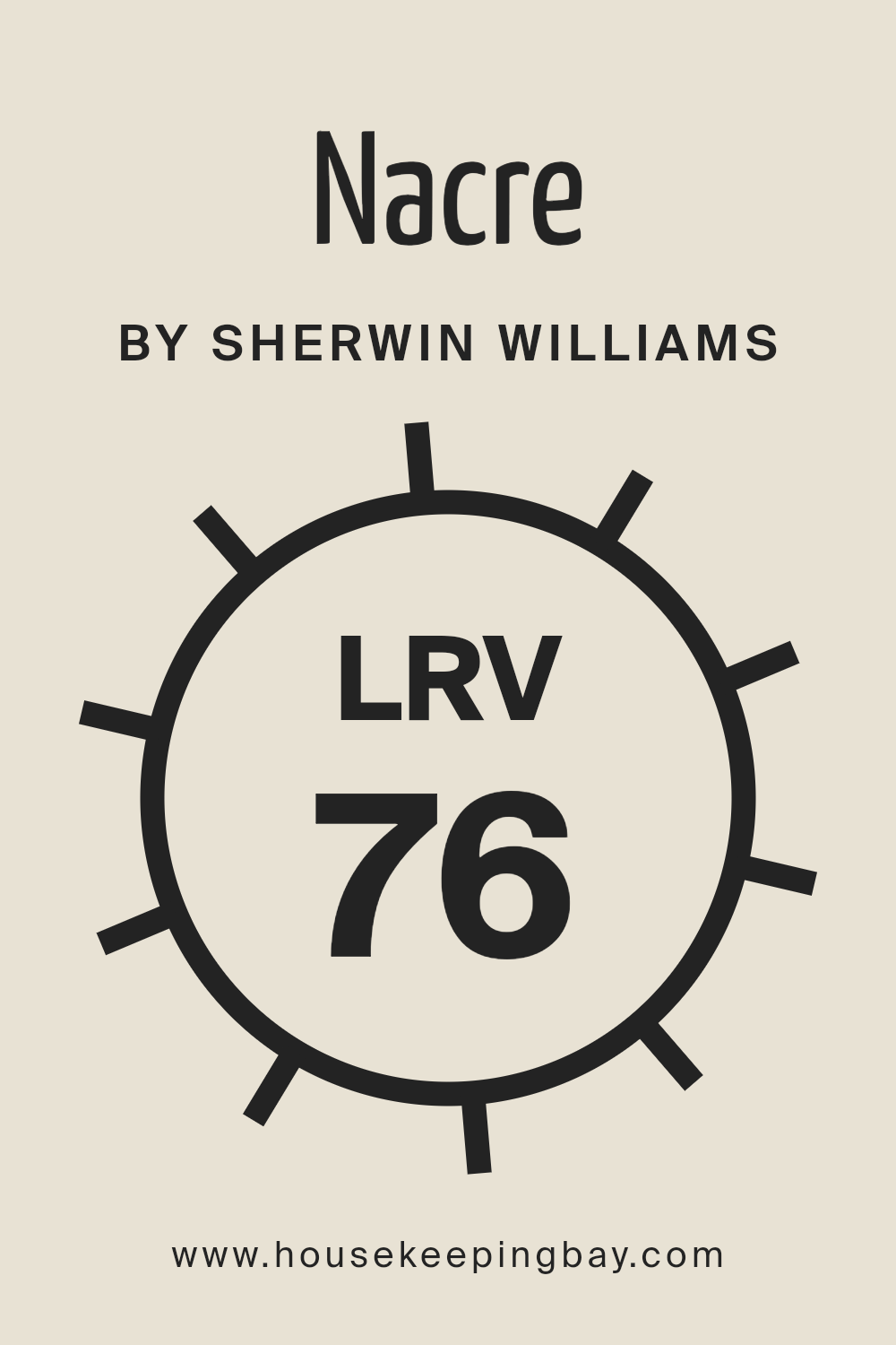
What is the LRV of Nacre SW 6154 by Sherwin Williams?
Light Reflectance Value (LRV) is an important parameter in the world of paint and design, quantifying the amount of visible and usable light that a paint color reflects or absorbs when applied to a surface. Measured on a scale from 0 to 100, LRV helps determine how light or dark a color will appear in a specific setting.
A value closer to 100 indicates that the color reflects more light and appears lighter, making it an excellent choice for brightening up spaces or making them appear larger. Conversely, colors with a lower LRV absorb more light, creating a cozier or more subdued atmosphere.
Understanding the LRV of paint colors can aid in making informed decisions to achieve desired ambiance and functionality in a space, especially in terms of enhancing natural light, energy efficiency, and visual comfort.
The LRV of Nacre (SW 6154) by Sherwin Williams, which stands at 76.416, signifies that it is a color with high light reflectance. This means that it has the ability to make spaces appear more open, airy, and well-lit, as it reflects a significant amount of light back into the room.
In practical terms, using Nacre on walls can help to maximize the perceived size of a room and enhance its brightness, making it an excellent choice for spaces that receive limited natural light or for areas where a light, calming atmosphere is desired. Additionally, the high LRV can contribute to reduced energy costs, as it may lessen the need for artificial lighting.
This particular color, with its soft and subtle tones, offers a versatile backdrop that can complement a wide range of decor styles, providing a soothing and welcoming environment.
housekeepingbay.com
What is LRV? Read It Before You Choose Your Ideal Paint Color
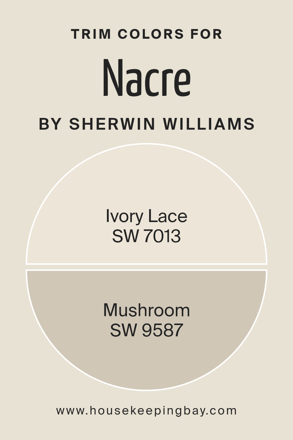
What are the Trim colors of Nacre SW 6154 by Sherwin Williams?
Trim colors, often selected for elements like door frames, window sashes, and baseboards, play a crucial role in defining the aesthetic and ambiance of a space. Strategically chosen trim colors can accentuate architectural details, create visual coherence, or introduce an element of contrast, thereby elevating the overall design scheme. For Nacre SW 6154 by Sherwin Williams, a warm, inviting neutral shade with an understated elegance, selecting the right trim colors is essential to complement its serene and welcoming vibe without overwhelming it.
Ivory Lace SW 7013, a soft, creamy hue, offers a subtle contrast that highlights the gentle warmth of Nacre SW 6154, enhancing its coziness while maintaining a light and airy feel. This choice is perfect for spaces aiming for a refined yet approachable look, bringing together elements in a harmonious blend.
Conversely, Mushroom SW 9587, with its earthy, deeper tone, grounds the airiness of Nacre SW 6154, adding depth and character to spaces. It serves as an excellent choice for creating a sophisticated palette that balances light with more substantial elements, ensuring a cohesive yet dynamic interior
Together, these trim colors not only complement Nacre SW 6154 but also contribute significantly to the overall design narrative, making them indispensable in achieving a desired aesthetic effect.
You can see recommended paint colors below:
housekeepingbay.com
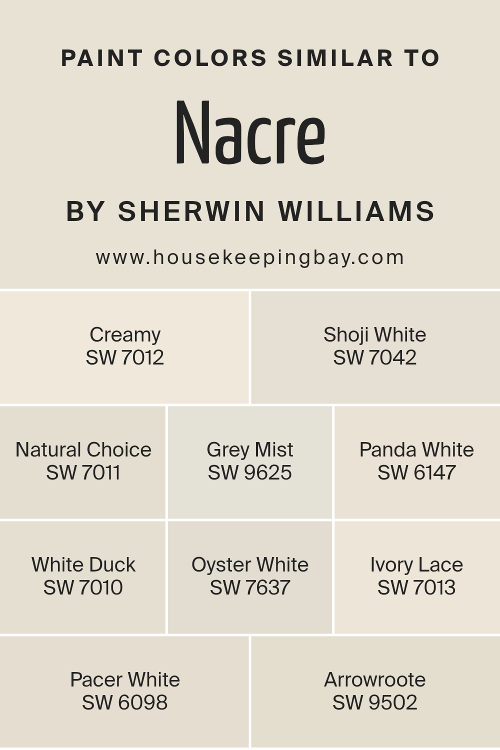
Colors Similar to Nacre SW 6154 by Sherwin Williams
Similar colors play a crucial role in interior design and painting, offering a seamless blend of hues that can enhance the aesthetic appeal of any space. When examining colors similar to Nacre SW 6154 by Sherwin Williams, such as Creamy SW 7012, Shoji White SW 7042, and Natural Choice SW 7011, among others, we find a cohesive palette that speaks to subtlety and versatility. These hues, ranging from the gentle whisper of Grey Mist SW 9625 to the soft, welcoming embrace of Panda White SW 6147, work together to create an atmosphere of calm and continuity.
White Duck SW 7010 and Oyster White SW 7637 further expand on this theme, offering a slightly denser touch that grounds the space, while Ivory Lace SW 7013 and Pacer White SW 6098 lend themselves to brightening and opening up a room without overwhelming it. Arrowroot SW 9502, with its unique charm, ties these elements together, emphasizing a connection to natural materials and textures.
Each color in this palette, while able to stand on its own, gains depth and complexity when combined with its counterparts.
Creamy SW 7012 brings a warm, inviting quality, akin to sunlight filtering through sheer curtains, while Shoji White SW 7042 offers a hint of gray that suggests a serene, contemplative space.
Natural Choice SW 7011 anchors the scheme with its earthy, grounded feeling, reminiscent of stone or soft clay, ensuring that the overall effect is one of balanced, effortless elegance.
Grey Mist SW 9625 and Panda White SW 6147 contribute to this narrative with their barely-there cool and warm undertones, respectively, providing a subtle backdrop that complements natural materials and textures.
Lastly, White Duck SW 7010, Oyster White SW 7637, Ivory Lace SW 7013, Pacer White SW 6098, and Arrowroot SW 9502 each add their layer of softness and nuanced color, creating a harmonious blend that enhances the sense of space and light in any interior design project.
You can see recommended paint colors below:
- SW 7012 Creamy
- SW 7042 Shoji White
- SW 7011 Natural Choice
- SW 9625 Grey Mist
- SW 6147 Panda White
- SW 7010 White Duck
- SW 7637 Oyster White
- SW 7013 Ivory Lace
- SW 6098 Pacer White
- SW 9502 Arrowroote
housekeepingbay.com
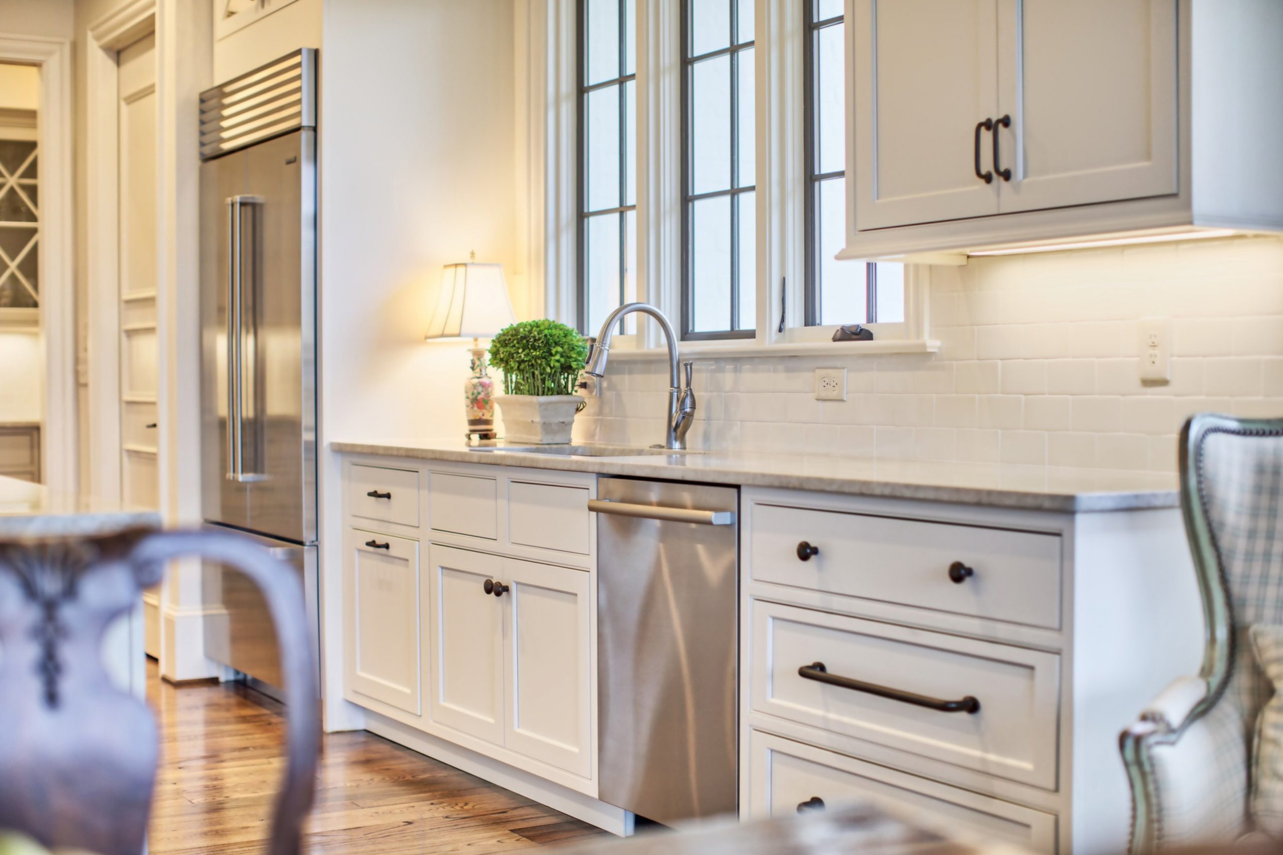
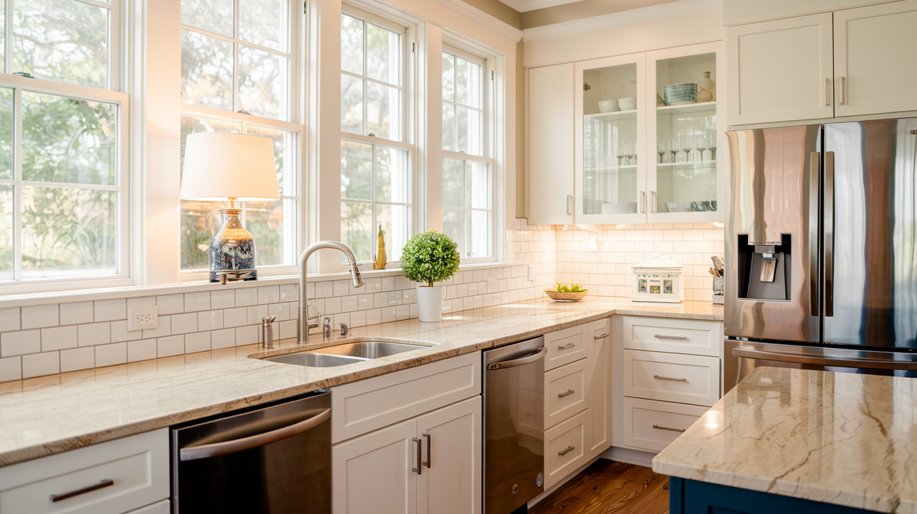
Nacre SW 6154 is it a good choice for the Kitchen?
In the kitchen, Nacre also holds up nicely, especially if you’re looking for something that feels fresh but not too bright. It adds warmth without feeling too yellow, and it works well with natural wood tones or white cabinetry. You can even add a few pops of color in the decor or backsplash to make the space more lively while still keeping that soft, neutral base.
@housekeepingbay
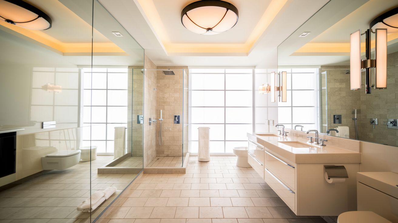
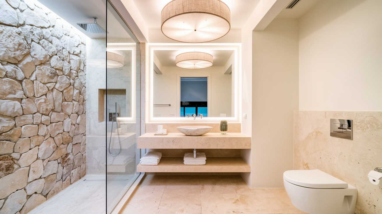
Nacre SW 6154 is it a good choice for the Bathroom?
Nacre SW 6154 can work really well in a bathroom. It’s a soft, warm neutral that gives a cozy and inviting feel without being overwhelming. The subtle beige undertone helps create a relaxing vibe, which is great when you want to wind down after a long day. Plus, it pairs nicely with both light and dark accents, so you can play around with towels, rugs, or decor to give the space some character.
housekeepingbay.com
housekeepingbay.com
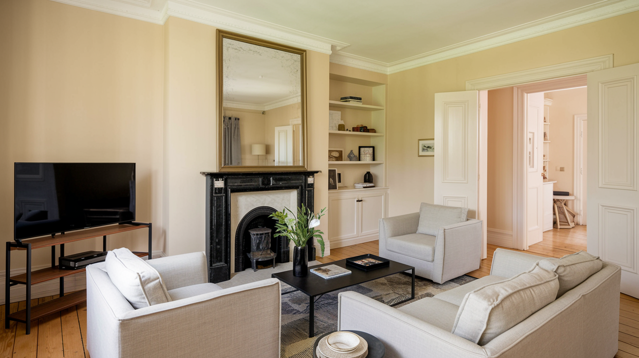
Nacre SW 6154 is it a good choice for the Living Roon?
For the living room, Nacre SW 6154 is a great option if you’re going for a soft, neutral backdrop that makes the room feel cozy and welcoming. It has enough warmth to keep the space from feeling too stark, but it’s still light enough to make the room feel airy and open. This color works beautifully with a range of furniture styles and textures, so whether you’re into modern or classic decor, it’ll fit right in.
It also pairs nicely with accent colors like soft blues or greens if you want to add some contrast without overwhelming the space. Overall, it’s a versatile and calming choice for a living room where you want to relax and enjoy time with family or friends.
housekeepingbay.com
How to Use Nacre SW 6154 by Sherwin Williams In Your Home?
Nacre SW 6154 by Sherwin Williams is a soft, warm neutral paint color that embodies coziness and sophistication in equal measure. This paint shade, evoking the smooth, pearlescent quality of its namesake, serves as a versatile backdrop for a wide range of home décor choices, adapting fluidly whether your style leans towards traditional, contemporary, or something uniquely personal.
Ideal for creating serene and inviting spaces, Nacre can be used in living rooms to foster a welcoming atmosphere or in bedrooms to craft a tranquil retreat. Its inherent warmth makes it a superb choice for north-facing rooms, counteracting the cool, natural light and infusing the space with a subtle glow.
Moreover, Nacre’s understated elegance allows for creative freedom with accent colors; it pairs beautifully with bold hues, grounding them without overshadowing, and complements softer tones for a harmonious palette. Homeowners can also extend its use to cabinetry or furniture, providing a chic, updated look without veering into stark modernity.
Ultimately, Nacre SW 6154 stands out as a timeless option, inviting homeowners to experience the soothing effect of a color designed to transform any space into a haven of comfort.
Nacre SW 6154 by Sherwin Williams vs Creamy SW 7012 by Sherwin Williams
Nacre SW 6154 by Sherwin-Williams and Creamy SW 7012 from the same brand offer subtle, warm nuances ideal for creating inviting spaces, yet each has its distinct personality. Nacre, taking inspiration from the inner layer of seashells, embodies a soft, muted beige with an almost imperceptible hint of pink. This color brings a serene, sophisticated vibe to a room, lending itself beautifully to a backdrop that allows other colors to stand out while still holding its own elegance.
On the other hand, Creamy SW 7012 lives up to its name with a buttery, warm off-white tone. It exudes a brighter, more luminous feel compared to Nacre, making spaces feel slightly more expansive and welcoming.
Creamy is perfect for those looking to imbue their surroundings with a gentle, cheerful lightness, offering a subtle richness without overwhelming the senses.
In comparison, while both colors invite warmth and light into a space, Nacre tends towards a nuanced, elegant palette with a hint of depth, whereas Creamy leans on the side of bright and spacious, offering a clean canvas for decoration.
You can see recommended paint color below:
housekeepingbay.com
Nacre SW 6154 by Sherwin Williams vs Natural Choice SW 7011 by Sherwin Williams
Nacre SW 6154 and Natural Choice SW 7011, both from Sherwin Williams, offer distinct, yet subtly different color experiences suitable for various design preferences. Nacre presents as a soft, serene beige with warm undertones, providing a comforting and inviting atmosphere. Its mild, creamy essence can illuminate rooms, making them feel more spacious and airy, while still maintaining a cozy vibe.
In contrast, Natural Choice leans towards a neutral, light greige – a blend of gray and beige – with slightly cooler undertones compared to Nacre. This color embodies versatility and sophistication, capable of offering a clean and contemporary look that complements a wide range of decor styles.
Choosing between them depends on the ambiance one wishes to create. Nacre, with its warmer, softer approach, exudes a traditional charm, ideal for creating a relaxed, homey feel. Natural Choice, on the other hand, offers a modern edge, its balance of beige and gray providing a neutral backdrop that adapts easily to different colors and textures within a space. Both paints promise to refresh and enhance interiors, albeit in their subtly unique ways.
You can see recommended paint color below:
housekeepingbay.com
Nacre SW 6154 by Sherwin Williams vs Grey Mist SW 9625 by Sherwin Williams
Nacre SW 6154 by Sherwin Williams and Grey Mist SW 9625 by Sherwin Williams are two distinct hues that cater to different aesthetic preferences and functions within interior spaces.
Nacre, sitting on the warmer end of the spectrum, is a soft, inviting beige with subtle undertones that can range from a creamy hue to a light, muted peach depending on the lighting. It exudes a comforting, serene vibe, making it a versatile choice for living areas, bedrooms, and spaces where a calm, welcoming atmosphere is desired.
On the other hand, Grey Mist is a cooler, more neutral grey that carries a light, airy quality. Its composition allows it to adapt beautifully in spaces that demand a contemporary, clean aesthetic, bringing a sense of balance and modernity. The grey in Grey Mist can also help other colors pop, making it an excellent choice for highlighting accent pieces or artworks.
In a direct comparison, Nacre offers warmth and a classic feel, ideal for creating a cozy retreat, while Grey Mist leans towards a sleek, minimalistic look that can make a space feel more open and refined. Both colors showcase Sherwin Williams’ ability to capture subtlety and sophistication but cater to different tastes and design objectives.
You can see recommended paint color below:
housekeepingbay.com
Nacre SW 6154 by Sherwin Williams vs Ivory Lace SW 7013 by Sherwin Williams
Nacre SW 6154 and Ivory Lace SW 7013, both by Sherwin Williams, offer distinctive yet harmonious palettes that can beautifully accentuate interior spaces with their nuanced tones. Nacre, taking inspiration from the inner layer of pearl shells, presents a soft, warm neutral with subtle beige undertones.
This color exudes a serene and inviting aura, making it perfect for spaces that aim for a cozy yet elegant ambiance. Its understated warmth lends itself to a wide array of decor styles, from modern minimalism to classic traditional.
On the other hand, Ivory Lace SW 7013 is a lighter, more delicate hue. Harking back to the gentle elegance of vintage lace, this color has a crisp, airy quality with a slight hint of yellow undertones, providing a touch of sunshine and openness to any room. Ivory Lace, with its soft and subtle approach, is ideal for creating a bright, refreshing environment. It’s especially suited to areas that aspire to a tranquil, uplifting feel.
While both colors share a base of understated elegance and versatility, Nacre’s depth provides warmth and sophistication, whereas Ivory Lace offers a brighter, more open and ethereal feel. Together, they could create a layered, nuanced interior, with Nacre grounding the space and Ivory Lace adding luminous accents.
You can see recommended paint color below:
housekeepingbay.com
Nacre SW 6154 by Sherwin Williams vs White Duck SW 7010 by Sherwin Williams
Nacre SW 6154 and White Duck SW 7010 by Sherwin Williams are both nuanced neutrals, each offering a distinct backdrop for interiors. Nacre, with its warm, creamy undertones, exudes a subtle richness that elevates spaces with a cozy and inviting vibe.
This color’s gentle warmth makes it versatile, seamlessly blending with a variety of decor styles and color palettes, from traditional to modern. It is particularly effective in rooms that aim for a soft, serene atmosphere without the starkness of pure white.
On the other hand, White Duck SW 7010 has a slightly cooler tone compared to Nacre, leaning towards a softer, greige (gray-beige) appearance. This color strikes a balance between warm and cool, making it incredibly adaptable and ideal for spaces that crave a neutral, but more defined, character. White Duck is impeccable for creating a minimalistic and airy ambiance, providing a clean slate without feeling cold.
Both colors celebrate neutral elegance but cater to different aesthetic preferences: Nacre for those desiring warmth and coziness, and White Duck for a clean, sophisticated neutrality with a hint of gray. Their subtle differences in tone and warmth make each uniquely suited for creating environments that resonate with individual tastes and styles.
You can see recommended paint color below:
housekeepingbay.com
Nacre SW 6154 by Sherwin Williams vs Arrowroote SW 9502 by Sherwin Williams
Nacre (SW 6154) and Arrowroot (SW 9502) by Sherwin Williams are two nuanced shades that gracefully inhabit different sections of the color spectrum. Nacre stands out as a delicate, warm neutral with a soft, inviting essence, reminiscent of the inner layers of a seashell. Its creamy undertone offers a sense of serenity and a subtle elegance, making it highly versatile for various settings, from cozy living spaces to serene bedrooms.
In contrast, Arrowroot (SW 9502) introduces a lighter, almost ethereal quality. This color whispers of sophistication and simplicity, carrying a more pronounced neutrality compared to Nacre.
Arrowroot’s understated charm lies in its ability to fuse slight gray hues with the faintest whisper of warmth, making it an excellent choice for creating a bright, airy feel in any space.
It reflects natural light beautifully, enhancing a room’s overall openness and tranquility.
Both colors offer unique aesthetic appeals – Nacre providing depth and warmth, Arrowroot offering lightness and calm. Each color, in its own right, can create mood and atmosphere that elevate a space to a new level of elegance and comfort.
You can see recommended paint color below:
housekeepingbay.com
Nacre SW 6154 by Sherwin Williams vs Shoji White SW 7042 by Sherwin Williams
Nacre SW 6154 and Shoji White SW 7042 by Sherwin Williams are both sophisticated hues, yet they bring distinct atmospheres to the spaces they inhabit. Nacre, drawing inspiration from the lustrous finish of pearls, offers a warm and inviting creamy beige tone. This color is versatile, creating a cozy and welcoming environment, making it suitable for living rooms, bedrooms, and even kitchens. It has the unique ability to blend with a variety of decor styles, from rustic to modern, adding a touch of elegance and subtlety.
On the other hand, Shoji White SW 7042 presents a lighter, more neutral palette. It is a soft white with warm undertones, avoiding the starkness associated with pure white. Shoji White is incredibly adaptive, capable of illuminating dark spaces and making small rooms appear more spacious.
It works beautifully in spaces that aim for a minimalist, airy feel, making it ideal for contemporary living spaces, bathrooms, and kitchens.
Although both colors share a subtle warmth, Nacre offers depth and coziness, while Shoji White provides a clean, expansive feel. Their unique qualities make them suitable for different applications, yet both can create serene and inviting spaces.
You can see recommended paint color below:
housekeepingbay.com
Nacre SW 6154 by Sherwin Williams vs Panda White SW 6147 by Sherwin Williams
Nacre SW 6154 and Panda White SW 6147, both from Sherwin Williams, exude subtle elegance, yet exhibit unique characteristics distinguishing one from the other. Nacre, taking cues from the iridescent sheen of pearls, offers a deeper, warmer appearance.
This hue, imbued with a soft, creamy undertone, brings a comforting, gentle layer of sophistication to spaces. It resonates with a sense of calm and can add depth to interiors, making it ideal for rooms seeking a cozy, inviting atmosphere without overwhelming with too much color.
On the flipside, Panda White leans towards a cooler spectrum compared to Nacre. While its name might suggest a stark contrast, Panda White is actually a soft, muted white with a slight gray undertone. This color embodies simplicity and versatility, offering a clean backdrop that enhances natural light in a room. It’s perfectly suited for minimalistic or modern spaces, where the aim is a fresh, airy feel.
Although both colors share a subtle elegance, their core lies in the warmth Nacre offers versus the crisp, clean essence of Panda White. Each serves distinct design needs, promoting either a warm, enveloping environment or a bright, open space.
You can see recommended paint color below:
housekeepingbay.com
Nacre SW 6154 by Sherwin Williams vs Pacer White SW 6098 by Sherwin Williams
Nacre SW 6154 and Pacer White SW 6098 are both colors by Sherwin Williams that offer nuances ideal for creating serene and welcoming spaces. Nacre, with its subdued, creamy warmth, leans towards a soft, off-white palette that encapsulates the essence of understated elegance. It’s a color that imbues a space with a gentle coziness, perfect for rooms aiming for a calm and inviting atmosphere. Its versatility allows it to blend seamlessly with a variety of décor styles, from modern minimalist to rustic charm.
Pacer White SW 6098, on the other hand, brings a slightly more pronounced warmth to spaces compared to Nacre. While still in the realm of neutrals, Pacer White has a deeper, richer tone that suggests a faint hint of beige or light taupe.
This color can add depth and warmth to spaces, making it ideal for those looking to create a cozy, yet sophisticated, ambiance. It works well in rooms that crave a touch of warmth without the intensity of a true color, maintaining a neutral but inviting palette.
Both Nacre and Pacer White are excellent choices for creating serene, welcoming environments. The primary difference lies in their undertones and depth of color—Nacre is lighter and cooler, offering a subtle, elegant backdrop, while Pacer White is warmer and richer, providing a more pronounced foundation that still retains a neutral versatility.
You can see recommended paint color below:
housekeepingbay.com
Nacre SW 6154 by Sherwin Williams vs Oyster White SW 7637 by Sherwin Williams
Nacre SW 6154 and Oyster White SW 7637 by Sherwin Williams are two nuanced and sophisticated colors that, while similar at first glance, have distinct characteristics that set them apart. Nacre, borrowing its name from the lustrous substance forming the inner layer of a mollusk shell, exudes a warm and inviting undertone.
It carries a creamy softness, making spaces feel cozy yet bright, ideal for creating a serene and welcoming ambiance in any room. This hue embodies a hint of richness that allows it to stand out subtly against a neutral palette.
On the other hand, Oyster White SW 7637 leans towards a cooler spectrum, mirroring the shade found on the exterior of oyster shells. It’s a refined, muted off-white with gray undertones, providing a sleek and contemporary aesthetic. Oyster White serves well in spaces aiming for a minimalist and understated elegance, offering a clean and crisp backdrop that pairs effortlessly with a wide range of decor styles.
While both colors inspire a sense of calm and sophistication, Nacre imparts a warmer, more enveloping feel, whereas Oyster White offers a fresh, airy, and modern vibe. Choosing between them would depend on the desired mood and the specific design goals for the space.
You can see recommended paint color below:
housekeepingbay.com
Conclusion
Concluding, Nacre SW 6154 by Sherwin Williams emerges as a captivating color choice for those seeking subtlety and sophistication in their interior spaces.
Its inherent warmth and soothing nuances translate into a versatile backdrop that complements a wide array of design styles, from contemporary to traditional. Nacre’s ability to beautifully interact with both natural and artificial light further elevates its appeal, making it a favored option for creating serene and inviting environments.
Its adaptability in pairing with various textures and materials underscores its role as a foundational hue that can anchor a room while also acting as a neutral canvas for bolder design elements.Beyond its aesthetic versatility, Nacre SW 6154 also embodies a sense of tranquility and comfort, making it an ideal choice for those wishing to curate spaces that serve as calming retreats from the bustle of daily life.
Whether applied in living areas, bedrooms, or spaces dedicated to relaxation and reflection, Nacre’s gentle presence offers a timeless elegance that speaks to a refined taste.
Its capacity to foster a harmonious atmosphere while providing a subtle depth to interiors cements its status as a distinguished selection within Sherwin Williams’ palette, promising enduring appeal and welcoming warmth to any home.
housekeepingbay.com
Ever wished paint sampling was as easy as sticking a sticker? Guess what? Now it is! Discover Samplize's unique Peel & Stick samples. Get started now and say goodbye to the old messy way!
Get paint samples