Summit Gray SW 7669 by Sherwin Williams
Elevating Elegance with Subtle Grays
If you’re setting out to transform a room or give your space a fresh coat of personality, SW 7669 Summit Gray by Sherwin Williams should be at the top of your consideration list. This particular shade of gray offers a unique blend of warmth and neutrality, making it incredibly versatile for any room in your house.
Whether you’re aiming to create a cozy bedroom retreat, a welcoming living room, or an elegant dining area, Summit Gray has the potential to elevate your decor with its sophisticated yet approachable vibe.
Choosing the right color can often feel overwhelming with so many options available, but Summit Gray strikes a perfect balance, ensuring your space feels both stylish and comfortable. It pairs wonderfully with a wide range of colors, from soft pastels to bold hues, giving you the freedom to express your personal style while maintaining a harmonious atmosphere.
This color can also serve as a balanced backdrop for various textures and finishes, allowing your furniture and decor to truly shine.
As you consider updating your space, keep in mind how different lighting conditions throughout the day can affect the perception of color on your walls. Summit Gray has the remarkable ability to adapt, presenting subtle nuances that add depth and interest to your room at any hour.
Whether you’re looking to create a statement or establish a calming sanctuary, Summit Gray by Sherwin Williams could be the perfect starting point for your next home project.
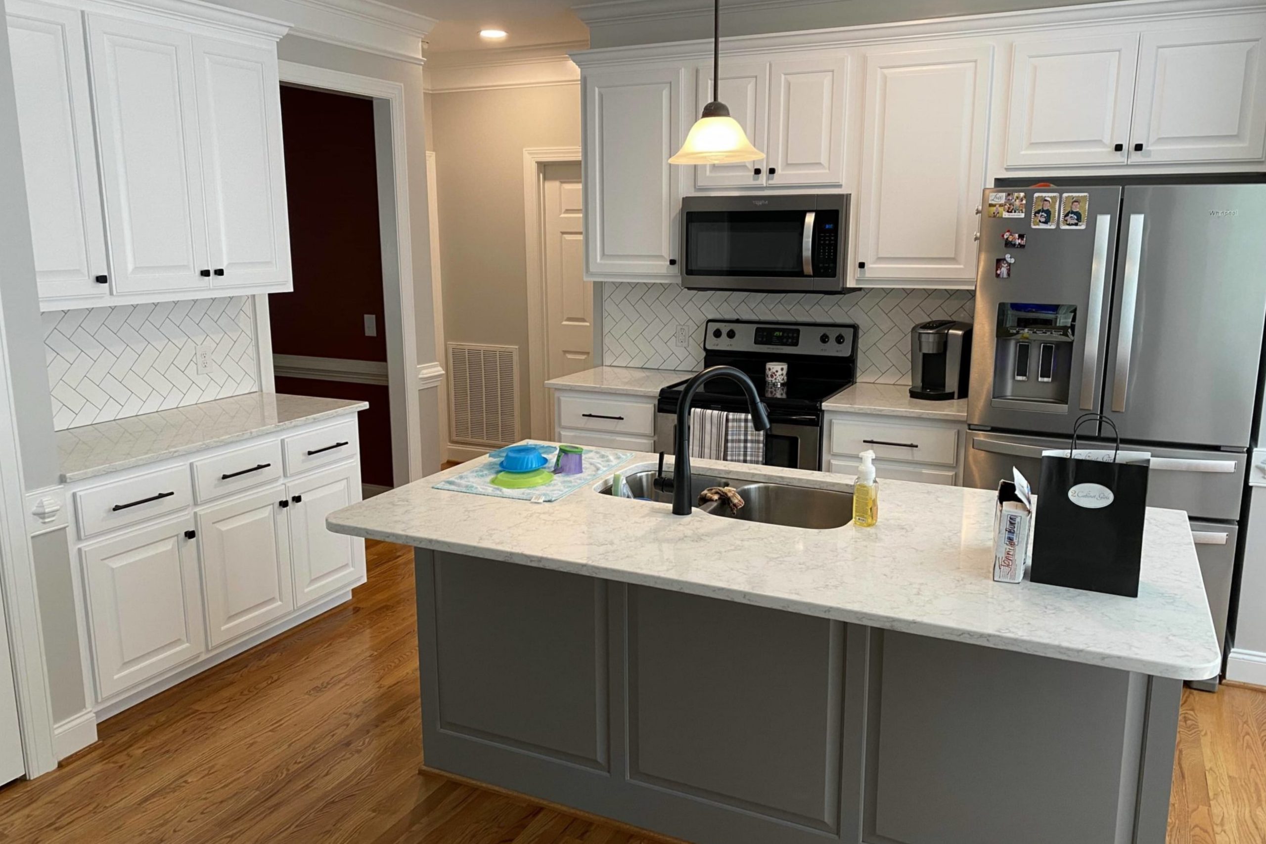
via 2cabinetgirls.com
What Color Is Summit Gray SW 7669 by Sherwin Williams?
Summit Gray SW 7669 by Sherwin Williams is a rich, complex gray that manages to assert a feeling of calm and sophistication in any space it adorns. This particular shade of gray strikes a perfect balance between warm and cool tones, making it incredibly versatile and adaptable to various interior designs and styles. The depth of this color ensures that it stands out, providing a subtle yet definite statement in any room.
Summit Gray works exceptionally well in modern and contemporary interiors, thanks to its clean, chic vibe. However, its timeless quality means it can also easily fit within traditional settings, lending them an updated, modern twist. This color excels in environments where the goal is to create a serene, thoughtful space.
It’s perfect for living rooms, bedrooms, and home offices where the interplay of light and shadow can be utilized to enhance its hue.
When it comes to pairing materials and textures, Summit Gray is notably accommodating. It pairs beautifully with natural wood, from light oaks to dark walnuts, highlighting the warmth of the wood. Metallic accents in silver, gold, or bronze can introduce a touch of luxury and elegance, while white trim or soft, light fabrics can offer a crisp, fresh contrast that elevates the overall look.
Textured fabrics like wool or linen in complementary or contrasting colors also work well, adding depth and interest to the decor. This color’s adaptability and depth make it an excellent choice for anyone looking to create a space that feels both grounded and emanating with subtle sophistication.

housekeepingbay.com
Is Summit Gray SW 7669 by Sherwin Williams Warm or Cool color?
Summit Gray SW 7669 by Sherwin Williams is a unique and versatile paint color that can make a big difference in any home. This gray has a balanced mix that feels just right—not too dark and not too light. It’s like the perfect middle ground for those who want a modern yet cozy vibe in their spaces.
People love using Summit Gray in various rooms because it works well with so many different decor styles and colors.
Whether you’re going for a sleek, minimalist look or something more warm and inviting, this shade of gray has the power to tie everything together nicely. It’s especially good for living rooms and bedrooms where you want a calm and relaxing atmosphere. Plus, it can help make small rooms look a bit bigger and more open, thanks to its ability to reflect light nicely.
Overall, Summit Gray SW 7669 is a great choice if you’re looking to refresh your home with a color that’s both stylish and easy to live with.
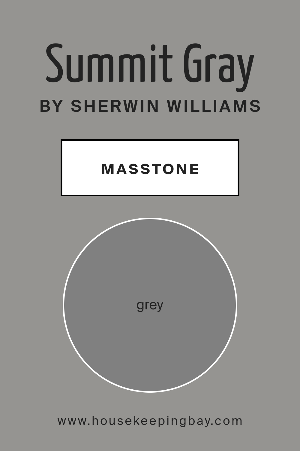
What is the Masstone of the Summit Gray SW 7669 by Sherwin Williams?
Summit Gray SW 7669 by Sherwin Williams is a unique shade of gray that really makes spaces feel special. Its masstone, which is the main color you see, is a true gray, similar to the color you might think of when you hear “gray” (#808080). This particular shade of gray is versatile and works great in all sorts of homes.
Because it’s a true gray, Summit Gray doesn’t lean too warm or too cool, making it a perfect choice for any room, no matter the lighting or the other colors in the space. It’s like a chameleon that can fit in anywhere, from the living room to the bedroom, and even in kitchens and bathrooms.
This color brings a sense of calm and elegance to a space, making it feel both cozy and stylish at the same time.
Whether your home has a modern look, a rustic vibe, or anything in between, Summit Gray can really tie a room together. It’s a color that works hard in the background, allowing your furniture and decor to shine, while also adding a touch of sophistication to the atmosphere.
housekeepingbay.com
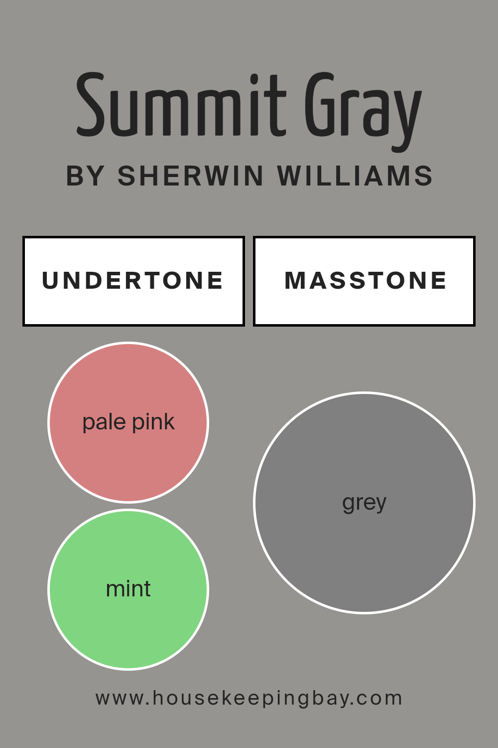
Undertones of Summit Gray SW 7669 by Sherwin Williams
Summit Gray SW 7669 by Sherwin Williams is a versatile color with complex undertones, making it unique and appealing for interior walls. The undertones in a paint color are like silent whispers of other colors that can change how the main color looks under different lighting or when paired with furniture and decor.
For Summit Gray, these undertones include a wide spectrum from pale pink to dark grey, including mint, lilac, and olive, among others.
These subtle colors mixed into Summit Gray affect how we see it in a room. For instance, in a well-lit space with lots of natural light, you might notice the lighter undertones like pale yellow or light blue, giving the room a fresh and airy feel. In a room with less light, the darker undertones, like dark green or navy, might stand out more, giving the space a cozier atmosphere.
The presence of such a variety of undertones means Summit Gray can complement many different color schemes and styles. For example, its olive and brown undertones can enhance natural wood elements, making them warmer.
The lilac or light purple undertones could pair well with soft textiles, adding a subtle hint of color to a neutral room without overwhelming it.
Overall, the numerous undertones in Summit Gray SW 7669 offer a lot of flexibility in interior design. This paint can adapt to many settings, moods, and personal tastes, making your walls look more engaging and thoughtfully designed.
Whether your home has modern, traditional, or eclectic decor, Summit Gray can align smoothly with your vision, bringing depth and character to your walls.
housekeepingbay.com
Coordinating Colors of Summit Gray SW 7669 by Sherwin Williams
Coordinating colors are hues that complement each other when used together in a design or palette, creating a cohesive and attractive look. When we say a color coordinates with another, it means they share a harmony that can enhance the overall aesthetic of a space.
They can be contrasting colors that offer a bold look or similar tones that provide a subtle and refined appearance. The key is how these colors balance each other out and bring a sense of unity to the design.
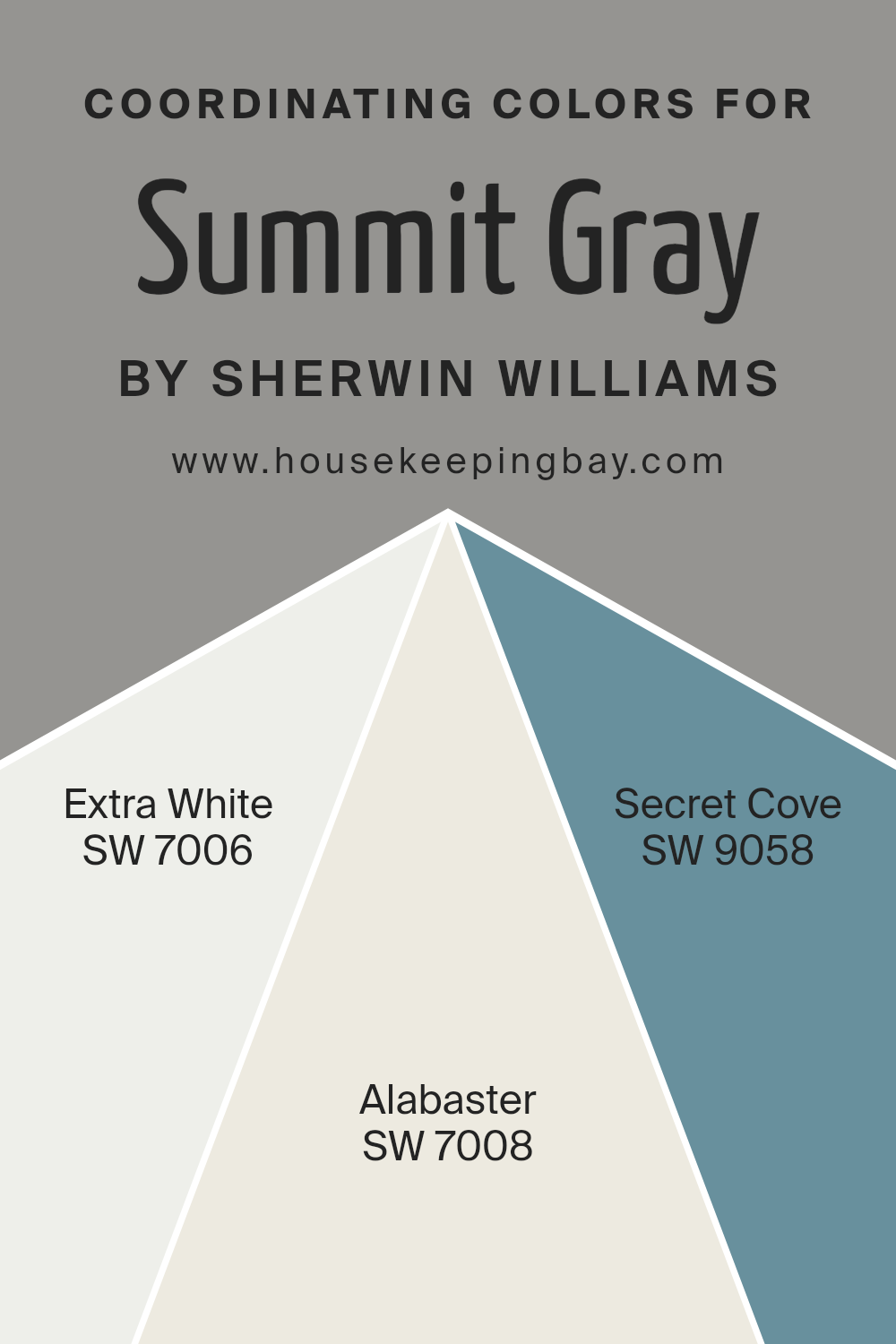
Take, for example, the color Summit Gray SW 7669 by Sherwin Williams. This is a sophisticated gray that serves as a versatile base, capable of supporting a range of coordinating colors such as SW 7006 – Extra White, SW 7008 – Alabaster, and SW 9058 – Secret Cove. Extra White is a clean and crisp white, offering a fresh contrast that can make darker colors like Summit Gray pop while giving a sense of spaciousness.
Alabaster is a warm, soft white with a hint of beige, providing a gentle and inviting contrast to cooler tones like Summit Gray, thus creating a serene and comfortable environment. Secret Cove, on the other hand, is a deeper hue that complements the neutrality of Summit Gray with its subtle complexity, adding depth and interest to the palette.
Together, these colors work harmoniously to enhance the beauty and balance of interior or exterior spaces.
You can see recommended paint colors below:
- SW 7006 Extra White
- SW 7008 Alabaster
- SW 9058 Secret Cove
housekeepingbay.com
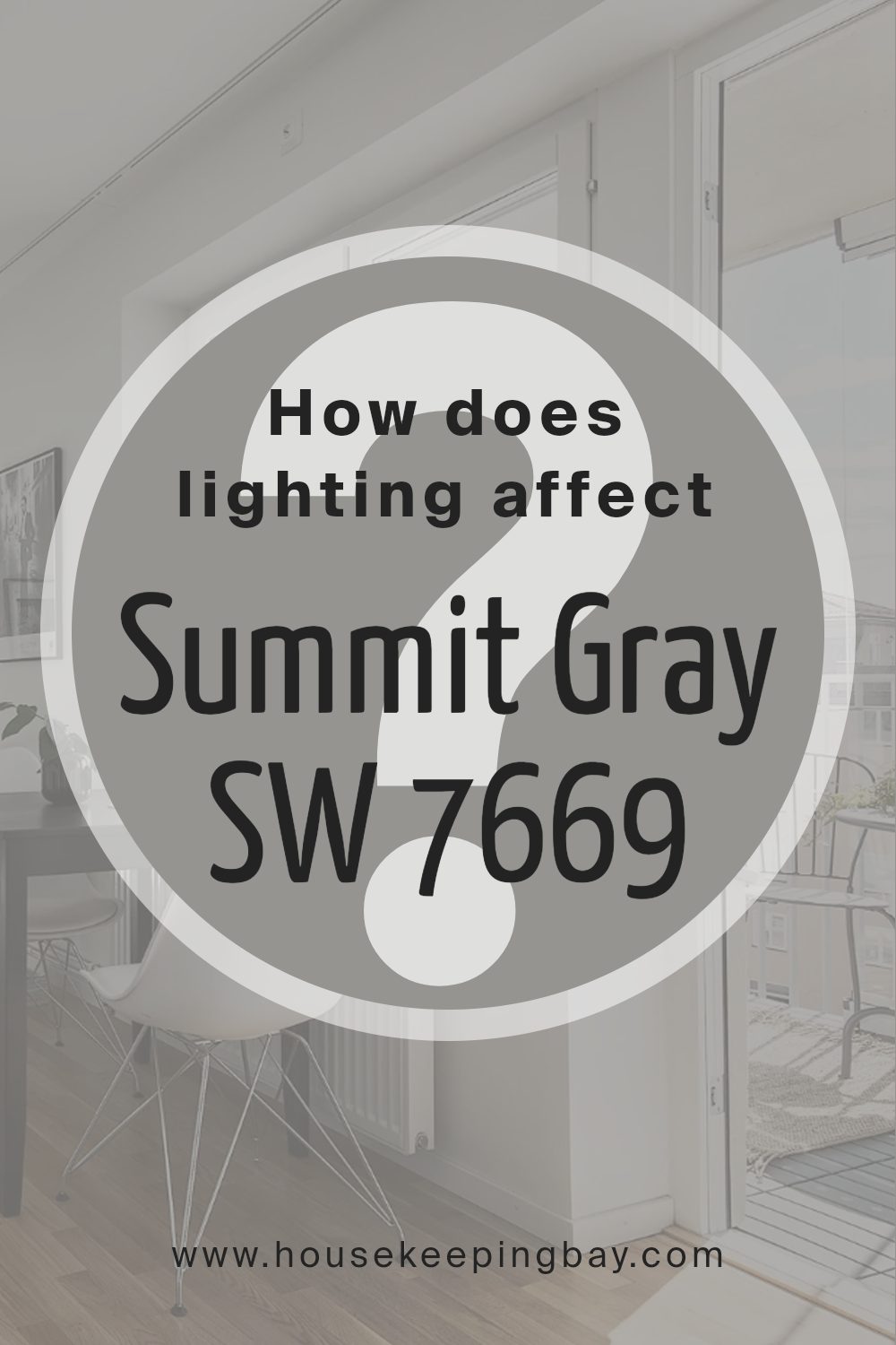
How Does Lighting Affect Summit Gray SW 7669 by Sherwin Williams?
Lighting plays a crucial role in how we perceive colors. It can make a color look vibrant or dull, warm or cool. When it comes to Summit Gray SW 7669 by Sherwin Williams, lighting can significantly impact its appearance, whether it’s in natural or artificial light.
In natural light, the true color of Summit Gray comes alive. However, the direction of the room can change its shade. North-facing rooms get less direct sunlight, which can make Summit Gray appear cooler and slightly more shadowy, emphasizing its elegant gray tones. Without the warmth of direct sunlight, the color might seem a bit more reserved but still very sophisticated.
South-facing rooms, on the other hand, get a lot of natural light throughout the day. This exposure can warm up Summit Gray, making it look lighter and more inviting. The warm light enhances the color, making the room feel cozy and lively.
East-facing rooms enjoy bright light in the morning and softer light as the day progresses. Summit Gray in an east-facing room will look warmly welcoming in the morning light, with a brighter, crisper feel. As the day goes on and the light softens, the color will appear more muted, maintaining a serene and calm ambiance.
In west-facing rooms, the situation flips. The color starts more muted during the morning and gets brighter and warmer in the afternoon and evening as the sun sets. This shift can make Summit Gray shift from a neutral, calm gray in the morning to a more dynamic and warmer hue in the golden afternoon and evening light.
Artificial light also influences how Summit Gray is perceived. Warm-toned lights can make it appear more inviting and cozier, pulling out the warmer undertones of the gray. Cooler-toned lights will emphasize the color’s cooler, more formal qualities, making it seem more modern and crisp.
The beauty of Summit Gray lies in its versatility under different lighting conditions, adapting and shifting to offer varying experiences of comfort, elegance, and tranquility throughout the day and in different room orientations.
housekeepingbay.com
What is the LRV of Summit Gray SW 7669 by Sherwin Williams?
This number helps you understand how bright or how dark a color will look in a space. The higher the LRV, the lighter the color appears, making a room feel more open and airy. Conversely, a lower LRV means the color is darker and might make a space feel cozier or smaller, but it can also add dramatic flair or warmth to a room.
For Summit Gray SW 7669 by Sherwin Williams, which has an LRV of 29.556, it’s on the darker side of the scale. This means it won’t reflect a lot of light back into the room. When used on walls, Summit Gray will give the space a more intimate and enclosed feel because of its lower LRV.
This color can add depth and character to larger spaces, making them feel more inviting.
However, in smaller rooms or in areas that already struggle with natural light, using a color with this LRV might make the space feel even smaller or darker. It’s crucial to consider how much natural or artificial light your room gets before deciding on using a color like Summit Gray.

housekeepingbay.com
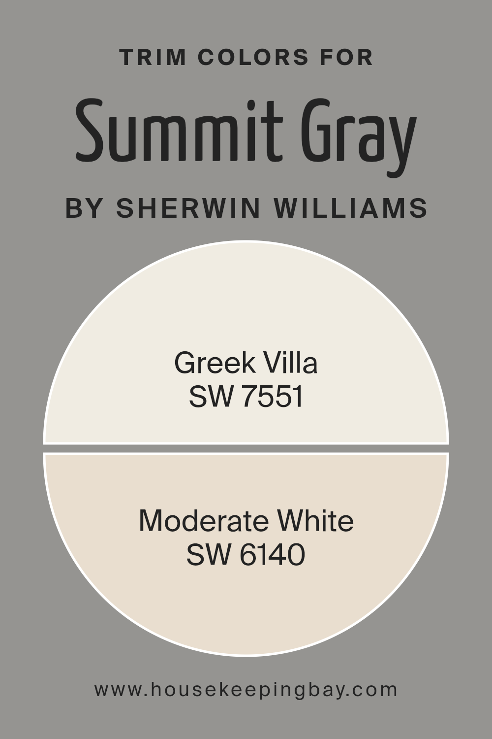
What are the Trim colors of Summit Gray SW 7669 by Sherwin Williams?
Trim colors are the hues used for the detailing of a building or room, like baseboards, window frames, and door frames. They play a crucial role in interior and exterior design by accenting or contrasting the main color of the walls, which in this case is Summit Gray SW 7669 by Sherwin Williams.
These trim colors can either enhance the sophisticated tone set by Summit Gray or softly blend with it, guiding the overall aesthetic towards a coherent and appealing look. Choosing the right trim color can elevate the visual appeal of the space, drawing attention to architectural details and creating a polished finish.
Using SW 7551 – Greek Villa as a trim color introduces a soft, warm white with creamy undertones that can brighten the space when paired with Summit Gray, offering a delicate contrast that is both welcoming and vibrant. On the other hand, SW 6140 – Moderate White, with its balanced blend of warm and cool tones, complements the deeper hues of Summit Gray in a way that’s subtle yet impactful.
This particular shade gently harmonizes with the gray, ensuring the transition between wall and trim is smooth and pleasing to the eye. Both color choices are aimed to enhance the base color, ensuring a refined and inviting space.
You can see recommended paint colors below:
housekeepingbay.com
Colors Similar to Summit Gray SW 7669 by Sherwin Williams
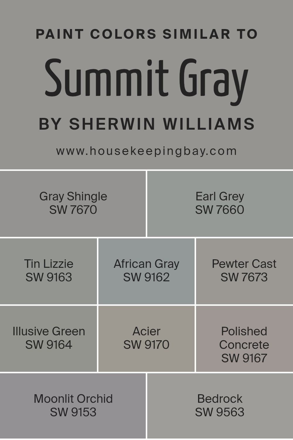
Similar colors play an integral role in design and decor, creating a harmonious and balanced aesthetic. Take, for instance, the shades closely related to Summit Gray SW 7669 by Sherwin Williams. These colors, while unique, share a common thread that ties them seamlessly together, enhancing cohesive visual flow in any space.
Starting with Gray Shingle SW 7670, it presents a light, airy feel that’s both crisp and soft, perfect for creating a serene backdrop. Earl Grey SW 7660, on the other hand, brings a stronger, more defined gray tone that adds depth and sophistication.
Tin Lizzie SW 9163 leans into the cooler spectrum, offering a sleek, modern vibe, whereas African Gray SW 9162 provides a warmer, more inviting undertone, excellent for adding subtle warmth. Pewter Cast SW 7673 injects a hint of metallic flair without overwhelming, creating a refined yet understated elegance.
Illusive Green SW 9164, with its gray undertones, introduces a touch of nature, blending indoor spaces with the outdoors seamlessly. Acier SW 9170 offers a bold, striking gray that anchors spaces with its strong presence. Polished Concrete SW 9167 encapsulates urban chic, reflecting the beauty of industrial materials.
Moonlit Orchid SW 9153 subtly shifts towards a soft, romantic violet hue, enriching spaces with a touch of whimsy. Finally, Bedrock SW 9563 grounds the palette with its earthy, solid foundation, reminding one of natural stone elements. Each color, while reflecting individual qualities, complements and enhances the collective beauty of the group, illustrating the power of similar hues in design.
You can see recommended paint colors below:
- SW 7670 Gray Shingle
- SW 7660 Earl Grey
- SW 9163 Tin Lizzie
- SW 9162 African Gray
- SW 7673 Pewter Cast
- SW 9164 Illusive Green
- SW 9170 Acier
- SW 9167 Polished Concrete
- SW 9153 Moonlit Orchid
- SW 9563 Bedrock
housekeepingbay.com
Colors that Go With Summit Gray SW 7669 by Sherwin Williams
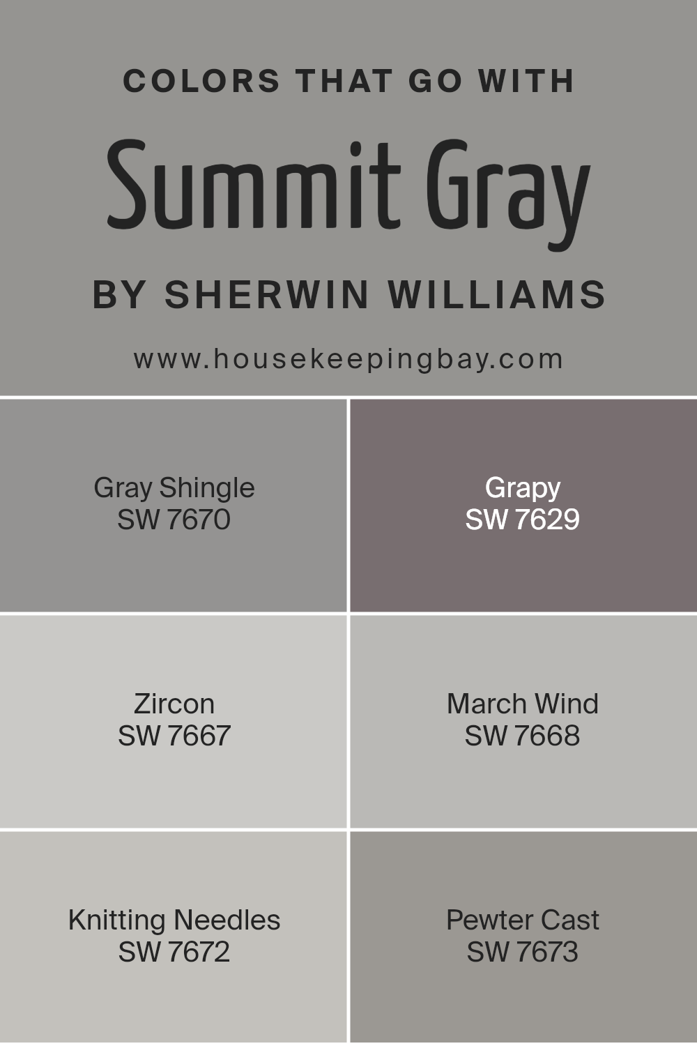
Colors that harmonize with Summit Gray SW 7669 by Sherwin Williams are crucial because they help create a cohesive and attractive space. When you select colors like Gray Shingle, Grapy, Zircon, March Wind, Knitting Needles, and Pewter Cast, you’re ensuring that the room has a balanced and sophisticated look.
These colors work well with Summit Gray because they share similar undertones, making them blend smoothly without clashing. This harmony in color allows for a flexible palette that can suit various design styles, from modern to traditional, making personalizing your space easy and fun.
Gray Shingle is a soft, welcoming gray that brings a sense of calm and serenity to a room, while Grapy is a unique color that adds a subtle hint of drama and depth without overwhelming the senses. Zircon offers a light, airy feel, perfect for creating a spacious and open atmosphere.
March Wind has a slightly cooler tone, providing a refreshing contrast that can help highlight architectural features. Knitting Needles is another light gray that pairs wonderfully with Summit Gray, giving a look that’s both sophisticated and inviting without being too stark.
Lastly, Pewter Cast offers a stronger statement with its deeper tone, anchoring the room and adding a sense of grounding. Together, these colors complement Summit Gray in a way that enhances the overall aesthetic, ensuring a space that is both beautiful and cohesive.
You can see recommended paint colors below:
- SW 7670 Gray Shingle
- SW 7629 Grapy
- SW 7667 Zircon
- SW 7668 March Wind
- SW 7672 Knitting Needles
- SW 7673 Pewter Cast
housekeepingbay.com
How to Use Summit Gray SW 7669 by Sherwin Williams In Your Home?
Summit Gray SW 7669 by Sherwin Williams is a beautiful, versatile paint color that can bring both warmth and modern elegance to your home. Its unique shade is a perfect balance between light and dark, making it a great choice for anyone wanting to add a touch of sophistication without overpowering a room.
You can use Summit Gray in various spaces, from living rooms and kitchens to bedrooms and bathrooms. It pairs wonderfully with white trims, giving a crisp, clean look, or with wooden accents for a more cozy, earthy vibe.
If you’re thinking about refreshing your walls, Summit Gray can be a fantastic base color, allowing for colorful decorations or artwork to stand out. For those with open-plan homes, this color can also help create a smooth transition between different areas, making the space feel cohesive.
Plus, it’s a great backdrop for both modern and traditional furniture, so you won’t have to worry about it clashing with your style.
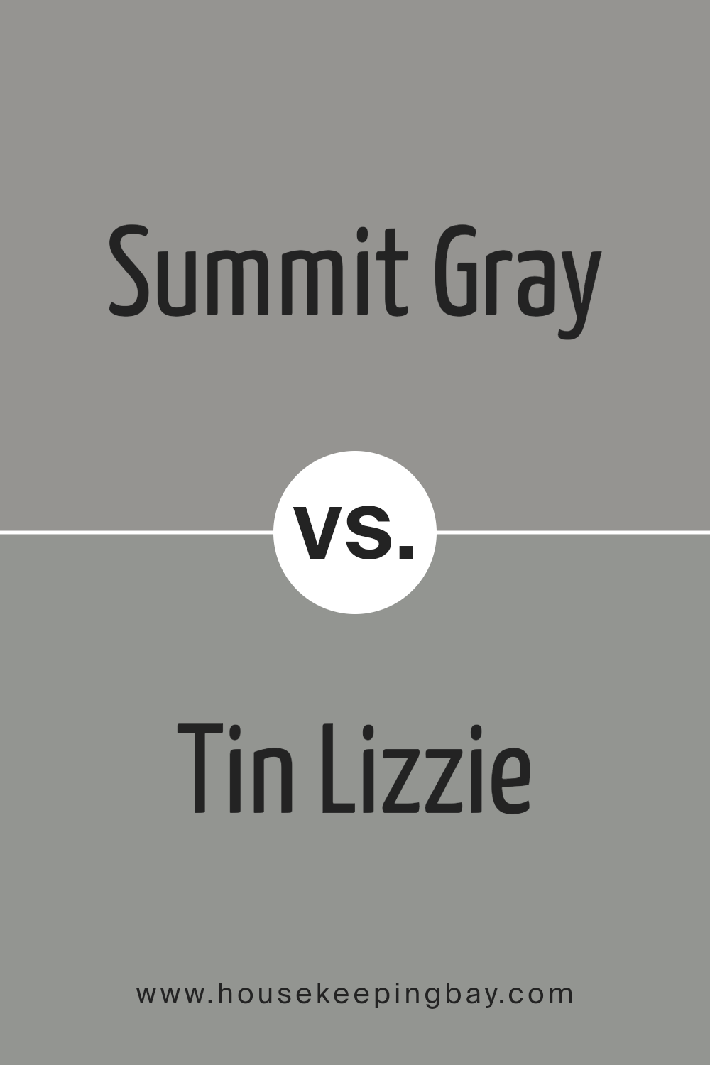
Summit Gray SW 7669 by Sherwin Williams vs Tin Lizzie SW 9163 by Sherwin Williams
Summit Gray SW 7669 and Tin Lizzie SW 9163 by Sherwin Williams are both unique shades of gray, but they offer different vibes for your space. Summit Gray is lighter and carries a soft, welcoming feel. It’s versatile, making it great for any room in your home, adding a gentle, cozy atmosphere. It’s like a light, overcast day, bringing a calm, soothing presence.
Tin Lizzie, in contrast, is a deeper gray. It has a more pronounced, stronger character, leaning towards a more modern and sophisticated look. This color can make a statement in a space, offering a backdrop that’s both bold and stylish. It’s similar to the color you might see on a stormy sea, offering depth and intensity to your walls.
While both colors share the tranquility of gray, Summit Gray is your go-to for a softer, airy feel, and Tin Lizzie steps it up with a deeper, more dramatic flair.
You can see recommended paint color below:
- SW 9163 Tin Lizzie
housekeepingbay.com
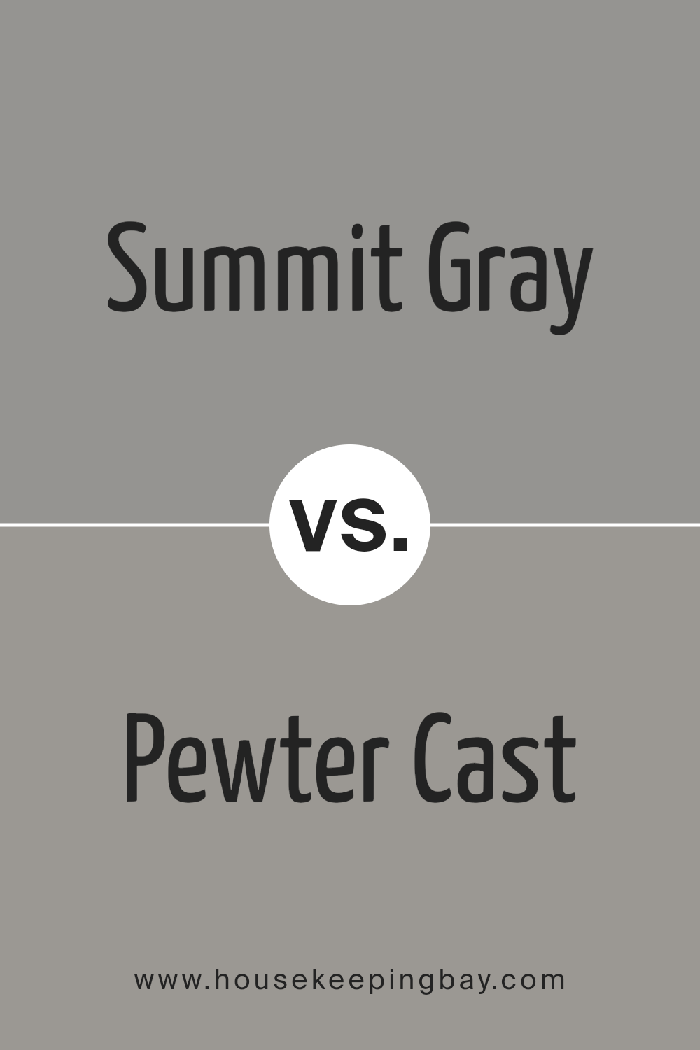
Summit Gray SW 7669 by Sherwin Williams vs Pewter Cast SW 7673 by Sherwin Williams
Summit Gray SW 7669 by Sherwin Williams and Pewter Cast SW 7673 by Sherwin Williams are both unique colors, but they have their differences. Summit Gray is a lighter shade, offering a soft and calm vibe to any space. It’s perfect for creating a serene and inviting atmosphere in rooms.
On the contrary, Pewter Cast is a bit darker. It adds a stronger, more defined look to walls or furniture. This color is great for those looking to make a subtle, yet significant, statement in their decor. While Summit Gray brings a gentle warmth, Pewter Cast offers a touch of sophistication and depth.
If you’re deciding between the two, consider the mood you want to set in your room. For a lighter and airier feel, go with Summit Gray. If you prefer a more grounded and robust aesthetic, Pewter Cast is your best bet. Both colors stand out for their versatility and can beautifully complement a wide range of decor styles.
You can see recommended paint color below:
- SW 7673 Pewter Cast
housekeepingbay.com
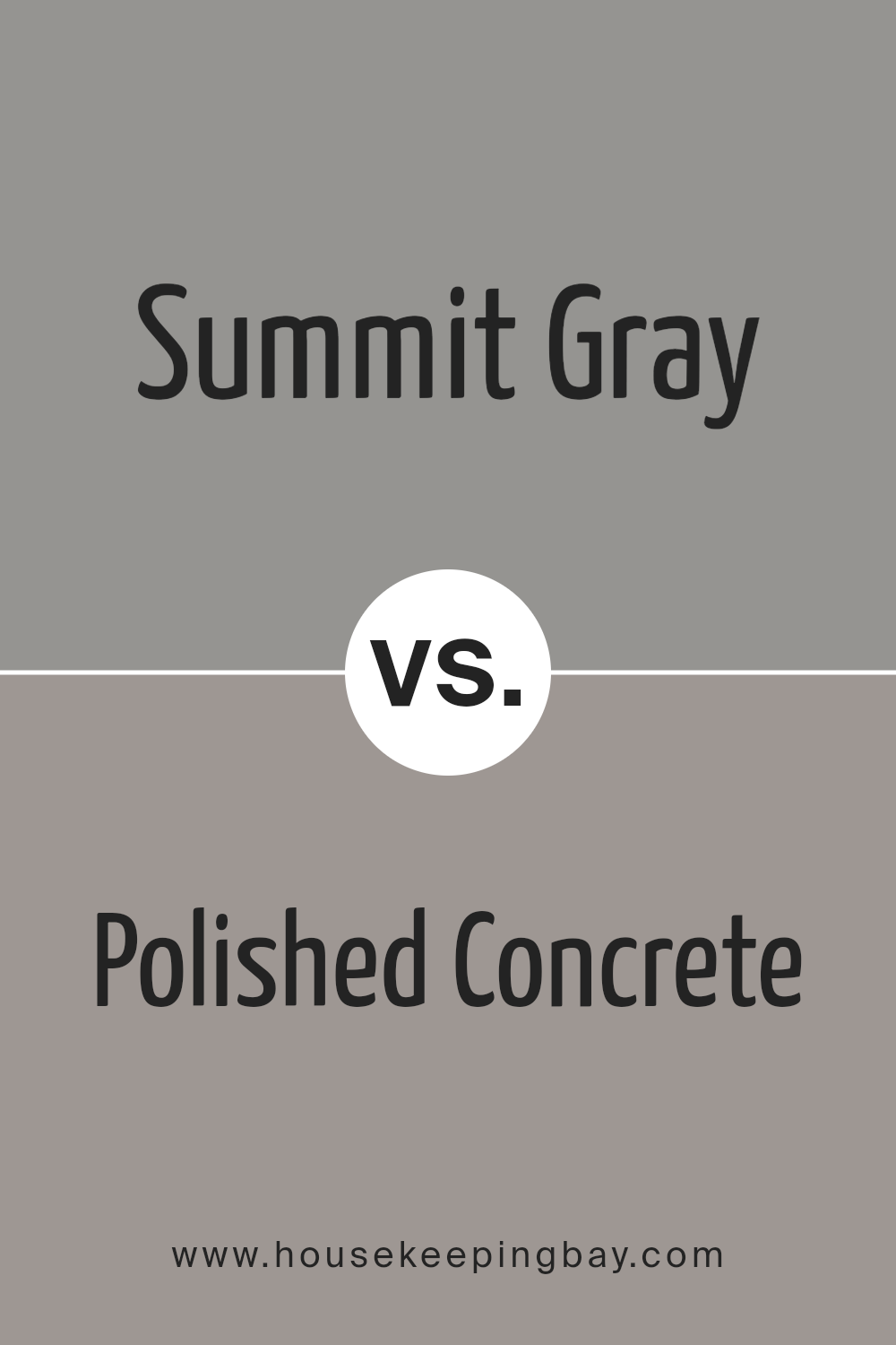
Summit Gray SW 7669 by Sherwin Williams vs Polished Concrete SW 9167 by Sherwin Williams
Summit Gray SW 7669 by Sherwin Williams is a darker shade that can add a touch of seriousness to any room. It’s got a strong presence that can make furniture and artwork pop. Its deeper tones are great for creating cozy, inviting spaces. This color works well in places where you want to settle down and relax, like living rooms or bedrooms.
Polished Concrete SW 9167 by Sherwin Williams, on the other side, is lighter and gives off a cleaner, more open vibe. Its lighter shade can make small rooms feel bigger and brighter. It’s a good pick for modern spaces or anywhere you want a fresh, airy look. This color is versatile, fitting well in kitchens, bathrooms, or any area that benefits from a sense of openness.
Both colors offer unique vibes – Summit Gray brings depth and warmth, while Polished Concrete offers a fresh, minimalist feel. Choosing between them depends on the atmosphere you want to create.
You can see recommended paint color below:
- SW 9167 Polished Concrete
housekeepingbay.com
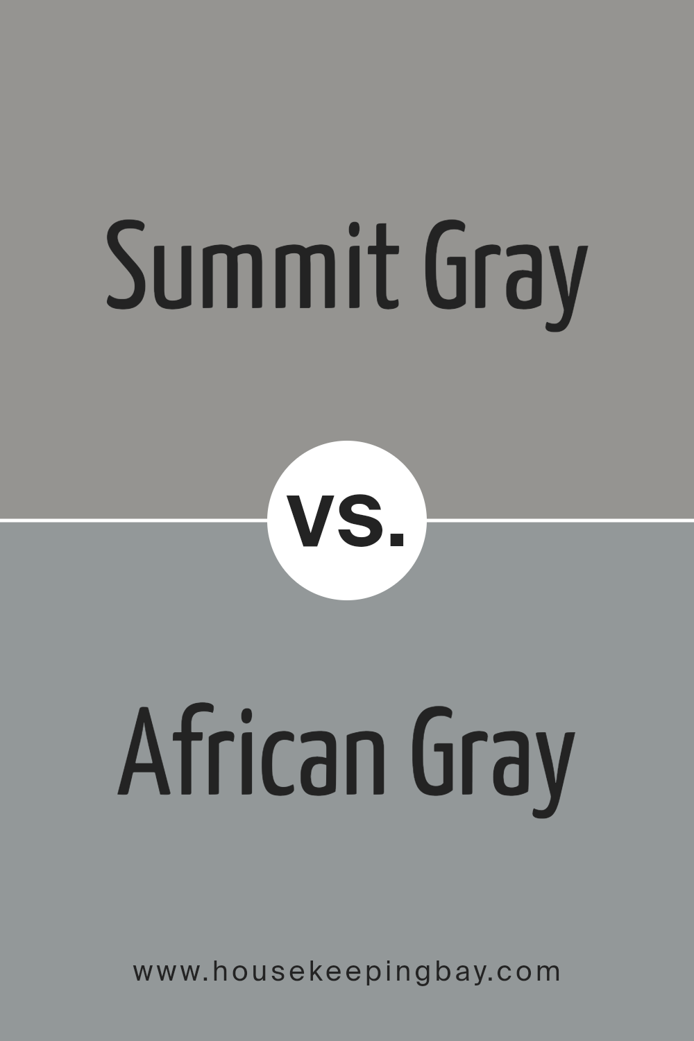
Summit Gray SW 7669 by Sherwin Williams vs African Gray SW 9162 by Sherwin Williams
Summit Gray SW 7669 and African Gray SW 9162 by Sherwin Williams are two interesting colors. Summit Gray is a cooler, more neutral gray. It’s like the color of smooth stones or a cloudy sky before the rain starts. It feels fresh and modern, perfect for making a room feel spacious and calm.
African Gray, however, has a warmer tone to it. It’s a bit like the color of elephant skin or dry clay. This warmth makes it cozy and inviting, ideal for spaces where you want to relax and feel at home. It works well in living rooms or bedrooms where comfort is key.
Both colors are versatile and can be used in various styles of decor. Summit Gray, being cooler, might be great for a sleek, contemporary look, while African Gray, with its earthier feel, suits rustic or traditional spaces better. Despite their differences, both colors bring their unique charm to spaces, providing a solid base for decorating with art, furniture, and accessories.
You can see recommended paint color below:
- SW 9162 African Gray
housekeepingbay.com
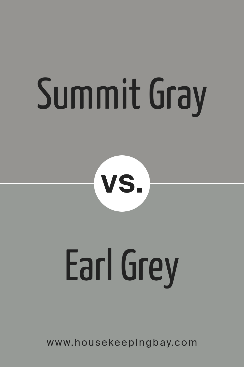
Summit Gray SW 7669 by Sherwin Williams vs Earl Grey SW 7660 by Sherwin Williams
Summit Gray SW 7669 by Sherwin Williams and Earl Grey SW 7660 by Sherwin Williams are both unique colors that offer distinct shades of gray for various settings. Summit Gray is a darker, more profound shade, providing a strong presence in a room. It’s perfect for creating a comforting and cozy atmosphere, especially in spaces designed for relaxing or intimate gatherings. This color has a certain warmth to it, despite its deeper tone, making it versatile for many design styles.
In contrast, Earl Grey offers a lighter, more subtle gray. It’s excellent for spaces where you want to promote a sense of calmness and serenity without overwhelming the area with too dark of a color. This shade is ideal for achieving a modern look, as it brightens the space while still bringing the sophistication that comes with gray hues.
Both Summit Gray and Earl Grey have their unique appeals, with Summit Gray leaning towards a more pronounced, warmer ambiance, and Earl Grey offering a lighter, refreshing vibe. These characteristics make them suitable for different purposes and design objectives.
You can see recommended paint color below:
- SW 7660 Earl Grey
housekeepingbay.com
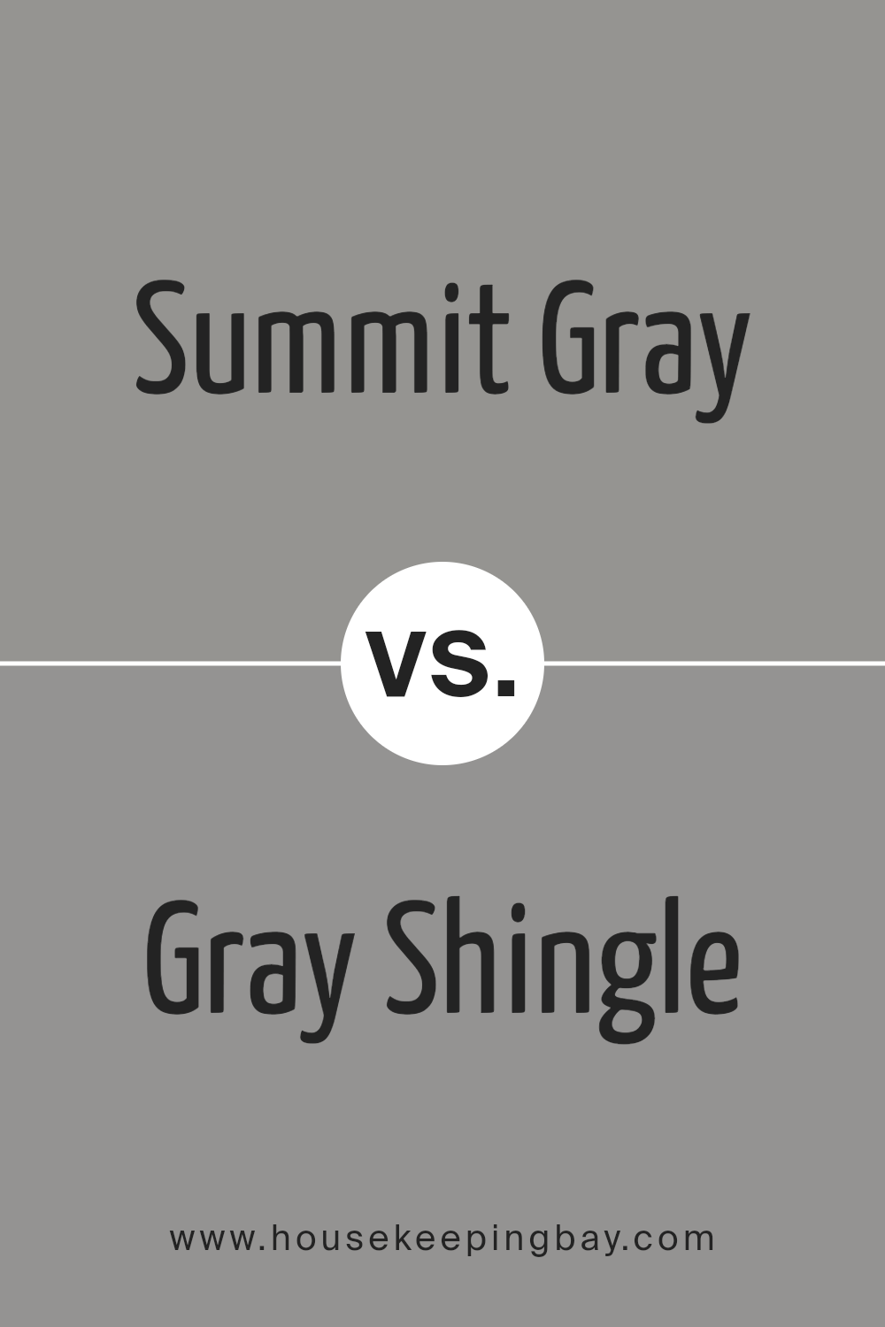
Summit Gray SW 7669 by Sherwin Williams vs Gray Shingle SW 7670 by Sherwin Williams
Summit Gray SW 7669 by Sherwin Williams and Gray Shingle SW 7670, also by Sherwin Williams, are both beautiful shades of gray, but with some subtle differences. Summit Gray stands out as a slightly darker shade that brings a strong, solid feel to any space. It’s perfect if you want to add a bit of drama without going too dark. This color gives off a warm, inviting vibe, making it ideal for living rooms or bedrooms where you want a cozy atmosphere.
Gray Shingle, in comparison, is a tad lighter. This shade is great for creating a soft, calm environment. It’s particularly good for smaller rooms or spaces with less natural light, as it can help make them appear brighter and more open. Gray Shingle works well in bathrooms or kitchens, where you want a clean, fresh look.
Both colors are versatile and can blend nicely with other decor elements, but the choice between them really depends on the kind of mood and space you’re aiming to create.
You can see recommended paint color below:
- SW 7670 Gray Shingle
housekeepingbay.com
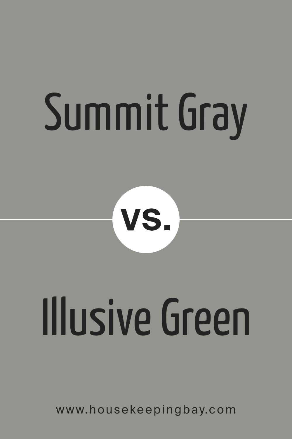
Summit Gray SW 7669 by Sherwin Williams vs Illusive Green SW 9164 by Sherwin Williams
Summit Gray and Illusive Green are two shades by Sherwin Williams that offer unique vibes for any space. Summit Gray is a cool, medium gray that delivers a calm yet pronounced backdrop. It’s subtle enough to work in any room but has enough depth to make a statement. Think of it as a serene base that’s easy to match with other colors.
Illusive Green, in contrast, is a gentle green with gray undertones. It brings a touch of nature indoors, creating a soothing and refreshing atmosphere. It’s like a breath of fresh air in your home, offering a light and airy feel that can brighten up darker spaces or add a touch of tranquility to any setting.
Together, these colors offer a versatile palette. Summit Gray’s solid neutrality pairs beautifully with the softer, more whimsical character of Illusive Green. Whether you’re looking to create a balanced, peaceful area or add a subtle hint of color, these shades work wonderfully together or on their own.
You can see recommended paint color below:
housekeepingbay.com
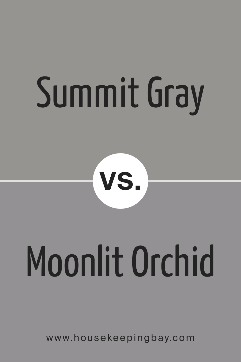
Summit Gray SW 7669 by Sherwin Williams vs Moonlit Orchid SW 9153 by Sherwin Williams
Summit Gray SW 7669 by Sherwin Williams and Moonlit Orchid SW 9153 by Sherwin Williams are two unique colors. Summit Gray is a soothing, mid-toned gray that feels calm and versatile. It’s like a soft, overcast sky, perfect for creating a serene and subtle background in any room. It doesn’t scream for attention but rather sets a peaceful tone.
Moonlit Orchid, however, has a different vibe. It’s a deeper, richer color that combines the mystery of twilight with the gentle allure of a blooming orchid. This color brings a touch of elegance and depth to spaces, ideal for adding a bit of drama and sophistication without overwhelming.
While Summit Gray lends itself to a more neutral, laid-back atmosphere, Moonlit Orchid offers a more pronounced, striking visual appeal. Both colors offer unique possibilities for decorating, with Summit Gray working well in spaces where calm and clarity are desired, and Moonlit Orchid perfect for areas that benefit from a splash of intensity and charm.
You can see recommended paint color below:
- SW 9153 Moonlit Orchid
housekeepingbay.com
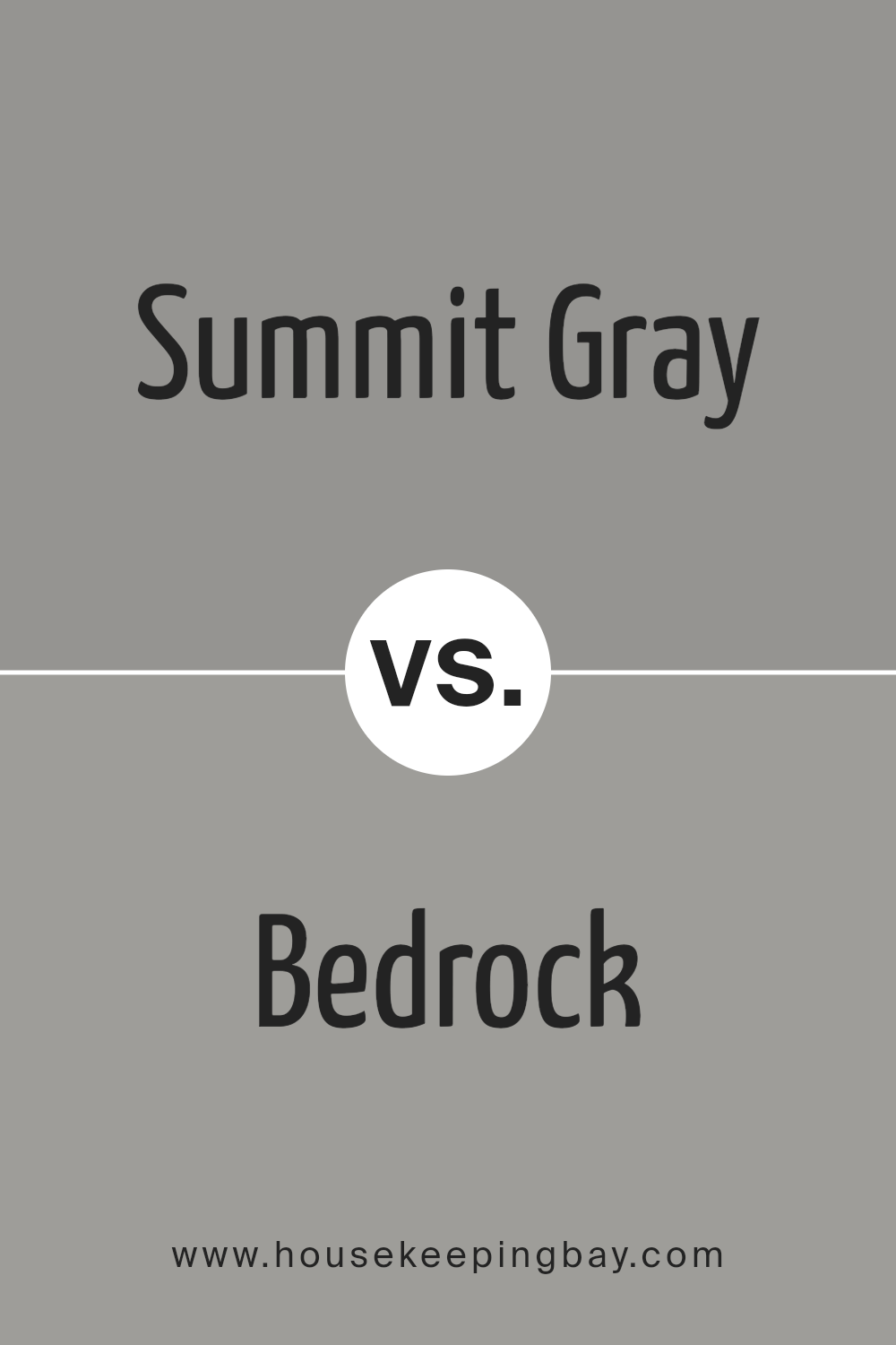
Summit Gray SW 7669 by Sherwin Williams vs Bedrock SW 9563 by Sherwin Williams
Summit Gray SW 7669 by Sherwin Williams and Bedrock SW 9563 by Sherwin Williams are both interesting colors with their distinct vibes. Summit Gray is like the color of a cloudy sky just before it rains, a gentle, soft gray that brings a calm and soothing presence into any space. It’s perfect for those who want a neutral backdrop that’s both understated and elegant, making rooms feel open and serene.
In contrast, Bedrock steps a bit darker and warmer. It’s akin to the shadowy hues you might find on a mountain trail at dusk. This color offers a solid, grounding effect, giving a sense of stability and warmth to a place. It works well when you’re aiming for a cozy atmosphere, adding depth and character without overwhelming.
Together, these colors could complement each other beautifully in a home. Summit Gray could be the light, airy foundation, while Bedrock adds welcoming Earth-toned accents, creating spaces that are both inviting and stylish.
You can see recommended paint color below:
housekeepingbay.com
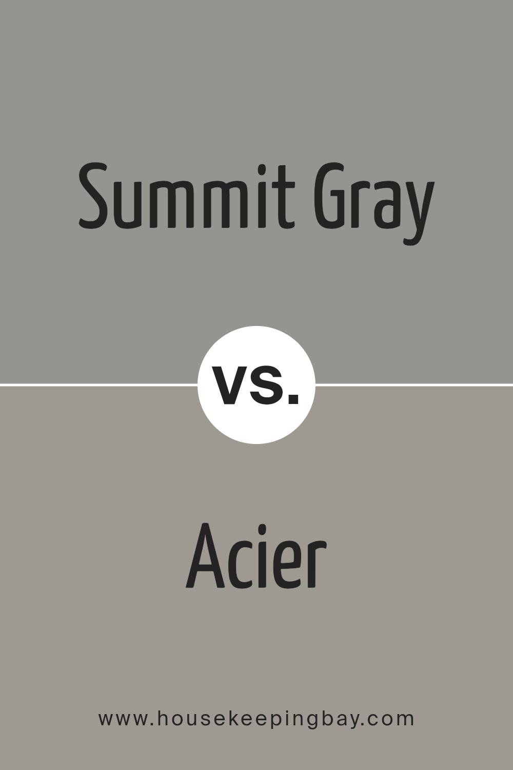
Summit Gray SW 7669 by Sherwin Williams vs Acier SW 9170 by Sherwin Williams
Summit Gray SW 7669 and Acier SW 9170, both by Sherwin Williams, offer unique yet somewhat similar vibes for spaces. Summit Gray is a cool, soothing gray that brings a calm and serene atmosphere to any room. It’s light enough to make small spaces appear larger and can easily match with a wide range of decor styles, adding a sleek and modern touch.
On the contrary, Acier SW 9170 steps a bit darker, presenting a stronger and more pronounced gray. It carries a bolder personality, perfect for creating accent walls or adding depth to a space without overwhelming it. Acier’s richness allows it to pair well with both bright and muted colors, offering flexibility in design choices.
While Summit Gray is ideal for those looking for a gentle, airy feel, Acier is suited for someone wanting to inject a bit more drama or sophistication into their environment. Both colors offer elegance and a timeless quality, but their differences in shade and intensity cater to distinct preferences and uses in interior design.
You can see recommended paint color below:
- SW 9170 Acier
housekeepingbay.com
Conclusion
In wrapping up, SW 7669 Summit Gray by Sherwin Williams is a top-notch choice if you’re aiming to refresh your space with a touch of sophistication and versatility. Its unique blend of tones makes it a perfect backdrop for virtually any room, adding depth and character without overwhelming the space. Whether you’re aiming for a cozy, inviting atmosphere or a sleek, modern look, Summit Gray has the flexibility to fulfill your vision.
One of the standout qualities of this paint color is its ability to play well with different lighting conditions, reflecting varying shades throughout the day that keep your space feeling fresh and dynamic. Moreover, its compatibility with a wide range of decor styles and colors allows you to mix and match your favorite pieces without worrying about clashes.
So, if you’re considering giving your home a makeover, you might want to think about giving Summit Gray a shot. Its reliability, ease of application, and aesthetically pleasing hue make it a smart choice for anyone looking to update their home’s look. Remember, the right color can transform a room from blah to beautiful, and Summit Gray by Sherwin Williams could be just what you need to achieve your desired ambiance.

housekeepingbay.com
Ever wished paint sampling was as easy as sticking a sticker? Guess what? Now it is! Discover Samplize's unique Peel & Stick samples. Get started now and say goodbye to the old messy way!
Get paint samples
