Comfort Gray Color SW-6205 by Sherwin-Williams
A complete color description with tips and life hacks regarding its use
The better we choose the paint colors to use in our homes when we are up to any renovation projects, the better the final results will be. However, many of us find it difficult to figure out what paint colors to use since many of them are rather complex in terms of shades and undertones, as well as the way they react to light and appear on the walls.
One of such colors is Comfort Gray by Sherwin-Willaims brand. And today we are going to introduce it to you better. From this article, you are going to learn what type of color it is and what undertones it has.
Also, we will tell you how this color reacts to light and what light reflectance value it has. In addition, you will learn more about the best trim color and coordinating colors of the Comfort Gray paint. And as a bonus, we will tell you how this color will work in different rooms in your home.
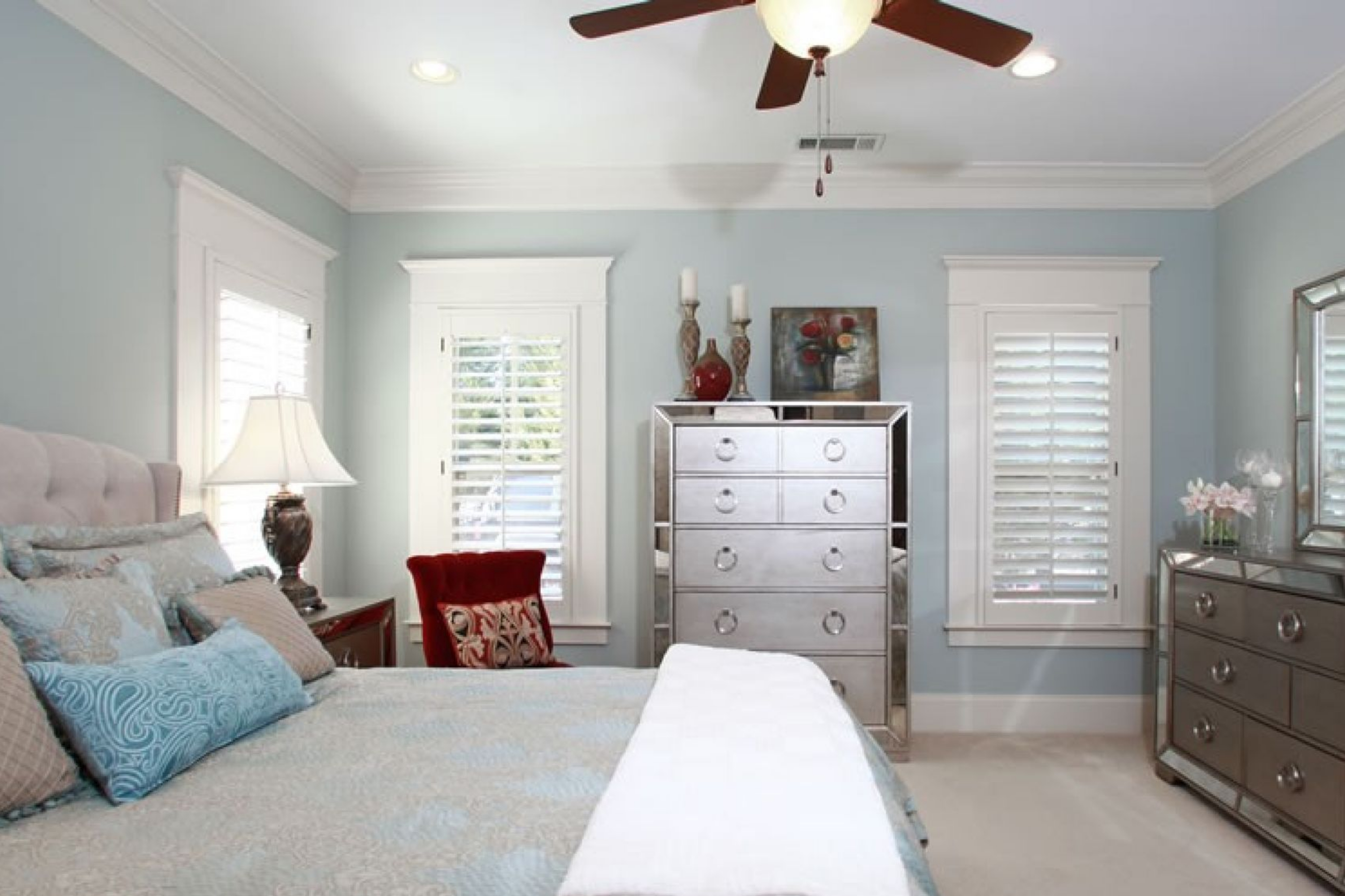
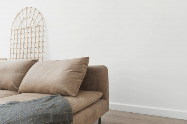
roomwithstyle via VistaCreate
What Kind Of Color Is Sherwin-Williams Comfort Gray?
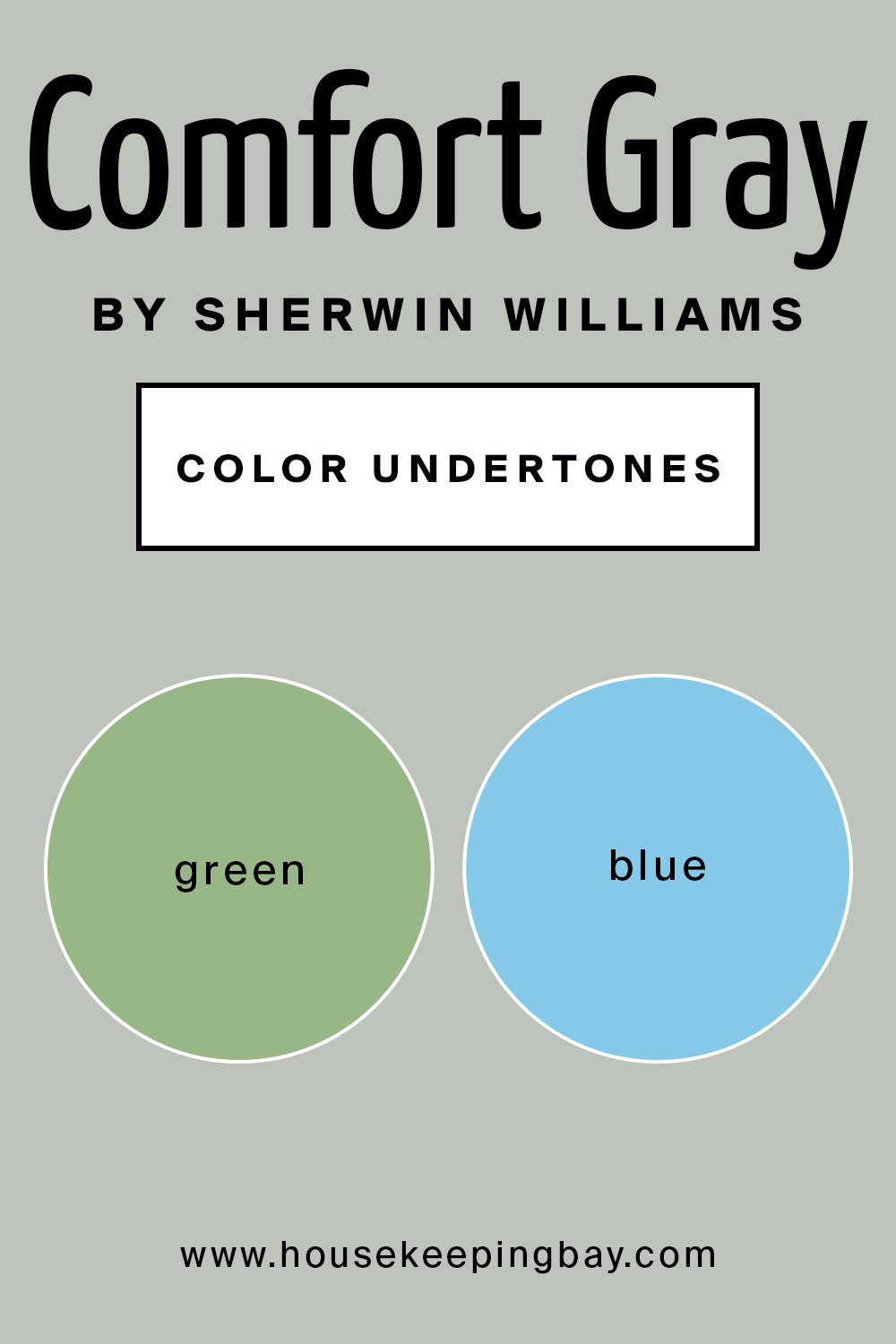
First of all, you need to know that SW Comfort Gray can hardly be called a simple color! Even though it is classified as gray, it is in fact a blend of green, blue and gray! Nevertheless, all three colors combine in one absolutely flawlessly and harmoniously, creating a lovely gray with the a seawave hue.
As Encycolorpedia says, while the name of this paint color might suggest gray, it is actually a shade of green. And thanks to its complex nature, it can be used in many rooms and in many types of lighting, which we will discuss in detail below.
housekeepingbay.com
Table of Contents
Undertones Of SW Comfort Gray Color
Defining what undertones a certain paint color has is always tricky and complicated, especially if you are not very knowledgeable in paints. Undertone can be affected by the way the light hits the paint, as well as by the rest of the color palette and more.
This is why it often happens that a paint color can look one way in the hardware store when looking at paint swatches, but when you test a sample on your wall, it can turn out to be totally different!
Speaking of undertones, Comfort Gray is a real ninja! See, according to the logic, it should have green undertones, but in fact, this chameleon paint easily leans into blue! However, we need to admit that it rarely becomes dominated by the blue and usually shows up as a beautiful blend of both.
Still, before you decide to buy a few cans of this shapeshifting paint, we recommend you consider the rest of the colors you are going to have in the room where Comfort Gray is planned to be used. Also, considering the type of light is a must to avoid any unexpected and unwanted effects on your walls!
housekeepingbay.com
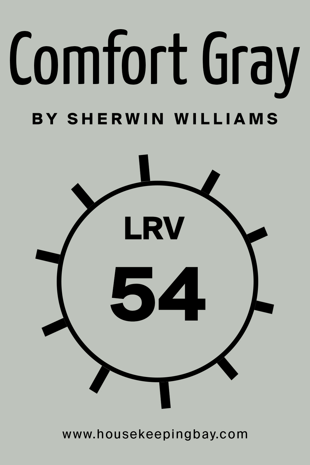
SW Comfort Gray Color’s LRV
Comfort Gray has an LRV of 54 which makes it a paint color with a light-medium depth, but on the higher side of this range for sure. This slightly lower LRV along with its extra bit of color makes Comfort Gray a beautiful choice for bright and light rooms as well as darker rooms.
housekeepingbay.com
For those of you who don’t know (or forgot) what LRV is, here is a reminder: LRV stands for Light Reflectance Value. It shows the amount of light that paint is able to reflect when it is already applied to the wall. The LRV scale goes from zero to 100 where zero is the darkest color (true black) and 100 is the lightest (pure white). So the higher the LRV rate of the paint the lighter it is, and vice versa.
housekeepingbay.com
What is LRV? Read It Before You Choose Your Ideal Paint Color
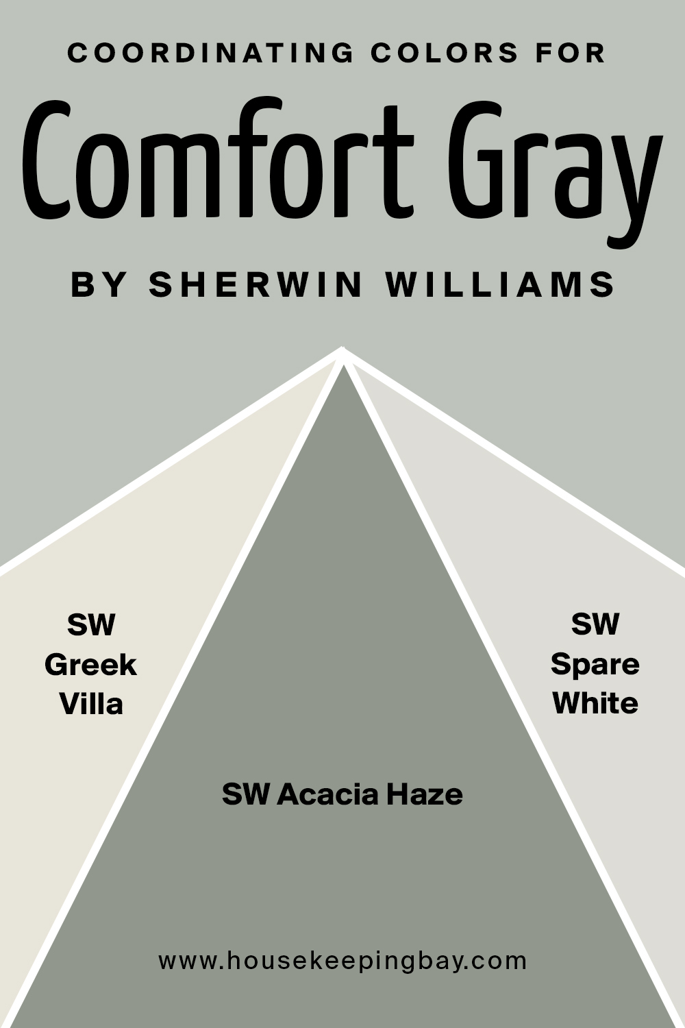
Coordinating Colors For SW Comfort Gray Paint
Deciding what coordinating colors will be suitable for the paint color that you are going to use as a major color is always a handful. Especially if you are going to use such a complex color as Comfort Gray. But the more harmonious the coordinating colors will be, the more balanced in terms of color your living space will look.
So as for the Comfort Gray paint color, grab a few ideas on what paint colors might work the best as its coordinating colors:
- SW Greek Villa
- SW Acacia Haze
- SW Spare White
housekeepingbay.com
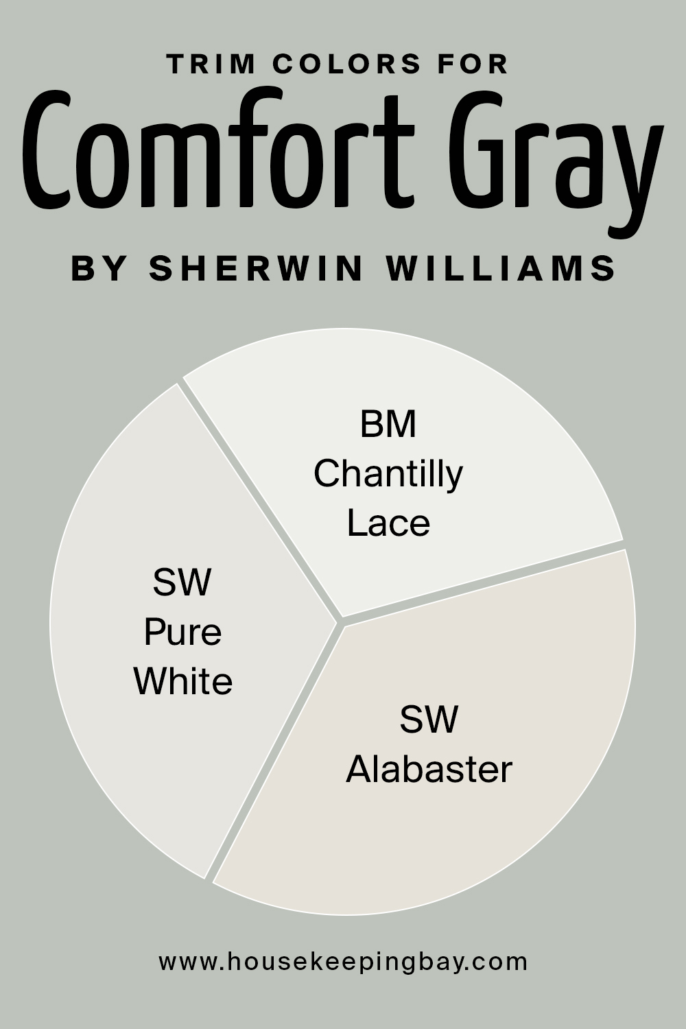
Best Trim Colors For Sherwin-Williams Comfort Gray
Like with many other interior paint colors, for the Comfort Gray by Sherwin-Williams, white would be the optimal and the best choice in terms of a trim color. For example, you can check out one of the best white paint matches:
housekeepingbay.com
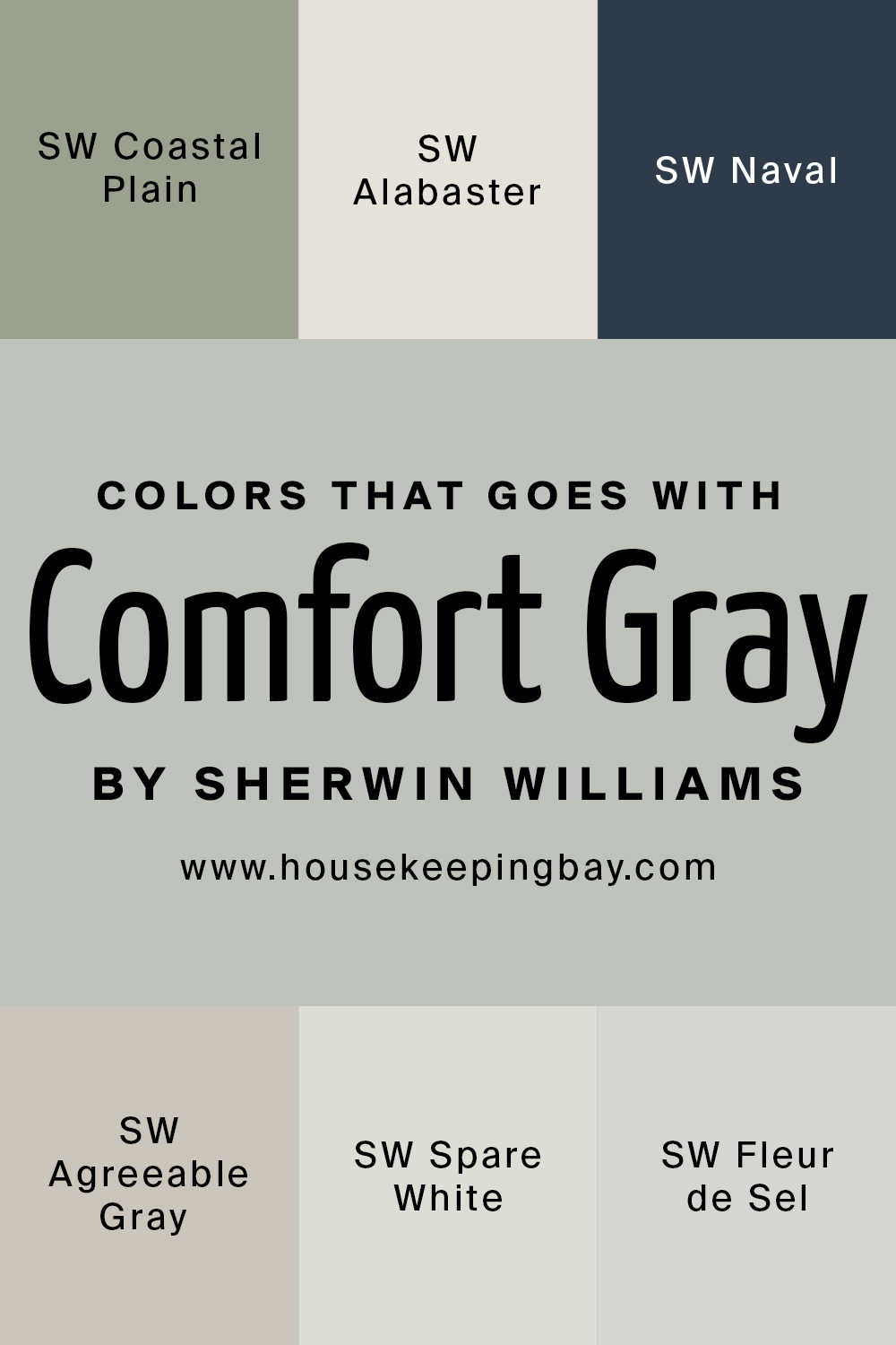
Colors That Go With Sherwin-Williams Comfort Gray
When you choose a certain color to be used in your home, you should be aware of a few other colors that might look good along with it. Like this, you will be able to create a more harmonious color palette in your home space.
Speaking of Comfort Gray, this color can be used with quite many colors from lighter to darker ones. Besides, this green-gray-blue will also work great with the bright colors!
In particular, you may want to consider most of the bronze family, and caramel and a lot of the sand colors (that’s if you want a more subtle combination). But Comfort Gray will work with bright colors as well, such as coral and watermelon, for example. It’s also a great foil for sparkling white and indigo blue.
As an example, you may want to try Comfort Gray with such colors as:
- Coastal Plain
- Alabaster
- Naval
- Agreeable Gray
- Spare White
- Fleur de Sel
housekeepingbay.com
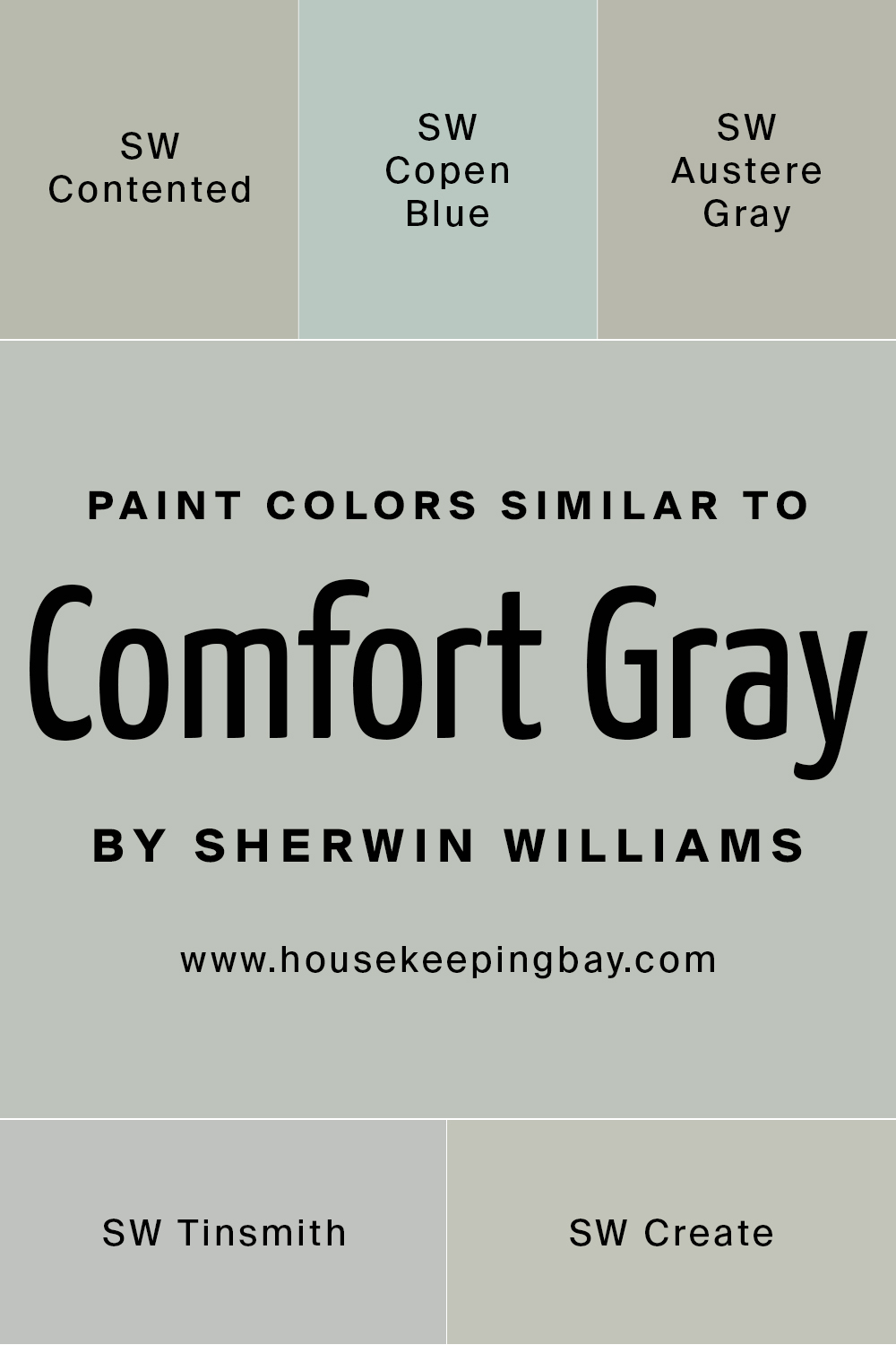
Paint Colors Similar to Comfort Gray
Sometimes we might need to use other colors instead of the one that we considered at the beginning. With the Comfort Gray, it might be a bit difficult so we decided to help you out a bit. Below you can find a list of paint colors that are similar to SW Comfort Gray and they look more or less the same. Of course, note that they are not literally the same, so you still need to choose carefully!
- SW Contented
- SW Copen Blue
- SW Austere Gray
- SW Tinsmith
- SW Create
housekeepingbay.com
Where Comfort Gray Color SW-6205 Can Be Used In Your Home?
There are colors that can be used in particular rooms only whilst others can be applied anywhere in your home. As for the Comfort Gray, you have to be careful with this gray-gree-blue color since for some spaces, it might not be the best choice due to its tricky nature. For example, you should not use it in very small rooms, closets, or small lavatories/bathrooms. As for other rooms, this magnificent chameleon might work just fine!
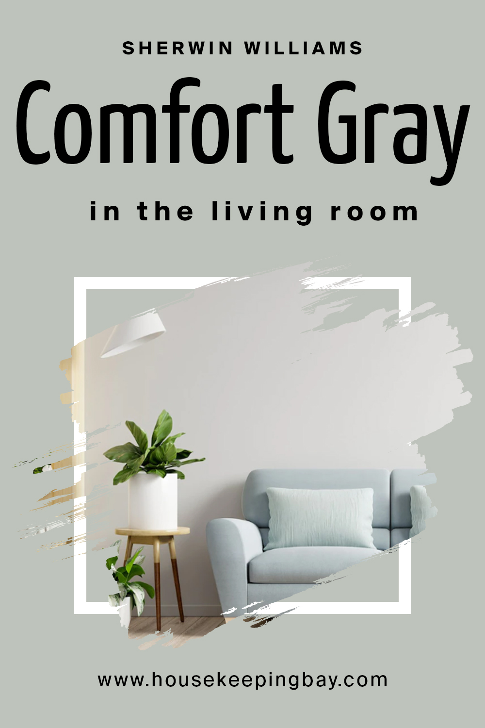
Comfort Gray Color SW-6205 in the Living Room
Use it on your living room walls only if the space is large enough and well-lit. It doesn’t matter whether the light is warm or cool, this color will simply read a bit differently (greener or grayer).
But in a small room with dusk light, this blend will not work well, besides, it may look darker and kind of “dirty” on the walls. Nobody wants to feel like in a swamp in their own home, right?
housekeepingbay.com
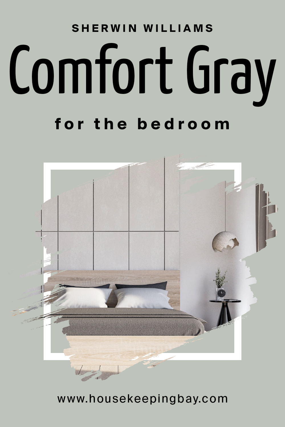
Comfort Gray Color SW-6205 in the Bedroom
Again, if you want to use Comfort Gray in your bedroom, it should have enough daylight! Otherwise the color will look quite dark. But if you don’t mind that, well, it’s up to you!
housekeepingbay.com
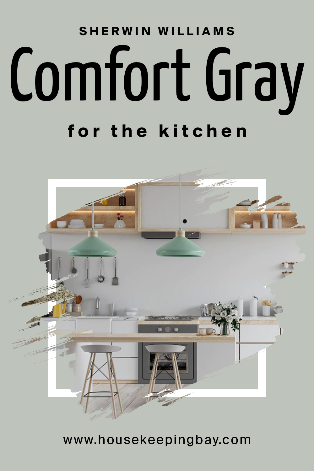
Comfort Gray Color SW-6205 in the Kitchen
It might not be the ideal color for your kitchen walls but Comfort Gray could be a stunning color for your cabinets instead! We wish more people would use it there, to be honest! It would look particularly beautiful with soft white or off-white walls.
housekeepingbay.com
Comfort Gray Color SW-6205 in the Bathroom
This is not a usual color for bathrooms. First of all, in an enclosed space like this, Comfort Gray may read darker and cooler. Second, in warm bulb light, it will reveal its gray and green udertones, making the room look smaller. However, if you pair it with a lot of white, chances are it can help!
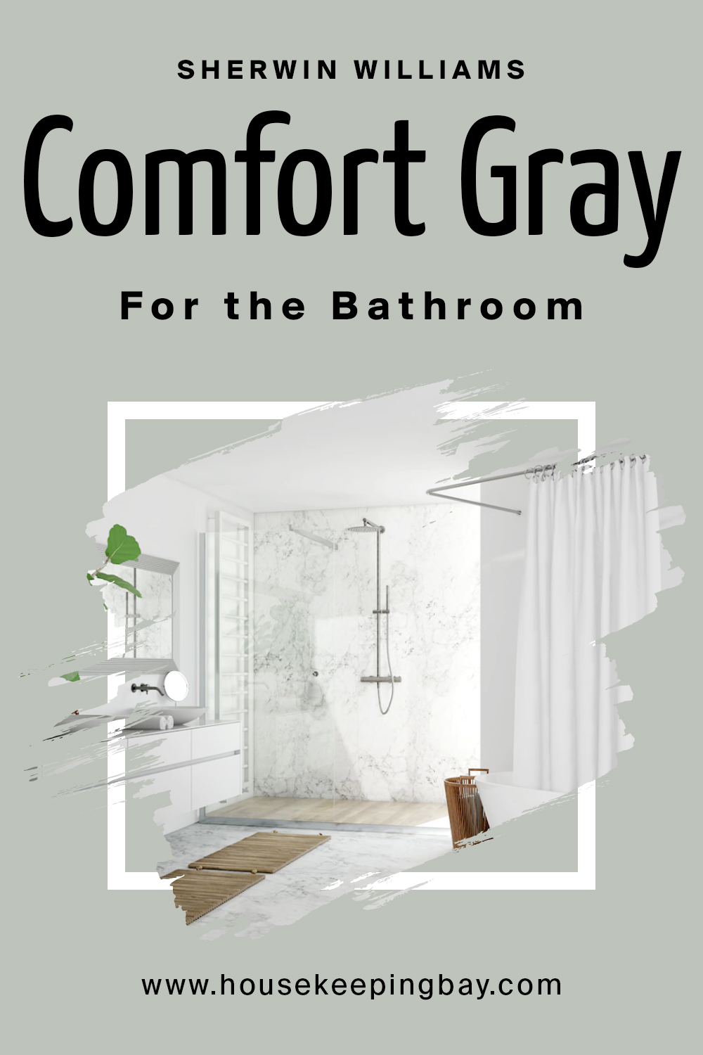
housekeepingbay.com
Comfort Gray Color SW-6205 for the Exterior use
To tell the truth, Comfort Gray is not a popular color option for exterior walls as the majority of homeowners prefer neutrals or white. Blue or Green would also be more preferable on exteriors rather than blends like this.
Like that, you are now aware of all the basics regarding this tricky, complex, yet very beautiful blend color! You know its undertones and LRV, you know how it reacts to light and what colors can make it look even better than it already is. With that in mind, you will be able to use it wisely in your home.

housekeepingbay.com
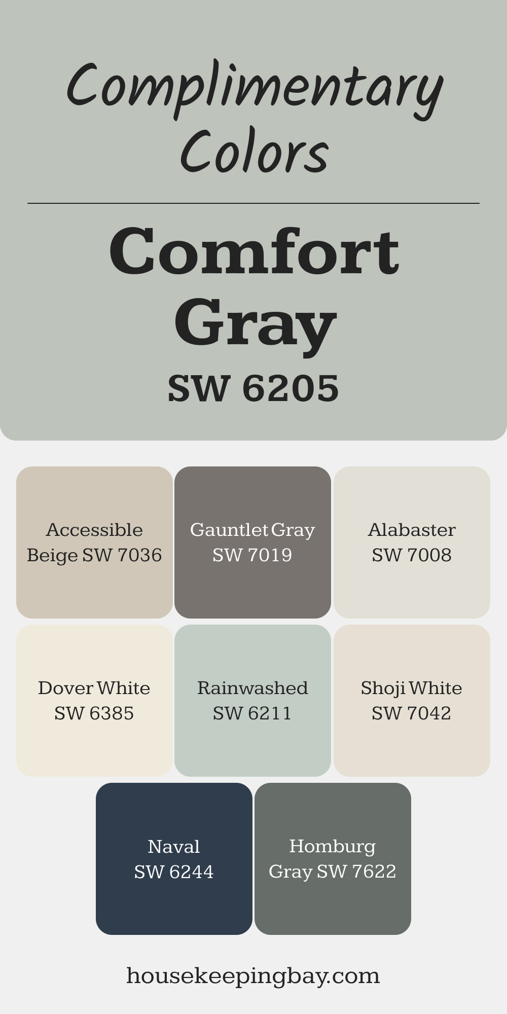
Complimentary Colors for Comfort Gray SW 6205 Paint Color by Sherwin Williams
Comfort Gray shines when paired with soft neutrals like Alabaster or Shoji White, creating a balanced and inviting look. For a touch of contrast, Rainwashed adds a gentle pop of color, while Accessible Beige keeps the palette subtle and cohesive.
For darker accents, consider Naval or Homburg Gray to bring depth and richness. Gauntlet Gray and Dover White complete the set, offering flexibility for a variety of looks.
These combinations make it easy to create a harmonious space.
via housekeepingbay.com
Comparing Comfort Gray to Other Colors
We know it can be difficult to decide what color to choose when it comes to your home painting project. So below you can find a comparison of Comfort Gray to a few other similar colors – just in case you decide to use another, alternative gray.
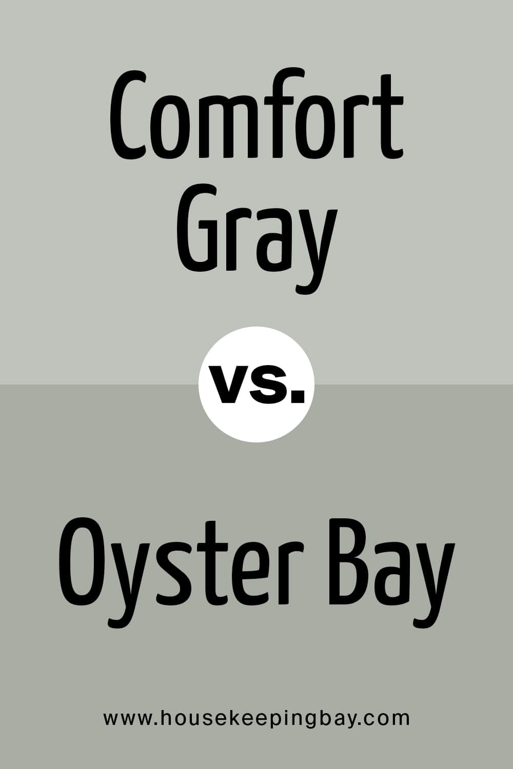
Comfort Gray vs Oyster Bay
Ouster Bay reads much greener than comfort Gray because of its green undertones. Besides, Oyster Bay is also darker and looks warmer. Not the best colors to use together, but Oyster Bay can be a good option if you need a darker version of Comfort Gray.
housekeepingbay.com
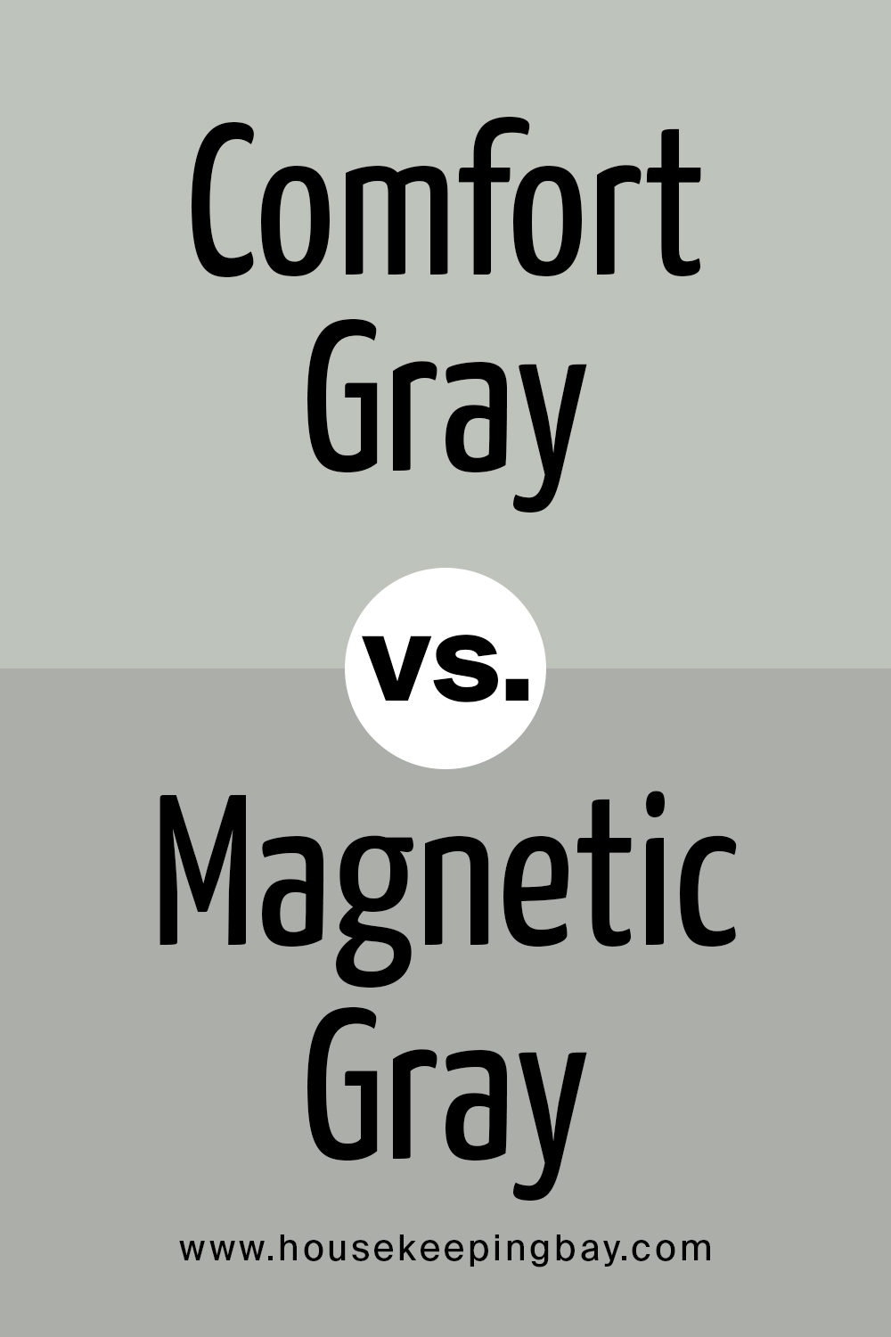
Comfort Gray vs Magnetic Gray
Magnetic Gray looks grayer since it has prominent gray unertones. Beside it, Comfort Gray reads a very light green. However, since both are warm-toned, they look nice together.
housekeepingbay.com
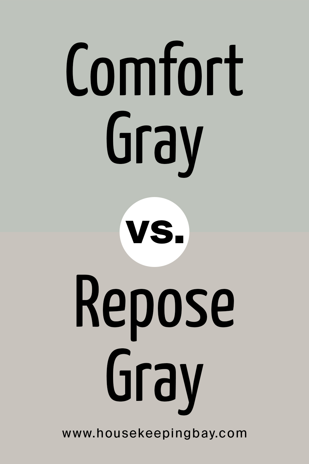
Comfort Gray vs Repose Gray
Repose Gray has blue undertones and slight violet (purple undertones) but they are very minimal. However, compared to Comfort Gray, it shows those very slight purple undertones more. Comfort Gray, on the contrary, reads almost green.
housekeepingbay.com
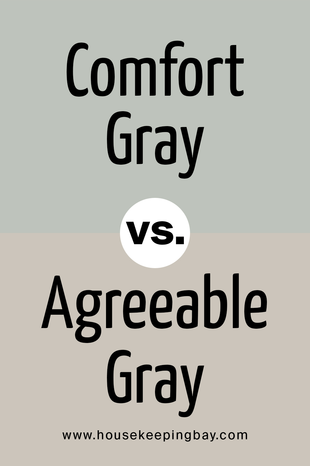
Comfort Gray vs Agreeable Gray
Agreeable Gray is a gray with a warm, beige undertone. Depending on the light, it may lean more into its beige or gray side. Compared to Comfort Gray, this color reads prominently beige whilst its counterpart looks like a muted green.
housekeepingbay.com
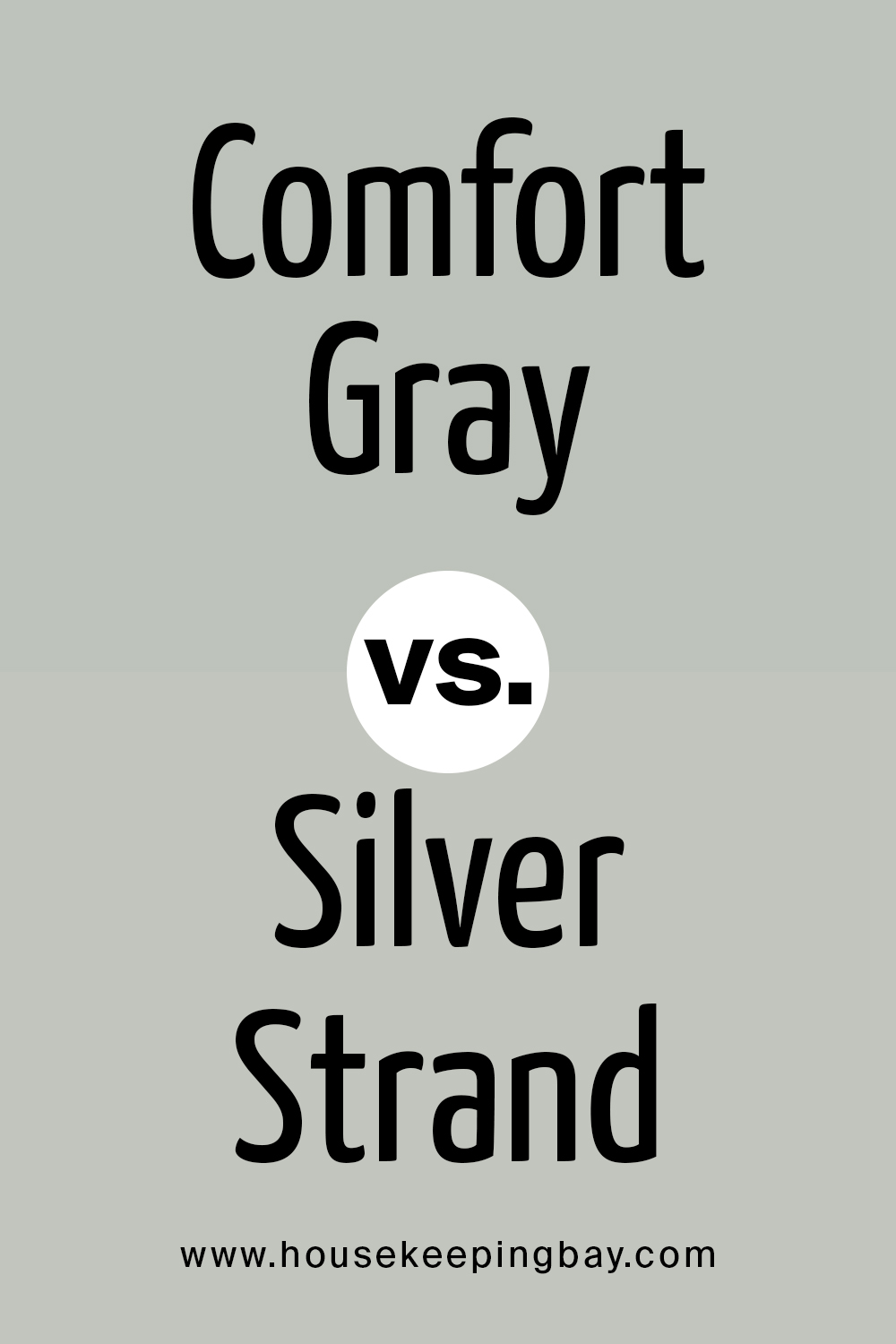
Comfort Gray vs Silver Strand
Silver Strand has blue and green undertones which relates it with Comfort Gray. But unlike Comfort Gray that reads rather green, Silver Strand looks more gray with a slight greenish hue.
housekeepingbay.com
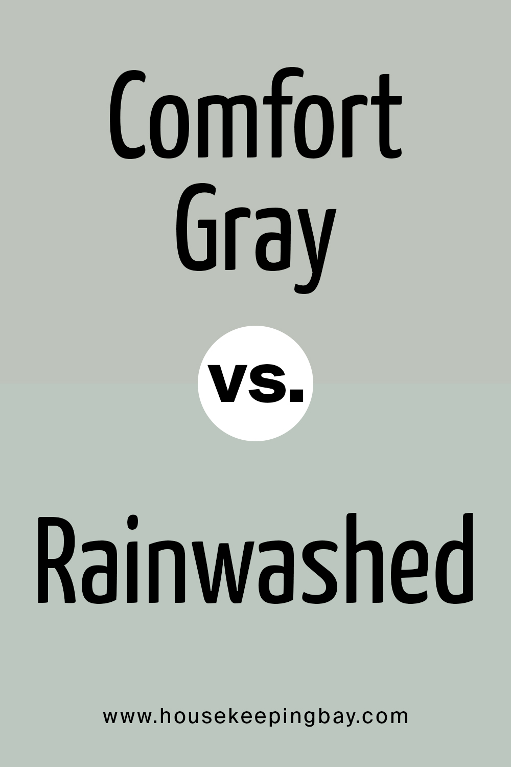
Comfort Gray vs Rainwashed
Rainwashed has undertones of blue, green, and gray which is nearly the same as Comfort Gray has. But ulike Comfort Gray, Rainwashed reads much lighter and greener. Comfort Gray, on the other hand, looks grayer beside it.
housekeepingbay.com
So, this is all about Comfort Gray paint color by Sherwin-Williams. Now you know more about its type and specifics, you know how it works in different rooms and what to expect from it in different light.
housekeepingbay.com
Ever wished paint sampling was as easy as sticking a sticker? Guess what? Now it is! Discover Samplize's unique Peel & Stick samples. Get started now and say goodbye to the old messy way!
Get paint samples


Frequently Asked Questions
⭐Is it ok to paint my entire house with Comfort Gray?
You can do that, but you should consider the light since the color may read differently, greener or grayer.
⭐Is Comfort Gray a warm-toned color?
This blend belongs to warm-toned colors.
⭐Can this color be paired with brass hardware in the kitchen?
Definitely! Comfort Gray looks very nice with brass and bronze elements.
7 thoughts on “Comfort Gray Color SW-6205 by Sherwin-Williams”
Leave a Reply


Can I paint the bedroom in Confort Gray and the bathroom in Sea Salt?
Hi Rosa, It’s Melinda here.
Going with Comfort Gray for your bedroom and Sea Salt for the bathroom is a fabulous idea. Both colors have a way of bringing a peaceful and serene vibe to a space. Comfort Gray has that cozy feel, perfect for a bedroom where you want to relax and unwind. And Sea Salt? It’s like a mini retreat, ideal for a bathroom where you can just soak and forget the world for a while. They complement each other wonderfully, creating a smooth flow between your spaces. You’ve got a great eye for colors that create a harmonious home.
If you need any more advice or tips as you get started, I’m here to help!
Can I have Confort Gray in the bedroom and Sea Salt in the bathroom?
I want to paint my walls gray but my sister says this color is not popular anymore. Does anyone know whether gray is still trendy in 2022?
I think yes, it is, while gray has been ruling over our interiors during the recent years. I’m sure it is on top in 2022 as well! Anyway, if you like it – who cares whether it’s trendy or not?
Could you please tell me what Sherwin-Williams gray is the most popular for bedrooms? I really like the colors of this brand but I can’t make a decision!
Hello! Usually, Agreeable Gray SW-7029 is considered to be the most popular gray paint color because it’s the perfect hue for any living space, including bedrooms.