Quietude SW 6212 HGTV Home by Sherwin-Williams 2025 Color of the Year
Soothing Hues for Serene Spaces
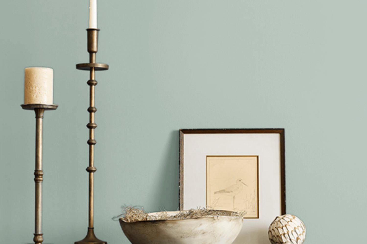
Are you looking to transform your space into a serene sanctuary? Sherwin Williams’ SW 6212 Quietude might just be the perfect shade for you. This enchanting hue belongs to a palette that professionals and homeowners alike trust to bring a sense of calm and tranquility into any room. Quietude is a soft, muted green with a hint of blue, making it incredibly versatile and ideal for creating a peaceful retreat in your home.
Whether you’re planning to refresh your living room, bedroom, or even your bathroom, Quietude offers a refreshing backdrop that complements a wide range of decor styles. From modern and minimalist to traditional and cozy, its subtle elegance effortlessly enhances the aesthetics of your space.
Choosing the right paint color can sometimes feel overwhelming, but with Quietude, you’ll discover how easy it is to infuse your home with a touch of nature and sophistication. Its soothing tone not only beautifies walls but also promotes a calming atmosphere, encouraging relaxation and reflection.
So, if you’re ready to refresh your living environment with a color that reflects tranquility and elegance, SW 6212 Quietude by Sherwin Williams is a choice worth considering. Let’s explore how this beautiful shade can redefine your space and reflect your style.
by sherwin williams
What Color Is Quietude SW 6212 by Sherwin Williams?
Quietude SW 6212 by Sherwin Williams is a soothing and versatile color that brings a sense of calm and relaxation to any space. This paint color falls somewhere between a soft green and a light blue, giving off a serene vibe that is both refreshing and gentle. It has an almost ethereal quality to it, making it perfect for creating a peaceful retreat in your home.
Quietude works best in interior styles that prioritize comfort and tranquility, such as modern minimalism, Scandinavian, and coastal. Its understated elegance also makes it a great fit for traditional settings that aim for a more updated, yet timeless appeal. This color shines in well-lit rooms, highlighting its subtle undertones and adding depth without overwhelming the senses.
When it comes to materials and textures, Quietude pairs beautifully with natural wood finishes, from light oak to richer walnut, enhancing the warm undertones of the wood. It also works well with soft, matte metals like brushed nickel and antique brass, adding a touch of sophistication. For textiles, consider linens and soft cottons in neutral tones or even gentle pastels to keep the space feeling airy and light. Quietude’s versatility also allows it to complement bolder patterns and textures, making it an excellent choice for accents like pillows, rugs, or curtains, adding layers of interest to a room without overpowering.
housekeepingbay.com
Is Quietude SW 6212 by Sherwin Williams Warm or Cool color?
Quietude SW 6212 by Sherwin Williams is a soft, soothing green with a hint of gray, offering a peaceful and serene vibe to any room. This versatile color creates a calm atmosphere, making it perfect for places where you want to relax like bedrooms and bathrooms. Its muted tone blends well with various styles and decorations, allowing it to work seamlessly in both modern and traditional spaces.
One of the key benefits of Quietude is its ability to make small rooms feel larger and more open because of its light-reflective qualities. This can be especially useful in homes where maximizing the sense of space is important. Additionally, it pairs beautifully with natural elements, such as wood and stone, enhancing the feeling of being connected to the outdoors. Whether you’re looking to create a peaceful retreat or simply want to add a touch of tranquility to your home, QuietudeSW 6212 can help you achieve the look and feel you desire.
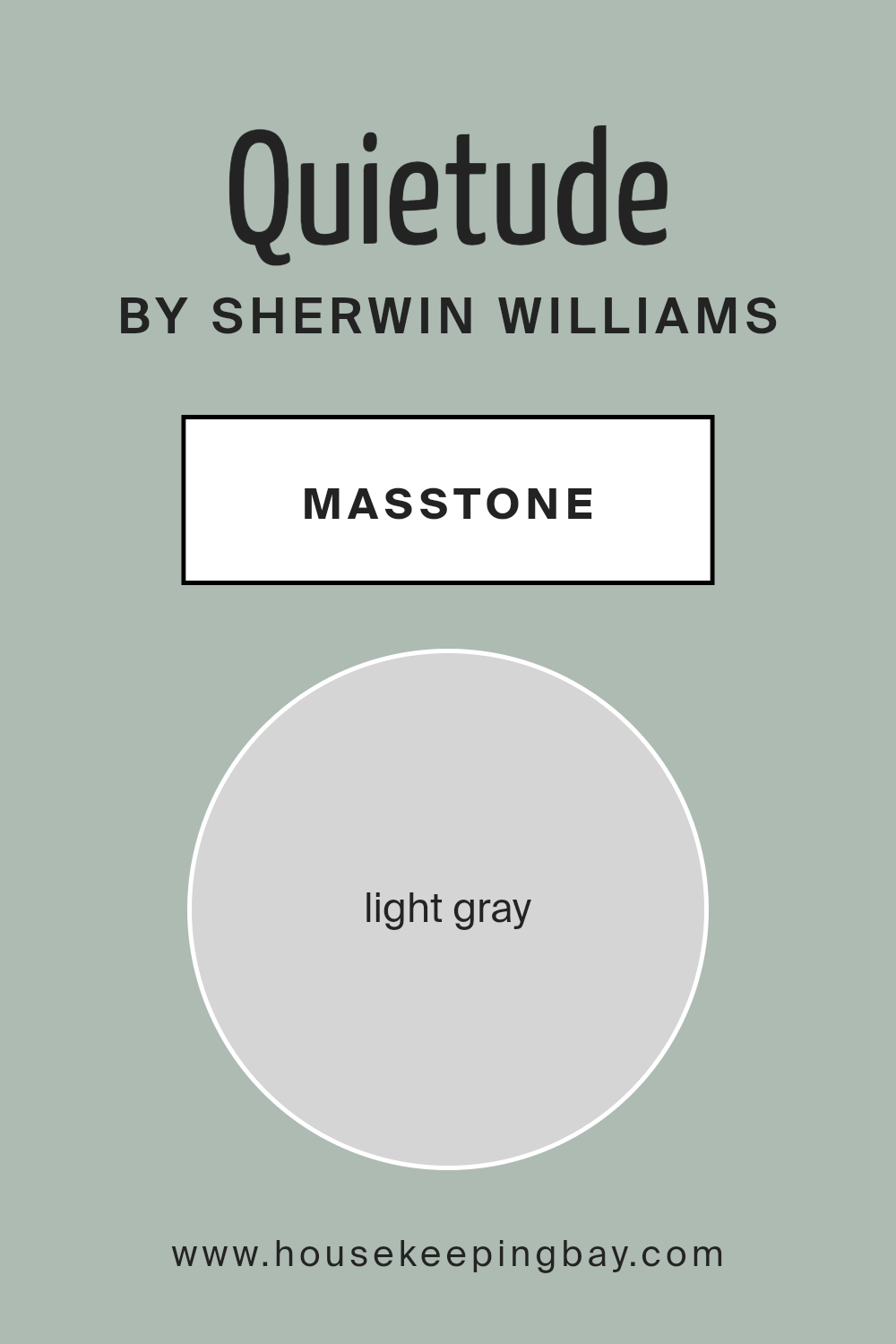
What is the Masstone of the Quietude SW 6212 by Sherwin Williams?
Quietude SW 6212 by Sherwin Williams has a masstone of Light Gray, marked with the code #D5D5D5. This particular shade of gray acts like a gentle whisper in any room, making spaces feel calm and collected. When used in homes, its light gray tone brings a kind of quiet elegance without overwhelming the senses. This color seamlessly fits in various types of decor, making it incredibly adaptable and versatile.
Putting Quietude SW 6212 on the walls can significantly open up a room, making smaller spaces appear larger and more inviting. Its lightness reflects natural light beautifully, enhancing the brightness of a room, especially during the day. For bedrooms, living rooms, or even home offices, this color creates a peaceful backdrop that encourages relaxation and focus. It’s soft enough to serve as a neutral base, making it easy to combine with other colors and textures, from vibrant accents to deeper shades, adding depth and interest to any interior design scheme. Whether aiming for a modern minimalistic look or a cozy, eclectic vibe, Quietude SW 6212’s light gray masstone offers an effortlessly chic canvas to work with.
housekeepingbay.com
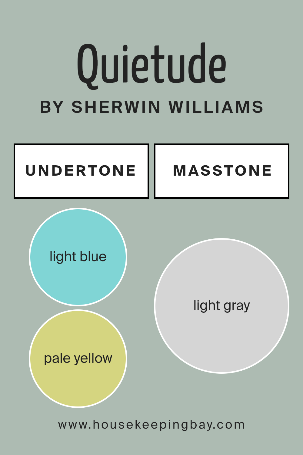
Undertones of Quietude SW 6212 by Sherwin Williams
Quietude SW 6212 by Sherwin Williams is a beautiful color with a mix of subtle undertones that can really change how it looks in different settings. These undertones include light blue, pale yellow, mint, light purple, lilac, pale pink, and grey.
The undertones in a paint color are like secret ingredients. They can add depth and complexity, affecting the overall look and feel of the color. Depending on the lighting and surrounding colors, one undertone might stand out more than another. This is why the same paint can look slightly different from one room to another or even one wall to another.
In the case of Quietude SW 6212, these varied undertones make the color highly versatile. For example, in a room with a lot of natural light, the pale yellow or mint undertones might make the color feel warmer and more welcoming. In artificial light, the lilac or light purple undertones could stand out, giving the room a cooler, more serene vibe.
When used on interior walls, Quietude can create a peaceful and inviting space. The light blue and mint undertones can make a small room feel more open and airy, while the pale pink and lilac can add a soft, comforting feel to a bedroom or living area. The grey undertone helps to ground the color, ensuring it doesn’t feel too overwhelming or bright.
Overall, the unique mix of undertones in Quietude SW 6212 makes it a flexible and interesting choice for interior walls. It’s capable of adapting to various styles and lighting conditions, ensuring your space always feels just right.
housekeepingbay.com
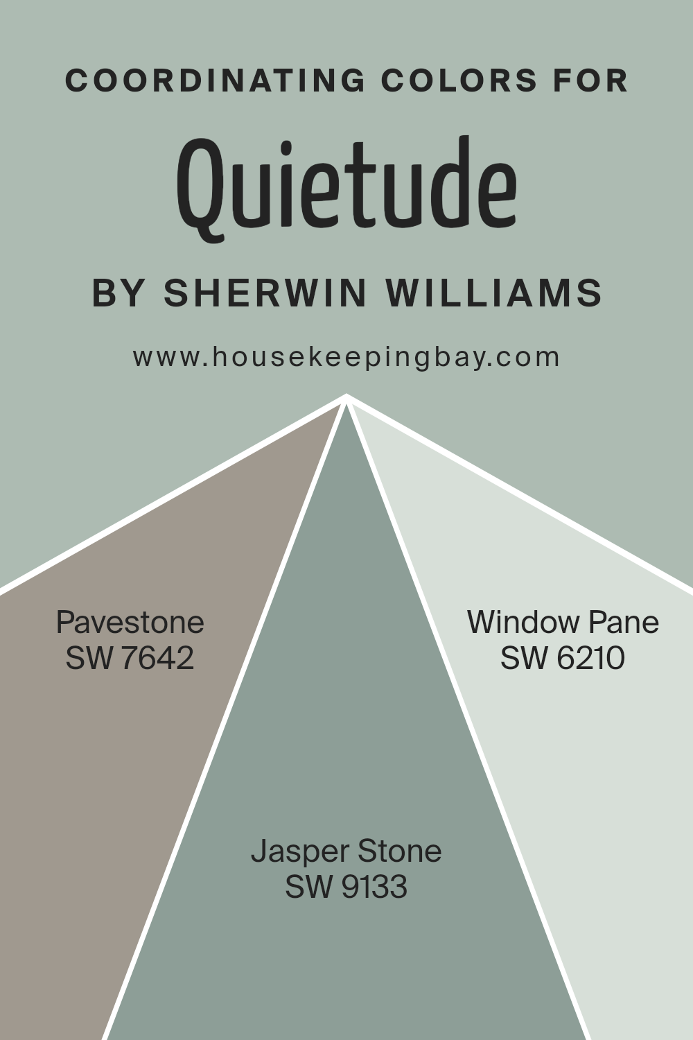
Coordinating Colors of Quietude SW 6212 by Sherwin Williams
Coordinating colors work together harmoniously to enhance the overall appearance of a space, offering a visually pleasing palette that can bring out the best in each other. When we look at Quietude SW 6212 by Sherwin Williams, a serene and softly muted green, the importance of choosing the right coordinating colors cannot be overstressed. Coordinating colors, like SW 7642 – Pavestone, SW 9133 – Jasper Stone, and SW 6210 – Window Pane, are selected for their ability to complement and elevate this primary hue, ensuring that the atmosphere in any room feels balanced and well thought out.
Pavestone SW 7642 is a robust, grounding shade that brings a sense of stability and depth to spaces, meshing well with the tranquility of Quietude by providing a sturdy, neutral base. Jasper Stone SW 9133 introduces a subtle hint of color, a muted green with undertones that resonate beautifully alongside Quietude, offering a natural, earthy vibe that’s both refreshing and soothing. Lastly, Window Pane SW 6210 serves as a light, airy complement, a soft and almost ethereal blue that can brighten spaces while still aligning perfectly with Quietude’s calm and restful nature. Together, these colors form a cohesive palette that creates a peaceful, harmonious environment, using their combined strengths to enhance the visual appeal and atmosphere of any room.
You can see recommended paint colors below:
- SW 7642 Pavestone
- SW 9133 Jasper Stone
- SW 6210 Window Pane
housekeepingbay.com
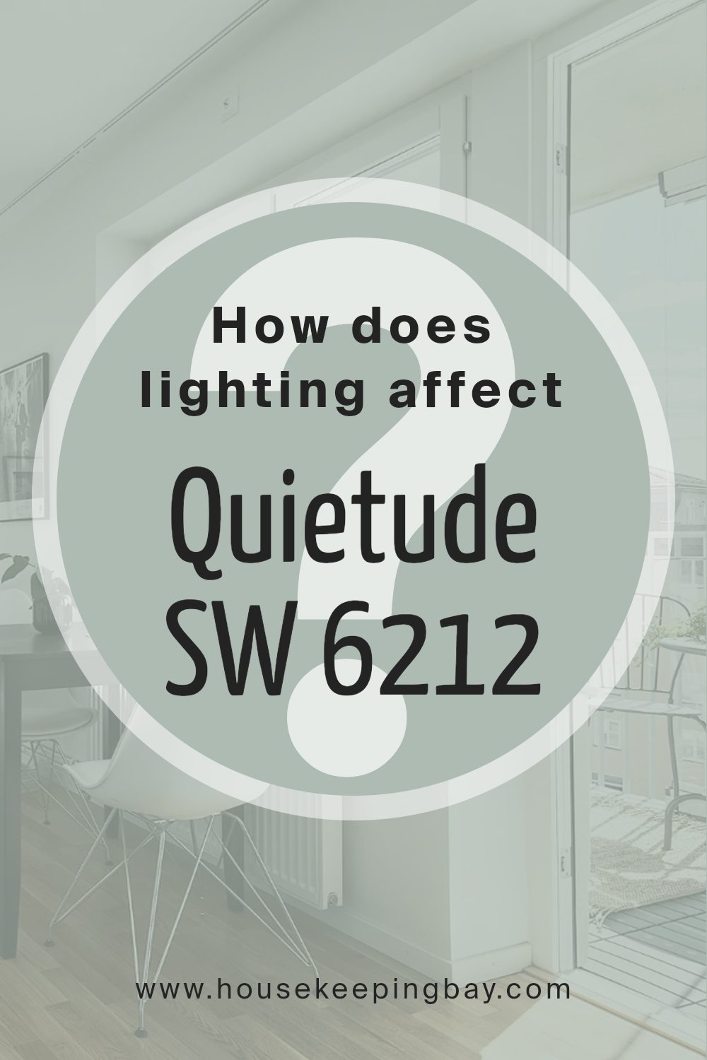
How Does Lighting Affect Quietude SW 6212 by Sherwin Williams?
Lighting plays a crucial role in how colors appear in any space. Different light sources can make the same color look varied, altering its intensity, brightness, and hue. When considering a specific color like Quietude SW 6212 by Sherwin Williams, it’s essential to understand how it behaves under various lighting conditions to achieve the desired effect in your space.
- In artificial light, the impact on Quietude can vary depending on the type of bulbs used. Warm-toned lights, such as those from incandescent bulbs, will bring out the cozy and comforting tones of Quietude, making spaces feel more inviting. On the other hand, cooler light, like that from LED or fluorescent bulbs, may highlight its cooler undertones, giving the color a crisper appearance.
- Natural light, influenced by the direction of the room, also affects how Quietude looks:
- North-faced rooms: These rooms get less direct sunlight, which can make colors appear slightly cooler and more muted. Quietude may seem more subdued and softer in north-facing rooms, emphasizing its calming and serene qualities.
- South-faced rooms:These receive ample sunlight, making colors warmer and brighter. In south-facing rooms, Quietude will likely appear lighter and more vibrant, enhancing its soothing but cheerful vibe.
- East-faced rooms: Morning light in these rooms is warmer, making Quietude look soft and warm in the morning but cooler and more shadowed as the day progresses. This daily change can bring a dynamic feel to the space with this color.
- West-faced rooms: The evening light in west-facing rooms brings warmth and a golden glow, which can make Quietude feel warmer and more welcoming in the afternoons and evenings.
Understanding these nuances of lighting can help you choose the right setting for Quietude SW 6212, ensuring that the color aligns with the mood and atmosphere you’re aiming to create in your space. Whether bathed in natural or artificial light, the direction your room faces significantly influences how this versatile color will ultimately present itself.
housekeepingbay.com
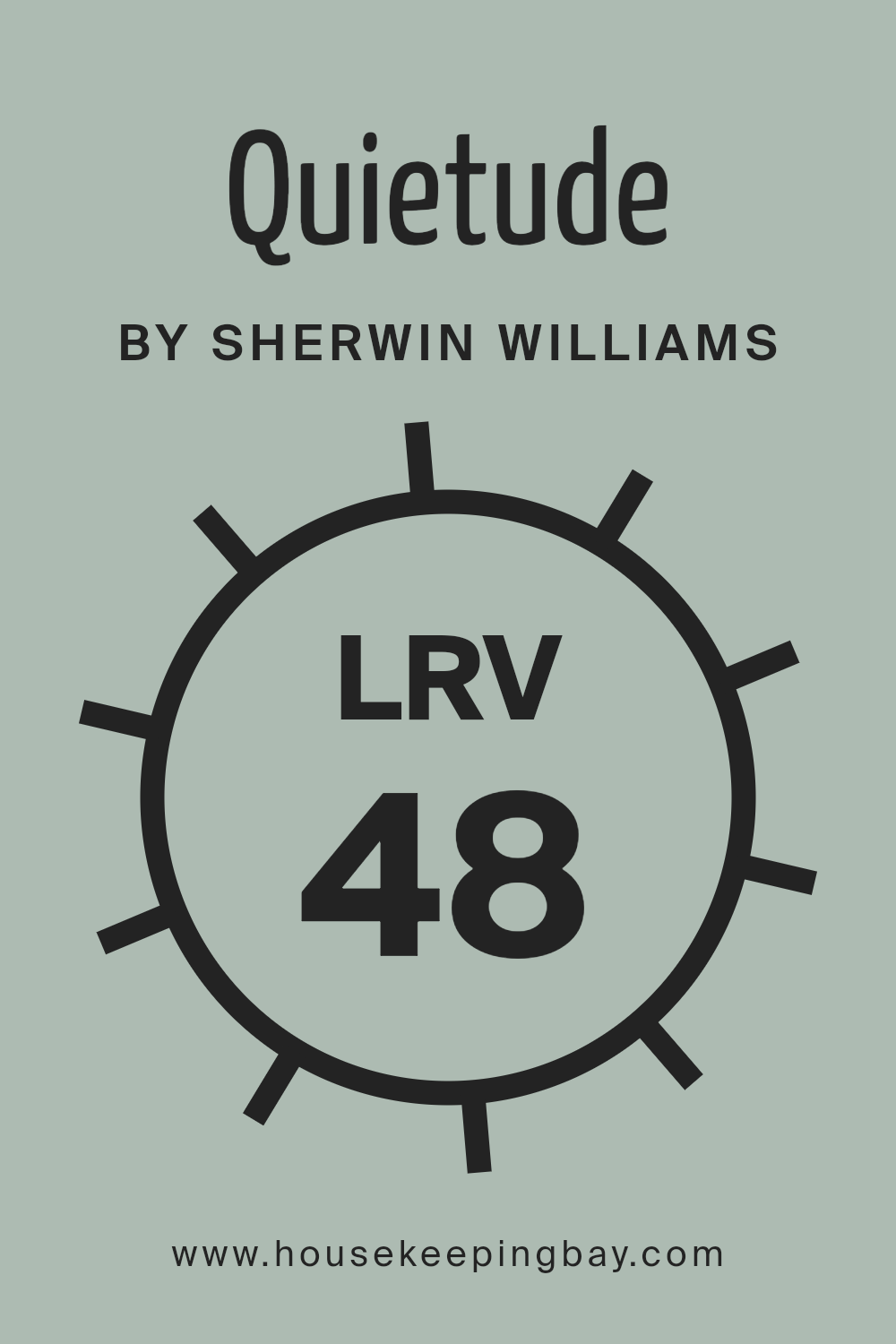
What is the LRV of Quietude SW 6212 by Sherwin Williams?
LRV stands for Light Reflectance Value, a measurement that tells you how much light a paint color reflects or absorbs. Think of it like this: on a scale from 0 to 100, a pure black, which doesn’t reflect light, would have an LRV of 0, while a pure white, reflecting all the light, would sit at 100. In simpler terms, colors with higher LRVs make rooms feel brighter because they reflect more light around the space. On the other hand, colors with lower LRVs absorb more light, which can make a room feel cozier but also a bit darker.
Now, looking at Quietude SW 6212 by Sherwin Williams with an LRV of 47.605, it sits almost in the middle of the scale. This means it has a balanced mix of reflecting and absorbing light. In a room with plenty of natural sunlight, Quietude will appear lighter and more airy, helping to create a tranquil and soft atmosphere. However, in spaces with less natural light, it might look a bit darker but still provides a warm and soothing ambiance. The specific LRV of Quietude suggests that it’s versatile and can work in various settings, adapting subtly to the changing light conditions of the space it graces.
housekeepingbay.com
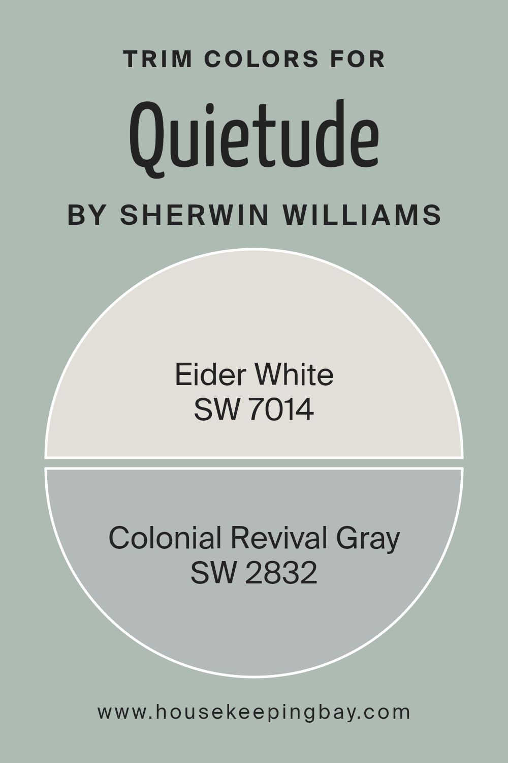
What are the Trim colors of Quietude SW 6212 by Sherwin Williams?
Trim colors are essentially the hues used for the detailing work in spaces, like door frames, skirtings, window frames, and molding, aimed at enhancing architectural features or adding a pop of contrast to the primary wall color. For a serene and soothing paint like Quietude SW 6212 by Sherwin Williams, selecting the right trim colors can accentuate its calming effect while bringing out the best in the room’s features. Trim colors can either blend smoothly with the primary color for a subtle definition or create a striking outline that frames and defines the space, guiding the eye along the room’s architectural contours and elevations.
Using SW 7014 – Eider White as a trim color introduces a subtle, warm white that provides a soft, almost minimalist contrast to Quietude, enhancing the peaceful and serene ambiance without overpowering it. It’s a versatile choice that pairs beautifully, adding just the right amount of definition without creating too much contrast. On the other hand, SW 2832 – Colonial Revival Gray offers a deeper, more defined contrast that can articulate the architectural details more prominently against Quietude’s backdrop. This gray shade brings a timeless elegance, ensuring the trim details are highlighted in a sophisticated and understated manner, making it a great choice for those looking to add a bit more depth and character to their space.
You can see recommended paint colors below:
- SW 7014 Eider White
- SW 2832 Colonial Revival Gray
housekeepingbay.com
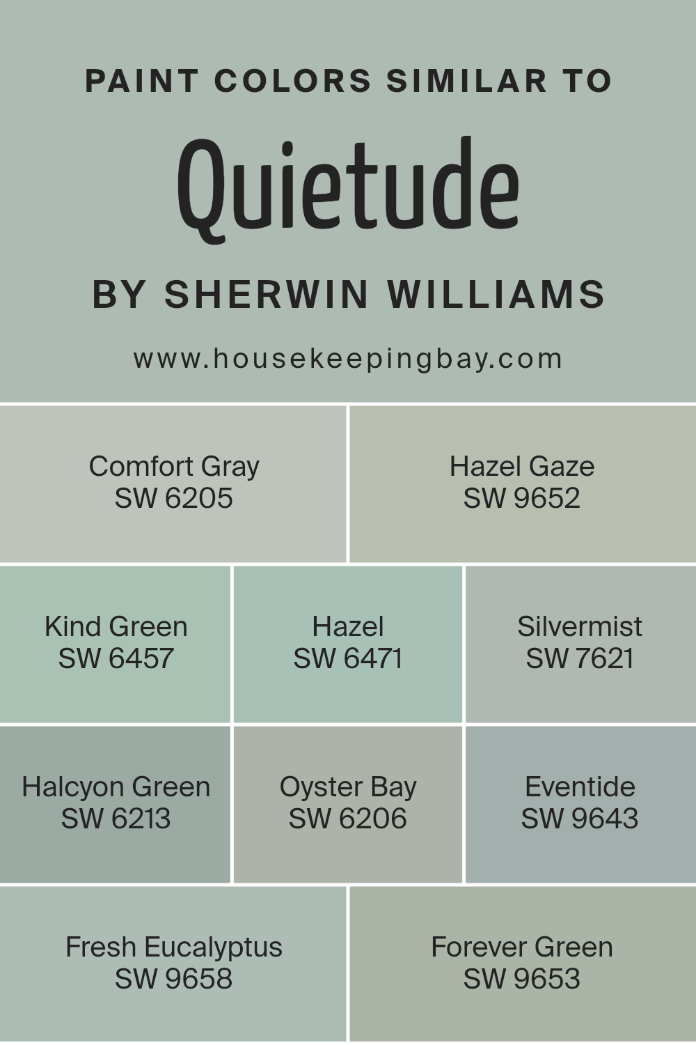
Colors Similar to Quietude SW 6212 by Sherwin Williams
Choosing similar colors, like those akin to Quietude SW 6212 by Sherwin Williams, plays a crucial role in creating a harmonious and visually appealing space. Similar colors work by sharing common hues, which allows for a seamless transition from one color to the next. This smooth blend can enhance the feeling of calmness and coherence in a room without causing a visual shock to the eyes. For example, when used together, colors like Comfort Gray SW 6205 and Halcyon Green SW 6213 can create a soothing backdrop that is both elegant and understated. These colors, because of their shared qualities, can easily complement each other, enhancing the overall ambiance of a space.
Comfort Gray brings to mind a serene sky, offering a gentle muted backdrop, while Hazel Gaze has a deeper, more grounding earth tone. Kind Green is soft and subtle, providing a hint of natural freshness. Hazel presents as a warm, inviting brown with a green undertone, creating a sense of coziness. Silvermist has an ethereal quality, much like a misty morning. Halcyon Green and Oyster Bay offer a retreat into a serene, peaceful escape with their soft, calming presence. Eventide brings a quiet, reflective mood. Fresh Eucalyptus and Forever Green introduce vigor and life, reminiscent of thriving greenery, completing the scene with a touch of vitality. Together, these colors create a cohesive, tranquil space where every hue plays an important role, subtly supporting and enhancing one another for a polished, unified look.
You can see recommended paint colors below:
- SW 6205 Comfort Gray
- SW 9652 Hazel Gaze
- SW 6457 Kind Green
- SW 6471 Hazel
- SW 7621 Silvermist
- SW 6213 Halcyon Green
- SW 6206 Oyster Bay
- SW 9643 Eventide
- SW 9658 Fresh Eucalyptus
- SW 9653 Forever Green
housekeepingbay.com
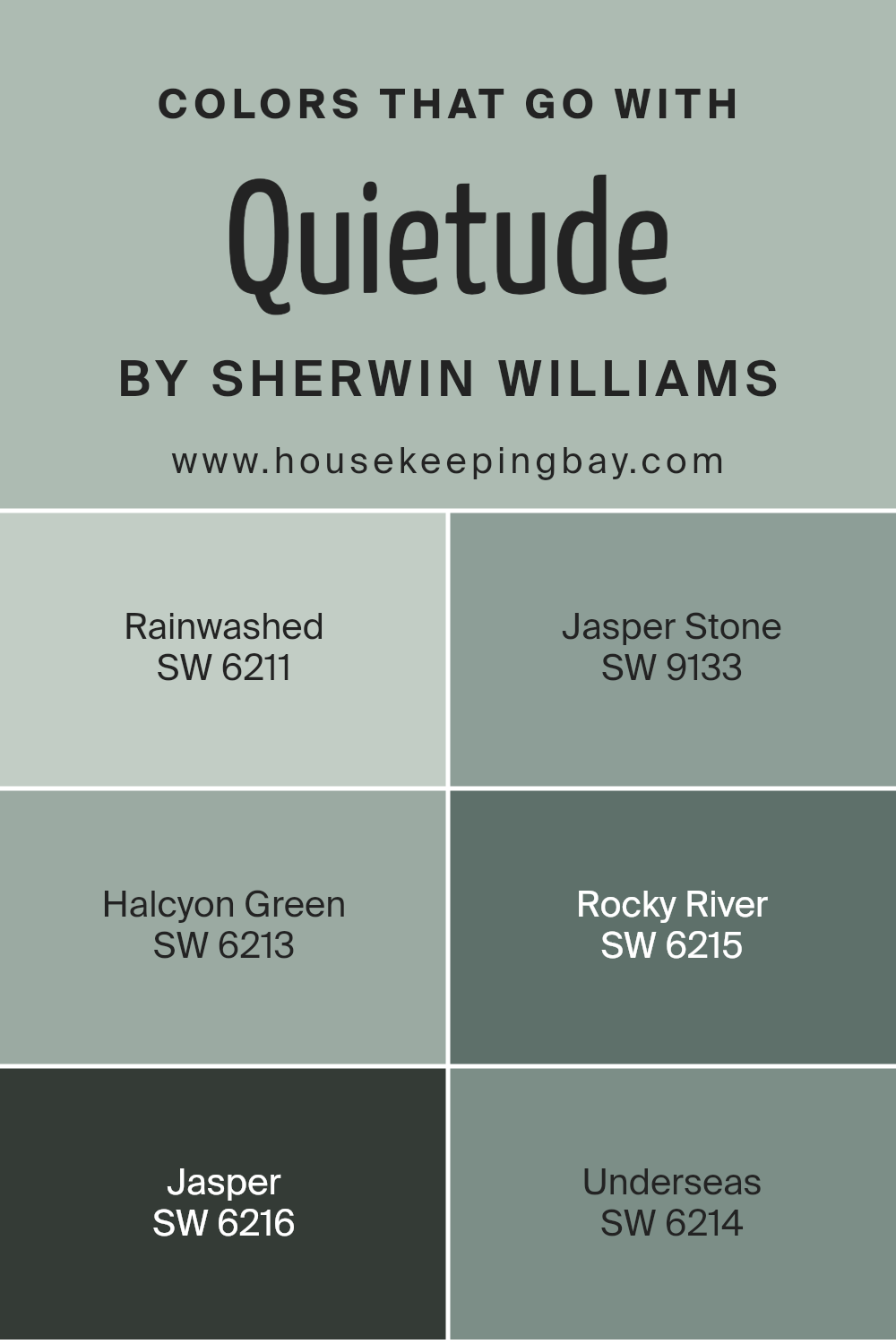
Colors that Go With Quietude SW 6212 by Sherwin Williams
When choosing colors to complement Quietude SW 6212 by Sherwin Williams, it’s essential for creating a cohesive and inviting atmosphere in your space. These colors work because they share complementary tones that enhance the beauty and tranquility of Quietude, a soft, soothing greenish-gray hue. By selecting shades that harmonize with Quietude, you’re able to design a room that feels balanced and welcoming, whether you’re going for a calm retreat or a lively gathering space.
Take for instance Rainwashed SW 6211, a gentle blue with a touch of green, it brings in a sense of serenity and openness, like a breath of fresh air in your living space. Jasper Stone SW 9133, on the other hand, is a deeper, earthy green that adds a rich, grounding effect, perfect for accent walls or furniture. Halcyon Green SW 6213 is a lighter green that pairs beautifully with Quietude, offering a refreshing and nature-inspired vibe.
Rocky River SW 6215 moves into the deeper, bluer territory, providing a striking contrast that remains in harmony. Jasper SW 6216 introduces a robust clay tone that enriches the palette with its depth and warmth, whereas Underseas SW 6214, a deep teal, injects a bold yet harmonious energy into the mix. Together, these colors create a versatile palette that can transform a room into a beautifully coordinated space that feels both sophisticated and welcoming.
You can see recommended paint colors below:
- SW 6211 Rainwashed
- SW 9133 Jasper Stone
- SW 6213 Halcyon Green
- SW 6215 Rocky River
- SW 6216 Jasper
- SW 6214 Underseas
housekeepingbay.com
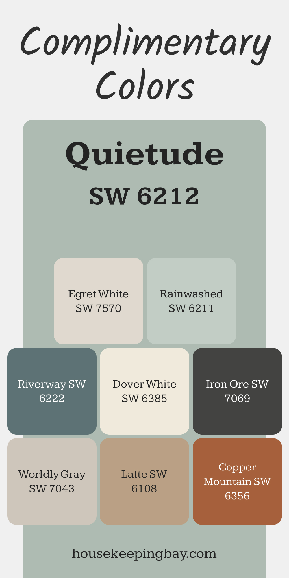
Complimentary Colors for Quietude SW 6212 Paint Color by Sherwin Williams
Quietude pairs beautifully with soft neutrals like Eider White and Dover White, offering a clean and airy backdrop. Worldly Gray adds a subtle touch of depth while maintaining a serene balance in the space.
Iron Ore and Copper Mountain provide striking contrast, while Rainwashed and Riverway bring fresh, complementary tones.
Latte offers a warm touch, blending seamlessly with Quietude’s peaceful blue-green hue.
via housekeepingbay.com
How to Use Quietude SW 6212 by Sherwin Williams In Your Home?
Quietude SW 6212 by Sherwin Williams is a soothing paint color that can really transform your home into a peaceful oasis. Imagine stepping into a room and immediately feeling a wave of calm wash over you; that’s the power of Quietude. It has a subtle green undertone that reminds you of a tranquil forest or a soft morning mist.
This color is versatile and can be used in any room of your house. In the bedroom, it can create a serene backdrop for rest and relaxation. In the living room or study, Quietude can help foster a calming environment, perfect for reading or unwinding after a long day. The kitchen and bathroom can also benefit from this color, adding a refreshing and clean feel to these spaces.
When pairing with furniture and decor, Quietude goes well with both light and dark tones, allowing you to mix and match according to your style. Natural wood, white accents, and soft, textured fabrics complement this color beautifully, further enhancing its calming effect. Quietude SW 6212 is more than just a paint color; it’s a simple way to make your home a more peaceful and relaxing place to live.
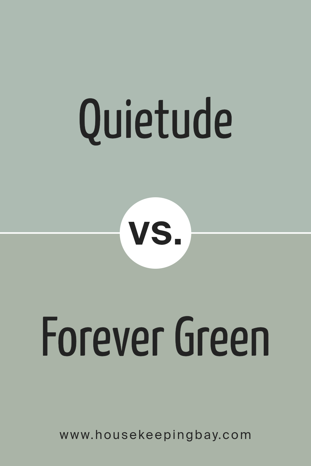
Quietude SW 6212 by Sherwin Williams vs Forever Green SW 9653 by Sherwin Williams
Quietude SW 6212 and Forever Green SW 9653, both from Sherwin Williams, offer unique vibes for any space. Quietude is a light, soft green with a hint of blue, creating a calm and serene feel. It’s perfect for a peaceful bedroom or a relaxing living area. On the other hand, Forever Green is a bold, vibrant green that brings energy and life into a room. It’s great for spaces that need a pop of color or for accent walls that stand out. While Quietude leans towards a more subtle, muted tone, Forever Green goes all in with brightness and vivacity.
Whether you want to create a soothing retreat or invigorate your surroundings, these two colors offer distinct options. Choosing between them depends on the mood you want to set: tranquil and gentle with Quietude or cheerful and lively with Forever Green.
You can see recommended paint color below:
housekeepingbay.com
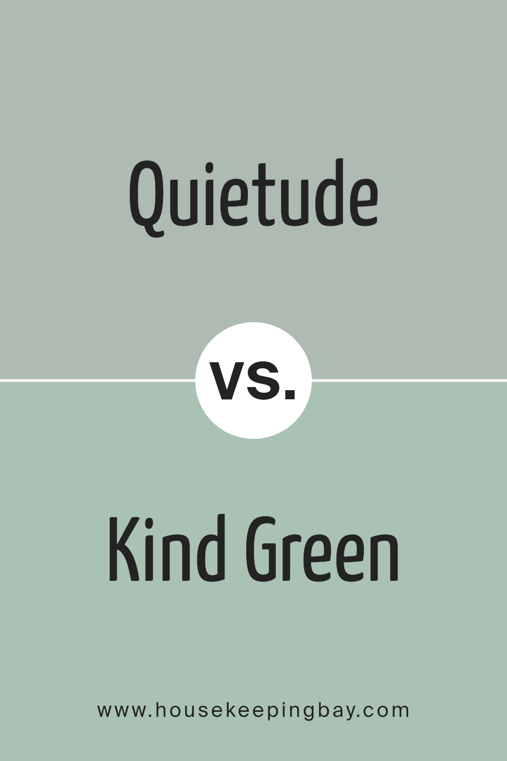
Quietude SW 6212 by Sherwin Williams vs Kind Green SW 6457 by Sherwin Williams
Quietude SW 6212 by Sherwin Williams is a soothing, soft green with a hint of gray, giving it a calm and serene vibe. This color is gentle and can make any space feel tranquil and peaceful. It’s perfect for bedrooms or any area where you want to create a restful atmosphere.
On the other hand, Kind Green SW 6457 by Sherwin Williams is a brighter, more vibrant green. This shade brings a fresh and lively feel to any room, ideal for spaces where you want to add energy and a touch of nature. Kind Green is bolder and can make a statement without overwhelming the space.
While Quietude offers a more subdued and cozy feel, Kind Green brings in a dynamic and refreshing energy. Both colors celebrate the versatility of green in decorating but cater to different moods and settings. Choosing between them depends on whether you’re looking for a calming retreat or an invigorating sanctuary.
You can see recommended paint color below:
- SW 6457 Kind Green
housekeepingbay.com
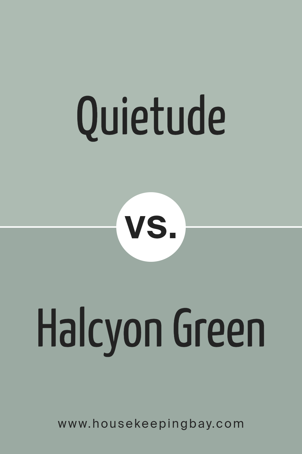
Quietude SW 6212 by Sherwin Williams vs Halcyon Green SW 6213 by Sherwin Williams
Quietude SW 6212 by Sherwin Williams is a soft, peaceful green that gives a calm and tranquil vibe to any space. It has a hint of grey, making it versatile and easy to blend with different decor styles. This color can make rooms feel larger and more open, providing a soothing backdrop that’s not too bold but still adds character.
On the other hand, Halcyon Green SW 6213 by Sherwin Williams is one shade darker, offering a slightly richer and earthier tone. It carries more depth, bringing a cozy warmth to interiors. This color is perfect for creating a welcoming and comfortable atmosphere, making it a great choice for living areas and bedrooms where you want a bit more color without overwhelming the space.
Both colors sit next to each other on the color wheel, making them complementary. However, Quietude leans towards a lighter, airier feel, while Halcyon Green offers a bit more substance and grounding. Depending on the mood you want to create, either could be a perfect choice.
You can see recommended paint color below:
housekeepingbay.com
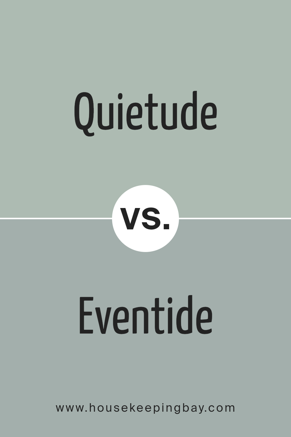
Quietude SW 6212 by Sherwin Williams vs Eventide SW 9643 by Sherwin Williams
Quietude SW 6212 and Eventide SW 9643 are two paint colors from Sherwin Williams, each bringing its own unique vibe to a space. Quietude is a soft, serene green with a hint of gray, making it perfect for creating a calm and soothing atmosphere. It’s a color that works well in bedrooms or any place where relaxation is key. On the other hand, Eventide is a deeper, more intense shade. While it still maintains a sense of calm, its richness adds a layer of sophistication and depth to a room. This color can make a striking statement in living areas or dining rooms, especially when aiming for a more dramatic look. Despite their differences, both colors have a way of modernizing a space while keeping it welcoming. Whether you prefer the lighter, airy feel of Quietude or the bold, cozy ambiance of Eventide, either choice will refresh your home with style.
You can see recommended paint color below:
housekeepingbay.com
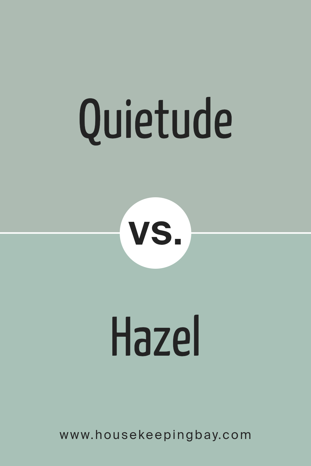
Quietude SW 6212 by Sherwin Williams vs Hazel SW 6471 by Sherwin Williams
Quietude SW 6212 by Sherwin Williams is a calm, soft green with a touch of gray. It gives off a serene and soothing vibe, perfect for creating a peaceful and relaxing atmosphere in any room. This color works well in spaces where you want to unwind and feel at ease, such as bedrooms or living rooms.
Hazel SW 6471, on the other hand, is a more vibrant, energetic green with hints of blue. It’s a lively color that can brighten up a space and give it a fresh, cheerful look. Hazel is great for areas where you want to add a pop of color and vitality, like kitchens or bathrooms.
While both colors come from the green family, Quietude is more subdued and understated, making it ideal for a calm, tranquil setting. Hazel is bolder and more dynamic, perfect for injecting life and energy into a space. Depending on the mood you want to create, either color could be a great choice.
You can see recommended paint color below:
- SW 6471 Hazel
housekeepingbay.com
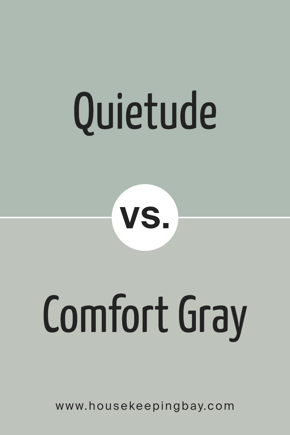
Quietude SW 6212 by Sherwin Williams vs Comfort Gray SW 6205 by Sherwin Williams
Quietude SW 6212 and Comfort Gray SW 6205, both from Sherwin Williams, are like close cousins in the world of colors. Quietude is a gentle, muted green that has a serene and peaceful vibe. It’s like looking at a soft, lush meadow that instantly makes you feel at ease. It has a touch of warmth that makes any room feel more inviting and cozy.
Comfort Gray, on the other hand, lives up to its name with a comforting blend of gray with subtle green undertones. It’s more like looking at a stormy sea than a calm meadow, offering a sense of stability and calmness. This color is versatile, fitting well in spaces that aim for a more grounded and tranquil atmosphere.
Both colors bring a sense of calm to any space, but while Quietude leans towards a warmer, more pastel approach, Comfort Gray goes for a slightly cooler, more neutral vibe. Depending on the mood you want to create, either could be the perfect choice. Whether you’re going for a soft, welcoming feel with Quietude or a more muted, serene environment with Comfort Gray, you can’t really go wrong.
You can see recommended paint color below:
housekeepingbay.com
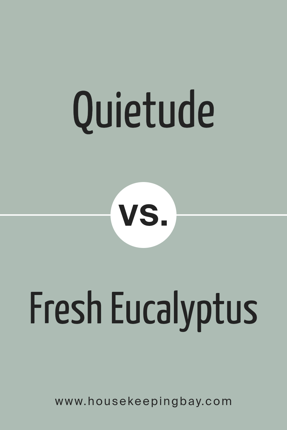
Quietude SW 6212 by Sherwin Williams vs Fresh Eucalyptus SW 9658 by Sherwin Williams
Quietude SW 6212 and Fresh Eucalyptus SW 9658 are both Sherwin Williams colors, but they have their unique qualities. Quietude is a soft, soothing green with grey undertones, creating a calm and tranquil vibe perfect for spaces where you want to relax. Think of it as a gentle whisper in a room, offering a peaceful and restful feeling. On the other hand, Fresh Eucalyptus is a brighter, more vibrant green.
It has a lively and refreshing energy, much like the plant it’s named after. This color brings a bit of nature indoors, making any room feel fresh and full of life. While Quietude leans towards a muted, serene palette, Fresh Eucalyptus stands out with its more dynamic and cheerful presence. Choosing between them depends on the mood you’re aiming for: Quietude for serenity and Fresh Eucalyptus for a burst of energy.
You can see recommended paint color below:
- SW 9658 Fresh Eucalyptus
housekeepingbay.com
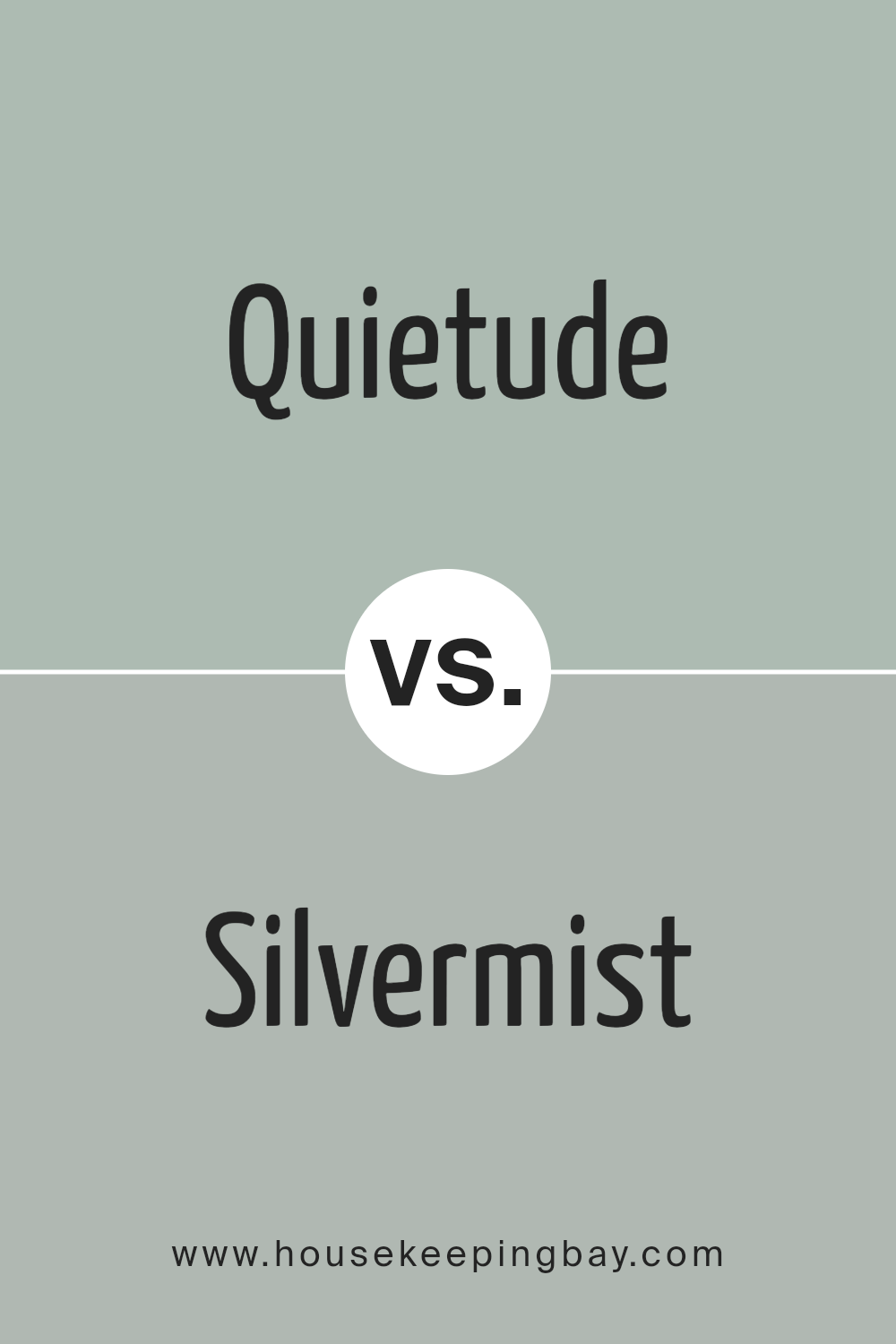
Quietude SW 6212 by Sherwin Williams vs Silvermist SW 7621 by Sherwin Williams
Quietude SW 6212 and Silvermist SW 7621 are two beautiful colors by Sherwin Williams, but they bring different vibes to a space. Quietude is a soft, calming green with a hint of gray, creating a peaceful atmosphere that’s perfect for rooms where you want to relax or focus. It’s like a breath of fresh air in your home, offering a gentle touch of nature.
Silvermist, on the other hand, is a cooler, more muted shade that leans towards a soft blue-gray. This color brings a serene and sophisticated feel to any room, making spaces feel open and tranquil. It’s great for achieving a modern, chic look without going too bold.
Both colors work well in various lighting and can complement a wide range of decor styles. Quietude tends to warm up a room with its subtle green undertones, while Silvermist keeps things cool and collected with its blend of blue and gray. So, whether you’re looking for something cozy and inviting (Quietude) or something more refined and laid-back (Silvermist), these colors offer great options.
You can see recommended paint color below:
- SW 7621 Silvermist
housekeepingbay.com
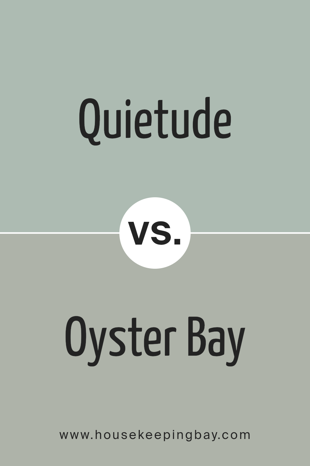
Quietude SW 6212 by Sherwin Williams vs Oyster Bay SW 6206 by Sherwin Williams
Quietude SW 6212 and Oyster Bay SW 6206, both by Sherwin Williams, are unique colors that bring different vibes to a space. Quietude is a soft, peaceful green with hints of gray. It creates a calm and soothing atmosphere, perfect for bedrooms or quiet areas. Oyster Bay, on the other hand, has a deeper, richer green tone with gray undertones. It’s a bit more dynamic and can add a sense of sophistication and depth to spaces like living rooms or studies.
While Quietude offers a gentle, serene backdrop, Oyster Bay provides a stronger presence due to its deeper hue. This makes Oyster Bay a good choice for anyone looking to make a bit more of a statement in their space, whereas Quietude is ideal for creating a tranquil retreat. Both colors work well with natural light, but Oyster Bay might need a bit more care in lighting decisions to ensure it doesn’t darken a room too much.
Whether you prefer the softer, relaxing touch of Quietude or the bolder, richer look of Oyster Bay, each color brings its unique charm to the home.
You can see recommended paint color below:
housekeepingbay.com
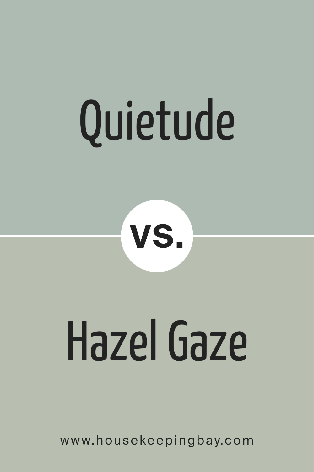
Quietude SW 6212 by Sherwin Williams vs Hazel Gaze SW 9652 by Sherwin Williams
Quietude SW 6212 by Sherwin Williams is a soothing, soft green with a hint of gray. It has a calming effect, perfect for creating a serene and peaceful atmosphere in any space. Its lightness brings a sense of freshness and tranquility, making it ideal for bedrooms or quiet sitting areas where relaxation is key.
Hazel Gaze SW 9652, on the other hand, is a warmer tone, leaning towards a brown with a soft orange undertone. This color radiates warmth and comfort, suggesting an inviting and cozy environment. It’s great for living rooms or dining areas where a welcoming and nurturing vibe is desired.
While both colors offer a sense of calm, Quietude leans towards a cool, airy feel, reminiscent of a gentle daybreak. Hazel Gaze offers warmth, akin to the soothing embrace of an autumn sunset. Each brings its unique charm to a space, Quietude with its breath of fresh air, and Hazel Gaze with its snug, homey appeal.
You can see recommended paint color below:
housekeepingbay.com
Conclusion
Choosing the right paint color for your space is a big decision, and SW 6212 Quietude by Sherwin Williams is a choice you won’t regret. This beautiful shade of greenish-blue has the power to transform any room into a peaceful sanctuary. Its soothing tones bring a sense of calm and tranquility, making it perfect for bedrooms, bathrooms, or any area where relaxation is key.
You’ll find that Quietude is incredibly versatile. Whether your home has a modern vibe or leans more towards traditional decor, this color fits right in. It pairs wonderfully with a wide range of colors – from neutrals like whites and grays to more vibrant hues. This flexibility allows you to create a space that truly reflects your personal style without overwhelming the senses.
Moreover, Quietude’s understated elegance adds a touch of sophistication to your home. It enhances the other elements of your decor, allowing furniture and artwork to stand out beautifully. It’s not just a paint color; it’s a backdrop that elevates your home’s aesthetic appeal.
In conclusion, if you’re looking to refresh your space with a color that’s both beautiful and serene, SW 6212 Quietude by Sherwin Williams is an excellent choice. Its calming effect, versatility, and elegant simplicity make it a top pick for homeowners looking to create a soothing and stylish living environment.
housekeepingbay.com
Ever wished paint sampling was as easy as sticking a sticker? Guess what? Now it is! Discover Samplize's unique Peel & Stick samples. Get started now and say goodbye to the old messy way!
Get paint samples


