Malabar SW 9110 by Sherwin Williams
Unveiling Warmth and Sophistication with Every Brush Stroke
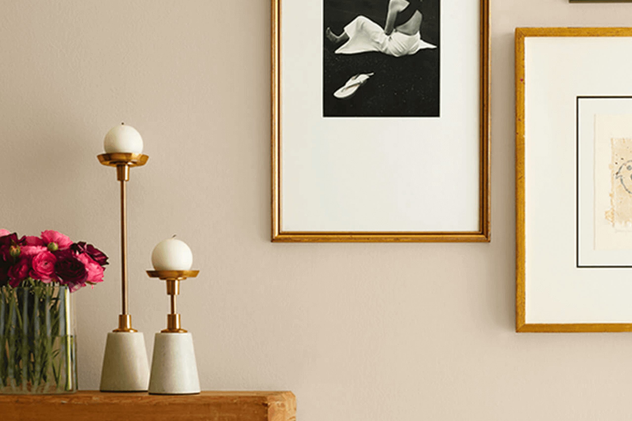
Are you thinking about giving your space a fresh look? Consider SW 9110 Malabar by Sherwin Williams. This paint color is a gentle beige that adds a warm and inviting feel to any room. Whether you’re looking to freshen up your living room, bedroom, or kitchen, Malabar is versatile enough to fit seamlessly into various decor styles and settings.
Malabar isn’t just any beige; it has a unique depth that pairs beautifully with both bold and subtle hues. This means you can easily match it with your existing furniture and accents or use it as a neutral backdrop for something new. It’s perfect if you’re into a minimalist style or even if you like richer, darker themes.
If finding the right paint color sometimes feels overwhelming, Malabar offers a soothing choice that’s hard to get wrong. It’s like a cozy blanket on a chilly day, making everyone feel at home. So, thinking about a change? Malabar could be just what you need to freshen up your space effortlessly.
via sherwin-williams.com
What Color Is Malabar SW 9110 by Sherwin Williams?
Malabar SW 9110 by Sherwin Williams is a warm, muted taupe that brings a sense of calm and sophistication to any space. This versatile color pairs well with a wide range of interior styles, particularly traditional, rustic, and contemporary designs. Its earthy hue makes it an excellent choice for creating a cozy, welcoming environment.
In traditional settings, Malabar works beautifully with rich woods such as mahogany and cherry, which enhance its warmth. It also complements ornate textiles like damask or velvet, adding a touch of elegance to the décor. For a rustic look, pairing Malabar with natural materials such as stone, jute, and unfinished wood can create a homely, organic feel.
In contemporary spaces, Malabar serves as a neutral backdrop that allows modern furnishings and vibrant accents to stand out. It looks sleek when combined with metals like brushed nickel or stainless steel, and it can soften industrial elements, making them feel more approachable.
Additionally, Malabar pairs nicely with softer textures, including wool, linen, and cotton, reinforcing a comfortable, relaxed atmosphere. It’s particularly effective in rooms that aim for a subtle, yet inviting ambiance, such as living rooms, bedrooms, and dining areas.
This color maintains its beauty under various lighting conditions, ensuring a stable, appealing look throughout the day.
housekeepingbay.com
Is Malabar SW 9110 by Sherwin Williams Warm or Cool color?
Malabar SW 9110 by Sherwin Williams is a unique paint color that carries a warm, neutral tone. This shade is particularly effective in creating a cozy and inviting atmosphere in homes. Its subtle richness can bring a sense of calm and comfort to any space, making it ideal for living rooms and bedrooms where relaxation is key.
The hint of earthiness in Malabar helps balance brighter colors and can serve as a beautiful backdrop for furniture and art. When paired with natural materials like wood or leather, it enhances the room’s overall aesthetic and provides a grounded, soothing vibe.
For homeowners who want a color that supports a variety of décor styles without overwhelming the space, Malabar is a perfect choice. It’s versatile enough to work in traditional, modern, or eclectic settings and its understated elegance makes it easy to incorporate into existing color schemes.
Overall, Malabar SW 9110 by Sherwin Williams is a great option for those looking to create a warm, welcoming environment in their home without going too bold.
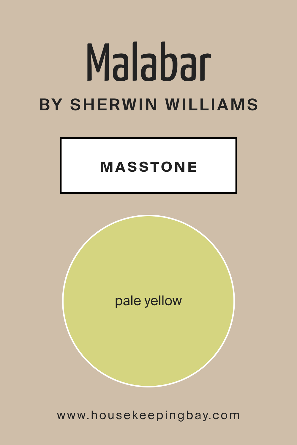
What is the Masstone of the Malabar SW 9110 by Sherwin Williams?
The MalabarSW 9110 by Sherwin Williams has a masstone of pale yellow, coded as #D5D580. This gentle and soft shade of yellow brings a subtle touch of brightness into any room without overwhelming the space. Because it’s not too bold or intense, it fits beautifully in various areas of a home, working especially well in living rooms, kitchens, or bedrooms where a calm and welcoming atmosphere is desired.
Pale yellow can make small rooms seem larger and more open, as it reflects light better than darker colors. It also pairs easily with many different decor styles and colors, from classic white trim to more vibrant blues or greens in furnishings.
This versatility means that homeowners can use Malabar SW 9110 to create a warm base for their decor, which can easily be updated with accents and accessories over time without needing a complete repaint. In essence, this color is ideal for creating a cozy, inviting space in a home.
housekeepingbay.com
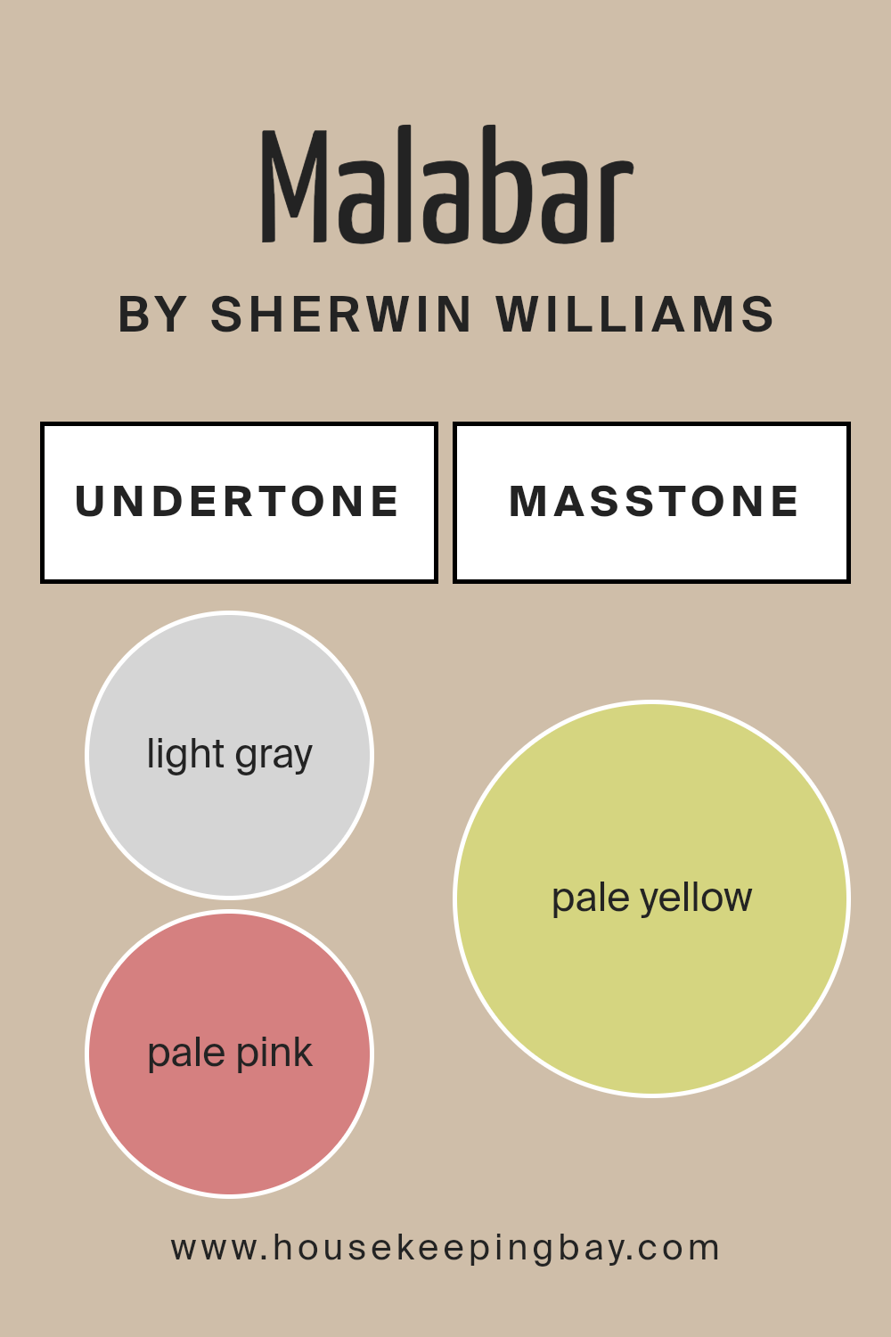
Undertones of Malabar SW 9110 by Sherwin Williams
Malabar SW 9110 by Sherwin Williams is a versatile paint color known for its rich blend of undertones. These undertones, ranging from light gray, pale pink, and light purple, to mint, light blue, grey, and beyond, significantly influence how this color appears in different settings and lighting.
Undertones are subtle hues mixed into the main color and can change the perception of the color depending on the surrounding elements and light. For Malabar SW 9110, the variety of undertones like lilac, yellow, orange, light green, and olive, add a complex depth that can make the wall paint look differently at various times of the day or in different types of lighting.
In interior walls, these undertones make Malabar an adaptive choice. In natural daylight, the lighter undertones, such as light gray and pale pink, might make the color appear softer and more soothing. In artificial lighting, darker undertones like grey and olive may become more noticeable, giving the walls a more grounded, secure feel.
This adaptability makes Malabar SW 9110 a good fit for many rooms regardless of their natural light exposure. It can offer a soothing backdrop in a brightly lit living room or a cozy atmosphere in a dimmer, more intimate space.
By understanding these undertones, you can better predict how this color will behave in your specific interior setting, ensuring it meets your aesthetic needs.
housekeepingbay.com
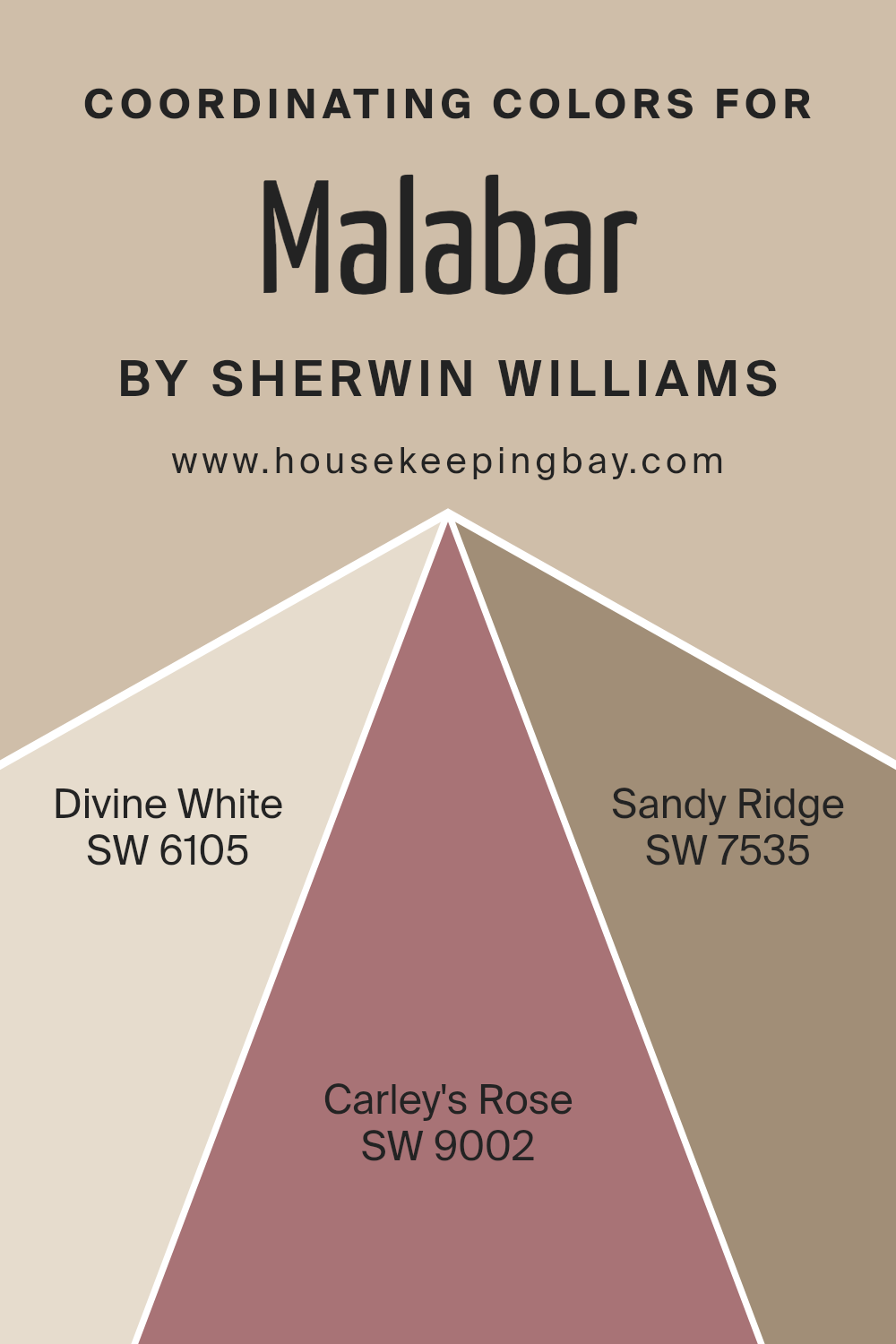
Coordinating Colors of Malabar SW 9110 by Sherwin Williams
Coordinating colors are shades that complement or enhance each other when used together in interior design or fashion. These colors are selected based on their ability to create a visually appealing and harmonious look. By choosing colors that coordinate well, you can achieve a balanced and cohesive appearance in any space. Often, these colors are chosen to align with a main shade, serving to accentuate or subtly contrast with it, thereby enhancing the overall aesthetic of the design.
Malabar SW 9110 by Sherwin Williams works beautifully with several coordinating colors like SW 6105 – Divine White, SW 9002 – Carley’s Rose, and SW 7535 – Sandy Ridge. Divine White is a soft, creamy off-white that provides a calm and gentle complement to richer, deeper hues, offering a soothing tone that is easy on the eyes.
Carley’s Rose is a soft, soothing pink with a hint of warmth, ideal for adding a touch of gentle color to a space without overwhelming it. Sandy Ridge, on the other hand, is a subtle taupe that merges gray and brown for a warm earthy feel that adds depth and sophistication to the palette. Each color supports and enhances Malabar, creating different moods and styles that suit any decor.
You can see recommended paint colors below:
- SW 6105 Divine White
- SW 9002 Carley’s Rose
- SW 7535 Sandy Ridge
housekeepingbay.com
How Does Lighting Affect Malabar SW 9110 by Sherwin Williams?
Lighting plays a crucial role in the perception of colors. The type and intensity of light can significantly alter how we see and experience colors in our environments. Malabar SW 9110 by Sherwin Williams, a warm, soft taupe, demonstrates how lighting can influence color appearance.
Artificial Light vs. Natural Light:
Under artificial lighting, Malabar SW 9110 can appear richer and slightly darker, particularly under warm, yellow light, like that from incandescent bulbs. This type of lighting enhances the warm undertones of Malabar, making spaces feel cozy and welcoming. In cooler artificial light, such as that from fluorescent bulbs, Malabar might lose some of its warmth, appearing more muted and neutral.
In contrast, natural light brings out the truest form of Malabar SW 9110. Sunlight reveals the complexity of this taupe, showcasing its subtle blend of brown and gray.
As the quality of natural light changes from dawn to dusk, so too does the appearance of Malabar, shifting from a soft morning light that highlights its warm tones, to a clearer, brighter midday light that might make it appear lighter, and finally to a serene late-day light that deepens its hues.
Room Orientation:
In north-facing rooms, which receive less direct sunlight and have cooler light, Malabar SW 9110 may appear more subdued and slightly cooler, emphasizing its gray qualities more than its taupe ones. These rooms don’t enhance the warmth of Malabar as effectively, but the color still helps to add a touch of softness in such spaces.
South-facing rooms benefit from ample sunlight throughout the day, which warms and enlivens the appearance of Malabar SW 9110, making it look more vibrant and cozy. The color becomes especially inviting under these conditions.
East-facing rooms catch the morning sun, which can make Malabar SW 9110 look exceptionally warm and welcoming in the morning, fading to a softer and more neutral hue as the day progresses.
West-facing rooms see the most dramatic change, as they receive the intense late afternoon light. Malabar takes on a richer, deeper tone in the evenings, becoming more pronounced and dynamic.
Understanding how Malabar SW 9110 interacts with light in various settings can help in making informed decisions about where to apply this versatile color to achieve desired effects in home decor.
housekeepingbay.com
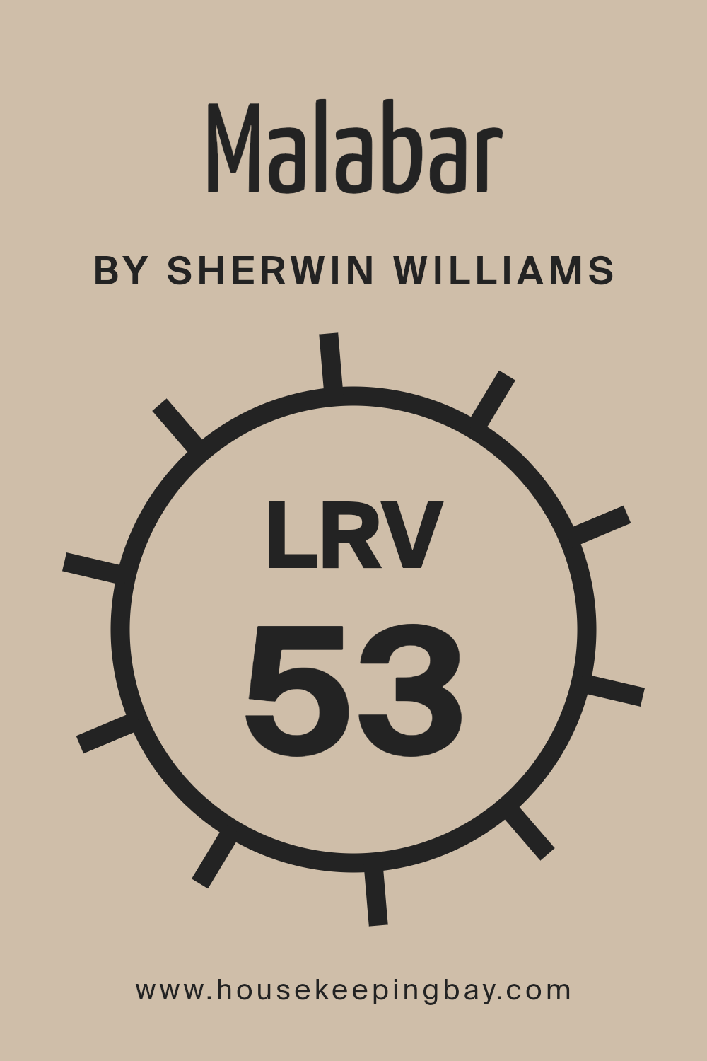
What is the LRV of Malabar SW 9110 by Sherwin Williams?
LRV, or Light Reflectance Value, is a measurement that tells us how much light a paint color reflects or absorbs. It is expressed on a scale from 0 (absorbing all light and appearing completely black) to 100 (reflecting all light and appearing pure white). This value is crucial because it affects how light or dark a color will look on your walls once applied. Higher LRV colors can make rooms feel more open and airy as they reflect more light, while lower LRV colors can make spaces feel cozier but smaller as they absorb more light.
With an LRV of 53.11, Malabar SW 9110 by Sherwin Williams is a mid-tone color. This means it doesn’t reflect as much light as lighter shades, nor does it absorb light like darker tones.
In practical terms, Malabar will offer a balance, maintaining a sense of warmth without darkening the room excessively. It’s an adaptable shade that doesn’t lean too dramatically towards either extreme of light or dark, making it a versatile choice for various spaces and lighting conditions.
housekeepingbay.com
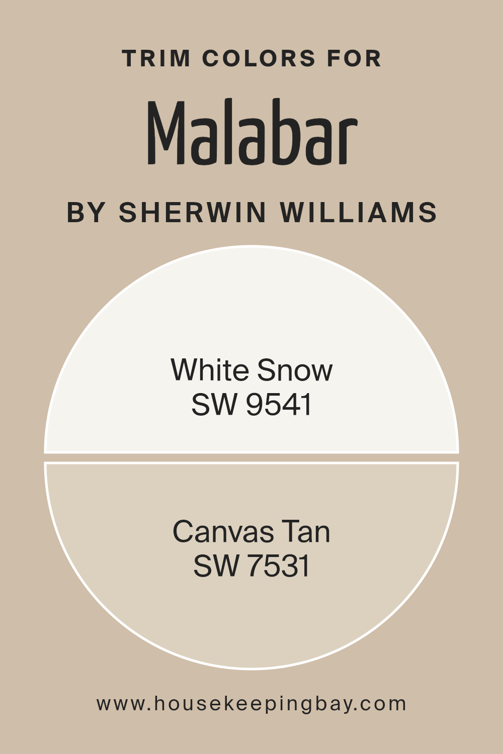
What are the Trim colors of Malabar SW 9110 by Sherwin Williams?
Trim colors are specific shades used for accentuating the architectural details of a room, such as door frames, window sills, moldings, and skirting boards. By selecting the right trim color, you can enhance the overall look of a wall painted with a primary color, such as Malabar SW 9110 by Sherwin Williams.
A well-chosen trim color frames the main wall color, creating a cohesive and pleasing aesthetic, and can also highlight the room’s best features or shift focus away from less appealing areas.
For example, SW 9541 – White Snow is a clean, bright white color that provides a crisp contrast to the warm, subdued tones of Malabar SW 9110. This trim color adds a fresh, sharp edge to any room, giving a sense of clarity and spaciousness.
On the other hand, SW 7531 – Canvas Tan is a soft, neutral beige that blends smoothly with Malabar SW 9110, promoting a seamless transition between wall and trim. This color combination offers a subtle delineation, perfect for enhancing a sophisticated and unified look in any living space.
You can see recommended paint colors below:
housekeepingbay.com
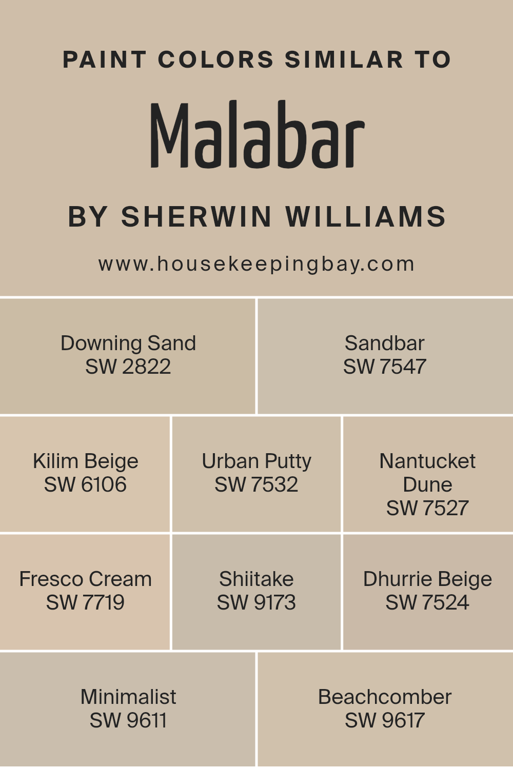
Colors Similar to Malabar SW 9110 by Sherwin Williams
Similar colors play a critical role in creating a cohesive and soothing atmosphere in interior design. When colors such as SW 2822 Downing Sand, a warm, light beige, and SW 7547 Sandbar, a slightly richer tone of the same hue, are used together, they bring a sense of unity and fluidity to the space.
The use of SW 6106 Kilim Beige, a neutral with an earthy feel, alongside SW 7532 Urban Putty, a gray-infused beige, can subtly enhance the visual warmth of a room without overwhelming it with bold contrasts.
SW 7527 Nantucket Dune adds a touch of sandy brown, reminding one of a peaceful beach setting, while SW 7719 Fresco Cream offers a light, airy cream color that reflects natural light beautifully.
Additionally, SW 9173 Shiitake, a soft, mushroom gray, pairs wonderfully with shades like SW 7524 Dhurrie Beige, a muted beige, to create a serene backdrop that highlights décor elements. For a touch of minimalism, SW 9611 Minimalist provides a nearly off-white canvas, an excellent foundation for modern interiors. Meanwhile, SW 9617 Beachcomber reflects a slightly darker, muted neutral, versatile enough to support various design styles.
Choosing similar colors, whether for a single room or an entire home, ensures that every area flows smoothly into the next, fostering a visually relaxing environment that makes areas seem larger and more connected.
You can see recommended paint colors below:
- SW 2822 Downing Sand
- SW 7547 Sandbar
- SW 6106 Kilim Beige
- SW 7532 Urban Putty
- SW 7527 Nantucket Dune
- SW 7719 Fresco Cream
- SW 9173 Shiitake
- SW 7524 Dhurrie Beige
- SW 9611 Minimalist
- SW 9617 Beachcomber
housekeepingbay.com
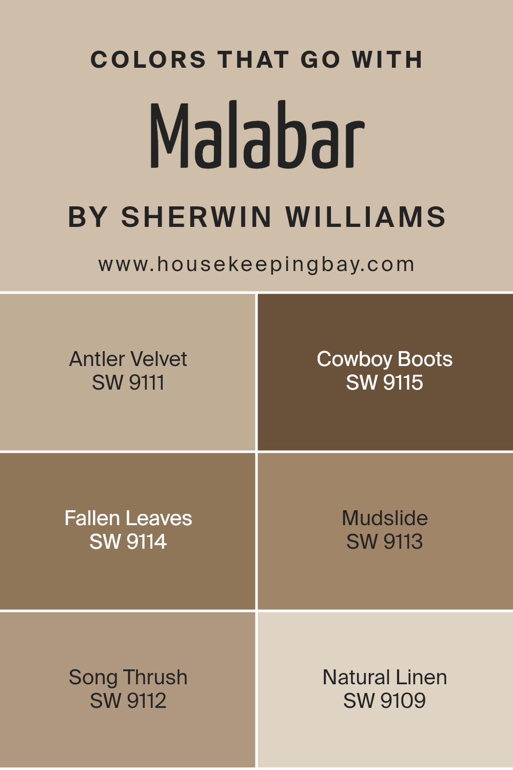
Colors that Go With Malabar SW 9110 by Sherwin Williams
Choosing the right colors that align with Malabar SW 9110 by Sherwin Williams is essential for harmonious interior design. Malabar, a soft, warm taupe, serves as an excellent neutral base that pairs beautifully with a variety of complementary shades. These coordinating colors enhance the cozy and inviting ambiance of any space without overwhelming the senses.
Antler Velvet SW 9111 is a gentle beige that gives a clean and subtle contrast to the deeper tones of Malabar, making it perfect for creating a light and airy feel in a room. Cowboy Boots SW 9115 offers a rich, leathery brown which adds a touch of rustic charm and depth when used alongside Malabar.
Fallen Leaves SW 9114 features a mellow, autumn-inspired brown that works well in spaces aiming for a warm and grounded look. Mudslide SW 9113 is a darker brown with a soft, earthy base that enriches the environment when combined with the neutrality of Malabar.
Song Thrush SW 9112 is a muted, grayish-brown shade that provides a sophisticated balance to lighter walls. Finally, Natural Linen SW 9109 echoes the quiet warmth of sandy beaches, blending seamlessly with Malabar to promote a serene and welcoming atmosphere.
These colors collectively create a balanced and cohesive palette, enhancing the aesthetic appeal and overall feel of your home.
You can see recommended paint colors below:
- SW 9111 Antler Velvet
- SW 9115 Cowboy Boots
- SW 9114 Fallen Leaves
- SW 9113 Mudslide
- SW 9112 Song Thrush
- SW 9109 Natural Linen
housekeepingbay.com
How to Use Malabar SW 9110 by Sherwin Williams In Your Home?
Malabar SW 9110 by Sherwin Williams is a warm, neutral paint color that brings a cozy feeling to any space in your home. It features a blend of beige and gray which makes it versatile for combining with various decor styles, from traditional to modern.
You can use Malabar in numerous areas of your home. It works exceptionally well in living rooms and bedrooms where you want to create a calm, soothing atmosphere. Because of its neutral tone, it pairs nicely with vibrant colors and also complements wooden furniture and natural textures.
Painting your kitchen or dining area with Malabar can make the space feel welcoming and warm, enhancing meal times and gatherings. It also serves as an excellent backdrop for art or can be used on cabinetry for a subtle, refined look.
In bathrooms, applying Malabar can add a touch of softness, making the space feel clean yet cozy. This color maintains a balance, ensuring the other elements in the room stand out.
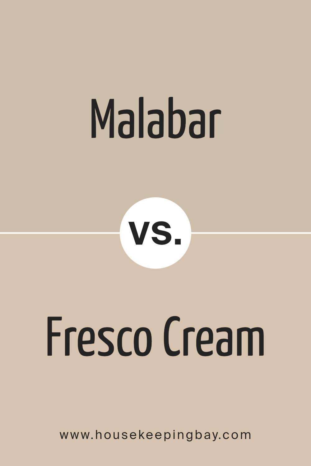
Malabar SW 9110 by Sherwin Williams vs Fresco Cream SW 7719 by Sherwin Williams
Malabar SW 9110 by Sherwin Williams is a rich taupe that brings a sense of warmth and simplicity to spaces. Its subtle beige undertones make it a versatile choice for various decorating styles, providing a cozy backdrop in rooms that aim for a soft, neutral look.
On the contrary, Fresco Cream SW 7719 by Sherwin Williams leans towards a lighter, airy palette. This soft, pale yellow hue injects a cheerful brightness into spaces, ideal for creating a serene and inviting atmosphere.
While Malabar offers a deeper, earthier base, ideal for grounding a room, Fresco Cream works well to illuminate and enhance smaller spaces or those with less natural light. Both colors support a range of complementary shades but serve different moods and themes within home décor.
You can see recommended paint color below:
- SW 7719 Fresco Cream
housekeepingbay.com
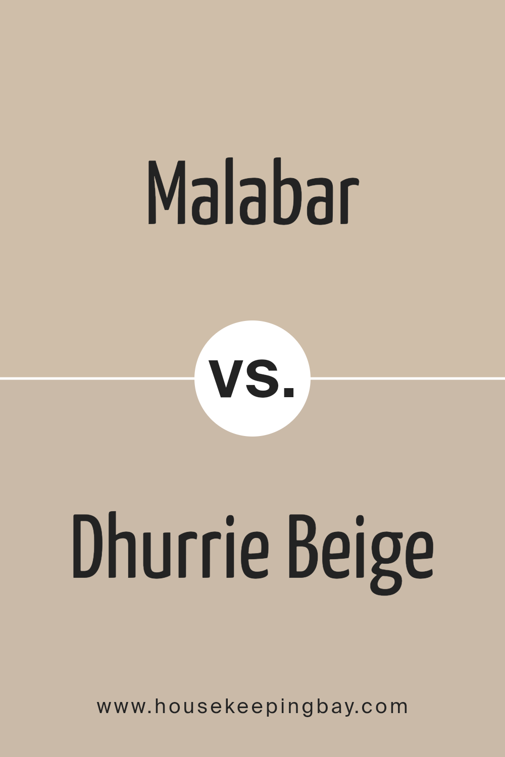
Malabar SW 9110 by Sherwin Williams vs Dhurrie Beige SW 7524 by Sherwin Williams
Malabar SW 9110 and Dhurrie Beige SW 7524, both from Sherwin Williams, offer unique tones for interior spaces. Malabar SW 9110 is a darker, muted pink with a sandy undertone, which creates a warm and cozy atmosphere, ideal for living rooms or bedrooms seeking a calm and inviting ambiance.
Dhurrie Beige SW 7524, however, is a lighter beige color with a grayish cast, providing a more neutral background that pairs well with various decor styles, from modern to traditional. This color is excellent for areas where you want to maintain an open, airy feel, such as kitchens and bathrooms.
Both colors are versatile, though Malabar emits a warmer essence, while Dhurrie Beige leans towards a cleaner, more subtle look. They can also complement each other well in a color scheme for those looking to create a balanced, harmonious palette in their home.
You can see recommended paint color below:
- SW 7524 Dhurrie Beige
housekeepingbay.com
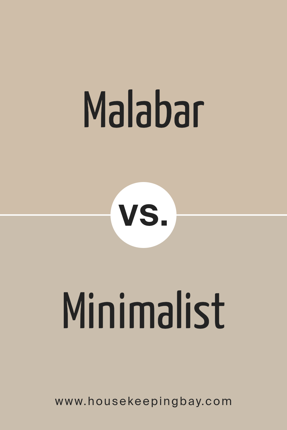
Malabar SW 9110 by Sherwin Williams vs Minimalist SW 9611 by Sherwin Williams
Malabar SW 9110 by Sherwin Williams is a gentle, muted beige with a cozy warmth that makes it ideal for creating a soft and inviting atmosphere in any room. Its earthy tones provide a solid foundation for various decor styles, from rustic to modern.
In contrast, Minimalist SW 9611 is a lighter, more neutral beige. This color has a cleaner, almost airy quality, making it perfect for enhancing the sense of space in smaller rooms or serving as a subtle backdrop for bold, vibrant accents. Both colors share a soothing beige palette but differ in intensity and mood.
Malabar offers a richer, warmer hue, suitable for spaces intended to feel snug and homey. Minimalist, with its lighter approach, is better suited for achieving a fresh, open feel, making it excellent for minimalist decor or rooms aiming for a bright, streamlined look.
You can see recommended paint color below:
- SW 9611 Minimalist
housekeepingbay.com
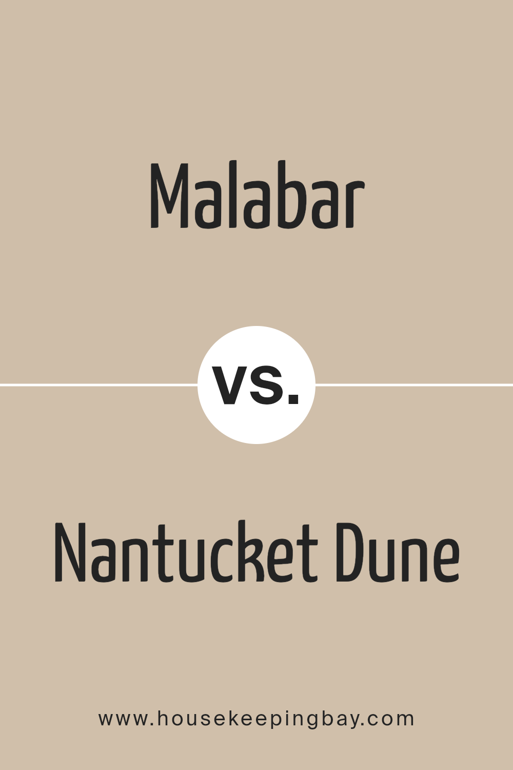
Malabar SW 9110 by Sherwin Williams vs Nantucket Dune SW 7527 by Sherwin Williams
Malabar SW 9110 by Sherwin Williams is a muted, soft taupe that evokes a sense of warmth and coziness, making it ideal for spaces where comfort is key, such as living rooms and bedrooms. Its understated earthiness allows it to pair well with a wide range of decor styles, from rustic to modern.
In contrast, Nantucket Dune SW 7527 is a lighter, beige color with a breezy, airy quality that can help make small rooms appear larger and more open. This lighter shade is versatile enough to work in various settings but is especially effective in creating a relaxed, serene atmosphere in spaces like bathrooms and kitchens.
Both colors work well in a neutral palette but offer distinct vibes—Malabar with its deeper, warmer undertones provides a grounding effect, whereas Nantucket Dune offers a lighter, more refreshing touch. Each brings its unique mood to interiors, making them suitable for different purposes and preferences in home design.
You can see recommended paint color below:
- SW 7527 Nantucket Dune
housekeepingbay.com
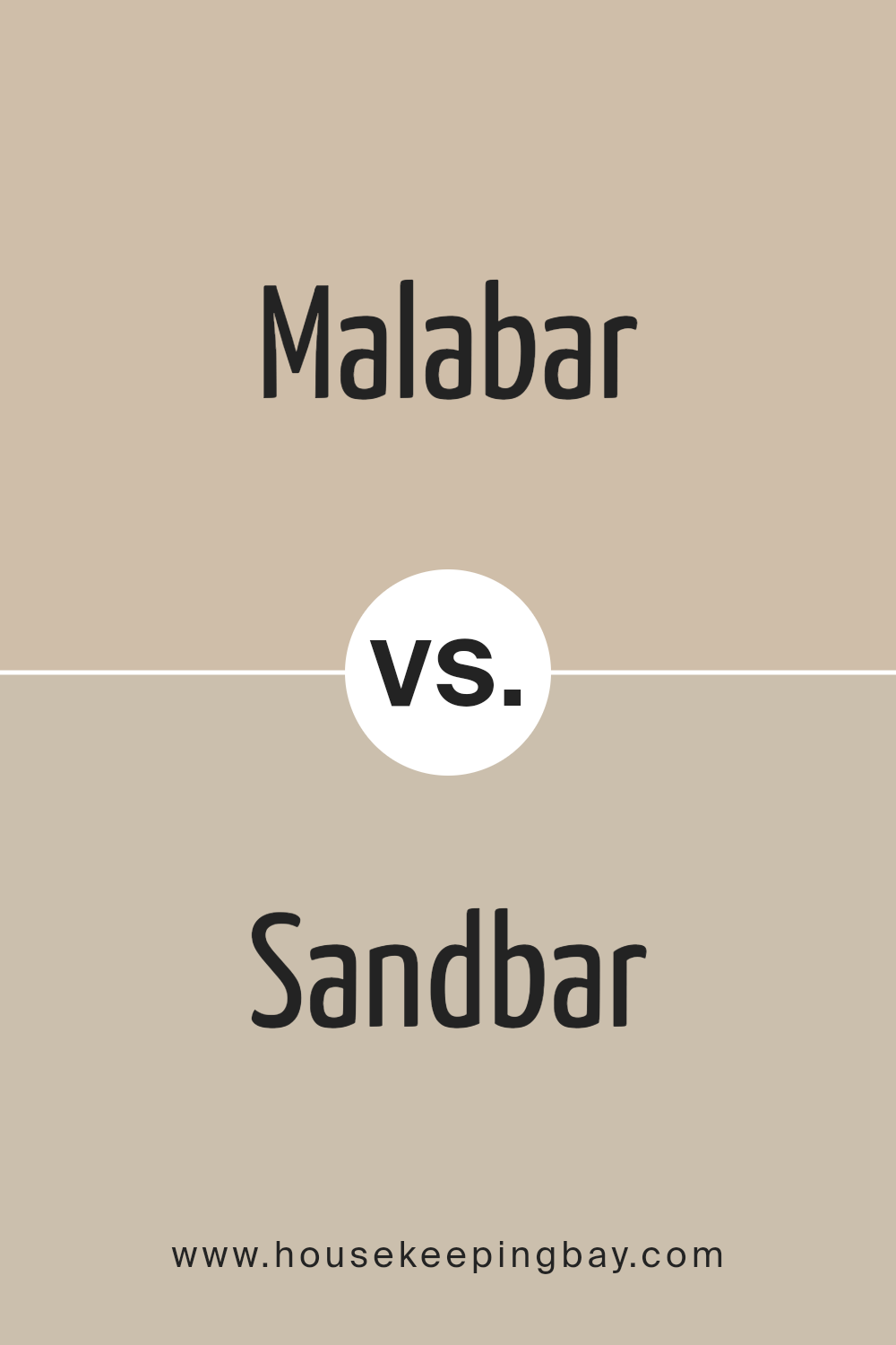
Malabar SW 9110 by Sherwin Williams vs Sandbar SW 7547 by Sherwin Williams
Malabar SW 9110 and Sandbar SW 7547 by Sherwin Williams are two neutral shades that carry distinct vibes yet maintain a soothing palette. Malabar SW 9110 is a darker, more subdued color resembling a soft gray with hints of green. This gives it a richer and somewhat earthier tone, ideal for creating cozy, inviting spaces. It works well in areas where a sense of calm and focus is desired, such as bedrooms or home offices.
Contrastingly, Sandbar SW 7547 is lighter and leans towards a warm beige. This color has a very light, airy feel, making it perfect for making spaces appear brighter and more open. It suits well in living rooms, kitchens, or any area that benefits from a fresh, clean look.
Both colors offer versatility and could beautifully complement each other, especially in a color scheme aiming for balance between warmth and grounded design. This makes them great for coordinating different rooms in a home while maintaining a cohesive aesthetic.
You can see recommended paint color below:
housekeepingbay.com
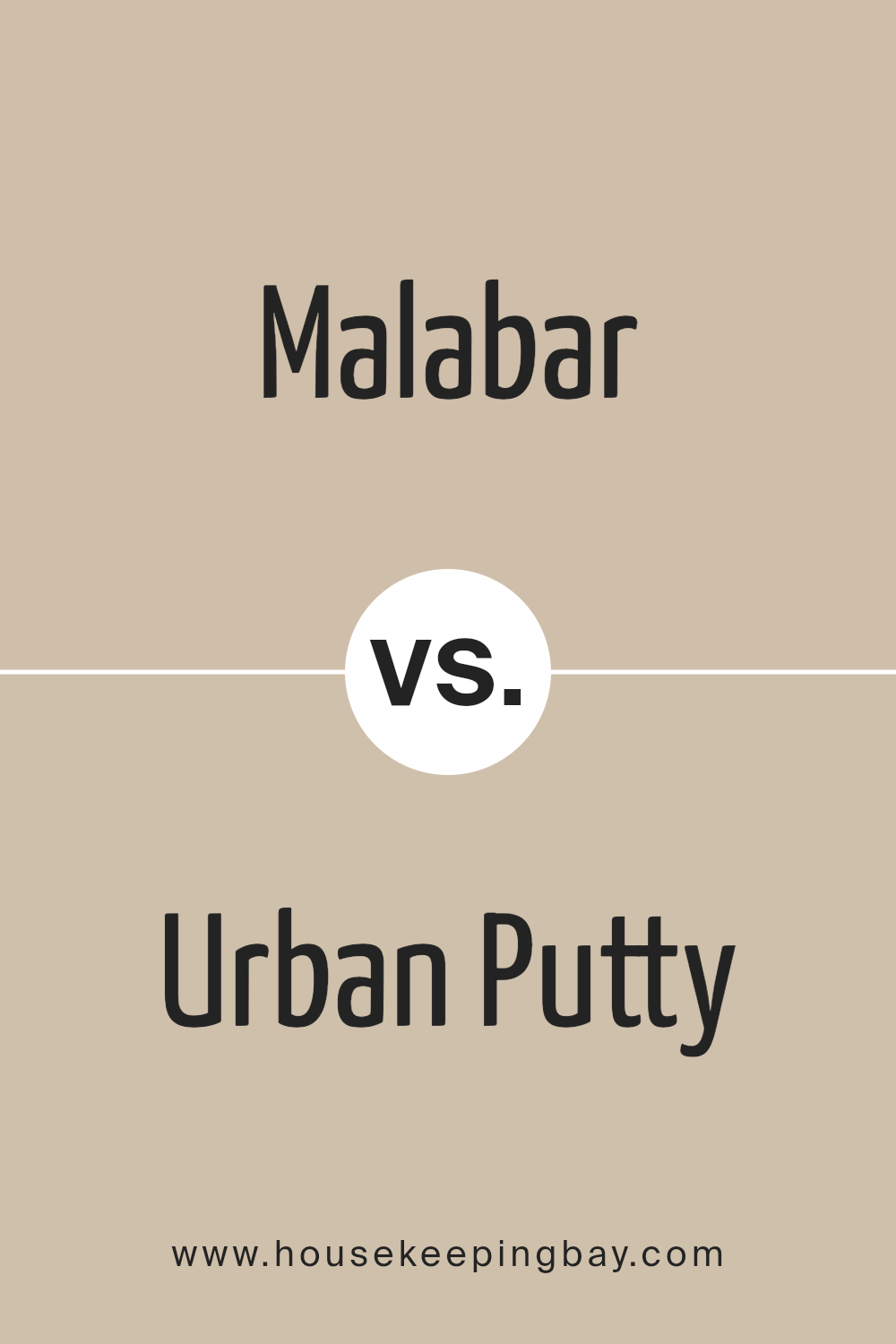
Malabar SW 9110 by Sherwin Williams vs Urban Putty SW 7532 by Sherwin Williams
Malabar SW 9110 and Urban Putty SW 7532, both from Sherwin Williams, offer subtle and warm aesthetics, but they bring different vibes to spaces. Malabar SW 9110 is a gentle taupe that leans towards a light brown with soft gray undertones. It provides a cozy, soothing atmosphere that works well in living rooms and bedrooms, promoting a calm and welcoming environment.
Urban Putty SW 7532, on the contrary, is a bit deeper, featuring a blend of beige and gray. This color is versatile, fitting seamlessly into various decor styles, from modern to traditional. It’s excellent for areas where you want a touch of warmth without overpowering other design elements.
Both colors are neutral, making them a good foundation for decorating with bolder colors or keeping things understated. Malabar might be preferred for a softer look, while Urban Putty offers a more robust backdrop in spaces that see lots of activity.
You can see recommended paint color below:
- SW 7532 Urban Putty
housekeepingbay.com
Malabar SW 9110 by Sherwin Williams vs Shiitake SW 9173 by Sherwin Williams
Malabar SW 9110 and Shiitake SW 9173, both by Sherwin Williams, offer subtle yet distinct atmospheres. Malabar is a light, warm taupe, providing a soft backdrop that feels cozy and inviting. Its lighter tone makes rooms look more spacious and bright, making it ideal for smaller areas or spaces without much natural light.
In contrast, Shiitake SW 9173 is a deeper, richer beige with grey undertones. This color adds a sense of warmth and sophistication to any space. Shiitake is perfect for creating a refined look in larger rooms or areas where you want to make a calm, grounded statement.
Both colors work well in various settings due to their neutral bases. However, the choice between them depends on your desired aesthetic and the specific characteristics of the space, such as size and lighting. Malabar is better for a light, airy feel, while Shiitake suits a more dramatic and cozy environment.
You can see recommended paint color below:
housekeepingbay.com
Malabar SW 9110 by Sherwin Williams vs Kilim Beige SW 6106 by Sherwin Williams
Malabar SW 9110 by Sherwin Williams is a deep, muted taupe that projects a feeling of warmth and understated elegance. It works well in spaces where you want to create a cozy, inviting atmosphere without overwhelming the senses. This color pairs beautifully with rich woods and natural textiles, enhancing the aesthetic of spaces aiming for a grounded, organic feel.
Kilim Beige SW 6106, also by Sherwin Williams, is a lighter, softer beige with warm undertones. This hue is versatile and widely appealing, making it perfect for various settings, including living rooms, bedrooms, and hallways where you seek to create a serene, welcoming environment. It complements a broad range of decor styles and coordinates effortlessly with other colors.
Both Malabar and Kilim Beige offer unique charms: Malabar leans towards a richer, deeper presence, while Kilim Beige provides a lighter, more neutral backdrop. They can be used together to define different moods within a home or independently to suit individual tastes and purposes.
You can see recommended paint color below:
housekeepingbay.com
Malabar SW 9110 by Sherwin Williams vs Downing Sand SW 2822 by Sherwin Williams
Malabar SW 9110 by Sherwin Williams is a soft, gentle gray that has a warm undertone, making it cozy and inviting for almost any room in your home. It pairs well with a variety of decor styles, especially enhancing spaces that lean towards a modern, minimalistic aesthetic. Malabar offers a subtle backdrop that complements bold and vibrant colors or can quietly unify other neutral shades.
Downing Sand SW 2822, also by Sherwin Williams, is a warmer, earthier tone compared to Malabar. This color resembles the natural hue of sandy beaches, providing a soft, warm, and inviting feel. It is particularly effective in spaces where you want to add warmth without overwhelming the area with darker colors.
Downing Sand works well with natural elements like wood and stone, promoting a relaxed and comfortable environment.
Both colors provide a neutral palette, yet each creates a distinct mood and atmosphere depending on your space and styling choices.
You can see recommended paint color below:
- SW 2822 Downing Sand
housekeepingbay.com
Malabar SW 9110 by Sherwin Williams vs Beachcomber SW 9617 by Sherwin Williams
Malabar SW 9110 and Beachcomber SW 9617, both by Sherwin Williams, are interesting colors that bring their own unique vibes to spaces. Malabar is a muted pink with a dusty rose hue that adds a soft and soothing presence. This color works great in bedrooms or living areas where you want a calm, gentle backdrop. It pairs well with earthy tones and natural textures, giving a cozy, comfortable feel to any room.
Beachcomber, meanwhile, is a light taupe that leans toward a sandy, neutral color. This versatile shade is perfect for those looking to maintain a subtle yet warm ambiance in their surroundings. It’s an excellent choice for common areas and can also serve as a sophisticated base in more stylish, contemporary settings.
When combined with blues and greens, Beachcomber can create a serene but inviting atmosphere.
Both colors offer flexibility in decor but serve their best purposes in different types of spaces based on the mood you’re aiming to achieve.
You can see recommended paint color below:
housekeepingbay.com
Conclusion
In conclusion, SW 9110 Malabar by Sherwin Williams offers an exceptional palette that could dramatically enhance the atmosphere of any room. This color, characterized by its warm, inviting undertones, is ideal for those looking to create a cozy and serene environment in their home or office.
Malabar has a versatile appeal that works well in various spaces, from living rooms to bedrooms, making it a smart choice for anyone considering a fresh paint job. Additionally, its timeless nature ensures that it won’t quickly go out of style, providing a long-lasting appeal that won’t necessitate frequent updates.
For those contemplating a new look for their walls, Malabar by Sherwin Williams presents a reliable option that combines both beauty and functionality. Whether you’re aiming to create a subtle background or a bold statement piece, this color meets a wide range of stylistic needs. So, if you’re planning your next home improvement project, consider the warm and welcoming tone of Malabar to give your space a refined update.
housekeepingbay.com
