Moth Wing SW 9174 by Sherwin Williams
A Gentle Hue for Every Space
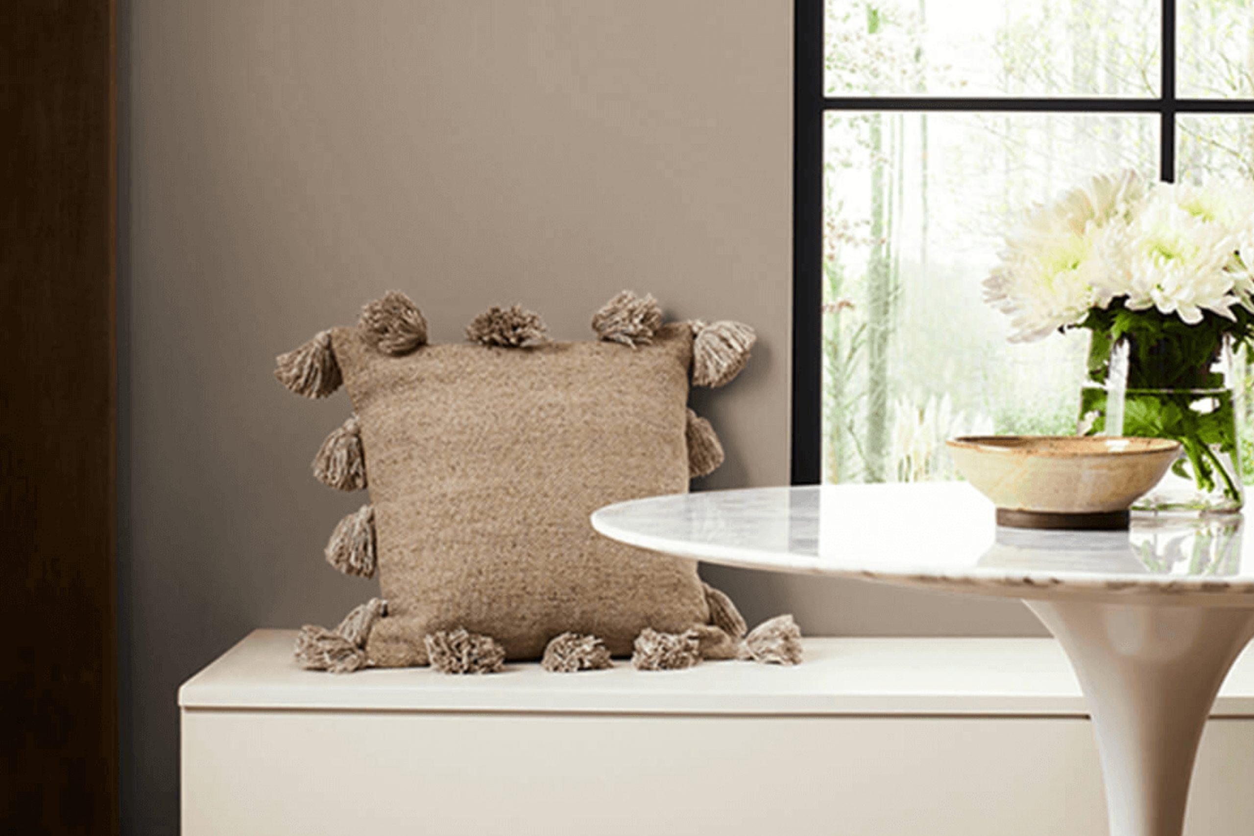
Paint colors have a unique ability to influence how we feel in a space, and one such color that adds a soft, calming touch is SW 9174 Moth Wing by Sherwin Williams. This shade of timeless taupe sits comfortably between warm and cool tones, making it a reliable choice for those aiming to create a neutral yet cozy atmosphere in any room.
When you choose Moth Wing, you’re opting for a color that adapts gracefully to different lighting. In natural daylight, it can highlight the natural elements in your home, creating a serene and grounding effect. Under artificial light, it transforms into a warmer, more inviting hue, perfect for a relaxing evening.
Think about how Moth Wing can complement a variety of textures and finishes. It’s versatile enough to pair beautifully with wooden floors, stone fireplaces, or even metallic accents. Whether you’re updating your living room, bedroom, or office, this paint offers a warm backdrop without overwhelming the other elements in your décor.
Moth Wing carries an understated elegance that invites comfort and calmness. With its balanced hue, it encourages harmony in your space, allowing you to create a home that feels both stylish and welcoming.
via sherwin-williams.com
What Color Is Moth Wing SW 9174 by Sherwin Williams?
Table of Contents
Moth Wing SW 9174 by Sherwin Williams is a warm, muted beige with subtle gray undertones. This versatile color brings warmth and comfort to any room without overwhelming the senses. It sits comfortably between beige and taupe, lending a soft, cozy vibe to interior spaces.
This shade fits wonderfully in contemporary and Scandinavian interiors, where simplicity and comfort are key. Moth Wing provides an ideal backdrop for minimalist decor, allowing furnishings to shine without distraction. It’s also a great choice for rustic or farmhouse styles, complementing natural elements like wood and stone.
In terms of materials, Moth Wing pairs beautifully with natural woods—think oak or walnut—and soft textiles like linen and cotton. These textures enhance its earthy tones, creating a harmonious space. Metals like bronze or brushed nickel also work well, providing an elegant contrast without overpowering the warmth.
For a more layered look, consider adding soft, neutral rugs or woven baskets, which mirror the color’s versatility. Accent colors such as deep blues, greens, or subdued reds can introduce depth and interest, contrasting pleasantly with Moth Wing’s gentle nature.
This color choice ensures a room remains inviting, relaxed, and effortlessly stylish.
housekeepingbay.com
Is Moth Wing SW 9174 by Sherwin Williams Warm or Cool color?
Moth Wing SW 9174 by Sherwin Williams is a warm, neutral color that can bring a cozy feeling to any space. This soft taupe hue combines earthy tones with a touch of gray, making it versatile for various home styles. Its gentle warmth can make rooms feel inviting and comfortable, creating an ideal backdrop for living areas, bedrooms, and kitchens.
Moth Wing pairs beautifully with both light and dark shades. It complements whites and creams for a clean, airy look, while also working well with darker browns and blacks for a more dramatic vibe. The color’s adaptability makes it suitable for modern, traditional, or eclectic interiors.
In an open floor plan, Moth Wing can help define spaces without overwhelming them. It balances well with natural materials like wood, stone, and metals, enhancing the home’s overall harmony. Homeowners appreciate its soothing quality, which adds warmth and depth without overpowering a room.
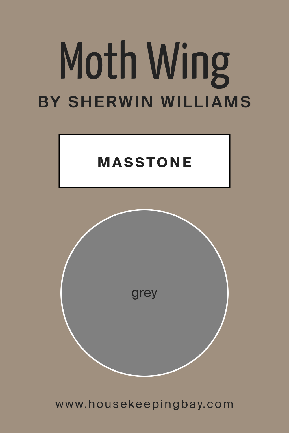
What is the Masstone of the Moth Wing SW 9174 by Sherwin Williams?
Moth Wing SW 9174 by Sherwin Williams has a masstone of grey (#808080), which significantly impacts its use in home settings. This shade of grey is versatile and neutral, making it a popular choice for many spaces. Its neutrality allows it to complement various design styles and color schemes without clashing.
In living rooms, Moth Wing creates a calming and cozy atmosphere. It acts as a backdrop that highlights furniture and décor, making bold colors pop. In kitchens, it lends a clean and modern touch, perfectly matching stainless steel appliances and white cabinets.
Bedrooms painted with Moth Wing feel restful, encouraging relaxation and ensuring a peaceful sleep ambiance.
Additionally, this shade works well with natural light, maintaining its warm undertone without appearing cold or stark. It strikes a balance between elegance and simplicity, helping to make any room feel welcoming and cohesive.
housekeepingbay.com
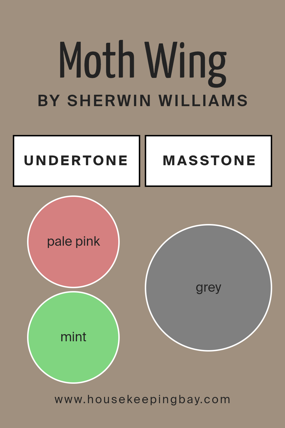
Undertones of Moth Wing SW 9174 by Sherwin Williams
Moth Wing SW 9174 by Sherwin Williams is a subtle, neutral shade with complex undertones. These undertones include a mix of pale pink, mint, pale yellow, olive, lilac, orange, light purple, and many others, contributing to its depth and versatility. Undertones influence how a color appears in different lighting and environments. For instance, natural light might bring out the warmer, pink and orange undertones, giving the room a cozy, inviting feel. On the other hand, cooler artificial light may highlight the cooler undertones like mint, lilac, or light gray, lending a more calm and sophisticated ambiance.
When applied on interior walls, the color’s undertones can complement or contrast with existing decor, furniture, and accessories. If the room has other warm tones, such as wooden furniture or orange accents, the warmer undertones in Moth Wing might become more pronounced.
Conversely, pairing it with cooler colors, like blues or greens, might enhance the cooler undertones, providing balance and harmony.
Ultimately, the undertones allow Moth Wing SW 9174 to adapt easily to various styles and decors. It suits modern settings and traditional ones alike, shifting its character with lighting and color pairings. This versatility makes it an excellent choice for those seeking a neutral yet dynamic backdrop in their space.
housekeepingbay.com
Coordinating Colors of Moth Wing SW 9174 by Sherwin Williams
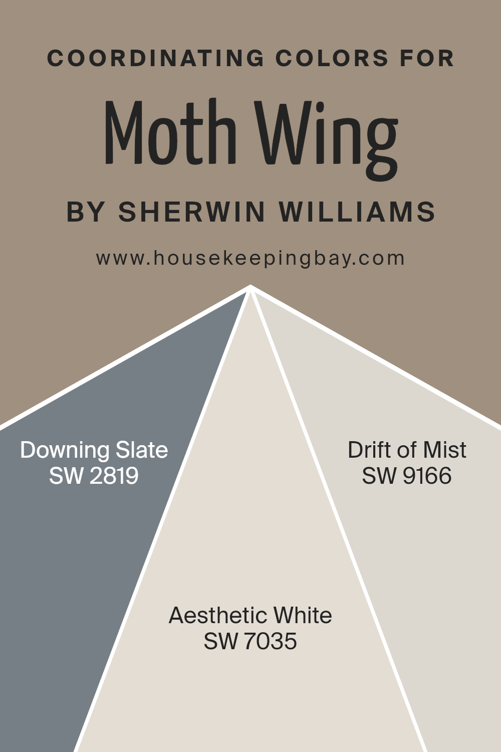
Coordinating colors are hues that complement each other, creating a harmonious look in a space. Sherwin-Williams’ Moth Wing SW 9174, a warm neutral with a hint of gray, benefits from such coordinating colors to enhance its character. When paired with these colors, Moth Wing can help establish a cohesive atmosphere.
SW 2819 – Downing Slate, a timeless and muted blue-gray, works well with Moth Wing by providing a touch of contrast without overpowering.
Its gentle tone brings depth and calmness, making it ideal for both traditional and contemporary spaces. On the other hand, SW 7035 – Aesthetic White, which is a soft off-white with a touch of warmth, brightens spaces and complements Moth Wing by maintaining a subtle balance. This color can lighten up a room without making it feel cold or stark.
SW 9166 – Drift of Mist introduces a slightly cooler, pale gray that contrasts with the warmth of Moth Wing while still complementing it.
This color adds a delicate freshness, perfect for spaces requiring a light and airy feel. Together, these coordinating colors create a unified look, offering an elegant and soothing palette. Moth Wing, combined with these thoughtfully selected colors, results in a design that feels catered to any taste, providing both warmth and variety.
You can see recommended paint colors below:
- SW 2819 Downing Slate
- SW 7035 Aesthetic White
- SW 9166 Drift of Mist
housekeepingbay.com
How Does Lighting Affect Moth Wing SW 9174 by Sherwin Williams?
Lighting plays a crucial role in how we perceive colors. The intensity and temperature of light can change the appearance of a color significantly. For instance, a paint color like Moth Wing SW 9174 by Sherwin Williams can look quite different under various lighting conditions.
Artificial light, such as incandescent or LED bulbs, can warm up or cool down a color depending on the bulb’s temperature. Moth Wing, a warm neutral taupe, might appear slightly more yellow or beige under the warm glow of incandescent lights.
LED lights, available in different temperatures, can make it look cooler or warmer. An LED bulb with a cooler, bluish light may draw out cooler undertones in the paint. In contrast, a warmer LED bulb will enhance the paint’s inherent warmth, highlighting its taupe notes.
Natural light also affects how we see Moth Wing. In north-facing rooms, where light tends to be cooler and softer, the color might appear a bit muted or grayer. The cooler light can subdue the warm tones, giving it a more understated look.
In south-facing rooms, which get an abundance of warm, direct sunlight, Moth Wing will show off its warm and earthy tones more prominently. The bright sunlight will enhance its taupe qualities, making the color appear rich and warm.
For east-facing rooms, where morning light is bright and warm but becomes cooler throughout the day, Moth Wing can initially appear more vibrant and then shift slightly cooler and softer as the day goes on.
West-facing rooms receive warm afternoon and evening light. This means Moth Wing will grow warmer and more intense later in the day. In the morning, it might look more subdued due to the lack of direct sunlight.
Understanding these variations helps in making a decision about using colors in different parts of a home, ensuring that they complement the room’s natural lighting.
housekeepingbay.com
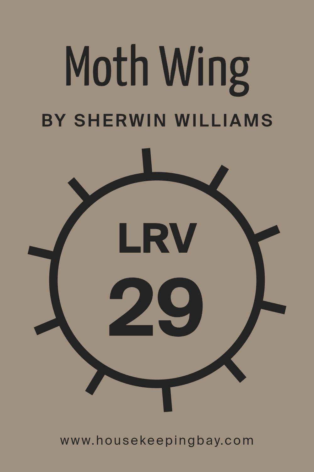
What is the LRV of Moth Wing SW 9174 by Sherwin Williams?
Light Reflectance Value, or LRV, measures how much light a color reflects or absorbs. Scale ranges from 0 (absolute black) to 100 (pure white). If a color has low LRV, it reflects less light and absorbs more, making the space feel darker. High LRV colors reflect more light and can make rooms appear brighter and larger.
When choosing paint, LRV helps understand how light or dark a color will feel in your space, influencing mood and atmosphere.
Moth Wing by Sherwin Williams has an LRV of 29.104, placing it on the lower side of the scale. This means it absorbs more light than it reflects, giving rooms a cozy, intimate feel. With this LRV, Moth Wing doesn’t bounce as much light around, so it won’t make the room feel bigger or brighter.
Instead, it adds depth and warmth, great for spaces where you want a comfortable, snug environment. Consider this LRV in rooms with enough natural or artificial light to keep it from feeling too dim.
housekeepingbay.com
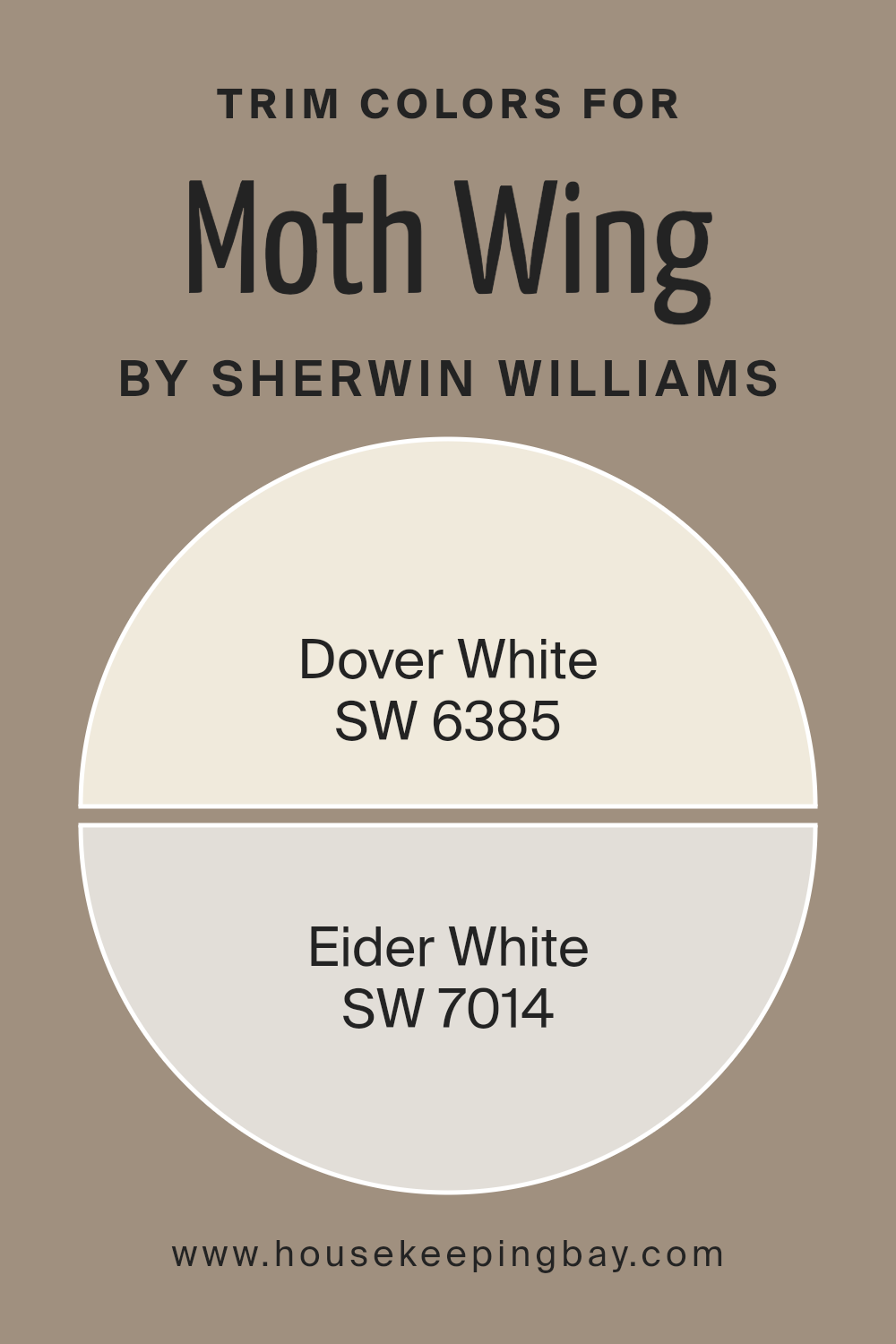
What are the Trim colors of Moth Wing SW 9174 by Sherwin Williams?
Trim colors are the shades used for doors, windows, baseboards, and moldings, helping define and highlight a room’s edges. In the case of Sherwin Williams’ Moth Wing SW 9174, which is a warm, earthy taupe, the use of carefully selected trim colors can make a significant impact.
Trim colors like SW 6385 Dover White and SW 7014 Eider White add contrast and brightness. Dover White offers a warm, creamy tone that can help soften and complement Moth Wing’s richness, creating a welcoming and comforting atmosphere.
On the other hand, Eider White brings a cooler grayish-white tone, balancing the warmth of Moth Wing and adding a touch of modern elegance that can enhance the overall look of a space.
Choosing the right trims is crucial because they frame the walls and contribute to the room’s character.
When paired with Moth Wing, Dover White trim can introduce an inviting glow, enhancing Moth Wing’s earthy appeal without overpowering it.
Eider White can serve as an excellent option when you want a fresher and more subdued effect, as its subtle gray undertones provide depth and sophistication.
Using these trim colors creates visual contrast, allowing Moth Wing to stand out while ensuring the room remains bright and engaging. Both of these whites serve to highlight Moth Wing’s unique qualities and give a finished, polished look to any space.
You can see recommended paint colors below:
housekeepingbay.com
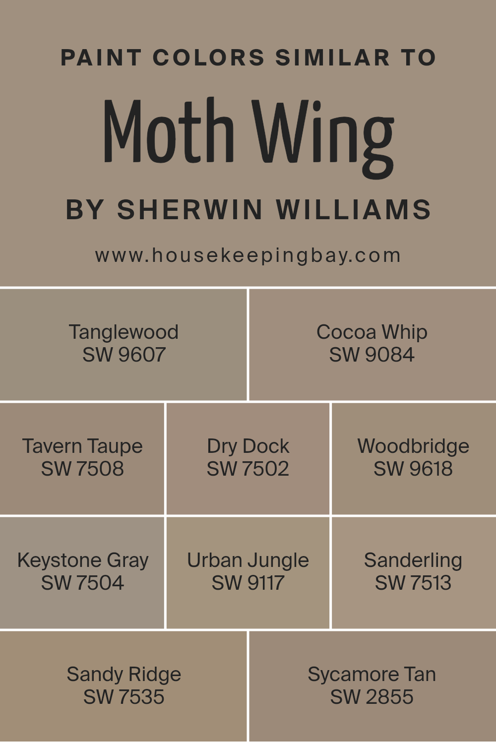
Colors Similar to Moth Wing SW 9174 by Sherwin Williams
Similar colors play a key role in design and aesthetics by creating a harmonious and cohesive look. The colors that are similar to Moth Wing by Sherwin Williams include a variety of muted, earthy tones that complement each other beautifully. SW 9607 Tanglewood offers a rich, woody hue that adds depth without overwhelming a space.
On the softer side, SW 9084 Cocoa Whip provides a warm, creamy touch that is both inviting and neutral. SW 7508 Tavern Taupe has a classic feel with its grounded, earthy brown color that can anchor a room effectively.
SW 7502 Dry Dock brings a subtle sense of coziness with its muted, warm beige tone. Meanwhile, SW 9618 Woodbridge adds a hint of sophistication with its slightly deeper, elegant brown. SW 7504 Keystone Gray offers a balanced, slightly cooler gray that can work as a great backdrop. SW 9117 Urban Jungle introduces a touch of green, perfect for adding a fresh, natural element.
SW 7513 Sanderling is a versatile light beige, pairing well with almost anything. Similarly, SW 7535 Sandy Ridge delivers a gentle, sand-colored hue, enhancing spaces with its natural feel.
Finally, SW 2855 Sycamore Tan ties everything together with its timeless, soft tan, ensuring that these colors create a seamless design harmony throughout any room.
You can see recommended paint colors below:
- SW 9607 Tanglewood
- SW 9084 Cocoa Whip
- SW 7508 Tavern Taupe
- SW 7502 Dry Dock
- SW 9618 Woodbridge
- SW 7504 Keystone Gray
- SW 9117 Urban Jungle
- SW 7513 Sanderling
- SW 7535 Sandy Ridge
- SW 2855 Sycamore Tan
housekeepingbay.com
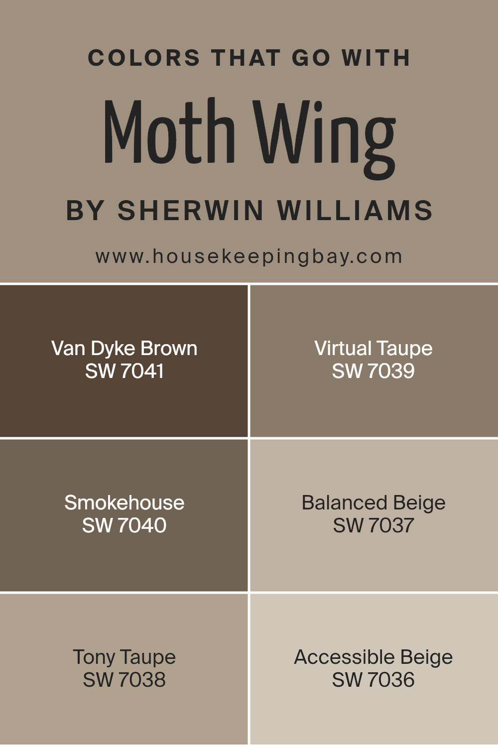
Colors that Go With Moth Wing SW 9174 by Sherwin Williams
Moth Wing SW 9174 by Sherwin Williams is a versatile and soothing neutral tone. When paired with carefully chosen complementary colors, it can create a cohesive and inviting space. The importance of selecting colors that harmonize with Moth Wing lies in their ability to enhance the atmosphere of a room.
For instance, SW 7041 Van Dyke Brown provides a rich, deep accent that adds depth and warmth, making it perfect for adding contrast to a space. SW 7039 Virtual Taupe, with its earthy undertones, helps bring a sense of stability and groundedness, enhancing the natural appeal of Moth Wing.
SW 7040 Smokehouse features a smoky essence bringing in subtle intrigue, while SW 7037 Balanced Beige offers a soft backdrop, maintaining a neutral palette without overpowering other elements. SW 7038 Tony Taupe is a warm, inviting color that complements Moth Wing’s elegance with ease.
Lastly, SW 7036 Accessible Beige offers a lighter, airy feel that can add a sense of openness and brightness.
Together, these colors create a palette that ensures a balanced and harmonious environment, enhancing the overall aesthetic and comfort of any room. Each shade contributes its unique character, allowing for a unified yet varied color scheme.
You can see recommended paint colors below:
- SW 7041 Van Dyke Brown
- SW 7039 Virtual Taupe
- SW 7040 Smokehouse
- SW 7037 Balanced Beige
- SW 7038 Tony Taupe
- SW 7036 Accessible Beige
housekeepingbay.com
How to Use Moth Wing SW 9174 by Sherwin Williams In Your Home?
Moth Wing SW 9174 by Sherwin Williams is a versatile and warm taupe paint color that suits various spaces in a home. Its neutral tone pairs well with many other colors, making it a great choice for those looking to create a cozy and inviting atmosphere.
In living rooms, Moth Wing provides a calming backdrop that complements both modern and traditional furniture. It works well with soft whites, muted greens, or even bold accents like deep blues if you want a more dynamic look. In bedrooms, this color can create a restful environment, especially when combined with soft textiles and lighting.
Kitchens and dining areas benefit from its natural feel, setting a comfortable mood that enhances mealtimes. For an elegant touch, consider pairing it with wooden or metal finishes. Bathrooms can also feature Moth Wing for a spa-like ambiance, especially when paired with plush towels and simple accessories. Overall, this paint gives any room a welcoming touch.
Moth Wing SW 9174 by Sherwin Williams vs Keystone Gray SW 7504 by Sherwin Williams
Moth Wing SW 9174 and Keystone Gray SW 7504, both by Sherwin Williams, offer warm, neutral tones perfect for various spaces in a home. Moth Wing SW 9174 leans towards a soft taupe with subtle beige undertones, creating a cozy and welcoming feel. It works well in living rooms or bedrooms, providing a calming backdrop that pairs smoothly with soft whites or deeper browns.
Keystone Gray SW 7504 offers a richer, deeper hue with stronger gray undertones than Moth Wing. It brings more depth to a room while still maintaining warmth. This makes Keystone Gray a great choice for dining rooms, kitchens, or any space where you want a more grounded feel.
Both colors work well with natural materials like wood or stone. However, Moth Wing serves better where lighter, airier tones are ideal, while Keystone Gray suits spaces desiring a bolder, more sophisticated look.
You can see recommended paint color below:
- SW 7504 Keystone Gray
housekeepingbay.com
Moth Wing SW 9174 by Sherwin Williams vs Dry Dock SW 7502 by Sherwin Williams
Moth Wing SW 9174 and Dry Dock SW 7502 are two popular Sherwin Williams colors, each offering a distinct vibe. Moth Wing is a neutral, earthy taupe with a refined, understated look. Its balanced mix of brown and gray undertones makes it versatile, often suiting modern and classic spaces alike. This color provides a calm, warm backdrop without becoming overpowering, ideal for living rooms or bedrooms aiming for a cozy feel.
Dry Dock, meanwhile, presents a richer, deeper brown tone with a slightly more pronounced warmth compared to Moth Wing. It provides a strong, grounding presence, making spaces feel intimate and secure. This shade works well in areas like dining rooms or libraries, where a sense of depth and comfort is desired.
While both colors share a degree of warmth, Dry Dock’s boldness contrasts with Moth Wing’s subtlety, offering different ways to enhance a room’s atmosphere.
You can see recommended paint color below:
- SW 7502 Dry Dock
housekeepingbay.com
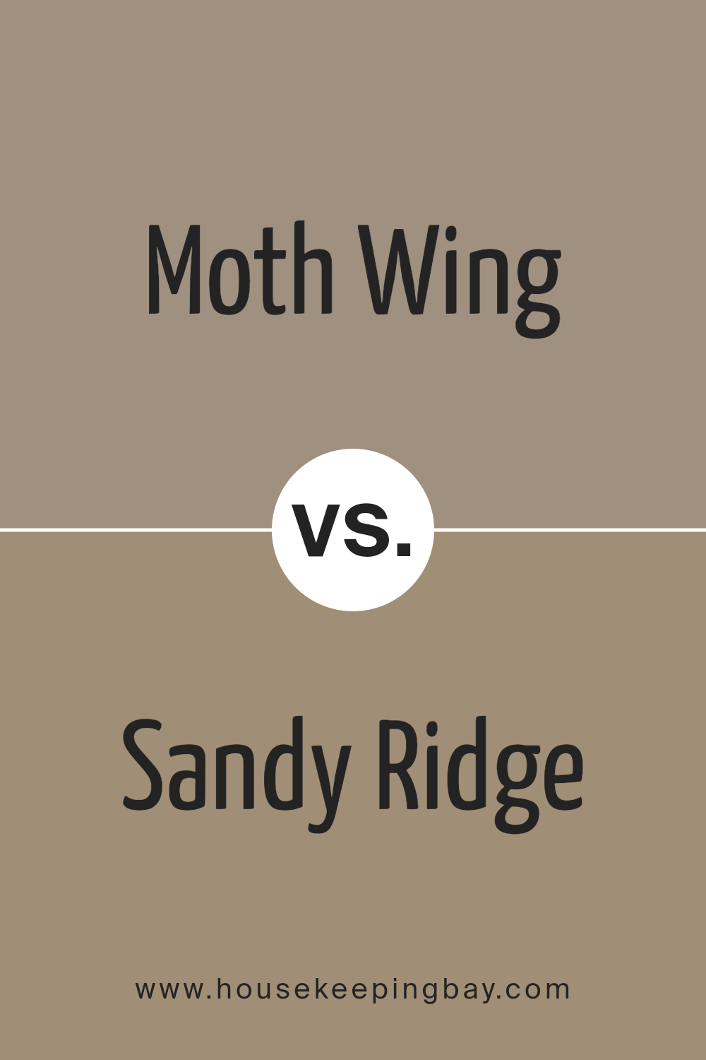
Moth Wing SW 9174 by Sherwin Williams vs Sandy Ridge SW 7535 by Sherwin Williams
Moth Wing SW 9174 by Sherwin Williams is a warm, muted brown-gray. It provides a cozy, earthy feel, similar to the color of natural wool or soft clay. This shade can create a comforting atmosphere, perfect for a living room or bedroom.
Sandy Ridge SW 7535 is a lighter, sandy beige. It brings a bright, airy touch to any space, much like the soft color of beach sand. This color feels cheerful and uplifting, ideal for kitchens or hallways.
Both colors offer a neutral palette, allowing flexibility in accent choices. Moth Wing adds a deeper and more intimate tone, while Sandy Ridge offers more lightness. Moth Wing works well for cozy, inviting spaces. Sandy Ridge suits areas needing freshness and openness. They both complement natural materials like wood and stone, but Moth Wing adds warmth, whereas Sandy Ridge maintains a lighter, brighter look. Both are versatile for different styles and moods.
You can see recommended paint color below:
- SW 7535 Sandy Ridge
housekeepingbay.com
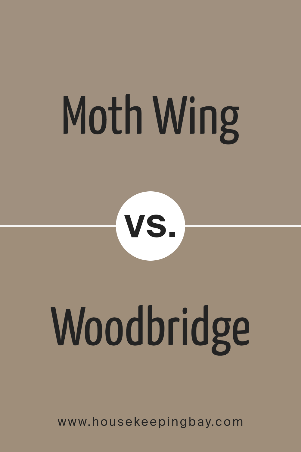
Moth Wing SW 9174 by Sherwin Williams vs Woodbridge SW 9618 by Sherwin Williams
Moth Wing SW 9174 and Woodbridge SW 9618 by Sherwin Williams offer distinct vibes, each suiting different tastes or spaces. Moth Wing is a warm, earthy taupe with subtle gray undertones, perfect for creating cozy or neutral settings. Its versatility allows it to pair well with both bold and muted accents, making it a great backdrop in living rooms or bedrooms.
Woodbridge, however, leans more towards a muted brown with a touch of gray, giving it a slightly cooler or deeper appearance. It provides a sophisticated touch, often used for more formal spaces like dining rooms or offices. While Moth Wing offers warmth and a sense of comfort, Woodbridge brings subtle elegance and depth.
Choosing between them can depend on the desired mood and function of the space, with either option delivering a timeless, adaptable choice for interiors.
You can see recommended paint color below:
- SW 9618 Woodbridge
housekeepingbay.com
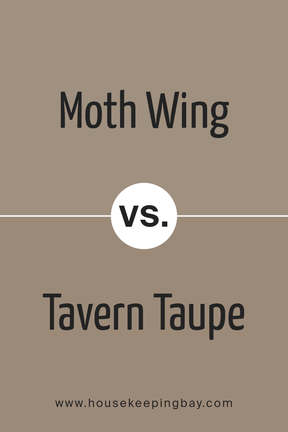
Moth Wing SW 9174 by Sherwin Williams vs Tavern Taupe SW 7508 by Sherwin Williams
Moth Wing SW 9174 and Tavern Taupe SW 7508 are two popular choices from Sherwin Williams, yet they provide different moods and applications. Moth Wing is a soft, muted color, resembling a gentle blend of gray and beige. This makes it versatile and easy to pair with various other colors and decor styles. It gives rooms a calm and understated look, working well in spaces where a neutral backdrop is desired.
Tavern Taupe, however, leans more towards a rich, earthy brown. It has a warm, cozy feel that adds depth and a sense of comfort to rooms. This makes it suitable for spaces where a bit more warmth and character are wanted.
While Moth Wing might be ideal for modern, minimalist settings, Tavern Taupe fits perfectly into traditional or rustic environments. Both colors have their own charm depending on the atmosphere you wish to create, making them excellent choices for different interior styles.
You can see recommended paint color below:
- SW 7508 Tavern Taupe
housekeepingbay.com
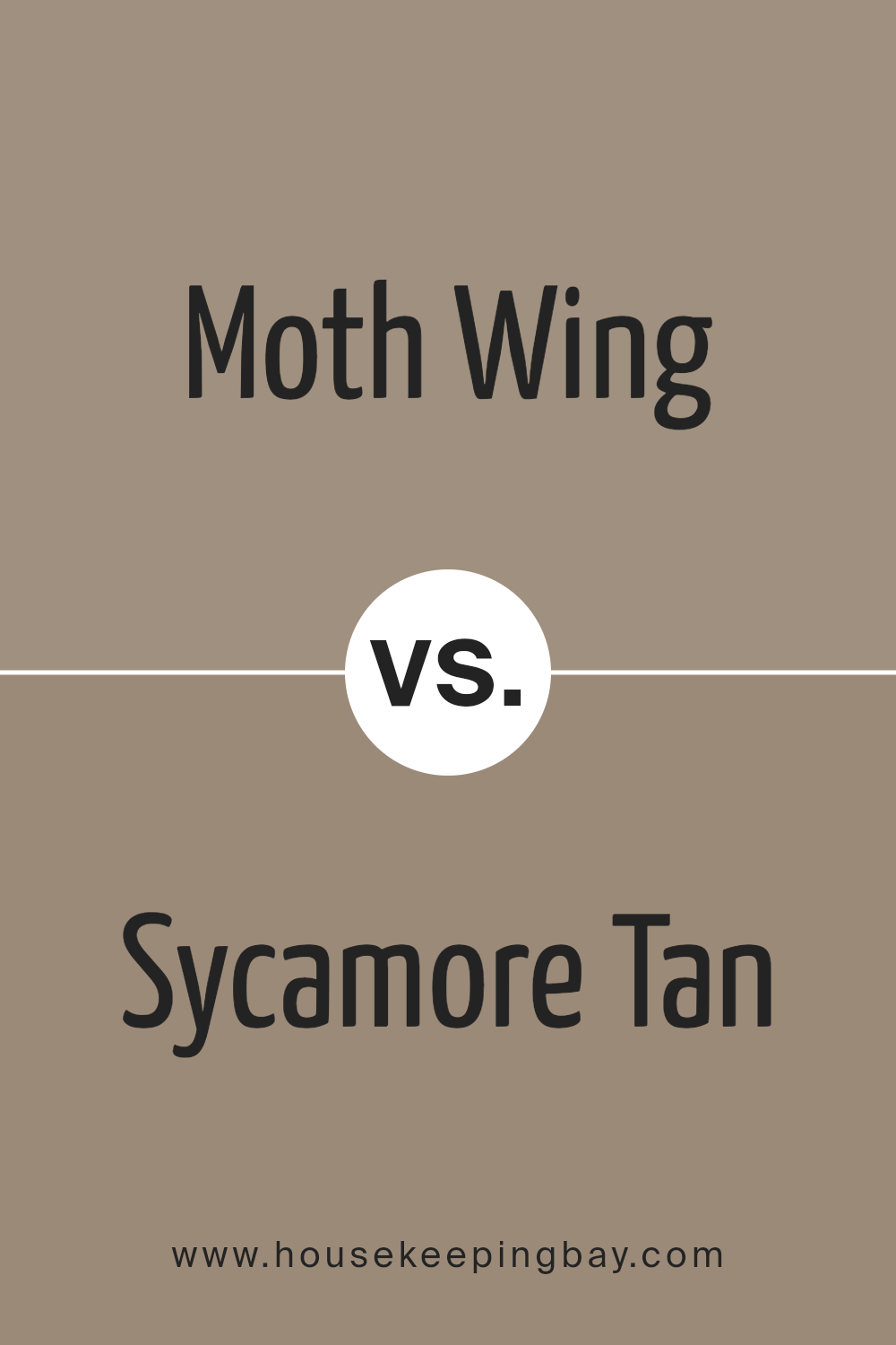
Moth Wing SW 9174 by Sherwin Williams vs Sycamore Tan SW 2855 by Sherwin Williams
Moth Wing SW 9174 and Sycamore Tan SW 2855 are two popular paint colors by Sherwin Williams. Moth Wing is a warm, medium-toned taupe that blends gray and beige, creating a sophisticated, neutral hue. It works well in modern and traditional spaces, providing a versatile backdrop that pairs nicely with a variety of color palettes.
Sycamore Tan, meanwhile, offers a lighter, more earthy beige tone. It has an inviting warmth that feels cozy and welcoming, making it perfect for living areas or bedrooms where you want a comfortable, homely atmosphere.
When comparing the two, Moth Wing comes across as more muted and refined, suitable for contemporary spaces. Sycamore Tan feels more casual and comforting, ideal for creating spaces that feel relaxed and inviting. Both colors bring a touch of sophistication but achieve different moods with their undertones and depth, allowing you to choose based on the desired feel of the room.
You can see recommended paint color below:
housekeepingbay.com
Moth Wing SW 9174 by Sherwin Williams vs Urban Jungle SW 9117 by Sherwin Williams
Moth Wing SW 9174 by Sherwin Williams offers a subtle, muted shade with earthy undertones. This color brings a sense of calm and warmth, making it an ideal choice for spaces that seek comfort and a cozy ambiance. It’s versatile and pairs well with both light and dark accents, lending itself to various interior styles from traditional to modern.
Urban Jungle SW 9117, however, stands out with its deeper, rich green tones. This color brings a touch of nature indoors, evoking vitality and freshness. It’s a bold choice that can add character and drama to a room, making it suitable for statement walls or accent pieces.
While Moth Wing creates a soothing atmosphere, Urban Jungle introduces vibrancy and energy. When used together, Moth Wing’s neutrality can balance the intensity of Urban Jungle, providing a harmonious feel to the overall design. Both colors, while distinct, offer opportunities for creative expression in home decor.
You can see recommended paint color below:
- SW 9117 Urban Jungle
housekeepingbay.com
Moth Wing SW 9174 by Sherwin Williams vs Tanglewood SW 9607 by Sherwin Williams
Moth Wing SW 9174 and Tanglewood SW 9607, both by Sherwin Williams, offer unique qualities. Moth Wing is a warm, muted brown with subtle gray undertones, exuding a sense of coziness and simplicity. Its neutral nature makes it versatile, suitable for living rooms or bedrooms, providing a grounded, comforting backdrop.
Tanglewood SW 9607, meanwhile, introduces a rich, earthy green with distinct vibrancy. It brings the freshness of nature inside, offering an invigorating and lively feel. This green works well in spaces where you want energy or a natural touch, like kitchens or creative workspaces.
Moth Wing creates a calming, soothing environment, perfect for unwinding. Tanglewood infuses spaces with a natural energy, appealing to those who appreciate the outdoors. Both colors excel in their domains: Moth Wing for serene, neutral spaces, and Tanglewood for bold, nature-inspired settings. Choosing between them depends on whether you seek warmth or vibrancy for your space.
You can see recommended paint color below:
- SW 9607 Tanglewood
housekeepingbay.com
Moth Wing SW 9174 by Sherwin Williams vs Cocoa Whip SW 9084 by Sherwin Williams
Moth Wing SW 9174 by Sherwin Williams is a warm, neutral brown with subtle gray undertones. It brings a comforting sense of earthiness to any space, creating a cozy atmosphere. This color pairs well with natural wood elements and can be used to create a harmonious look in living rooms or bedrooms.
Cocoa Whip SW 9084, also by Sherwin Williams, is a shade that leans more towards a rich, creamy taupe. It offers a slightly lighter and more inviting feel compared to Moth Wing. Cocoa Whip tends to brighten spaces with its warmth and is ideal for kitchens or dining areas where a light, welcoming ambiance is desired.
Both colors suit various design styles, but Moth Wing, with its deeper tones, works great for adding depth, while Cocoa Whip provides a soft, inviting backdrop. These colors, though similar, serve different purposes based on the desired mood and feel of the room.
You can see recommended paint color below:
- SW 9084 Cocoa Whip
housekeepingbay.com
Moth Wing SW 9174 by Sherwin Williams vs Sanderling SW 7513 by Sherwin Williams
Moth Wing SW 9174 and Sanderling SW 7513 by Sherwin Williams are both neutral colors, but they offer different vibes. Moth Wing is a warm, mid-tone taupe that gives spaces a cozy, inviting feel. It balances beige and brown, making it versatile for many settings. Its earthy undertones work well with natural materials like wood and stone.
Sanderling SW 7513, however, leans more toward a soft, sandy beige. It is lighter than Moth Wing, creating an airy, open atmosphere in a room. Sanderling pairs nicely with both warm and cool tones, making it ideal for creating a light, serene space.
In essence, Moth Wing grounds a room with warmth, perfect for a cozy environment, while Sanderling offers a brighter, softer background suitable for open, light-filled spaces. Both colors can be paired with a variety of accents, but their impact on a room’s mood is noticeably different.
You can see recommended paint color below:
- SW 7513 Sanderling
housekeepingbay.com
Conclusion
SW 9174 Moth Wing by Sherwin Williams effortlessly provides a perfect balance between sophistication and warmth. As I explored this color, I recognized its ability to adapt and complement a variety of spaces, making it incredibly versatile.
Its gentle, earthy tone creates an inviting and cozy atmosphere, whether used in a living room, bedroom, or even in a larger commercial setting.
This color subtly enhances the architectural features of a room, adding depth without overpowering other design elements. I noticed how it works harmoniously with both light and dark accents, allowing for creative freedom with furnishings and decor.
Whether paired with vibrant colors for a bold look or softer shades for a more unified palette, SW 9174 Moth Wing opens up endless possibilities.
It has a calming effect that brings a sense of relaxation and comfort, which I find particularly beneficial in spaces meant for unwinding. SW 9174 Moth Wing has a timeless quality, ensuring it remains appealing and relevant in various design trends. Its natural elegance makes it a remarkable choice, whether one seeks a subtle background or desires to highlight other artistic elements in a room.
Overall, I believe this color is not only practical but also an aesthetic asset to any interior design project.
housekeepingbay.com
Ever wished paint sampling was as easy as sticking a sticker? Guess what? Now it is! Discover Samplize's unique Peel & Stick samples. Get started now and say goodbye to the old messy way!
Get paint samples


