Virtual Taupe SW 7039 by Sherwin Williams
Warm Up Your Space with a Cozy Neutral Touch
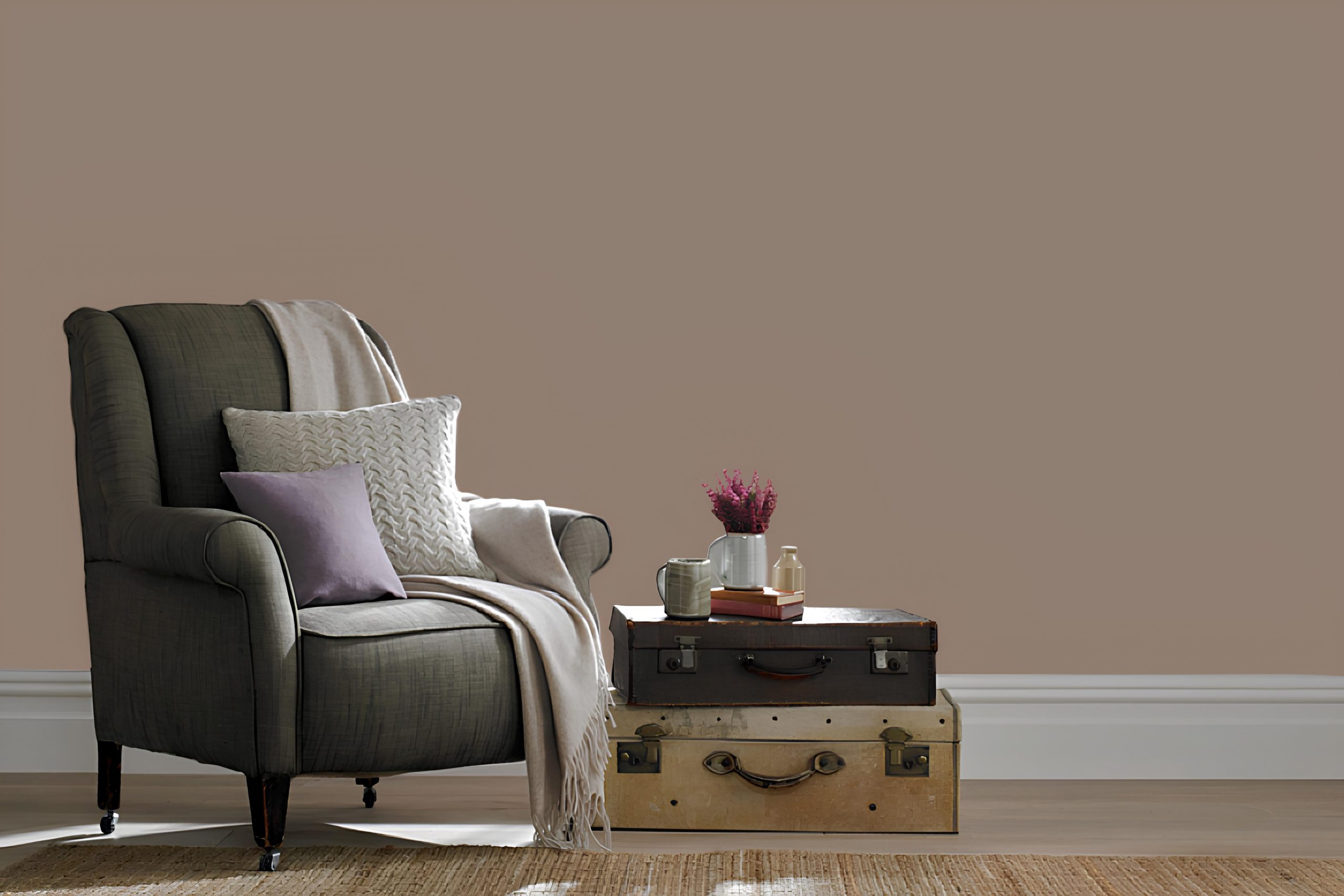
Choosing a paint color like SW 7039 Virtual Taupe by Sherwin Williams can be a key decision for any space. This color adds a perfect balance to rooms with its warm and neutral tones. Virtual Taupe is more than just a simple shade; it’s about bringing a cozy feel to your home.
Imagine a soft, inviting hue that pairs well with various design styles. Whether you have a modern space or something more traditional, this color fits seamlessly.
The neutral quality of Virtual Taupe makes it an excellent backdrop for any room, allowing your furniture and decor to stand out.
What’s more, Virtual Taupe works well in any room, whether it’s a living room filled with natural light or a bedroom that needs a calming touch. Thanks to its adaptable nature, you won’t have any trouble matching Virtual Taupe with other colors in your home.
When you use SW 7039 Virtual Taupe, you’re enhancing your space with a color that offers both warmth and sophistication. So, if you’re ready to freshen up your space, consider how Virtual Taupe can bring a simple yet impactful change to your home’s atmosphere.
via kraskahygge.ru
What Color Is Virtual Taupe SW 7039 by Sherwin Williams?
Table of Contents
Virtual Taupe SW 7039 by Sherwin Williams is a warm, earthy shade that rests between brown and gray. It offers a grounded, natural feel, perfect for adding depth to interior spaces. This color fits seamlessly into various design styles, giving rooms a cozy and inviting atmosphere.
In rustic or farmhouse interiors, Virtual Taupe works beautifully alongside reclaimed wood and natural stone. Its warmth accentuates the textures of these materials, creating a harmonious space that feels connected to nature. Pair it with wicker or rattan for added dimension.
In modern and contemporary spaces, Virtual Taupe acts as a sophisticated backdrop. It can be paired with sleek metal finishes like stainless steel or brass to create a balanced, chic environment. Crisp white trim or furnishings can be used to add contrast and keep the look fresh and airy.
For a more traditional setting, Virtual Taupe complements rich fabrics like velvet or wool. It can enhance classic furniture pieces and add a touch of elegance when paired with dark wood tones.
This versatile hue also finds a place in minimalist decor, where it works with clean lines and uncluttered spaces, providing warmth without overwhelming. Virtual Taupe’s subtle charm allows it to adapt to diverse materials and textures, making it a flexible choice for any room.

housekeepingbay.com
Is Virtual Taupe SW 7039 by Sherwin Williams Warm or Cool color?
Virtual Taupe SW 7039 by Sherwin Williams provides a warm, inviting atmosphere in homes. This earthy, neutral tone blends brown and gray, offering versatility that suits various styles and settings. When used in living rooms or bedrooms, it creates a cozy, comfortable environment.
Its muted nature means it pairs well with both vibrant and muted accents, allowing for creative design combinations.
The color’s depth helps add character without overpowering other elements in a room. Furniture and décor in family-friendly materials harmonize well with this shade, highlighting its adaptive nature. Lightens modern spaces when accompanied by natural light, making rooms feel open yet intimate.
In kitchens, cabinets with Virtual Taupe exude warmth and elegance, appealing without fuss. Bathrooms feel sophisticated, especially when matched with whites or metallics. Overall, this shade brings a subtle charm to homes, proving timeless while conforming to changing trends.
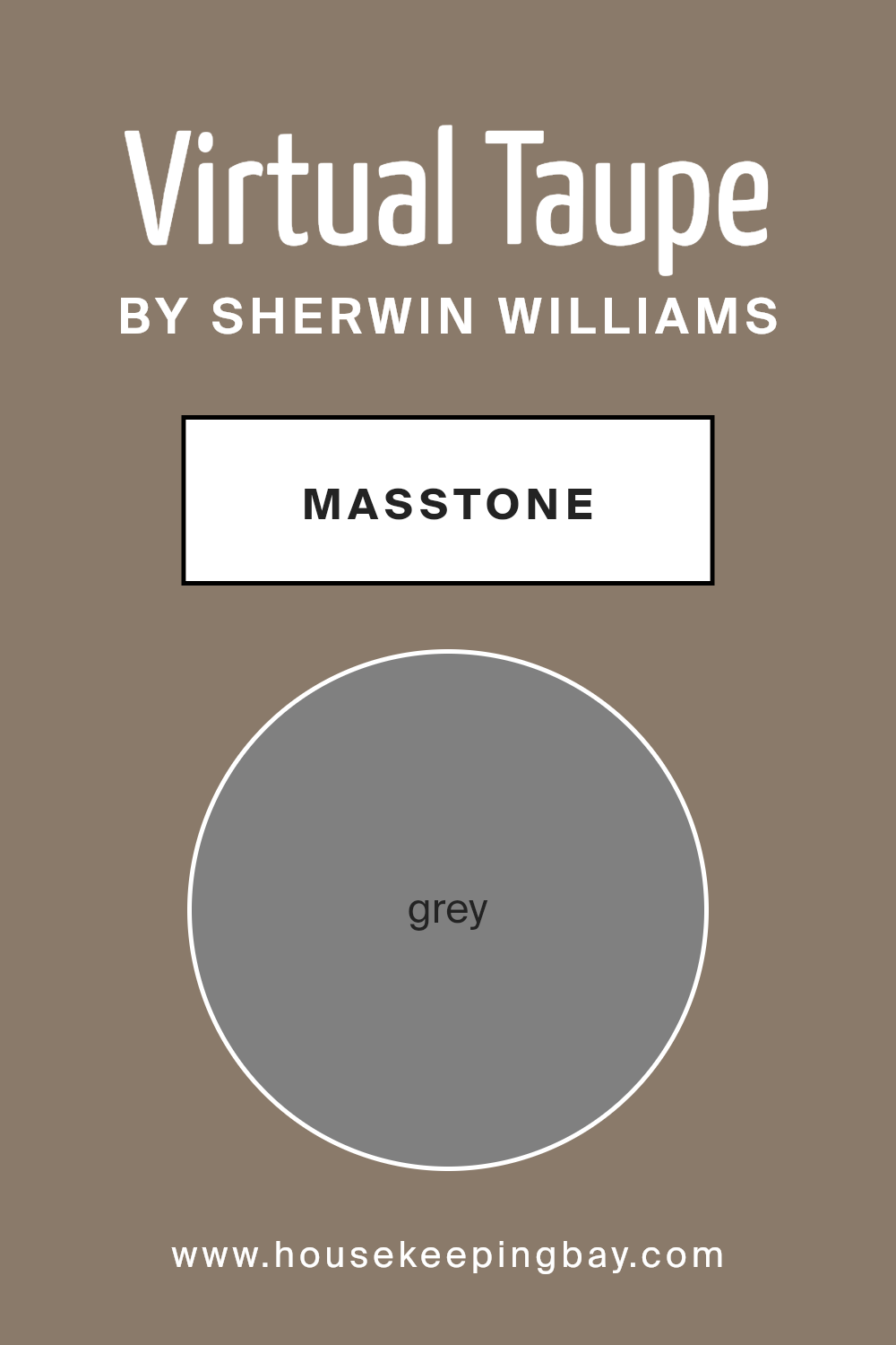
What is the Masstone of the Virtual Taupe SW 7039 by Sherwin Williams?
Virtual Taupe SW 7039 by Sherwin Williams is a delightful neutral shade. Its masstone, or dominant color, is grey (#808080), offering a balanced presence in any room. This grey undertone allows Virtual Taupe to blend seamlessly with other colors, making it a versatile choice for home interiors.
In living rooms or bedrooms, Virtual Taupe adds a cozy, inviting feel without overpowering the space. The grey masstone helps ground the color, creating a calming backdrop that works well with natural light. This makes it perfect for rooms that need a touch of warmth without losing their openness.
In kitchens or bathrooms, Virtual Taupe’s grey undertone complements both modern and traditional decor. It works well with stainless steel appliances and white fixtures, creating a clean and sophisticated look.
Overall, the grey masstone in Virtual Taupe SW 7039 offers a flexible option for any room, providing both warmth and elegance while maintaining simplicity and style.
housekeepingbay.com
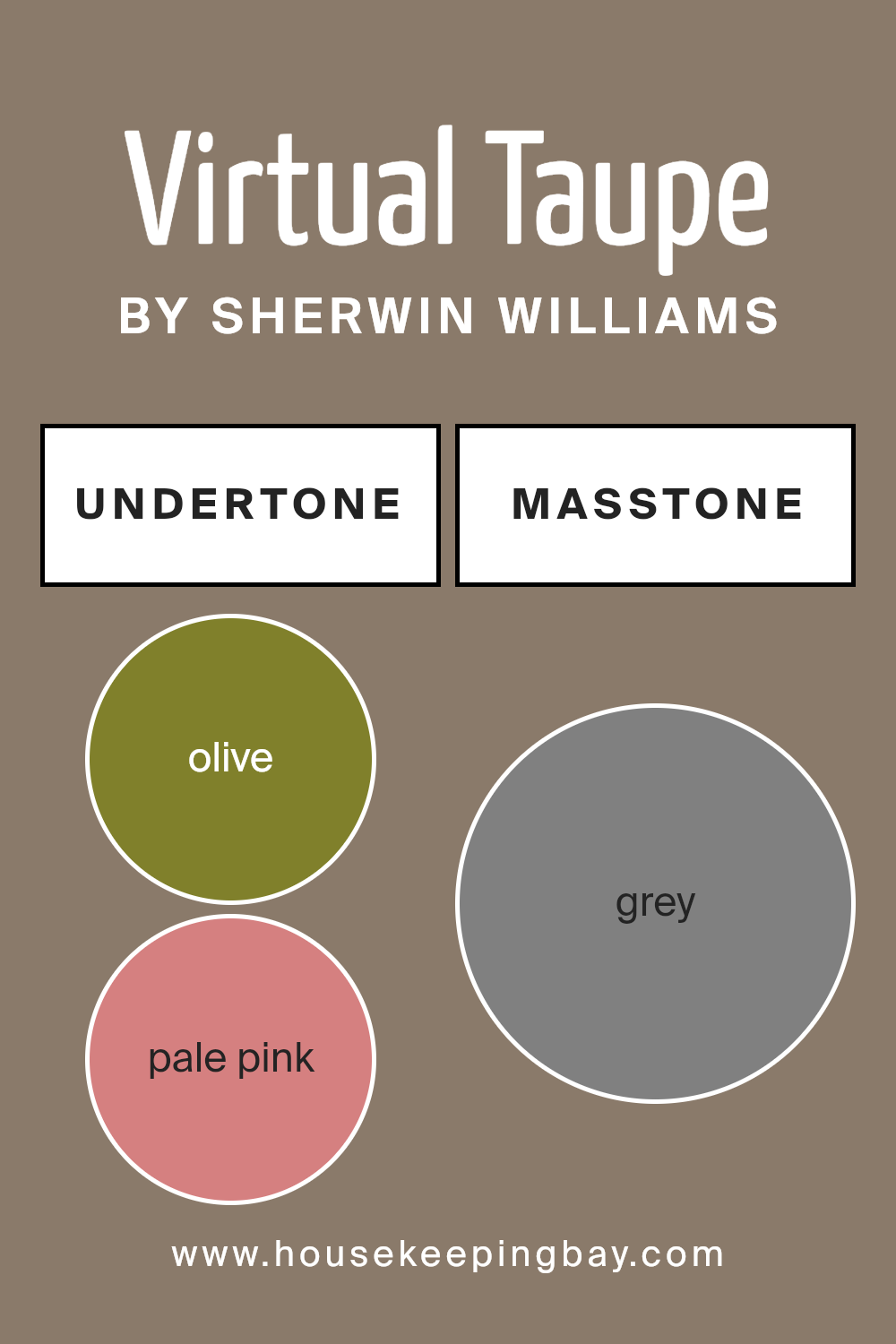
Undertones of Virtual Taupe SW 7039 by Sherwin Williams
Virtual Taupe SW 7039 by Sherwin Williams is a versatile and calming color with a unique set of undertones. These undertones include shades such as olive, pale pink, purple, mint, dark turquoise, and others, which influence how the color is perceived in different lighting and settings.
Undertones are subtle colors within a main color that can affect the appearance of a paint. They can make a color look warmer, cooler, brighter, or softer, depending on the light and surrounding colors
For example, an olive or dark green undertone can make Virtual Taupe appear more earthy and grounded.
The presence of purple or lilac undertones might lend a feeling of sophistication or add depth, while mint or pale yellow could make the color feel fresh and lively.
When used on interior walls, these undertones help Virtual Taupe adapt to different environments. In a room with ample natural light, the color might showcase its warmer undertones, making the space cozy. In dimmer settings, cooler undertones can provide a more soothing ambiance.
The balance of these subtle shades allows Virtual Taupe to complement a variety of decor styles, from modern to classic, without overpowering other elements in a room. This adaptability makes it a favored choice for spaces that aim to feel both warm and inviting.
housekeepingbay.com
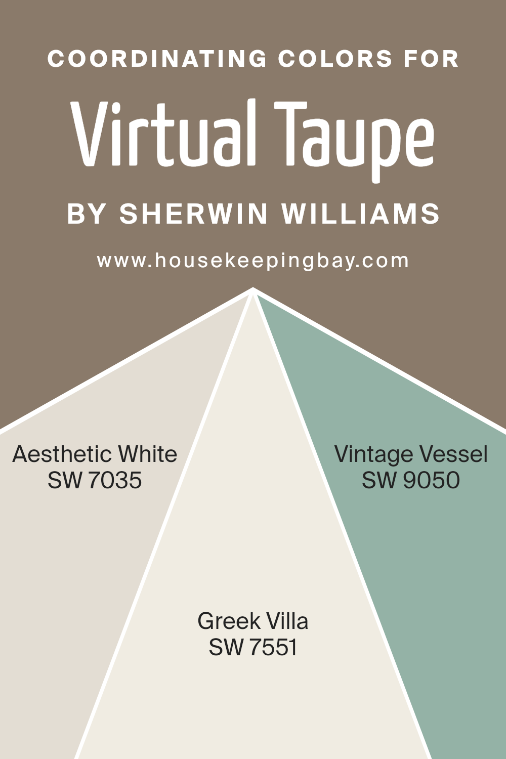
Coordinating Colors of Virtual Taupe SW 7039 by Sherwin Williams
Coordinating colors are hues that complement each other well, creating a pleasing and harmonious look when used together in a space. These colors enhance the overall aesthetic by either contrasting nicely or blending seamlessly.
For Virtual Taupe SW 7039 by Sherwin Williams, some excellent coordinating colors are SW 7035 – Aesthetic White, SW 7551 – Greek Villa, and SW 9050 – Vintage Vessel.
Virtual Taupe is a warm, earthy color that grounds a room, making it a versatile anchor for both neutral and richer color schemes.
Aesthetic White is a soft, warm white with a hint of cream that adds a gentle, inviting touch to any area.
It works well in spaces where you want a light and open feel without starkness. Greek Villa, another ideal partner, is a timeless off-white with subtle warmth, which gives rooms a clean, crisp appearance that doesn’t feel too cold.
Finally, Vintage Vessel is a muted green with a slightly gray undertone, offering a touch of nature and calm to offset the depth of Virtual Taupe. When used together, these colors create a balanced and cohesive environment, perfectly suited for a tranquil and inviting home setting.
You can see recommended paint colors below:
- SW 7035 Aesthetic White
- SW 7551 Greek Villa
- SW 9050 Vintage Vessel
housekeepingbay.com
How Does Lighting Affect Virtual Taupe SW 7039 by Sherwin Williams?
Lighting plays a crucial role in how we perceive colors. It can significantly alter the appearance of a color like Virtual Taupe SW 7039 by Sherwin Williams. Different types of light can make this taupe appear warmer or cooler, and it can also affect how vibrant or muted the color seems.
In natural light, the color can change throughout the day. In a north-facing room, the light tends to be cooler and softer. This can make Virtual Taupe look slightly grayer, lessening its brown warmth. It may feel more subdued in these conditions.
In a south-facing room, there’s more intense sunlight, often warmer and brighter. This type of light can enhance Virtual Taupe’s brown tones, making it appear cozier and warmer. The colors can seem more inviting and lively in such spaces.
East-facing rooms get warm, yellowish light in the morning. Under this light, Virtual Taupe might appear warmer and more inviting early in the day. As the sun moves away, the color can become cooler and more neutral, particularly in the afternoon.
West-facing rooms experience the opposite. Morning light may make Virtual Taupe look flatter and cooler as it lacks warmth. However, in the afternoon and evening, the light is warmer and more golden, which can bring out the rich tones in the paint, making it seem more welcoming and cozy.
Under artificial light, the type of bulb used can greatly affect how Virtual Taupe looks.
Incandescent bulbs tend to emit a warm light, which can enhance the taupe’s warm tones. LED lights, available in various temperatures, can either warm up the color or make it appear cooler, depending on the bulb. Fluorescent lighting often casts a cooler, bluer light, potentially making Virtual Taupe seem grayer than it actually is.
Understanding these lighting effects can help in choosing the best setting for this versatile color.
housekeepingbay.com
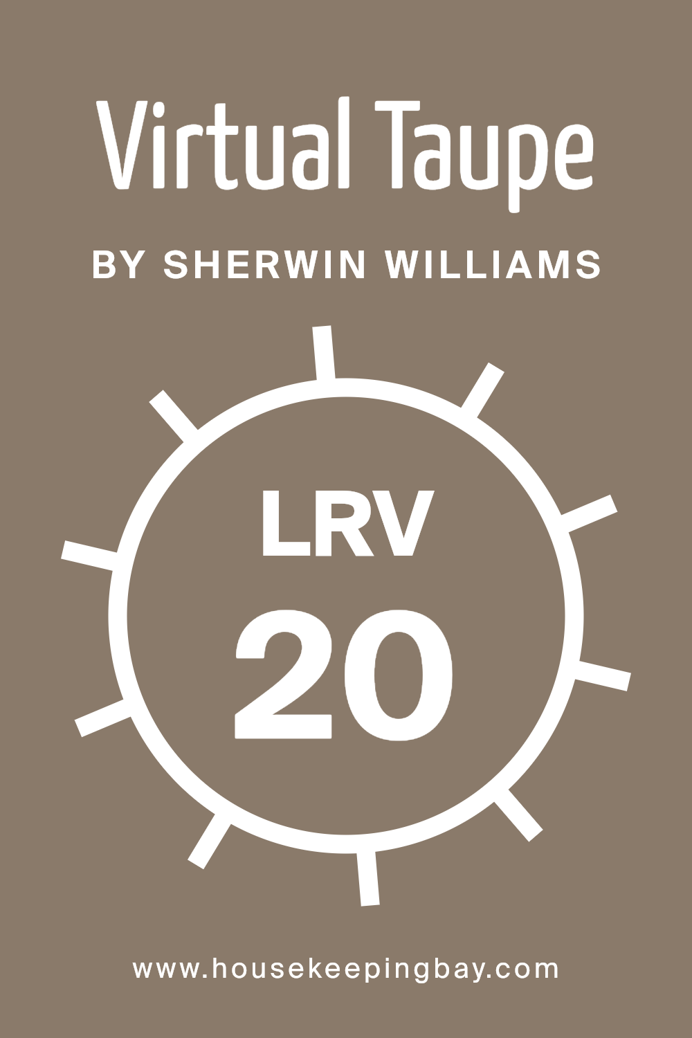
What is the LRV of Virtual Taupe SW 7039 by Sherwin Williams?
Light Reflectance Value, or LRV, indicates how much light a color reflects or absorbs. On a scale from 0 to 100, 0 represents absolute black, absorbing all light, while 100 stands for pure white, reflecting all light. So, the higher a color’s LRV, the more light it reflects, making the room feel brighter and more open.
Conversely, colors with lower LRV values absorb more light, creating a cozier, more intimate atmosphere. This measure helps people anticipate how a color might change when applied to surfaces in different lighting conditions.
Virtual Taupe by Sherwin-Williams has an LRV of 20.32, meaning it falls on the darker side of the scale. This suggests that the color absorbs a fair amount of light, giving it a warm, enveloping feel. In a room with ample natural light, Virtual Taupe might feel rich and inviting, providing a sense of depth.
However, in dimly lit spaces, it might make the room feel smaller and more enclosed. Knowing the LRV helps in deciding where to use this color to achieve the desired mood and effect in a space.
housekeepingbay.com
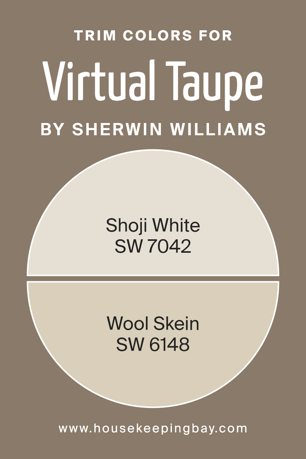
What are the Trim colors of Virtual Taupe SW 7039 by Sherwin Williams?
Trim colors play a significant role in the overall appearance of a room by providing contrast and definition to walls, windows, and doors. When pairing trim colors with Virtual Taupe SW 7039 by Sherwin Williams, they can either subtly enhance or boldly outline architectural features.
Using a lighter trim shade like Shoji White SW 7042 can make a space feel more open, complementing the warm neutral of Virtual Taupe with its soft, creamy undertone. Shoji White adds a touch of lightness that highlights the natural elegance of the taupe, making the room feel fresh and inviting.
On the other hand, Wool Skein SW 6148 brings a different dimension to the color scheme. It carries a gentle and earthy warmth with its beige-green tone, which blends seamlessly with Virtual Taupe. This pairing offers a harmonious look that feels cohesive and grounded, ideal for creating a comfortable and welcoming environment.
Both trim color choices can significantly enhance the balance and mood of a space by highlighting the main wall color and refining the room’s aesthetics.
You can see recommended paint colors below:
housekeepingbay.com
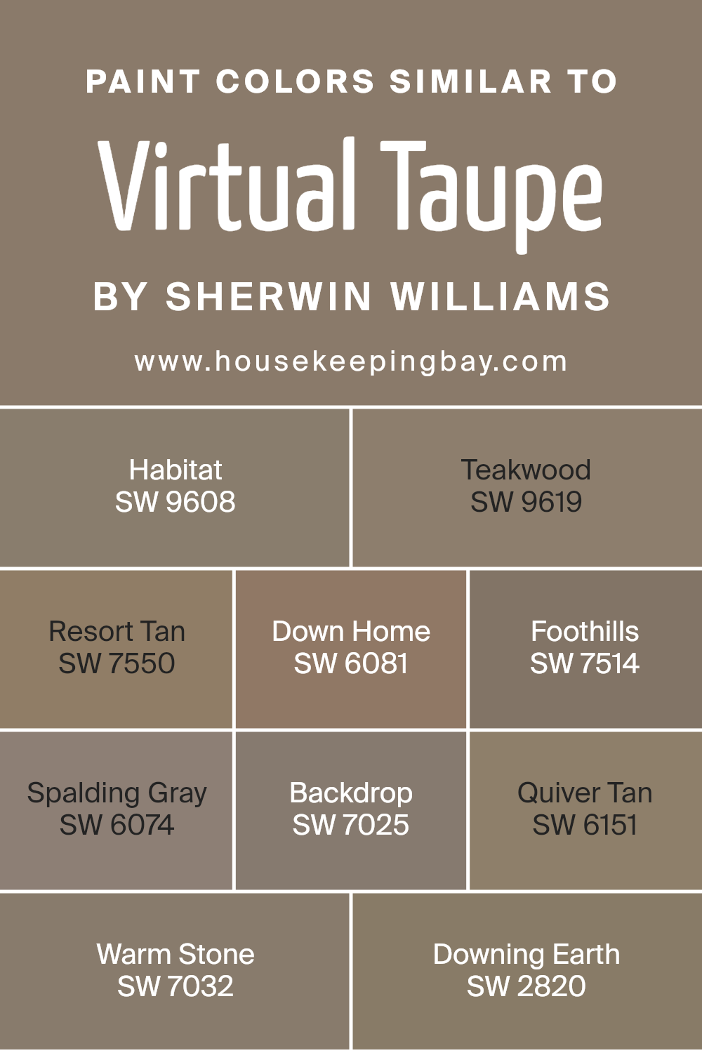
Colors Similar to Virtual Taupe SW 7039 by Sherwin Williams
Similar colors play a pivotal role in design and decoration, particularly when aiming for a cohesive and harmonious look. By selecting colors close to Virtual Taupe SW 7039, such as Habitat SW 9608 or Teakwood SW 9619, you can create a warm and inviting atmosphere.
These hues share subtle earthy undertones, lending spaces a cozy and grounded feel. Resort Tan SW 7550 and Down Home SW 6081 provide slightly warmer and richer variations, perfect for adding depth without overwhelming a room’s palette.
Meanwhile, Foothills SW 7514 and Spalding Gray SW 6074 bring in a more subdued, neutral vibe, making them versatile choices for various settings.
Colors like Backdrop SW 7025 and Quiver Tan SW 6151 add contrasting elements without departing from the cohesive theme, ensuring a seamless flow throughout your space.
Warm Stone SW 7032 creates an enveloping, soft ambiance, ideal for spaces where comfort and relaxation are key. Downing Earth SW 2820 wraps everything together with its deep, rich tone, lending a touch of elegance to any decor.
Each of these shades, while similar, provides its own unique character, allowing for subtle variations that enhance the overall design, adding depth and interest while maintaining harmony.
You can see recommended paint colors below:
- SW 9608 Habitat
- SW 9619 Teakwood
- SW 7550 Resort Tan
- SW 6081 Down Home
- SW 7514 Foothills
- SW 6074 Spalding Gray
- SW 7025 Backdrop
- SW 6151 Quiver Tan
- SW 7032 Warm Stone
- SW 2820 Downing Earth
housekeepingbay.com
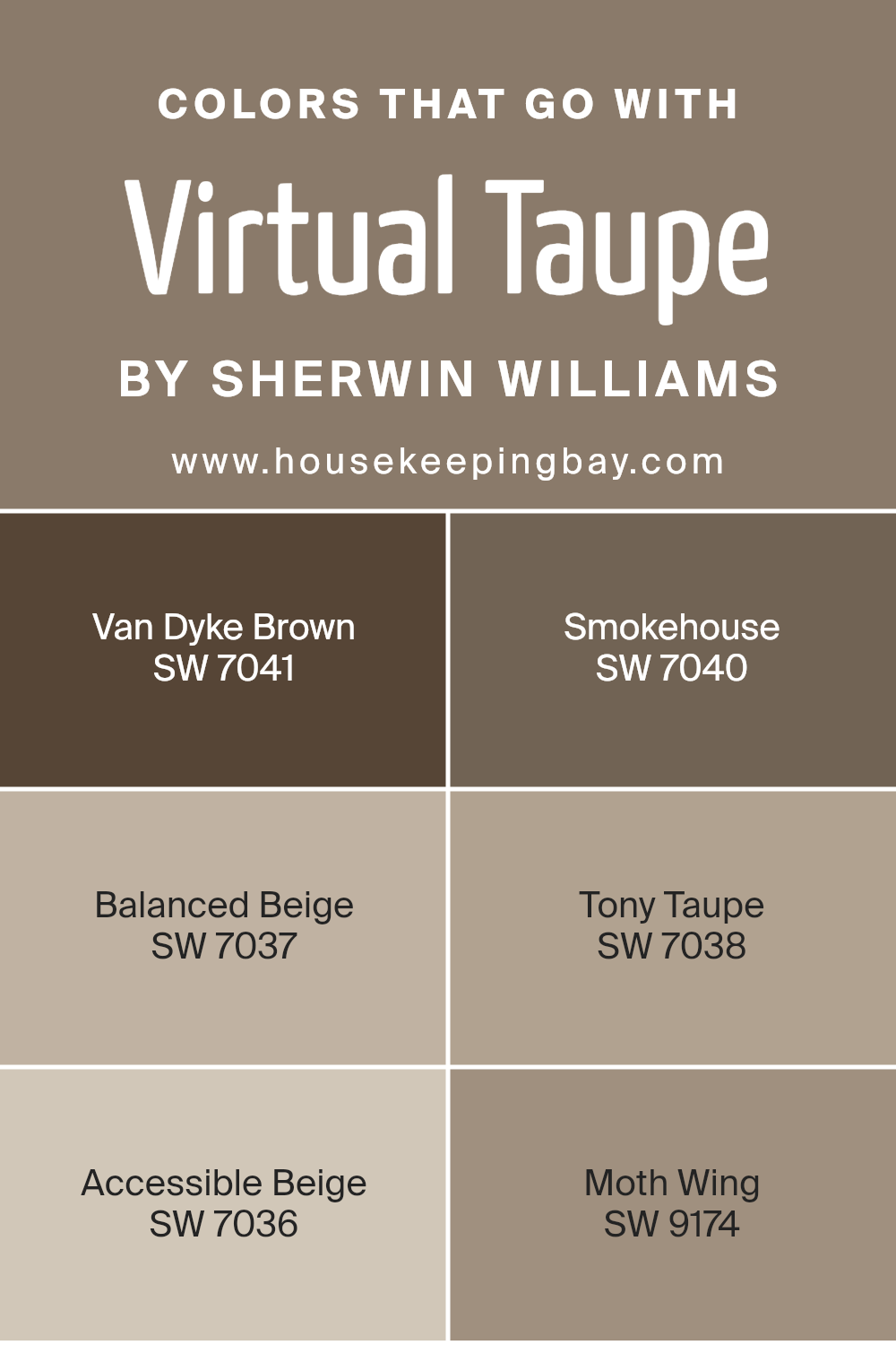
Colors that Go With Virtual Taupe SW 7039 by Sherwin Williams
Choosing colors that pair well with Virtual Taupe SW 7039 by Sherwin Williams is crucial for creating harmonious spaces in your home. Van Dyke Brown SW 7041, a deep and earthy hue, adds a robust warmth that contrasts beautifully with the subtler tones of Virtual Taupe.
Smokehouse SW 7040, with its rich and muted character, provides a comforting and grounding effect, enhancing the depth of your color palette. Balanced Beige SW 7037, lighter and more neutral, offers a soft touch, perfect for maintaining a serene and open feel in any room.
Tony Taupe SW 7038, close to Virtual Taupe but slightly darker, adds a gentle contrast that can help to define architectural features or create cozy corners within a space.
On the other hand, Accessible Beige SW 7036 is a versatile shade that brings out the best in surrounding colors, offering a neutral backdrop that feels warm and inviting.
Moth Wing SW 9174, with its soft gray undertones, complements Virtual Taupe’s subtle warmth while adding a layer of sophistication.
These colors all work seamlessly with Virtual Taupe by adding depth, contrast, or harmony, ultimately invigorating your space without overwhelming it. Together, these shades craft a cohesive environment that feels balanced, welcoming, and stylish.
You can see recommended paint colors below:
- SW 7041 Van Dyke Brown
- SW 7040 Smokehouse
- SW 7037 Balanced Beige
- SW 7038 Tony Taupe
- SW 7036 Accessible Beige
- SW 9174 Moth Wing
housekeepingbay.com
How to Use Virtual Taupe SW 7039 by Sherwin Williams In Your Home?
Virtual Taupe SW 7039 by Sherwin Williams offers a warm and inviting color option for home interiors. It’s a versatile taupe shade with a mix of brown and gray tones, providing a perfect neutral backdrop for various styles. This color works well in living rooms, bedrooms, and hallways, creating a cozy and welcoming atmosphere.
In the living room, Virtual Taupe pairs nicely with both light and dark furniture, allowing for flexibility in decor choices. Adding colorful pillows or vibrant artwork can create appealing contrasts.
In a bedroom, this shade provides a calming environment that promotes relaxation. Pairing it with white or cream bedding enhances its soothing qualities.
For a cohesive look, use Virtual Taupe on walls and add accents of white or soft pastels through accessories like curtains or rugs. Its adaptable nature makes it suitable for open floor plans, tying different spaces together seamlessly while maintaining a sense of warmth and comfort.
Virtual Taupe SW 7039 by Sherwin Williams vs Downing Earth SW 2820 by Sherwin Williams
Virtual Taupe SW 7039 and Downing Earth SW 2820, both by Sherwin Williams, present distinct visual impressions. Virtual Taupe is a medium taupe with a balanced mix of brown and gray, offering a warm, inviting feel. It works well in spaces where neutral stability is desired. Its versatility makes it suitable for contemporary and traditional settings, coordinating easily with a variety of accent colors.
Downing Earth SW 2820, slightly darker, leans more towards a rich brown. It carries deeper earth tones, evoking a sense of coziness and grounding. This color is often chosen to create a warm, enveloping atmosphere, perfect for rooms where an intimate and comforting environment is key.
When compared, Virtual Taupe’s lighter tone can make a room feel more open and airy, while Downing Earth’s depth can add a touch of sophistication and warmth. Both colors can enhance interiors effectively, each providing its unique character and feel.
You can see recommended paint color below:
- SW 2820 Downing Earth

housekeepingbay.com
Virtual Taupe SW 7039 by Sherwin Williams vs Quiver Tan SW 6151 by Sherwin Williams
Virtual Taupe SW 7039 and Quiver Tan SW 6151, both from Sherwin Williams, offer warm, earthy tones suitable for various spaces. Virtual Taupe has a rich, deep natural tone that feels comforting and grounded. It’s slightly darker, providing a cozy backdrop and works well in living rooms or bedrooms where you want a soothing atmosphere.
Quiver Tan, in contrast, is a shade lighter with more warm undertones. It carries a soft, inviting feel that’s very versatile. This color suits spaces like kitchens or common areas where you desire a welcoming environment without overwhelming the space.
When comparing them, Virtual Taupe provides more depth and intensity, perfect for creating a snug retreat. Quiver Tan offers brightness and warmth, suitable for spaces needing light but still wanting that earthy, calm vibe. Both colors blend well with neutral palettes, fitting seamlessly into modern or classic home styles.
You can see recommended paint color below:
- SW 6151 Quiver Tan

housekeepingbay.com
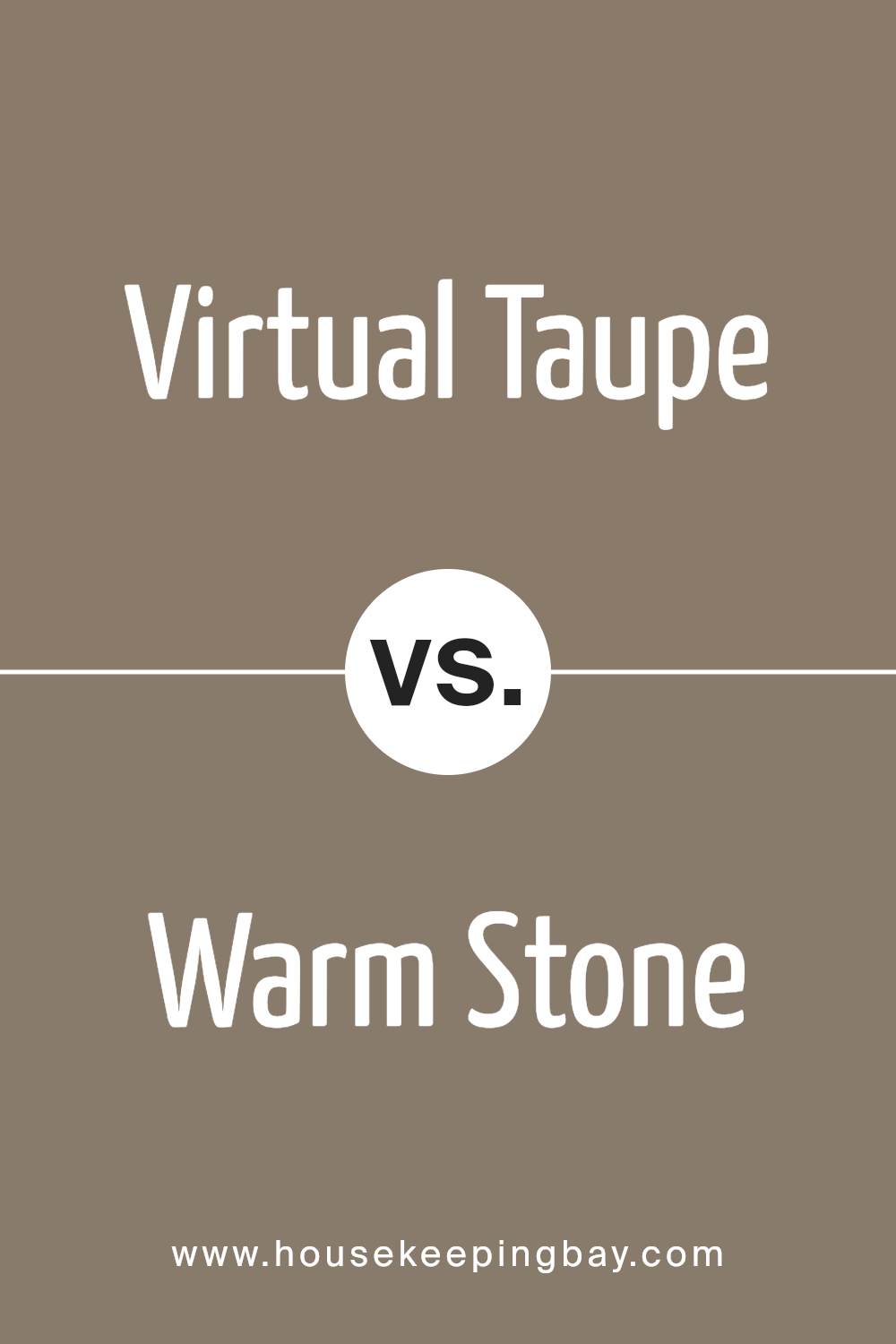
Virtual Taupe SW 7039 by Sherwin Williams vs Warm Stone SW 7032 by Sherwin Williams
Virtual Taupe SW 7039 and Warm Stone SW 7032, both from Sherwin Williams, are versatile, earthy tones that work well in various spaces. Virtual Taupe is a rich, deep taupe with a smooth balance between brown and gray. It exudes a cozy, inviting vibe, making it a great choice for living rooms or bedrooms where comfort is key.
Warm Stone, in contrast, leans more towards a lighter, greige (grey-beige) tone. It offers a soft, soothing appearance with a gentle warmth.
While Virtual Taupe provides a more dramatic, bold impact, Warm Stone feels more subtle and neutral. Both colors create an inviting backdrop, yet Virtual Taupe might suit a space where you want more depth and coziness.
Warm Stone, with its airy quality, is ideal for areas seeking a light, spacious feel. Whichever you choose, each color brings its unique charm, allowing for many creative design opportunities.
You can see recommended paint color below:
housekeepingbay.com
Virtual Taupe SW 7039 by Sherwin Williams vs Down Home SW 6081 by Sherwin Williams
Virtual Taupe SW 7039 and Down Home SW 6081, both by Sherwin Williams, offer distinct vibes for any space. Virtual Taupe presents itself as a warm, cozy taupe with a subtle blend of gray and brown, creating a neutral yet inviting atmosphere.
It feels sophisticated and can anchor a space without overwhelming it. Meanwhile, Down Home SW 6081 leans more into a warm earthiness with noticeable undertones of peach or pink, providing a more traditional, homey feel.
Virtual Taupe is versatile, fitting modern and transitional styles, while Down Home brings warmth that complements rustic or country-inspired designs. Pairing Virtual Taupe with cooler accents enhances its neutral characteristics, making it adaptable.
Down Home, with its warmth, works beautifully with natural materials like wood or soft, creamy whites. Both colors bring unique warmth, but Virtual Taupe leans towards subtle sophistication, whereas Down Home radiates a welcoming, cozy atmosphere for relaxed settings.
You can see recommended paint color below:
- SW 6081 Down Home

housekeepingbay.com
Virtual Taupe SW 7039 by Sherwin Williams vs Foothills SW 7514 by Sherwin Williams
Virtual Taupe SW 7039 and Foothills SW 7514 by Sherwin Williams both fall in the neutral color family, yet they each have unique characteristics. Virtual Taupe is a medium, earthy brown with a warm undertone. It’s a versatile shade, adding warmth and depth to spaces without overpowering them. It pairs well with both lighter and darker accents.
Foothills SW 7514, meanwhile, presents a lighter, softer brown, almost tan, with a slightly cooler undertone compared to Virtual Taupe. This color brings a gentle, calming vibe to a room, making it suitable for creating a relaxed atmosphere.
When placed side by side, Virtual Taupe appears richer and more grounded, while Foothills feels airy and light. Both colors can work well in living rooms or bedrooms, depending on the mood you wish to create. While Virtual Taupe commands subtle sophistication, Foothills offers a sense of soft comfort.
You can see recommended paint color below:
- SW 7514 Foothills

housekeepingbay.com
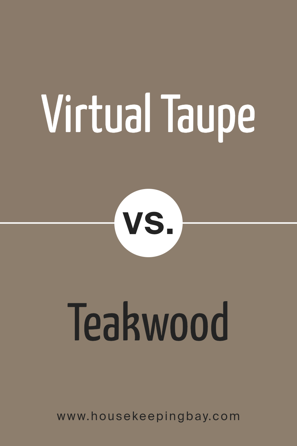
Virtual Taupe SW 7039 by Sherwin Williams vs Teakwood SW 9619 by Sherwin Williams
Virtual Taupe SW 7039 and Teakwood SW 9619, both from Sherwin Williams, offer inviting and earthy hues for any space. Virtual Taupe presents itself as a warmer, deeper shade of taupe with subtle gray undertones. Its versatility makes it ideal for creating cozy and comforting environments, working well in living rooms or bedrooms. This color pairs beautifully with creams and muted greens, enhancing its soothing qualities.
Teakwood, meanwhile, exudes rich, earthy brown tones reminiscent of natural teak timber. It features a sense of strength and maturity and can add a touch of richness to a setting. This color matches perfectly with warm whites and reds, creating a cohesive and grounded atmosphere.
Both colors embody earthiness but in distinctive ways. Virtual Taupe brings a softer, more contemporary feel, while Teakwood offers a bold, classic statement. Their contrasting shades provide ample opportunity for mixing and matching within various design themes.
You can see recommended paint color below:
housekeepingbay.com
Virtual Taupe SW 7039 by Sherwin Williams vs Habitat SW 9608 by Sherwin Williams
Virtual Taupe SW 7039 and Habitat SW 9608, both by Sherwin Williams, offer unique qualities for home and office settings. Virtual Taupe is a warm neutral shade, characterized by its rich brown undertones. This color brings an inviting, cozy vibe, making it perfect for living spaces where comfort is the focus. It’s adaptable, pairing well with both modern and traditional décor.
Habitat SW 9608, meanwhile, holds a more earthy green tone. This color feels fresh and natural, reminiscent of lush landscapes. It brings a sense of calm and peace, ideal for spaces aiming to connect with nature. Habitat works well in bedrooms or offices where a balanced atmosphere is the goal.
While both colors are versatile, Virtual Taupe suits spaces wanting a snug feel, and Habitat infuses a room with an organic touch. Both choices reflect their strengths in either grounding a room or invigorating it with nature-inspired elements.
You can see recommended paint color below:
- SW 9608 Habitat

housekeepingbay.com
Virtual Taupe SW 7039 by Sherwin Williams vs Backdrop SW 7025 by Sherwin Williams
Virtual Taupe SW 7039 and Backdrop SW 7025 by Sherwin Williams are both warm, earthy tones but have distinct characteristics. Virtual Taupe is a medium-toned taupe with a balance of brown and gray undertones. This color offers a cozy and grounded feel, making it suitable for living rooms or bedrooms where comfort and neutrality are desired.
Backdrop SW 7025, meanwhile, leans darker and richer, with stronger gray undertones, creating a more dramatic and sophisticated ambiance. Its deeper hue works well as an accent wall or in spaces where you want a bold yet neutral statement.
Both colors fit well with natural materials like wood or stone, enhancing their warmth. Virtual Taupe feels slightly more versatile due to its lighter tone. In contrast, Backdrop offers more depth and can introduce stronger contrast when paired with lighter elements in a room. These colors can complement each other when used thoughtfully in a cohesive design plan.
You can see recommended paint color below:

housekeepingbay.com
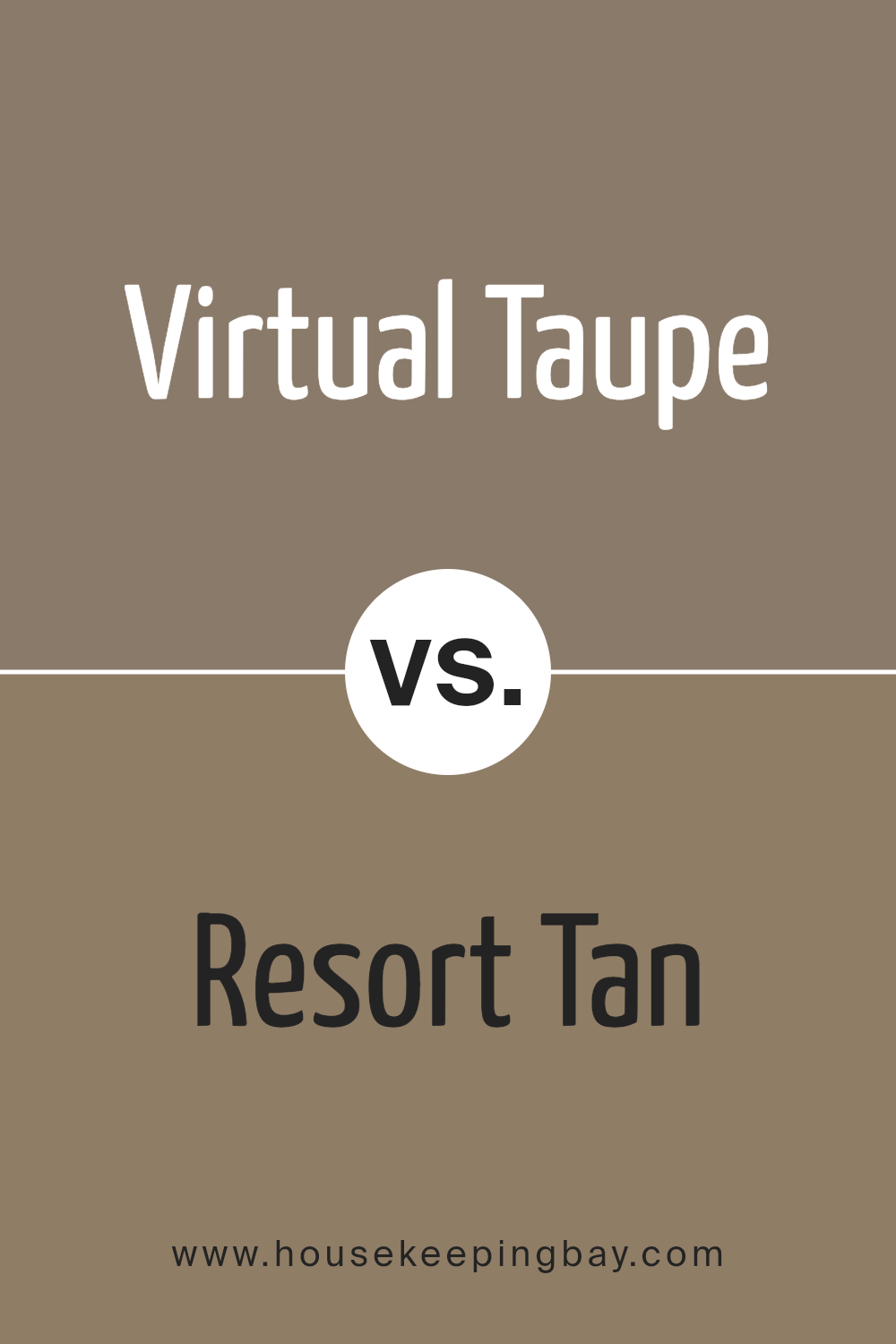
Virtual Taupe SW 7039 by Sherwin Williams vs Resort Tan SW 7550 by Sherwin Williams
Virtual Taupe SW 7039 and Resort Tan SW 7550, both by Sherwin Williams, offer warm, earthy tones that suit a variety of spaces. Virtual Taupe presents a deep, rich brown shade with a grounded feel, making it a superb choice for creating cozy, inviting interiors. It pairs well with both lighter shades for contrast and other warm hues for a harmonious look.
Resort Tan, a lighter, sandy brown, brings a sense of airiness to rooms. Its soft touch makes it more versatile in brightening spaces while still providing warmth. This hue works well in rooms where natural light enhances its subtle glow.
While both colors exude warmth, Virtual Taupe stands out with its depth, whereas Resort Tan contributes a lighter, breezier touch. Both provide excellent backdrops for natural materials and furnishings, but their differences in shade depth offer distinct ambiances to explore in home styling.
You can see recommended paint color below:
- SW 7550 Resort Tan
housekeepingbay.com
Virtual Taupe SW 7039 by Sherwin Williams vs Spalding Gray SW 6074 by Sherwin Williams
Virtual Taupe SW 7039 and Spalding Gray SW 6074, both from Sherwin Williams, are versatile neutral shades, yet they have their distinct characteristics. Virtual Taupe offers a warm, earthy vibe. It often brings a cozy and inviting feel to a space, working well in living areas or bedrooms. Its brown undertones give a natural and grounded appearance, perfect for creating a comfortable atmosphere.
Spalding Gray SW 6074, in contrast, leans toward a cooler, more subdued tone. It has a subtle gray base that often feels more modern and sophisticated. This color suits spaces where a relaxed yet stylish setting is desired, like home offices or dining rooms.
Both colors can be paired with a variety of accents. Virtual Taupe pairs nicely with warm woods and soft cream tones, while Spalding Gray compliments whites and other cool hues. Each offers a different mood, allowing for personalized expression based on preference.
You can see recommended paint color below:
- SW 6074 Spalding Gray
housekeepingbay.com
Conclusion
Virtual Taupe by Sherwin Williams is an interesting choice when thinking about a paint color. Its earthy tone brings warmth and sophistication to any space. When I consider how it can impact a room, I see its versatility—it adapts well to both traditional and modern styles.
This color seems to create a cozy feeling, making spaces feel inviting and comfortable. It pairs beautifully with various other colors and materials, enabling flexibility in design.
I appreciate how Virtual Taupe can help in making a room feel complete and grounded. It doesn’t overwhelm but rather enhances the overall atmosphere. The neutral aspect of this color makes it an excellent backdrop for bold accents or more subtle décor.
It’s an approachable choice that can appeal to diverse tastes and design preferences.
Choosing Virtual Taupe feels like a way to add a touch of elegance without difficulty. It provides a balanced, sophisticated look while maintaining a sense of warmth.
In a world of endless color choices, Virtual Taupe stands out as a reliable, tasteful option that can truly transform a home in a simple yet effective way.
housekeepingbay.com
Ever wished paint sampling was as easy as sticking a sticker? Guess what? Now it is! Discover Samplize's unique Peel & Stick samples. Get started now and say goodbye to the old messy way!
Get paint samples


