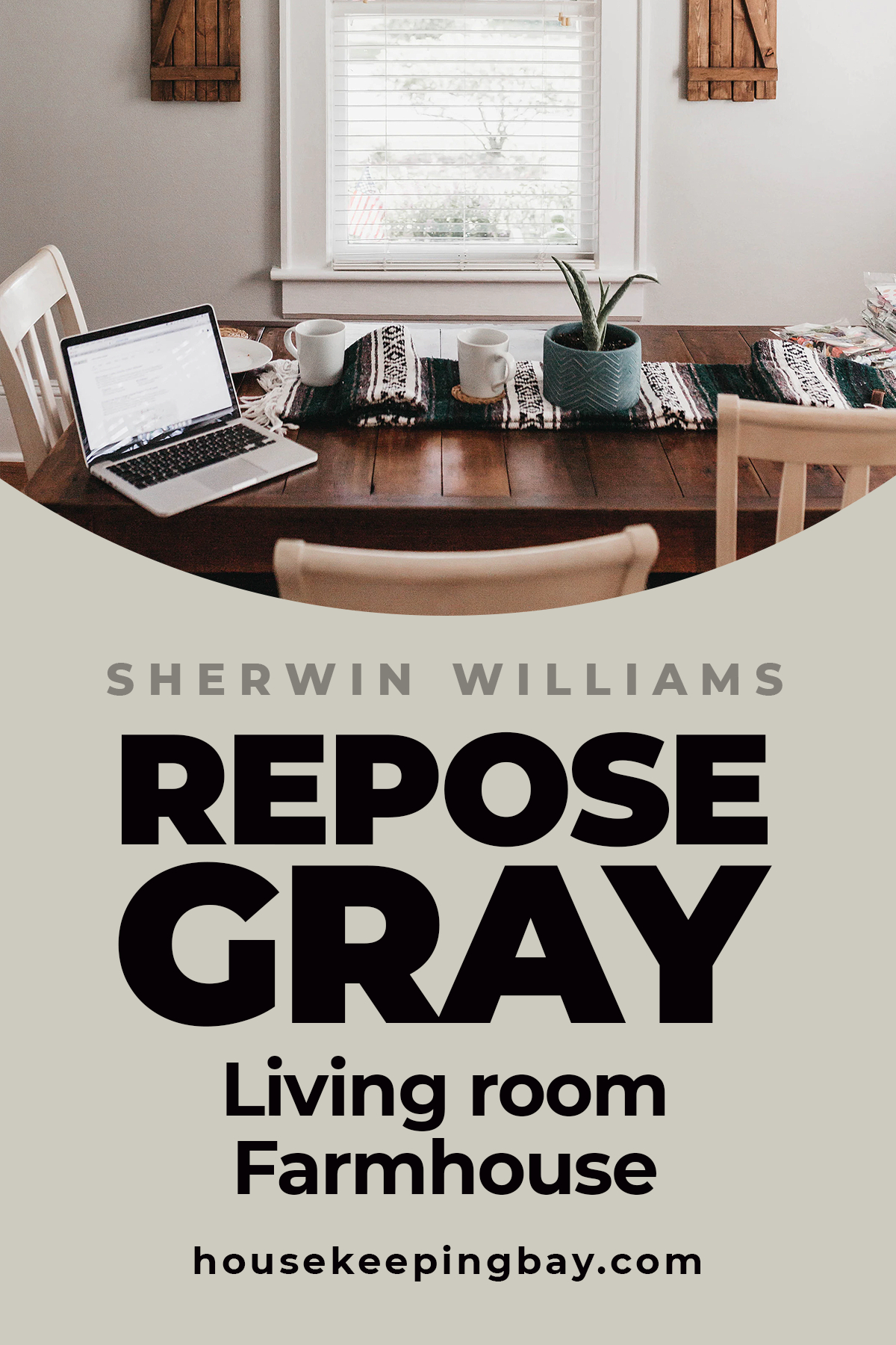
Repose Gray For the Living Room
Detailed Guide From The Experts
Living room is the space where most of us spend the majority of our time. No wonder that people usually want to have this room finely decorated and good-looking! And the simplest way to do that is to choose the correct wall paint since it is the base for everything else.
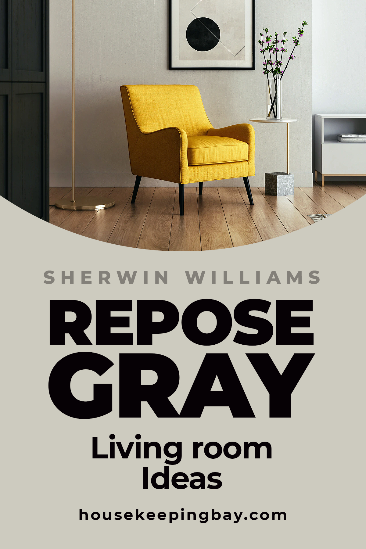
If you are looking for the color that will complement almost any lighting and room furnishing or decor, take into consideration such wall paint shade as Repose Gray by Sherwin Williams that belongs to neutral colors.
It will fit almost any design and type of furnishing, as well as most of the interior color palettes.
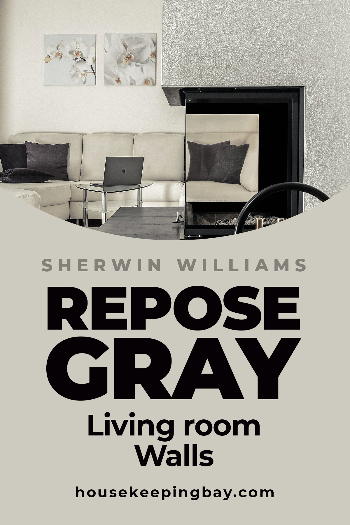
Sherwin Williams Repose Gray Repose Gray SW 7015 – Neutral Paint Color is one of the most popular warm neutrals that this brand produces. It is fantastically versatile being an ideal neutral that will fit any home.
housekeepingbay
In general, this color can be called warm, however, there is that slight coolness that makes it work perfectly with almost any decor style.
This is why Repose Gray is an optimal choice if you are looking for a universal gray shade for your home.
This paint color reflects light pretty well which means it will not look too dark in the evening under the artificial lighting. Also, in broad daylight, this gray shade will look rather fair adding a room some extra space.
What makes this seemingly simple shade so versatile, you may wonder? Such characteristics become possible because of the undertones of the color. See, Repose Gray has a taupe-ish base that consists of brown, greige, gray, and a slight dab of purple. Because of such a rich undertone collection, the color itself does not look flat, dull or boring.
housekeepingbay
This is also what makes this gray shade so good at being combined with other greiges and neutrals. Besides, you can make use of it in almost any part of your house from kitchen or bedroom to living room and bathroom. It can even be used for painting cabinets or for the exterior paint works!
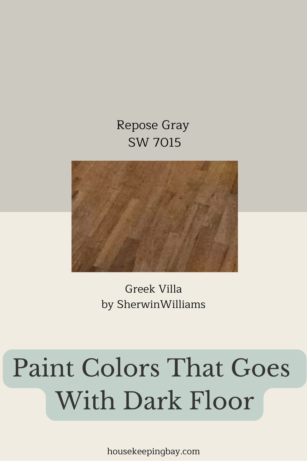
Repose Gray SW 7015 + Dark Floors = A Perfect Match
Table of Contents
If you’re working with dark wood floors and want a wall color that just works without making the room feel too heavy, Repose Gray is one of those no-fuss colors that really gets the job done
This pin shows a combo with Greek Villa for trim or surrounding walls, and it’s sooo good together. Repose Gray has a soft greige base—so it’s not too cold, not too warm. And when paired with rich brown flooring like oak or walnut, it really lightens things up while keeping everything grounded.
One of my clients had a living room with espresso floors and was struggling with how dark it felt. We swapped out her cool gray walls for Repose Gray and added Greek Villa on the trim and ceiling… it changed everything! The room instantly felt brighter, but still cozy—not sterile at all. She even messaged me later and said, “Now I actually like sitting in my living room.” That’s the goal, right?
Little tip: Repose Gray shifts slightly depending on the light. If your room is north-facing, it may lean a little more gray, and in the afternoon sun, you’ll see its warmer undertones peek through. Either way, it stays super neutral and pairs beautifully with white trim, natural woods, and even black accents.
housekeepingbay.com
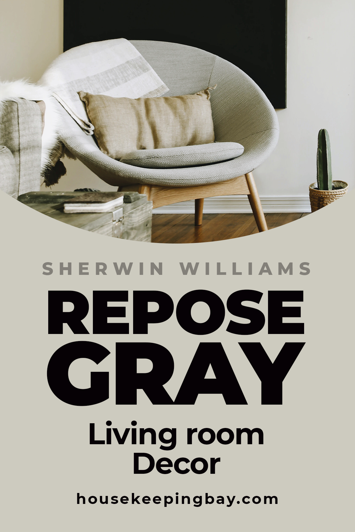
Repose Gray In a Living Room. Decor Winning Combinations
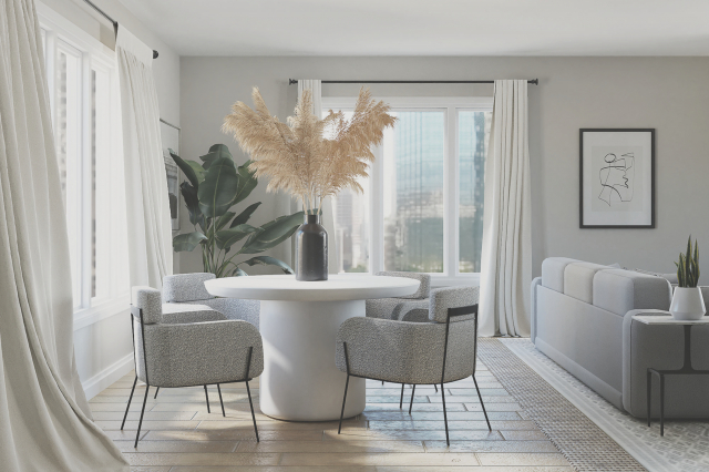
If you have your living room painted with SW Repose Gray, it gives you almost endless possibilities for decor experiments. Since this color is neutral, it can be successfully combined with most of other neutral shades, as well as greiges and beige or gray paints.
However, whites will also create an exquisite and elegant combination with this warm neutral color!
As for the interior elements or decor, stick to all shades of brown since they will reveal that warmth of the Repose Gray even more.
Also, don’t forget about white items, such as window frames, fretwork, or others, since Repose Gray used in a living room with white trim colors make this neutral gray look fresher.
Finally, if your room has too many neutrals, feel free to add some bright and vivid elements and colors. Orange, yellow, green or bright red will look great against the background of Repose Gray.
housekeepingbay
Repose Gray In a Living Room. Ideas And Suggestions
We are used to thinking that neutrals, as well as greige or other subtle shades, are better to be combined with similar colors. However, the good thing about them is that we can actually mix them with way more distinct colors and shades the same successfully to create more vivid interiors!
As for the SW Repose Gray, one of the winning color combinations that rather few people think about is with different blue tones.
Yes, such an interior will have a rather cool appearance, but if this is what you like, then why not try?! Blue cushions or curtains will nicely match the neutral shade of the walls.
Also, this color combines greatly with stone and wooden decor elements. Consider this if you are looking for the ideas of how to make your living room look more rustic. A massive wooden coffee table or brown marble table top will look especially cozy in such a room.
housekeepingbay
Also, it may work well to combine this color with some golden decor elements, such as lamps. Even though this is not a frequent thing to do, such a color combination will create an interesting and elegant yet simple effect.
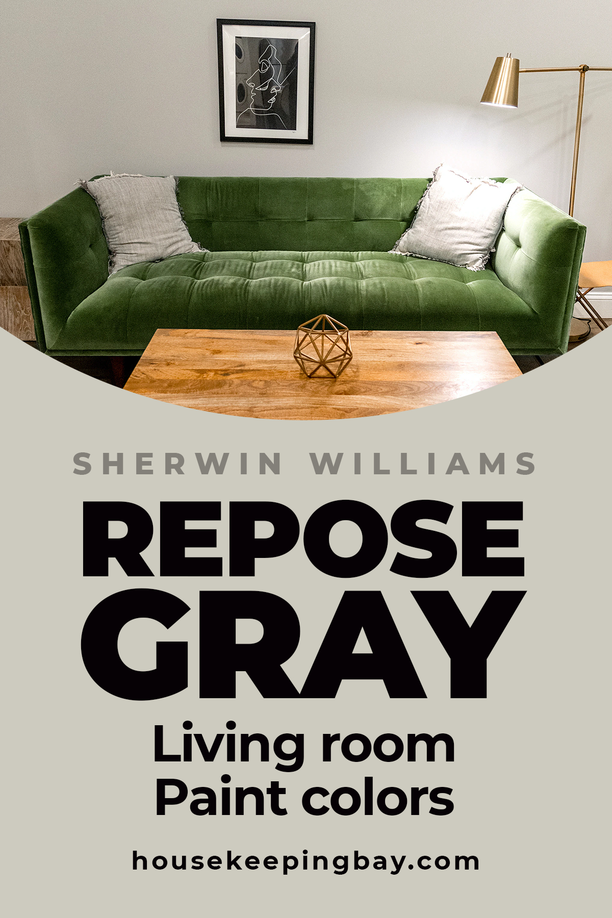
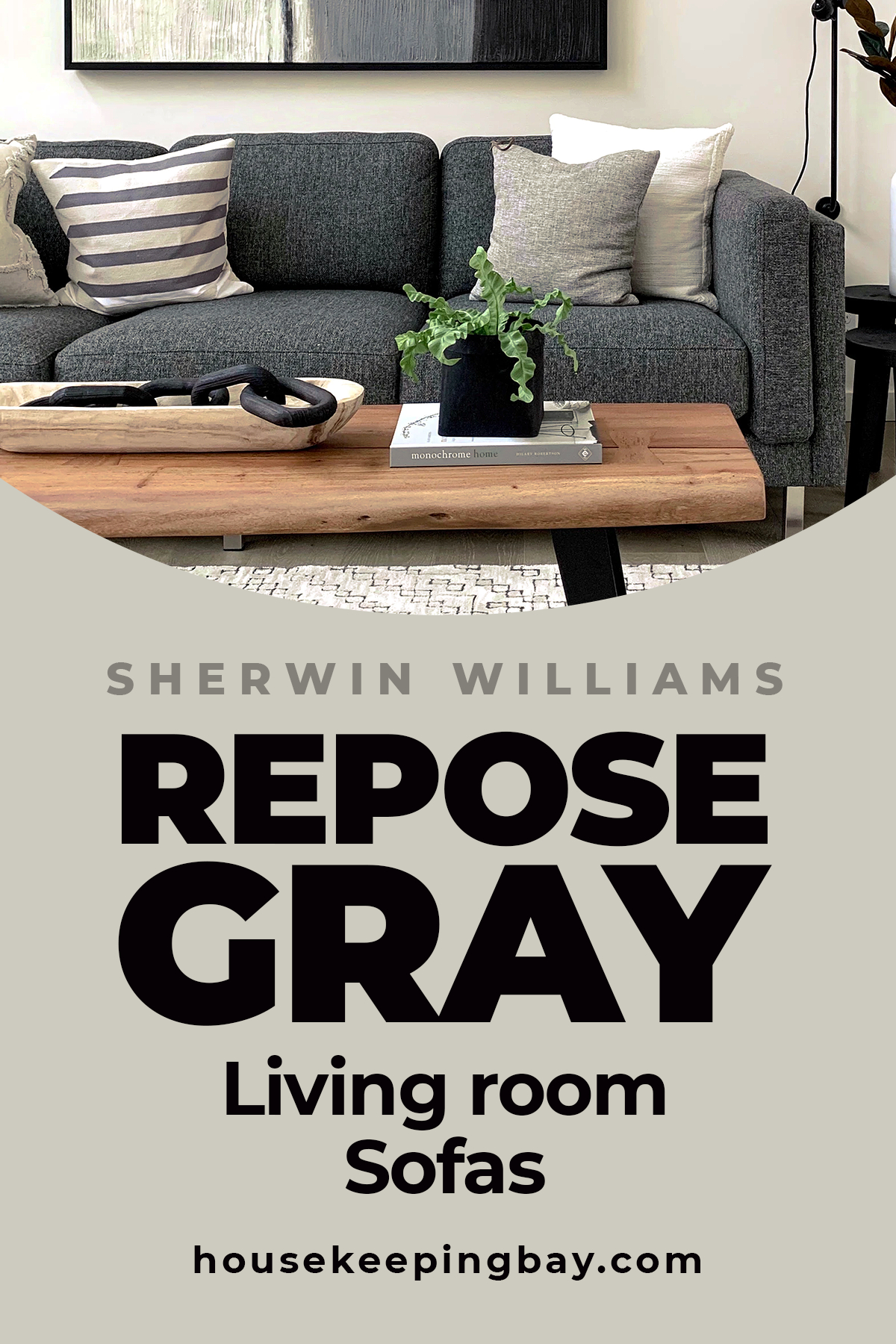
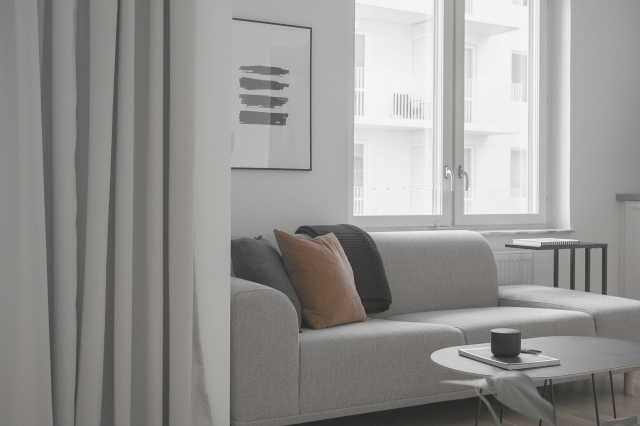
How Repose Gray Combines With Sofas
The choice of a proper wall color in your living room must be coordinated with the color of the objects in it, such as curtains, armchairs, and the sofa in particular. If you pick up the colors in the wrong way, the overall color ensemble will not be harmonious.
As for the SW Repose Gray, since it is neutral, it can be combined with sofas of any color and material. No matter if you have a leather couch or a modern sofa with textile upholstery, they will complement this color on the walls.
Repose Gray looks especially good when being mixed with other neutrals or greiges, so if your sofa is of one of those colors, you’re lucky! The owners of a leather item can also breathe out with relief: Repose Gray fits brown shades very well, too!
But in case you’re looking for more unusual ideas, think of azur or blue sofa. These colors will create a win-win combination with such a warm neutral as Repose Gray.
housekeepingbay
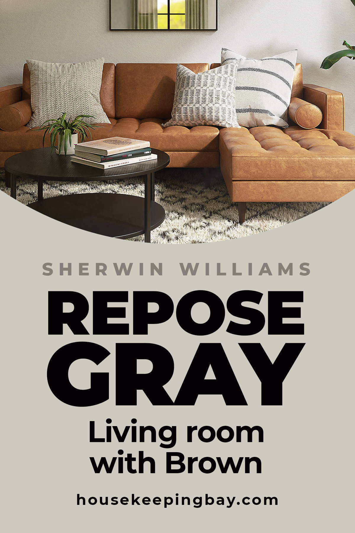
SW Repose Gray With Brown Sofas
Brown might seem to be not quite a suitable matching color for a warm and neutral Repose Gray, but in fact, these two combine perfectly well. The secret is hidden in the undertones of the basic color.
See, one of the undertones of Repose Gray is brown. It means that, if we combine this color with any brown shade, the latter one will reveal that undertone more intensively making the paint color look warmer.
So if your goal is to make your living room look cozier, think of placing some brown objects there, for instance, wooden decor elements or furniture.
housekeepingbay
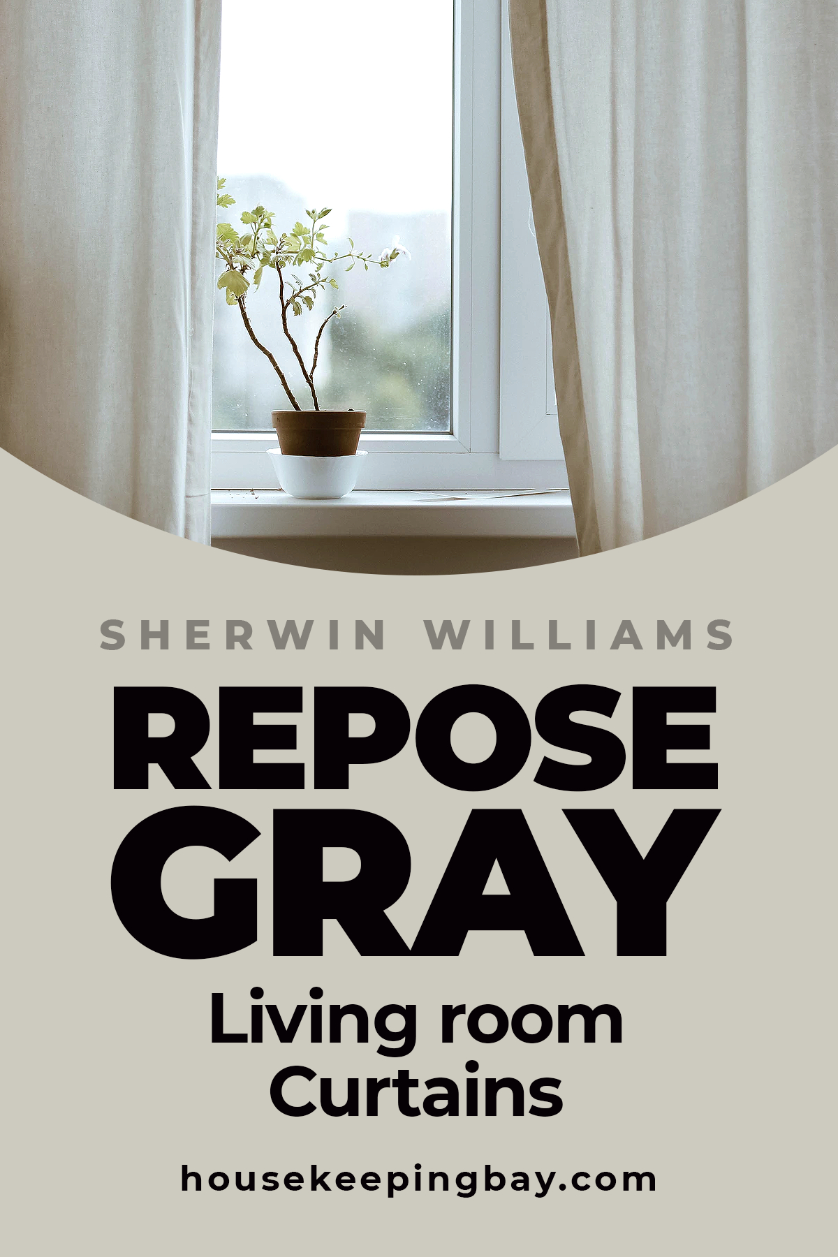
SW Repose Gray Curtains Combinations
When picking up curtains for your living room painted with Repose Gray, don’t be afraid to go beyond the common beige\greige palette! This color is neutral which makes it really versatile and easy-to-combine with lots of other shades, not only subtle.
Of course, the easiest color combinations would be with other neutrals or grays, as well as various tones of beige. However, such a room will look somewhat too boring, so think of adding more liveliness to it by using the colorful curtains:
- azur
- blue
- patterned
- light pink
- olive green
They will create a cozy atmosphere in your living room and make it look way less formal.
housekeepingbay
Is SW Repose Gray Good For Painting Farmhouse?
All right, now we know that SW Repose Gray is one of the best colors for interior works. But what about the exterior of your house? Fortunately, this color can also be successfully used for painting external walls, not only the internal ones.
However, consider that the color will look slightly different depending on the lighting. If you, for instance, live in an area with lots of sunlight, and you paint your house with Repose Gray, the walls will look rather light and warm. On the contrary, in the area with less sunlight, this paint color may look somewhat cooler and closer to gray.
Like that, now you know what colors combine best with SW Repose Gray living room painted walls, so you can easily pick up the palette that will make your living room and the whole house look refreshed.
housekeepingbay
Ever wished paint sampling was as easy as sticking a sticker? Guess what? Now it is! Discover Samplize's unique Peel & Stick samples. Get started now and say goodbye to the old messy way!
Get paint samples


Frequently Asked Questions
⭐What is the undertone for Repose Gray?
Its undertones are brown, purple, greige, and gray.
⭐Where to buy Repose Gray?
It can be bought either in a brand store of Sherwin Williams or in any store that sells wall paints.
⭐What color is lighter than Repose Gray?
Paper White is lighter than Repose Gray.
27 thoughts on “Repose Gray For the Living Room”
Leave a Reply


What color cabinets go with Repose Gray on the walls? I’ve almost twisted my brain inside out trying to find the best color!
Hi! Look, guys, I need your advice. Do you think Mindful Gray is too cool-toned for a living room? The room is quite spacious and light, so I don’t think this color might read darker.
Hello! I guess whether to use it or not depends on the atmosphere you want in your living room. I personally like this gray for its airiness and moderate coolness.
Hello. Thanks for sharing so much helpful information about this paint color. Do you think Agreeable Gray will work for a living room instead of Repose Gray?
Hello. The color choice depends on other colors in the room, as well as the lighting in your living room. But in general, we would recommend using Agreeable Gray if you want a warmer and more beige color on your walls.
With Repose Gray on living room walls, what ideas of upholstery color could you suggest?
Hi! Oh, well, white? Or very light gray. Very light beiges/greiges might also be nice. I’d definitely not recommend you browns! With them, your wall color will look too “muddy”.
If you compare repose gray vs agreeable gray, which one is darker?
I’d say the are similar (or nearly similar) in terms of light reflectance. The right question would be to ask which one looks warmer since in my opinion, Agreeabl Gray is a bit warmer due to its pronounced beige hue.
Hi! I have a question. Can I use all Repose Gray coordinating colors at once in the same room?
I guess you can try, at least. ANyway, these colors are supposed to work well together no matter how many of them you use. So I’m sure you will succeed anyway!
Will Repose Gray color be a good option for bedroom walls? I’m afraid it will read too dark gray.
Well, it depends on how well your bedroom is lit. If it has dim light, then it’s likely this color will read darker than it is. I can recommend you use as much white in the room as possible. White ceiling, white bedding and carpet, white curtains…White will add aira nd space to the room, making Repose Gray look lighter.
Hi …What color area rug for repose gray walls and dark brown leather couch?
If I have repose gray on my walls, what color shall my carpet be in this case?
If you try something brown (not too dark though), I guess it might be a good variant. Also, white is a great option but white carpet needs a lot of maintenance so…you decide. Cold grey shades might also be fine, by the way.
Hi! We have recently moved to a nice small condominium and we decided to refresh it a bit. The basic plan is to repaint the walls first but we can’t decide on one issue: which is a prettier gray for a small dark condo, a repose gray or agreeable gray?
I guess Agreeable is better because it looks a bit warmer, but that’s as for me.
I just repainted my bedroom with sherwin williams repose gray. What goes well with this color to repaint the ceiling?
In my personal opinion, white is the best solution since it won’t make the room look smaller.
Hello everyone! I do need your advice folks. What white trim color shall I use with repose gray? Which one will be the best?
Hey! I’d recommend you use clean whites since they pair with this color better than others. For instance, Alabaster or Oyster Bay might be a good option.
I used SW pure white, looks great to me
What white color goes with repose gray best of all? I need it for trimming my kitchen cabinets but I can’t decide on what color to choose.
From my own experience, white or off-white trims will be the best variants for you.
Help me to solve the puzzle! What is the undertone for repose gray? No matter how I try, I can’t figure this out myself. However, maybe I’m just a color dummy!
Well, technically, this paint has taupe and beige undertones. But in a dark room, it may even reveal greenish undertones, too.