Tony Taupe SW 7038 by Sherwin Williams
Power of Neutral Elegance
Are you considering a fresh color for your walls? SW 7038 Tony Taupe by Sherwin Williams might be the perfect choice for you. This shade is a beautiful balance between gray and brown, providing a neutral backdrop that works wonderfully in various spaces.
Whether you want to freshen up your living room, bedroom, or even your office, Tony Taupe offers a subtle warmth that enhances the room without overpowering it.
This color is versatile enough to match different decor styles, from modern to rustic, and adapts well to a range of lighting conditions. If you’re thinking about redecorating or just want a simple change that has a noticeable impact, consider Tony Taupe. It’s a timeless color that could be just what you need to create a refreshed and inviting space.
Are you ready to see how Tony Taupe can transform your home?
Let’s take a look at how this shade performs in real-life settings, helping you make a more informed decision on whether it’s the right fit for your walls.
sherwin-williams.com
What Color Is Tony Taupe SW 7038 by Sherwin Williams?
Table of Contents
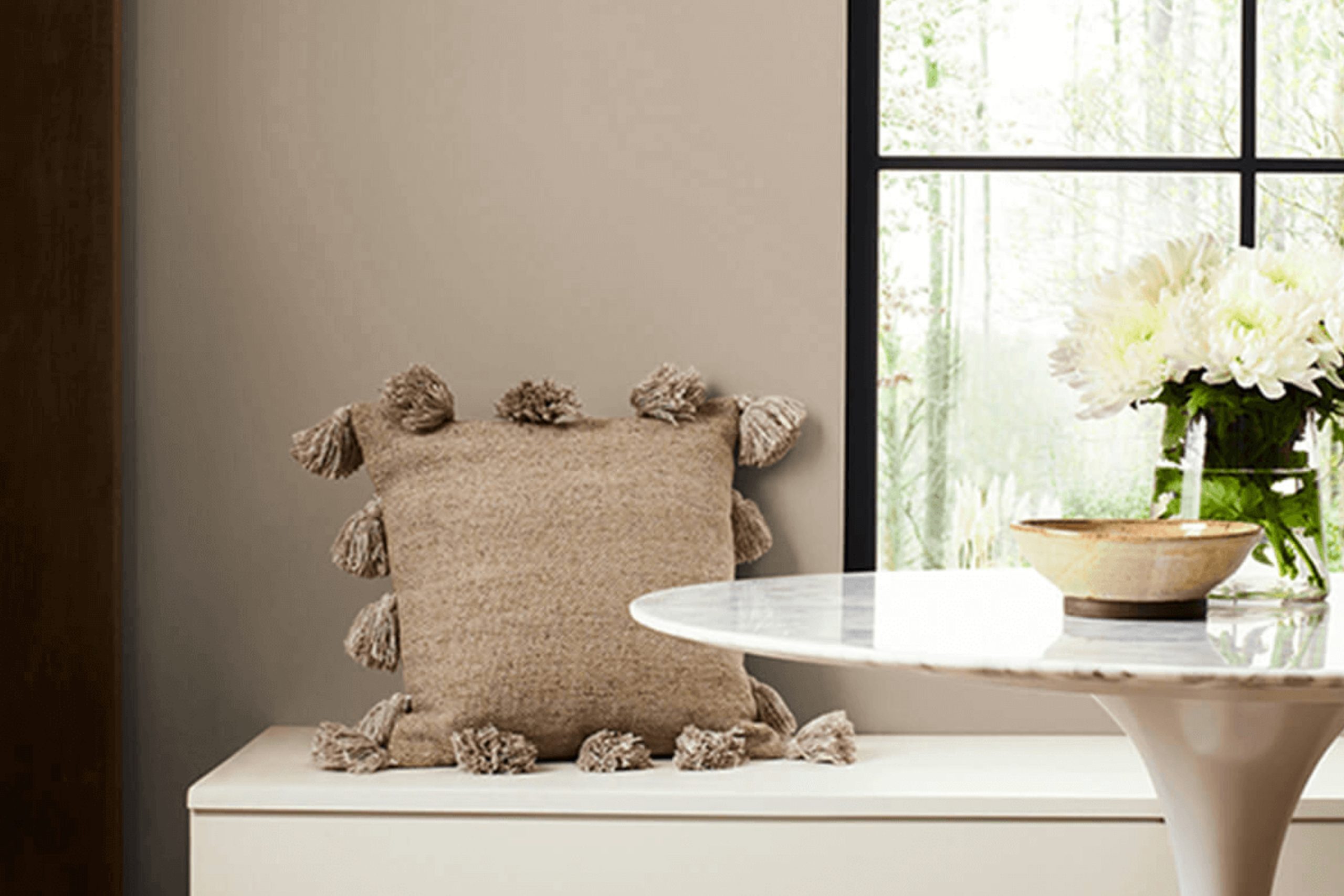
Tony Taupe SW 7038 by Sherwin Williams is a rich, warm gray with brown undertones, providing a cozy and inviting feel. This versatile color balances beautifully between gray and beige, making it perfect for those who appreciate neutral tones. Its depth adds sophistication to any room, acting as a stylish backdrop that enhances decor without overwhelming it.
This hue is highly adaptable and works well in various interior styles including modern, traditional, and rustic. In modern settings, Tony Taupe offers a sleek, subtle foundation that complements metallic accents and streamlined furniture.
For traditional interiors, its warmth enhances classic wood trimmings and ornate details. Rustic spaces benefit from its earthy vibe, pairing seamlessly with natural textures.
Tony Taupe pairs well with a range of materials and textures. It looks elegant with polished woods, adding depth and character to furniture and flooring. In spaces with stone elements, such as fireplaces or stone countertops, it creates a cohesive look that ties together stone’s rugged texture with the softness of the taupe shade.
Fabrics like linen or wool in lighter shades ensure a balanced, sophisticated interior, while metallic finishes like brass or brushed nickel stand out against its understated elegance. This color can transform any space into a harmonious and chic environment.
housekeepingbay.com
Is Tony Taupe SW 7038 by Sherwin Williams Warm or Cool color?
Tony Taupe SW 7038 by Sherwin Williams is a versatile neutral paint color that blends well with a range of design styles. Falling in the taupe category, it offers a balance between brown and gray, providing a warm, welcoming backdrop for any room.
This color can make small spaces feel larger by reflecting light, while in larger spaces, it adds a cozy depth. It pairs beautifully with both bright colors and subdued tones, making it ideal for living rooms, bedrooms, and even exteriors.
Tony Taupe is a practical choice for families as it hides imperfections well and requires less frequent touch-ups. The resilience and adaptability of Tony Taupe make it a favorite for homeowners looking for a reliable and flexible color that enhances their home’s aesthetic while remaining easy to maintain.
Its ability to harmonize with natural elements like stone and wood further increases its popularity.
What is the Masstone of the Tony Taupe SW 7038 by Sherwin Williams?
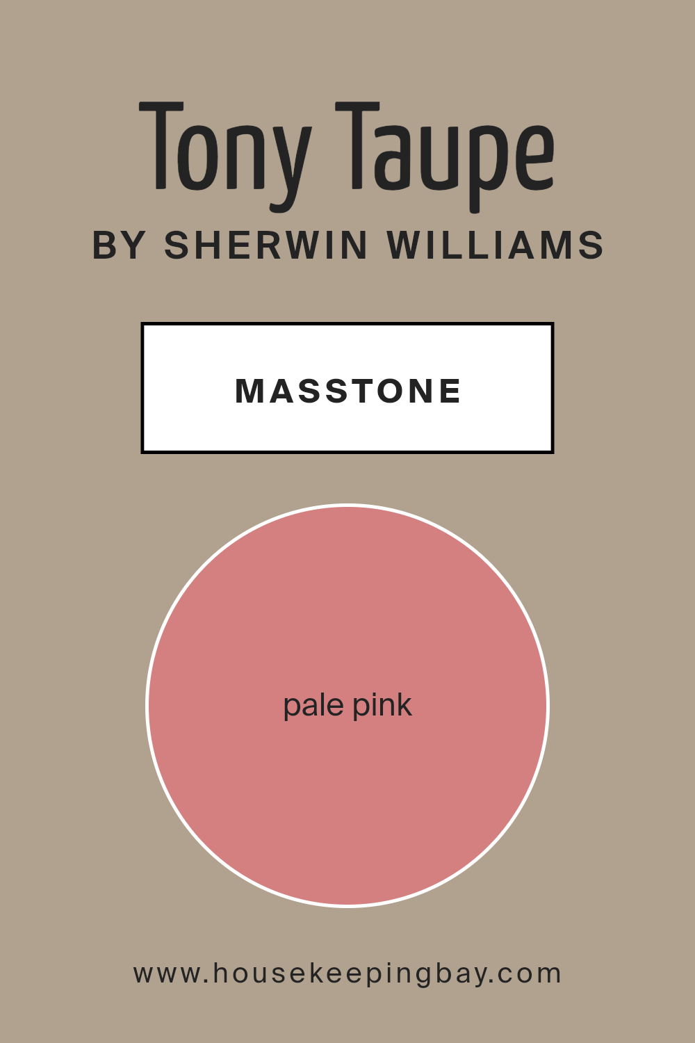
Tony Taupe SW 7038 by Sherwin Williams, characterized by its masstone Pale Pink (#D58080), presents a gentle and soothing shade, ideal for creating calming environments within homes. The masstone, a soft pink, offers a blend of warmth and subtlety that suits various decorating styles, from contemporary to classic.
This particular hue of pink is versatile in its usage, effectively enhancing spaces without overwhelming them. It works well in smaller rooms to introduce a sense of openness, or in larger areas where a touch of soft color is needed without committing to a bold statement.
Tony Taupe’s subtle pink undertones make it an excellent choice for bedrooms and living rooms, imparting a cozy, inviting atmosphere. Additionally, this color coordinates effectively with neutral tones and natural materials, allowing for a balanced and harmonious aesthetic. Due to its understated elegance, Tony Taupe is practical yet stylish, fitting seamlessly into many interior designs.
housekeepingbay.com
Undertones of Tony Taupe SW 7038 by Sherwin Williams
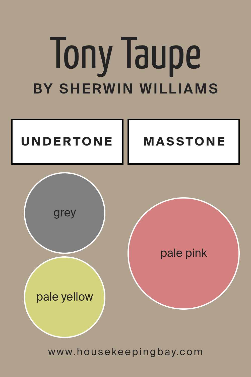
Tony Taupe SW 7038 by Sherwin Williams is a versatile paint color with a complex blend of undertones that gives it a rich, nuanced look. An undertone is a subtle color that lies beneath the surface of the main color, influencing its overall hue and appearance.
For Tony Taupe, these undertones include shades of grey, pale yellow, mint, light purple, lilac, light gray, light blue, orange, olive, yellow, light green, pink, purple, fuchsia, violet, red, and brown.
The presence of grey and light gray undertones in Tony Taupe lends it a cool neutrality, making it a flexible background color that can fit into many design schemes. The warmer undertones like orange, brown, and yellow add a subtle warmth, ensuring that the color is inviting and not too sterile. This balance between cool and warm tones allows Tony Taupe to adapt to different lighting conditions and room settings without losing its appeal.
On interior walls, Tony Taupe SW 7038 provides a soothing backdrop that complements a wide range of furnishings and decor styles. Whether in a living room, bedroom, or hallway, this color can enhance the space’s aesthetic without overwhelming it.
The added undertones enrich the primary taupe hue, preventing it from appearing flat or dull. Instead, it generates a sophisticated depth that makes interior spaces look more refined and thoughtfully composed.
Understanding these undertones is crucial for selecting complementary colors for fabrics, furniture, and other room elements to create a cohesive and visually pleasing environment.
housekeepingbay.com
Coordinating Colors of Tony Taupe SW 7038 by Sherwin Williams
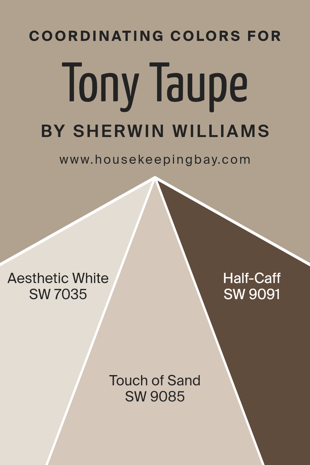
Coordinating colors are selected to complement and enhance the main color in any color scheme. For the main color Tony Taupe SW 7038 by Sherwin Williams, suitable coordinating colors would include Aesthetic White SW 7035, Touch of Sand SW 9085, and Half-Caff SW 9091. These colors are chosen carefully to create a harmonious look that ties different design elements together.
Aesthetic White SW 7035 is a soft and gentle white that provides a clean and subtle backdrop, making it an excellent choice for trim or ceilings to lift the ambiance of a space without overwhelming it.
Touch of Sand SW 9085 offers a mild beige hue, providing warmth and versatility, perfect for creating a soothing neutral that works well in many settings, enhancing the fullness of Tony Taupe. Half-Caff SW 9091, a richer and darker shade, adds depth and sophistication to the space, making it ideal for accent walls or decorative details that require a bit more prominence.
ogether, these coordinating colors work with Tony Taupe to produce a cohesive and inviting atmosphere in any room.
You can see recommended paint colors below:
- SW 7035 Aesthetic White
- SW 9085 Touch of Sand
- SW 9091 Half-Caff
housekeepingbay.com
How Does Lighting Affect Tony Taupe SW 7038 by Sherwin Williams?
Lighting has a significant effect on the perception of colors. Light sources with different qualities can change how a color looks. For example, Tony Taupe SW 7038 by Sherwin Williams can appear differently under various types of lighting.
In artificial light, such as LED or incandescent bulbs, Tony Taupe can show a warmer or cooler tone depending on the bulb’s color temperature. LEDs with a cooler temperature can make Tony Taupe look more grayish, whereas warm light bulbs bring out more of its brown undertones, giving a cozy feel to a room.
Natural light, on the other hand, changes throughout the day and affects colors differently. In the morning, natural light is generally softer and can make Tony Taupe look softer and more neutral. As the sun reaches its peak, the brightness can enhance the taupe, making it appear stronger and more vibrant. In late afternoon, the color might appear softer again as the sunlight dims.
Room orientation also affects how colors like Tony Taupe behave:
– North-facing rooms often get less direct sunlight, which can make Tony Taupe appear more muted and cooler, as the light tends to be bluer.
– South-facing rooms receive more intense daylight, which can warm up the color, making Tony Taupe appear lighter and bringing out its warm undertones.
– East-facing rooms enjoy bright morning light, which can make Tony Taupe look very lively and warm in the morning, but cooler and more subdued in the afternoon.
– West-facing rooms receive the evening light, which can make Tony Taupe warmer and richer towards the end of the day when sunlight is golden.
Understanding these effects can help in choosing the right paint color for a room based on its exposure and the lighting conditions, ensuring that Tony Taupe looks its best throughout the day.

housekeepingbay.com
What is the LRV of Tony Taupe SW 7038 by Sherwin Williams?
Light Reflectance Value (LRV) measures the percentage of light a paint color reflects from or absorbs into a painted surface, based on a scale from 0 (absolute black, absorbing all light) to 100 (pure white, reflecting all light).
Understanding LRV helps in selecting the right paint color for your space, considering how light or dark you want the room to feel. Higher LRV colors can make a room feel brighter and more open because they reflect more light around the space, while lower LRV colors create a cozier and more intimate atmosphere by absorbing more light.
The LRV of Tony Taupe SW 7038 by Sherwin Williams is 37.198, placing it on the darker end of the spectrum but not extremely dark. With this level of light reflectance, Tony Taupe will not brighten a room significantly; instead, it will add depth and warmth.
If the room has less natural light, this color might appear even darker, making the room feel smaller or more enclosed. Conversely, in well-lit spaces, Tony Taupe can provide a sophisticated backdrop, enhancing the overall aesthetic without making the room feel too heavy.

housekeepingbay.com
What are the Trim colors of Tony Taupe SW 7038 by Sherwin Williams?
Trim colors are the hues used for detailing aspects of a room such as door frames, moldings, and window trims, providing an aesthetic contrast that highlights and defines the structural features of a space.
When paired with Tony Taupe SW 7038 by Sherwin Williams, selecting the right trim colors can greatly affect the overall mood and coherence of the decor. For Tony Taupe, which is a balanced, warm greige (a mix of gray and beige), using appropriate trim colors helps in achieving a polished look that enhances the main color’s richness and subtlety.
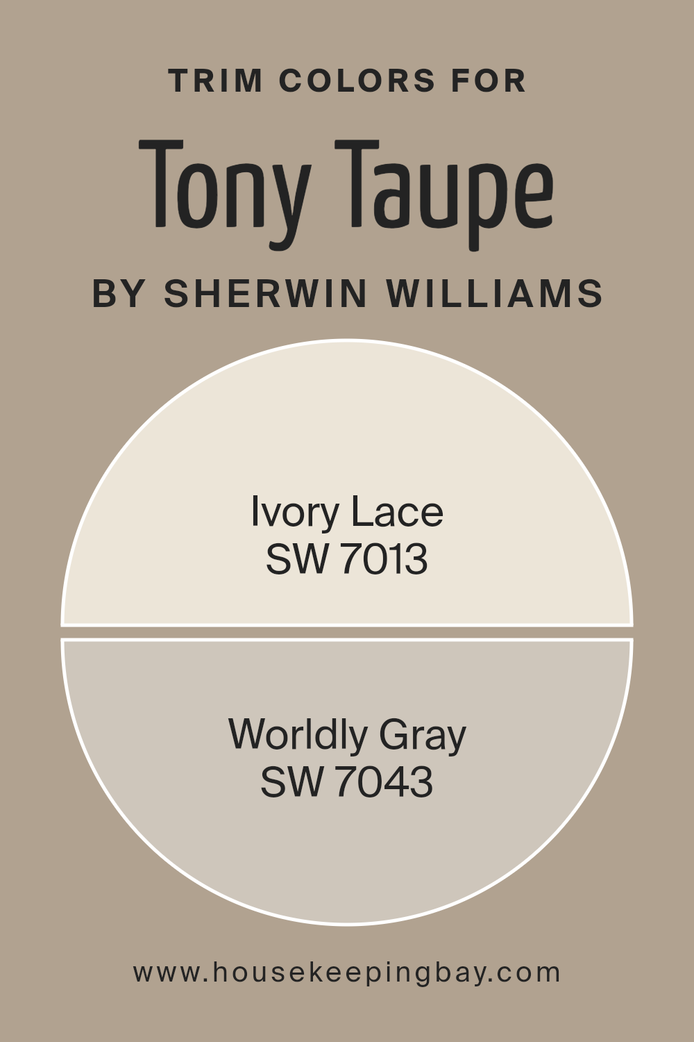
Ivory Lace SW 7013 and Worldly Gray SW 7043 are two great choices for trim when using Tony Taupe as the primary shade. Ivory Lace is a soft, creamy white that offers a gentle, subtle contrast, adding a light, fresh dimension that can make the taupe feel more vibrant and airy.
On the other hand, Worldly Gray is a deeper gray that shares undertones with Tony Taupe, providing a seamless transition while still defining spaces through its slightly deeper saturation. This color adds a sophisticated touch, reinforcing the cohesive appearance of the room.
Both trim colors, with their distinct qualities, work synergistically with Tony Taupe to create a harmonious interior that feels both coordinated and beautifully enriched.
You can see recommended paint colors below:
housekeepingbay.com
Colors Similar to Tony Taupe SW 7038 by Sherwin Williams
Similar colors play a crucial role in creating a cohesive and harmonious look, ensuring fluidity and visual appeal within a space. Colors like Tony Taupe SW 7038 by Sherwin-Williams are versatile neutrals that serve as a perfect backdrop for a wide variety of decor themes.
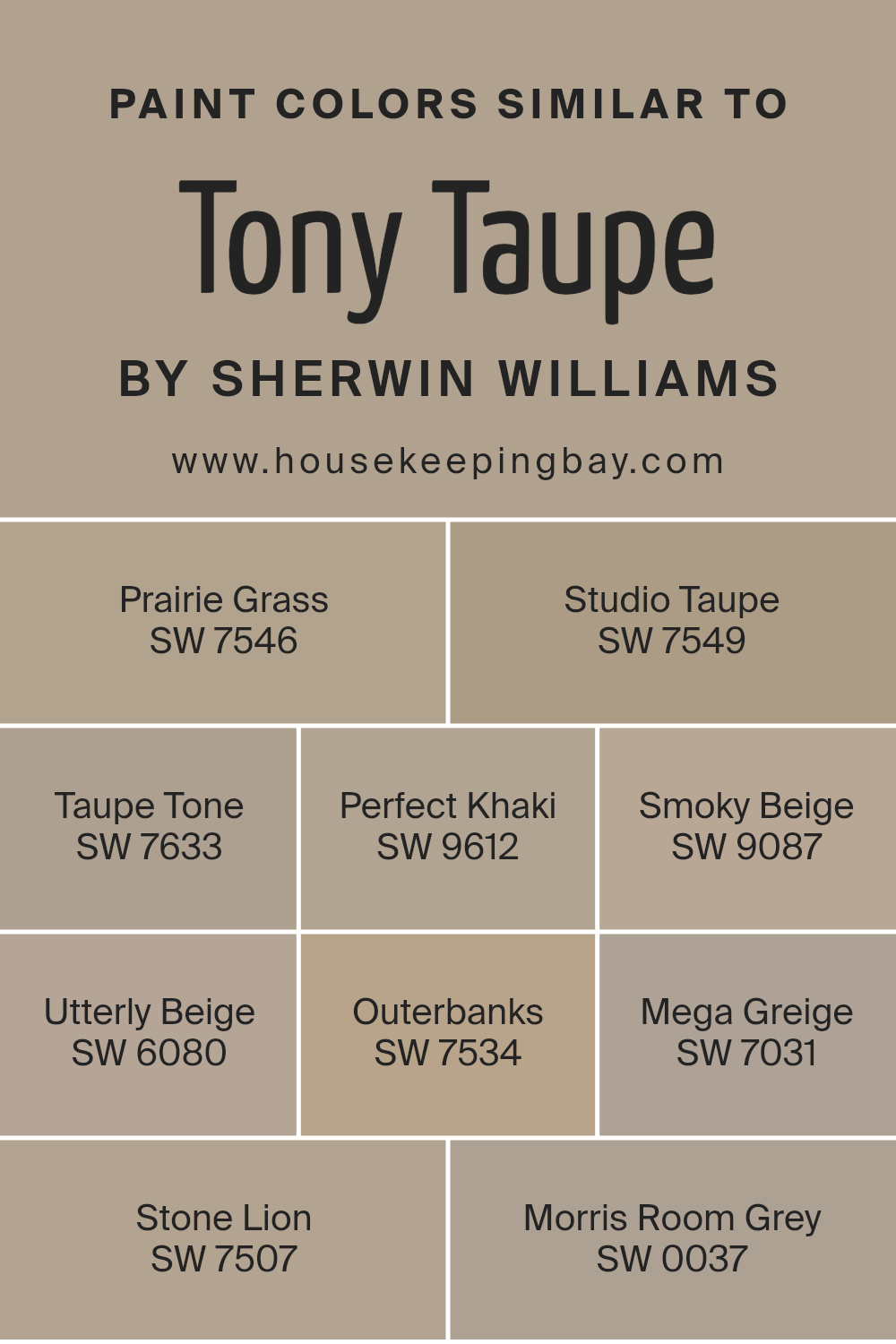
Colors such as Prairie Grass SW 7546, a muted green-gray, and Studio Taupe SW 7549, a darker, earthy beige, are examples of shades that complement Tony Taupe nicely by adding subtle contrast while maintaining a soothing palette. Taupe Tone SW 7633 offers a slightly richer hue that leans more towards a warm beige, which pairs well with the cooler undertones of Tony Taupe.
Perfect Khaki SW 9612 has a balanced beige tone that brings warmth to the room, and Smoky Beige SW 9087 is a lighter option that can help create a feeling of openness and light. Utterly Beige SW 6080 adds a touch of softness and simplicity, making it effortless to integrate into any design style.
In addition to these, Outerbanks SW 7534 provides a deeper, more saturated hue that can be used for accentuating features or furniture, while Mega Greige SW 7031 shifts towards a gray influence, offering a modern twist to the classic taupe.
Stone Lion SW 7507 gives a slightly stony look, ideal for adding some grounded, earthy elements to a space without overpowering the primary color theme. Lastly, Morris Room Grey SW 0037 is the most contrasting, a deep grey that can provide dramatic flair or act as a grounding force in lighter, neutral-themed spaces.
These similar colors, when used together, ensure that the overall aesthetic remains balanced and visually integrated, perfect for creating a serene yet sophisticated environment.
You can see recommended paint colors below:
- SW 7546 Prairie Grass
- SW 7549 Studio Taupe
- SW 7633 Taupe Tone
- SW 9612 Perfect Khaki
- SW 9087 Smoky Beige
- SW 6080 Utterly Beige
- SW 7534 Outerbanks
- SW 7031 Mega Greige
- SW 7507 Stone Lion
- SW 0037 Morris Room Grey
housekeepingbay.com
Colors that Go With Tony Taupe SW 7038 by Sherwin Williams
Choosing the right colors to accompany Tony Taupe SW 7038 by Sherwin-Williams is crucial for creating a harmonious and aesthetically pleasing environment. Coordinating colors enhance the visual impact of a space by providing balance and accentuating the key features of a room.
For instance, SW 7041 – Van Dyke Brown serves as a robust, dark brown that can ground a space and give it a solid, reassuring foundation, while SW 7039 – Virtual Taupe offers a slightly lighter and warmer tone, perfect for softening the overall feel without detracting from the room’s modern vibe.
SW 7040 – Smokehouse adds a smoky, almost mystical grey that can serve as a striking contrast or a subtle complement, depending on the surrounding decor. On the other hand, SW 7037 – Balanced Beige presents a lighter, airier approach, providing a fresh and calm atmosphere that helps in relaxing the senses.
SW 7036 – Accessible Beige tends slightly towards a warmer spectrum, perfect for spaces intended to be cozy and inviting. Lastly, SW 9174 – Moth Wing introduces a muted earth tone that has the flexibility to blend with various textures and materials, enhancing the room’s character without overwhelming it.
Together, these colors create a palette that supports a wide range of design styles, making any space feel thoughtfully curated and professionally styled.
You can see recommended paint colors below:
- SW 7041 Van Dyke Brown
- SW 7039 Virtual Taupe
- SW 7040 Smokehouse
- SW 7037 Balanced Beige
- SW 7036 Accessible Beige
- SW 9174 Moth Wing

housekeepingbay.com
How to Use Tony Taupe SW 7038 by Sherwin Williams In Your Home?
Tony Taupe SW 7038 by Sherwin Williams is a warm, neutral gray that offers versatility and sophistication, making it a perfect choice for any room in your house. It pairs beautifully with a variety of color palettes, whether you’re aiming for a cozy, inviting look or a more modern, sleek appearance.
You can use Tony Taupe in your living room to create a subtle background that complements your furniture and art pieces. In a bedroom, it can help establish a calm, soothing atmosphere, ideal for relaxing. This shade also works well in a kitchen, as it matches well with both wood cabinets and more contemporary finishes.
If you love a cohesive aesthetic, consider using Tony Taupe in your hallways or common areas to create a unified look throughout your home. It’s also an excellent choice for the exterior, giving your home an elegant and timeless curb appeal. Whether you’re painting a wall, updating your kitchen, or giving your exterior a fresh look, Tony Taupe adapts to your vision with ease.
Tony Taupe SW 7038 by Sherwin Williams vs Mega Greige SW 7031 by Sherwin Williams
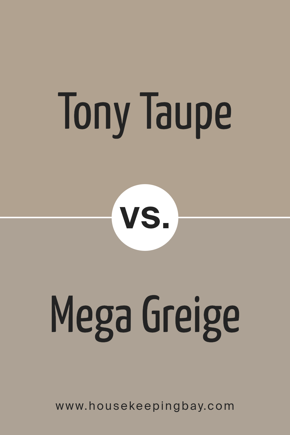
Tony Taupe SW 7038 and Mega Greige SW 7031, both from Sherwin Williams, provide subtle yet distinct tones for any space. Tony Taupe is a warm, welcoming grey-brown that feels cozy and versatile. It suits various settings, offering a neutral backdrop that complements bolder colors and decor beautifully.
Mega Greige, on the contrary, leans more towards a deeper grey with beige undertones, offering a slightly more robust hue compared to Tony Taupe. This color can create a stronger statement while still maintaining an understated elegance. Both colors are ideal for anyone wanting to add sophistication and warmth to their environments without overwhelming the senses.
These shades work well together or apart, depending on the desired ambiance, offering flexibility in design choices.
You can see recommended paint color below:
housekeepingbay.com
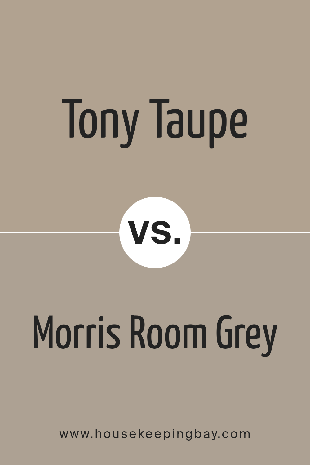
Tony Taupe SW 7038 by Sherwin Williams vs Morris Room Grey SW 0037 by Sherwin Williams
Tony Taupe SW 7038 by Sherwin Williams is a warm, neutral shade that blends beige and gray, creating a cozy and inviting atmosphere in any room. It’s versatile enough to complement various decor styles, from modern to traditional, making it a popular choice for homeowners looking to create a grounded and soothing environment.
Morris Room Grey SW 0037, also by Sherwin Williams, is a deeper, more intense color. It leans more towards a traditional gray, offering a more formal and sophisticated feel. This color works well in spaces that aim for a more serious or elegant tone. It’s particularly effective in enhancing architectural details and works well in spaces with ample natural light.
Both colors are neutral and highly adaptable, but Tony Taupe has a warmer undertone, which can make a room feel more welcoming, while Morris Room Grey, with its cooler undertone, is ideal for creating a more refined aesthetic.
You can see recommended paint color below:
- SW 0037 Morris Room Grey
housekeepingbay.com
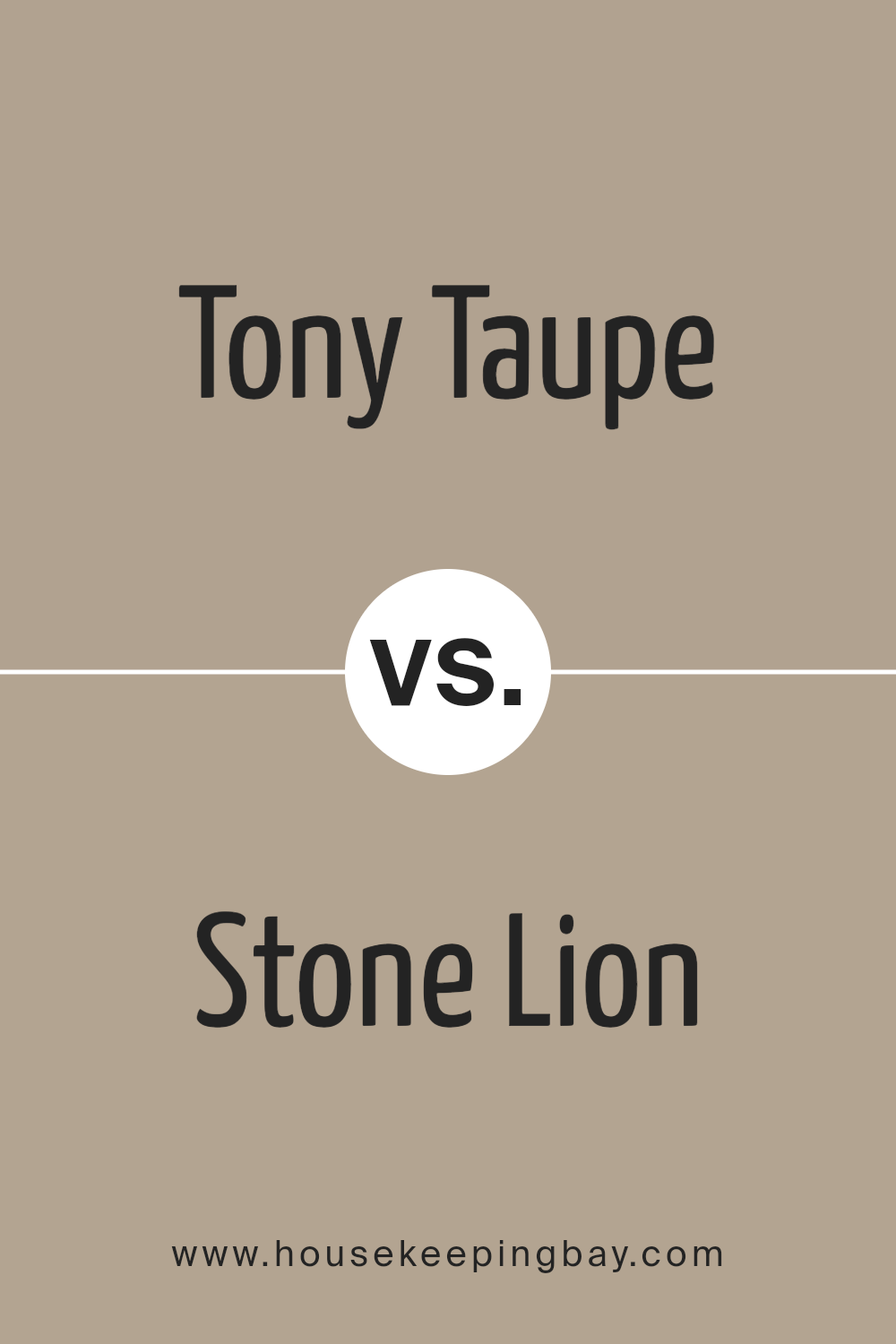
Tony Taupe SW 7038 by Sherwin Williams vs Stone Lion SW 7507 by Sherwin Williams
Tony Taupe SW 7038 and Stone Lion SW 7507, both by Sherwin Williams, are neutral colors, but with distinct tones. Tony Taupe carries a warmer, softer gray-brown shade, providing a cozy and inviting feel. It’s a versatile color that pairs well with a variety of decor styles from modern to rustic.
On the contrary, Stone Lion is a bit darker and leans towards a khaki brown, creating a slightly more intense and formal atmosphere. This color works well in spaces that aim for a sophisticated and grounded appearance.
While both colors are excellent choices for those looking to achieve a neutral palette, Tony Taupe is better for adding warmth, whereas Stone Lion suits spaces that need a dignified, strong anchor.
You can see recommended paint color below:
- SW 7507 Stone Lion
housekeepingbay.com
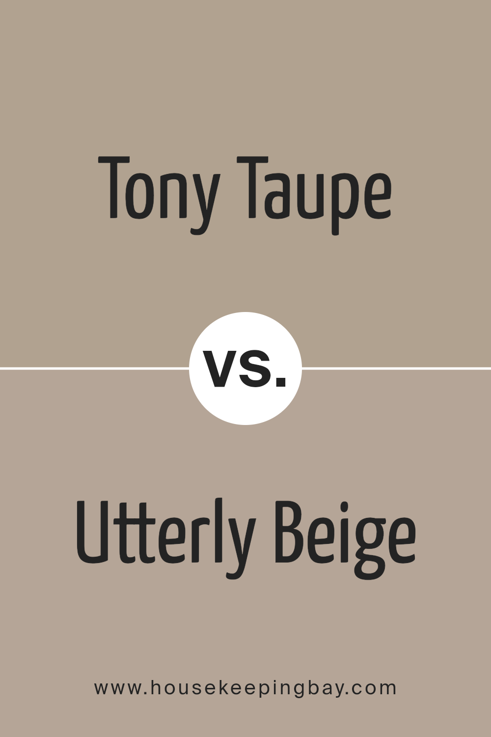
Tony Taupe SW 7038 by Sherwin Williams vs Utterly Beige SW 6080 by Sherwin Williams
Tony Taupe SW 7038 and Utterly Beige SW 6080 from Sherwin Williams are both neutral colors that provide a soothing backdrop to any room. Tony Taupe is a deeper, warm gray with brown undertones, giving it a rich and cozy feel. This color works well in spaces that aim for a sophisticated yet inviting atmosphere. It pairs beautifully with brighter colors and wood finishes, enhancing the overall warmth of a space.
Utterly Beige SW 6080, in contrast, is a lighter and softer beige with creamy undertones. It is ideal for creating a light and airy feel, making small rooms appear larger and more open. Utterly Beige is perfect for those looking for a subtle and understated look, and it offers great versatility in pairing with both bright and muted accents.
Both colors are excellent choices for those seeking neutral tones with character, and they can be used in a variety of decors to achieve a cozy and welcoming environment.
You can see recommended paint color below:
- SW 6080 Utterly Beige
housekeepingbay.com
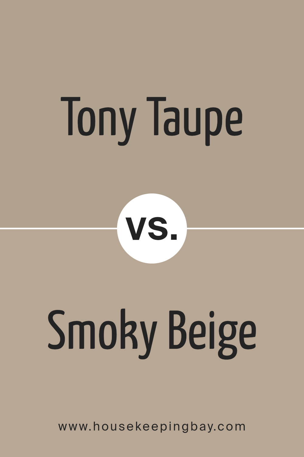
Tony Taupe SW 7038 by Sherwin Williams vs Smoky Beige SW 9087 by Sherwin Williams
Tony Taupe SW 7038 by Sherwin Williams is a warm, versatile neutral shade that works well in numerous environments, providing a cozy and solid foundation for any space. It has a balanced mix of deep brown and gray, making it flexible for combining with various decor styles and color palettes.
In contrast, Smoky Beige SW 9087 is a lighter, softer color, leaning more towards a gentle beige with subtle gray undertones. This color creates a soothing and inviting atmosphere, ideal for rooms where a airy and fresh feel is desired.
While both colors share a neutral base, Tony Taupe is deeper and more pronounced, suitable for accent walls or larger areas. Smoky Beige, with its lighter tone, is better suited for full rooms and smaller spaces, reflecting light beautifully and making areas appear larger. Each offers unique benefits, depending on your specific design needs.
You can see recommended paint color below:
- SW 9087 Smoky Beige
housekeepingbay.com
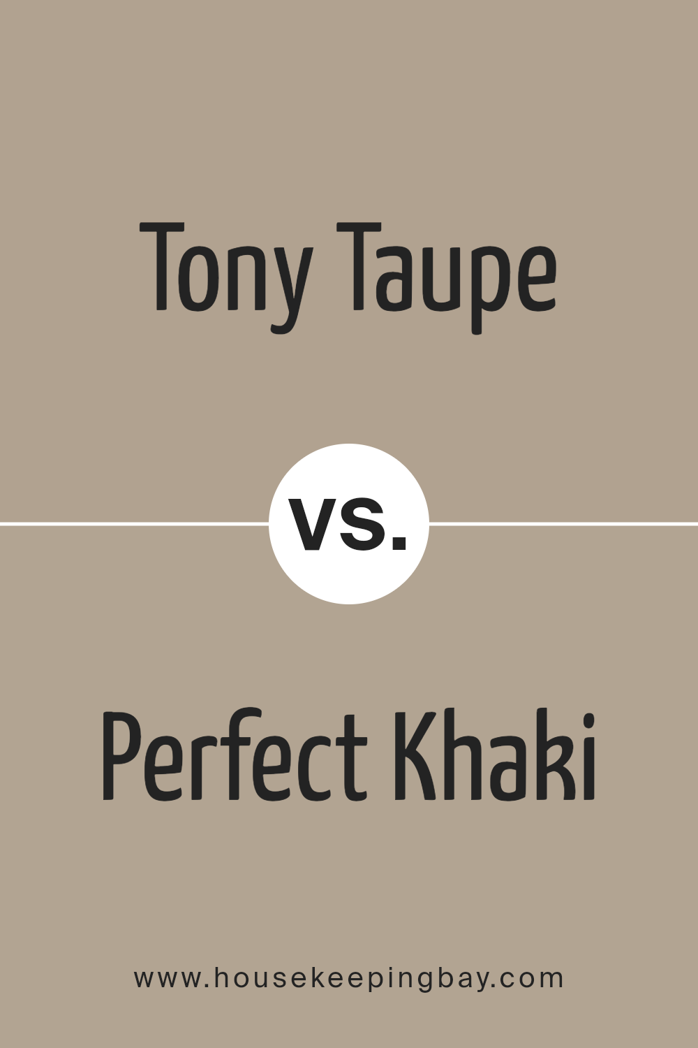
Tony Taupe SW 7038 by Sherwin Williams vs Perfect Khaki SW 9612 by Sherwin Williams
Tony Taupe SW 7038 by Sherwin Williams and Perfect Khaki SW 9612 from the same brand are two popular neutral paint colors that each bring unique warm tones into any space. Tony Taupe has a deep, rich base, leaning towards a gray-brown that offers a subtle sophistication and versatile backdrop for various decor styles, from modern to traditional. It pairs well with vibrant whites and can make colorful decor pop.
On the flip side, Perfect Khaki is lighter and leans more towards a softer, earthy beige that brings a gentle warmth to rooms without overwhelming with color. This hue works particularly well in spaces aiming for a calm and cozy atmosphere. It’s quite flexible, matching well with soft blues and greens for a natural, airy feel.
Both colors are quite adaptable, fitting into many areas of a home, like living rooms, bedrooms, and kitchens, providing a solid foundation for personal style preferences and various furnishings.
You can see recommended paint color below:
- SW 9612 Perfect Khaki
housekeepingbay.com
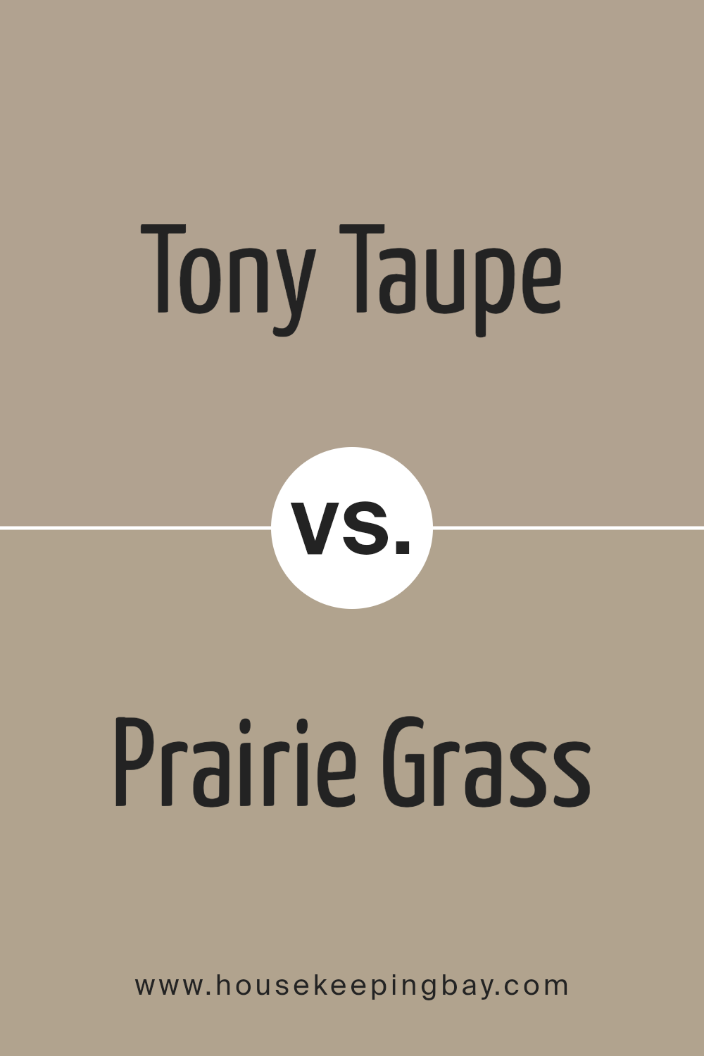
Tony Taupe SW 7038 by Sherwin Williams vs Prairie Grass SW 7546 by Sherwin Williams
Tony Taupe SW 7038 by Sherwin Williams is a warm, grayish brown tone that offers a soothing, neutral backdrop suitable for various spaces. It pairs well with a broad palette, supporting both bold and subtle hues. This flexibility makes it a practical choice for living rooms, bedrooms, and home offices, contributing to a cohesive and understated elegant look.
Prairie Grass SW 7546, on the contrary, is a soft, muted green with earthy undertones. This color brings a gentle hint of nature indoors, evoking a peaceful and comforting atmosphere. It’s ideal for creating a calming environment in areas like kitchens or bathrooms, where the feel of freshness and serenity is often desired.
While both colors lend themselves to creating inviting spaces, Tony Taupe leans towards a versatile, urban feel, whereas Prairie Grass invites a more organic, soothing vibe into the home. Both are excellent choices, depending on the mood and style you want to achieve in your space.
You can see recommended paint color below:
- SW 7546 Prairie Grass
housekeepingbay.com
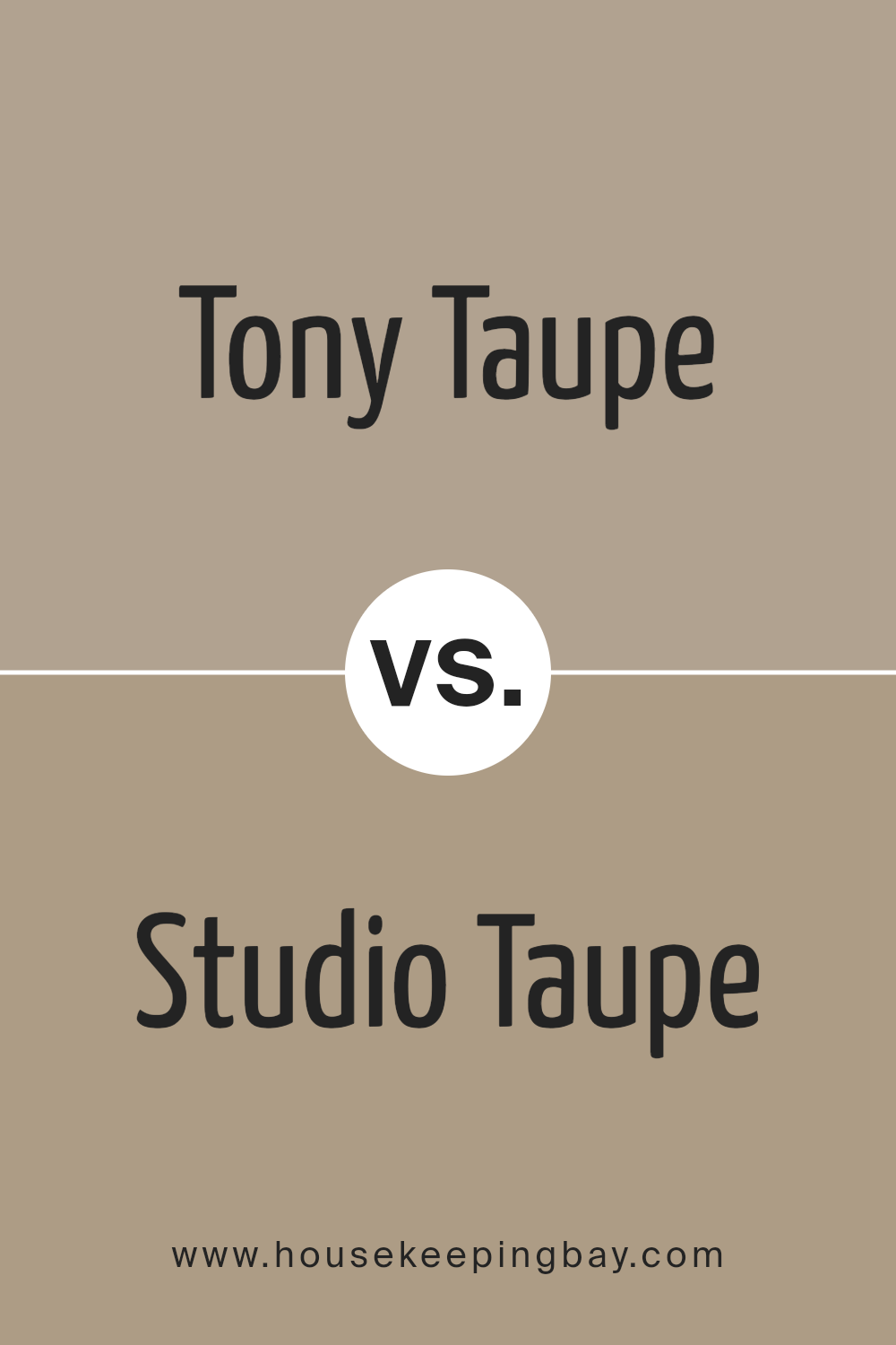
Tony Taupe SW 7038 by Sherwin Williams vs Studio Taupe SW 7549 by Sherwin Williams
Tony Taupe SW 7038 and Studio Taupe SW 7549, both by Sherwin Williams, are shades of taupe that share a neutral palette but differ subtly in tone and warmth. Tony Taupe is a warm, cozy taupe that leans slightly towards brown, giving it a solid, earthy feel that is versatile for many spaces. It works well in areas where a sense of stability and comfort is desired, such as living rooms and bedrooms.
In contrast, Studio Taupe SW 7549 is lighter and grayer, offering a more subdued and contemporary look. This color is excellent for spaces that aim for a modern and minimalistic aesthetic, as it provides a clean and calm background that helps other elements in the room stand out.
Both colors are neutral and flexible, making them easy to integrate into various decor styles. However, the choice between them depends on the desired atmosphere and the specific undertones you want to emphasize in your space.
You can see recommended paint color below:
housekeepingbay.com
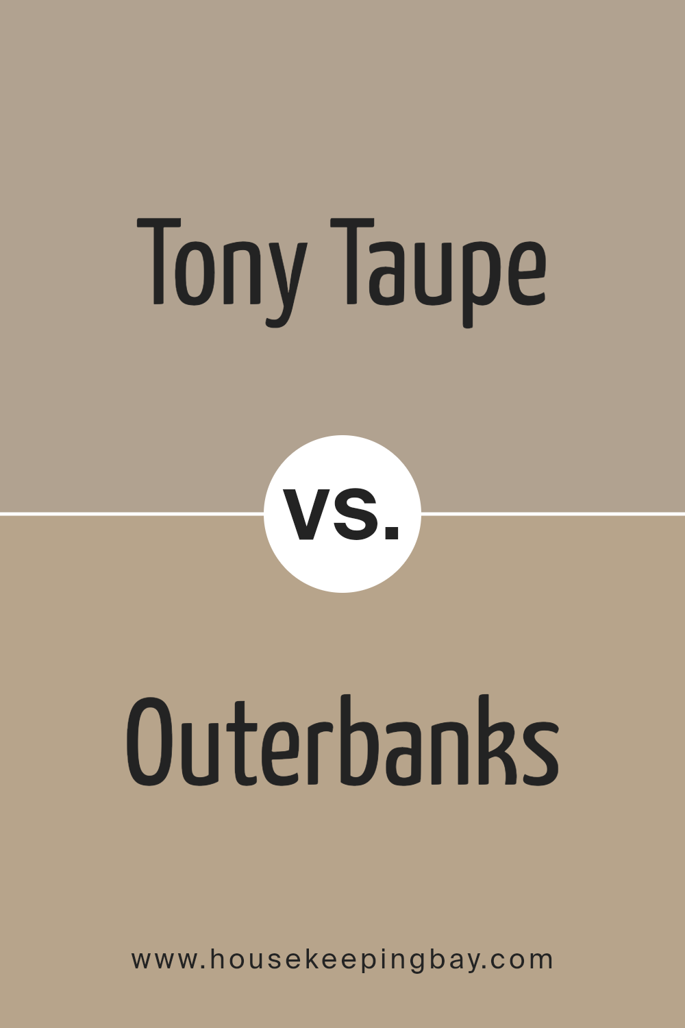
Tony Taupe SW 7038 by Sherwin Williams vs Outerbanks SW 7534 by Sherwin Williams
Tony Taupe SW 7038 by Sherwin Williams is a warm, earthy taupe with a balanced mix of brown and gray. This color offers a soothing neutrality, making it versatile for various spaces, whether it’s for a cozy living room or a sophisticated office. It pairs well with both bright and muted tones, allowing for flexible design choices.
Outerbanks SW 7534, also by Sherwin Williams, is darker and more intense. It leans heavily towards a rich, deep gray with subtle brown undertones, providing a strong presence in any room. This color is ideal for creating dramatic accents or for use in areas where a more profound, commanding tone is desired, like in formal dining rooms or home libraries.
While both colors share earthy qualities, Tony Taupe is lighter and more neutral, making it easier to integrate into various decor styles. Outerbanks, with its deeper and bolder tone, is better suited for creating focal points or enhancing a room’s dimensions.
You can see recommended paint color below:
- SW 7534 Outerbanks
housekeepingbay.com
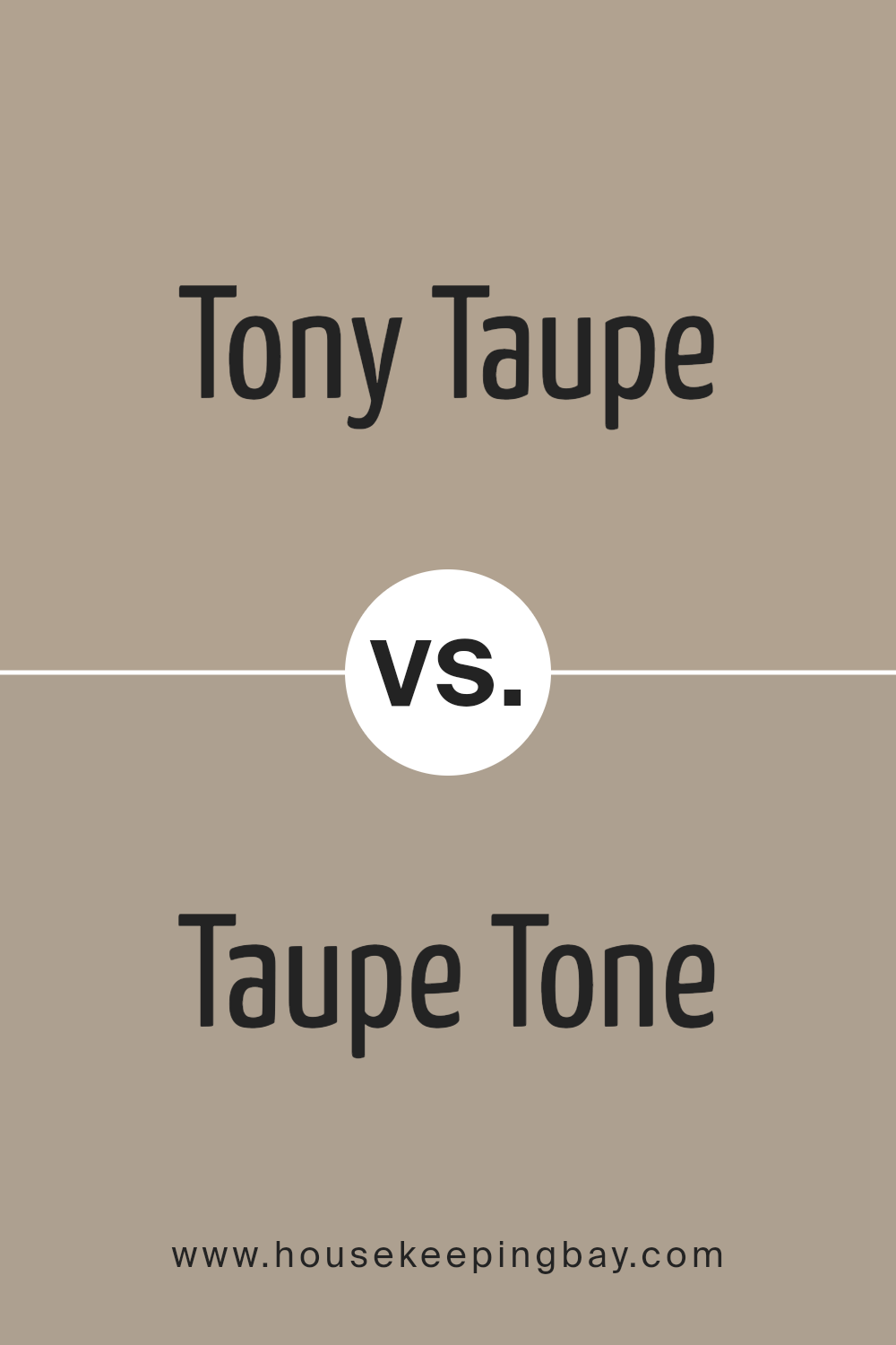
Tony Taupe SW 7038 by Sherwin Williams vs Taupe Tone SW 7633 by Sherwin Williams
Tony Taupe SW 7038 and Taupe Tone SW 7633 by Sherwin Williams are both popular choices for creating warm, welcoming spaces but have distinct tones. Tony Taupe SW 7038 has a deeper, gray-brown hue making it a great choice for adding a touch of sophistication and a grounding feel to a room. It pairs well with a variety of color schemes, specifically cooler shades or vibrant whites which help to balance its depth.
In contrast, Taupe Tone SW 7633 is lighter and leans more towards a softer, more neutral beige without veering too far into gray territories. It gives a room a brighter feel, making small spaces appear larger, and works well in areas with plenty of natural light.
Together, these colors can complement each other in different areas of a home to create both cozy retreats and open, airy spaces with a harmonious flow.
You can see recommended paint color below:
housekeepingbay.com
Conclusion
SW 7038 Tony Taupe by Sherwin Williams showcases a versatile color choice that can bring a warm, inviting feel to any space in your home. As a neutral shade, Tony Taupe serves as an excellent foundation, allowing individual creativity to shine through various accents and decor.
Its understated elegance makes it ideal for those looking to create a cozy, sophisticated environment. Whether aiming for a contemporary look or a more traditional atmosphere, this color adapts effortlessly, providing a seamless blend with different styles and materials.
For anyone considering a fresh paint job, Tony Taupe offers a reliable option that pairs well with a wide range of color palettes, ensuring your decor remains cohesive and stylish. This color can enhance the aesthetic appeal of your living space and make it feel more like a home, making it a sound choice for your next decorating project.
housekeepingbay.com
