Beige Wall Colors That Actually Work: My Go-To Guide for Every Room (And Even Outside)
From cozy bedrooms to inspiring exteriors—my favorite beige paint colors
Why Beige Still Works (Yes, Even in 2025)
I can’t count how many times people tell me, “Beige is boring.” But every time I finish a home using the right beige tones, guess what happens? The rooms feel peaceful, the light moves beautifully across the walls, and people feel like they can breathe. That’s not boring. That’s home.
I’ve been helping families and homeowners for years, and beige has always been part of the story. Not because it’s safe—but because it’s flexible. It listens to the room. It doesn’t yell. It gives your furniture, your art, and your life a place to stand out.
And no, beige isn’t one single color. There are soft taupes, warm greiges, buttery creams, and muted clay-like shades that all fall under that beige umbrella. Some have a bit more gray, some a touch of yellow or pink, and some are almost white.
I’ve watched beige go through its ups and downs in trends, but here’s what hasn’t changed—when it’s done right, it feels right.
Now let me show you the shades I actually use and love—from real paint decks to real walls. These are the ones I go back to over and over again, and the ones that help turn a house into a home.
My Favorite Beige Paint Colors by Brand
When I’m picking beige paint, the first question I ask is: Sherwin-Williams or Benjamin Moore?
Both brands have beautiful options, but they feel a little different. Sherwin-Williams usually leans a bit more modern and soft, while Benjamin Moore gives you those creamy, classic tones that feel cozy right away. I use both all the time—it just depends on the house and the light.
via housekeepingbay.com
Here are the shades I trust the most:
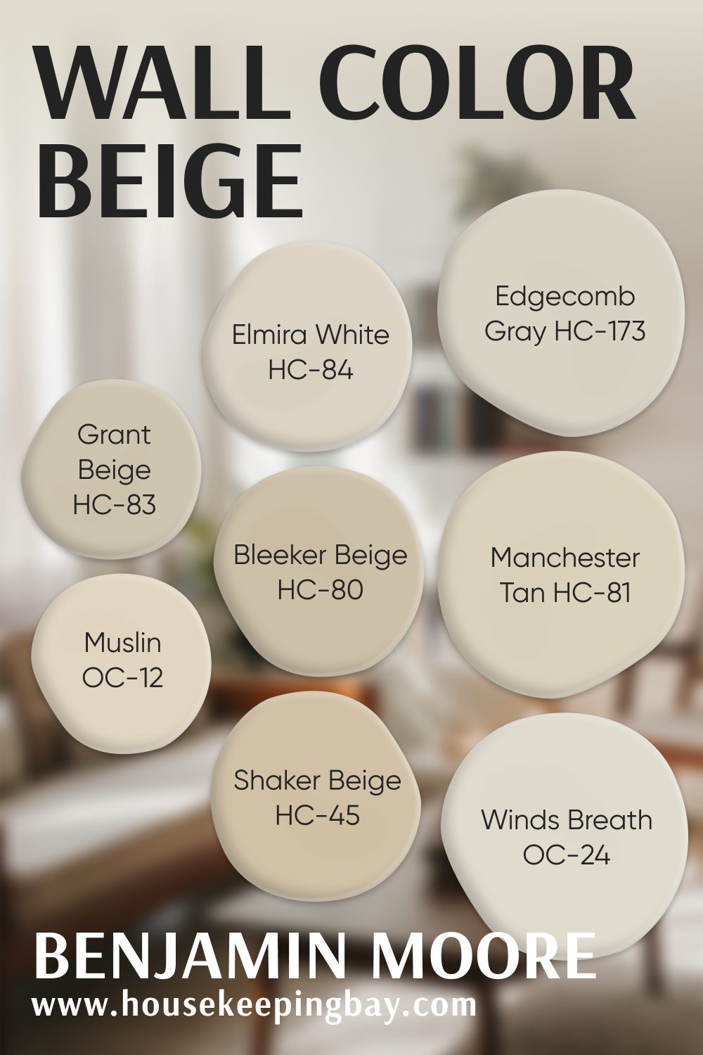
Benjamin Moore Beige Favorites
- Edgecomb Gray HC-173 – Soft and airy. This one reads warm but not yellow. I’ve used it in everything from living rooms to entryways.
- Manchester Tan HC-81 – A gentle beige with just enough warmth. Feels like fresh linen on a sunny morning.
- Shaker Beige HC-45 – A rich, deeper beige. It feels grounded. I love it in homes with dark wood floors.
- Grant Beige HC-83 – Strong and balanced. Doesn’t lean too gray or too yellow. It’s a solid choice for whole house color.
- Bleeker Beige HC-80 – Earthy and a little deeper. This one works beautifully in dining rooms or home offices.
- Muslin OC-12 – This is my go-to for soft, calming bedrooms. Barely there, but still warm.
- Elmira White HC-84 – Feels like a vintage home in the best way. Warm and gentle, but never dull.
- Winds Breath OC-24 – Has a slight gray undertone that keeps it from feeling flat. Works great in spaces with lots of sunlight.
via housekeepingbay.com
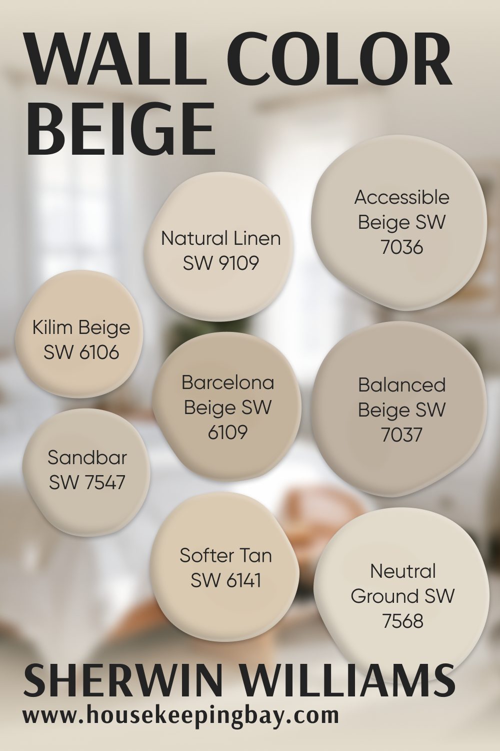
Sherwin-Williams Beige Favorites
- Accessible Beige SW 7036 – The name says it all. Not too gray, not too tan. I’ve used this in every type of home.
- Kilim Beige SW 6106 – Warm, classic, and just right. Perfect for family rooms.
- Natural Linen SW 9109 – Soft and airy. Great with white trim and natural textures like jute or linen.
- Barcelona Beige SW 6109 – A bit deeper, but still reads clean. Good choice for larger rooms.
- Balanced Beige SW 7037 – Mid-tone and very calm. I love this one in homes with beige-toned stone or tile.
- Neutral Ground SW 7568 – Light and bright. I use it a lot in open-concept homes.
- Softer Tan SW 6141 – Exactly what it sounds like. It’s beige, but with a smooth tan warmth.
- Sandbar SW 7547 – Has a slight green-beige base that works well with wood tones.
via housekeepingbay.com
3. The Best Beige for Every Room
Let’s break this down by room, because beige works differently depending on the light, furniture, and how you want the space to feel.
These are the actual paint colors I reach for, grouped by where I’ve seen them work best.
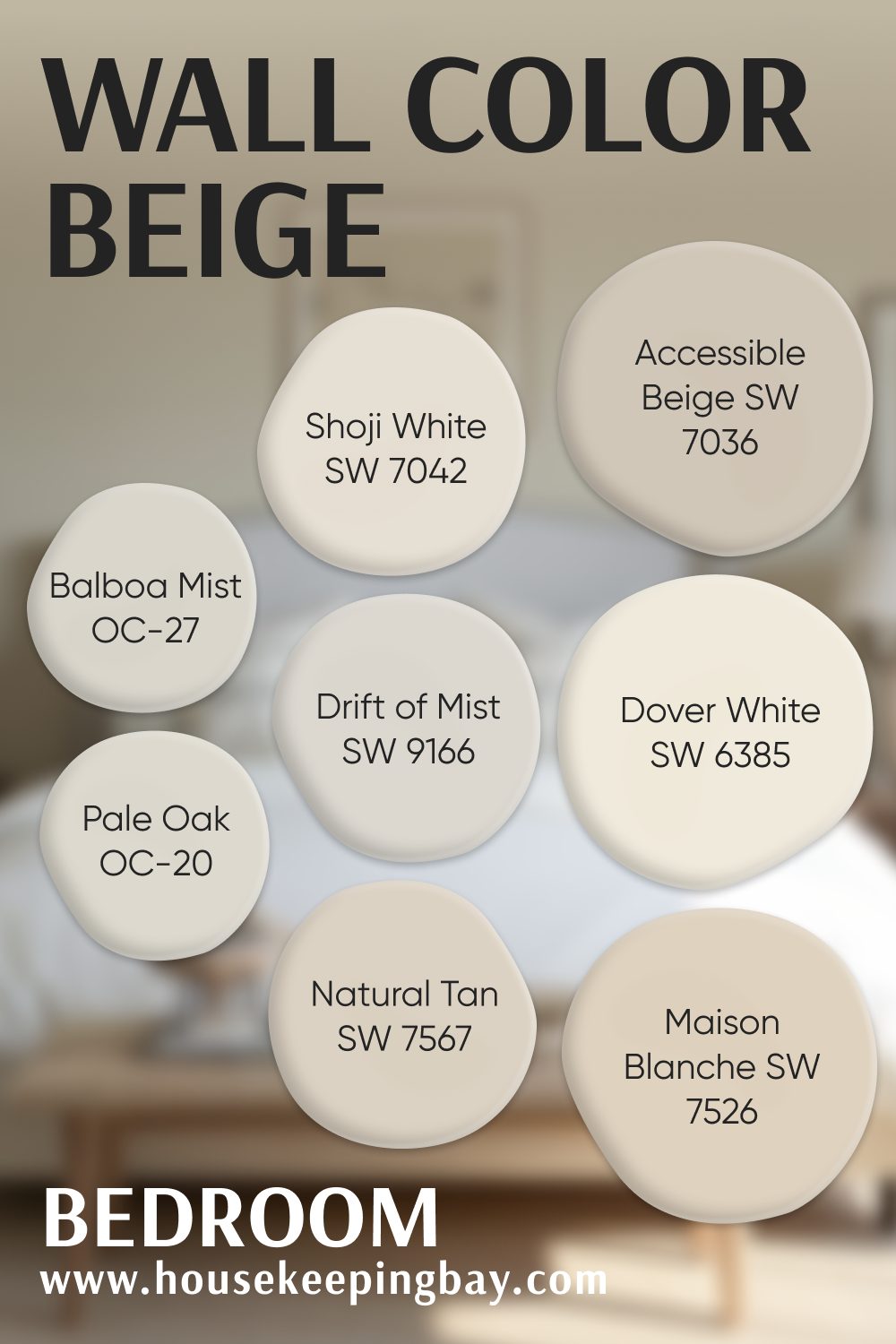
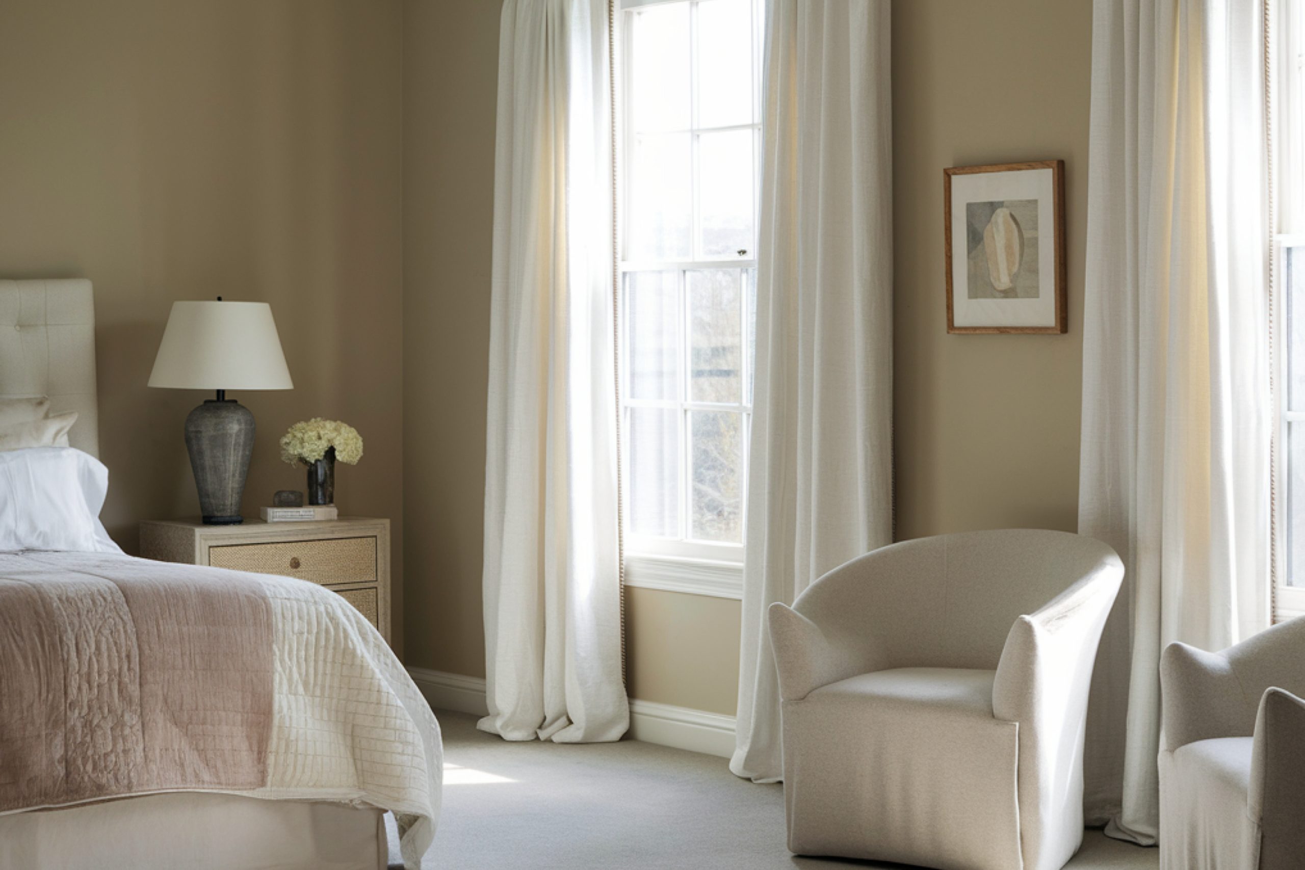
Bedroom Beige Paint Colors
Bedrooms need to feel calm. I usually go with beiges that are soft, not too yellow, and work well with low light. A hint of gray or cream helps the room feel restful, especially in the morning or at night.
Here are the shades I trust in bedrooms:
- Shoji White SW 7042 – Very soft, almost a warm off-white. Pairs perfectly with cozy bedding.
- Drift of Mist SW 9166 – A clean beige-gray that still feels warm. Works great in smaller bedrooms.
- Accessible Beige SW 7036 – Not too light, not too dark. A solid choice if you want warmth without heaviness.
- Natural Tan SW 7567 – It has a slight rosy undertone. I like this for guest rooms—it feels welcoming.
- Dover White SW 6385 – Creamy and warm. Looks lovely with wood headboards or natural textures.
- Maison Blanche SW 7526 – A very soft beige with a vintage feel.
- Balboa Mist OC-27 (Benjamin Moore) – A light gray-beige. Great in modern bedrooms.
- Pale Oak OC-20 (Benjamin Moore) – Light and creamy, almost floaty. One of my all-time favorites for bedrooms.
via housekeepingbay.com
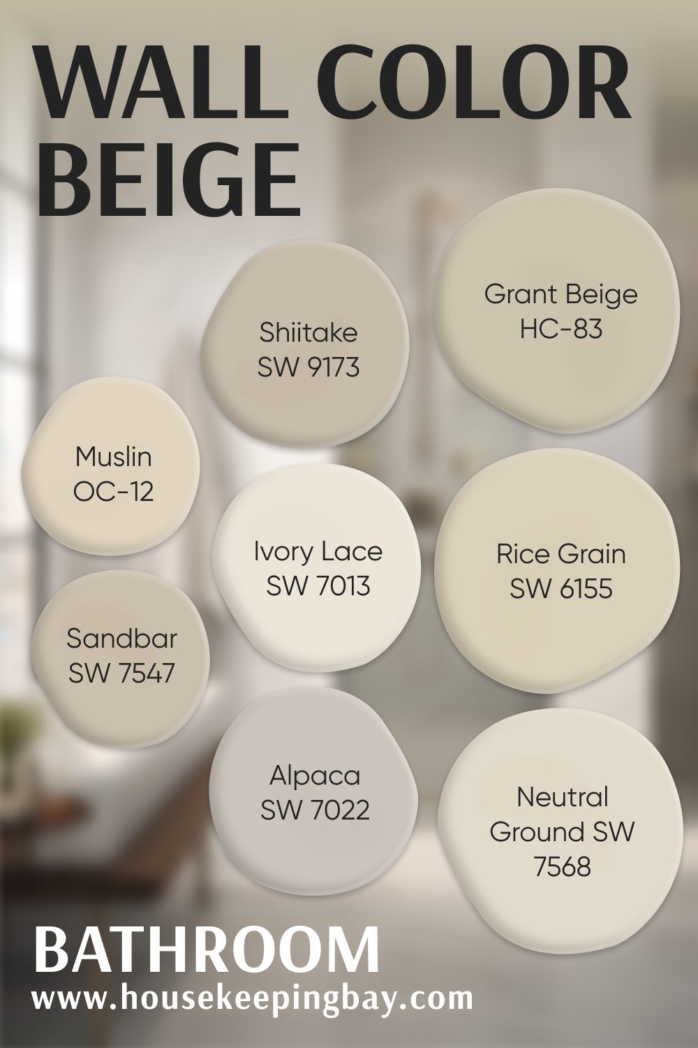
Bathroom Beige Paint Colors
Bathrooms need beige that works with tile, mirrors, and changing light. I always test samples next to white fixtures. I avoid anything too yellow or too muddy.
These have worked again and again:
- Alpaca SW 7022 – A warm gray-beige that feels clean but not cold.
- Ivory Lace SW 7013 – Soft, almost white, but warmer. Looks great with marble or white tile.
- Shiitake SW 9173 – A rich greige that adds depth without closing in the room.
- Sandbar SW 7547 – Earthy and smooth. Great in natural-light bathrooms.
- Rice Grain SW 6155 – This one feels spa-like. Warm, but still light.
- Neutral Ground SW 7568 – A go-to for clean beige that matches most flooring.
- Muslin OC-12 (Benjamin Moore) – Warm and calm. I’ve used this in powder rooms with antique mirrors.
- Grant Beige HC-83 (Benjamin Moore) – A little more body than Muslin. Good if you want some color on the wall but still neutral.
via housekeepingbay.com
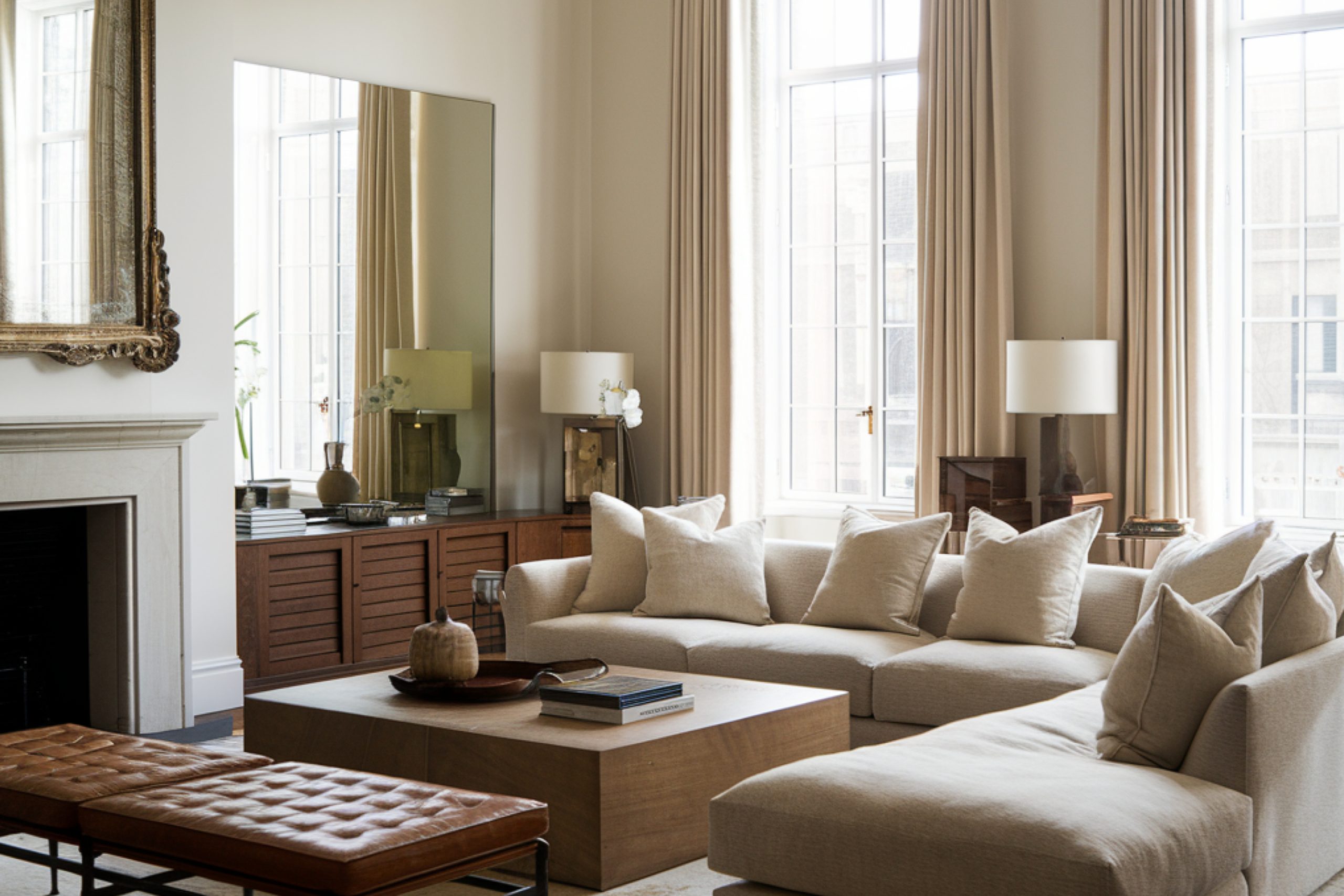
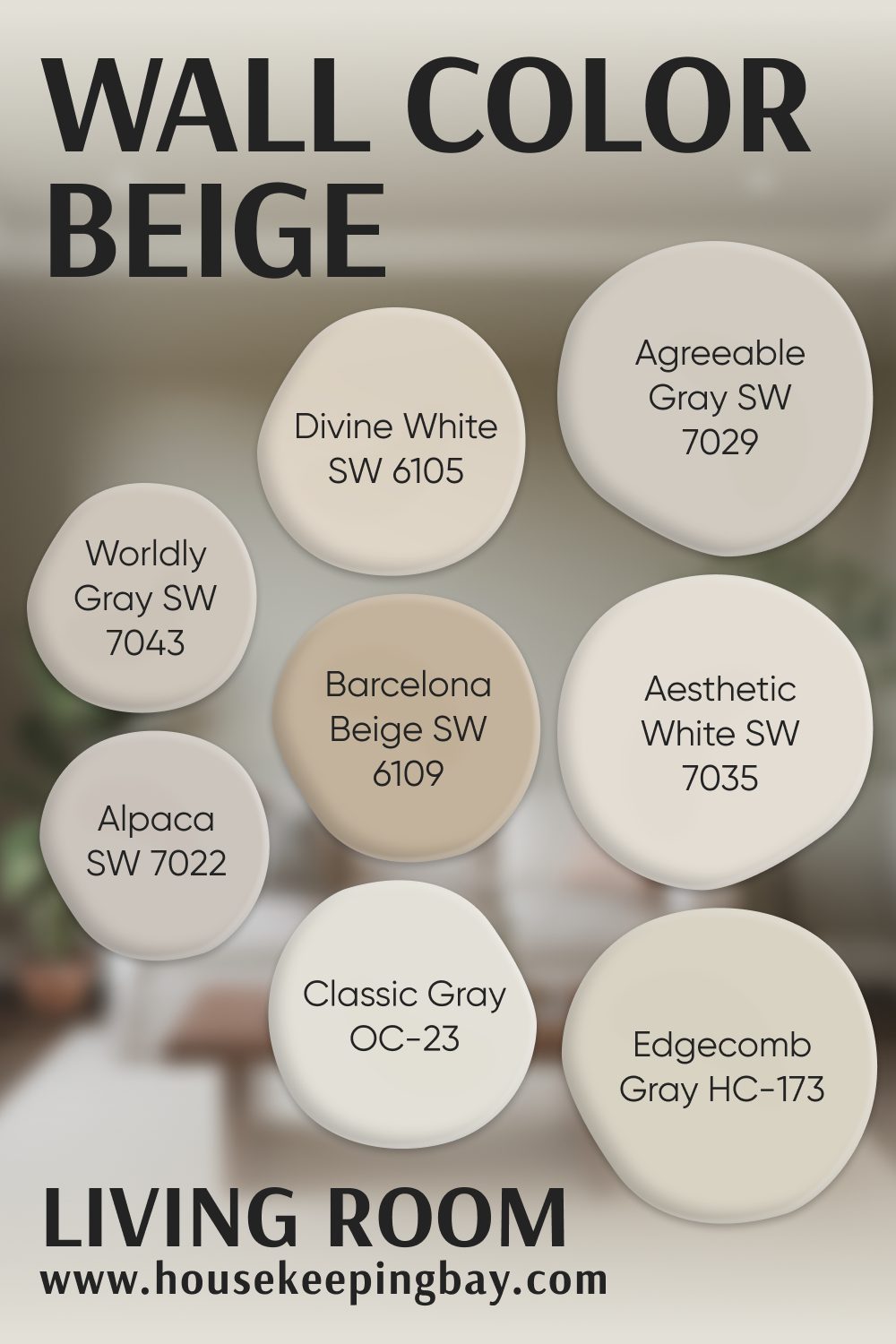
Living Room Beige Paint Colors
Living rooms need balance. Not too light, not too dark. Beige here should feel relaxed but still polished. I look for colors that catch light during the day and feel cozy in the evening.
Here are my top choices:
- Agreeable Gray SW 7029 – A classic beige-gray. Always looks fresh.
- Aesthetic White SW 7035 – Light and open, but warmer than plain white.
- Divine White SW 6105 – Clean beige with a creamy finish. Looks beautiful with dark floors.
- Worldly Gray SW 7043 – A little more muted. Works well with grays or blacks in furniture.
- Alpaca SW 7022 – It shows up again here because of its versatility.
- Barcelona Beige SW 7530 – Soft, not too yellow. Good in homes with leather or tan accents.
- Edgecomb Gray HC-173 (Benjamin Moore) – One of my most-used living room colors. It works with everything.
- Classic Gray OC-23 (Benjamin Moore) – A barely-there beige-gray. Great for a light, airy feel.
via housekeepingbay.com
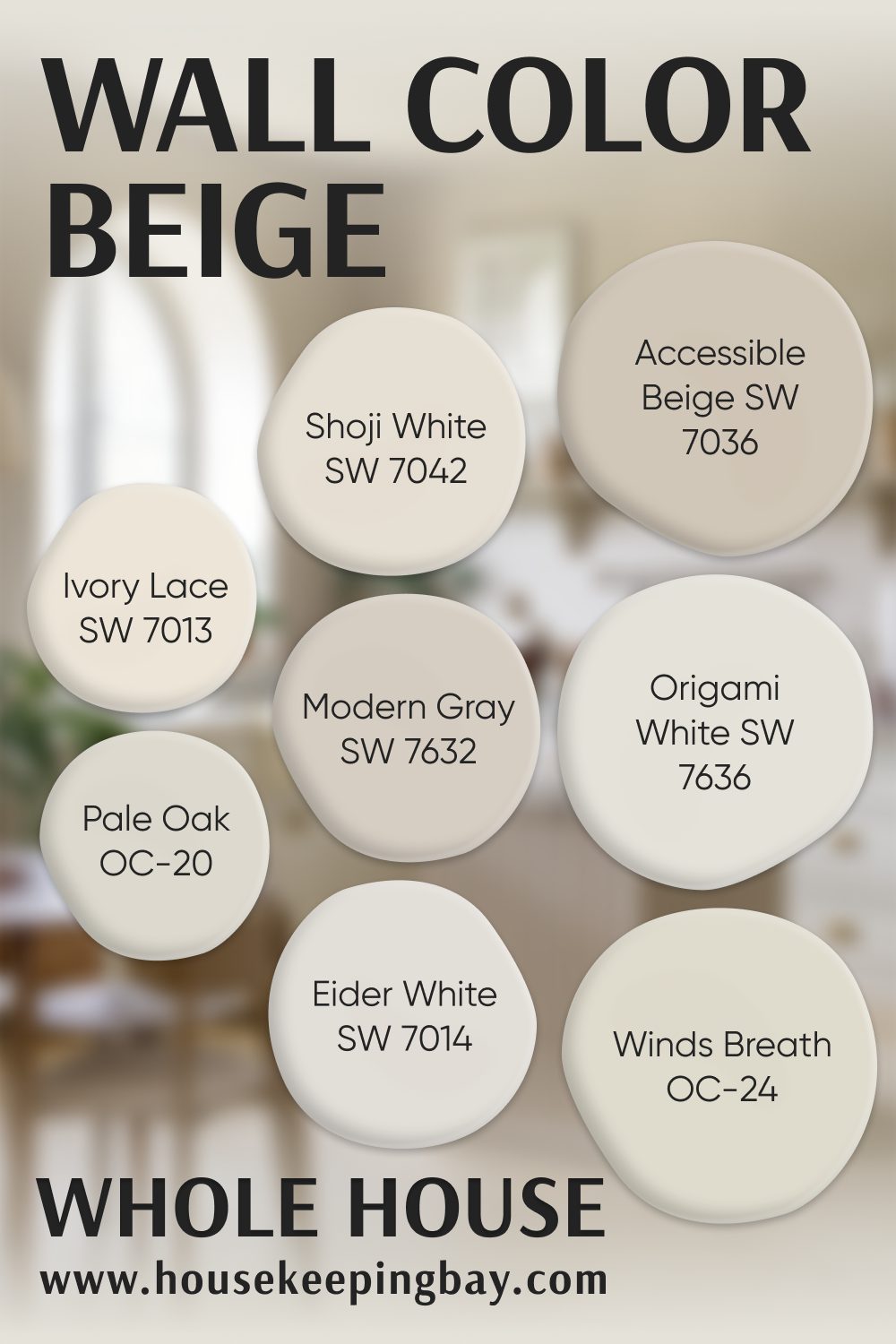
Whole House Beige Paint Colors
This is where things get real. Whole house colors need to look good in every kind of light. From sunny living rooms to shaded hallways. I always test these across the day before making a final call.
Here are my go-tos:
- Modern Gray SW 7632 – A soft greige. It doesn’t shift too much between day and night.
- Shoji White SW 7042 – Shows up again because it’s so flexible. Warm, but not overpowering.
- Origami White SW 7636 – This leans more off-white but has enough warmth to be called beige.
- Accessible Beige SW 7036 – It never fails. Works from room to room.
- Ivory Lace SW 7013 – Great if you want a bright but not stark house color.
- Eider White SW 7014 – A cooler off-white with a gray base. Looks great with black accents.
- Pale Oak OC-20 (Benjamin Moore) – Creamy, soft, and easy to live with.
- Winds Breath OC-24 (Benjamin Moore) – Warm and inviting. Feels like a big hug when you walk in.
via housekeepingbay.com
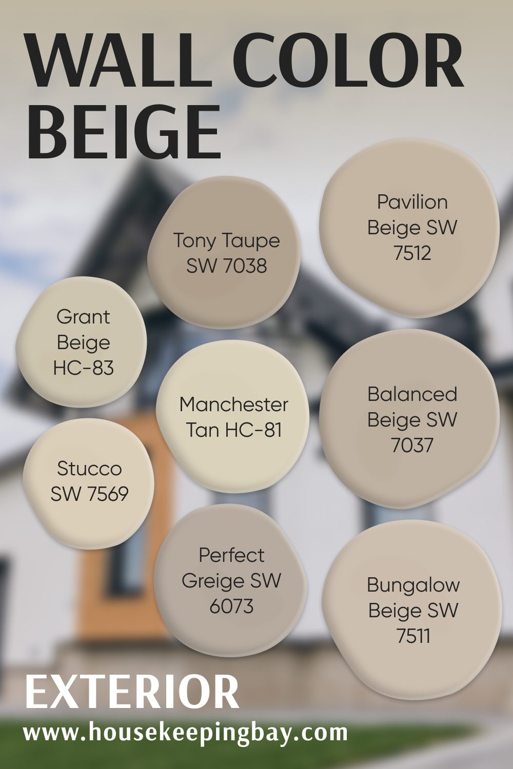
Exterior Beige Paint Colors
Outside, beige takes on a whole new life. Sunlight can bleach it out or make it go yellow. I look for shades that have a bit more depth and work well with stone, brick, or black window frames.
These are the ones that hold up:
- Balanced Beige SW 7037 – Rich and grounded. Looks beautiful with white trim.
- Tony Taupe SW 7038 – A little darker, great for farmhouse-style homes.
- Bungalow Beige SW 7511 – Warm and creamy. I’ve used this with cedar accents and it’s stunning.
- Pavilion Beige SW 7512 – A true soft beige. Not too yellow.
- Perfect Greige SW 6073 – A strong neutral that reads earthy and balanced.
- Stucco SW 7569 – Creamy and smooth. Ideal for homes with tile roofs or terracotta.
- Grant Beige HC-83 (Benjamin Moore) – Also great outside. It doesn’t fade too fast and works with a lot of stone types.
- Manchester Tan HC-81 (Benjamin Moore) – Light and warm. Looks very natural on traditional homes.
via housekeepingbay.com
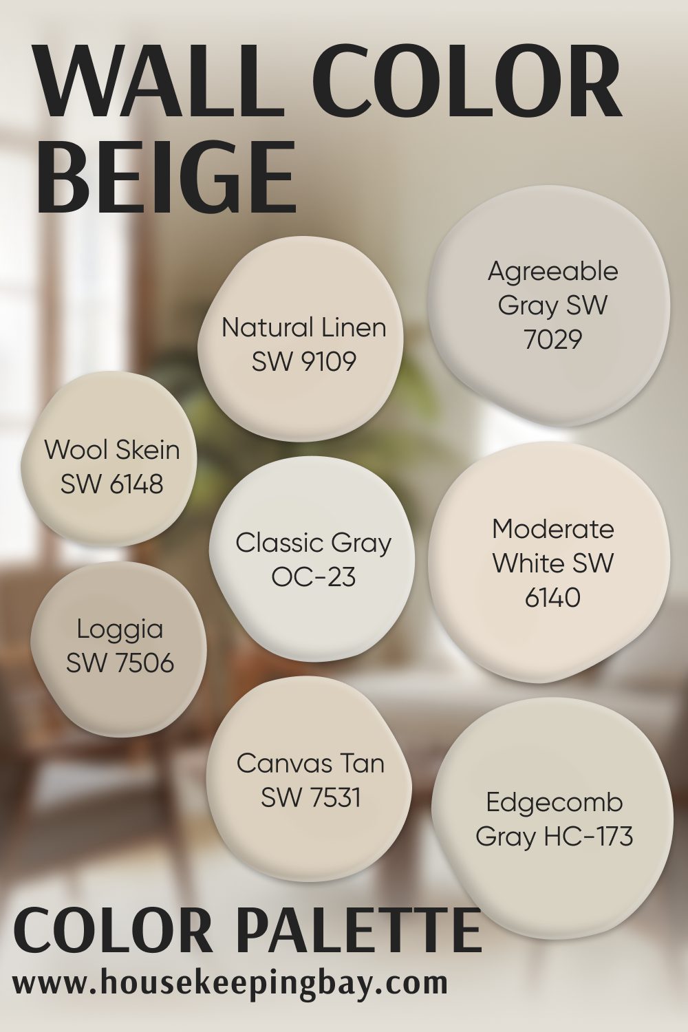
Whole Home Beige Color Palette That Flows
If you want a house that feels connected room to room, this is where I always start—the palette. These are the shades I reach for when I want different rooms to feel slightly unique, but still work together without clashing.
Think of it like building a wardrobe in neutral tones: the pieces may be different, but they all mix and match beautifully.
Here’s my go-to palette that works in almost any home:
- Agreeable Gray SW 7029 – This one anchors everything. It has warmth, but it never gets too yellow or pink.
- Canvas Tan SW 7531 – Soft, smooth, and easy to live with. I like this in dining areas or hallways.
- Natural Linen SW 9109 – Gentle and clean. Pairs well with white trim and soft wood flooring.
- Moderate White SW 6140 – A light, creamy beige that feels fresh and bright.
- Loggia SW 7506 – A little deeper and richer. It adds some weight to spaces like a study or entry.
- Wool Skein SW 6148 – Soft and buttery. I’ve used this in kitchens and breakfast nooks—it always feels inviting.
- Edgecomb Gray HC-173 (Benjamin Moore) – I know I’ve said it before, but this one’s a hero. It fits anywhere.
- Classic Gray OC-23 (Benjamin Moore) – A barely-there neutral. Perfect for when you want light walls that don’t feel cold.
You don’t have to use all of these in one house—but choosing 3–5 that work together can make your home feel intentional, even if each room has its own look.
via housekeepingbay.com
4. The Perfect Beige Palette
People always ask me, “How do I make sure all the beiges in my house actually look good together?” It’s a good question—because one beige in the living room and a totally different tone in the hallway can make everything feel disconnected.
Here’s what I do every single time I create a beige-based home palette:
Start with the “Anchor” Color
Pick one beige that you love the most. This is usually the color that goes in the main living area—like Agreeable Gray SW 7029, Edgecomb Gray HC-173, or Canvas Tan SW 7531.
This color will help set the mood. If it’s soft and warm, the rest of the palette should feel that way too. If it leans cooler or more gray, stay in that family for the rest.
Build Around It With Support Colors
Once you have your anchor, pick 2–3 supporting shades. These can go in bedrooms, bathrooms, or offices. They don’t have to match exactly—but they should feel like cousins, not strangers.
Here’s one of my go-to beige palettes for an open-concept home:
- Anchor: Agreeable Gray SW 7029
- Bedroom: Pale Oak OC-20 (Benjamin Moore)
- Bathroom: Ivory Lace SW 7013
- Office or Dining: Loggia SW 7506
- Trim or Cabinetry: Classic Gray OC-23 (Benjamin Moore)
They all work together without being identical. That’s what makes the home feel balanced.
Test It in Real Light
Please—don’t skip this. Beige can shift a lot depending on light. What looks like the perfect greige in one room can turn green or pink in another.
I always test 3 things before making a final choice:
- Paint two coats on large sample boards or directly on the wall.
- Check the color morning, noon, and night.
- Place it next to trim, flooring, and furniture—not just white paper.
Sometimes, I test 4–5 shades in one room just to be sure. It’s worth it. Beige changes a lot with shadows, sun, and even bulb color.
My Tip
Stick with either warm beige (with yellow or creamy tones) or cool beige (with gray or taupe). Mixing both can look off unless you really know what you’re doing.
If you’re not sure what undertone a color has, just compare it to a plain white sample. You’ll see whether it leans peach, pink, yellow, green, or gray pretty fast.
Before You Paint: What I Tell Every Client
Before a single wall gets painted, here’s what I always say—slow down. Beige looks simple, but choosing the right one takes a little patience. And it’s worth every second.
Even after years of doing this, I never skip my steps.
I test, I wait, I walk through the house at different times of day. Because beige can change so fast depending on your light, your flooring, your furniture—even your windows.
via housekeepingbay.com
Here’s how I always test beige:
- Get real paint samples (not just the paper swatches).
- Paint two coats on a large board—or even directly on your wall.
- Move that board around the room: hold it next to your couch, next to your tile, under a window.
- Check it morning, afternoon, and evening. See how it changes.
And here’s what I always ask myself:
- Does this color make the room feel warm or cold?
- Does it match the style of the home?
- Will it still look good when the furniture goes in?
- Can I live with this color every day—or does it feel “off”?
Sometimes it takes trying 3 or 4 shades before I know I’ve found the right one. That’s normal.
Why beige still feels good—every time
In the end, neutral colors give you breathing room. They let your favorite things shine—your furniture, your rugs, your art. They calm the house down so you can feel settled.
Beige isn’t plain. Beige is the background to your life. And when it’s the right shade, it feels like home.
