Stucco SW 7569 by Sherwin Williams
Detailed Guide
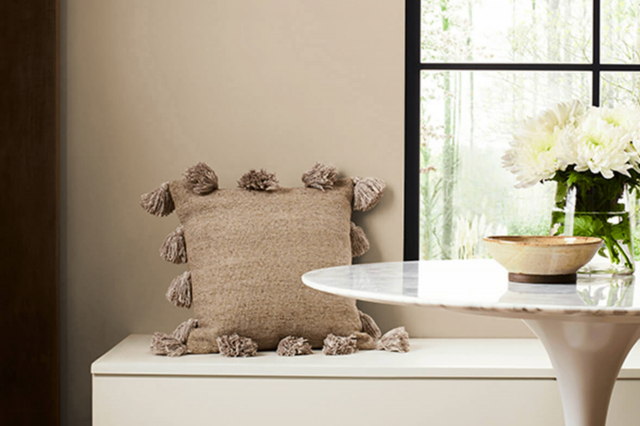
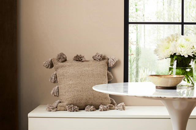
Among the numerous options, SW 7569 Stucco by Sherwin Williams stands out as a unique and versatile choice for homeowners and designers alike.
This shade of paint is an intriguing option for anyone looking to refresh their walls with a neutral yet distinctive color. Stucco is not just any ordinary beige; it has a depth that adds warmth and character to rooms without overwhelming the space with color.
Sherwin Williams has long been respected for its quality paints and wide color selection, and SW 7569 Stucco is no exception. This particular shade is part of their extensive palette, appealing to those seeking a modern yet timeless look.
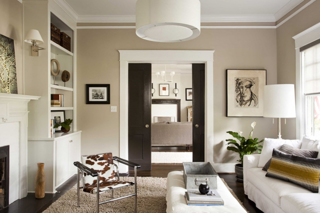
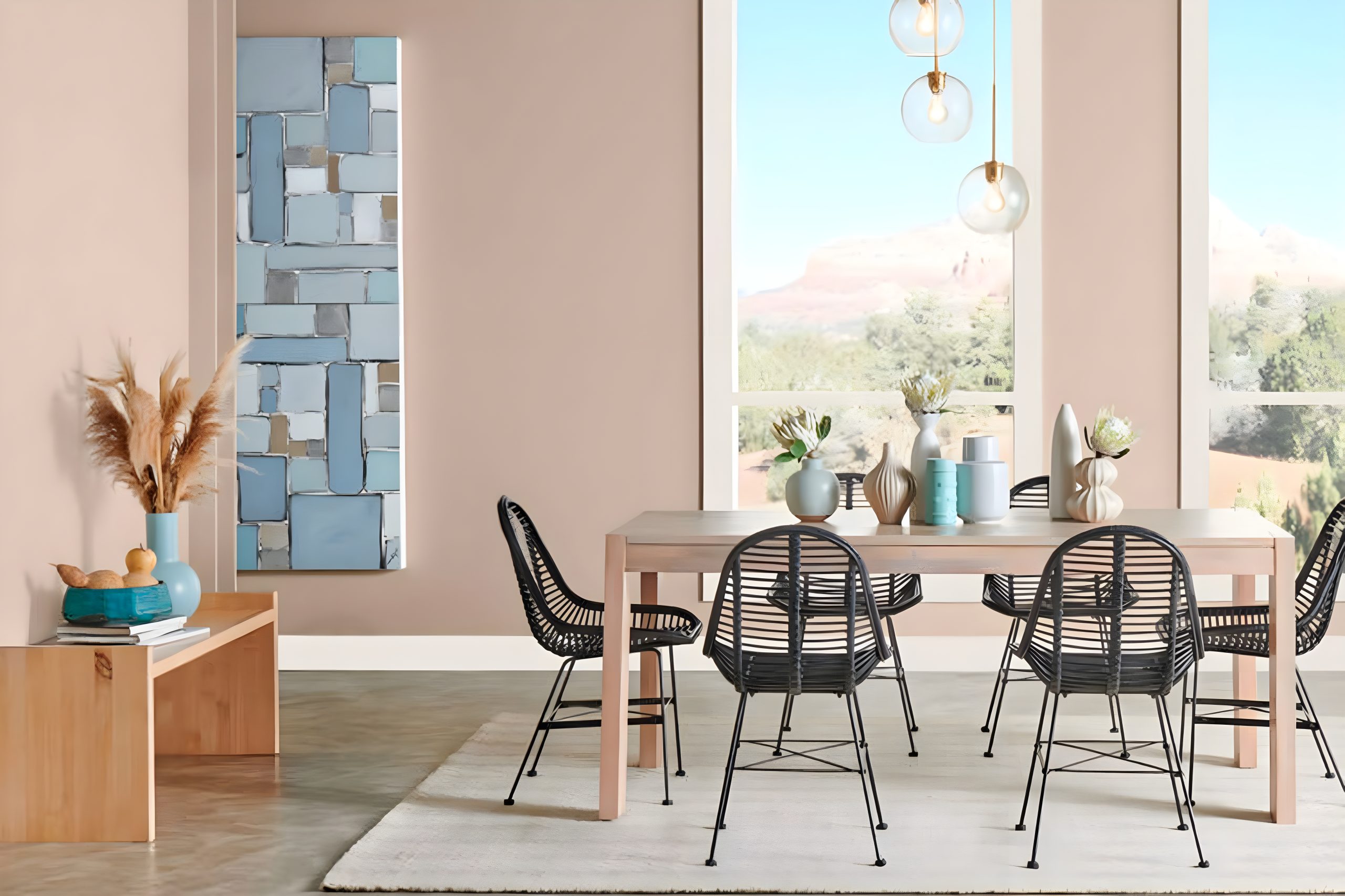
The color can easily complement various decor styles, from rustic to contemporary, making it a practical choice for living rooms, bedrooms, and even exterior applications.
Choosing the right paint color can feel like a daunting task, but SW 7569 Stucco offers a balance that works well in both well-lit and dimly-lit spaces.
Its versatility lies in its ability to pair well with both bold and subdued accent colors, providing a cozy background that enhances the overall aesthetics of a room.
For anyone considering a paint update, SW 7569 Stucco is worth considering for its warm, inviting vibe and the sophisticated finish it delivers.
via sherwin-williams.com
What Color Is Stucco SW 7569 by Sherwin Williams?
Stucco SW 7569 by Sherwin Williams is a warm, soothing beige that brings a soft and natural feel to any space it graces. This welcoming hue is reminiscent of the solid yet gentle touch of earth, offering a calm and comfortable atmosphere.
Its neutral base makes it incredibly versatile, fitting into a variety of interior styles effortlessly. Whether you’re aiming for a minimalist look, a modern farmhouse vibe, or a cozy bohemian aesthetic, Stucco SW 7569 provides a solid foundation to build upon.
It shines particularly well in rooms that aim for a light, airy feel, helping to enhance natural light while maintaining a sense of warmth.
This color works magic in living rooms, bedrooms, and kitchens, offering a seamless flow from one room to the next.
When it comes to pairing with materials and textures, Stucco SW 7569 is equally accommodating. It complements natural wood finishes, from light oak to richer walnuts, adding depth and character to the space.
Metals, whether brushed nickel, copper, or brass, also stand out against this backdrop, providing a touch of elegance or rustic charm, depending on the context.
Textiles in soft cotton, luxurious velvet, or even rough linen bring out its earthy qualities, making any room feel welcoming.
Overall, Stucco SW 7569 is a timeless choice that supports a range of personal styles and preferences, making it a go-to color for anyone looking to create a serene and inviting home environment.
housekeepingbay.com
Table of Contents
Is Stucco SW 7569 by Sherwin Williams Warm or Cool color?
StuccoSW 7569 by Sherwin Williams is a warm, neutral paint color that can really make a home feel cozy and welcoming. It’s a bit like the color of a natural clay pot – not too light but also not too dark.
This versatility means it works great in a lot of different spaces in a house, from living rooms and kitchens to bedrooms and bathrooms.
What’s special about this color is how it brings a sense of calm and earthiness into a home. It pairs well with a wide range of other colors.
Whether you have lots of bright furniture or more subtle wooden pieces, StuccoSW 7569 can complement them nicely. Because it’s such a grounded color, it helps other elements in the room stand out without overpowering them.
In rooms with lots of natural light, StuccoSW 7569 can look a bit lighter, creating a soft, airy feel. In spaces with less light, it adds depth and warmth, making the room feel snug and inviting. No matter the lighting, this color can make homes feel more put-together and stylish.
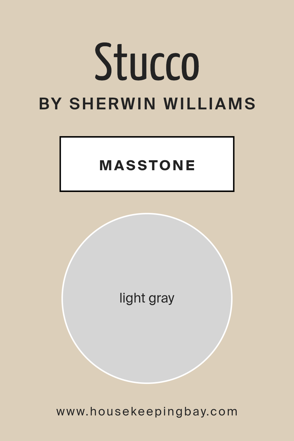
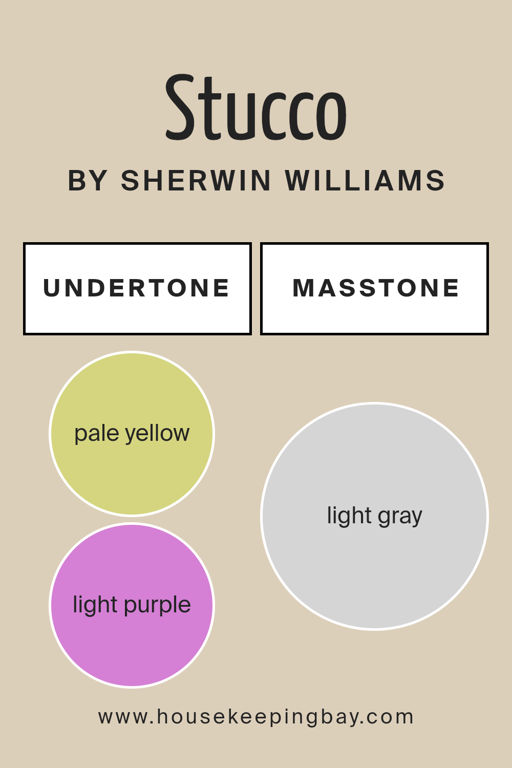
What is the Masstone of the Stucco SW 7569 by Sherwin Williams?
StuccoSW 7569 by Sherwin Williams has a masstone, or main color, that looks like light gray. This light gray color (#D5D5D5) is very easy and pleasant to look at.
It is a flexible color that can fit into many different home styles without overwhelming spaces or clashing with other colors.
Since it is a kind of gray, it works like a neutral color, which means it can go well with many other colors, whether they are bright or dark.
This makes it perfect for walls because it can help rooms look bigger and brighter, especially if the home doesn’t get a lot of sunlight.
Also, because it’s a soft and simple color, it helps create a calm and relaxing feeling in homes, which is great for places like living rooms and bedrooms where comfort is key.
This versatility makes StuccoSW 7569 a popular choice for many homeowners who want a color that is both beautiful and practical.
housekeepingbay.com
Undertones of Stucco SW 7569 by Sherwin Williams
Stucco SW 7569 by Sherwin Williams is a unique and appealing color that brings a gentle warmth to any space. This color has subtle undertones of pale yellow and light purple, which play a key role in how it looks and feels in a room.
Undertones are like secret ingredients in a color recipe. They can change how a color appears under different lighting conditions or when paired with other colors.
For example, under warm light, the pale yellow undertone in Stucco might make the color seem softer and more inviting. On the other hand, in cooler light, the light purple undertone might show up a bit more, giving the color a slightly cooler vibe.
When it comes to painting interior walls with Stucco SW 7569, these undertones can truly affect the mood and style of a room. The pale yellow undertone adds a touch of brightness, making spaces feel more open and airy.
It’s great for living rooms or kitchens where a cheerful atmosphere is welcome. The light purple undertone offers a hint of sophistication and can make bedrooms feel cozy and restful.
As light changes throughout the day, these undertones can subtly shift the wall color’s appearance, keeping the interior dynamic and interesting.
Understanding these undertones helps in choosing decor and furniture, as they ensure everything comes together harmoniously. When used thoughtfully, Stucco SW 7569 can create beautifully balanced spaces that feel just right.
housekeepingbay.com
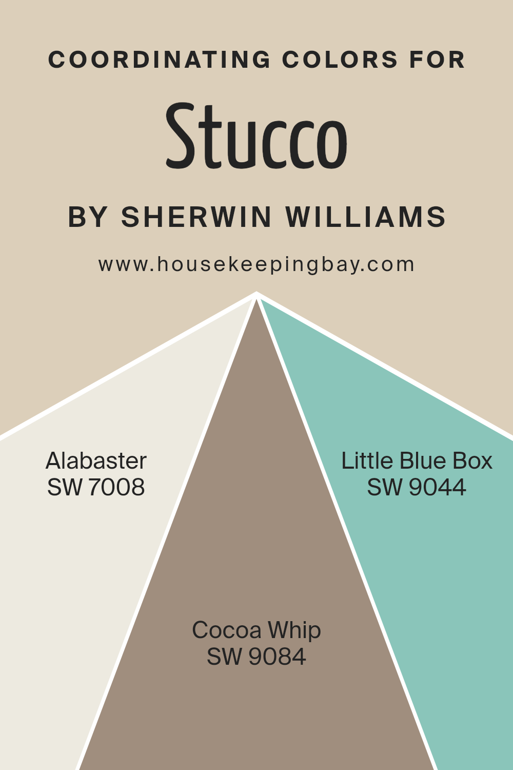
Coordinating Colors of Stucco SW 7569 by Sherwin Williams
Coordinating colors are complementary hues that work together to enhance the overall aesthetic of a space, creating a harmonious palette. When used thoughtfully, these colors can add depth, contrast, and a sense of unity to your decor.
For example, if we take Stucco SW 7569 by Sherwin Williams as a base color, it pairs beautifully with a carefully selected set of coordinating colors.
These additional colors are not random; they are chosen to either compliment or subtly contrast with the base color, ensuring a cohesive and pleasing look.
Taking Stucco SW 7569, a warm and inviting neutral, we find it has a natural companionship with Alabaster SW 7008, a soft, creamy white that brings a gentle brightness to the palette, perfect for creating a sense of space and light.
Cocoa Whip SW 9084, on the other hand, offers a richer, deeper tone that suggests comfort and earthiness, adding a layer of sophistication and warmth.
Lastly, Little Blue Box SW 9044 introduces a splash of color with its refreshing and serene hue, reminiscent of a clear sky, providing a surprising yet delightful contrast that elevates the whole combination.
Together, these colors work in harmony to create a visually appealing and cohesive space that feels both balanced and inviting.
You can see recommended paint colors below:
- SW 7008 Alabaster
- SW 9084 Cocoa Whip
- SW 9044 Little Blue Box
housekeepingbay.com
How Does Lighting Affect Stucco SW 7569 by Sherwin Williams?
Lighting plays a big role in how we see colors. The same color can look different under various types of light.
This happens because light sources have different color temperatures. Warm light makes colors look more vibrant, while cool light can make them seem muted.
Take the color StuccoSW 7569 by Sherwin Williams. This color is like a warm, soft beige. Under artificial light, such as from LED bulbs or fluorescent lamps, StuccoSW 7569 might look a bit different than in natural sunlight.
Artificial lights vary in color temperature. Warm artificial light can make StuccoSW 7569 look cozier and richer, enhancing its warm tones. Under cool artificial light, the color may appear slightly duller, losing some of its warmth.
In natural light, StuccoSW 7569 can look quite different depending on the time of day and the direction of the light. In rooms that face north, natural light is cooler throughout the day.
Here, StuccoSW 7569 can appear more neutral or even have a slight grayish tone, as the cooler light does not emphasize its warm undertones.
In south-facing rooms, the light is warmer and brighter for most of the day. This means StuccoSW 7569 will show its warm, welcoming side more vividly here, making the room feel inviting.
East-facing rooms get bright, warm morning light, making StuccoSW 7569 look warmer and lighter in the mornings.
As the day progresses, the intensity of the light decreases, and the color can look softer and more neutral.
West-facing rooms have the opposite effect; they get softer light in the morning, which makes StuccoSW 7569 appear more muted.
But in the evenings, as the sun sets, the room fills with warm light, making the color look warmer and richer.
So, lighting’s effect on StuccoSW 7569 by Sherwin Williams shows just how much the feeling and look of a color can change under different conditions. This highlights the importance of considering the lighting in a room when choosing paint colors.
housekeepingbay.com
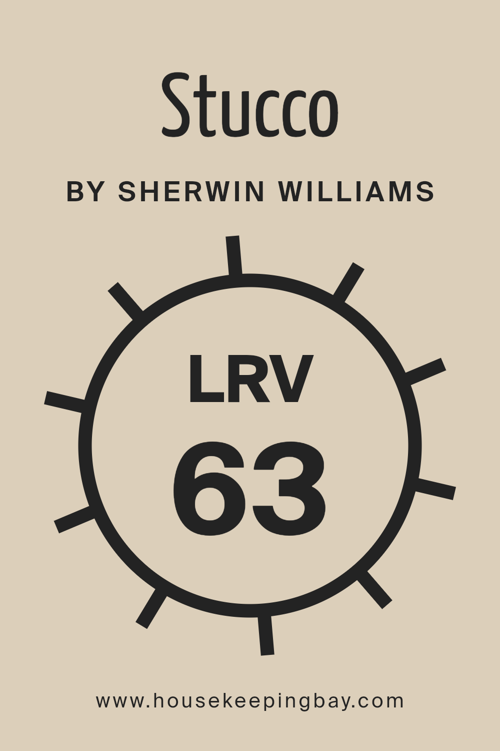
What is the LRV of Stucco SW 7569 by Sherwin Williams?
LRV stands for Light Reflectance Value, which measures the amount of light a paint color reflects or absorbs when it’s on your walls. This number ranges from 0, which is pure black and absorbs all light, to 100, which is pure white and reflects all light.
LRV is important because it helps you understand how light or dark a color will look in your space. It can also impact the mood of the room and can make spaces appear larger or cozier.
When choosing paint, knowing the LRV can help you predict how the color will change under different lighting conditions throughout the day.
With an LRV of 63.277, Stucco SW 7569 by Sherwin Williams is on the lighter side, meaning it reflects more than half of the light that hits it. This makes it a great choice for making rooms feel airy and bright.
Because it’s a lighter color, it can help small spaces appear bigger and more inviting. However, the exact effect can still vary depending on the room’s natural light, the size of the windows, and the direction they face.
This value tells us that Stucco is versatile and can work well in many different spaces, enhancing natural light during the day and maintaining a soft, pleasant look under artificial lighting at night.
housekeepingbay.com
What is LRV? Read It Before You Choose Your Ideal Paint Color
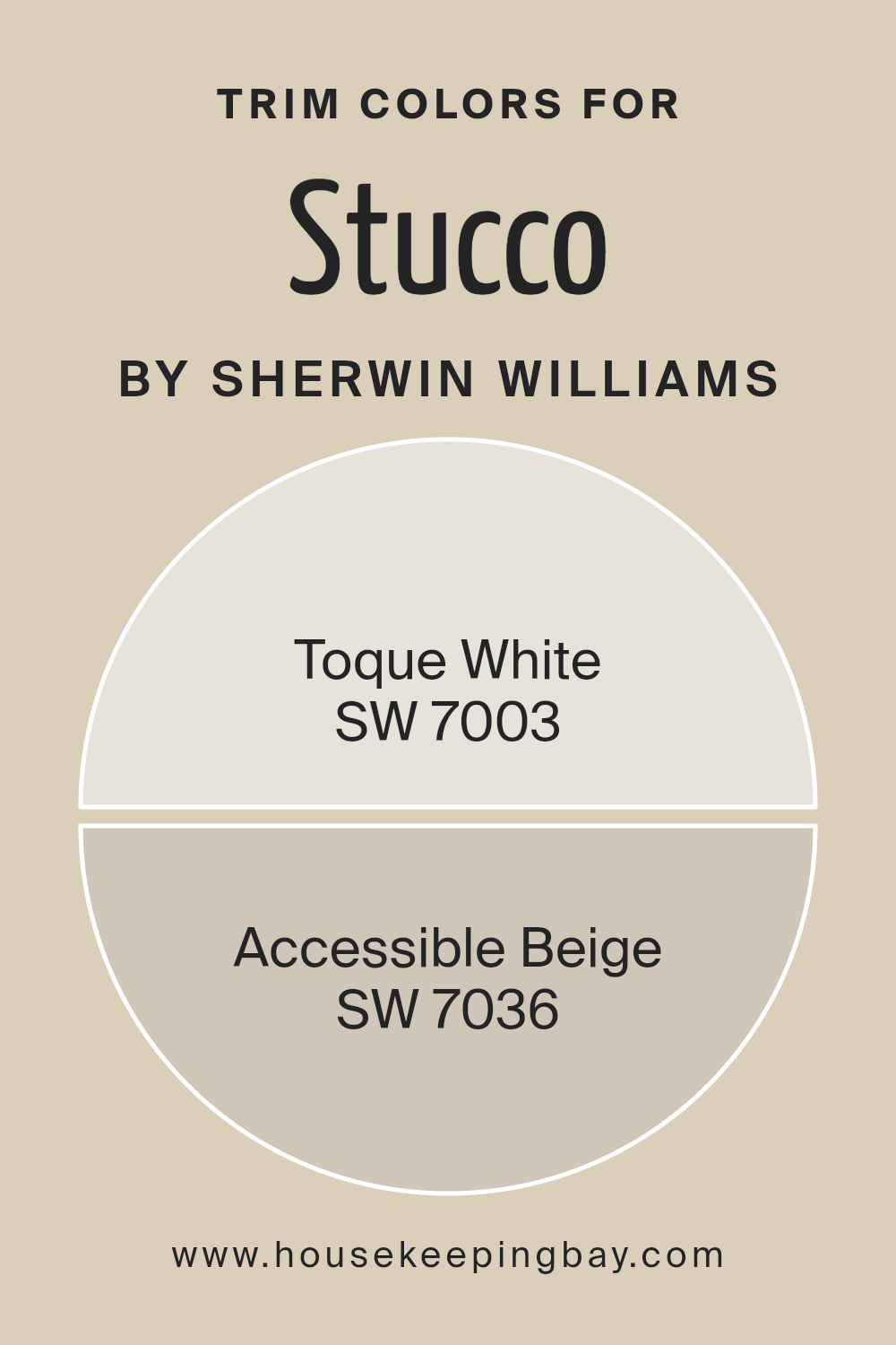
What are the Trim colors of Stucco SW 7569 by Sherwin Williams?
Trim colors play a significant role in defining and accentuating the aesthetic appeal of a structure’s exterior. When it comes to Stucco SW 7569 by Sherwin Williams, choosing the right trim color can greatly influence the overall look and feel of the property.
Trim colors act as a frame for the main color, enhancing architectural details and complementing the primary stucco color to create a cohesive and attractive appearance.
The choice of trim color can either subtly blend with the primary color for a harmonious look or contrast with it to make a bold statement, depending on the desired effect.
For Stucco SW 7569, a warm, inviting shade, SW 7003 – Toque White and SW 7036 – Accessible Beige are exceptional choices for trim colors.
Toque White is a soft, serene hue that brings a light and airy feel to the exterior, bridging the gap between different elements seamlessly. It’s a versatile color that adds a touch of elegance without overpowering the main color.
On the other hand, Accessible Beige is a warm, welcoming neutral that grounds the design and adds depth. Its understated elegance complements the stucco, providing a natural, balanced look that enhances the property’s appeal.
Together, these colors offer fantastic options for creating a visually appealing exterior that stands the test of time.
You can see recommended paint colors below:
- SW 7003 Toque White
- SW 7036 Accessible Beige
housekeepingbay.com
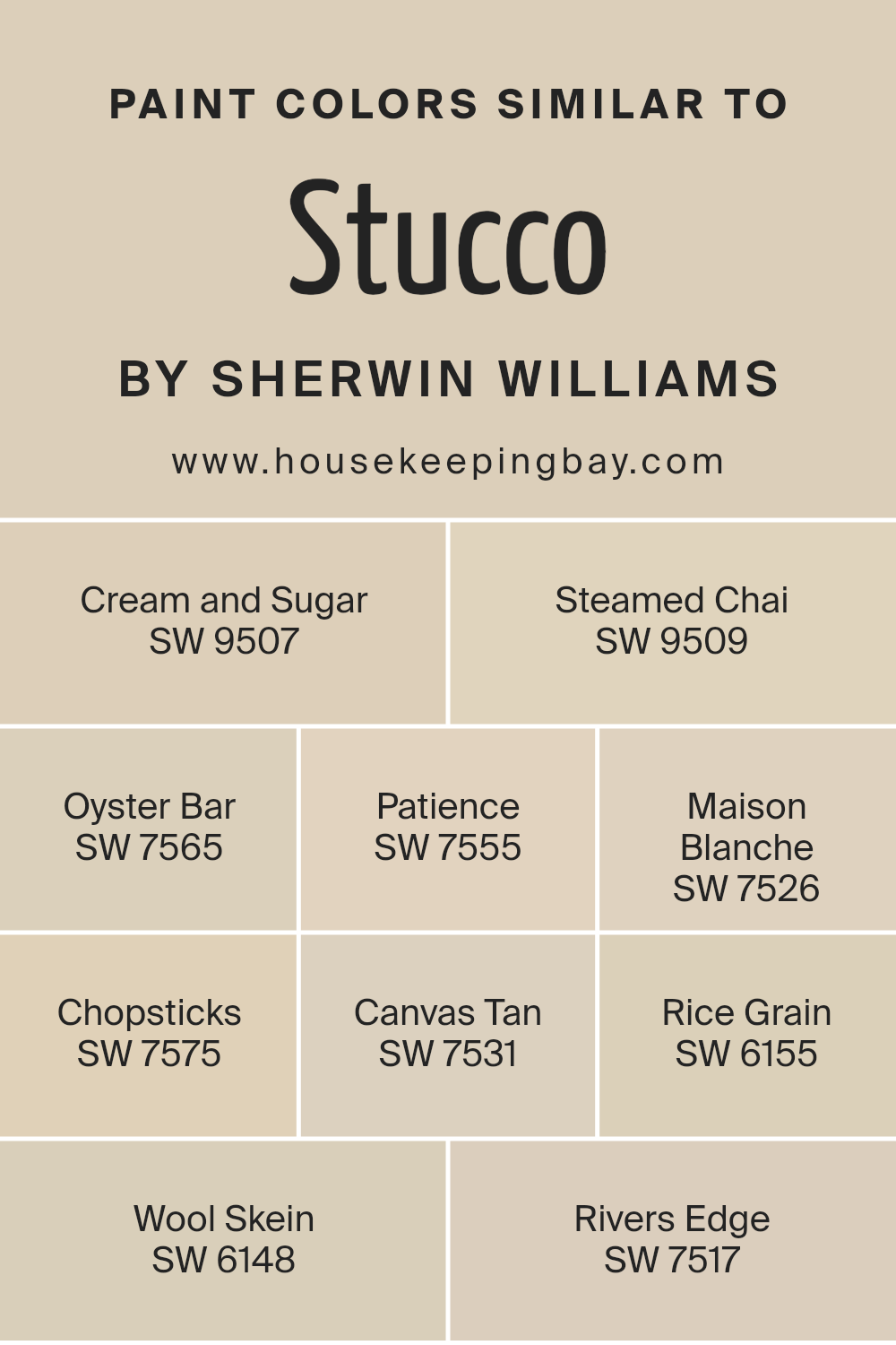
Colors Similar to Stucco SW 7569 by Sherwin Williams
Choosing similar colors can greatly enhance the aesthetic harmony in a design or space, creating a cohesive and soothing atmosphere.
Colors similar to Stucco SW 7569 by Sherwin Williams tap into a palette that blends seamlessly, offering subtle variations that enrich the environment without overwhelming it with stark contrasts.
For example, Cream and Sugar SW 9507 provides a gentle, warm hue, akin to the inviting sweetness its name suggests, perfect for creating a cozy ambiance.
Steamed Chai SW 9509, on the other hand, leans into a slightly spicier tone, reminiscent of its namesake beverage, offering warmth with a touch of sophistication.
Oyster Bar SW 7565 brings a hint of maritime freshness into play, soft enough to complement more earthy tones while maintaining its distinct character.
Patience SW 7555 evokes a sense of calm, its understated elegance making it a versatile choice for spaces seeking a neutral backdrop.
Maison Blanche SW 7526 offers a classic, clean look, reminiscent of traditional elegance, while Chopsticks SW 7575 introduces a deeper, yet still neutral, dimension that adds depth without dominating.
Canvas Tan SW 7531 pulls in a slightly bolder, earthy feel, grounding the space with its sturdy presence.
Rice Grain SW 6155, Wool Skein SW 6148, and Rivers Edge SW 7517 further enrich the palette, each contributing their unique whisper of color, from the softest hint of green in Rice Grain to the gentle flow of beige in Wool Skein and the refreshing nature-inspired Rivers Edge.
Together, these colors work harmoniously, allowing for a fluid and adaptable design scheme that caters to various tastes and styles, all the while maintaining a cohesive and inviting aesthetic.
You can see recommended paint colors below:
- SW 9507 Cream and Sugar
- SW 9509 Steamed Chai
- SW 7565 Oyster Bar
- SW 7555 Patience
- SW 7526 Maison Blanche
- SW 7575 Chopsticks
- SW 7531 Canvas Tan
- SW 6155 Rice Grain
- SW 6148 Wool Skein
- SW 7517 Rivers Edge
housekeepingbay.com
How to Use Stucco SW 7569 by Sherwin Williams In Your Home?
Stucco SW 7569 by Sherwin Williams is a versatile paint color that can transform any room in your home. This shade is like a warm, comforting hug for your walls, offering a neutral backdrop that’s both stylish and easy to match with a variety of decor styles.
Whether you’re looking to refresh your living room, bedroom, or even your bathroom, Stucco can add a touch of understated elegance to your space.
Using Stucco in your home means you get a color that can adapt to different lighting conditions, looking slightly different as the day goes on. This keeps your space feeling fresh and interesting.
It’s perfect for creating a cozy atmosphere in bedrooms or for making small spaces appear larger and more open.
You can pair Stucco with bold colors on furniture or decorations to make them pop, or keep things muted for a more relaxed vibe. For a modern look, combine it with metal finishes or clean, sleek lines.
Whether you’re updating a single room or giving your whole house a makeover, Stucco SW 7569 offers a timeless canvas that can suit any style.
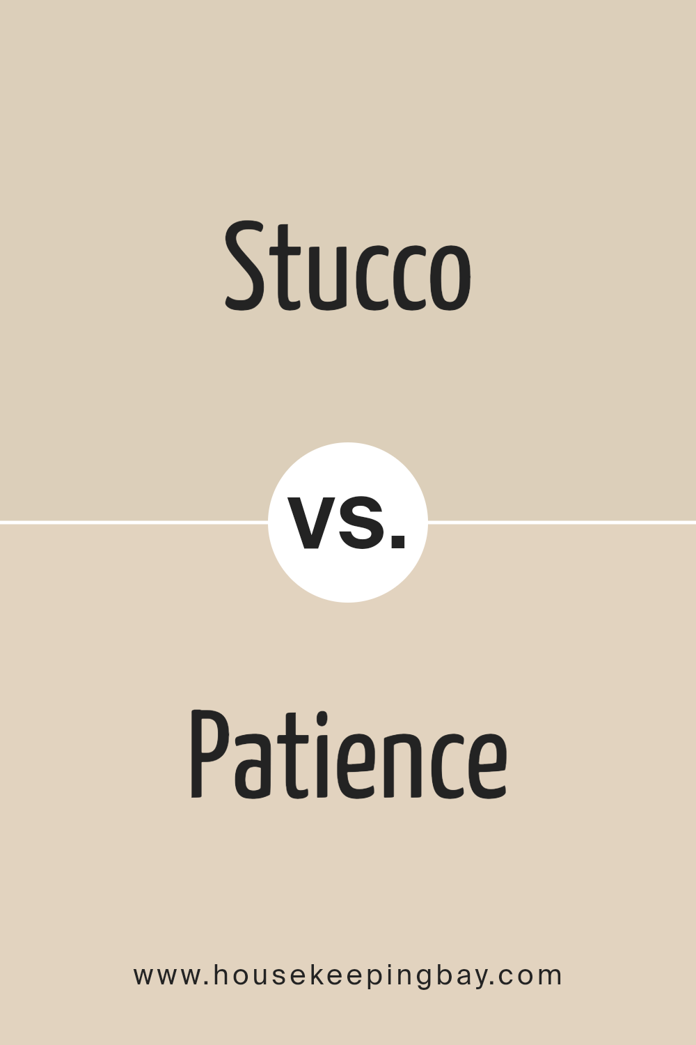
Stucco SW 7569 by Sherwin Williams vs Patience SW 7555 by Sherwin Williams
Stucco SW 7569 by Sherwin Williams is a warm, neutral shade that feels like a cozy, sunlit room. It’s a color that brings a sense of calm and stability to any space, fitting well in living rooms or bedrooms where you want to create a peaceful atmosphere.
In contrast, Patience SW 7555 is a softer, lighter tone. It leans more towards a gentle cream color that spreads a serene, airy vibe throughout a space, making it perfect for places where you want to relax, like a spa-like bathroom or a calm reading nook.
Although both colors share a neutral base, Stucco has a richer, earthier feel to it, perfect for adding a bit of warmth to a room. Patience, on the other hand, is lighter and offers a fresh, open feel, ideal for making smaller rooms appear larger and more inviting.
Both colors work well in various settings, depending on whether you want to cozy up a space with Stucco or lighten it up with Patience.
You can see recommended paint color below:
housekeepingbay.com
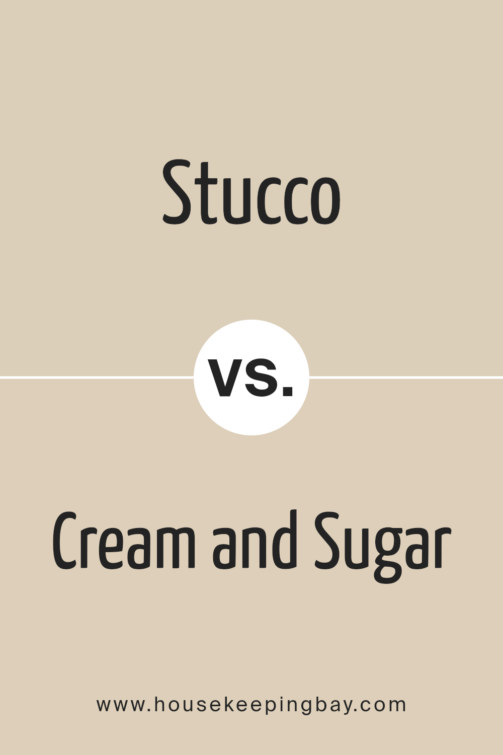
Stucco SW 7569 by Sherwin Williams vs Cream and Sugar SW 9507 by Sherwin Williams
Stucco SW 7569 by Sherwin Williams is like the cozy feel of a well-loved room. It’s a warm, welcoming beige that feels like a soft, comfortable embrace. This color makes spaces feel snug and inviting, perfect for living areas or bedrooms where you want to relax.
On the other hand, Cream and Sugar SW 9507 by Sherwin Williams is lighter and gives off a creamy, soft vibe. It’s like a gentle touch that brightens up a place effortlessly.
This color leans more towards a fresh, airy look, making it ideal for kitchens and bathrooms where you want a clean, uplifting atmosphere.
When comparing them, Stucco is the go-to for adding depth and warmth, making spaces feel more intimate, while Cream and Sugar opens up a room, bringing in a light, cheerful mood.
Both colors offer their unique charm, setting the tone for spaces that are both welcoming and stylish.
You can see recommended paint color below:
housekeepingbay.com
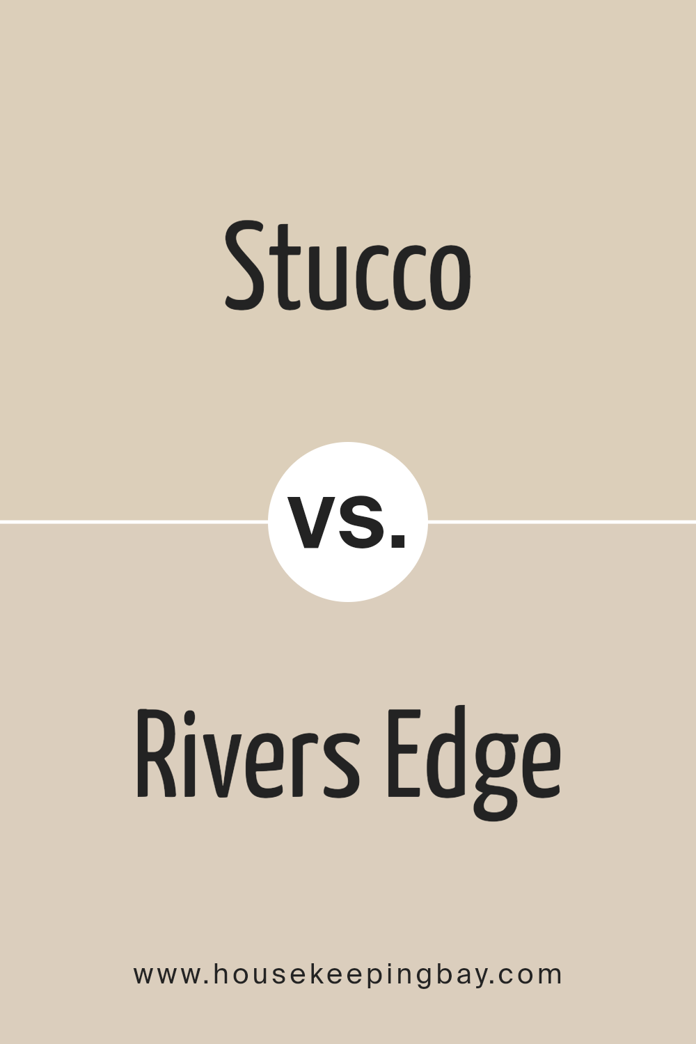
Stucco SW 7569 by Sherwin Williams vs Rivers Edge SW 7517 by Sherwin Williams
Stucco SW 7569 by Sherwin Williams is a warm, neutral color. It brings a cozy vibe to any space, making it feel welcoming and calm. On the other hand, Rivers Edge SW 7517 is a cooler, more subdued tone.
It resembles the soft hues found in nature, providing a tranquil and serene atmosphere. When comparing the two, Stucco is like the warmth of a sunny day, while Rivers Edge is like the calmness of a quiet stream.
Stucco works well in areas where you want to add a touch of warmth without overpowering the space, perfect for living rooms or bedrooms. Rivers Edge, with its cool undertone, is great for creating a peaceful retreat, ideal for bathrooms or spaces where relaxation is key.
Both colors offer a nice backdrop for various decor styles, from rustic to modern, but the choice between them depends on the mood you are aiming to achieve in your space.
You can see recommended paint color below:
- SW 7517 Rivers Edge
housekeepingbay.com
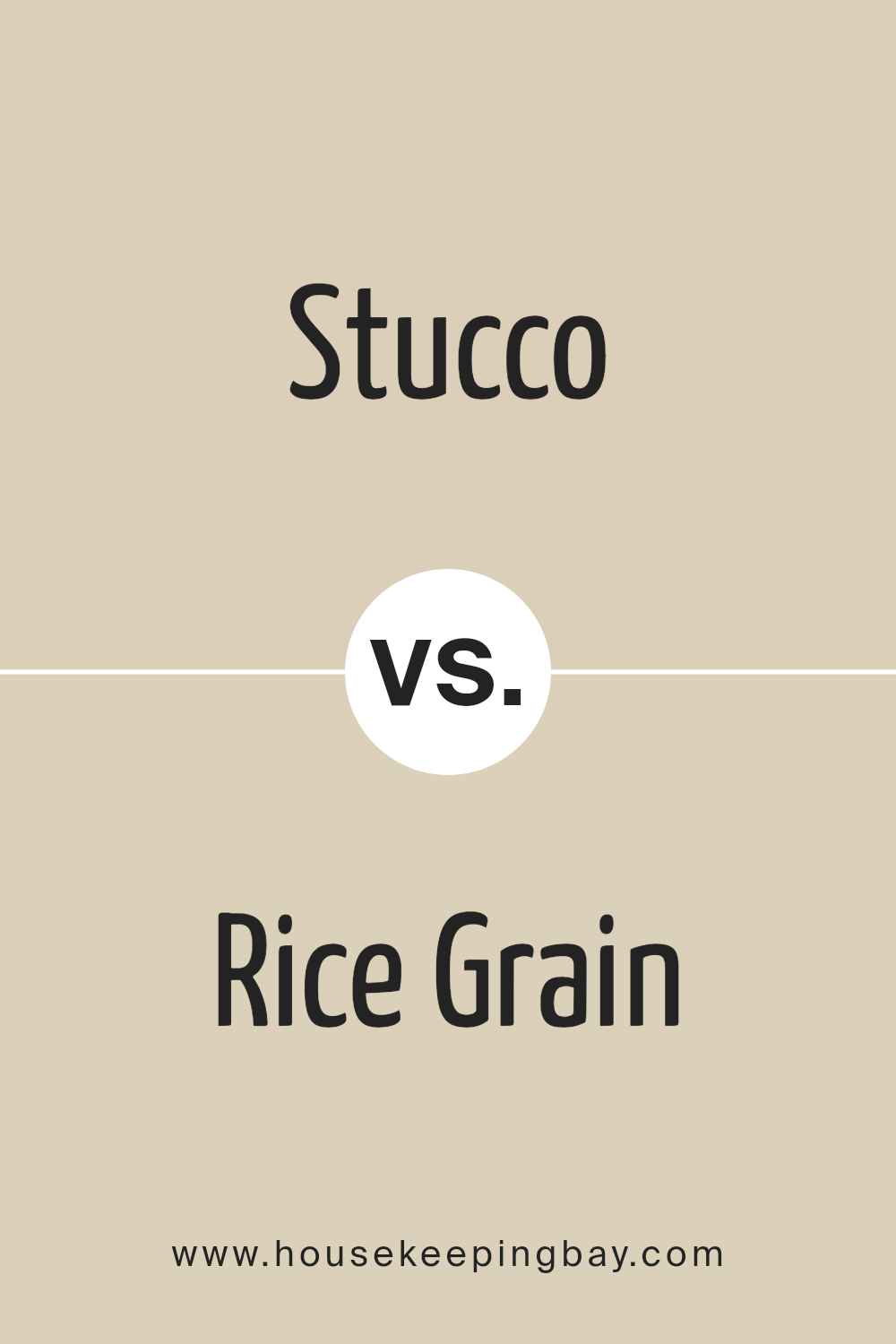
Stucco SW 7569 by Sherwin Williams vs Rice Grain SW 6155 by Sherwin Williams
Stucco SW 7569 by Sherwin Williams is a warm, neutral shade that brings a cozy and welcoming feel to any space. Its earthy tones make it an excellent choice for those looking to create a soothing and comfortable atmosphere in their home or office.
On the other hand, Rice Grain SW 6155 is also a warm neutral, but it leans slightly more towards a light, creamy color. This makes Rice Grain a bit brighter and more versatile, able to lighten up a room while still maintaining that warm, inviting vibe.
Both colors are quite adaptable and can easily pair with a wide range of decor styles and other colors. However, if you’re aiming for a slightly richer, more grounded ambiance, Stucco would be the way to go.
If your goal is to make a space feel more open and airy, then Rice Grain might be your preferred choice. Ultimately, both shades offer their unique charm, capable of creating beautiful, cozy environments that feel like home.
You can see recommended paint color below:
- SW 6155 Rice Grain
housekeepingbay.com
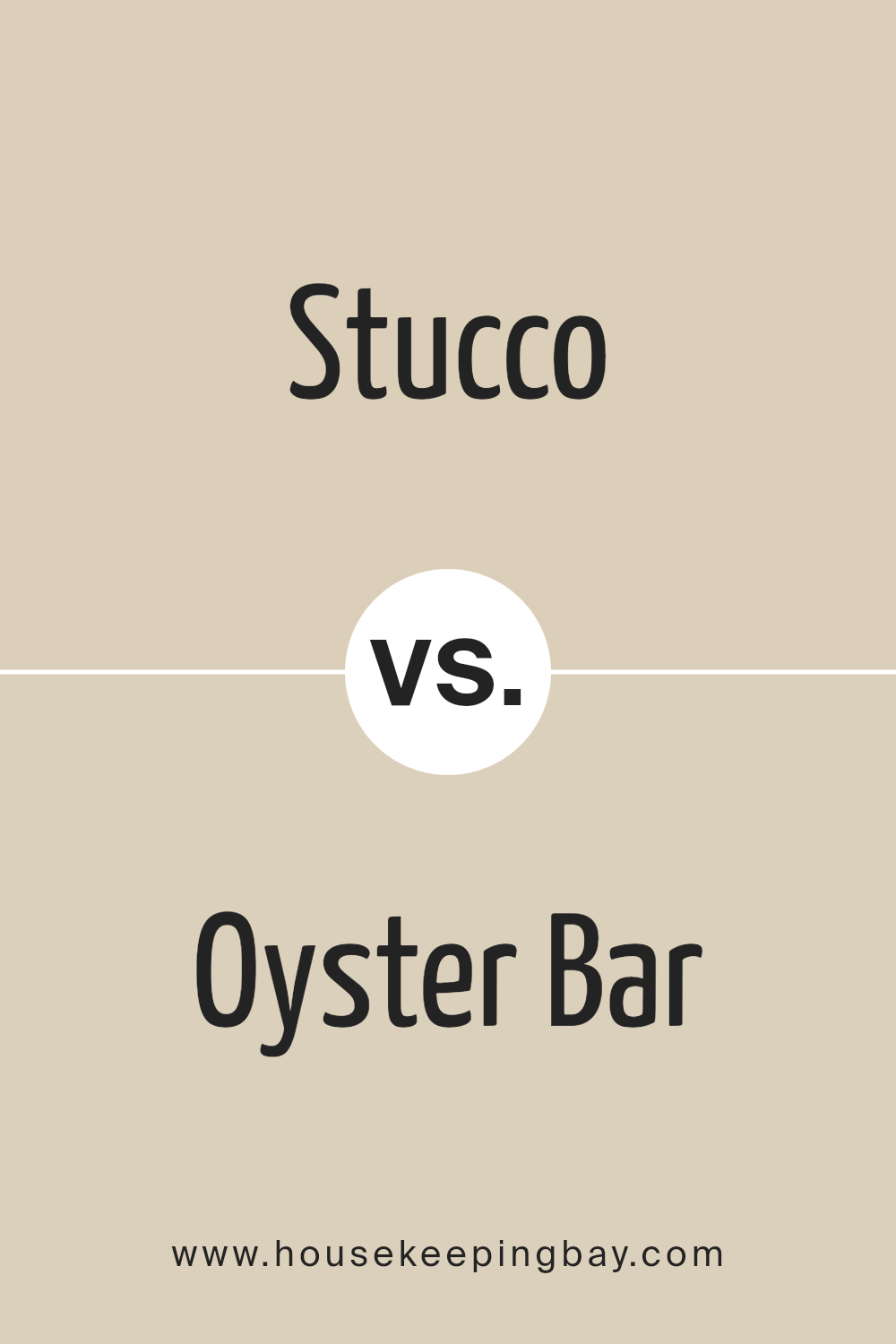
Stucco SW 7569 by Sherwin Williams vs Oyster Bar SW 7565 by Sherwin Williams
Stucco SW 7569 by Sherwin Williams is a warm, inviting beige with a hint of grey. It’s like a cozy blanket, offering a comfortable and soothing ambiance to any room. Its earthy tones make it adaptable, fitting well with various decor styles, from modern to rustic.
On the other hand, Oyster Bar SW 7565 leans towards a lighter, softer palette, blending beige with slight pinkish undertones. This color is reminiscent of a peaceful morning, bringing a gentle and calming presence to a space.
While Stucco offers depth and a sense of grounding, Oyster Bar introduces a lighter, serene touch. Both colors create a welcoming atmosphere but in different shades.
Stucco provides a stronger foundation, whereas Oyster Bar lights up the room with its airy vibe. Perfect for those looking to establish a relaxed yet elegant space, these colors offer versatile solutions to home decoration challenges.
You can see recommended paint color below:
- SW 7565 Oyster Bar
housekeepingbay.com
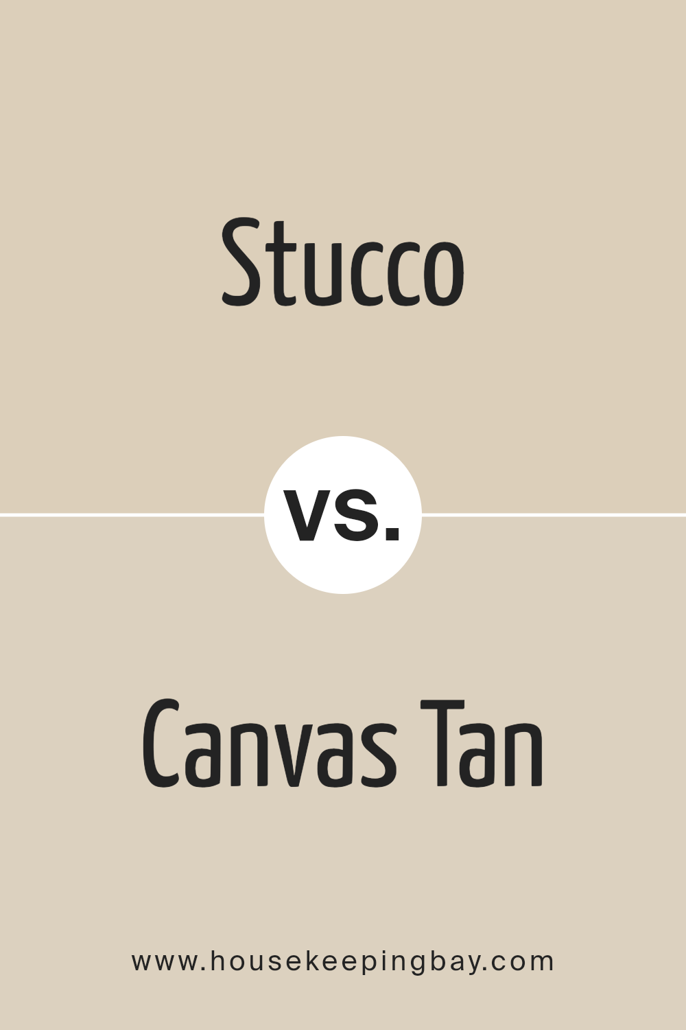
Stucco SW 7569 by Sherwin Williams vs Canvas Tan SW 7531 by Sherwin Williams
Stucco SW 7569 by Sherwin Williams is a warm, neutral color that feels like a cozy blanket on a chilly day. Imagine a soft, earthy tone that brings a calm and welcoming vibe to any room.
It’s not too dark or too light, just perfectly in the middle, making it versatile for various spaces and styles.
On the other hand, Canvas Tan SW 7531 is more like the light, creamy color of a morning latte. It’s a bit lighter than Stucco, offering a fresh and airy feel that can make small rooms appear bigger and brighter.
Canvas Tan is great for creating a relaxed, easy-going atmosphere in your home.
While both colors belong to the neutral family, Stucco leans more towards a deeper, cozier feel, and Canvas Tan brings a lighter, breezier touch.
Depending on the mood you want to set, Stucco is great for adding warmth and depth, whereas Canvas Tan is perfect for a soft, uplifting vibe.
You can see recommended paint color below:
- SW 7531 Canvas Tan
housekeepingbay.com
Stucco SW 7569 by Sherwin Williams vs Chopsticks SW 7575 by Sherwin Williams
Stucco SW 7569 and Chopsticks SW 7575, both from Sherwin Williams, have their unique appeal. Stucco has a light, creamy tone, presenting a soft and welcoming feel.
It works great in spaces where you want a sense of warmth without overpowering the room. The color is versatile, fitting well in living areas, bedrooms, or even kitchens, adding a touch of coziness.
On the other hand, Chopsticks steps in with a deeper, more earthy vibe. It’s a shade that leans towards taupe, offering a more grounded and neutral palette.
It has the knack for bringing a natural, calming essence into a space. This color is fantastic for those looking to create a serene backdrop that’s both elegant and down-to-earth.
It complements a wide range of decor styles and colors, making it a solid choice for living rooms, dining areas, or bedrooms.
Both colors provide lovely choices for interior spaces, with Stucco injecting a brighter, softer look, while Chopsticks brings depth and sophistication.
Choosing between them depends on the atmosphere you’re aiming to achieve in your space.
You can see recommended paint color below:
housekeepingbay.com
Stucco SW 7569 by Sherwin Williams vs Wool Skein SW 6148 by Sherwin Williams
Stucco SW 7569 by Sherwin Williams is a warm, neutral beige color with a cozy vibe. It’s a kind of color that makes a room feel inviting and comfortable, like being wrapped in a soft blanket.
On the other hand, Wool Skein SW 6148 is also a neutral shade, but it leans more towards a light, sandy beige with subtle yellow undertones. This color gives off a serene and calming feel, making spaces look bright and airy.
When comparing the two, Stucco tends to bring a richer, deeper warmth to walls due to its stronger beige presence. It’s great for creating a snug, welcoming atmosphere in a home.
Wool Skein, with its lighter tone and hint of yellow, is excellent for spaces where you want to maximize natural light and add a touch of softness.
Both colors work well in various settings, from modern to traditional, depending on the vibe you’re going for. Stucco is perfect for those who prefer a bit of coziness and warmth in their decor, while Wool Skein is ideal for those wanting to achieve a lighter, more refreshing look.
You can see recommended paint color below:
- SW 6148 Wool Skein
housekeepingbay.com
Stucco SW 7569 by Sherwin Williams vs Steamed Chai SW 9509 by Sherwin Williams
Sure, let’s compare Stucco SW 7569 and Steamed Chai SW 9509, both by Sherwin Williams, in simple terms. Stucco is like a warm, cozy blanket; its earthy tones give a soothing and welcoming feeling.
It’s not too dark or too light, hitting that sweet spot of comfort and style. Think of it as that favorite tan sweater you love – fashionable yet comfy.
On the other hand, Steamed Chai is lighter, bringing a softer, airy feel. It’s kind of like the color of a delicious, frothy latte on a sunny morning.
This color brightens up spaces and gives them a fresh, open vibe. It’s perfect for making small rooms look bigger and more inviting.
While both colors share a warmth and coziness, Stucco leans more towards a solid, earthy foundation, and Steamed Chai offers a lighter, creamier touch.
Each has its unique charm, making them great choices for different reasons – Stucco for grounding and richness, Steamed Chai for lightness and freshness.
You can see recommended paint color below:
housekeepingbay.com
Stucco SW 7569 by Sherwin Williams vs Maison Blanche SW 7526 by Sherwin Williams
Stucco SW 7569 by Sherwin Williams and Maison Blanche SW 7526 are two appealing paint colors that bring their unique vibes to spaces. Stucco sits in the realm of neutral, earthy tones, giving off a warm and cozy feeling that’s perfect for creating a welcoming space.
Its rich depth makes it an excellent choice for living rooms or bedrooms, adding a comfortable, grounded ambiance.
On the other hand, Maison Blanche is lighter, leaning towards the off-white spectrum with a subtle hint of warmth. This color is fantastic for making rooms feel more open and airy, ideal for smaller spaces or areas you want to brighten up.
It pairs beautifully with a wide range of decor, providing a soft, versatile backdrop that can easily complement various styles and colors.
Though both colors share a warmth that can cozy up a space, Stucco brings a deeper, earthier feel, while Maison Blanche offers a lighter, refreshing touch.
Choosing between them depends on the mood you want to set: Stucco for a more enveloping, cozy atmosphere, and Maison Blanche for a breezy, light-filled room.
You can see recommended paint color below:
- SW 7526 Maison Blanche
housekeepingbay.com
Conclusion
Stucco SW 7569 by Sherwin Williams is a paint color that stands out for its unique blend of warmth and neutrality. It has the ability to transform any space into a cozy and inviting area without overwhelming it with too much intensity.
Its versatility makes it a perfect choice for those looking to add a sophisticated touch to their interiors, ranging from living rooms to bedrooms.
Moreover, the color works well in various lighting conditions, further enhancing its appeal among homeowners and designers alike.
The beauty of Stucco SW 7569 lies in its understated elegance. It complements a wide range of decor styles and color schemes, making it an excellent option for anyone wanting to update their space without committing to a drastic change.
Additionally, its soothing nature creates a peaceful ambiance, ideal for rooms where relaxation is a priority. Whether used as a main color or an accent, Stucco SW 7569 by Sherwin Williams proves to be a timeless choice that can easily adapt to changing trends and personal preferences.
housekeepingbay.com
Ever wished paint sampling was as easy as sticking a sticker? Guess what? Now it is! Discover Samplize's unique Peel & Stick samples. Get started now and say goodbye to the old messy way!
Get paint samples