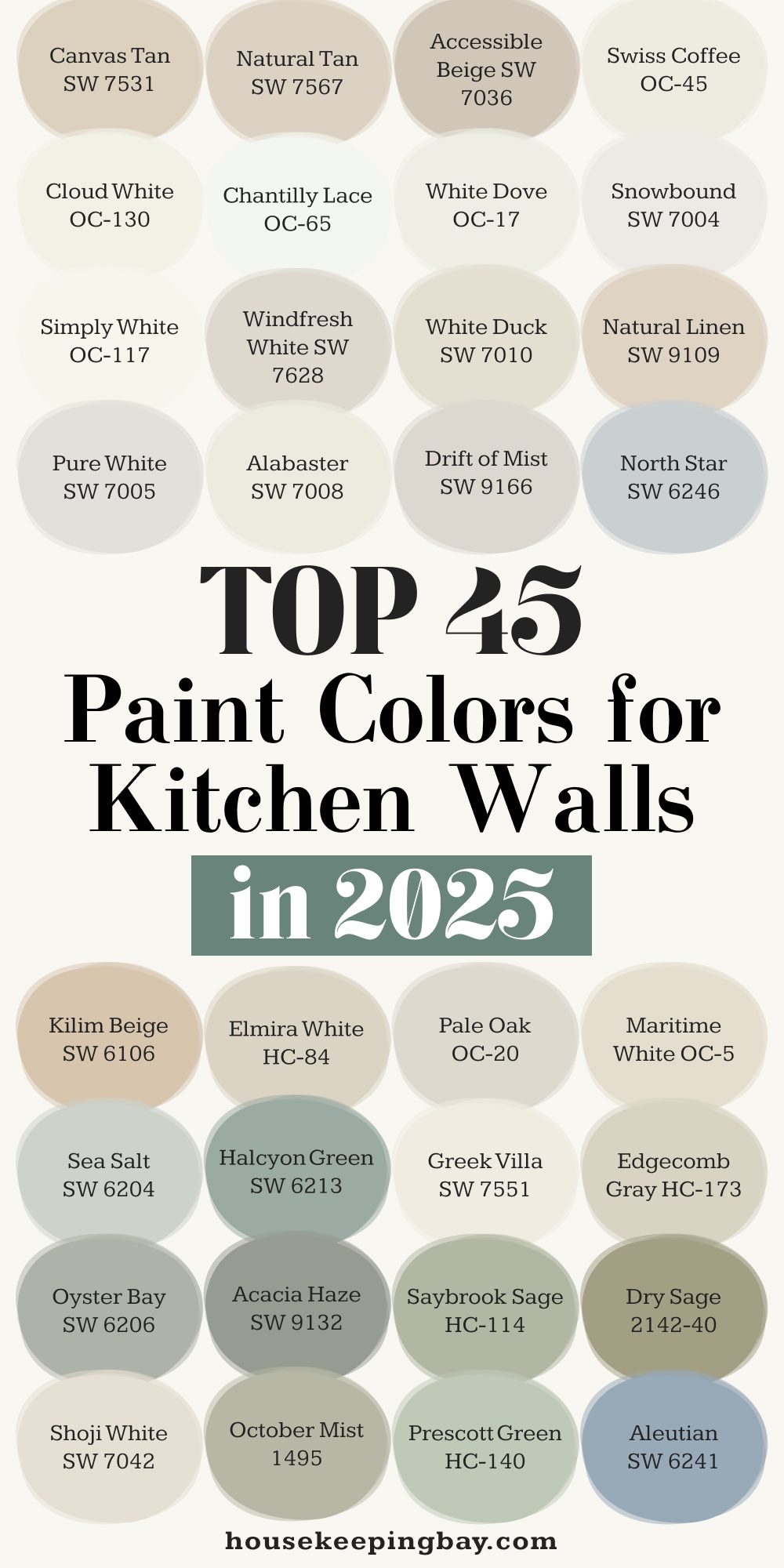
45 Top Paint Colors for Kitchen Walls in 2025
The Heart of the Home Starts with Color
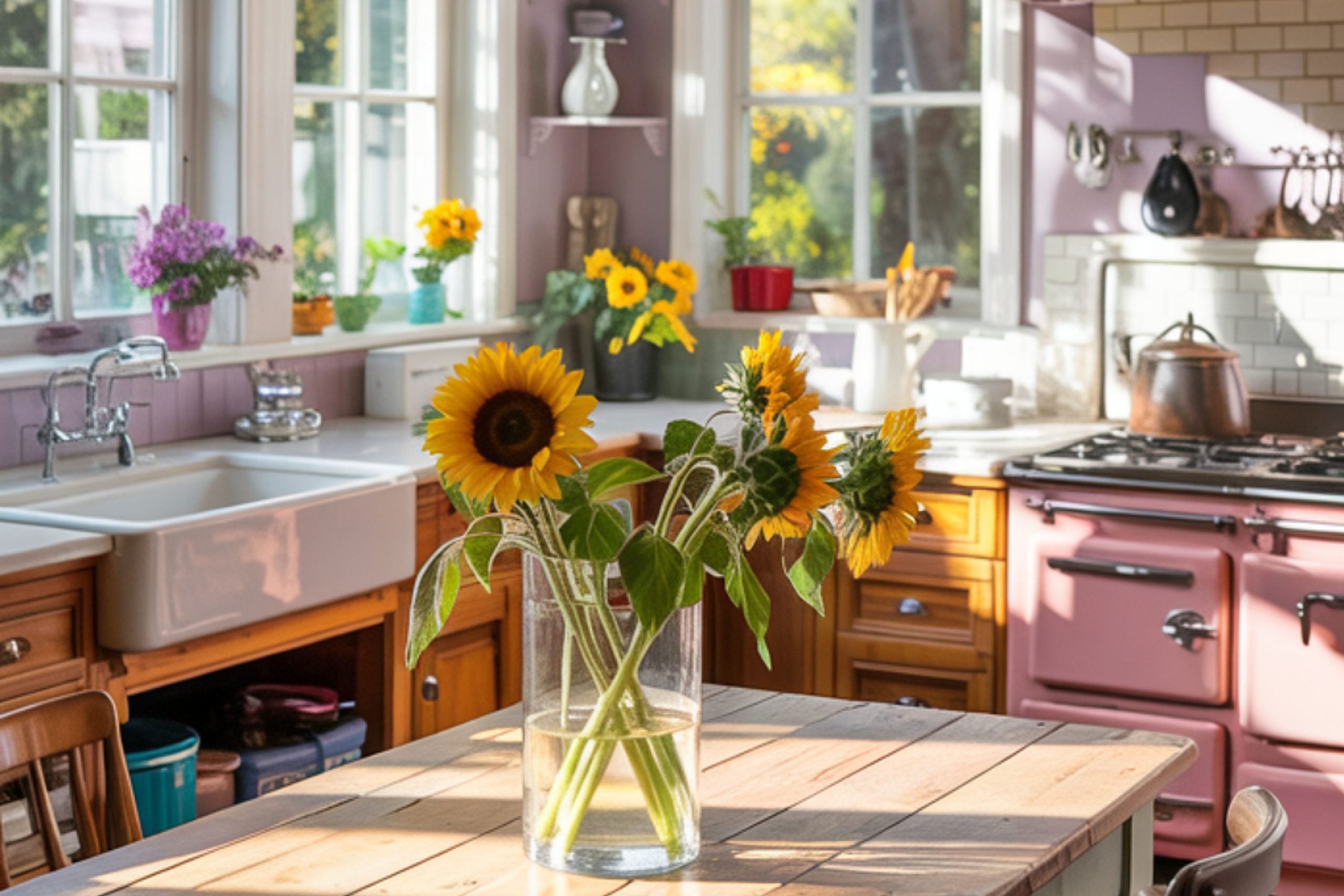
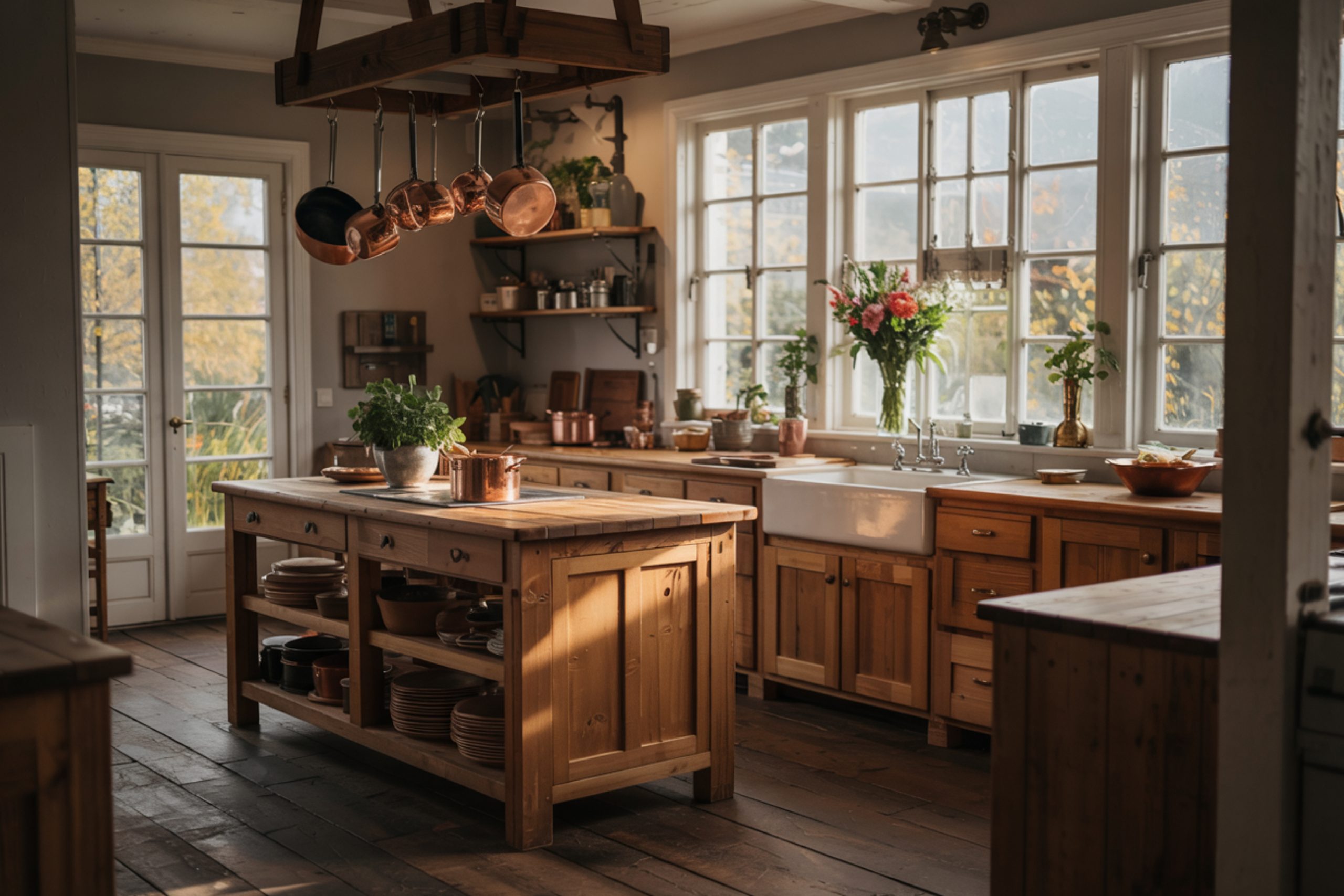
I’ve walked into hundreds of kitchens in my life — some felt cold, others chaotic, and a few felt like a hug. The biggest difference? The walls. Paint does more than coat a surface. It changes how a kitchen feels. And we all know the kitchen isn’t just for cooking — it’s where your kid finishes their science project, where you sneak cookies at midnight, and where the best conversations always happen.
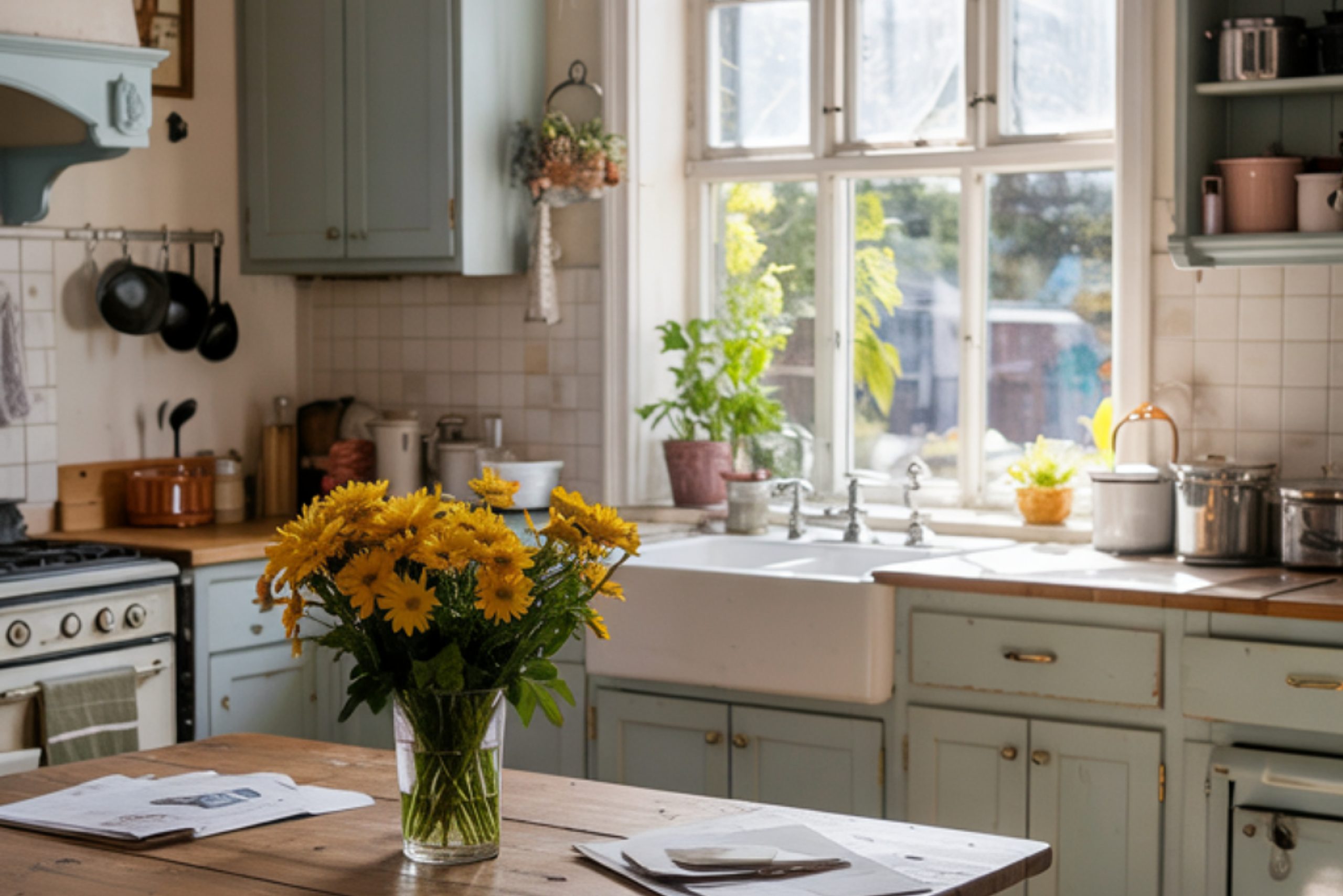
2025 is already shaping up to be a year full of softer whites, cozy beiges, and muted colors that make you breathe a little easier. People aren’t looking for bold statements as much as they’re craving comfort. And honestly, I get it.
More of my clients are asking for kitchens that feel light but warm — clean, but not cold. They want a backdrop that works with their countertops and cabinets, but also with their life.
So I’ve pulled together 45 of the best paint colors I recommend over and over again. Some are new favorites, and a few are classics that never fail me.
If you’re painting your kitchen this year, you don’t need to look through thousands of swatches. Just start here.
via housekeepingbay.com
The 4 Must-Have Paint Colors of 2025
Table of Contents
If you told me I had to pick just four kitchen wall colors to work with this year — these would be it.
I’ve used them in everything from tiny apartment kitchens to large open-concept homes, and they always deliver the same feeling: clean, calm, and comfortable.
1. Alabaster SW 7008
This one is my personal go-to. It’s warm without being yellow, soft without feeling dull. Joanna Gaines once called it “the perfect neutral,” and honestly, she’s right. I’ve used this in homes where clients wanted a fresh look but didn’t want their walls to scream “white.”
Pro tip: Pairs beautifully with brass or matte black hardware.
2. Pure White SW 7005
Some whites feel too bright — almost sterile. Pure White has just a hint of warmth that helps avoid that. It still reads clean and fresh, which is what most people want in their kitchens.
I love it: when the cabinets are wood or darker tones. It balances everything out.
3. Greek Villa SW 7551
This one feels more relaxed. If you have a kitchen with lots of natural light, Greek Villa brings in a soft glow. It’s not flashy, but it gives off this quiet comfort that a lot of families love.
Where it works best: farmhouse-style kitchens, or if you’ve got open shelves.
4. Shoji White SW 7042
Think of this as the cousin to greige. It has a little more depth than typical white but still keeps things light. In homes with beige, wood, or warmer undertones — this paint just works.
It’s great with: oak cabinets or butcher block counters.
These four colors are safe choices — but not boring. They give kitchens that peaceful, “I want to hang out here” kind of feel.
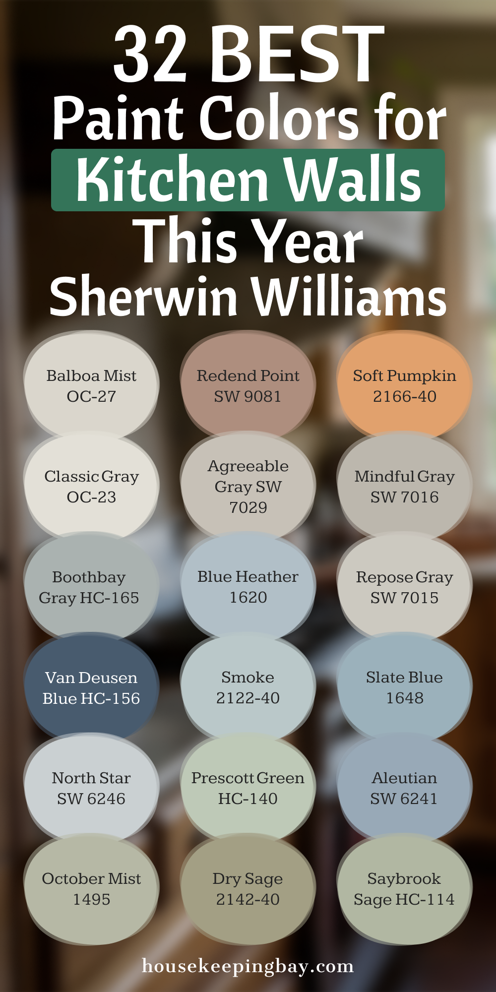
32 Best Paint Colors for Kitchen Walls by Sherwin-Williams This Year
When someone tells me, “I want the kitchen to feel fresh, but not too white… warm, but not yellow,” — I know exactly where to go: Sherwin-Williams and a few top picks from Benjamin Moore. These are the shades that hit that sweet spot. I’ve grouped them so it’s easier to figure out what kind of mood you’re going for.
Soft Whites – Clean, Not Cold
These work great with any style: modern, farmhouse, or traditional.
- Drift of Mist SW 9166 – Slightly cool, but still inviting. I’ve used this with marble counters and it’s gorgeous.
- White Duck SW 7010 – Creamy and warm without being yellow.
- Windfresh White SW 7628 – A soft white with a gray tint.
- Snowbound SW 7004 – This one leans cooler, works well with stainless steel appliances.
- Swiss Coffee OC-45 (Benjamin Moore) – This is a fan favorite. It’s warm, subtle, and looks expensive.
- Simply White OC-117 – A bright white that still feels soft. It reflects light beautifully.
- White Dove OC-17 – Timeless. This one works in any kitchen.
- Chantilly Lace OC-65 – The cleanest white in the group. Pairs best with modern or minimal kitchens.
- Cloud White OC-130 – A little creamy. Looks great next to warm wood tones.
- Steam AF-15 – Subtle and peaceful, with a tiny hint of gray.
via housekeepingbay.com
Warm Neutrals – Inviting and Easy to Live With
These colors bring in that cozy energy without going too dark.
- Natural Linen SW 9109 – Feels like a soft blanket. Works well with matte black or brass.
- Accessible Beige SW 7036 – Not your grandma’s beige. This one has just enough gray in it to stay modern.
- Natural Tan SW 7567 – Light, sandy tone. I used this in a beach house kitchen — still love how it turned out.
- Canvas Tan SW 7531 – Warmer than greige, softer than brown.
- Kilim Beige SW 6106 – A solid classic. Great for traditional kitchens.
- Elmira White HC-84 – Balanced beige that doesn’t take over the room.
- Pale Oak OC-20 – A designer favorite. Feels light and clean without being stark.
- Maritime White OC-5 – A warm, creamy tone that looks beautiful with gold or bronze.
- Edgecomb Gray HC-173 – Somewhere between beige and gray. I’ve recommended this more times than I can count.
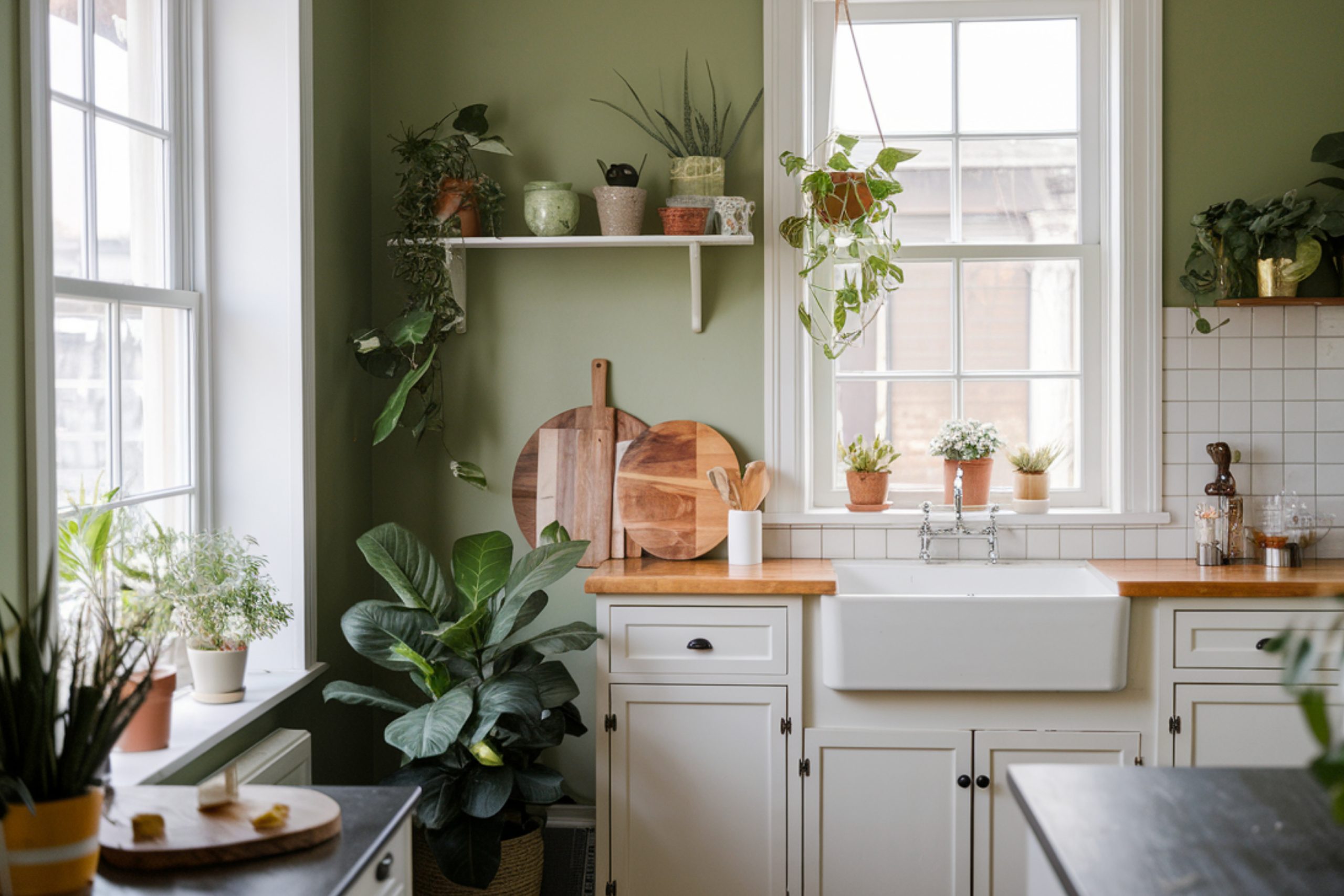
Greens That Feel Calm
Green is having a big moment in kitchens — especially muted, earthy ones.
- Sea Salt SW 6204 – Soft, airy green with a touch of blue.
- Halcyon Green SW 6213 – Dusty green that pairs well with wood cabinets.
- Acacia Haze SW 9132 – Earthy and grounded. This works better in bigger kitchens.
- Oyster Bay SW 6206 – Subtle and cool-toned. I’ve seen it paired with white oak — beautiful.
- Saybrook Sage HC-114 – Looks natural and cozy. Feels like the outdoors came inside.
- Dry Sage 2142-40 – Dusty, calm green with a vintage vibe.
- October Mist 1495 – Benjamin Moore’s Color of the Year 2022. It’s still going strong.
- Prescott Green HC-140 – A pale, classic green. If you’re nervous about using green, start here.
via housekeepingbay.com
Cool Blues & Grays – Peaceful and Polished
These give off a clean, grounded feeling.
- Aleutian SW 6241 – Dusty blue with a bit of gray.
- North Star SW 6246 – Subtle blue-gray that’s perfect in kitchens with lots of light.
- Slate Blue 1648 – Deep, stormy blue — amazing in coastal homes.
- Smoke 2122-40 – Light blue-gray, feels gentle and relaxed.
- Van Deusen Blue HC-156 – A bold navy if you want some drama.
- Blue Heather 1620 – Dusty periwinkle tone that’s still neutral enough.
- Boothbay Gray HC-165 – A perfect mix of gray and blue. It looks different depending on the light.
- Repose Gray SW 7015 – Balanced gray with soft warmth.
- Mindful Gray SW 7016 – A touch deeper than Repose, works beautifully with white trim.
- Agreeable Gray SW 7029 – If you can’t decide between beige and gray, this is your answer.
- Classic Gray OC-23 – Lighter and warmer. Doesn’t steal attention but makes everything look better.
- Balboa Mist OC-27 – Soft and smooth. Works well in open floor plans.
That’s the full list — 32 of the best colors that actually work in real kitchens. These are paints I keep in my client folders year after year.
via housekeepingbay.com
Trending Neutrals for a Cozy Kitchen Feel
Not every kitchen wants to be bright white. Some just want to feel warm. Lately, I’ve had more homeowners tell me:
“I want it to feel calm, but not boring.”
That’s where these neutrals come in.
They give off a soft, grounded look. They work with white cabinets, wood cabinets, even dark hardware. And best of all — they’re super forgiving. If you have a busy kitchen (kids, dogs, toast crumbs everywhere), these tones can handle it.
My Favorite Warm Neutrals Right Now:
1. Accessible Beige SW 7036
There’s a reason this one keeps trending. It’s not the old-school beige you’re probably thinking of. This version has just a hint of gray, which keeps it feeling updated.
I like it paired with creamy cabinets or natural wood.
2. Pale Oak OC-20
Benjamin Moore calls this one a “pale gray-beige,” but to me it’s just soft and lovely. I used it in a kitchen with white oak open shelves, and it was perfect.
“It reads like a whisper of color,” says designer Shea McGee. She’s not wrong.Shea McGee on Pale Oak
3. Canvas Tan SW 7531
If you’re into warm farmhouse kitchens, this is one to look at. It’s not too dark, so your kitchen still feels light. I usually pair it with warm backsplash tiles or butcher block countertops.
4. Edgecomb Gray HC-173
This one is a classic. It’s right in that sweet spot between gray and beige. Works in all lighting — which is great because kitchens get tricky shadows, especially around cabinets.
Why Neutrals Work So Well
A 2023 study by Fixr showed that 65% of interior designers named warm neutrals as their top choice for kitchens in real homes.
Because they’re easy to decorate around. Because they don’t date quickly. And because they feel comfortable — and that’s what people want most right now.
What I Tell Every Client Before They Pick a Paint Color
People usually think choosing a kitchen wall color is about picking something pretty. But here’s what I’ve learned:
It’s about how you want to feel in the kitchen.
Do you want it to feel clean and bright in the morning?
Cozy and warm at night while you cook dinner?
Like a calm corner when the rest of the house feels loud?
via housekeepingbay.com
Color sets the mood — and you’ll see it every day. That’s why I always tell my clients:
“Pick the paint that feels like your version of home, not just what’s trending.“
The 45 colors I’ve shared in this list are ones I actually use. They’re tested in real kitchens, with real lighting, and real families. Some of them have been around for years.
Others are just now gaining attention. But every one of them works — when you use it with intention
If you’re still not sure where to start, here’s my quick tip:
- White kitchens: Go with Alabaster or Greek Villa
- Warm & cozy: Try Pale Oak or Accessible Beige
- Fresh with personality: Go for Sea Salt or October Mist
- Modern and cool: I’d look at Mindful Gray or Boothbay Gray
In the end, the right paint color doesn’t just change the walls — it changes the way your kitchen feels to everyone who walks in.
And that’s what really matters.
via housekeepingbay.com
